Homework
Similar to last week, four homework assignments, summarized here with links to details.
- Rework a previous assignment to make it stronger, if you wish (see Week 2 here and here)
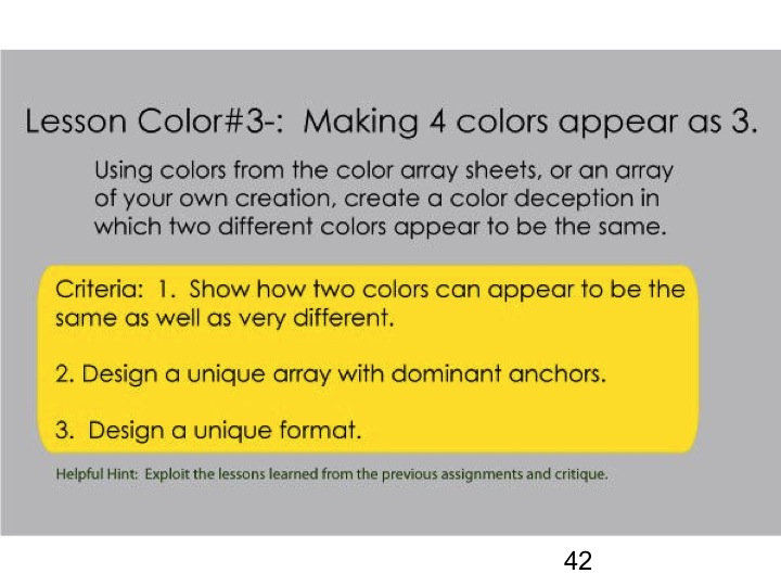
- This week’s new assignment: Make 4 colors appear as 3 (see below)
- Look for examples of “freaks” (see Week 2 here)
- Exploitation: look for examples of these phenomena in your own work or elsewhere (see Week 2 here)
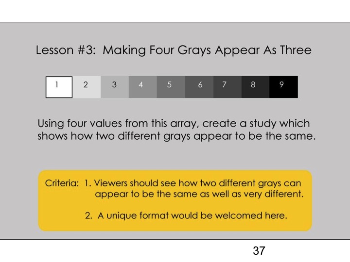
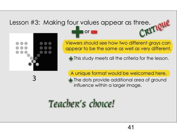
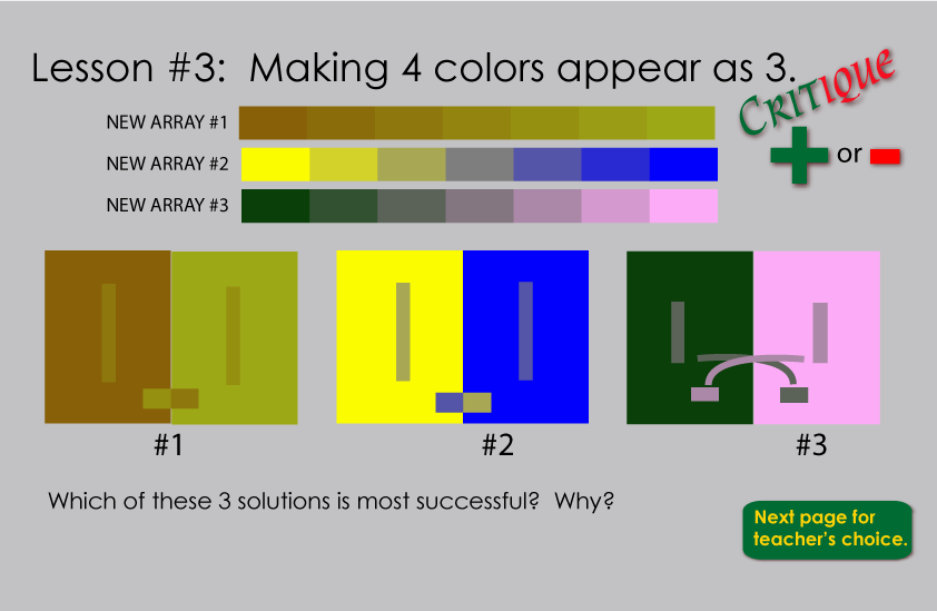
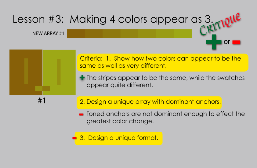
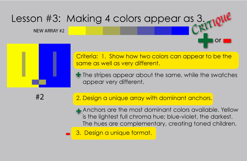
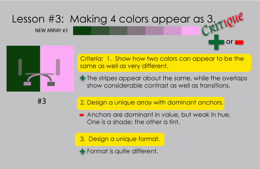
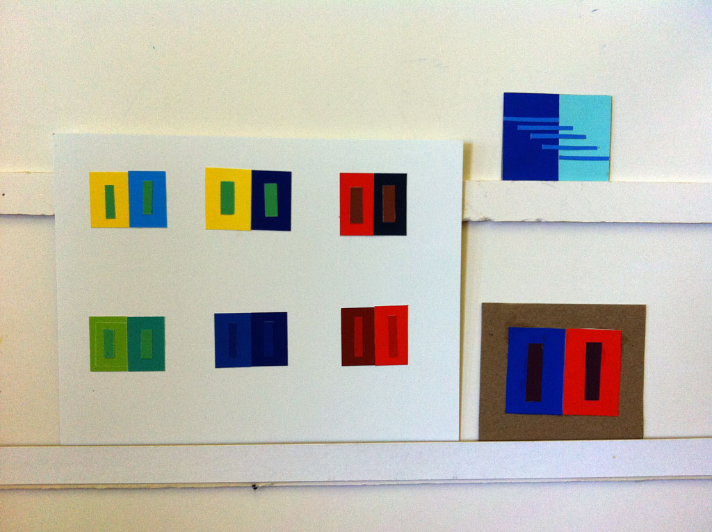
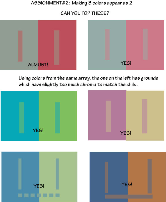
Color deception three: Make 4 colors appear as 3
Bring in your study for critique next week. If you’re doing it on the computer instead of paper, please send it to Karen by 7 pm the night before class, in PDF, PNG, JPG, or GIF format.
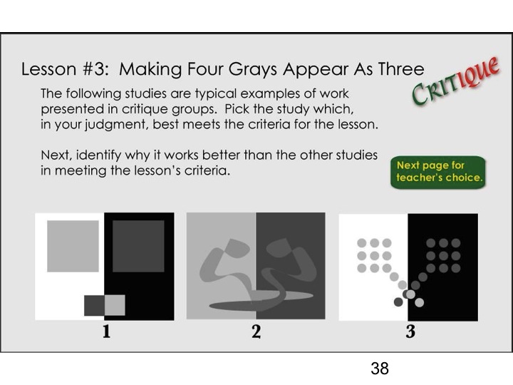
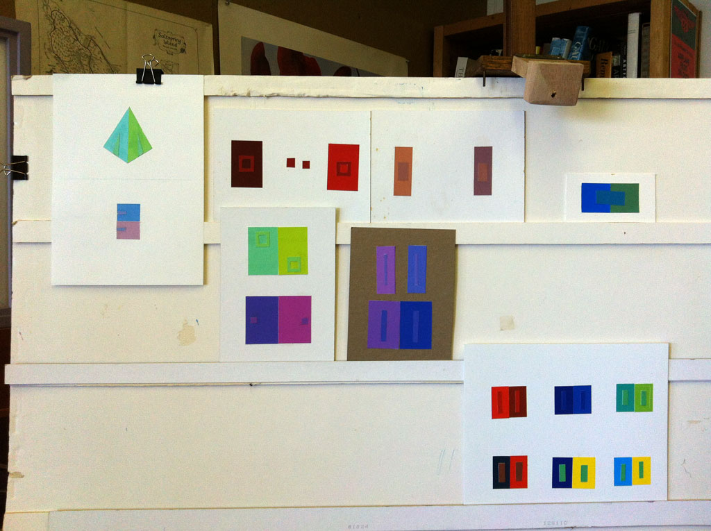
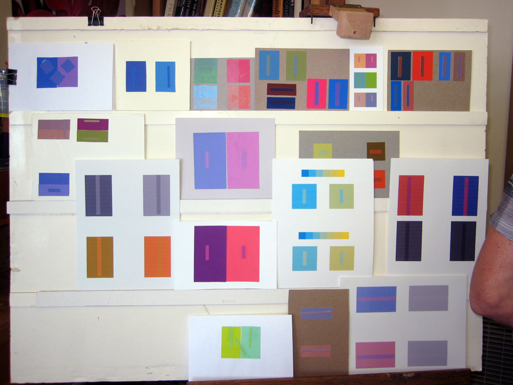
See the Class Materials section below for the examples and critiques in value and color. Remember that you are trying to surprise the viewer as much as possible. Push the illusion – shove it!
[gview file=”https://dicknelsoncolor.com/wp-content/uploads/2013/09/Lesson3Combined.pdf”]
The 30-second video below demonstrates one solution.
Class recap – some key ideas
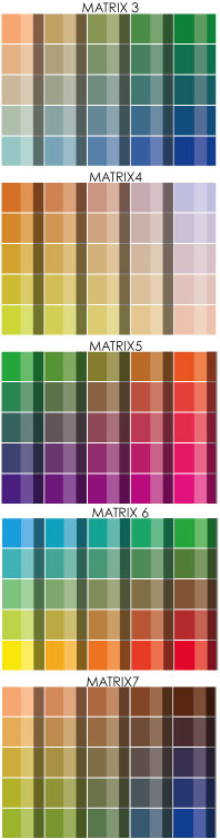
Learning to self-critique is absolutely vital. Dick has set very focused assignments, with the judging criteria spelled out. This should allow you to measure your own success in the assignment. He has also provided a valuable tool, the array. Using an array – choosing all the colors in your study from a single array – provides a huge shortcut to finding a solution that works.
Critique tips
There are three general questions to ask yourself when critiquing your own work:
- What was I trying to do?
- Did I do it?
- Was it worthwhile?
Some more specific questions, below, will help you see and evaluate objectively, answering #2 above when considering a specific piece or assignment.
[box color="yellow"]Some questions to ask in a personal critique
- Is this deception one of value, hue, or both?
- What is the relationship of the stripe to the two grounds?
What colors are present in each of the two parents?
Does the child possess all of these colors?
Does the child have any colors, tints, or shades not found in either parent? - How dominant are the parents?
More chroma than the child? - Does the child favor one parent over the other in value? Hue?[/box]
It will take practice, and time, to recognize the primary components of a color. Challenge yourself to try it. How strong is the chroma – is it fully saturated? If not, is it tinted, shaded, or toned? What does that tell you? Which primary is dominant? How much cyan is there? How much magenta? How much yellow? Dick emphasized that you must be able to identify the primaries in any color.
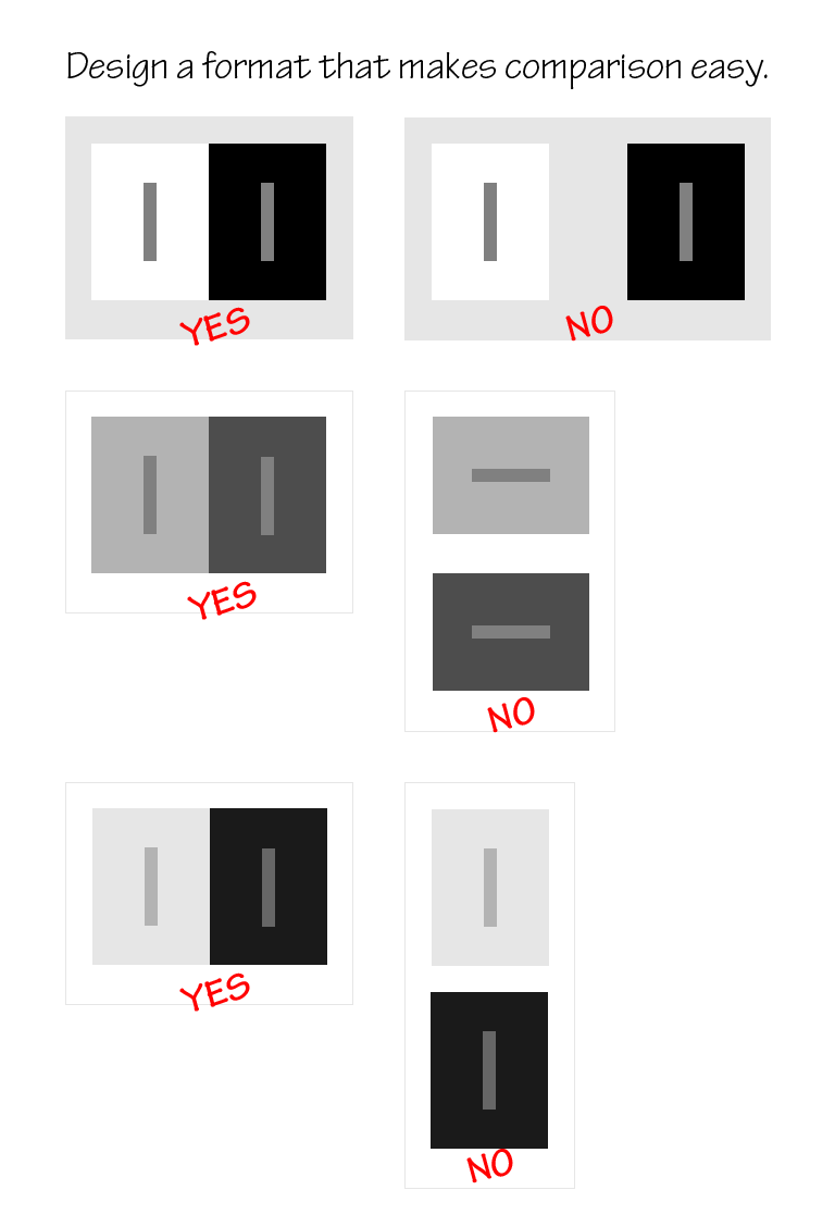
Format tips
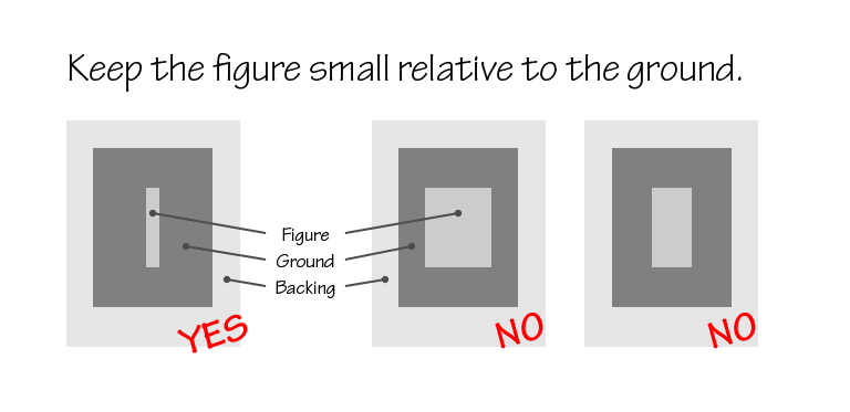
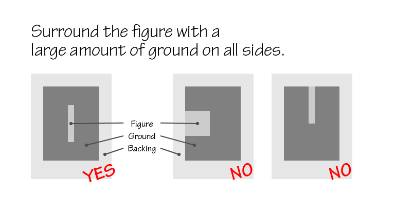
In these studies, we are using a large, dominant ground to cause an apparent color change in a smaller, weaker (in chroma) figure. If the figure is too large, it’s easier for a viewer to judge the color independently of the ground, so keep the figure relatively small. Keep it in the center of the ground; if it touches an edge, you weaken the ground’s influence. Make the viewer’s task of comparison easier by placing the two ground elements parallel horizontally and close together, near the center of the display, rather than separating them with a chasm of empty space.
Critique – reworked assignment 1

1. What was I trying to do?
Make one color appear as two. Display how different the same color appears on different grounds. The greater the change, the better.
2. Did I do it?
Did I put one color on two different grounds? Is there a convincing difference between the two? Could I make the illusion even more dramatic?
- Is this deception one of value, hue, or both?
- What is the relationship of the stripe to the two grounds?
What colors are present in each of the two parents?
Does the child possess all of these colors?
Does the child have any colors, tints, or shades not found in either parent? - How dominant are the parents?
More chroma than the child? - Does the child favor one parent over the other in value? Hue?
3. Was it worthwhile?
Where can I use this in my own work? Does this help me see why a particular piece didn’t work as well as it could have, or why something appears magical and I didn’t know how it was done?
Critique – assignment 2


1. What was I trying to do?
Make three colors appear as two, appearing as reversed grounds. Display one color on two different grounds. Convince a viewer that only two colors were used in the study. Clear and simple format.
2. Did I do it?
Did I put one color on two different grounds? Does each figure look like the opposite ground? Is my format simple and effective? Could I make the illusion even more dramatic?
- Is this deception one of value, hue, or both?
- What is the relationship of the stripe to the two grounds?
What colors are present in each of the two parents?
Does the child possess all of these colors?
Does the child have any colors, tints, or shades not found in either parent? - How dominant are the parents?
More chroma than the child? - Does the child favor one parent over the other in value? Hue?
3. Was it worthwhile?
Where can I use this in my own work? Does this help me see why a particular piece didn’t work as well as it could have, or why something appears magical and I didn’t realize how it was done?
Here are some solutions from Dick.
We looked at some of the published solutions to the first two assignments in the Albers app, and discussed how they could be made stronger, mostly by using grounds (and array parents) with stronger chroma, so the deception included more hue change, instead of mostly value change.
An impressive solution to this week’s challenge (making 3 colors appear as 2 or reversed grounds) had a very narrow X filling the space on each side and meeting at a crossover point to show it was the same color on both sides, similar to the images below.


Dick printed some new array sheets, which are available for purchase for $5 each. The sample matrices are shown below.
Freaks and exploitation
We discussed the sample gallery, identifying which artists seemed to be consciously using color and value relationships, and which seemed oblivious to the laws of light and color, creating “freaks“. A few students shared some examples they had found.
One student shared an example of her past work which had exploited the properties of an array, sampling a photo of the work and arranging the samples in array order.


Class materials