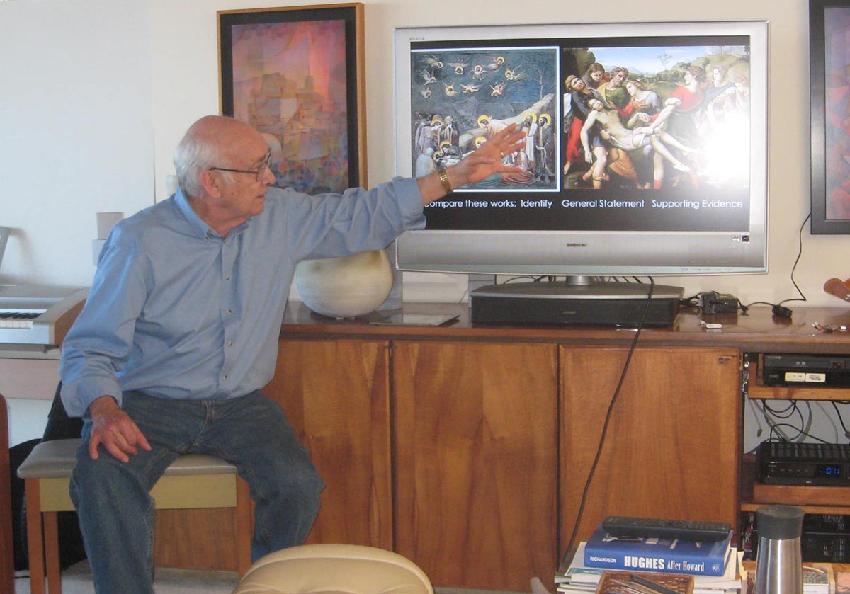
 The ninth session of the “Art is Us” art history class for Spring 2015 was held on Thursday, May 14. Artwork from the Surrealism, De Stijl/Neo-Plasticism, Abstract Expressionism, Op Art, Pop Art, and Photo-Realism movements was introduced. Works by Salvador Dali, Jackson Pollock, Josef Albers, Claes Oldenburg, Chuck Close, and Richard Nelson were featured. Concepts from the whole course were reviewed in quizzes. The reason/passion polarity was revealed to be the organizing principle of the entire course.
Class recap – some key ideas
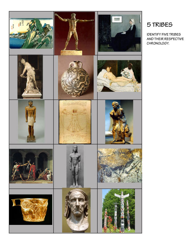
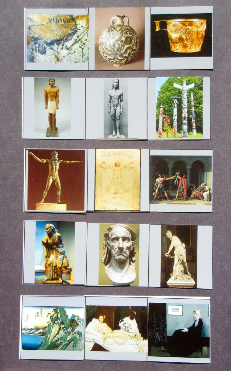
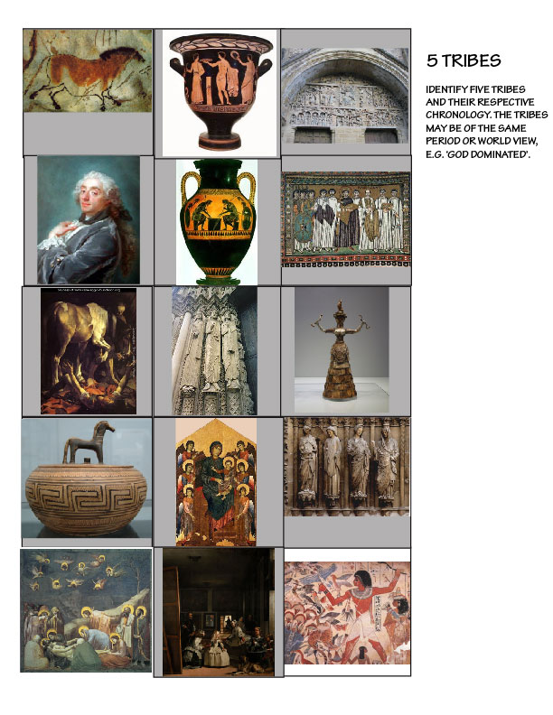
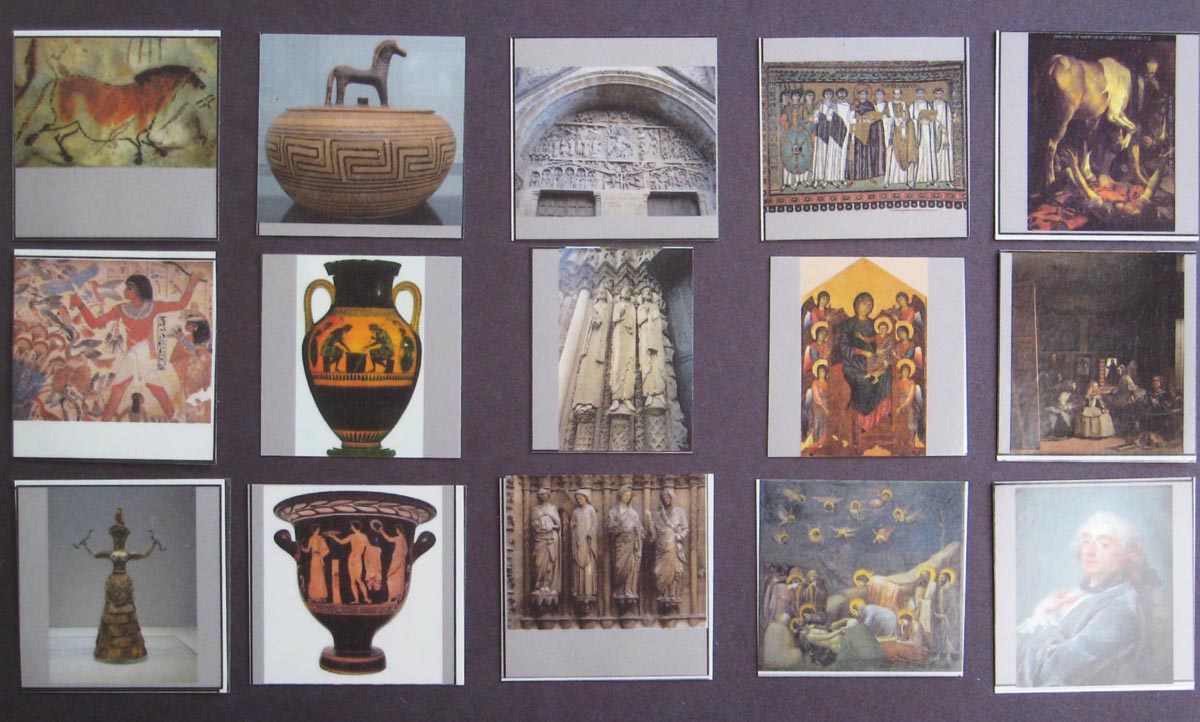
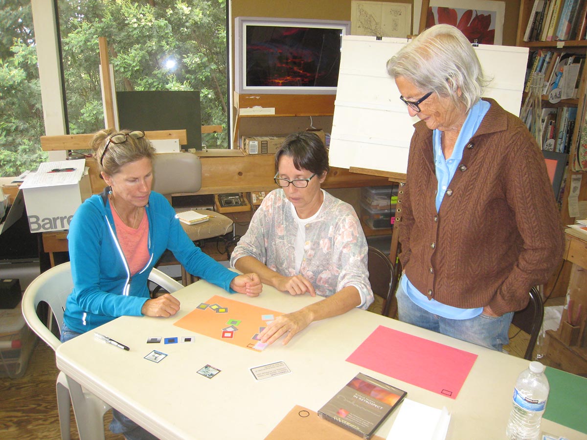
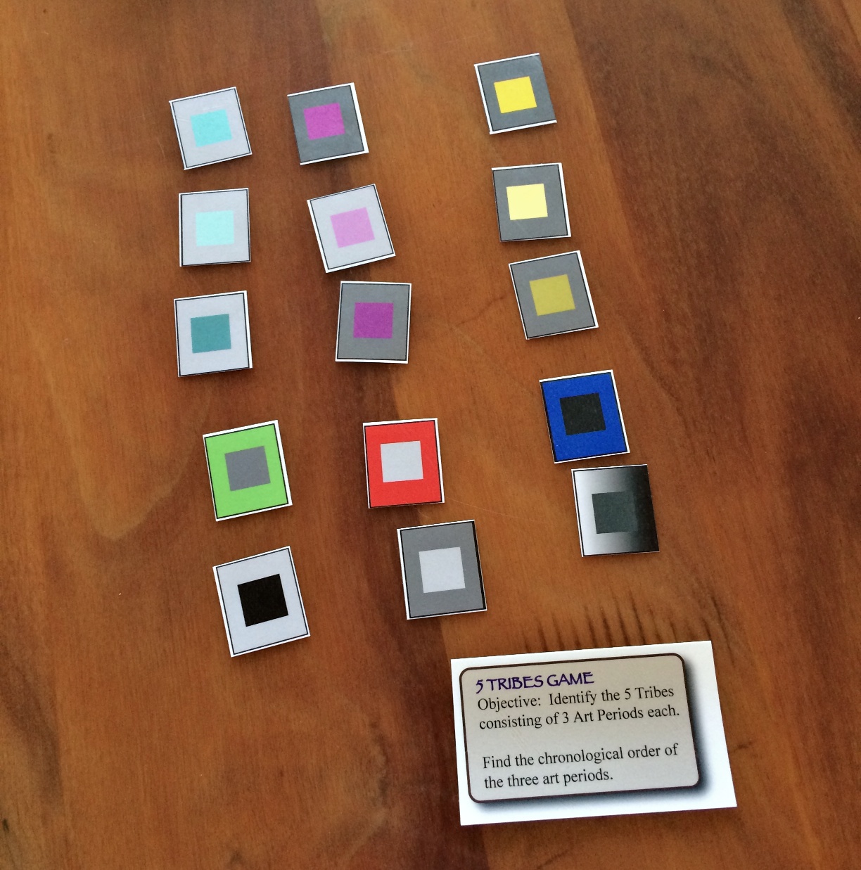
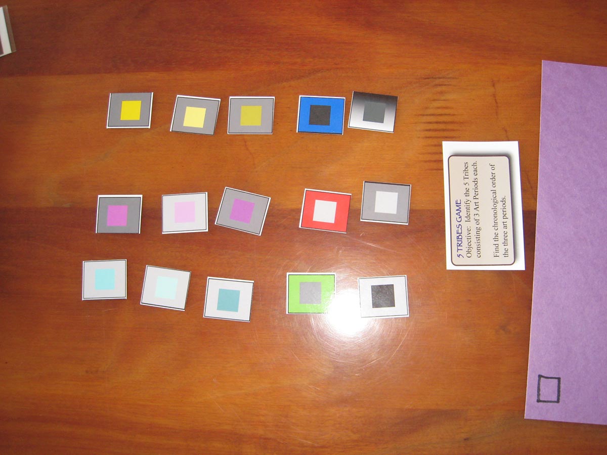
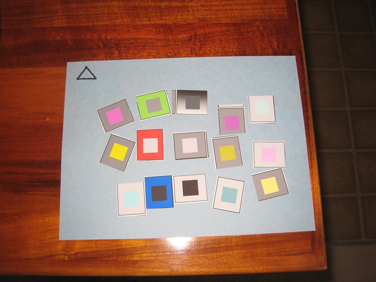
Five tribes, by Valerie
Lecture and slideshow: Isms is in!
Here are some brief notes on each slide. Listen to the audio files, below, for more detail.
- Art Is Us Lecture #9 Isms is in!
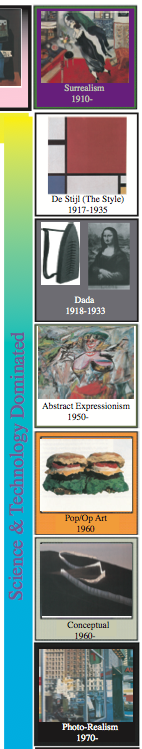
We’re covering the whole right side of the gameboard (most of the 20th century) today. You can trace the lineage of most “Isms” to one of the two core ideas, reason or passion. - Philippe Halsman The Dali Atomicus Surrealism: Are dreams the only true reality?
Every single period of art deals with reality. What was real or important in each period varied. Dick argues that dreams may be more real (for the dreamer) than waking life. In Surrealism, recognizable objects are set in an impossible context. The artist and movement raise the question of what IS reality? - Images Of The Mind: Imagine that! Real? Try to smoke it! Can dreams be translated? Reality? Dali Persistence of Memory
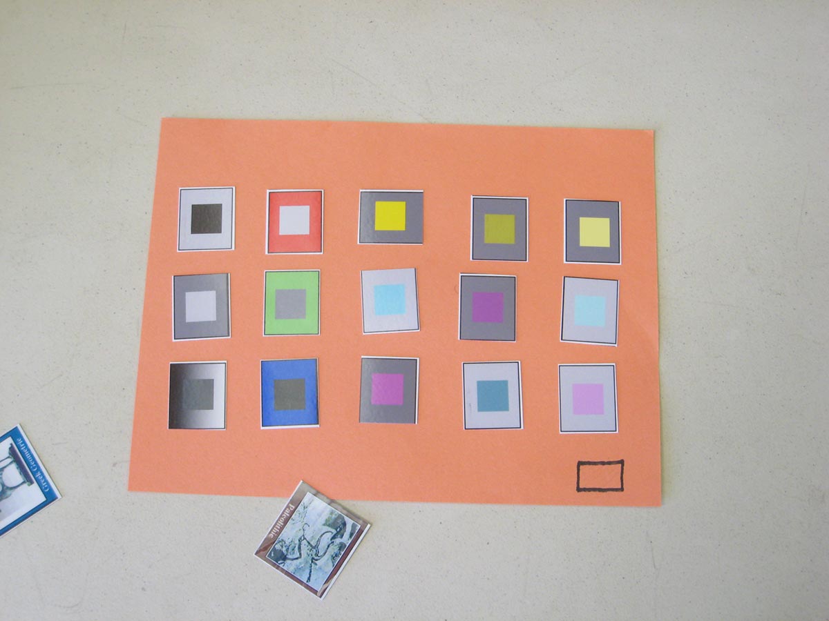
Ambiguity of form: The same shapes can be read as different objects, at different scales. - Can you find feet in these images? Hint: Be negative.
Artists must be aware of, and recognize the importance of, both figure and ground. - A face or bowl of…? A dog or landscape? Dali Apparition of Face and Fruit Dish on a Beach
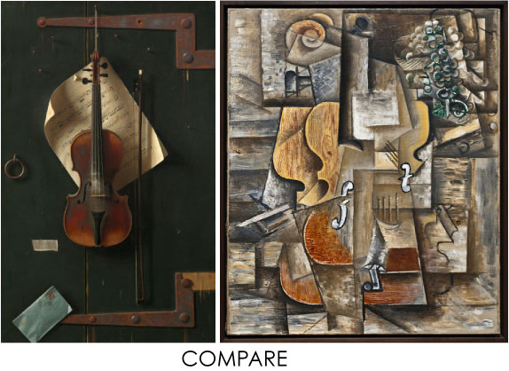
- Plagiarism? Dali, Nelson.
Dick created the painting on the right to illustrate a newspaper story about traffic deaths, and later discovered Dali’s image. - 20th-Century cross-pollination Miro The Tilled Field
Miro combined a surreal setting with shapes and colors reminiscent of cubism and collage. - De Stijl/Neo-Plasticism: Reasoned arrangements and condensations of primary (?) colors and shapes. Mondrian: Composition in Red, Blue and Yellow Mondrian Broadway Boogie
Here is a very rational distillation of strong shapes and colors. There is no representation here. This is non-objective – there is no subject matter other than what you see. - Abstract Expressionism. Action Painting: A visual choreography of an artist’s interaction with paint and color.
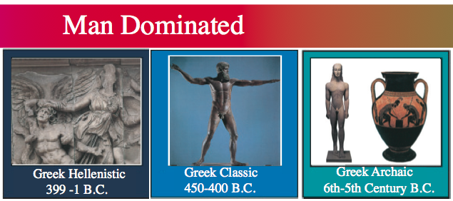
If Mondrian is Classic, Pollock is Hellenistic. There is no careful planning here. You get a different line depending on the thickness of paint and the action of applying it – this is a portrait of paint. - The final conclusion of Art For Art’s Sake. A visual record of the inherent qualities of paint applied in a choreography of drips and pours. Jackson Pollock
Going to the core, we can be reasonable, and we can be passionate. We think about things, and we also feel about things. These are the major divisions in art history, and one usually seems to dominate in each period. - An Age of Proclamations. Should we trust the art critic? A myth maker who proclaimed that the only valid subject matter is that which is tragic. “Without monsters and gods, art cannot enact a drama.” -Rothco “A colorist he is not!” -Dick Nelson
The critics and public didn’t know what to make of the art of the time, so artists made proclamations to explain or impress. For Dick, the final analysis is the work itself – does it move me, or doesn’t it? Dick used to think someone must exist with the god-like ability to recognize great art, but has now concluded that few curators or art historians understand what actually happens in the art studio. They study the artist – history, social forces, personality – more than the artistic process. - Can My Six-Year-Old Do Better? If this is a statement, what does it state? Motherwell Elegy to the Spanish Republic No. 110
The qualities of line and shape convey emotion. - Reshaping post-war frustrations with a new expressive vision. Does this rationale “FLY”? De Kooning Woman De Kooning Gotham News
After World War II, the focus of the art scene shifted from Europe to New York, but many of the famous artists had come from Europe. - Reason: Op Art: Josef Albers: Homage To The Square. Passion: Abstract Expressionism: Hans Hoffman: The Gate
Reason and passion have been Dick’s organizing principle for this course. He hopes no one walks away thinking it’s either/or. It’s not possible to paint without thinking, or without feeling.
So far today we have seen examples of the the three major divisions in modern art: abstraction, expression, and fantasy. - Pop Art. Familiarity breeds…? Andy Worhol Campbell’s Soup
Pop art asked the viewer to reflect on society, rather than calling attention to itself as art. - Quality control! Claes Oldenburg Hamburger
- What does our ART tell us about “us”? Seeing the familiar in an unfamiliar way. Oldenburg Eraser, Soft Bathtub
Raising questions about what is or isn’t art. - Patriotism or Patronizing? The visual elements are upstaged by concept. Contemporary Icon: Let’s run it up the flagpole and see if it flies! Jasper Johns
The flag, and this depiction of it, would have very different meanings to different audiences, such as veterans, war protesters, and people from other countries. - Illustration or fine art? Thiebaud: Three Machines
Thiebaud is one of Dick’s favorite artists. - OP ART. Is this all there is? Bridget Riley Movement In Squares
- 1 + 1 = 3. The interaction of color. Albers Homage to the Square
- Nelson: Homage To Albers “Learning Never Ends” -Albers
What Dick learned from Albers was that any of these colors, taken out of context, would lose its luminosity. They appear to glow because they are all related. - Vasarely Optical Illusion. Is permanence a factor in art?
The consistent light-dark relationships create the 3D illusion. - Photo-Realism. It’s all an illusion. When paint mimics photos which mimic optical reality… (literally speaking). Now, this is truly taking dictation!! Ralph Goings Ralph’s Diner
Ralph Goings was a classmate of Dick’s at art school. - What’s A Portrait? A visual statement with two very different realities. One is seen at a DISTANCE; the other at CLOSE range. A synthesis of Pointillism, Photo-Realism, Op and Intuition Chuck Close
Chuck Close is one of Dick’s absolute favorite artists. - Close…..Up? Distant Viewing? Your spatial preference?
- Art: An observation, by Richard Nelson
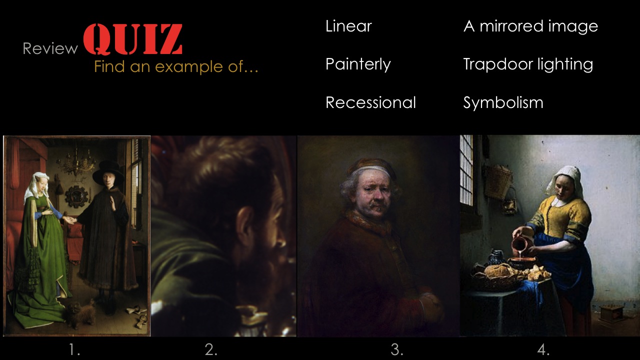
- Quiz / review, part 1
- Quiz / review, part 2
- Reason / Passion game (review)
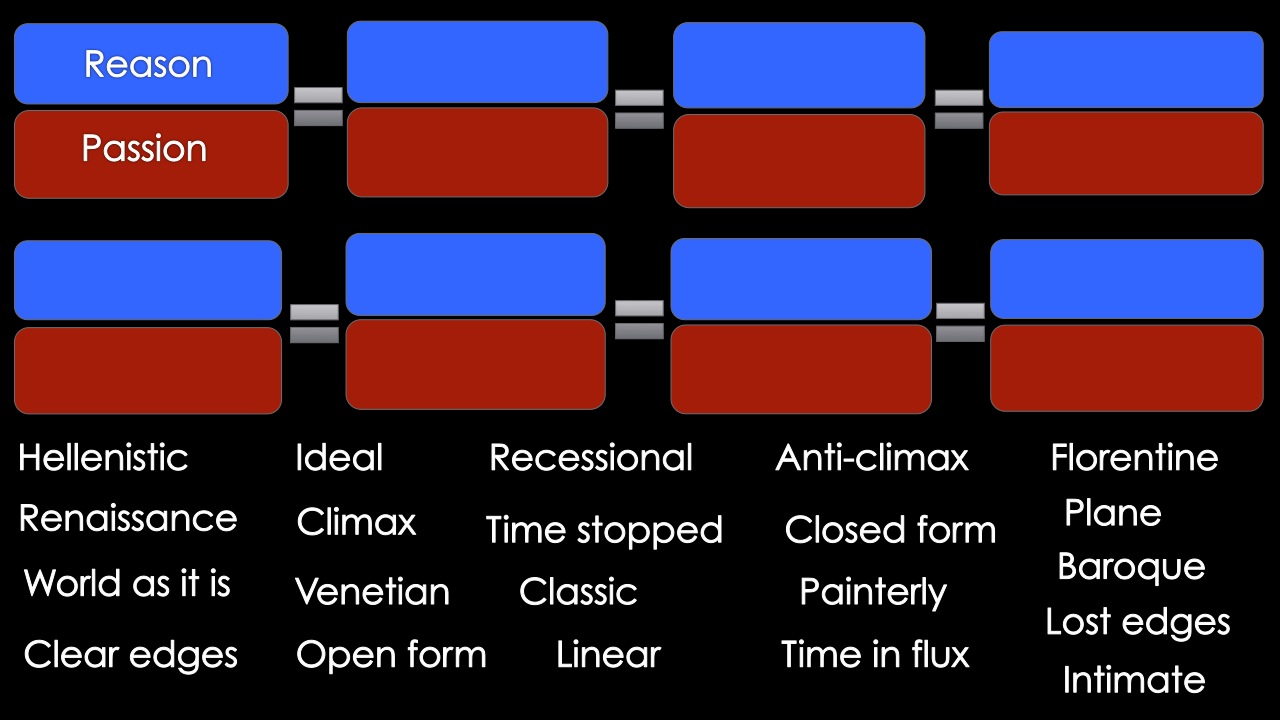
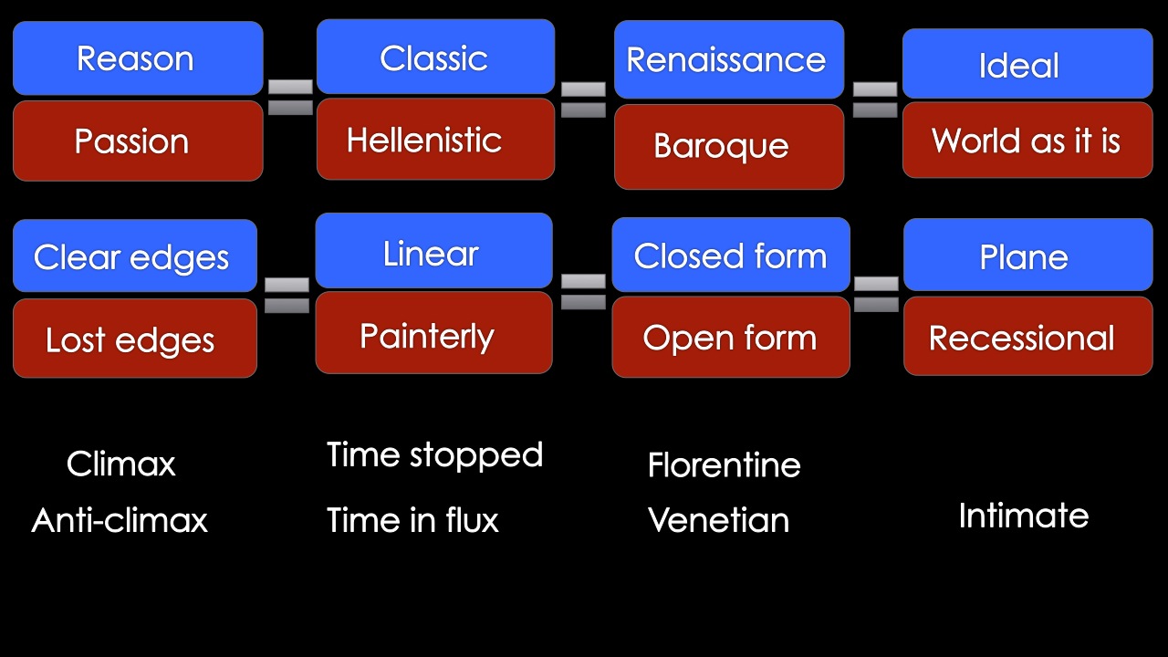
Reason and Passion – perennial human characteristics
We have seen that these sets of characteristics are frequently found together in the art of different cultures, periods, movements, or individuals. They provide clues to identification and chronology, because what we create is an expression of what we believe, how we see the world. This is Dick’s organizing principle for the entire course. Reason Passion Classic
Renaissance
Florentine
Neo-classic
Ideal
Clear edges
Linear
Closed form
Plane
Climax
Time stopped
RationalHellenistic
Baroque
Venetian
Romantic
World as it is
Lost edges
Painterly
Open form
Recessional
Anti-climax
Time in flux
Intuitive - Art Is Us: Final Assignment #1 (most influential work)
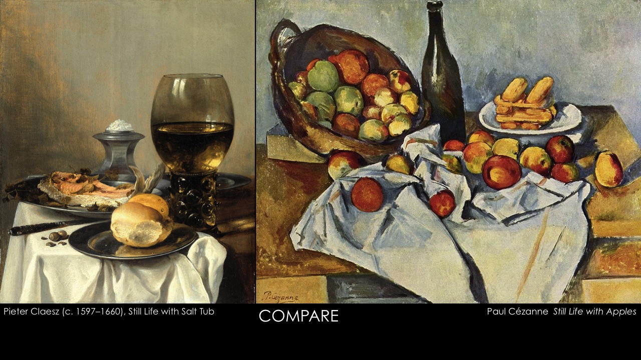
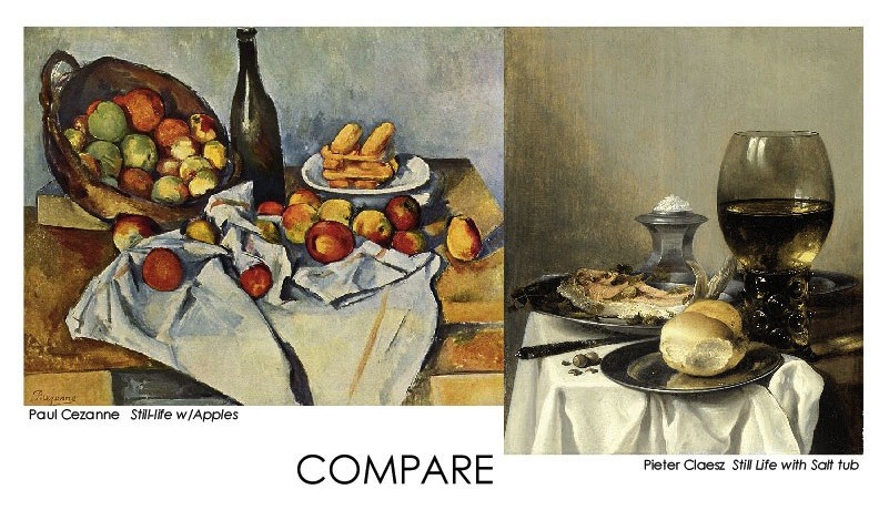
Dick believes the mission of education is to increase the student’s options. - Patti: Cézanne Still Life with Basket of Apples
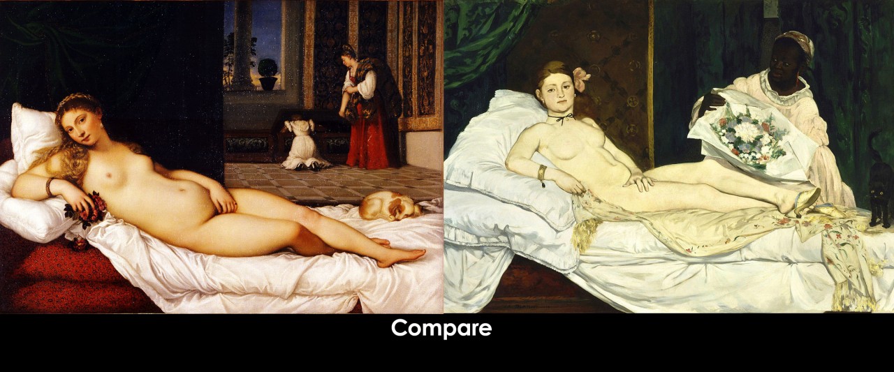
- Valerie, Jill: Manet Olympia
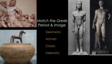
- Holly: Mycenaen Octopus Vase
- Steve: Picasso Guernica
- Sheri: Cycladic head
- Elizabeth Ann: van Gogh
- Jill: Goya The Third of May 1808
- Art Is Us: Final Assignment #2 (conceptual art)
The 2009 version:
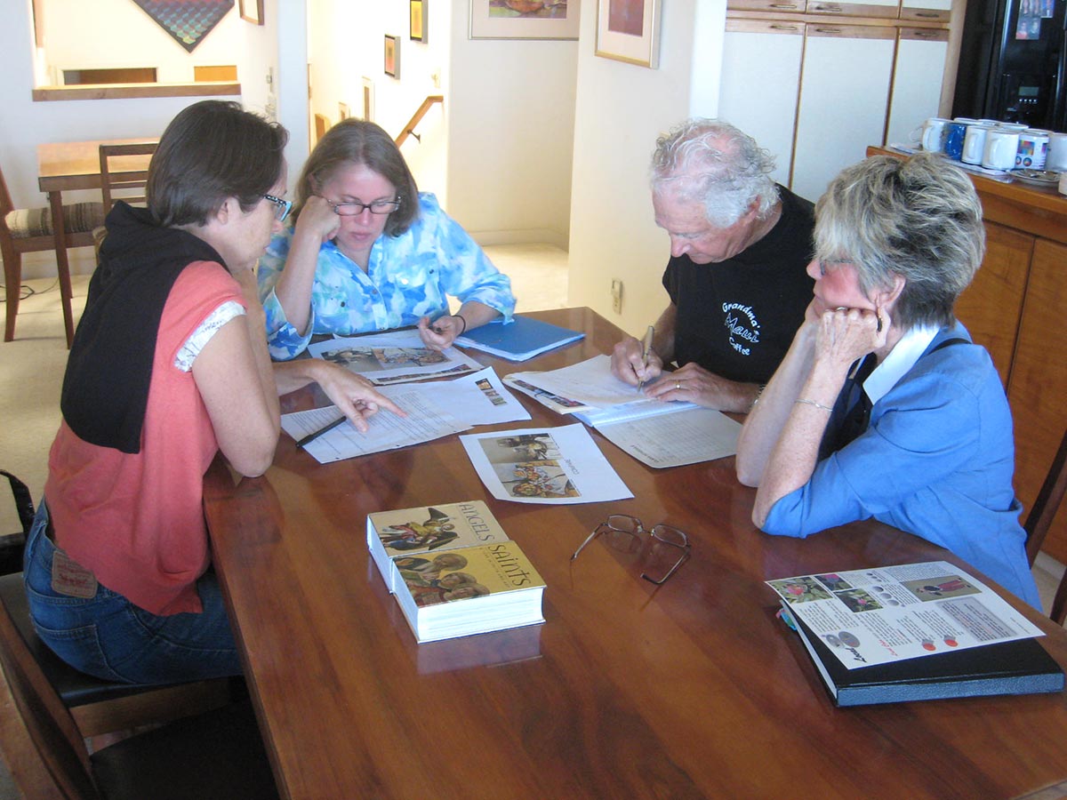
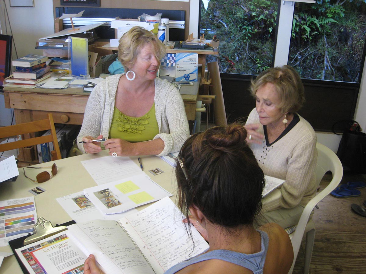
Class materials
Audio files
Part 1, slides 1-14 (1:10:03)
Part 2, slides 15-39 (1:24:28)