For our final assignment, Dick has “removed the fence posts” constraining subject matter and technique. He said, “My goal is to make you more independent. With each assignment I’ve given you more flexibility. You have the opportunity to push your boundaries.” He offered the following guidelines and checklist.
Look at what’s happening
Look at your checklist
Ask, “What would happen if?”
Be willing to keep experimenting, even taking it to disaster
It’s not a coloring book – the magic happens when you cross the lines
“It’ll take painting an acre of canvas before you get it” – George Allan
A checklist for a watercolorist:
Identify the givens, e.g., white ground, 1, 2, or 3 mixtures, etc.
Define the neighborhood, e.g., Earthy, Candy Store, Luminous, Plain, etc.
Identify the options:
Tones, tints, & shades
Halations
Vanishing boundaries
Film and veil
Reverse gradation
Surfaces
Light and shade
Bring your work in for critique next week. We won’t be painting in the final class, so you don’t need to bring your painting supplies.
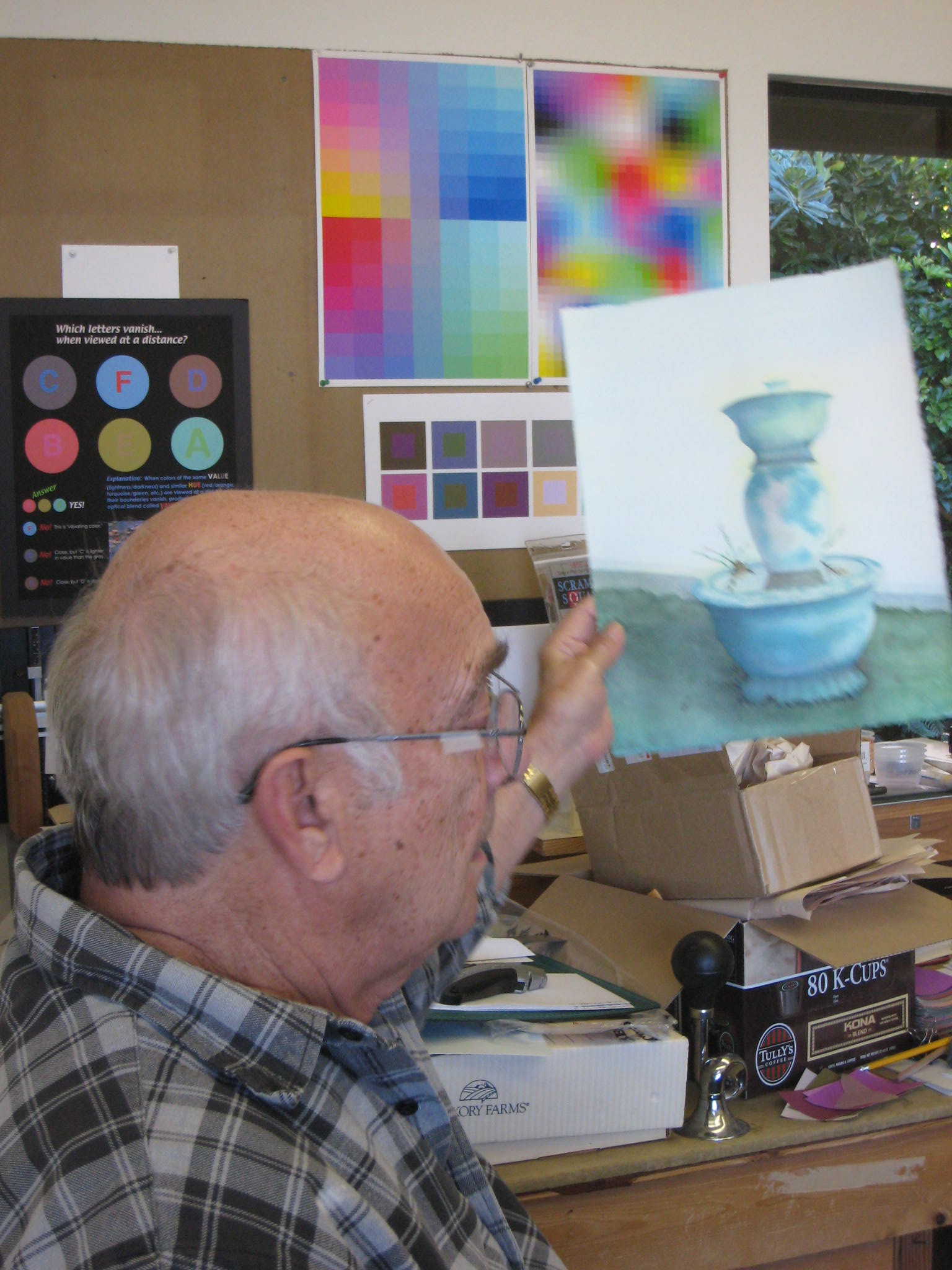
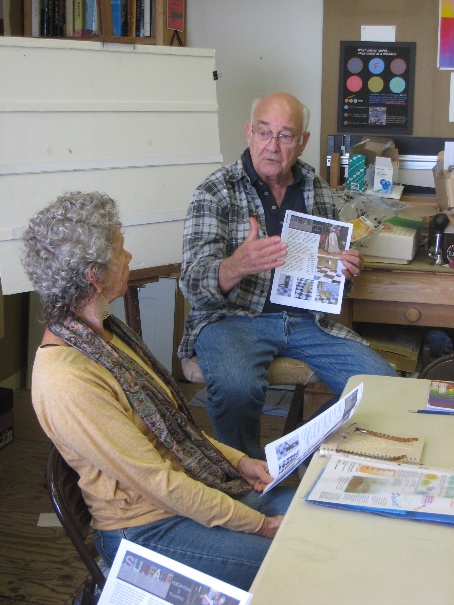
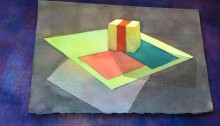
Talking about recognizing and representing surfaces
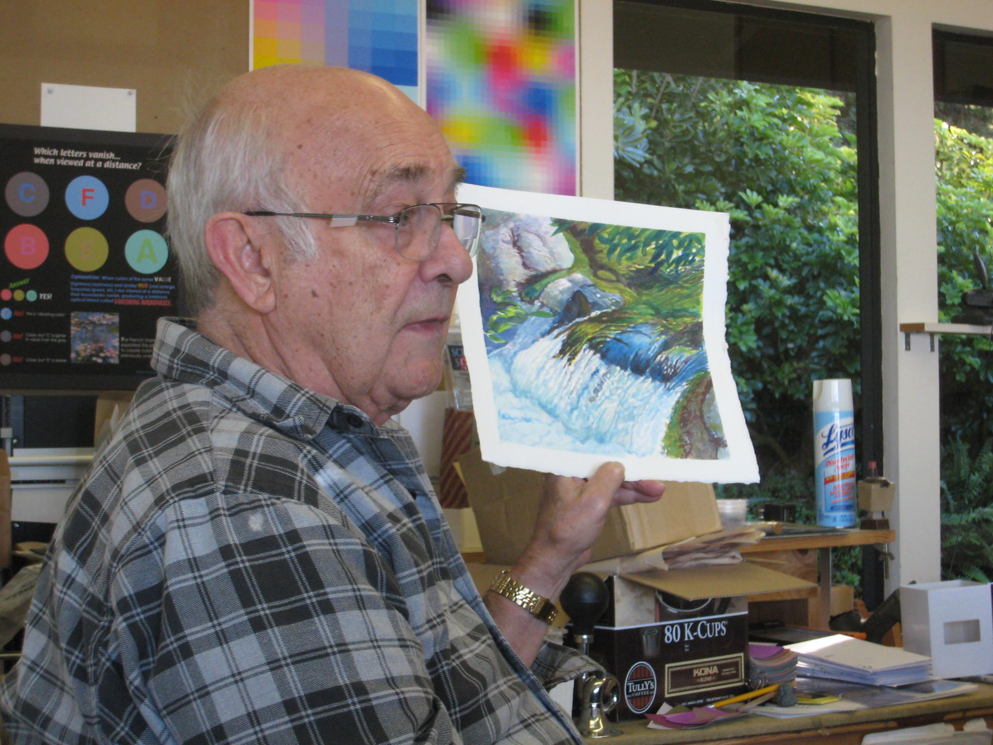
Chris brought in a photo of fruit on a reflective surface, which Dick used to point out visual cues of surface qualities.
The image under discussion
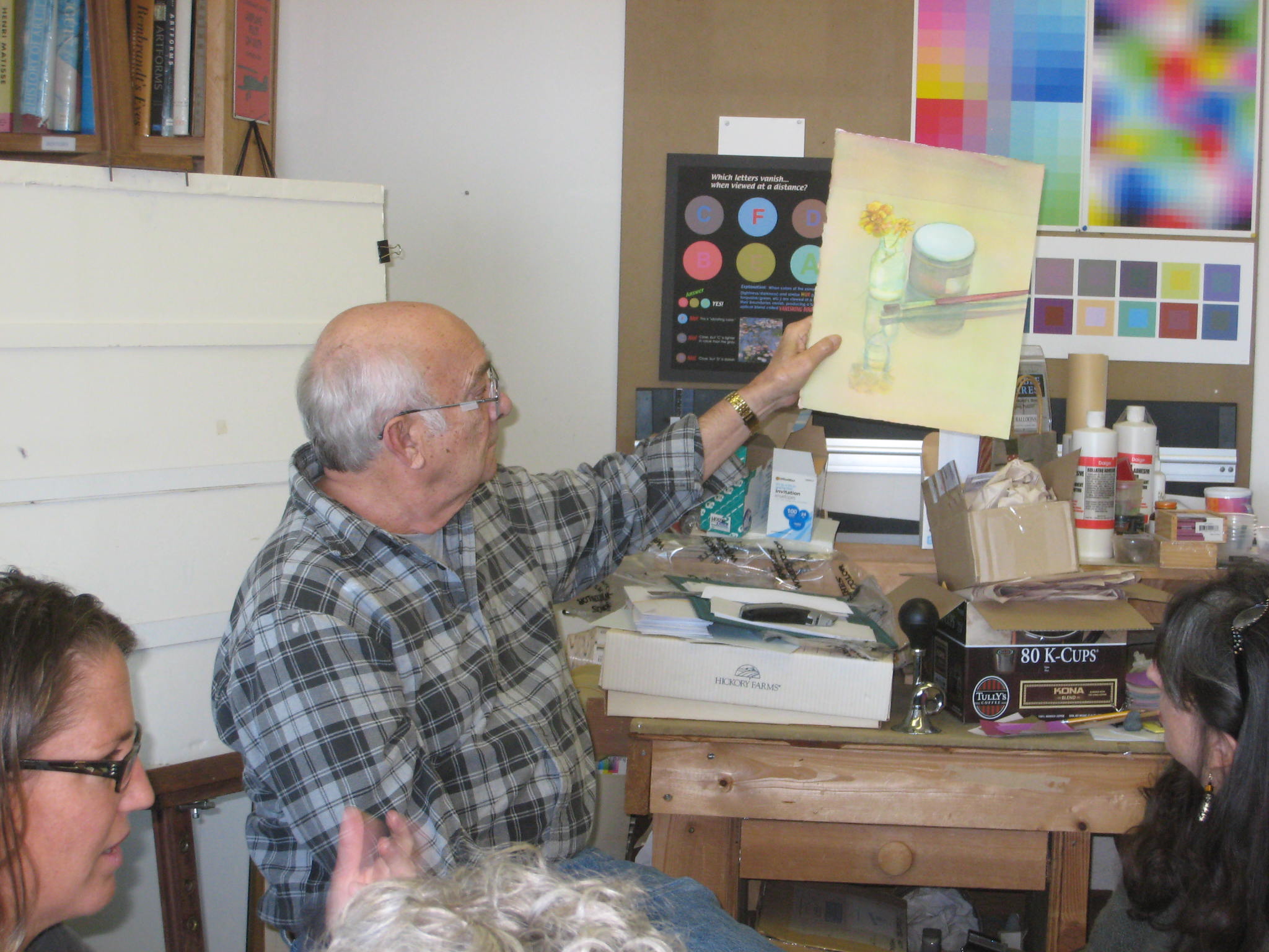
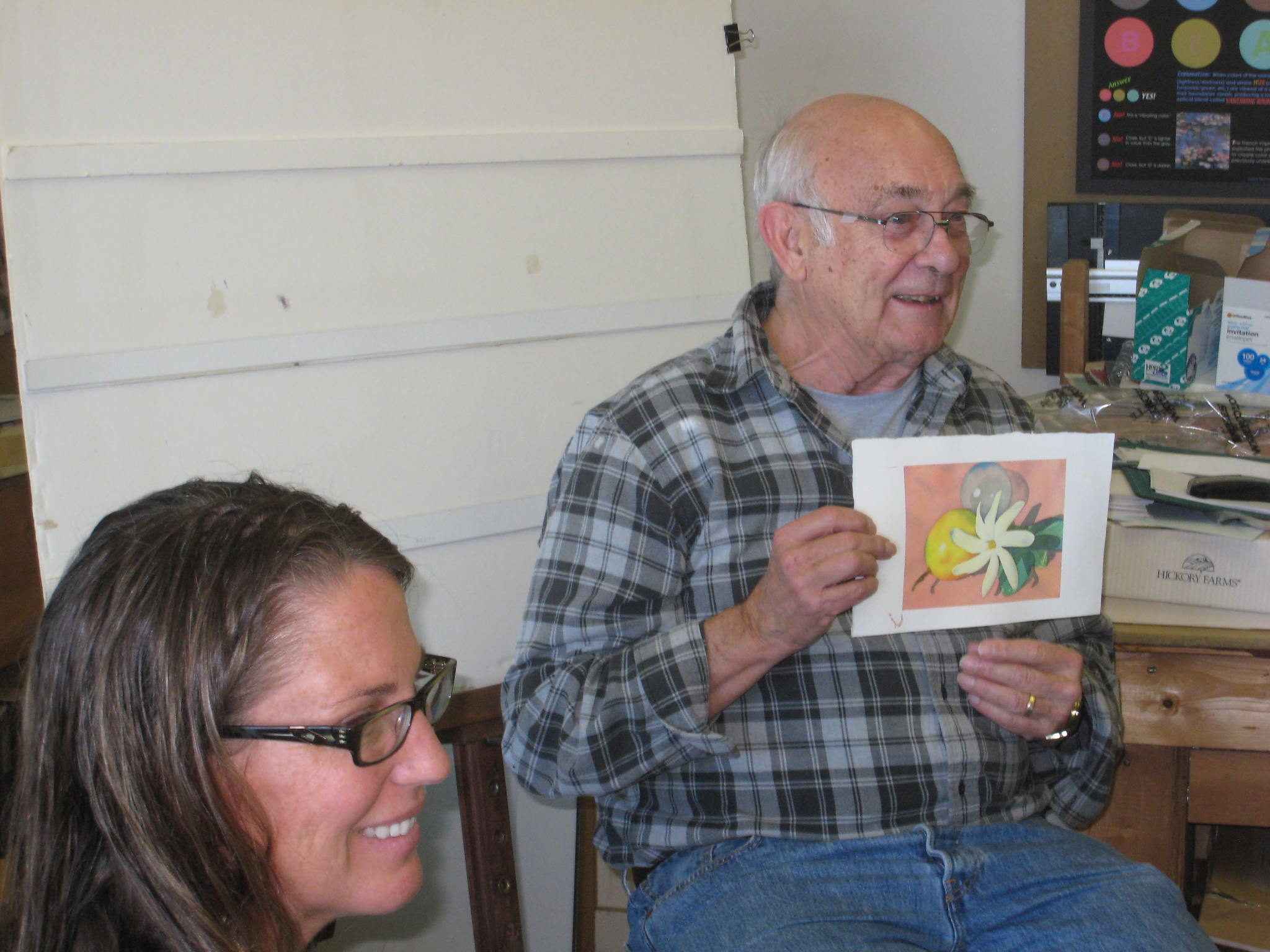
Critique: simple watercolor compositions focusing on surface
Tips for painting surfaces
A number of tips came out during the critique:
Water and glass have two qualities in common, transparency and reflection. Use them to create more convincing and interesting results. Use principles of veils to explore the mist quality of water.
Reflective surface will reflect anything in the environment – use your eyes and your mind to recognize that a surface will be influenced by the things around it. That’s how nature works, and it ties things together. It’s all relationship.
If there’s a highlight, take care to leave it (for instance, in an eye or a reflection). It provides an important visual cue.
If it’s worth doing, do it again and again. Each time will bring more sureness. Dick would do as many as five or six paintings for a major commission, working through different problems each time. Working in watercolor, he could do a complete painting in a day.
Reserve white for a small accent (see above), rather than keeping it as the majority of the space, because it takes the scene out of context.
Try to create exciting colors. You’re working with shape, and color – the problem comes when you say, “Grass!” Most of your viewers will look for subject matter, but the artists in the audience will look for visual excitement in your shapes and colors.
To make grass more interesting and less flat, start with some yellow interspersed with white. This will promote vanishing boundaries when you add other colors over it.
“I’m trying to get you to see what you paint – to recognize – to RE-COG-NIZE.”
How to plot reflections
How to plot reflections
Reflections behave differently than shadows. A shadow’s position depends on where the light source is, relative to the object. Reflections always point straight toward the viewer.
Why go to the trouble of using surfaces in a painting?
Great composing, whether in music or art, requires a heart, and a mind, that wants to share. These are tools under your command for conveying emotion as well as subject matter. To Dick, it is important to show each of us what can be achieved. You don’t have to use the tools, but be conscious of the choice. You have to work hard to be great, as a musician practices. Dick shared that this was the one year anniversary of his wife, Elly’s, death, and said, “You only get one life. Live every single moment. Don’t put it off. Enjoy the process.”
Seeing neighborhoods and painting demo
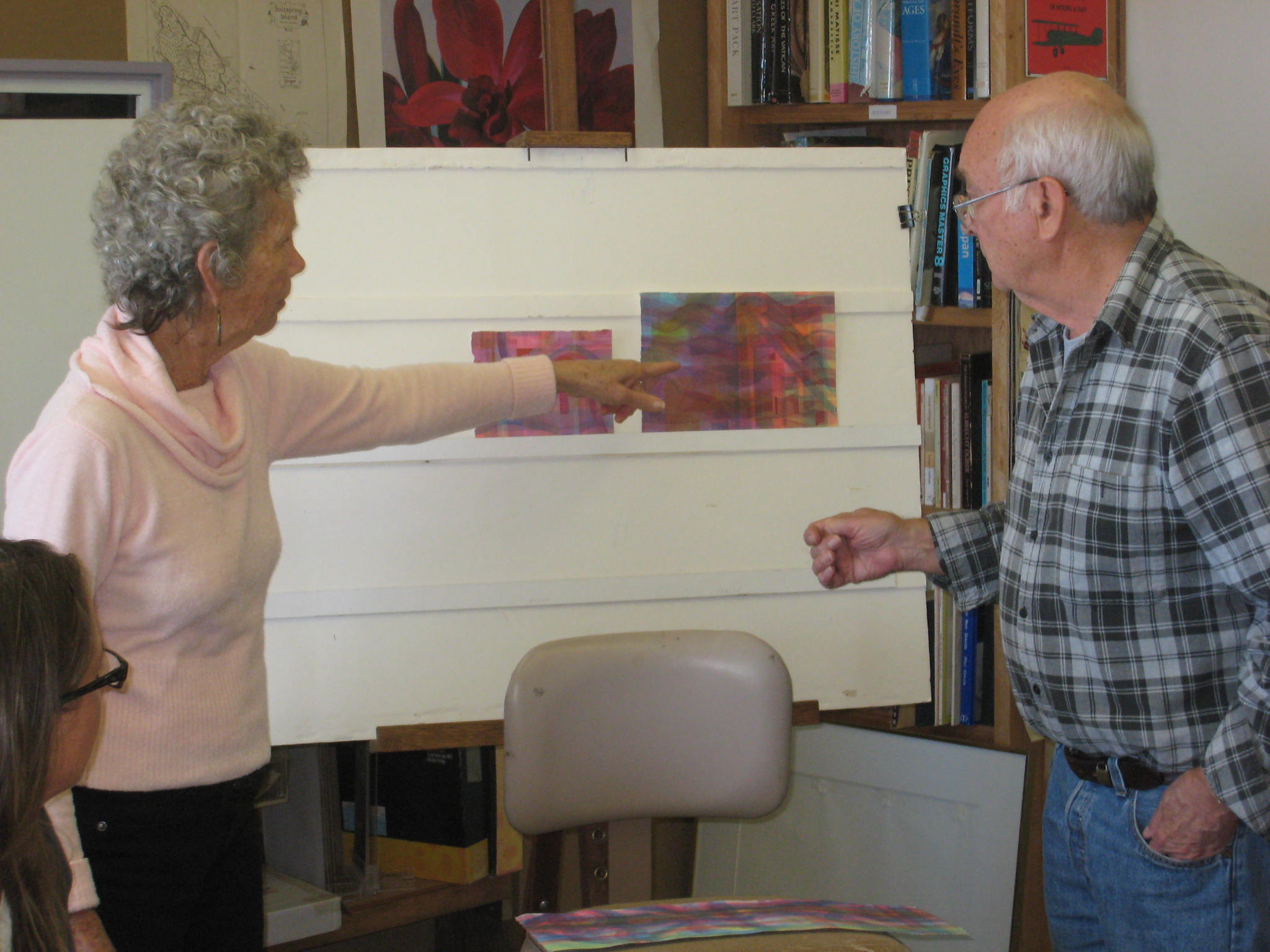
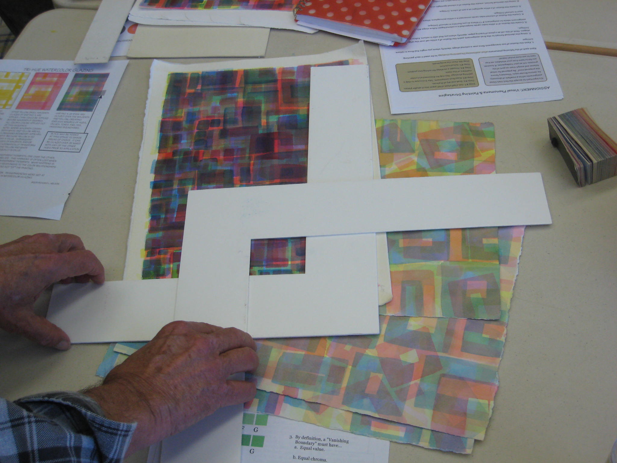
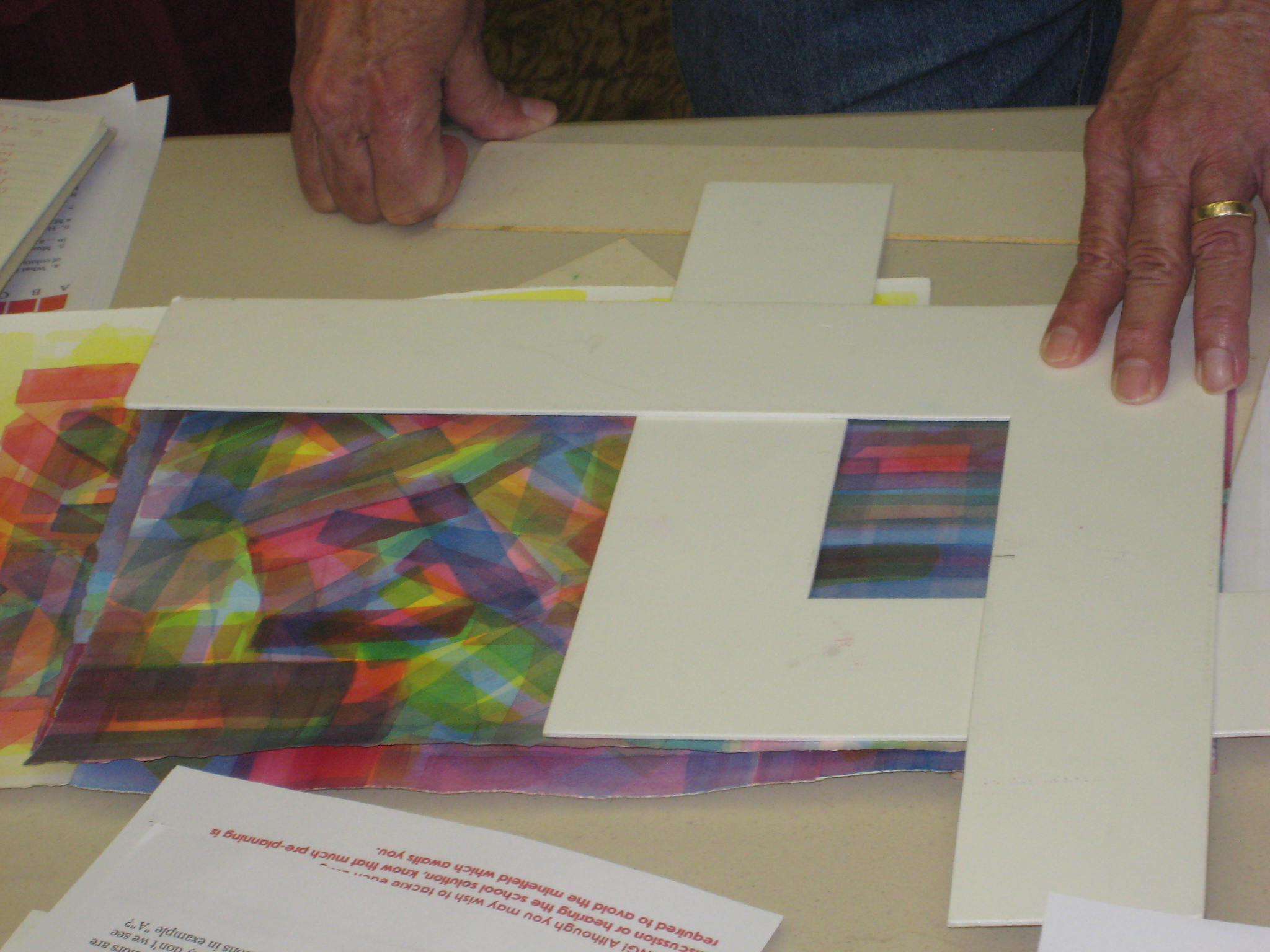
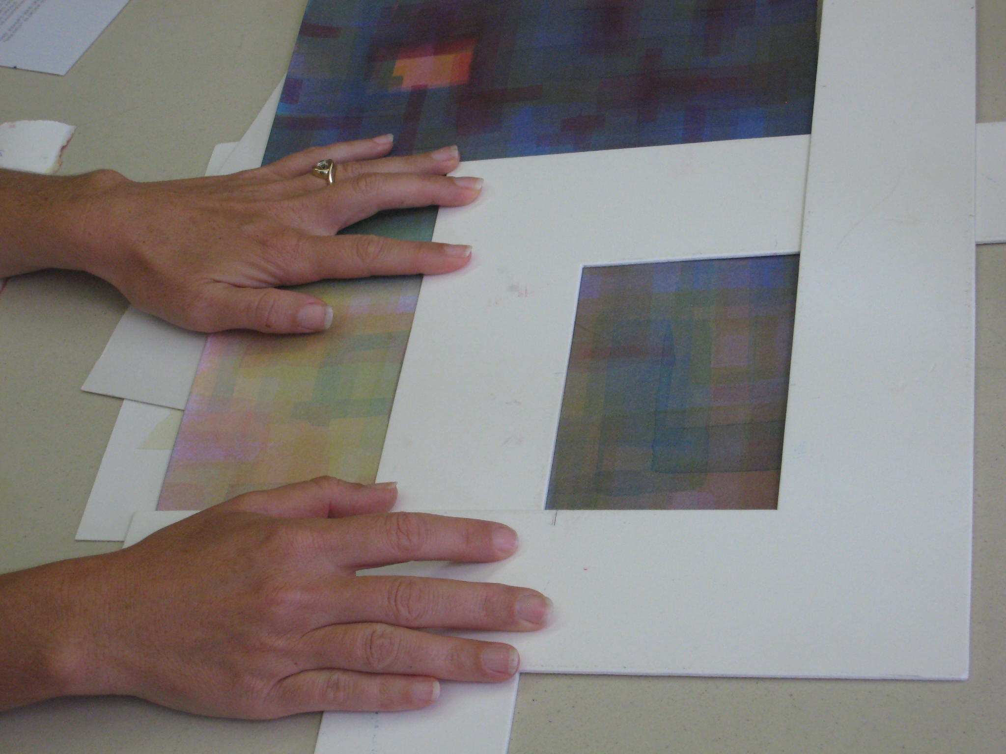
Using Ls to find “neighborhoods” in a painting
We used mat board Ls to frame “neighborhoods” in the demo piece. A neighborhood has a common language and culture. Look for a focal point, like a special park or restaurant.
The evolving demo piece
Dick gave another painting demo, going into the ongoing piece and finding unresolved areas, joining some, highlighting places. Use gradations between light and dark, and warm and cool. Create areas of darker-than, lighter-than, where a shape transitions.
Class started with Dick talking us through, and demonstrating, how he builds a painting as “a conversation,” responding to what he sees, unifying disjointed areas of color, “addressing issues” of unresolved [too raw; primary or secondary] color, and choosing what to leave and what to emphasize. He explores and experiments and asks, “What if?” because even with his years of experience painting, he is sometimes surprised and delighted by the magical things that can happen as he adds a new area of color.
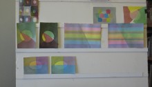
We looked at student solutions to last week’s gradation exercises and talked about strategies to achieve them, and in what situations we might want to apply them.
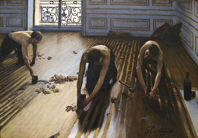
The Floor Scrapers – Gustave Caillebotte
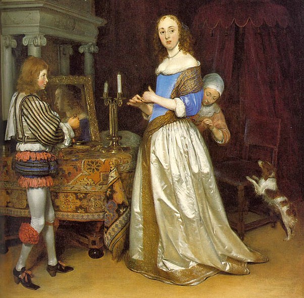
Dick introduced the topic of “surfaces” by having us look carefully at a portion of a canvas by a Dutch Baroque painter he’d included in a handout, looking for the visual cues the artist used to tell us the nature of the surfaces in the painting. Objects act on and react to their surroundings, and accurately depicting the visual appearance of that interaction triggers tactile sensations in our brains. He mentioned another masterful depiction of surfaces, “The Floor Scrapers” by Gustave Caillebotte.
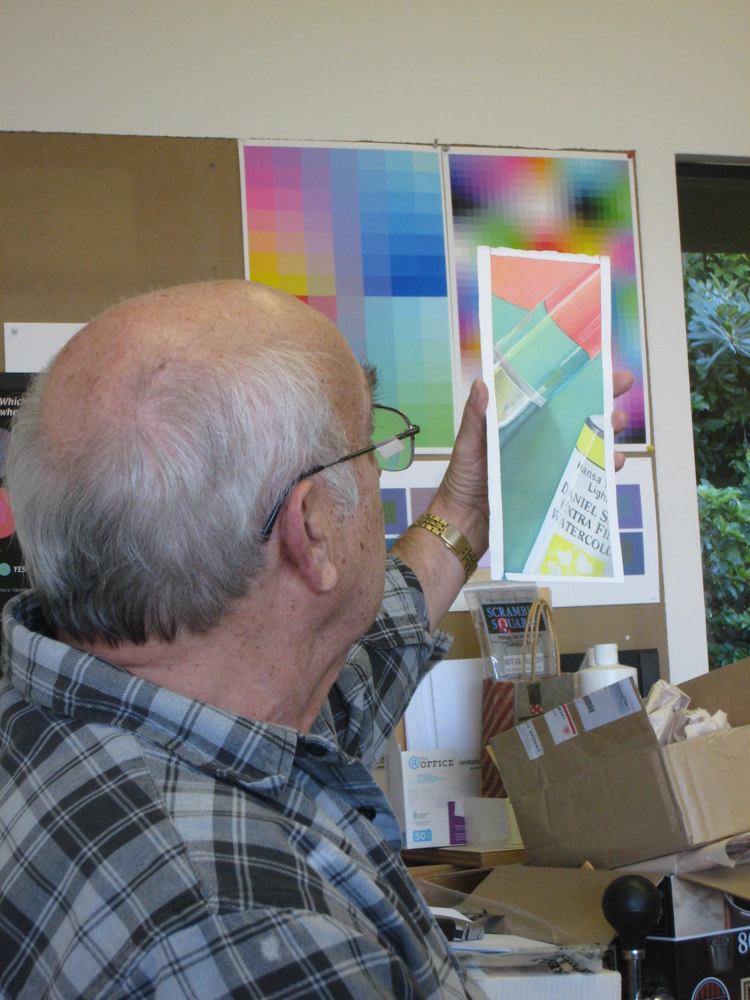
Today’s handouts are below. The homework assignment is at the bottom of the second one: “EXERCISE: Paint a simple watercolor composition which incorporates these visual phenomena.” In a few surfaces, explore the range of reflections, from dull to shiny.
Watercolorists have an advantage over artists in other media when it comes to shadows. Since light affects all objects in a scene equally, you can mix a single batch of color for your shadows and apply wherever needed. Dick loves using light and shadow in paintings because, “instantly, it unifies.”
Here’s the basic principle of creating the illusion of a spotlight on a surface: the shaded area contains some degree of black (that’s what defines a shade, remember?) plus the complement of the light color. So for white light, the shadow appears as a black film. For a bright light, the shadow is dark; a dimmer light would have a lighter shadow. For amber light (such as at sunset), the shadow contains blue. (In years past, artists were taught a falsehood: that the shadow of an object contains the complement of the object’s color.) Some hints came out as we reviewed which illusions were most successful:
You can’t just put a colored circle inside a shaded background; you need to have at least 2 reference shapes and colors in the scene so you can see how they are affected by the light and shadow. This helps its “gestalt” (see below).
Use a saturated color for at least one shape, because if all are left as tints, the lighted area might be read as a veil instead.
Gestalt has to do with composing your shapes so they will be perceived as you intend. For example, in the picture at left, if you want to illustrate a wire-frame cube, the lower drawing is more convincing that the top one. Symmetrical shapes will tend to be perceived more as a design than as a representation of reality. For this reason, in the picture below, the arrangement on the left is less successful, due to its near symmetry, than the one on the right, which is clearly asymmetrical.
3D still-life/landscape illuminated by ambient light and a point source
There are three sources of light on objects (and their representation in images):
Ambient, which affects all objects in the scene
Direct, falling from one or more light sources on some portion of the scene, and
Reflected, bouncing off one or more surfaces in the scene onto other surfaces
Here again, variation in the hue and saturation of the shapes helps convey the illusion more effectively than where the shapes had similar colors or saturation.
Gradation demos
Connie and Dick demonstrated their methods (which were slightly different) for achieving a smooth color gradation. Jill captured a video of Dick’s demo:
Here are Connie’s helpful hints for a gradient wash in watercolor:
Start wet – both sides
Use the softest, biggest flat brush you have – or a huge round sable, if you have one
Start with dark side and lay down several strokes of deep, saturated color
Brush QUICKLY down from there with back and forth strokes down to 2/3 of your sheet – not recharging your brush with pigment
Rinse out all color from brush and work from light up to maybe one half of sheet. Tip sheet so that gravity helps move pigment back and forth, being careful not to let pigment run all the way to the bottom or the lightest part of the wash.
You may add pigment to top and work down again – as long as sheet is evenly wet.
Dry on towel
Remember to work fast
Remember to have sheet evenly wet to begin with and pay attention to even wetness throughout.
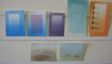
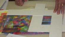
The homework assignment for this week is to reproduce all of the exercises on the page above, in your own choice of colors. Use 1/16 or 1/8 of a sheet for each.
Homework for this week is exercises 5-7 on the assignment sheet from last week (Visual Phenomena & Painting Strategies): Illusion of a white spotlight; Illusion of a colored spotlight; 3D still life/landscape with cast shadow and ambient light. An example of exercise 7 in work is shown below. If you’re having trouble visualizing where the shadows should be, or how dark, it could help to observe it in nature, or set up a little model with a box and desk lamp, for example.
Also, if the discussion of last week’s exercises gave you new insight into 1-4 and you want to try any of them again for a more convincing effect, that would be great.
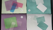
Paint the illusion of two transparent films over a colored shape.
Using the identical format to the first assignment, paint the illusion of a white veil over the original colored shapes. Think of the veil as a piece of tracing paper.
Create the illusion of 4 white index cards suspended in a colored liquid.
Create the illusion of colored index cards immersed in a white atmosphere.
Strategies for painting films and veils, illustrated and annotated!
On the homework sheet handed out in class, “ASSIGNMENT: Visual Phenomena & Painting Strategies”, only exercises 1-4 are due for next week. Be sure to read the guidance in the top right box about planning a strategy before you start painting. Also, continue your rectangle layering experiments.
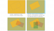
Here are Dick’s hints on strategies for Exercises 1 and 2:
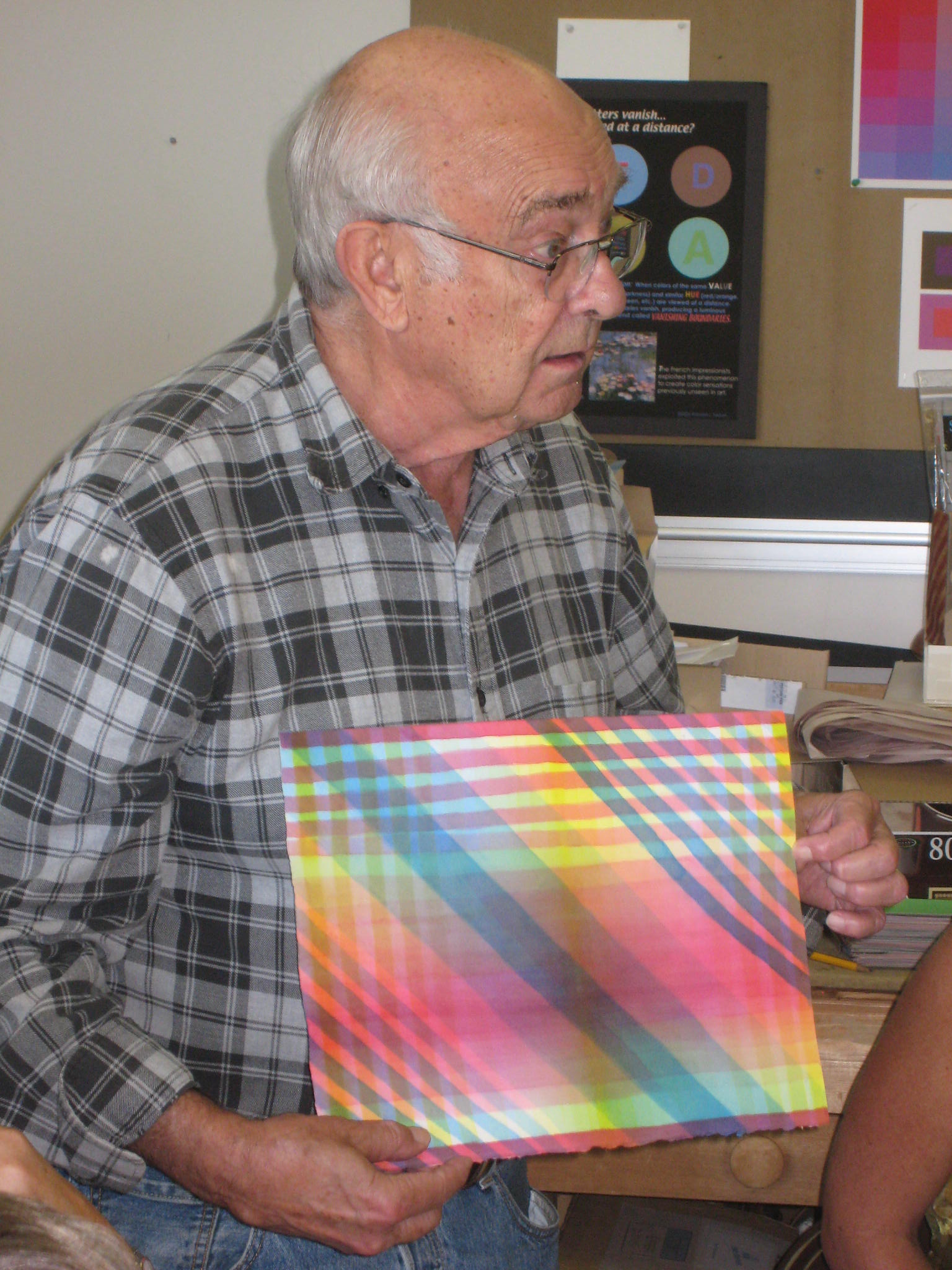
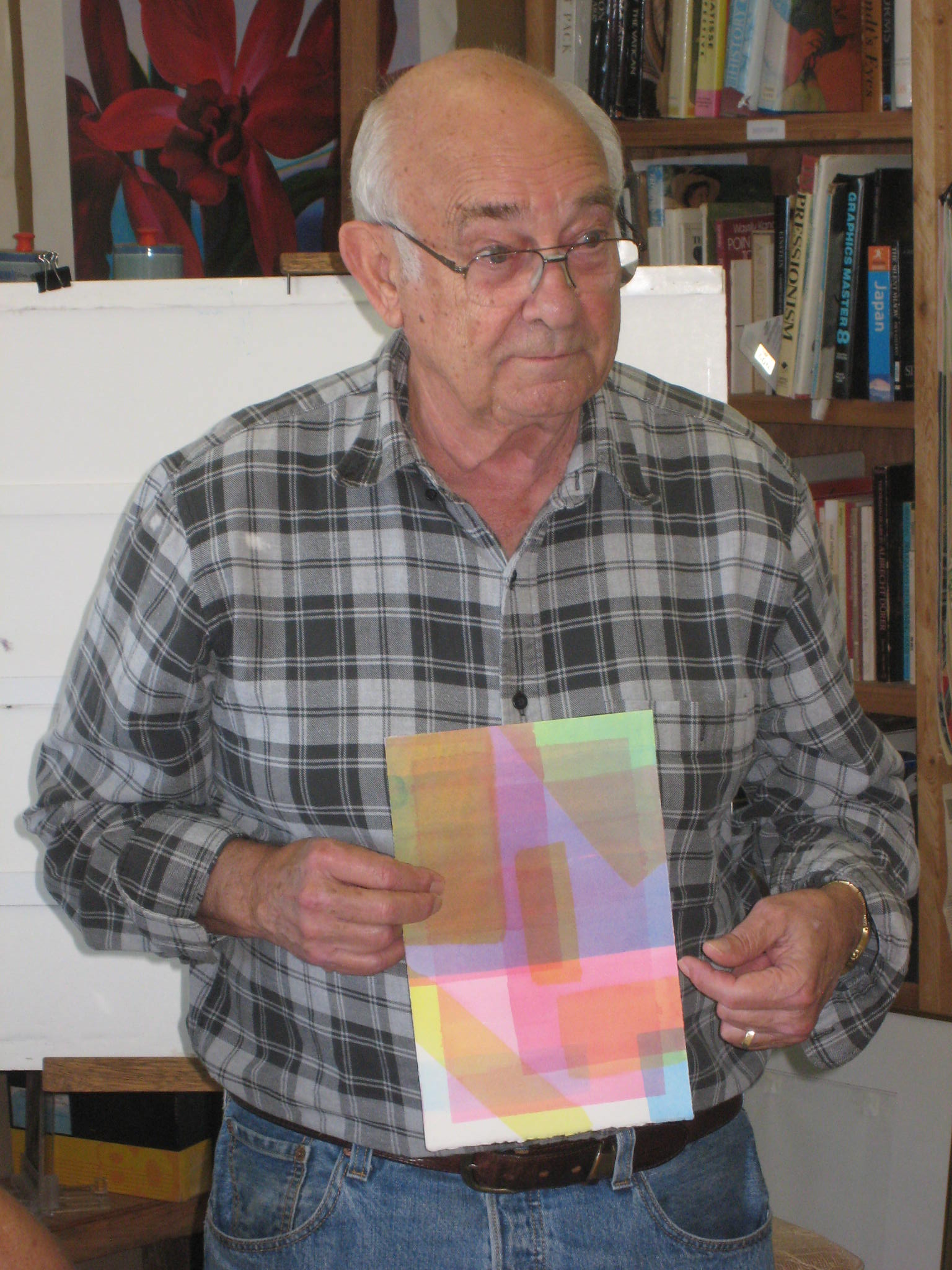
We started the third class with a critique of the homework assignments – layering rectangles, aiming for more nuanced and complex colors and interactions – “fine French cuisine”.