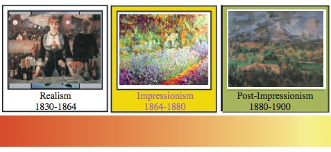
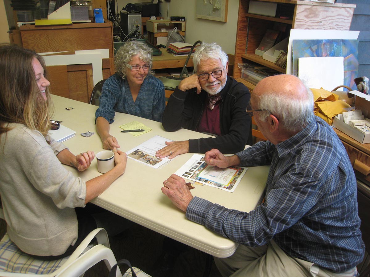
The seventh session of the “Art is Us” art history class for Spring 2015 was held on Thursday, April 30. Artwork from the Realist, Impressionist, and Post-Impressionist periods was shown and discussed. Artists moved away from simply “re-“presenting the world, and started creating “art for art’s sake.” Works by Manet, Whistler, Monet, Renoir, Caillebotte, van Gogh, Toulouse-Lautrec, Degas, Cézanne, Gauguin, Seurat and others are featured.
Homework assignment
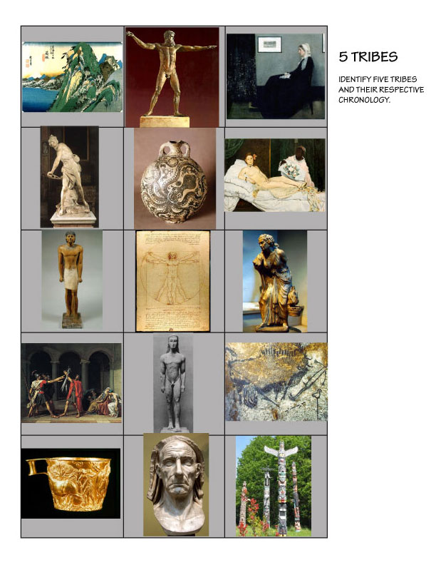
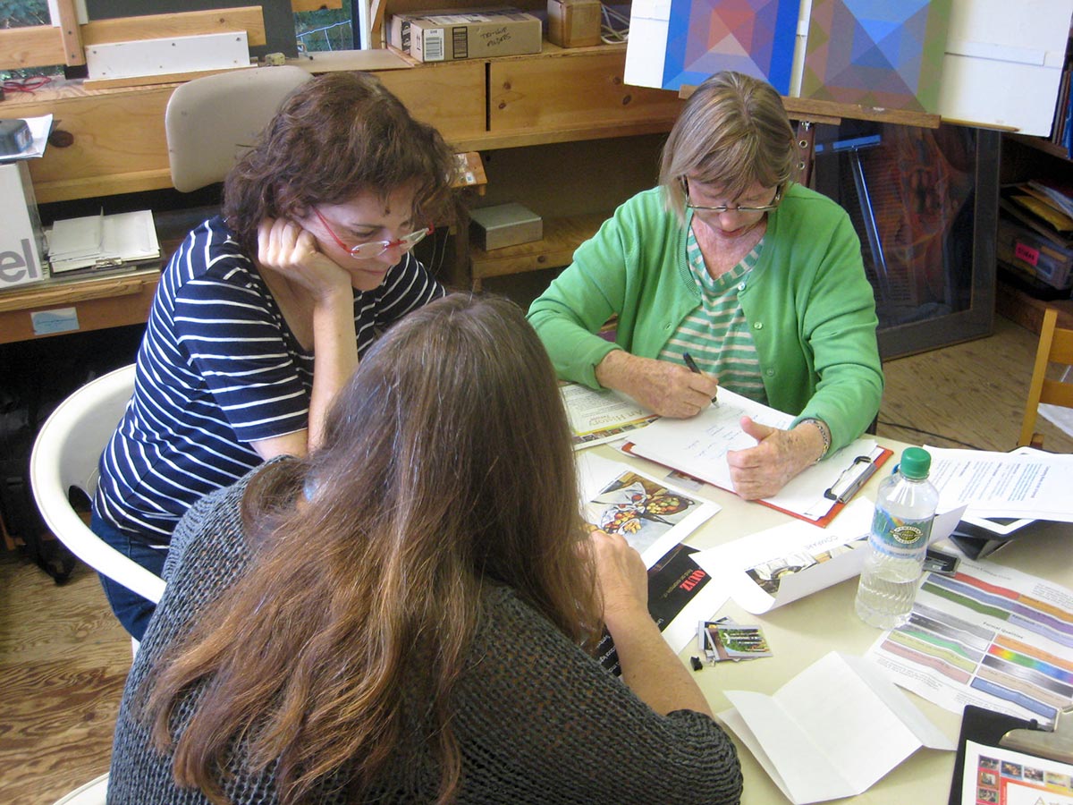
There are two homework assignments this week: Creating your own “tribes”, and a new comparison.
Tribes: Your turn!
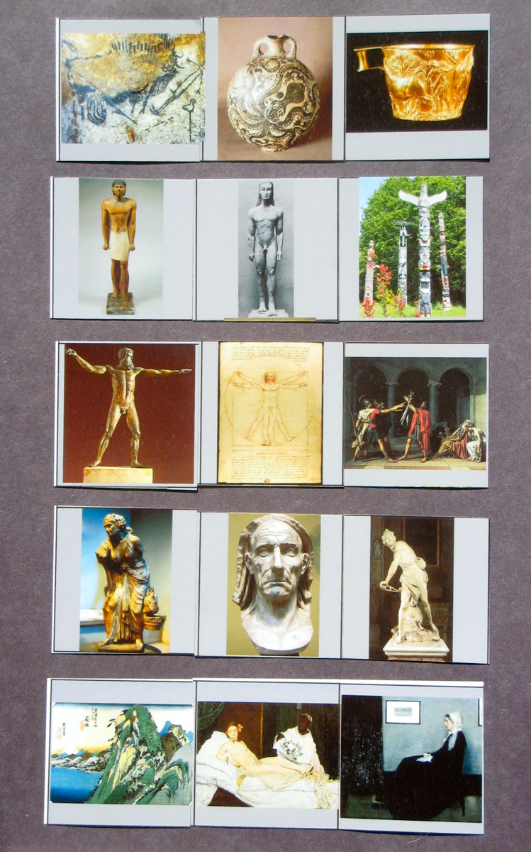
Based on what we have learned so far, come up with 3 tribes, each with a 3-part chronology. For example, see last week’s solutions, below. Each tribe may share a major theme like nature-dominated, man-dominated, god-dominated; or a principle such as linear, painterly, planar…
You may use images we have seen before, or find new ones that are representative of the era or principle.
You may work individually or with others.
Please print and cut out your puzzle pieces. You will share these in class next week, and have classmates solve them.
Optional: Create more than 3 tribes.
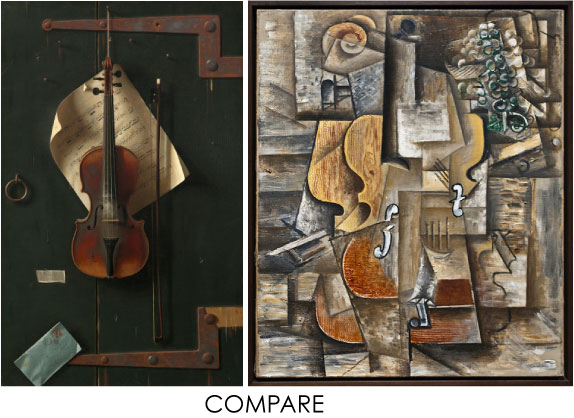
Comparison: Fiddlin’s Many Sides
Class recap – some key ideas
5 tribes homework solution
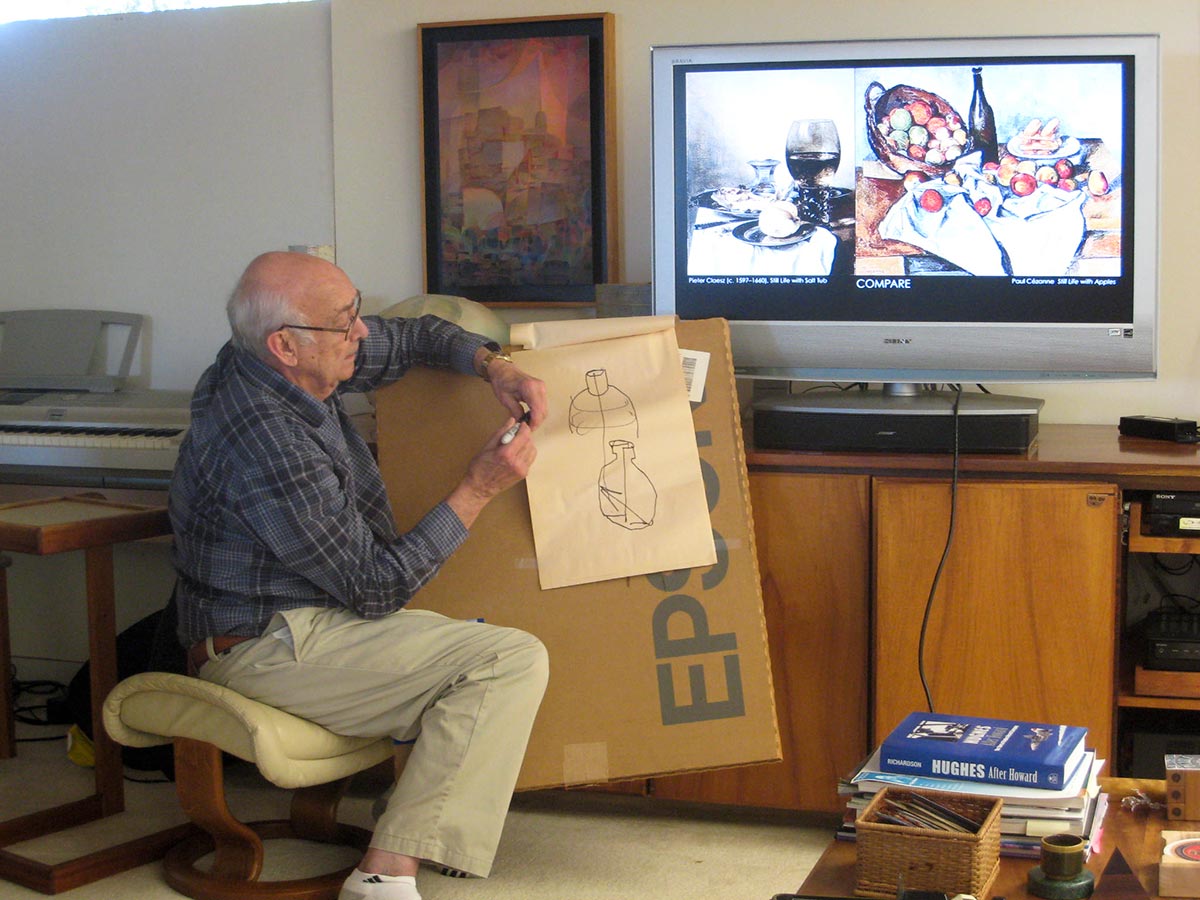
Comparison homework discussion
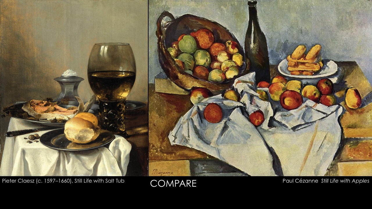
The homework assignment was to compare two paintings, Still Life with Salt Tub by Pieter Claesz and Still Life with Apples by Paul Cézanne. Listen to the Part 1 audio file, below, for more detail.
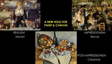
Lecture and slideshow – A new role for paint and canvas
Here are some brief notes on each slide. Listen to the Part 2 audio file, below, for more detail.
- Quiz
- Whistler’s Arrangement in Gray and Black is one of the most famous of American paintings. It is an example of “art for art’s sake,” where the artist makes visual elements like composition, space, value, and color – aspects of paint on canvas – more important than the subject matter. What Dick, as an artist, sees in this piece is very different from what most people see.
- Comparison (see above)
- Intro slide: Realism, Impressionism, and Post-Impressionism. Manet, the Realist, was a forerunner of the Impressionists. By and large, the Impressionists were Realists.
- In Realism, something new was happening with composition, influenced by the new, more candid art of photography. Yet the painting retains the character of a painting, paint on canvas.
- Why would the label “Romantic” be inappropriate? No dramatic finish. Local color emphasis. Minimal modeling. Even illumination. Candid. A debt of gratitude to Courbet and Manet. Degas
- Real life’s candid moments. Although influenced by the camera… Real paint’s interpretation. Degas
- Say farewell to Romanticism. Common subjects. Undramatic and non-flattering poses. Pastel renderings. Degas Bath
- A moment in practice is the performance. How would a Romantic paint this?
- East Meets West: Impressionists drew inspiration from Japanese prints. Whistler, Monet
- Origin of the IMPRESSIONIST label. Monet & The Impressionists
- The Moment. The Particular. Capturing sunlight on forms and atmosphere at a particular time of day. Monet The Saint-Lazare Station
- The Rouen Cathedral Mission: The effect of changing light. Monet did about 30 of these!
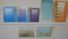
- COLOR LUMINOSITY: Achieved when colors of similar hue & equal value vanish at their boundaries. Your eye blends the colors, resulting in a more luminous effect than simply mixing paint.
- At what point does the text vanish? At what point does the text become luminous?
- Impression: Sunrise Huedoku puzzle
- Vanishing Boundaries Huedoku puzzles
- Luminosity achieved through Vanishing Boundaries and Halations. Individually, these two effects create luminosity. Together, the effect is even stronger. Dick considers Josef Albers his mentor, but Dick has taken the study of color relationships far beyond what Albers ever did. He never concentrated on vanishing boundaries.
- Albers paintings in the Tate Modern, along with a Nelson.
- Two Impressionists: Renoir & Monet. Impressionism is almost everyone’s favorite period. It is fresh and luminous, optically delightful.
- Form gives way to color & light. Renoir’s paintings delight the eye, but do not challenge the intellect.
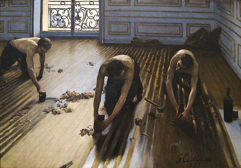
- Other Impressionists and their worlds: Caillebotte Floor Scrapers
- Caillebotte Rooftops Under Snow
- Two Women Impressionists: Mary Cassatt, Berthe Morisot The Cradle
- ”Impressionists replaced the gray toned works associated with traditional studio art with strokes of bright, unmixed colour.” Some art historians perpetuate a myth, when closer scrutiny reveals flawed seeing. Note the difference between full chroma swatches and Monet’s actual color palette.
- Post-Impressionism: Moving towards more personal interpretations. Three major themes, expressed individually or in combination are expression, abstraction, and fantasy: van Gogh, Cézanne, Gauguin
- Mutual Influences: Toulouse-Lautrec Portrait of van Gogh; van Gogh Self-portrait. The hatching technique allows the eye to blend the colors.
- Empathy with a brush and without clients. van Gogh Potato Eaters
- Eastern Influence. van Gogh The Blooming Plumtree
- Impressionist’s influence could not restrain personal expression. van Gogh Patch of Grass
- Psychological attachment to color. van Gogh Café Terrace at Night
- Toulouse-Lautrec: Subjects from Paris night life.
- Personal and social deformities. Toulouse-Lautrec Moulin Rouge Patronage
- The Entertainers of Lautrec’s world.
- Nobility in search of another kind of nobility? Lautrec Portrait of Justine Dieuhl
- A search for a reality beneath appearances Gauguin Where Do We Come From? What Are We? Where Are We Going?
- From establishment to painter of a different society. Gauguin Swineherd
- The “Noble Savage”: Portrayal of the significance of reality. Why is the figure flattened? Gauguin Spirit of the Dead Watching
- “…if you see a blue tree in the forest and you like the color, paint it all blue!” Paying homage to color for its own sake. Gauguin The White Horse
- The Great Escape From Convention. Photograph of Gauguin. Gauguin Self-Portrait
- Controlled arrangements of form and color. Seurat Sunday Afternoon
- Particulars surrender to the Universal. Cézanne Still Life with Apples
From 2009, part 1:
From 2009, part 2:
Class materials
Audio files
Part 1, Comparison homework and slides 1-4 (1:04:06)
Part 2, Lecture and discussion, slides 5-42 (1:11:17)