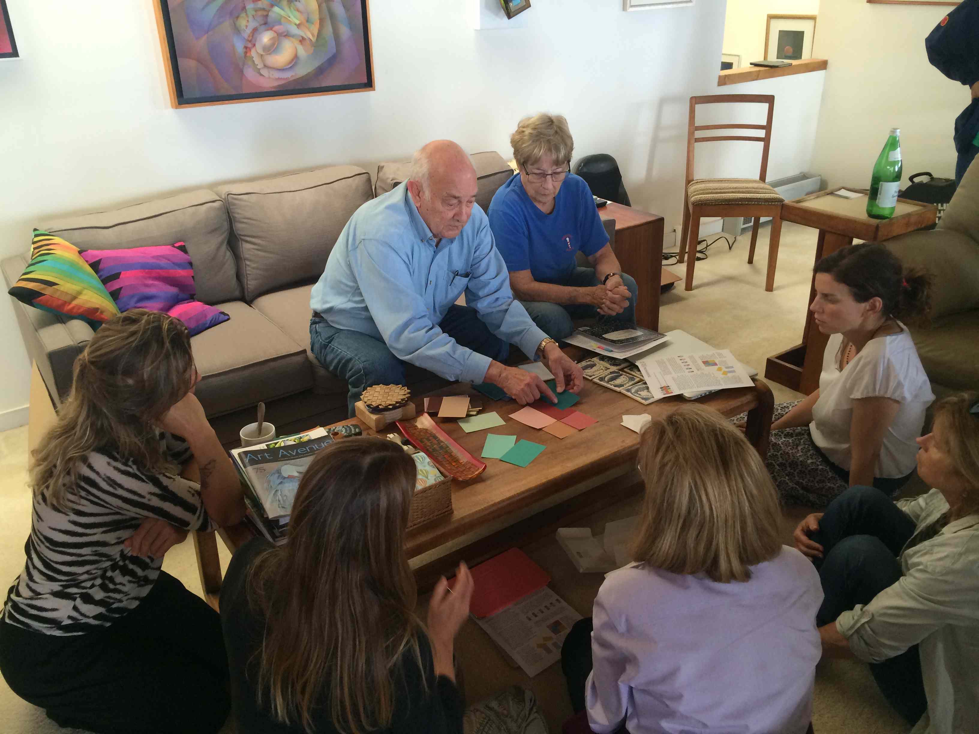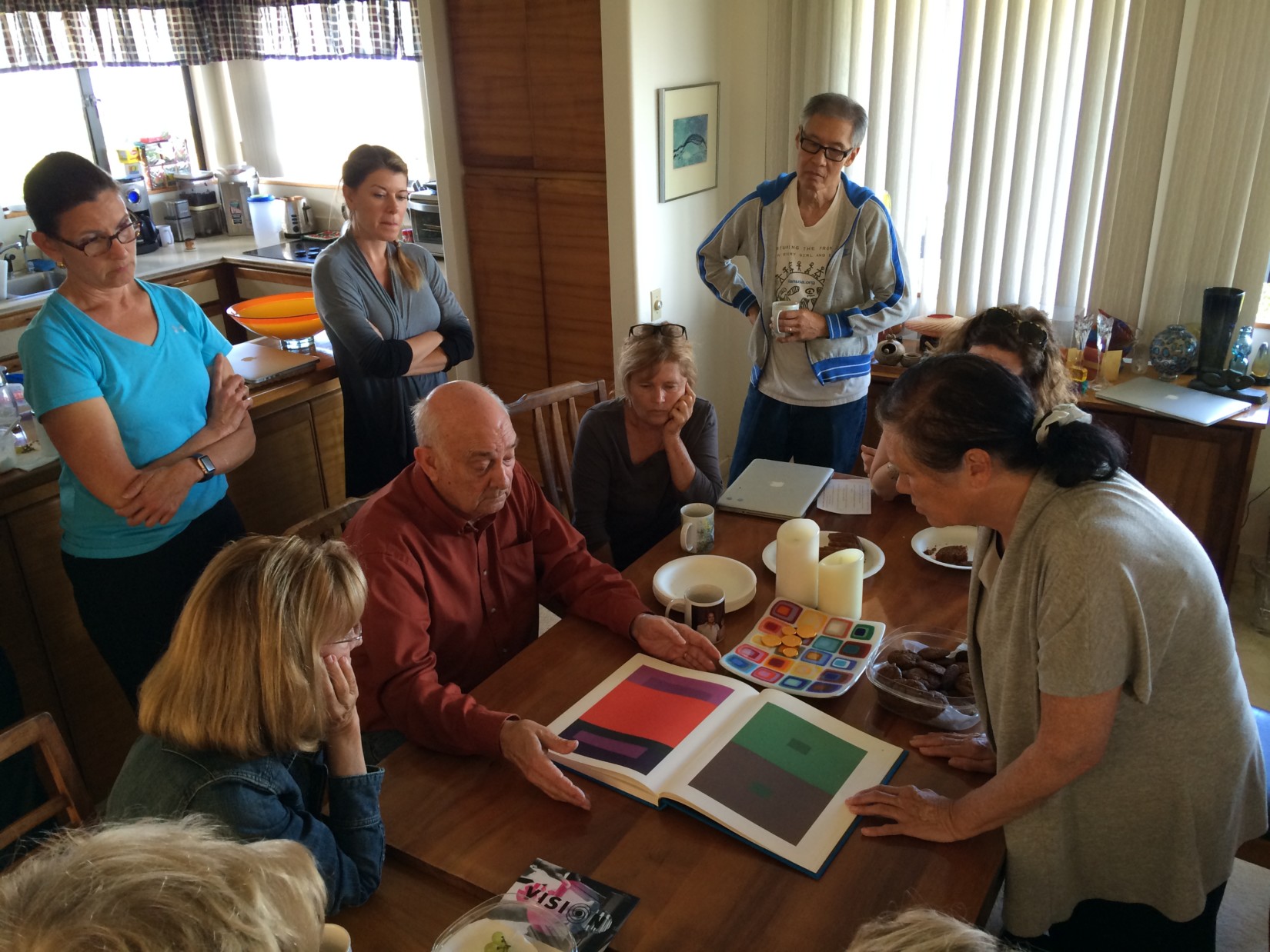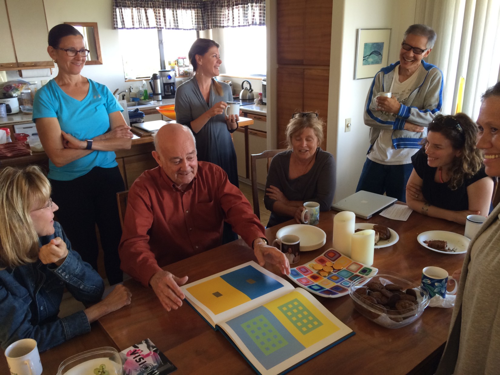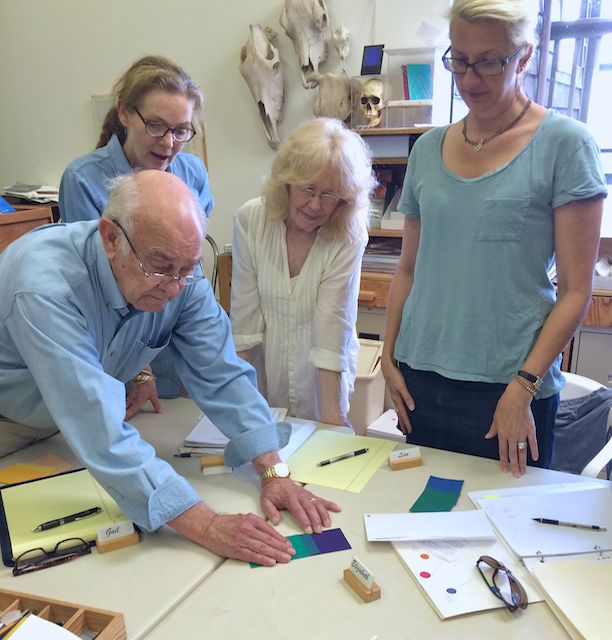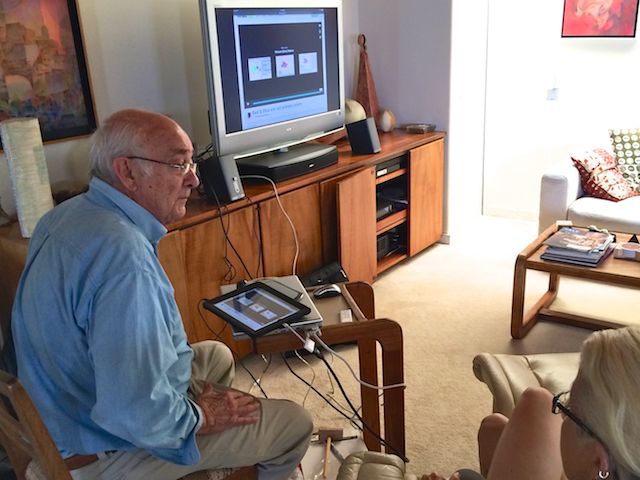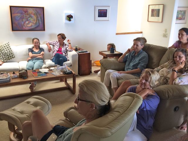
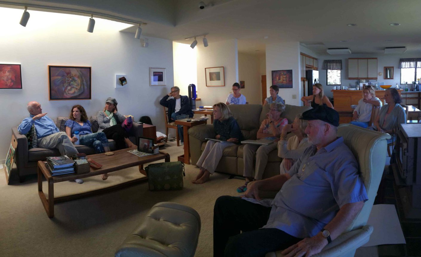
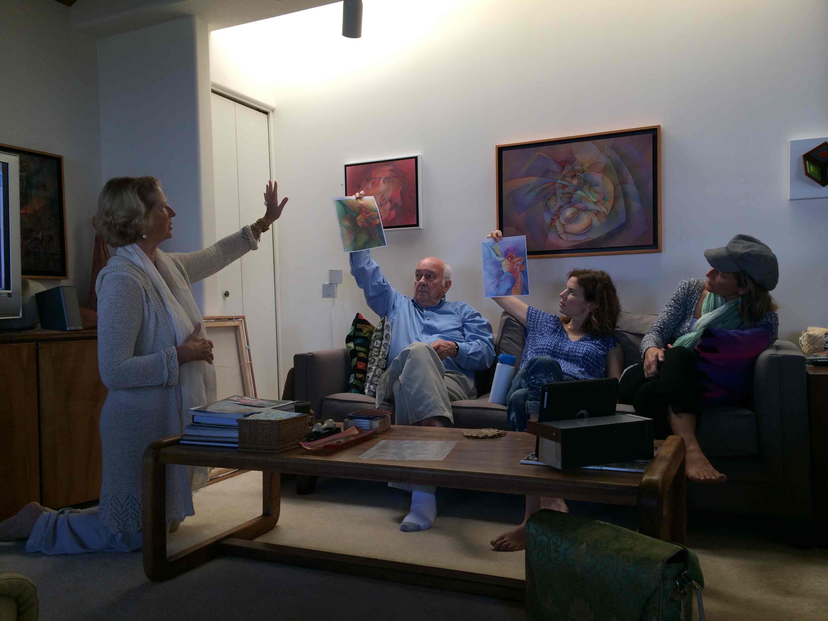
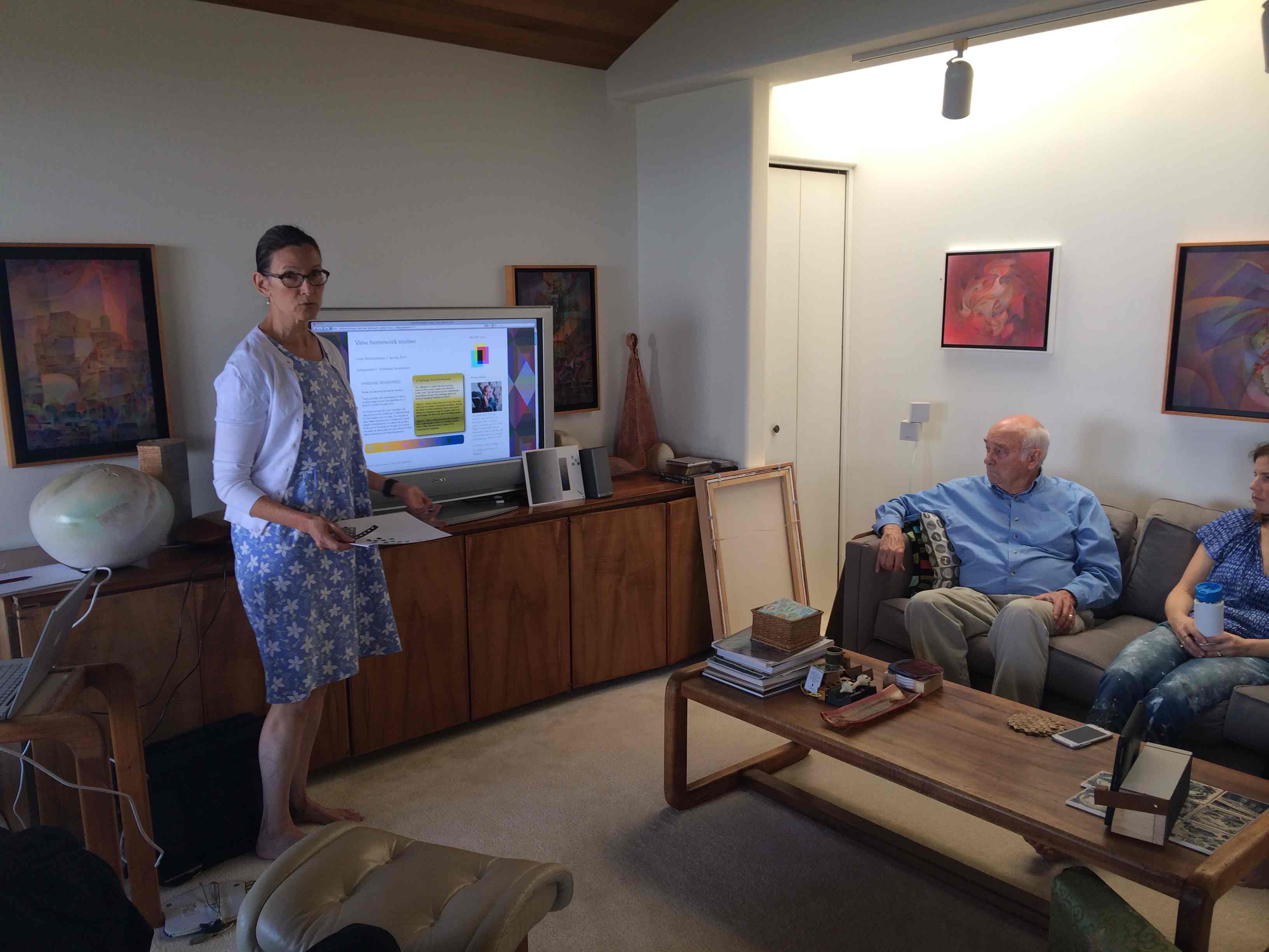
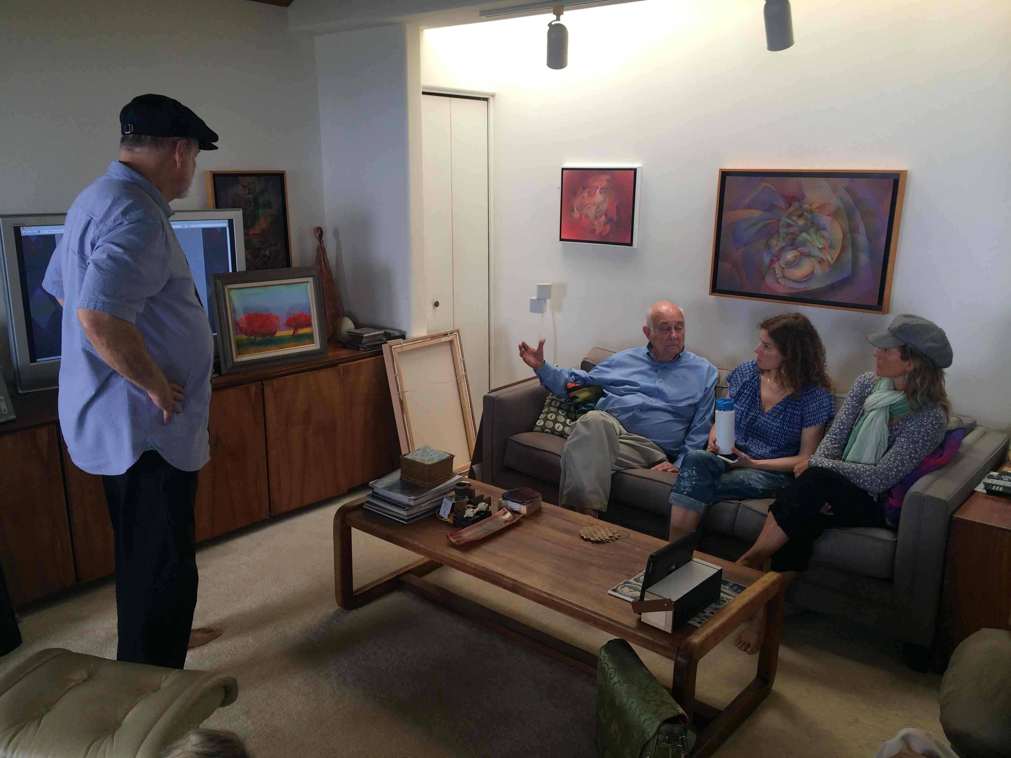
The fifth and final session of the Color Relationships class for Spring 2016 was held on Wednesday, May 4. The class shared the results of their last assignment, heard from guest artist Valérie about her color explorations, and watched a video that demonstrated how color, pattern, and viewing distance are all important considerations when creating a work of art. See the full post for class materials, photos, and final assignments.
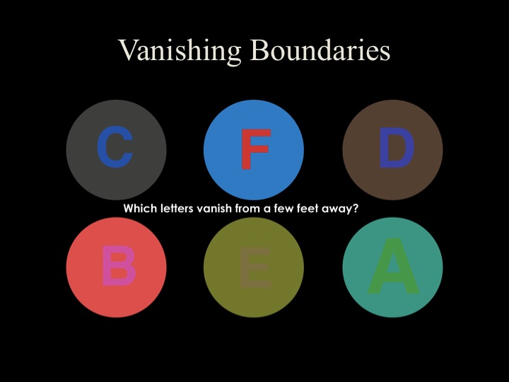
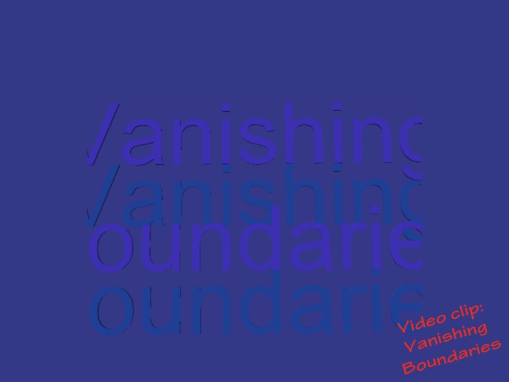
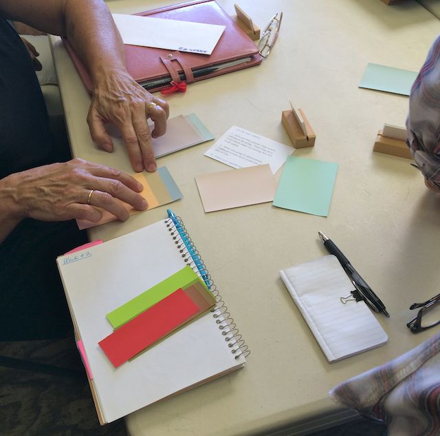
Critique – Vanishing Boundaries assignment
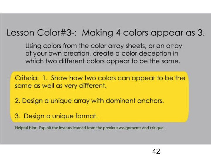
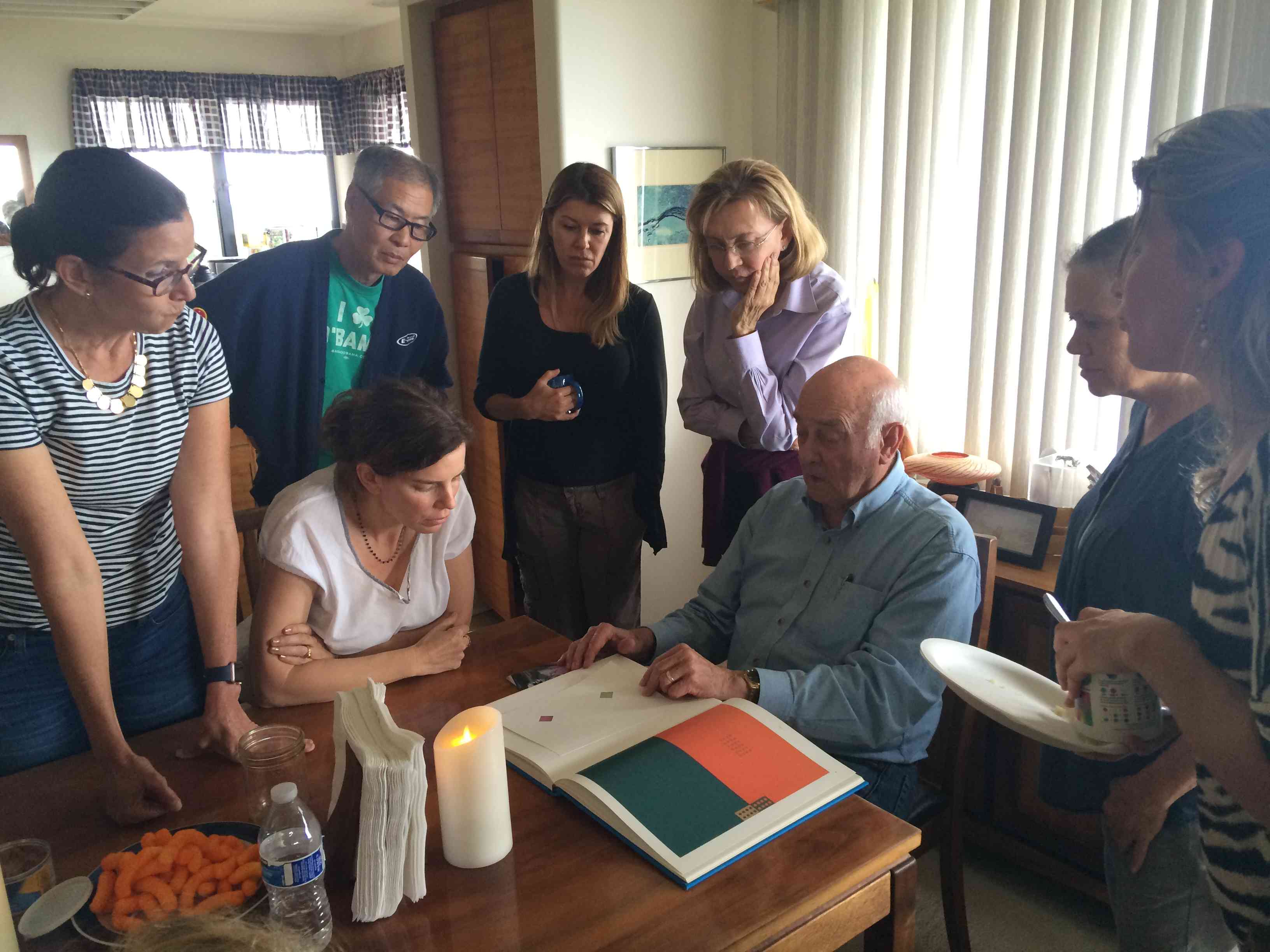
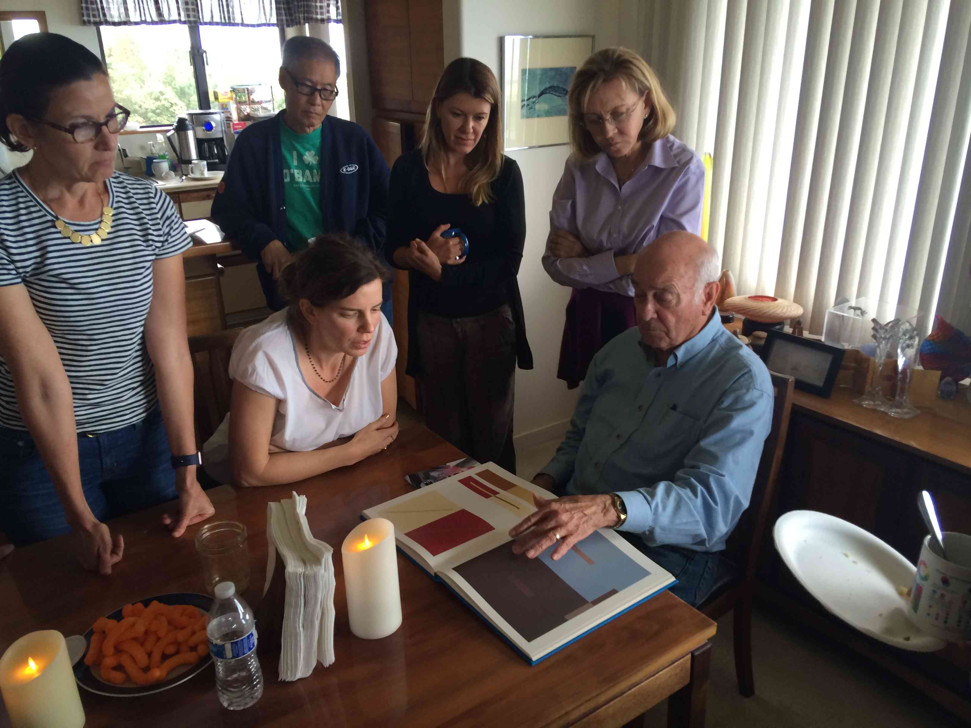
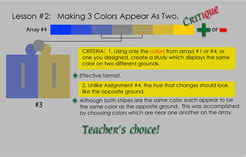
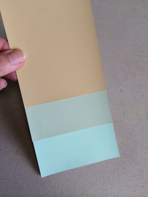
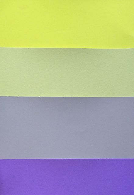
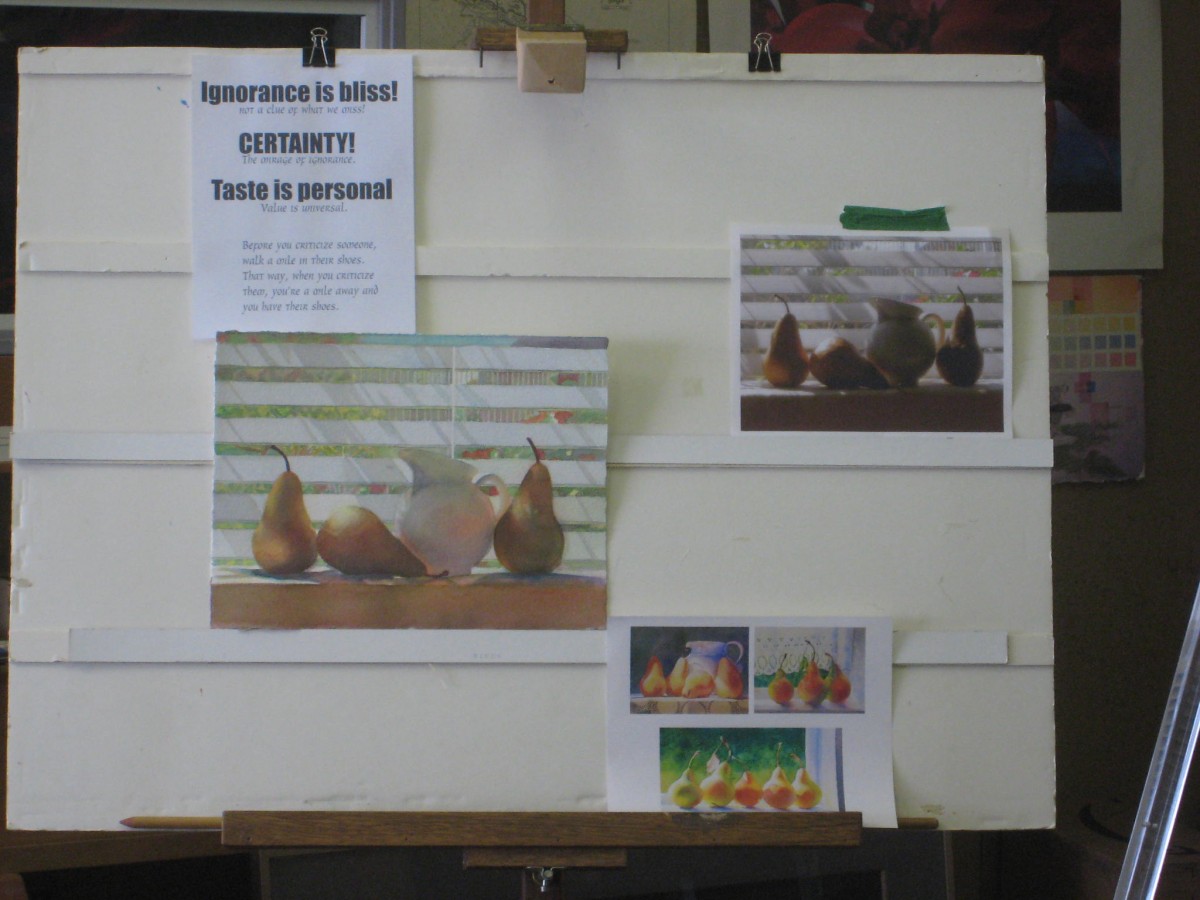
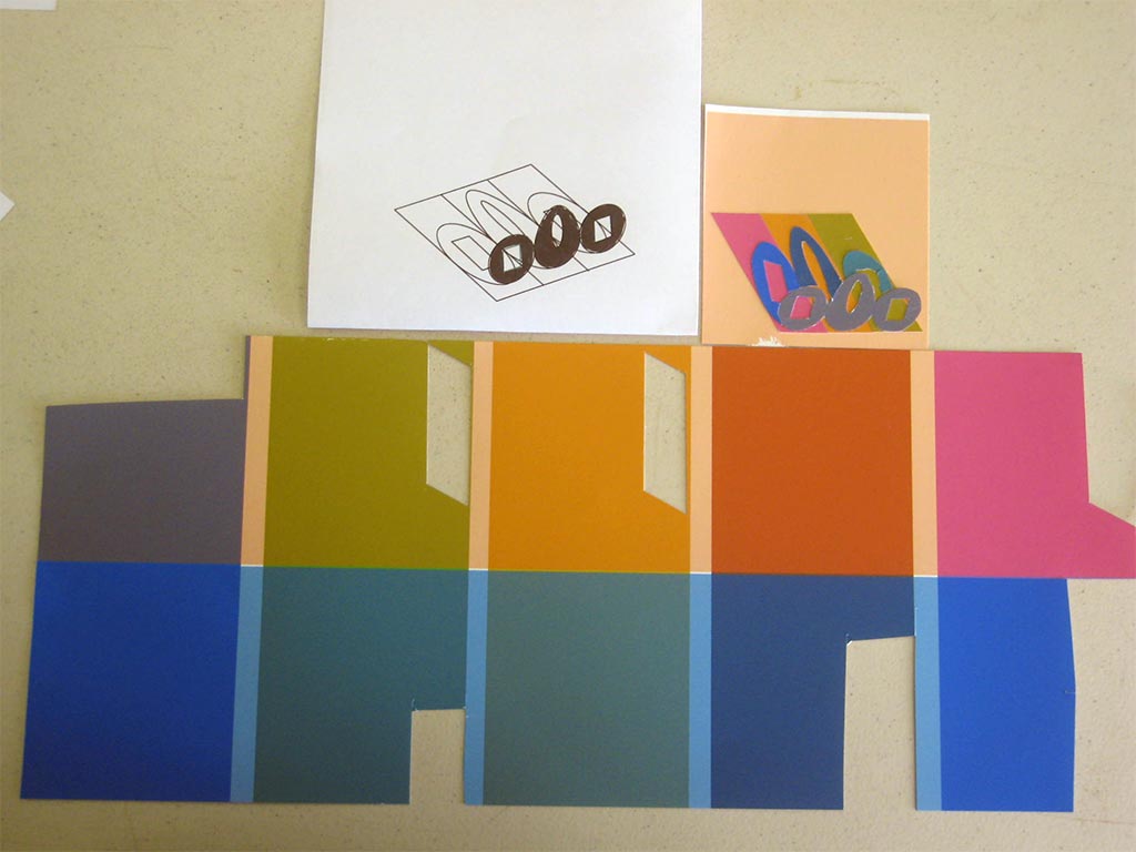
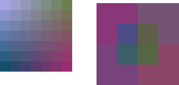
The final assignment for this color group was to create a color study which demonstrated the application of VANISHING BOUNDARIES. Dick gave students a few options for the format of this assignment: one was to simply lose a shape against its background colors; another was to take a section of a previous art piece and redo it to incorporate vanishing boundaries; and the last was to take another artist’s work and redo it with the same goal. The only criteria that Dick stressed was that he did not want students to concentrate on shape, only on color.
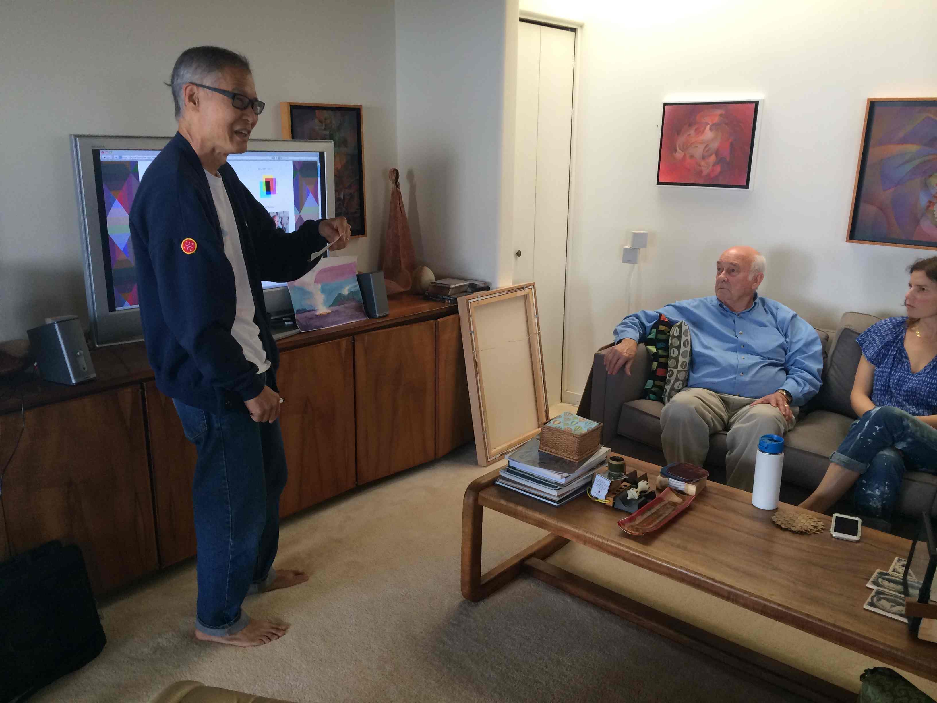
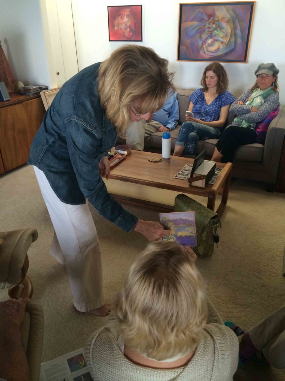
Here are the results of that effort:
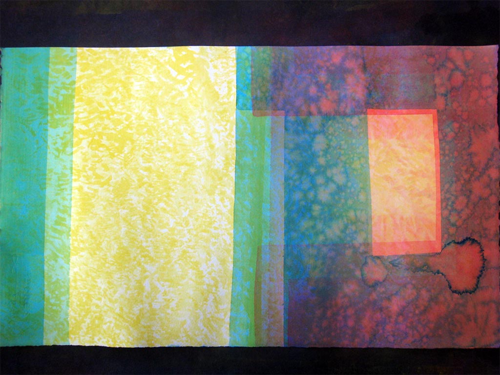
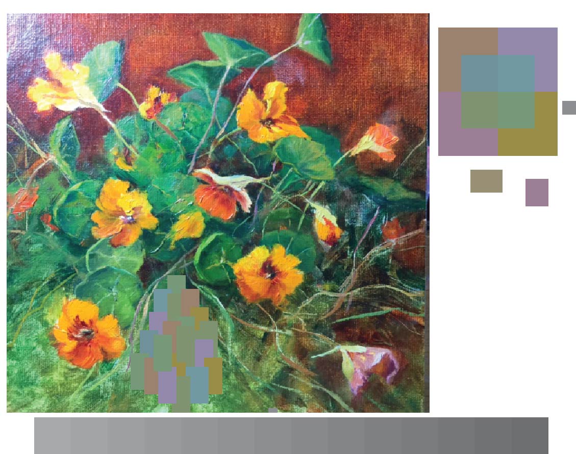
Gabby brought in an acrylic painting that she altered in a bid to incorporate equal value and halations. It was more challenging than she anticipated, but this is the first step in exploring how to integrate this color knowledge into her work.
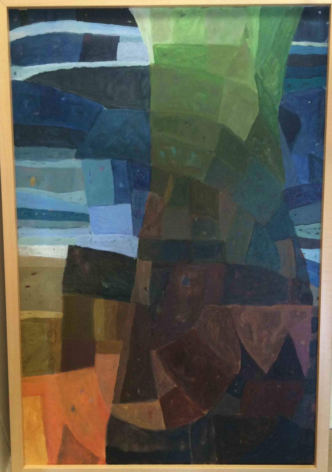
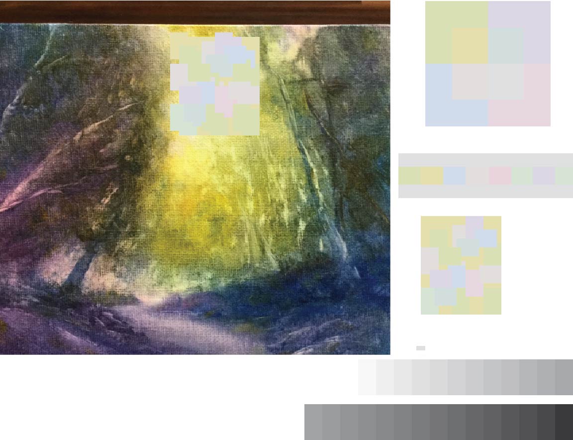
Anyes also brought in an original painting that she used to experiment with equal values. She incorporated vanishing boundaries on the right side of the painting, mainly in the shadows of the mountain. The left side is untouched, and showed her original color choices.
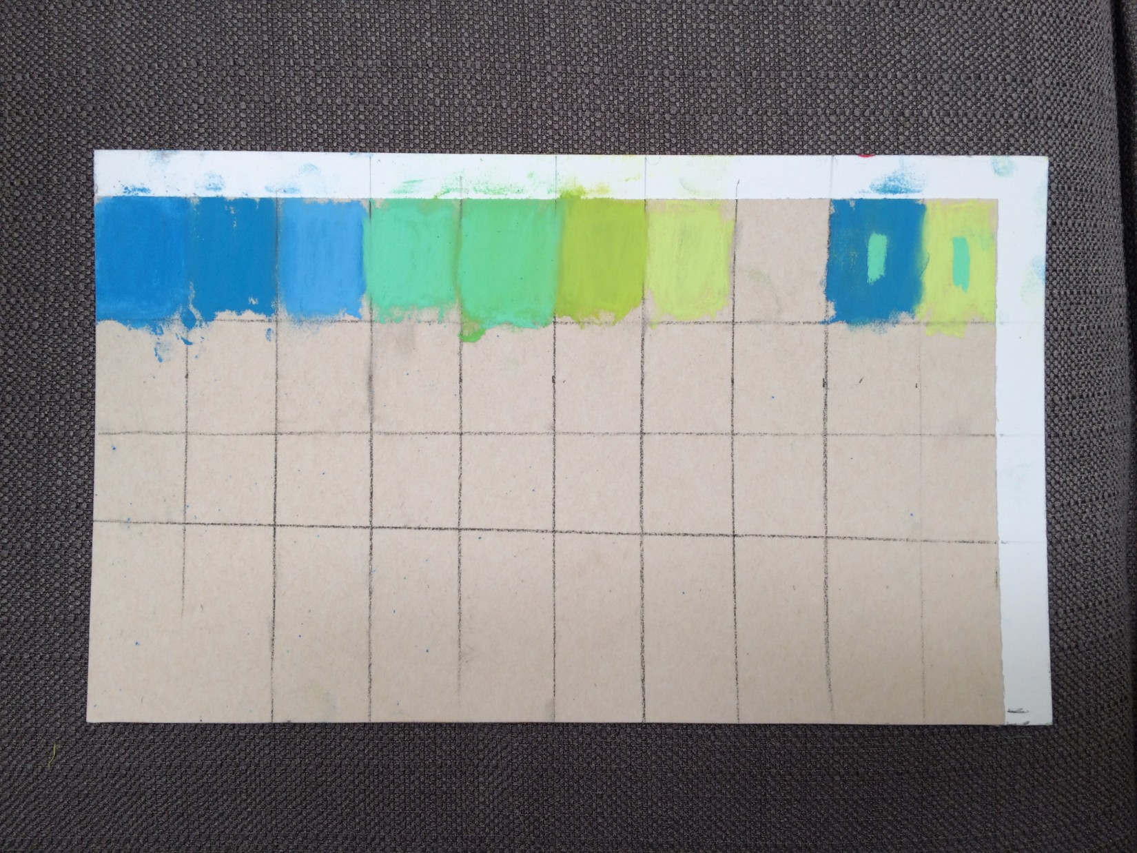
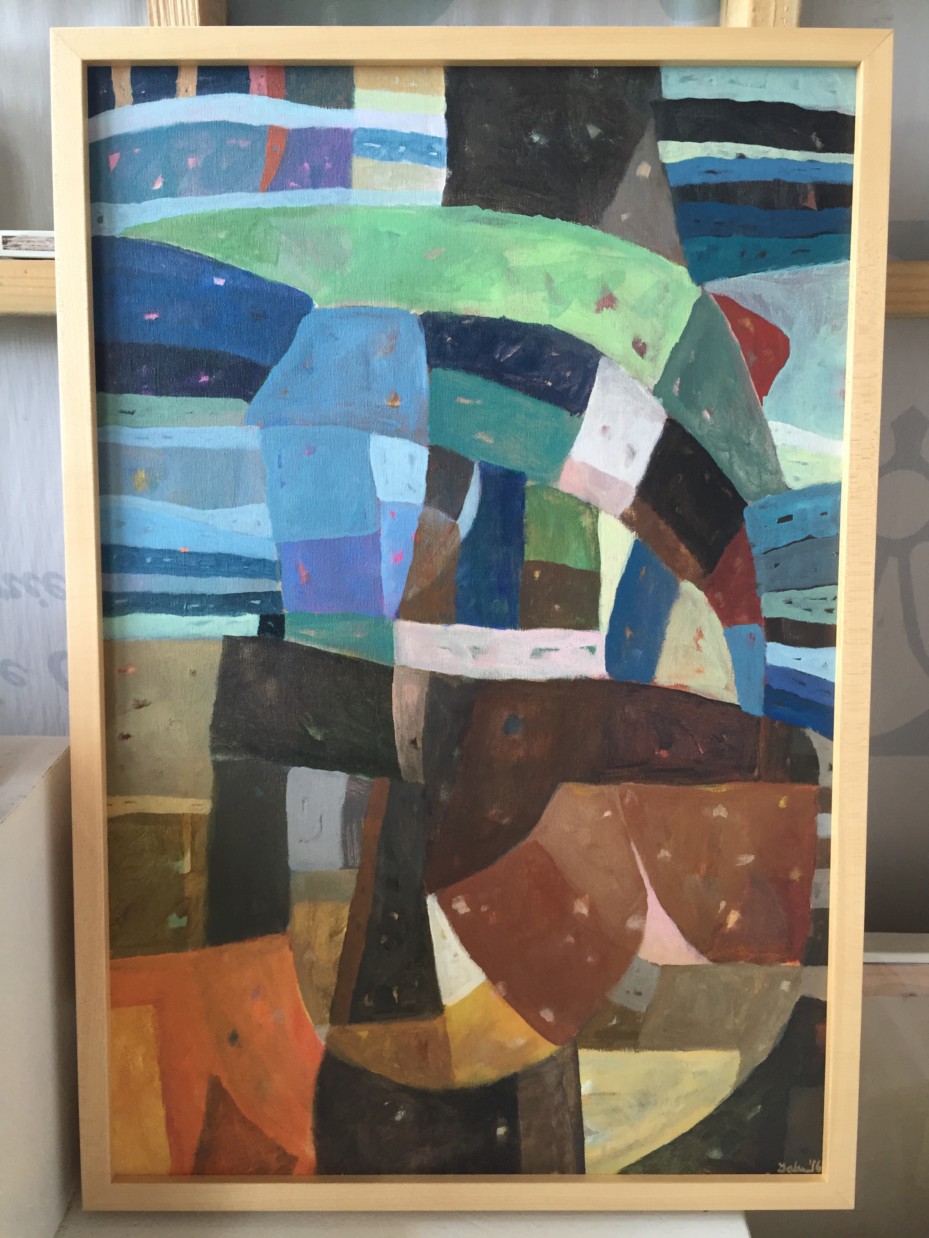
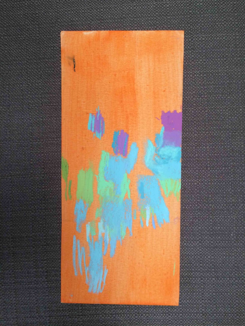
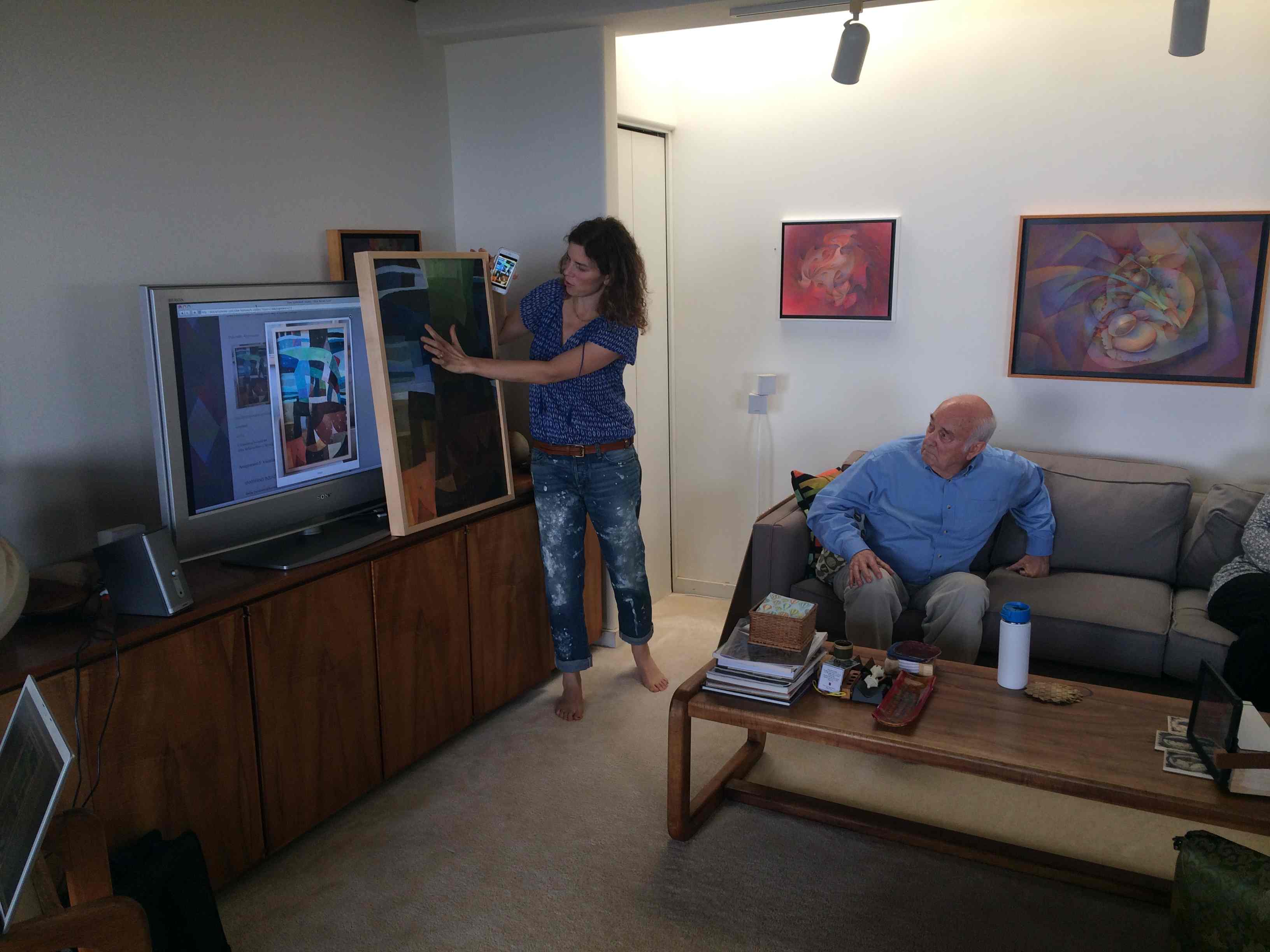
Susan shared both physical and digital work, bringing in a small pastel piece along with the original paintings that she used to create matrices from. Her pastel landscape incorporated arrays, halations, and vanishing boundaries, while her digital studies were done to find equal value possibilities for future alteration.
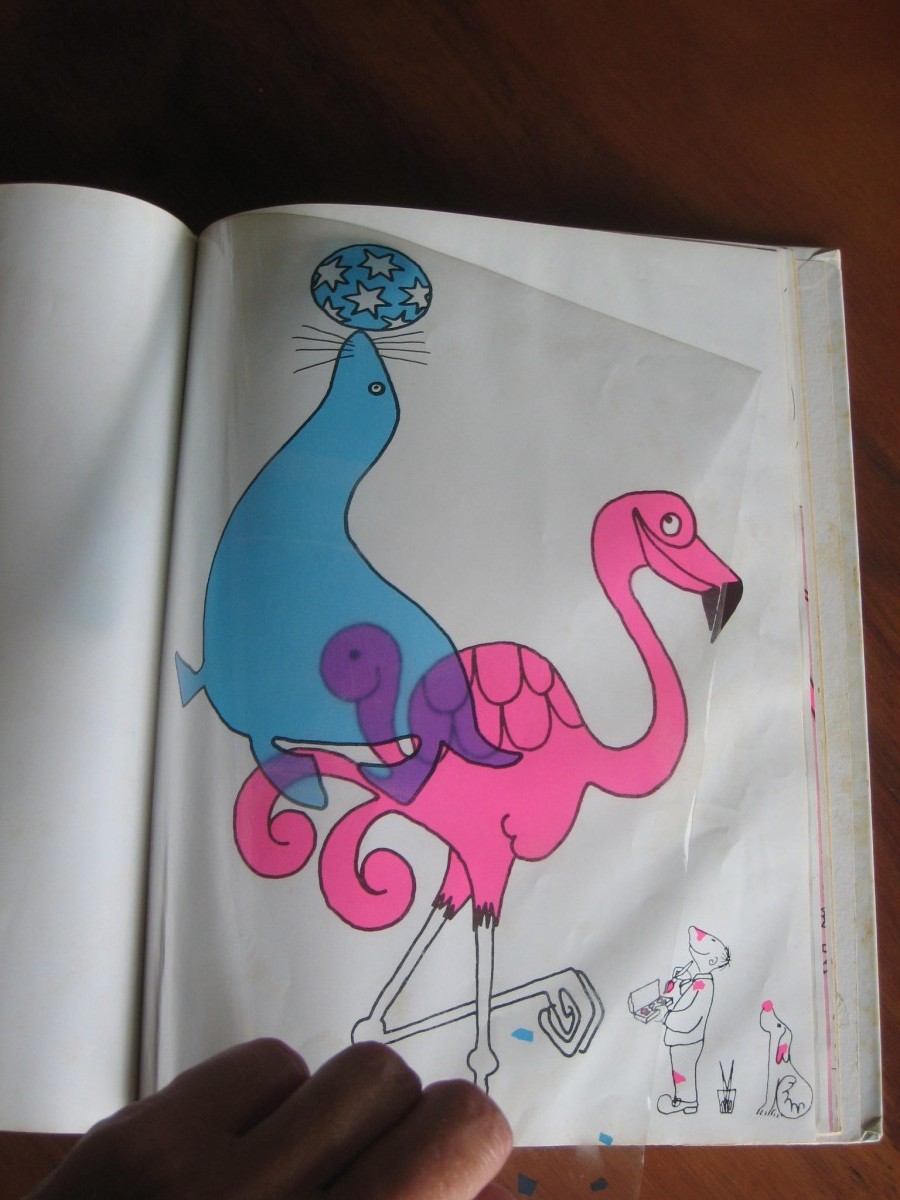
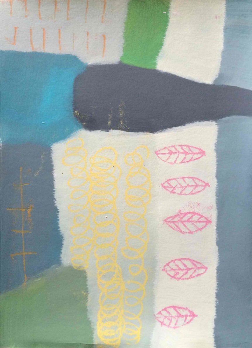
Janet shared pages from her sketchbook, drawings she made with mixed media. Many of the designs showed experimentation with equal values, vanishing boundaries, and array colors.
Christina shared her experiments in acrylic and oil, as she explores the ways she will use this color knowledge in her chosen media. She also brought in a small painting she had done in the last week, where she had restricted herself to only cyan, magenta, and yellow paint to see what was possible.
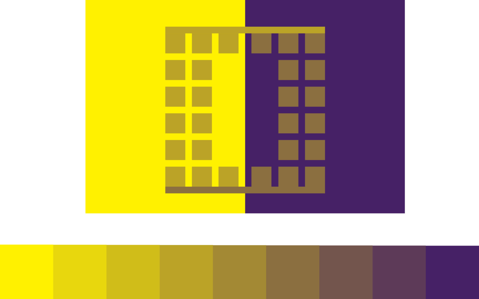
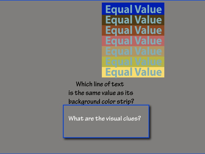
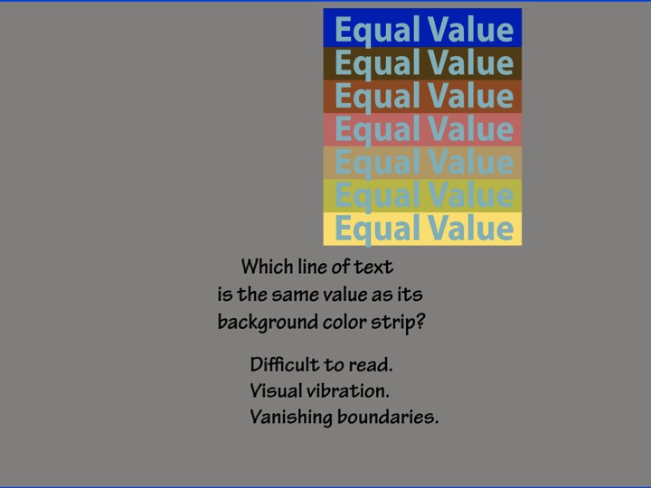
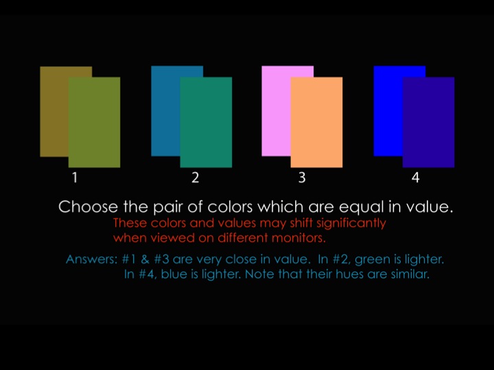
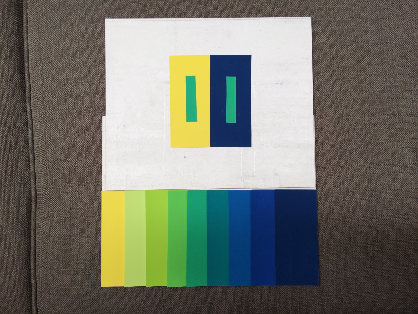
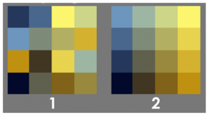
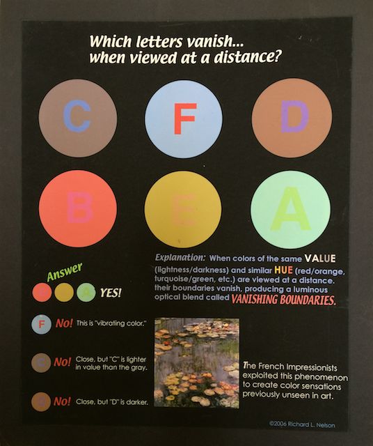
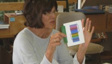
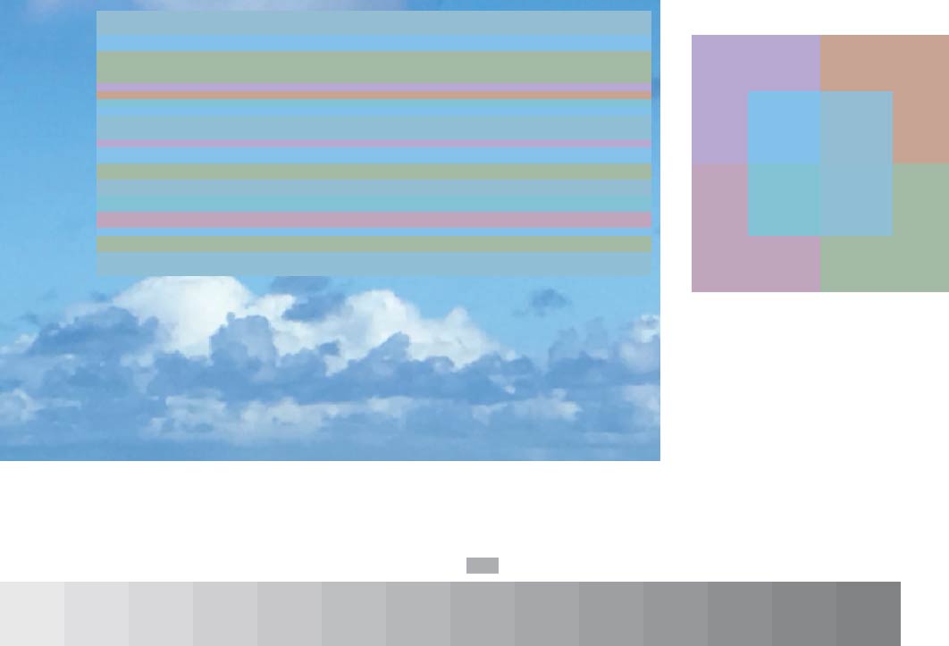
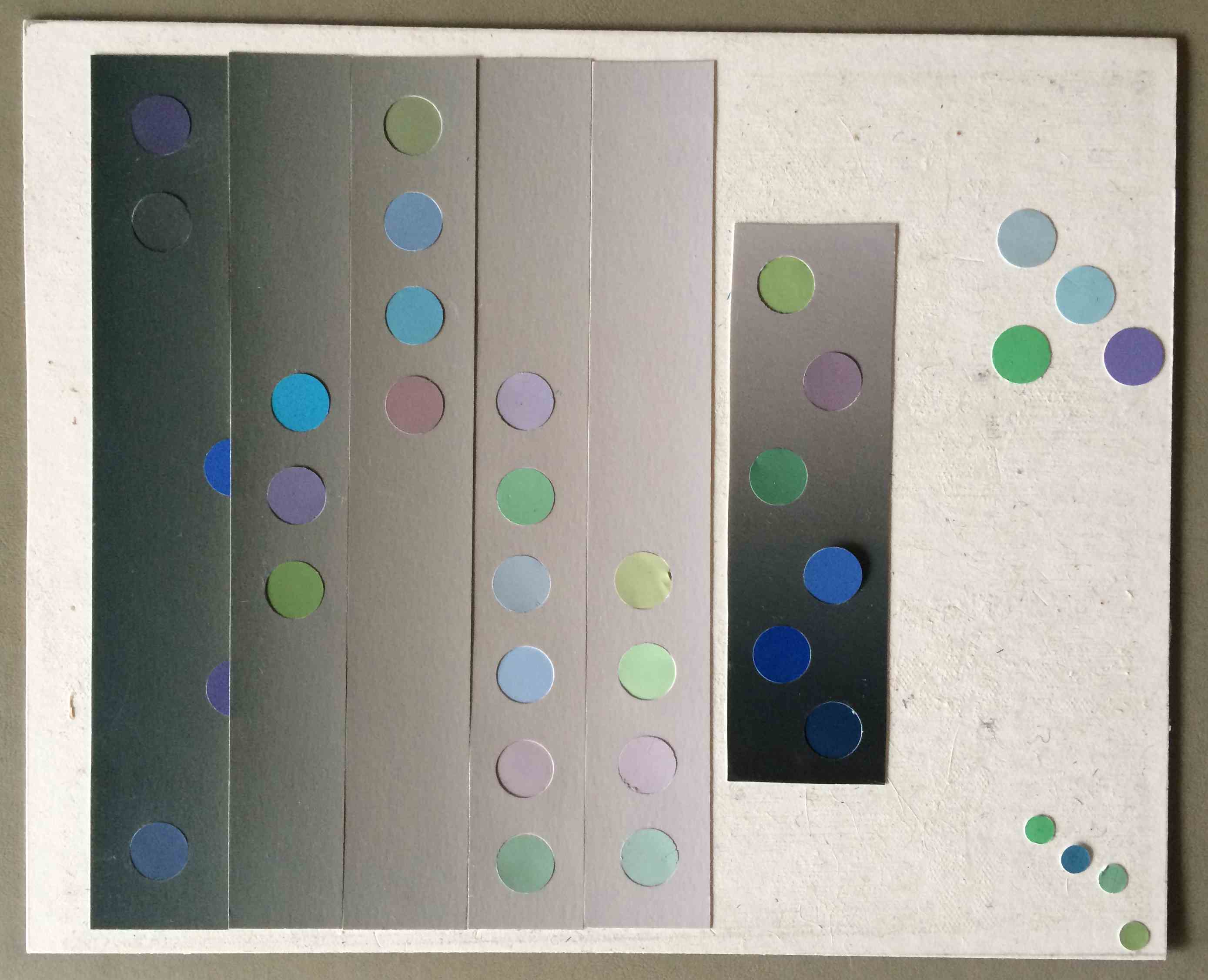
Linden used Color-Aid paper and gray scale sheets to create an innovative design which provides accurate readings on equal values. The result is an immediate recognition of when colors are matching in value, and when they are not: the colors that do not match jump off the page, while the colors that share equal value disappear at a distance.
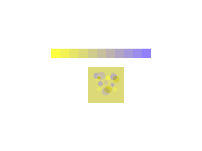
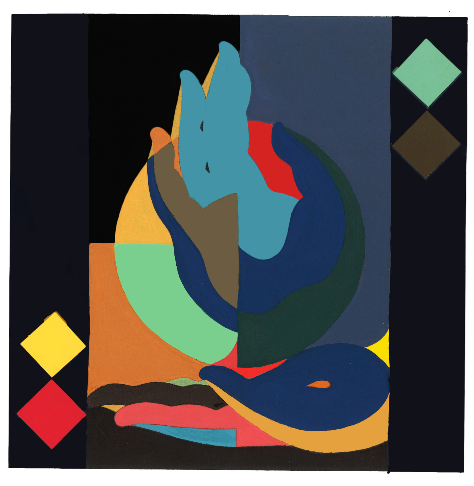
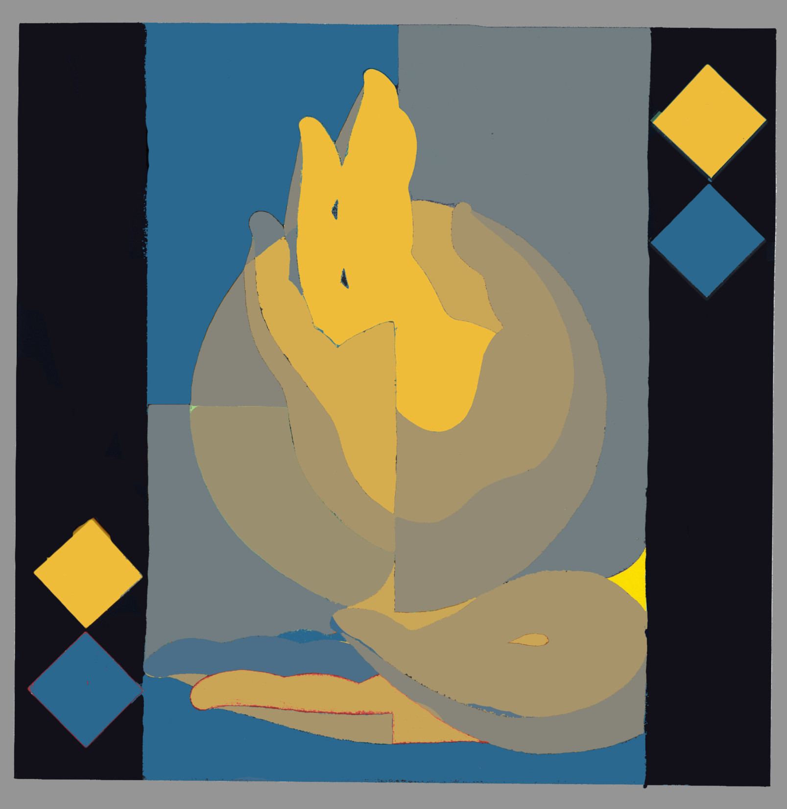
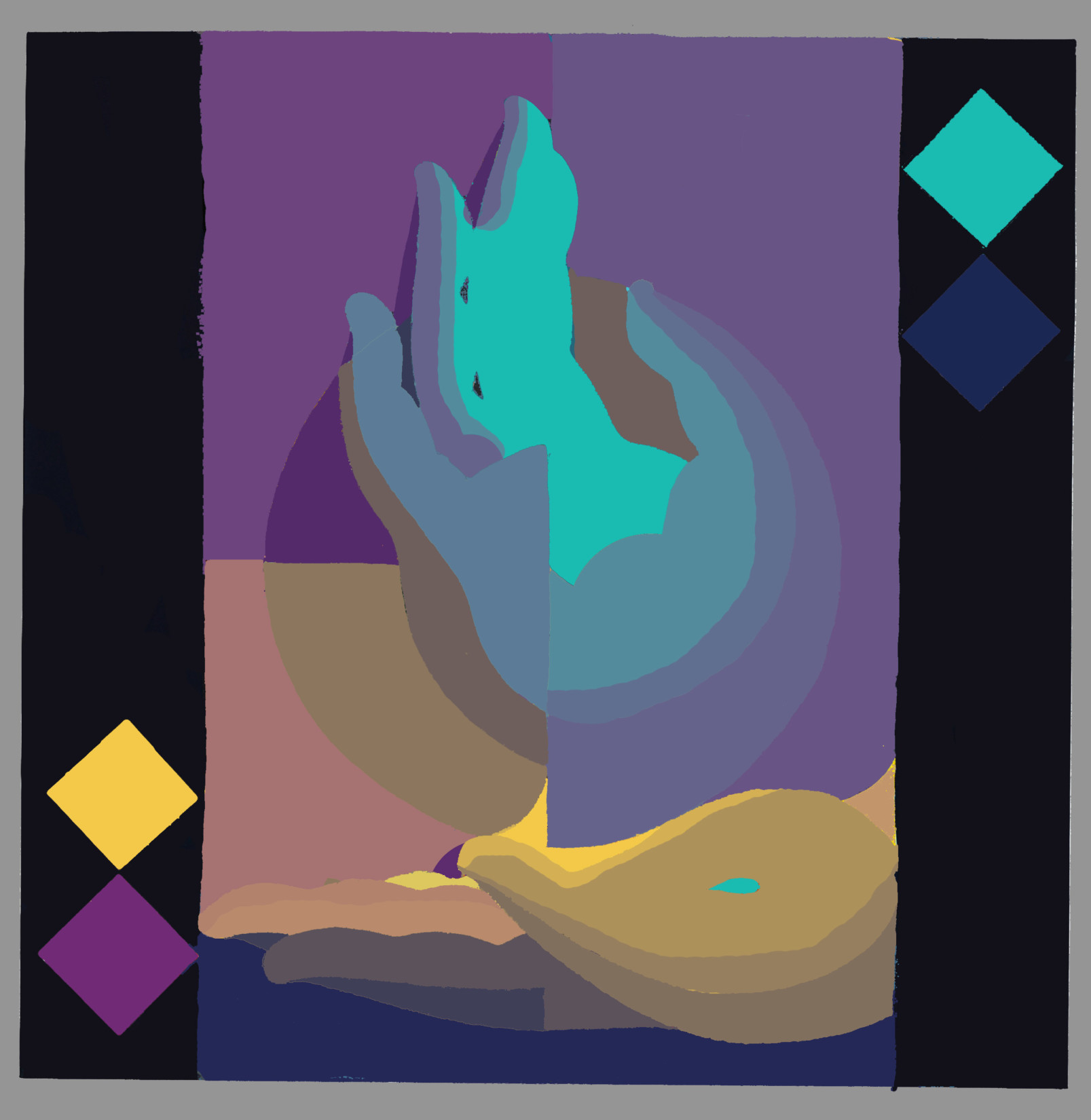
Jane submitted several digital examples of her explorations with equal values, vanishing boundaries, creating matrices, and furthering her knowledge of the Adobe Illustrator program. She commented that using this program has helped her immensely in the understanding of color interaction.

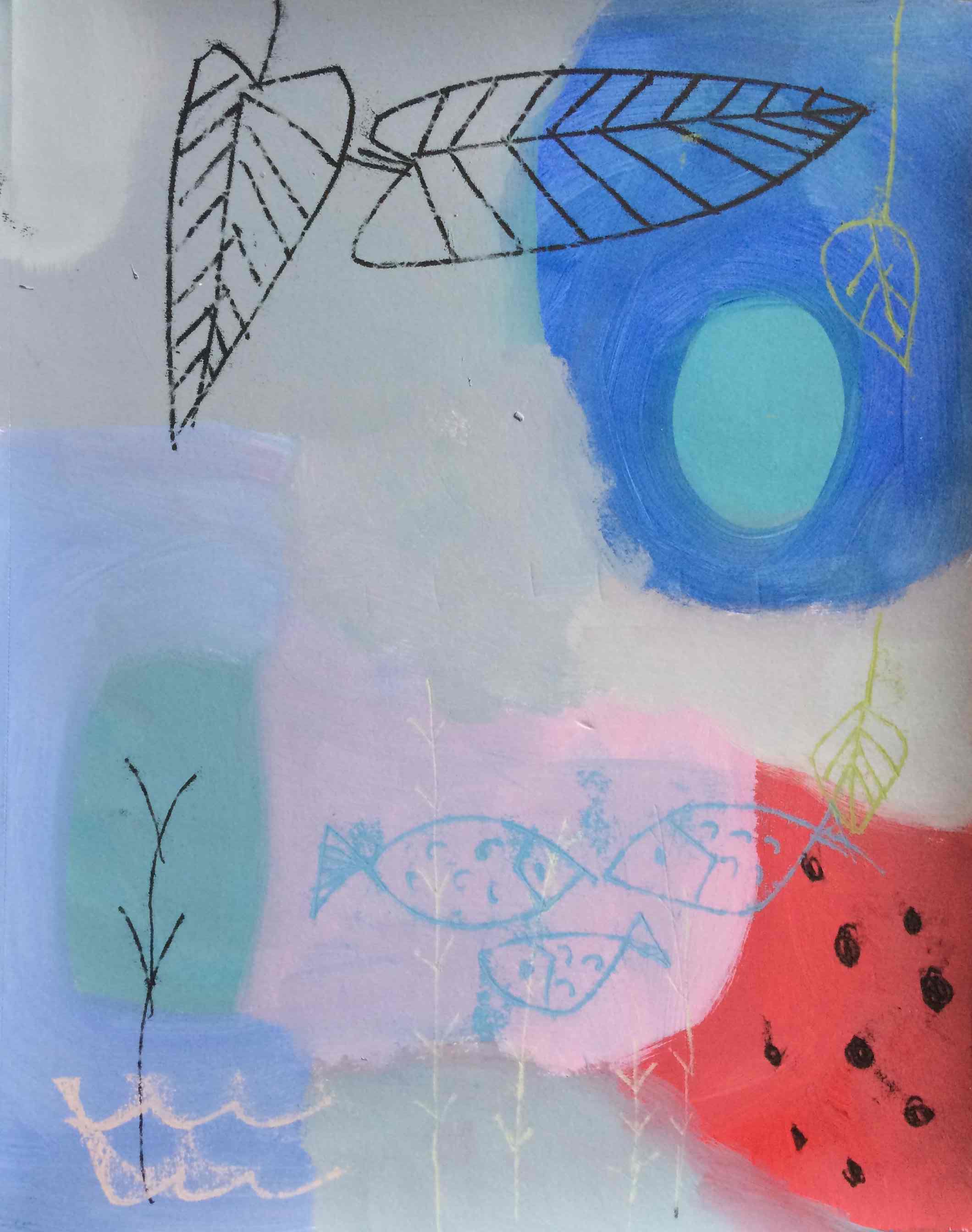
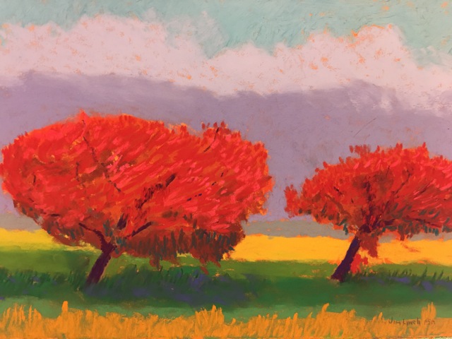
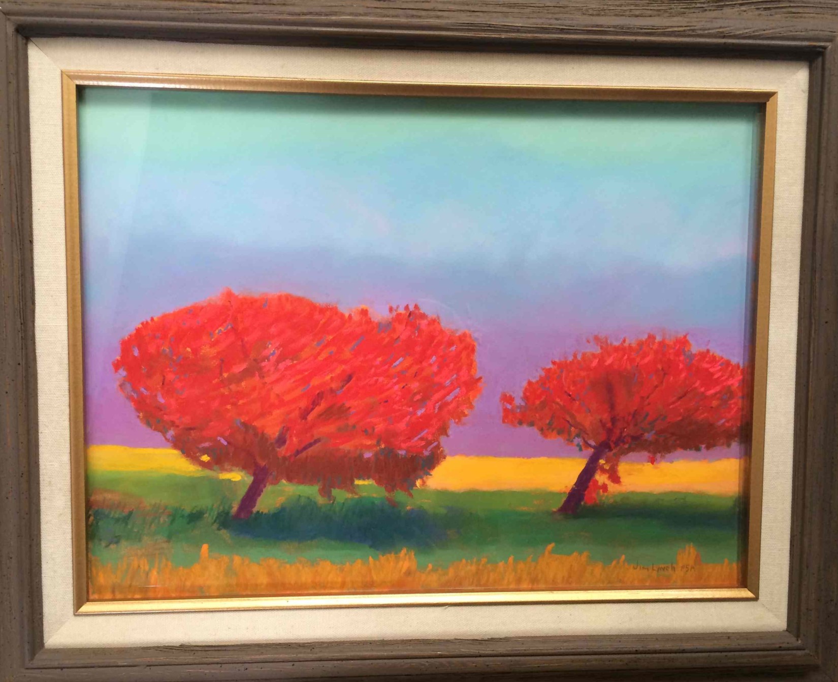
Jim brought in a pastel piece that he reworked to incorporate vanishing boundaries. He also shared a small study of equal values in opposing hues, which gives us the contrary effect of vibrating boundaries.
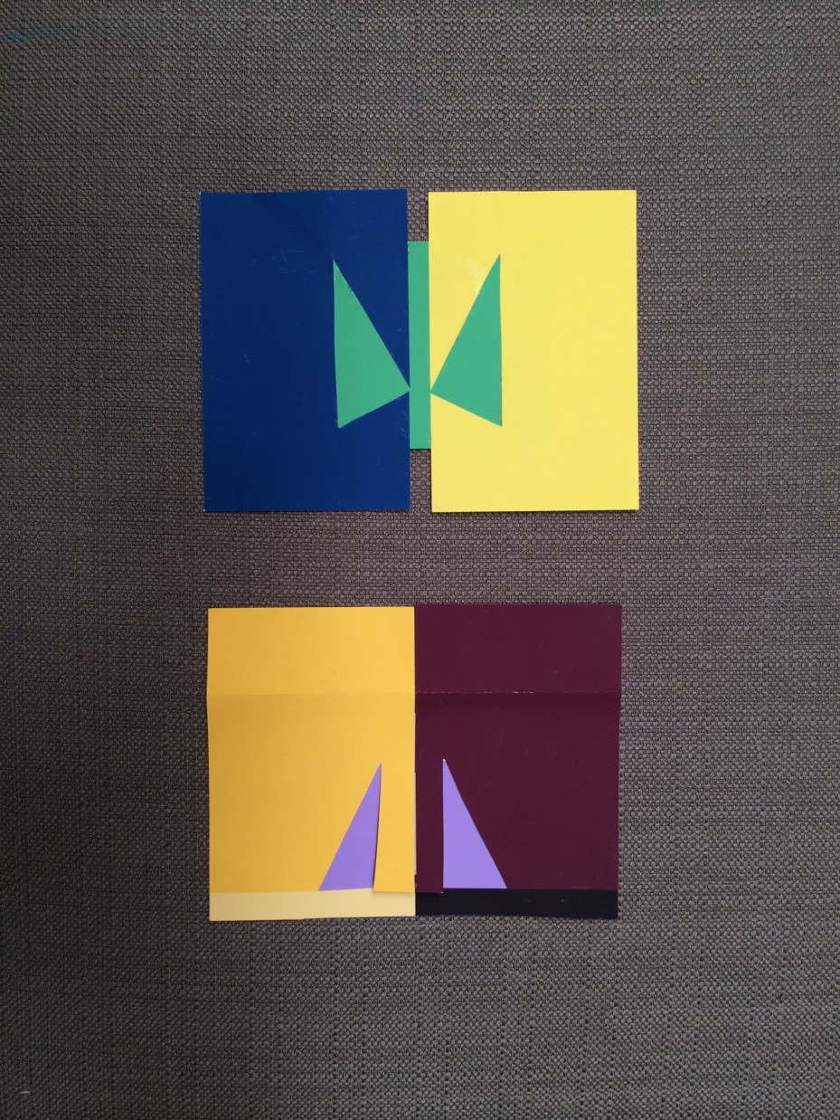
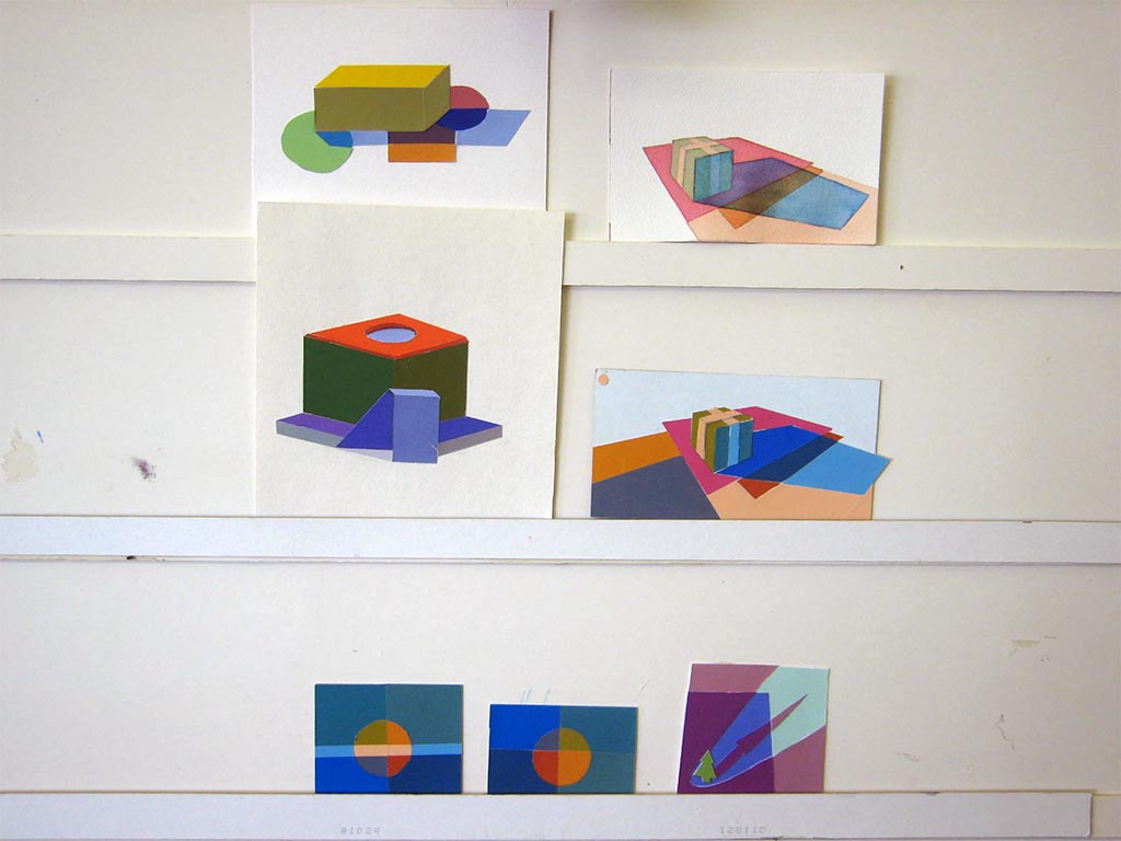
Cynthia experimented with an original image in Adobe Illustrator, trying new color combinations. In one version, she used only one array (two parents) and in another version, she used a matrix (four parents) to choose her colors. There were strong halations, yet only a few areas of vanishing boundaries, due to the different values of the parents.
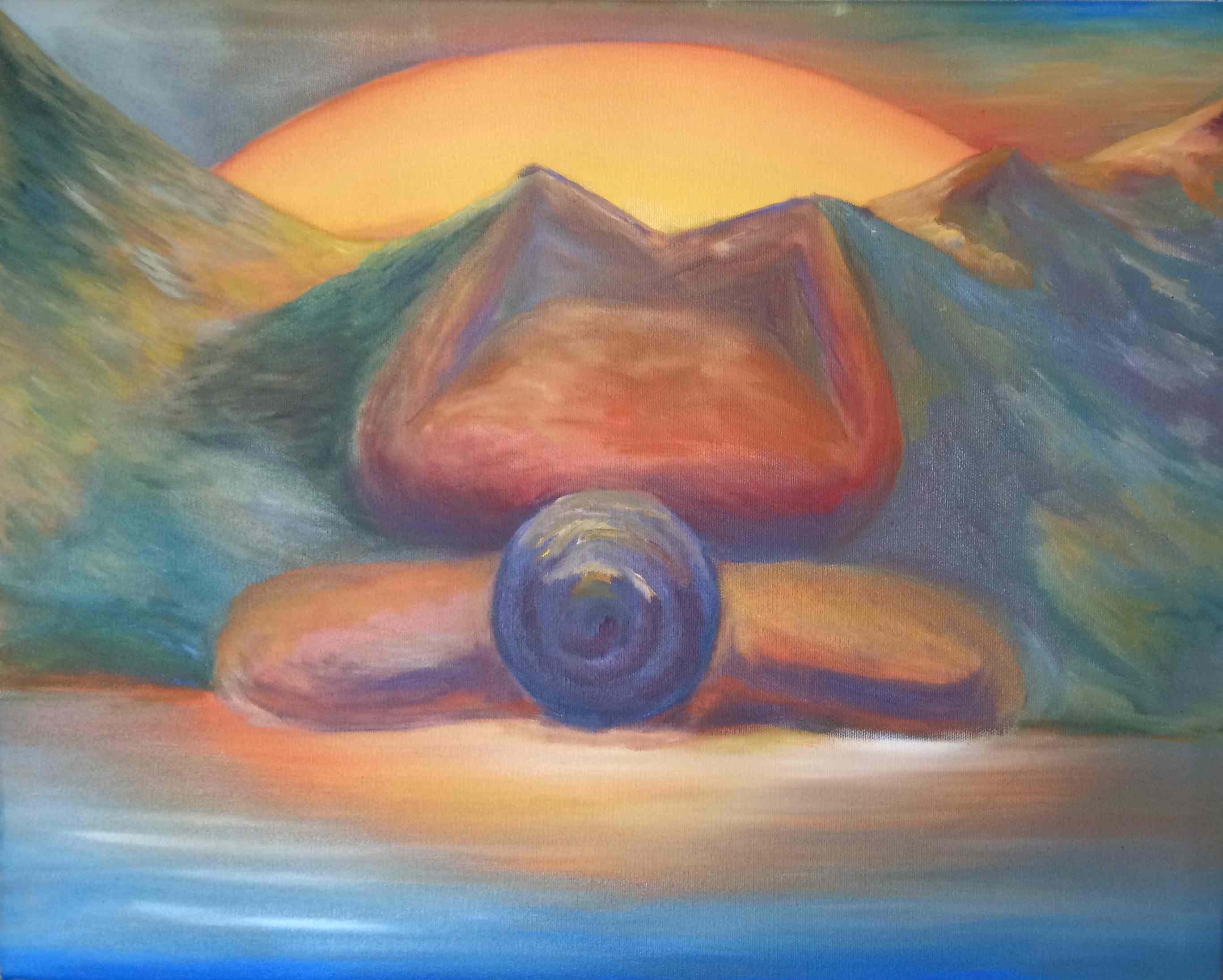
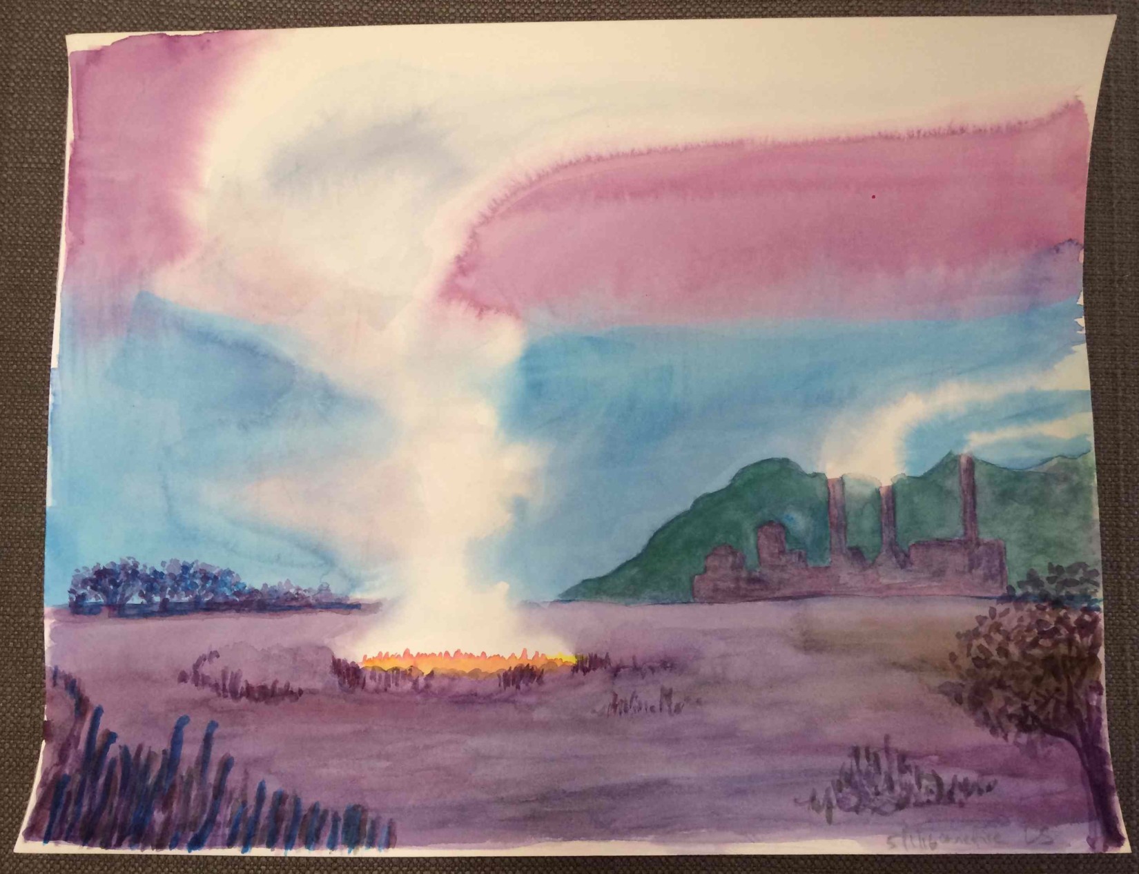
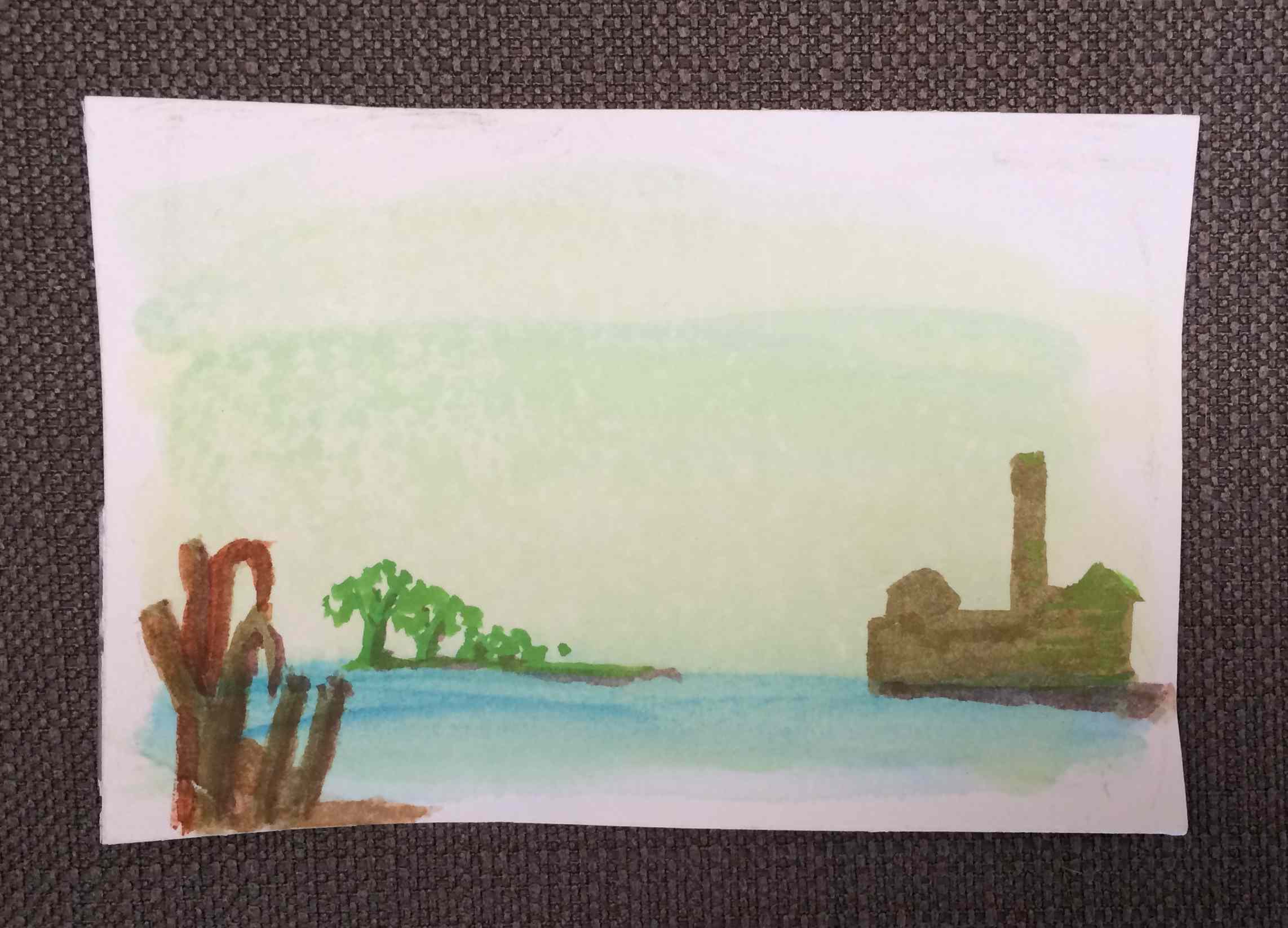
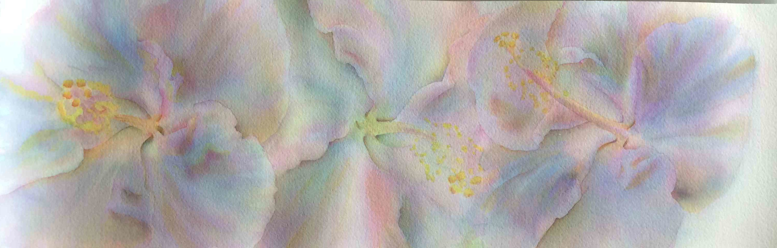
Leonard worked on a couple watercolors where he experimented with only using the 3 primaries, and worked on equal values and vanishing boundaries. He choose the sugar mill as his subject, which proved to be more challenging than he originally thought!
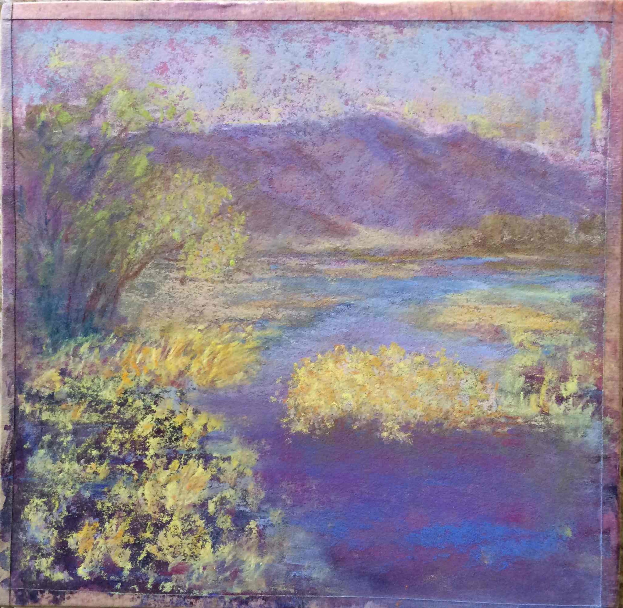
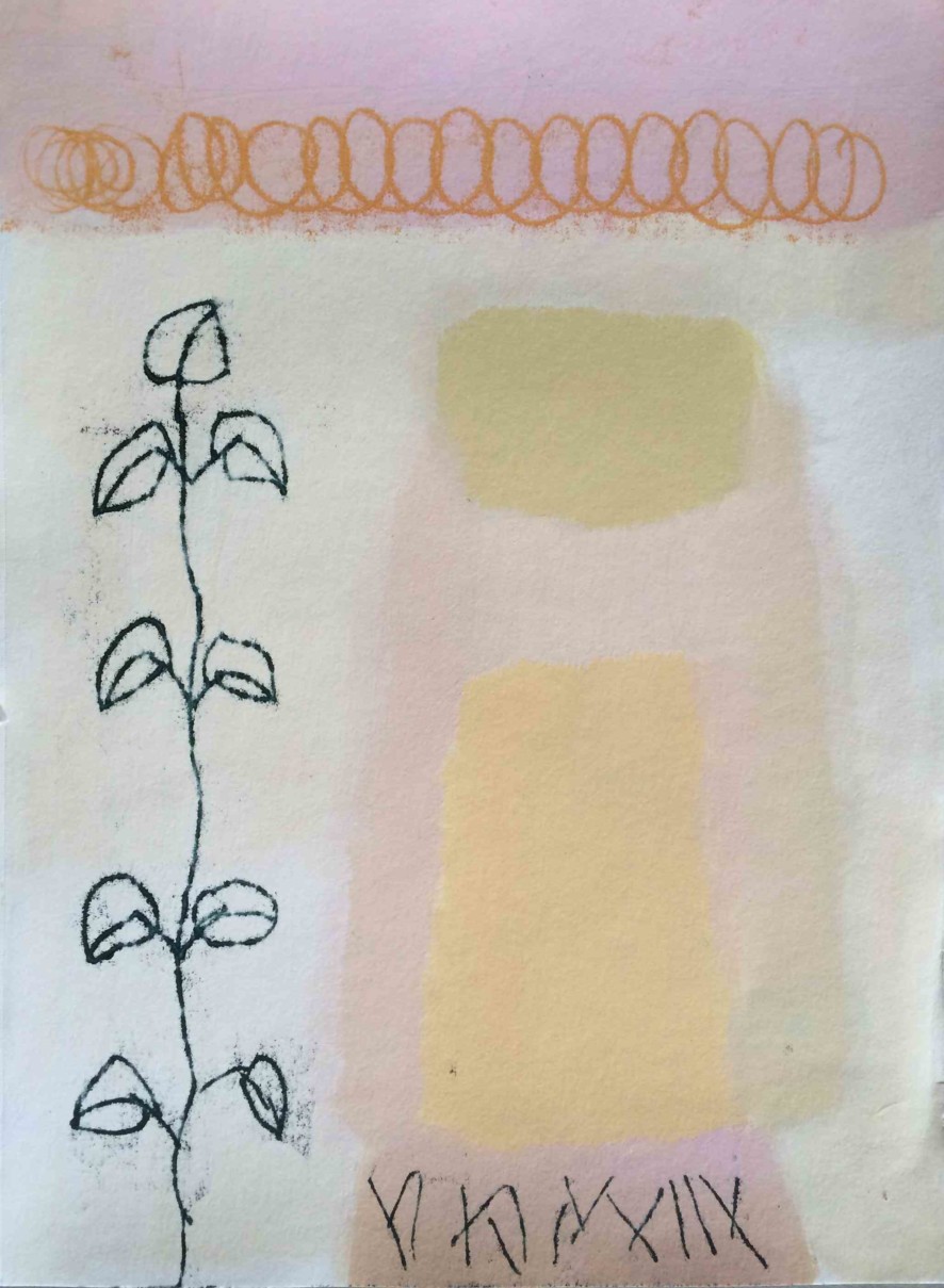
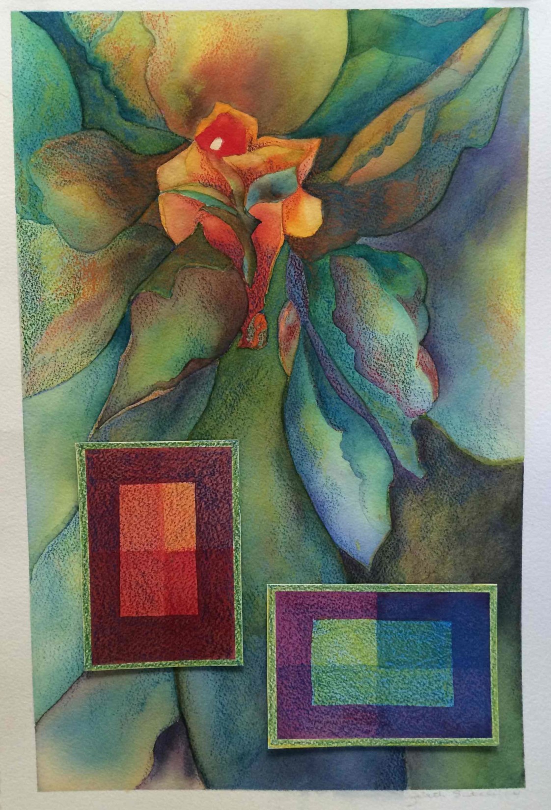
Elizabeth Ann brought in an original watercolor that she reworked to achieve color harmony and vanishing boundaries. She showed us examples of the before image, adding that she thought the original color scheme had been a bit “garish”; then revealed the final result, which she had toned considerably. She also added her formal color studies as a counterpoint to the flowing lines of her original composition.
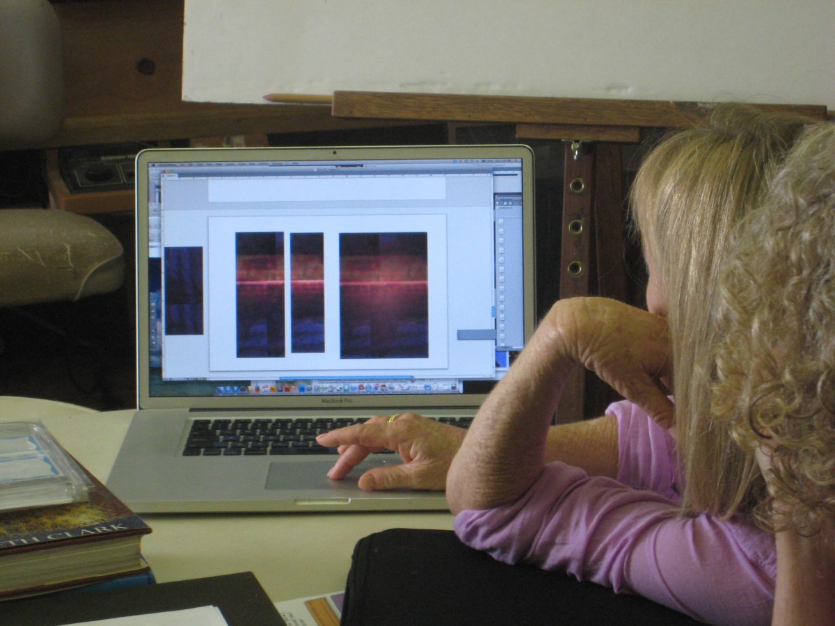
View the digital vanishing boundaries studies.
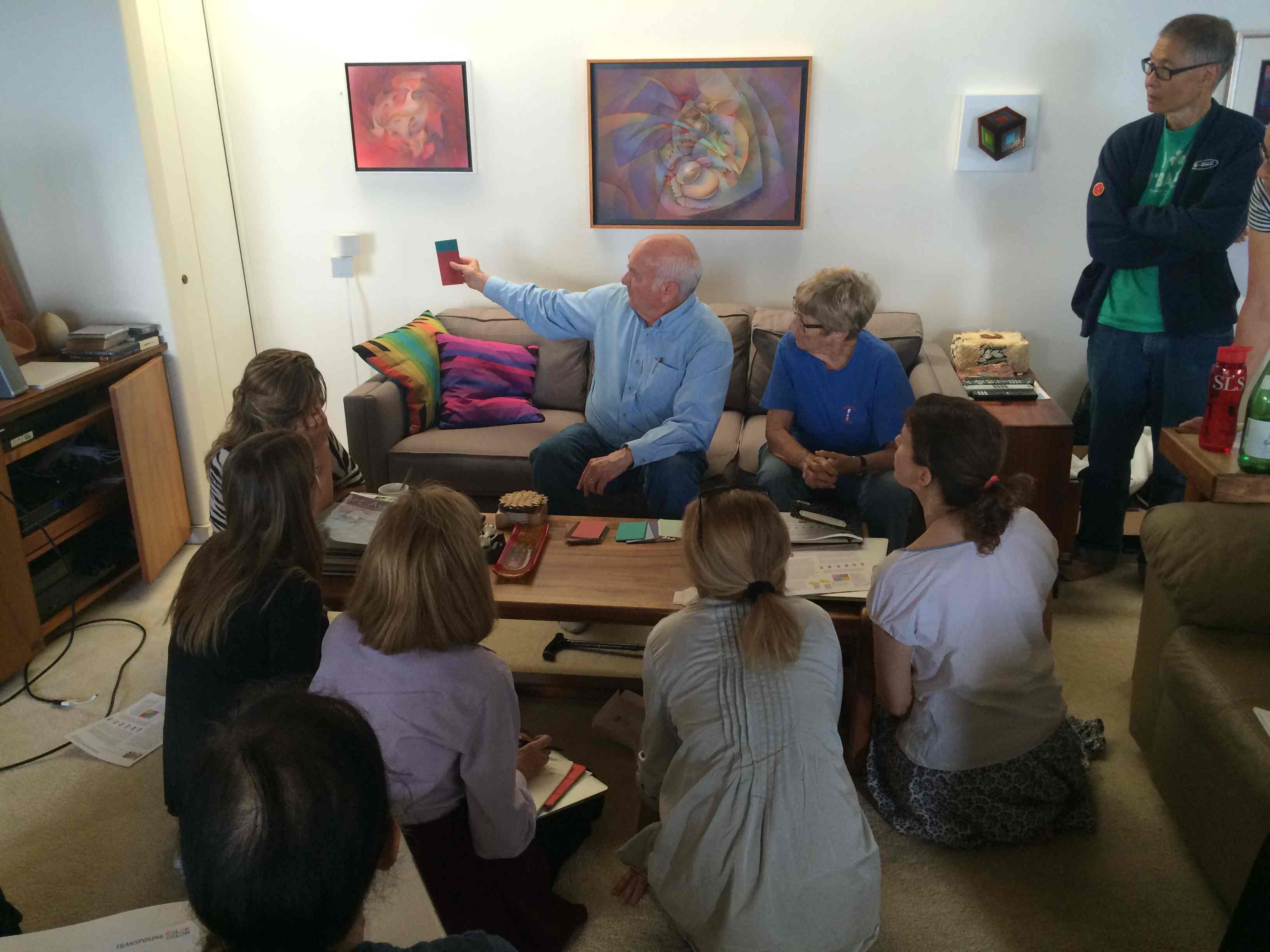
Class recap – some key ideas
The importance of stepping stones
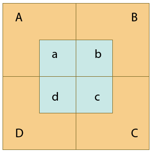
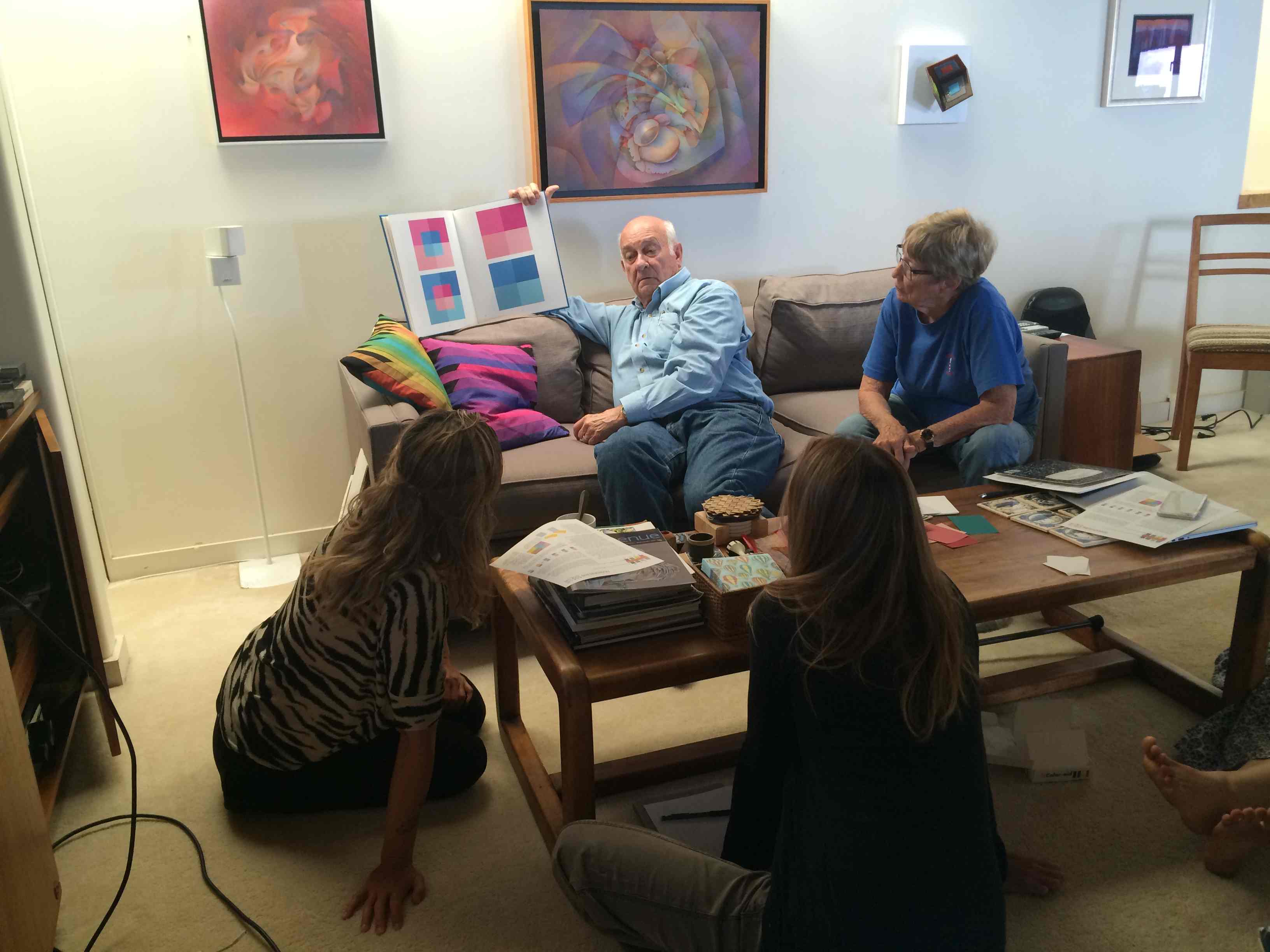
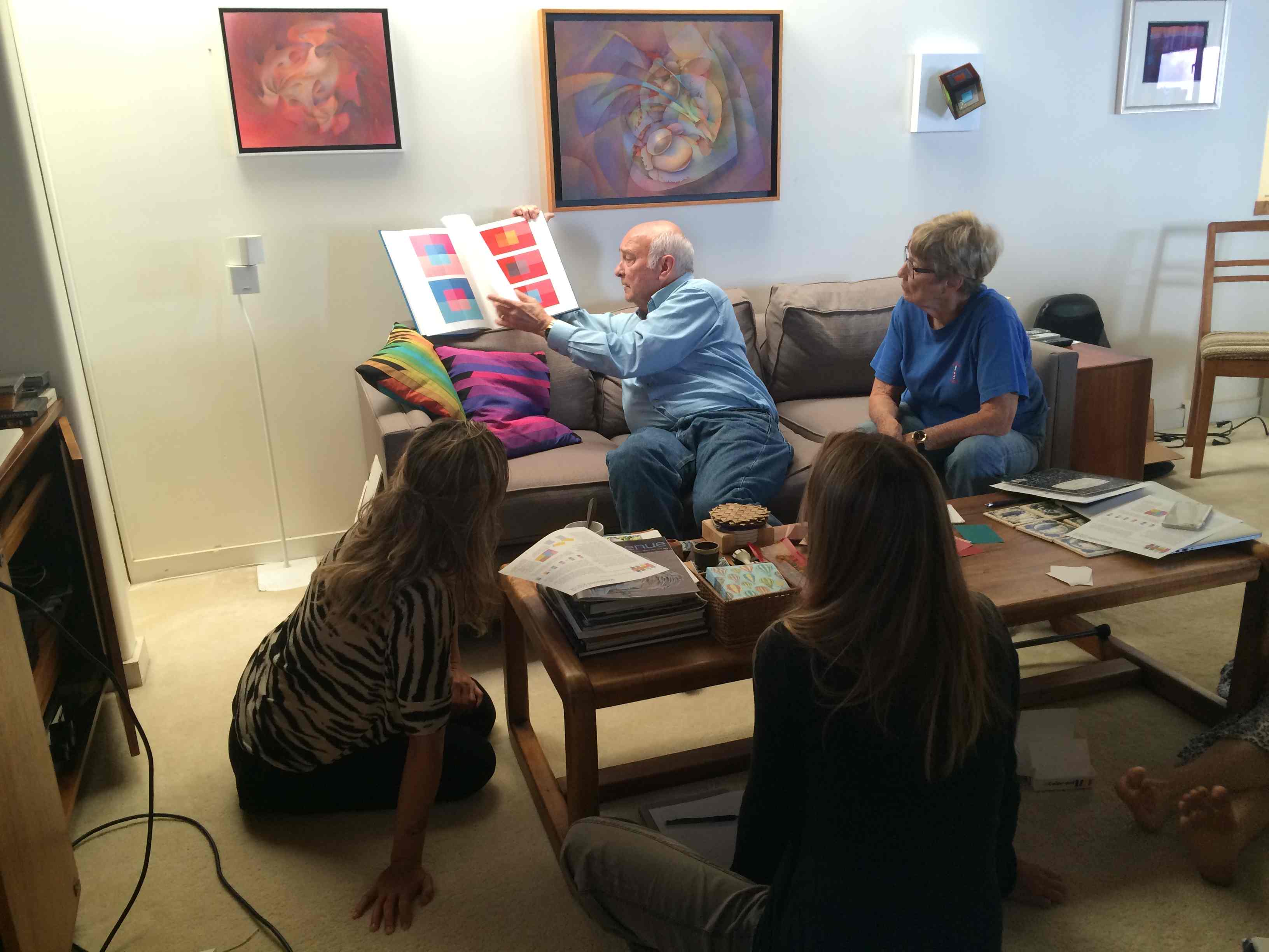
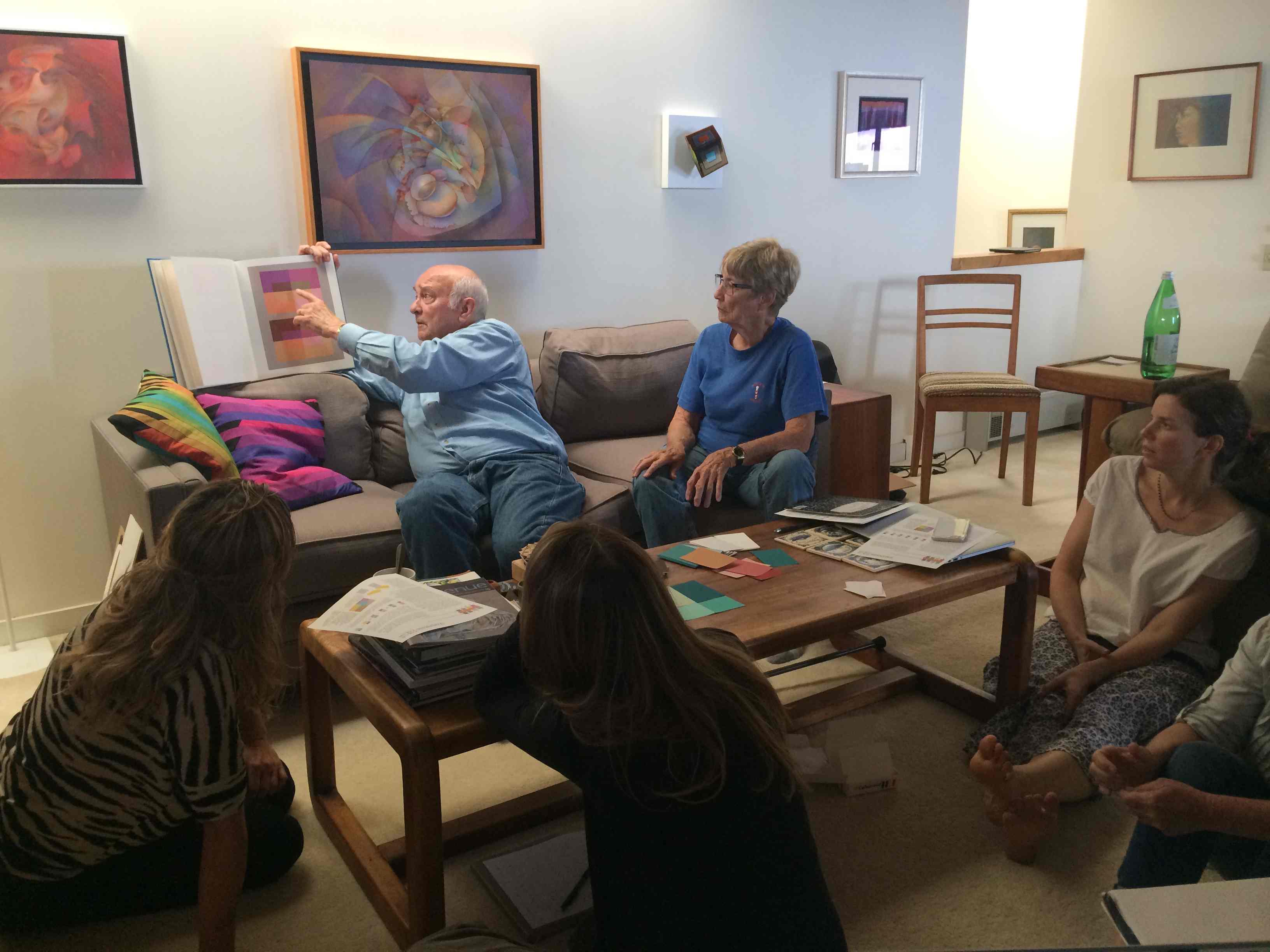
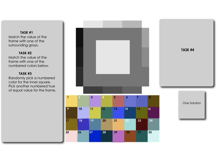
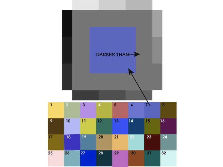
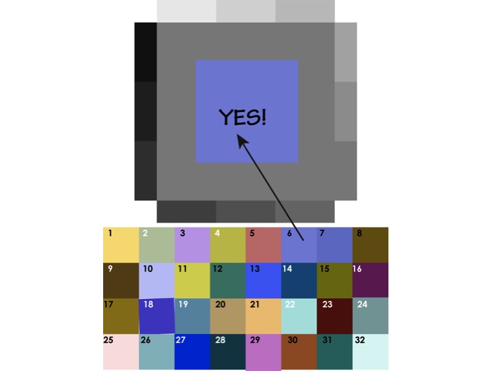
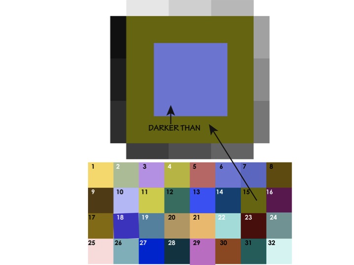
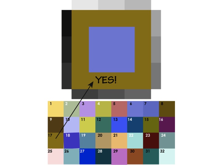
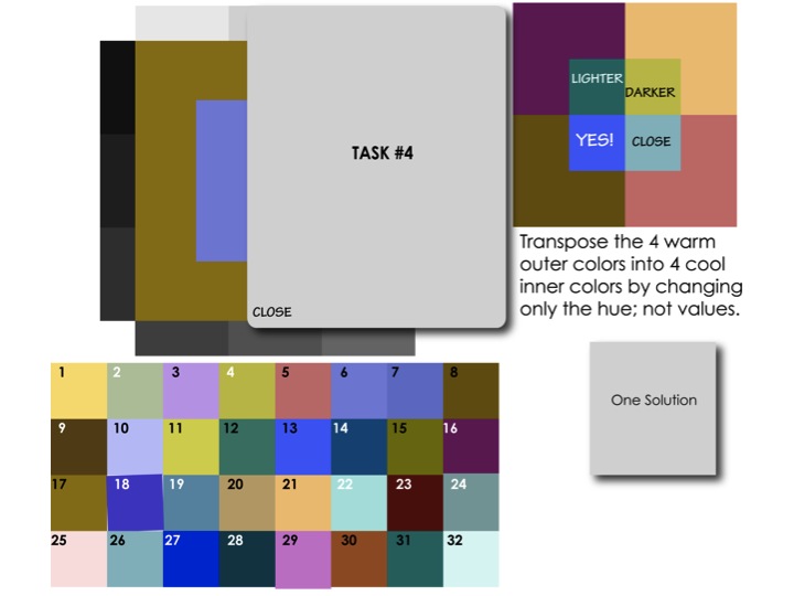
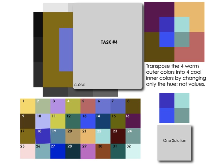
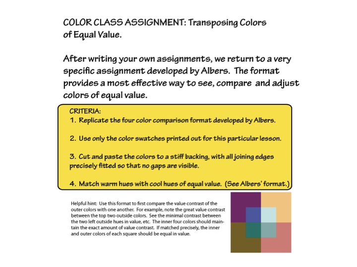
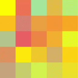
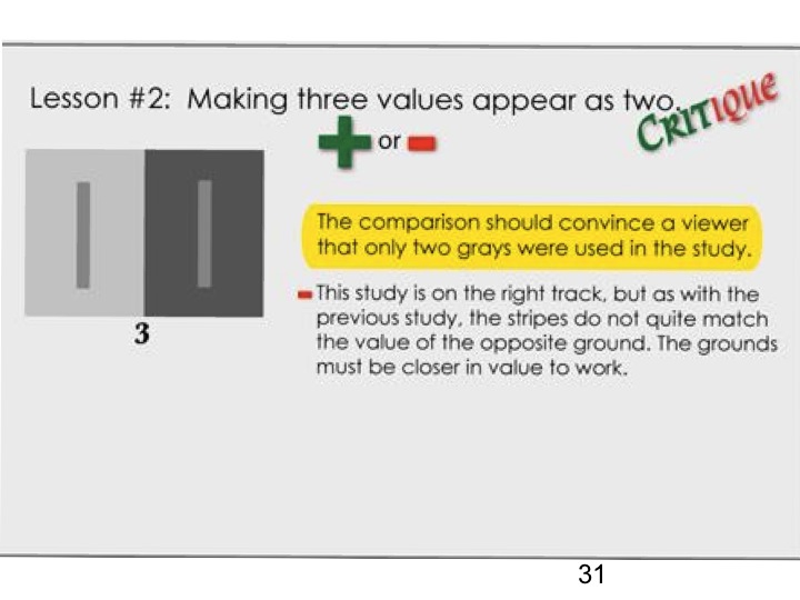
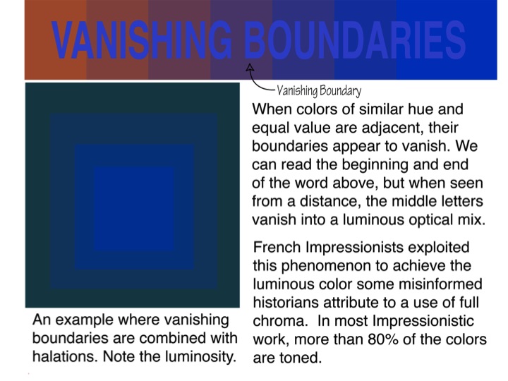
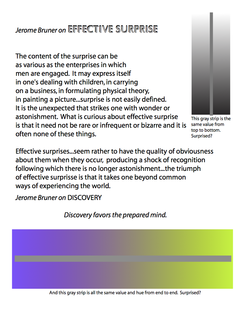
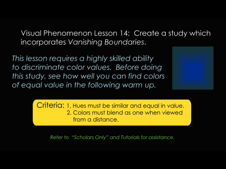
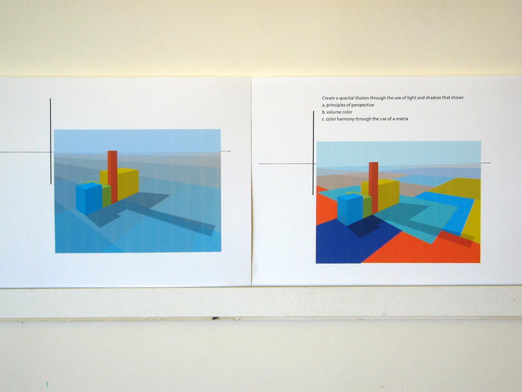
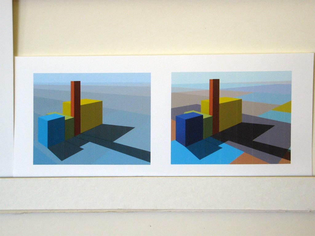
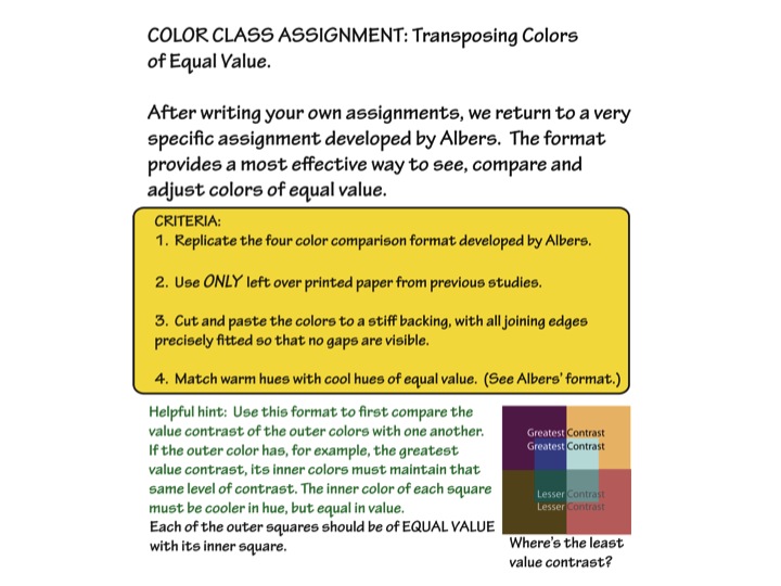
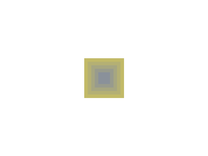
We reviewed more on the theme of vanishing boundaries, and Dick shared a worksheet he designed on Adobe Illustrator that could help students improve their value comparisons. By creating a matrix with equal value parents, one could pick color combinations to try and make the inner shape disappear, either a lot or just a little. See the worksheet below, in the ‘Class materials’ section, which is available for download as well.
Dick also wondered if the color information had affected anyone, and asked the class: “Personally, what, if any, behavioral change have you gone through?”
Most everyone agreed that the information was ‘eye-opening’ and powerful. One student said, “I see my own work so differently now. I used to take it for granted that I knew what I was looking at; well, I thought I knew what I was looking at.” Another student described it as: “I feel I have the eyes of a dragonfly … I can see the world of colors – not as one, all at once – but all of them, individually; I can see them now.”
Dick cautioned that it is important to keep this wave of euphoria going, and to dedicate oneself to practicing and experimenting with this color knowledge, or it will all too easily be lost. He used the metaphor of footprints in the sand: “… when you walk on wet sand, you leave behind footprints, and the next wave that comes up, it washes them away a little, but you can still see the outline. And then the next wave comes, and then another, and eventually the footprints are completely gone, there’s no way to tell anyone ever walked this way before. Well, these assignments are like those footprints, and if you don’t continue to practice, you’ll forget them. The waves of distractions can wash them away, but stepping stones will leave footprints [for us to follow].”
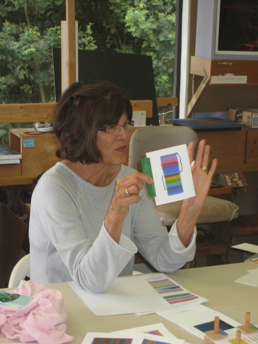
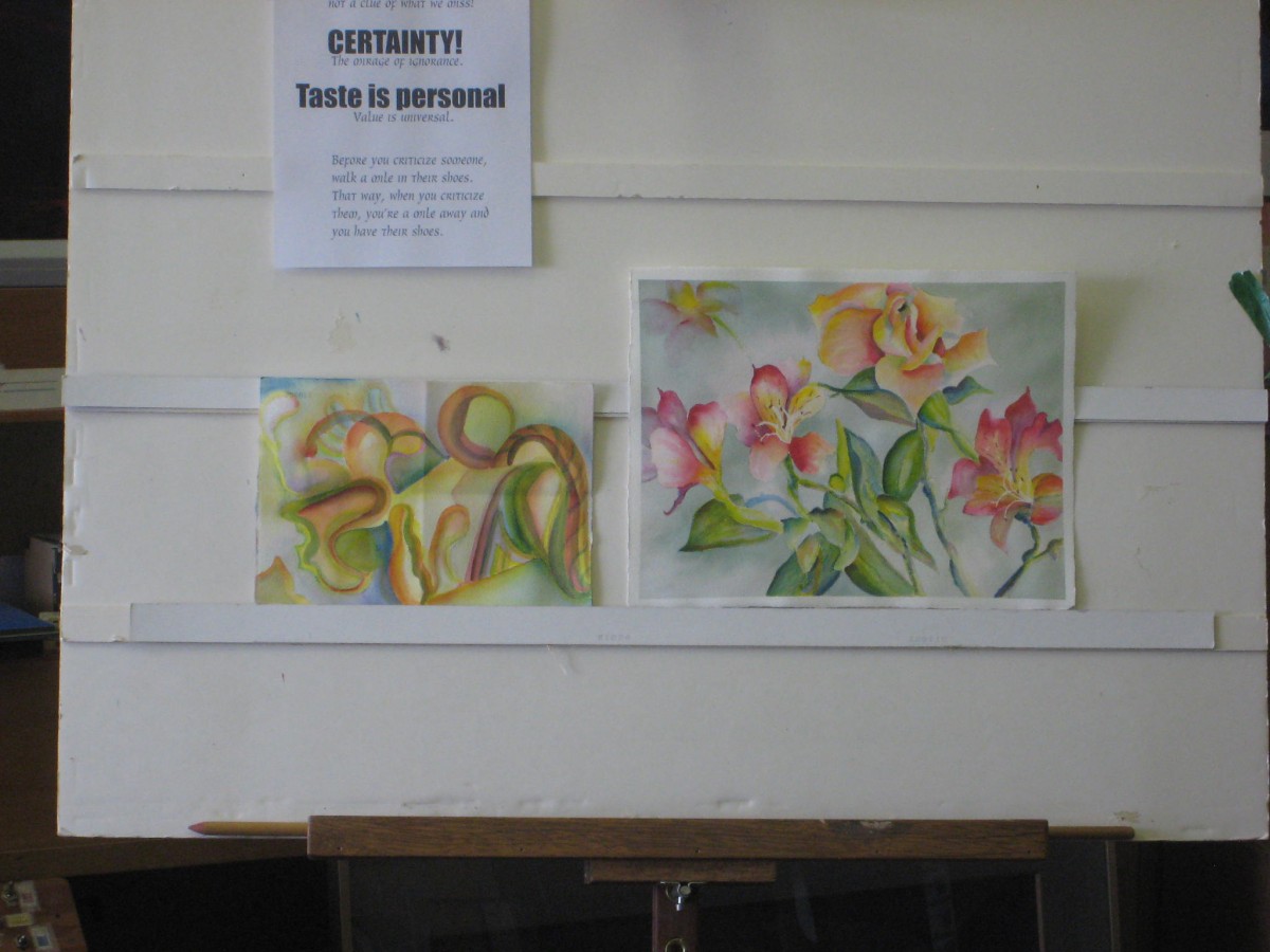
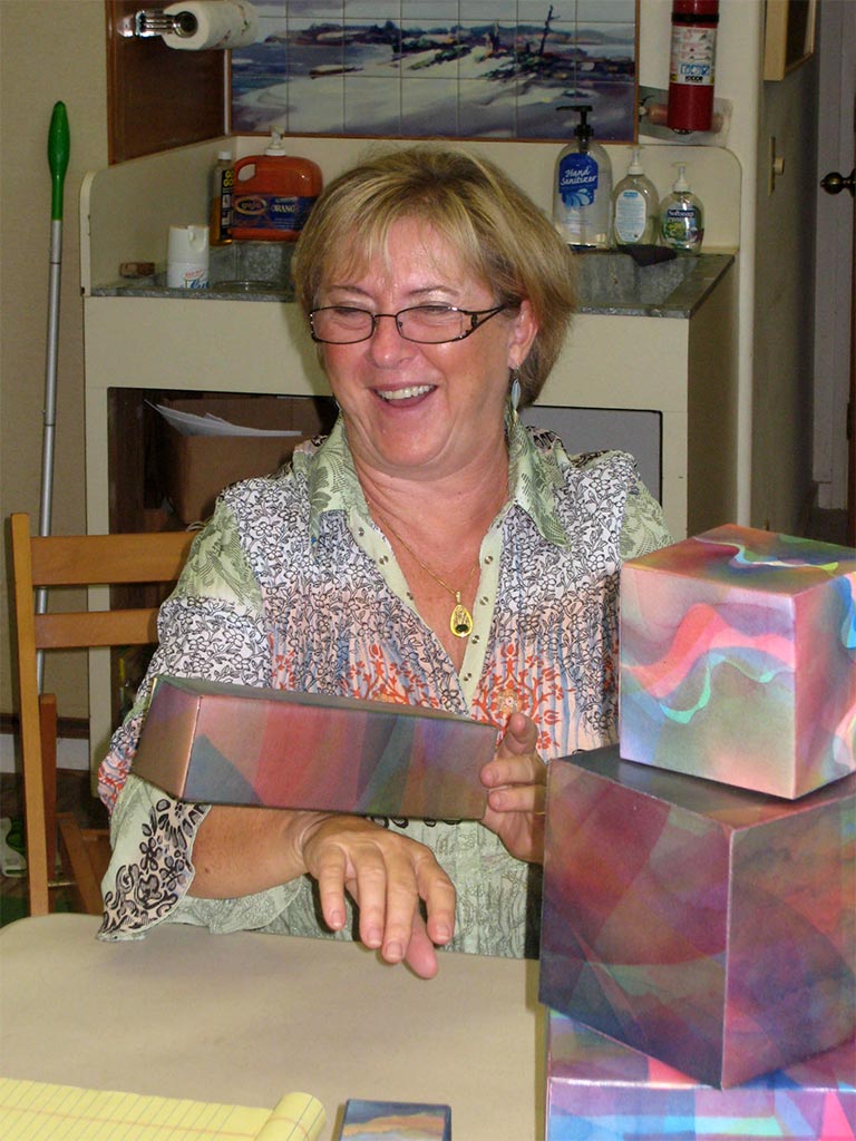
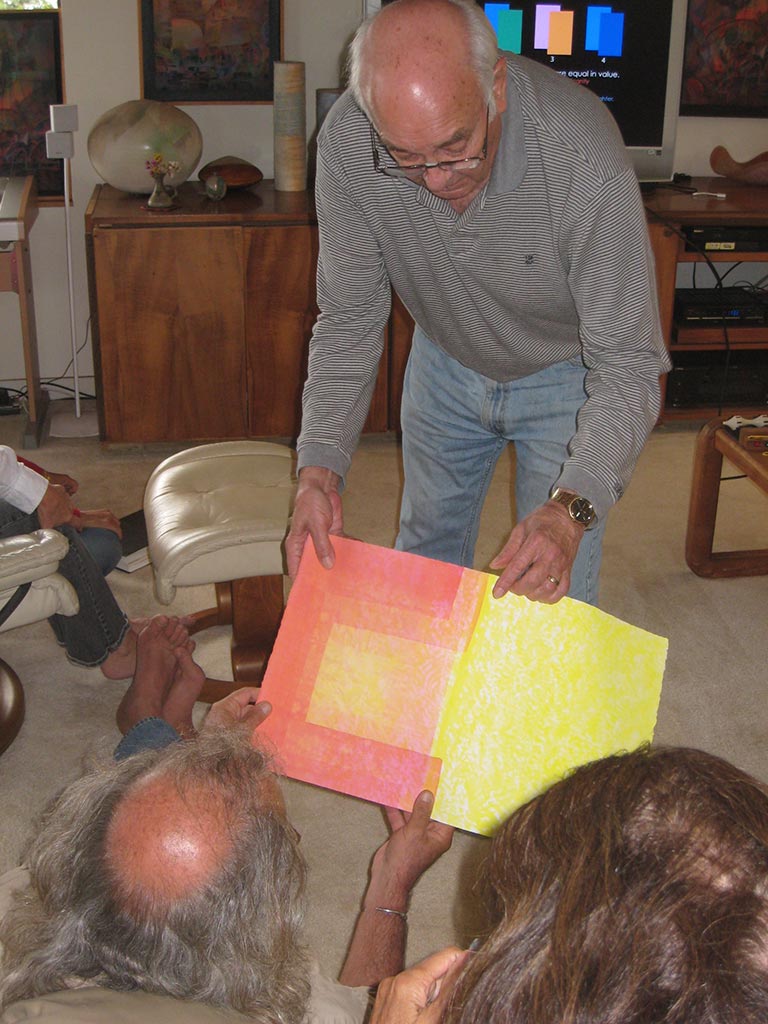
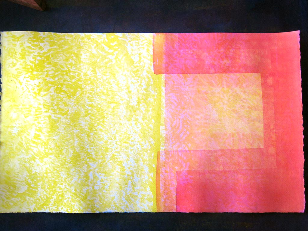
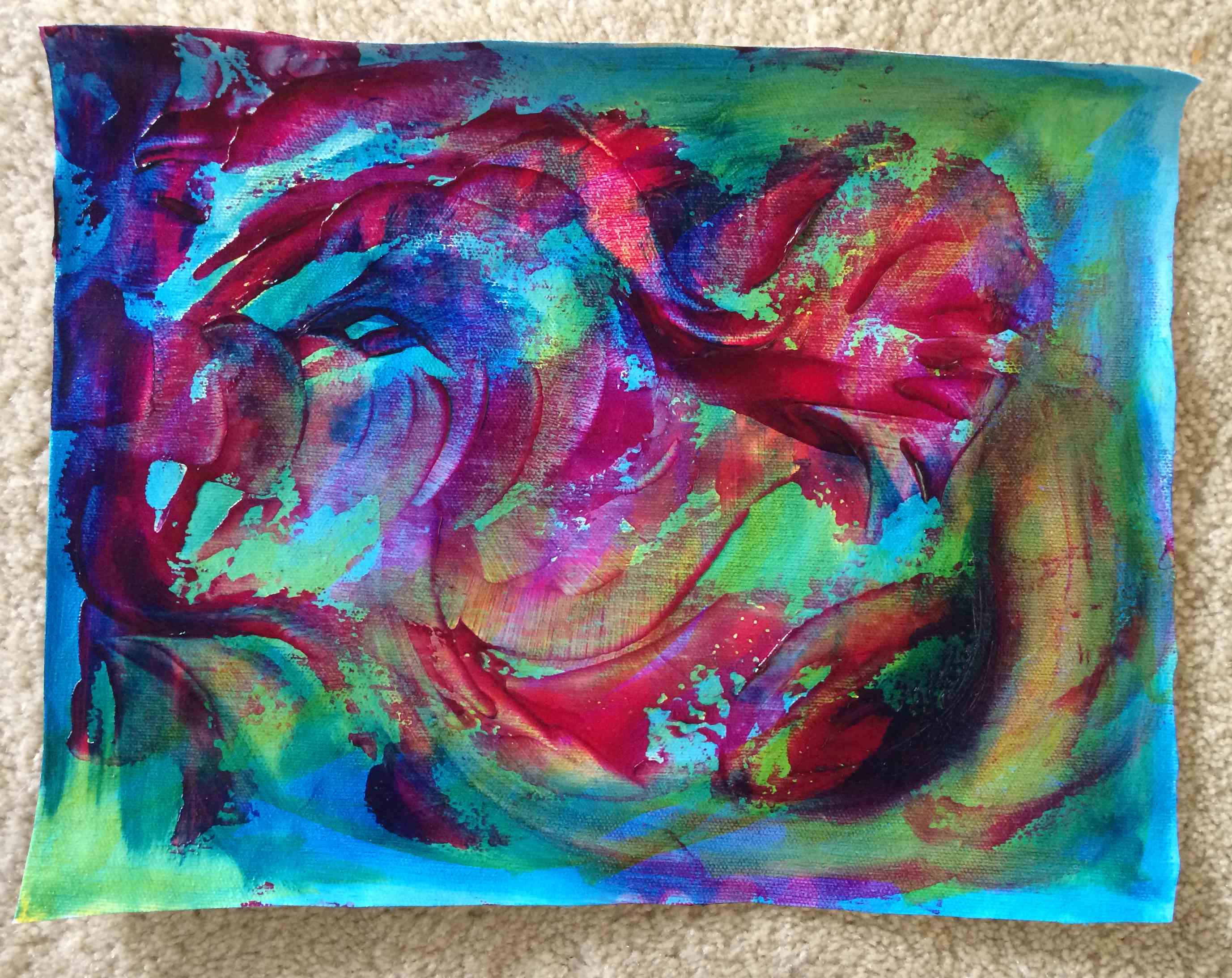
Valérie’s watercolors
And to show us proof of how important stepping stones are for an artist, Dick had invited guest artist Valérie to join us for this class, and towards the end of the coffee break we were treated to the results of Valérie’s commitment to studying color. She has been practicing with watercolors, and as a transparent media, they can be very useful in creating color harmony. Dick talked about how one of the obstacles artists usually face is the desire to create something “perfect”, or how easy it is to lose perspective and feel too attached to our work: “So often when we get engaged with subject matter, we don’t see what is happening with color and shape … Valérie was at a point where she needed to stop making ‘precious stones’ and start making ‘stepping stones’ to expand her vocabulary in color, and then go back to what she was doing.”
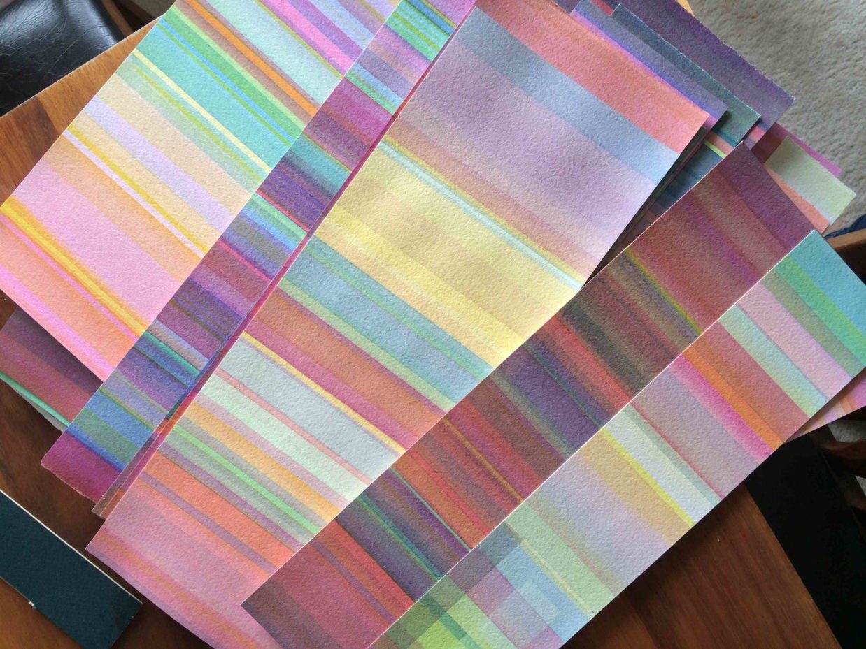
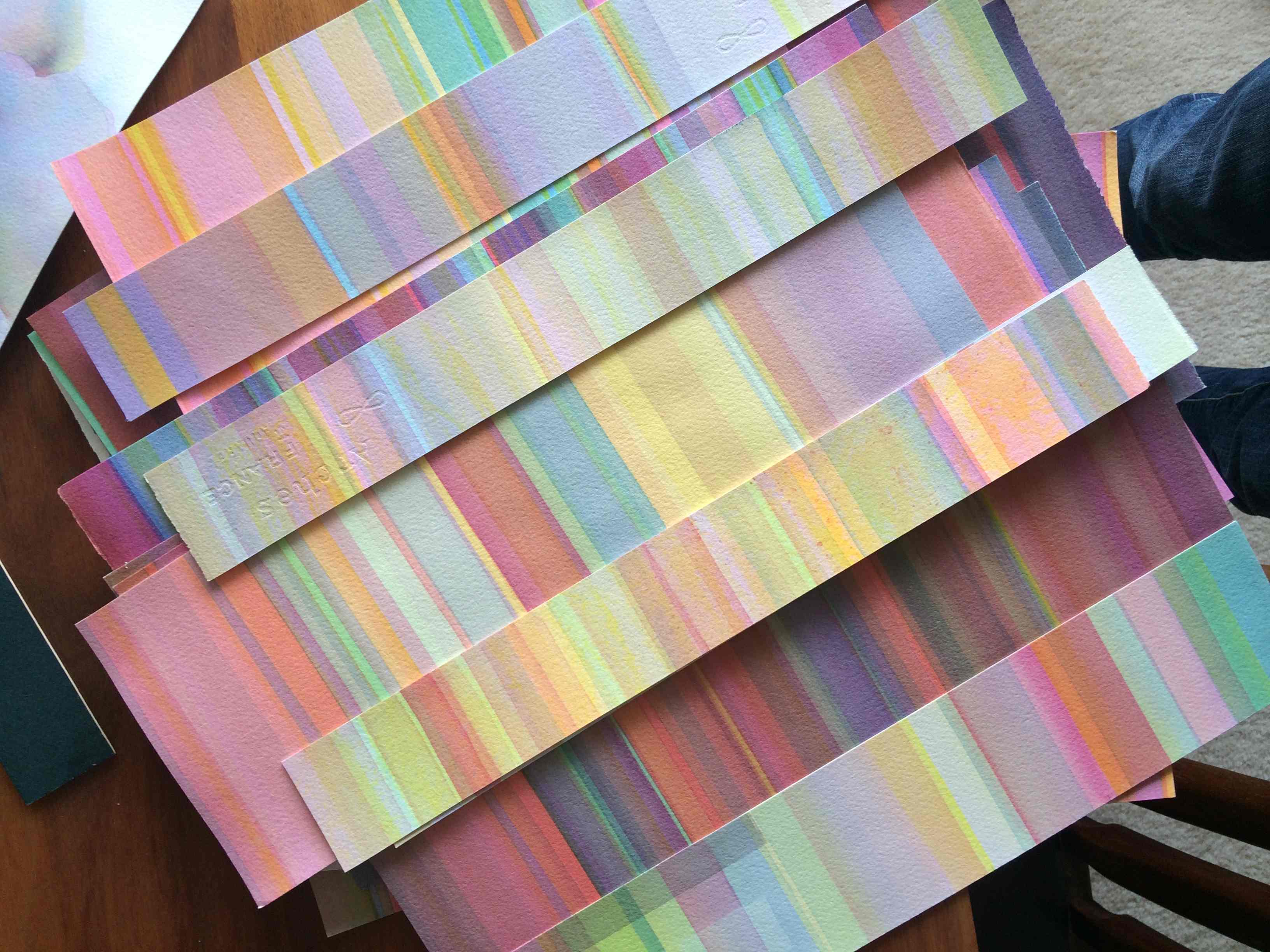
Valérie spoke a little about her process, and shared some of the revelations she has had that are changing the way she thinks about and approaches her work. “If you want to learn about colors, you have to drop completely painting ‘something’, and just work with the colors. And it takes time, just putting in the hours, day after day. And little by little, you start to see it – before, I thought I had to work at finding the values; but as you do it, as you paint, it comes to your eyes. So every time you will learn a little something. But you have to put in the time.”
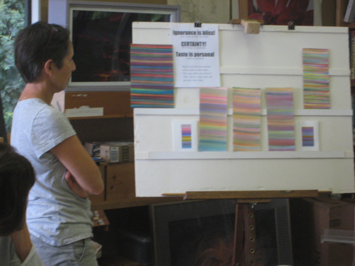
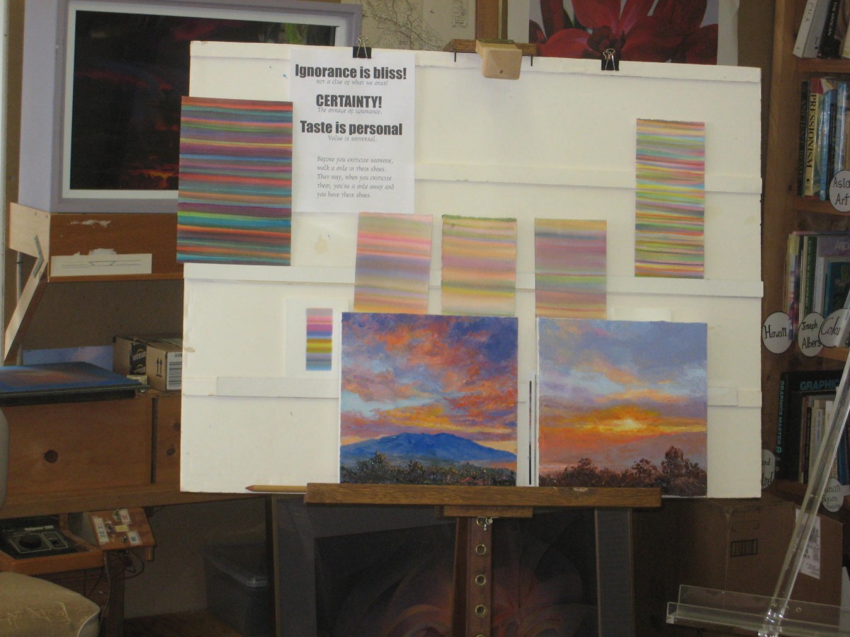
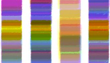
Valérie has been working on these stripes for about one year now, and she is beginning to incorporate shape and form back into her color studies. The tricky part is to not do it all at once: she cautions to only try one aspect at a time until it becomes familiar and easier to handle. Trying to do it all right away can lead to frustration and discouragement, so sometimes it is best to pull back and make things simple for awhile. Valérie’s work certainly proves that patience and commitment will take you far!
Post-class work
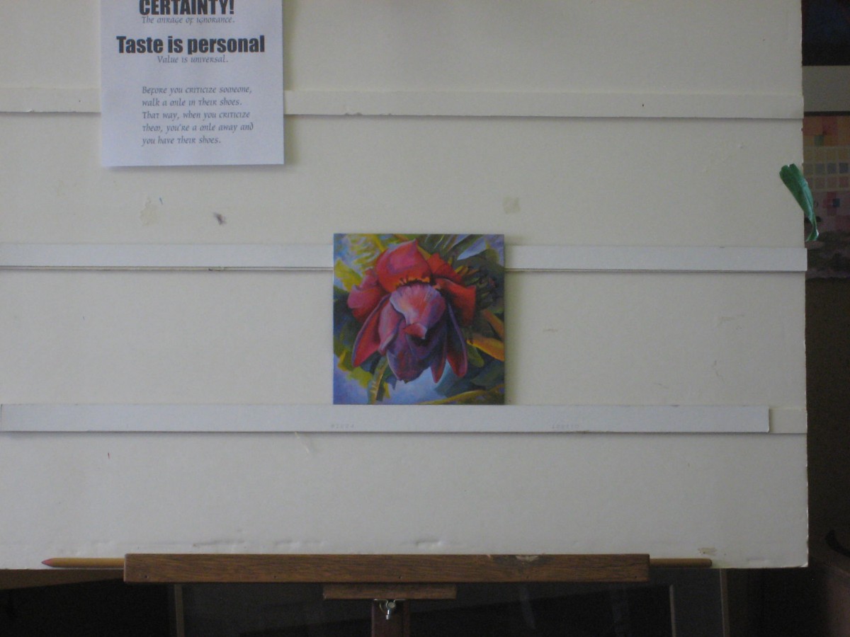
Dick also encourages students to share their stepping stones, and any work they do in the future that incorporates these lessons! It is always a pleasure to see how artists use this knowledge, and as an example, look at the work Dick received a few days after class had finished:
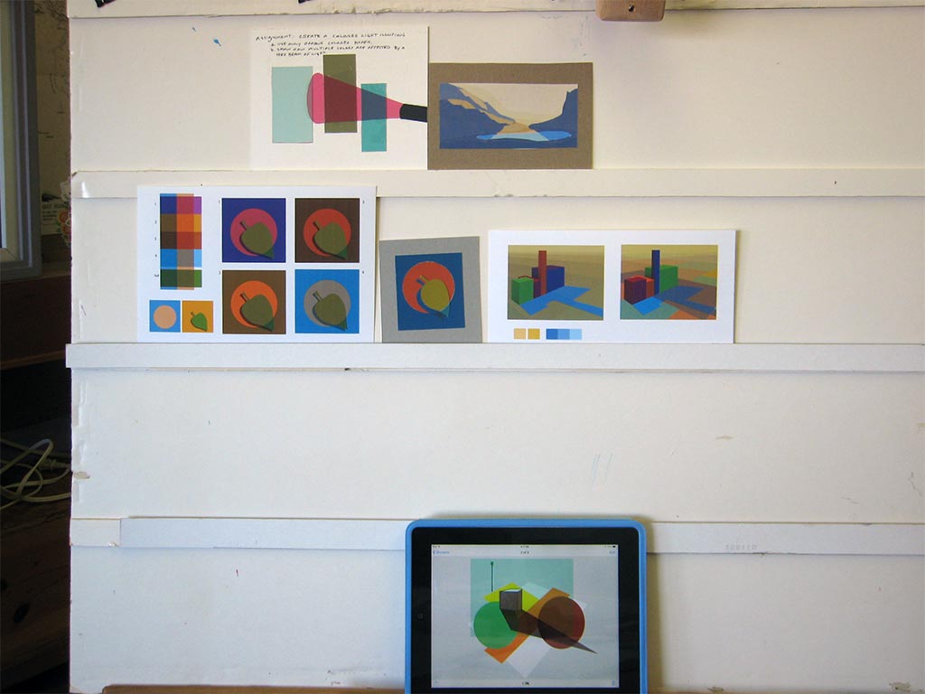
Jane,
The class may not be meeting, but all should see and share such breakthroughs in color such as this matrix and how far you have taken these two lessons. I truly believe you have reached a level in color. I will forward this to Karen and Holly to be sure others can see your achievement and encourage others to share alike.
Take a well deserved bow!!
Dick
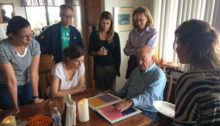
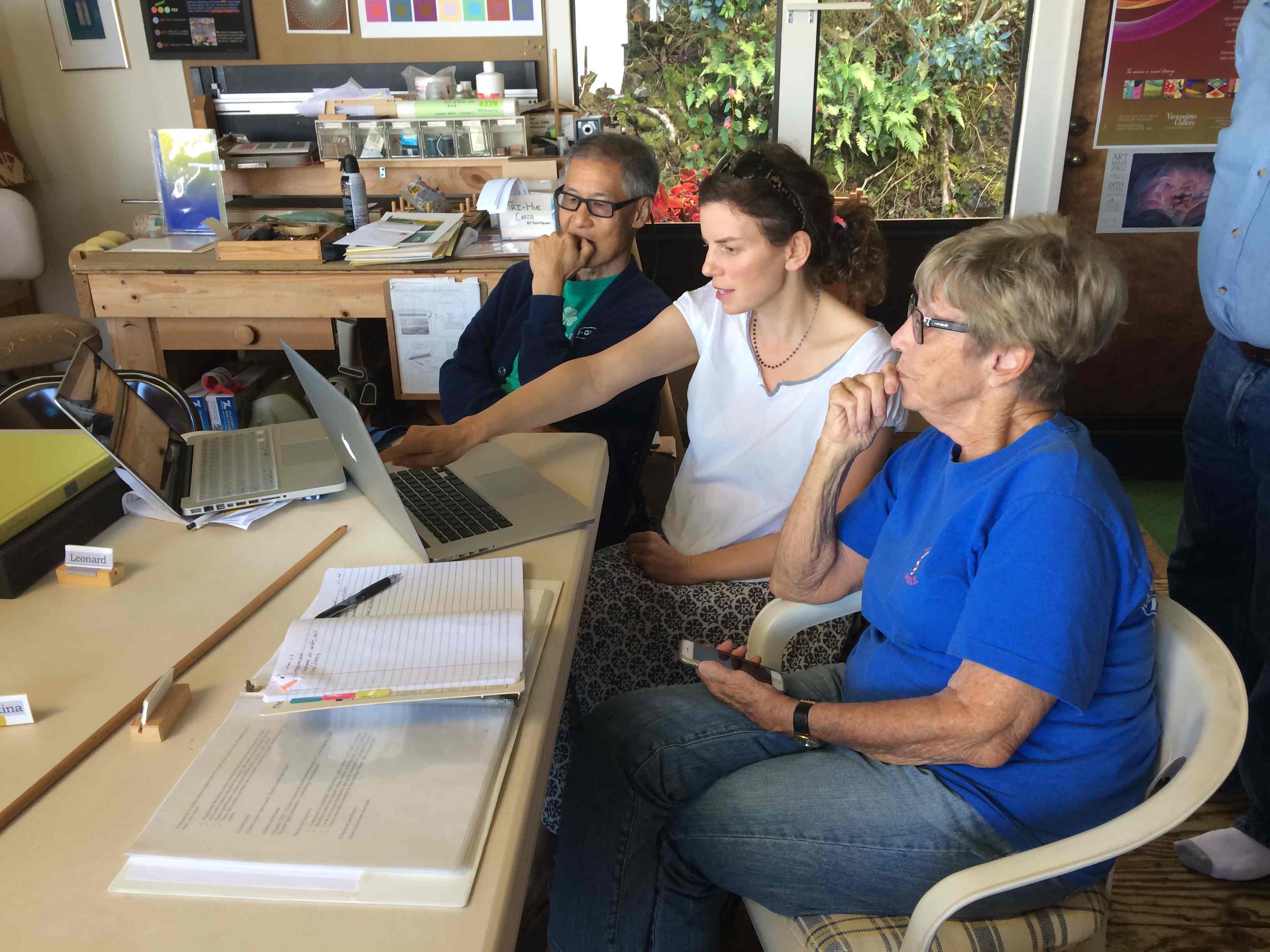
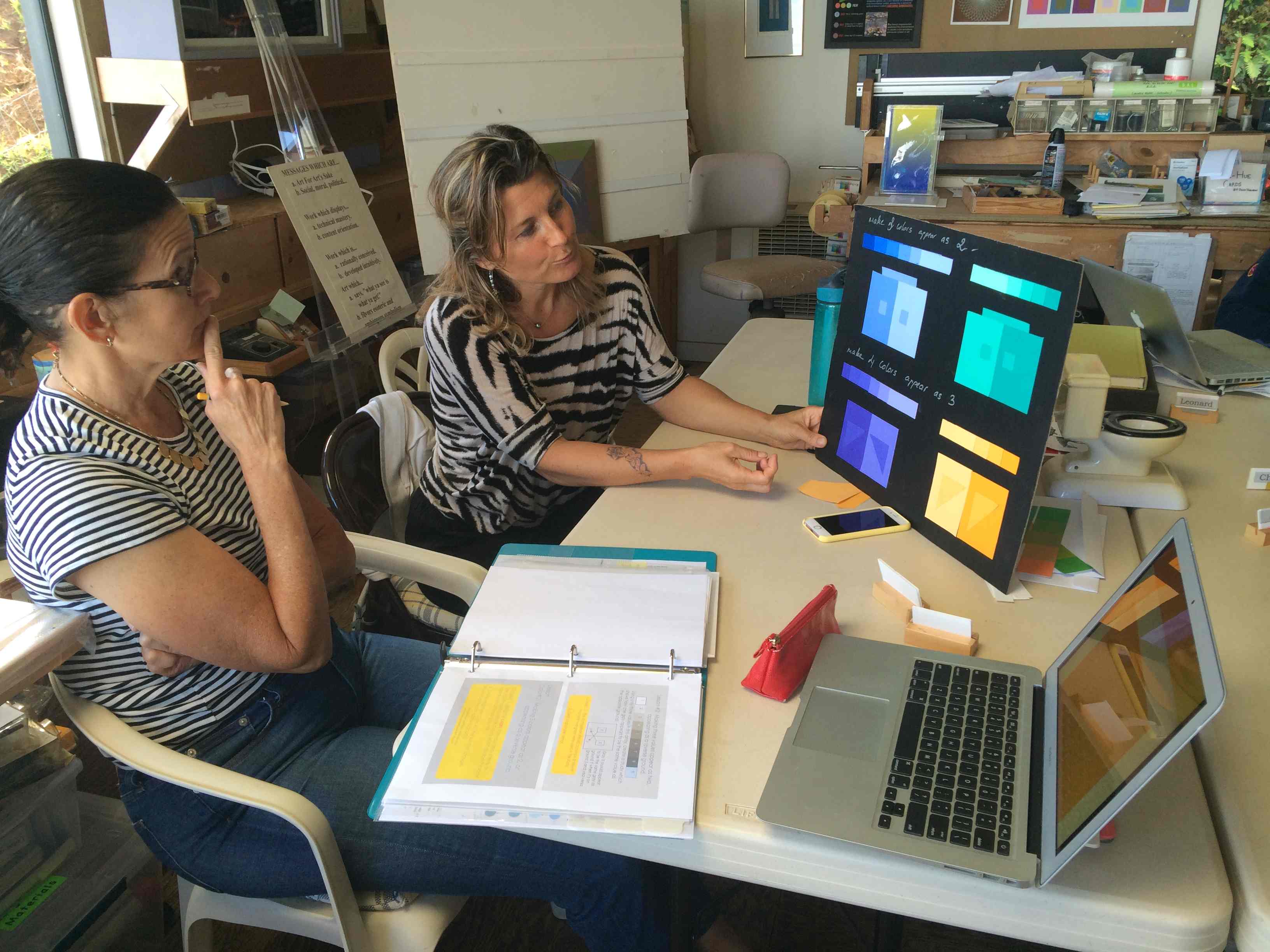
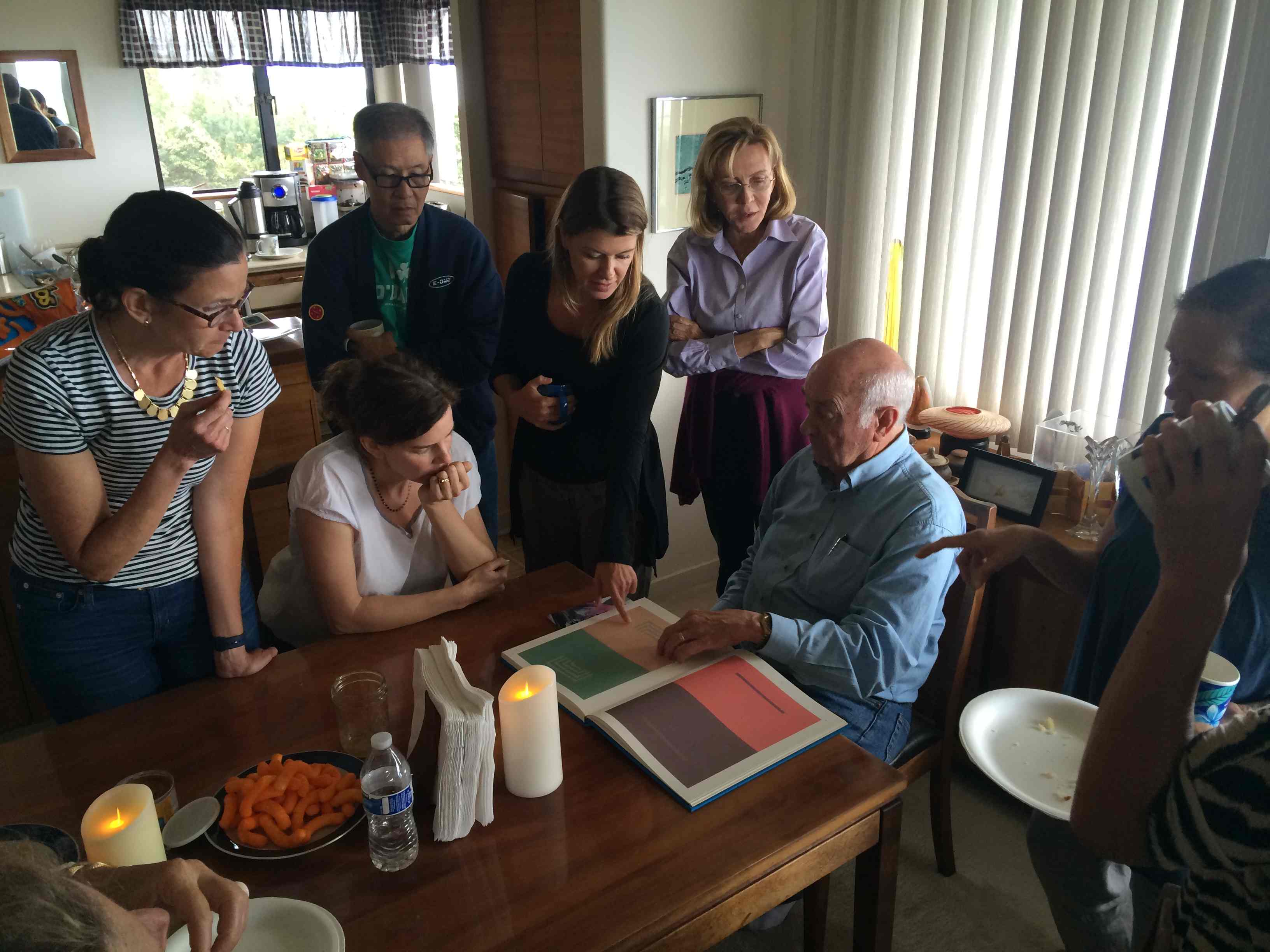
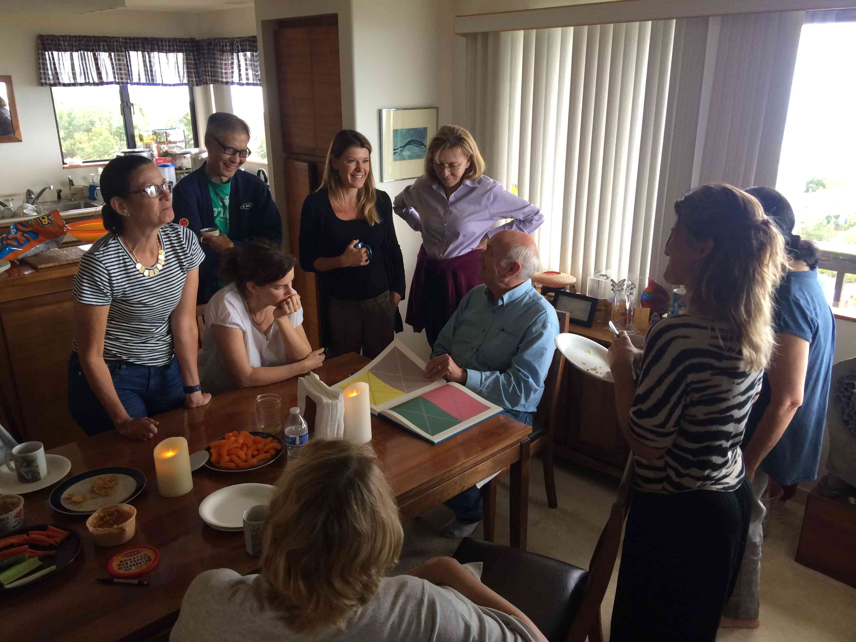
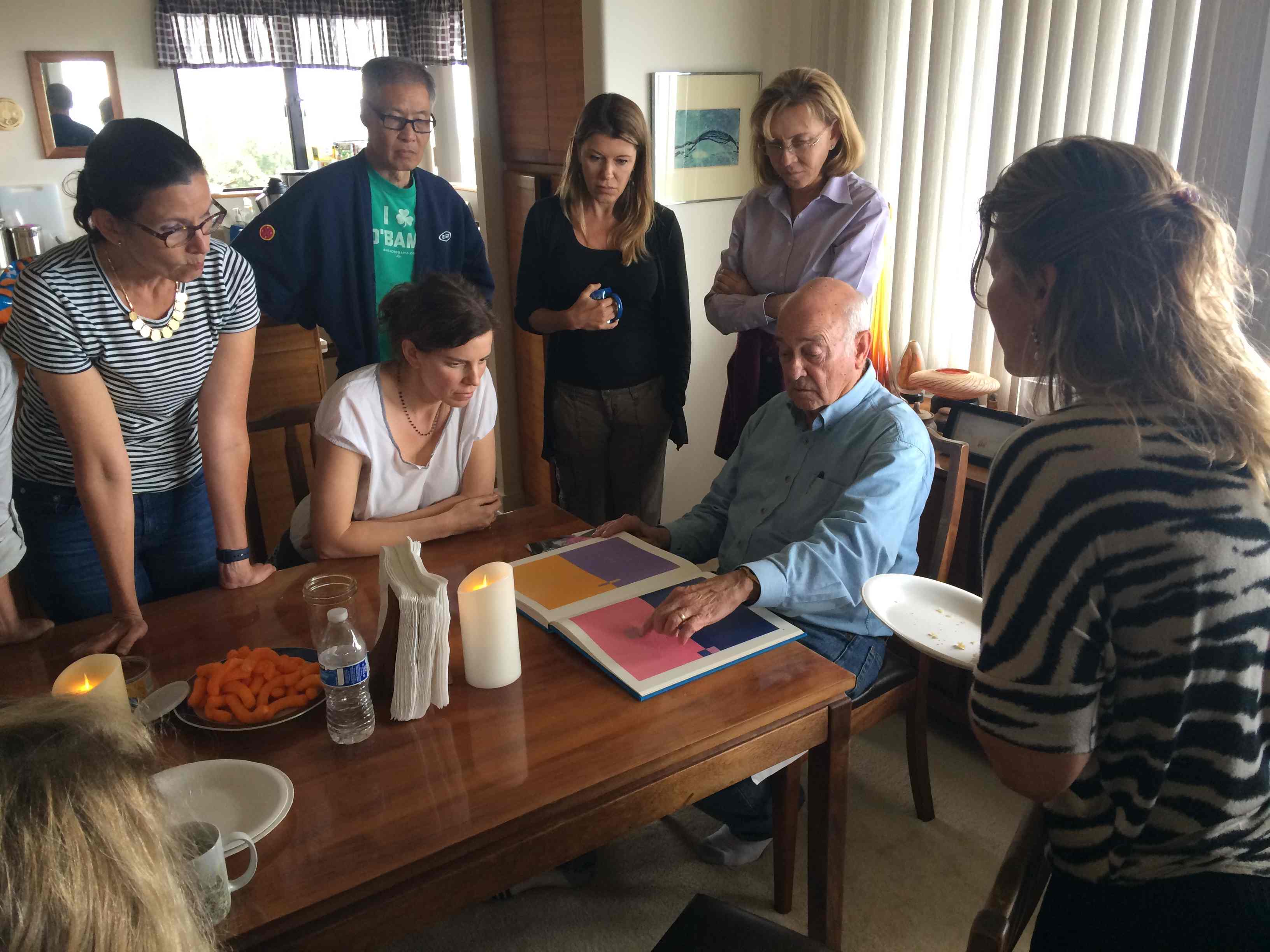
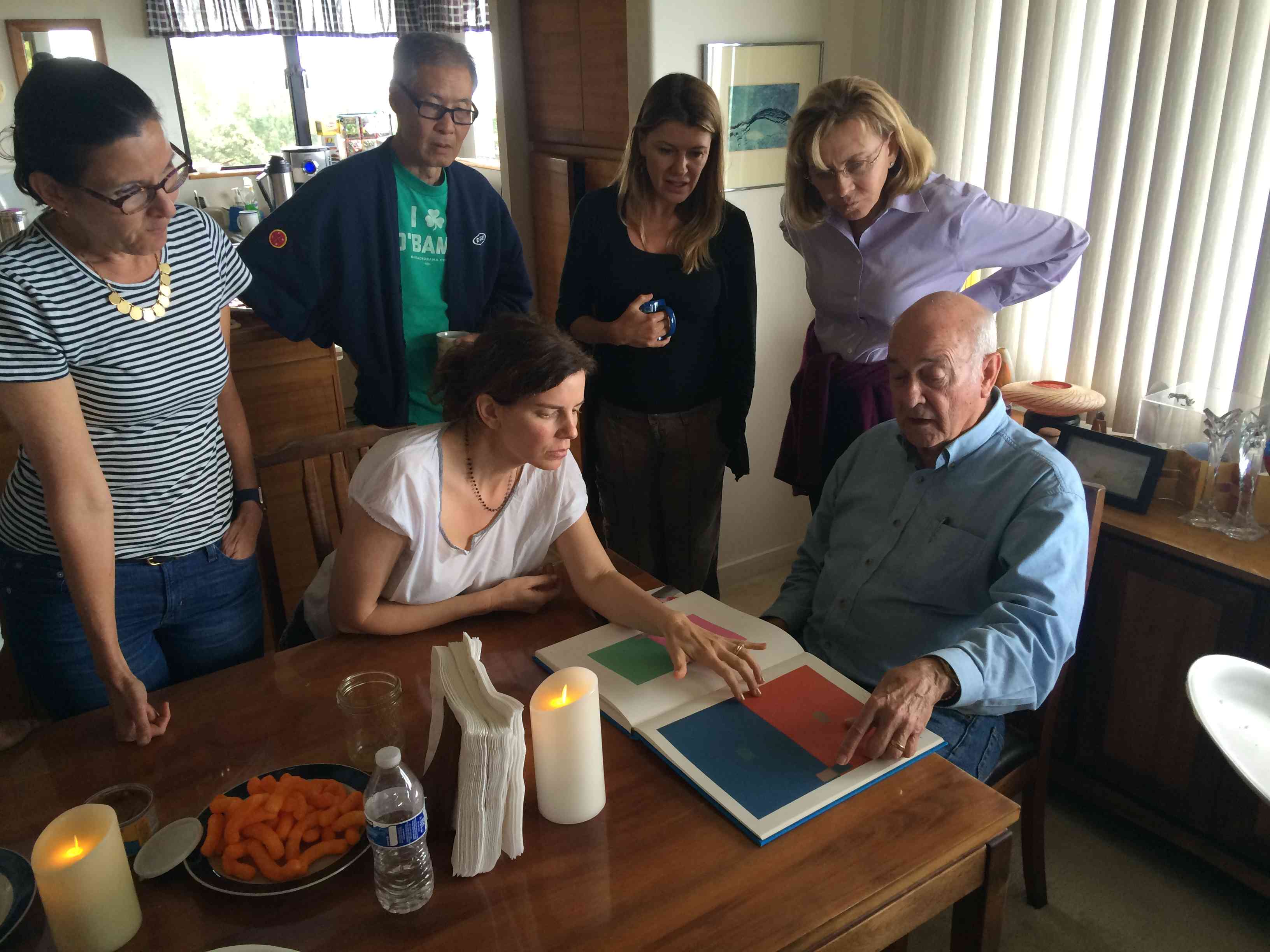
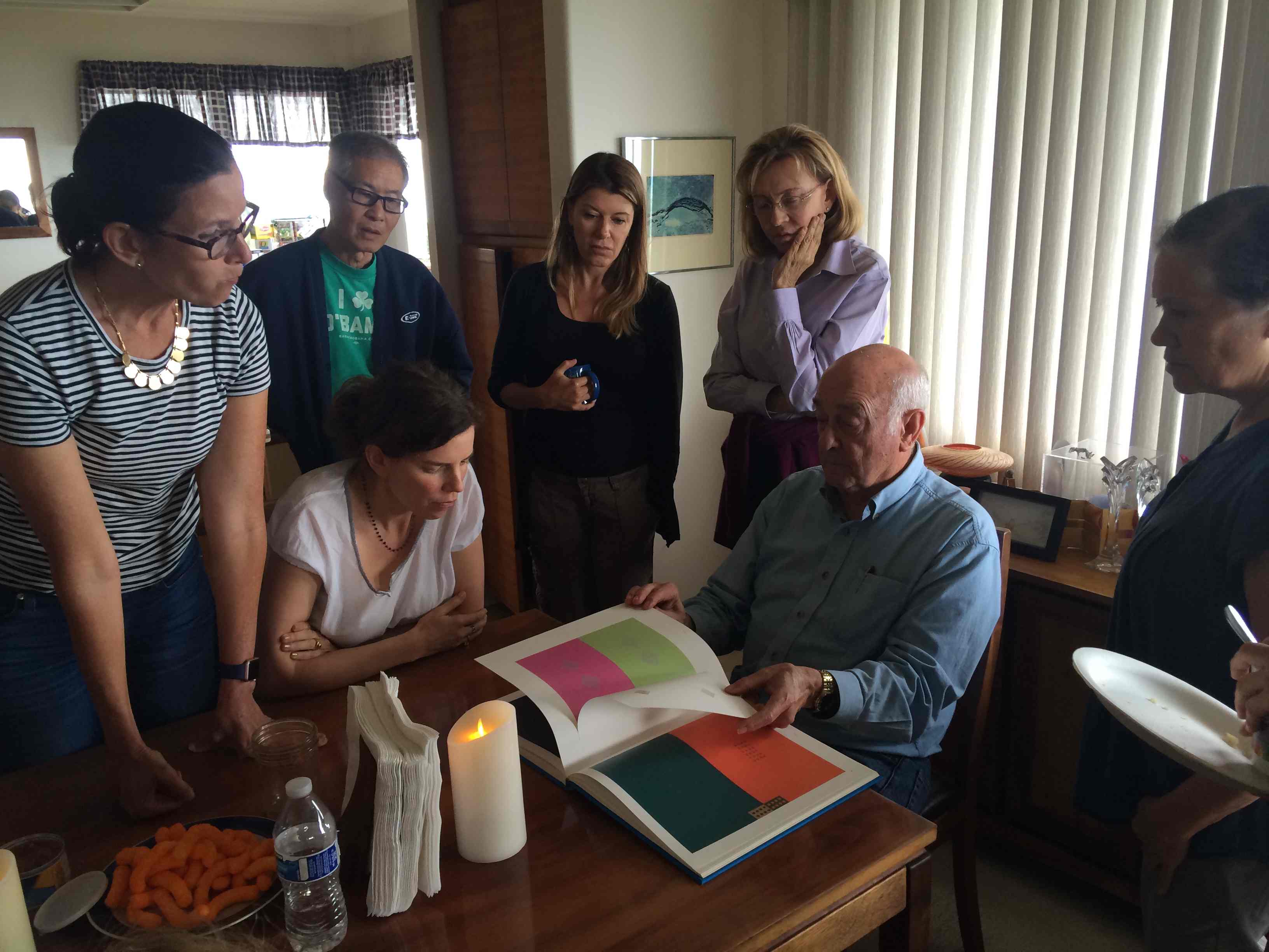
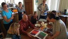
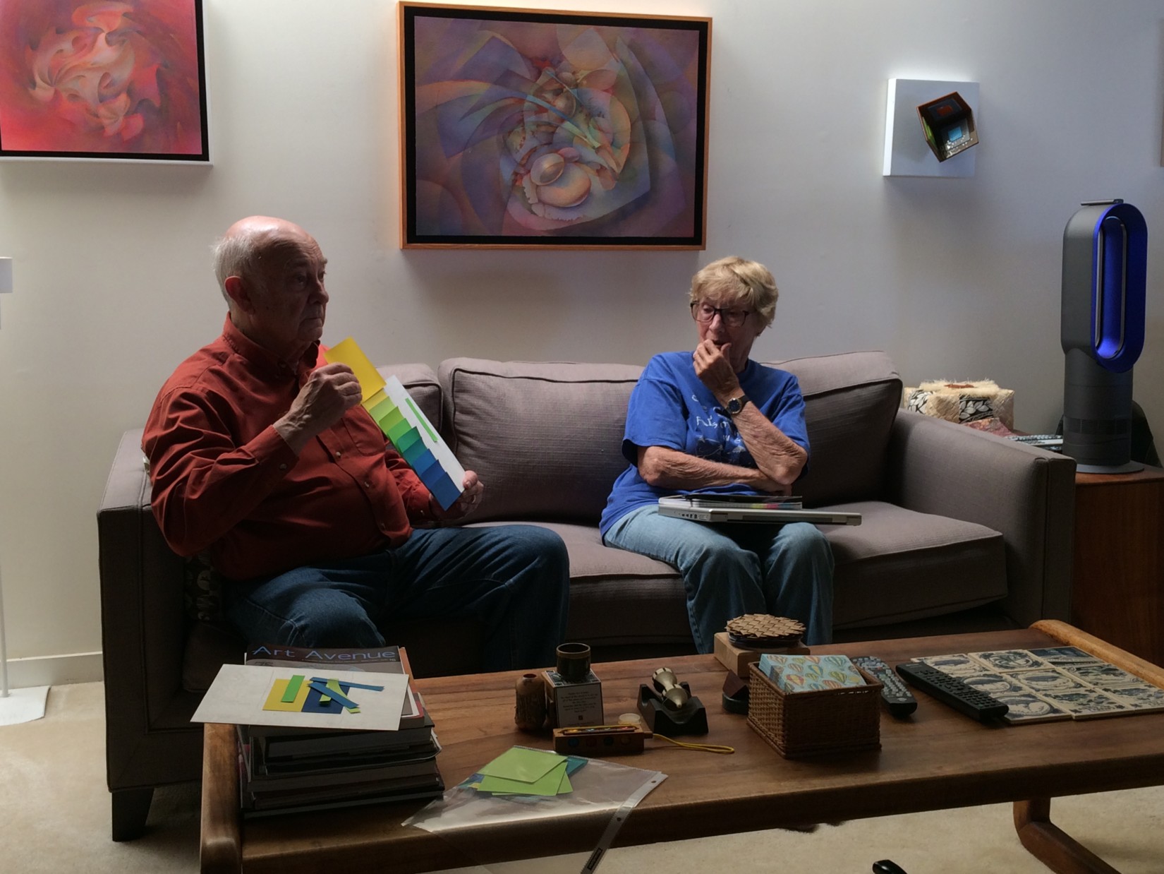
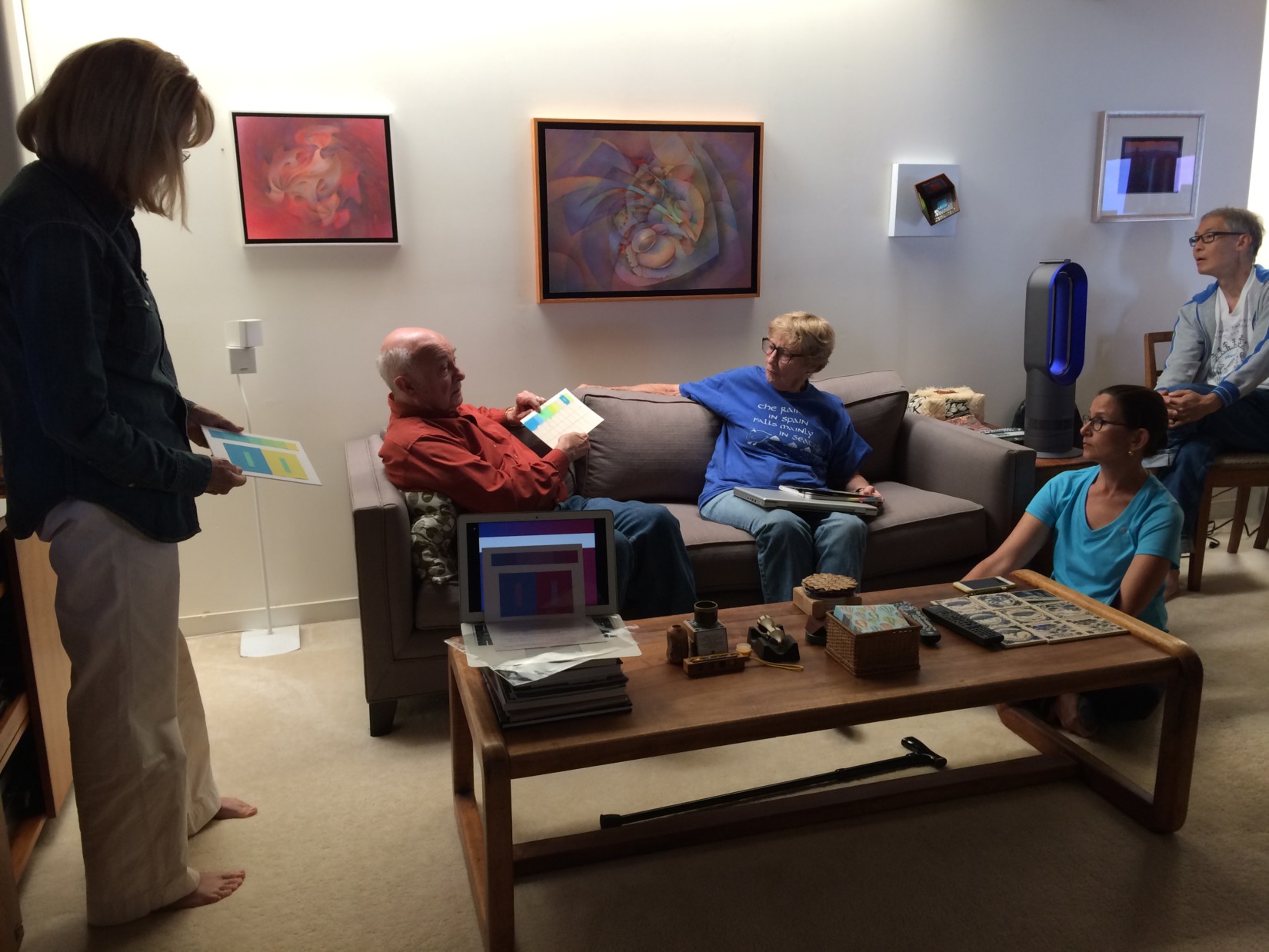
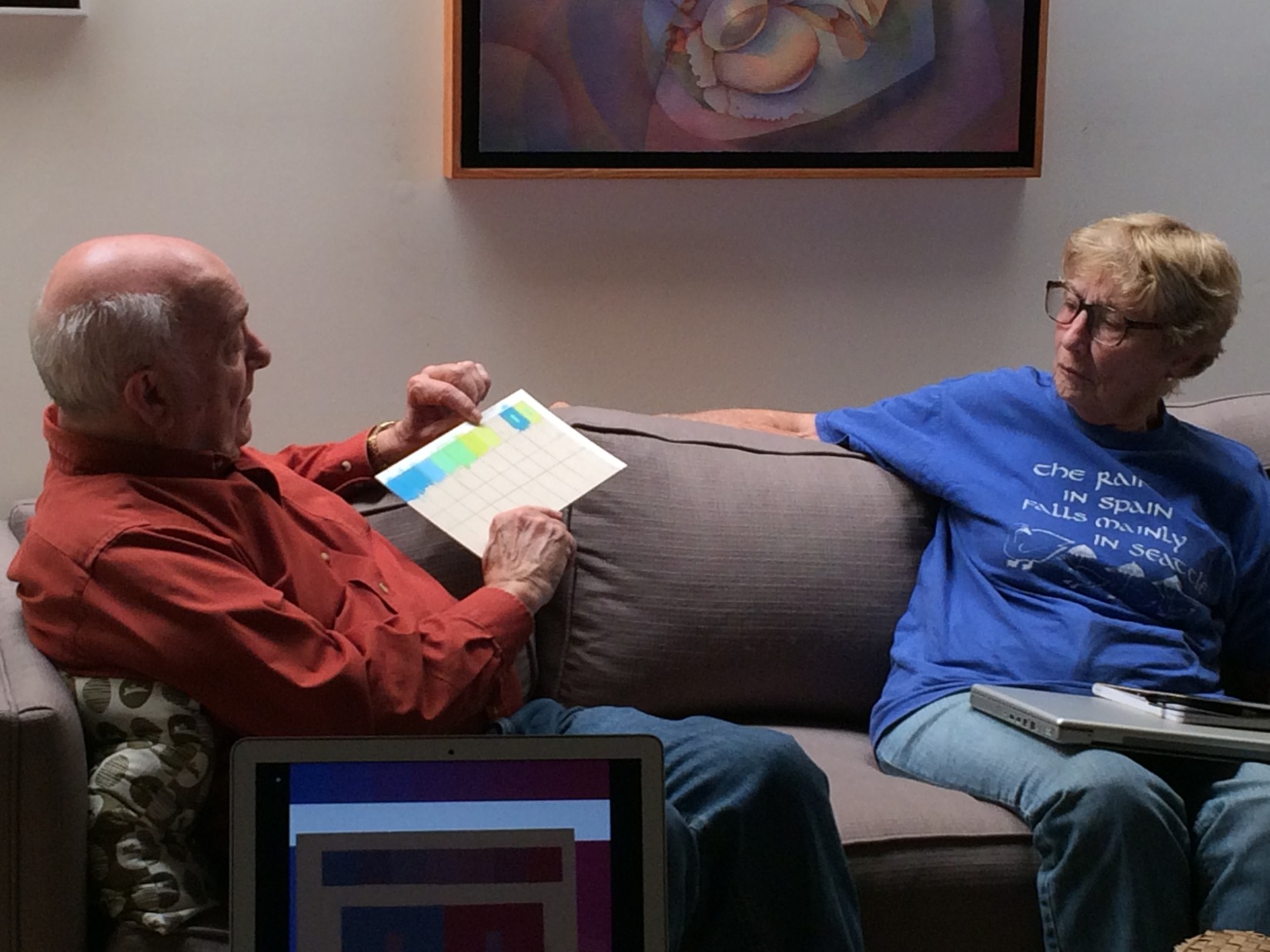
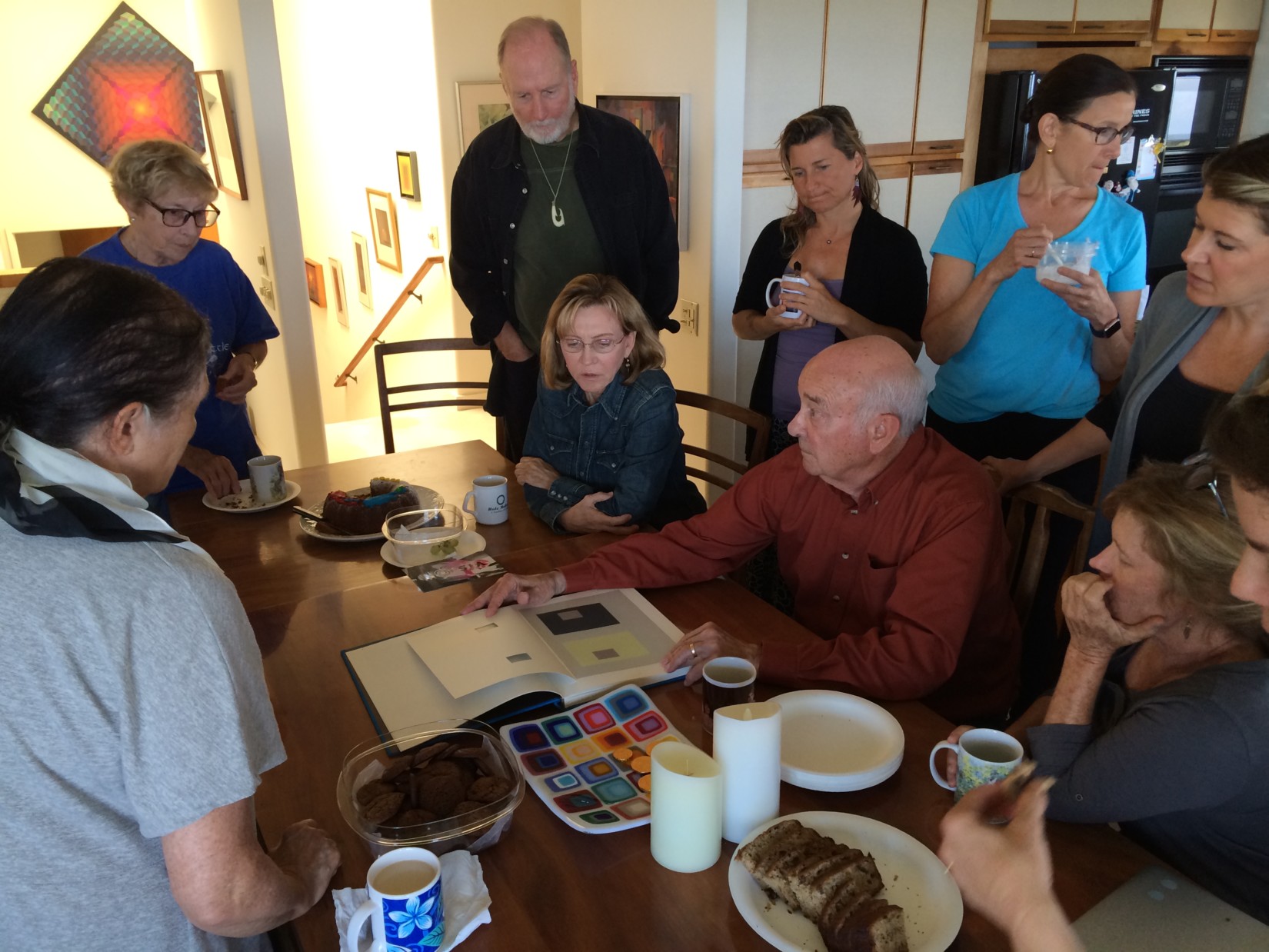
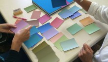
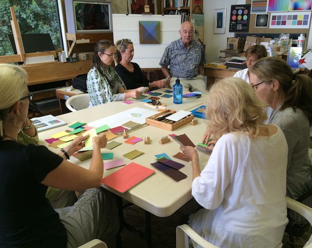
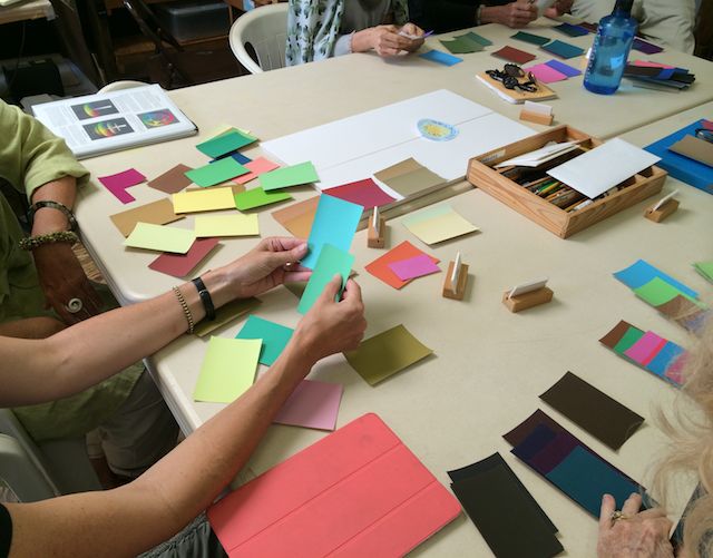
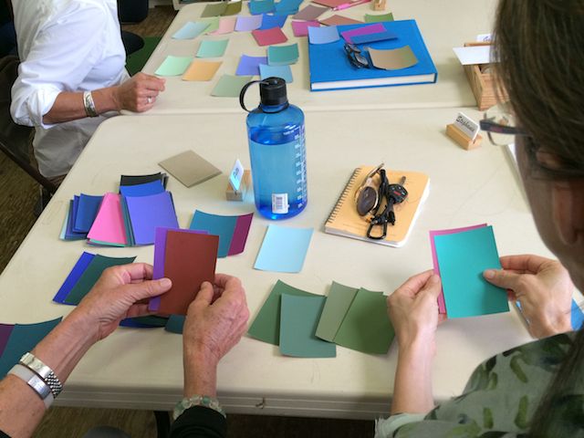
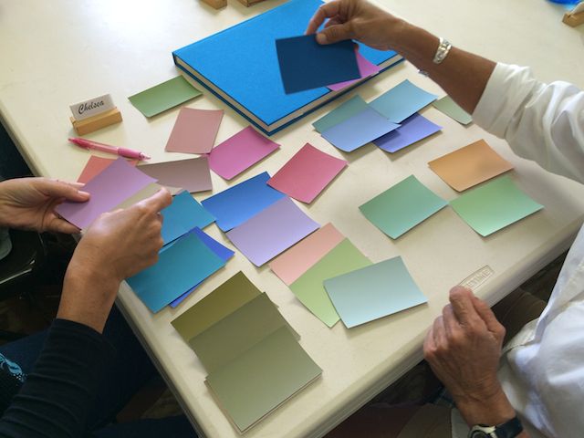
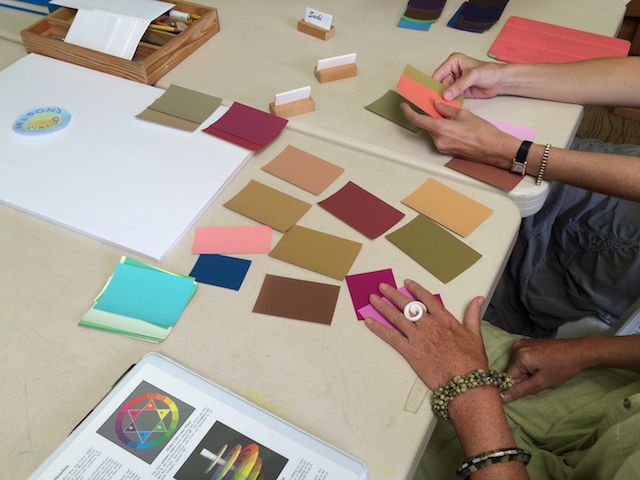
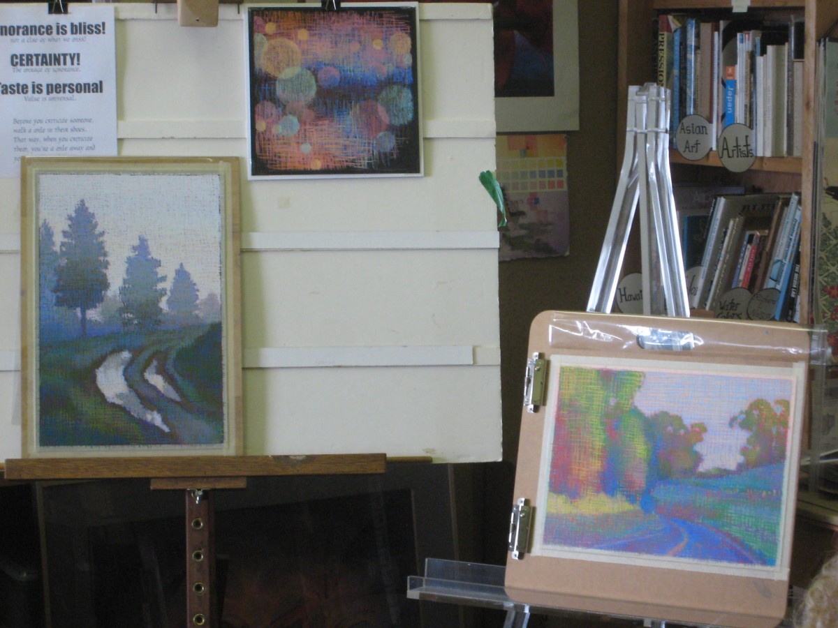
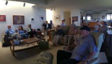
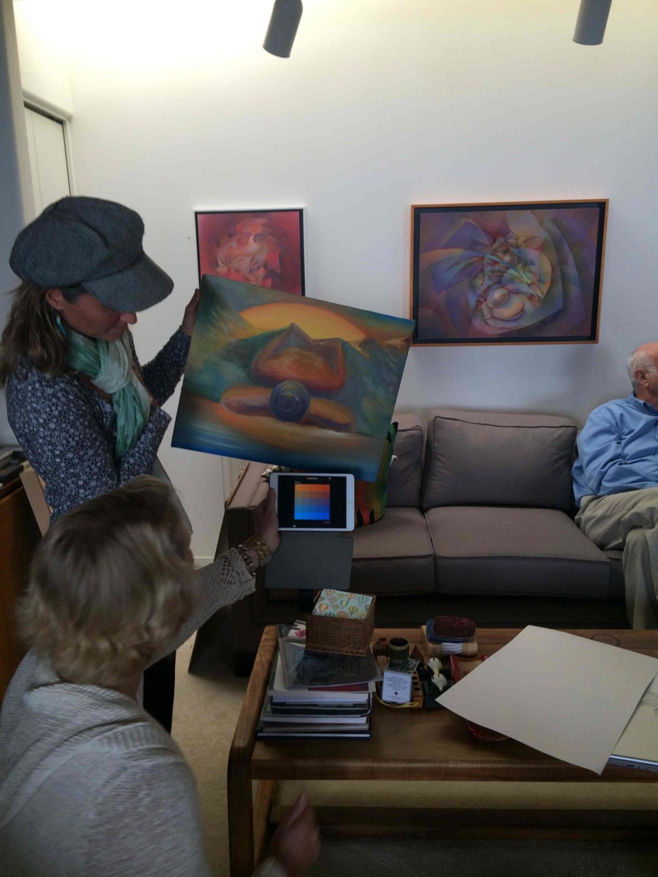
Class photos
Class materials
[gview file=”https://dicknelsoncolor.com/wp-content/uploads/2016/05/Color-Final-2016.pdf”]
[gview file=”https://dicknelsoncolor.com/wp-content/uploads/2016/05/VB-Matrix.pdf”]
This is an editable PDF – after downloading, you should be able to edit it in Adobe Illustrator to experiment with vanishing boundaries.
Videos
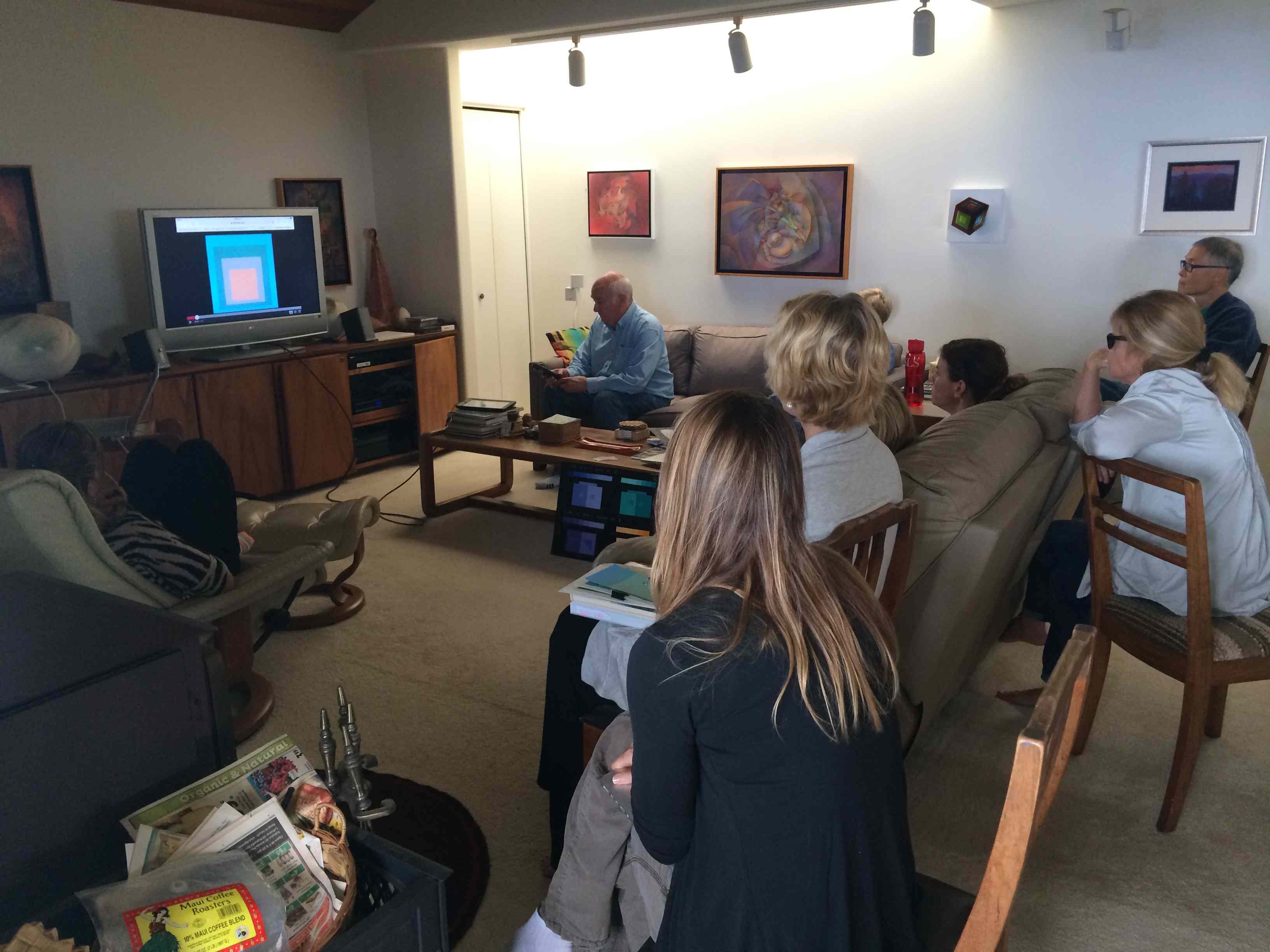
Dick shared a short clip of the well-known artist Chuck Close working on a painting (view his website here). What is intriguing about the clip is that it demonstrates the powerful effect that that viewing distance can have on a work of art. This is an important consideration for any type of visual artwork, and should be a consideration when working with color as well.
The clip that Dick shared with the class starts somewhere around the 12:30 mark of the video.
Same class, different year
View the corresponding class post from 2015.