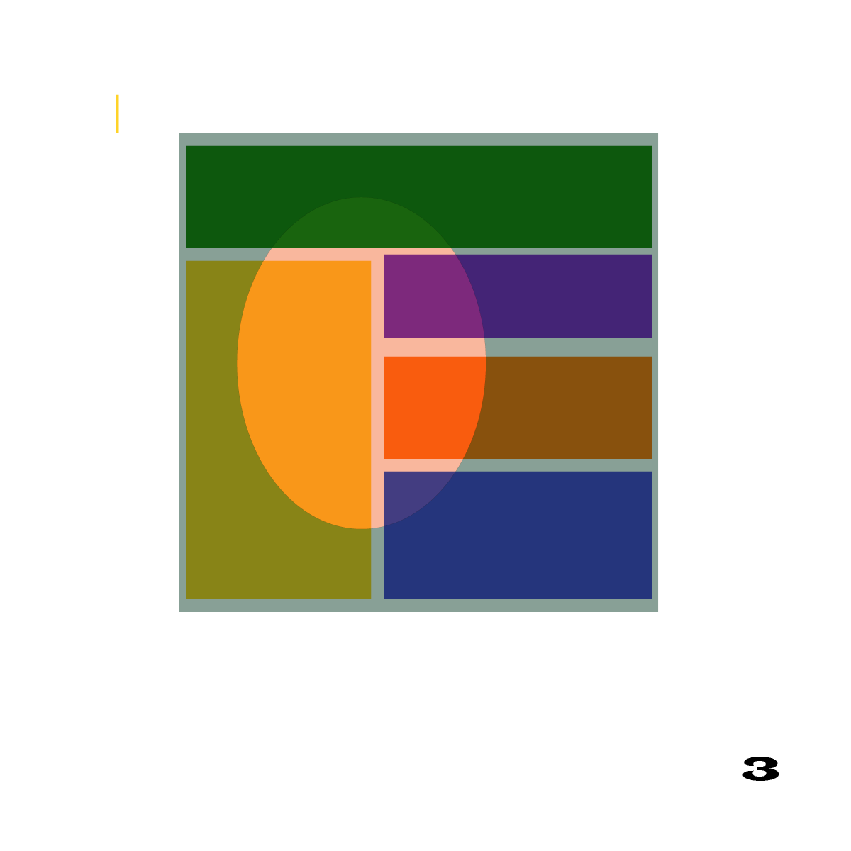
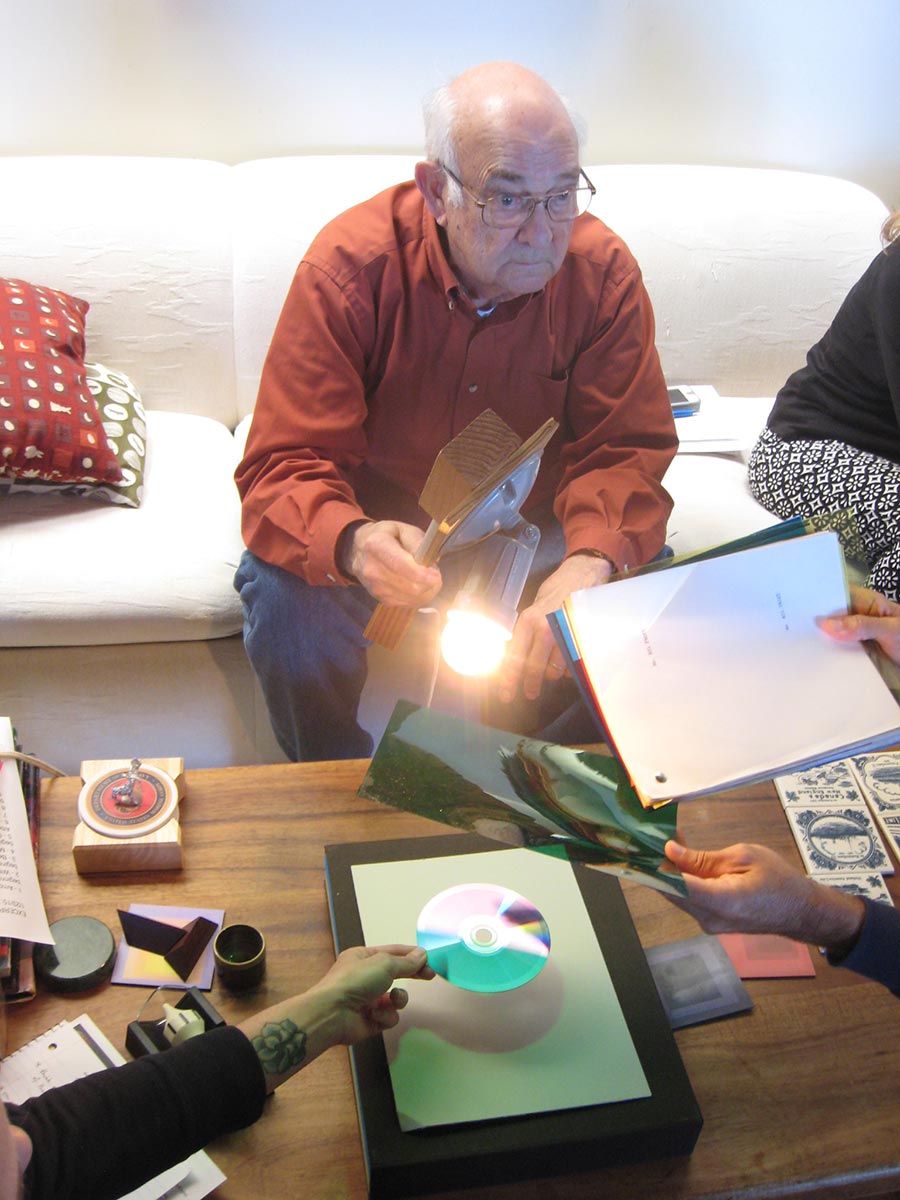
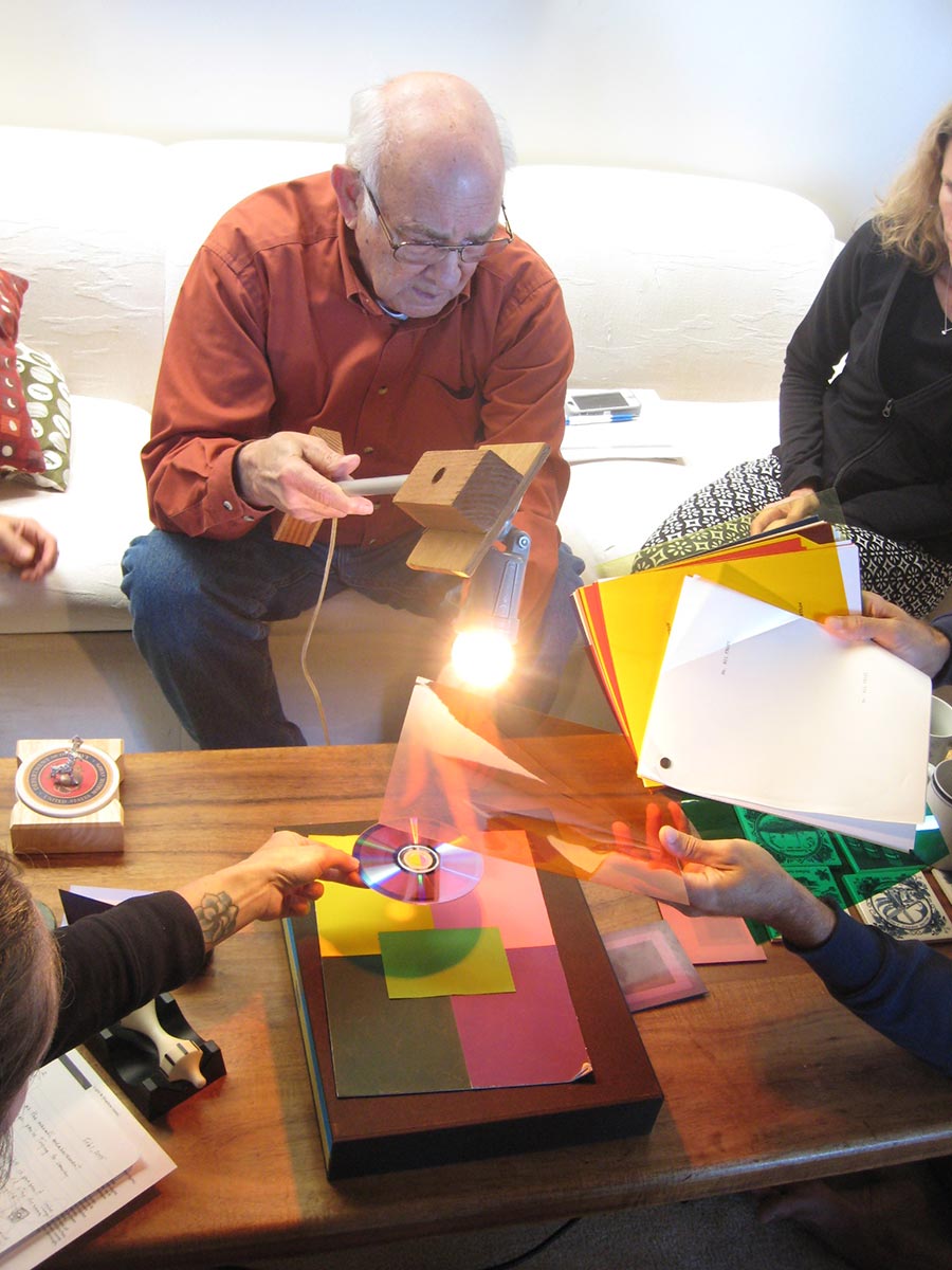
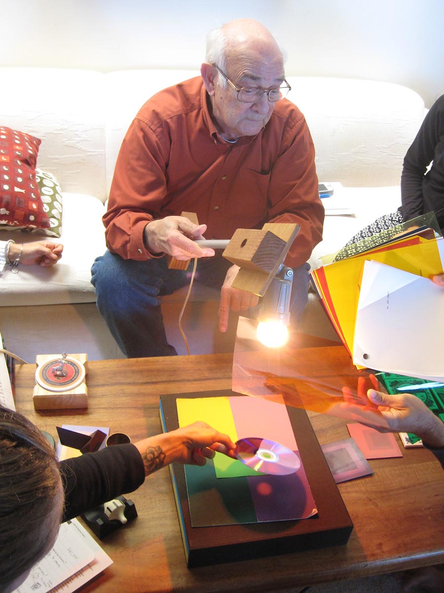
The seventh sessions of the Trihue Watercolor class for Winter 2018 were held on Wednesday, February 28 and Sunday, March 18. The colored light studies were critiqued. The new topic, surface, was introduced. Surface has to do with light being reflected or absorbed. Similar to the value scale of white to black, you can imagine a surface scale from very reflective to not at all reflective: mirror to black velvet. Still water at a distance will reflect the sky or other surroundings, acting like a mirror, while looking down into it at a steep angle, or where an object is between us and the light source, you can see through it like a window. The new painting assignment provides a chance to tackle this intriguing phenomenon.
The seventh sessions of the Trihue Watercolor class for Winter 2018 were held on Wednesday, February 28 and Sunday, March 18. The colored light studies were critiqued. The new topic, surface, was introduced. Surface has to do with light being reflected or absorbed. Similar to the value scale of white to black, you can imagine a surface scale from very reflective to not at all reflective: mirror to black velvet. Still water at a distance will reflect the sky or other surroundings, acting like a mirror, while looking down into it at a steep angle, or where an object is between us and the light source, you can see through it like a window. The new painting assignment provides a chance to tackle this intriguing phenomenon.
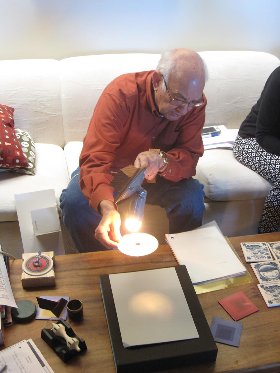
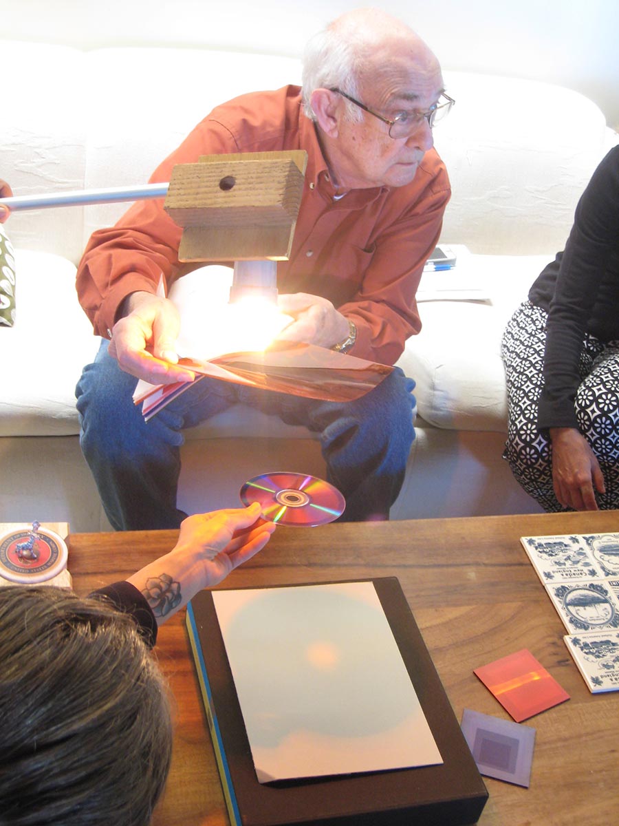
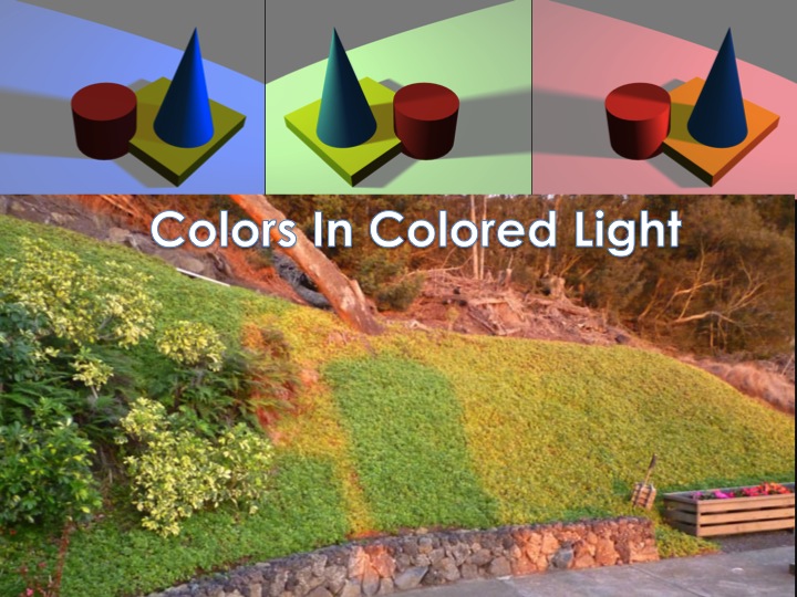
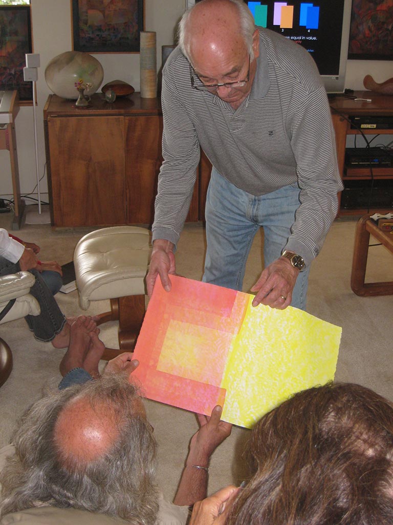
Dick showed this photo that Kathy had sent him with a clear example of colored light and shadows.
Notice the colors of the light and shadows
Videos – Class explanations and demos
Colors of light and shadow
Dick Nelson explains the relationship between the colors of a light source, its shadow, and the ambient light, and how to apply it to mixing colors for a watercolor. Cover the entire paper with a tint of the light color. Mix a shadow color containing black (because there is a lot of white light in any light), the complement of the light color, and the color of the ambient light. (2:30)
Painting strategy: Illusion of a gradated veil
Dick Nelson shows an illusion of a gradated veil, and describes the watercolor painting strategy for achieving it. (4:07)
Critique of transparency illusions in Albers book
Dick Nelson analyzes two transparency illusions from the Josef Albers book Interaction of Color, pointing out where the illusions fail to be completely convincing because they behave inconsistently with real life. (3:38)
Dick Nelson shows and describes strategies for conveying the illusion of water or another reflective surface, volume color (atmospheric perspective), and how to plot reflections. (6:14)
Wednesday class photos
Sunday class photos
Mahalo to Valérie Richter for Wednesday photos and videos, and to Holly Duane for Sunday photos.
The sixth sessions of the Trihue Watercolor class for Winter 2018 were held on Wednesday, February 21 and Sunday, March 11. The white light homework was critiqued. The new topic for this week is colored light. Dick gave a demo of colored light shining on white paper and on an arrangement of different colors and values. Colored light and shadow work to unify a scene, because all colors are affected equally. Shadow colors are the complement of the light color, plus black (because all light contains a lot of white light) and any ambient light (outside, the blue of the sky). Sunset provides an opportunity to observe this phenomenon, with amber light and rich blue-green shadows. For more detail, be sure to read the post linked to in the “Other resources” section.
The sixth sessions of the Trihue Watercolor class for Winter 2018 were held on Wednesday, February 21 and Sunday, March 11. The white light homework was critiqued. The new topic for this week is colored light. Dick gave a demo of colored light shining on white paper and on an arrangement of different colors and values. Colored light and shadow work to unify a scene, because all colors are affected equally. Shadow colors are the complement of the light color, plus black (because all light contains a lot of white light) and any ambient light (outside, the blue of the sky). Sunset provides an opportunity to observe this phenomenon, with amber light and rich blue-green shadows. For more detail, be sure to read the post linked to in the “Other resources” section.
The handout below is displaying strangely, but should display correctly after downloading.
[gview file=”https://dicknelsoncolor.com/wp-content/uploads/2018/02/PaintLightPiecesAA.pdf”]
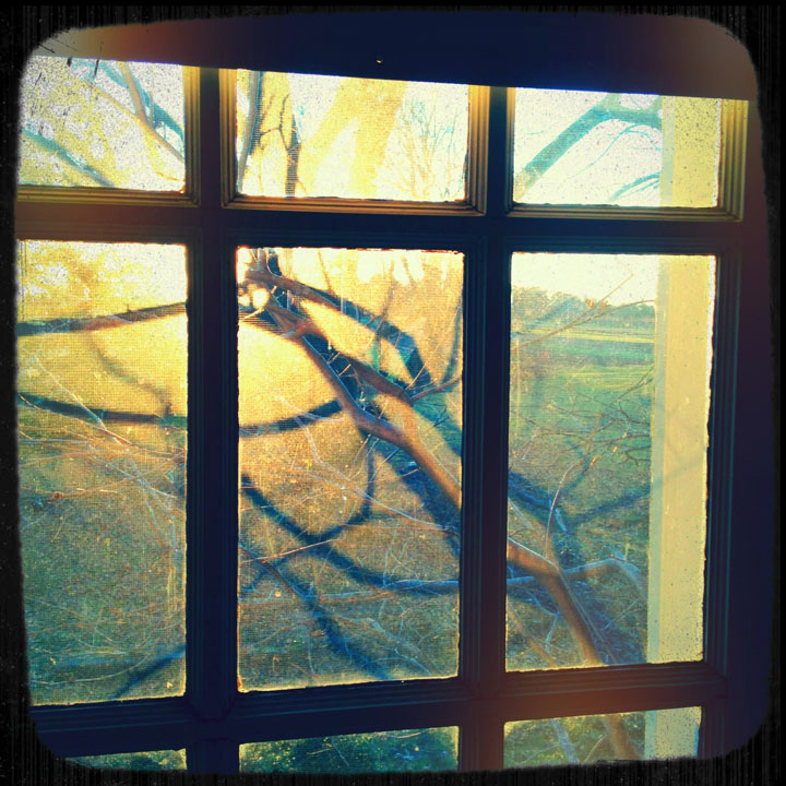
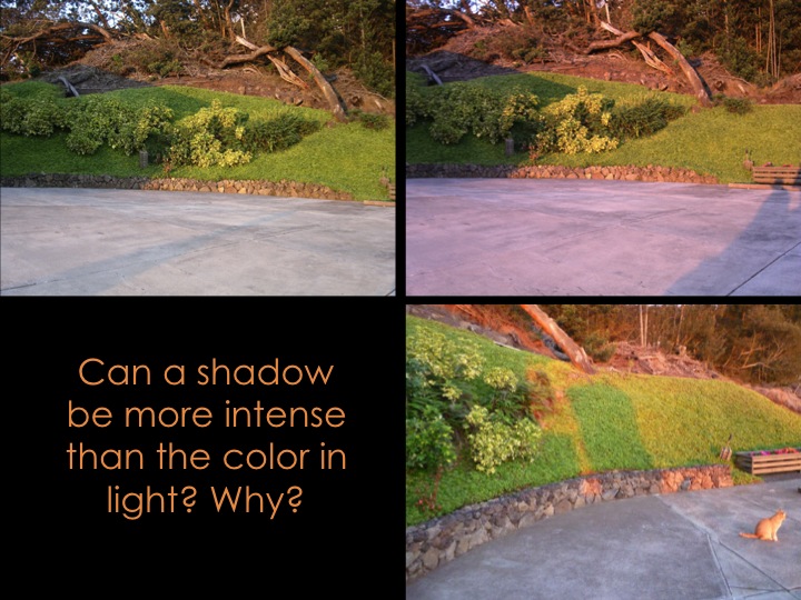
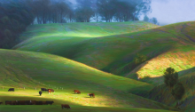
Notice the colors at sunset, in the light and in the shade
Upcountry at sunset. Photo by Kit Gentry
Colored light and shadow demo photos
It’s good to understand the rules for how light behaves, but it’s even more important to observe them for oneself. Dick gave a demo of light and shade, and colored light and shade, on white paper and on a varied set of colors.
Wednesday class
Sunday class
Videos
Critique: Illusion of white light
What is good Gestalt?
An image with “good Gestalt” communicates your intended message without ambiguity. It is often characterized by a casual arrangement which avoids formal symmetry and unintended coincidence or overlap of points or edges. (2:18)
A cast shadow is a film
Every brushstroke of transparent watercolor is laying down a film, making it easier for a watercolorist to convey consistent shadows than it is for an artist using an opaque medium. (0:38)
Assessing shadow value contrasts
Dick Nelson critiques white light and shadow watercolor homework. Look for value relationships between colors in light to be maintained in the shade: “This is to this, as this is to this.” To keep the shadow saturation consistent, mix up plenty of your shadow color, and be sure to wet the entire contiguous shadow area and paint the shadow color in quickly while it is still wet (but not puddly). Remember: a shadow is a film, and unifies, because it treats all colors under it equally. (7:26)
Shadows in a perspective drawing
Dick Nelson examines shadow values in a 3D perspective watercolor study. (2:03)
White and colored light demos
Paper – white or gray?
Looking closely at light and shade and our own perceptions. (0:48)
How different values are affected by light and shade
Noticing the value contrast of a shadow cast across two colors of very different value. (0:50)
Colored light and its complementary shadow color on white
Dick Nelson demonstrates the appearance of lit and shaded areas of white paper under different colors of light: red, pink, green, and blue. (1:59)
How colored light and shade affect different colors
Dick Nelson demonstrates how different colors are enhanced or dulled by colored light and its complementary-colored shadow. Pink light, blue light, and amber/sunset color light are shown. (3:45)
Homework critique – Illusion of white light
Wednesday class
Sunday class
Other resources
Colored light sessions held during past Color Relationships classes are documented on this website, which provide additional commentary and photos for the serious student. Susan recommends this 2016 Color Relationships post dealing with colored light, and it contains links to earlier sessions.
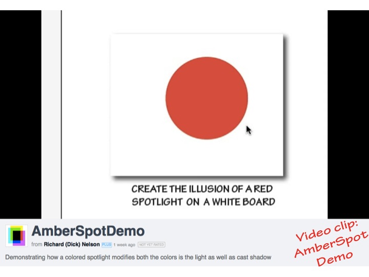
A demo on creating the illusion of a red spotlight, and of an amber light on a flat arrangement of colors.
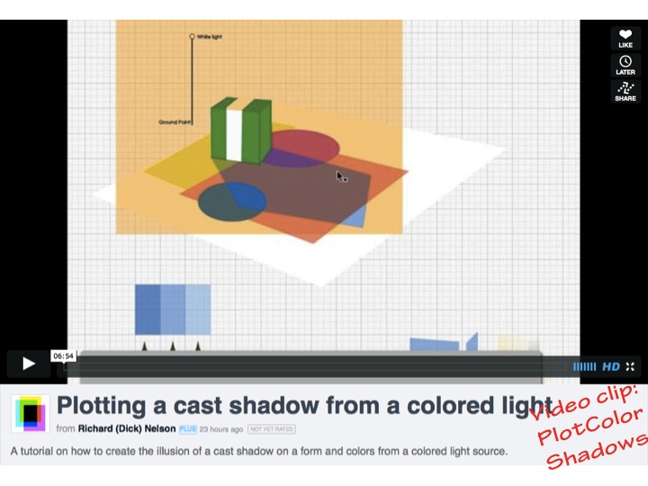
A tutorial on how to create the illusion of a cast shadow from a colored light source on a form and colors.
Mahalo to Valérie Richter for Wednesday photos and videos, and to Holly Duane for Sunday photos.
The seventh session of the Color Relationships 2 class for Fall 2016 was held on Wednesday, October 12. We critiqued the homework (Translucency), and introduced the last homework assignment, Freedom! Dick discussed the importance of going from dependence to independence, and the 6 phases of creative problem solving that will help you on your journey as a mature artist. See the post for a full recap.
The seventh session of the Color Relationships 2 class for Fall 2016 was held on Wednesday, October 12. We critiqued the homework (Translucency), and introduced the last homework assignment, Freedom! Dick discussed the importance of going from dependence to independence, and the 6 phases of creative problem solving that will help you on your journey as a mature artist.
Homework assignment
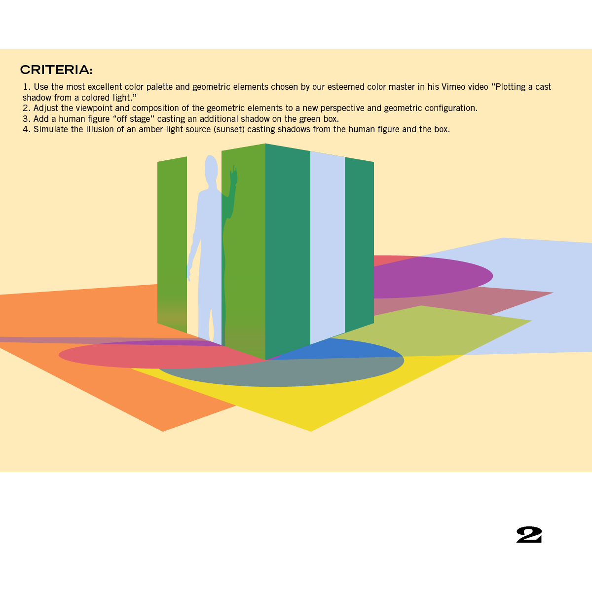
The homework assignment is Freedom!, which means that the criteria for this one are up to YOU!
Incorporate one or more visual phenomena into a composition of your own design. Submit as many individual compositions as you choose, providing your criteria for each. Refer to the Fence Posts graphic, below.
The visual phenomena covered in this course are provided in the Fence Posts graphic, and include
Films
Veils
Volume color
White light
Colored light
Translucency
Halation
Vanishing boundaries
Write down the criteria you decided on, to guide your development and evaluation phases. What boundaries did you set, in terms of
There were many different takes on this challenging assignment. Most of the homework shared the same problem: an inconsistency between the bright spots and the shadow areas. The relationship between the light and shadow should stay consistent throughout the piece, so if one area shows evidence of a dim light source, then the shadows should be muted as well. Said another way: if you have deep, dark shadows, then the highlights should be very bright in response. You simply cannot have a vivid light with wimpy shadows, or strongly pronounced shadows with soft lighting – it doesn’t make visual sense.
Dick also mentioned noticing where the highlights are placed on objects. The placement of highlights tells the viewer both the shape of the object and the direction of the light source. Even if your colors and values are correct for the type and amount of lighting, the wrong distribution of highlights will confuse the viewer.
Strong chroma in the area through which light is transmitted is one of the most striking aspects of the phenomenon of translucency. Other areas appear duller, more neutral, setting off the translucent area’s saturation by contrast.
Patt also took a photo of her still life, which appears to be a lemon, but is actually a lime with an amber light behind it. The very bright rectangular shape in one of the segments is due to a missing seed
Susan choose to do her homework in pastels
Dick closed the discussion of translucency by showing a work by former student Jean Hardie, and telling about a building which is one of his favorite pieces of architecture because of its translucent walls. He used the words sophisticated and delicate to describe Jean’s piece, an intriguing image which uses reverse gradation to great effect. The marble walls of Yale’s Beinecke Rare Book Library allow filtered light to pass through, bathing the interior in a pale yellowish light, and causing it to glow when the exterior is viewed at night.
Jean Hardie’s reverse gradation painting
Interior of Beinecke Library at Yale. The pale yellow interior color comes from daylight transmitted through the marble walls. The bluish light at left is coming through windows on the first floor and up a stairwell.
Recreate a Masterpiece discussion
Dick asked Susan what she had acquired from doing this assignment. She said she really got to know the painting, and noticed a lot of details she hadn’t seen before, when she saw it in a museum. Someone suggested that the Friends of the Library is a good source for magazines for collage, and Dick’s tip was to turn the magazine upside down when you’re using it, so you don’t get distracted and read the articles!
For the Recreate a Masterpiece assignment, Susan chose a work by Vincent van Gogh
Susan’s collage version
Demo – correcting a colored light homework assignment
Dick thought it would be helpful to review colored light by showing how to complete one of the homework assignments submitted last week.
Final assignment, creative problem solving, and boundaries
The final assignment for this class is Freedom! Dick has mentioned several times that his main goal as a teacher is to take his students from dependence to independence, and there are several factors involved in getting there.
An important aspect of independent thought is recognizing the 6 phases of creative problem solving. These are: 1) Point of entry, 2) Expansion, 3) Convergence, 4) Development, 5) Evaluation, and 6) Exploitation. Observing these 6 stages is extremely helpful for any artist involved in their process, and two of the most essential phases for growth are Evaluation and Exploitation. Once you have completed a project, take some time to critique your work and view it objectively, recognizing what works and what does not. When you know what was successful in your piece, exploit what you learned by going back to either re-work or redo the artwork. In this way, your artistic vocabulary will continue to expand.
Another factor in reaching independence is the acknowledgment of boundaries. At the start of this course, Dick was in charge of setting up the boundaries (the criteria) for the assignments. Over the weeks he has gradually been removing some of his requirements, and now it is up to the students to create their own boundaries. Dick likens it to raising a child: taking a baby from total dependency on their parents, to being a young adult who has learned to make their own decisions, and also to accept the consequences of those decisions. Part of this week’s assignment is to be aware of the boundaries inherent in any piece of work, including those set by the technical elements (subject matter, materials, forming process, etc.). These decisions are what become our “fence posts”, that which defines and dictates our goal.
We also had the good fortune to have a guest visitor in class, Kari McCarthy, who has taken many of Dick’s courses in the past. She happened to be part of a group who decided to create their own assignments during the class, and every week it was one student’s role to assign the homework. She shared with us her assignment, NaturalLight, which had the criteria: “Create a composition (using the medium of your choice) of a still life or landscape as seen at different times of day.” While the technical boundaries were still left up the individuals to decide, Kari clearly defined the goals of the assignment in her description and rationale. This type of exercise, learning how to create your own assignments and identify artistic goals, will be an invaluable asset in your growth as an artist.
Kari shared her assignment from a previous class where the students had to come up with the homework assignments for each other. This was Kari’s assignment for her fellow classmates
Kari’s answer to her own assignment, using Color-Aid paper to find the right mixture of colors in her photographs
Videos
As a visual recap, Dick showed the movie from his Dimensions of Color lessons DVD. Many of the segments can be found on his Vimeo page.
The sixth session of the Color Relationships 2 class for Fall 2016 was held on Wednesday, October 5. We critiqued the homework (Colored light and shadow) and viewed more examples of how a colored light will modify other hues. Dick introduced a new assignment for this course, Translucency, using a demo and slide show presentation to discuss this challenging and beautiful visual effect. View the full post for photos, class materials, and videos.
The sixth session of the Color Relationships 2 class for Fall 2016 was held on Wednesday, October 5. We critiqued the homework (Colored light and shadow) and viewed more examples of how a colored light will modify other hues. Dick introduced a new assignment for this course, Translucency, using a demo and slide show presentation to discuss this challenging and beautiful visual effect.
Homework assignment
Class recap – some key ideas
Critique – Illusion of colored light
The homework submitted showed a strong understanding of this difficult phenomenon. Colored light can have a dramatic effect on the colors it touches, as can the accompanying shadows. The key to a convincing illusion is to strive for consistency between the highlights and shadows, so that the effect of ‘color constancy’ remains stable.
Most of comments that came up during critique pertained to the strength or brilliance of the light (and thus, the darkness of the shadows). One student remarked that she was having a difficult time determining how strong her light source was in relation to her shadow areas, and also how bright the ambient light should be. Dick answered, “How bright the light, how bright the ambient light – all arbitrary.” More important is to check the consistency of value between the highlight and shadow areas: lighter value colors should stay lighter, whether in the light or in the shadow.
Another comment had to do with how intense the colored light source should be. Of course, it all has to do with what is appropriate to the scene and the artist’s intentions, but Dick had to ask, “At what point is the light so bright that you lose all chroma, all hue [of your objects]?” In most cases, the scene will read better if the light does not overpower all the chroma in a scene, and the viewer is able to see the relationship of the ‘local color’ as it is modified by both the light and shade.
One problem with a few studies was that the illusion fell apart, because of a white ground, or object left white. Every object in a scene will be influenced by the light source. White is lighter than any color, but in a real scene, nothing can be brighter – lighter – than the light source. So, for example, if your light source is amber, or red, the surroundings and every object must show that they are influenced by it, and the value of everything in the scene must be as dark as, or darker than, that light source (sun, candle, reflection). This trips up a lot of people, since we are used to ignoring, and barely noticing, the light-valued “given” of the paper, canvas, or screen.
Dick applauded the class for their hard work, and reminded them to not be afraid of making mistakes – that is how we learn, after all. “As long as you play it safe, you’ll never know ‘what if’.”
Keri also showed us her method for finding the colors in her piece: she wrapped a colored gel over the end of a flashlight, and used that over her fabrics to determine the light color, and the color of the shadows
The intensity of the light will make a big difference in the hue of the fabric: the closer the light source is, the stronger the red light becomes, effectively overpowering the original hue of the fabric
Elizabeth Ann did the homework using watercolors
An alternate design by Elizabeth Ann, also in watercolors
Translucency
We moved on to our next phenomenon: translucency, and how do we portray a translucent object in art? First was the difference between something transparent and something translucent: transparent objects “allow light to pass through so that objects can be distinctly seen”; whereas translucent objects “allow light, but not detailed images, to pass through.” In other words, something translucent will transmit light, but is opaque enough to not allow clear or distinct images to be seen through it.
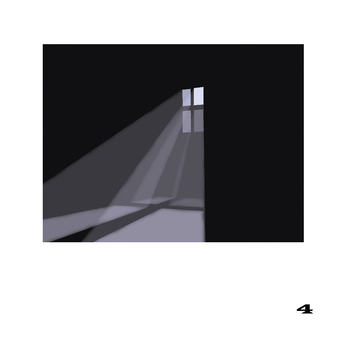
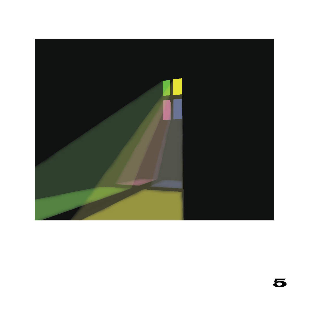
Dick had asked the students to find examples of translucent objects in his house, and to observe the qualities of those objects. Why would an artist use the effect of translucency in their art? There is something about translucency that is very compelling, and one of the best examples of its use in art is stained glass windows. Although the use and manufacture of colored glass was known to Egyptian and Roman cultures, the art of stained glass reached its peak in Medieval times, when the technological advances in architecture allowed for ever more impressive sizes of windows. In churches and cathedrals, the pictorial use of stained glass was used to illustrate Bible scenes and lessons, as most of the general populace was illiterate. The philosophy and connection to ‘Divine Light’ was a motivating theme behind all of this, and the large, colorful windows allowed ‘the light of God’ to shine through these sacred structures as a reminder of God’s presence.
Not having any stained glass windows present, Dick used a leaf and an orange slice for the demonstration. Can a leaf be translucent? Yes, if it has a strong light source behind it. The orange slice showed an even greater amount of translucency, where the pulp took on the appearance of a cathedral window with the beautiful glow of stained glass.
A leaf becomes translucent when there is a strong light source behind it
How do the colors differ from the translucent side of the leaf, to the opaque side (the side lying on the plate)?
An orange slice glows like stained glass when lit from behind
What other visual clues tell us the orange slice has a translucent area? How do we know which parts are translucent versus those that are opaque?
Dick asked the class to observe a few things about the orange slice:
Where is the shadow? What does that tell us about the direction of the light?
How can we tell it is translucent? What is different about the shadow as compared to a solid, opaque object?
What parts of the orange are opaque? What parts are translucent? Which areas have more chroma, the opaque or translucent parts? Which areas have less chroma?
Following the discussion, the class viewed a slide show presentation on the characteristics of translucency, and a short Illustrator demo on how to recreate the effect with opaque colors. For this assignment, the composition and Gestalt become even more important, as it is the correct placement of highlights and shadows which convey an accurate impression of translucency. Dick also shared the three things necessary to convey translucency (this list is shown in the slide show during the Illustrator demo):
Identify back lighting by cast shadow and shaded sides of the object.
Saturation of color area that is transparent.
Some evidence of transmitted light (similar to stained glass effect) falling on areas which would otherwise be in shade.
Again, it’s all about RELATIONSHIPS! With the right combination of light, shade, chroma, and composition, the illusion of translucency will be convincing and compelling. Good luck with the homework!
Class photos
More colored light & shadow demonstrations
The color samples in white light
The color samples under a red light
Here you can see where part of the board is in white light, moving into the red light. It is especially interesting to see how the hue the green swatch in the middle of the board is modified by the red light. In the highlight areas, it changes from a bright yellow-green into a very neutralized gray; while in the shadows, it changes from a hue that has a lot of black in it, to a very vibrant green
White light
Under a green filter. Again, part of the board is still under the white light, and the modifying power of the colored light is most noticeable on the pink swatch in front
Green light
White light
Again, you can see the difference in hue modification by the curved line over the purple swatch in the left corner. Moving left to right, it ranges from dark purple (white light shadow), to pink (full white light), to a deep blue-purple (blue light)
Blue light
Class materials
Translucency: Light shining through, as a stained glass window
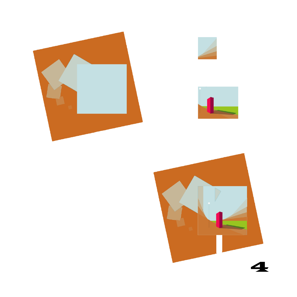
Dick Nelson demonstrates how to create the appearance of translucency (light shining through an object) in Adobe Illustrator. He names three visual clues for creating a convincing illusion.
Sainte-Chapelle
The stained glass windows in the Gothic cathedral Sainte-Chapelle in Paris are a stunning example of the visual phenomenon of translucency.
Same class, different year
View the corresponding class post from 2015 or 2013.
The previous year posts will be useful for the critique of colored light studies. However, the translucency presentation is new for this year.
The fifth session of the Color Relationships 2 class for Fall 2016 was held on Wednesday, September 28. We critiqued the homework (White light and shadow), which is always a trickier assignment than it initially seems. The class was introduced to the bizarre phenomenon of colored light and shadows, which often defies what your mind tells you to be true! Seeing it happen in real time is key to this lesson, and Dick provided a great demonstration to prove the effects. Please see the full post for photos, class materials, and this week’s new homework assignment, Colored light and shadow.
The fifth session of the Color Relationships 2 class for Fall 2016 was held on Wednesday, September 28. We critiqued the homework (White light and shadow), which is always a trickier assignment than it initially seems. The class was introduced to the bizarre phenomenon of colored light and shadows, which often defies what your mind tells you to be true! Seeing it happen in real time is key to this lesson, and Dick provided a great demonstration to prove the effects. Please see the full post for photos, class materials, and this week’s new homework assignment, Colored light and shadow.
Homework assignment
The homework is at the very bottom of this PDF. Re-create your white light composition in colored light, or create a new study of colored light and shade.
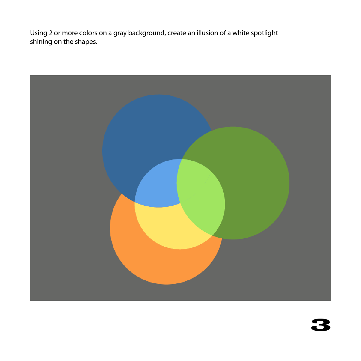
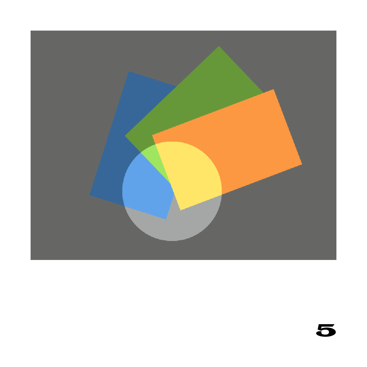
The homework showed a variety of studies seeking to convey an impression of a white spotlight. One of the keys to a convincing illusion was to show multiple colors and shapes both in the light and in the shade; another key element was the overall Gestalt. As Dick loves to say, “Everything comes back to RELATIONSHIPS.”
Dick’s main comments on the homework:
Gestalt plays a large part in conveying your intentions correctly – the audience can’t understand your message if the Gestalt is not clear. The most common problem was a formal or symmetrical composition. To “sell” the viewer on your illusion, the arrangement should be casual, askew, jaunty. Informal positioning, overlaps and angles will be more convincing, because it’s rare for objects to be perfectly centered or aligned in the real world.
We are making visual statements, and we want the viewer to read it correctly … the viewer has to see it immediately – you don’t want to have to write it out.
Make sure the connection between what is in the light, and what is in the shade, is consistent and uniform; remember, light will treat everything in its path EQUALLY.
This is what’s so important about light and shadow: it unifies the painting.
When you start thinking [as you’re painting], that ‘This is separate from this, and this is separate from this’, you’re not thinking like nature anymore.
Susan built her own “spotlight” to observe what the light and shadow would do across different colors
Colored light demo and slide show
Satisfied that the class understood the principles of white light and shadow, Dick moved on the next topic: colored light and shadows. This interesting phenomenon has been observed for many centuries (the first methodical account on the color of shadows was written in 1672, by Otto von Guericke), yet it is still one that defies our rational expectations. Shadows are always the complement of the light source: if you shine a red light on an object, its shadow will be green. Shine a green light on it, and the shadow is red. Weird, but true!
The best example of colored light and shadow seen in nature is viewed at sunrise or sunset, when the light is very orange or amber-colored. This time of day is a favorite with photographers and painters, for it infuses skin tones with a beautiful rosy glow, and warms up all the colors in a scene. However, a colored light source will affect various colors in different ways, either enhancing its dominant parent color (thus becoming more saturated), or working against its dominant parent color (and thus toning it towards a neutral gray). As Karen wrote in the 2013 Color Relationships post: “Colors could be either enhanced or dulled by the light and by the shadow. A warm-colored light (yellow or pink) enhanced colors containing yellow or magenta, and dulled cooler colors, those containing cyan. The cool blue or green shadow, respectively, of those warm lights, enhanced cool colors and dulled warm ones.”
Noticing the correct color of the shadows is imperative for this assignment, as it is the hue of the shadows which tells the viewer what color the light source is. We cannot identify the color of the light source by the highlights alone, since as the light falls across all objects of varying colors, it will modify these colors equally and make it difficult to distinguish the original hue separately from the colored influence (ex: a purple hue will not change to orange under an amber light, it will still appear purple to our eyes). This is described by the term ‘color constancy‘, which loosely means you can see the same colors in context to each other, no matter what color light is shining on them.
We don’t always perceive these colors accurately, however, due to an effect called “color constancy.” If we “know” from past experience that objects have a certain color – a red apple, a white house – we will tend to interpret them as that color, even when the color is strongly modified by colored light or shade. But if we paint them as the color we “know” they will look wrong, as seen in some local paintings depicting white surf at sunset. This is the idea of “local color.” Local color exists only in our minds. Color is never absolute; it is always relative to the lighting conditions and surrounding colors. Colors at sunset are different than “in the light of day,” which is why it evokes such a different mood. If you understand these concepts, you are more likely to notice these phenomena, and perceive them more accurately. – Karen, Color Relationships 2, 2015
Dick listed the three things to ask when painting shadows:
What is the color of the light? (think in terms of Cyan, Magenta, and Yellow)
What is its complement?
Is there any ambient or reflected light? How will that affect the shadows?
And again, why teach us about colored lights and shadows? Because it unifies and creates RELATIONSHIP in a piece: “That’s why I’m teaching film and light: it unites, it brings things together.” Just look to the many examples of Baroque paintings (especially Caravaggio and Rembrandt) to see what using a colored light source will do for your work.
Class photos
The amber hue of the light adds more yellow and orange to the colors it touches, while the shadow cast adds more violet and blue.
Note the cool cast of the shadows in contrast to the warm cast of the light.
Look at the yellow area on the board. Under the amber light, what color is the yellow where the light hits it? What color is the shadow area?
Now look at the same yellow area when a green filter is placed over the amber bulb. What changes have taken place?
Here is the same experiment with the pink area of the board. The light and shadow areas are all being affected by the amber bulb, leading the pink to become more yellow, while the shadow becomes more violet and blue.
Look at the same pink area with the green filter in front of the amber bulb. The intensity of the light has dropped, which means both the highlights and shadows are less intense. The color of the pink in the light has changed to become more neutral (working towards neutral gray), while the shadow has become much more pink, since the shadow has changed towards red.
See if you can spot the changes as they occur on green and purple. Here, what are the effects of an amber light on both the highlights and the shadows?
And what are the effects when a green filter is added in front of the amber bulb? Note the change in the highlights on the green, and the dulling down of the purple.
Dick asked if anyone had ever seen an orange shadow before. The orange shadow effect is more clearly seen over the yellow and pink colors, producing a more vivid pink color, and a warm orange shadow on the yellow.
Here we can clearly see the orange cast of the shadow from the blue bulb. Why is the shadow orange instead of yellow? The bulb is really a mixture of cyan + blue (along with white), which means the shadow becomes a mixture of red + yellow (along with black).
By placing the white paper on the floor, and reducing the ambient light, the orange shadow and blue highlights became more obvious. (The edge of yellow seen on the upper part of the paper may be due to a yellow filter that was not tucked away.)
Class materials
Videos
These videos were part of the slide presentation.
Colored spotlight
Analyzing Kit Gentry’s upcountry sunset photo
Color constancy
Watercolor painting strategy for colored light
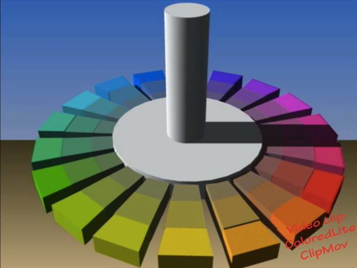
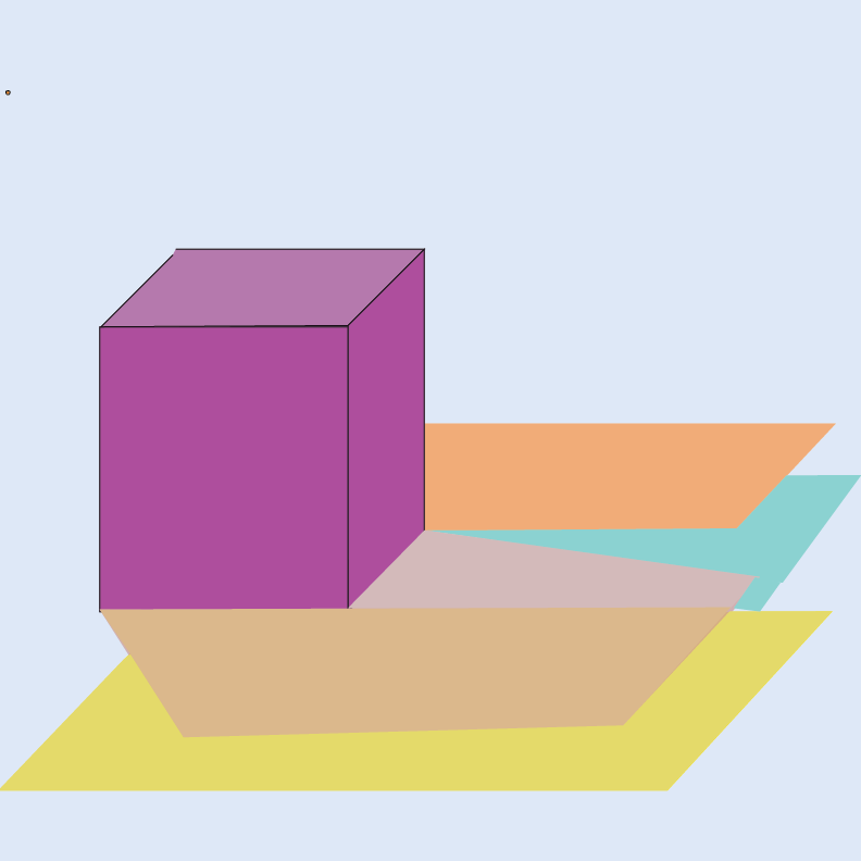
3D Illusion of colored light in Illustrator
Same class, different year
View the corresponding class post from 2015 or 2013.
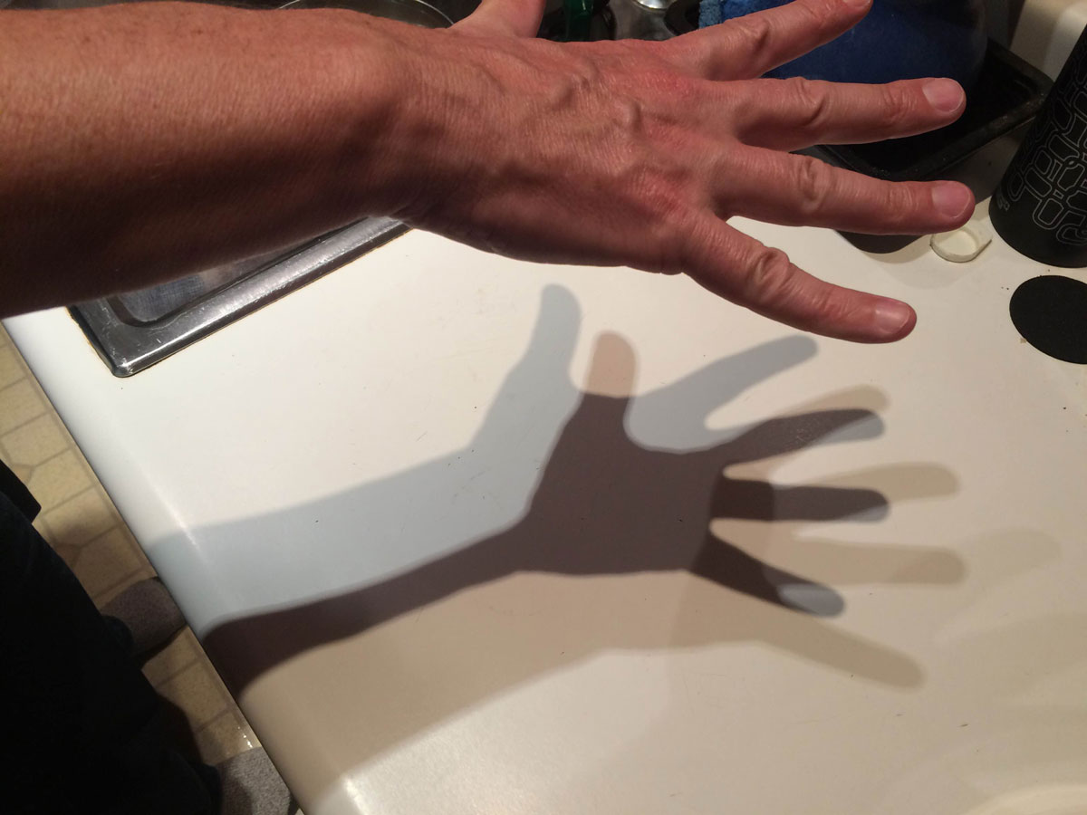
The sixth and final session of the Color Relationships class for Winter 2015 was held on Friday, February 13. We analyzed a photo with colored shadows, and critiqued the colored light and shade homework assignments. A quiz provided a review of course concepts. Dick gave an introduction to his upcoming art history class.
The sixth and final session of the Color Relationships class for Winter 2015 was held on Friday, February 13. We analyzed a photo with colored shadows, and critiqued the colored light and shade homework assignments. A quiz provided a review of course concepts. Dick gave an introduction to his upcoming art history class.
Class recap – some key ideas
Observation and analysis
We discussed this photo taken in a kitchen at night. Three track lights mounted on the ceiling above are casting the shadows. There is some general incandescent lighting in the room, and the walls and ceiling are wood, reflecting a light golden brown color.
Critique – colored light and shadows
Critique of the homework studies identified a few inconsistencies, where correction could strengthen the illusion. There should always be some gray or black in a shadow, since light is always predominantly white. When possible, observe a phenomenon in real life, or by simulating in Illustrator or Photoshop, and try to match it. If a portion of the image is inconsistent with the rest, it weakens the illusion and makes the viewer disbelieve.
Dick was especially impressed with Juan’s rendering of light streaming through a stained glass window, saying he’d never seen anyone do anything like it in his 50 years of teaching, and “This is a real WOW!” Holly shared her explorations of translucency, the brilliant appearance and colors of backlit objects. She had discussed the phenomenon with Dick, and he advised observing carefully and taking notes, to identify what factors are key to recognizing and creating it. Our minds do all these calculations for us automatically; recreating them is difficult.
Quiz
This quiz provided a chance to review and consolidate concepts from the past several weeks.
[gview file=”https://dicknelsoncolor.com/wp-content/uploads/2015/03/ColorFinalRevised.pdf”]
In discussing the answer to number 9, Dick commented “It harmonizes – it’s like the string that holds the pearls.”
Upcoming class – art history
Someone asked Dick about his upcoming art history class. Art reflects the values and attitudes of the culture of the time. “We keep peeling the onion until we get through to the heart of their beliefs.” You can look through the history of art and see yourself more clearly. You can look at yourself and know what your options are. It’s about seeing beneath the surface and recognizing the mindset of the artist, their philosophy, why they make the choices they do. We’ll look at questions like “What drives the form the art takes? How does the artist handle light, color, space? What was the artist trying to tell us?” Dick gave some examples, from ancient Greece and the Renaissance, and later. Dick described his Yale art history professor, Vincent Scully, as the finest in the world.
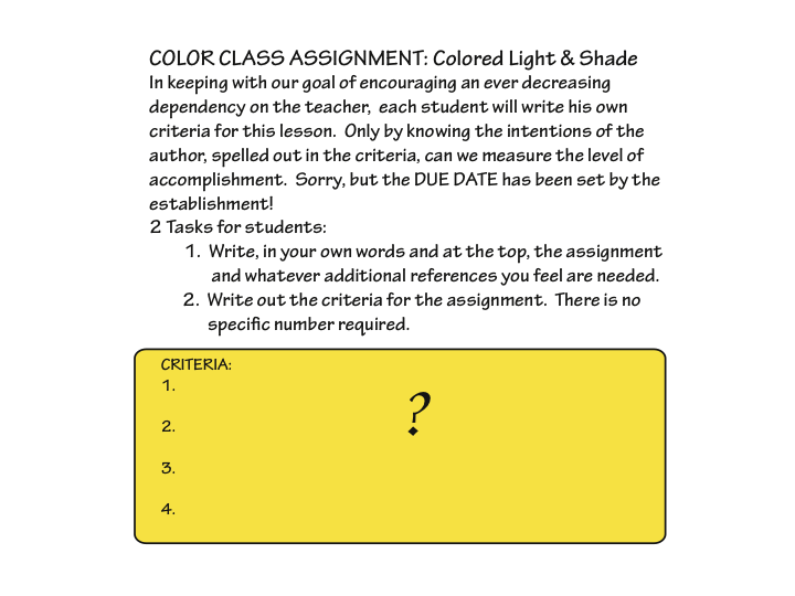
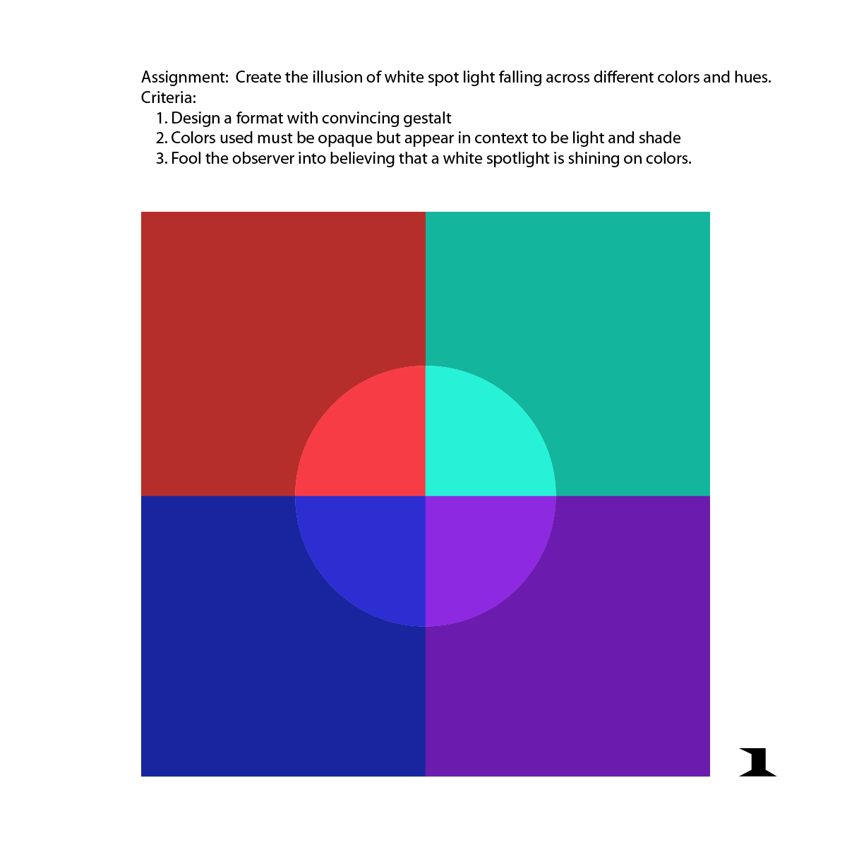
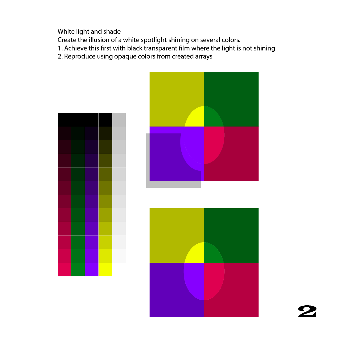
The fifth session of the Color Relationships class for Winter 2015 was held on Friday, February 6. We critiqued the white light and shade assignment. The phenomenon of colored light was introduced through a demonstration, discussion, and video presentations. Students will define their own assignment and criteria for a colored light illusion.
The fifth session of the Color Relationships class for Winter 2015 was held on Friday, February 6. We critiqued the white light and shade assignment. The phenomenon of colored light was introduced through a demonstration, discussion, and video presentations. Students will define their own assignment and criteria for a colored light illusion.
Homework assignment
Create your own assignment and criteria for a colored light illusion, as described below.
Class recap – some key ideas
Critique – white light
Homework & studies
Homework studies submitted demonstrated an understanding that we need to see multiple colors under both light and shade to correctly read an illusion of white light. The gestalt in some of the studies could have been improved by using a more casual arrangement of shapes. Unevenly placed shapes, and an off-center light, would more closely resemble real life. There’s a lot to pay attention to, to be an effective visual magician!
Observations
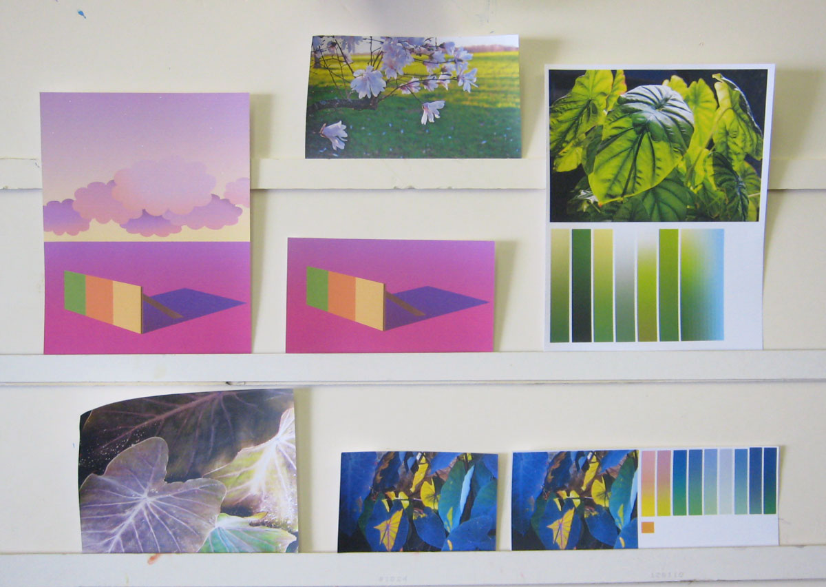
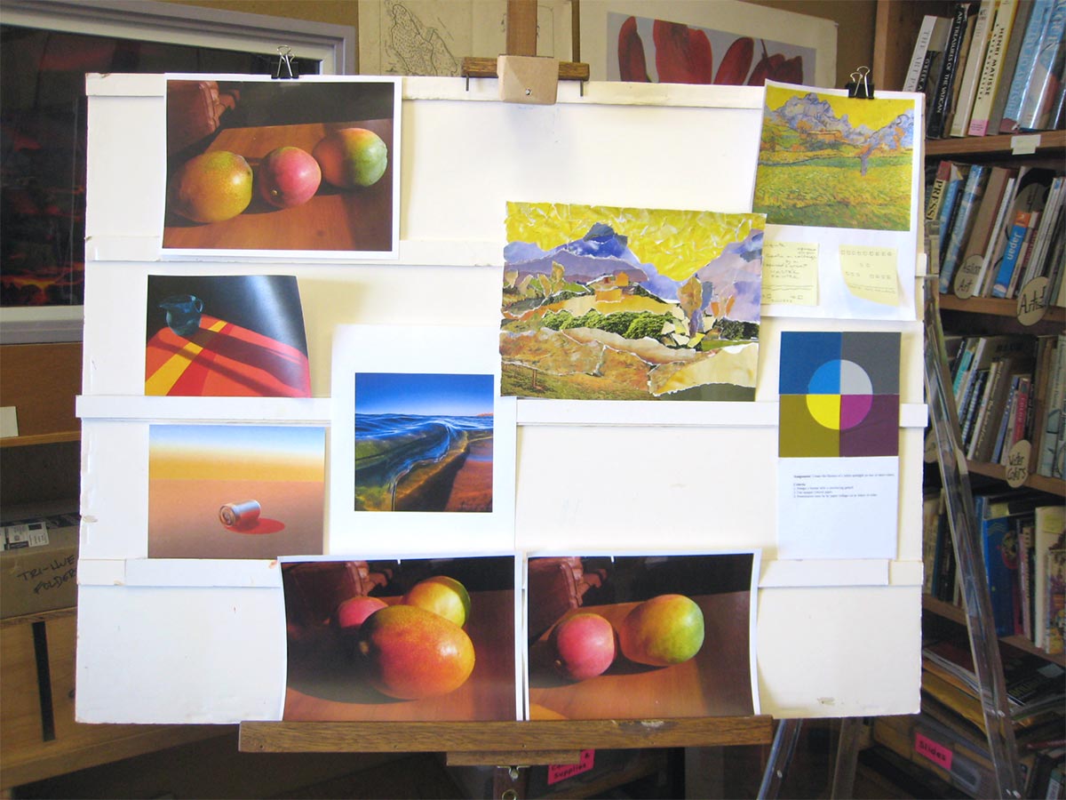
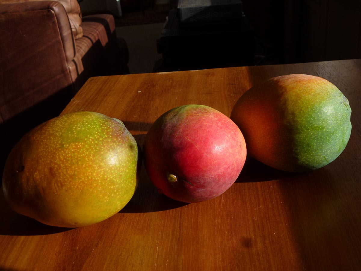
Kathy shared some photos of mangoes, where colored reflected light from neighboring fruit and the table can be clearly seen (below, and above in the critique board photo). Holly shared photos she’d taken which illustrate light and shadow phenomena, below.
Colored reflected light from neighboring fruit and the table can be seen clearly.
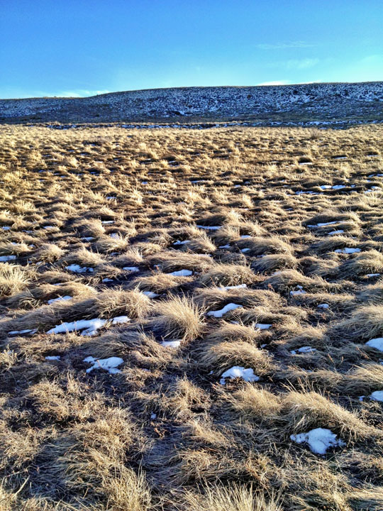
With the sun from the right at a low angle, pockets of snow in the shade of the grasses are not white. Instead, they reflect the blue color of the ambient light, from the blue dome of the sky. It’s also noticeable on the distant hillside.
Intensely blue shadows cast by a golden light
New this week: Colored light
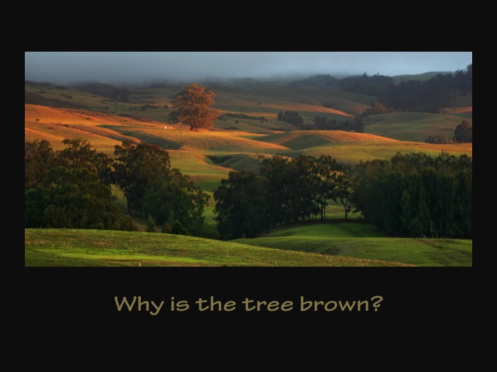
Even more than white light, colored light has the power to both unify a scene and set a mood. Because the shadow color is the complement of the light color, all colors in the scene are modified. Under a warm light like amber, warm colors are intensified and cool colors are dulled (toned, made more neutral), while in the blue-green shadow of an amber light, warm colors are dulled and cool colors intensified. We frequently observe this phenomenon at sunset, “the magic hour,” the time Leonardo da Vinci was referring to when he said, “Paint at no other time than this!”
Slightly yellow white light
Amber light, blue-green shadow
Green light, reddish shadow
Amber light, blue-green shadow
Amber light, blue-green shadow
Where the orange and blue films overlap, the result is almost black, because almost all light is absorbed by the two nearly complementary colors.
Colored light has a lot of white in it, so its shadows also have a lot of black. Shaded areas will also show evidence of the ambient light color, but in illuminated areas, the ambient light color is insignificant, because it is overwhelmed by the colored light source.
We don’t always perceive these colors accurately, however, due to an effect called “color constancy.” If we “know” from past experience that objects have a certain color – a red apple, a white house – we will tend to interpret them as that color, even when the color is strongly modified by colored light or shade. But if we paint them as the color we “know” they will look wrong, as seen in some local paintings depicting white surf at sunset. This is the idea of “local color.” Local color exists only in our minds. Color is never absolute; it is always relative to the lighting conditions and surrounding colors. Colors at sunset are different than “in the light of day,” which is why it evokes such a different mood. If you understand these concepts, you are more likely to notice these phenomena, and perceive them more accurately. Renaissance paintings show objects with distinct colors, in the light of day, while Baroque paintings tend to have colors unified under a common light, setting a very different mood.
Class materials
Demonstrating how a colored spotlight modifies both the colors in the light as well as cast shadow
A tutorial on how to create the illusion of a cast shadow on a form and colors from a colored light source.
The PDF below has 29 pages of drawing instruction and exercises, including helpful information on perspective and light.
[gview file=”https://dicknelsoncolor.com/wp-content/uploads/2012/05/Drawing.pdf”]
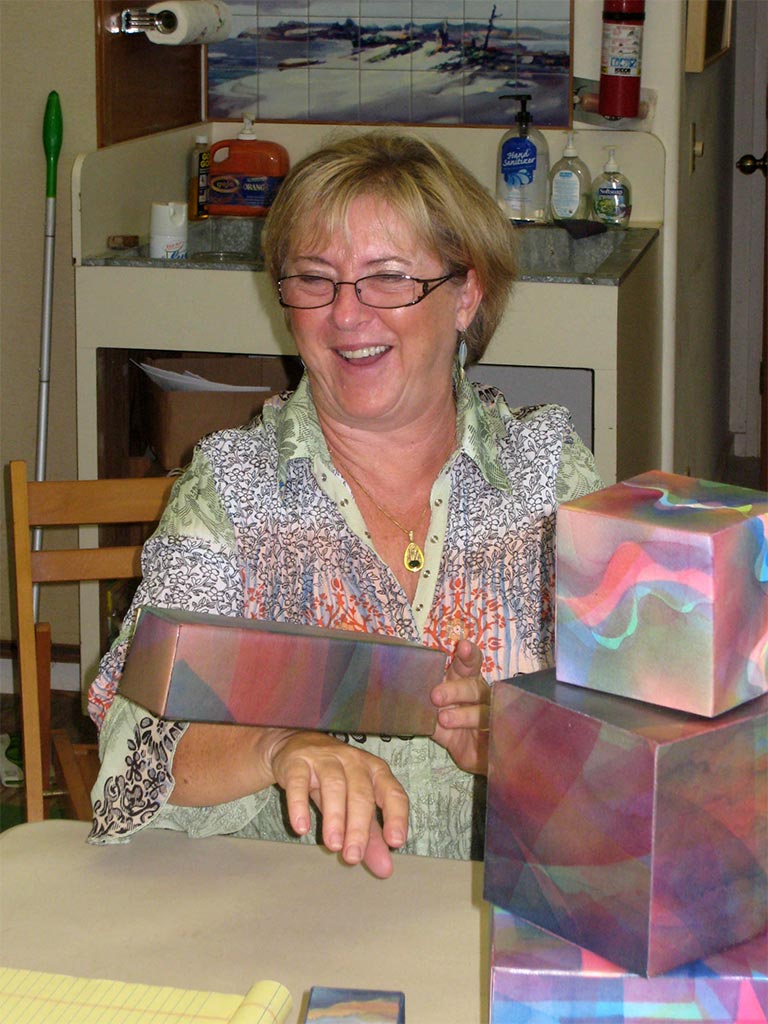
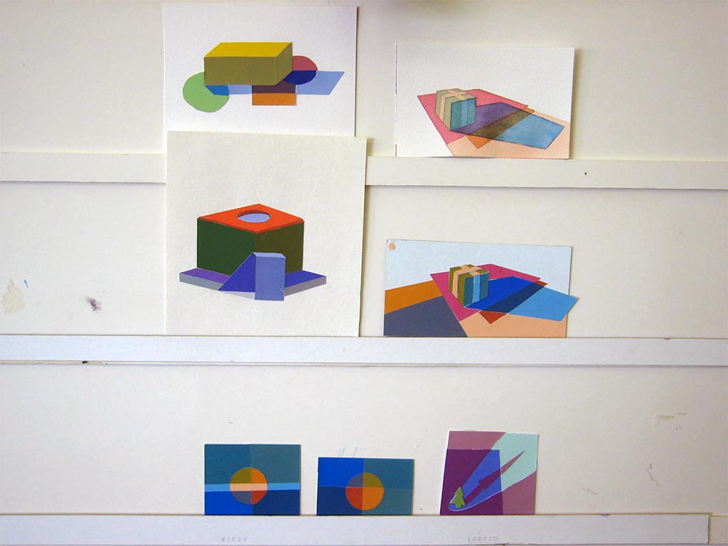
Chris Scharein has taken many of Dick’s classes, beginning in 1999. She brought in some examples of her current projects, boxes made from tri-hue watercolors.
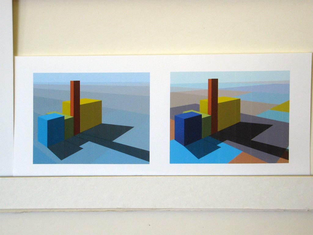
Critique – reworked assignments 1-7
Original: wimpy and inconsistent shading
Redo: dramatic and consistent shading
Reworking an assignment strengthens your understanding of the concepts and provides a lasting reminder for future reference.
Consistency is key to believability for illusions of light and shadow. Cheryl suggested a simple method for self-checking. Assign number values between 1 and 10 to the different areas of the study. You want the difference between one color’s light and dark value to be the same as a second color’s.
Review
Each person gave some feedback on the course so far. Many are finding they see the world, and artwork (including their own) much differently. They notice things they didn’t before. Some would like to see a follow-on class focused on application, or stay together to critique each other’s work. Chris recalled an advanced group that she was in, where a different person would set the assignment each week for everyone to bring in the next week.
Same subject and lighting conditions, different background color
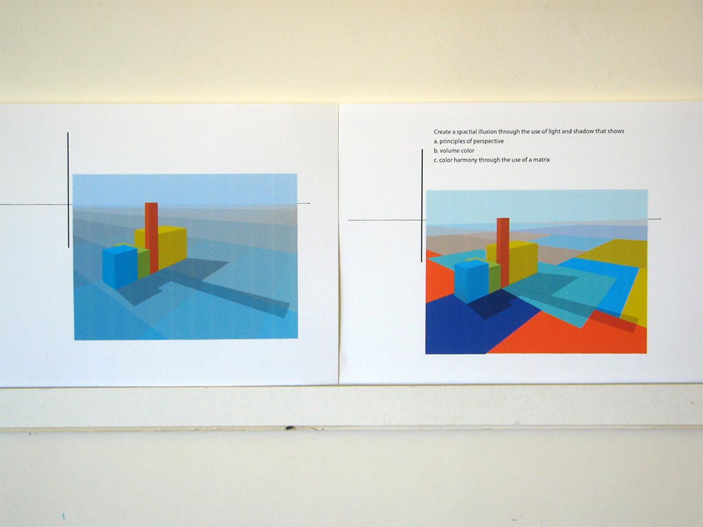
Colored light study: planning sketch, swatches, and finished study
A common problem with the homework studies was not recognizing that light affects everything in the scene. That’s what makes it so powerful as a unifying factor. Everything in the study needs to be under the influence of either the light or its shadow. There can be no white or other foreign background color. There were also some problems with perspective and gestalt. A casual arrangement of shapes is more believable – has better gestalt – than one in which edges are parallel with or coincide with other shapes. Noticing and correcting those issues can make a more convincing illusion.
Here’s a short video on drawing a cube in two-point perspective. (Thanks, Valerie!)
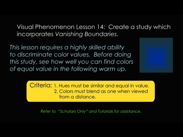
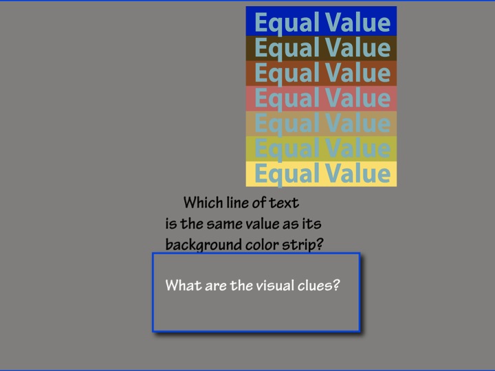
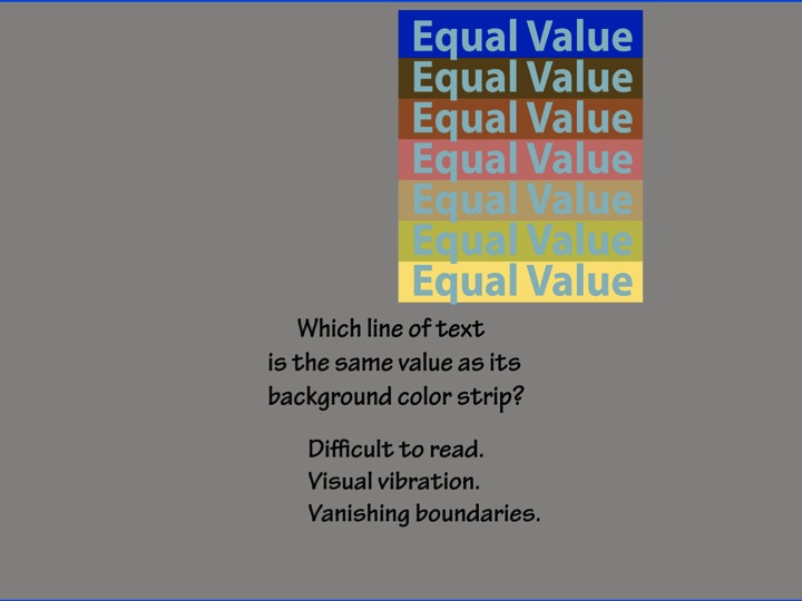
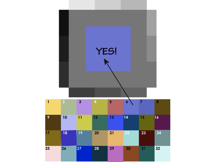
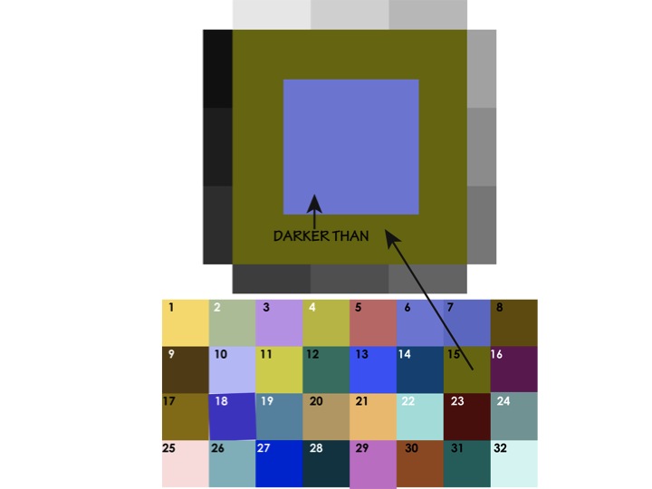
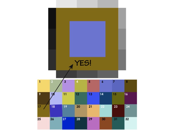
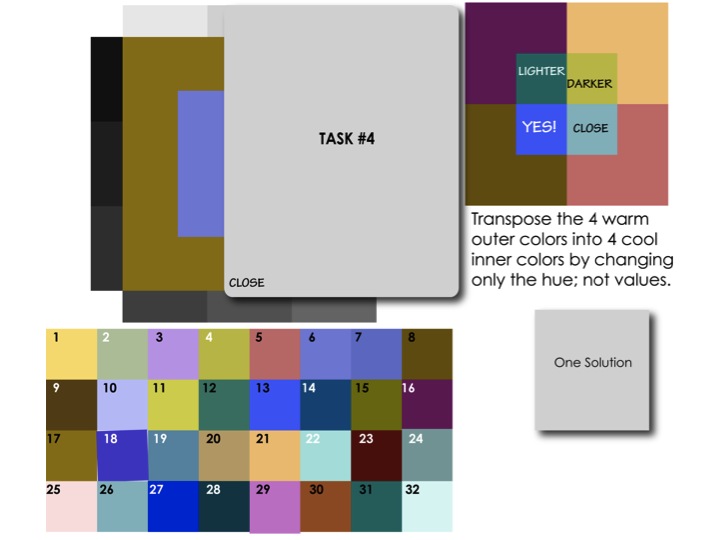
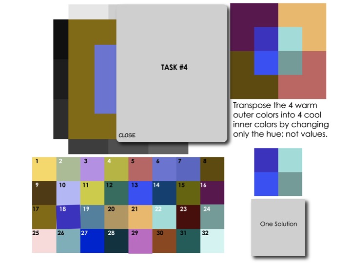
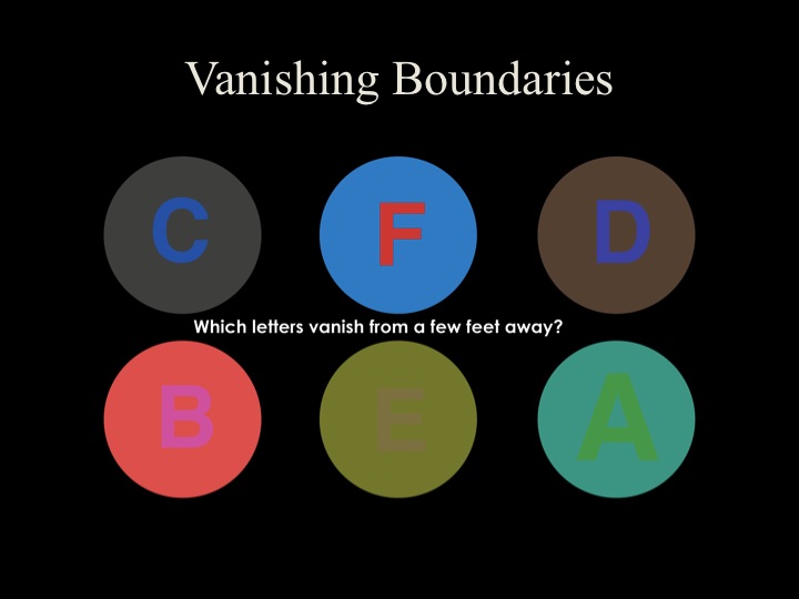
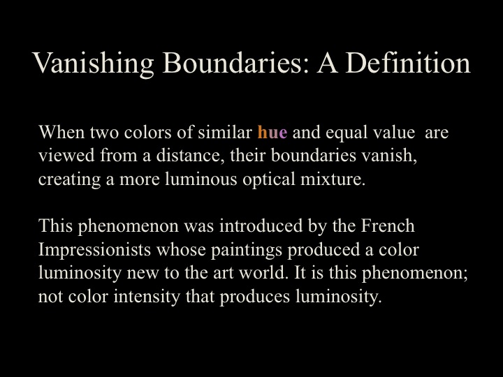
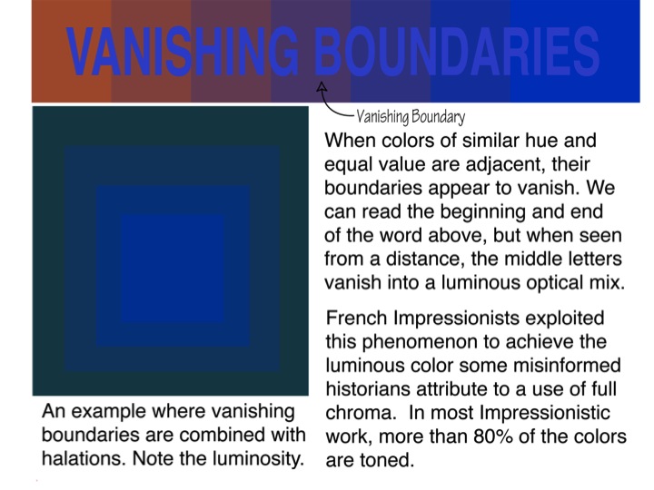
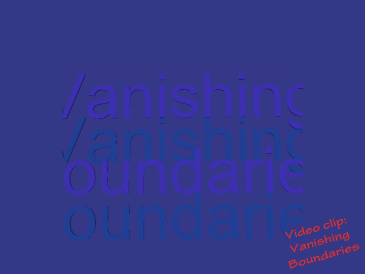
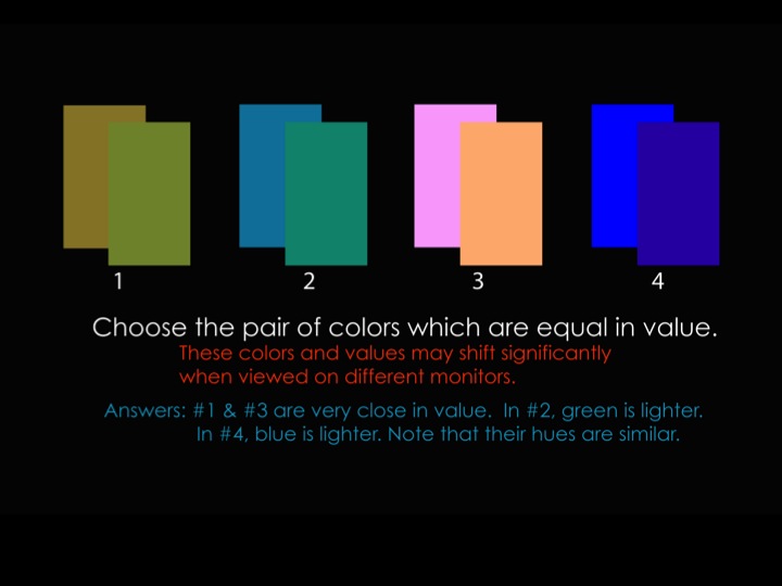
This week’s new concepts: Equal value and vanishing boundaries
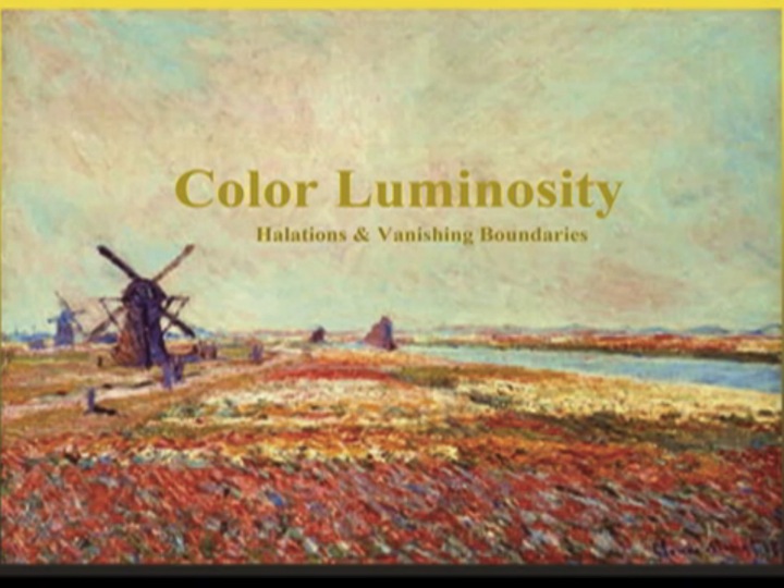
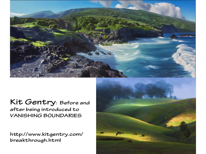
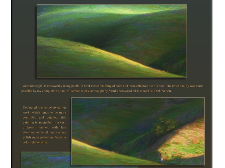
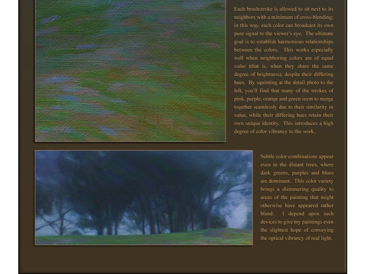
The luminosity achieved in many Impressionist paintings, notably those of Claude Monet, comes from the optical mixing that we perceive of individual brush strokes of colors which are very close in hue and value. Applying this principle, anyone should be able to create luminosity in their work, if they want to. In his “Breakthrough” web page, Kit Gentry shows close-ups of sections of his painting and explains what he was trying to do and how he did it. He writes, “Each brushstroke is allowed to sit next to its neighbors with a minimum of cross-blending … You’ll find that many of the strokes of pink, purple, orange and green seem to merge together seamlessly due to their similarity in value, while their differing hues retain their own unique identity. This introduces a high degree of color vibrancy to the work.” (Excerpts from Kit Gentry’s website used with permission.)
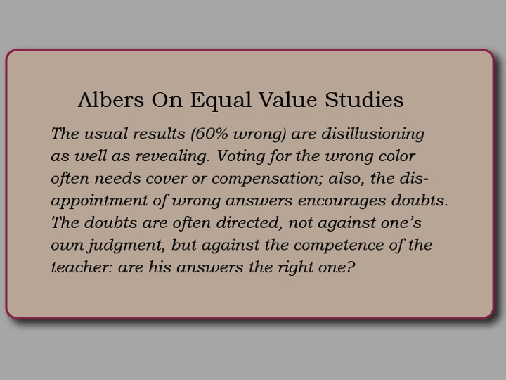
To achieve luminosity from vanishing boundaries, you have to develop your capacity to accurately perceive value, something that is difficult for us to do. We can easily distinguish different hues, but comparing the values of different hues is hard. Albers estimated that students’ initial judgments were wrong over half the time! Repeated attempts and careful comparisons will help develop your eye. This week’s color transposition assignment is designed to provide that practice and improve value discrimination.
Dick showed how he is able to create luminosity in his watercolors. He starts by applying yellow in small, irregular shapes. Its value is very close to the white of the paper, so when magenta and cyan are glazed over, the resulting colors maintain the relationship of equal value and similar hues.
Class materials
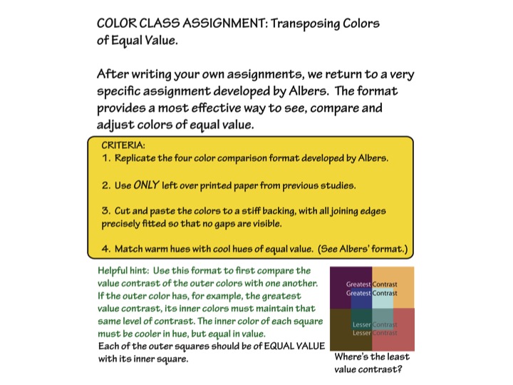
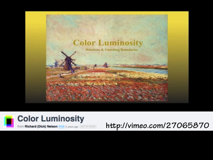
Vanishing boundaries assignment
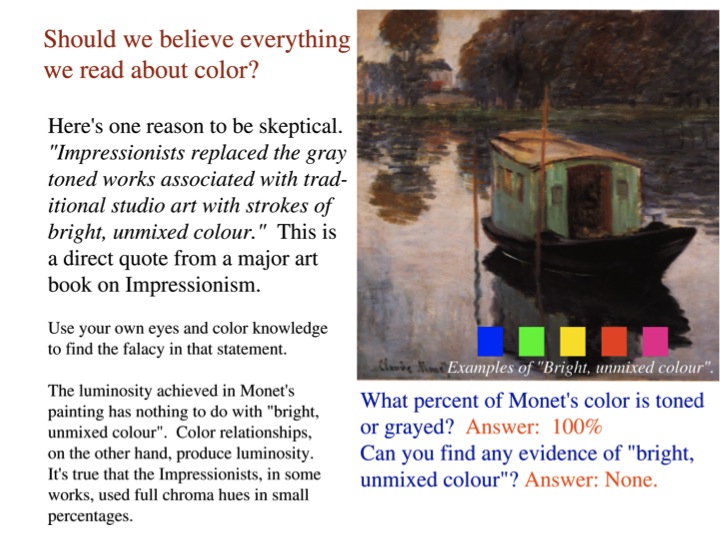
Here are two ways color luminosity can be achieved. This should dispel the notion that the French Impressionists achieved color luminosity by way of full chroma color application. See the truth with your own eyes.