The fourth session of the Color Relationships class for Spring 2016 was held on Wednesday, April 27. We critiqued the color transposition assignment, discussed the two ways to create luminosity in artwork, and enjoyed a watercolor demonstration that showed the effects of equal values, vanishing boundaries and halation. See the full post for class materials, photos, and videos to supplement our class time.
Homework assignment
[gview file=”https://dicknelsoncolor.com/wp-content/uploads/2016/04/VB-AssignNEW.pdf” height=”400″]
Class recap – some key ideas
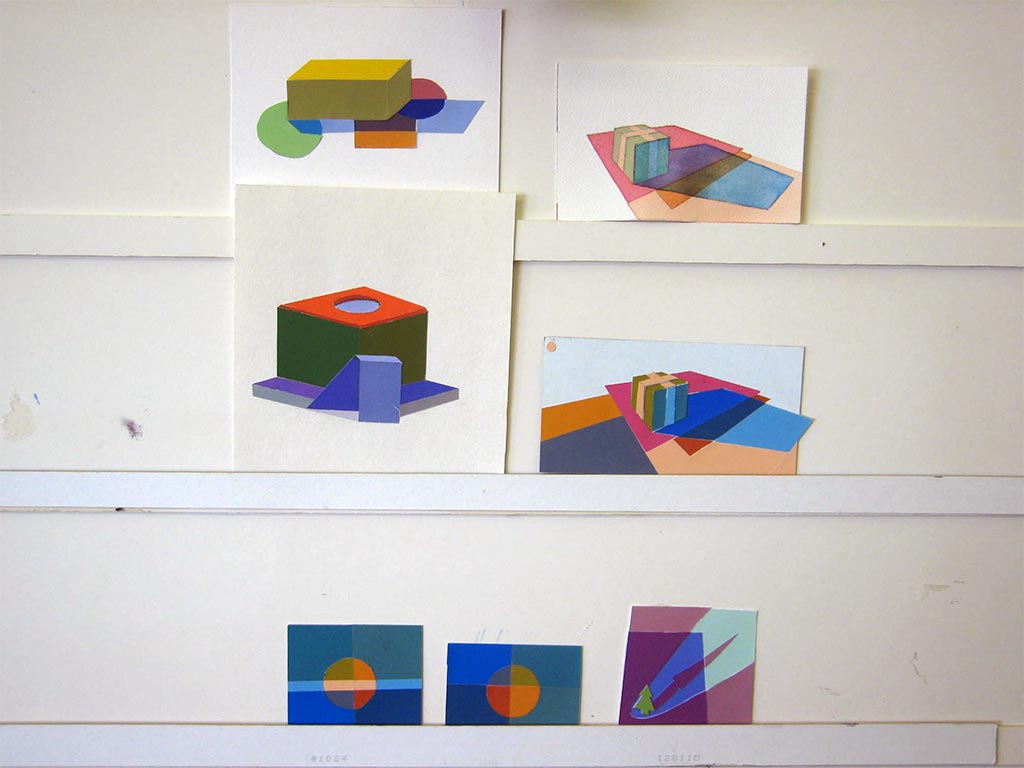
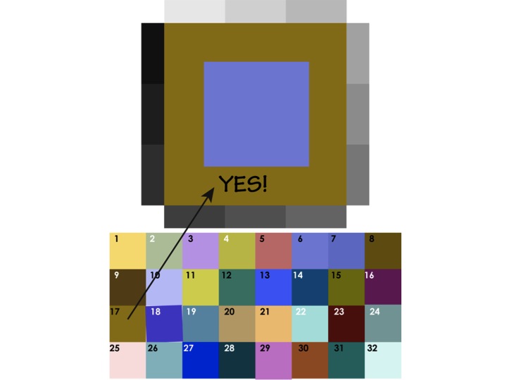
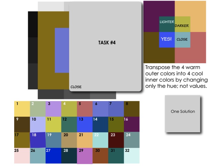
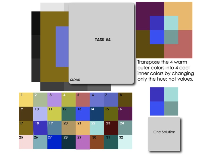
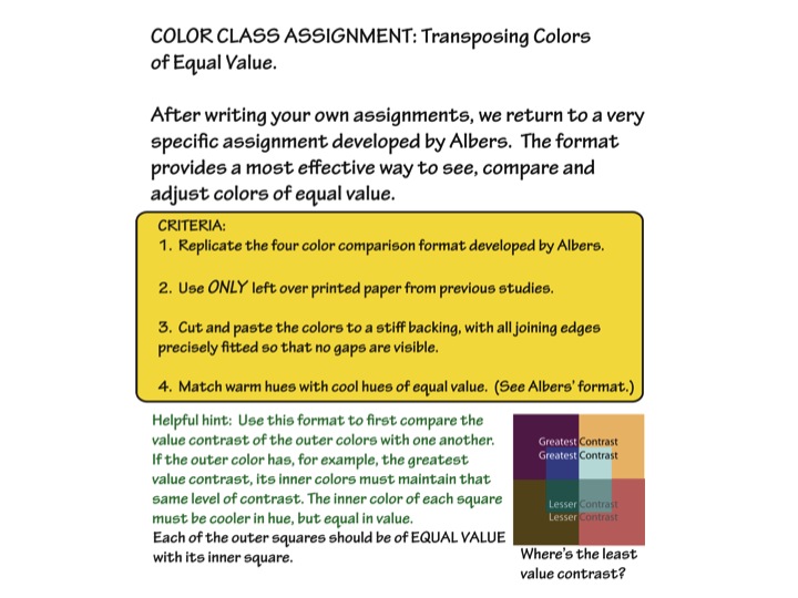
Critiquing the homework – Transpose colors of equal value
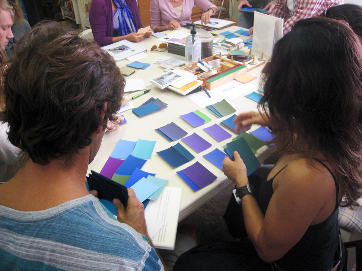
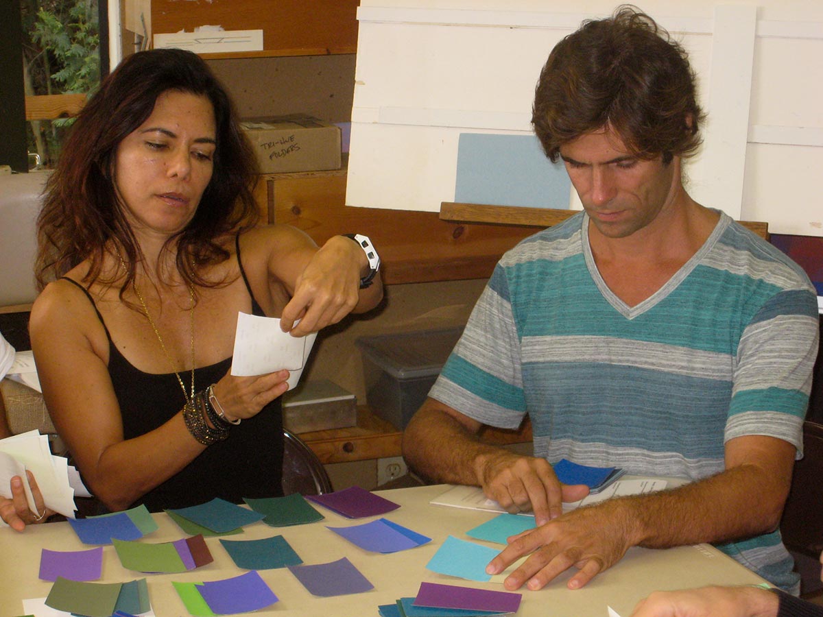
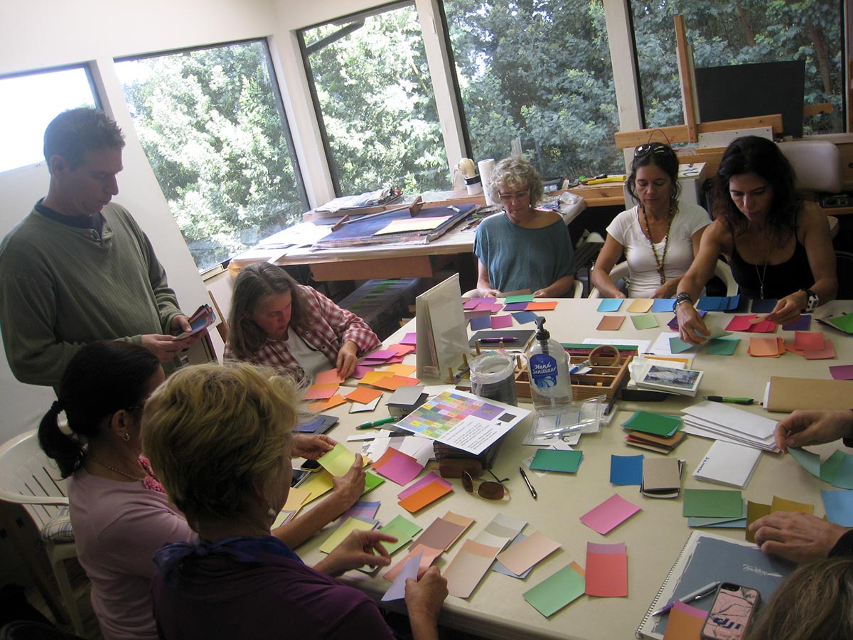
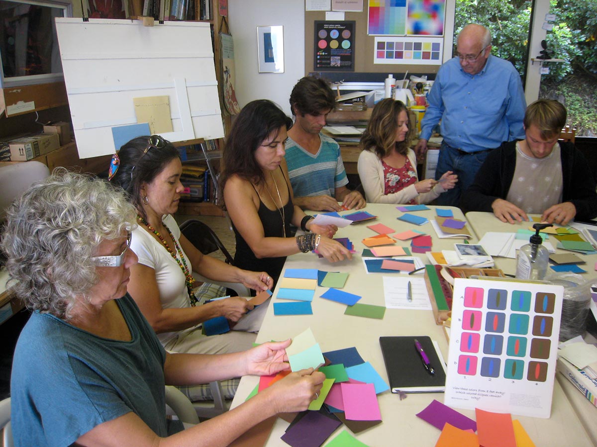
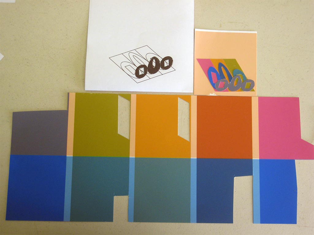
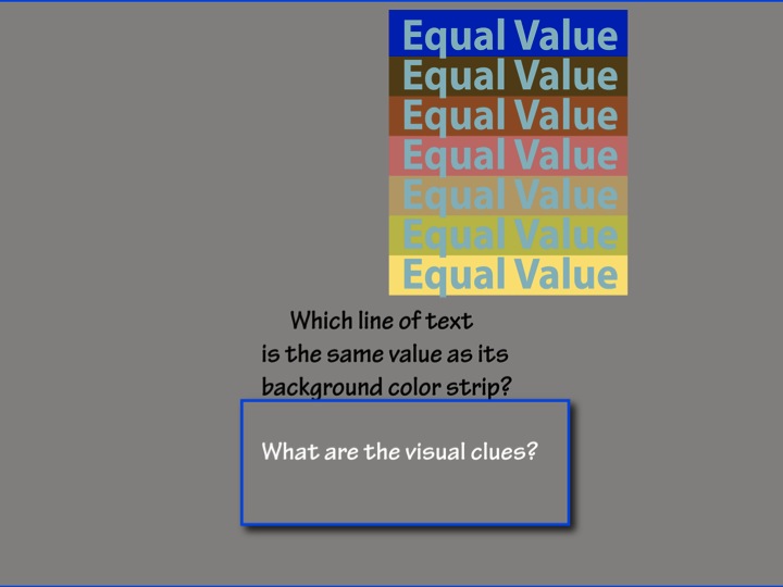
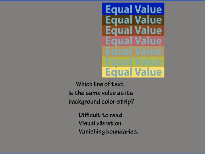
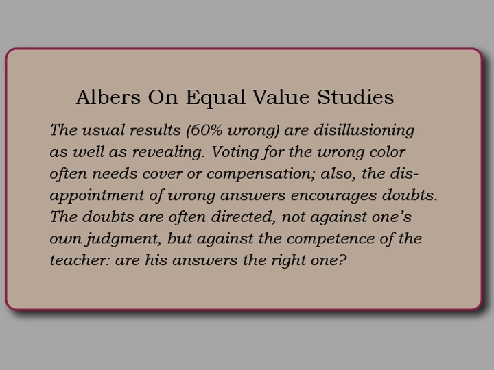
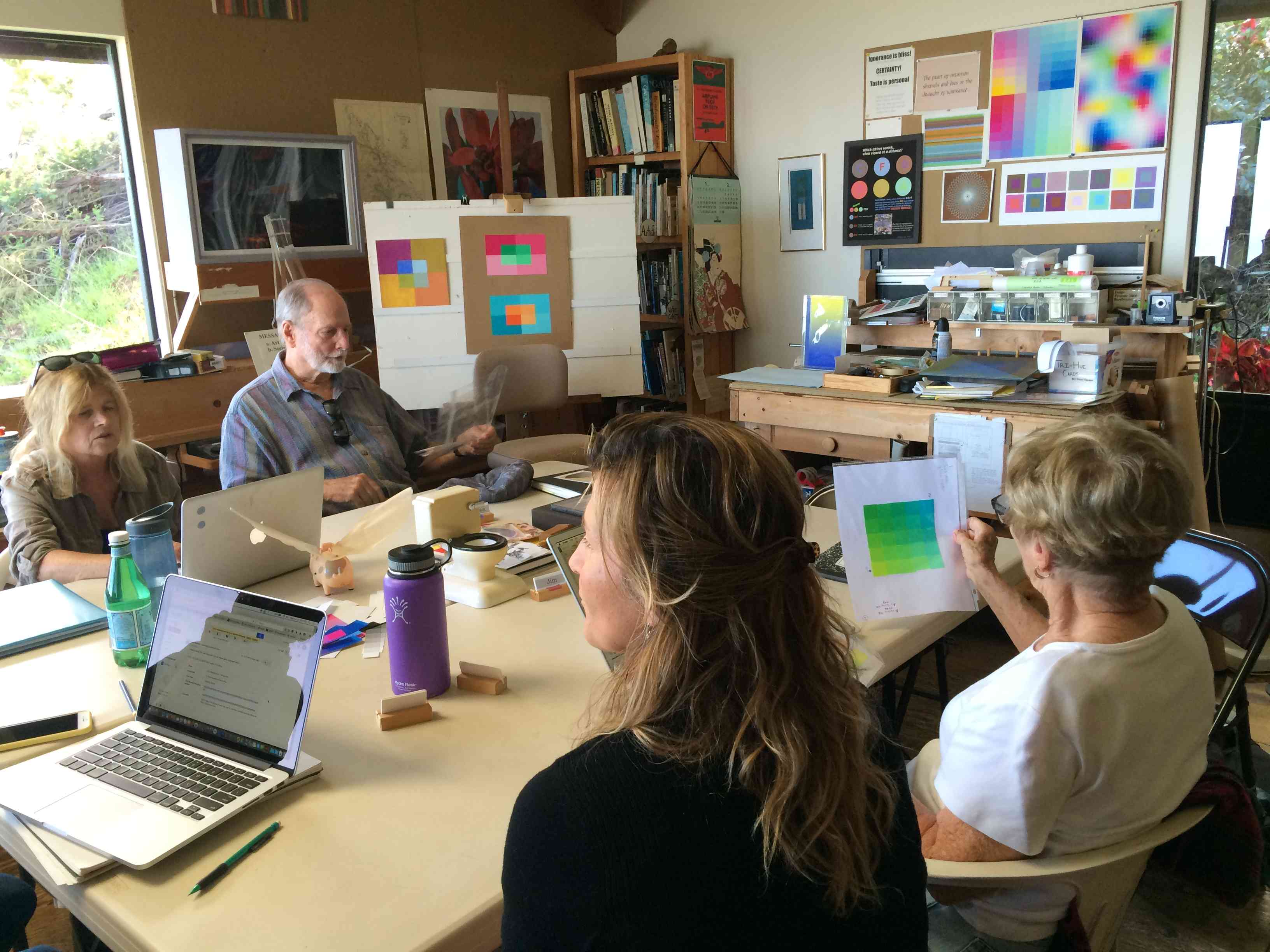
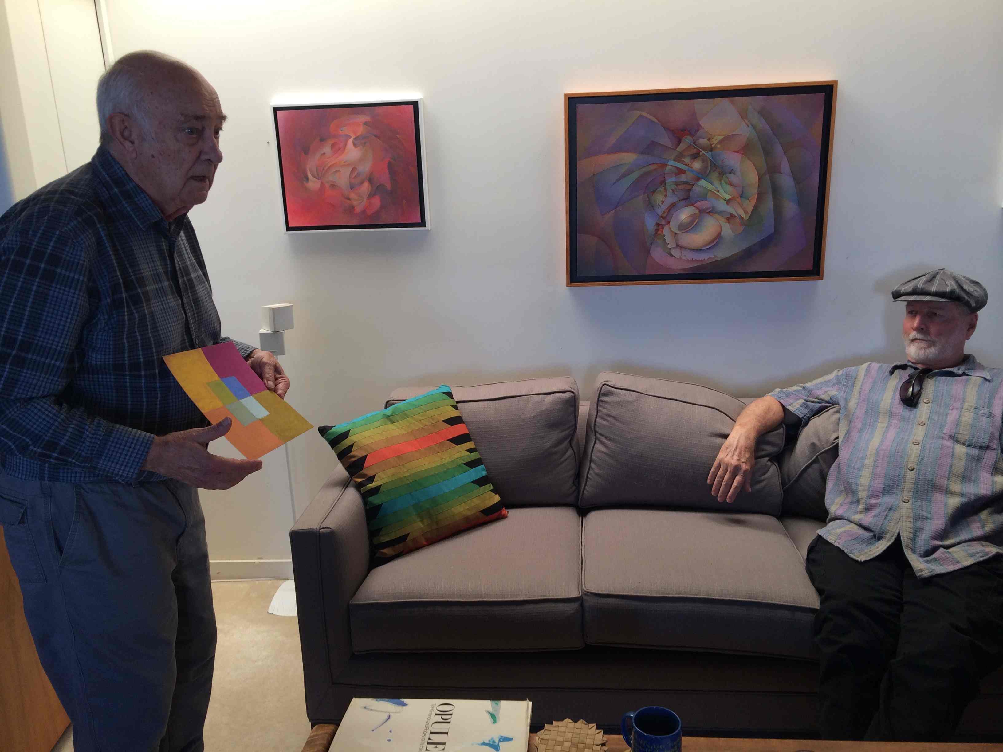
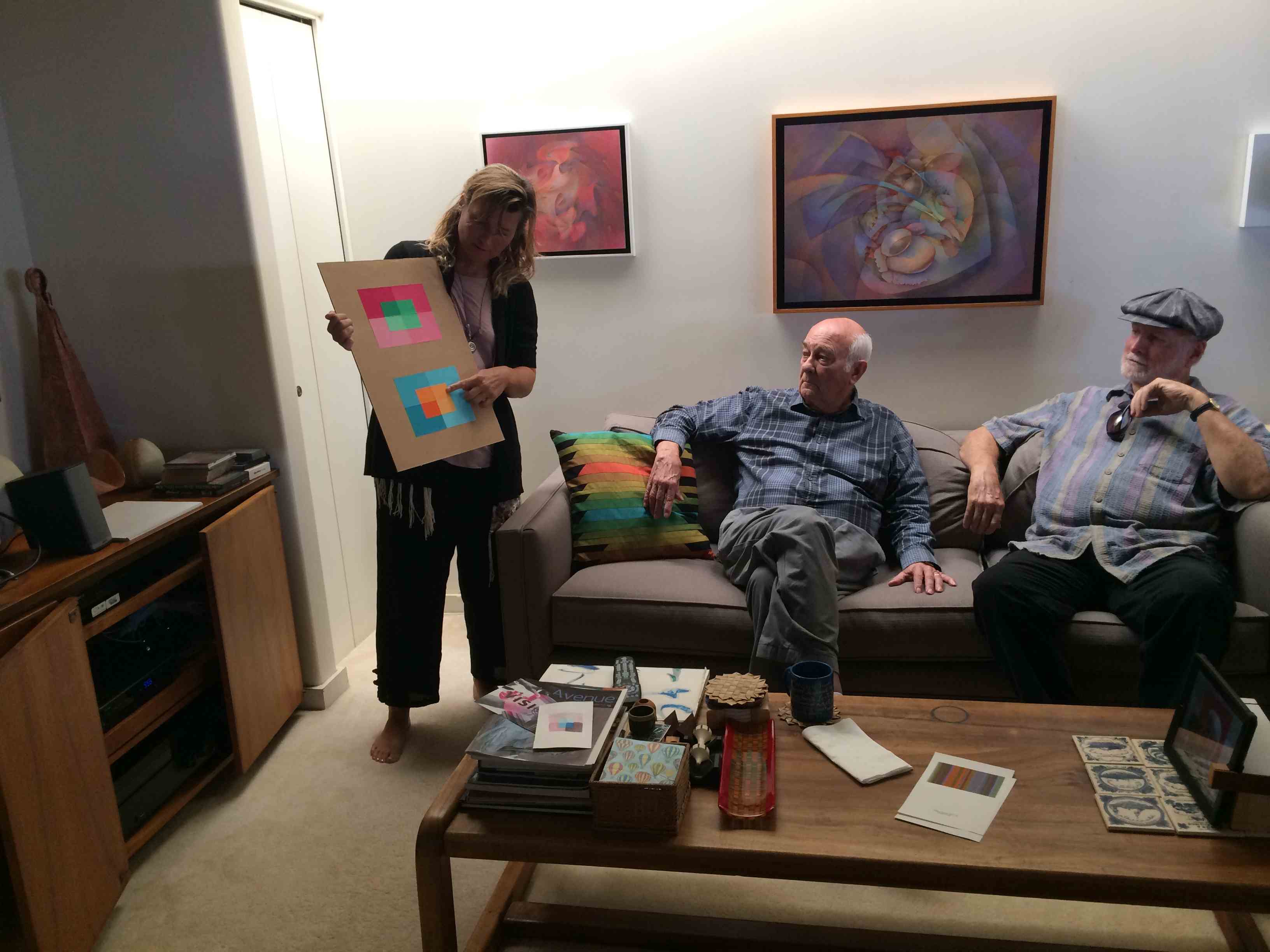
 Much of class time was spent sharing the results of this last assignment, and even in a week Dick could tell how much student’s value perception had sharpened. Value is very hard to discern when competing hues are seen together; however this particular format provides a way to compare many colors and values all at once, for which Dick still praises Albers’ ingenuity for designing color exercises.
There are also quite a few students trying these assignments in alternate media (Color-Aid paper, pastel, and watercolors), which presents different challenges than the ones encountered in Illustrator. Some of the difficulties arise simply from the nature of the medium itself, and there was a brief discussion on the importance of working with the materials in a way that keeps the focus on the color. Dick mentioned that the only material Albers let his students use was the Color-Aid paper, as it was one way to minimize the distractions inherent in art making. Albers wanted to concentrate on color, not shapes or design or mediums: “Albers had students coming from all different backgrounds – oil painting, pastels, printmaking – so he didn’t want us to get caught up in craftsmanship or subject matter. He wanted [the focus to be on] the direct relationship of color, and that’s why he had his students work with the Color-Aid papers. He didn’t want us to get cute with the design or show how clever we could be [with shapes]: the focus was on color.”
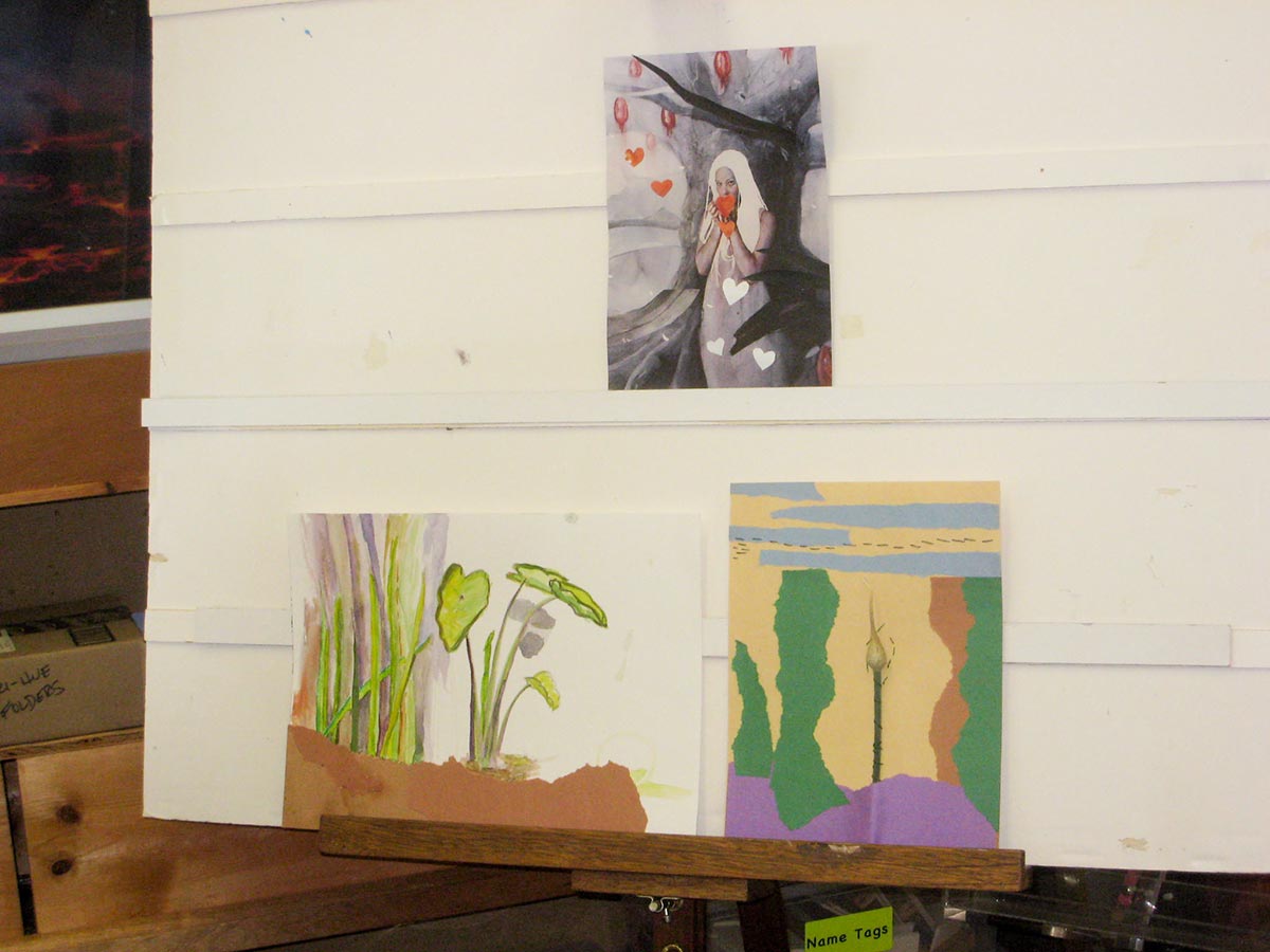
View the students’ color transposition studies.
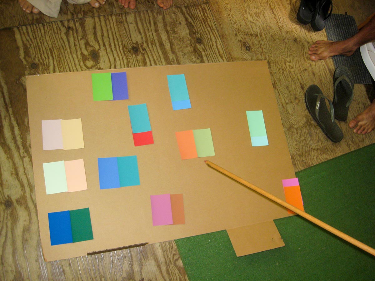
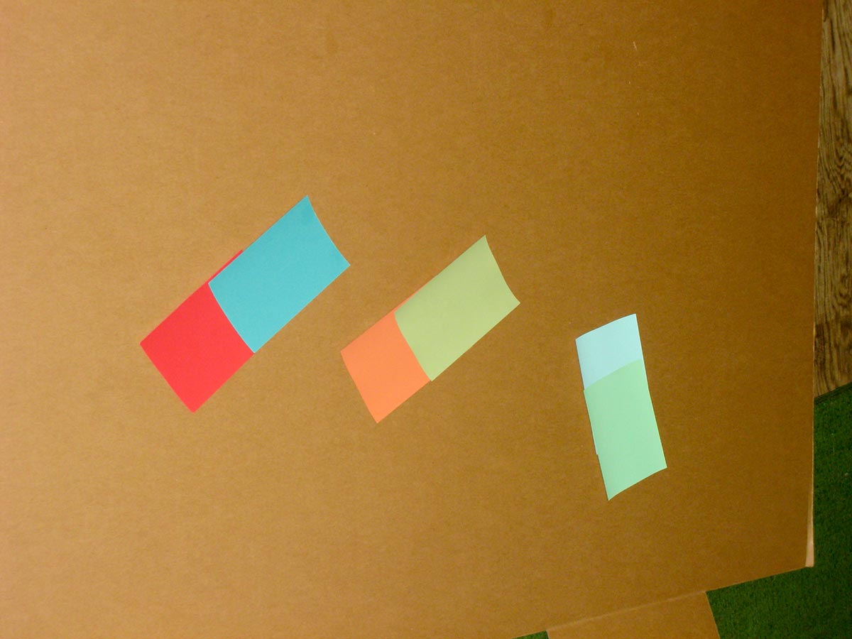
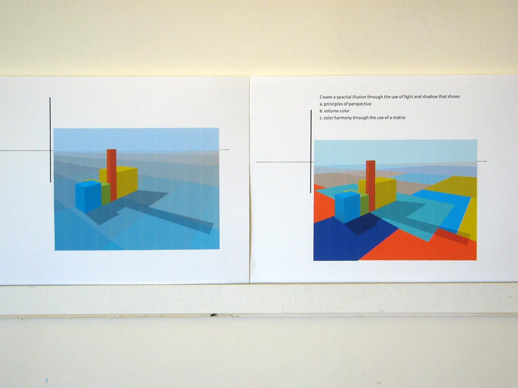
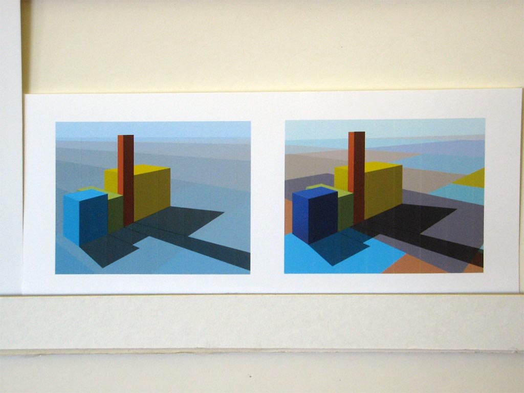
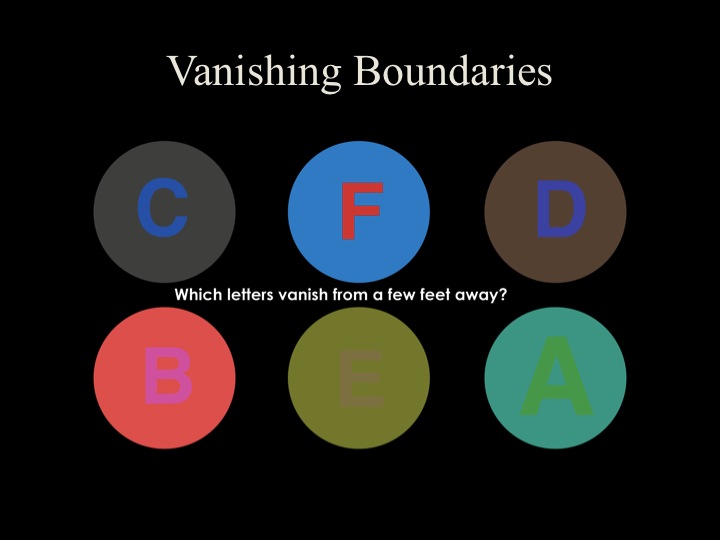
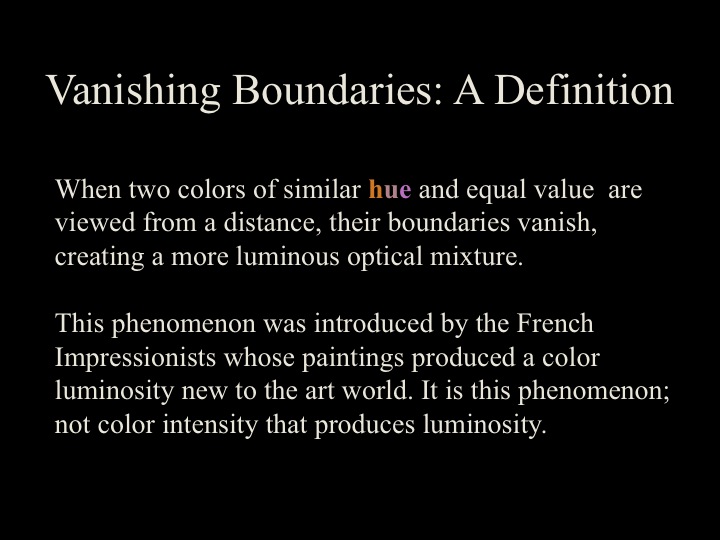
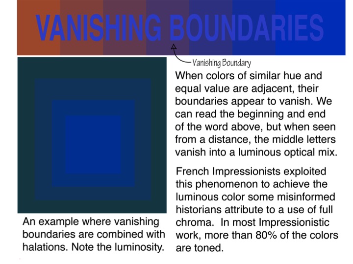
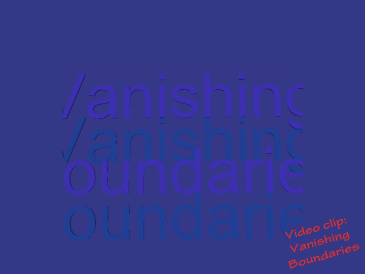
Two ways to create luminosity in artwork: vanishing boundaries and halation
After the critique, we discussed why recognizing value is such an important skill for visual artists to learn: to create luminosity in their art. There are two ways to create luminosity: vanishing boundaries and halation, and when an artist employs both of these effects, the result can be breathtaking. As Dick said: “If there aren’t relationships, things fall apart. And that’s what is so beautiful about nature: everything relates.”
Which is another reason why Dick is confounded by the lack of these effects in his previous students’ artwork; he has taught thousands of students over his lifetime, and yet only a handful of them use these techniques in their work: “I’ve been wrestling with this for years. Why can people understand vanishing boundaries and halation in class, and then they leave class and they don’t use it in their work? How do I prepare you to use this as your own so that you can take this knowledge and find a way to plug it in? How long does it take before it becomes a part of what you’re doing? How many of you will learn to use it as Kit did, and plug it into your own work?”
One student said, “So you’re saying this is a way of making it glow.” She recognized that she’d created this effect in one area of a past painting, but didn’t know how to recreate it. She was eager to get back to the studio and try out some new ideas!
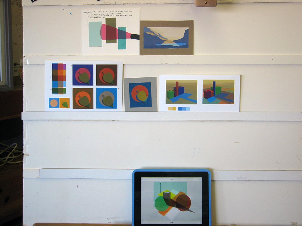
For the last assignment, the challenge is to make these lessons your own, and find ways to combine a halation and vanishing boundaries to create luminosity. Students can make a simple composition of their own, which could be as basic as a single repeating shape; or a ‘Challenge to the Professional’ which would involve re-doing a previous art piece to employ these effects. As we approach the last class, Dick’s ultimate goal is to foster independence: “I want you to make a transition from being in class and having student assignments, to making this knowledge your own. I want to see that you can take these principles and apply them in your own way.”
 Dick has this hint for working with your vanishing boundaries assignment:
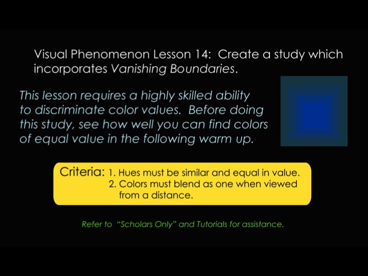
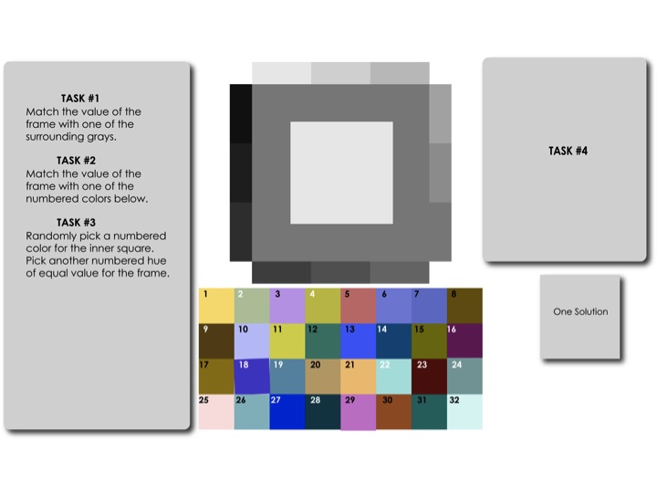
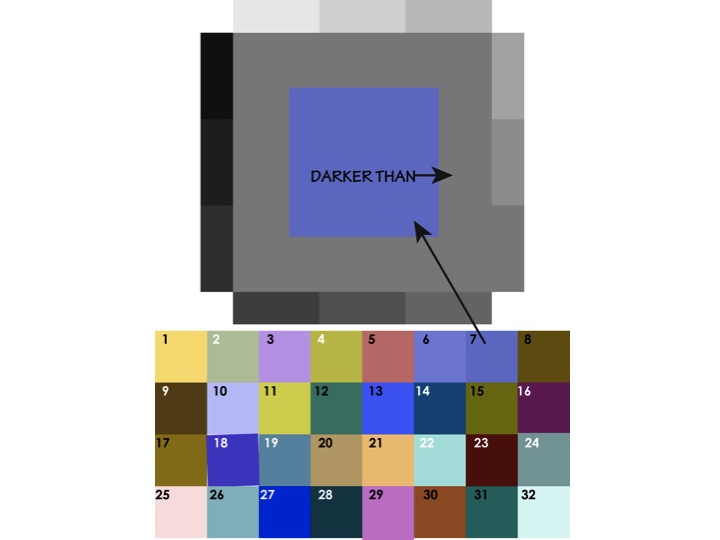
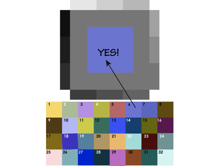
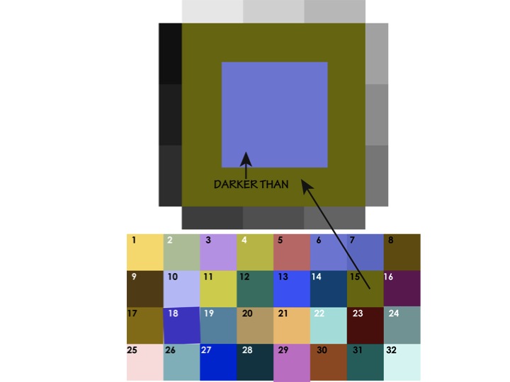
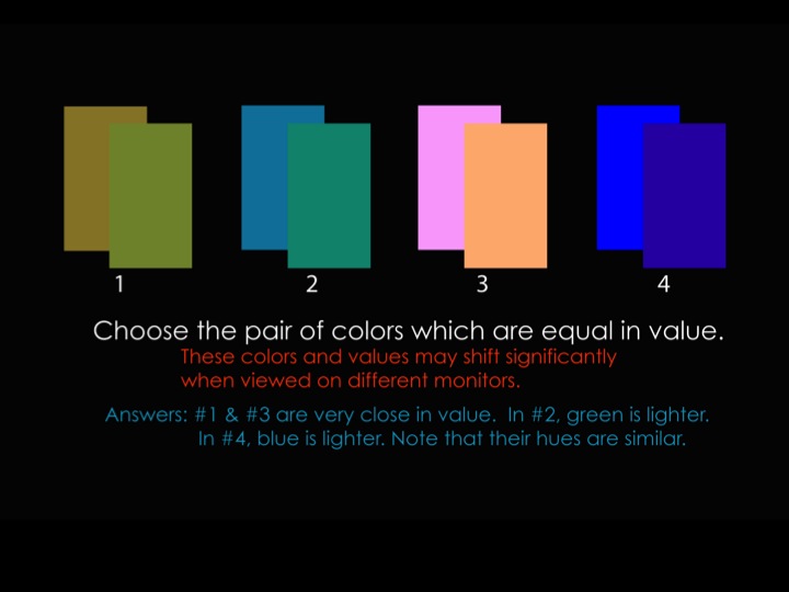
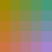
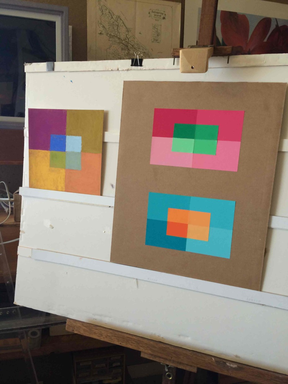
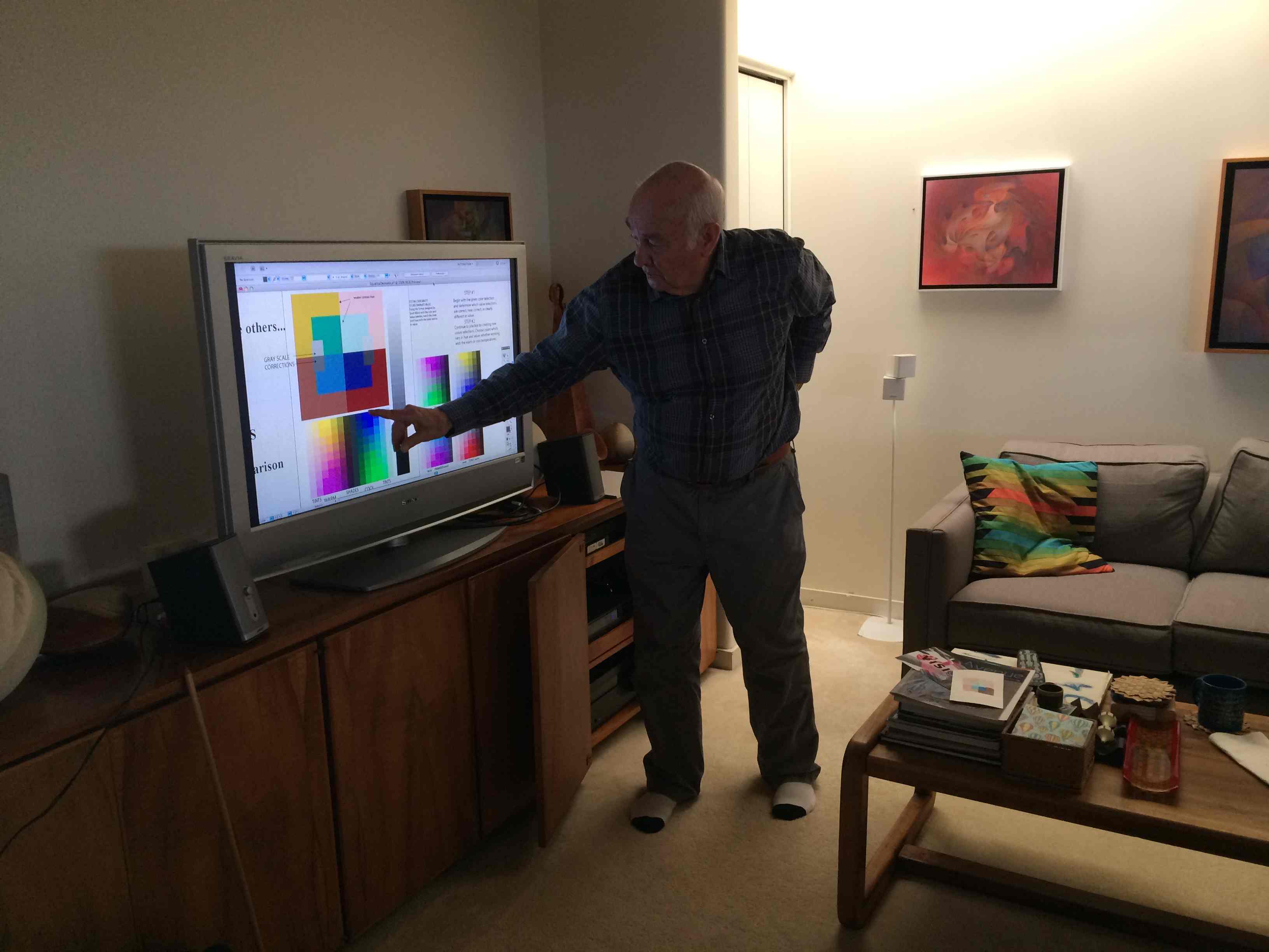
If you are using arrays or matrixes, you need all anchor colors (parents or corners) to be of the same value, or very close.
He made this matrix as an example, and says “Note the color luminosity in this sample matrix which combines both halation and vanishing boundaries.”
(And remember that for true vanishing boundaries, the hues also need to be close!)
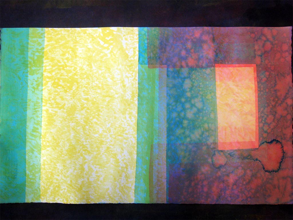
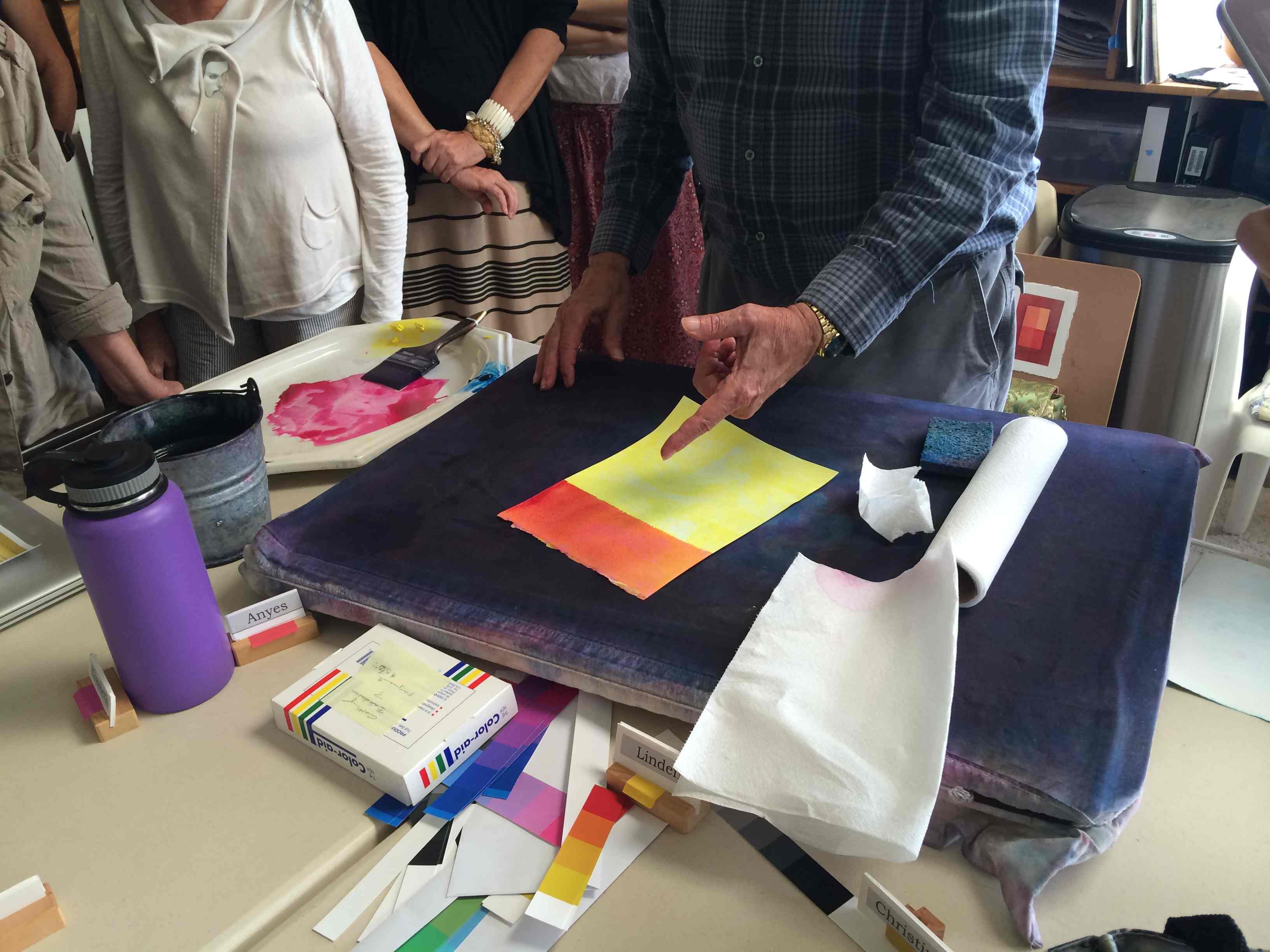
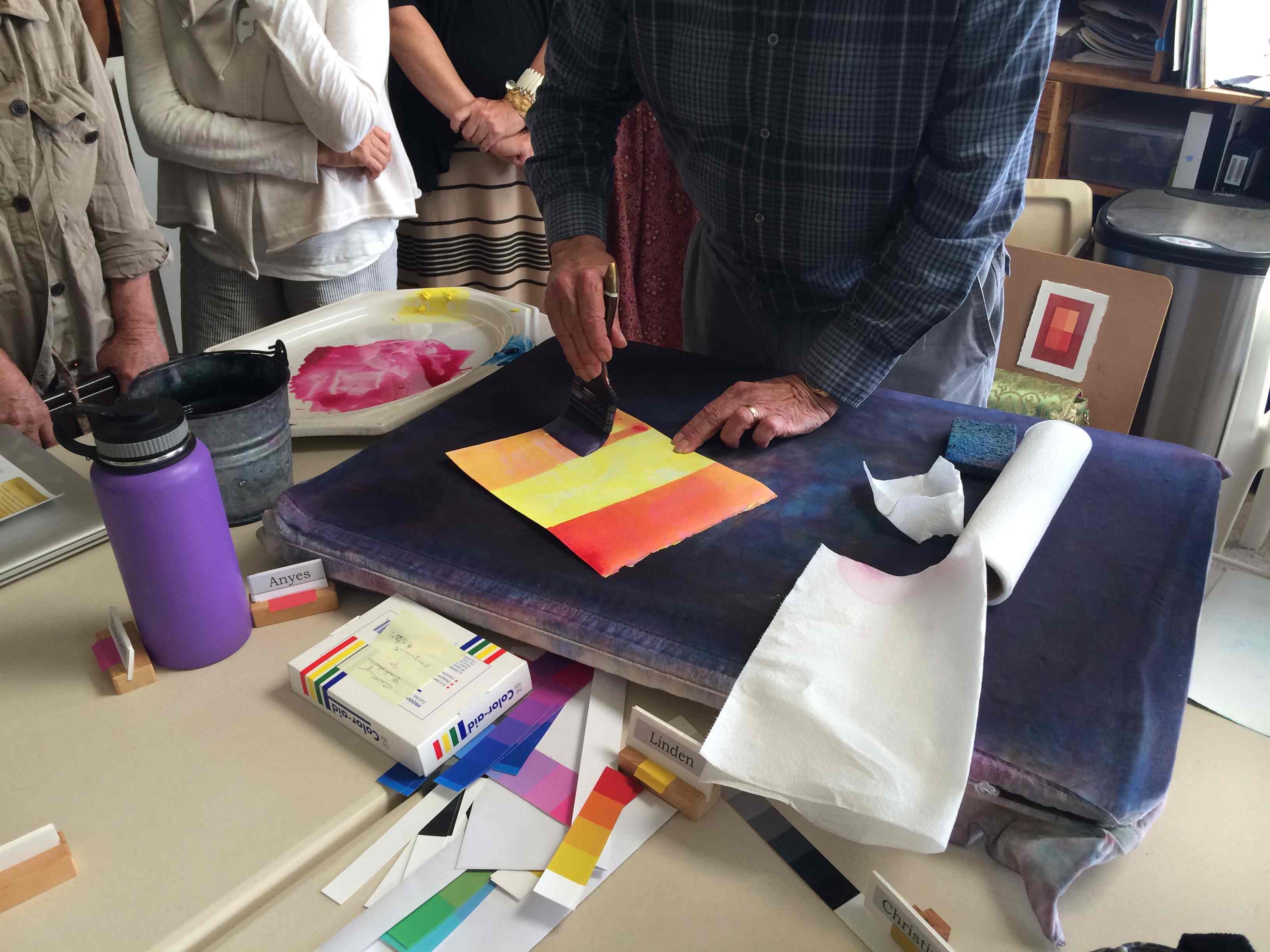
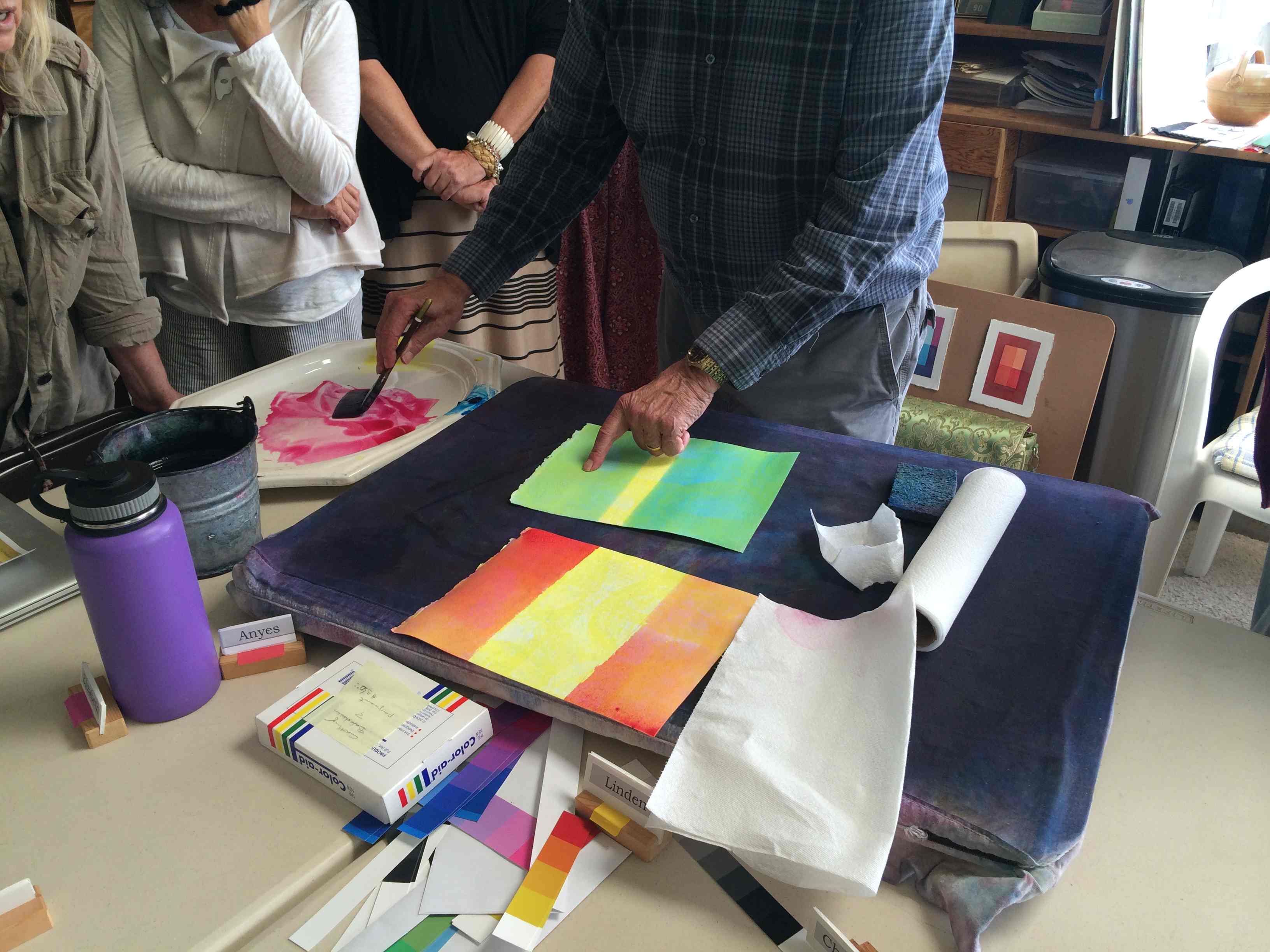
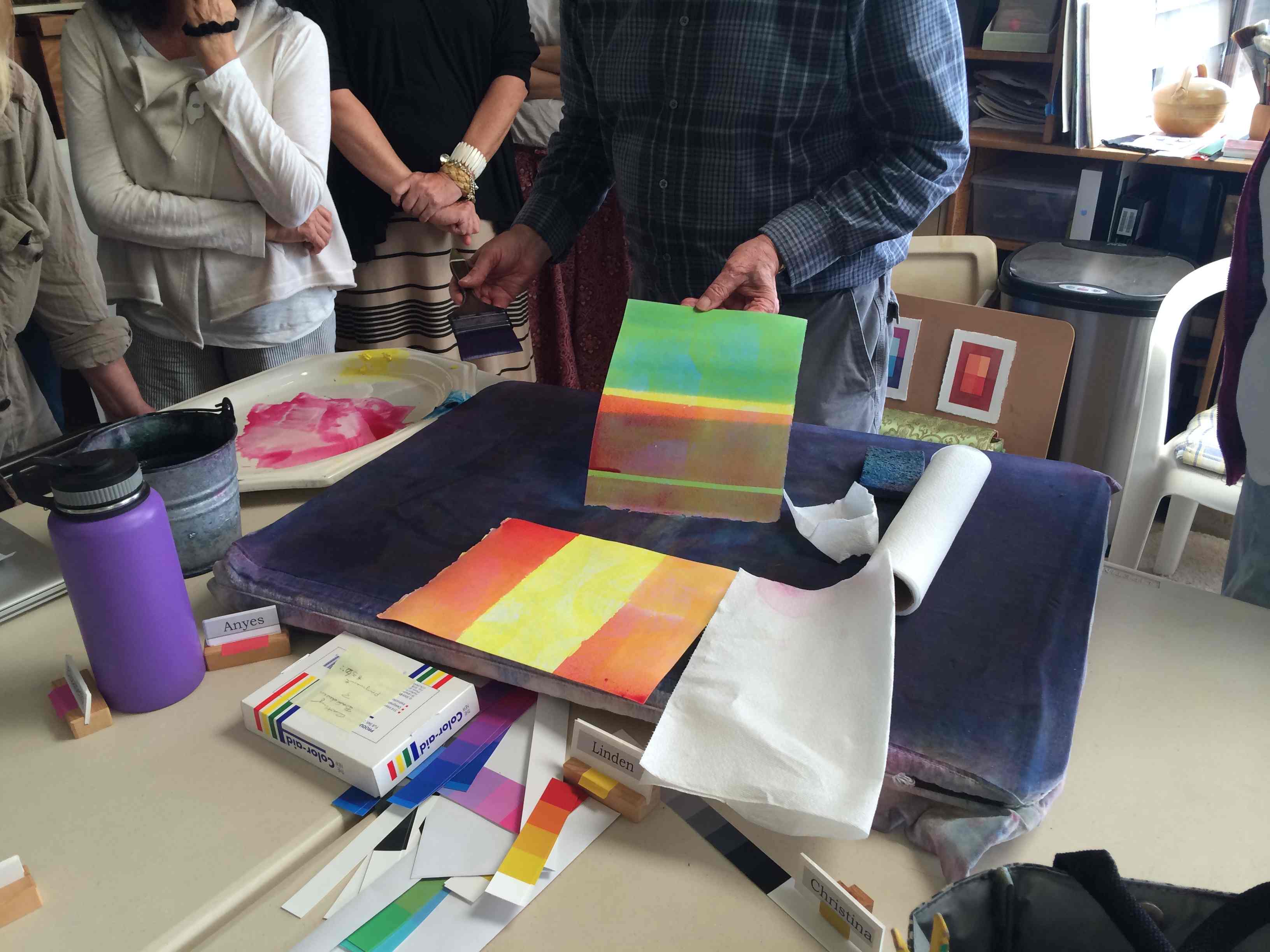
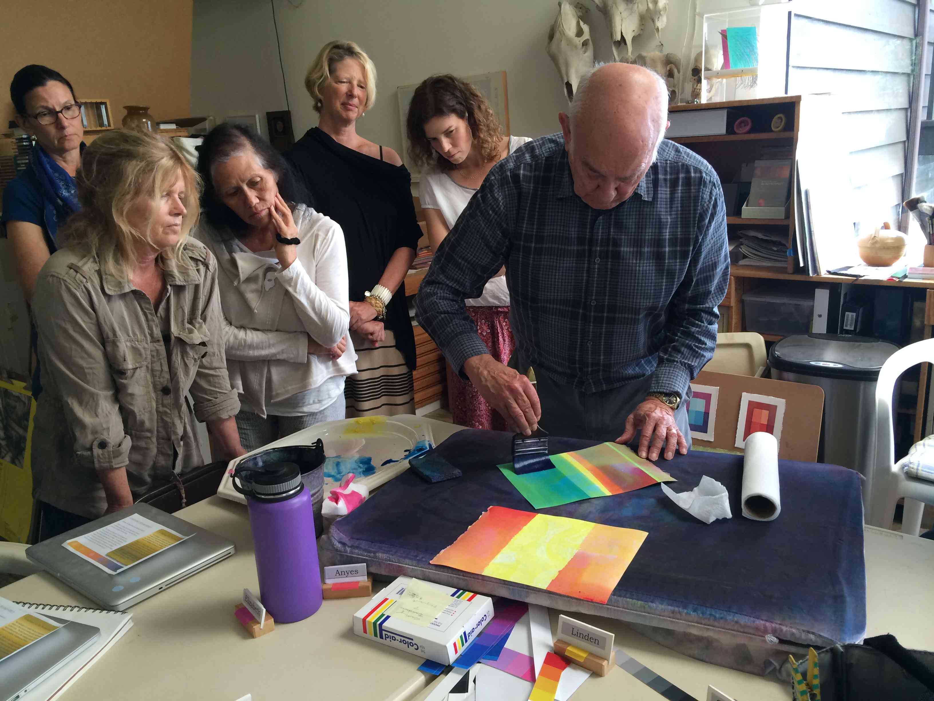
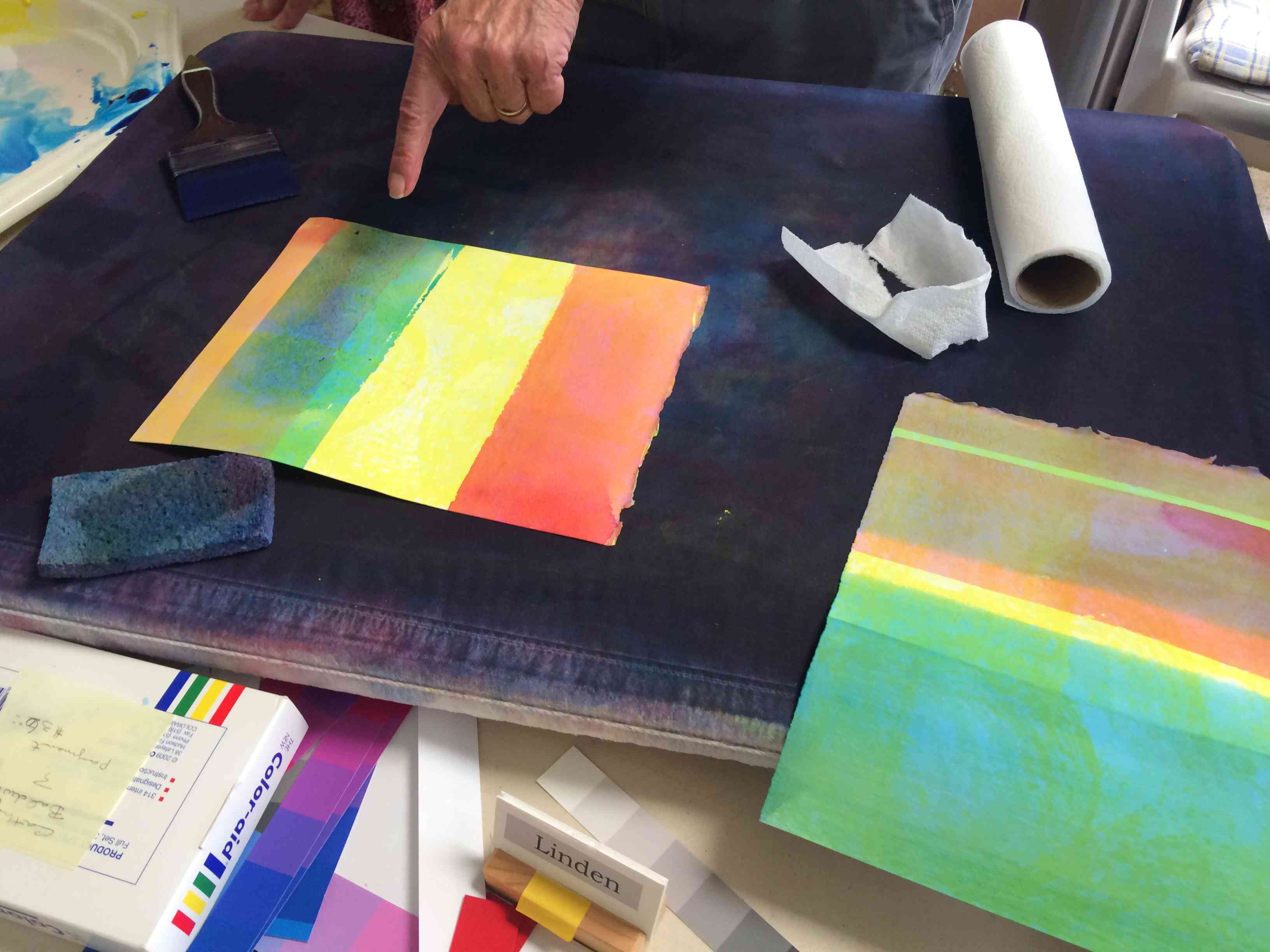
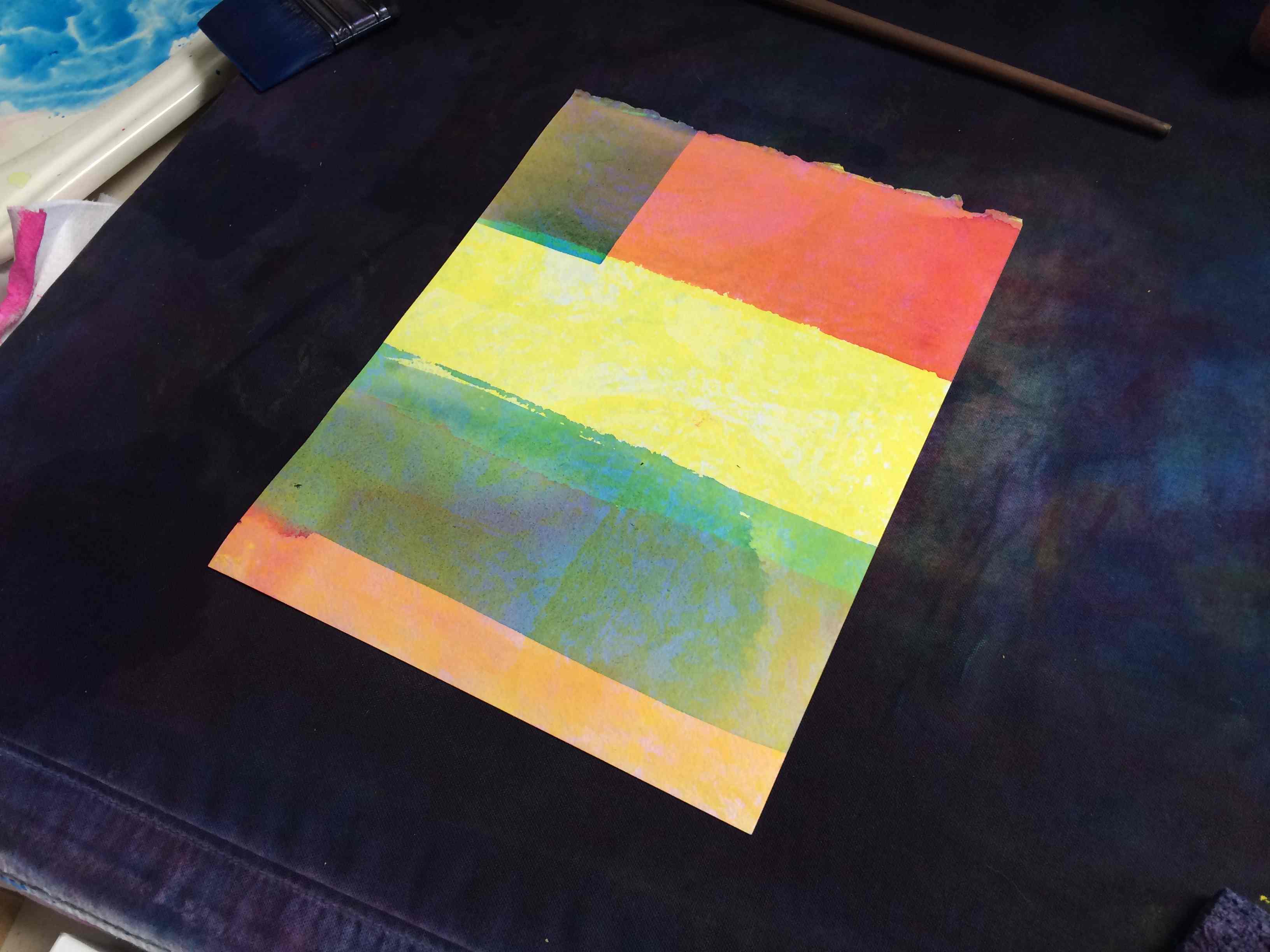
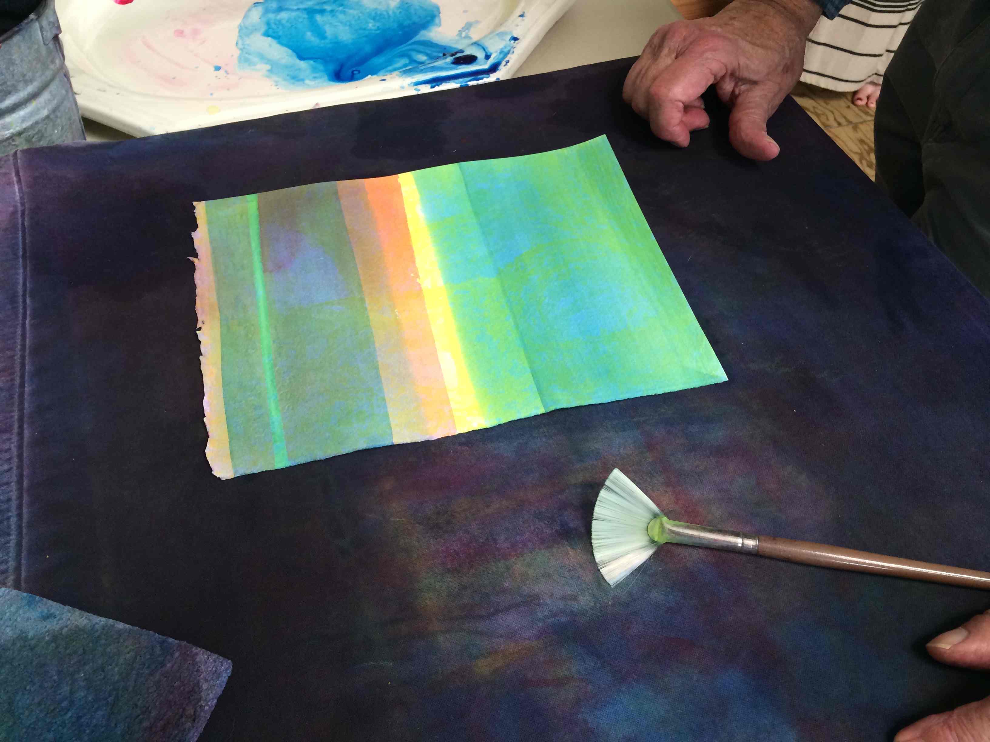
Watercolor demonstration
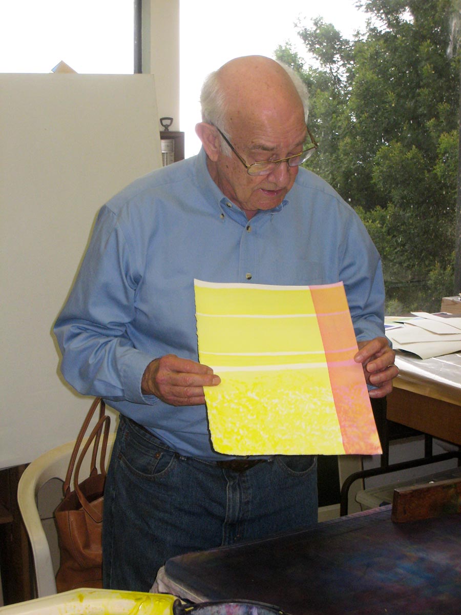
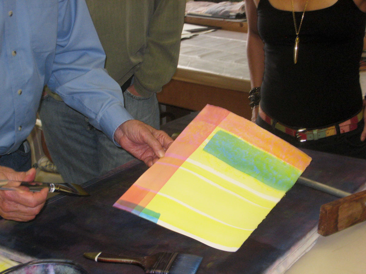
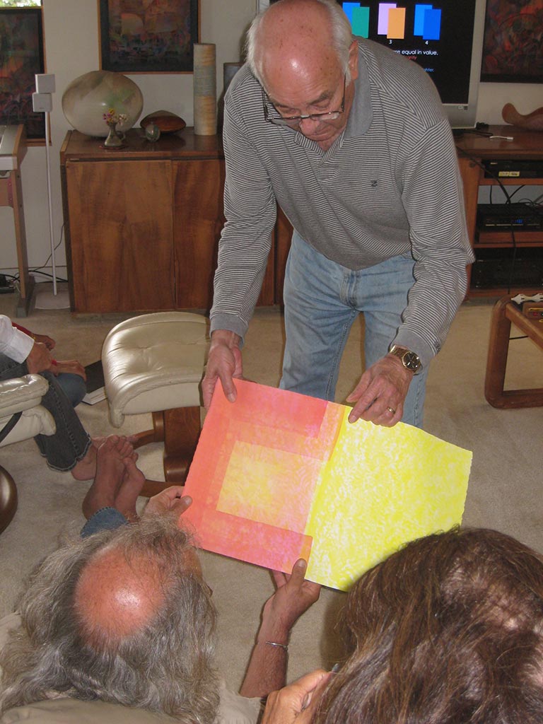
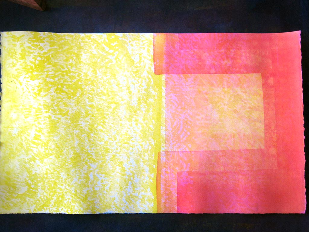
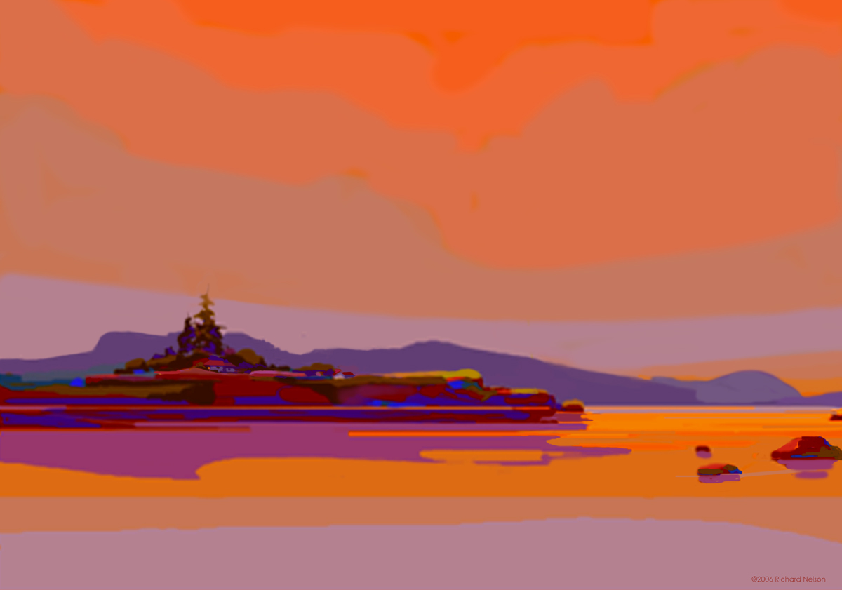
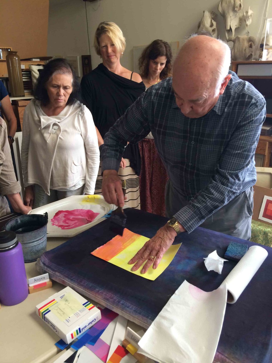
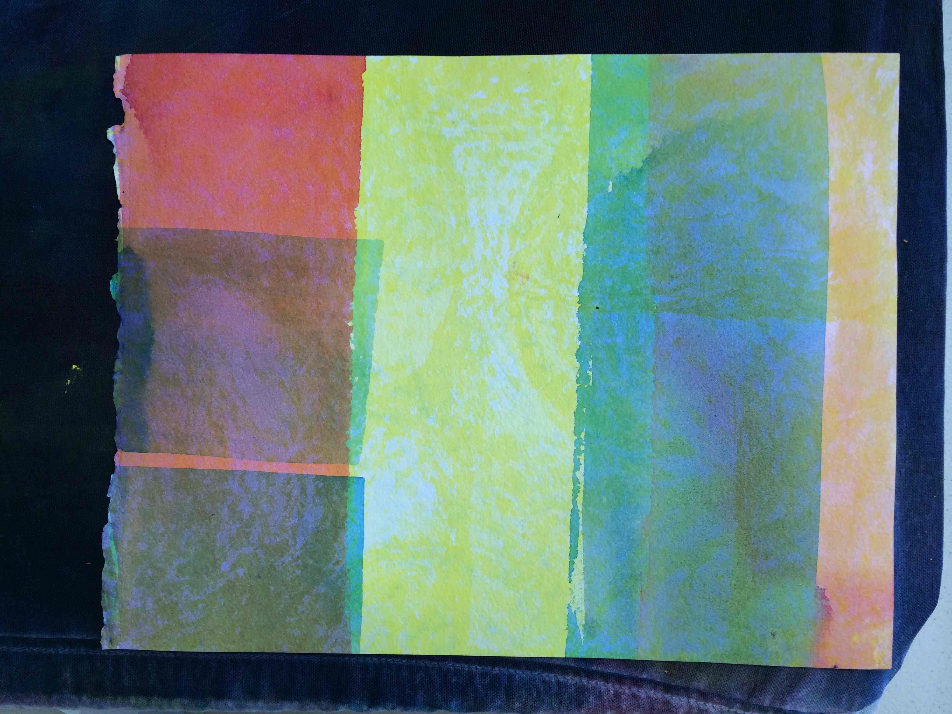
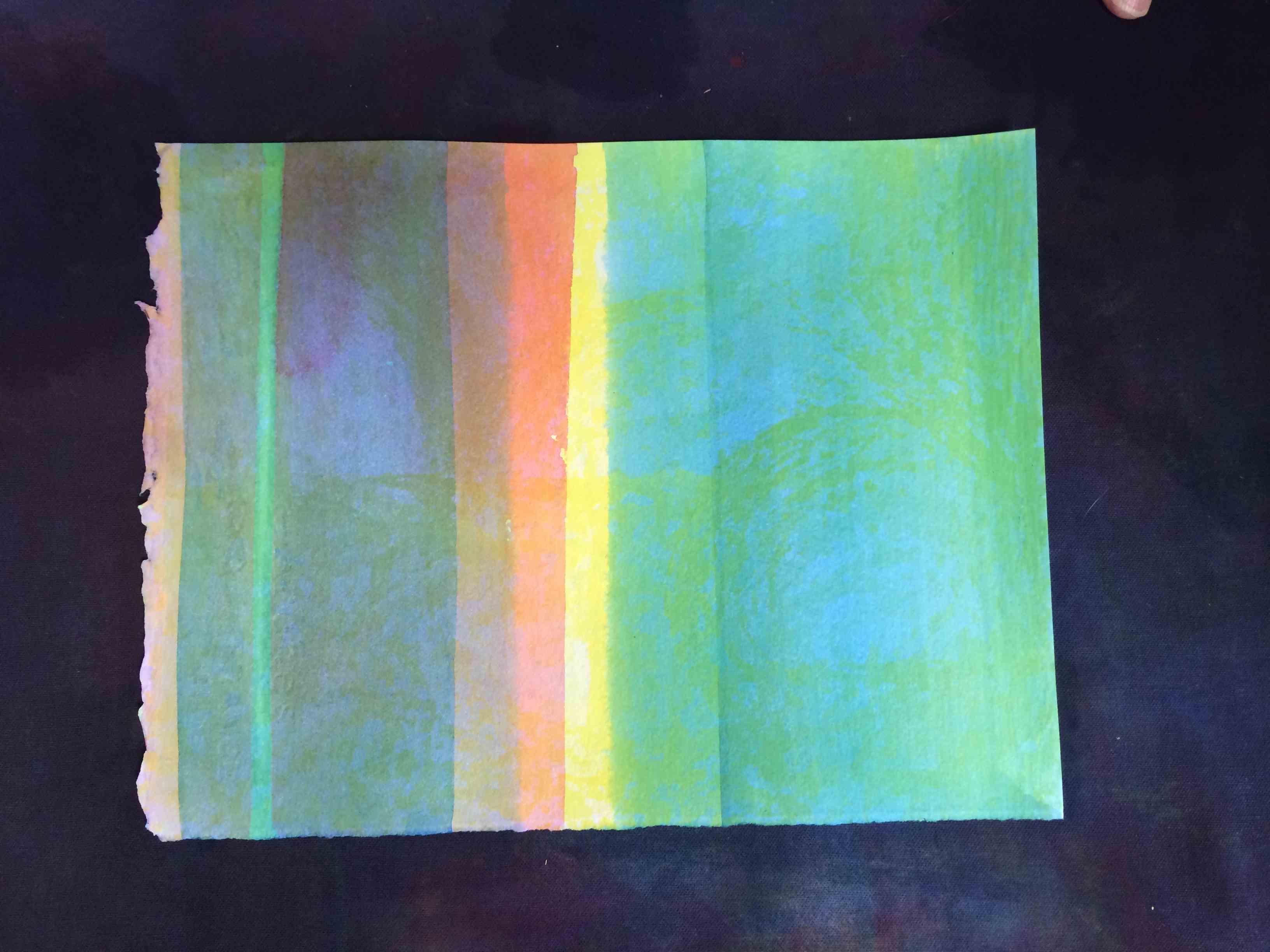
To finish the class, Dick led a watercolor demonstration which illustrated the amazing effect of vanishing boundaries and halation. Karen described it well in her post from the 2014 Color Relationships 1 class:
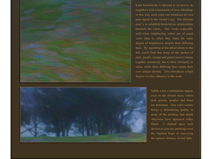
“Dick demonstrated how to achieve equal value, vanishing boundaries, and halation in watercolor. He started with strips of solid and mottled yellow, then laid in stripes of magenta and cyan over it. Because the yellow is so light – so close in value to the white of the paper – neighboring values of cyan and green, and magenta and red, are also nearly identical, creating a luminous, sparkling effect, much more engaging because of the optical mixing than areas of solid color would be. No matter how many further layers are added, this relationship remains.”
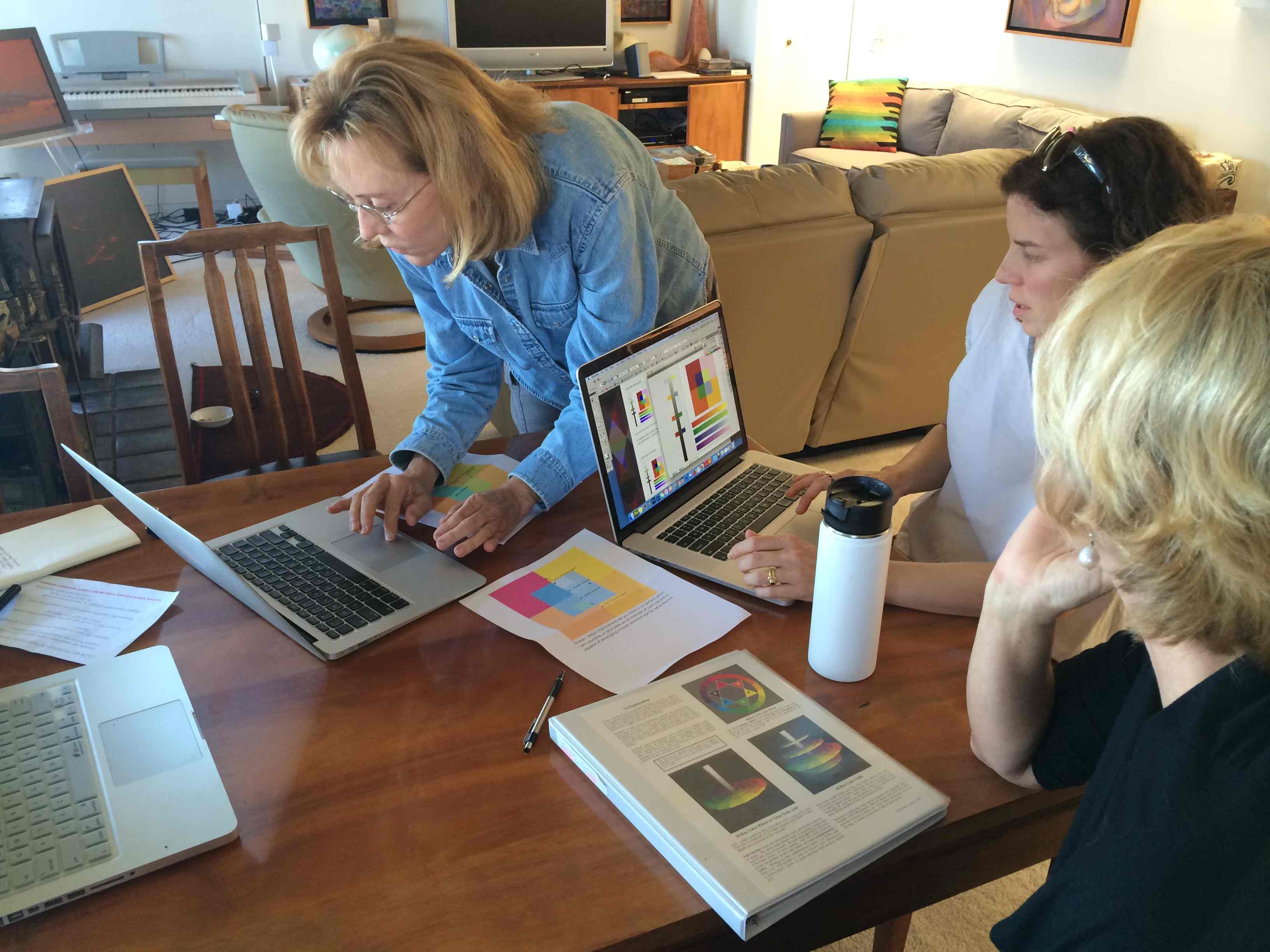
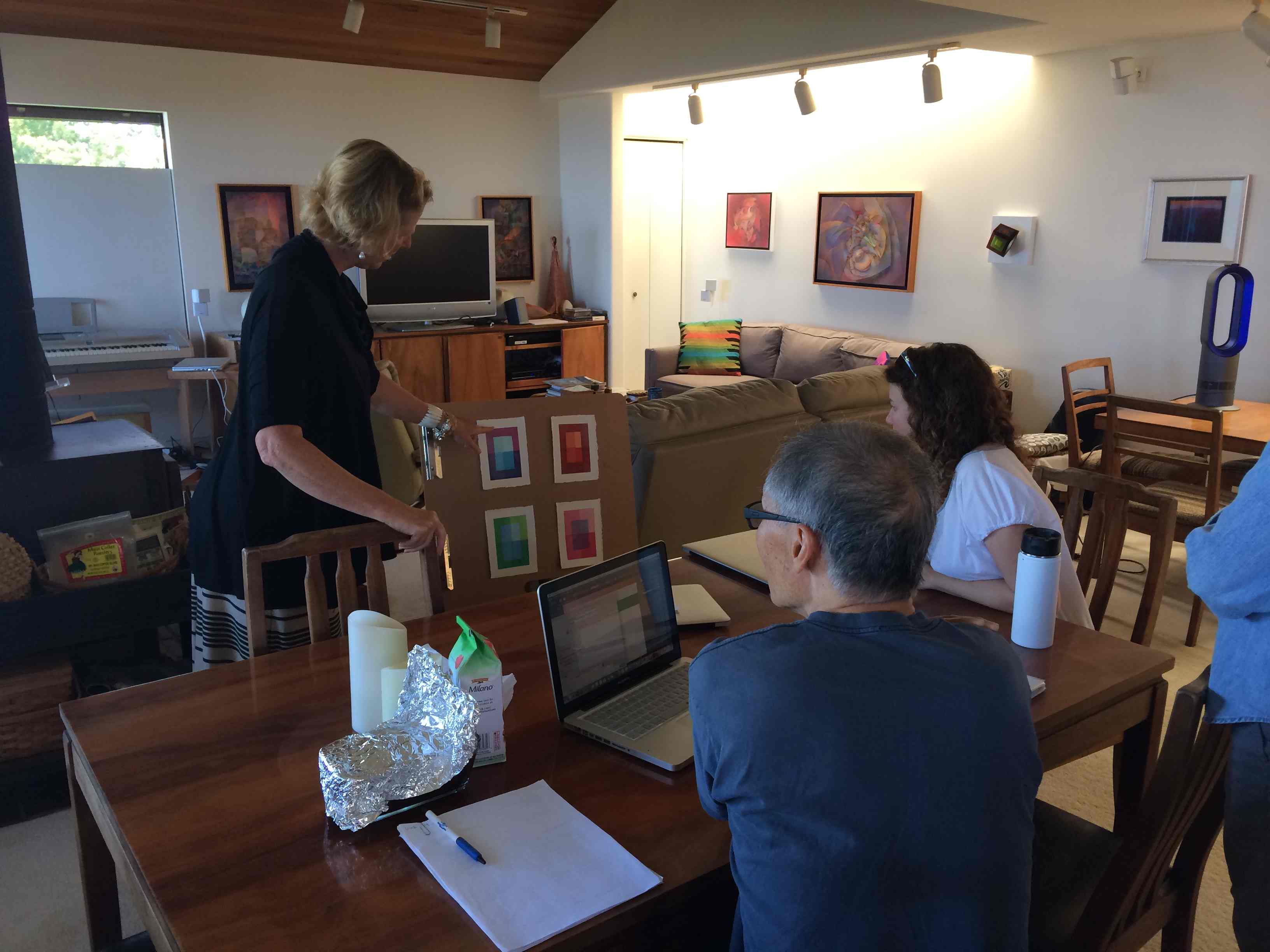
Class photos
Class materials
[gview file=”https://dicknelsoncolor.com/wp-content/uploads/2016/04/VBHandout16.pdf”]
[gview file=”https://dicknelsoncolor.com/wp-content/uploads/2016/04/ColoristDefined3.pdf”]
Videos
Matrix Tutorial
A step-by-step tutorial on building a color matrix in Adobe Illustrator.
The Color Matrix
Following the ARRAY concept of color relationships, I have expanded Josef Albers’ two-parent relationship to a broader spectrum of color possibilities. The results are startling and a new tool for those who seek color harmony.
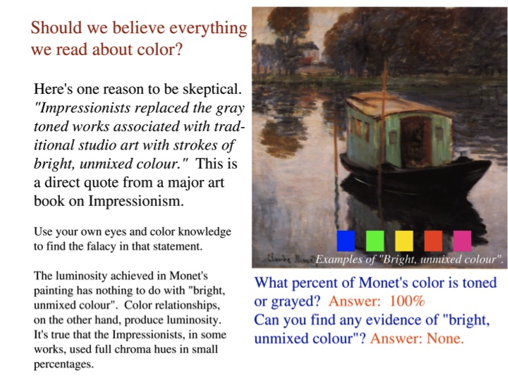
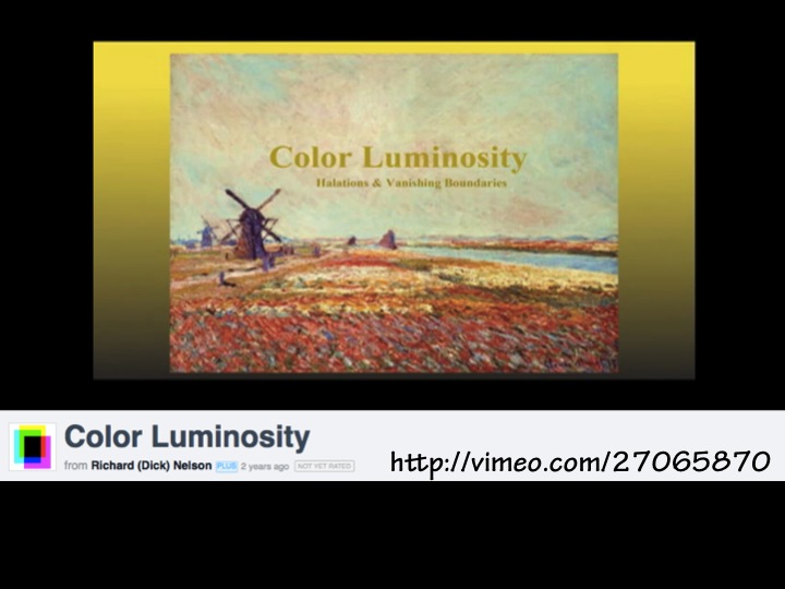
Color Luminosity
Here are two ways color luminosity can be achieved. This should dispel the notion that the French Impressionists achieved color luminosity by way of full chroma color application. See the truth with your own eyes.