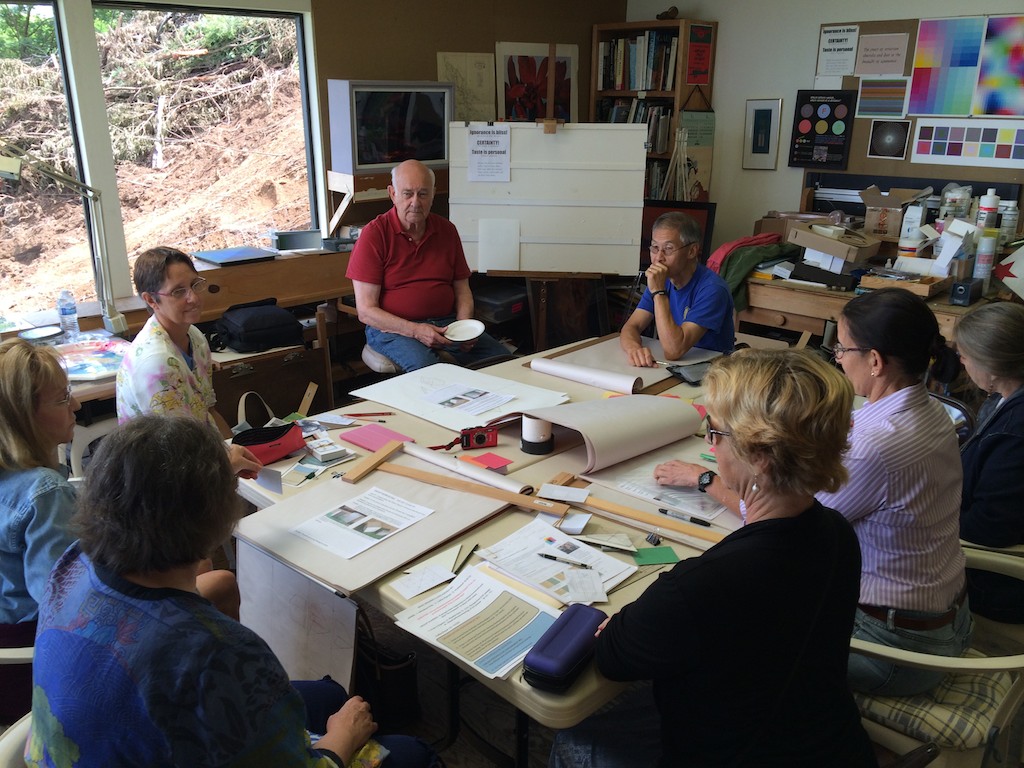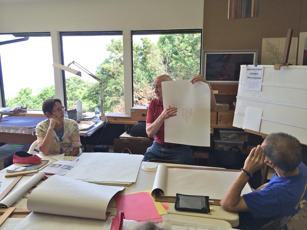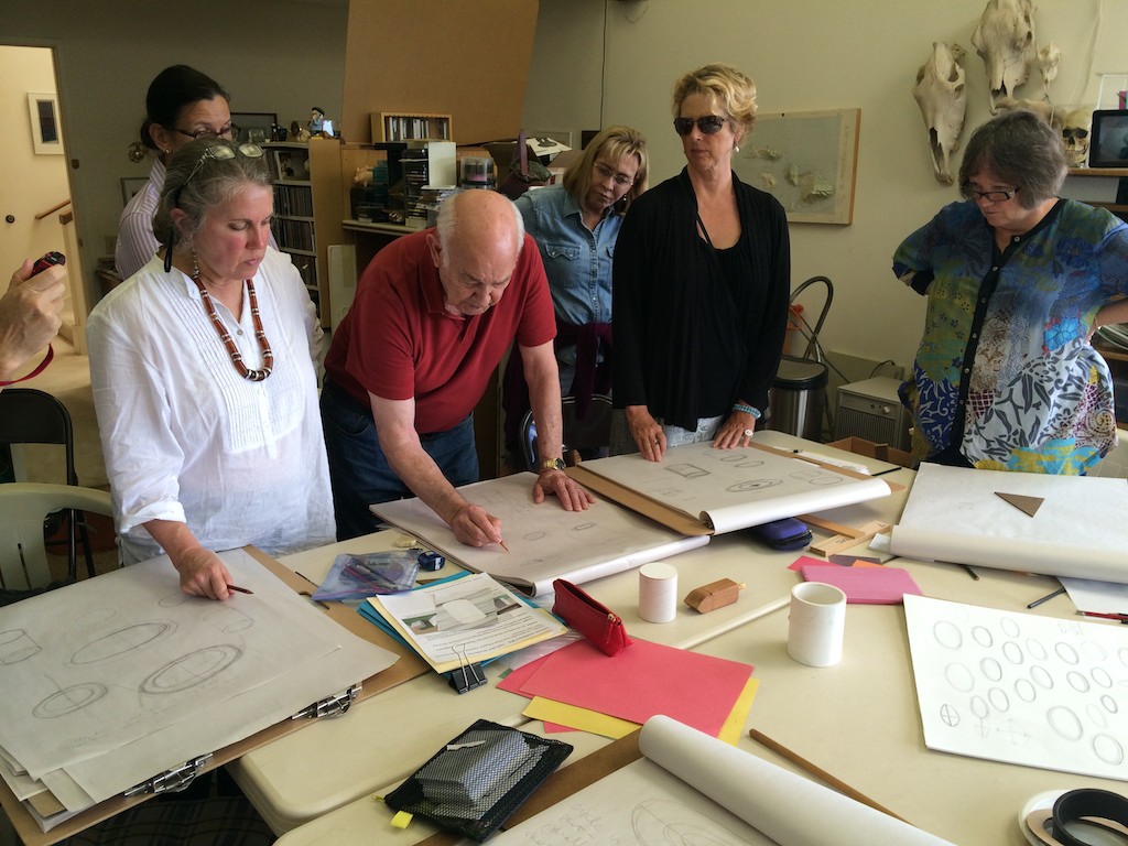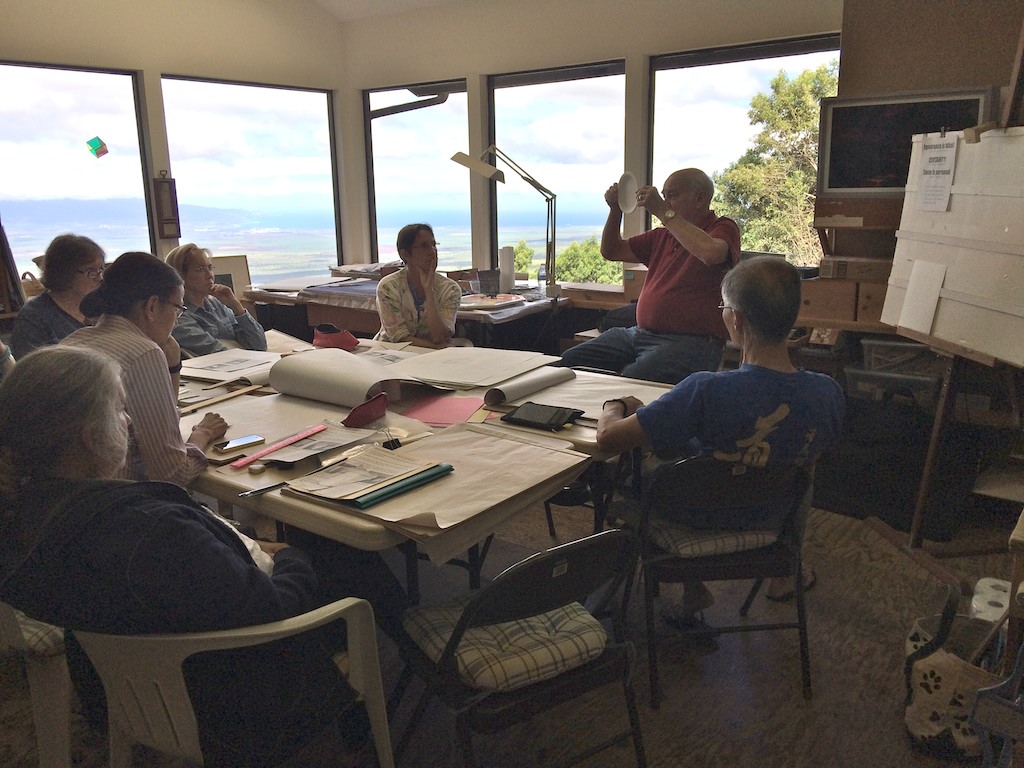
The eighth session of the Drawing Foundation class for Fall 2015 was held on Thursday, November 5. We covered a lot in the class, including: more lessons learned from the index cards; the importance of pride in your work; the subtleties between literal interpretation versus artistic interpretation; a drawing by the great Michelangelo; figure-ground combinations and reversals; and much more.
Homework assignment
Class recap – some key ideas
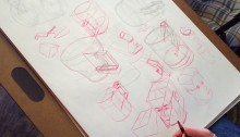
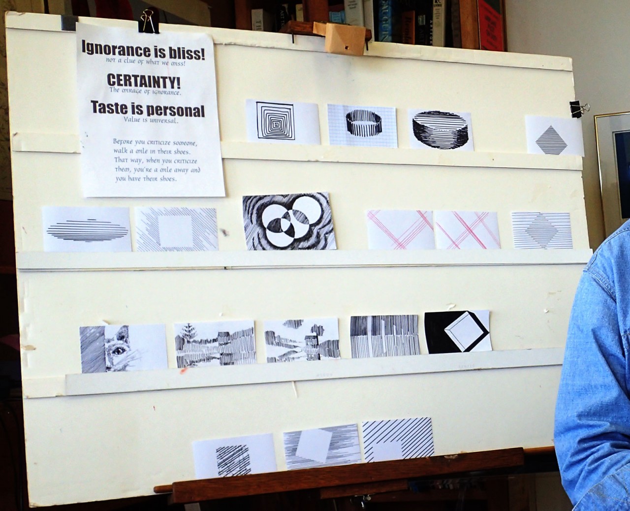
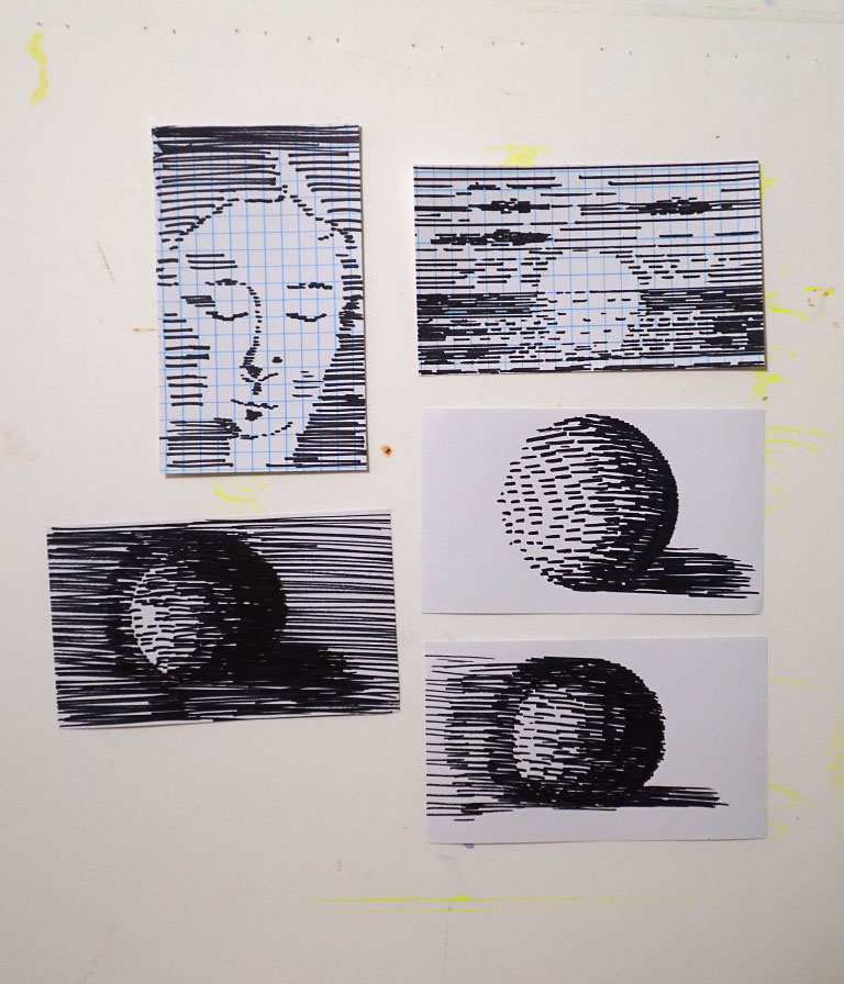
Index cards
Another round of successful and unique index cards were shown this week. One notable feature that speaks to the success of this simple assignment is the prolific output of work, and students have continued to create original designs. Each week brings more solutions that have yet to be seen, which is quite a feat!
Dick remarked on every card, exclaiming over the use of descriptive line, composition, subject matter, and even incorporating the weight of line to add depth and distinction to the image. He applauded the class: “How do you guys come up with these things? I was so proud of myself, I thought my 20-odd images were the final say … this is just far beyond any of my expectations!”
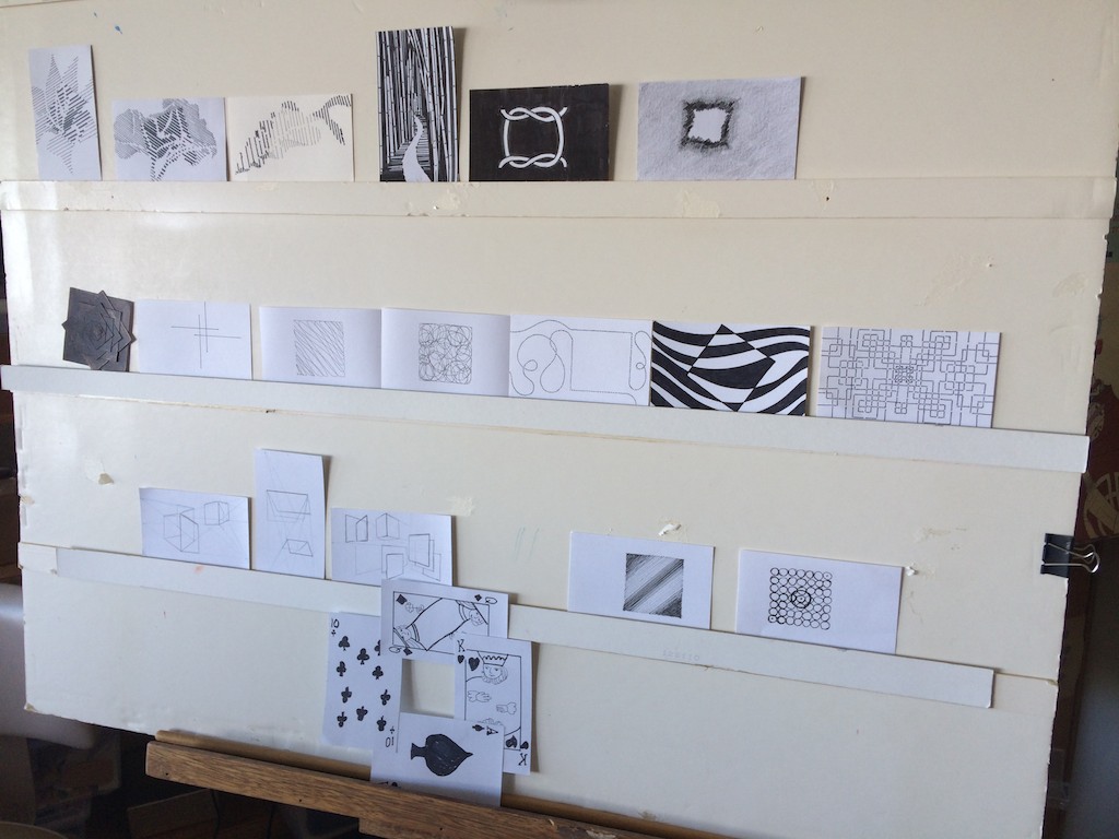
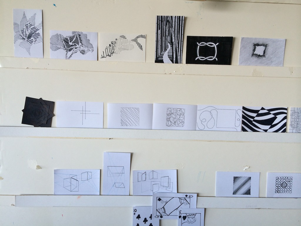
He made mention of one card, a symmetrical design made up of many squares, and done with all dashed lines that did not meet at their implied corners: “By interrupting the corners, so that the lines are not meeting – do you see rounded corners? I thought ‘How did they get all of those corners perfectly, like a bull-nosed corner, on all of these squares?’ But it’s simply by leaving a gap: it’s all implied, and it’s not there at all.
“Now, this is a rather important visual element: think of how important filling in what is not said, like in literature, or a good joke. Unfortunately, the literal person never gets the joke because they can’t ‘fill it in’. And I’ve heard people going into art galleries and museums and saying ‘Isn’t this marvelous, look: they painted every single leaf on that tree!’ – oh, give me a break. Because we don’t see that way, we don’t look that way. When I look out there, I see a bunch of leaves moving in the wind … and you think you see it all, but you’re filling in all the detail.
“But this is why ‘1+1=3’: when it’s more than just lines, but the lines are arranged, or papers are arranged, or ideas are put together in such a way that it adds up to more than the sum of the individual parts. And to me, that’s great art, when that begins to happen.”
Thoughts on taking pride in your work
Dick moved on to ask a different question, wondering how the students had been responding to the class, and if the content had met their expectations. He addressed the issue of whether or not this kind of detailed instruction was necessary, or even worthwhile, since this is not a class of graduates looking to get a degree or make art their primary profession. “In case you haven’t noticed, I haven’t watered this down: this is the same kind of approach you would have at graduate school at Yale. And so you might say, ‘I really don’t need this, because I’m not going to be a professional artist’, so this might be some overkill. But I am curious, is this frustrating to you that I’m not watering this down?” Everyone agreed that they enjoyed the challenge of what he was teaching, and while it isn’t coming easily, this course is also providing practical tips and techniques to build upon.
Dick shared his philosophy on taking pride in your work: “When I came back from Korea, I went into the reserve, and they said ‘Now, Dick, don’t be too hard on these guys – we want them to come back.’ And I said, ‘Well, I’m sorry, but that’s not how I’m trained; and my platoon will have haircuts, they will be in proper uniform, all the brass will be polished – these guys will know that they have a leader!’ Boy, did they. But our morale shot up so far, and in the long run, I found that people don’t take pride in themselves or their work if there’s nothing to be proud about.
“And you know, there’s something very precious in life as you begin to recognize how important it is to do a job and do it really well. I can’t tell you what this does to me when I see this level of involvement. I’ll tell you, your morale will never be higher than when you’ve done something and you know it’s right.”
Critique of plant drawings
We took a quick coffee break, and set up the homework assignments in the living room for a group critique. The class had drawn a beautiful variety of plant life, from banana trees, to succulents, to ti leaves and orchids. The display caused Dick to mention how far we’d come since the first class, and that the drawings all showed an understanding of form that we may not have been able to capture on our first day.
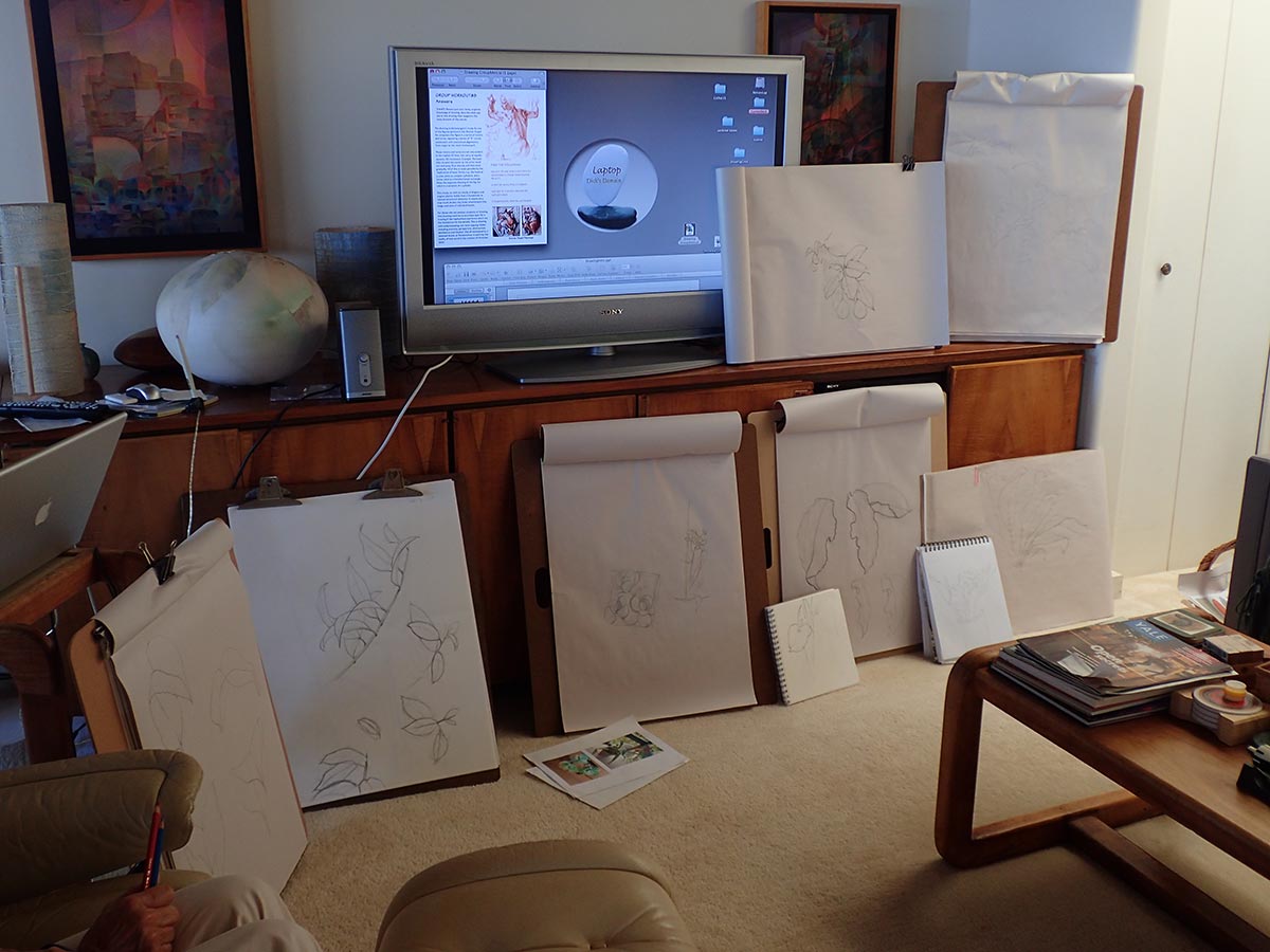
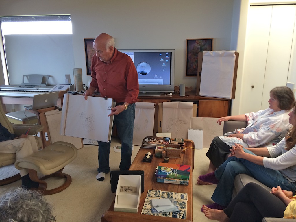
One of the most common critiques was varying the weight of lines, and learning how to use this technique to communicate distance, texture, and form. When line weight is too similar throughout, or is improperly used, the result can be visually disorienting and confusing. “Take advantage of that weight because it gets ambiguous in here, especially from a distance. Up close I can clearly see [the drawing]; just lift some of these leaves off the ground by virtue of the weight of line.”
He pointed out one drawing where all the veins of a leaf had been sketched in, and commented: “One of the few that actually put all the veins in. There comes a question: what, by editing, do you leave out? What do you put in?” This followed on what he had been saying earlier about the importance of ‘what is not said’, and how important it is to consider that all elements of a piece will add to the sum of its message (1+1=3).
Dick continued: “What I’m doing is taking this another step folks, because all drawing is communication, and what you’re communicating by putting the veins in or not putting them in, and doing this or doing that: there’s a story beyond just the image of a leaf. It’s like poetry: if it adds up to ‘here’s a drawing of a leaf’, that’s fine, but that’s not art. Just because words rhyme doesn’t mean it’s poetry. The poet or the artist relates … there’s a relationship, to you or to life or something beyond …
“And that might also dictate how bold or how delicate or what view or what angle you choose: what are you telling me, what is your story? So right now you are getting the grammar: but grammar isn’t writing. It’s what you need in order to make it art, or make it writing, right? But you’re not going to communicate anything if you don’t know the grammar. So we start with that.
“The course is coming to a close: where do we go from here? And all I’m suggesting is that there’s another whole door to open, to step in, and this becomes poetry, or something more than just a literal interpretation of a leaf.”
Dick summed up the class work with an affirmation that we are headed in the right direction: “These are major steps, because this was our first major encounter with something that’s organic, and I get the feel that it’s alive. Bravo.”
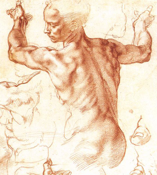
Michelangelo’s drawing
We changed to a discussion about one of most famous drawings in history, The Libyan Sibyl, a study by Michelangelo of a figure for one of his frescoes on the ceiling of the Sistine Chapel.
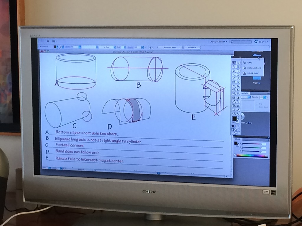
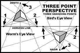
Dick asked us to tell him what we saw in the drawing that related to any of the lessons we have covered in this course. People identified the use of perspective and foreshortening (especially in the arms as they reach away from the viewer); line weight (the importance of fading off the end of a line to suggest ‘overlapping’, such as in the musculature of the arms, and how darker lines give emphasis to edges); cylinders and squares (we could see the suggestion of a cylinder in one of the wrists, and how Michelangelo used it to shape a sketch of a big toe); and the invisible shapes that governed the forms (the head fits in a cube, while the torso is a rectangular block, the arms in cylinders, etc.).
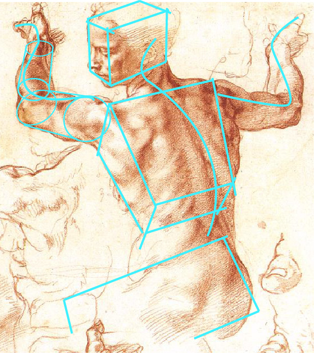
Dick then pointed out one the most important characteristics of why this is such a beautiful drawing: the repetition of a visual theme – or in musical terms, a melody – that ties the whole piece together:
“The head’s tilting back towards us, right? So three-dimensionally he’s pulling the head towards us, and the arms could be enclosed in a plane that’s foreshortened or going back into space: he’s counteracting, right? And so the head is turning to the left, the torso is twisting to the right … And if you’re posing a model, do you see how you’d have to have them sitting to get these different twists? [This pose is visually] more exciting, as it twists and turns … And if you really look at this, from a standpoint of twists and turns, there is a built-in implied ‘S’, and how many S’s can you find? Now, they’re subtle – but like the trunk of the tree, the branch of the tree, the twigs, and the leaves [the pattern will repeat] …
“He turns this hand back, away from the angle of the wrist, just as he did the head. Instead of bending the hand this way, it’s counteracting the angle which this is going. And then the other hand bends back away in opposition to this direction, and then these fingers come back again. So all the way through: repeat, repeat, repeat, S, S, S … can you see that? Don’t be literal, but the idea is that when we come down to common elements it all goes back to, for example, how many notes are there in music? And yet, with those few notes, think of what can be done.”
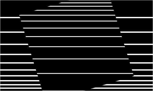
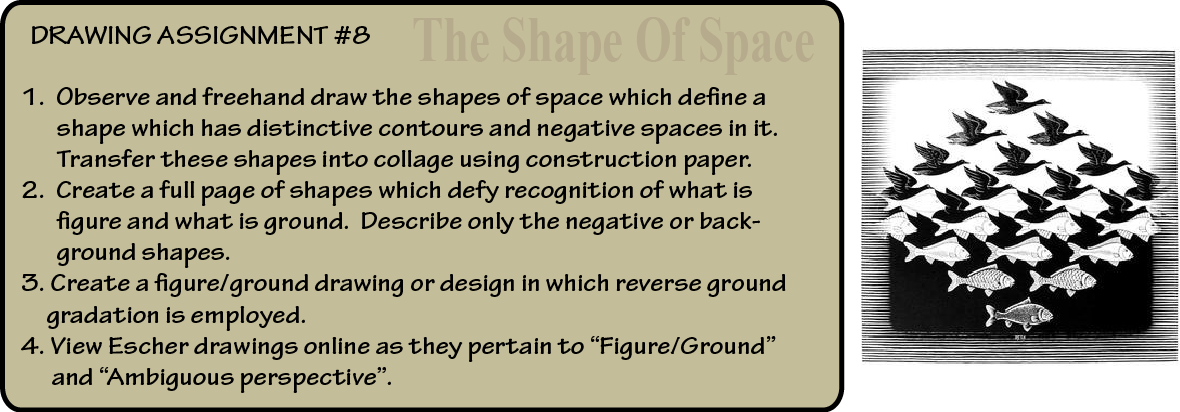
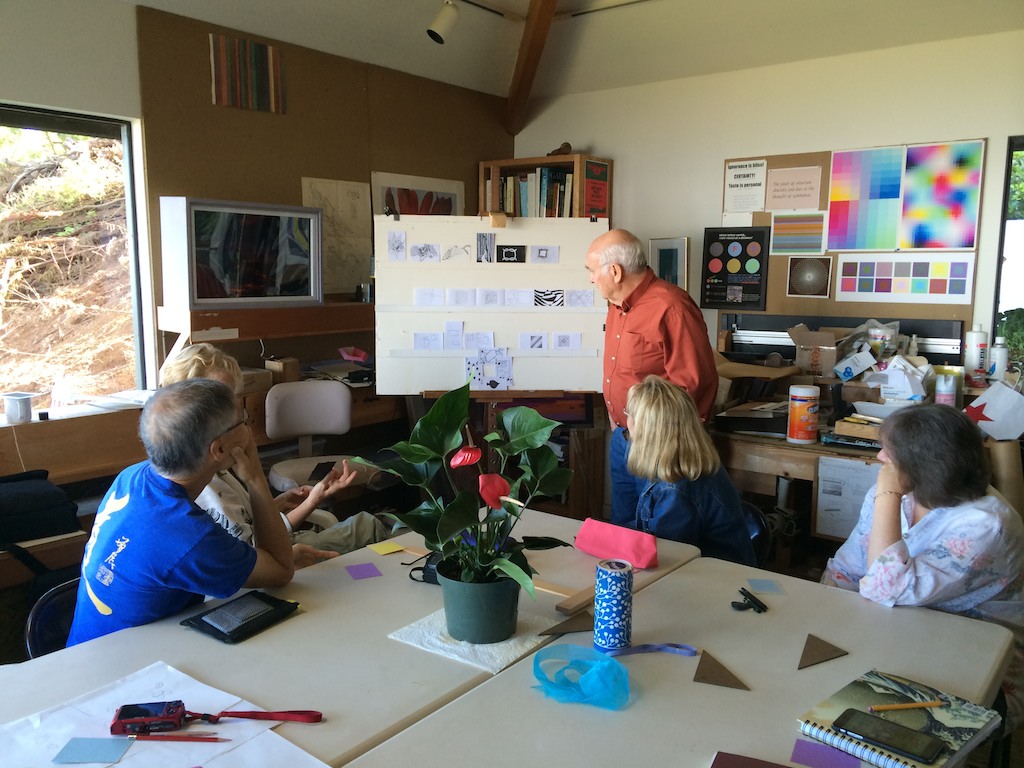
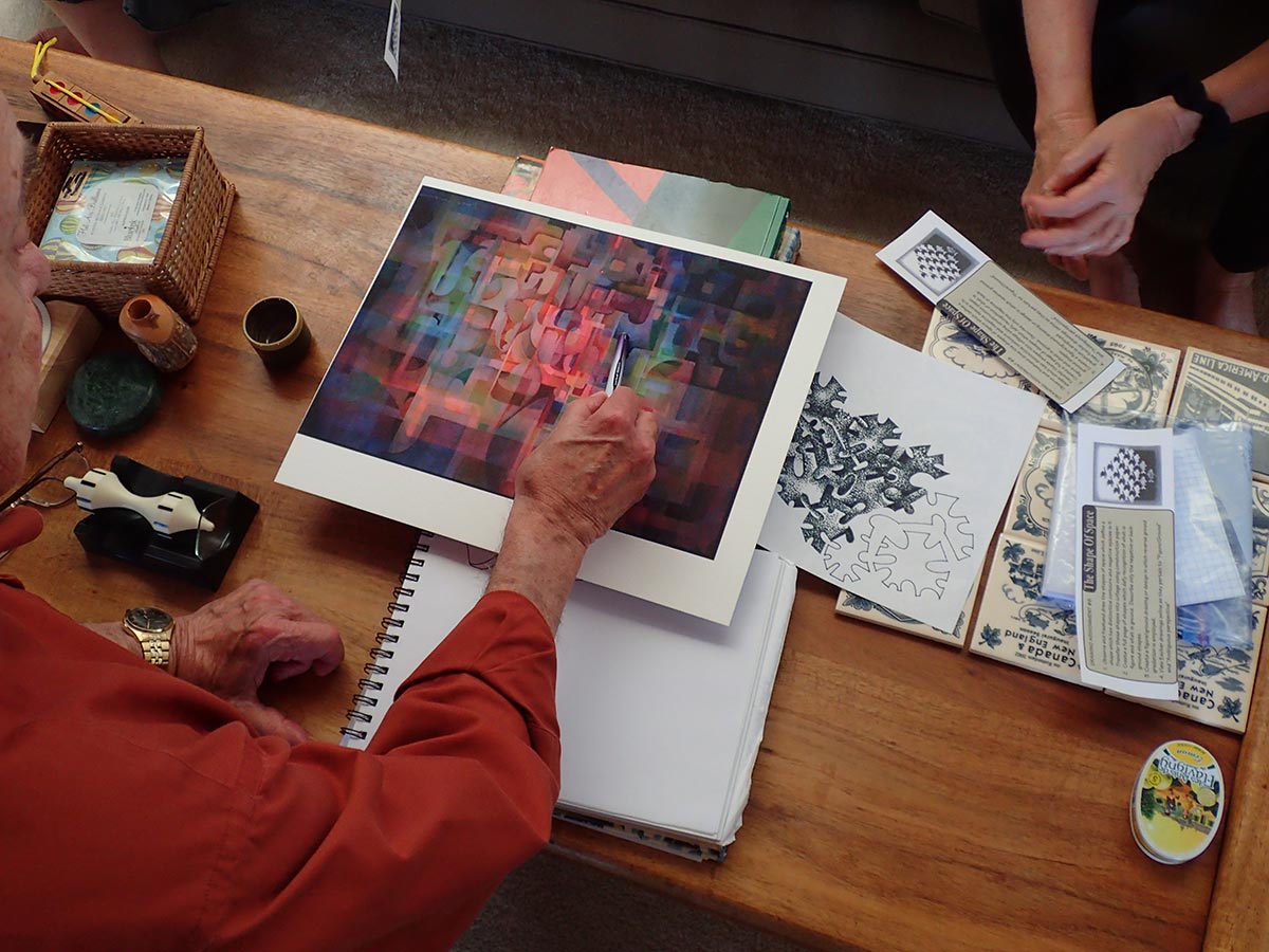
“The Shape of Space” and figure-ground reversals
Dick moved on to discuss this week’s homework assignment. This 3-part assignment deals with negative space, and asks the artist to look for the shapes in between objects, rather than at the objects themselves. It also asks us to learn to see the relationship between figure and ground, and recognize their equal significance. Most artists get so involved with the subject matter of a piece, they forget to think of the background, which becomes, as Dick put it, ‘fill-in time’. By concentrating simultaneously on both the shape you are creating and the negative space around it, you will learn to incorporate both parts into a cohesive whole.
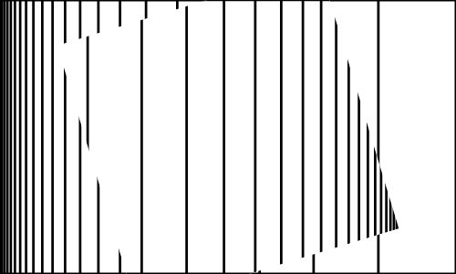
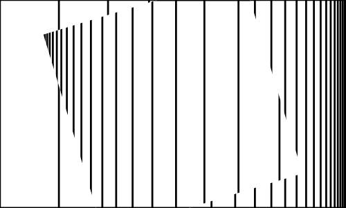
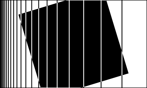
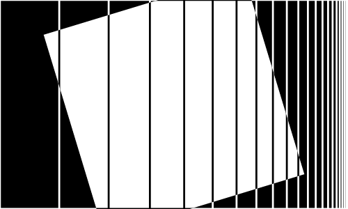
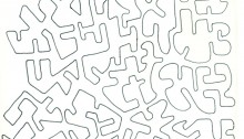
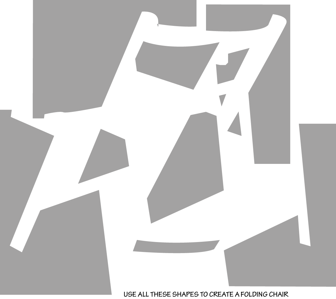
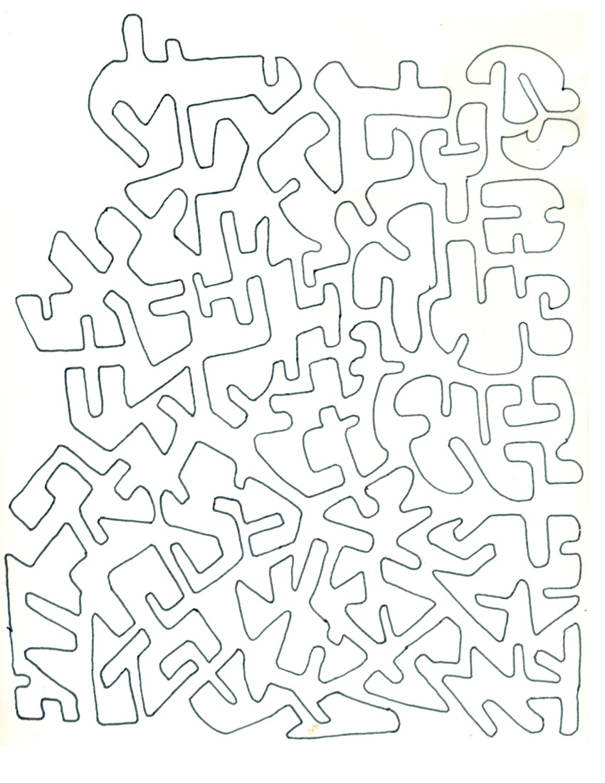
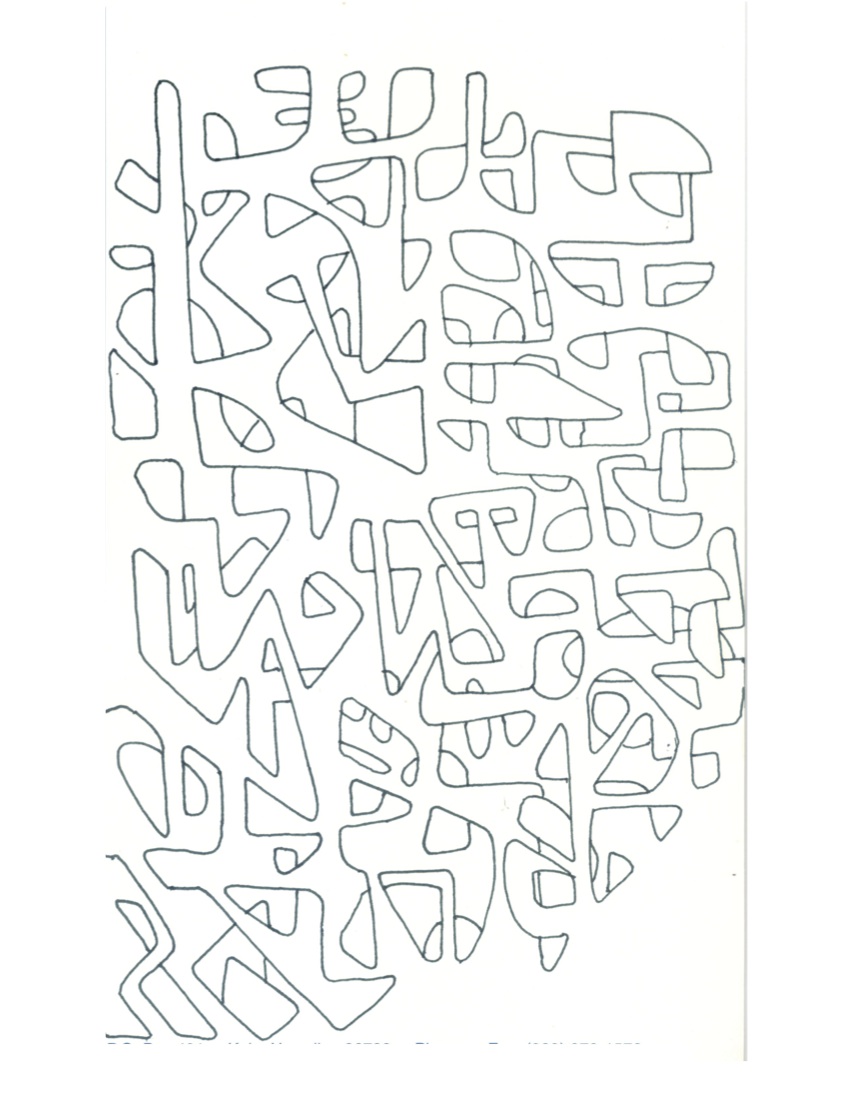
To demonstrate the power of negative space, Dick had created a sort of reverse puzzle, where the objective was to find the placement of the ‘background’ in order to figure out what the subject was. In this case, when all the pieces were placed properly, the silhouette of a chair appeared. Even without the details of the chair, we can recognize it as such from the definition of the space around it, showing how influential these shapes can be. When scattered randomly, it is easier to see how these ’empty spaces’ are actually dynamic forms in their own right, and that they are just as important as the subject matter.

Dick expanded on the concept of figure-ground by sharing some of the drawings he does in his downtime, and how important it is to see all elements in your artwork as being of equal consequence: “So the new assignment is ‘the shape of space’, but figure-ground in particular … as I watch television I always have a piece of paper about letter size, and I just start drawing a shape. But the shape must create around it an equally important shape.
“If you always think of your background as second-class citizen, as a backdrop, then you’ve lost some of the strength of the great art, and that is: what is the shape, and what is the ground? And you could say this is the shape, but the shape [that surrounds it] is even more exciting.
“This assignment is simply done to slow you down, and to contemplate the sense of using [negative space consciously], and that when you’re creating one shape, you’re literally creating other shapes at the same time. And to learn to be aware of both figure and ground, so like a yin-yang [symbol]: which is which, and which dominates?”
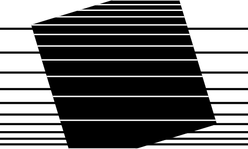
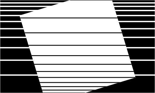
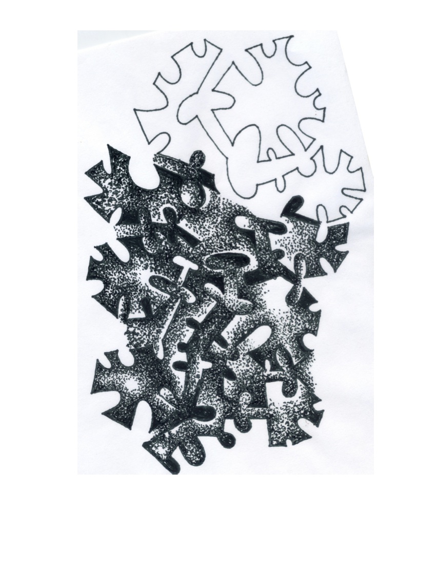
Another part of the homework asks us to develop the drawing a bit more by employing the use of gradation, and reverse gradation, as a way to trick the eye from identifying what is a highlight and what is shadow. This technique helps to both bring everything together on the page, so nothing stands out as being separate or isolated; and also creates a sense of depth and form:
“Then when you finish with a simple design like that, you can come back in, and as I did here, with just little dots of the pen point, and do a gradation by having it darker in one area, and leaving it light in another. Or do a reverse gradation: for example, it goes from darker to light here, as this is dark and sets this off. So it’s all part of looking at it, and recognizing that all these shapes are ‘of’ and not just ‘on’ a background. It’s a very, very important exercise, and one which can be done in the quiet moments of meditation. Don’t try to rush through it, just invent your own shapes, and one sheet is plenty. But if you get carried away, all the better.”
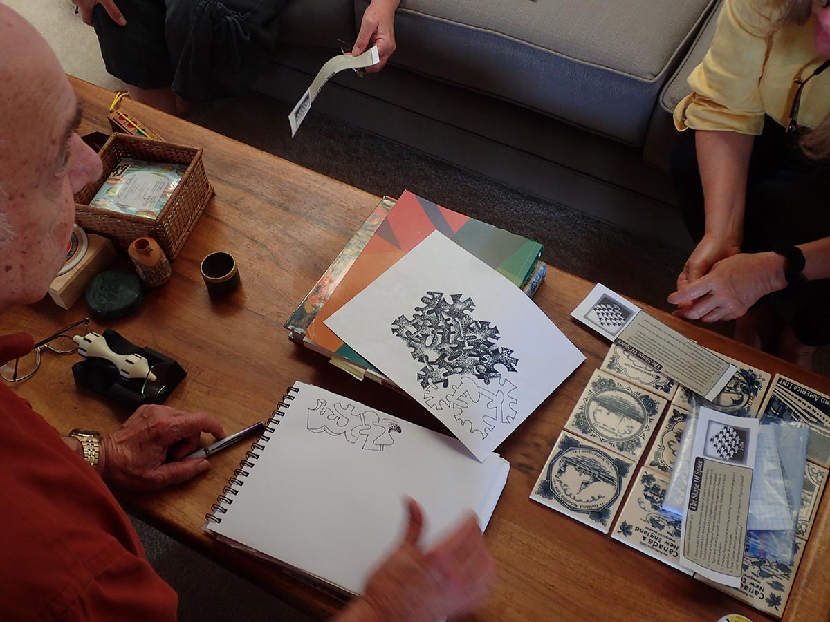
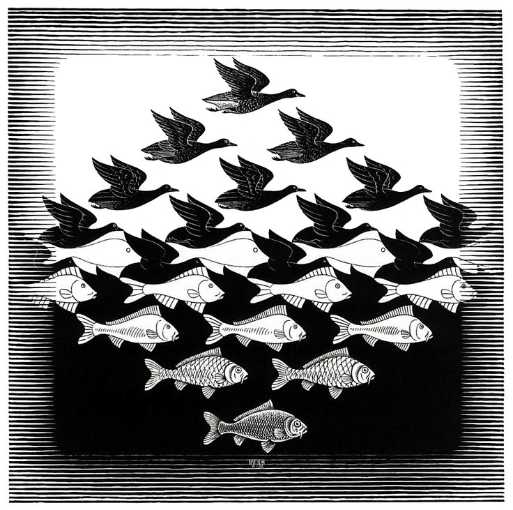
The last part of the assignment asks us to look up examples of work done by M.C. Escher, an artist famous for his play with optical tricks and illusions, and the rules of perspective. Dick shared a couple of Escher’s images for inspiration.
“Escher was a master at addressing this issue of what is space, and what is form, or figure, and what is ground. And he had a lot of fun with this, as the bird becomes less bird and eventually becomes just the background: black. And the fish are transformed at the midpoint, from fish into just white.”
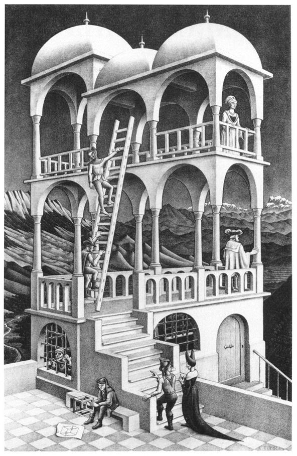
“Escher loved this also: taking what you know about perspective, and how you could fool people: as you concentrate on one element of the drawing, he’s changing something else – notice how the some column starts from the back corner and ends up as the front corner. A lot of these marvelous illusions take advantage of how our eyes depend on perspective.”
Enjoy your explorations, and we will see you next week for the final class of Drawing Foundations!
Videos
Dick Nelson demonstrates drawing figure-ground shape doodles. (3-1/2 minutes)
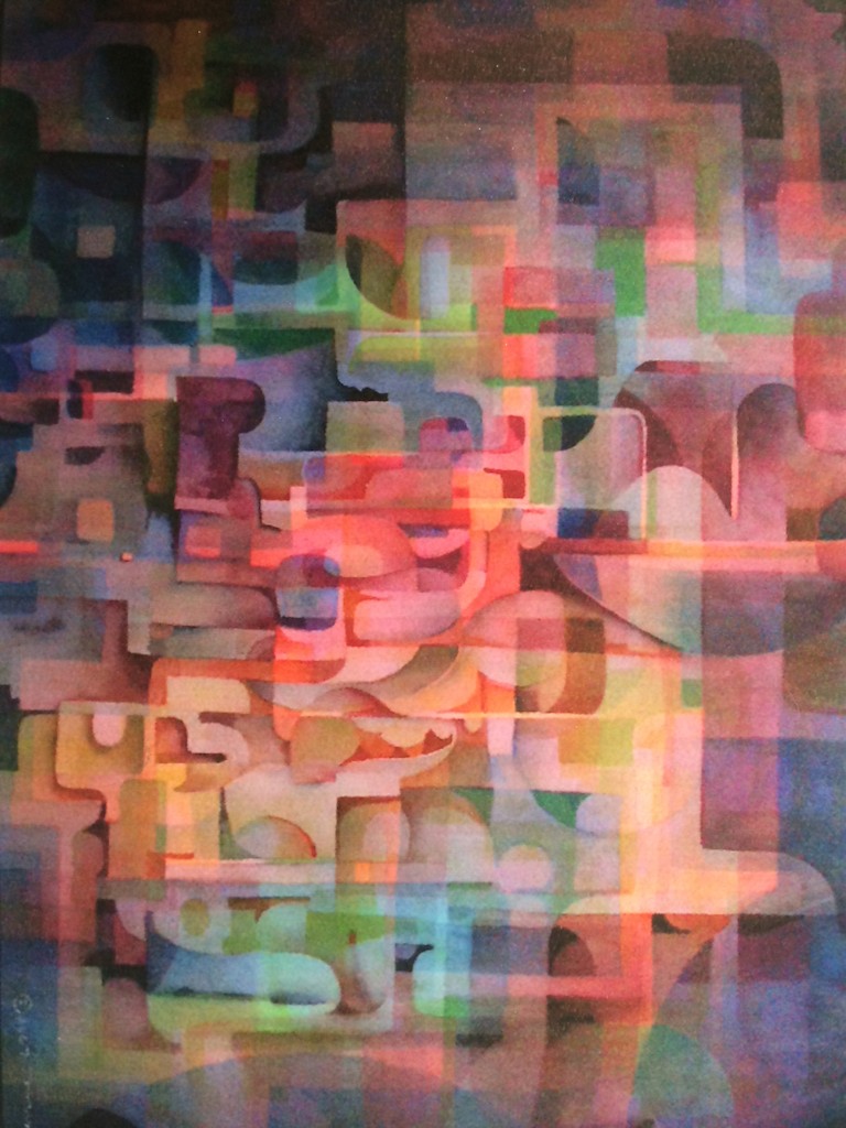
Dick Nelson talks about figure-ground relationships, veils, films, and reverse gradation in a non-representational watercolor. (4 minutes)
Dick Nelson demonstrates how to draw plant forms, and apply principles from ellipses and cylinders. (8 minutes)
Class materials
[gview file=”https://dicknelsoncolor.com/wp-content/uploads/2015/11/Drawing-Group8.pdf”]
[gview file=”https://dicknelsoncolor.com/wp-content/uploads/2015/11/Drawing-Group8Ans.pdf”]
[gview file=”https://dicknelsoncolor.com/wp-content/uploads/2015/11/Drawing-Group8AnsPlus.pdf”]