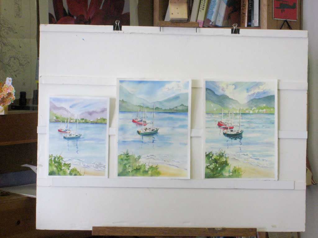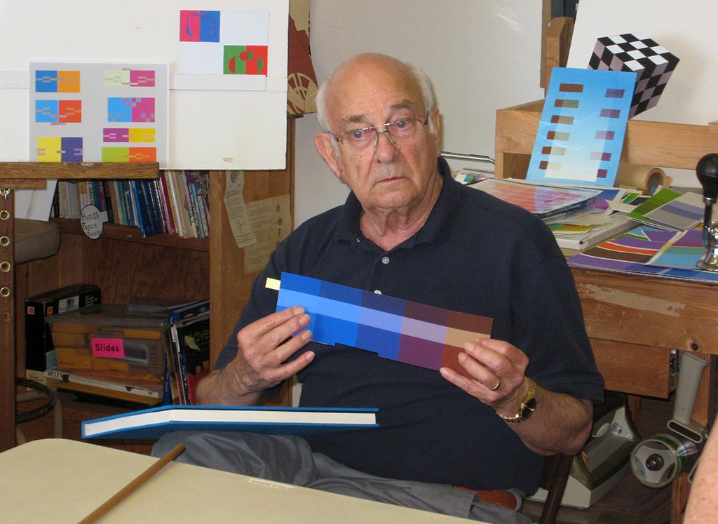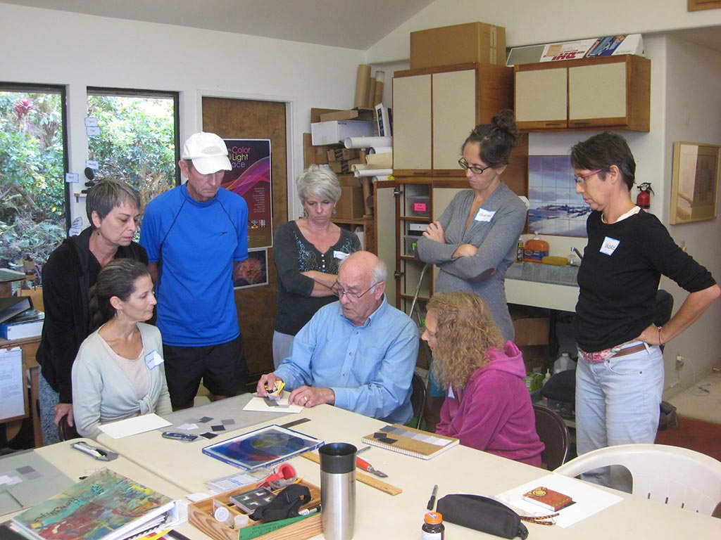
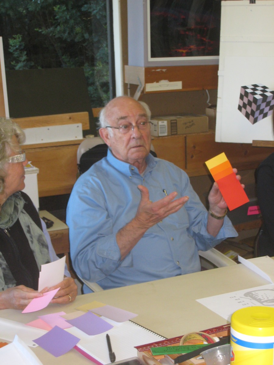
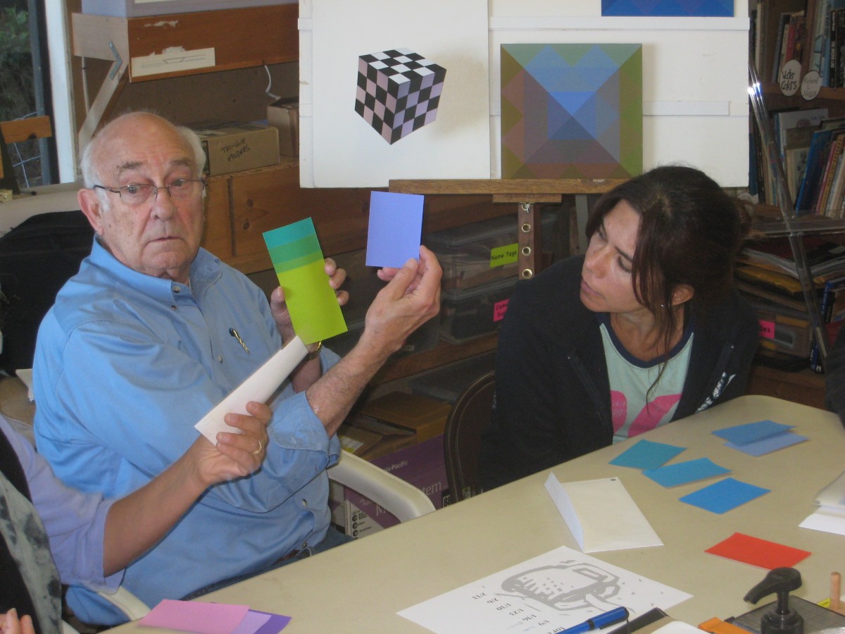
The first session of the Winter 2015 Color Relationships class was held on Friday, January 9. This series of lessons will address the visual phenomena of films, veils, volume color, white light, and colored light. We will explore how we perceive these phenomena, and what strategies we must develop in order to recreate them in our media. We reviewed concepts of arrays and halation that were fundamental to Color Relationships 1, held in the fall of 2014. Then the class was challenged to create an illusion of a black film, using only swatches of opaque gray. The solution was given and discussed, and a new challenge assigned for homework: Create the illusion of a colored film over two or more colors.
News flash: Dick will be a panelist at the Art Maui symposium this Saturday, January 17. See http://artmaui.com/2014/12/creativity-commercialism-and-you-making-a-living-in-art/ for more detail.
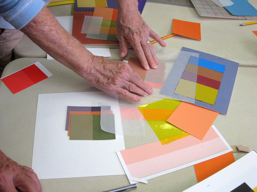
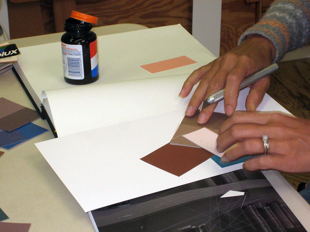
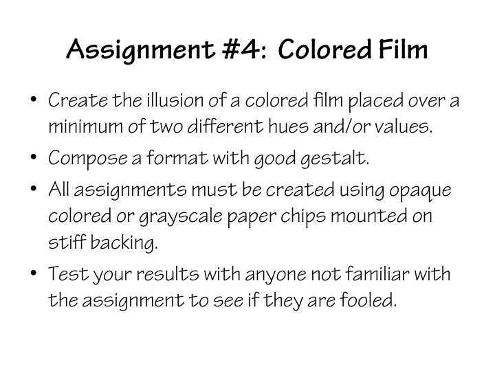
Homework assignment
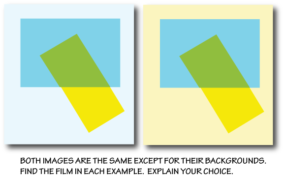
In addition to the film assignment below, please be on the lookout for examples of films in daily life, in magazines, or on the web, to share next week.
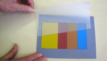
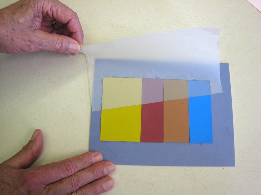
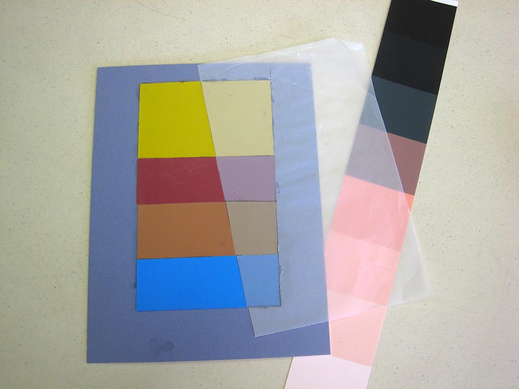
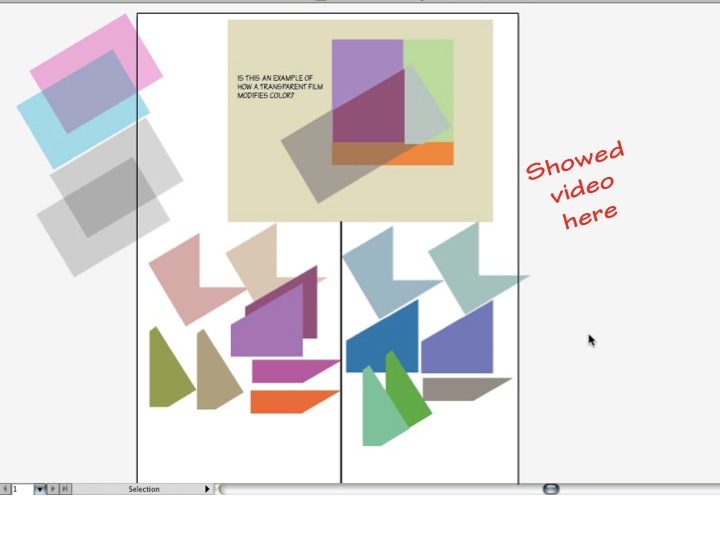
[gview file=”https://dicknelsoncolor.com/wp-content/uploads/2015/01/Assignment4-FilmNEW.pdf”]
Don’t miss the videos at the bottom of this page for practical tips for solving this problem!
Class recap – some key ideas
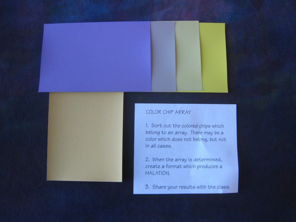
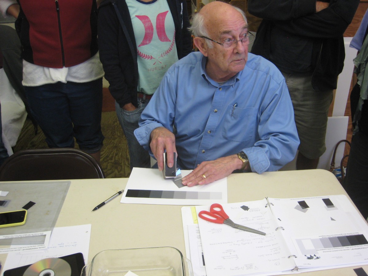
Array and halation exercise
As a warmup and review, Dick asked the class to sort sets of Color-Aid chips into arrays and demonstrate halation. He led a discussion on strategies used, which included
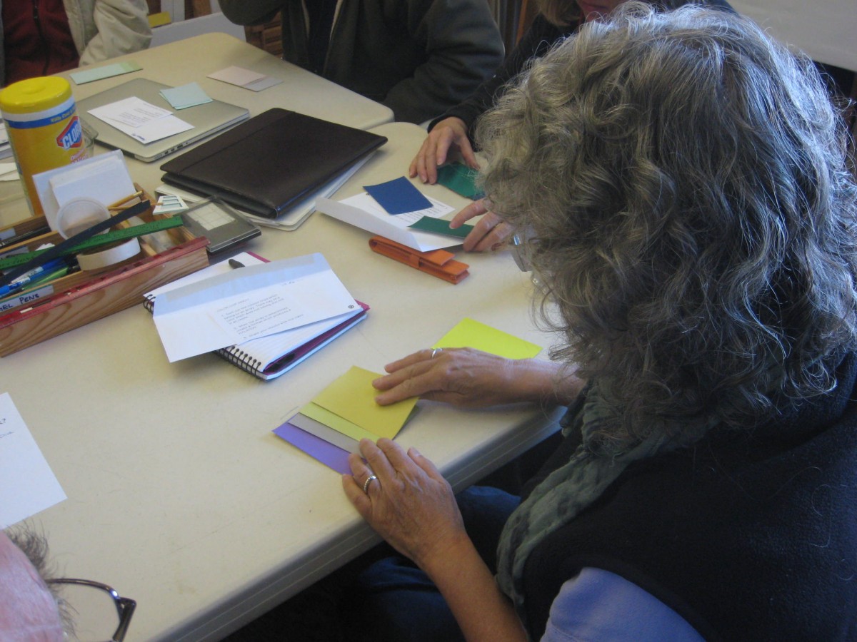
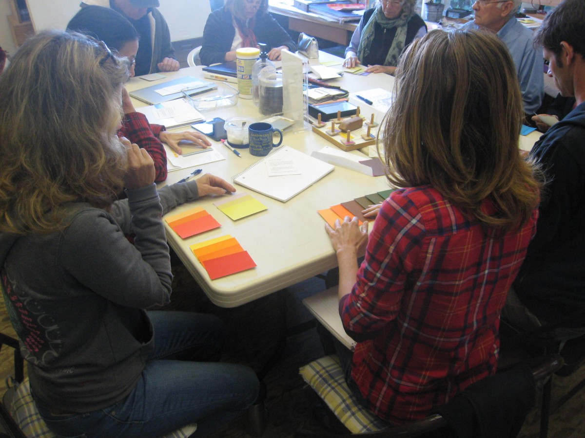
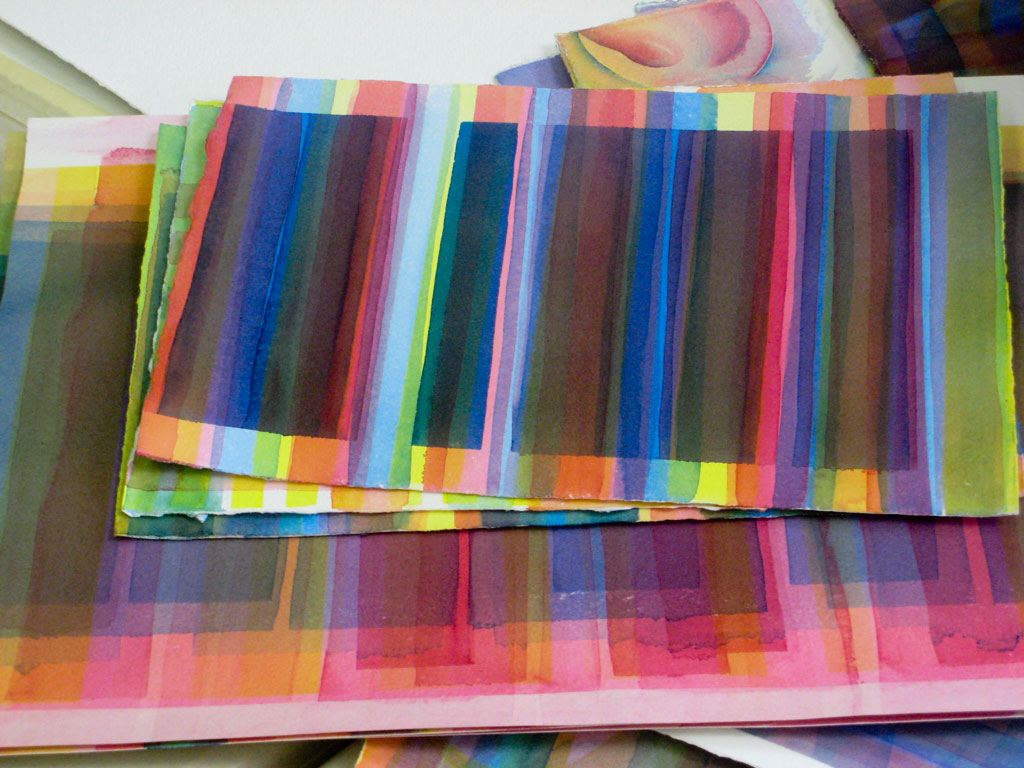
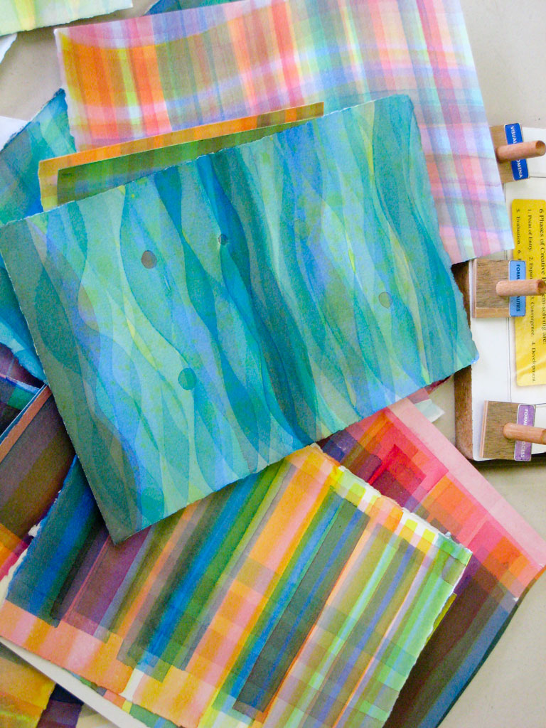
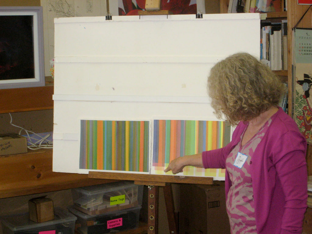
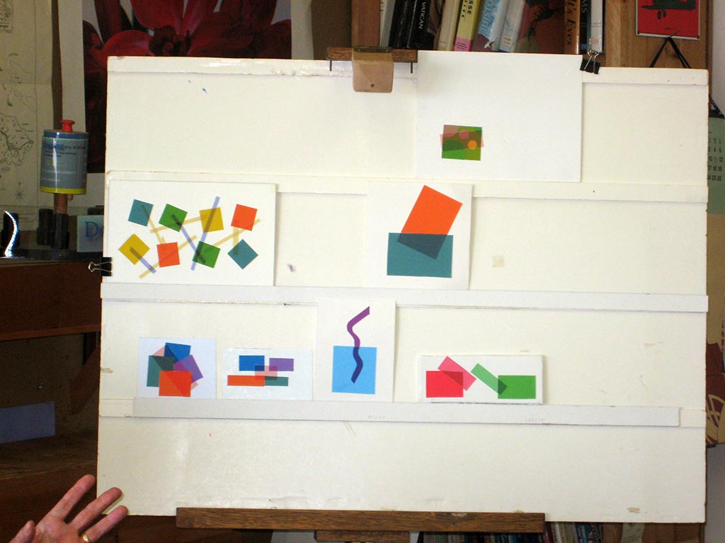
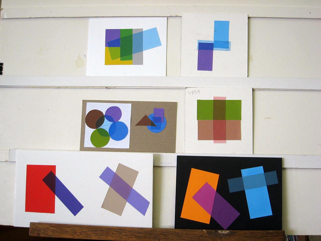
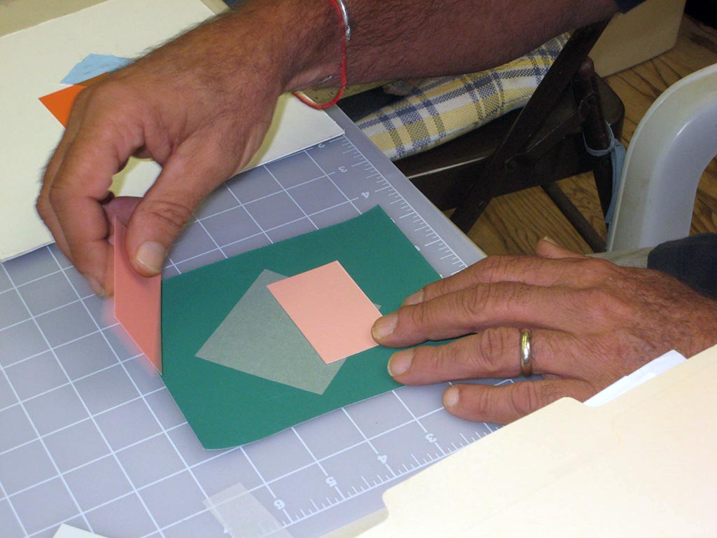
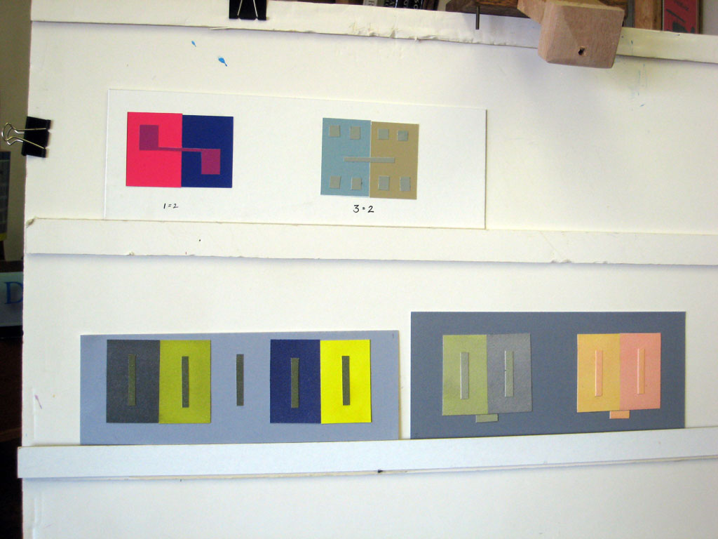
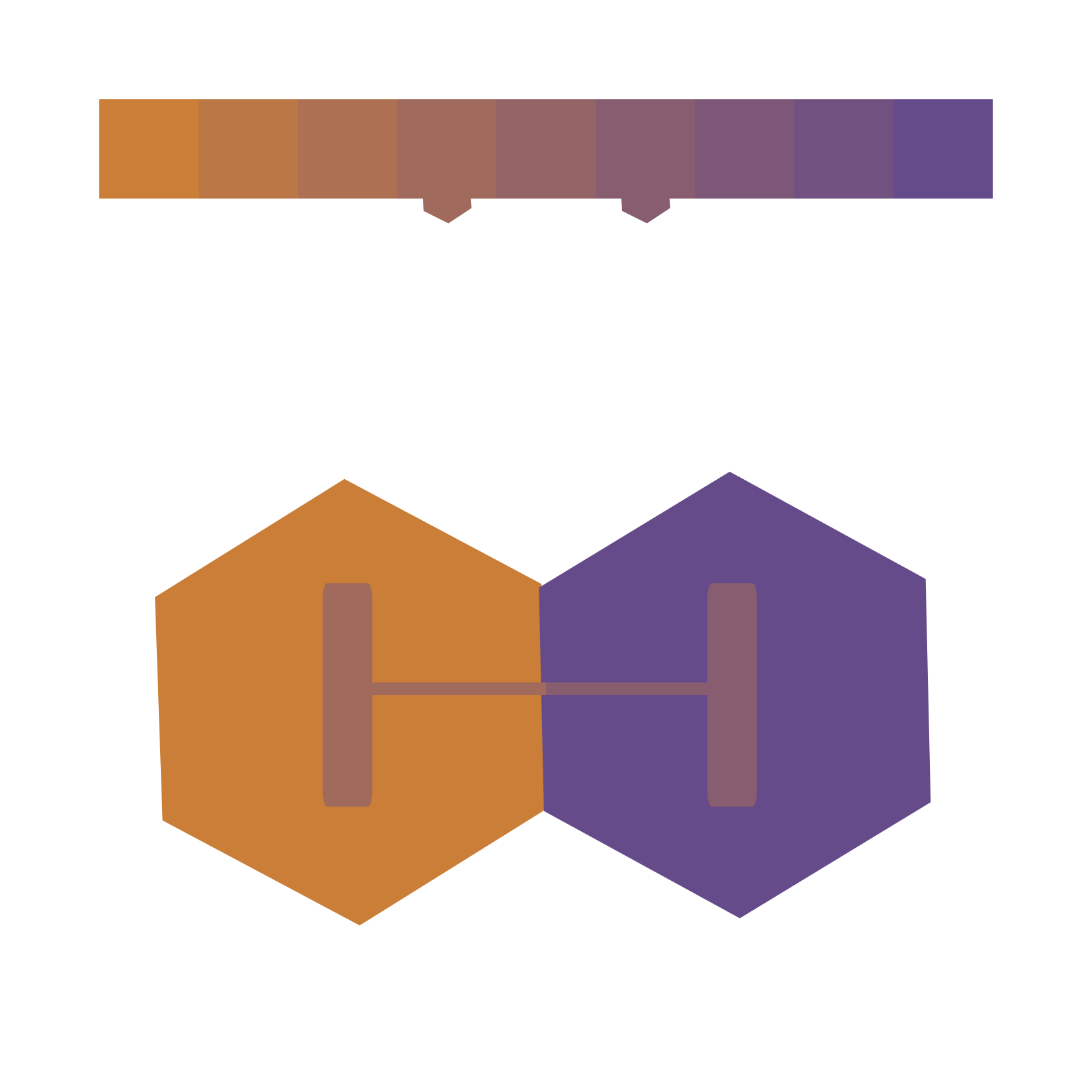
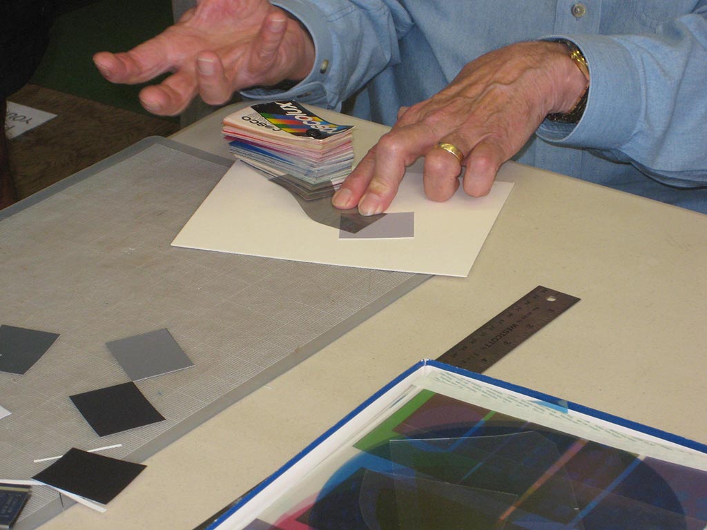
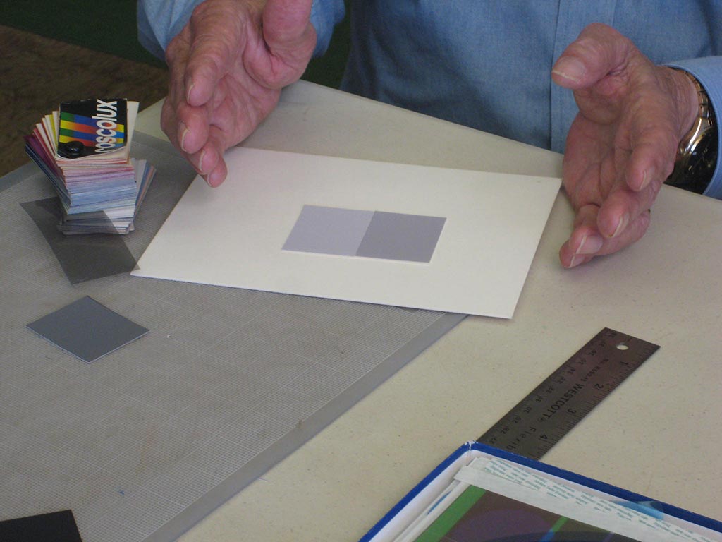
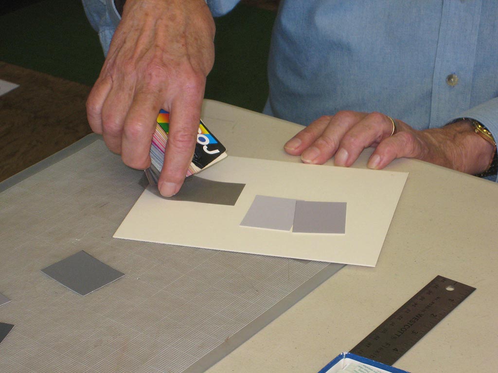
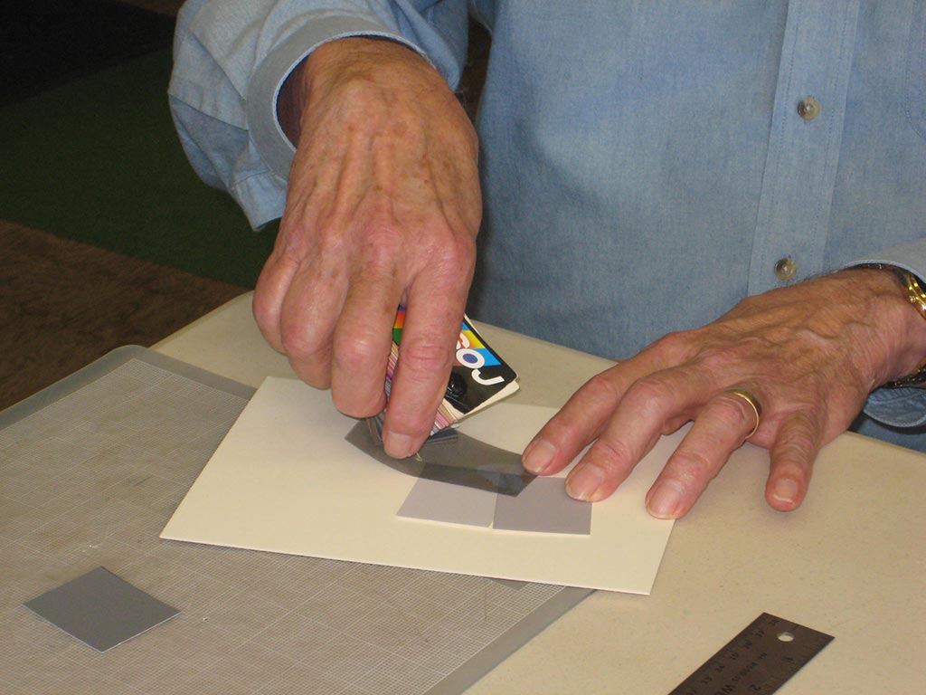
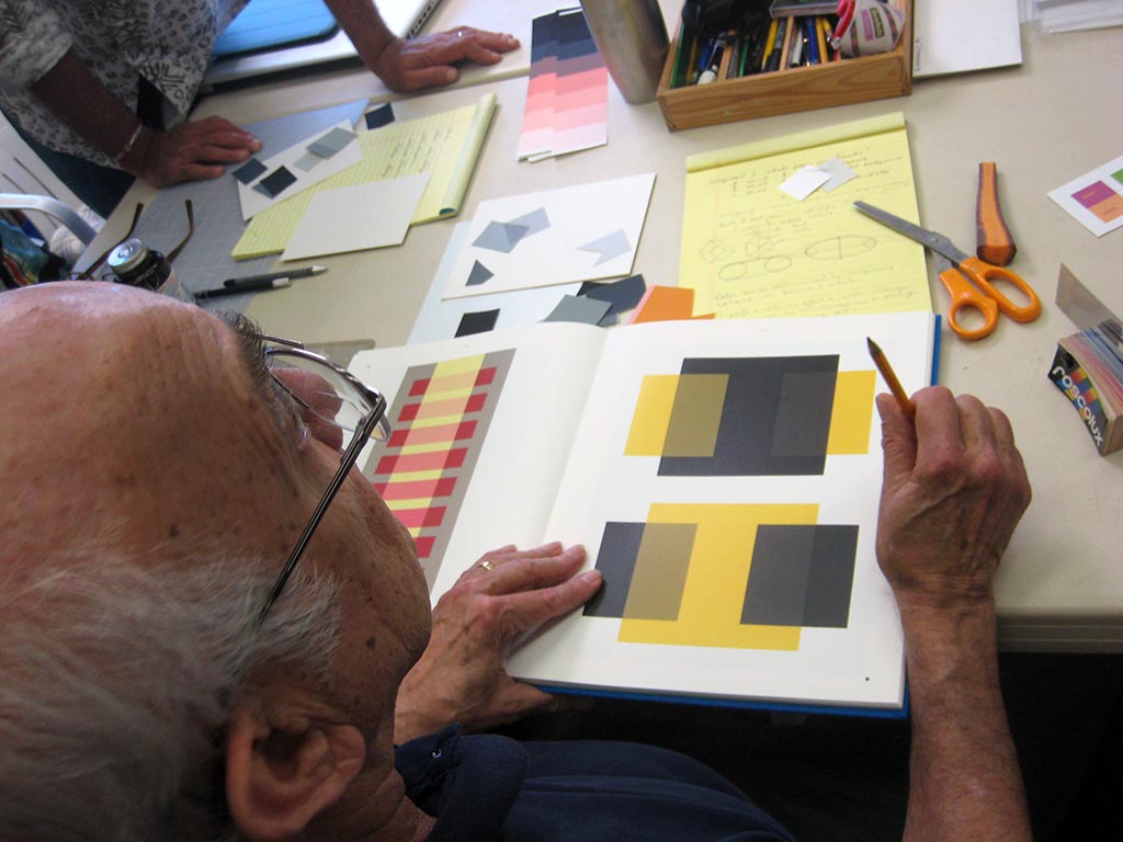
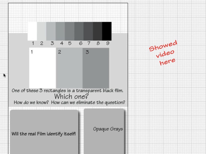
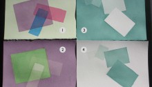
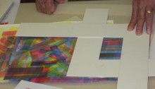
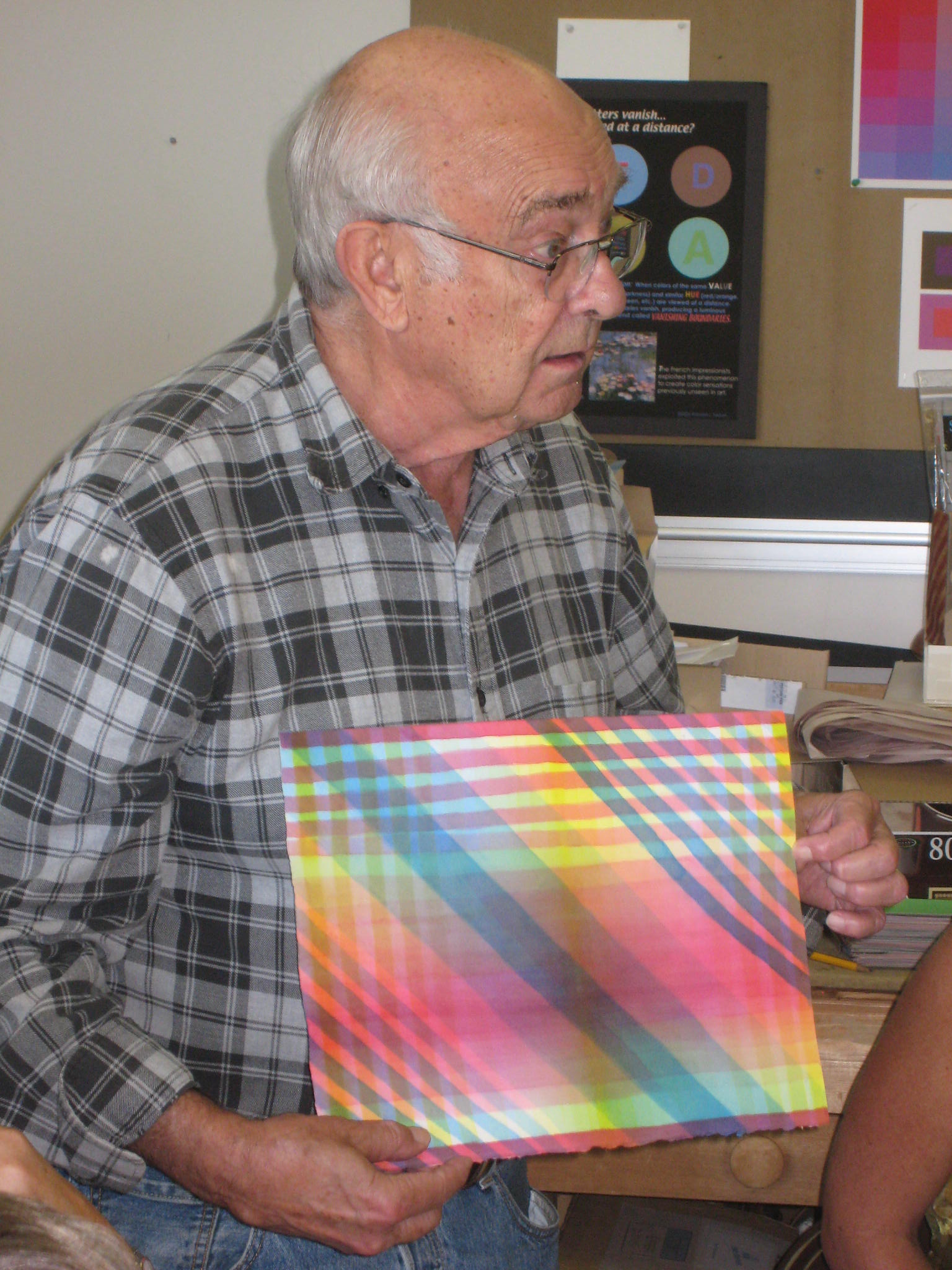
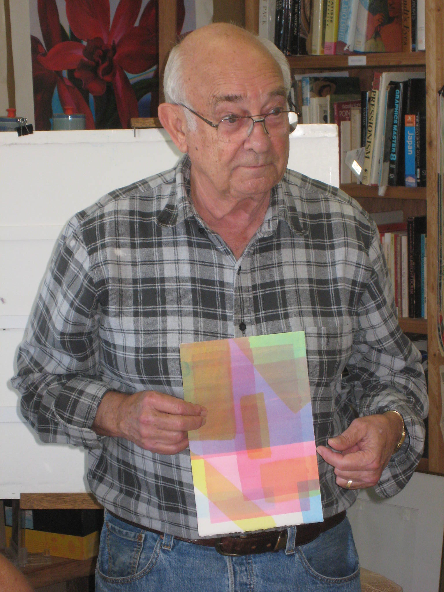
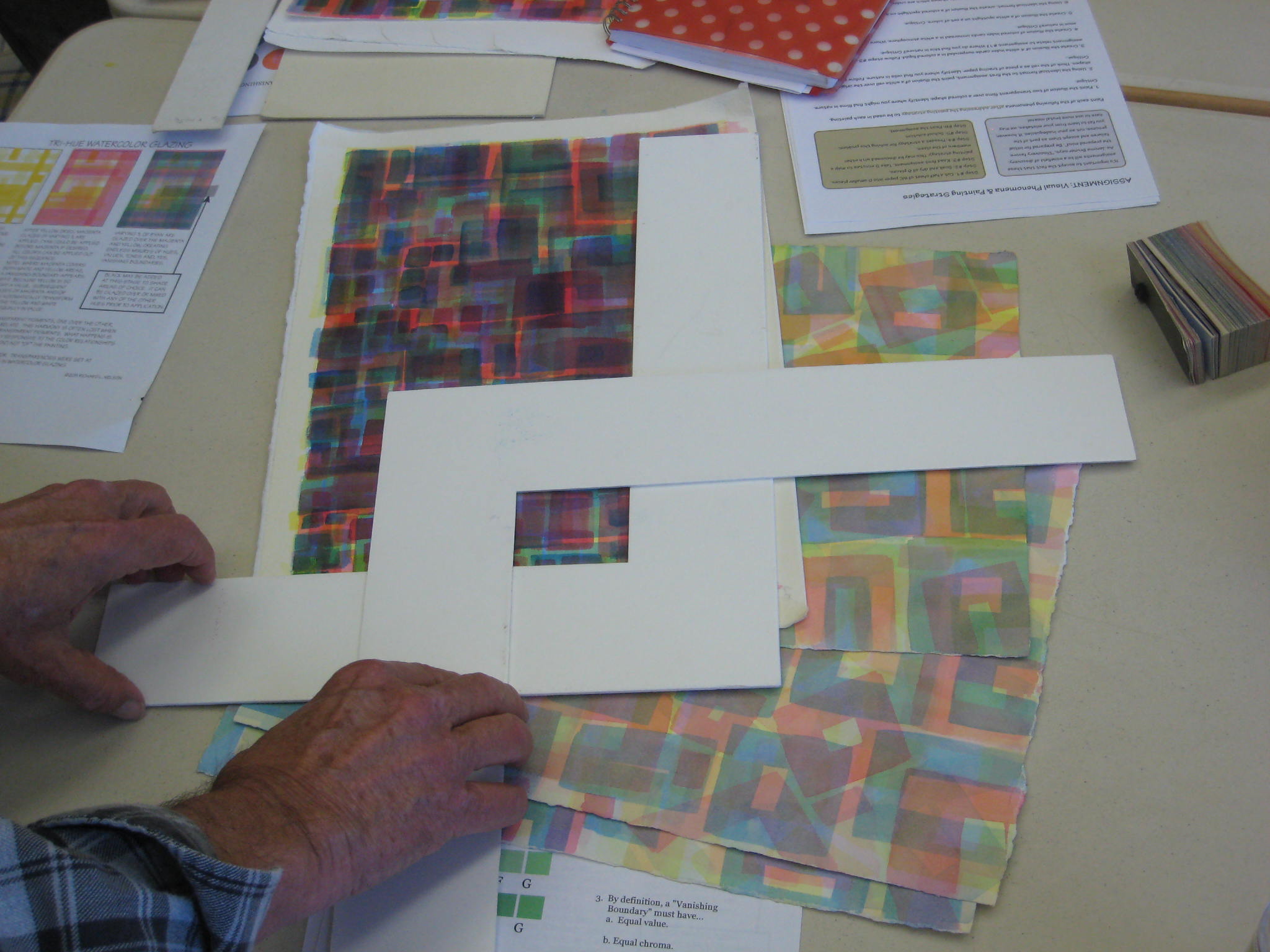
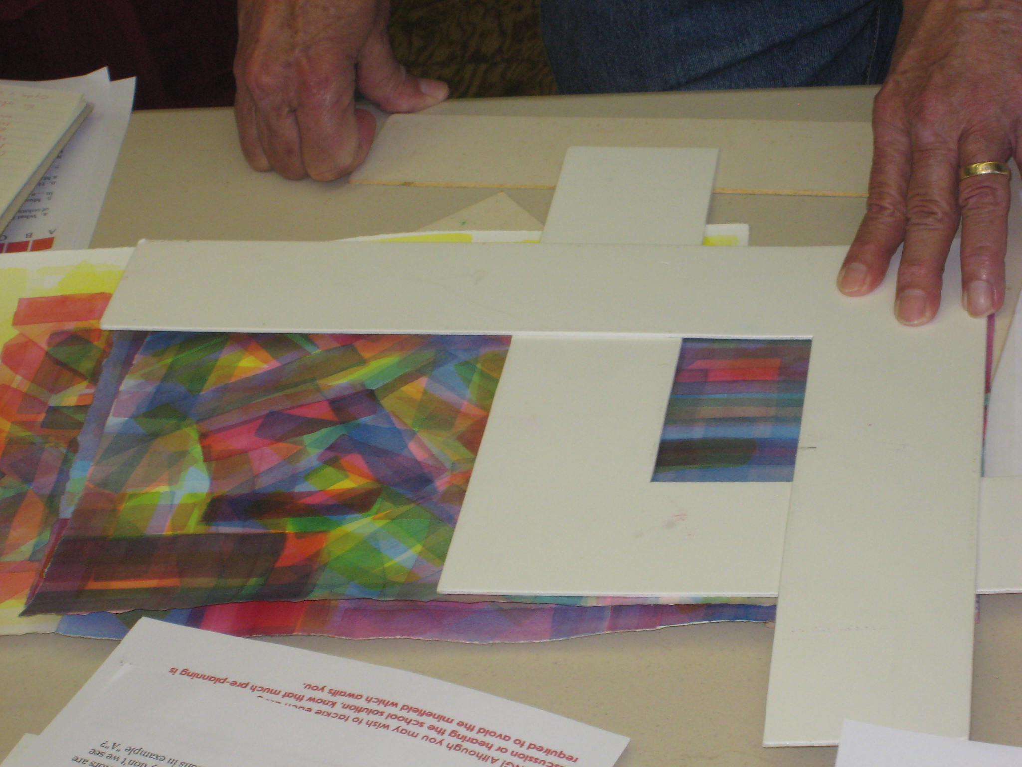
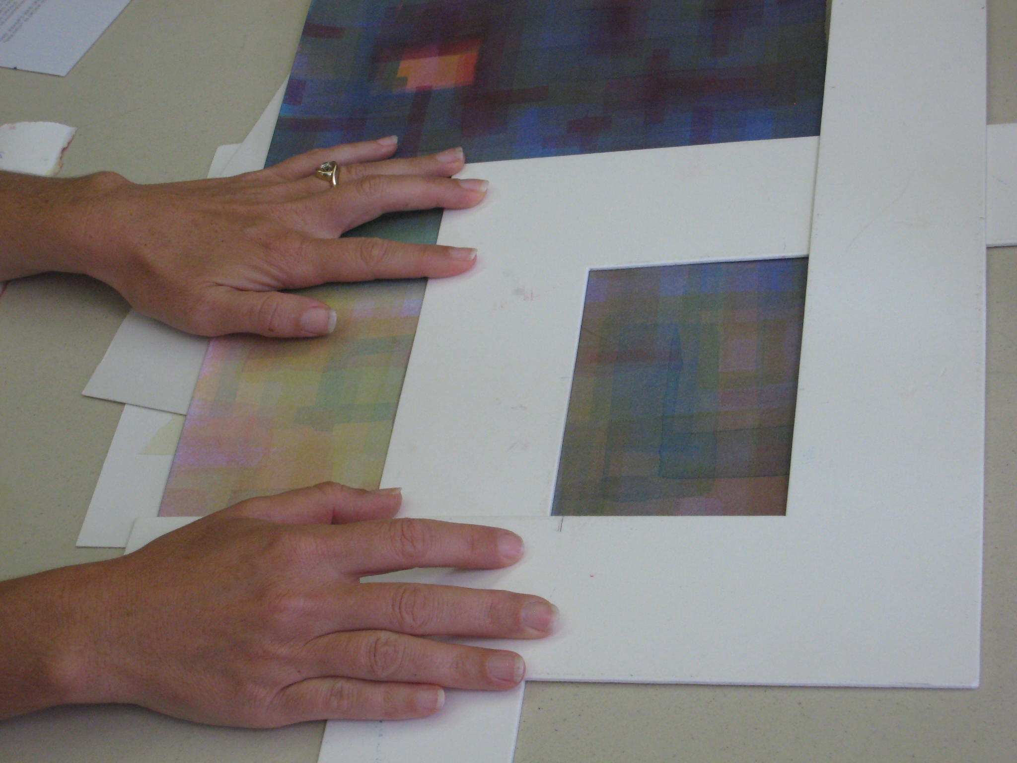
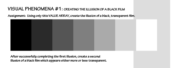
Hands-on exercise: Create an illusion of a transparent black film
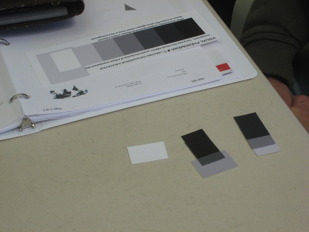
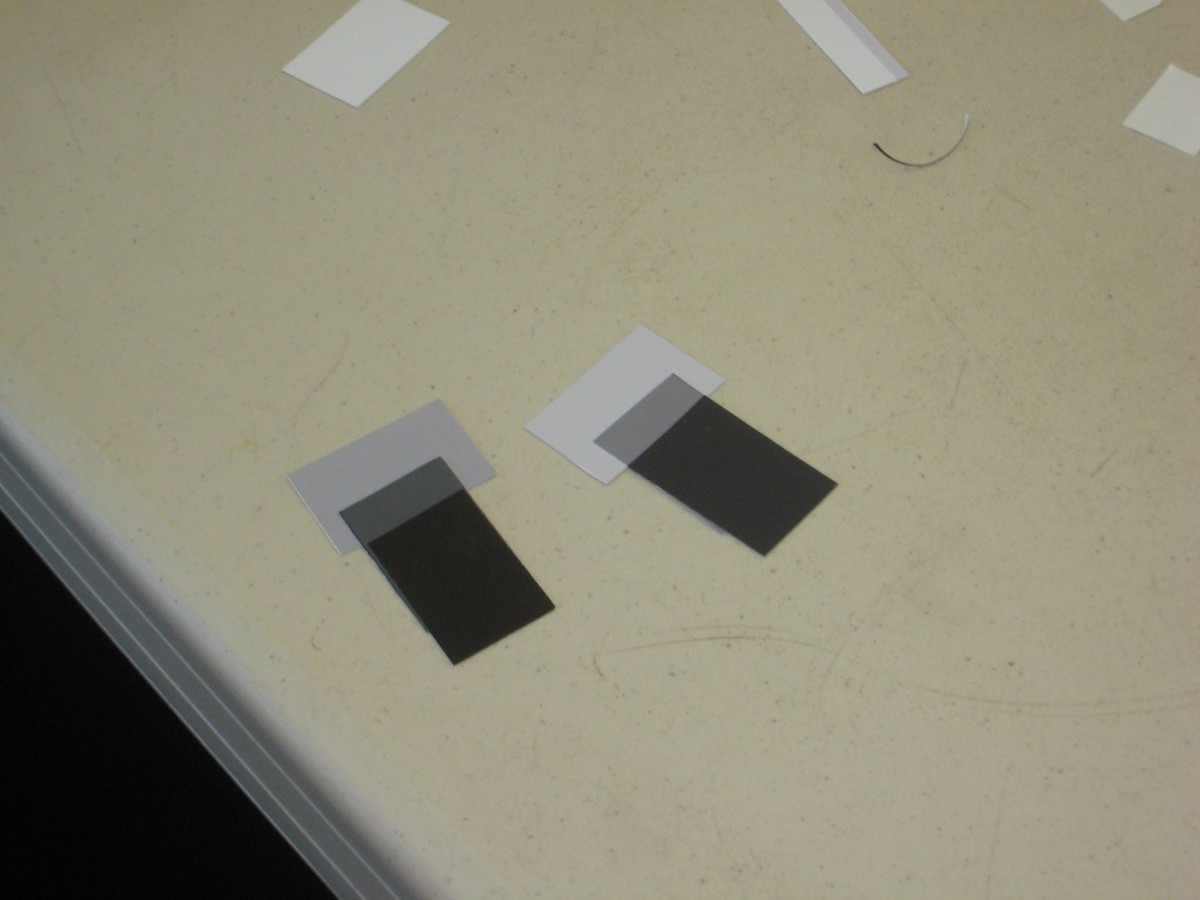
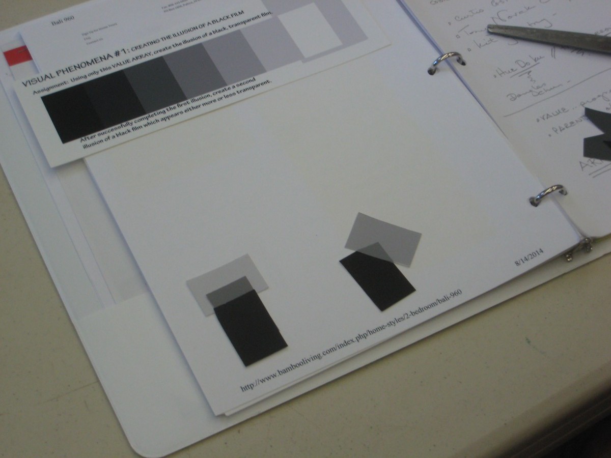
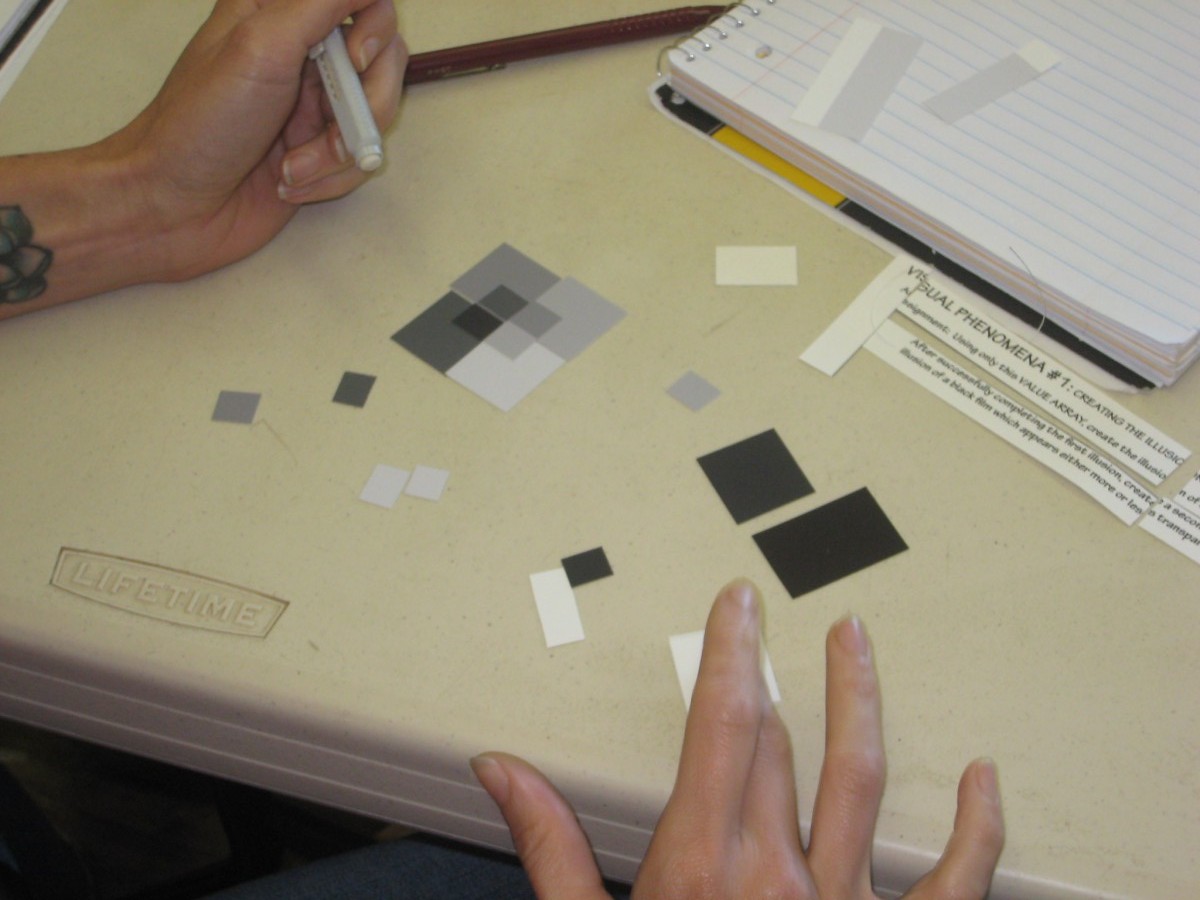
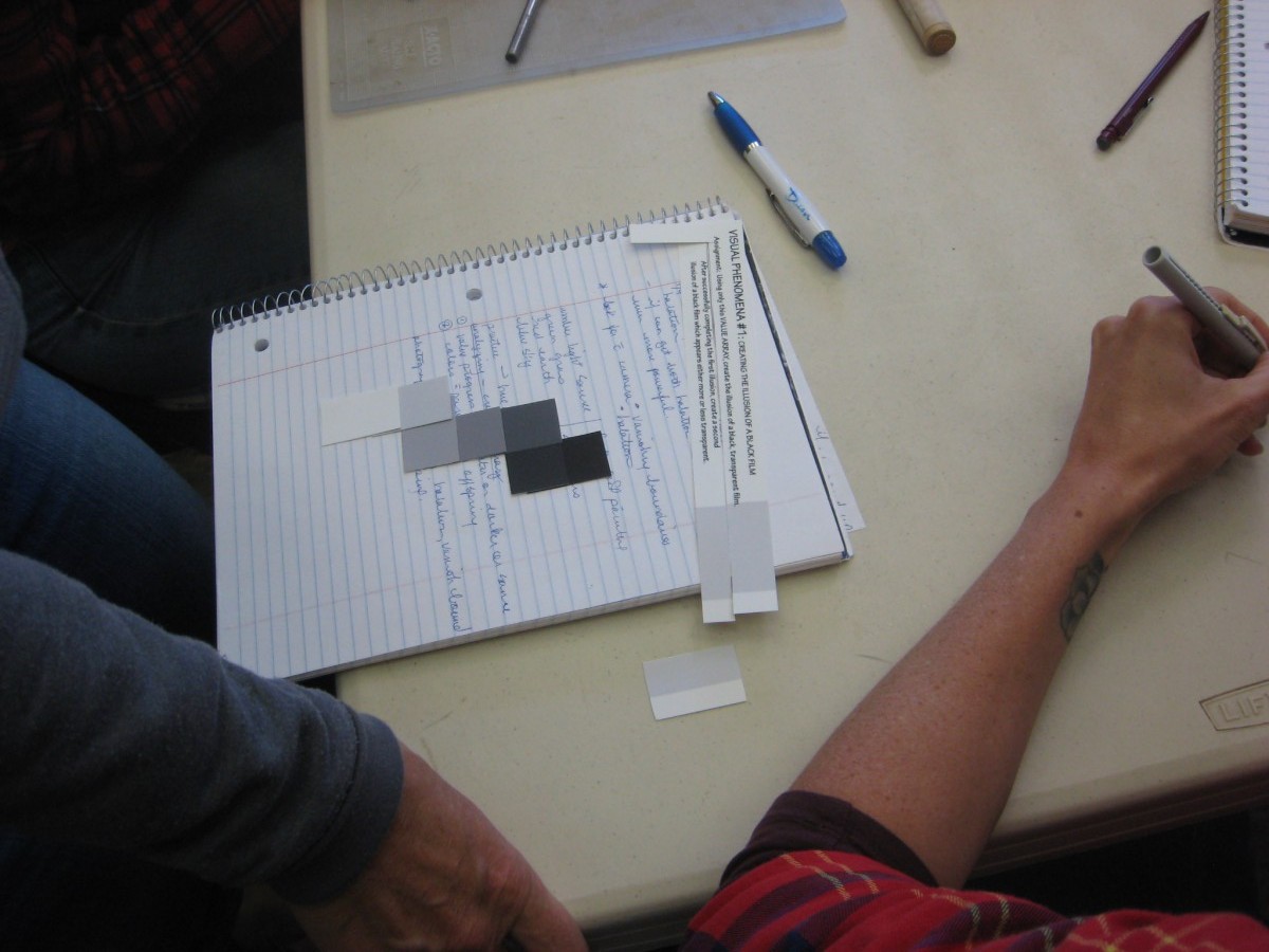
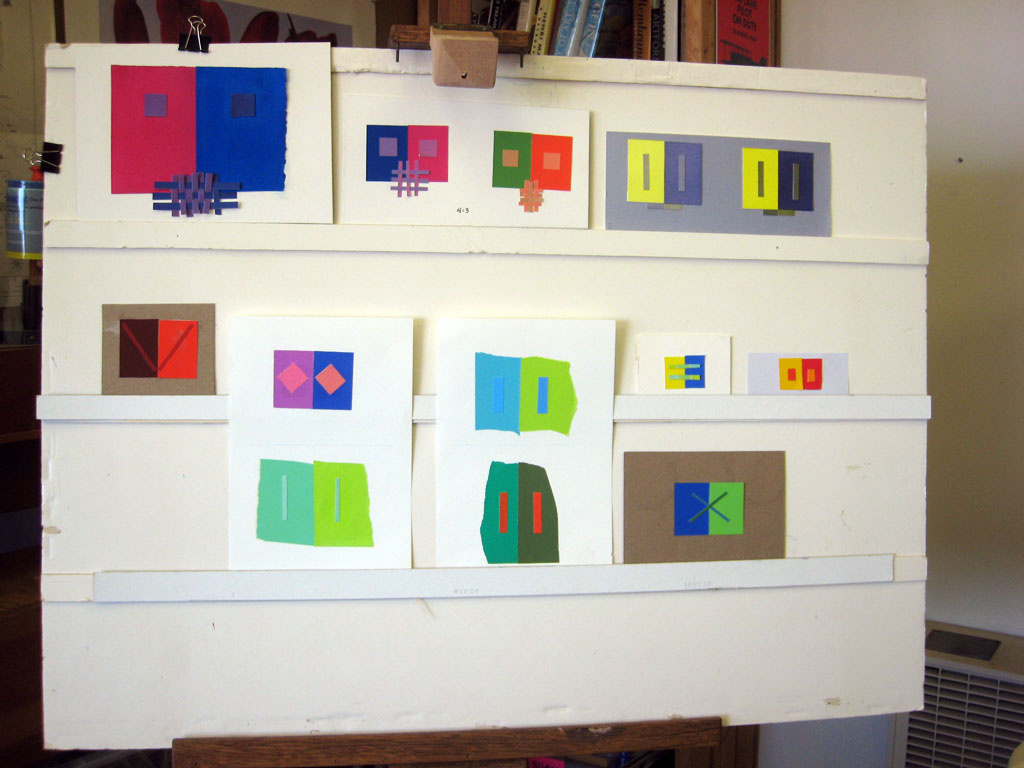
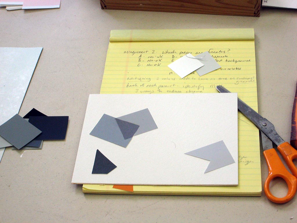
The solution to the black film illusion exercise
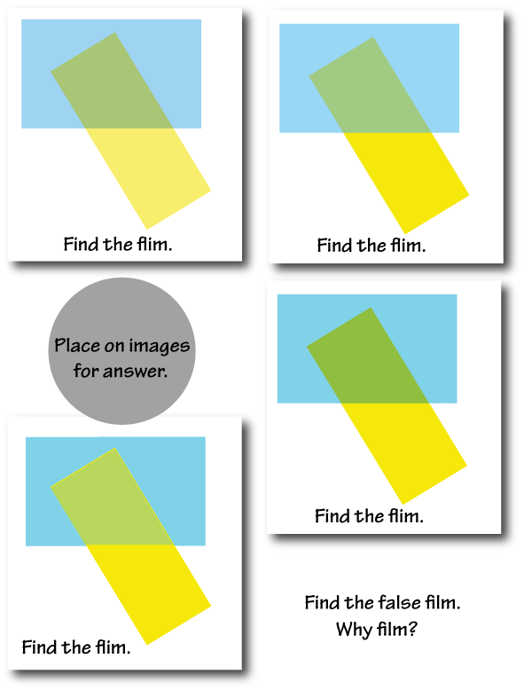
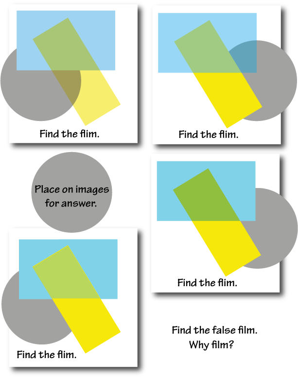
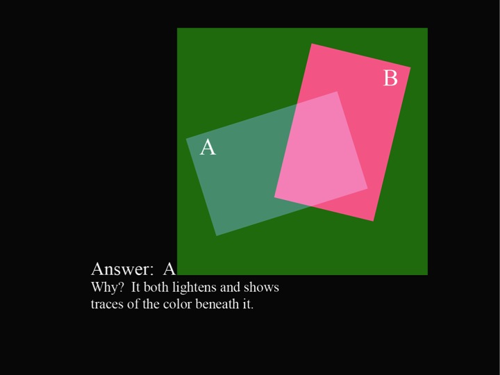
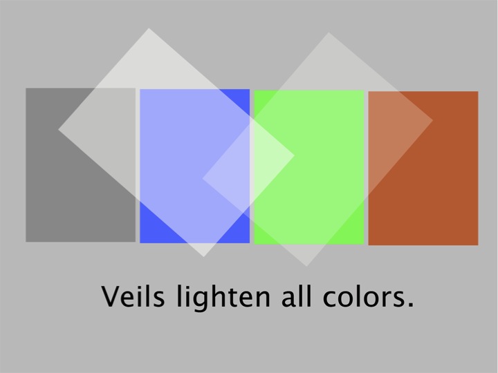
Creating the illusion of a film takes some thinking and observing. Most of the attempts in the photos above resemble transparency, but are false films, or veils (coming up next week!), not films. (The photos were taken in the early stages of attempting solutions.)
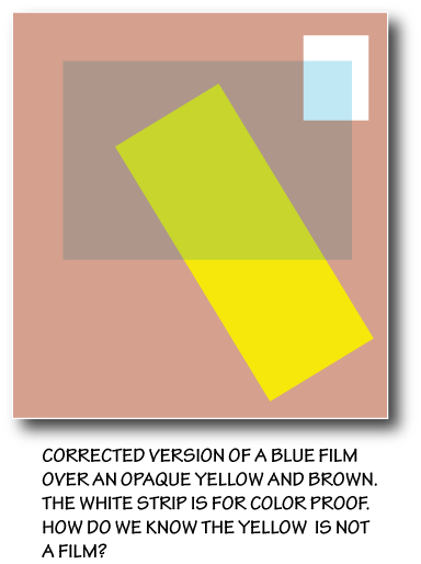
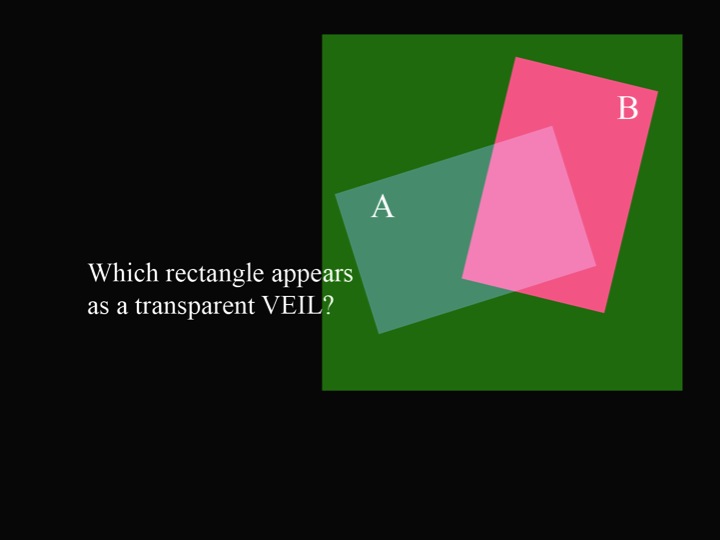
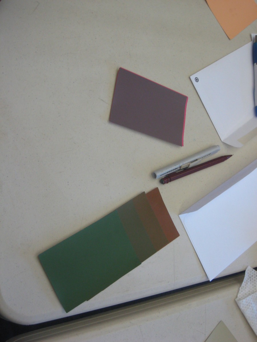
One solution possible with the array provided is an illusion of a transparent black film laid over a gray swatch on a white background. Here you need white, plus three values of gray: 1) the gray swatch itself; 2) a gray representing the film over white; and 3) a gray darker than either of those for where the film overlaps the swatch. Looking at the solution PDF below will help this verbal description make sense.
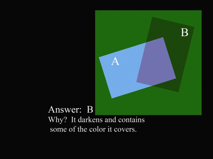
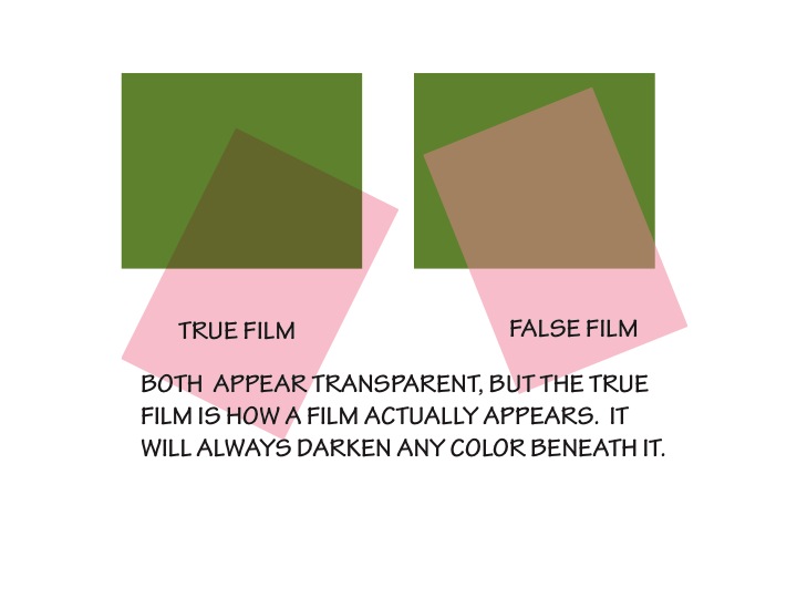
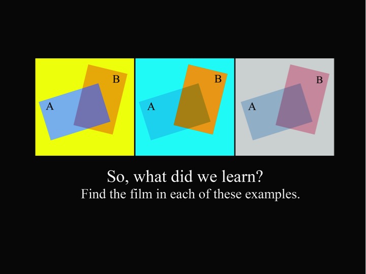
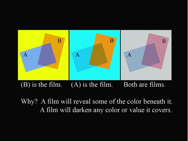
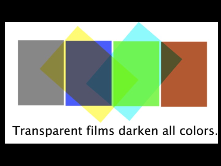
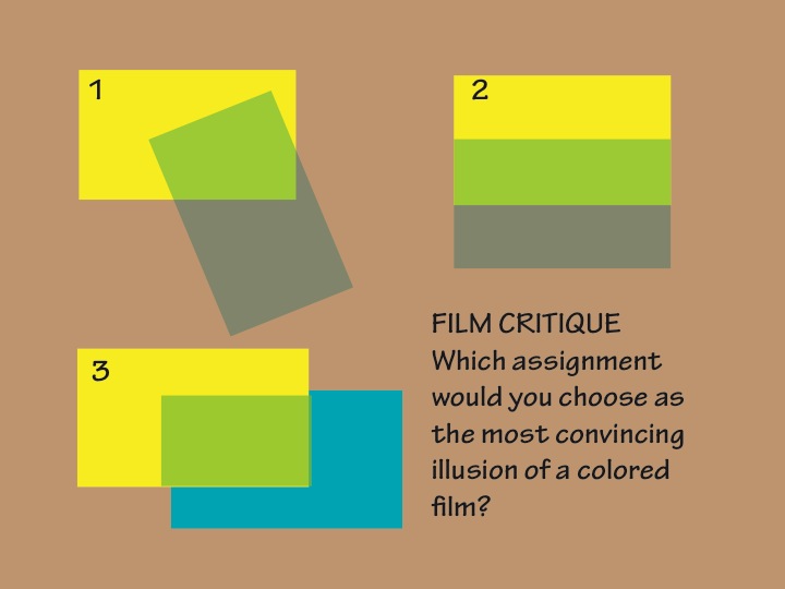
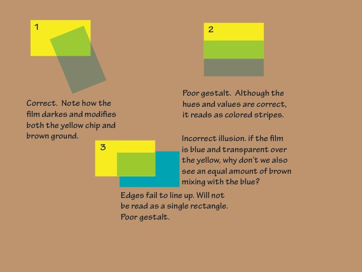
A film will always darken any color or value below it. You need to show how the film modifies more than one color. These contribute to a convincing “gestalt”, when combined with a casual or natural-appearing overlap (one in which the edges of the swatch and film do not align, and where the film is not entirely contained within the swatch). See the “Rules to remember” in the solution below for more tips for creating effective film illusions.
[gview file=”https://dicknelsoncolor.com/wp-content/uploads/2015/01/BlackFilmSoluFinal.pdf”]
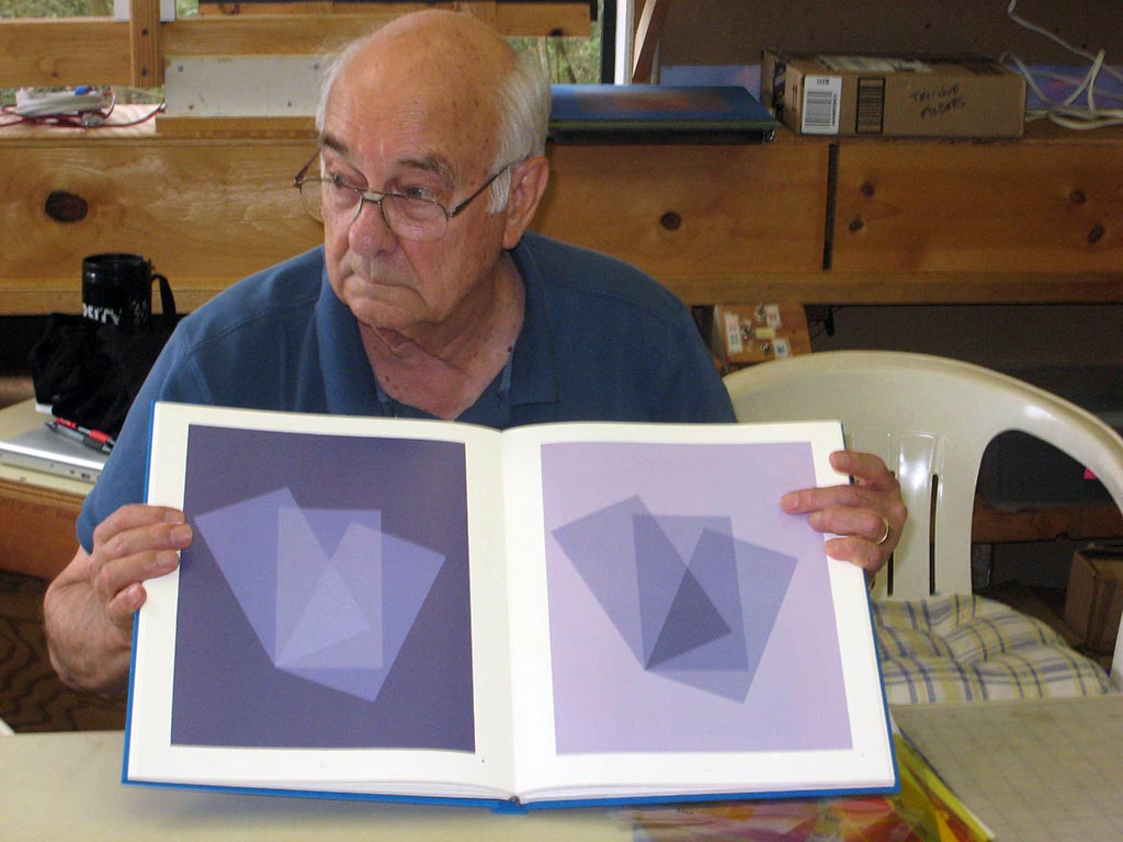
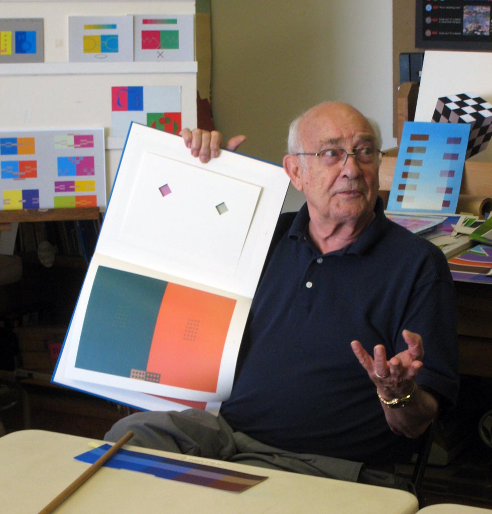
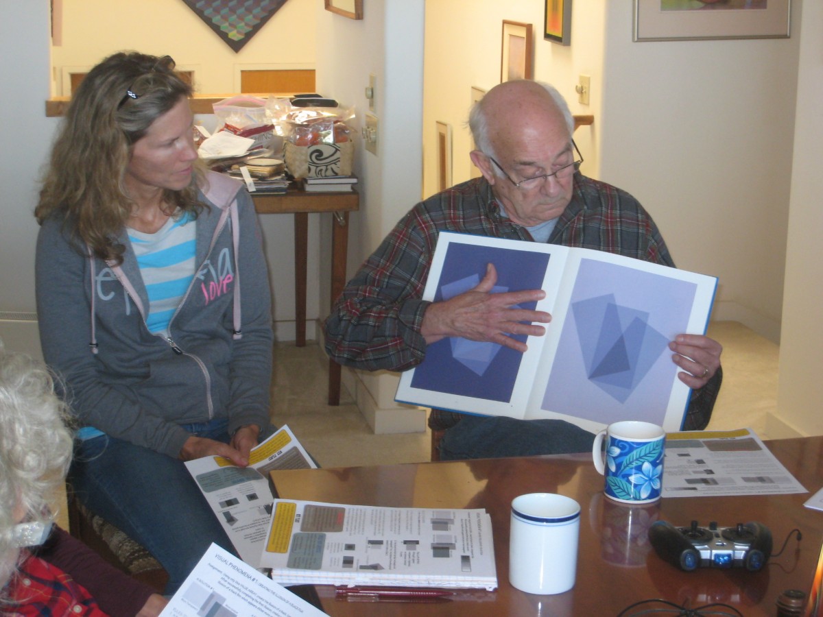
Critiquing transparency illusions in the Albers book
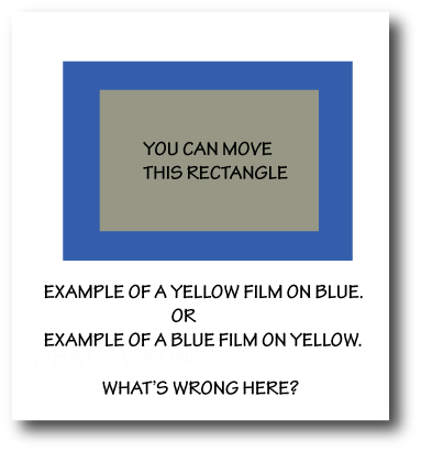
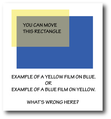
Looking back at his experience in Josef Albers’ color class at Yale, Dick recognizes that they never observed real films to see how they behave. Thus, many of the transparency illusions in the book are impossible – “freaks”. Several ignore the background – the “film” only influences another color, but not the ground that both are laid on. Some show the overlap area as a blend of the two colors (figure and film). These are incorrect “false films” because the value of the overlap area lies between the two colors, rather than showing how the film color darkens the other color.
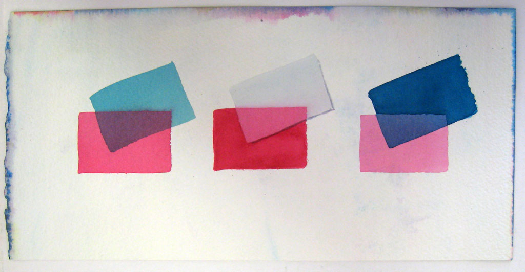
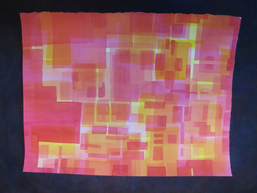
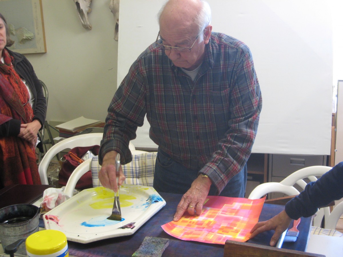
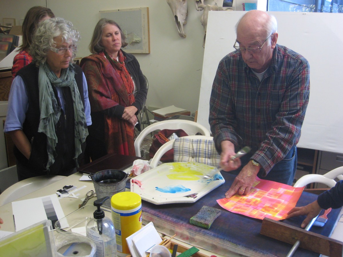
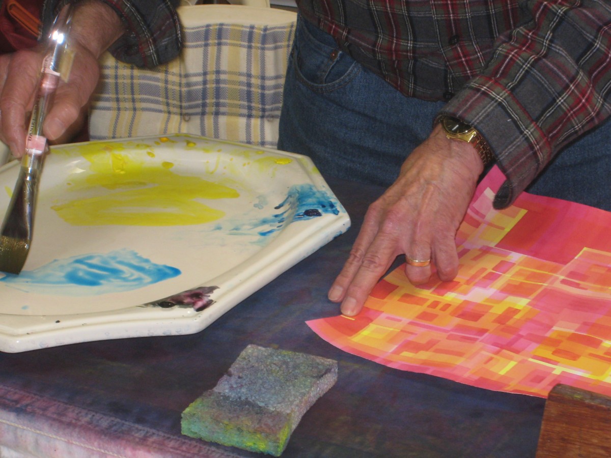
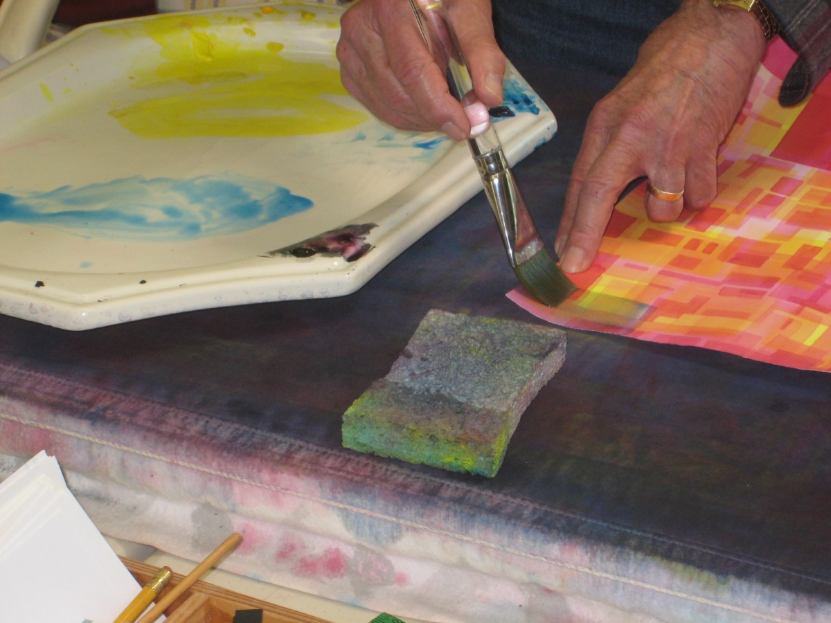
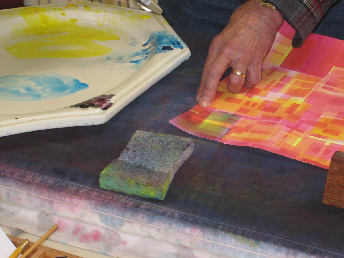
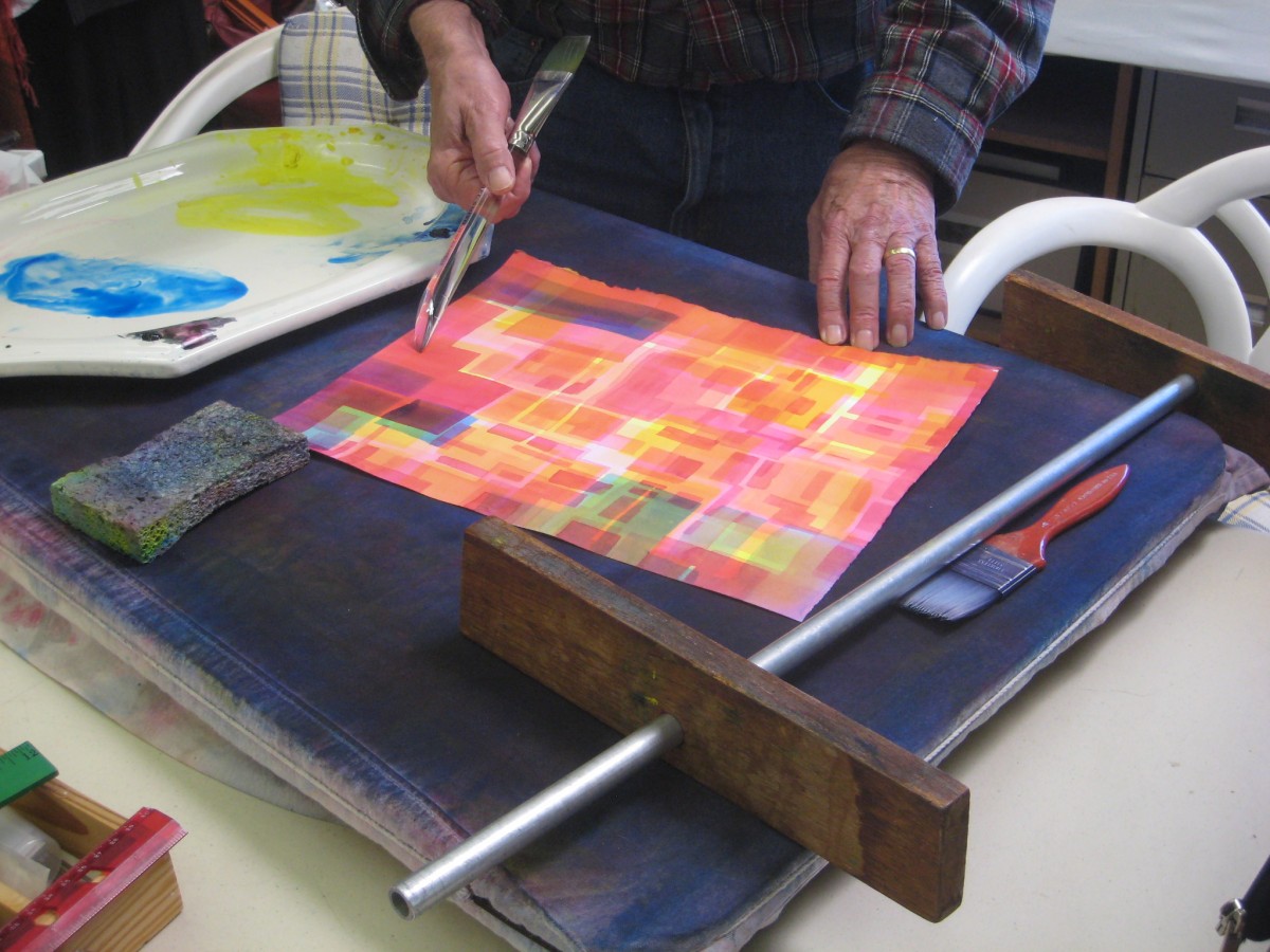
Watercolor demonstration: How films behave
Transparent watercolor washes behave as films, modifying all colors below them. Dick gave a demonstration, laying cyan washes of different opacities over areas of layered yellow and magenta watercolor.
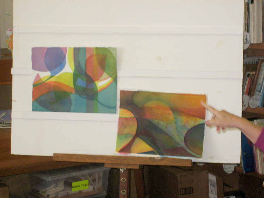
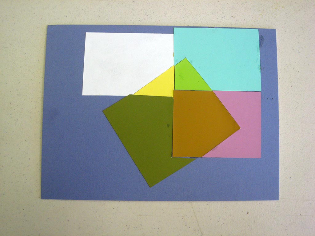
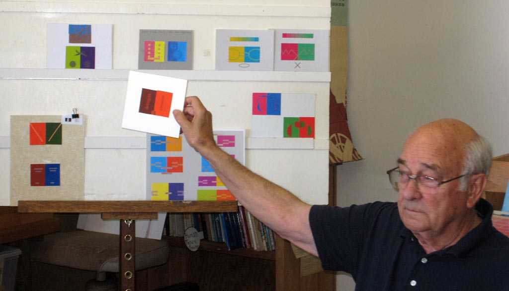
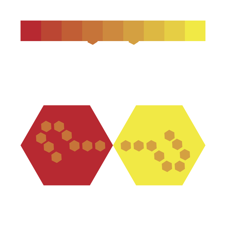
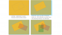
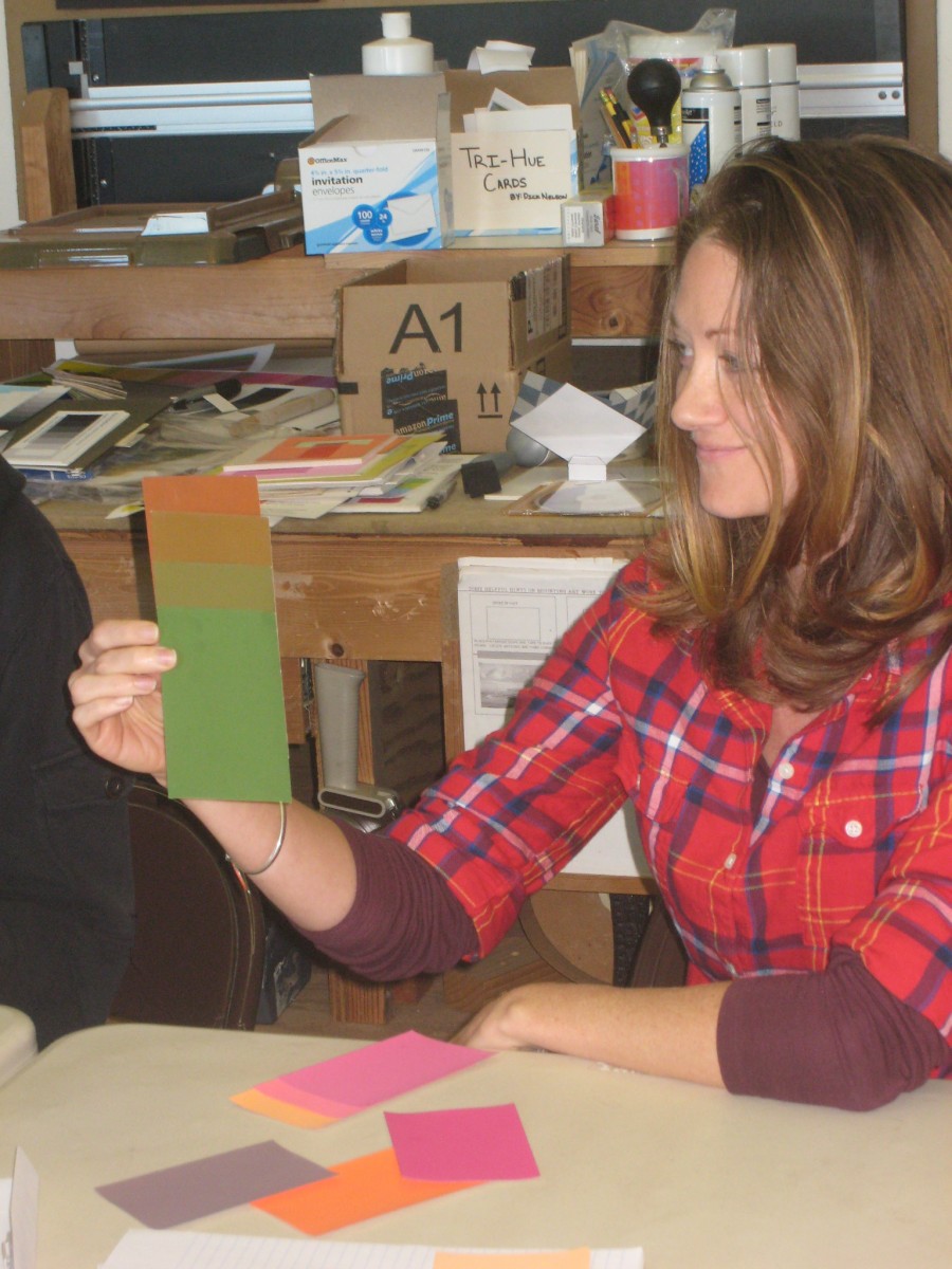
A dual film illusion created by a past student
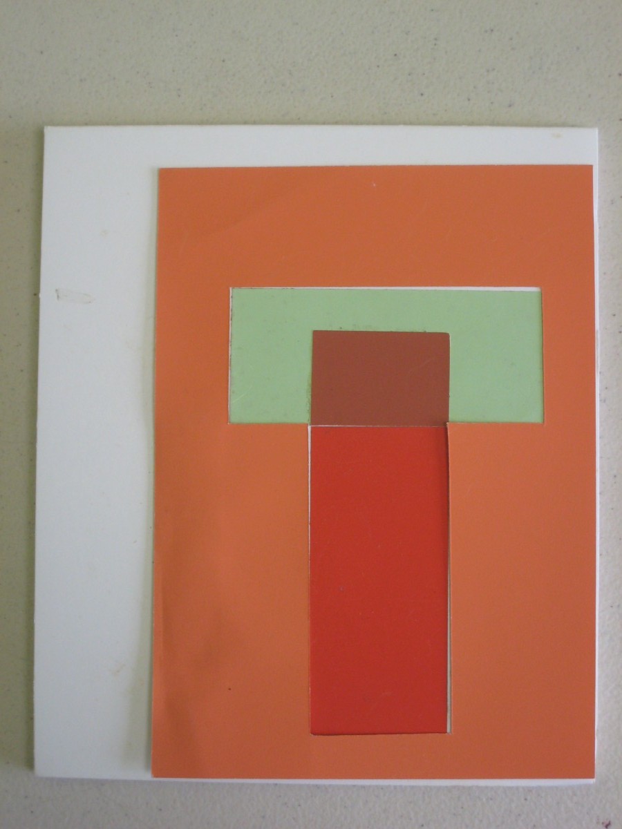
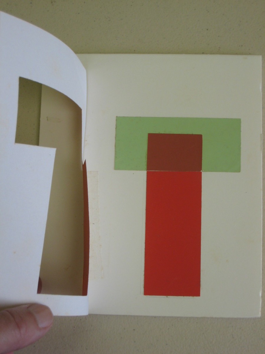
This clever construction demonstrates very clearly how color is relative – how our perception depends on context. On the left, we see what looks like a red film placed over orange and pale green grounds. On the right, lifting the orange flap, we see a white ground, and what appears to be a light green film placed over a solid red strip and the white background. All of the colors used are actually opaque.
Class materials
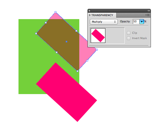
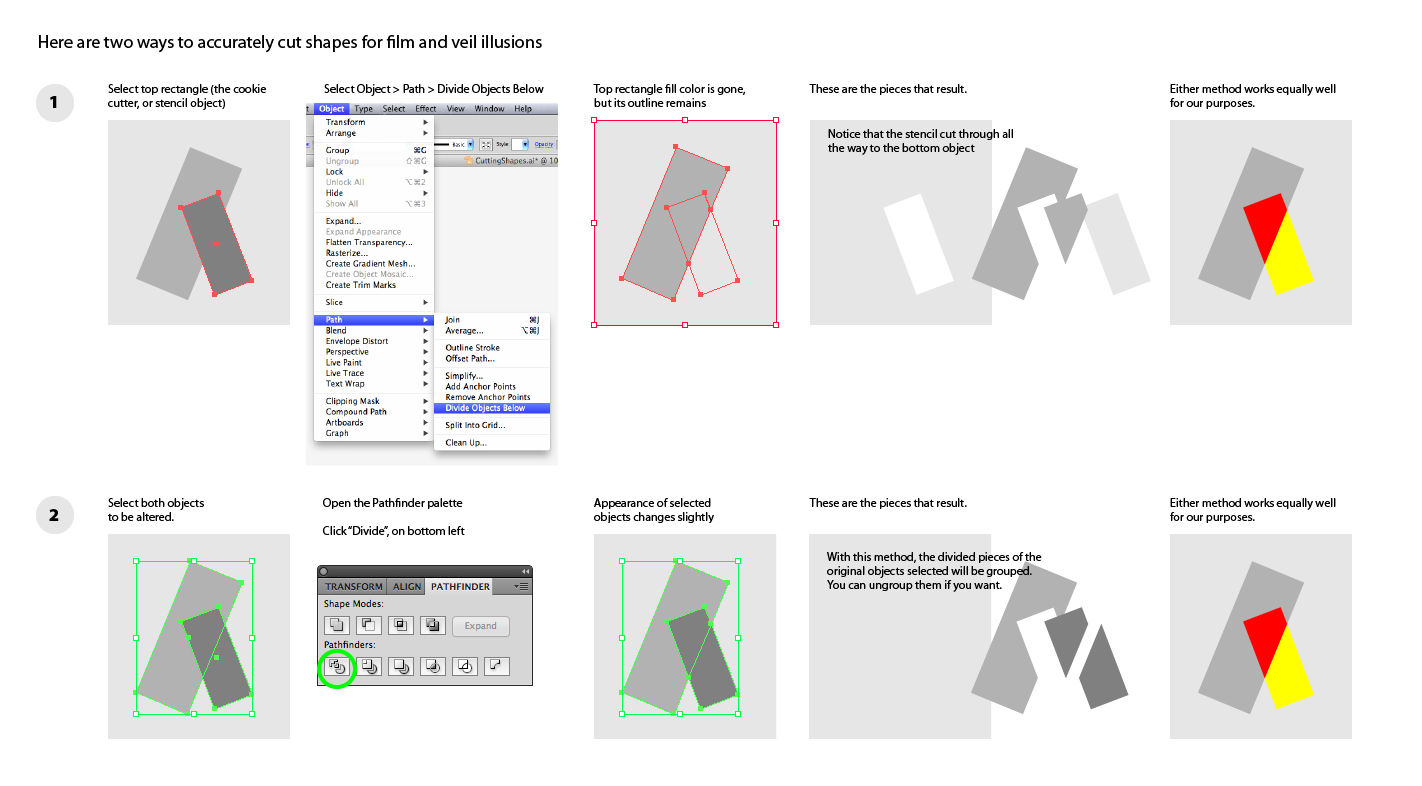
Two ways to accurately cut inlay shapes in Illustrator
Here are instructions for how to create interlocking shapes in Illustrator for the film illusion assignment. The pen tool can also be used to construct your shapes, if you are proficient with its use. If you will be printing these instructions, this version should give you higher print quality.
Videos
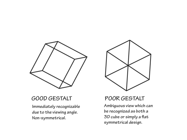
This 6-minute video introduces the concepts of films and gestalt, and demonstrates how it is possible to replicate the illusion of transparency with opaque colors. This is useful for any artist wishing to convey shadows, for instance.
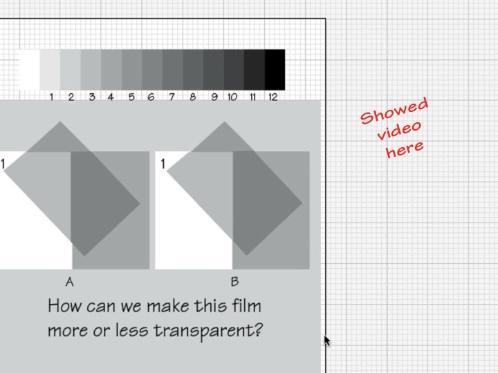
This 2-minute tutorial shows how different values of transparency can be achieved.
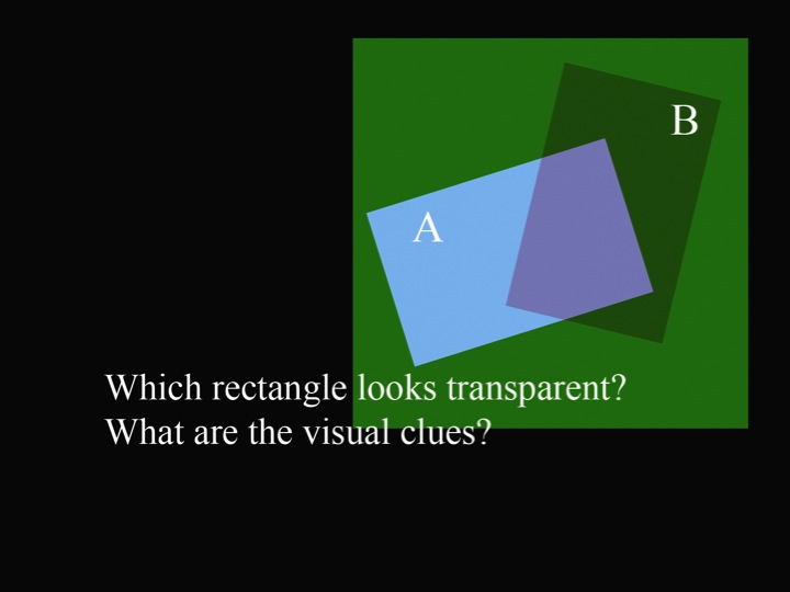
Building on the videos above, which demonstrated how transparent black films behave, this video shows how opaque colors can be arranged to create believable representations of colored films.
This 11-minute video shows how to create the illusion of a film over a set of colors using Adobe Illustrator. It demonstrates how to adjust color, and how to use the Pathfinder “Divide” function to create precisely interlocking shapes. This is Dick’s newest tutorial video, created for this class.