The fifth session of the Advanced Drawing and Composition class for Winter 2016 was held on Wednesday, February 10. We spent most of the class on a thorough critique of the homework, using worksheets and handouts to guide our thoughts, and discussed the importance of having relationships between all components of a piece. We were made aware of the differences between a value statement vs. a judgment, and Dick talked about why, as an artist, it is important to identify your theme before beginning your work. We received a new homework assignment, and wrapped up our session with a fun game that conveyed the difficulty in communicating an accurate visual message.
Homework assignment
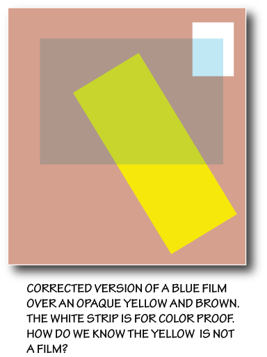
[gview file=”https://dicknelsoncolor.com/wp-content/uploads/2016/02/CompositionAssignment2wTriangles.pdf”]
Class recap – some key ideas
Critique
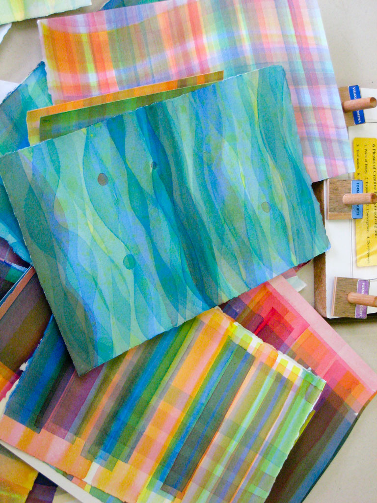
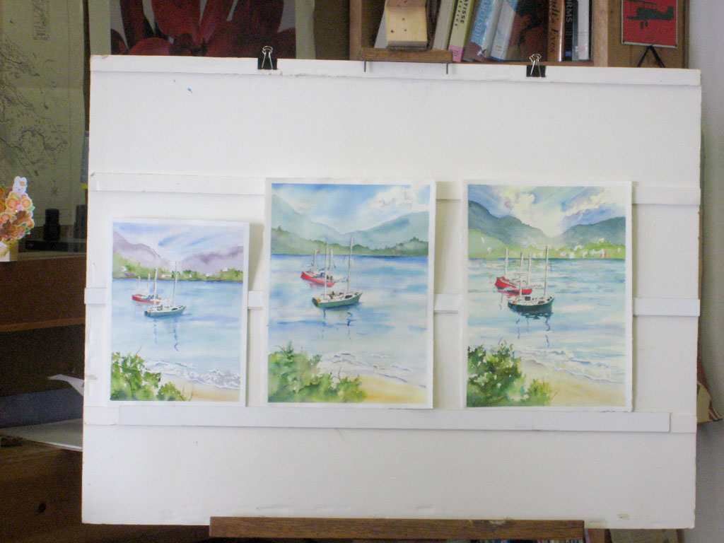
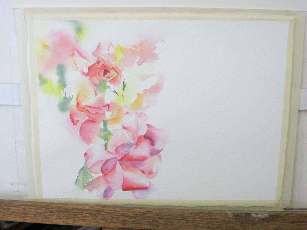
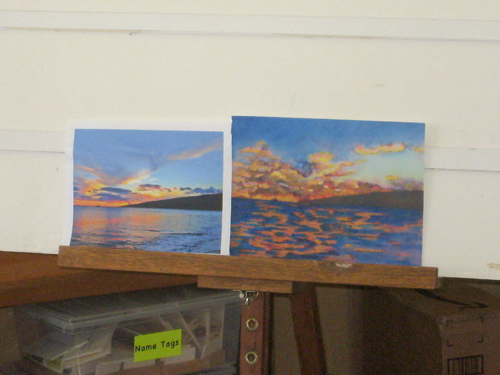
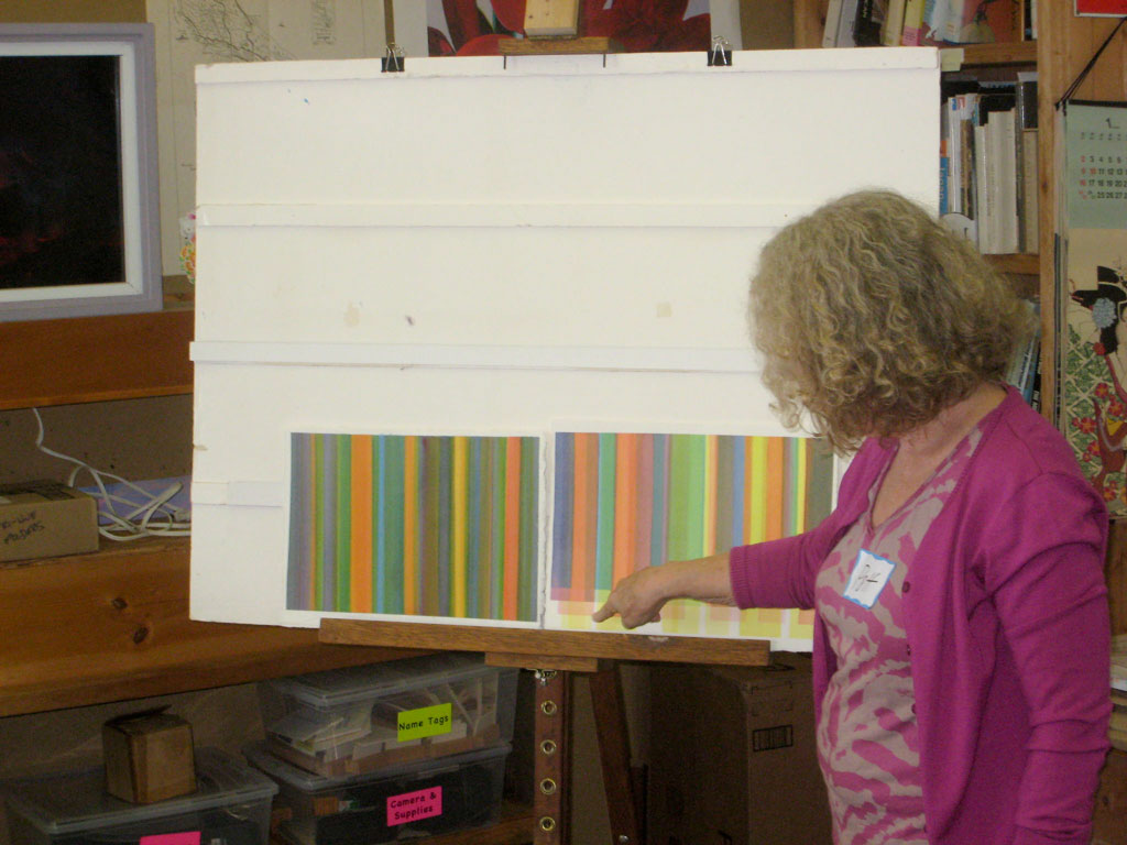
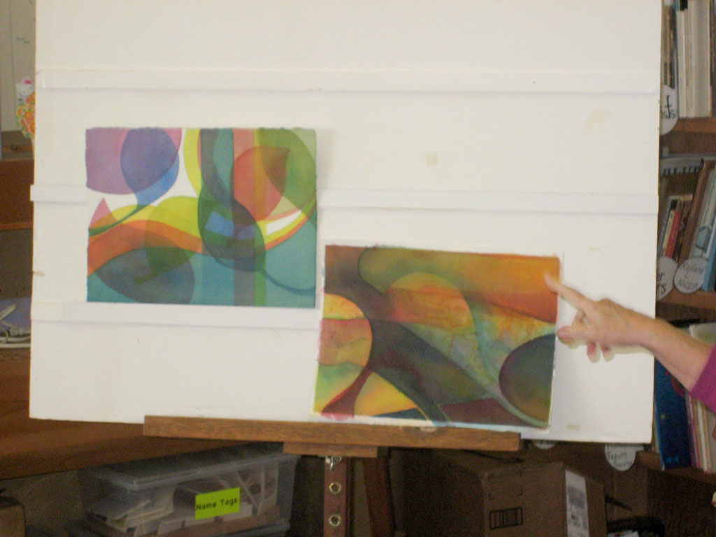
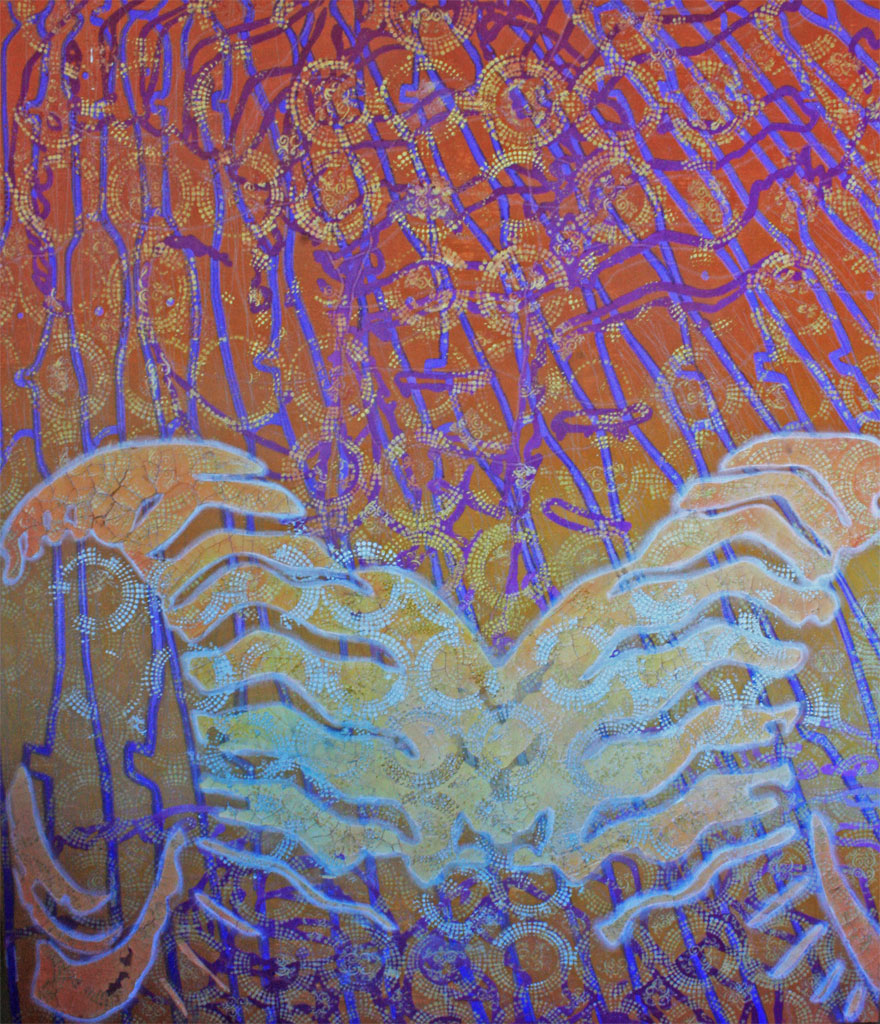
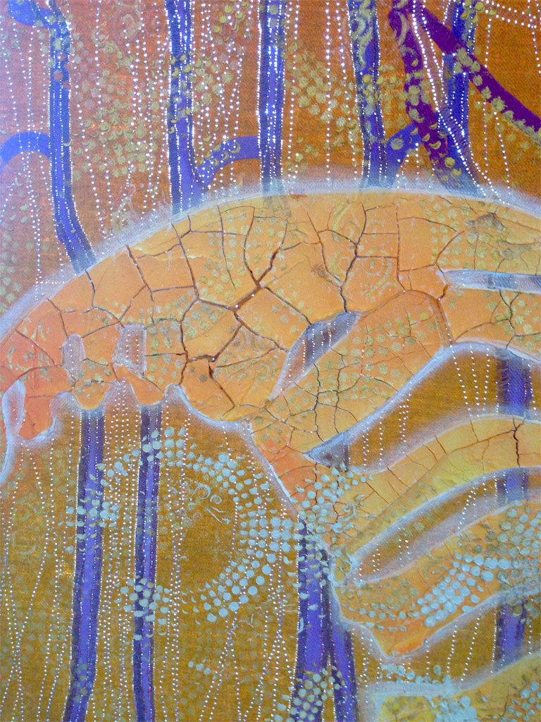
We began class with a critique of our last assignment, ‘Create a “composition”’, and as open-ended as the criteria had been, so too were the results. Each piece had a different subject matter, interpretation, theme, size, and medium.
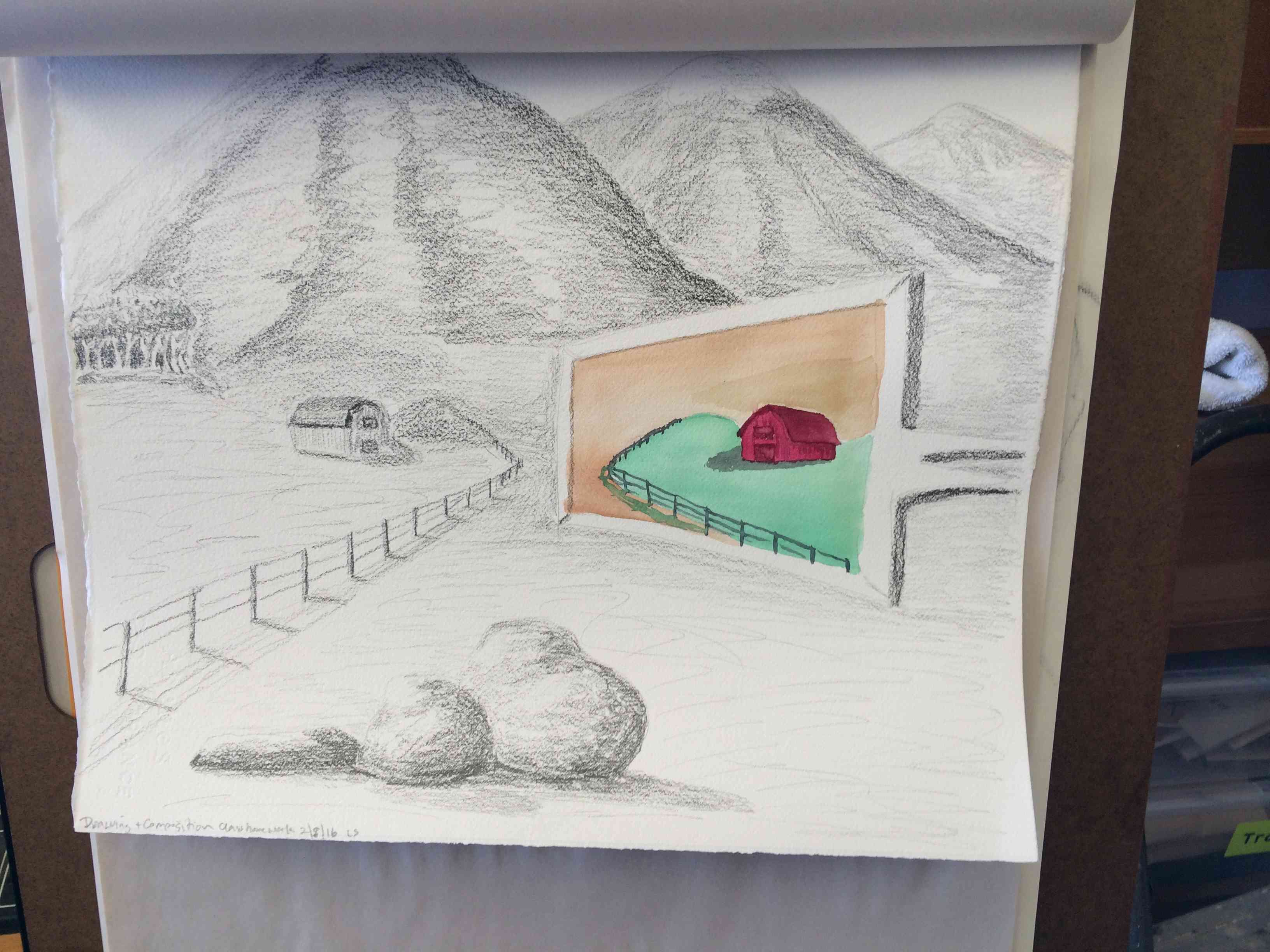
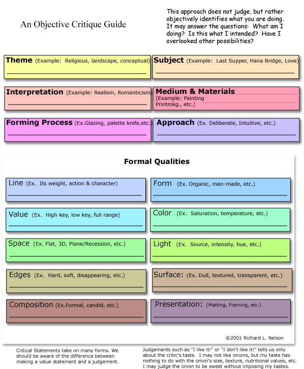
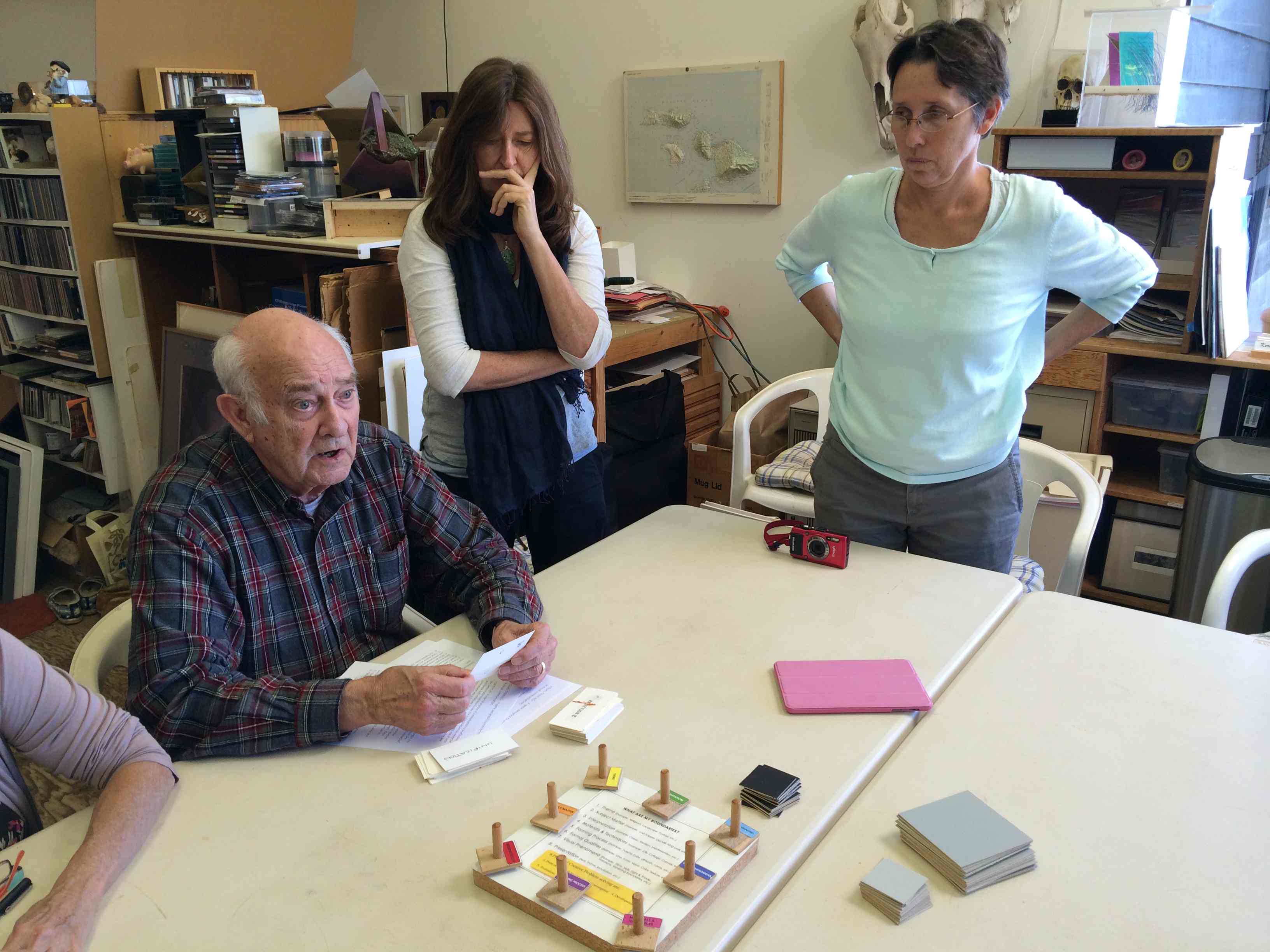
To help us in our critique discussion, Dick handed out ‘An Objective Critique Guide’ (see image at the end of this post), which is both a guide to looking at others’ work, and a helpful checklist when creating your own. At the top of the page are six categories: Theme, Subject, Interpretation, Medium & Materials, Forming Process, and Approach, and we spent most of our time talking about the ‘Theme’ of each piece. Once you have identified your theme, all of your choices will be made in relation to that, to make sure that each decision reflects your theme accurately and without ambiguity. The theme may also help by dictating some choices for you: the style or interpretation, the color palette, size/dimensions, what materials, etc. Relating all components back to the theme helps unify and strengthen the message of the artwork.
Here are a few excerpts on the different topics we covered (all quotes by Dick):
Theme
“What’s the theme? ‘Theme’ can have many interpretations … Once you have the theme, everything should relate to that. The organizing theme is _____________, and once you have that, that’s the anchor.”
“Every time I add something (shape, color, line, etc.), it complicates the scene. I have to ask myself, ‘How does it fit?’ How does it help my original interpretation? In other words, if ______________ is important to me, then how does ________________ reinforce that? I don’t put anything in unless it has an integration with the [overall message or theme].”
“There’s no magic in any of this, and it’s not a question of ‘I like’ or ‘I dislike’, or your preference, but what I’m trying to instill is that the first question is ‘What is the artist trying to do?’ And it starts with a theme, and that theme then sets the pace for the whole composition.”
Interpretation
“How many different kinds of interpretation [can there be]? Is it a Classic? Is it Realist? Romantic? Surrealist?”
“Don’t get me wrong: Expressionism is one movement, which doesn’t mean it is superior to something else … It may be authentic, or it may be made up, but if it’s not really YOU – if this is not really how you feel – [then it doesn’t work]. [Working in a style that is not authentically you] gets very pretentious, and it’s dishonest in a sense.”
Contrast
“What does the black against the white do? Wherever you have the greatest contrast will draw attention. [So, for example, that object is delicate, and it’s whispering,] but the black shape is shouting so much I can’t hear the whisper.”
Composition
“When you compose, think of the message you are sending. What would the message be if we were sending it in another medium: if this were a dance, or a music score? What would that be like?”
“Good compositions don‘t have anything extra. Can I do it with [just this]?”
“Not that you want to be able to predict exactly what’s going to happen all the way through. If you watch great choreography, or listen to great music, there are surprises around every turn, but they all relate. And the secret to composition is to compose around a theme, a subject, an interpretation; and be consistent.”
Helen’s sculptures/found objects
One student brought in a few objects which she found aesthetically pleasing, and in the ensuing discussion, she revealed that she simply loved the shape of the objects, which was her reason for choosing them. This admission provided for a reinforcement of Dick’s emphasis on theme and how that drives the rest of the decision making in a piece.
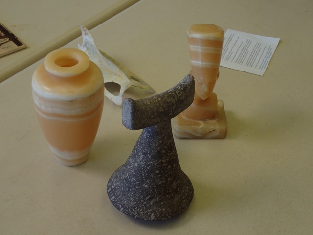
“If it’s really important for you to communicate a very specific idea, then reduce the amount of ambiguity. So if you love shapes, then that should be the most important thing … those shapes had really better be the focus of this composition.”
“And maybe the viewer does not see it. But if you told the viewer to look at the shape, and they said ‘Well, the shapes are not very interesting’, or ‘I didn’t notice them’, then you’ve lost. But if they say ‘Oh, yes, I see what you are saying – I wasn’t even aware of that! Now I see what’s happening,’ [then you’ve succeeded.]”
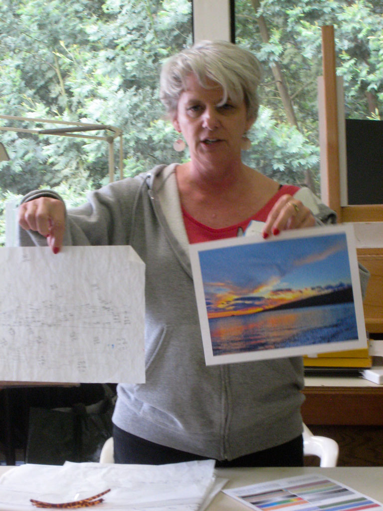
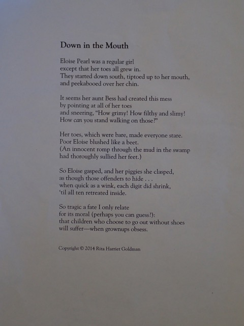
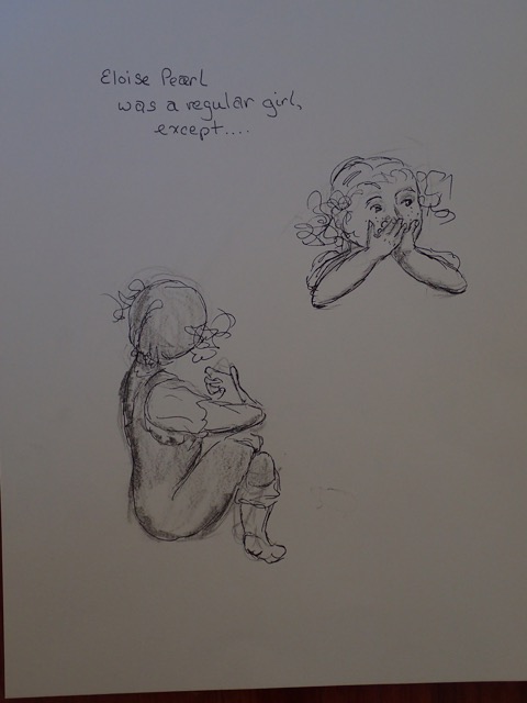
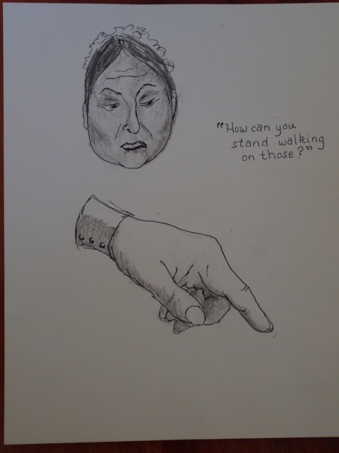
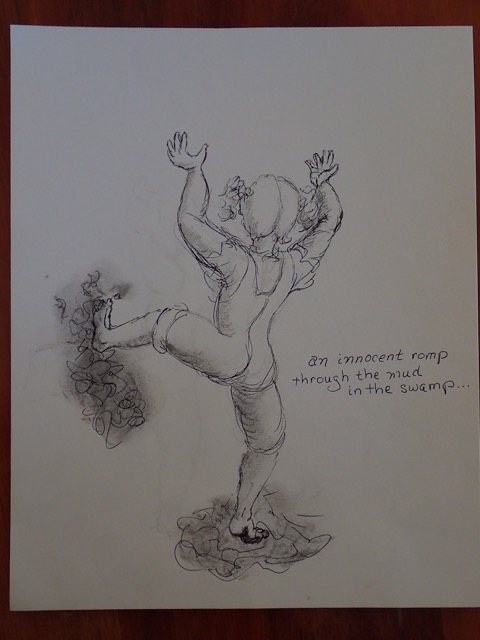
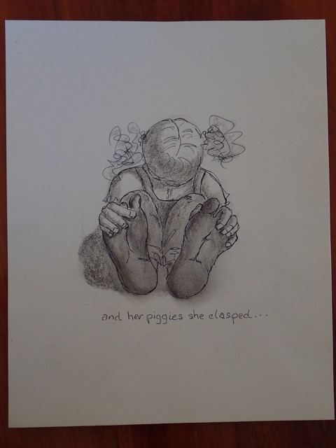
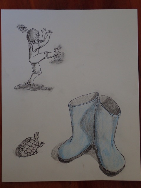
Rita’s Poem
One participant had illustrated a poem she had written, a delightful children’s story about a girl with dirty feet. This allowed Dick to expand on the idea of thinking about your work in other mediums (writing, music, choreography), and how to match a literary style in visual terms.
“If I show you this drawing, is it as lyrical as the poem? Think of Dr. Suess, and what makes for me, a Dr. Suess a Dr. Suess, is not just the poem ‘Green Eggs & Ham’, but that the image is also really off the wall! These are marvelous drawings, but my question is, do they have the same flavor as [the poem]?
So either change your style of writing, or change your style of drawing. Because you’re doing something that none of us are about; you’re asking for a double whammy. And so does the writing relate to the drawings?”
Objectivity versus judgment
Dick also went over the difference in critiquing objectively and stating what is, as compared to casting a subjective judgment by saying what an artist ought to have done. “Again, whenever it is we critique, watch out for your ‘is’ and your ‘oughts’. I’m only saying right now what I see – what is – not what she ought to be doing. Because the minute you get into that other realm, you’re in judgment.”
He went over the three main questions to ask when looking at artwork:
“The bottom line, and it bears repeating, is that there are only three questions I ask myself when I jury a show, or look at artwork:
- What was the artist trying to say?
- Were they successful (did they say it)?
- Was it worthwhile? (Which is the only subjective question.)
But so many people never get past the first question, because they never ask ‘What is the artist trying to do?’ and that’s where they get caught up in, ‘Well, they ought to be doing this’. Well, no, that’s not what they were trying to do.”
In summation, Dick pointed out how different all of the interpretations of this simple assignment had been. No one piece was the same as another, and yet they all fulfilled the criteria: “They are all addressing our point of entry, which is ‘what is composition’, and we haven’t even had a class in how to compose, or what composition is all about. So as a point of entry, we certainly are showing a broad range of possible definitions.”
Homework
We briefly went over the criteria for the next homework assignment, which differed significantly from the last assignment by having lots of restrictions where the last had almost none. Dick asked us why might he have gone from total freedom to lots of rules between these two assignments: “Why don’t I give you the freedom on this one? Because there are so many interpretations [you can do with] this.” Remember, restriction breeds creativity!
The main challenge of this homework is to come up with a design which exemplifies the idea of ‘Gestalt’. We are to use the same components (in this case, triangles) to create something that is greater than the individual pieces . “What does that mean, [that the design should add up to the sum of more than its individual parts]? Do I want to see triangles in the finished product? That’s just the sum of its individual parts. But if it begins to create a particular idea or illusion or whatever you come up with, [then you have successfully created a composition].”
We also covered how the six phases of creative problem solving are being used to develop our understanding of composition. “Point of entry, that’s the assignment you brought in [today]. Now when you’re playing with the triangular shapes [for this week’s homework] out on the table, you’re looking at all the different possibilities, right? So that’s Expansion. When you finally hit on an idea, that’s Converging on it; and then you Develop it.”
Game
We finished up class with a few rounds of a very interesting game, one that uses tight restrictions to force our creative thinking. The game is somewhat like charades, where each player is given one of two words that are similar yet different in meaning, and can only use squares of black, grey, or white to communicate their word.
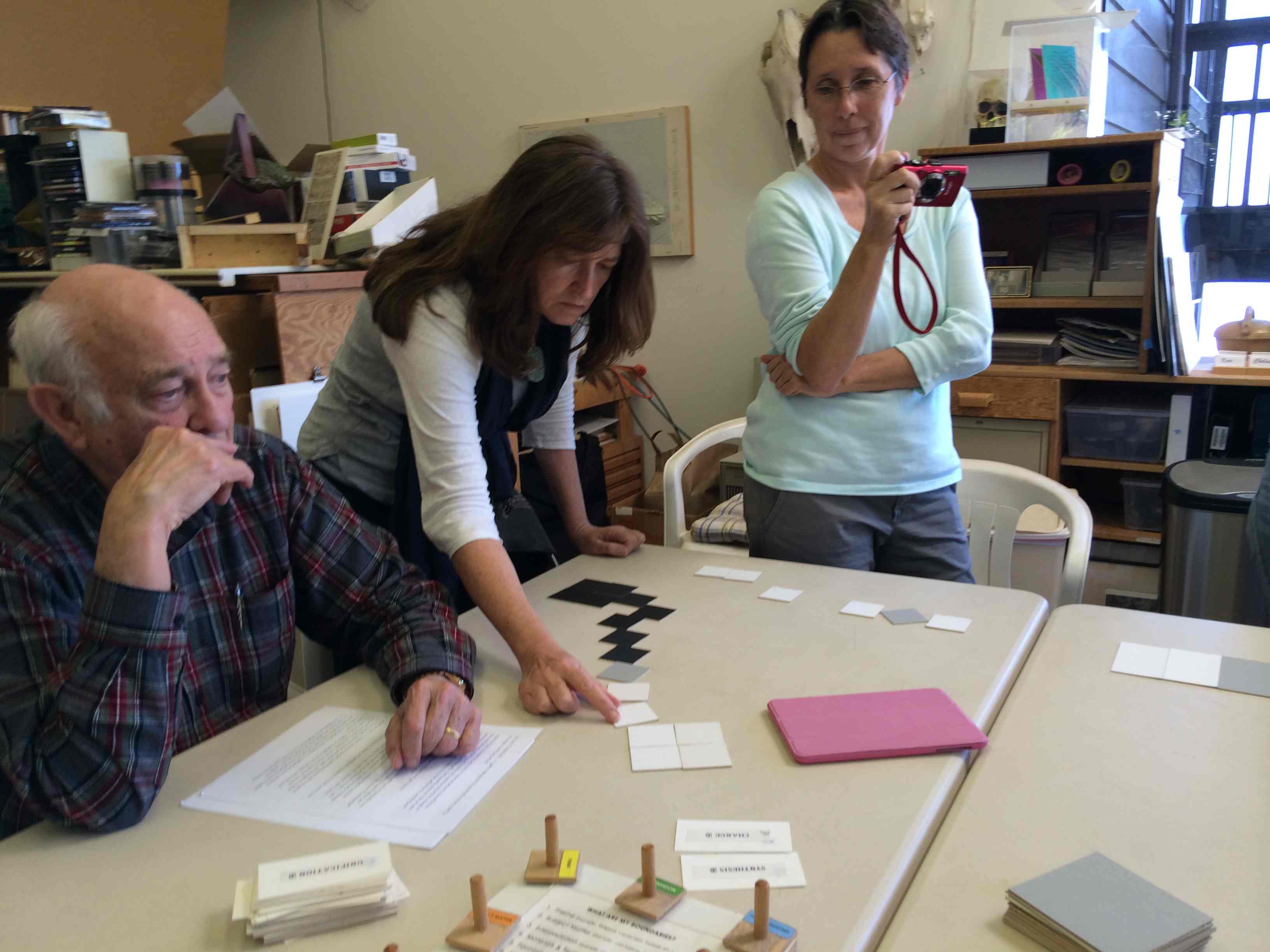
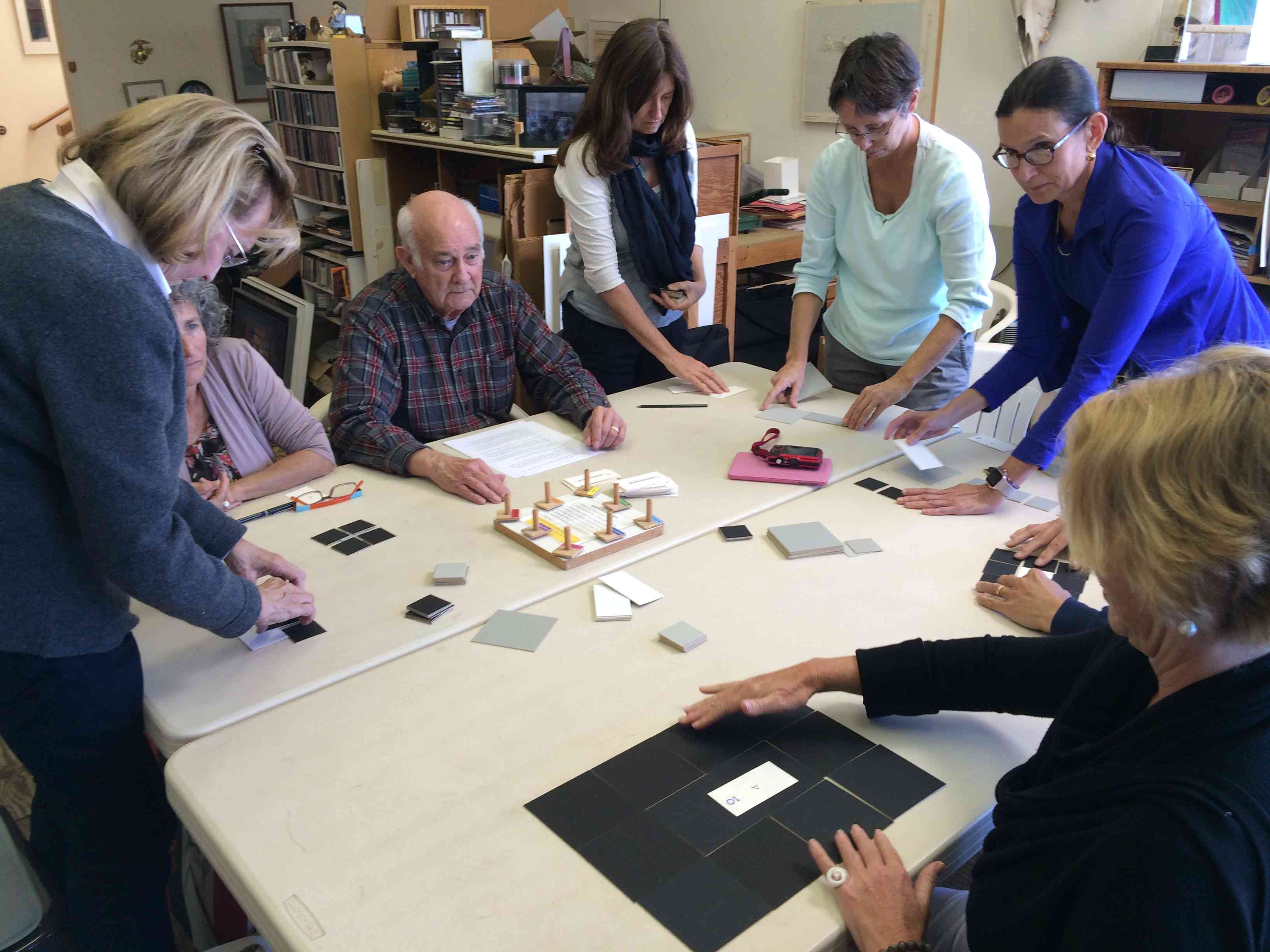
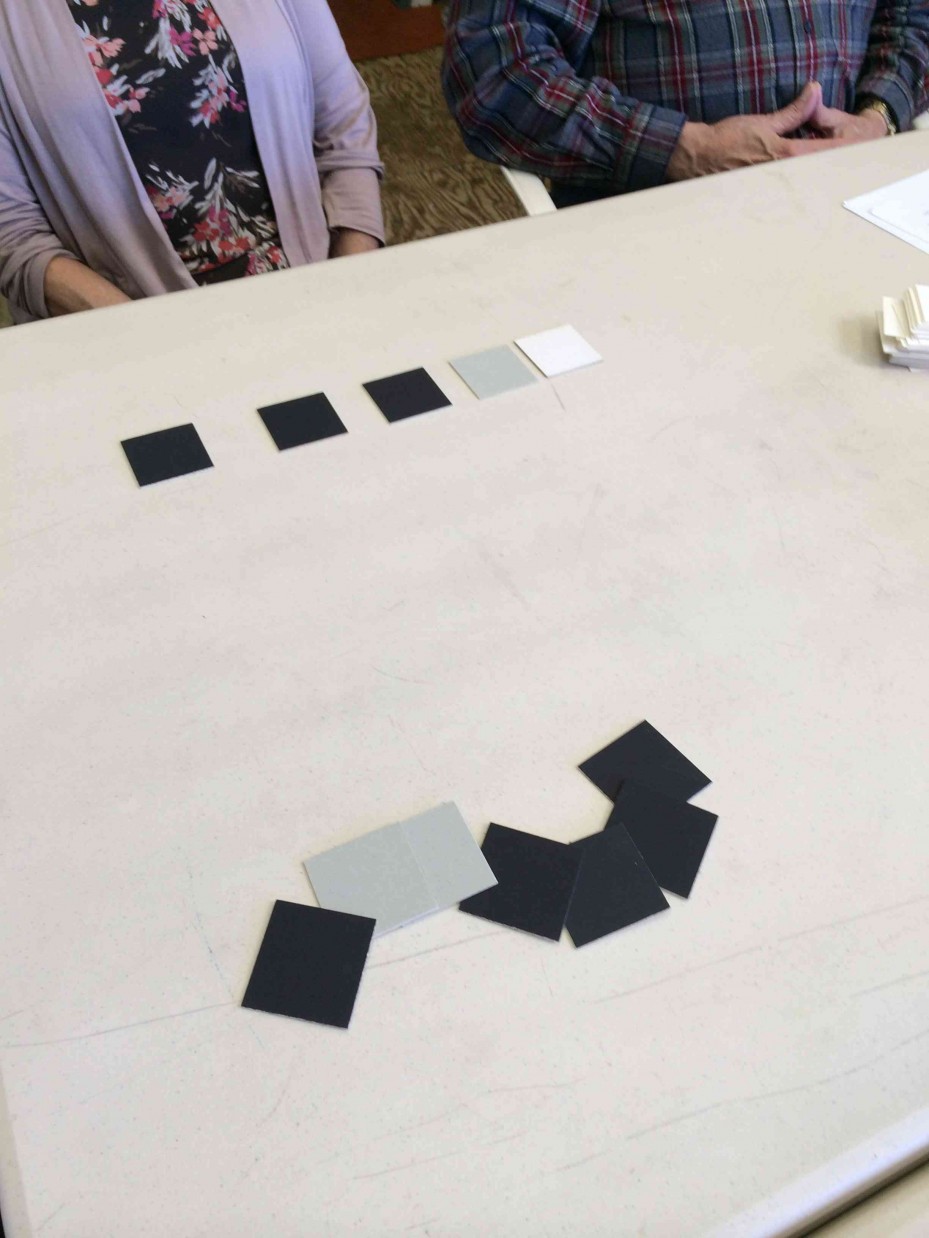
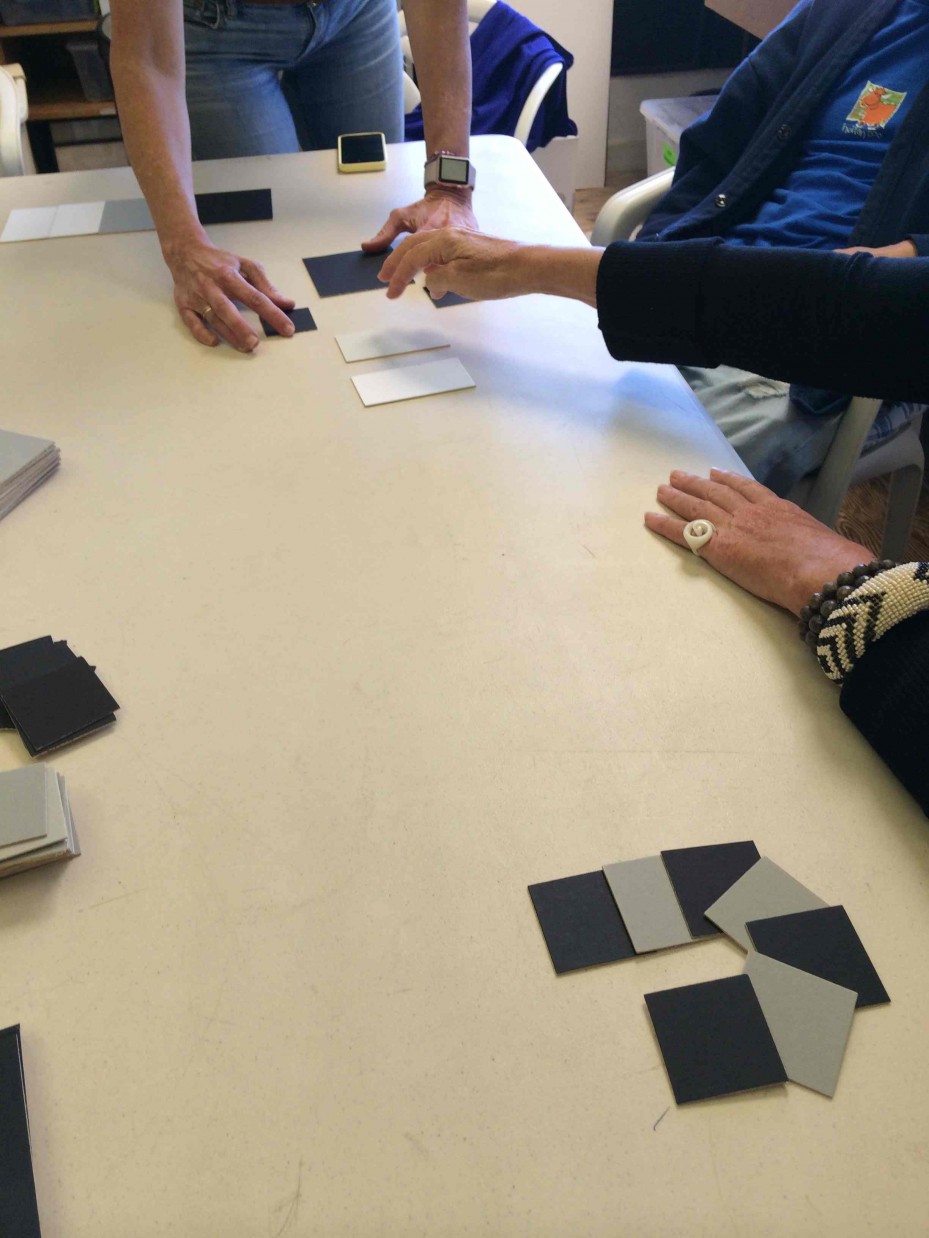
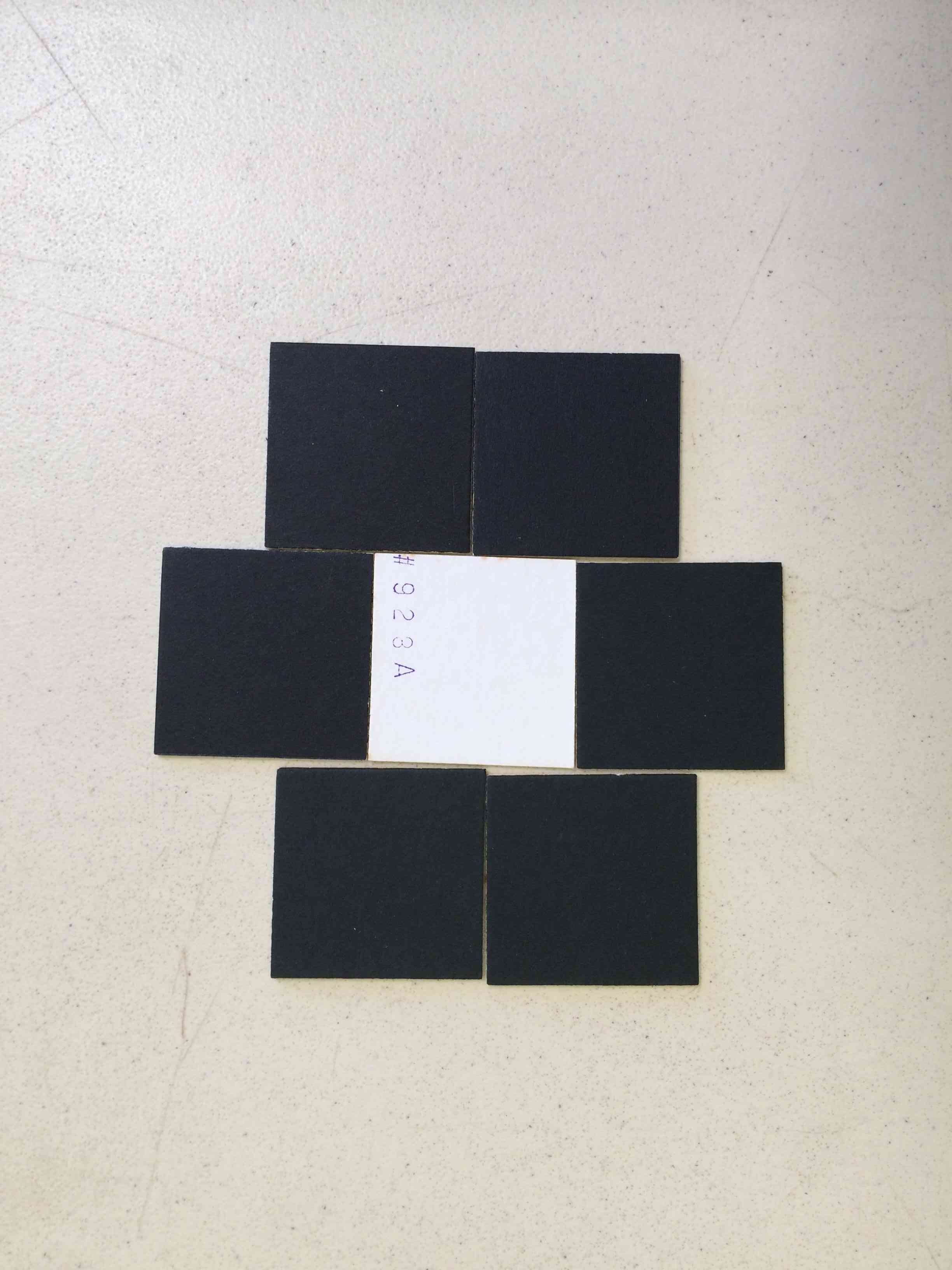
For example, the three rounds we played used these word combinations: leadership vs. domination; rejection vs. uniqueness; and synthesis vs. change. The words are closely related, yet have subtle connotations that lead to very different visual interpretations. This brought Dick back to the idea of using contrast as a communication device: “In order to see something that is unique, don’t we also have to see something that’s not unique? You have to set a pattern to tell you that now what’s happening is unique. In other words, you have all this conformity, and then [by contrast, this appears unique]. And how does that differ from being rejected too? It’s a fine line.”
All of these subtleties will play a part in our homework for this week, and we are being asked to bring all that we have covered so far into this assignment. By finding unique solutions within very controlled criteria, we will see that creative answers can spring from some of the most unlikely sources!
Audio and video recordings
The audio tracks below are in alphabetical order. The chronological order is Compositions Critique, Rita, Karen-Helen, Assignment.
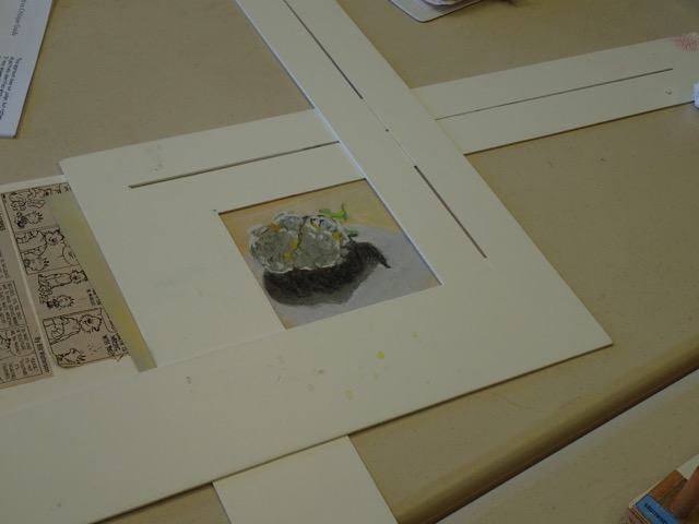
Cauliflower Cropping (0:42)
Composing includes deciding what and how much to include.
Rita’s Composition (19:35)
A literary and visual composition and critique.
A composition game: conveying concepts using only black, gray, and white rectangles.
Game 1 (4:25)
Game 2 (29:01)
Game 3 (3:34)
Class materials
The critique guide below was used to structure the discussion of each composition. All aspects of a piece should support the artist’s message. Otherwise, the piece is weaker than it could be, causing uncertainty or disbelief in the viewer.