The fifth color residual session was held on Saturday, May 31, 2014. Three guests and five regulars contributed to stimulating discussions between artists, sharing goals, difficulties, solutions, and ideas. Evidence mounts of increasing color awareness and sophistication.
Opening comments
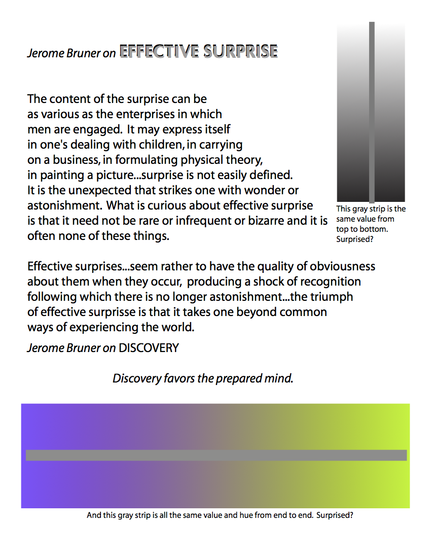 To set the stage for the session, Dick shared a quote from educator Jerome Bruner on effective surprise. “When a work takes your breath away,” elicits an “Aha!” or “Wow!”, “for me, that is the measurement,” Dick said. The illustrations accompanying the quote demonstrate how knowledge of color relationships – color relativity – can create an “effective surprise.” The color of a narrow strip of flat color can appear to be different, depending on its background – here, a narrow gray strip on a light-to-dark gray background, and on a gradient from purple to green (complementary colors).
Several people shared their experiences with trying to apply the color relationships lessons in their work. Valerie described it dramatically as feeling like “jumping off an airplane with a parachute and a manual.” Bonnie, who has been painting all her life, agreed, saying, “You think you understand it intellectually, but it’s incredibly hard to apply…It’s easier to start by using it in non-representational art.”
Dick also mentioned that his colleague and friend, prolific Canadian artist Robert Genn, had recently died. Dick subscribes to his “Twice-Weekly Letters” sent to artists all around the world. Robert’s daughter Sara is continuing their publication. In her announcement of his death, she wrote, “Dad’s dream has been to reach artists of all stripes – individuals with a common joy, journeying in this life-enhancing, inexplicable affair of the heart. He wrote, ‘We have no other motivation than to give creative people an opportunity to share ideas and possibly broaden their capabilities – to get more joy and understanding from their own unique processes.’” These color residual sessions provide such an opportunity for a few people at a time on Maui, and I encourage anyone who seeks that kind of stimulation and fellowship to subscribe to the Twice-Weekly Letters that will continue to be sent.
Sharing and critique
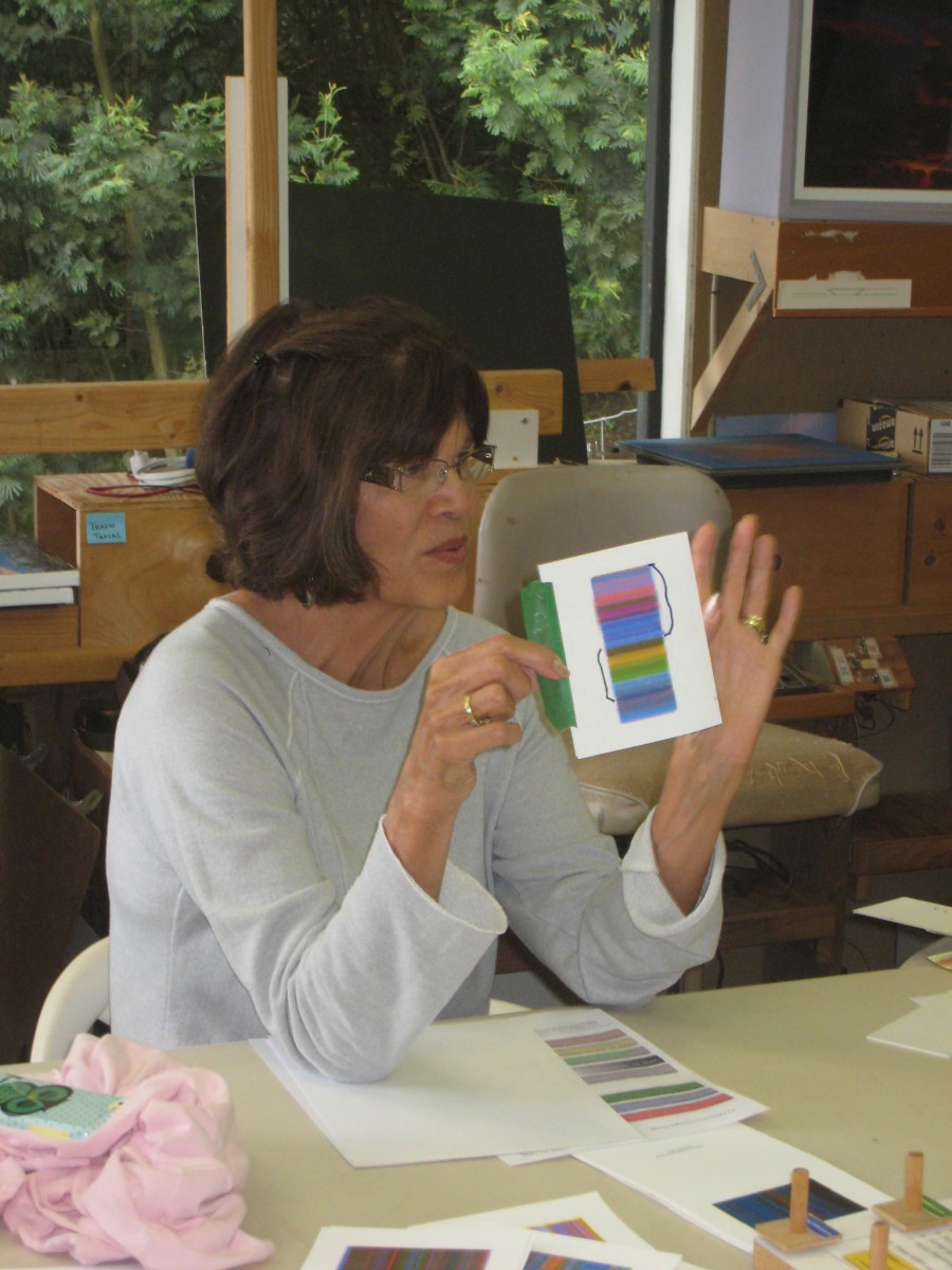
 Valerie used Dick’s Illustrator experiments with transparent overlays of primary colors as the inspiration for her own layering experiments in watercolor. Questions about saturation falling off, both as the watercolor dries, and with viewing distance, led to discussions about balancing the quantities of colors (which color is the lead actor? which are the supporting cast?) and how artists can provide a rich experience for the viewer both close up and from a distance. Kit commented that John Singer Sargent wore a hole in the carpet in his studio between his easel and the other side of the room, and that one of Kit’s college professors had a “de-magnifying” glass to get a sense of how a piece would look from a distance. Dick said they are (or were) a commonly used tool in printing production.
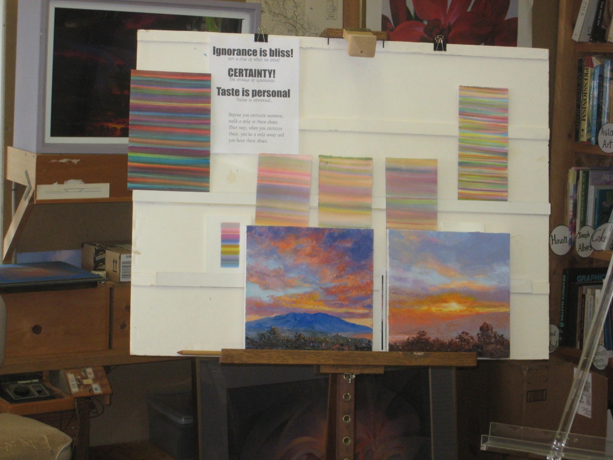
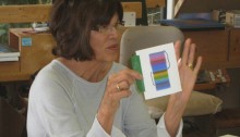
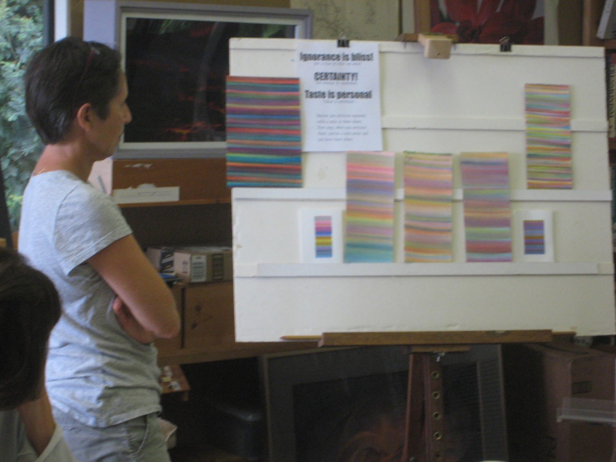
Betty Hay also took inspiration from Dick’s experiments, as shared in greeting cards last time, choosing key colors for two new landscapes. In one, she pushed the chroma for more drama, and consciously echoed sky colors from the top in foreground vegetation highlights in the bottom. In the second, she explored the subtle magic of luminosity created through vanishing boundaries. Who would have thought that gray could be so beautiful? This reminded Dick of one of Josef Albers’ favorite assignments to students: “Take your least favorite / mud color, and make it sing.” Of the second painting, Dick said, “That sky is one of the most exciting ones I’ve ever seen. I’m especially pleased when these are not just lessons in color, when you begin to plug it in. I think, Betty Hay, that you’ve opened a very important door for yourself and for us.”
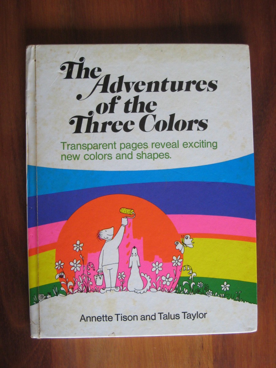
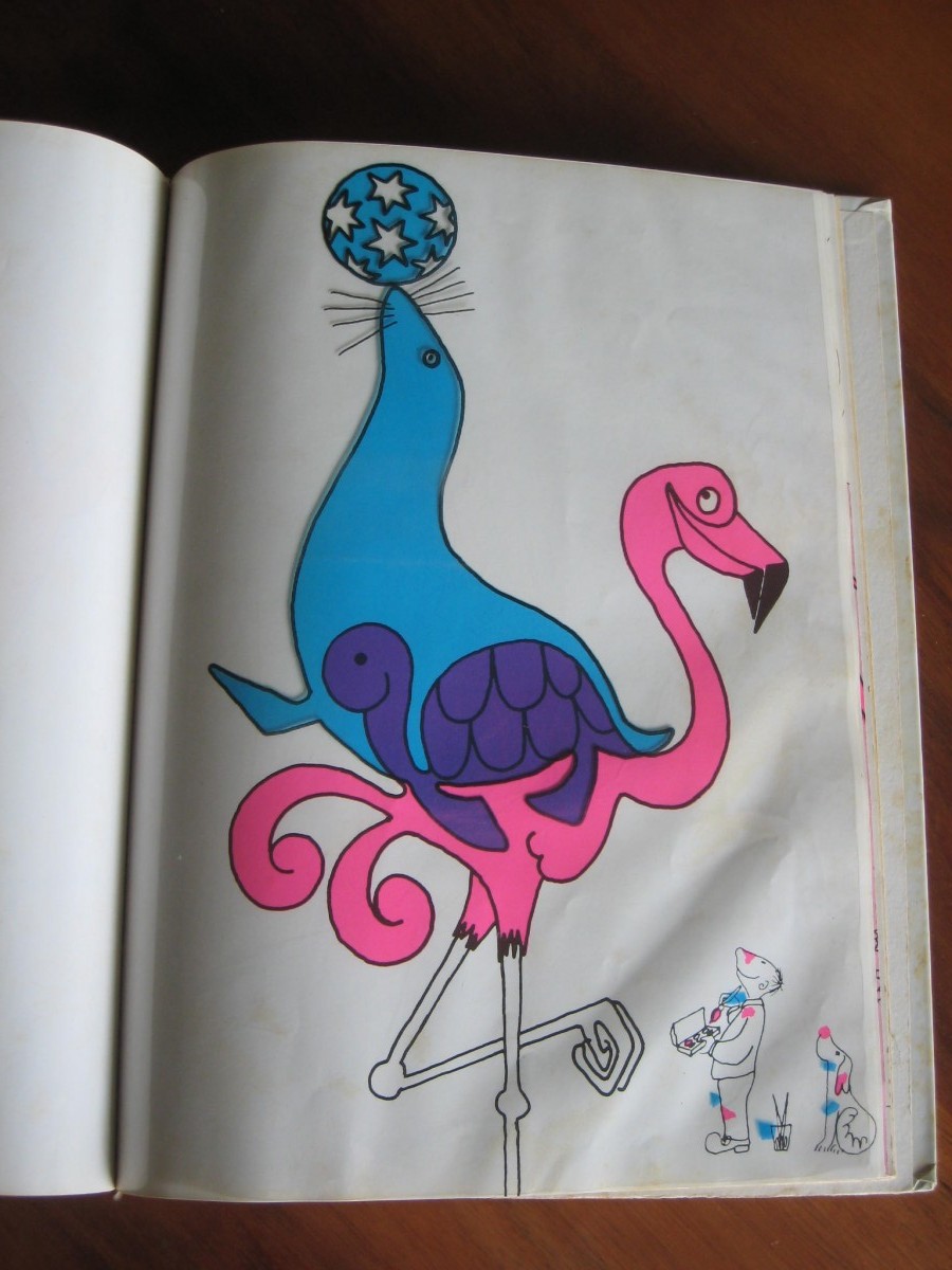
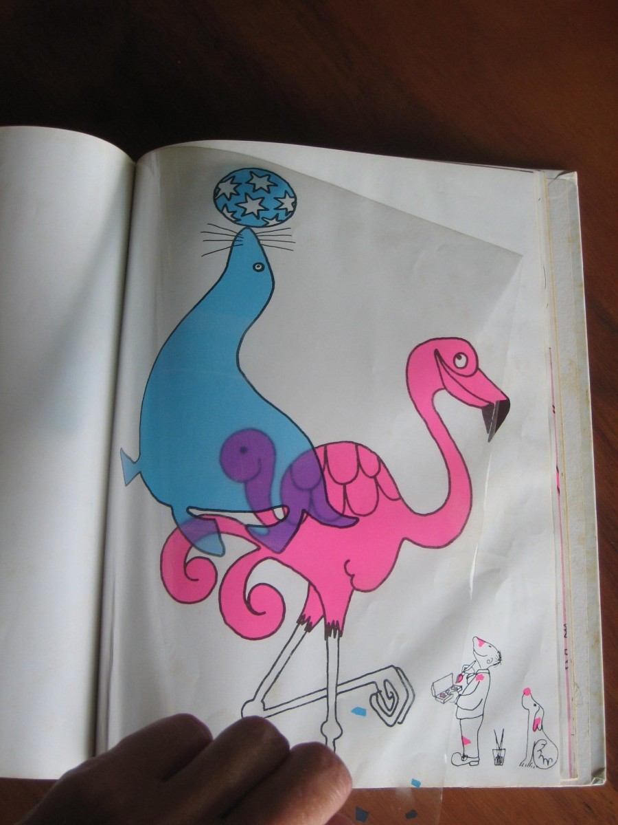
Chelsea also brought in a children’s book, unique in that it uses transparent overlays of the true primary colors (cyan, magenta, and yellow) to physically show how they mix. The book is The Adventures of the Three Colors, by Annette Tison and Talus Taylor, originally printed in 1971 and reprinted in 1980 (the edition she showed us).
Closing thoughts
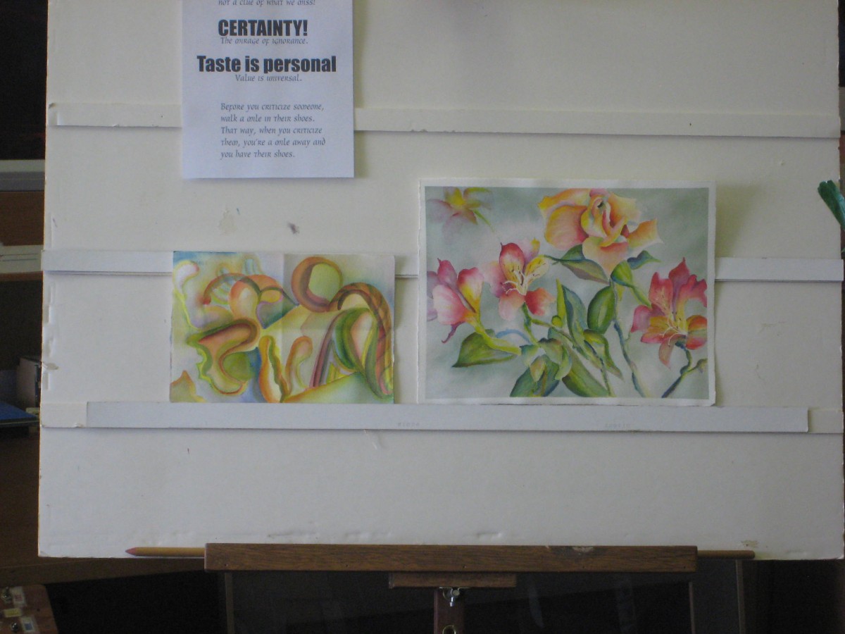
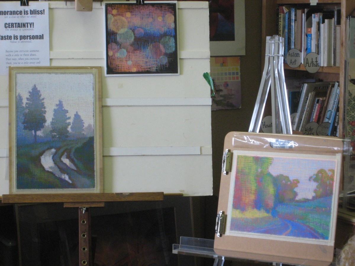
Abstract versus representational: Do you have to choose? These artists have found both useful and expressive.