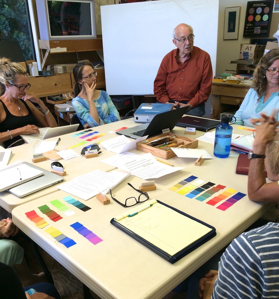
Wow, second session and we are fast covering ground! In this class, we moved right ahead, learning more about arrays; the importance of recognizing the difference between hue and value; how to look at your work objectively; and most importantly: HALATIONS! The following post summarizes our exciting class activities, the importance of critique, the new homework, and the fun videos we watched (no shortage of laughter!). Read on for more …
Class overview
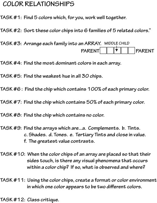
Color Chip Game
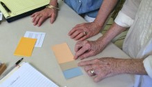
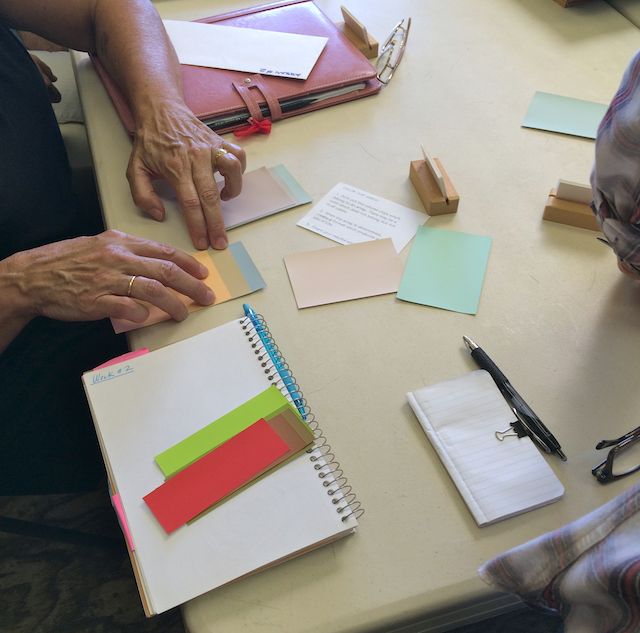
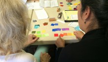
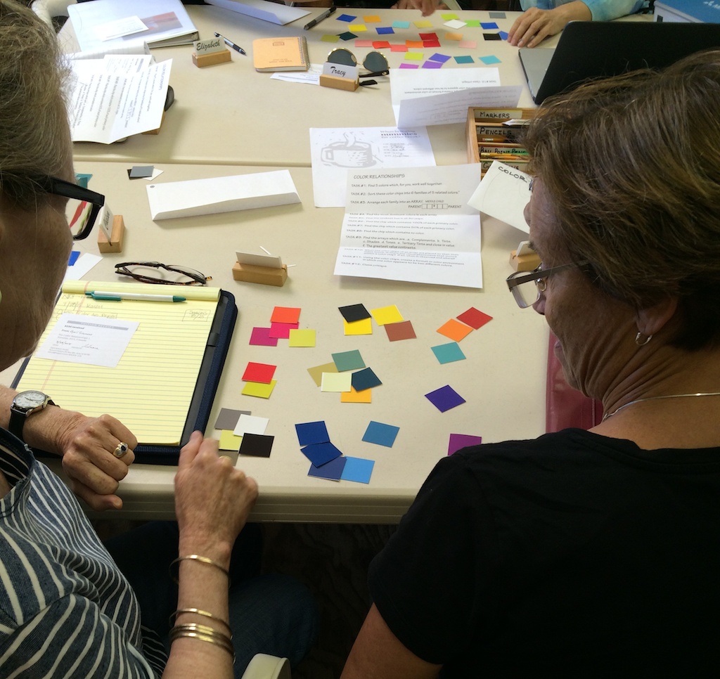
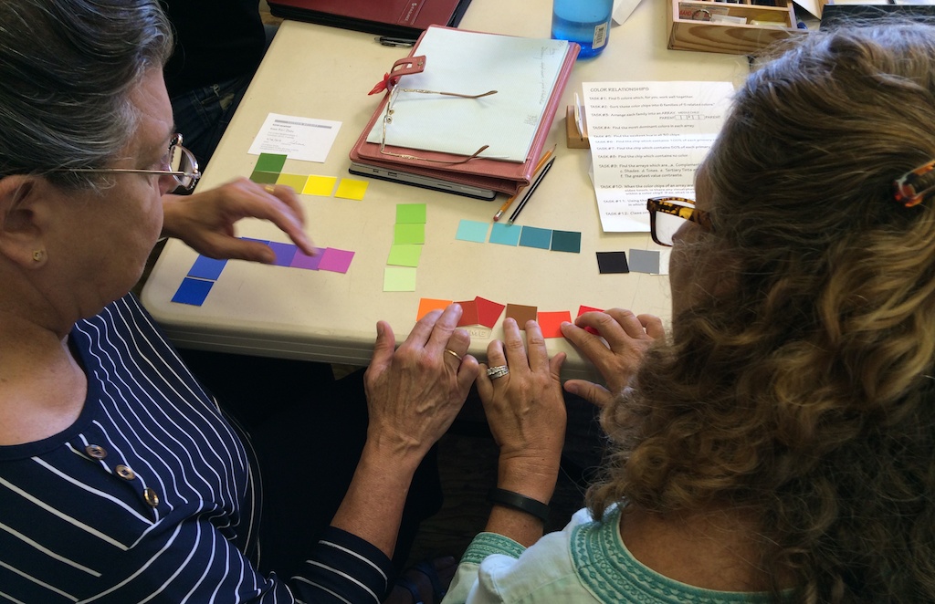
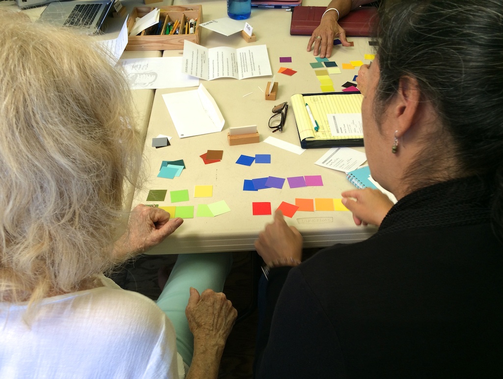
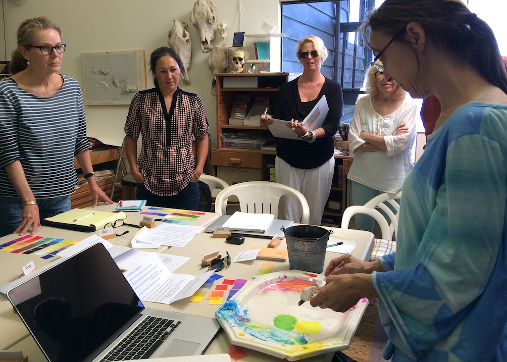
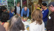
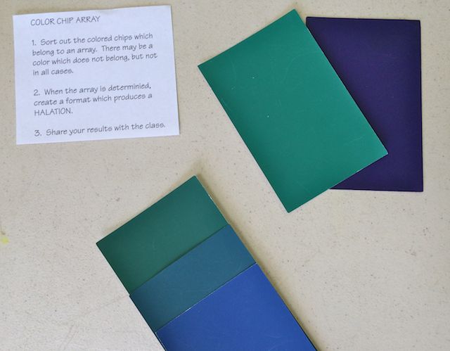 The second class of the Color Relationships Summer 2015 met again at Dick’s house on Tuesday, August 4th. After meeting one more student who was absent from the first class, we started right off with another game: Color Chip Array. Students paired off and had to sort through a pack of 4-5 colors to find the appropriate “relatives” and discard the hues that didn’t belong. The instructions then called for something interesting: “When the array is determined, create a format which produces a HALATION.” Well, what the heck is a halation? Before Dick would give the answer, he wanted the class to figure it out for themselves (no surprise there!). Teams worked on the arrays for around 10 minutes, then had to share their results with the rest of the class.
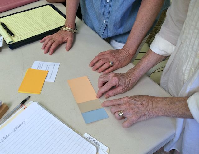
The game proved to be a bit more difficult than originally assumed, and many of the color chips had been chosen so that the colors were remarkably close in hue with subtle differences. Keeping with the metaphor of a “family”, Dick brought up a good technique to use when determining if colors are related: “When looking at color, ask, ‘What’s in this? Who’s the father? Who’s the mother? What are the values of the parents, and is one parent lighter than the other? Is the child progressing towards one or the other; that is, is it going lighter or darker?”
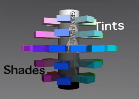
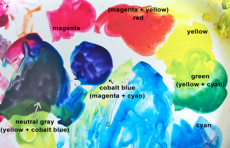
This is all about learning to identify what makes up a hue; that is, what ingredients does it have in it? Is there magenta? Is there yellow? Is there black, or white, or a complementary color? Dick stressed this point a few times throughout the class, that it is important to learn how to label colors so you can talk about them in a logical fashion. Don’t just come up with a clever name for a hue; learn to identify what primaries have gone into it, and in what proportion, and if they were modified in any way (with black, white, or if it’s been toned).
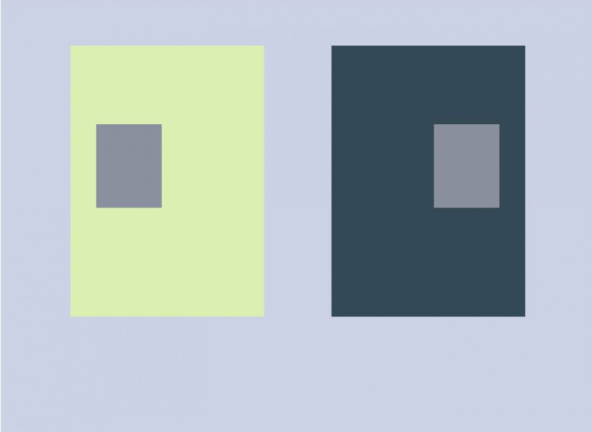
Halation
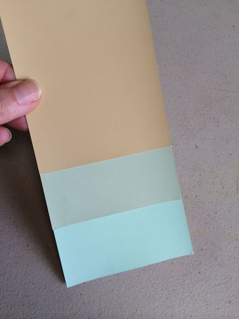
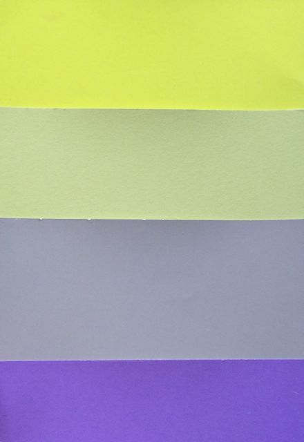
From this discussion, we narrowed down which hues belonged in which families, and which color chips could be discarded. Dick then introduced another technique for identifying color relationships: halation. Halation is a term that Dick was introduced to through Josef Albers, and although Dick remembers hearing Albers use it, there is no reference to the term in the entire Albers book. However, the term stuck, and it is a most appropriate word for the incredible, almost magical effect that occurs when colors are in true relationship to each other.
Dick demonstrated the effect by having the class gather around the table, and slowly pulling one color chip away from the rest of the array. If you watched closely, you could see the other color showing up along the edges of the chip, like a shadow moving across the paper, or as Dick described it, “like the wake of a ship.” Once you see it, you can’t believe that you have been ignoring this phenomenon your whole life! It appears to look like a trick of the light, or that some clever person has delicately airbrushed a light wash of color over another one, but when you see the demonstration, there is no faking it.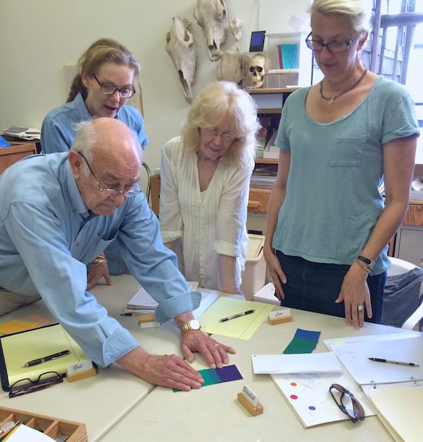
1 + 1 = 3
This is why halation can be such a powerful method of checking to see if the hues you are working with are truly in relation to each other: you will either see the halation between them, or not. This was also a powerful demonstration of one of Albers’ favorite quotes: ‘1+1=3’. Dick used the example of a hand: “A hand is not just four fingers, a thumb, and a palm – no, it’s so much more than that. It’s more than the sum of its parts. So one color plus another color is not just two, but has a sum, an effect, which is greater than its parts.”
Dick explained that this term would be an important part of today’s lesson, and was one of the key aspects of creating color harmony. Later in class during the critiques, the use and importance of halations became more apparent as it turned out to be an integral part of proper relationship, and is a phenomenon that is best understood through practice rather than simply discussing it.
Critique and objective analysis
We started with Chelsea’s homework, since she had chosen to go with the ColorAid paper, which meant she did not have the luxury of having Illustrator create an array for her, and had to make one herself from selecting color chips. Dick had cautioned how difficult this would be, since the colors are not organized, and as we have already seen, color perception can be easily thrown off by the other colors that surround it.
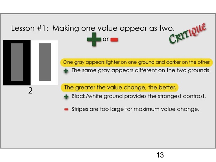
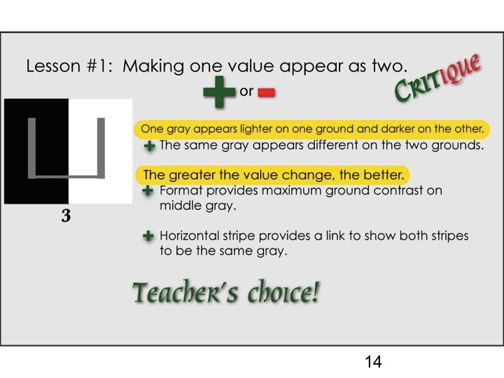
However, Chelsea had done a masterful job with her array, finding a closely related color family that truly reflected her parent hues. This led Dick to point out the practical use of the halation effect: “If your array is done properly, you should see halation between every color except which? The parents.” Why not the parents? “Halation can only occur if it is surrounded by other colors on both sides – you can’t have it isolated like the parent/anchor colors. It has to be inside two others.”
The class could clearly see the halation between Chelsea’s “children”, and the strong parent colors added to the effect. Dick also critiqued the formal qualities of the work: the design, the proportion of colors to each other, and how Chelsea was able to communicate her intentions through purely visual means. This is another one of Dick’s goals in this class, to educate his students on forming a coherent visual language. As he put it: “I’m playing the same role that Albers played with me: he questioned everything. Albers could be so objective. And I want you to think about that: what does placing this line here do? Does this help it? Does this hinder it?”
After our coffee break, we continued with the rest of the critiques, all done with Illustrator. Before starting the critiques, Dick made sure to reiterate what he was looking for in the assignments: “There are only two things I’m concerned with: HUE and VALUE. So when we look at the homework, continue to ask yourselves, ‘Is this a hue change or a value change?’”
After looking through several examples, students were getting faster at recognizing when the effect was one related to hue or one related to value. Some of the best examples made use of both attributes, which demonstrated the importance of knowing the difference between them, and how to use them effectively. The class could also clearly see when halation was occurring in an array, and when it was absent. Dick stressed again the importance of using that effect to gauge how well the relationship is working between the parents. If the array is in proper harmony, you will see halation appearing between the children.
And from there, the questions about hue and value become more specific to the assignment. “Continue to ask: is it a value change, or a hue change? See if changing one or the other strengthens or hinders the work.” Along with that, we saw examples of how the size, shape, and proportion of children colors to parent colors can dramatically affect the reading of the final piece. “How about the size of the area, the size of the child? Too much, too little? Why? Pay attention to that, because you want to influence as much as possible.”
Anomalies in Illustrator
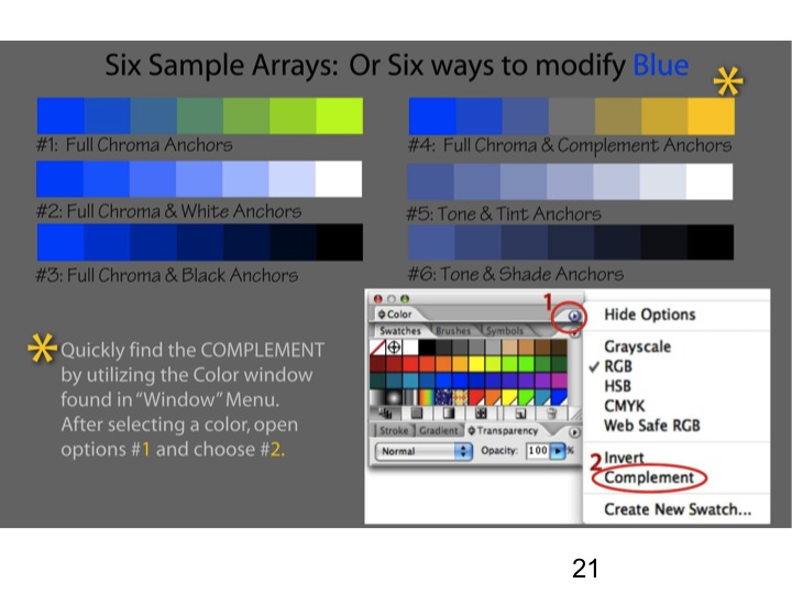
We also got to see a few examples of how the Illustrator program doesn’t always produce predictable results. The computer program is not perfect, and does not always calculate a color array that would match real world results. Again, watching for hue and value consistency will go a long way in finding harmonious color relations. For example, if a child appears to get darker than both of its parents, then the array is wrong and needs adjustment. Use your discernment when looking at your arrays: if the colors do not follow a logical pattern, or you can’t see halation between the colors, change them. Dick cautioned, “Don’t be too dependent on this application to give you accurate results.”
Overall, Dick was very impressed with what the class turned in for homework assignments, and congratulated everyone on their understanding of hue and value effects. And because they did so well, he decided to combine the next two homework assignments and have the class complete them both for next session. This will allow us to have extra time to go over some advanced color concepts at the end of the course.
Videos
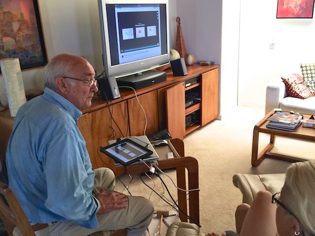
Before launching into our new homework assignments, we watched another one of Dick’s Vimeo presentations, “Red & Blue are not primary colors.” This involved demonstrating the luminous colors that are created when all three primaries are used in varying strengths, and the incredible variety of color that occurs when these hues are next to each other. As Dick said, “There’s no way to have dissonance when all colors are in harmony. You will see halations and luminosity by relating the three primaries to each other.”
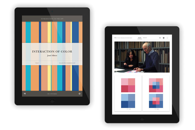
Dick also demonstrated the Huedoku app on his iPad to show the incredible effect that halation can have: once again, it’s either there or it’s not. There is no way to deny the truth of that statement once you see the game in action; and a color palette that at first sings and glows, then becomes flat and boring once shuffled around randomly. Place the chips in their proper positions, and the whole thing comes alive again, with unbelievably radiant color squares.
Last, Dick shared a YouTube video about Albers’ paintings, narrated by a curator of a museum. It turned out to be an interesting example of an “expert” who was actually making stuff up! The video included commentary about “colors migrating across borders” and “uneven lines” allowing “colors to jump across [their] boundaries.” Dick pointed out how dangerous it is to blindly believe those who claim to be “experts”, without questioning and finding proof that what they say is truly correct. “Unbelievable, folks: now this is a curator at a museum talking about these paintings. We must be very careful about who is our authority, and if they can’t prove [their theory] other than ‘it migrates across the boundary by the unevenness of the edge’, I mean, come on … You experienced this morning the incredible sensation of a halation: that is interaction. That’s what Albers is all about.”
And although we did not watch this video in class, Dick requested to include on this page one of his own videos talking about Albers’ famous series of paintings and prints, “Homage to the Square”, which was Albers’ preferred method of exploring color relationships. He completed hundreds of these images throughout his life, and his impact on the visual arts was so influential that one painting was even commemorated on a U.S. postage stamp in 1980, with his famous maxim underneath: “Learning never ends.”
Homework assignment
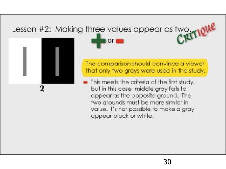
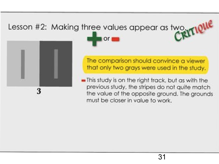
→ REMEMBER: The halation effect tells you whether or not you’re on the right track. You should see halation in your color array if it is done correctly.
**Just a reminder, you do not need to do B&W value studies! ONLY COMPLETE AND SUBMIT COLOR STUDIES.**
This week, there are two homework assignments:
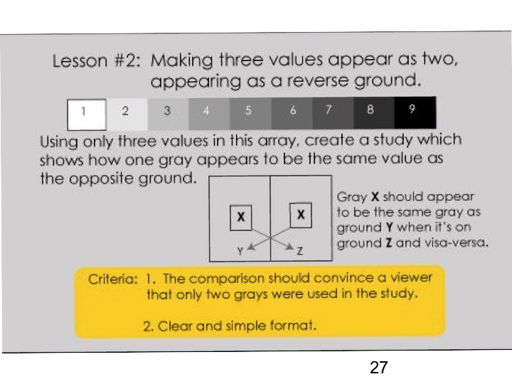
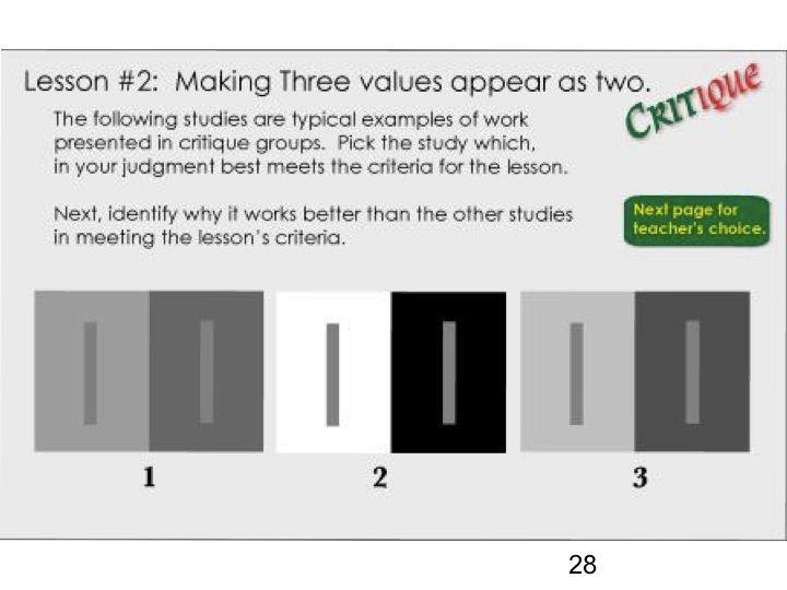
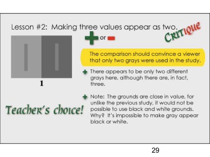
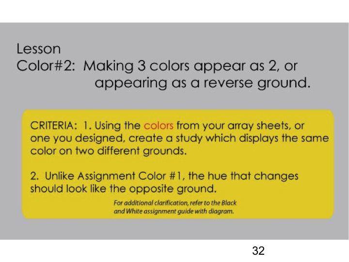
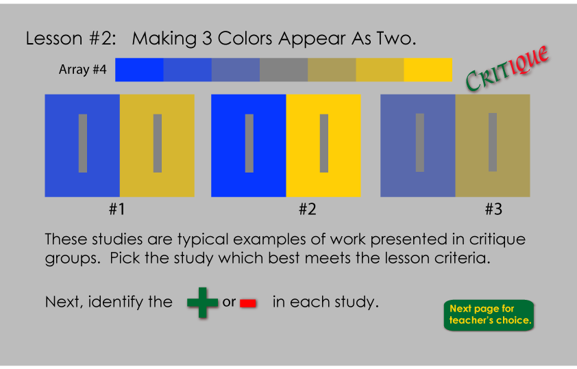
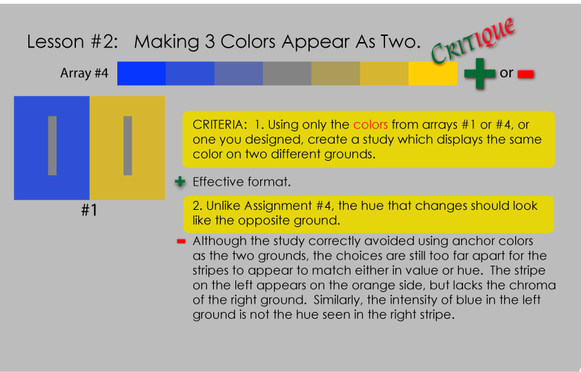
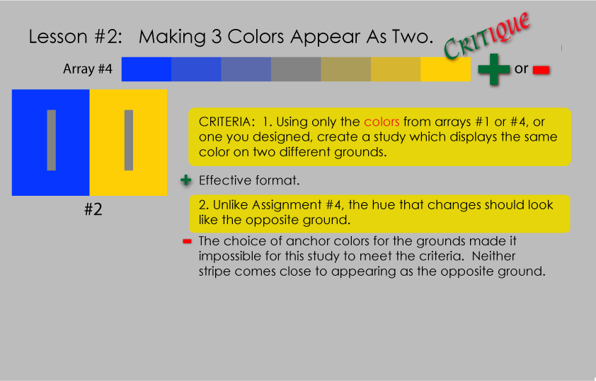
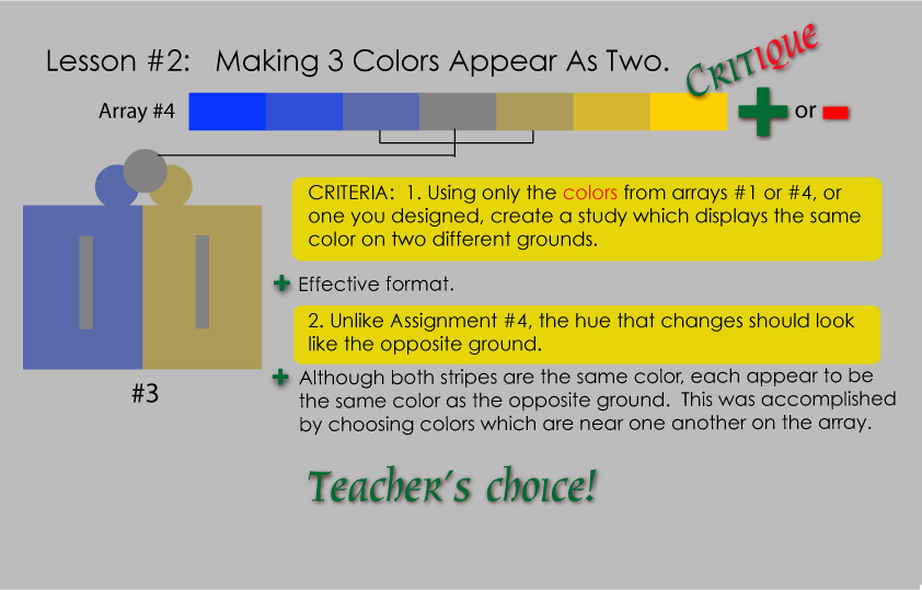
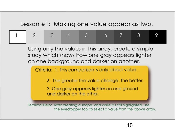
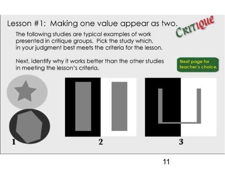
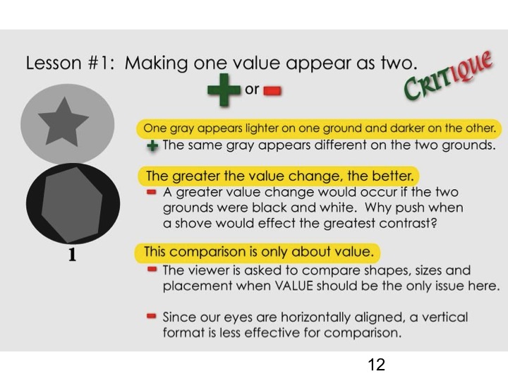
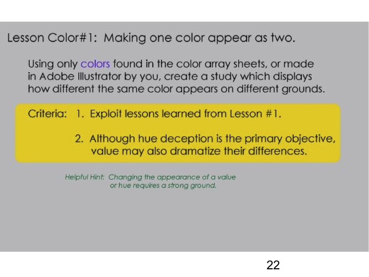
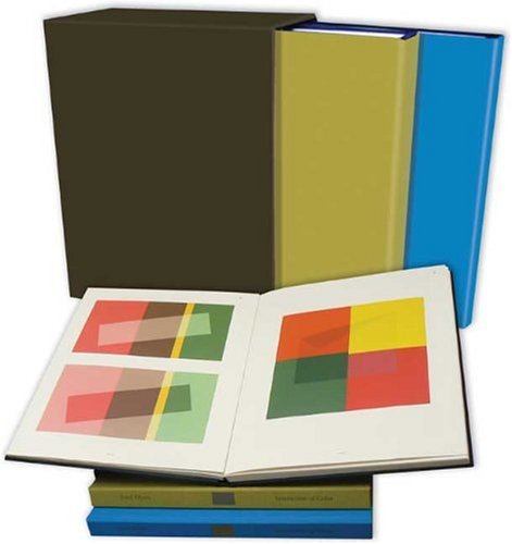
- Making 3 colors appear as 2, or appearing as a reverse ground (see PDF below). Create several solutions to this assignment. If you have access to the Interaction of Color book or app, this exercise comes from chapter VI, “1 color appears as 2 – looking like the reversed grounds”.
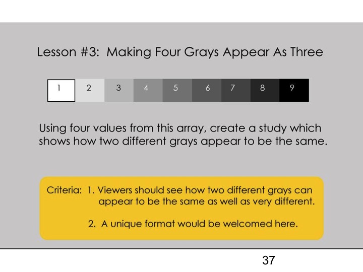
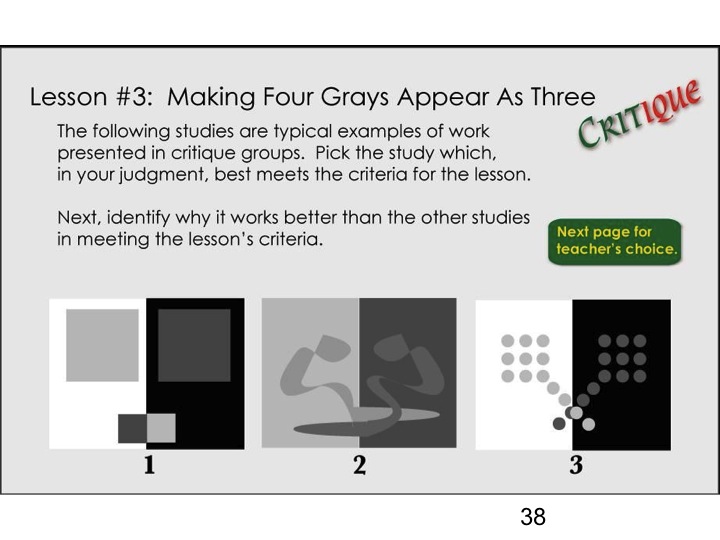
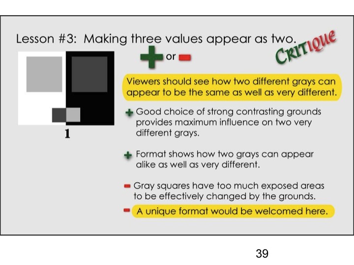
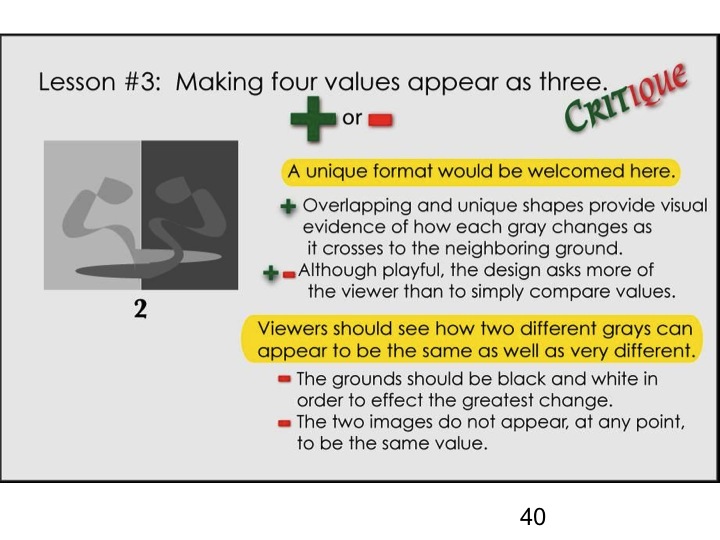
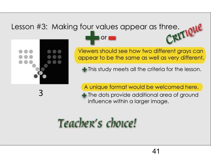
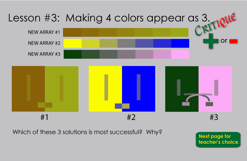
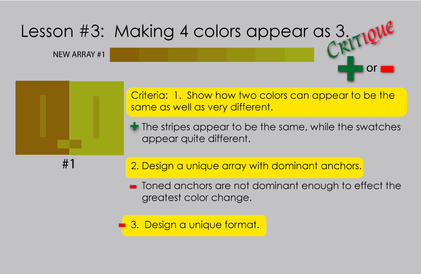
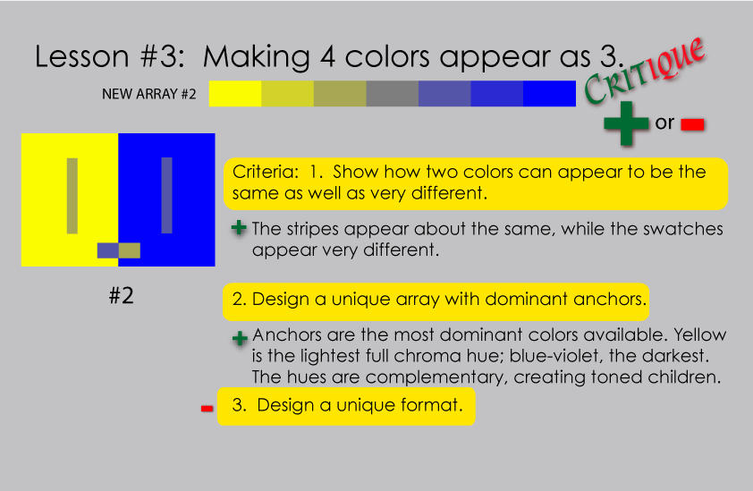
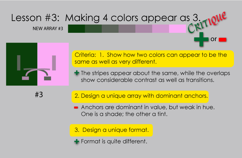
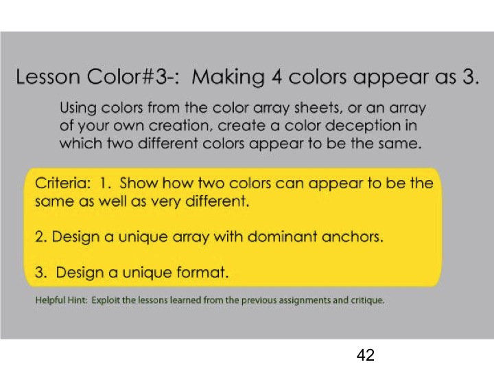
- Making 4 colors appear as 3. This exercise comes from Albers chapter VII, “2 different colors look alike – subtraction of color”.
[gview file=”https://dicknelsoncolor.com/wp-content/uploads/2013/09/Lesson2Combined.pdf”]
[gview file=”https://dicknelsoncolor.com/wp-content/uploads/2013/09/Lesson3Combined.pdf”]
Videos
Red & Blue are not primary colors from Richard (Dick) Nelson on Vimeo.
Proving that red and blue are not primary colors. while showing what colors can be produced with Cyan, Magenta and Yellow, the true primaries.
Albers Homage To The Square: An Explanation from Richard (Dick) Nelson on Vimeo.
A descriptive analysis of the work of Josef Albers by a former student Dick Nelson. This is followed with Dick’s animated collection of his own color studies which incorporate Albers format and his principles of color interaction.
Class materials
Slide presentation: Making 3 colors appear as 2, or appearing as a reverse ground
Slide presentation: Making 4 colors appear as 3