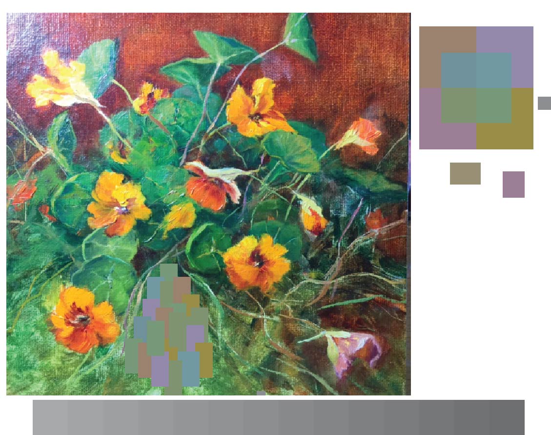
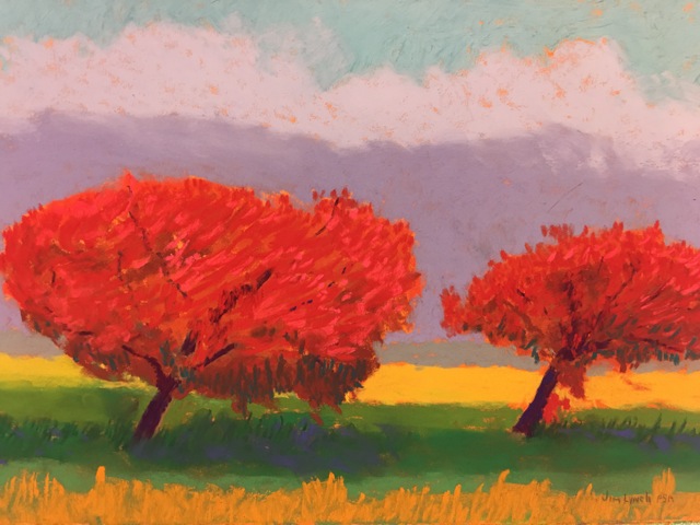
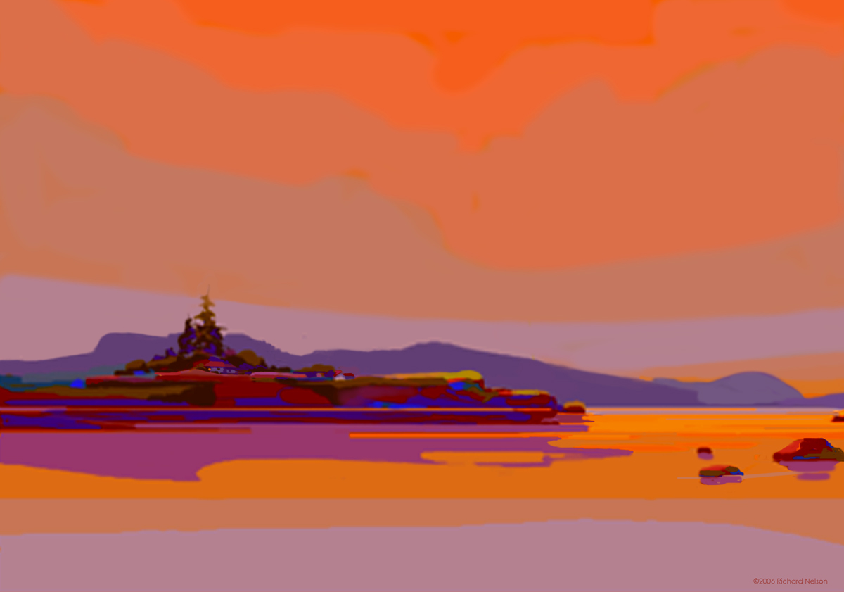
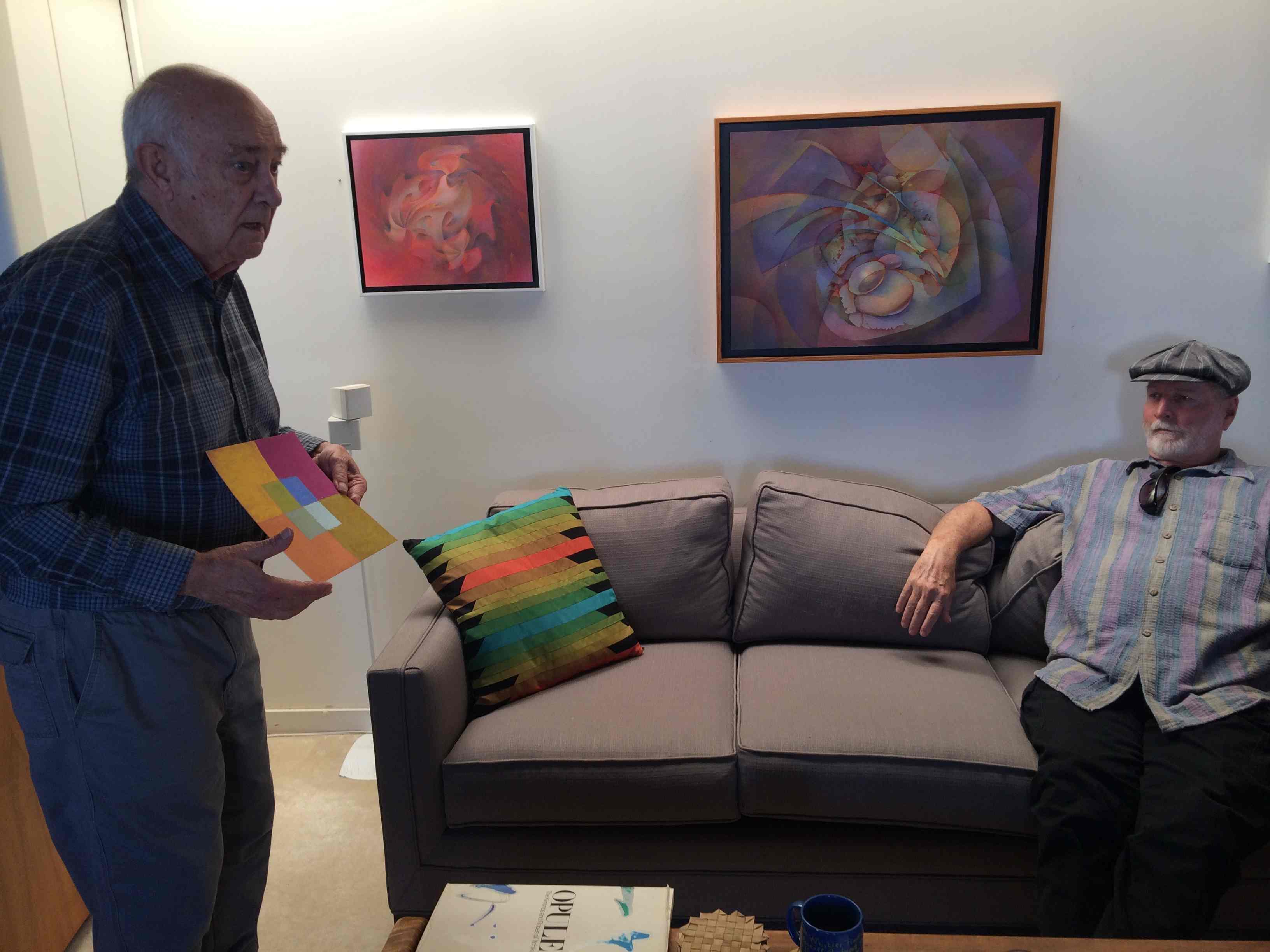
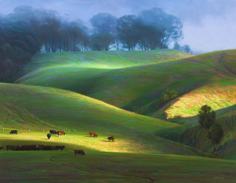
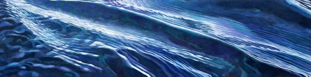
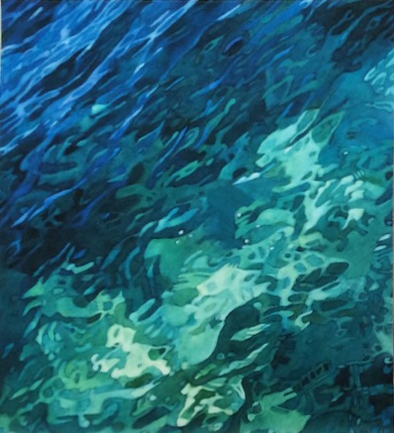
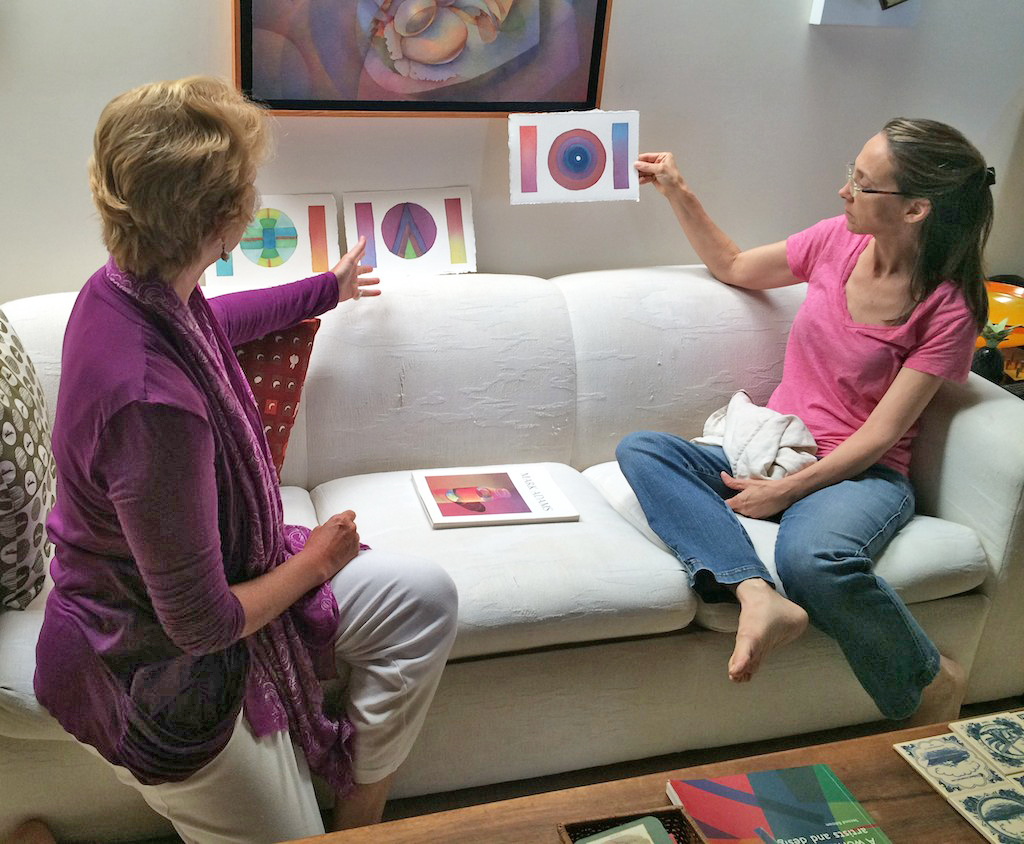
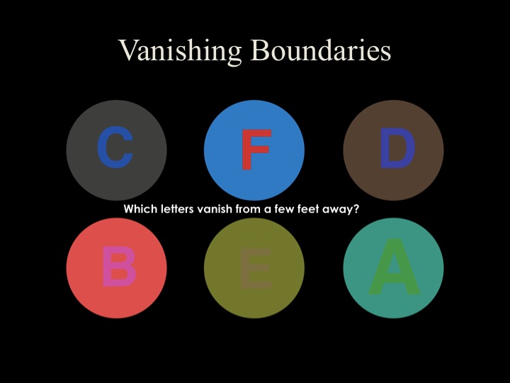
Artists and audiences have long been fascinated with the appearance of luminosity – an inner glow, or sense of light emanating from a painting. This quality is what has made paintings by Impressionist painter Claude Monet such favorites over the years. Yet few artists are able to achieve this effect reliably. It is usually an accident and can’t be repeated.
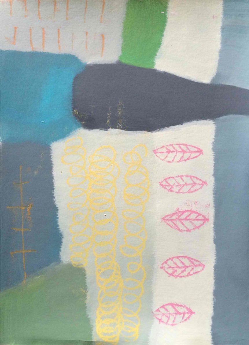
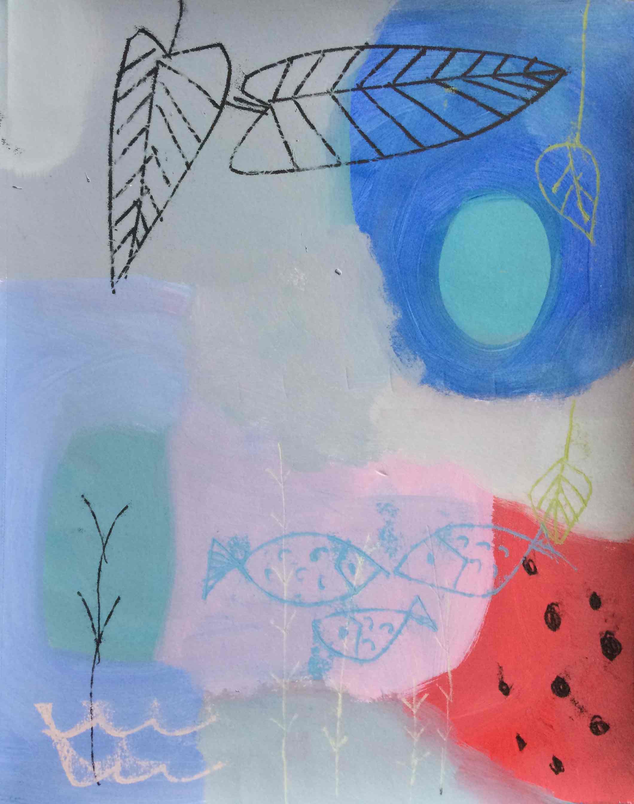
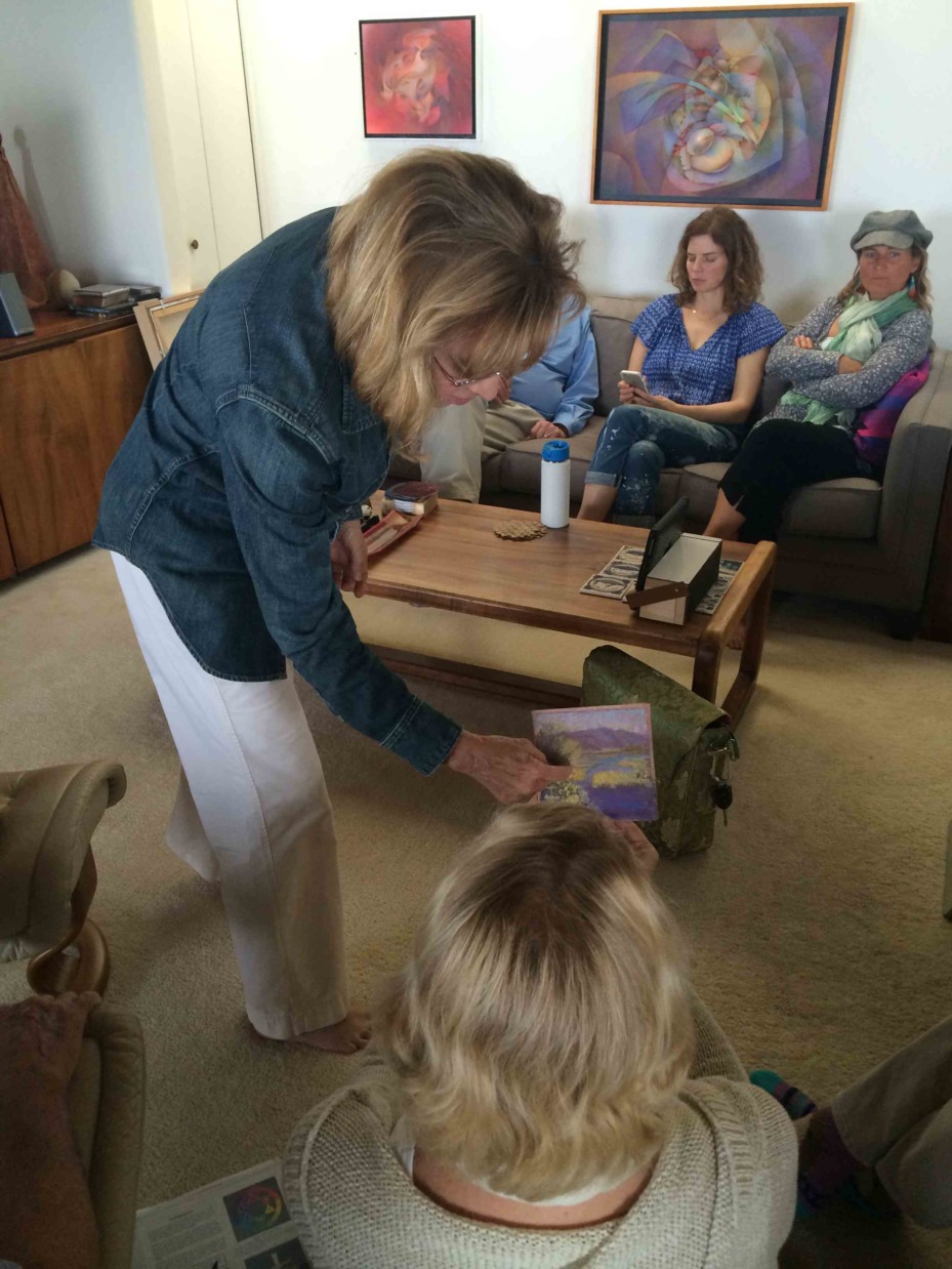
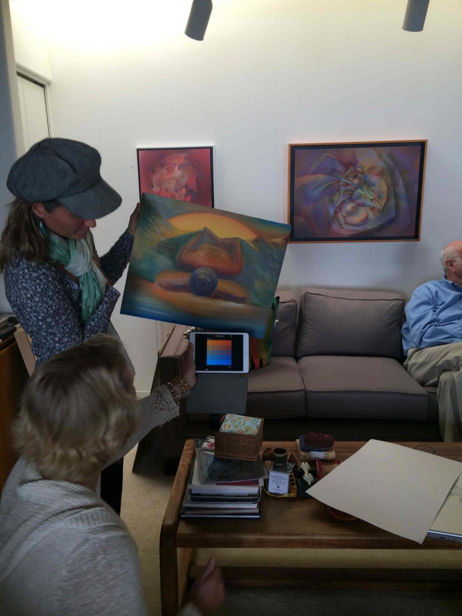
Every piece in the upcoming Viewpoints Gallery show, “Seeing the Light,” was chosen because it exemplifies this elusive quality of luminosity. It features the work of Kula resident Dick Nelson and some of his many students.
Dick Nelson has been teaching the secrets of color relationships to generations of artists since the 1960s. If you have ever taken a class with Dick, you will have heard him say, “There are only two ways to achieve luminosity: halation, and vanishing boundaries.” Truly understanding these concepts allows an artist to infuse their work with that alluring inner glow.
The current issue of On Maui! magazine features an article on Dick and the upcoming show. Read it for an engaging introduction to the artists and what to look for in the show. Pick up a print copy at numerous locations around Maui, or read it online (November/December 2019 issue, pages 22-25).
If you appreciate artwork with a fascinating inner glow, make sure you visit Viewpoints Gallery in Makawao between December 7, 2019 and January 17, 2020!
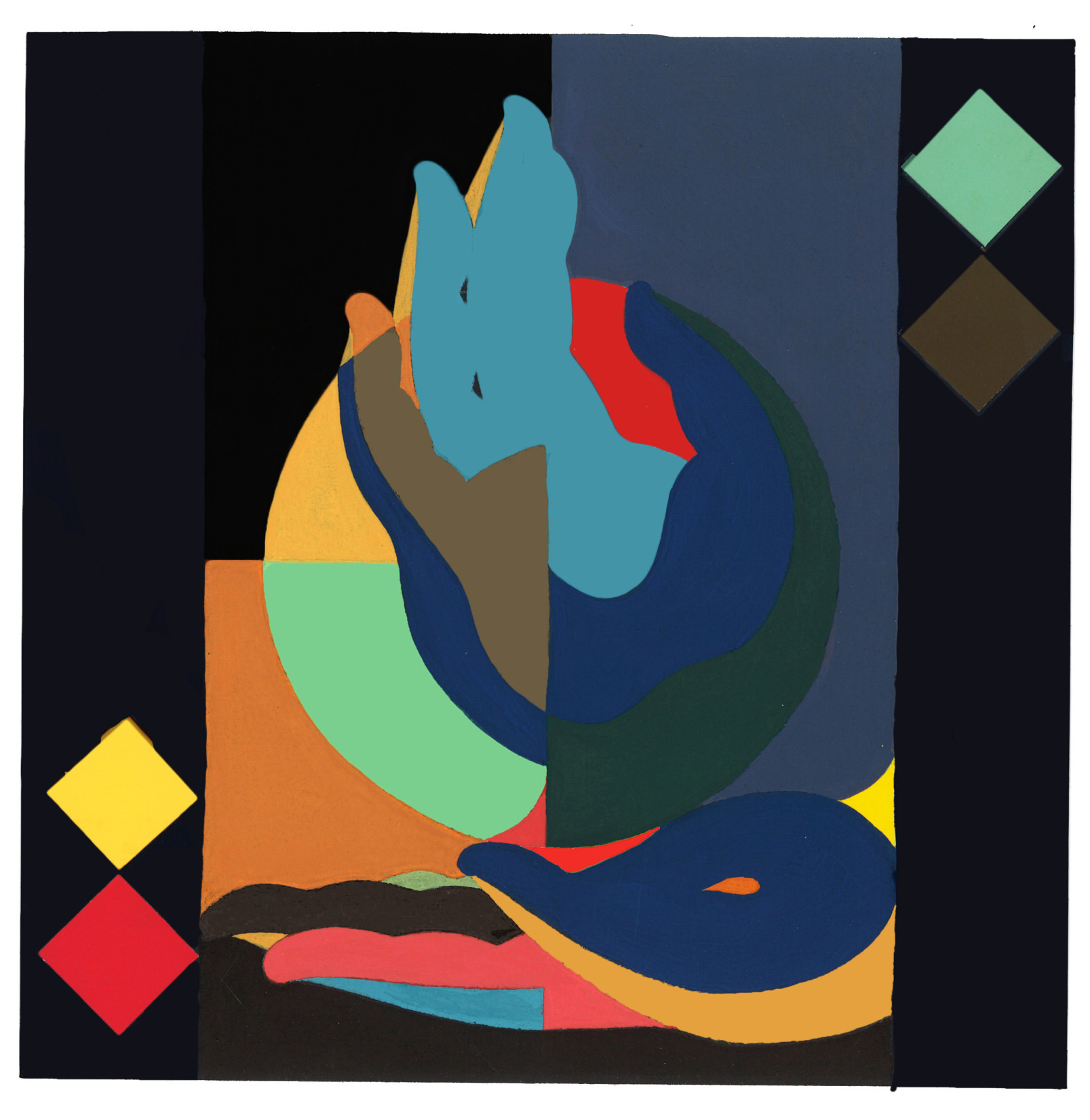
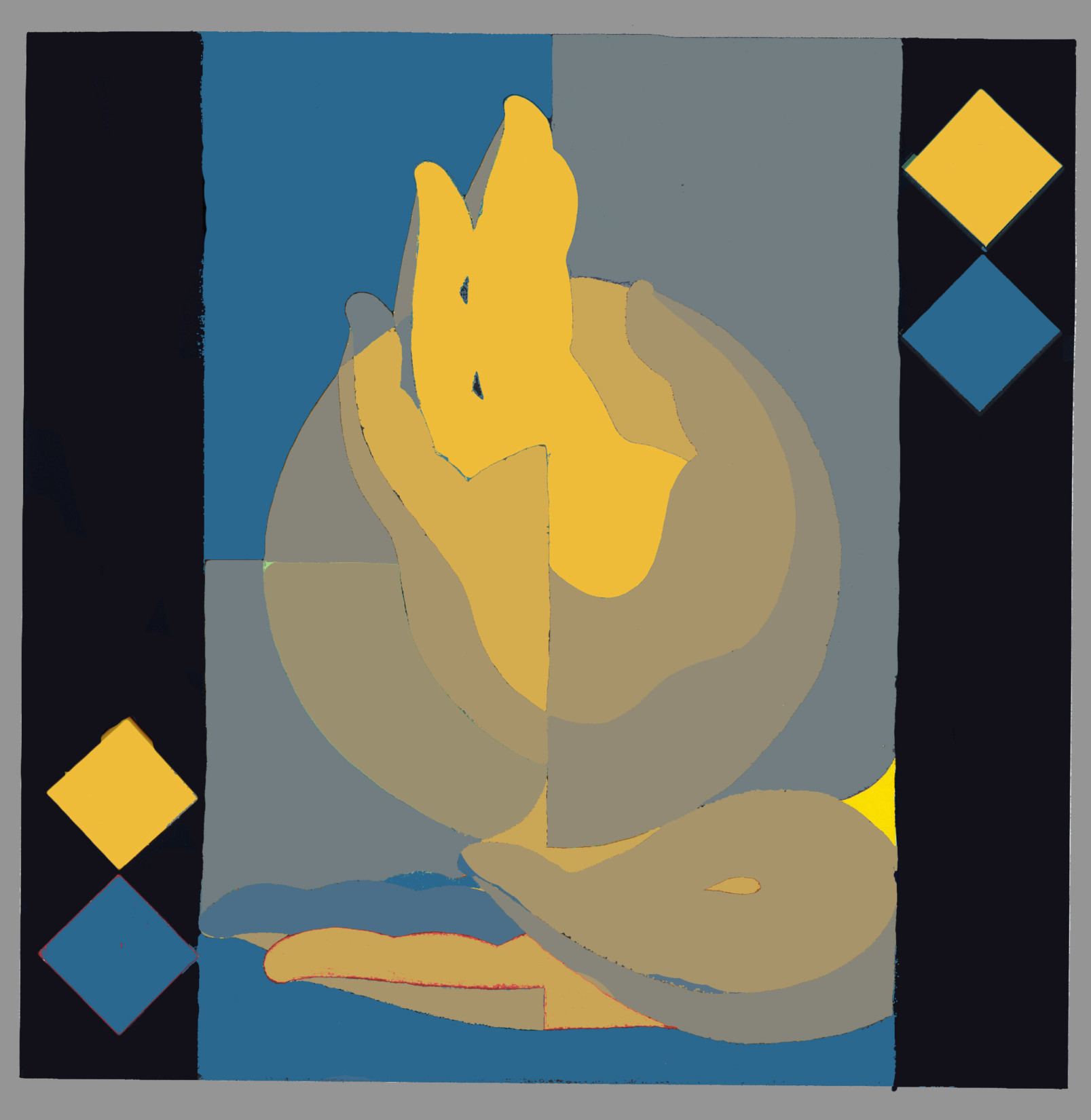
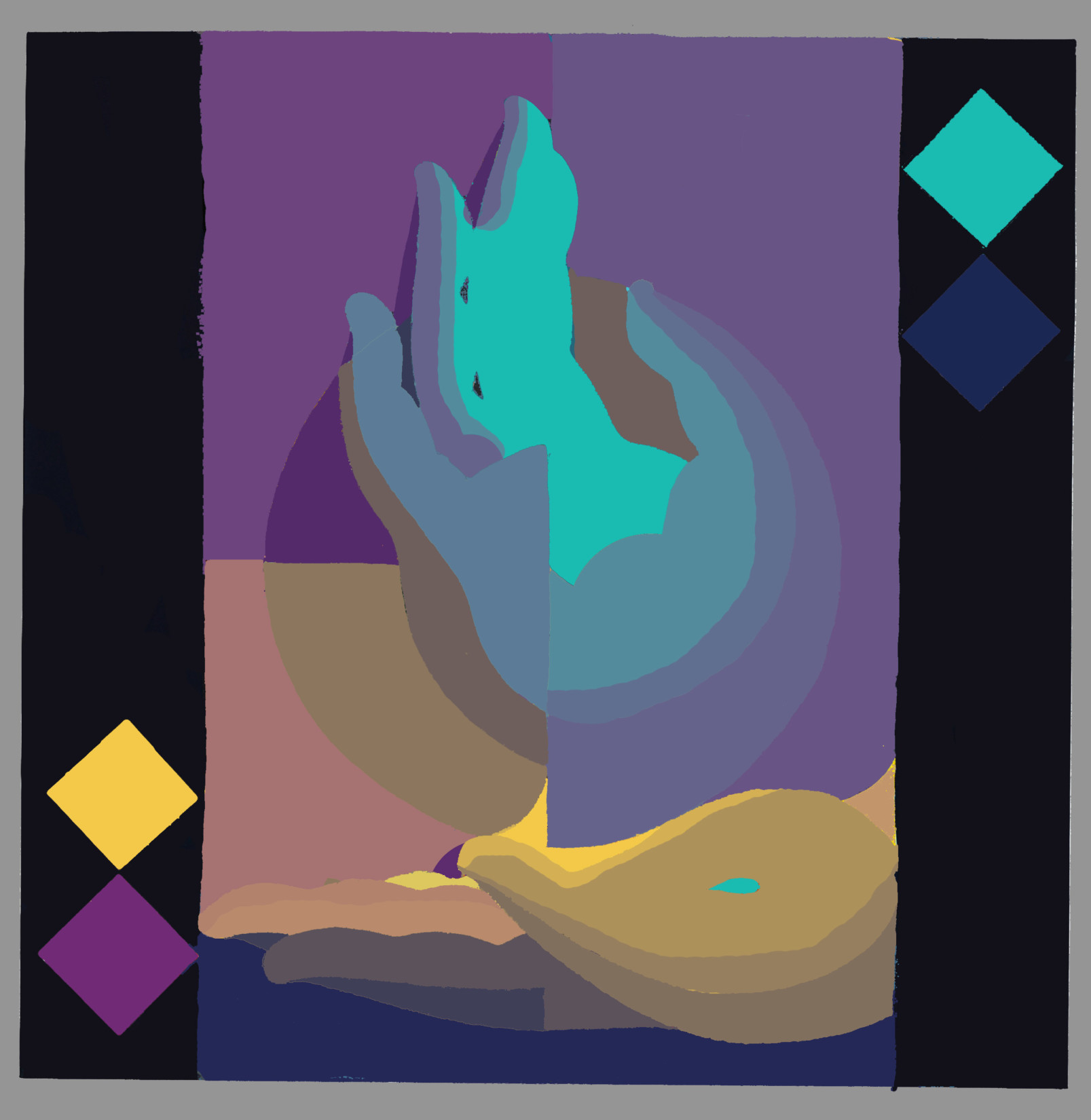
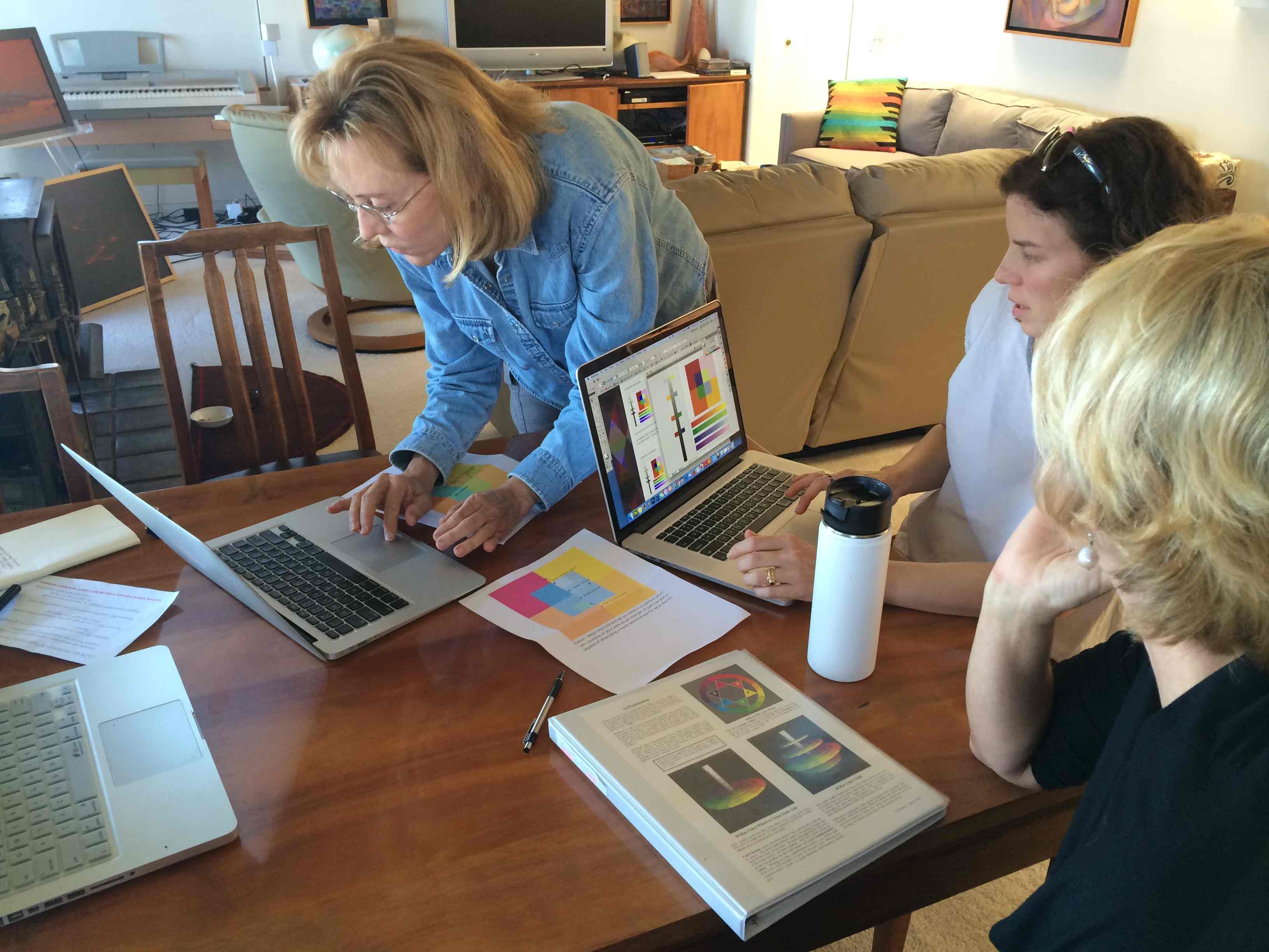
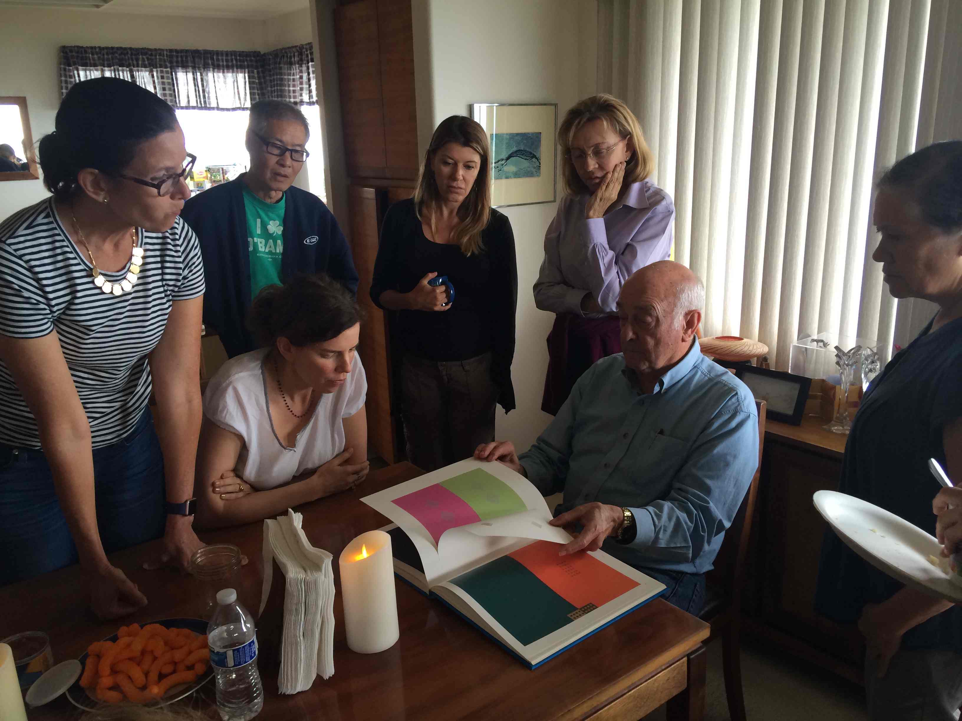
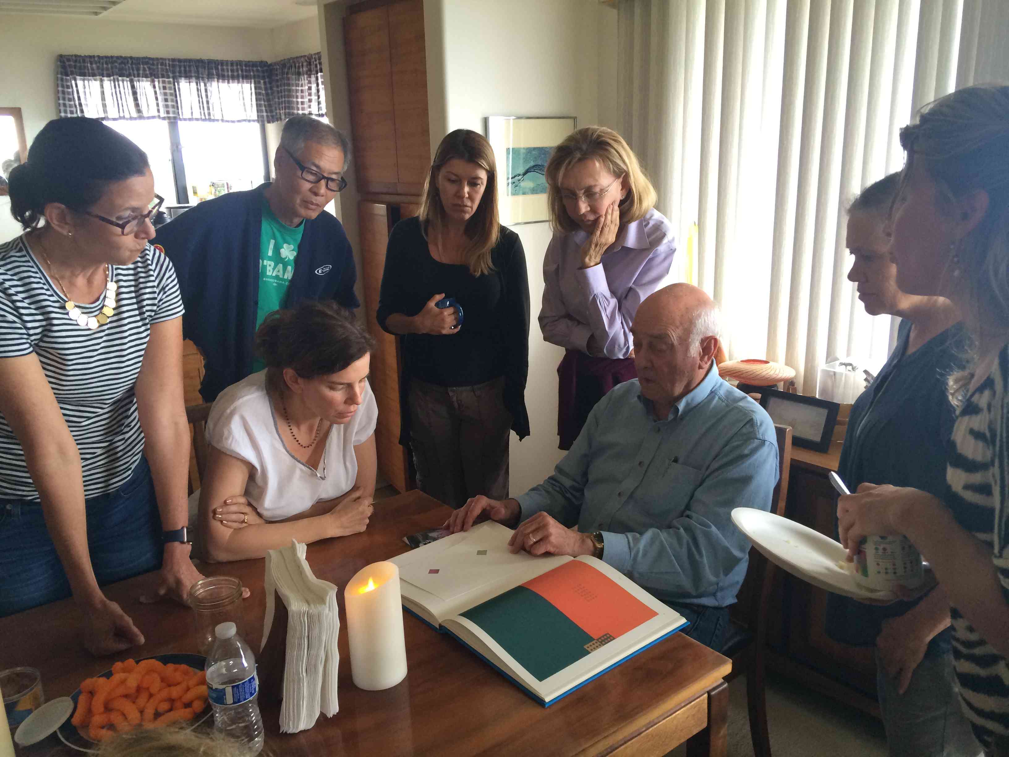
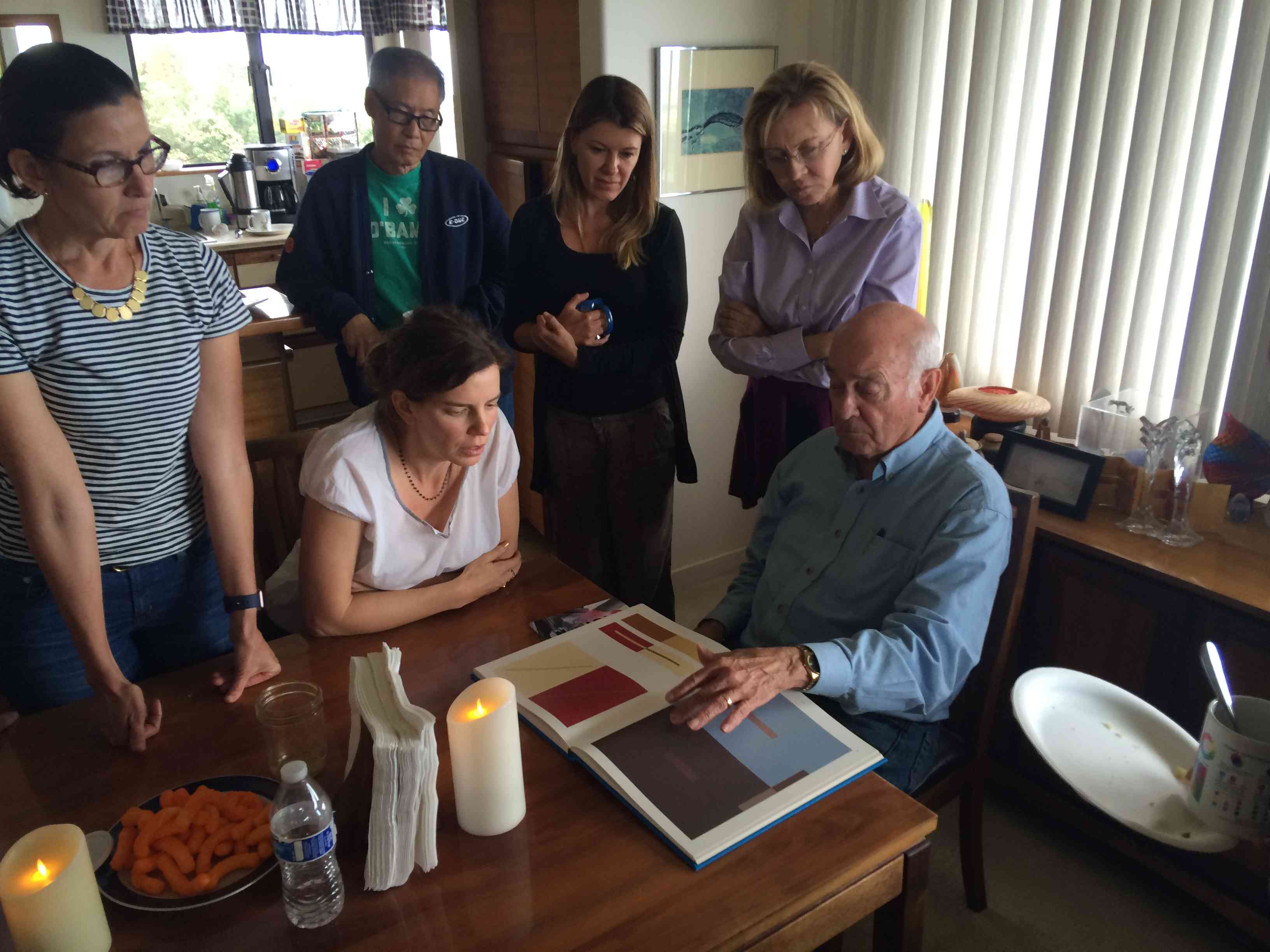
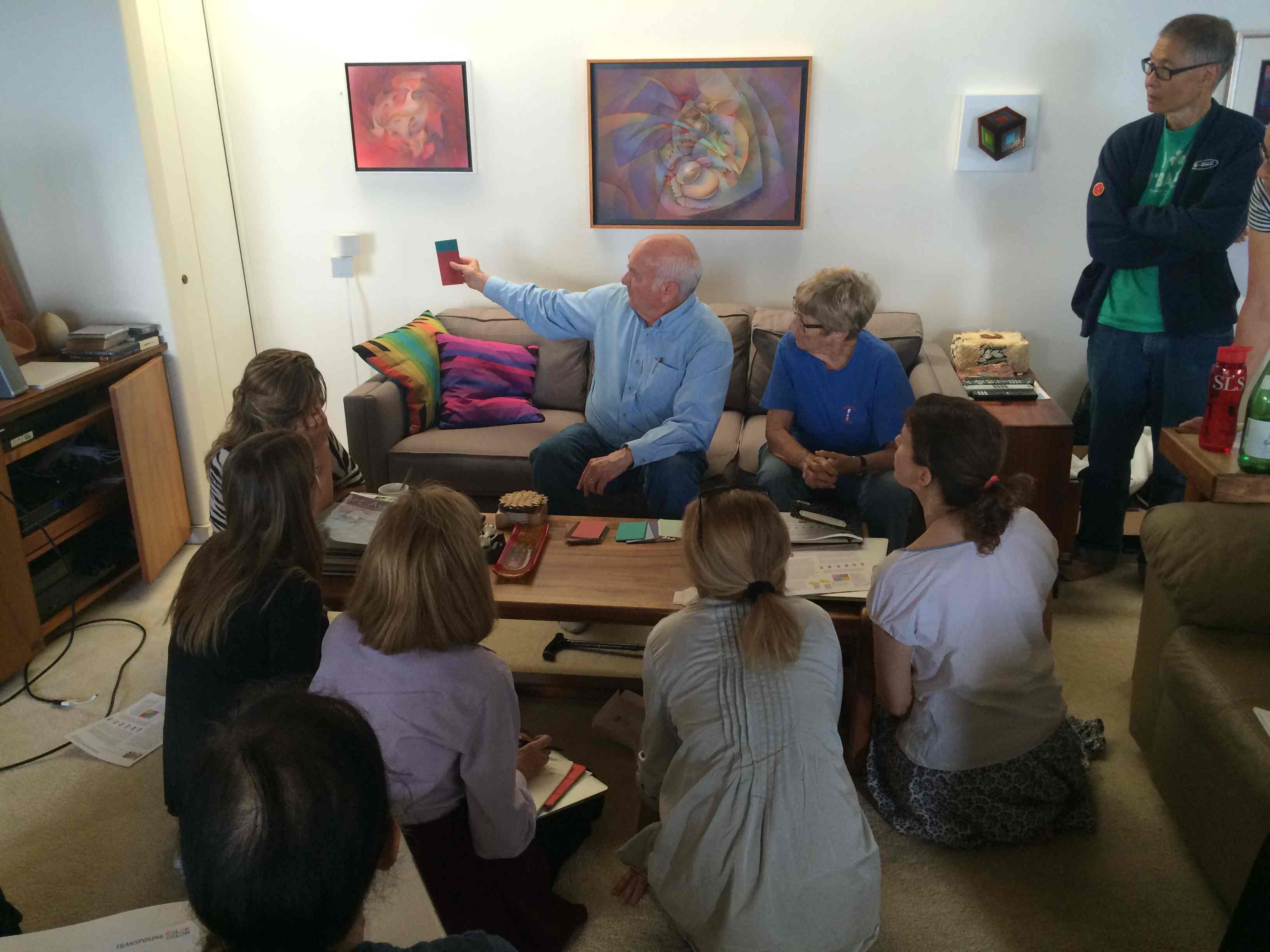
At Dick’s request, Valérie Richter shares words and images from a year-long exploration of luminosity.
Dick says, “Every artist for whom color is important must see and read this account, for it provides a guide and inspiration for us all. I am so very proud of Valérie’s mission and her support group, Karen, Holly, Craig and her classmates.”
At Dick’s request, Valérie Richter shares words and images from a year-long exploration of luminosity. Enjoy!
I have always been fascinated with color and I like to constantly learn. After taking Dick’s Tri-hue Watercolor class and then the Color Relationships class, I truly believed that he was teaching something that would open a new world for me, to see color and create color relationships as I had never done before.
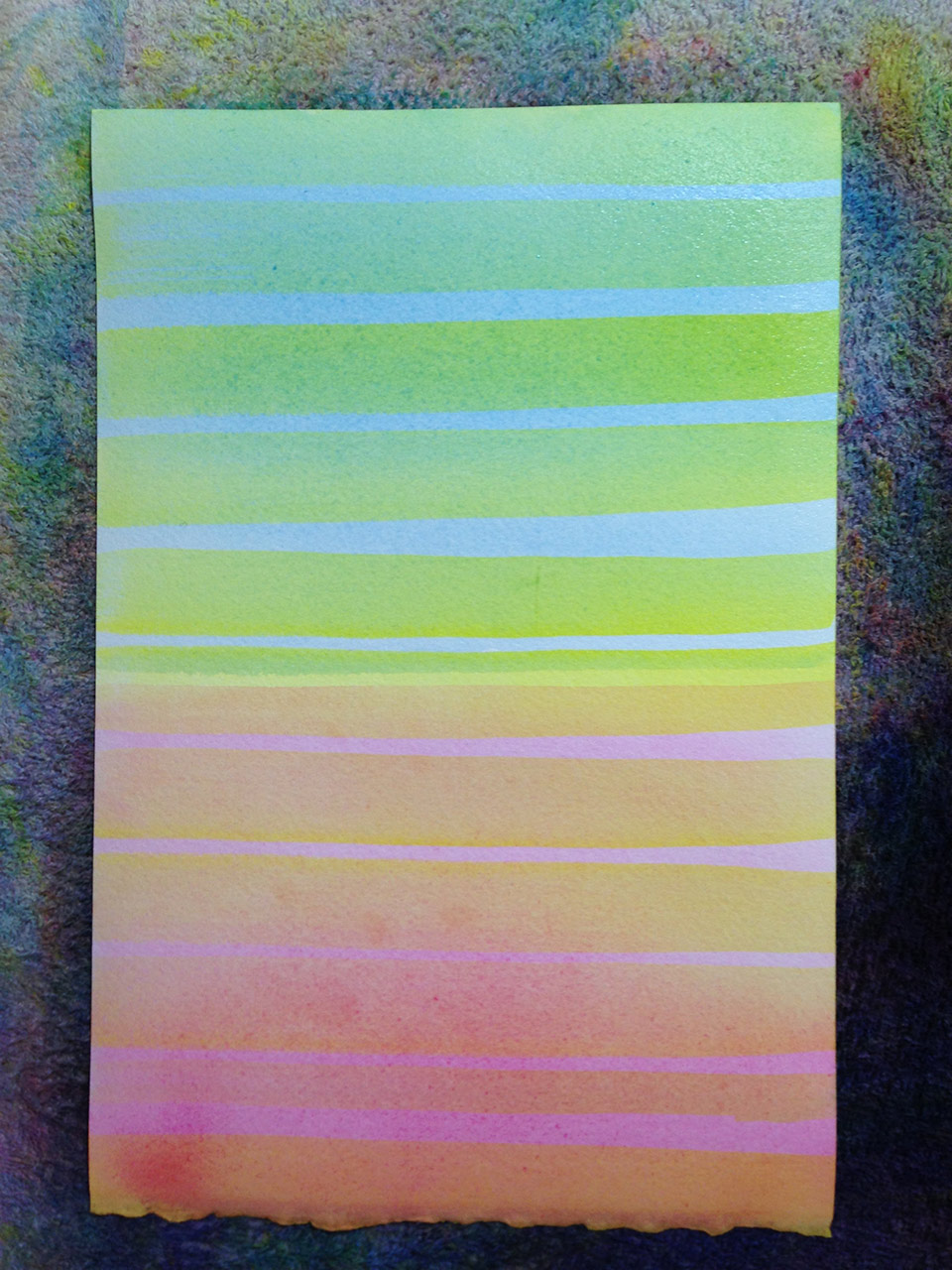
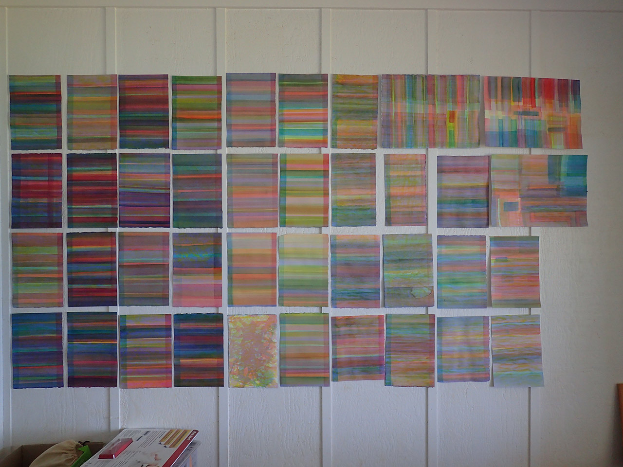
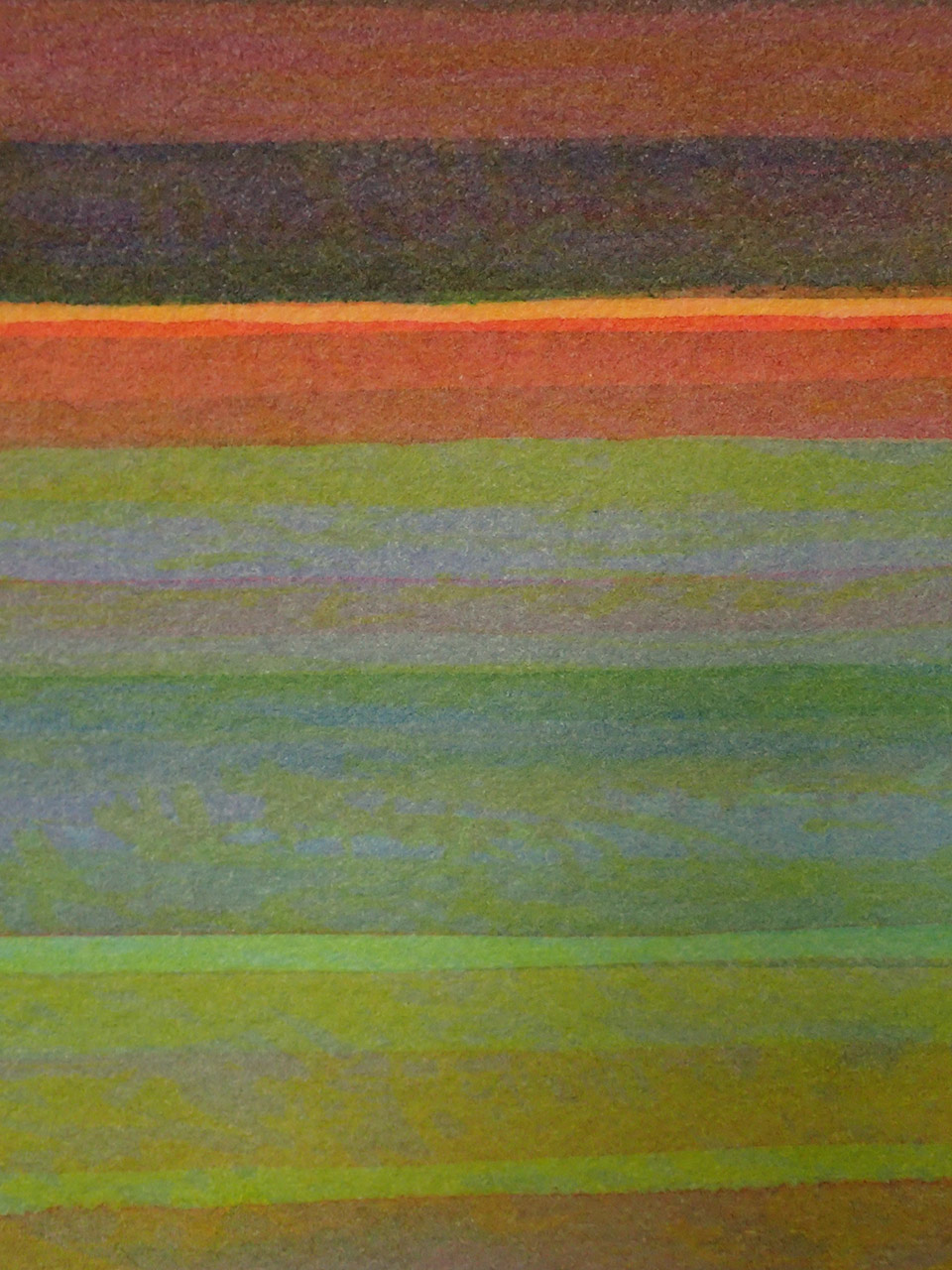
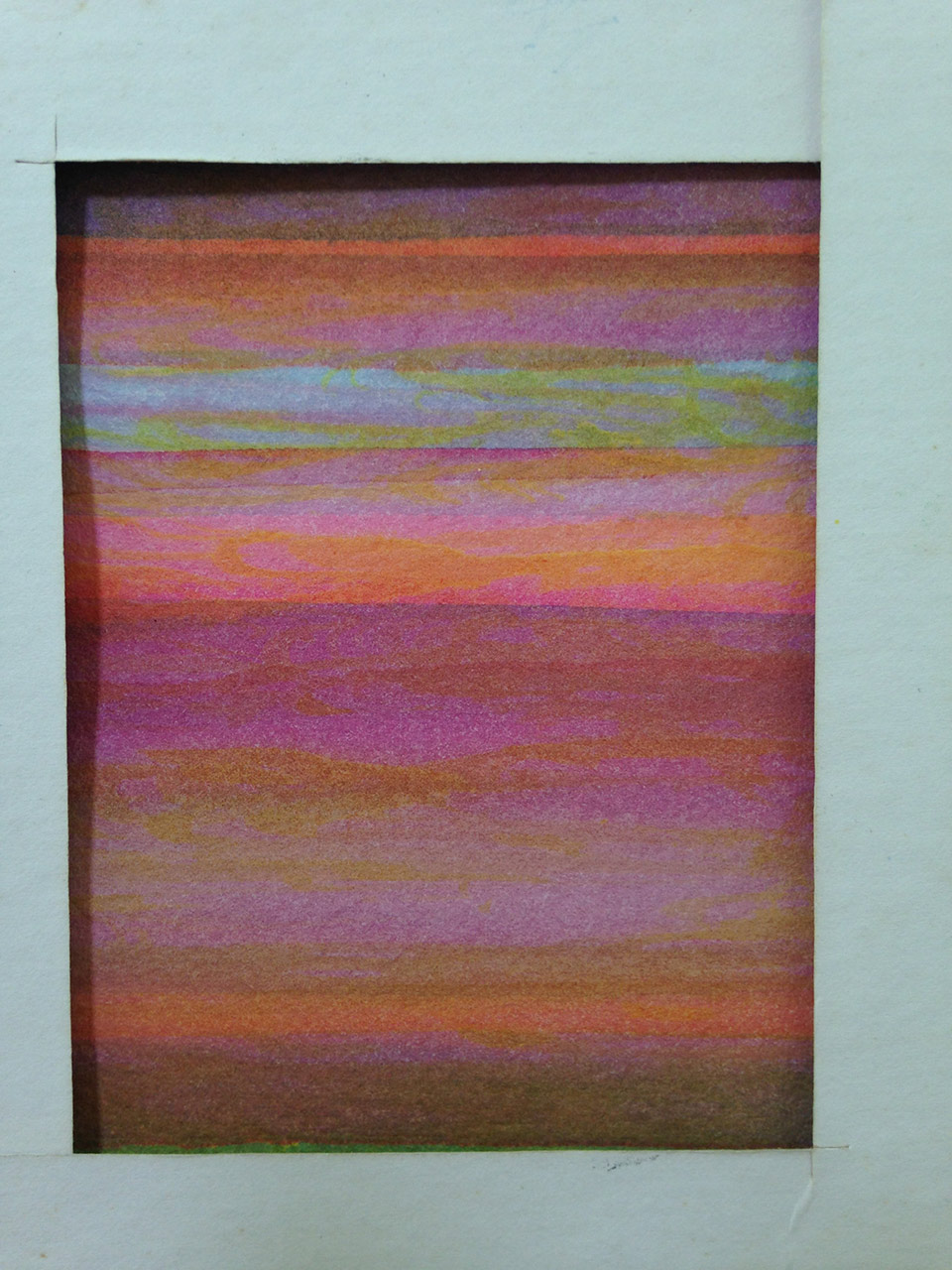
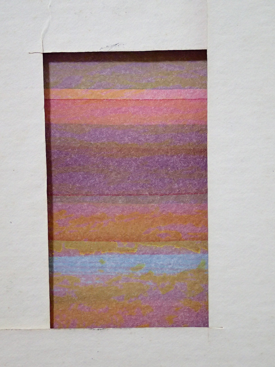
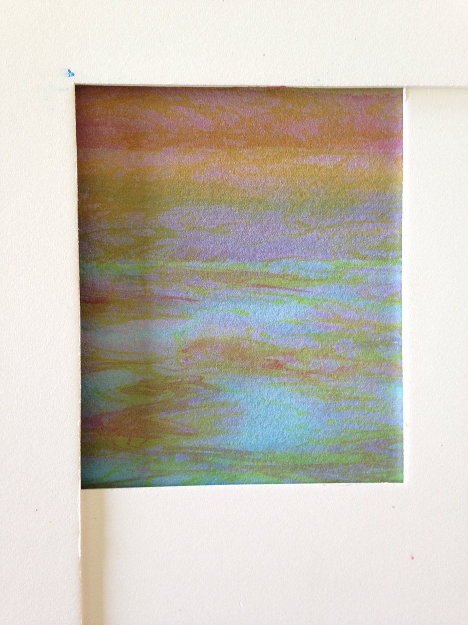
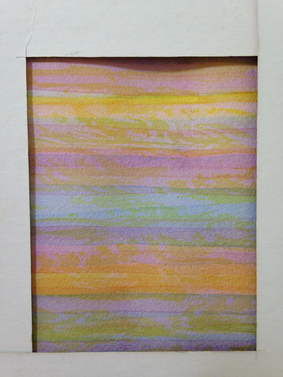
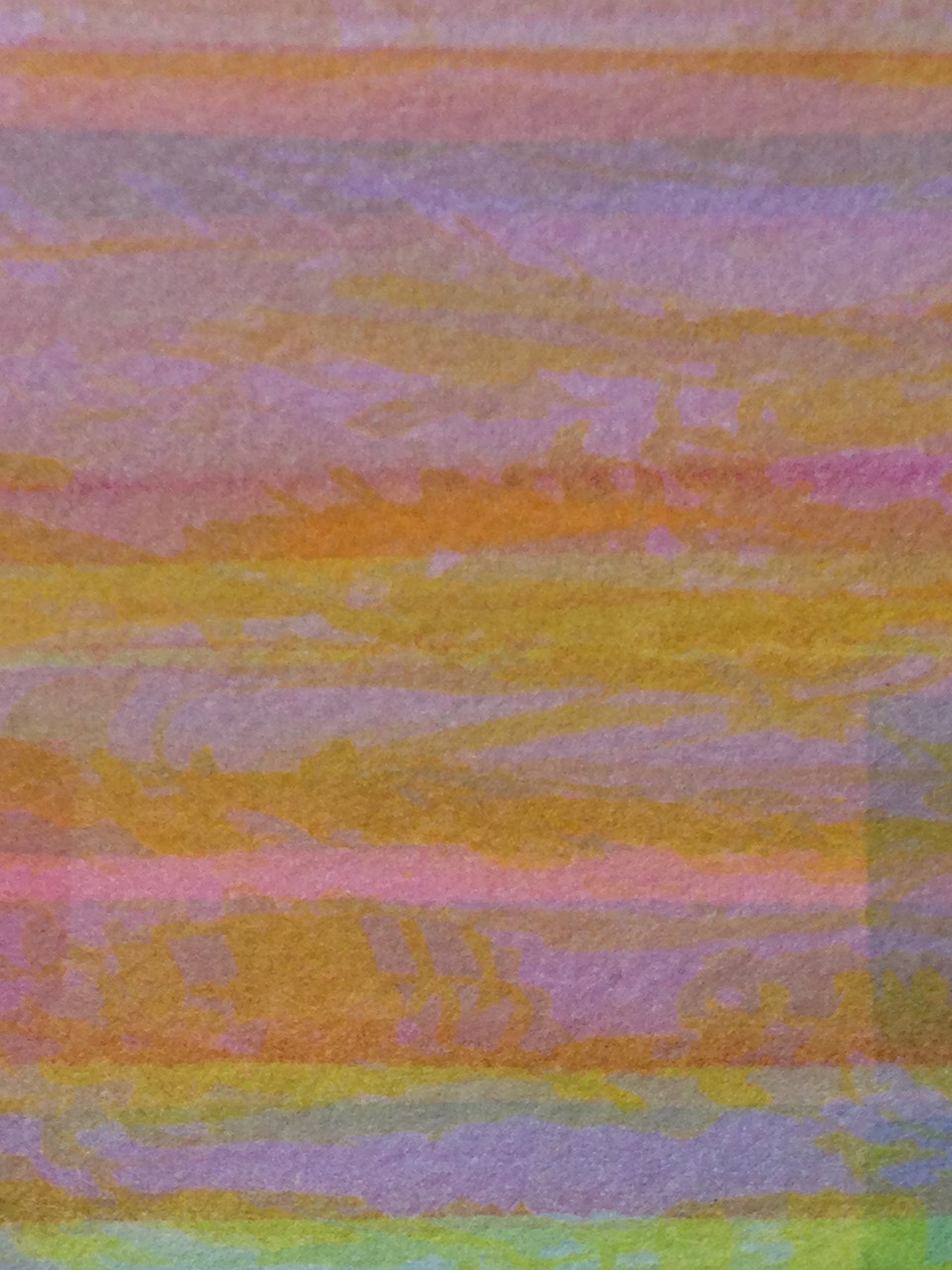
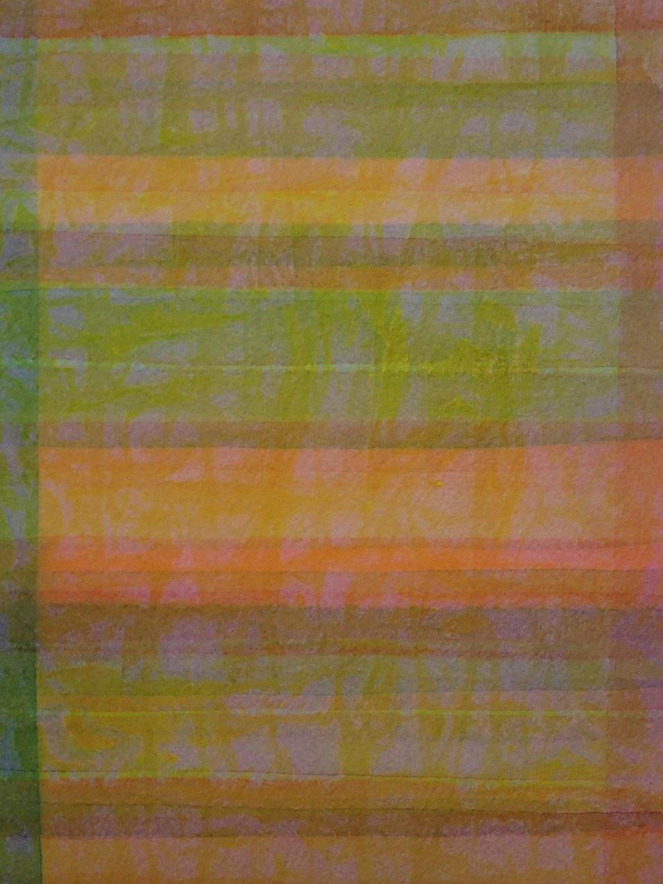
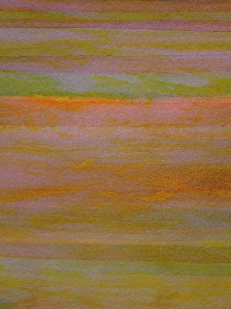
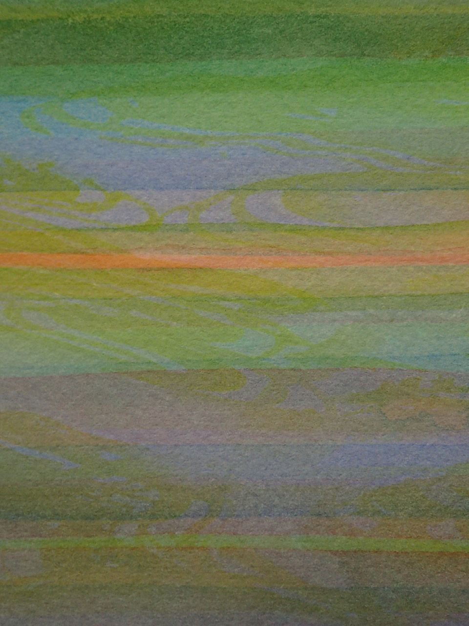
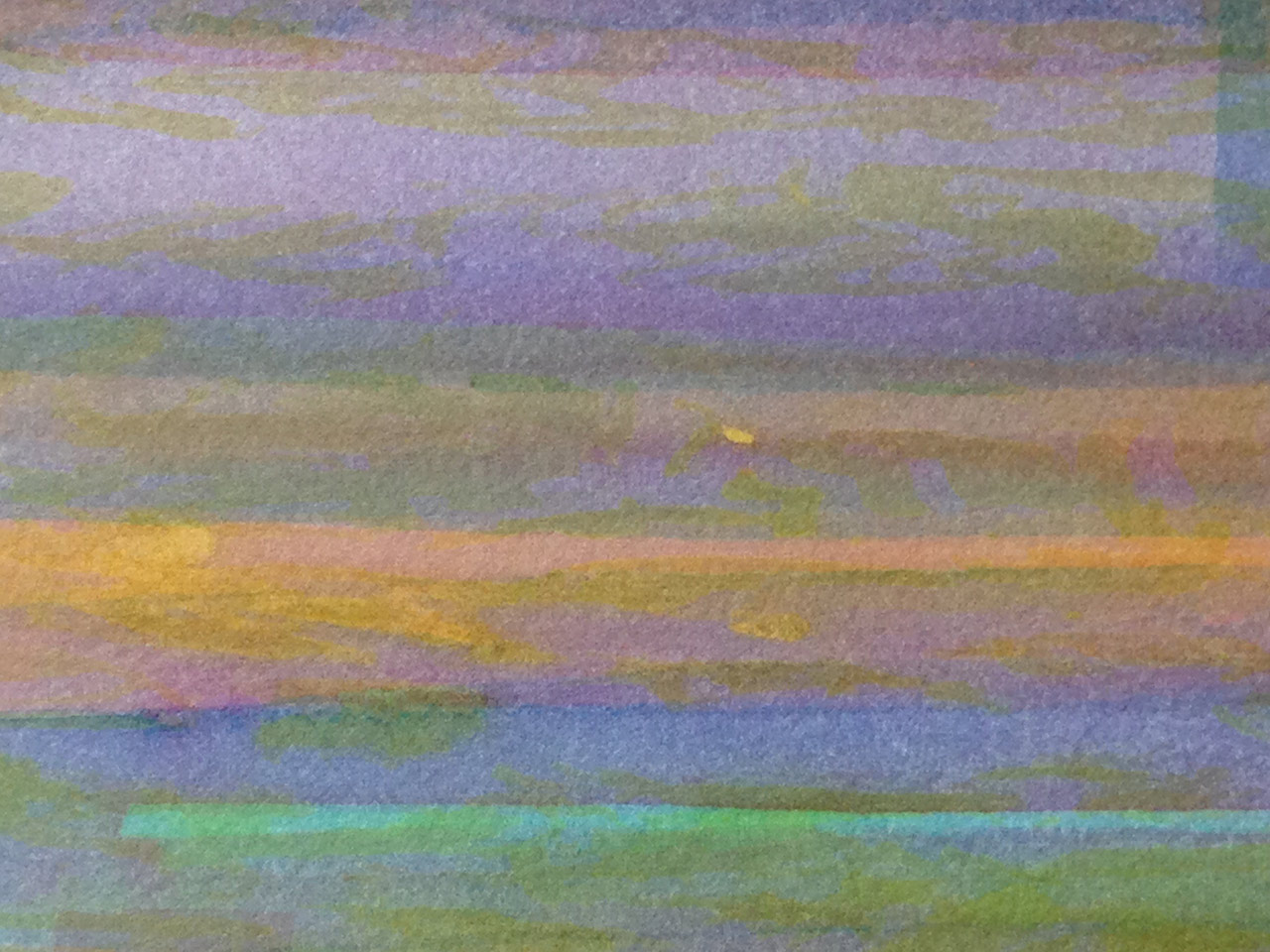
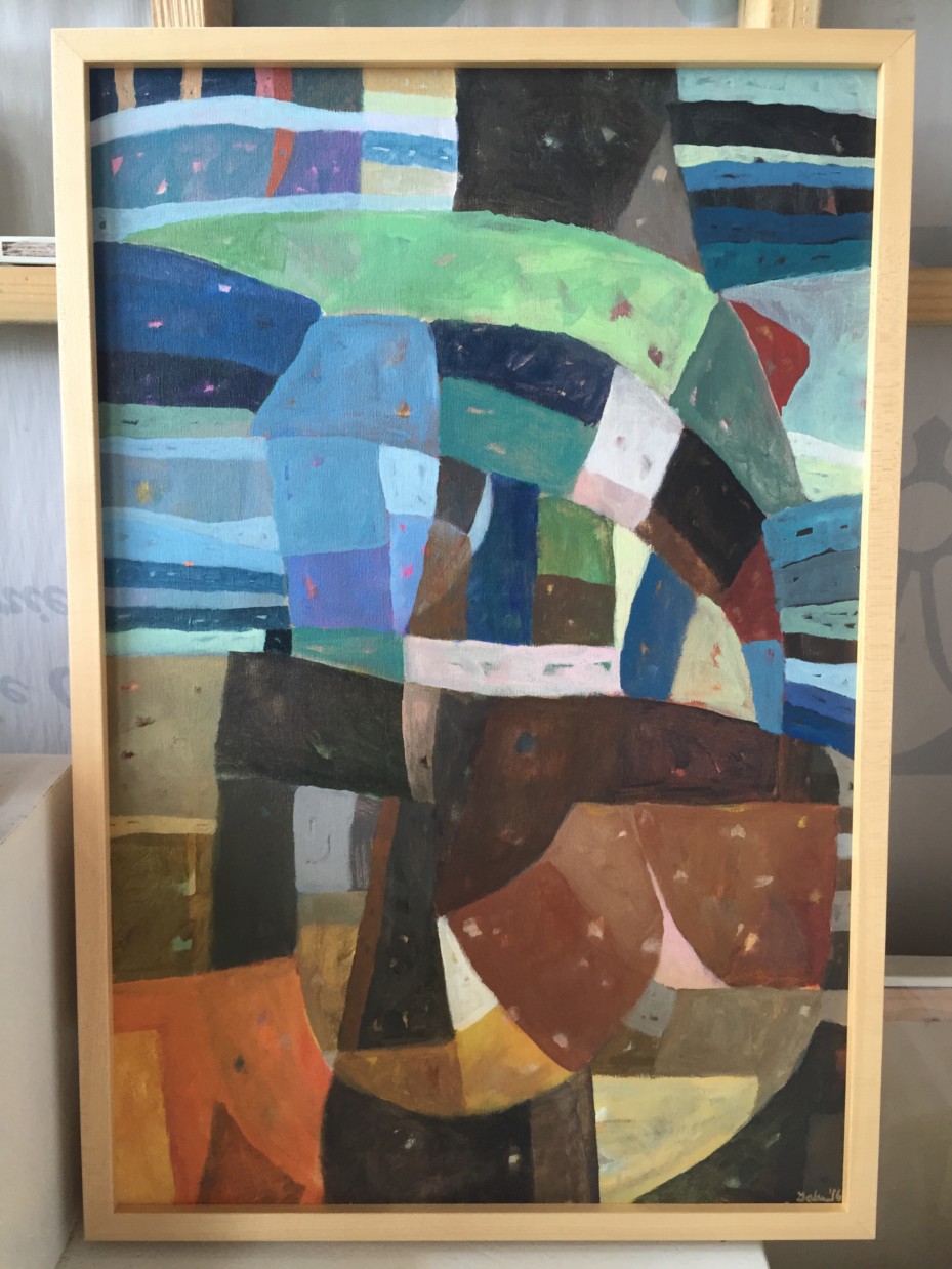
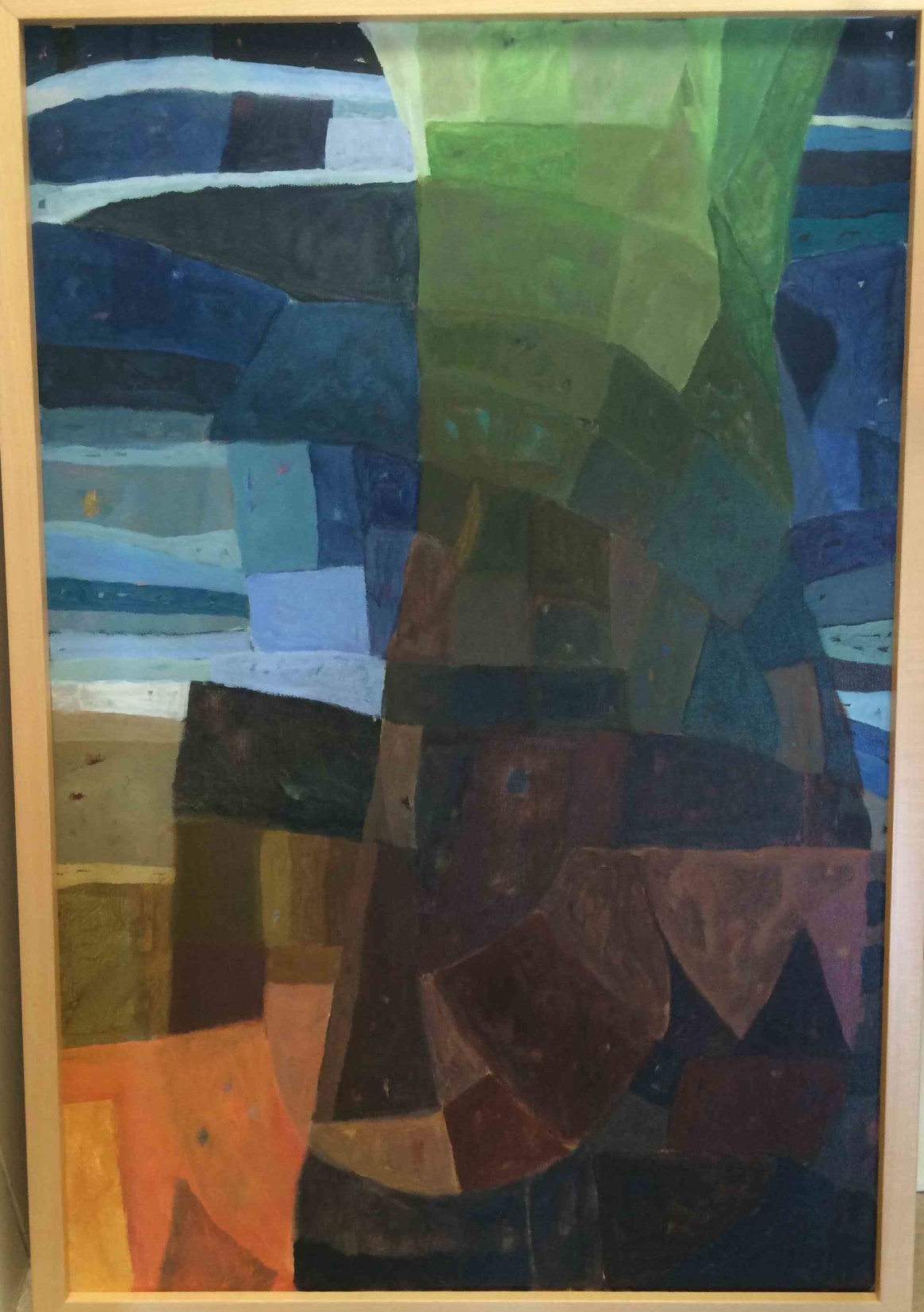
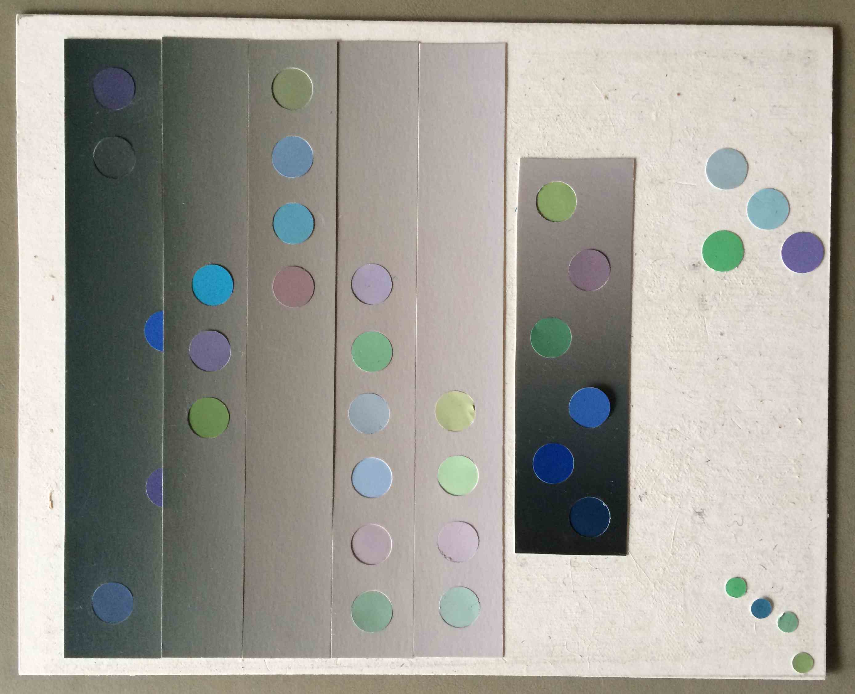
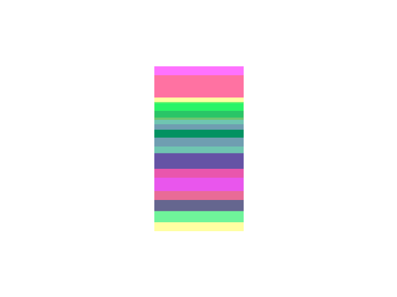
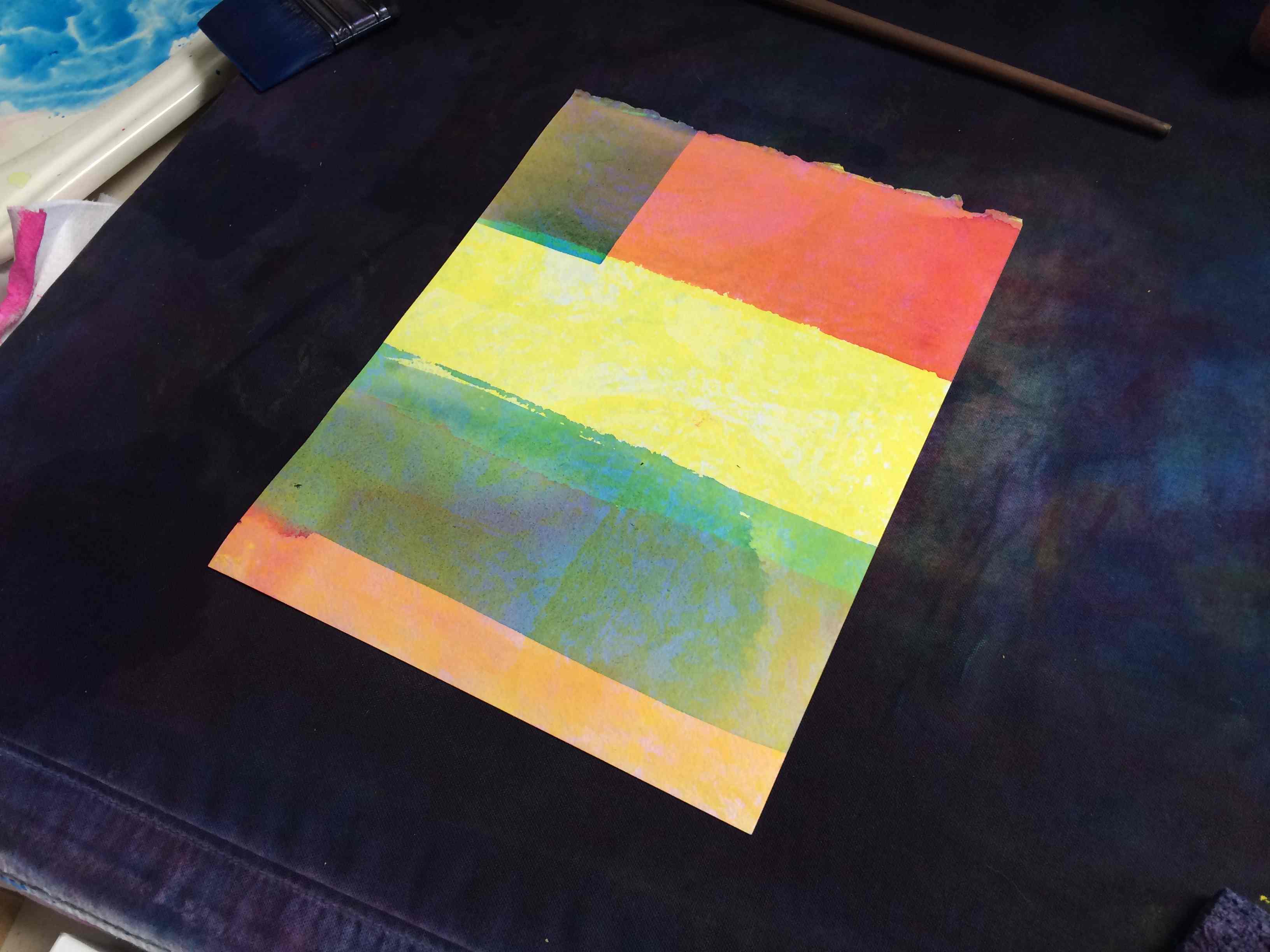
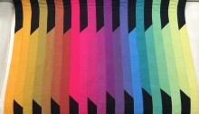
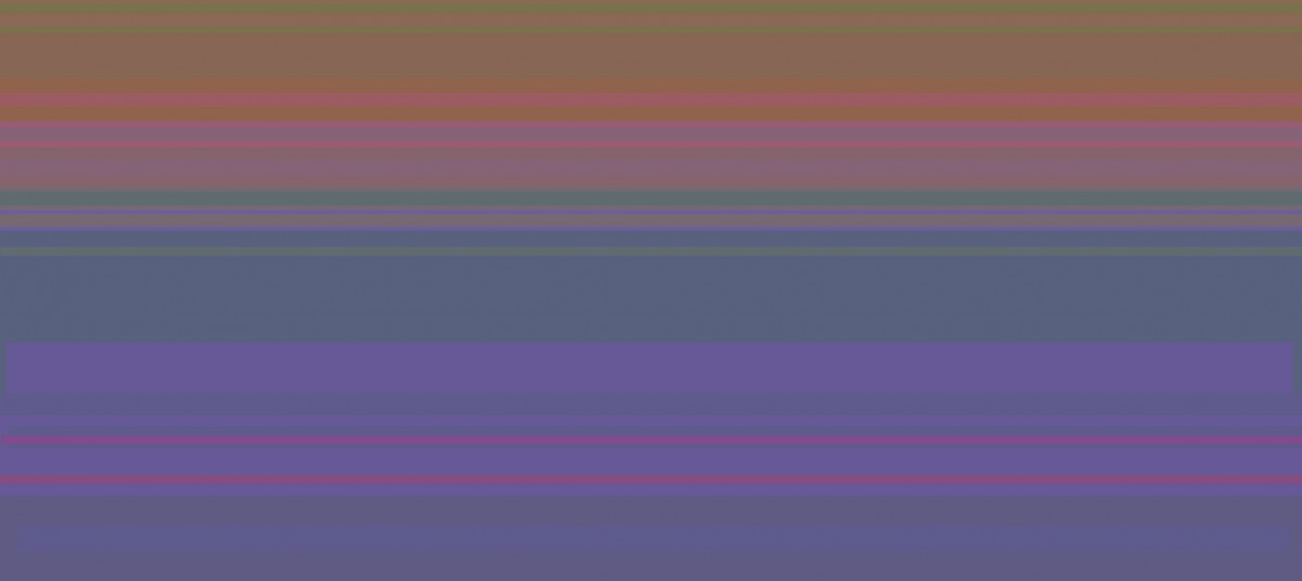
An early stripe study, 2015
Stripe studies from 2015
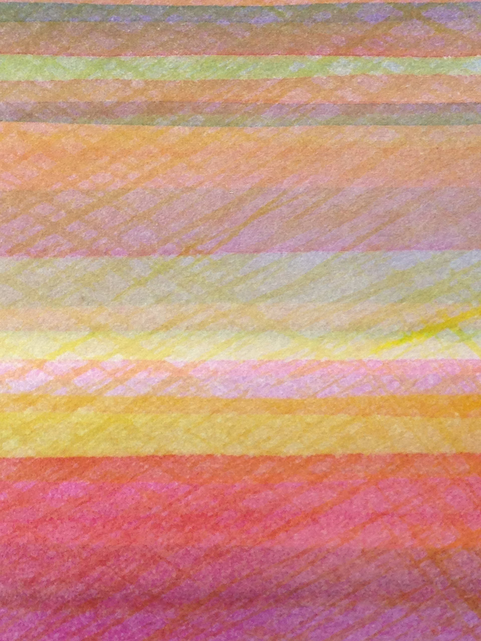
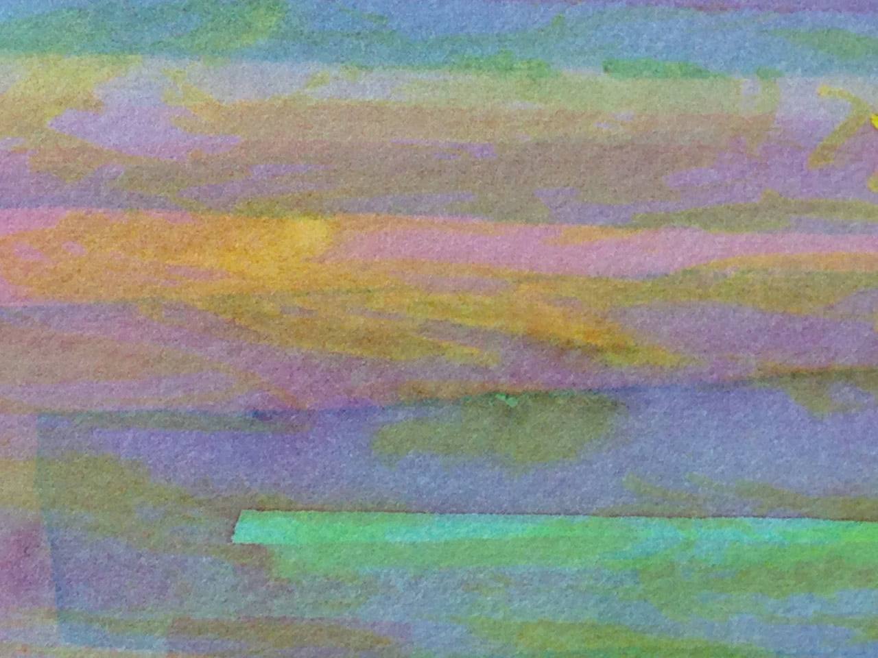
Stripe studies from 2016
Study, June 2016
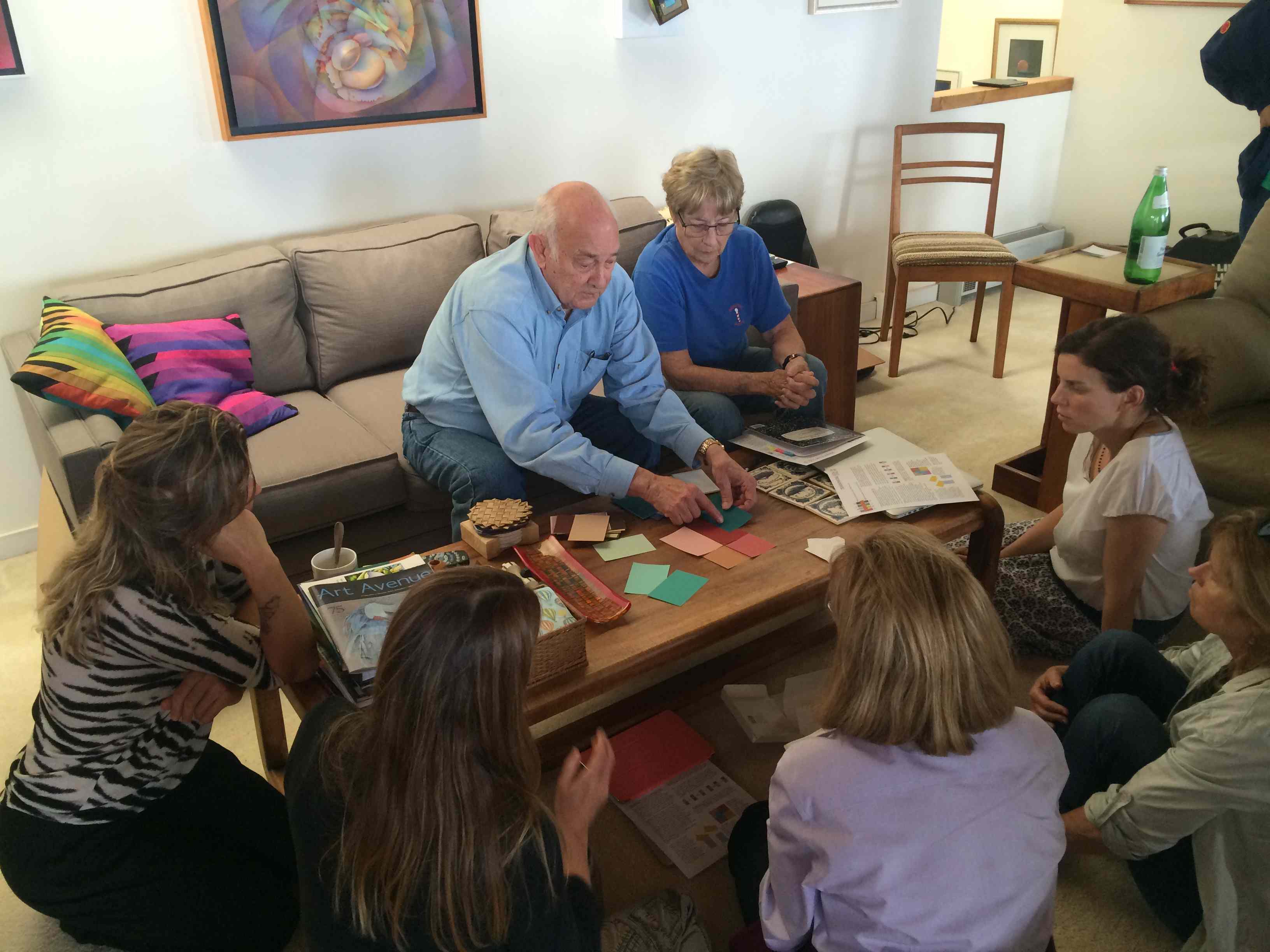
After taking those two classes I got very curious and decided to give up my 150 tubes of watercolor paint and just use the primary cyan, magenta and yellow, and start searching for the luminosity that Dick talks about. Armed with three tubes of paint, I began my journey.
My first attempts, to apply his method in painting flowers and landscapes, weren’t very successful. Dick encouraged me to put aside shapes, subject matter, and composition, and focus for awhile on painting color for color’s sake, by simply painting stripes. As we have heard him say many times, “discard the precious stones for the time being and take on some stepping stones”.
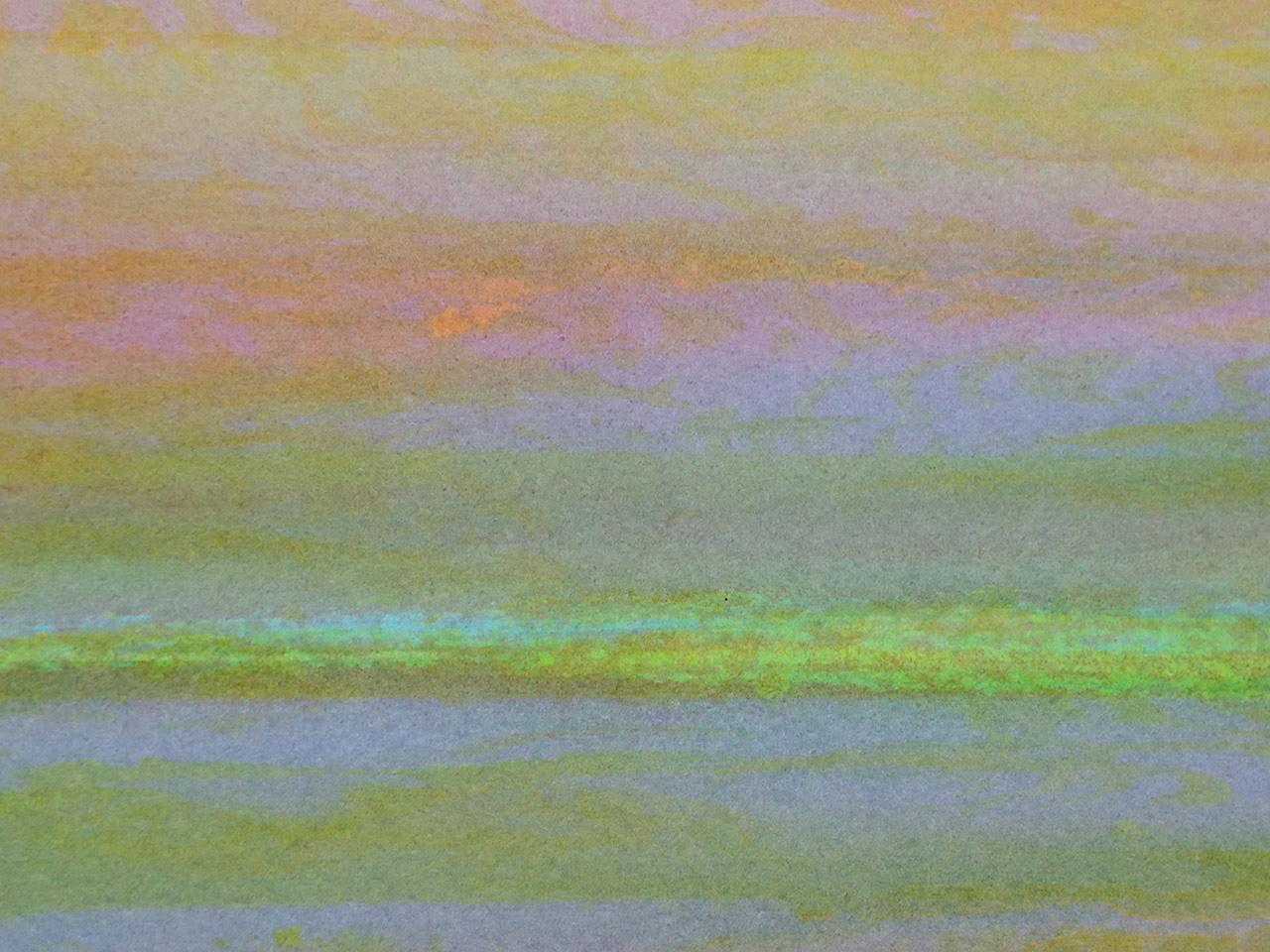
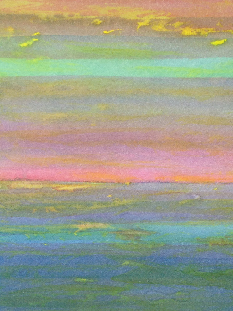
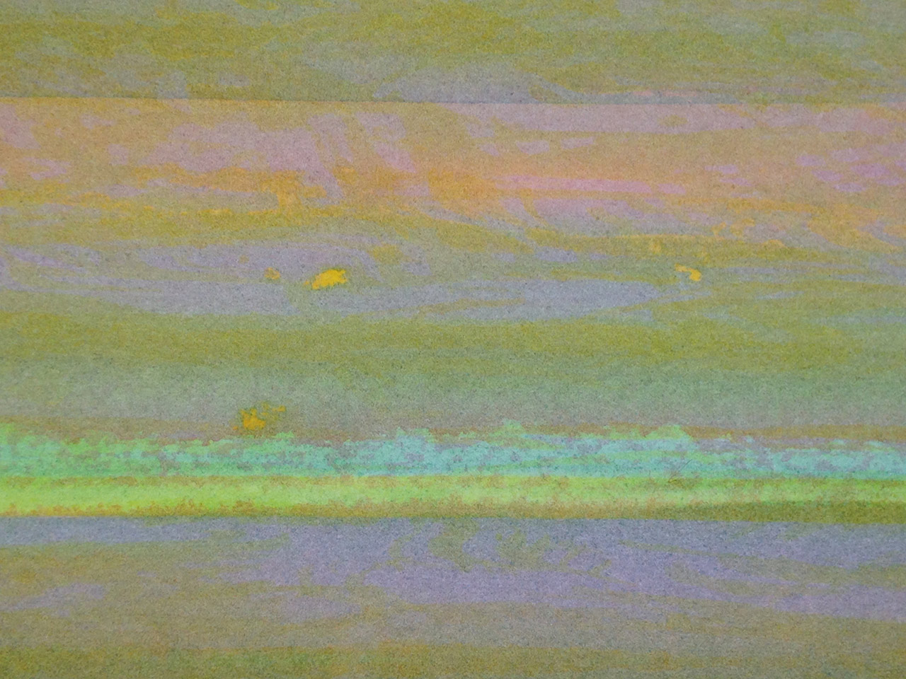
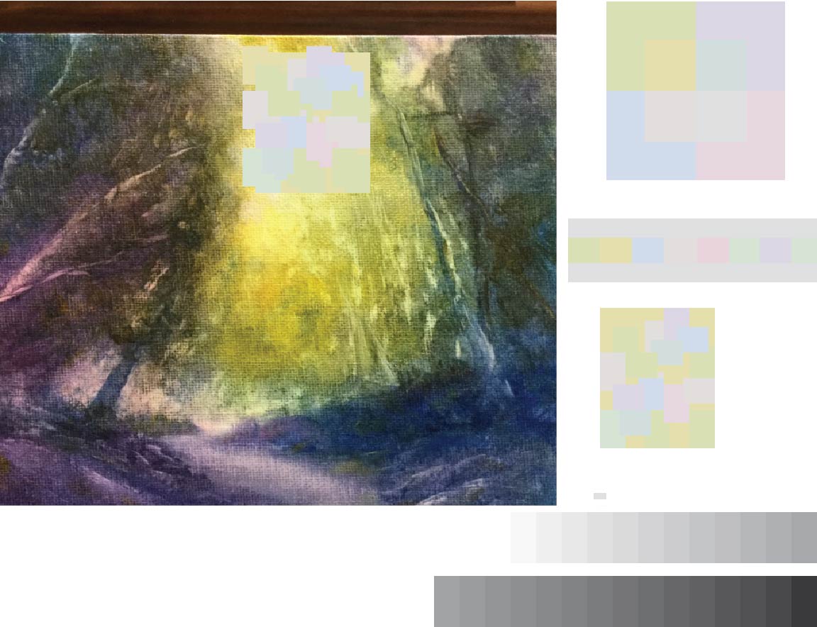
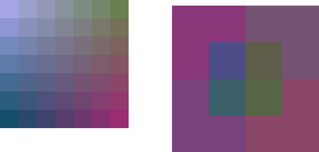
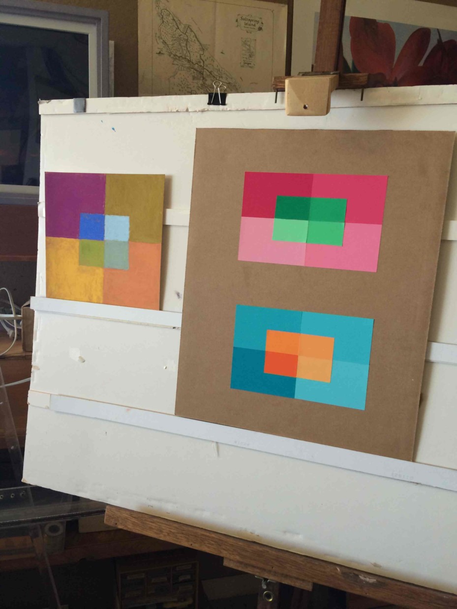
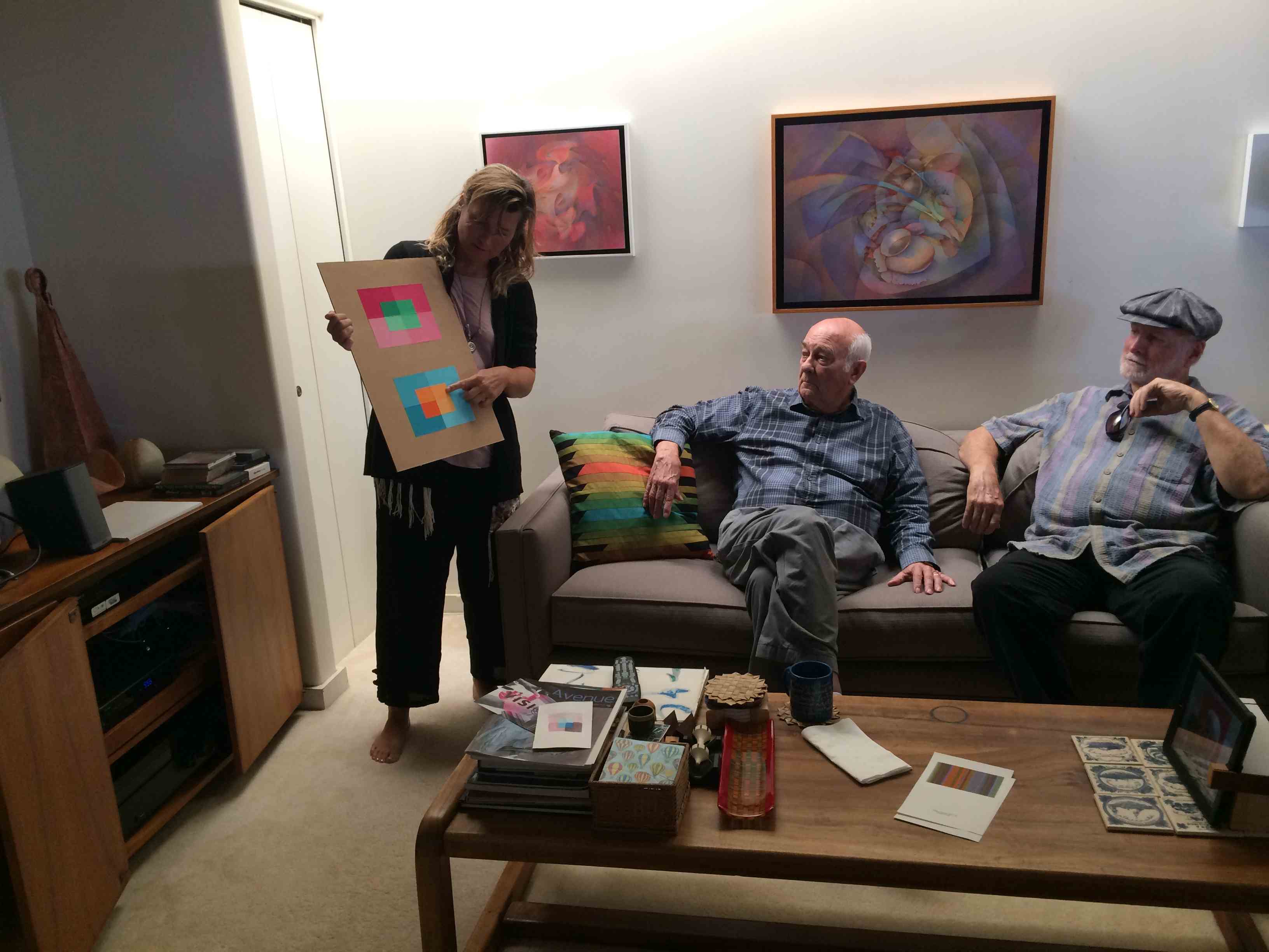
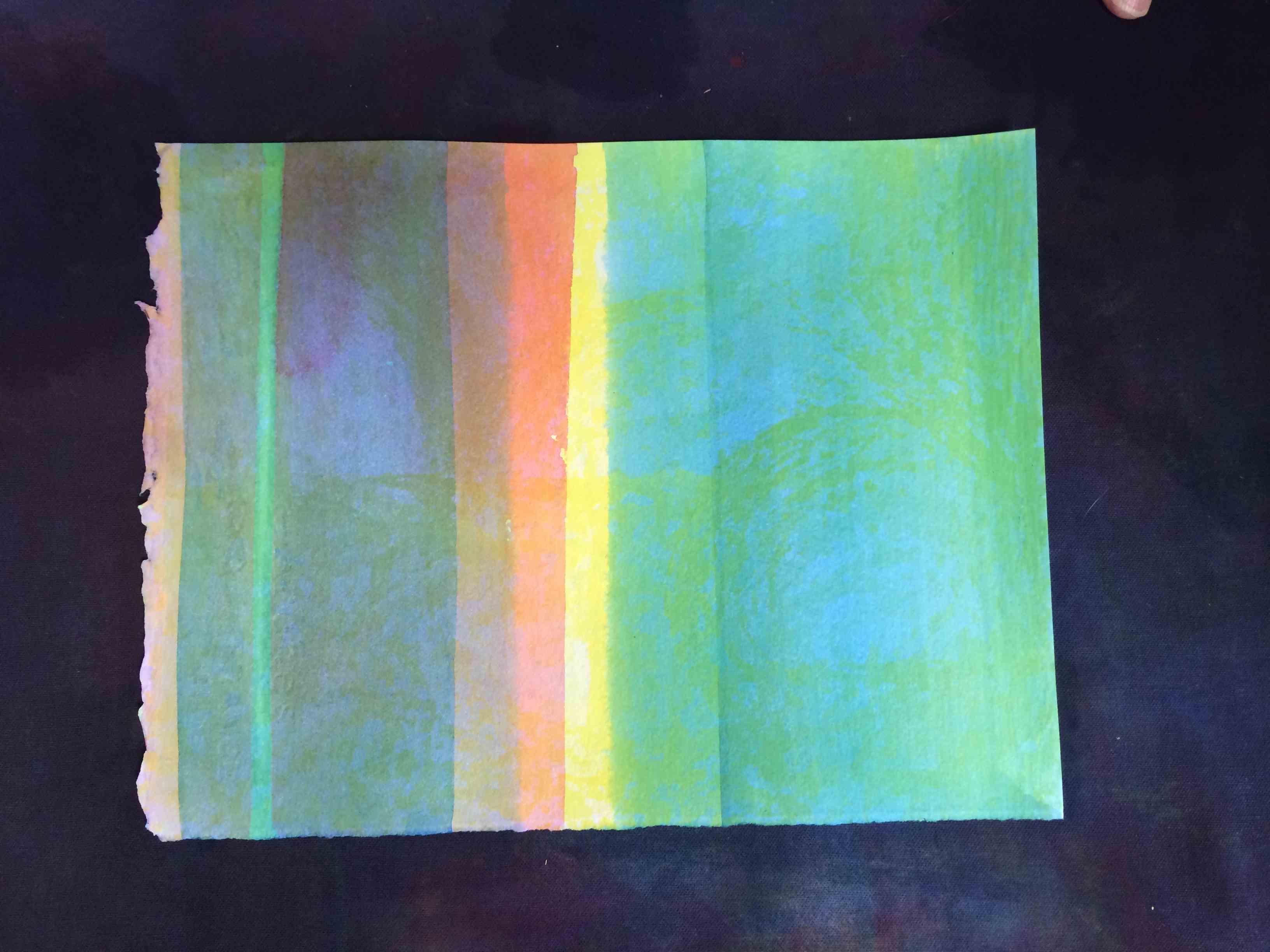
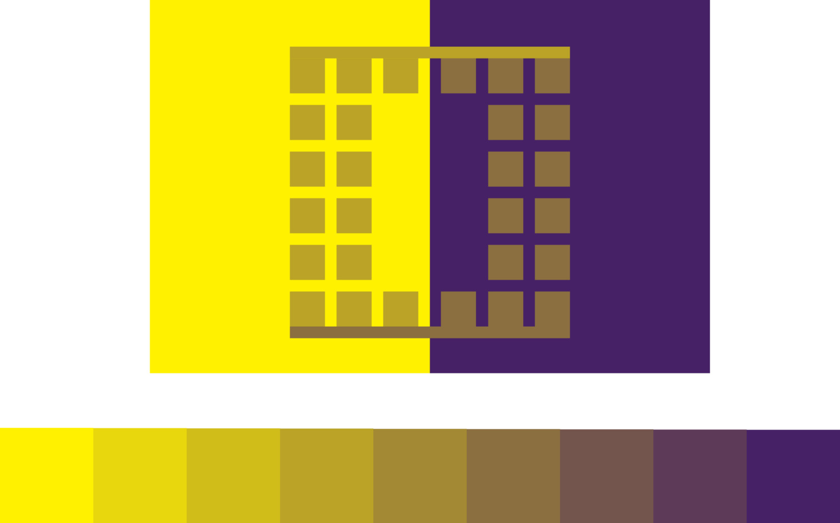
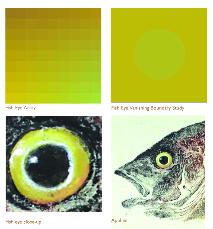
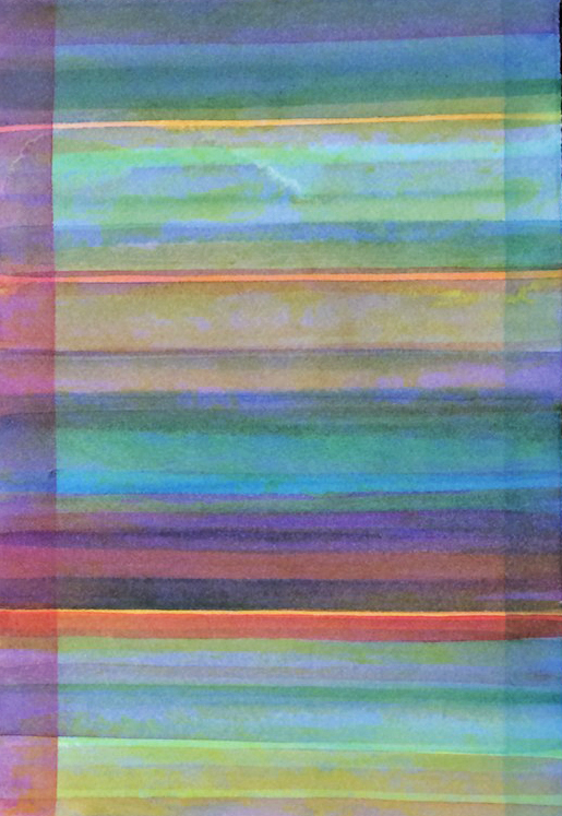
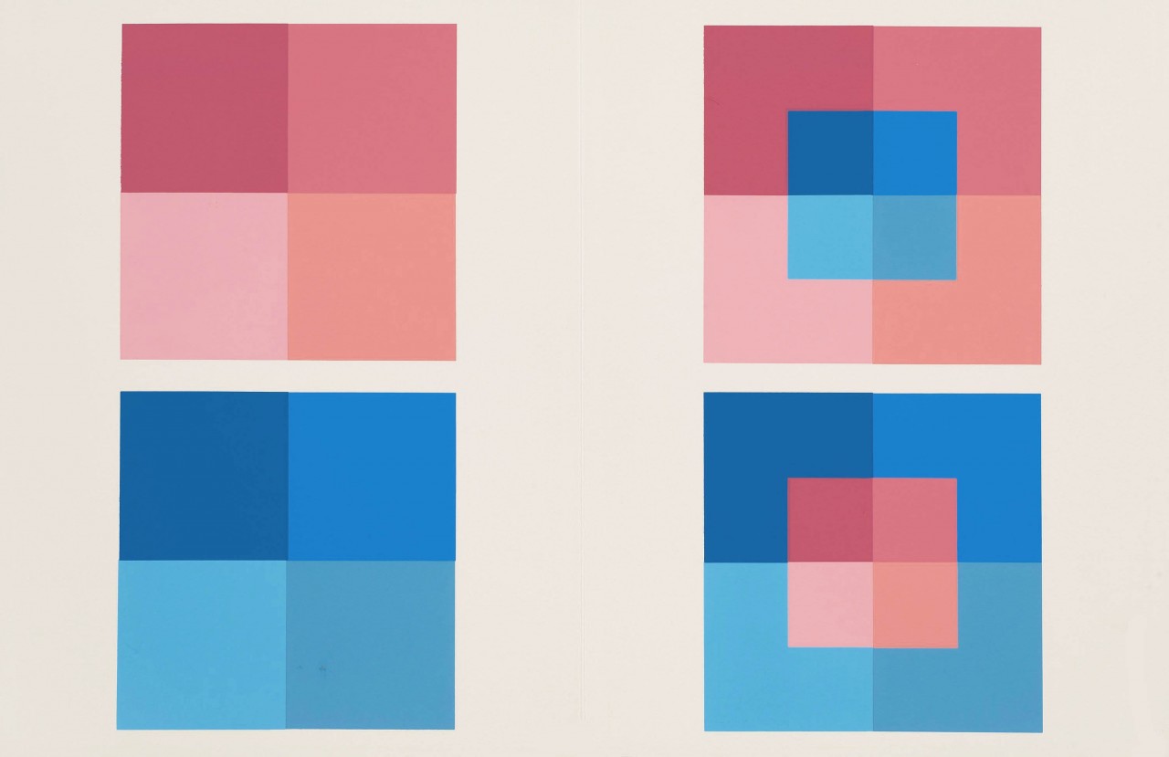
The very first layers of yellow, cyan, and magenta establish vanishing boundaries
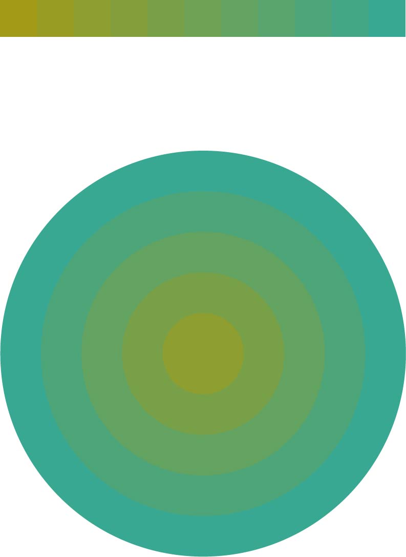
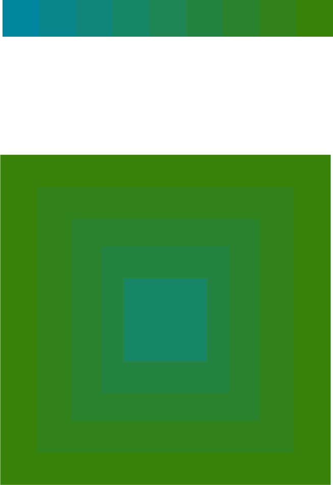
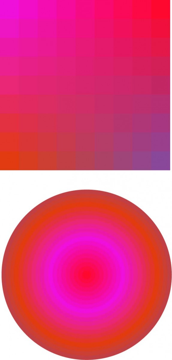
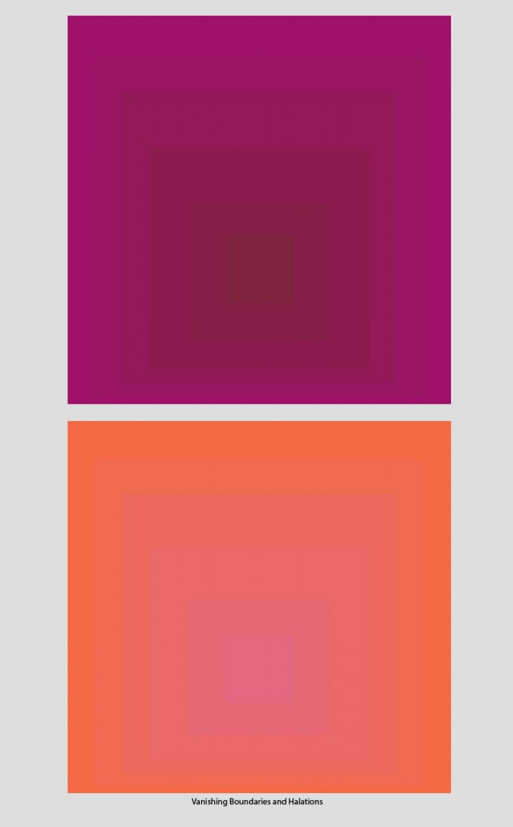
Dick teaches that vanishing boundaries (top) and halation (bottom) are the only two ways to achieve luminosity with pigments.They can be established early in a watercolor (left side) and will remain after additional layers are applied (right side).
As I started these stripe studies I had a list of themes/tools Dick had introduced in class: vanishing boundaries, halation, tone, values, color themes, film, veil, gradation, harmony, how to affect one color with another one, and “what if”… I would pick one or two at a time, to avoid getting lost by trying to do everything at the same time.
Each progressive stripe attempt taught me something – either to do or not to do!
As I instinctively put colors together to see the results, sometimes it came out to be a really fascinating color relationship that I had never achieved before, and sometimes it didn’t turn out anything at all like I thought it would.
I learned I needed to go through those mistakes and not think of a mistake as just a mistake. I needed to go through the mistakes and learn from each one. Until I could, in my way, be able to control those colors to get the various color relationships I wanted, try to repeat them, register them and add them to my “toolbox”.
I admit, it was hard sometimes to stick to one theme/tool or technical effect, and not be influenced by my color likes and dislikes.
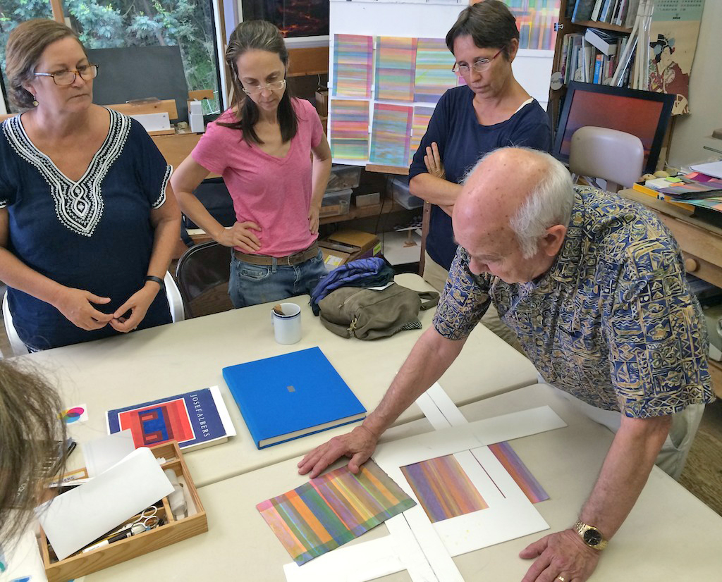
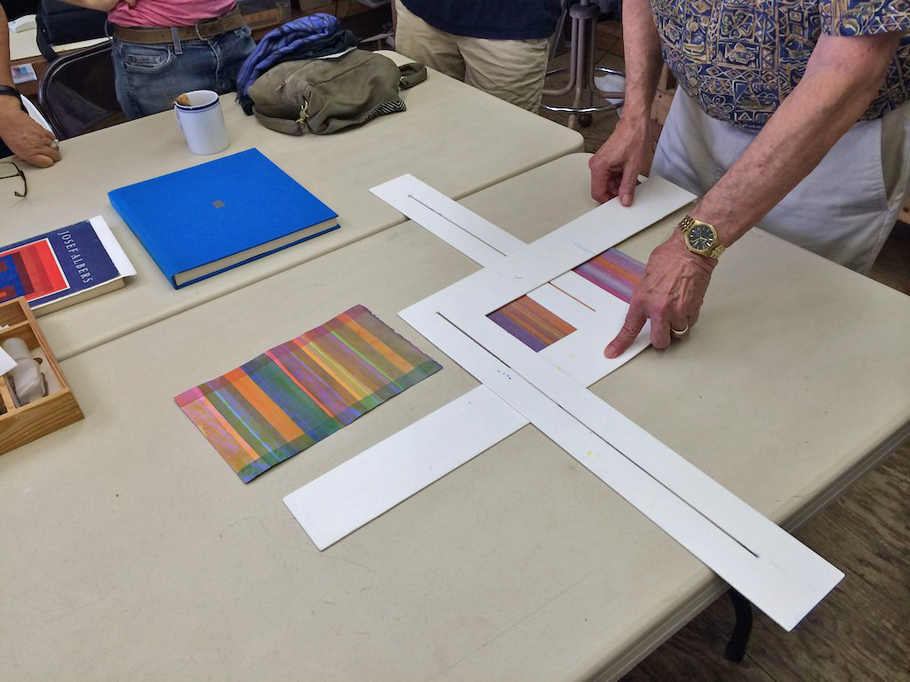
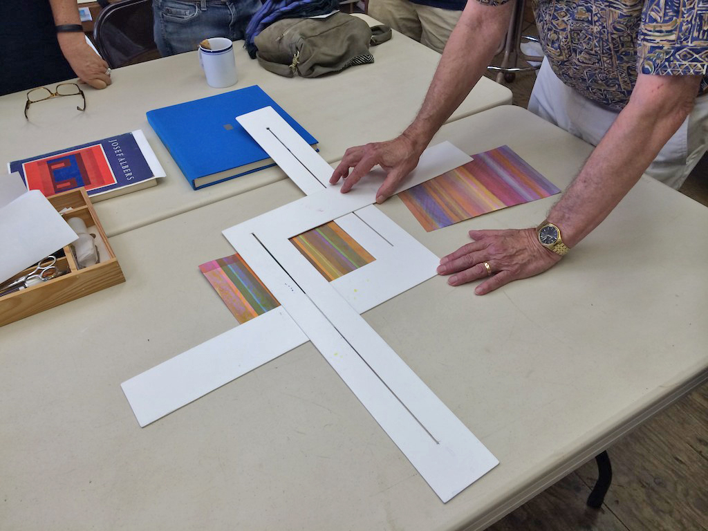
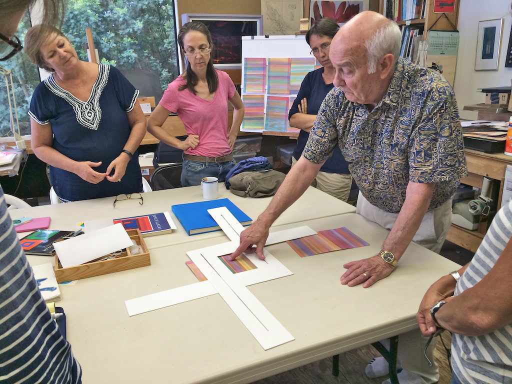
Dick also reminded me regularly of the importance of cropping, as it was unrealistic to expect perfect harmony on a full sheet while doing these studies. Cropping allowed me to isolate and see the color interaction better.
This took a lot of dedication, passion and time, plus of course Dick’s expertise, teaching skills, guidance and patience to let me discover things through my own experience instead of revealing them to me. All this is allowing me to make it my own. He is truly a great teacher, in the best sense of what teaching is.
Looking back now at my first studies, after applying myself for a year at painting stripes of color, I realize that I was oblivious at the time to already getting some vanishing boundaries, halation, and special relationships. I wasn’t recognizing them.
Dick’s encouragement to forget about doing a complete painting has caused me to not only paint the colors, but to see the colors. It makes me appreciate those accidental tones I was getting since I realize now how hard it is to get them.
As I look back over the past year’s studies I am excited at all that I have learned and accomplished and look forward to continuing exploring color. After much repetition it begins to stop being an accident and continues to grow until you cannot not do it. It is very hard to explain what happens as you practice; it is a mixture of technique and feel. The feel can’t be taught. It has to be experienced.
As I begin now to add shapes to my studies, I realize I have a long way to go, but that’s okay because I am enjoying the journey, and there is no end to it.
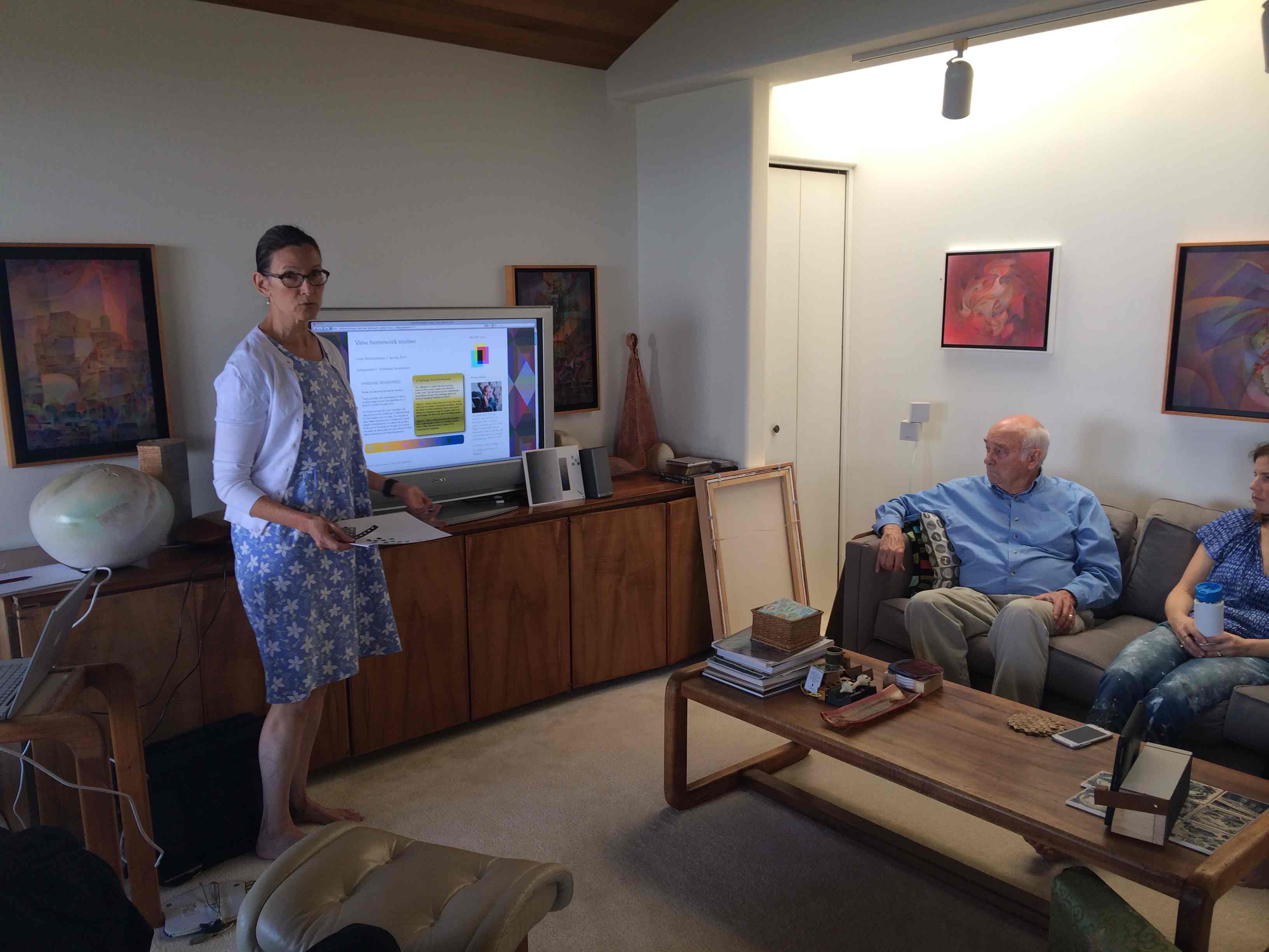
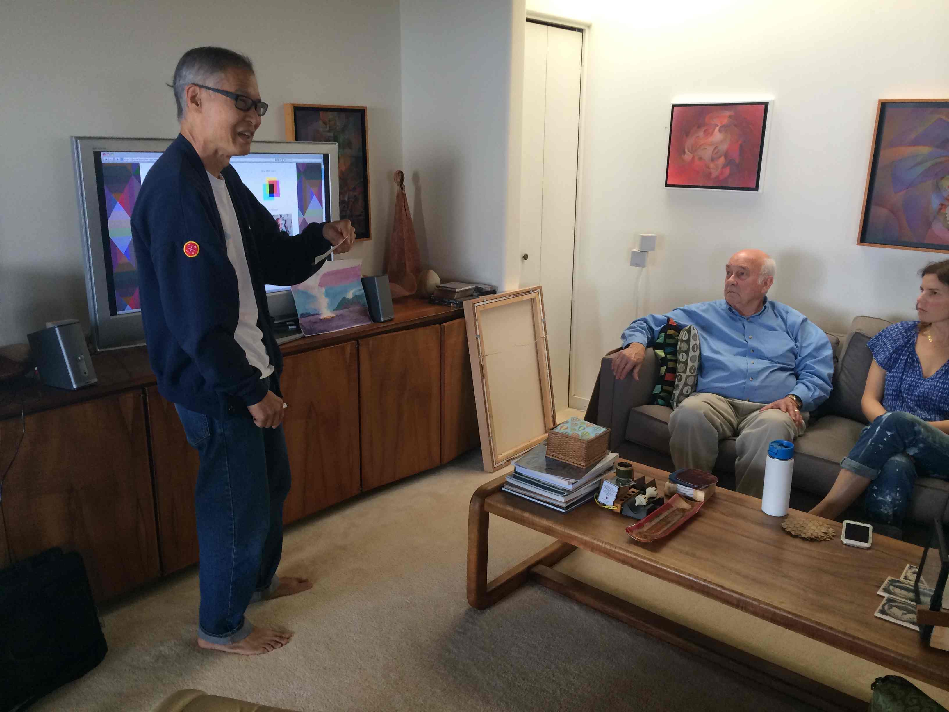
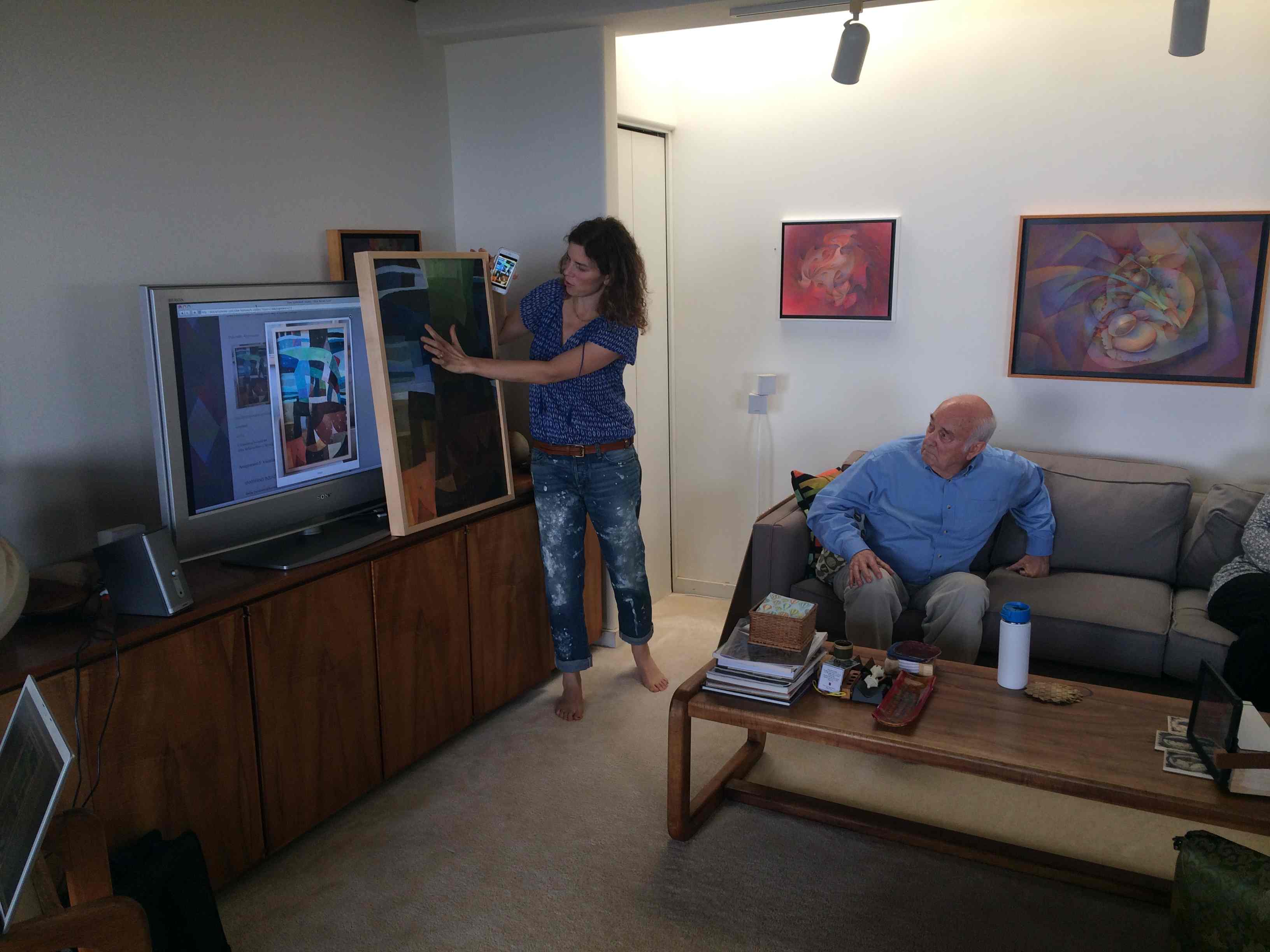
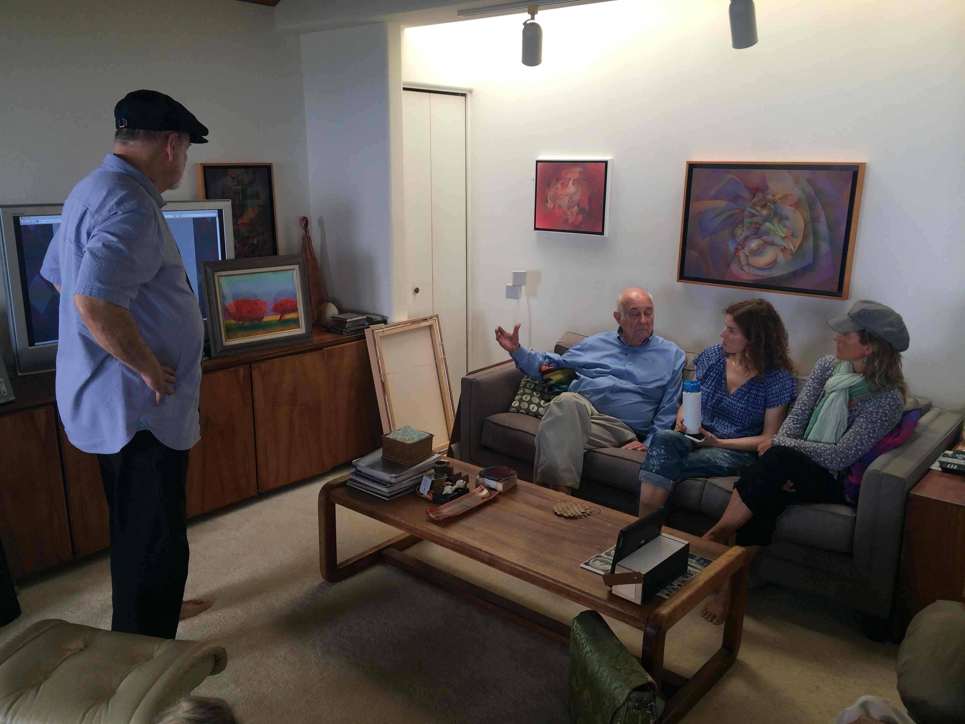
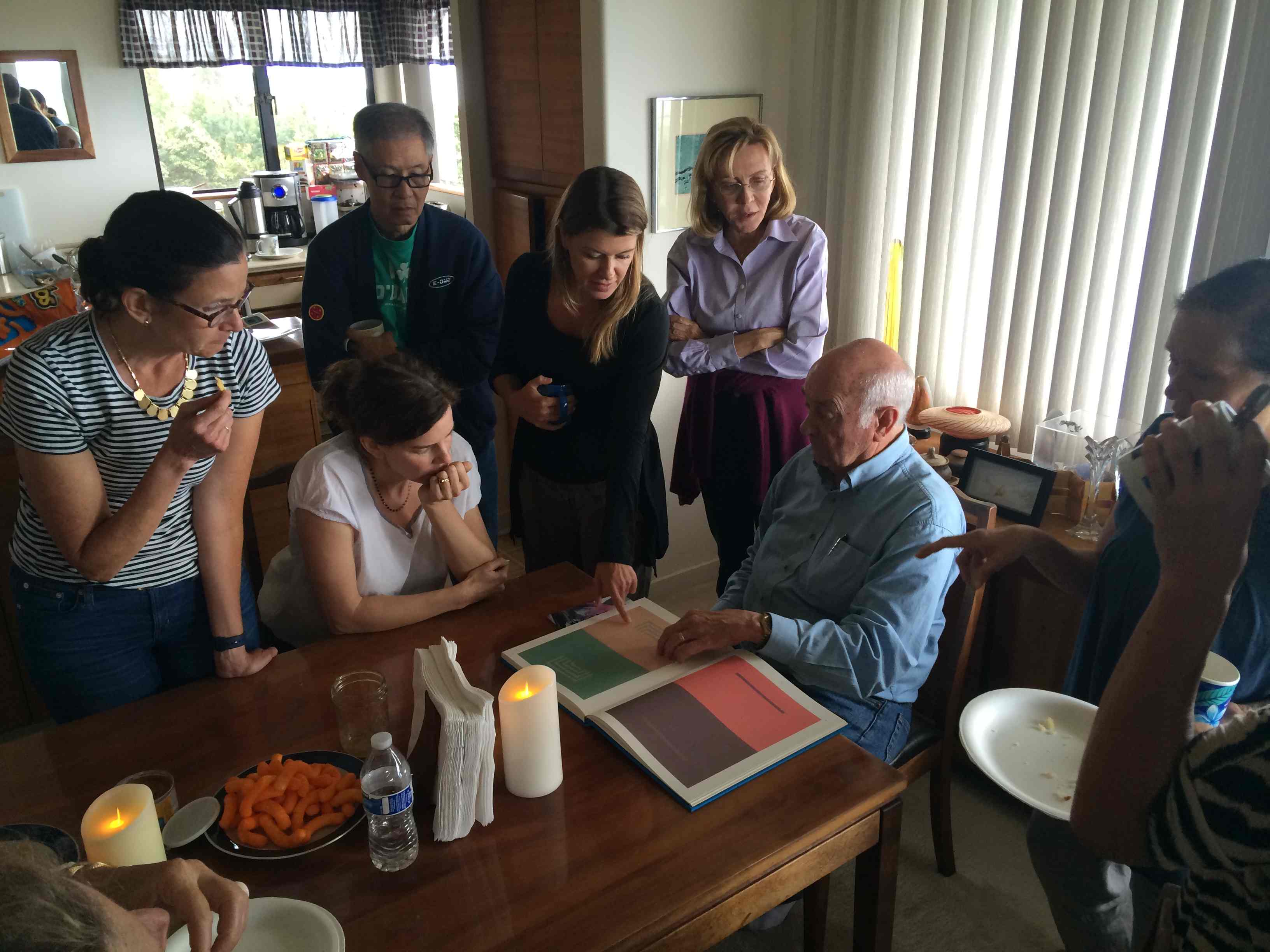
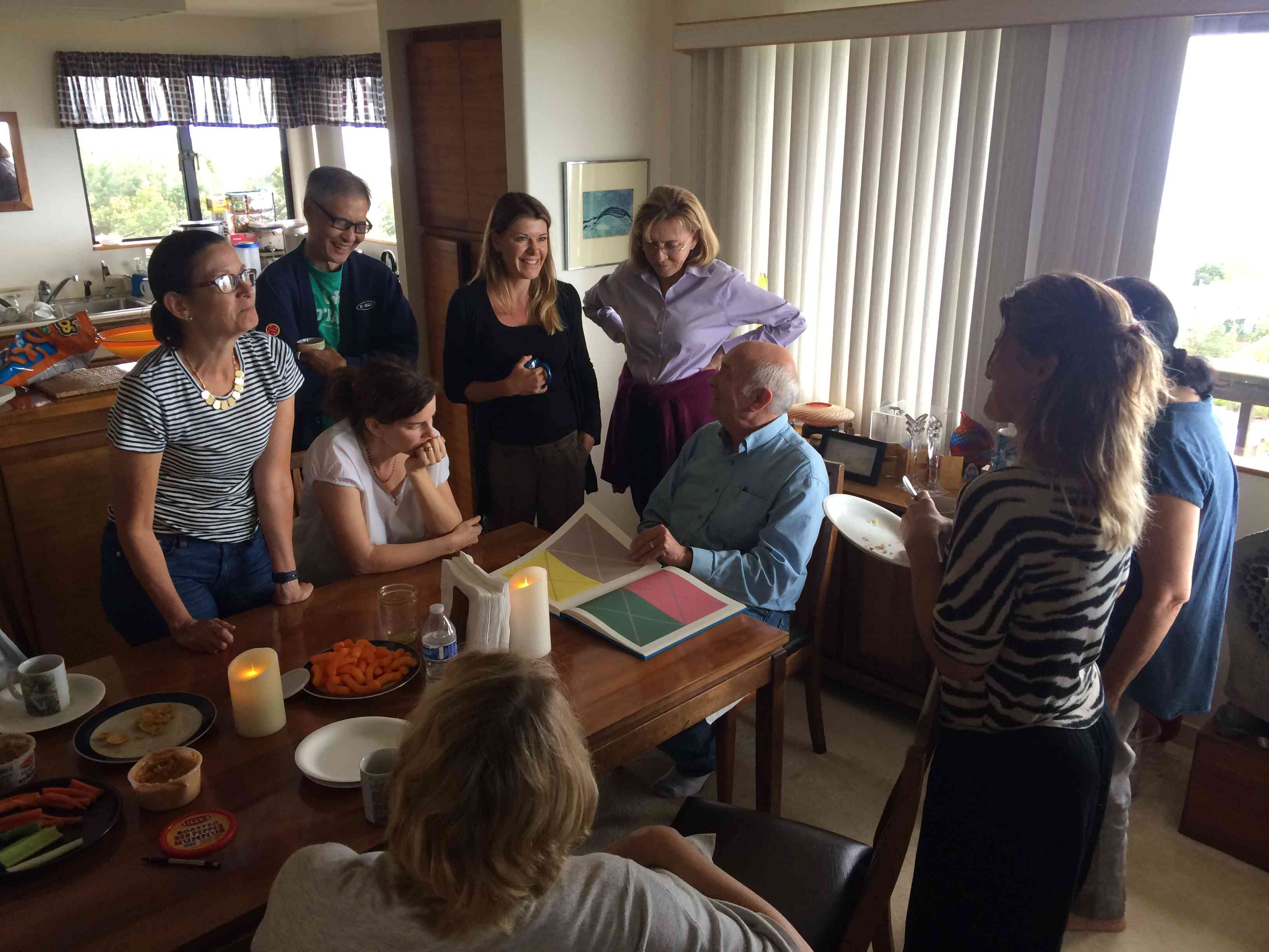
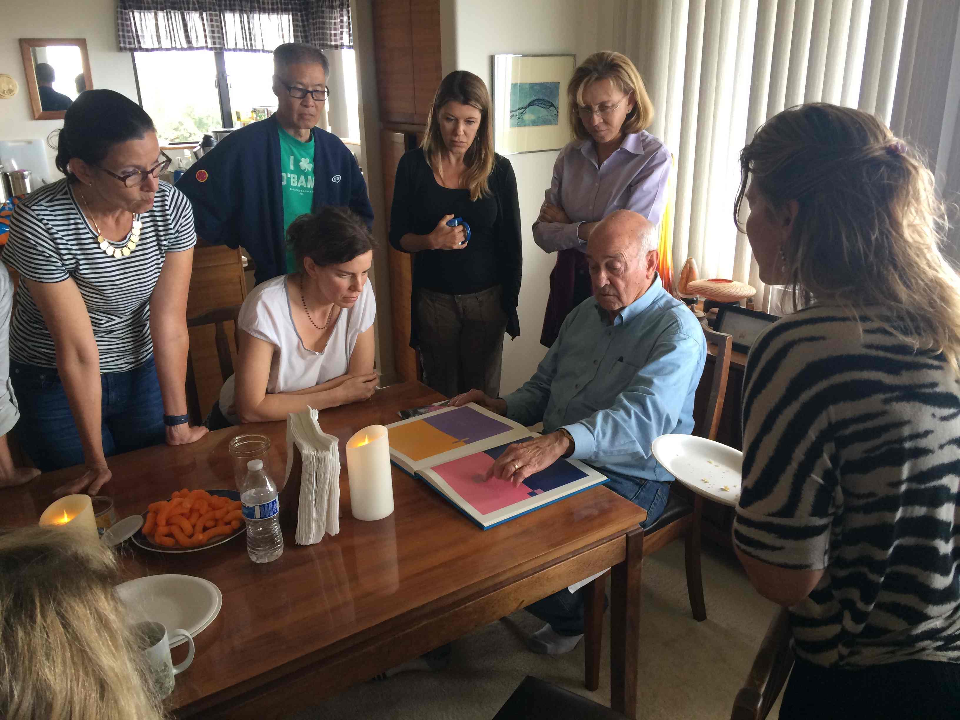
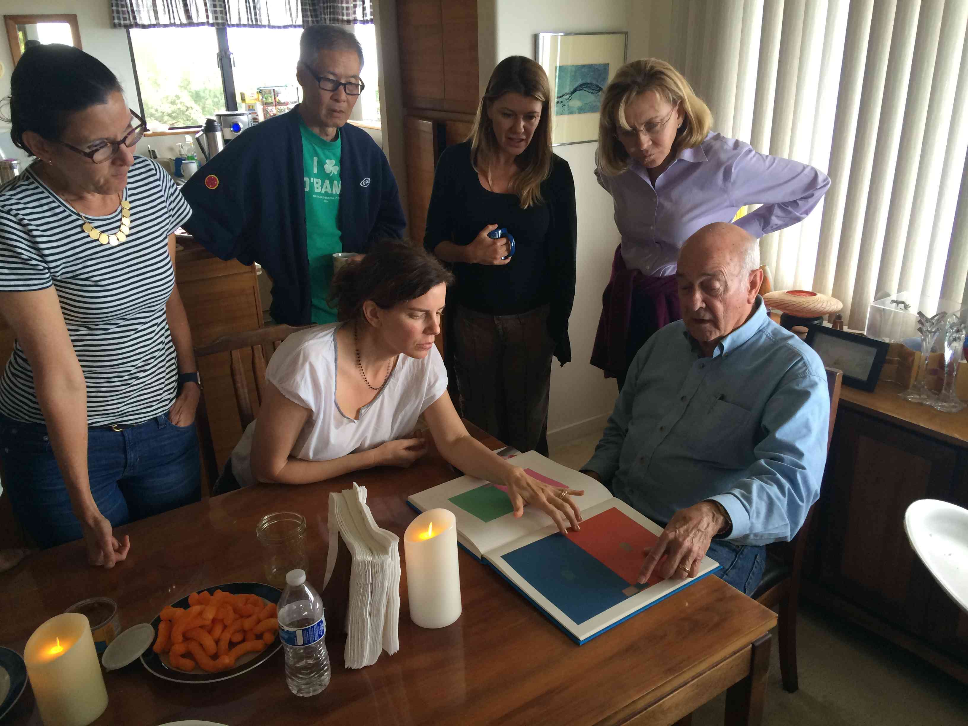
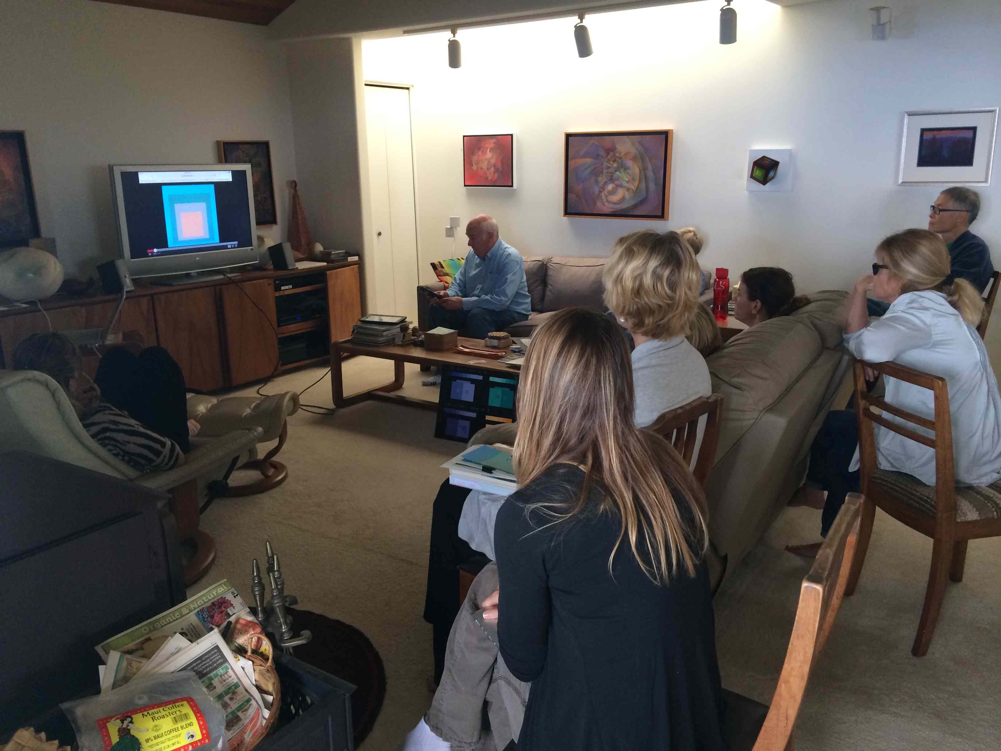
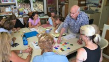
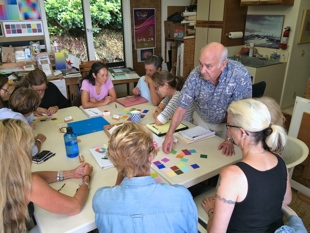
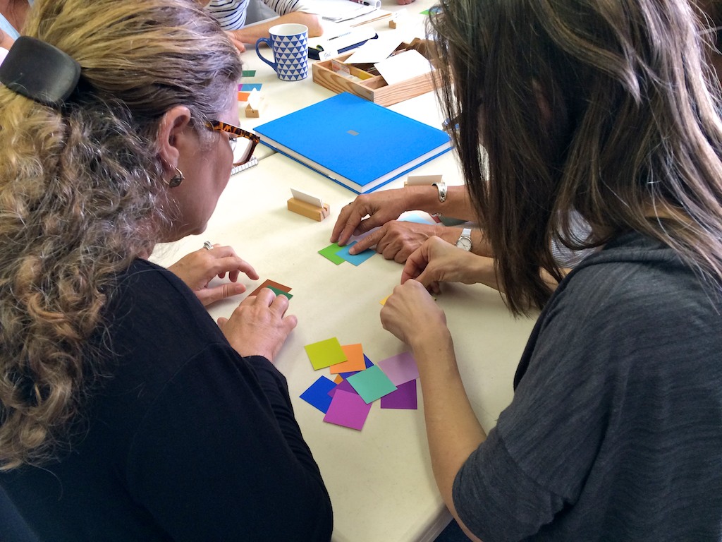
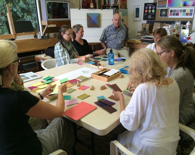
The fifth and final session of the Color Relationships class for Spring 2016 was held on Wednesday, May 4. The class shared the results of their last assignment, heard from guest artist Valérie about her color explorations, and watched a video that demonstrated how color, pattern, and viewing distance are all important considerations when creating a work of art. See the full post for class materials, photos, and final assignments.
The fifth and final session of the Color Relationships class for Spring 2016 was held on Wednesday, May 4. The class shared the results of their last assignment, heard from guest artist Valérie about her color explorations, and watched a video that demonstrated how color, pattern, and viewing distance are all important considerations when creating a work of art. See the full post for class materials, photos, and final assignments.
Critique – Vanishing Boundaries assignment
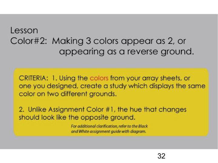
The final assignment for this color group was to create a color study which demonstrated the application of VANISHING BOUNDARIES. Dick gave students a few options for the format of this assignment: one was to simply lose a shape against its background colors; another was to take a section of a previous art piece and redo it to incorporate vanishing boundaries; and the last was to take another artist’s work and redo it with the same goal. The only criteria that Dick stressed was that he did not want students to concentrate on shape, only on color.
Here are the results of that effort:
Gabby brought in an acrylic painting that she altered in a bid to incorporate equal value and halations. It was more challenging than she anticipated, but this is the first step in exploring how to integrate this color knowledge into her work.
Original painting
Experimenting with equal values
Anyes also brought in an original painting that she used to experiment with equal values. She incorporated vanishing boundaries on the right side of the painting, mainly in the shadows of the mountain. The left side is untouched, and showed her original color choices.
Susan shared both physical and digital work, bringing in a small pastel piece along with the original paintings that she used to create matrices from. Her pastel landscape incorporated arrays, halations, and vanishing boundaries, while her digital studies were done to find equal value possibilities for future alteration.
Janet shared pages from her sketchbook, drawings she made with mixed media. Many of the designs showed experimentation with equal values, vanishing boundaries, and array colors.
Christina shared her experiments in acrylic and oil, as she explores the ways she will use this color knowledge in her chosen media. She also brought in a small painting she had done in the last week, where she had restricted herself to only cyan, magenta, and yellow paint to see what was possible.
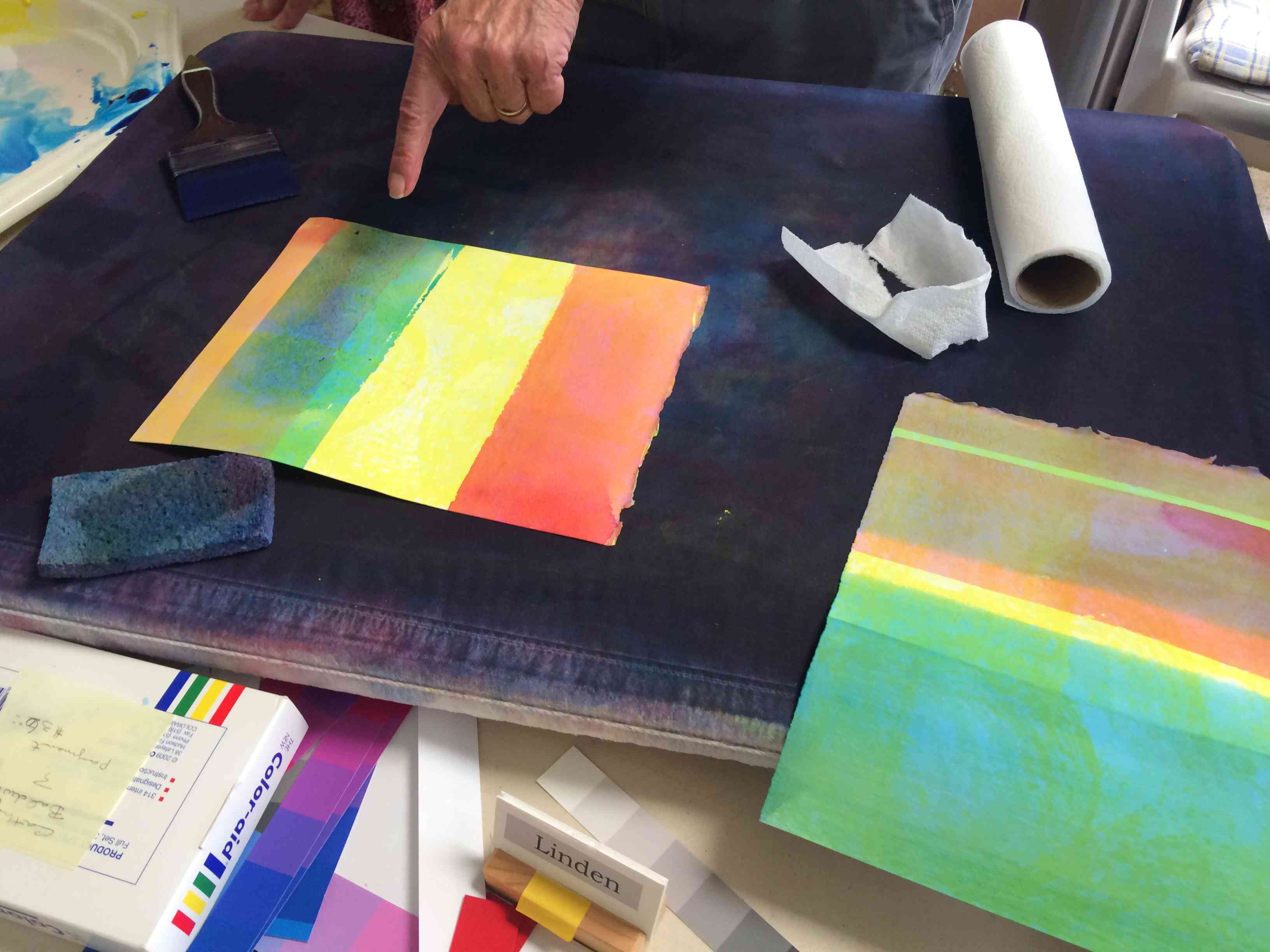
Linden used Color-Aid paper and gray scale sheets to create an innovative design which provides accurate readings on equal values. The result is an immediate recognition of when colors are matching in value, and when they are not: the colors that do not match jump off the page, while the colors that share equal value disappear at a distance.
Jane submitted several digital examples of her explorations with equal values, vanishing boundaries, creating matrices, and furthering her knowledge of the Adobe Illustrator program. She commented that using this program has helped her immensely in the understanding of color interaction.
Jim brought in a pastel piece that he reworked to incorporate vanishing boundaries. He also shared a small study of equal values in opposing hues, which gives us the contrary effect of vibrating boundaries.
The original piece
Reworked to incorporate vanishing boundaries
Study of equal values
Cynthia experimented with an original image in Adobe Illustrator, trying new color combinations. In one version, she used only one array (two parents) and in another version, she used a matrix (four parents) to choose her colors. There were strong halations, yet only a few areas of vanishing boundaries, due to the different values of the parents.
The original image
This version used one array
This version used a matrix of four colors
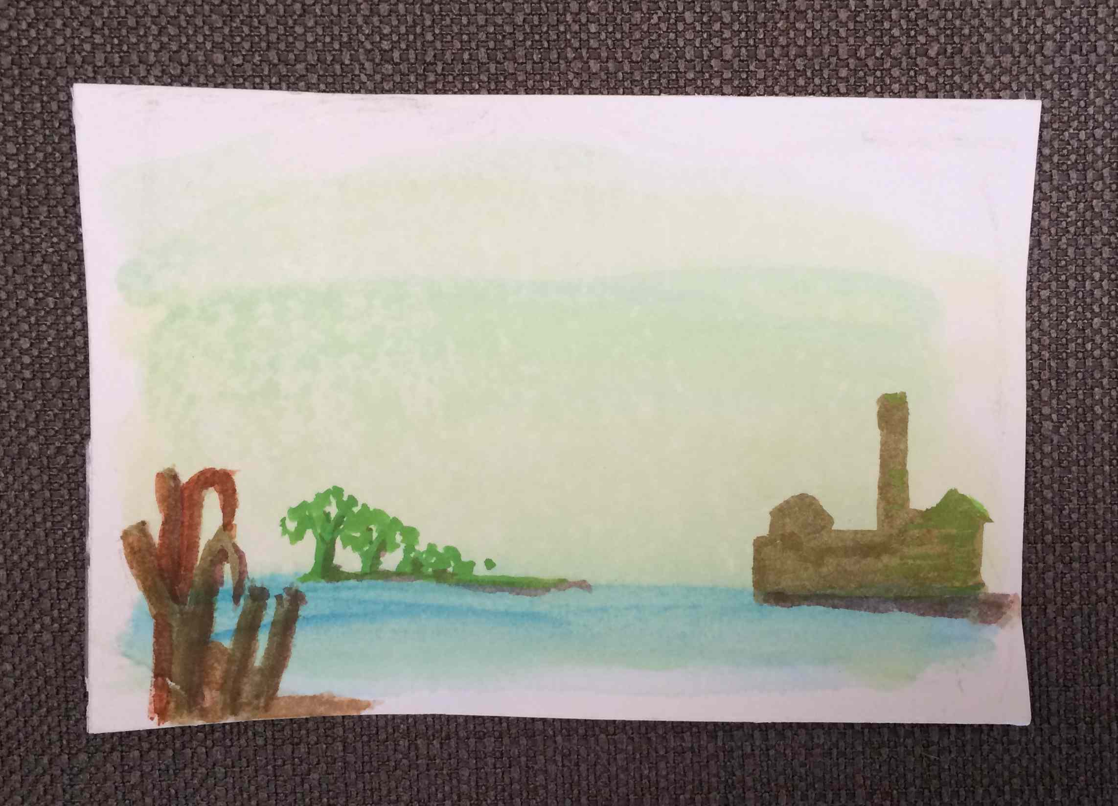
Leonard worked on a couple watercolors where he experimented with only using the 3 primaries, and worked on equal values and vanishing boundaries. He choose the sugar mill as his subject, which proved to be more challenging than he originally thought!
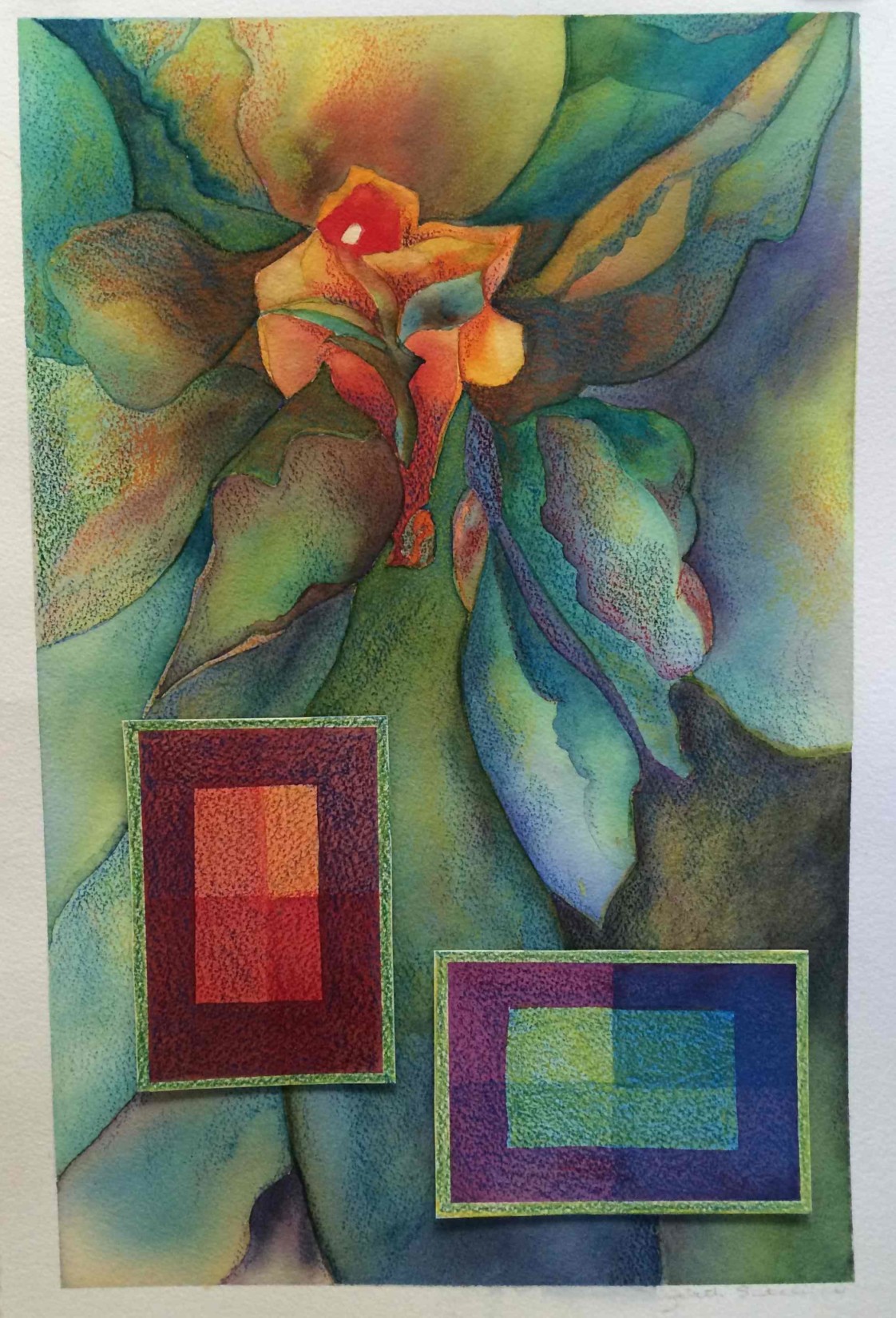
Elizabeth Ann brought in an original watercolor that she reworked to achieve color harmony and vanishing boundaries. She showed us examples of the before image, adding that she thought the original color scheme had been a bit “garish”; then revealed the final result, which she had toned considerably. She also added her formal color studies as a counterpoint to the flowing lines of her original composition.
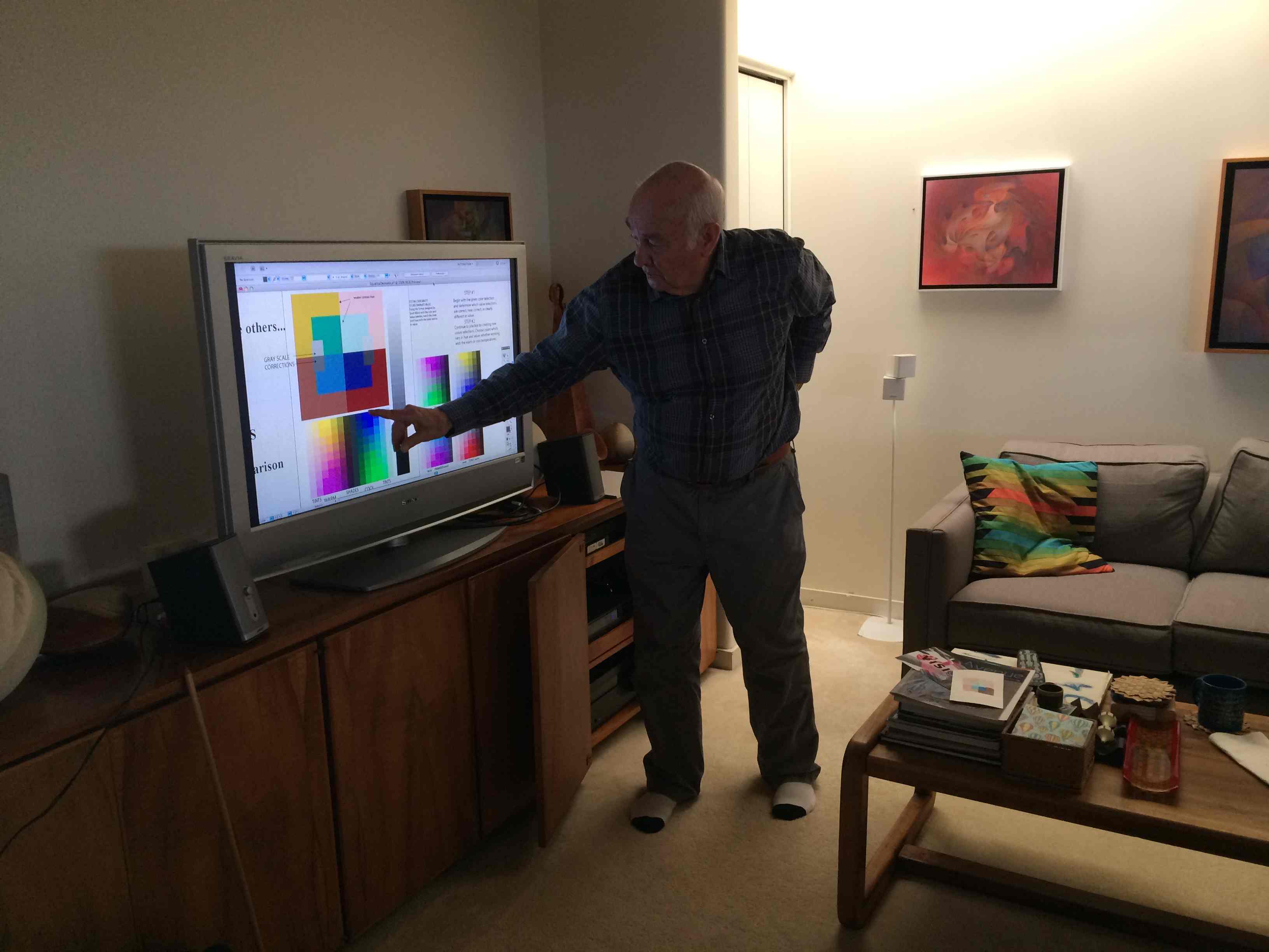
We reviewed more on the theme of vanishing boundaries, and Dick shared a worksheet he designed on Adobe Illustrator that could help students improve their value comparisons. By creating a matrix with equal value parents, one could pick color combinations to try and make the inner shape disappear, either a lot or just a little. See the worksheet below, in the ‘Class materials’ section, which is available for download as well.
Dick also wondered if the color information had affected anyone, and asked the class: “Personally, what, if any, behavioral change have you gone through?”
Most everyone agreed that the information was ‘eye-opening’ and powerful. One student said, “I see my own work so differently now. I used to take it for granted that I knew what I was looking at; well, I thought I knew what I was looking at.” Another student described it as: “I feel I have the eyes of a dragonfly … I can see the world of colors – not as one, all at once – but all of them, individually; I can see them now.”
Dick cautioned that it is important to keep this wave of euphoria going, and to dedicate oneself to practicing and experimenting with this color knowledge, or it will all too easily be lost. He used the metaphor of footprints in the sand: “… when you walk on wet sand, you leave behind footprints, and the next wave that comes up, it washes them away a little, but you can still see the outline. And then the next wave comes, and then another, and eventually the footprints are completely gone, there’s no way to tell anyone ever walked this way before. Well, these assignments are like those footprints, and if you don’t continue to practice, you’ll forget them. The waves of distractions can wash them away, but stepping stones will leave footprints [for us to follow].”
Valérie’s watercolors
And to show us proof of how important stepping stones are for an artist, Dick had invited guest artist Valérie to join us for this class, and towards the end of the coffee break we were treated to the results of Valérie’s commitment to studying color. She has been practicing with watercolors, and as a transparent media, they can be very useful in creating color harmony. Dick talked about how one of the obstacles artists usually face is the desire to create something “perfect”, or how easy it is to lose perspective and feel too attached to our work: “So often when we get engaged with subject matter, we don’t see what is happening with color and shape … Valérie was at a point where she needed to stop making ‘precious stones’ and start making ‘stepping stones’ to expand her vocabulary in color, and then go back to what she was doing.”
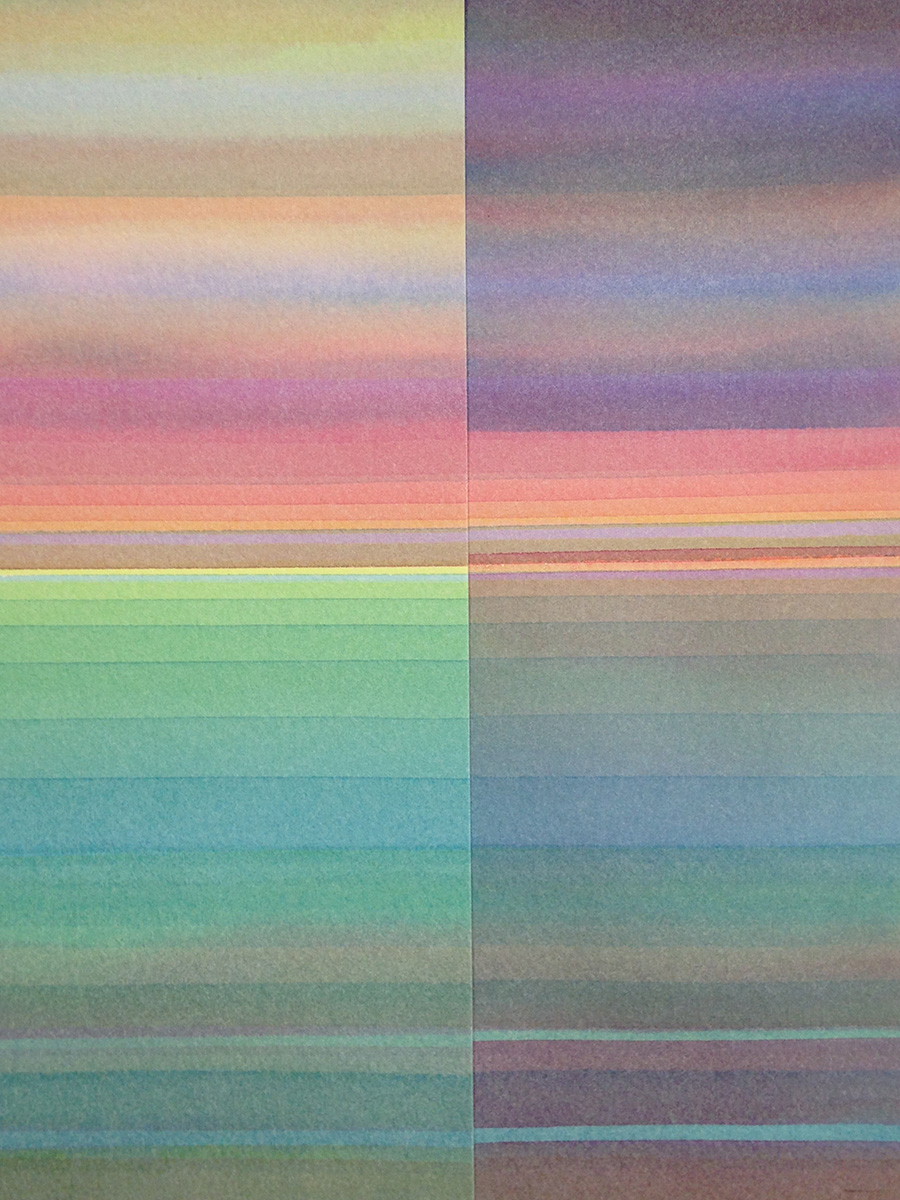
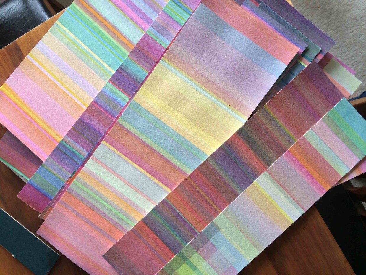
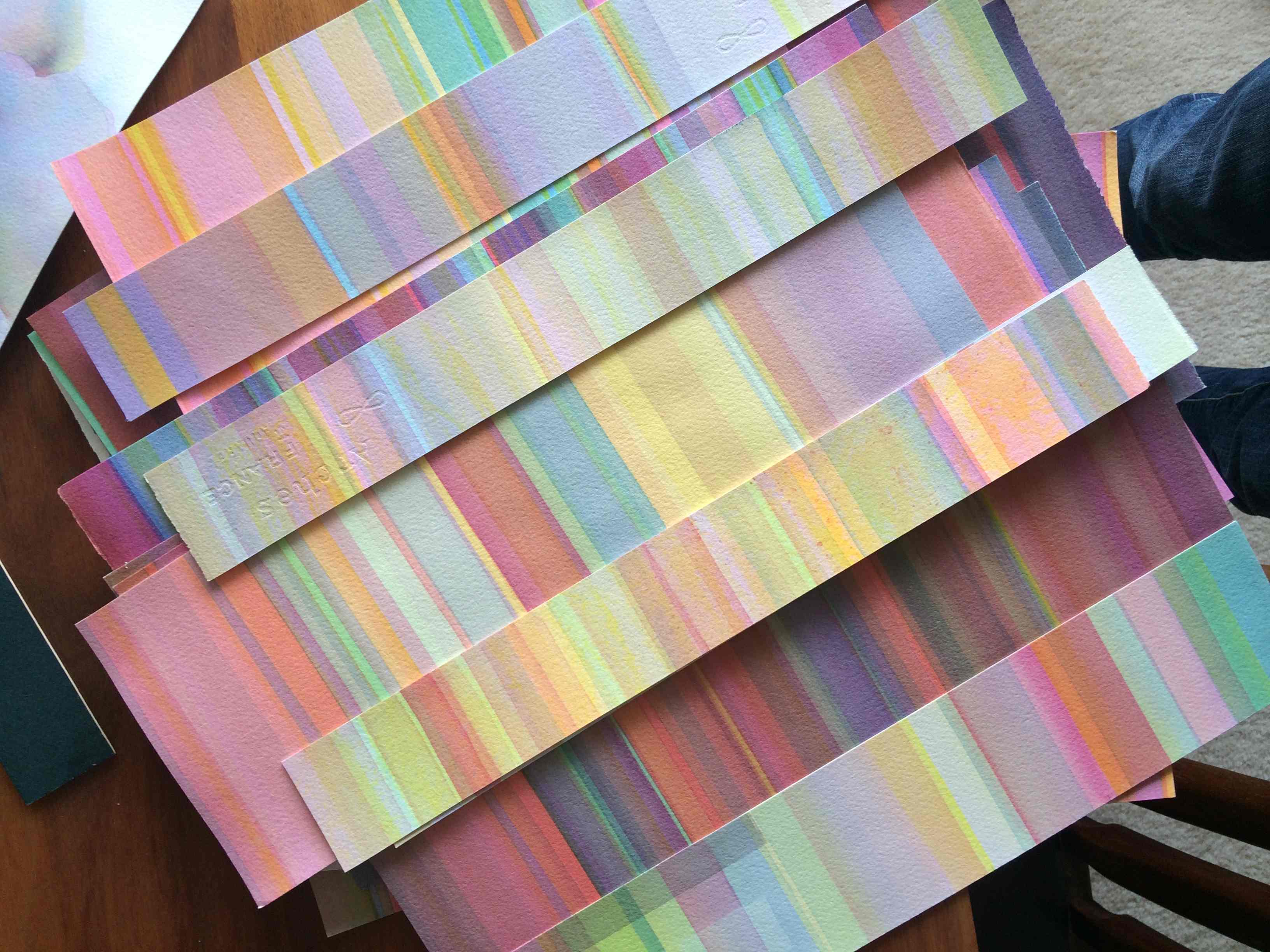
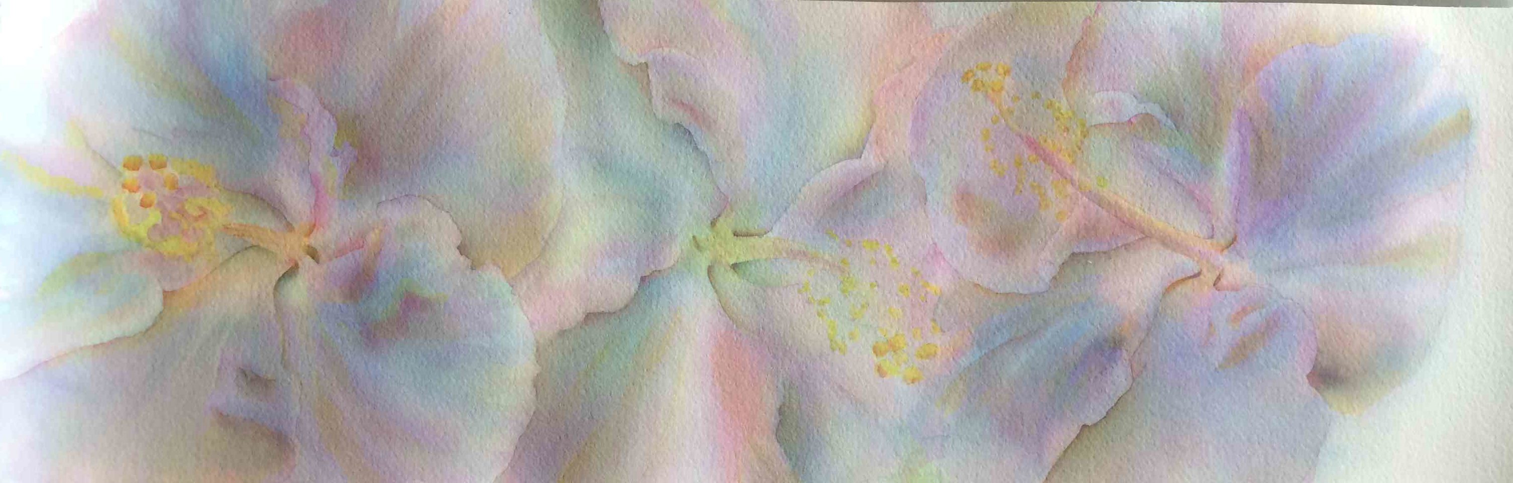
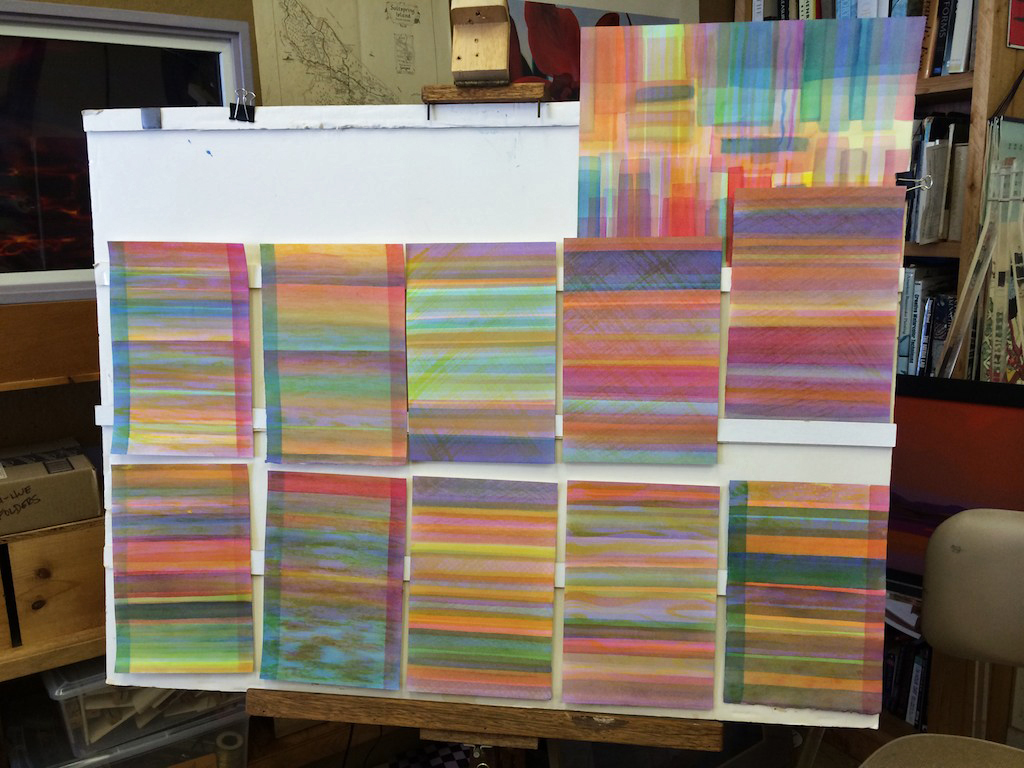
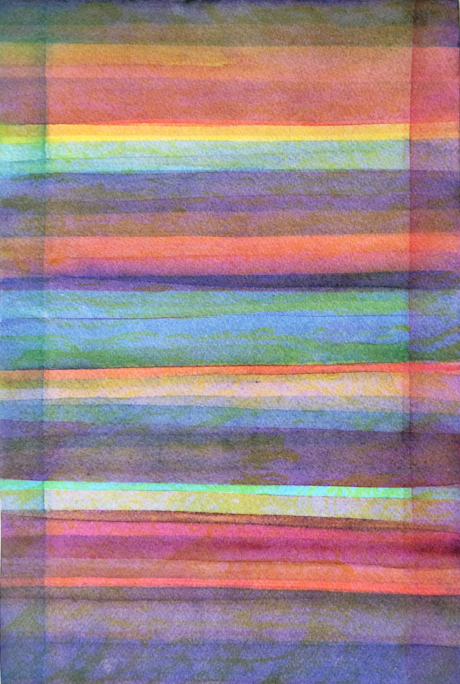
Valerie has been working on stripes of color for about one year
The stripes have been an effective format to study color interaction without being distracted by subject matter
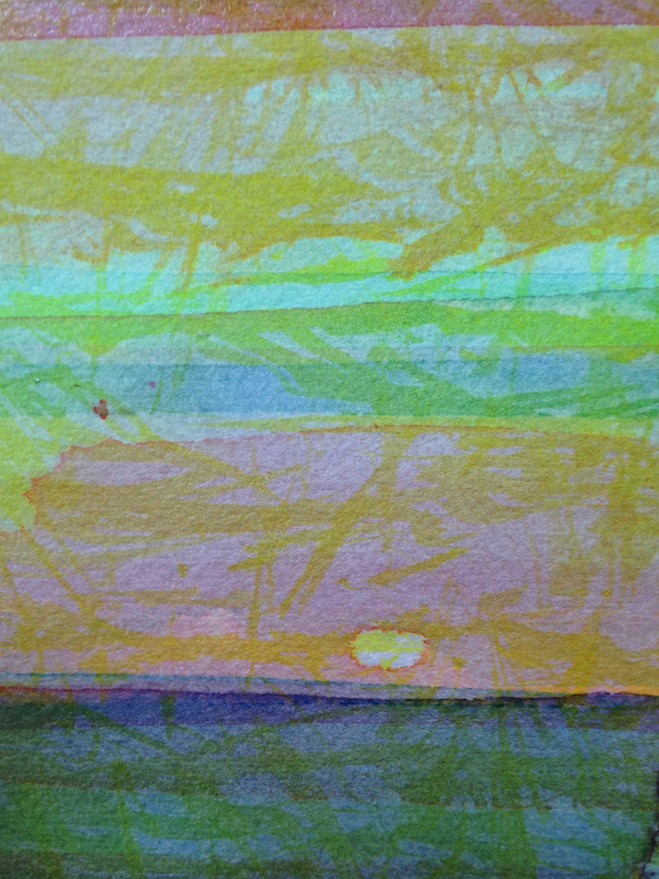
Valerie has recently been trying to incorporate her color knowledge with subject matter; in this case, a study of hibiscus
Valérie spoke a little about her process, and shared some of the revelations she has had that are changing the way she thinks about and approaches her work. “If you want to learn about colors, you have to drop completely painting ‘something’, and just work with the colors. And it takes time, just putting in the hours, day after day. And little by little, you start to see it – before, I thought I had to work at finding the values; but as you do it, as you paint, it comes to your eyes. So every time you will learn a little something. But you have to put in the time.”
Valérie has been working on these stripes for about one year now, and she is beginning to incorporate shape and form back into her color studies. The tricky part is to not do it all at once: she cautions to only try one aspect at a time until it becomes familiar and easier to handle. Trying to do it all right away can lead to frustration and discouragement, so sometimes it is best to pull back and make things simple for awhile. Valérie’s work certainly proves that patience and commitment will take you far!
Post-class work
Dick also encourages students to share their stepping stones, and any work they do in the future that incorporates these lessons! It is always a pleasure to see how artists use this knowledge, and as an example, look at the work Dick received a few days after class had finished:
Jane,
The class may not be meeting, but all should see and share such breakthroughs in color such as this matrix and how far you have taken these two lessons. I truly believe you have reached a level in color. I will forward this to Karen and Holly to be sure others can see your achievement and encourage others to share alike.
Take a well deserved bow!!
Dick
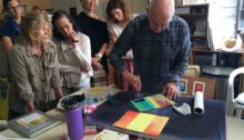
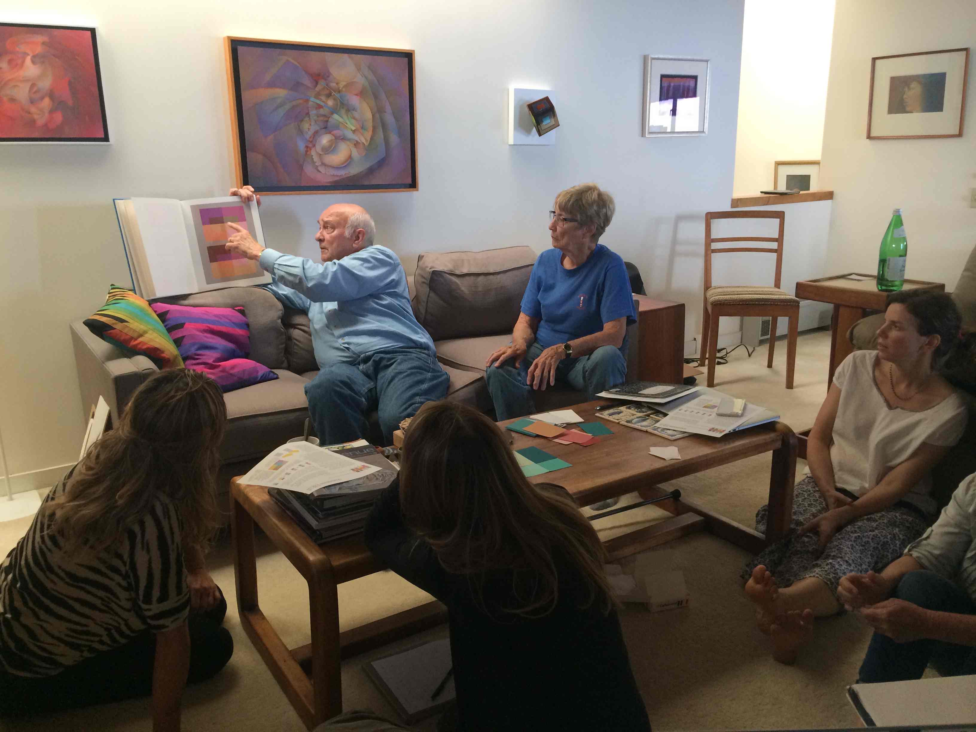
Class photos
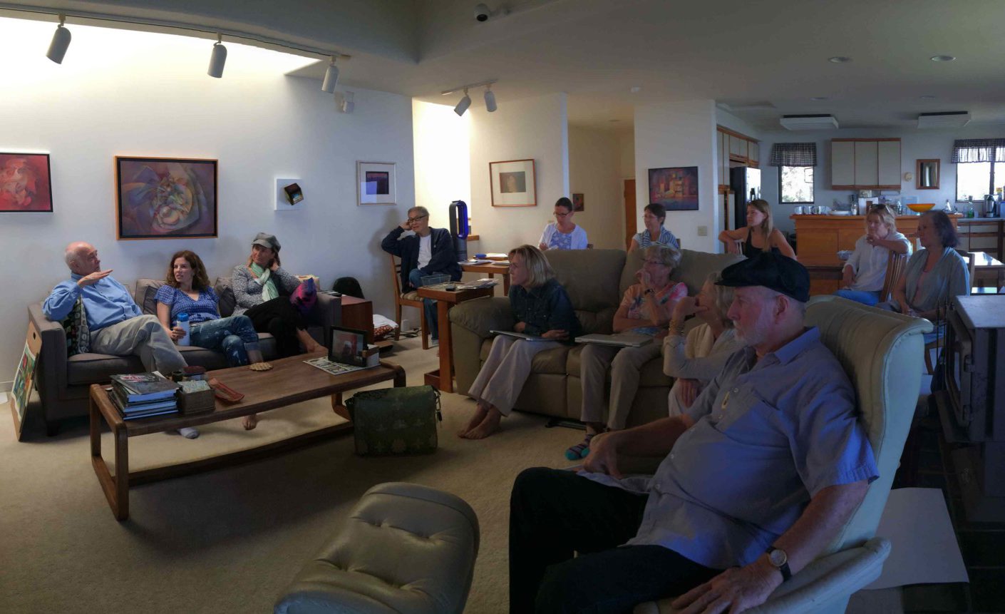
Gathering in the living room for our final critique
Elizabeth Ann shared her before and after images of the same painting
Linden did her final assignment in Color-Aid paper
Leonard presented his watercolor to the class
Gabby presented an acrylic painting that she reworked for the final assignment
Jim shared his reworked pastel piece to the class
Susan showing where she made modifications in her pastel drawing
Anyes used the dominant colors of her piece to create a matrix that she used for reference
[gview file=”https://dicknelsoncolor.com/wp-content/uploads/2016/05/VB-Matrix.pdf”]
This is an editable PDF – after downloading, you should be able to edit it in Adobe Illustrator to experiment with vanishing boundaries.
Videos
Dick shared a short clip of the well-known artist Chuck Close working on a painting (view his website here). What is intriguing about the clip is that it demonstrates the powerful effect that that viewing distance can have on a work of art. This is an important consideration for any type of visual artwork, and should be a consideration when working with color as well.
The clip that Dick shared with the class starts somewhere around the 12:30 mark of the video.
The fourth session of the Color Relationships class for Spring 2016 was held on Wednesday, April 27. We critiqued the color transposition assignment, discussed the two ways to create luminosity in artwork, and enjoyed a watercolor demonstration that showed the effects of equal values, vanishing boundaries and halation. See the full post for class materials, photos, and videos to supplement our class time.
The fourth session of the Color Relationships class for Spring 2016 was held on Wednesday, April 27. We critiqued the color transposition assignment, discussed the two ways to create luminosity in artwork, and enjoyed a watercolor demonstration that showed the effects of equal values, vanishing boundaries and halation. See the full post for class materials, photos, and videos to supplement our class time.
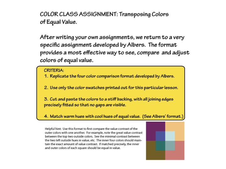
Critiquing the homework – Transpose colors of equal value
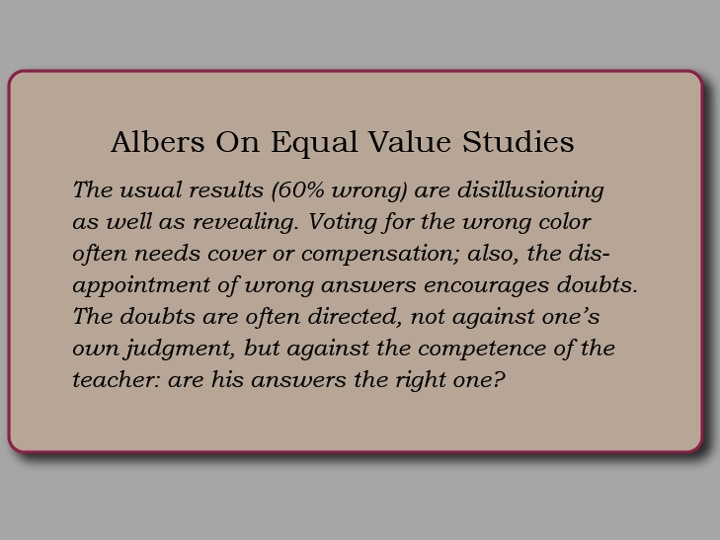
Much of class time was spent sharing the results of this last assignment, and even in a week Dick could tell how much student’s value perception had sharpened. Value is very hard to discern when competing hues are seen together; however this particular format provides a way to compare many colors and values all at once, for which Dick still praises Albers’ ingenuity for designing color exercises.
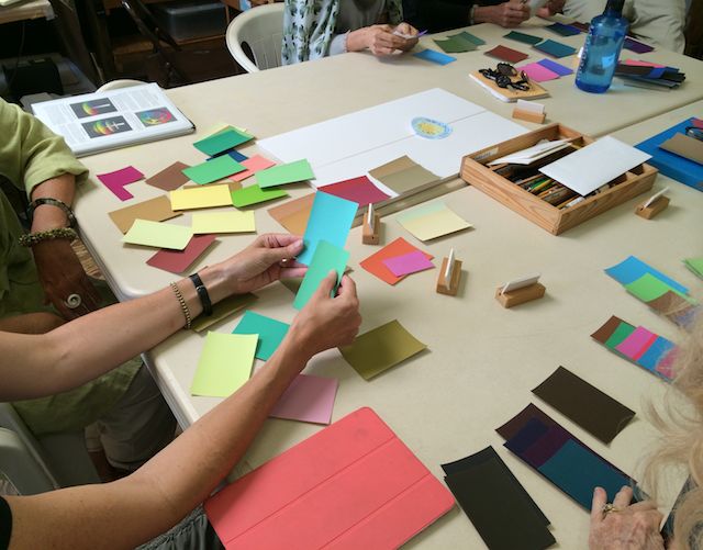
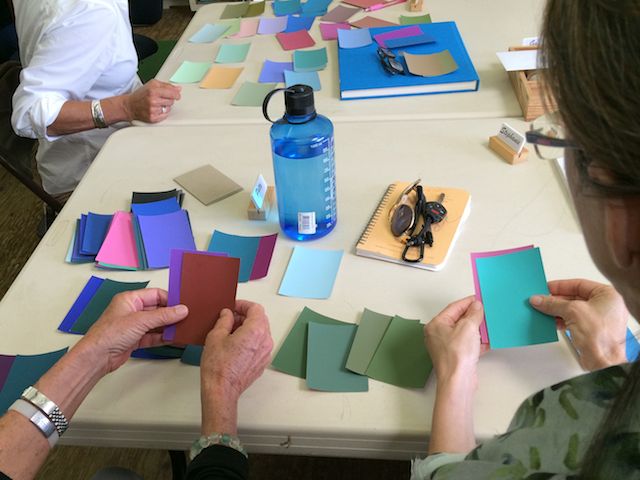
There are also quite a few students trying these assignments in alternate media (Color-Aid paper, pastel, and watercolors), which presents different challenges than the ones encountered in Illustrator. Some of the difficulties arise simply from the nature of the medium itself, and there was a brief discussion on the importance of working with the materials in a way that keeps the focus on the color. Dick mentioned that the only material Albers let his students use was the Color-Aid paper, as it was one way to minimize the distractions inherent in art making. Albers wanted to concentrate on color, not shapes or design or mediums: “Albers had students coming from all different backgrounds – oil painting, pastels, printmaking – so he didn’t want us to get caught up in craftsmanship or subject matter. He wanted [the focus to be on] the direct relationship of color, and that’s why he had his students work with the Color-Aid papers. He didn’t want us to get cute with the design or show how clever we could be [with shapes]: the focus was on color.”
Two ways to create luminosity in artwork: vanishing boundaries and halation
After the critique, we discussed why recognizing value is such an important skill for visual artists to learn: to create luminosity in their art. There are two ways to create luminosity: vanishing boundaries and halation, and when an artist employs both of these effects, the result can be breathtaking. As Dick said: “If there aren’t relationships, things fall apart. And that’s what is so beautiful about nature: everything relates.”
Which is another reason why Dick is confounded by the lack of these effects in his previous students’ artwork; he has taught thousands of students over his lifetime, and yet only a handful of them use these techniques in their work: “I’ve been wrestling with this for years. Why can people understand vanishing boundaries and halation in class, and then they leave class and they don’t use it in their work? How do I prepare you to use this as your own so that you can take this knowledge and find a way to plug it in? How long does it take before it becomes a part of what you’re doing? How many of you will learn to use it as Kit did, and plug it into your own work?”
One student said, “So you’re saying this is a way of making it glow.” She recognized that she’d created this effect in one area of a past painting, but didn’t know how to recreate it. She was eager to get back to the studio and try out some new ideas!
For the last assignment, the challenge is to make these lessons your own, and find ways to combine a halation and vanishing boundaries to create luminosity. Students can make a simple composition of their own, which could be as basic as a single repeating shape; or a ‘Challenge to the Professional’ which would involve re-doing a previous art piece to employ these effects. As we approach the last class, Dick’s ultimate goal is to foster independence: “I want you to make a transition from being in class and having student assignments, to making this knowledge your own. I want to see that you can take these principles and apply them in your own way.”
Dick has this hint for working with your vanishing boundaries assignment:
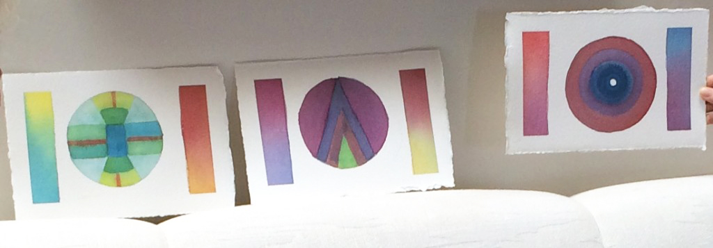
If you are using arrays or matrixes, you need all anchor colors (parents or corners) to be of the same value, or very close.
He made this matrix as an example, and says “Note the color luminosity in this sample matrix which combines both halation and vanishing boundaries.”
(And remember that for true vanishing boundaries, the hues also need to be close!)
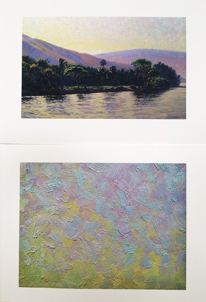
Dick showed one of his own works as an example of using halation and vanishing boundaries to create luminosity. The effect is best seen in both the clouds and the water reflections.
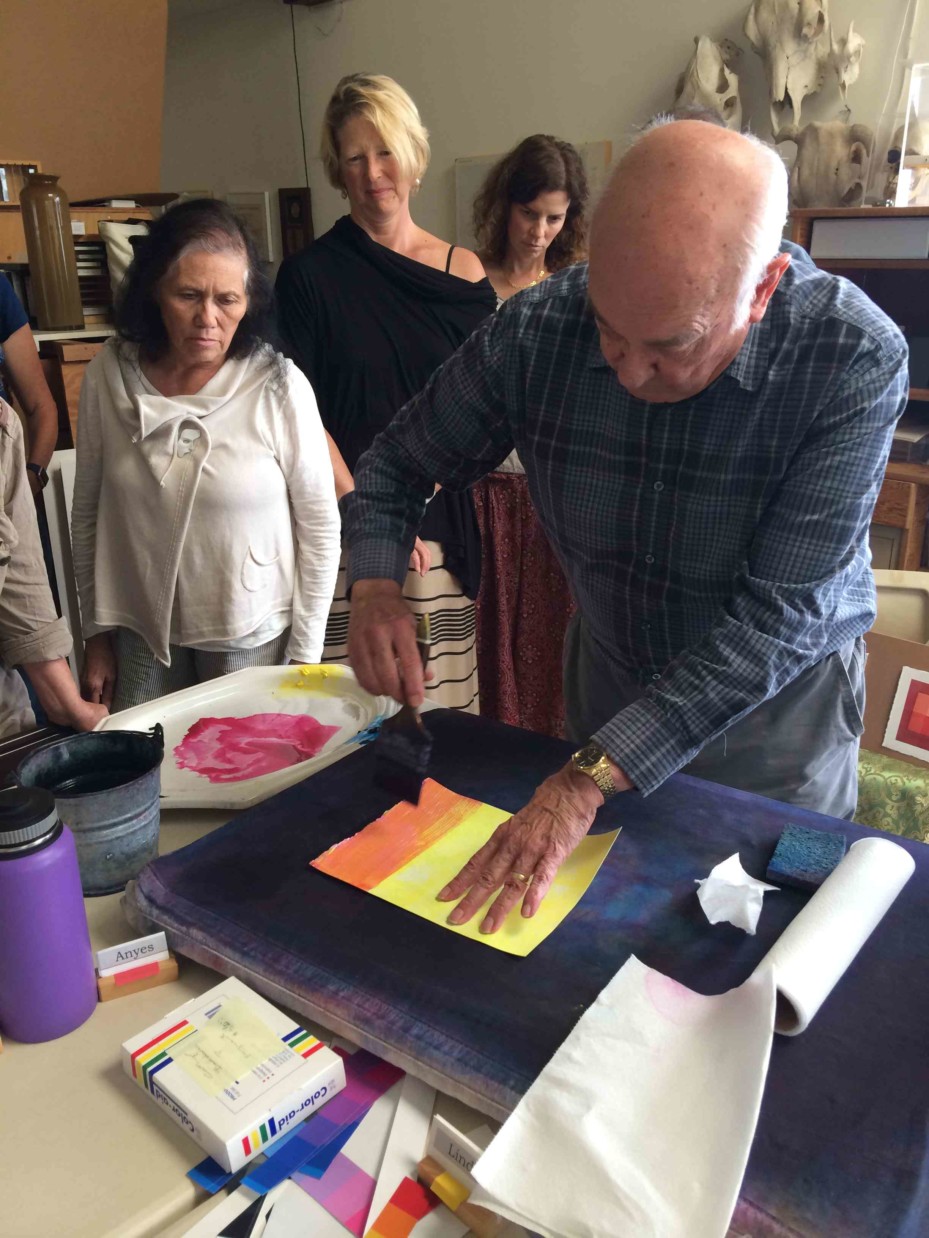
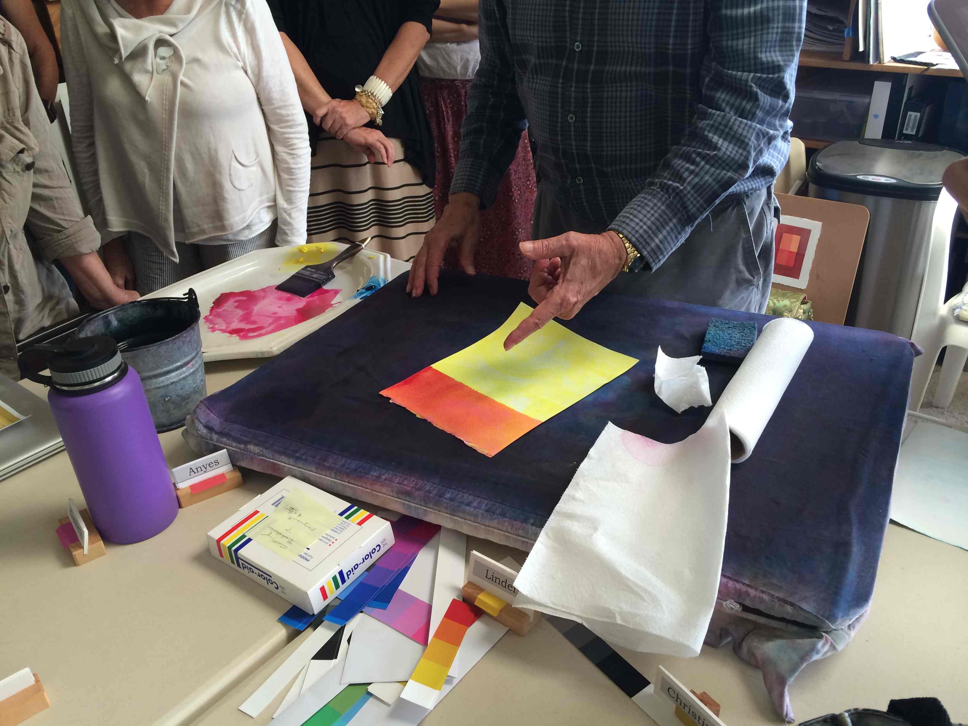
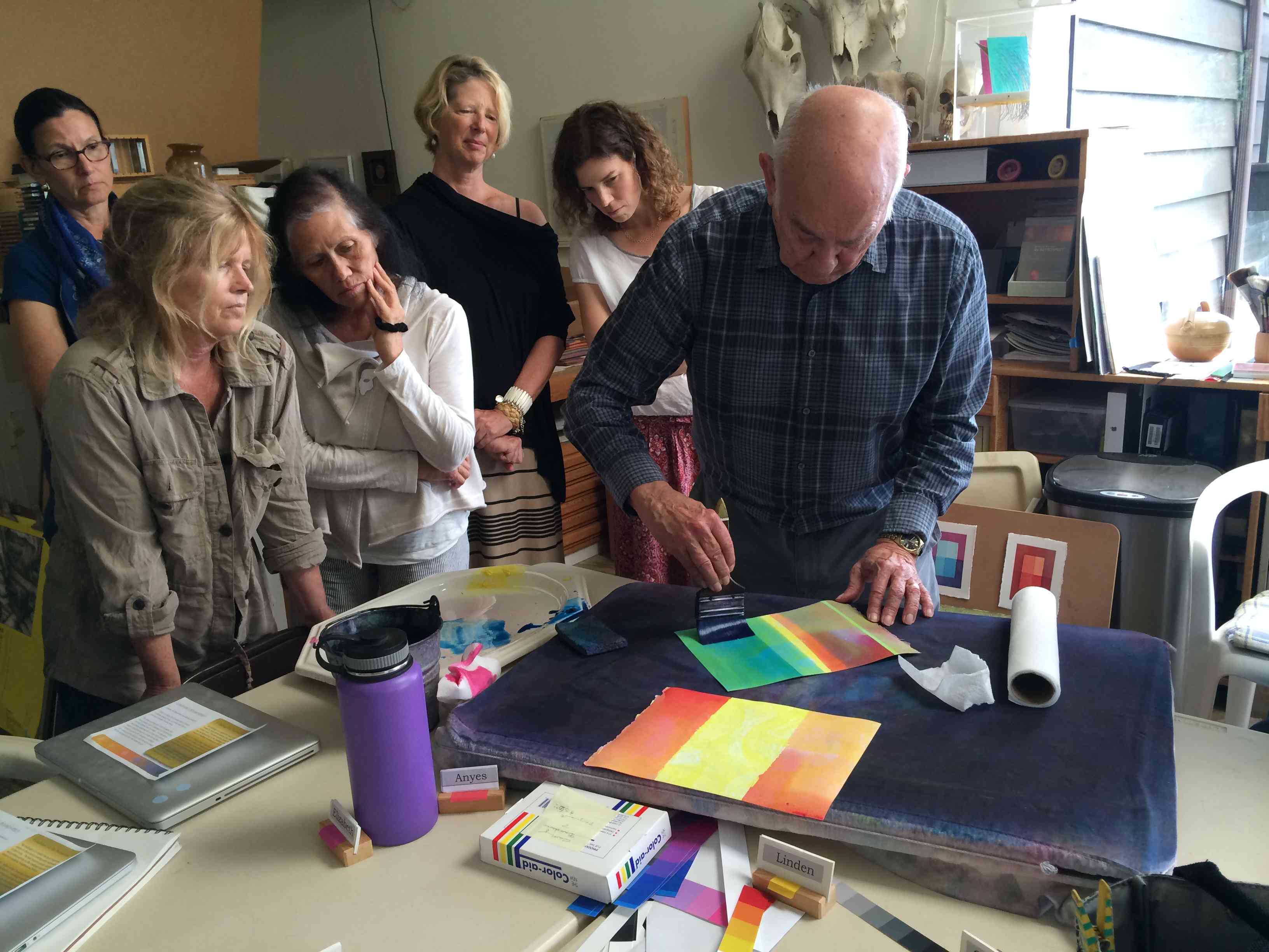
Watercolor demonstration
To finish the class, Dick led a watercolor demonstration which illustrated the amazing effect of vanishing boundaries and halation. Karen described it well in her post from the 2014 Color Relationships 1 class:
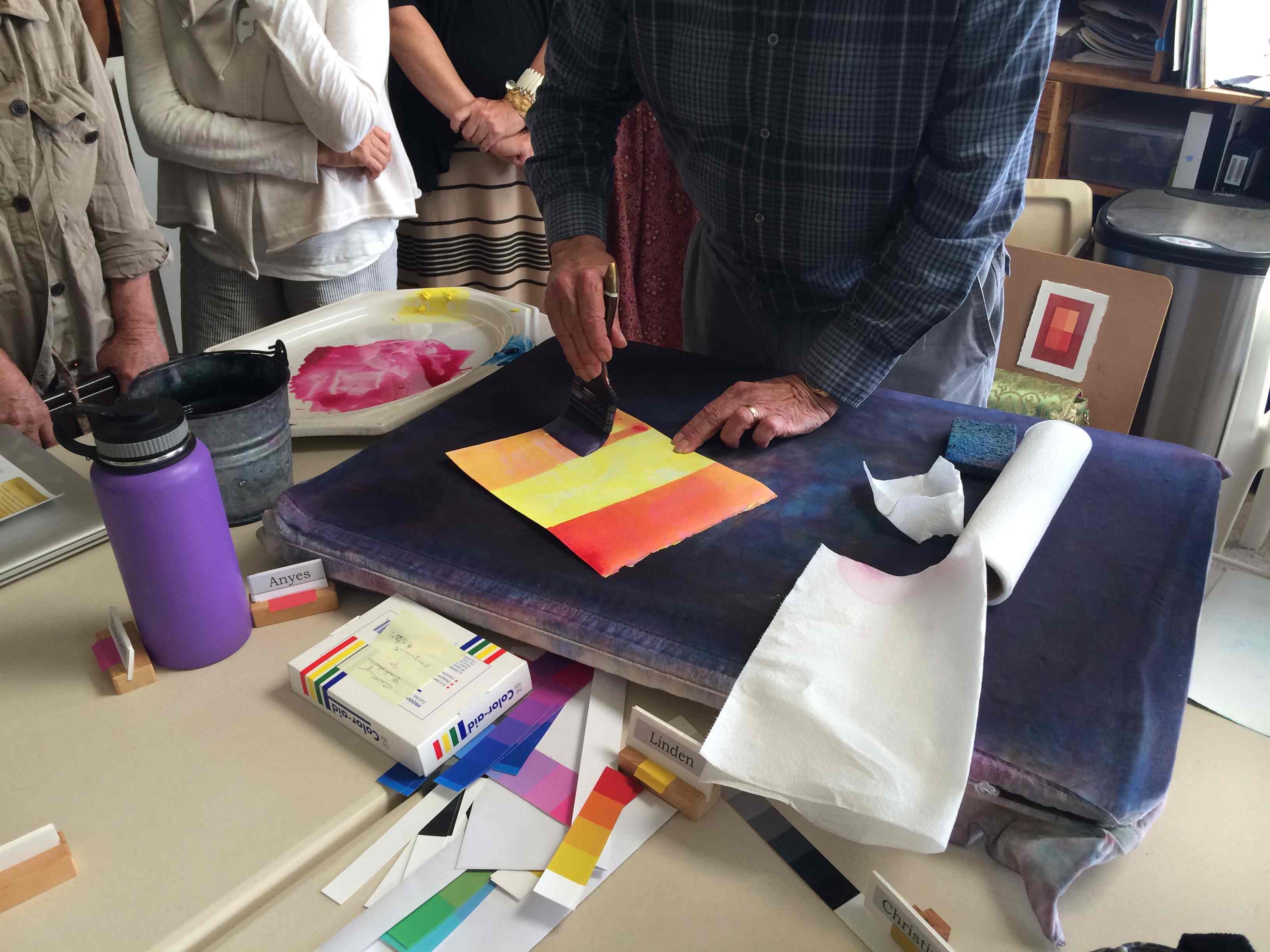
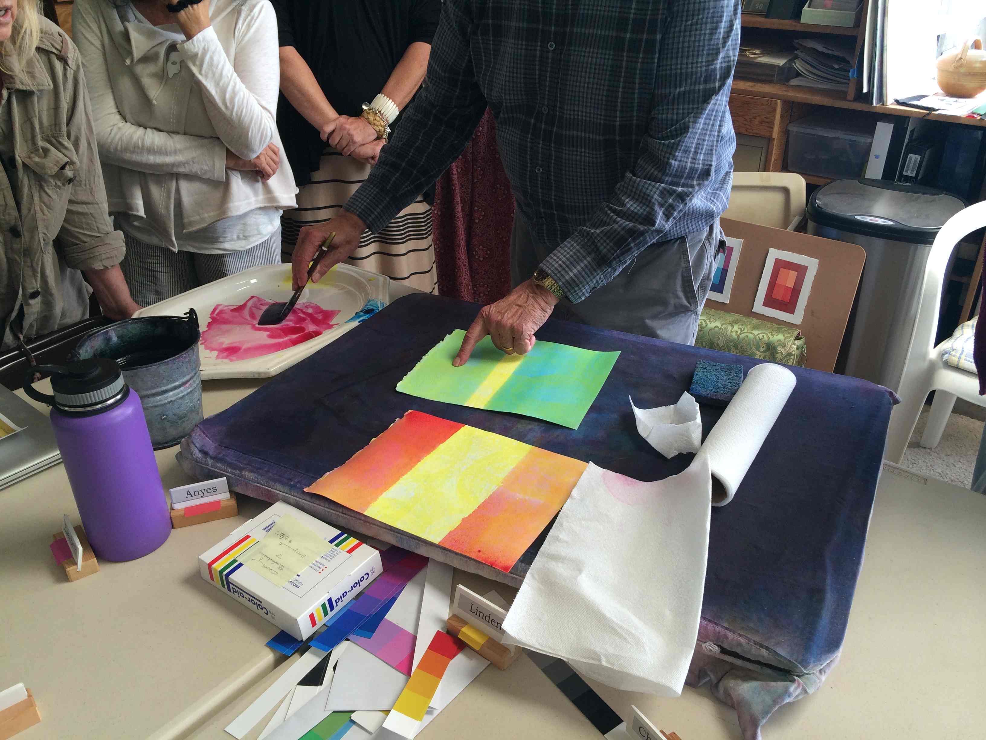
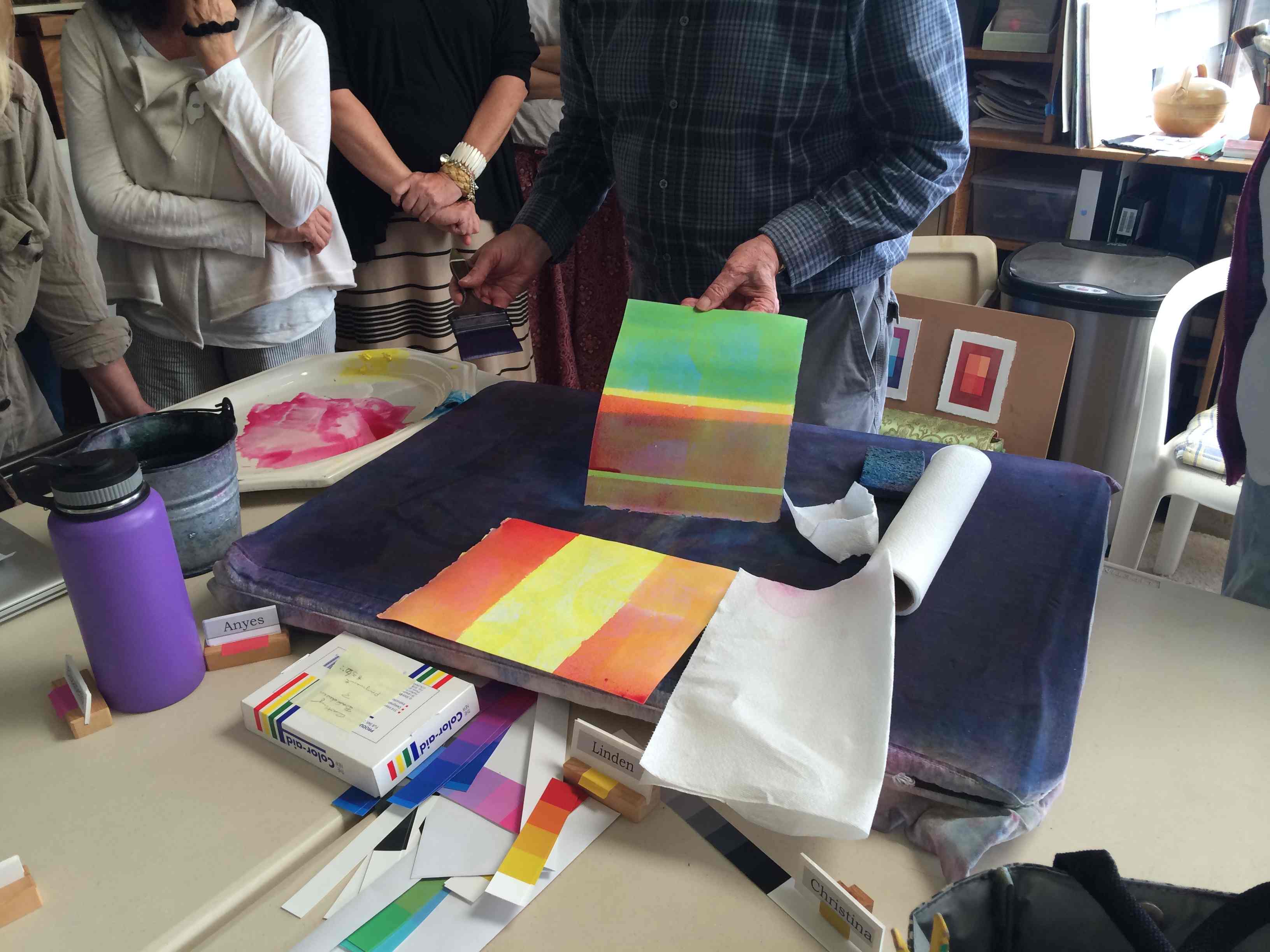
“Dick demonstrated how to achieve equal value, vanishing boundaries, and halation in watercolor. He started with strips of solid and mottled yellow, then laid in stripes of magenta and cyan over it. Because the yellow is so light – so close in value to the white of the paper – neighboring values of cyan and green, and magenta and red, are also nearly identical, creating a luminous, sparkling effect, much more engaging because of the optical mixing than areas of solid color would be. No matter how many further layers are added, this relationship remains.”
Class photos
Students gathered in small groups to share their homework.
One student’s attempt to do the assignment in watercolor.
Two small groups downstairs turned into one larger group to share their discoveries.
Some students have been doing the homework in different mediums other than Adobe Illustrator.
Everyone gathered in the living room for the full class critique.
There are different kinds of challenges experienced when students use different media.
Demo for how one can use Illustrator to practice value matching.
Dick used watercolors to demonstrate the powerful visual effects of luminosity.
Watercolor will continue to darken as you add more layers, so starting with yellow can help you plan your highlights (you can always darken a watercolor, but lightening it is very difficult).
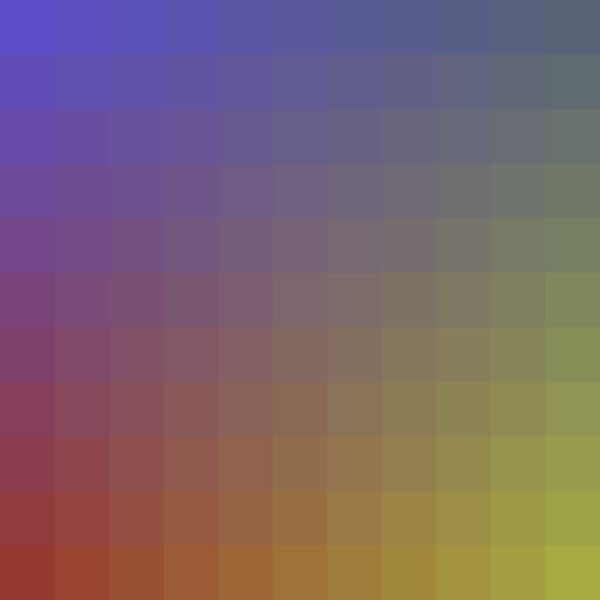
By using just the three primaries, you can achieve a range of colors.
By layering watercolors (a transparent medium), an artist can achieve beautiful color harmonies.
Combining all three primaries leads to spectacular results.
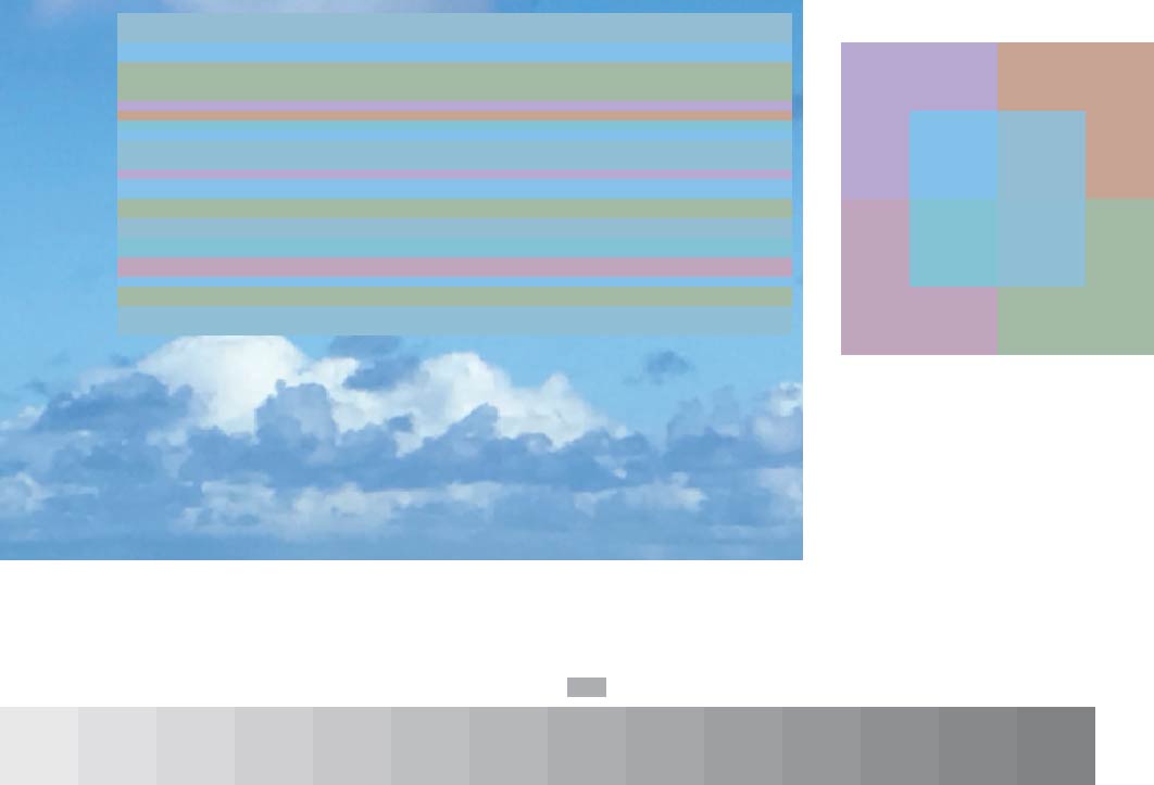
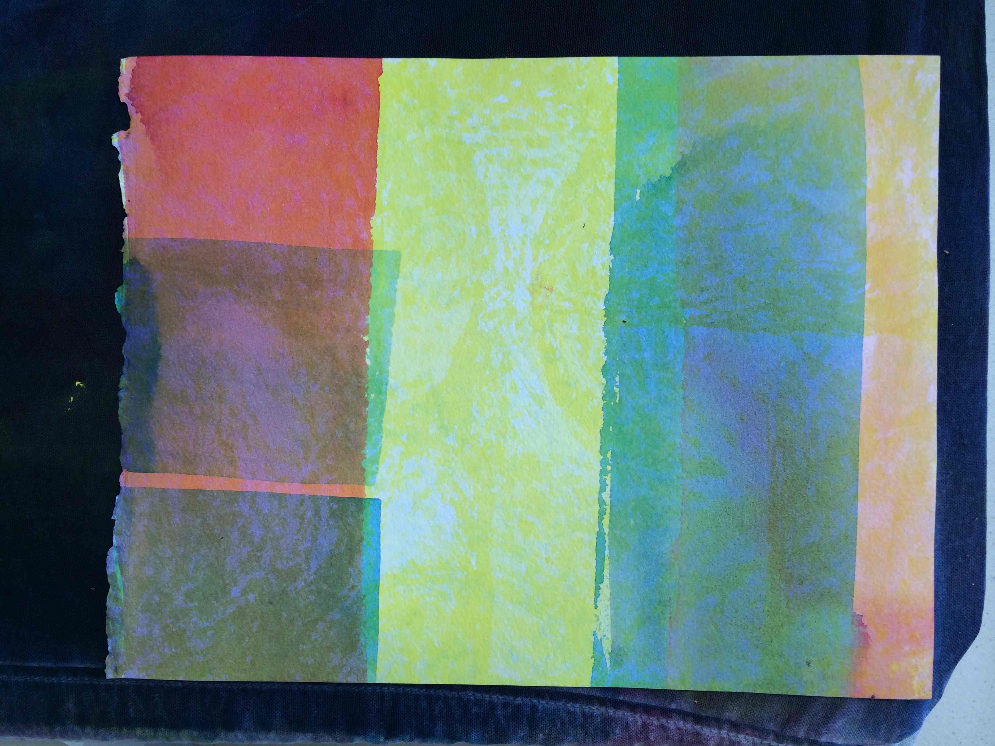
Notice how the thin green line to the left “pops” out of its’ surroundings. This is due to the relationship between neighboring values, hues, and the relative size of the stripes.
Vibrating boundaries begin to occur where colors have different hues yet similar values.
Halation also creates the effect of luminosity (seen here in the middle stripes of red-orange going towards a bluish-purple).
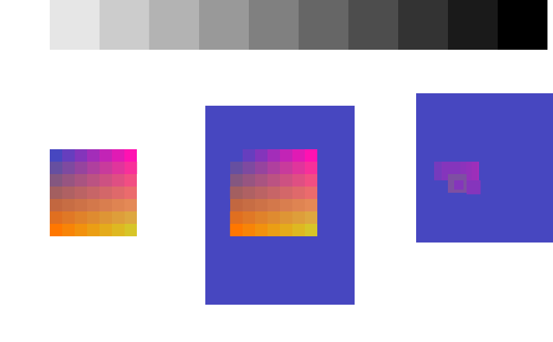
A step-by-step tutorial on building a color matrix in Adobe Illustrator.
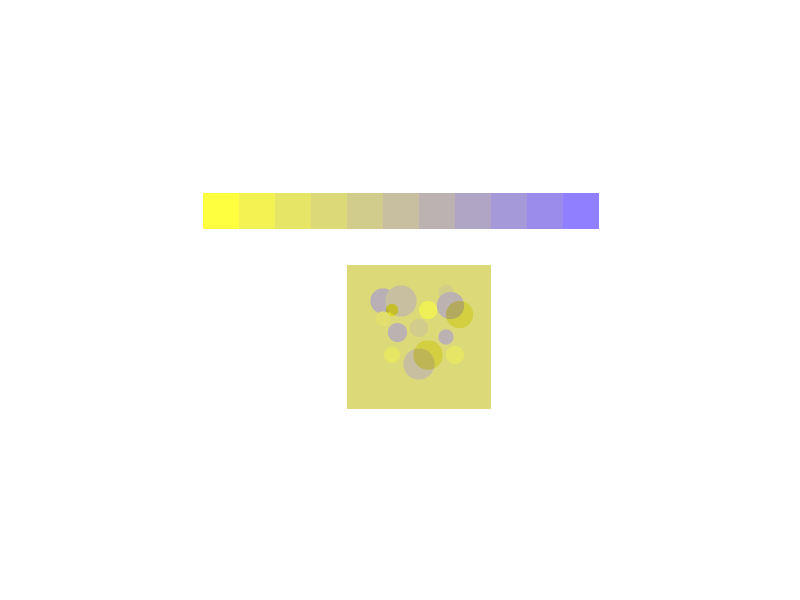
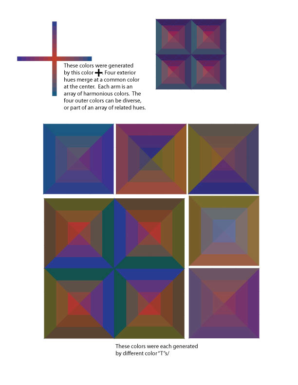
The Color Matrix
Following the ARRAY concept of color relationships, I have expanded Josef Albers’ two-parent relationship to a broader spectrum of color possibilities. The results are startling and a new tool for those who seek color harmony.
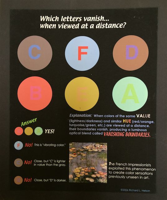
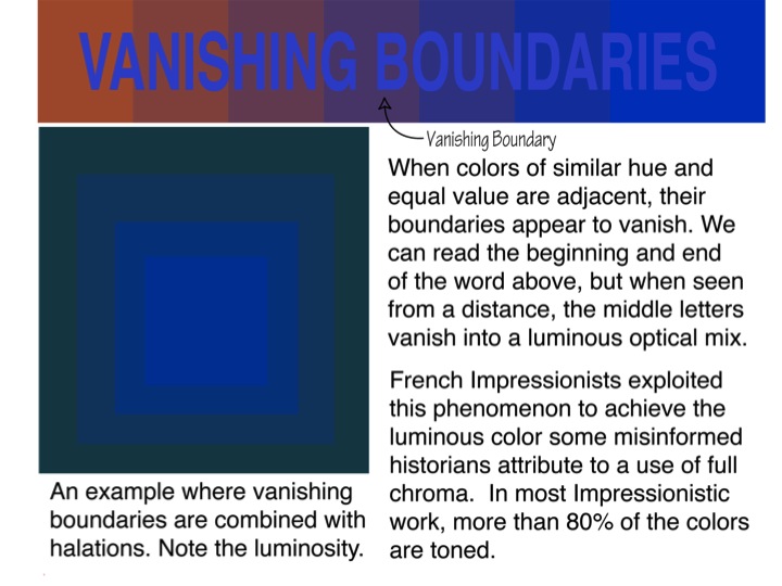
Color Luminosity
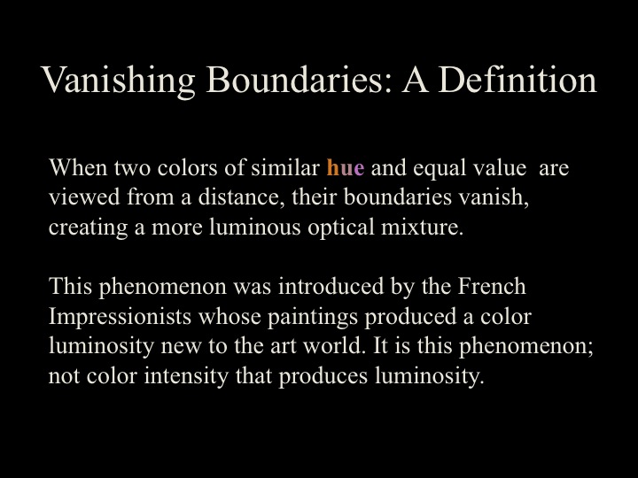
Here are two ways color luminosity can be achieved. This should dispel the notion that the French Impressionists achieved color luminosity by way of full chroma color application. See the truth with your own eyes.
Same post, different year
Read the corresponding class posts from 2014 and 2015.
The third session of the Color Relationships class for Spring 2016 was held on Wednesday, April 20. We shared the results from the previous two homework assignments, discussed and critiqued the many examples in Josef Albers’ book Interaction of Color, and introduced the new assignment, Transposing Colors of Equal Value. This is by far the most difficult exercise in the course, and usually involves many hours of trial and error. See the full post for class materials, photos, and videos to supplement our class time.
The third session of the Color Relationships class for Spring 2016 was held on Wednesday, April 20. We shared the results from the previous two homework assignments, discussed and critiqued the many examples in Josef Albers’ book Interaction of Color, and introduced the new assignment: Transposing Colors of Equal Value. This is by far the most difficult exercise in the course, and usually involves many hours of trial and error. See the full post for class materials, photos, and videos to supplement our class time.
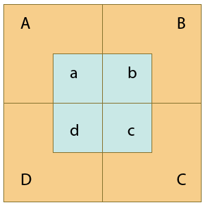
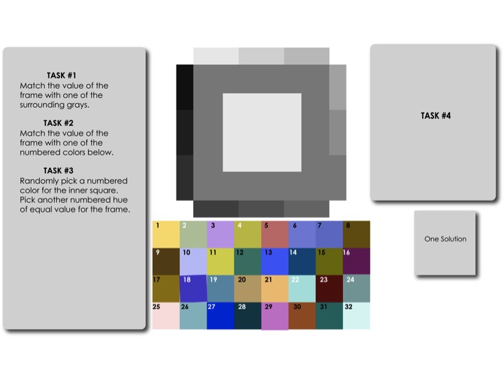
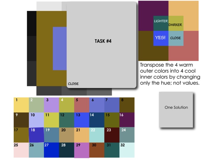
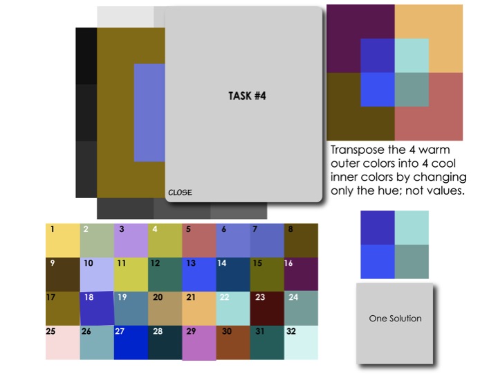
The new assignment is the most difficult one in this course. It is an exercise designed to develop the students’ value discrimination, which is a tricky skill to learn, by matching values between a range of warm and cool hues. Dick praised Albers for the ingenuity of this exercise and the cleverness of the format, by which you can gauge different color values in one piece. “You have four colors on the outside, and four colors on the inside. And Albers uses the term ‘transformation’: that you transform one set of colors into another set of colors, but the transformation is that they are only changed in hue, not in value.”
Dick has adopted his own term for the assignment: “Does anyone know what the term ‘to transpose’ means? If I have three notes and I transpose them, it means the melody is still recognizable, but the key has changed. What you’re doing with color is like changing the key, but the melody has stayed the same. The only thing that’s changed is going from warm to cool colors.”
The assignment is to find equal values between the outer and inner squares, and make sure that the shift from one quadrant to the next is matched in both the warm and cool colors. As this is a very difficult assignment, Dick advises students to expect failure: “Give this exercise a try, but recognize that we do not expect any attempts to be right on target until value discrimination develops by hours of trial and correction. At this time, experience with expected failures should be the mindset, so don’t be discouraged with your early results and their direct flight to the trash bucket. This week is truly trial with a high percentage of failure.”
Vanishing and vibrating boundaries
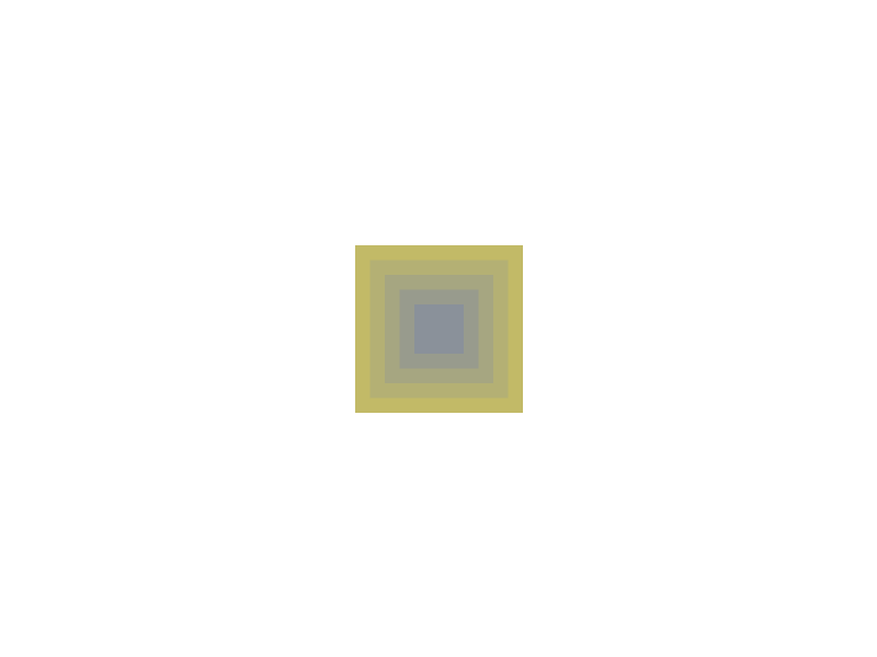
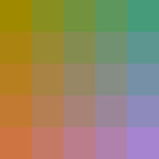
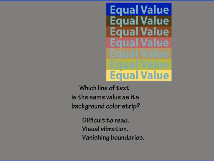
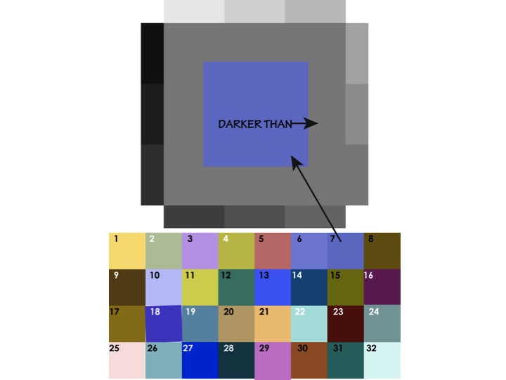
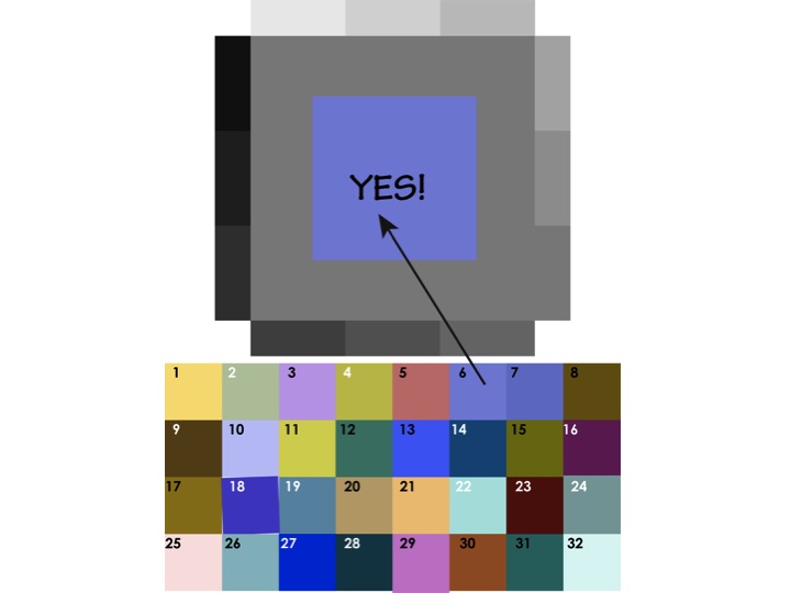
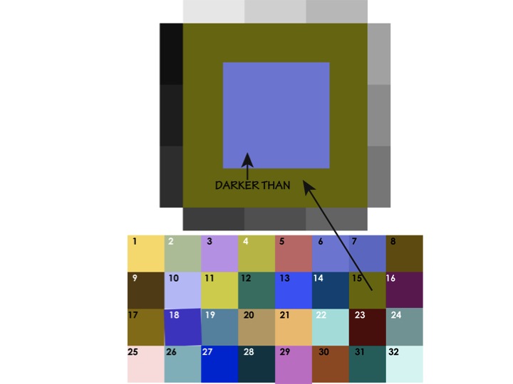
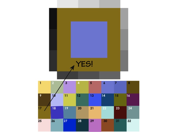
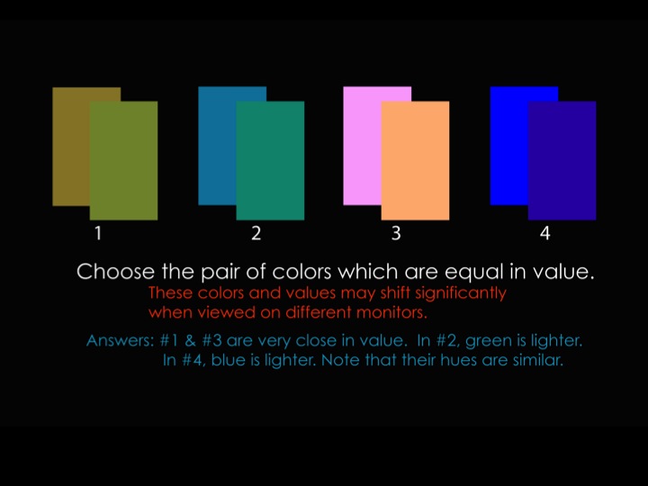
The results of equal value can be seen in two opposing optical illusions: one is vanishing boundaries, and the other is vibrating boundaries. Vanishing boundaries occur between two very similar hues that have matching values (such as light blue and lavender); and vibrating boundaries occur between two very opposed hues with matching values (such as full chroma red and green).
With either illusion, the border between the colors becomes hard to discern, since the eye has trouble separating the hues from their respective values. With colors of similar hues, the boundary appears fuzzy, diffuse, or seems ‘out of focus’; thus, the term vanishing boundaries. With colors in opposing hues, the boundary is hard to pin down because the eye has difficulty in seeing the opposing hues simultaneously, and they might even be irritating to look at. Dick used the example of Christmas posters made by high school students, where the red and green are competing so much that the viewer can’t look at it without feeling that something is wrong with their vision; thus, vibrating boundaries.
Hints for the color transposition / equal value assignment
Here are some additional suggestions for working with this assignment.
Make sure the screen brightness is all the way up (as Gabe recommends for Huedoku)
Try using a gray or black background instead of white, to reduce the competing light level and make it easier to focus on the study
Work for limited periods of time (5, 10, 15; 30 minutes max). When you think you have it, take a break and do something else away from the computer for at least 15 minutes, then take a fresh look.
Use the Albers afterimage trick with a movable swatch.
Squint, or zoom out, or stand some distance from your screen to view the overall effect.
When you think you have it, duplicate the swatch twice and make one a little lighter, one a little darker, and see if either of those is a better value match.
Some of these tips apply only if working in Illustrator, but some should help those working in physical media as well.
Student solutions to last week’s assignments
A single solution for each assignment is shown below, along with the assignment. Follow the links to see all digitally-submitted student solutions.
Even though we did not go over these particular images in class, this slide show demonstrates a very helpful way to practice equal value studies.
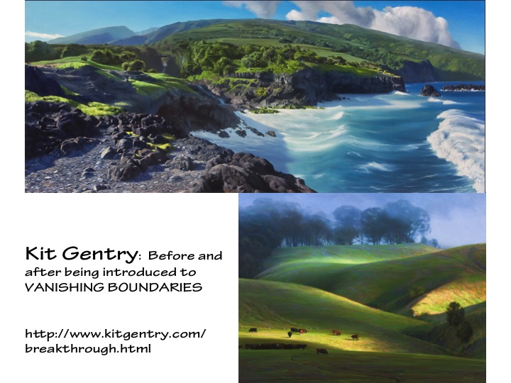
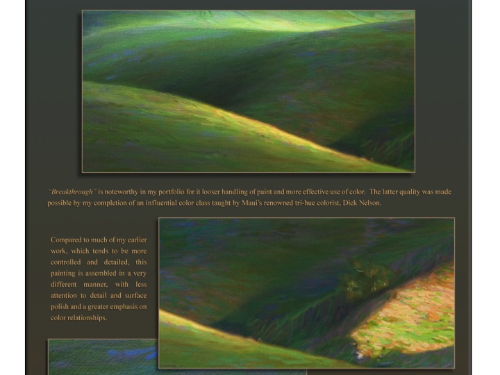
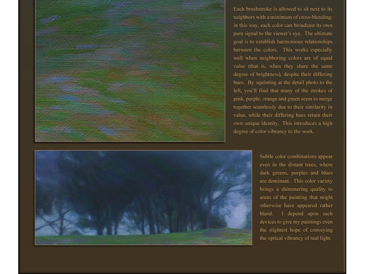
Dick briefly showed two paintings by Kit Gentry, a former student of his. Kit was already an accomplished artist before he took Dick’s class, but was amazed by the color theory that Dick taught. On his website, Kit shows a painting done after learning about equal value and vanishing boundaries, which he titled “Breakthrough” in reference to the revelation he had in understanding how to apply these theories to his work.
Videos
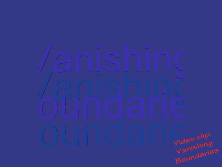
Color Luminosity
Here are two ways color luminosity can be achieved. This should dispel the notion that the French Impressionists achieved color luminosity by way of full chroma color application. See the truth with your own eyes.
Equal Value
The video tutorial below attempts to show and tell how to use the color transformation homework format to compare values. It seems that some colors and values have changed somewhat between what he was working with onscreen and the final result, but if you can overlook that you should still find value (ha-ha, get it?) in watching and listening to it.
Same session, different year
View the corresponding class post from 2014 and 2015.
The fifth session of the Color Relationships 1 class for Summer 2015 was held on Tuesday, August 25th. Our last session for the Color 1 series was a visual delight, from viewing the range of materials and various interpretations of the homework, to our guest speaker Valérie sharing her recent watercolor explorations. We heard a philosophical take on Dick’s theory of teaching and the shared contract of the responsibility for in student/teacher relationship, discussed the value of experimentation, and wrapped up with a delicious “graduation” potluck lunch and an hour of socializing.
The fifth session of the Color Relationships 1 class for Summer 2015 was held on Tuesday, August 25th. Our last session for the series was a visual delight, from viewing the range of materials and various interpretations of the homework, to our guest speaker Valérie sharing her recent watercolor explorations. We heard a philosophical take on Dick’s theory of teaching and the shared contract of responsibility in the student/teacher relationship, discussed the value of experimentation, and wrapped up with a delicious potluck lunch and a fun hour of socializing.
Class overview
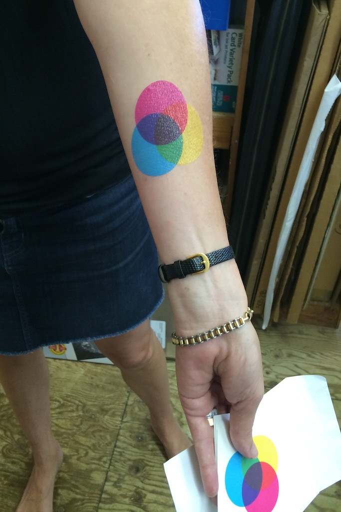
Tattoos and Albers’ legacy
We started off with a surprise: one class member, Lisa, had found such inspiration from this series that she had gotten a brand new tattoo of CMYK color circles! After Dick recovered from his shock, she revealed it was actually a temporary tattoo by Tattly, a company that specializes in temporary tattoos created by designers and artists. While checking out their selection, she found the beautiful CMYK circles and brought one for every class member. It seemed a perfect graduating gift for such an eye-opening series! While these tattoos only last a few days, the knowledge gained in these sessions will be informing everyone’s work for years to come.
Lisa’s brand-new tattoo!
CMYK temporary tattoo fun
After that we introduced our guest speaker for the day, Valérie Richter, who would be presenting her recent watercolor studies that explore luminosity, color relationship, and Dick’s “tri-hue” method of mixing transparent color washes. Before beginning the critique, Dick went through Albers’ book again, pointing out some of the examples and discussing Albers’ influence on his students. Dick talked about the importance of learning to put the lessons together to create the most visually effective work, and finding a way to take what you’ve learned and apply it in new and insightful ways: “[Vanishing boundaries] was Albers’ assignment, and I don’t understand why he didn’t incorporate it into his own work. What we have done in the class has already gone far past what Albers achieved, and so what’s next? It’s his own saying, ‘Learning never ends.’”
When asked if Dick ever considered putting out his own book on color theory, he responded that his videos and his online materials are his contribution to the field. “I made a whole DVD on this, with all the lessons, the tutorials, everything … and it’s great, because you get the interactive aspect, you can hear my voice, and watch the animations; everything’s there. I understand that some people like books and they like turning the pages and all that, but this is the future, folks: technology. And if you don’t accept that, then you’re living in the past.” As Dick explained later in class, it is his goal to ensure that his students become independent thinkers. He does not want us to simply fall in step with what is already accepted, but to push beyond the current boundaries and keep moving forward. What revelations are out there yet to be discovered? We will never find out if we stay within our comfort zones.
Homework critique and examples of vanishing boundaries
We moved upstairs for our homework critique and discussion. Since this assignment allowed for a choice of media, it was exciting to see how students explored the theme of vanishing boundaries within a range of materials. It was a chance for some students to jump into experimenting with how they might integrate these lessons into their own work, which has been a question on many people’s minds. Understanding the concepts is one part of the teachings; figuring out how to apply them to your own work is another challenge entirely.
We started with the students who had brought in non-digital work.
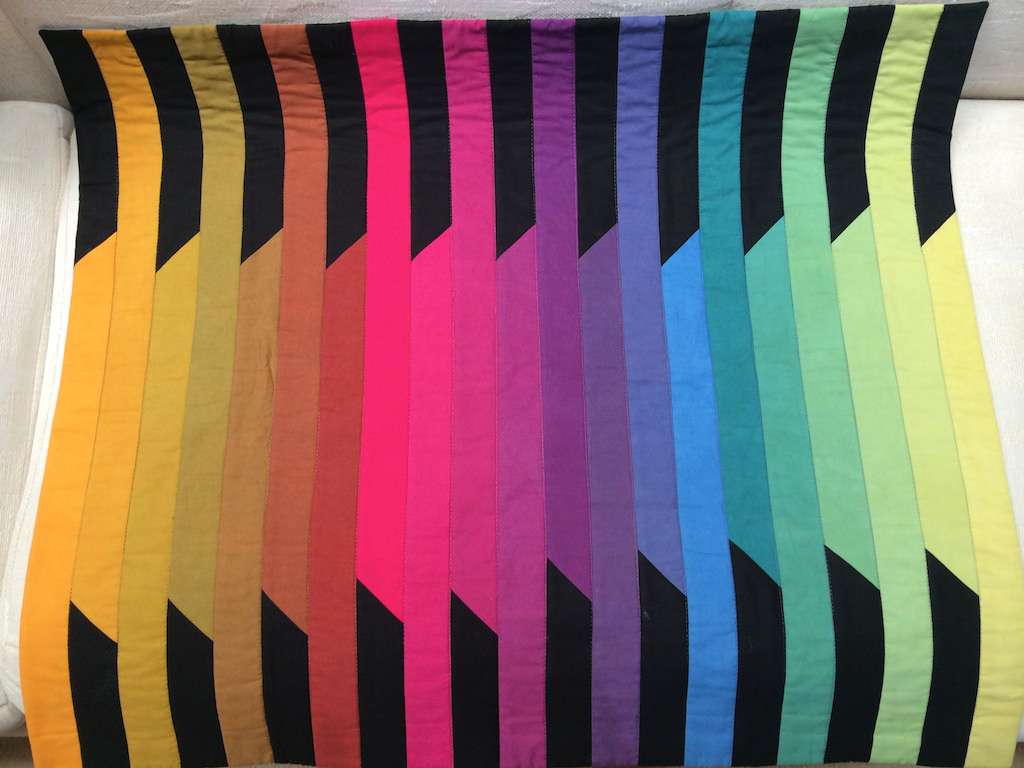
Keri used fabrics and thread as her media of choice:
Keri’s quilt of vanishing boundaries
She also brought in a quilt she recently completed based on a Charley Harper design
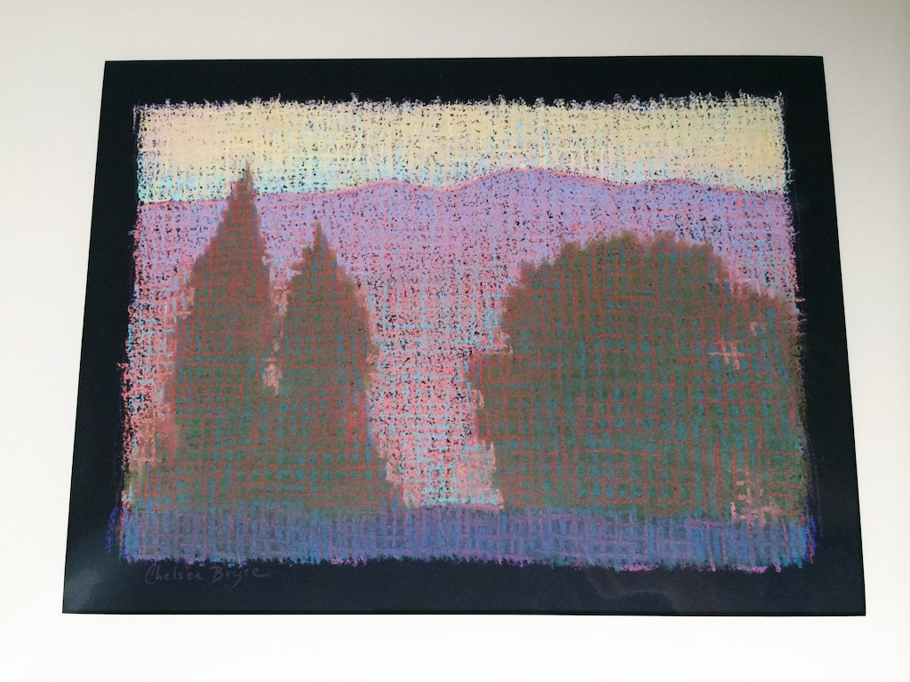
Chelsea used pastels:
An older work done in pastel
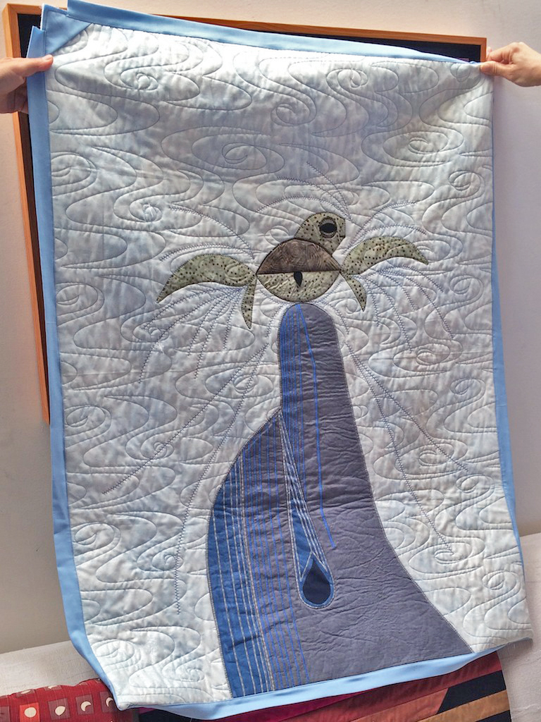
Tracy brought in acrylic paintings and photographs, and a few small studies she was playing with. She also brought in photographs of another artist’s work, and a close-up of the brushstrokes in the image:
An acrylic painting from her water series
Another painting from the water series
An example of another artist employing vanishing boundaries, with a close up of the brushwork
Elizabeth Ann brought a few watercolors studies, and a book (seen on the couch) by another watercolor artist, Mark Adams, as an example of work that inspires her:
Then we viewed the digital examples.
Lisa’s work:
Gail’s work:
Patty’s work: Debra submitted different images which demonstrated her process in approaching the assignment, and also how she might apply the lessons to her own work: Suchi’s work, along with a photograph that she enhanced in Photoshop and used as inspiration for the landscape rendering:
Stephanie’s work, showing how she used one matrix to create two very different compositions:
The goal of the teacher-student relationship
Stephanie also mentioned her appreciation for Dick’s commitment to teaching, which she experienced after she had submitted her initial study. Dick had given her feedback, which at first she felt was a reprimand that she had done something ‘wrong’, but on further reflection realized Dick was communicating that he had not done his job as a teacher. This led to a brief reflection by Dick on the role of the teacher, and the ‘contract’ that is the teacher-student relationship.
“Well, I don’t do you a service at all by giving false praise. My whole mission is to go from a ‘pretty controlled parent’ to ‘total freedom’, and a lot of art teachers like to say ‘Do your thing, man, do your thing.’ No, I don’t agree with that: it’s like asking a baby to survive on its own. The baby is going to die if you don’t feed it, you don’t clothe it; but you also don’t want that baby at 30 years of age living at home and being dependent on you. I believe in taking a student from dependency to independent; and if we, as teachers, make them more dependent on us, then we haven’t done our job. You can’t grade something you can’t teach. You can only measure by what our task was, and so this is a contract, where I’m going to teach you color, and what is your responsibility? And if you don’t do it, then it’s my job to make sure I’m getting through to you.”
He summed up the success of the class by congratulating them on how well they came through on these assignments: “I can’t tell you how much it means when I see how far we’ve come, especially in this last week. It is just so exciting to realize that you can achieve this level of work – ’cause you can’t fake this, and you either get it or you don’t.”
Valérie’s watercolor studies and the importance of cropping
After our coffee break, we were treated to Valérie’s recent undertaking, a commitment to studying color. She is practicing with watercolors, and as a transparent media, they can be very useful in creating color harmony. Dick talked about how one of the obstacles in our way is usually the desire to create something “perfect” or something that we are too attached to: “So often when we get engaged with subject matter, we don’t see what is happening with color and shape … She was at a point where she needed to stop making ‘precious stones’ and start making “stepping stones” to expand her vocabulary in color, and then go back to what she was doing.”
Valérie spoke about her process, the way she layers colors, and spoke about some of the revelations she has had that are changing the way she thinks about and approaches her work. “If you want to learn about colors, you have to drop completely painting ‘something’: just work with colors. And once awhile I think, ‘I’m going to try to do the ocean.’ So I was layering the colors, and I got stuck, and you get stuck because you’re trying to fit into this little thing, instead of having the freedom to just play with all those colors. So when I saw that I was stuck, I threw away the picture, and I thought ‘Just play with it, be bold, and go for it! It’s not precious, and you’re going to mess it up.’ So every time you learn a little something. But you have to let go.”
Her revelations are mental adjustments, or, as Dick would describe them, behavioral changes. As she works with the colors, she is learning all the time, and learning to let the process happen naturally. “You also have to try to focus on one thing at a time, because there are so many: between the harmony, the toning, the vanishing boundaries, the halations – you can’t try to do it all at once. So focus on one aspect at a time, and little by little … But it just takes putting in the hours. You start seeing it when it’s right, like values: before, I thought I had to learn values, and work at it, but as you do it, as you paint, it just comes to your eyes.”
Dick brought out his white ‘L’ guides and demonstrated the value of cropping. “When we do something like these studies, the cropping is very much a part of it, because we are not creating a composition, we are doing studies. These are not works of art, they are more ‘what would happen if?’ So I want to put a couple down and go over them with the cropping tools, and show you how you can hit on a particular color theme or an idea for a piece.” Dick likes to refer to it as the ‘cuisine’ of a piece, similar to a tasty entrée where the chef blends a multitude of flavors, yet keeps the dish balanced. It is about looking at the Gestalt, the play of interaction, and finding the right balance that allows “all voices in the choir to be heard”.
We finished off the class with a couple short segments of video, one from the introduction to the Albers’ app, and another from the juror for the Art Maui 2015 show, to show again the danger of listening to so-called ‘experts’ without questioning their reasoning and using our own intelligence. Then it was time to eat, to mingle, and wrap up another successful graduation of “Color Snobs”!
The fourth session of the Color Relationships 1 class for Summer 2015 was held on Tuesday, August 18th. We critiqued the transposition examples seen in Albers’ book, reviewed the homework submissions, enjoyed a poetry reading, and heard from Kit Gentry about the incredible use of value as it is employed in his paintings. We moved on to our last assignment (an exercise in freedom!), and Dick talked about considering how we might put these color concepts to use in the future.
The fourth session of the Color Relationships 1 class for Summer 2015 was held on Tuesday, August 18th. We critiqued the transposition examples seen in Albers’ book, reviewed the homework submissions, enjoyed a poetry reading, and heard from Kit Gentry about the incredible use of value as it is employed in his paintings. We moved on to our last assignment (an exercise in freedom!), and Dick talked about considering how we might put these color concepts to use in the future.
Class overview
Color examples from The Interaction of Color
We began class by looking over the transposing/transformation samples in Josef Albers’ book, The Interaction of Color. Dick asked the students to view the images objectively, going over them square by square.
Dick: “Of all of the reds which is the darkest?”
Class: “The dark red.”
Dick: “And which is the lightest?”
Class: “The pink.”
Dick: “So of all the contrasts between the squares, which would be the greatest? The one between the dark red and the pink. Now take those colors, and transpose them into blue: shouldn’t that border be the same then? So the strongest [most contrasting] border should be at the same place.”
But Dick also used this example to show that the color transposition was wrong. As Dick realized many years ago, the examples Albers included in his book (which were pulled from his own students’ work) are not accurate, and therefore much of Dick’s teaching is designed to get his students to learn how to discern between true color relationships, and those that are false.
Dick: “Now look at the blue and look at the red, of the ones we’re talking about, the place of greatest contrast. Is the blue lighter or darker?”
Class: “The blue is darker.”
Dick: “And let’s move to the left: is the blue lighter or darker?”
Class: “Its still darker.”
Dick: “Now go across the border between the two top reds; look at the strength of that contrast. Is that maintained between the blue?
Class: “No.”
Dick: “Do you see how that’s softer? It’s not as strong a contrast.”
This discussion is similar to one we had a couple weeks ago, after viewing the video about Albers’ ‘Homage to the Square’, narrated by the curator of a Midwest museum. We are learning that we cannot trust every “expert” that comes along. Dick’s message is that he’s teaching us how to make our own judgments, backed by knowledge and understanding of the rules of color interaction.
But even though the book’s example is incorrect, Dick again praised Albers’ genius in exploring this tricky subject, and inventing such original assignments to teach others about the many facets of color interaction. Dick marveled at Albers’ ingenuity in designing the format for this assignment, so that it both shows multiple value contrasts and gives the viewer the ability to properly gauge them. “That’s what makes this such a damn good format, because it gives you the opportunity to make these comparisons. And so we can check another color in the same way, against its neighbor above or below, and to one side. And ask, does that contrast match?”
He advised the class to continue this exercise after the session ends: “And the fine-tuning of value perception is like a conductor knowing if an instrument is off-key: they can recognize the difference between a note that’s correct, and a note that’s flat. And after awhile, you start to hear it, and then you get finer and finer in your discrimination.”
Poetry and color games
After closing the book, we had a few administrative announcements, and then a special treat: one of our classmates had composed a poem about color! Suchi had been so impressed with the new color revelations she encountered in the first class, she had gone home and later found herself writing a poem about our newly discovered color terms. Dick asked her to read it aloud to the class, which she graciously obliged, and we were all the lucky recipients of a spontaneous poetry reading:
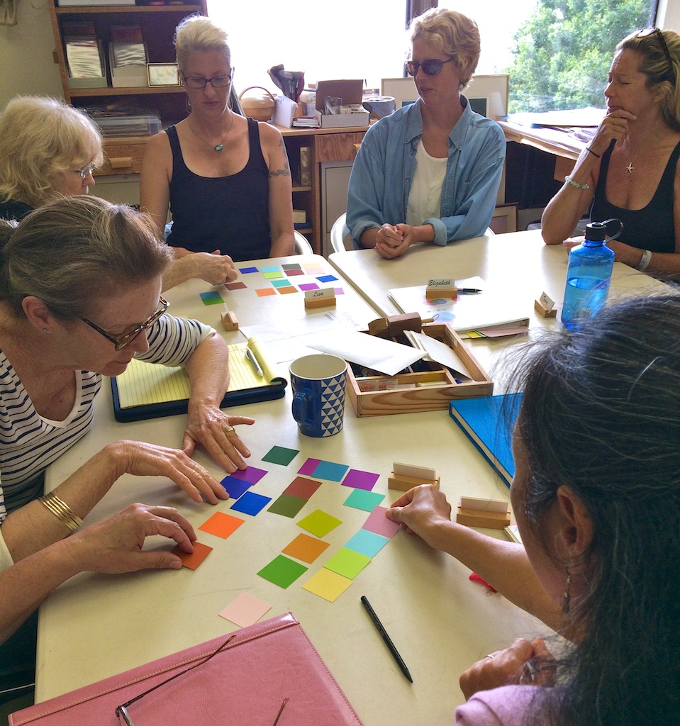
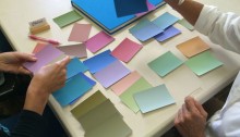
Following that was more fun: another color chip game! This one had the goal of finding two or more matching values from the pile of chips. Dick’s only word of caution was that he had designed this game the night before, and then printed a sheet out on his home printer, only to find that the colors seemed very off from what he was viewing on his screen. He tried it again, and again, and finally gave up trying to perfectly match the screen image. So his instructions made the game even more challenging: “What I’m going to do is put out some color chips, and out of four in a family there will only be two of them which are of equal value. But since the color was off, we really have no idea if we have any of equal value.” Have fun!
But the class was up to the challenge, and found many examples of value matches, which Dick was pleased to see. “Really, I’m very impressed, you have all improved substantially over this past week … your eye for value, as compared to last week, has improved tenfold.”
Color composition with triangles
We then took a moment to look at a composition Dick had placed on the easel in front of the class. “Now, this has been up on the board for weeks, and I’ve been waiting for someone to mention or say anything about this piece, and no one has said a word. What do you see? Everybody stand up and come to [the opposite] side of the room, and tell me: what do you see?”
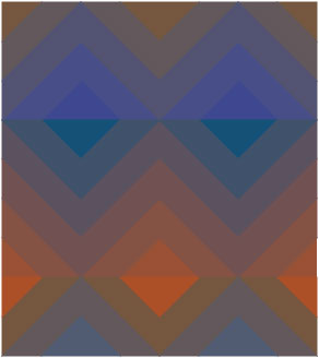
This is not the same pyramid piece we viewed in class, but has the same elements contained in the other piece: vanishing boundaries; halation; and a design that only uses one shape – a triangle.
The class took some time gazing at the piece, and when asked again what they saw, most people commented that they saw a pyramid, or more specifically, what looked to be an optical illusion of a four-sided pyramid. “But now, do you see any halations? Any vanishing boundaries?”
A few people said they did, and Dick asked them to go up and point out the halations. As each person got closer to the piece, they remarked in surprise at some of the triangles they had missed. In fact, the whole composition was constructed from triangles, but most were matching so closely in hue and value that they could hardly be seen from a distance, and are only noticed when up close. This “disappearance” of the triangles from a distance made the colors blend into each other, giving depth and a richness to the piece. There even appeared to be slight movement, as if we were seeing tricks of light and shadow. One student commented: “The longer I look at it, the more comes out to me. It’s really quite something.”
Critique
After our coffee break, we held the critique of last week’s assignment, ‘Transposing colors’. Many students lamented that the images on the screen did not match what they had seen on their monitors, which Dick agreed with. “I was thinking about it last night, all the different translations this image goes through, from your computer, you upload it to the website, to my computer, and now to my t.v. … So just realize that the final result, to hit it right on the button, via the internet and all the translations this color is going through, is near impossible. So I’m not that concerned [with the homework samples], I’m more concerned with whether or not you can see what the values are now, as they appear on the screen.”
So instead of critiquing the homework as it appeared, Dick would instead ask the author to discern which colors appeared lighter or darker on his screen, and which ones they would change to match in border contrast. Once again, Dick was happy to hear the class’ take on what we were seeing, and that even if the homework itself was not an accurate representation, the student’s value perception was right on target.
We followed that with a few short segments from Dick’s DVD, Dimensions of Color: ‘3D Colorwheel’, ‘Color is Relative’, and ‘Color Deception Fun’. [*note: Dick requested that another video be added to this post even though we did not watch in it class, ‘Color Luminosity’. You will find a link to it in the ‘Videos’ section below].
‘3D Color wheel’ we previously viewed on our first day of class, where we were introduced to an animated rendering of a color globe. Seeing the globe again weeks later is a fun way to see how far we’ve come, as students have put to use the terms “tints, tones, and shades”, and also now understand the incredible tools that arrays and matrices are for being able to link colors and get unexpected results.
At the end of the videos, it was time for Dick to dial in our guest for the day, someone whom Dick holds in high regard for his use of color relationships in his work.
Conversation with Kit Gentry
Dick introduced our special guest speaker, Kit Gentry, joining us via Skype from Michigan. Kit is former student of Dick’s, who took the Color Relationships series several years ago, which he credits with revolutionizing his artwork almost immediately. As a professional artist with a strong background in drawing and painting, Kit was able to take the lessons learned in class and incorporate them straight into his work. Dick had asked him to speak with us regarding the use of value in his paintings, which Kit uses masterfully to achieve stunning effects.
”I was drawing and painting for many years, and … [Dick] always marveled that I was able to assimilate the information as quickly as I did into what I was doing. My work changed pretty dramatically pretty quickly, even during the class. I attribute that to the fact that I had been drawing for so long that I had the concepts of value relationships worked out pretty well before I even came to take the class for the first time. So plugging in the color element became relatively simple because I understood value relationships, which I think made a big difference … because this is so much about value relationships and specifically about what you’re talking about today, equal values.”
He spoke about techniques he was incorporating into his recent work:
“In my own work right now, I’ve been focused largely on this idea of ‘the conservation of values’, which is something that you can see on display in many of the painters that we’re all familiar with: John Sargent is an example. These guys were trying to limit the value range of their paintings to only about 5 to 9 steps, which seems really, really limited. And it is, but what it recognizes is that paintings cannot have the full range of value that we would see in nature: say, the brightness of the sun to the darkest shadow, where there is absolutely no light at all. We can’t really get that in our paintings, so you have to figure out a way to make it work with fewer value steps available.
“For our purposes, its necessary to simplify and say “Ok, all the little things that are happening in that value area – say a shadow, or maybe a light area – you’re compressing the value range in there. And to show the subtle distinctions in there, you’re using changes in hue, instead of changes in value. So you can have an almost unlimited amount of stuff happening in a shadow as long as all the things you add into that shadow are of the same value. And that’s the sort of thing that you would see happening in my more recent work.”
Dick also asked Kit to talk about his discovery of “viewing distance”, and what he was working on in relation to that:
“What I really want my paintings to be able to do is be continually interesting to view from different distances. So when you come into a gallery and you see that thing across the room, you want that thing to reach out and grab you, and to be interesting to compel you to come up close. And what I want is that you can go up close to the work, and find it just as fascinating there, at that range, but for different reasons. At that point you’re viewing all of these, really millions, of these little color interactions, and those interactions need to be so beautiful that you find reason to stand there at close range as much as you need to view it from across the room. But it is a very different experience; the painting comes across very differently at close range than across the room.”
Free color studies
We thanked Kit for his time spent with us sharing his work and his insight, and Dick invited him to sit in for the rest of the class, as we went over our last assignment for the series.
This assignment turned out to be completely different from any of the other ones we have had thus far. It is a slight variation on something that Albers used to assign his students, which he referred to as “free studies”. For Albers, it was a way for students to take a break from the rigorous structure of his traditional color exercises, and explore the interaction of color in a looser and more personal way. In Albers’ own words: “… after such systematic exercises, a need for independent work arises, and free studies are encouraged. With them one may play with colors as one pleases…”
For our studies, the “free” part of the work is in content and design, and also materials, so students are encouraged to use whichever materials appeal to them. The only constraints are to create a composition that incorporates vanishing boundaries and halations. “If you like to do digital work on the computer, you can use that; you can do paper inlay; you can paint or use pastels: whatever is your ‘cup of tea’. The only criteria being that you inject vanishing boundaries, and halation, hopefully.”
Dick showed a couple of examples of sketches he has done on his iPad, utilizing arrays and matrices. Again he went over the requirements needed to have successful vanishing boundaries: “And if you look at this, I think you can clearly see, that the colors are different but equal in value: those are vanishing boundaries. They will be most successful when you put colors that are very similar together, rather than different. I would prefer that you choose colors that are very close in hue, a composition in which vanishing boundaries will occur.”
And Dick stressed that he didn’t want to see anything fancy or “cute”, as he is not interested in seeing shapes. Instead, he wants the shapes to disappear through color interaction, to let the play happen between ground and figure, object and viewer. “I think that one of the things that was so profound in working with Albers, is that he didn’t try to tell you ‘Look how clever I am with shapes’. He wanted you to experience color. So if the first thing I see is shape, then I know we are on the wrong track. Don’t be cute with it, you can have all the fancy shapes you want, but it will be a lot of time spent in vain, because I’m not going to be looking for it. I’m going to be looking for vanishing boundaries and halation. So consequently, shapes shouldn’t even really be seen, although they’re there.”
The reason for a free study as the last assignment has implications that go beyond our classroom: “I want you to make a transition from being in class and having student assignments, to making this knowledge your own. I want to see that you can take these principles and apply them in your own way.”
It is something that Dick admits he has struggled with throughout his teaching career, and he wonders what is missing that would allow students to take these lessons and incorporate them into their artwork. “I’ve been wrestling with this for years, is why can people understand vanishing boundaries in class, and then they leave class and it never again surfaces in their work? How do I prepare you to use this as your own – whether you’re an interior designer, or a painter, or a ceramicist, or whatever – so that you can take this knowledge and find a way to plug it in? How long does it take before it becomes a part of what you’re doing? How many of you will learn to use it as Kit did, and plug it into your own work?“
He cautioned that not stretching yourself as an artist, and not finding a way to play with these concepts, will keep you stuck at the same level as when you came in. “We all slide back to our comfort zone, and that’s your death knell … ‘One of these days I’ll do it, one of these days …’ So ask yourself: how might I address this issue? And if you can begin to bridge that gap … then maybe we can make a breakthrough there.”
One last tip for this week’s homework, something Dick repeats often: “Stepping stones; if you fill your pockets with precious stones, you’ll never cross the river. Stepping stones …”
Homework assignment
ASSIGNMENT: Vanishing Boundaries
1. Begin with an observation of nature to find evidence of vanishing boundaries. Record these findings with digital photographs, or a sketch, or however you can.
2. Look at artwork of your own and others for similar identification of vanishing boundaries (bring examples to class if possible).
3. Create a color study (or studies) that demonstrates use of EQUAL VALUE, primarily in the form of creating VANISHING BOUNDARIES. You get to choose the format and the materials, as long as you stay focused on color.
The criteria: to incorporate VANISHING BOUNDARIES first, and hopefully HALATION as well.
The subject matter can range from a simple shape of one color on a ground of equal value and closeness in hue, to many colors in a variety of shapes. The important thing to remember is that COLOR is the primary focus of the assignment, and shape is secondary. Shape should not be the first thing the viewer notices; in fact, the boundaries around shapes should “disappear” due to color interaction (think of Dick’s triangles that we viewed in class, and the way many of the triangles were hardly seen until pointed out).
These studies can take be done in a variety of materials, ranging from inlaid paper or magazine collage, to digital work, to painting or pastels – this gets to be your “cup of tea”! The main concern is to find a personal format that incorporates arrays and/or matrix format as a source for your colors.
An animated building of a 3D color wheel with identifying text. The full dimension of color relationships can be viewed in this animated movie. This is part of Dick Nelson’s DVD “Dimensions of Color”, used as his teaching device for the serious student of color. Having studied with the 20th Century master of color Josef Albers at Yale, Dick has incorporated many lessons from his mentor and added some of his own color revelations.
We perceive the hue and value of colors according to their surroundings. This video demonstrates just how relative color is and provides an explanation.
Here are two ways color luminosity can be achieved. This should dispel the notion that the French Impressionists achieved color luminosity by way of full chroma color application. See with the truth with your own eyes.
The third session of the Color Relationships 1 class for Summer 2015 was held on Tuesday, August 11th. We heard from participants about their latest experiences with color, critiqued the last two assignments, and moved on to explore a new facet of color interaction: equal value. This was a favored trick of the Impressionist painters, and when properly utilized can manifest the most beautiful and luminous fields of color. But matching value is much more challenging than it seems! It is truly the mark of a skilled colorist, one who can control their value selection as much as their choice of hues.
The third session of the Color Relationships 1 class for Summer 2015 was held on Tuesday, August 11th. We heard from participants about their latest experiences with color, critiqued the last two assignments, and moved on to explore a new facet of color interaction: equal value. This was a favored trick of the Impressionist painters, and when properly utilized can manifest the most beautiful and luminous fields of color. But matching value is much more challenging than it seems! It is truly the mark of a skilled colorist, one who can control their value selection as much as their choice of hues.
Class overview
Sharing enthusiasm for color theory
The class began with a call for reflection, as Dick and Holly asked for class feedback and wanted to know how students were feeling about the course. Dick wanted to know how this information was affecting people, and if they were as enthused about it as much as he is. He reflected on his time as a graduate student, and the excitement he felt when he studied with Albers. He hopes he is still expressing his excitement about this subject in a tangible way that students can share with him.
Everyone commented on how amazing this new way of thinking about color has been for them. Individuals talked about seeing color differently in their everyday lives, and how vivid things seem to be now. One student spoke of playing with arrays based on what she sees outside her window, as the weather and time of day changes. Another student described her experience as: “I mean, it’s mind-blowing. It’s just totally mind-blowing to think about color in such a different way.”
A couple participants mentioned still being a bit shocked by learning about this new color wheel, and thinking about the way these colors interact is so new to them that it can sometimes be a bit overwhelming (not to mention staring at a computer screen of color swatches for hours on end!). One student commented that it is still hard for her to see where this is going, and wanted to know how she will apply this information to her work. Dick said, “Oh, you want to know where this is going? Well, I can’t give you that, I can’t give you the answer! It’s called ‘delayed closure’.” Ah, yes, his preferred method of teaching!
Creating color matrices in Illustrator
We then switched to an Illustrator demo, with Dick teaching the class how to create full, four-sided color matrices. He relayed the story of how he came up with this idea, while traveling back to Maui after teaching a workshop: “And on that flight home, I thought, ‘Well, what would happen if yellow married cyan, and then married blue, or any other color? What would happen if cyan then married another color?’ What would happen if …? So I went home and created a matrix.”
Following the ARRAY concept of color relationships, I have expanded Josef Albers’ two-parent relationship to a broader spectrum of color possibilities. The results are startling and a new tool for those who seek color harmony.
He mentioned the benefit of coming up with color matrixes for fun: “And for me, this is where this course can do wonders for people who tend to get stuck with the same palette. I would never think to use some of these colors, but the array can show me some of those magical things, not to mention the luminosity … and again: they’re all related.“ It all comes back to relationship!
Homework critiques
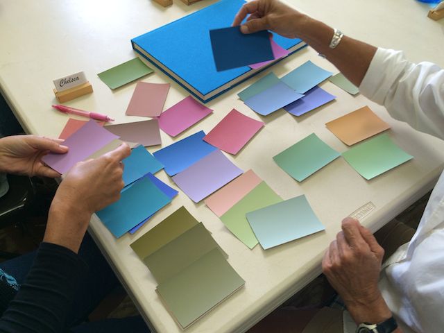
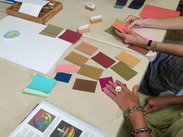
We moved on to the homework critiques, and Dick made special mention of Chelsea’s work, since she is still using ColorAid paper, and the skill she is utilizing to pick her arrays is quite admirable. Unlike playing around on Illustrator, Chelsea has to work at a slower pace, shifting through colors one at a time, and she can’t switch parents or change a family nearly as fast as you can with an ‘eyedropper tool’ on the computer. But she is developing an eye for reading the subtle notes in a color, by taking random color chips and learning to see their ‘ancestry’ (i.e., knowing who the ‘parents colors’ are).
Of course, Illustrator isn’t completely perfect either, and has its own drawbacks to consider, such as the algorithm that calculates the array doesn’t always mimic what would happen in real life. When using the program, you still have to be diligent and check your arrays for consistency. If the array is off, it will be much harder to create the illusion of color change.
“Why can’t I use two very dominant parents [as my ground] color in this assignment (‘Make 3 colors look like 2’)? Because you can’t have that great of a difference in the backgrounds.”
The importance of checking your arrays for consistent steps, no matter if you are using Illustrator or the medium of your choice:
“The first thing I want you to do is look at one of the parents. The second thing is look at the first child in; I should begin to see a clue that it is moving toward the other parent. And if it gets darker, or lighter, I should see that reflected in the other parent … I want you to train your own vision enough to recognize the process I’m going through right now: in a child color, I should see some glow of the opposite parent, and if I don’t, this should tell us that something is wrong here. And at that stage, what should we do? Try a different parent.”
Looking for those color interactions that offer up delightful surprises:
“When you take colors which are more opposite on the color wheel, then things will happen that are not as easily predictable … In other words, the two parents will provide for a surprise kind of interaction, things that are not kind of basic; or kindergarten, so to speak. It’s like French cuisine, there are flavors which I would generally not normally suggest; and now in a color scheme.”
And he congratulated the class on how far the group’s color perception has come in only two weeks:
“Go back a week ago, when the assignment was to make one color two different colors … and now, look at that. That’s sensational. How far we’ve come in one week, to pull off that deception. I don’t think a couple weeks ago, you would have believed possible that you could get a colored strip to look that different … but you really pulled it off.”
Equal value and transposing colors
Interestingly enough, many of the homework samples were done with parents of very similar values, which turned out to be the new lesson for this week: equal value. In a few of the homework examples, the class had noticed it was hard to see the inner shapes in crisp detail, and the edges of the shape seemed “fuzzy”, or out of focus.
It turns out this fuzziness is the product of two colors that are matching in value, the aptly named “vanishing boundary” effect. If two colors have matching values, the edge of their shape visually blends with the other one, “as though you’re having eye trouble”, as one student put it.
Dick took the class through another Illustrator demo, this one a game to teach how to identify matching values. There was a large square, surrounded by a thin gray scale; a smaller square inside the larger one; and a different assortment of color chips below. The instructions asked for the students to match the value of the large square to the small square, and offered a series of steps to learn how to gauge the value. The game proved challenging, especially with the size of the small color chips! But it did go to show how difficult it is for our eyes to go past hue and truly discern proper values.
Transposing colors
After playing the game for a bit, we went over this week’s homework assignment of transposing colors. Dick praised Albers for the ingenuity of this exercise and the cleverness of the format, by which you can gauge many different color values in one piece. “You have four colors on the outside, and four colors on the inside. And Albers uses the term ‘transformation’: that you transform one set of colors for another set of colors, but the transformation is that they are only changed in hue, not in value.”
Dick has also adopted his own term. “Instead of using Albers’ term ‘transforming’ color, I prefer something that happens in music, to ‘transpose’. What you’re doing with color is like changing the key, but the intervals between the notes stay the same. It’s the same melody on the inside as on the outside; the only thing that’s changed is that it’s gone from warm to cool colors in the center.”
Matching values with ColorAid chips
We ended the class with one more exercise, matching up paper color chips by value. Dick placed a stack of random ColorAid chips on the table, and had teams of two students compare colors. When a team felt they had a good match, Dick would hold up the two colors and ask for the class opinion.
Once again, harder than it seems! Matching up values is a learned trait, and often our prejudices about color confuse our estimation of value. The same as being able to name a color’s ‘ingredients’, Dick says that instant value recognition is a quality you can teach yourself to be good at, but only by spending hours looking at colors! And he promised the students would have plenty of experience with that this week, in their attempts to complete this unique assignment.
Dick warns that this is a very difficult assignment: “Give this exercise a try, but recognize that we do not expect any attempts to be right on target until value discrimination develops by hours of trial and correction. At this time, experience with expected failures should be the mindset, so don’t be discouraged with your early results and their direct flight to the trash bucket. This week is truly trial with high percentage of failure.”
A step-by-step tutorial on building a color matrix in Adobe Illustrator.
Class materials
Slide presentation: Equal value and vanishing boundaries
Vanishing boundaries and luminosity
Vanishing boundaries are a special case of equal value. Vanishing boundaries occur between two colors having similar hue and equal value. The optical mixing perceived by the eye results in a more luminous effect than if the colors had been mixed on the palette, and this is the secret of Impressionist painting. Kit Gentry is an artist who, after taking Dick’s class, masterfully applies this approach in his work.

 The current issue of On Maui! magazine features an article on Dick and the upcoming show. Read it for an engaging introduction to the artists and what to look for in the show. Pick up a print copy at numerous locations around Maui, or read it online (November/December 2019 issue, pages 22-25).