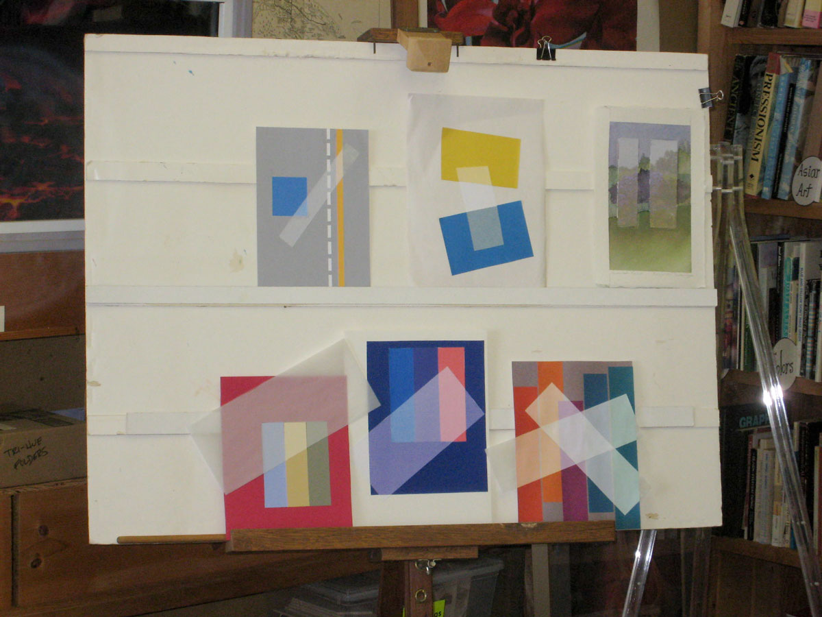
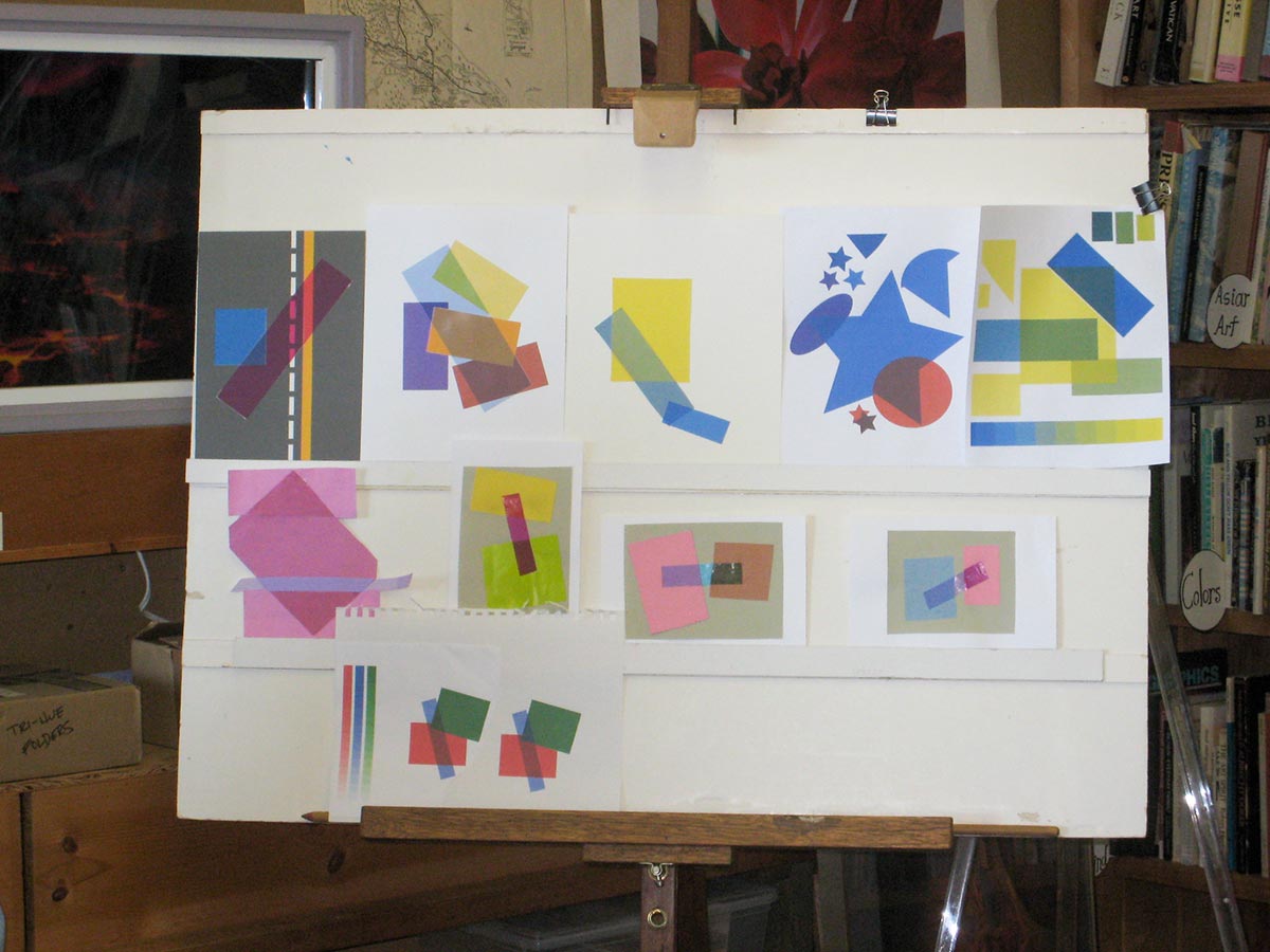
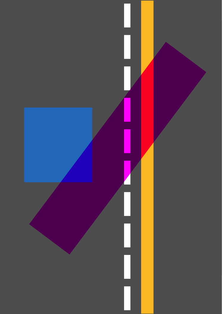
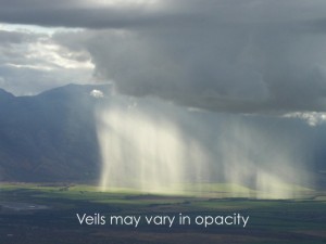
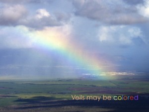
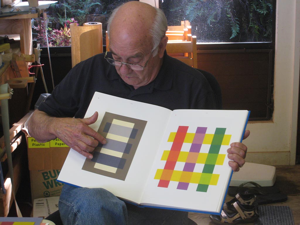
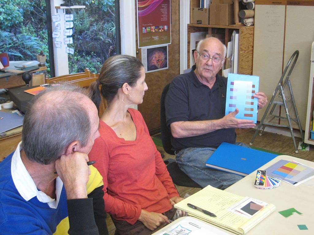
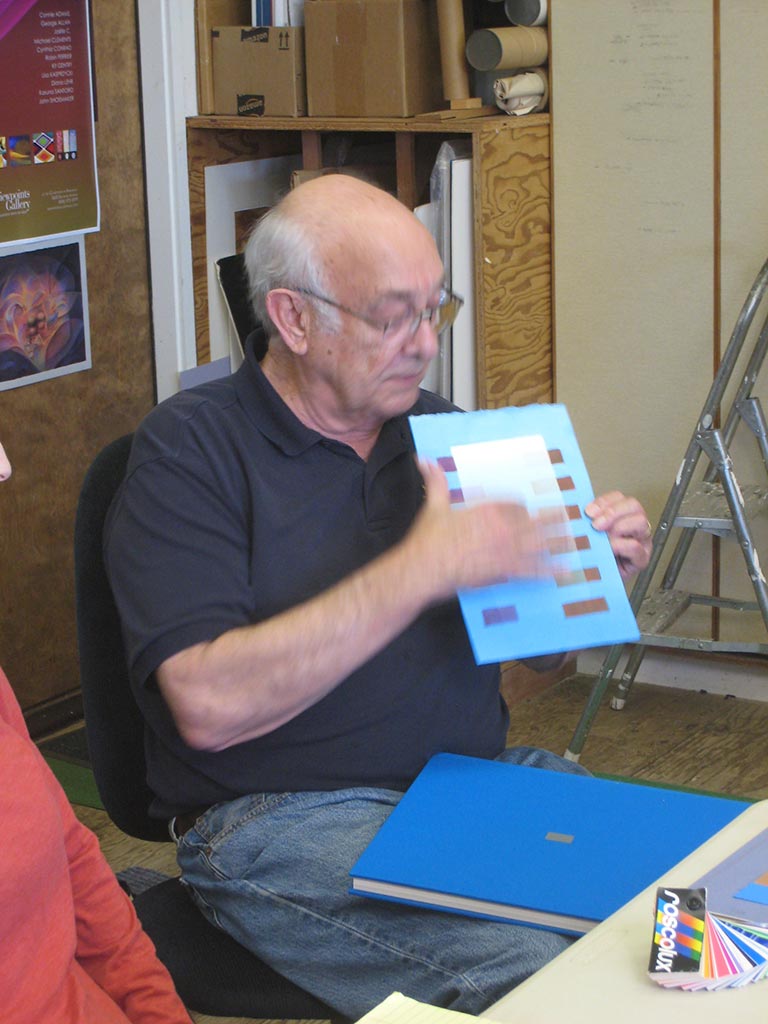
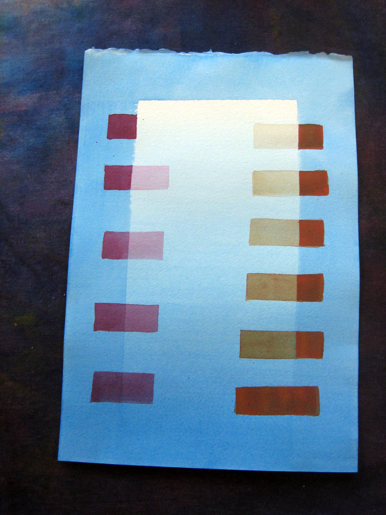
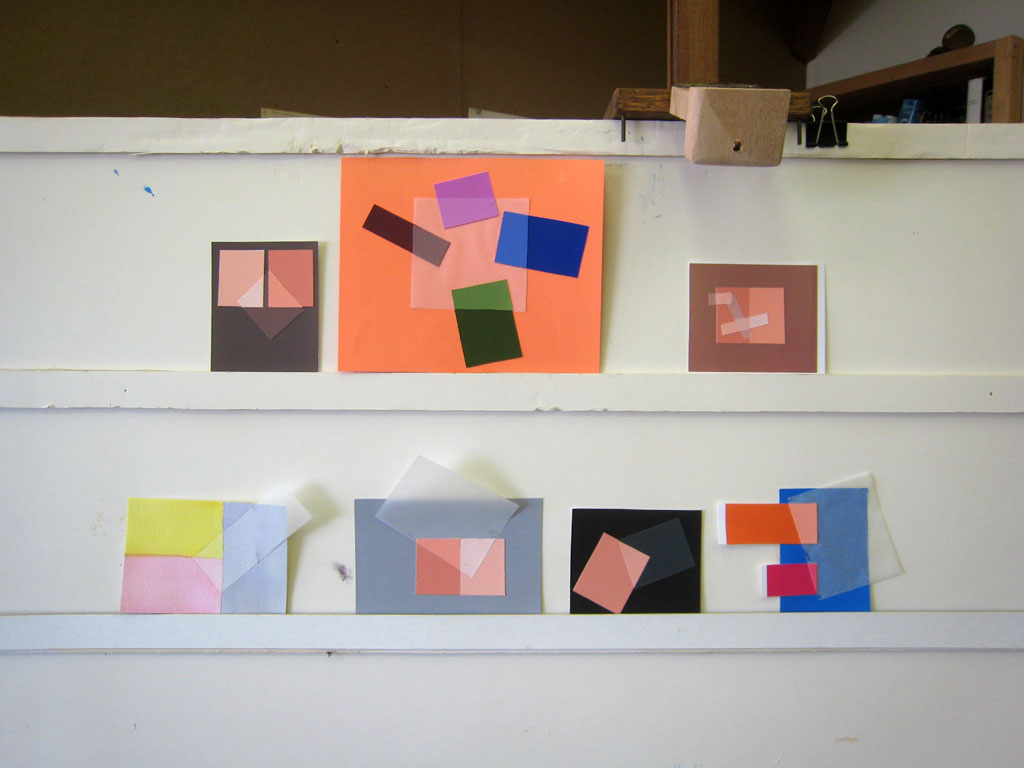
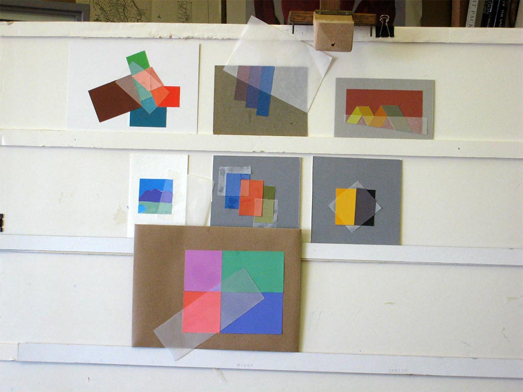
The fifth sessions of the Trihue Watercolor class for Winter 2018 were held on Wednesday, February 14 and Sunday, March 4. The film and veil homework was critiqued. The new topic is white light and shadow. You need shade to create the illusion of light. In white light, a cast shadow is a gray (transparent black) film. To paint shadows in watercolor, paint the local colors first, then apply the shadow wash over them. Or, since watercolors are transparent, lay down the shadows first and paint the local colors over.
The fifth sessions of the Trihue Watercolor class for Winter 2018 were held on Wednesday, February 14 and Sunday, March 4. The film and veil homework was critiqued. The new topic is white light and shadow. You need shade to create the illusion of light. In white light, a cast shadow is a gray (transparent black) film. To paint shadows in watercolor, paint the local colors first, then apply the shadow wash over them. Or, since watercolors are transparent, lay down the shadows first and paint the local colors over.
The template below can be used for a three-dimensional spotlight illusion. Cut out the hole, fold it up along the dashed line, shine a light from behind, and trace the cast shadow onto the horizontal area.
Our brains perceive objects maintaining a “local color”, though objectively, the color varies a lot depending on the light conditions.
Videos – Class demos
Painting strategies to avoid hard edges and provide depth cues
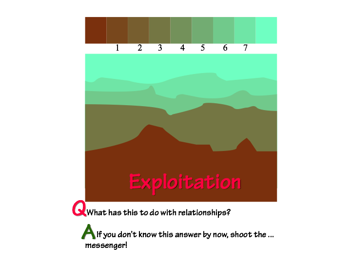
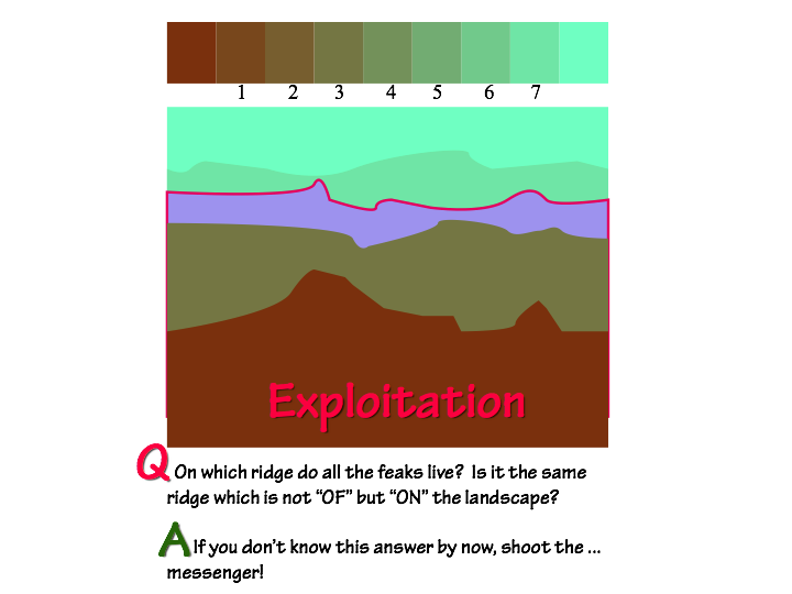
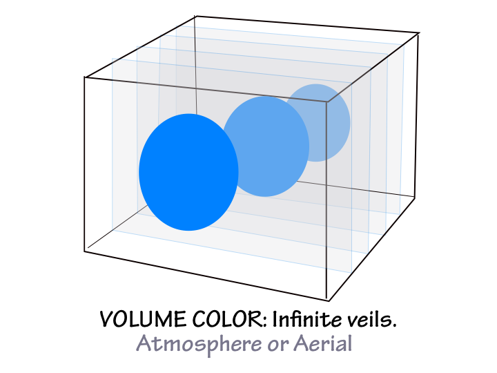
Avoid hard edges by painting large adjacent areas that have a common color, not isolating individual shapes. Layering color for more and less intensity provides depth cues in landscapes, also referred to as aerial perspective or volume color. (6:14)
Watercolor acts like these transparent films
Have fun arranging transparent watercolor shapes on your paper. (1:49)
Plotting a 3D cast shadow
Dick explains how to construct a cast shadow for this week’s assignment of simulating a shadow in watercolor. Choose a simpler format if you’re not familiar with perspective drawing. (5:48)
Three-dimensional shadow illusion example
Dick demonstrates how to create a 3D illusion of a cast shadow in watercolor, one of the options for this week’s homework assignment (example #3). (0:30)
Drawing & painting example #4
Dick demonstrates how to construct a 2D representation of a 3D scene, and the painting strategy to use, for this week’s homework assignment simulating light and shadow on a variety of colors. (1:38)
Observing shadows as films outdoors
Dick demonstrates how shadows behave as films over a variety of colors in the sun outdoors. Changing light allows observation of resulting changes in shadows. (2:15)
White Light Tutorial
An understanding of how colors change under light and shadow allows the artist to create illusions. Dick demonstrates how. (9:01)
Vimeo references
White Light: An Illusion
A tutorial for artists who wish to incorporate the illusion of a light on a variety of hues and values.
Plot White Light
Constructing shadow lines for a simple, imagined 3D scene and applying shadows, ambient light, and reflected light.
Wednesday class photos
Early morning films and veils
45 minutes later
Susan’s watercolor inspired by Valerie’s photo
Sunday class photos
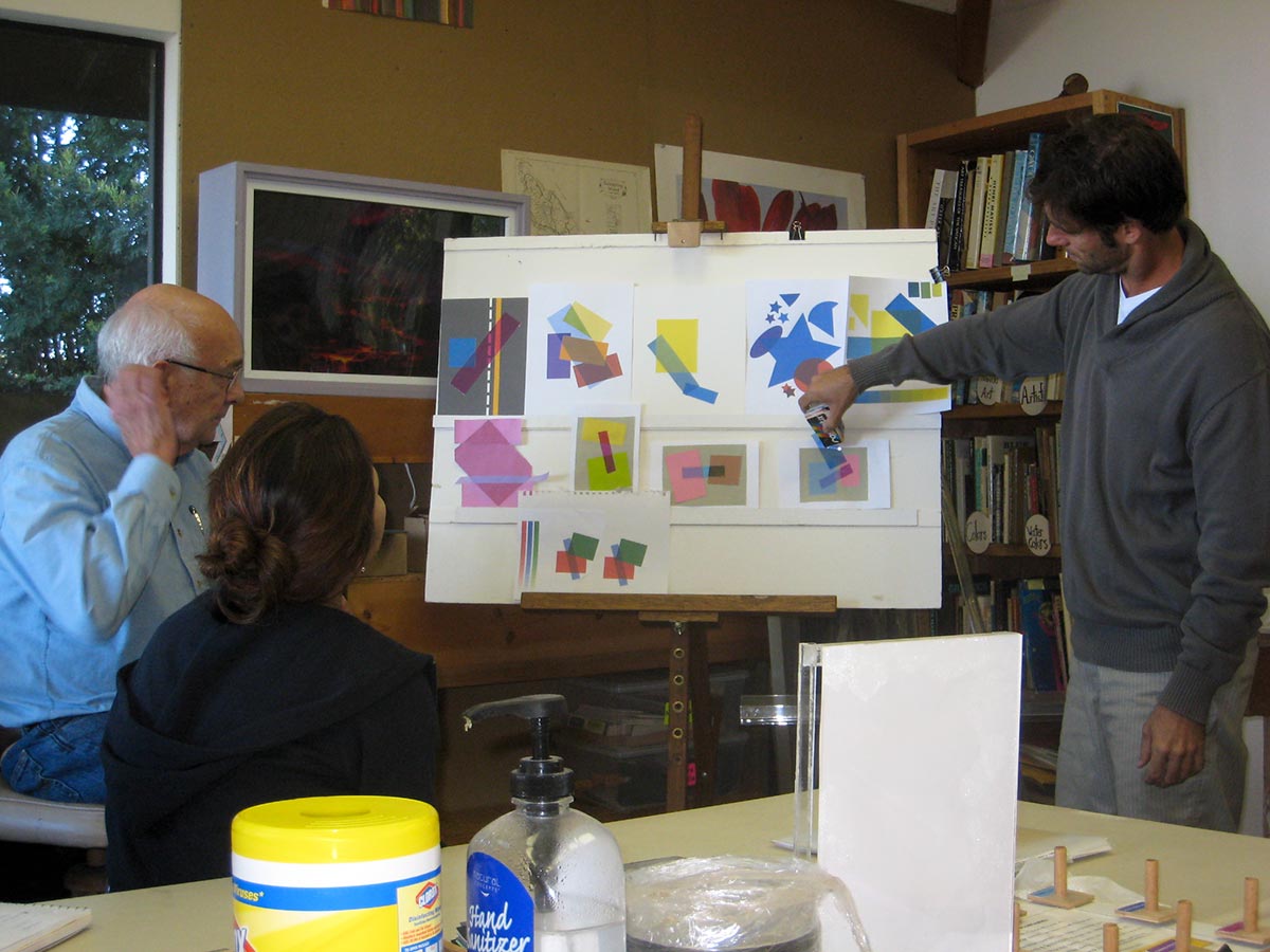
Homework critique
Homework – Films & Veils
White light demo
Observing light & shadow
White spotlight & shadow over several colors
Mahalo to Valérie Richter for Wednesday photos and videos, and to Holly Duane for Sunday photos.
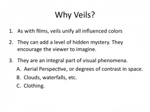
The fourth sessions of the Trihue Watercolor class for Winter 2018 were held on Wednesday, February 7 and Sunday, February 25. We critiqued the edges and gradations homework assignments. Transparency illusions, in the form of films and veils, were the new topic for the week. Dick showed transparency illusions from Albers’ Interaction of Color, pointing out ones that succeed, and some that fail because they are inconsistent with the actual phenomenon. Painting film illusions in watercolor is easy; painting veil illusions requires a painting strategy.
The fourth sessions of the Trihue Watercolor class for Winter 2018 were held on Wednesday, February 7 and Sunday, February 25. We critiqued the edges and gradations homework assignments. Transparency illusions, in the form of films and veils, were the new topic for the week. Dick showed transparency illusions from Albers’ Interaction of Color, pointing out ones that succeed, and some that fail because they are inconsistent with the actual phenomenon. Painting film illusions in watercolor is easy; painting veil illusions requires a painting strategy.
Critiquing transparency illusions in the Albers book – 1
Film illusions. If it’s transparent, you can see through it – over all surfaces it covers. Recognizing opaque vs. transparent appearances. A casual arrangement provides good Gestalt. Films, veils, and false films. (17:01)
Critiquing transparency illusions in the Albers book – 2
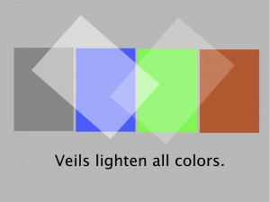
Painting strategy for veils. Films darken, veils lighten. (4:53)
Critiquing transparency illusions in the Albers book – 3
Recognizing false/impossible transparency. (3:08)
Painting demo – film and veil
Film illusion. Every single cast shadow is a film. Veil illusion. Veil painting strategy: build up layers. Tactic: to avoid brushstrokes caused by paint drying when covering a large area, wet the area first. (20:02)
Painting demo – Transparency illusion and painting strategy for films
Films are easy in watercolor: every layer of paint is a film. (2:33)
Painting demo – Transparency illusion and painting strategy for veils
Creating the illusion of a veil takes advance planning and careful observation of values. (4:33)
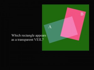
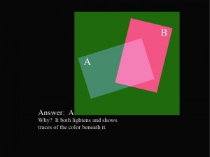
Opaque or transparent?
Why study films and veils? Mastering these illusions allows you to create visual magic. Changing background colors change your perception of which shape is opaque and which is transparent.
Wednesday class photos
Sunday class photos
Homework critique
Films & veils discussion
Mahalo to Valérie Richter for Wednesday photos and videos, and to Holly Duane for Sunday photos and videos.
The fourth session of the Color Relationships 2 class for Fall 2016 was held on Wednesday, September 21. We critiqued the homework (Volume Color), addressed common problems that students encountered, and discussed again the benefits of using volume color in artwork. The class was introduced to white light and shadows, and given a new homework assignment, Create the illusion of white light.
The fourth session of the Color Relationships 2 class for Fall 2016 was held on Wednesday, September 21. We critiqued the homework (Volume Color), addressed common problems that students encountered, and discussed again the benefits of using volume color in artwork. The class was introduced to white light and shadows, and given a new homework assignment, Create the illusion of white light.
Homework assignment
Create an illusion of a white light on a set of varied hues and values, using opaque media or Adobe Illustrator. Several formats are suggested below. Start simple, and base your study on observation.
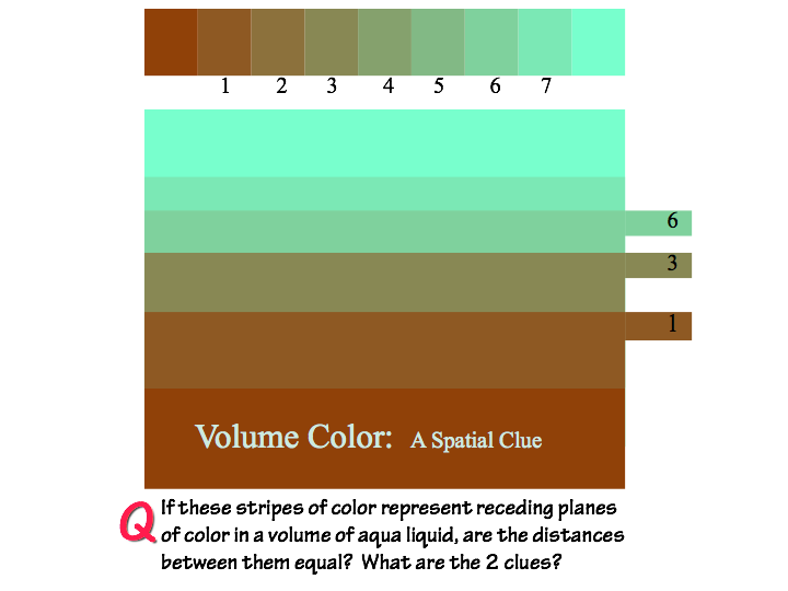
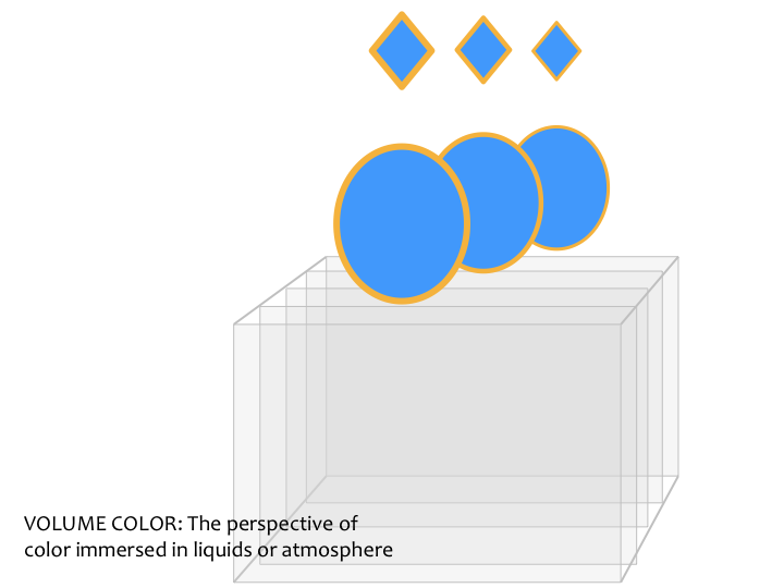
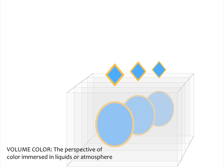
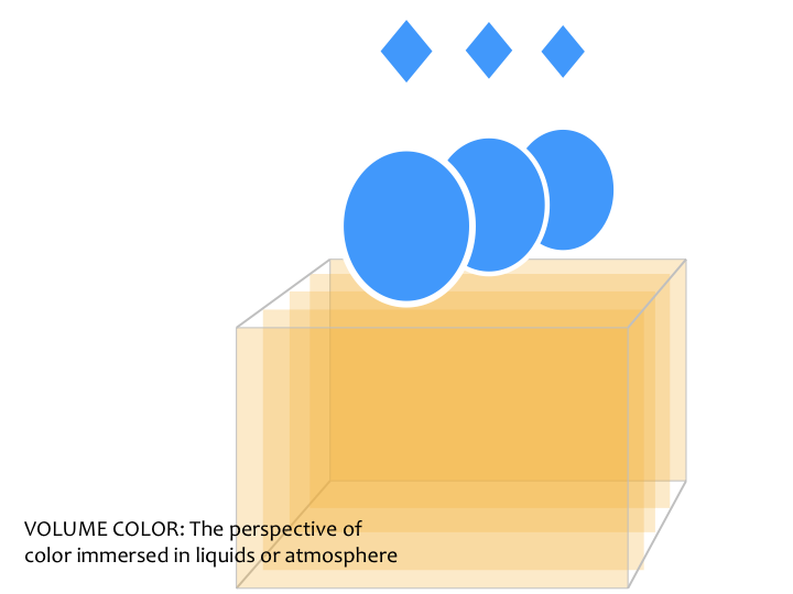
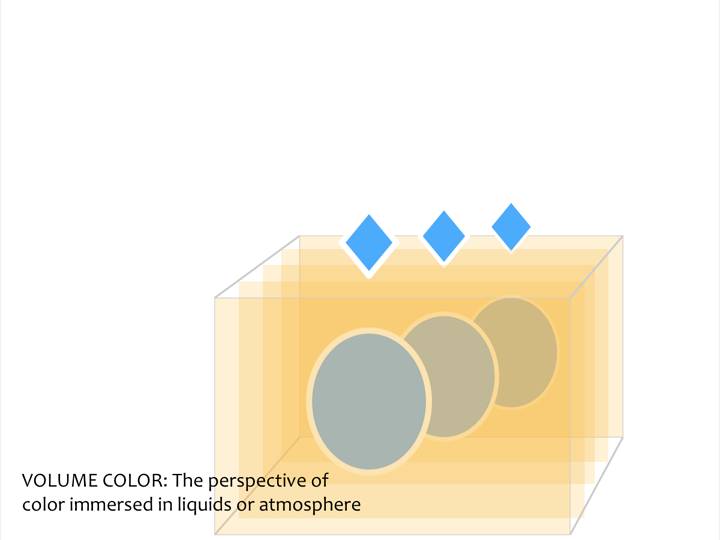
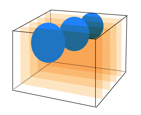
Class started with a critique of the homework, Volume Color. This assignment involved creating two final images, one that illustrated objects receding into a liquid; and one that illustrated objects receding into an atmosphere. Loosely translated, this meant that one image should show objects fading away into a dark background, and the other image should fade away into a light background.
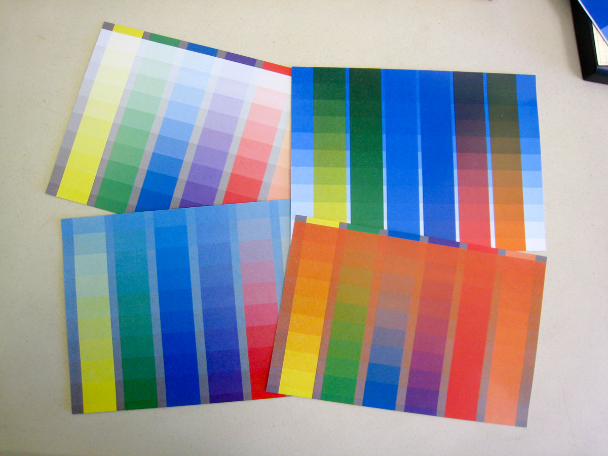
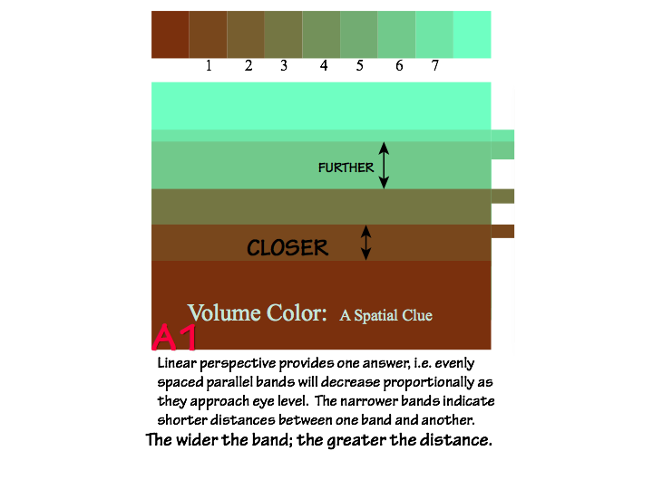
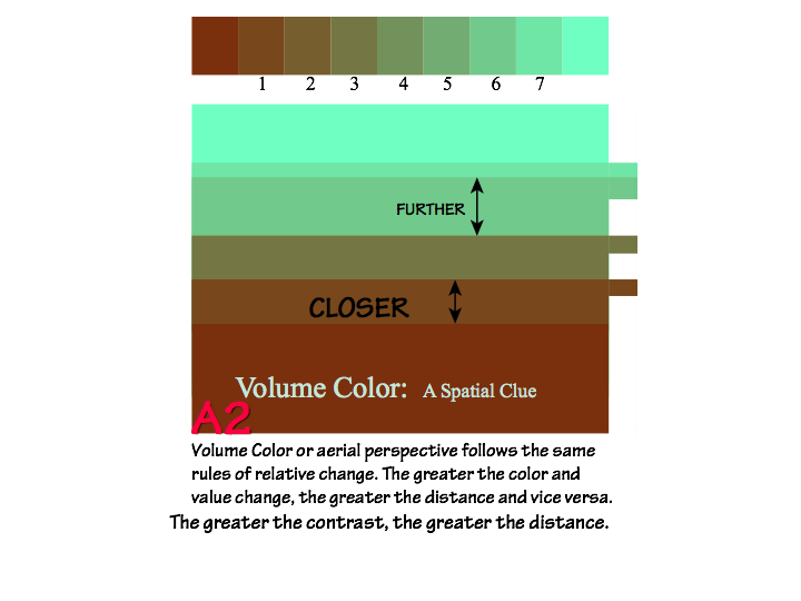
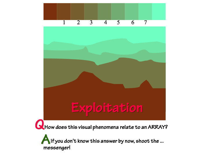
In order to make volume color convincing, it has to be CONSISTENT. To create an effective solution, one should make arrays of the original color along with the atmosphere or liquid color as the other parent. As Karen wrote in the 2013 Color Relationships post: In volume color, whether it’s liquid or air, the “background” is key, because its color influences all objects in it. If that context is missing, the illusion falls apart. Use an array with the volume color and object color as the parents.
Dick noted that many of the assignments used other visual clues (such as overlapping, size changes, etc.) that implied a sense of space and depth, and said again that volume color will help immeasurably in completing that illusion. Atmospheric perspective provides a harmony and a cohesiveness which none of the other visual clues can provide. As Dick says, it all comes back to RELATIONSHIPS. “It’s so effective when everything relates … [you can just see it]. Even if the colors clash, as you move it into a volume [color], it will unite your work, as it would in nature.”
Dick’s main critique was that he may have given this class too much freedom with this assignment, and that in certain cases technical challenges or subject matter became the main concern rather than demonstrating understanding of the concepts. Having no restraints can be liberating, but it can also introduce too many considerations which distract from the main objective. Since part of Dick’s goal in every class is to make his students more independent, his advice was to “keep it simple” in order to make sure you understand the concepts before you move on to more complex work. Concentrate on stepping stones, not precious stones.
Patt did the homework in both digital and watercolor media
Keri tried this particular composition as a “positive” and “negative” image to see what would happen
Another watercolor submission from Patt
Leonard attempted veils in this watercolor scene of the sugar mill
Leonard’s watercolor example of a creature disappearing into a liquid
Leonard’s homework for Recreate a Masterpiece, with the original painting on the left, and Leonard’s version on the right
A close up of Leonard’s re-creation
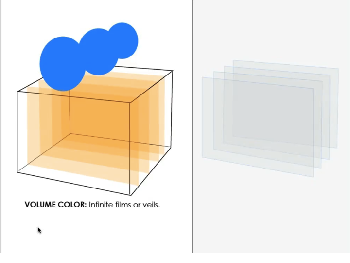
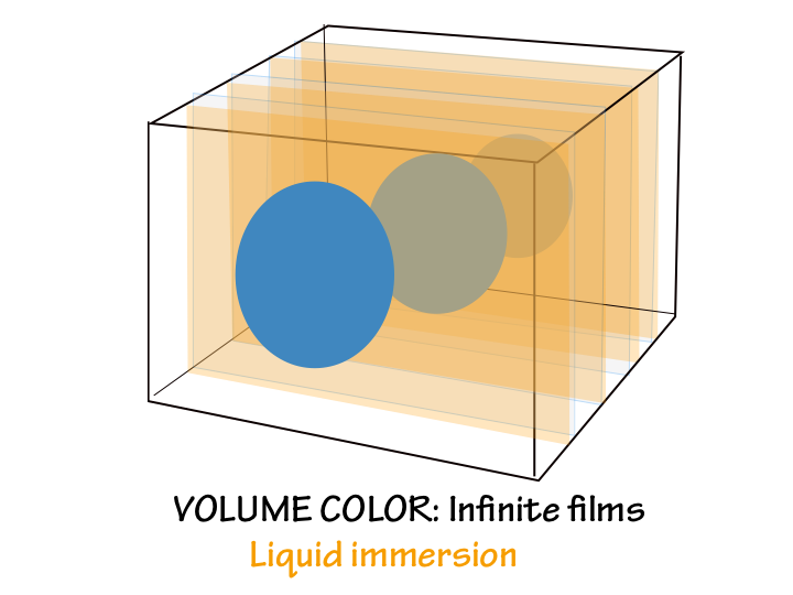
Films, veils, and volume color
Over the past few years, Dick has revised his teaching on films, veils, and volume color, based on observation. If you are familiar with his previous guidance, either as a student or from reading elsewhere on this website, it’s important to take note of this change. Like his mentor, Josef Albers, Dick not only believes, but exemplifies, that “Learning never ends!”
For many years, Dick taught that liquid behaved as a film, darkening objects placed in it. When considering a white or light-colored object, this made sense, and matched our observations. However, when we actually observe a liquid, such as the ocean, we see that both dark and light colors are gradually obscured, taking on the color of the water. As objects recede deeper into the liquid, the liquid color dominates and local color is lost. Dark objects do not become darker. The concept of transparent films, and their darkening behavior, is still important – shadows being the most notable example – it just doesn’t apply to volume color.
Likewise, for many years, Dick taught that “a veil will always lighten.” This is true in the case of many common veil phenomena, such as wedding veils, waterfall mist, and fog. But obviously, a black veil darkens. Smoke is sometimes dark. Veils are made of opaque particles, which absorb, reflect, and scatter light. Dick explored this phenomenon last week with the Illustrator simulation of veils of different colors and densities. A veil will lighten or darken an object depending on their relative values, and an object under the influence of a veil takes on the veil’s color.
Volume color behaves as a veil: objects immersed in it will lose their own color and take on the volume color, whether liquid or atmosphere. Arrays simulate this situation perfectly. If you make an array from the object’s color to the volume color, the steps in between represent the color as it would appear at different depths or distances in the liquid or atmosphere. As Dick said, “The array is the key,” “Array, array, array!” and “You have got to recognize that the array is your salvation.” Colors and values in a scene must be from the arrays, or they will be perceived as “freaks”, not belonging to the scene, and detracting from the credibility of the illusion you are trying to create.
White light demo
The rest of the class was spent discussing the next assignment, Create the illusion of a white spotlight. Dick demonstrated what a strong white light will do over a selection of colors, and the differences between a strong spotlight versus a weak one. Here are some of the highlights of that discussion (along with excerpts from previous class posts):
Dick gave a demo of white light shining on a white cube and an arrangement of colors. Shining the light from different directions allowed analysis of how we perceive the strength and direction of light – from the shadows it casts. The contrast between shaded and illuminated areas of a light color (like white or yellow in the photos) is greater than the contrast on a darker color like green, because light colors reflect more light, and dark colors absorb more light. Carefully observing this kind of phenomenon will help you identify and solve problems in your own or others’ work. (Color Relationships 2, 2015, week 4)
A strong light will create equally strong shadows
The effect is more subtle with a soft spotlight
To create the effect of a cast shadow, the artist has to consider perspective as well
How do you depict a white spotlight? You show the SHADOWS, you have to darken everything around the spotlight; you cannot imply a white spotlight by tinting the colors! The darkness (or value) of the shadows will depend on how bright your light source is: if you have a bright light, you’ll have darker shadows (more contrast). If you have a soft light, you’ll have lighter shadows (less contrast).
Watch for your viewer’s preconceptions: we are used to reading light as “coming from above”, so the use of shadows will change our perception of what we are looking at. Dick used an example from his Marine Corps days: an incident where a fellow Marine was reading aerial photographs in order to bring the troops to a strategic location. The fellow decided on a mountaintop as the destination, but Dick disagreed with the assessment, and asked the Marine to turn the photographs 180˚ and read them again. Once the shadows were properly oriented, It turns out the mountaintop was actually a valley! While artists don’t often have the same pressure to correctly render a scene, it still behooves us to put the correct information in our work to convey an accurate message.
Ambient light will have an effect on light and shadows: “I’m sure you’ve heard the advice to ‘paint the shadows cool’, but why? Since we have a blue sky, ambient light will add a blue cast.”
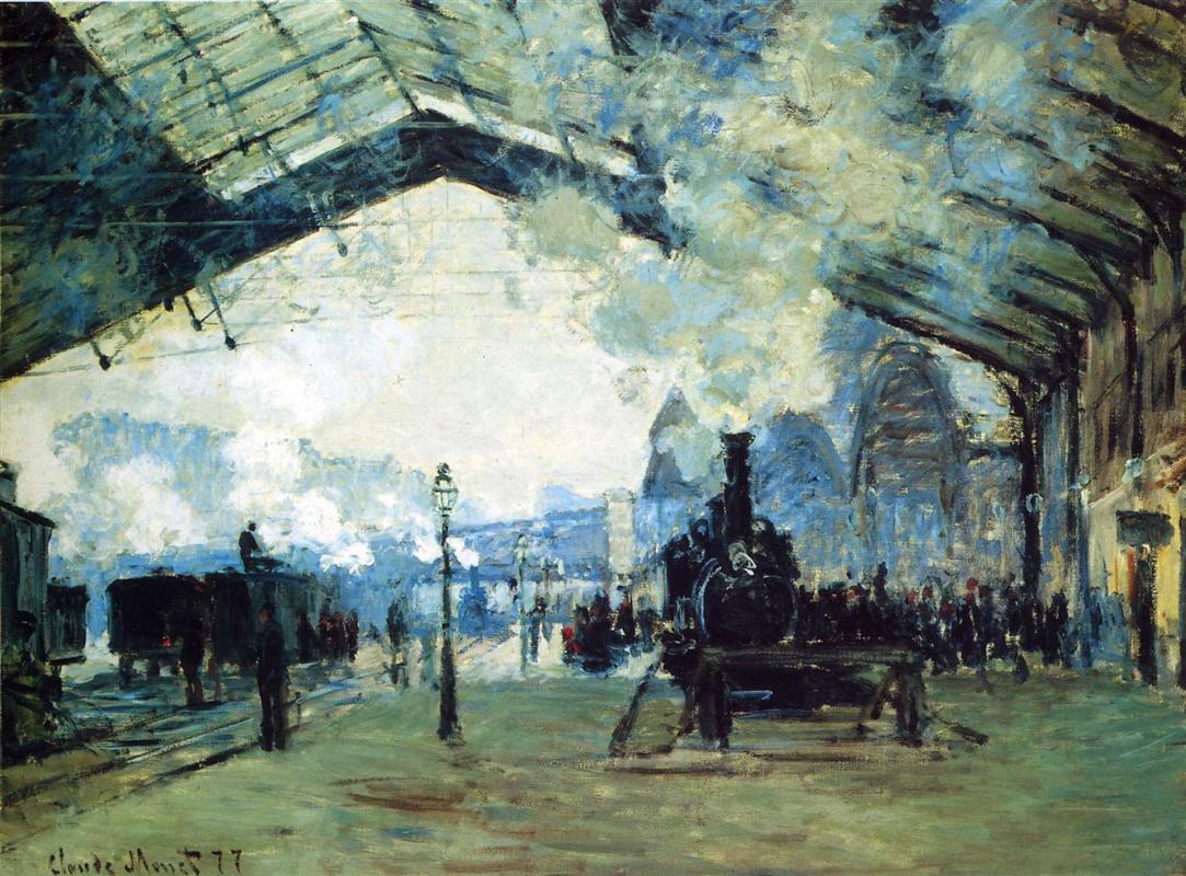
Shadow colors are the complement of the light source, so for white light, the shadow is black. Outdoors, most areas are exposed to some ambient light, which tends to be blue because “we live in a blue dome,” as Monet observed. Thus, because of this ambient blue light, most outdoor shadows will be cool. Light reflected from neighboring surfaces also influences the local color of an object. (Color Relationships 2, 2015, week 4)
“Nature works in relationships – light does not play favorites, everything is in relation.” When we are trying to create harmonious images, we should strive to understand these natural rules or we will create works that are not ‘of this world’ (or ‘freaks of nature’, as Dick calls them).
Links to previous classes and videos
There are several posts on Dick’s website that deal with observations about white light and shadows. Check out these links for more information, including videos from previous class lectures, and also previous class posts found at the bottom of this page (under Same class, different year).
These videos were shown as part of the slideshow presentation. Some are short demonstrations and others are detailed tutorials. Take advantage of them to reinforce concepts and help with completing homework.
Mix any color
Primary colors of pigment and light, and their relationship
Let there be light
A 3D simulation of a white spotlight moving over a scene, demonstrating light and shadow and how colors are affected.
A spotlight?
Demonstrating the illusion of a spotlight using only opaque colors
A spotlight illusion in Illustrator
Showing how opaque shaded colors can create the illusion of a spotlight on a set of colors
Light and shadow define form
A demonstration of how light and shadow define form, and affect colors consistently
Plotting white light
A tutorial on plotting white light, its cast shadow, and reflected light in 3D in Adobe Illustrator.
White spotlight illusion
Dick Nelson demonstrates how to create the illusion of a white spotlight on a set of colors, in Adobe Illustrator.
Same class, different year
View the corresponding class post from 2015 or 2013.
The third session of the Color Relationships 2 class for Fall 2016 was held on Wednesday, September 14. We critiqued the last assignment, (Create the illusion of a veil), and Dick discussed some recent revelations he has had concerning the tricky nature of a veil (sometimes it acts like a false film). The class tackled a new team challenge, discussed the features of atmospheric and volume color, and also heard from Dick on the four ways to show depth through visual clues. See the whole post for more info, class photos, and additional materials.
The third session of the Color Relationships 2 class for Fall 2016 was held on Wednesday, September 14. We critiqued the last assignment, (Create the illusion of a veil), and Dick discussed some recent revelations he has had concerning the tricky nature of a veil (sometimes it acts like a false film). The class tackled a new team challenge, discussed the features of atmospheric and volume color, and also heard from Dick on the four ways to show depth through visual clues.
Homework assignment – Volume color
Class recap – some key ideas
Critique – Illusion of a veil
Class began with a critique of the homework, Create the illusion of a set of two or more colors under the influence of one or more veils. Students commented on some of the difficulties they had with the homework, especially when it came to colored veils. Using a white veil was fairly easy, since it would simply tint the colors underneath it. But adding color to a veil made anomalies appear, where sometimes the veil acted in ways that didn’t match our definition (that a veil should always lighten the colors underneath it).
Dick revealed that he had had some revelations about veils over the last week that changed his mind on their characteristics. It occurred to him that there are black veils, such as those you would see at a funeral, and there is no way a black veil would lighten the colors behind it. And what would happen if you made the black mesh tighter or looser, or as Dick said, “What happens if I make that mesh more opaque?”. To further explore these ideas, Dick created an Illustrator test to see what would happen (see A closer look at veils, below).
What he found is that veils are tricky: sometimes they will lighten colors, and other times they will darken them. Using the black veil as an example, when you place a black mesh over other colors, it will act as both a film and a veil. It is darkening the colors behind it, and also obscuring them at the same time. Through various trials, Dick found that if the veil is darker than the color it is placed over, it will turn into a false film (see last week’s post for more information on false films).
This changes his previous rule that veils will always lighten colors underneath them. Veils, in certain cases, will behave like films and end up darkening a color. Dick summed it up with a new clarification of the difference between veils and films: the primary difference is that veils are made up of opaque particles (such as atmosphere) or material (such as mesh veils) that are actually obscuring your view, while films are entirely transparent (such as shadows). Observe veils in the real world to gain more understanding of how they modify color.
See all Illusion of a veil homework submitted online. Some students also submitted work done in physical media, fabric and watercolor.
Beginning the critique
Keri’s veil homework done with fabric
A second submission from Keri
Elizabeth Ann did several color studies in watercolor and crayon
Elizabeth Ann also continued working on film studies, in this case using both CMY and RGB as color themes for a cube illusion
In this study, Elizabeth Ann combined both her explorations of color harmony (seen in the stripes), and the use of films to create another cube illusion
A closer look at veils
To clarify his understanding of how veils behave, Dick simulated real-world veils in Illustrator, by creating grids or meshes of various colors and densities. Dick demonstrated it for the class, overlaying them on a variety of colors. Download the PDF below and open it in Illustrator to try for yourself.
[gview file=”https://dicknelsoncolor.com/wp-content/uploads/2016/09/VeilMeshTest.pdf”]
Another look at films
At the beginning of the slide show, Dick briefly touched on a recap of films and how to demonstrate them correctly. As he often repeats, it all comes back to RELATIONSHIPS. Films should modify all colors equally, and they should also show what colors are underneath them; they should be transparent. By changing the background colors, one can change the perception of which shape is the film versus which shapes are opaque.
Volume color
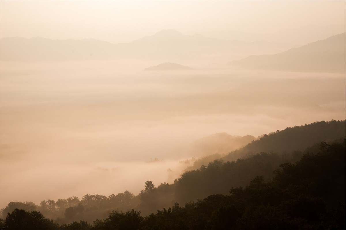
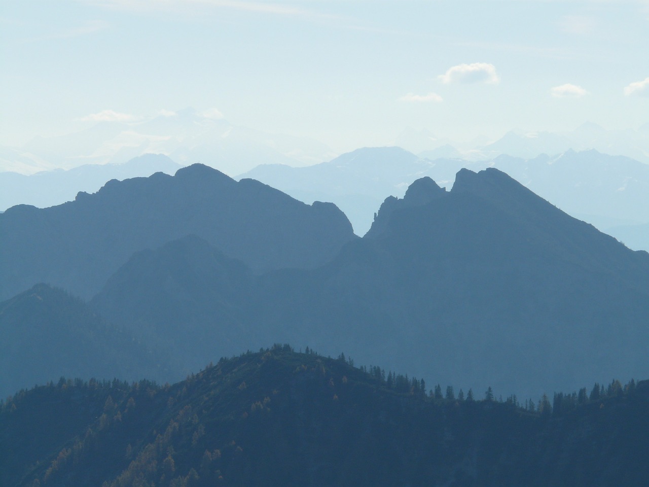
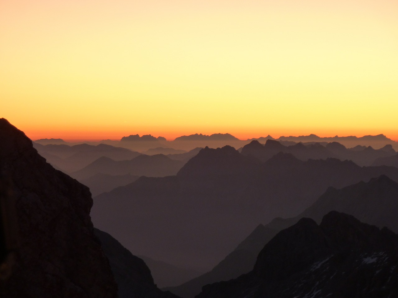
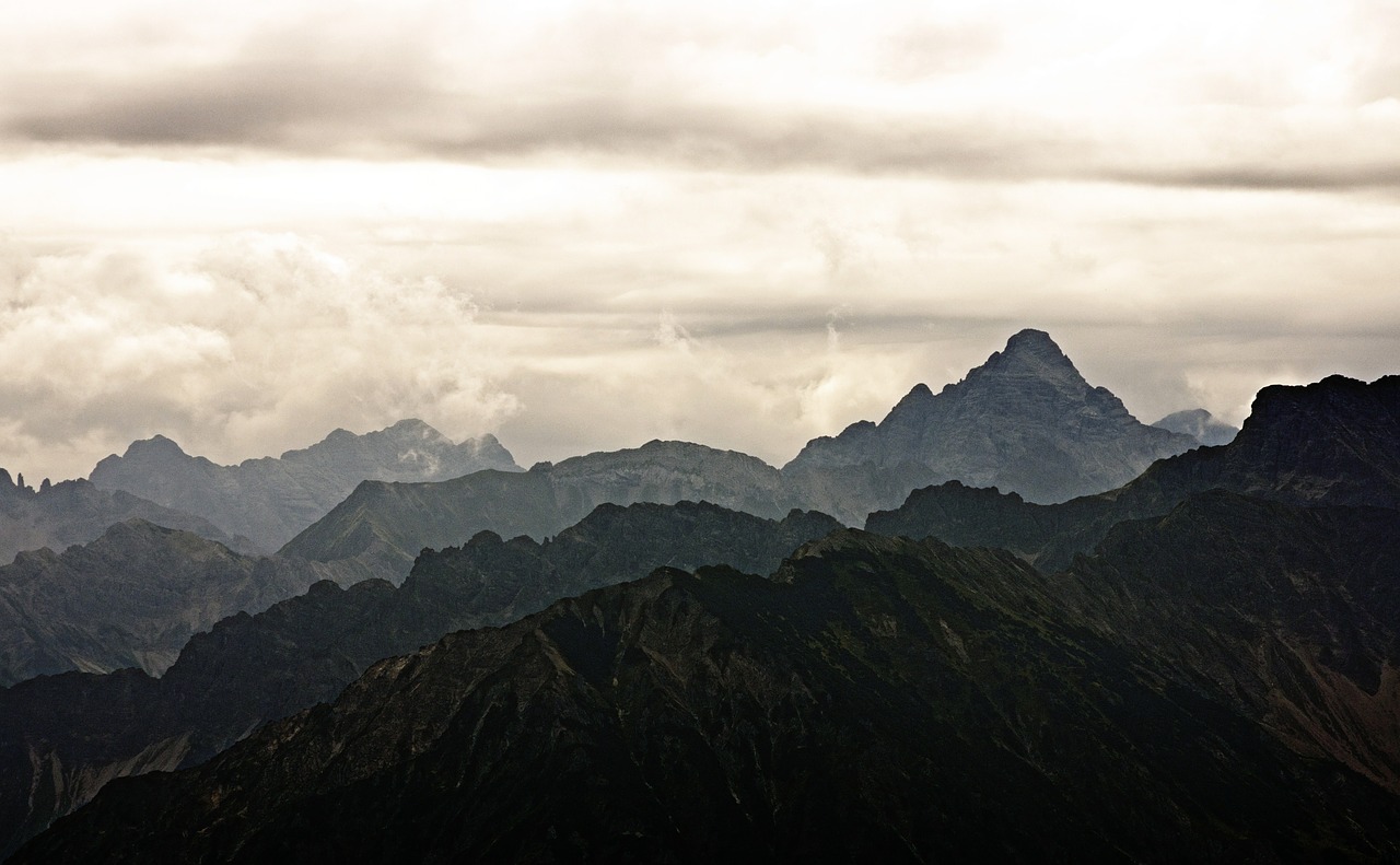
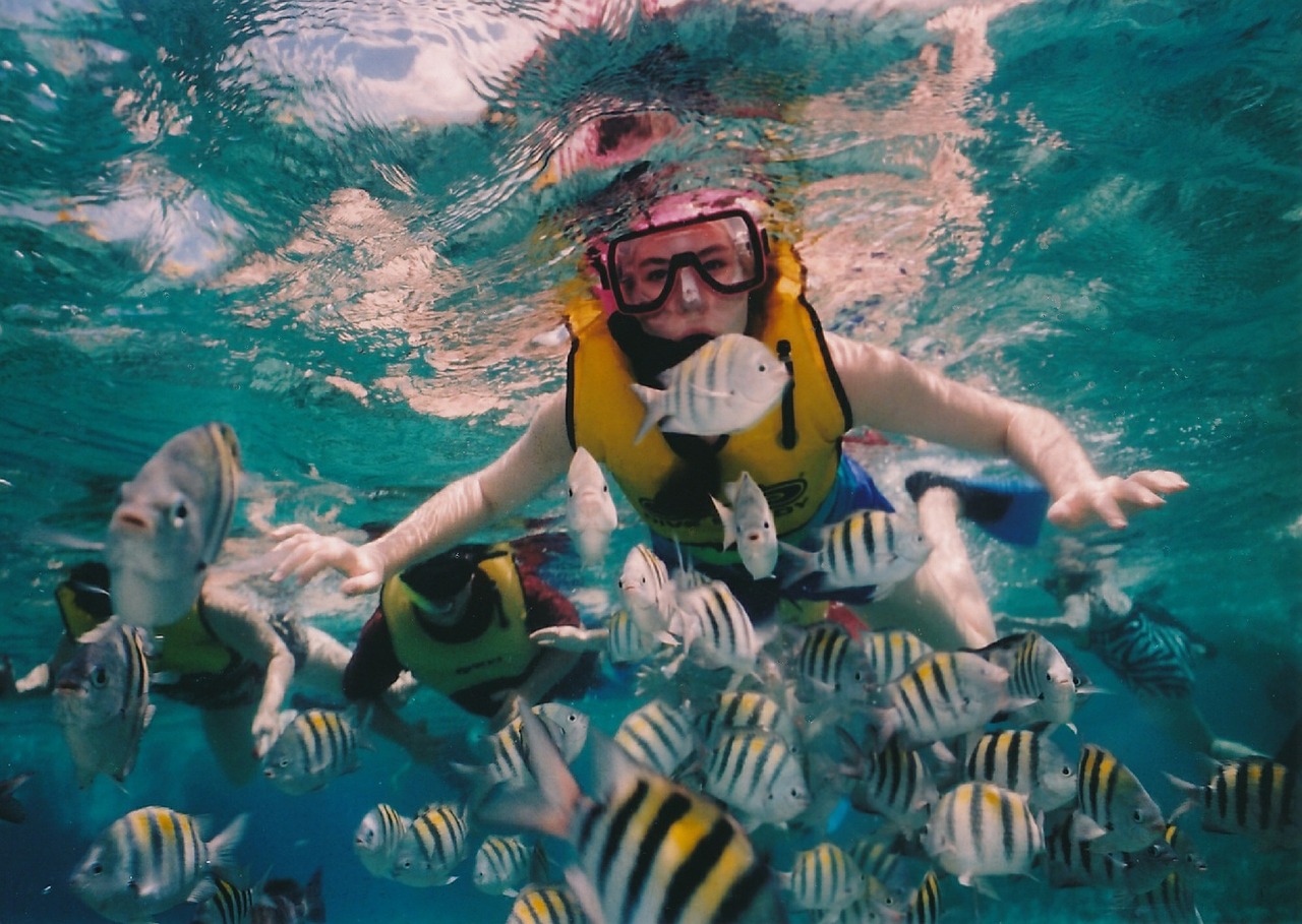
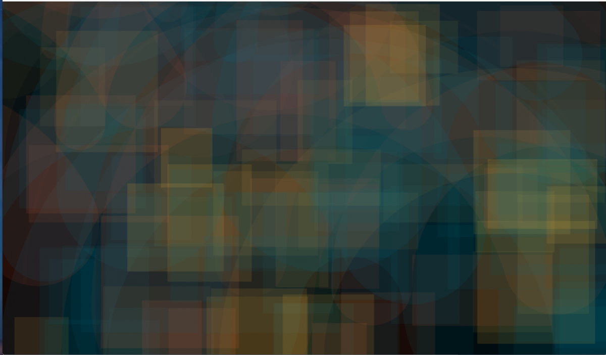
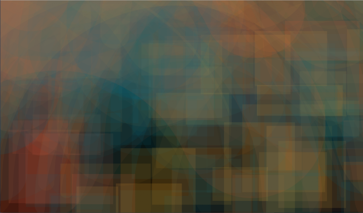
The slide show continued on to the topic of volume color. Dick uses this term to describe the effects of both objects seen at a distance (other terms include atmospheric perspective or aerial perspective), and under water. In both cases, objects become less detailed and fainter as they recede into space, with objects in water taking on the color of the water, and objects on land taking on the color of the atmosphere. Both atmosphere and liquid behave as infinite veils, imparting their color to objects behind them, in proportion to their density or thickness. The effect can vary from delicate modification to almost complete obscuration.
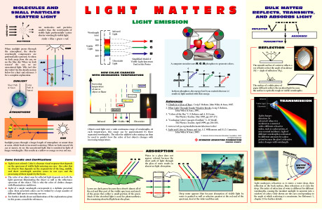
Light Matters poster
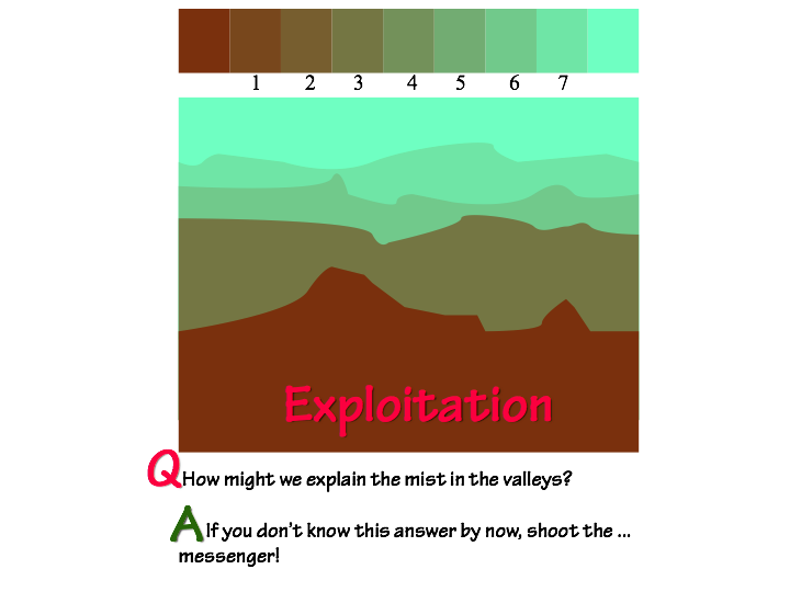
Dick pointed out that the reason objects at a distance are difficult to discern (such as a view of a mountain range) is due to little particles floating around in the atmosphere which are reflecting light. These particles can reflect different wavelengths of light, leading most often to a slight bluish tint as objects get further away. Karen has also found a great poster which illustrates the science behind this, writing in 2015, “The physics behind these phenomena are explained visually in the “Light Matters” poster available from the General Atomics Sciences Education Foundation (light is transmitted, scattered, refracted, reflected, and absorbed).”
Along with color modification, what other visual clues do we need to show space and depth? Dick spelled out the four main ways to convey depth in visual art work: overlapping, orientation on the picture plane, size/scale, and atmospheric perspective (for more information on this topic, please see these notes from the 2015 Drawing Foundation class). These are visual clues which help the viewer understand what they are looking at, and it is important to figure out which ones are necessary for the particular message the artist is trying to send. By using two or more of these principles simultaneously, the viewer will get an accurate sense of depth and space.
Watercolor demo
At the end of class, Dick had another watercolor demo for the class, to show how a watercolorist has to plan for veiling effects. Since watercolors are a transparent medium, any time one color is layered on top of other colors, it will act as a film and darken all the layers. To achieve a veiling effect, the artist has to choose where the veil will be, and then progressively darken around that area so that a veil naturally emerges from the untouched colors. Dick asked several students to take turns adding select layers, which also involved choosing the right color mixture and value change, so that all the colors would be affected equally, thus making the illusion complete.
Setting up for the watercolor demonstration
Creating a veil in watercolor means the artist has to plan in advance where the veils will be, and then darken around them to create the effect.
In the upper right quadrant, dark blue was added to enhance the veiling effect, along with a dark turquoise on the left side, and a touch of darker orange in the middle stripe.
Before creating the veil, Dick had drawn a rectangle, and asked students to apply darker colors around it.
After adding darker colors, the veil begins to emerge.
Free color studies
Dick also showed some slides on free color studies, discussing how Albers wanted his students to work with color and color alone. Albers’ assignment was to use autumn leaves and create collages which had color as the focal point, not shape. He asked his students to “lose the shape” by using the interaction of color. Dick encourages this class to try their hand at both free color studies, and also the ‘Recreate a Masterpiece’ assignment, as they are both challenging exercises which will enhance students’ color acuity and understanding (see handouts below, under ‘Class materials’).
Class photos
The team challenge this week was to create the illusion of objects in space, one composition as seen through atmosphere and one through liquid.
Dick asked the class to think about all the ways to show depth: overlapping, size/scale, placement, and atmosphericcolor.
Some of the final results
Both overlapping and changing size can be very effective at conveying depth
Dick also encouraged sutdents to think about ‘casual’ compositions
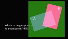
Changing background colors change your perception of which shape is opaque and which is transparent. Baffling, even when you understand the principles involved!
Volume color
This tutorial demonstrates how volume color modifies a color immersed in it. The demonstration explains how aerial perspective also influences color. An important tool in creating a composition in which all colors are “OF” and not merely “ON” the picture plane.
Same class, different year
View the corresponding class post from 2015 or 2013.
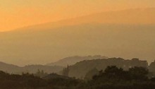
“While walking my dog at Giggle Hill this morning, looking mauka, I noticed the vog creating a very graphic & 2 dimensional example of ‘veils’…”
Dick thought students of color would enjoy seeing this photo sent to him recently by a former student.
“While walking my dog at Giggle Hill this morning, looking mauka, I noticed the vog creating a very graphic & 2 dimensional example of ‘veils’ very effective in conveying depth. Simple iPhone capture.” ~ Tony Novak-Clifford, 2013 Color Relationships student
The more you learn about color and your world, the more you can see.
To learn more about atmospheric veiling and how it magically and naturally conveys depth, look at some of the posts tagged with volume color or some of the other tags at the bottom of this post.
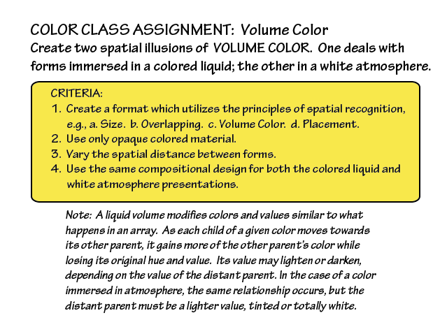
The third session of the Color Relationships class for Winter 2015 was held on Friday, January 23. We critiqued the veil illusion homework studies. Volume color and aerial, or atmospheric, perspective were introduced. Class members shared some observations and experiments with color. Composer Robert Pollock visited and gave a presentation on musical analogies to color concepts. The new homework assignment is to create two spatial illusions of volume color, one of forms immersed in a colored liquid, the other in a white atmosphere.
The third session of the Color Relationships class for Winter 2015 was held on Friday, January 23. We critiqued the veil illusion homework studies. Volume color and aerial, or atmospheric, perspective were introduced. Class members shared some observations and experiments with color. Composer Robert Pollock visited and gave a presentation on musical analogies to color concepts. The new homework assignment is to create two spatial illusions of volume color, one of forms immersed in a colored liquid, the other in a white atmosphere.
Homework assignment
The new homework assignment is to create two illusions of volume color, as detailed below (except the compositions need not be identical). You can turn in your assignment in digital form (by Thursday!) or paper. Arrays are the key!
Class recap – some key ideas
Critique – illusion of a veil
Veil studies
The assignment was to create the illusion of one or more veils over a set of two or more colors, incorporating an actual veil. The studies demonstrated a good grasp of the concept of how a light veil lightens or tints the colors underneath it. Dick got “picky, picky” pointing out instances where the perceived transparency wasn’t quite consistent, weakening the illusion. This shows the importance of developing a very precise sense of value, and careful observation of the phenomena you’re trying to recreate. We go through 12 years of language study in school, but our visual literacy is under-developed. Dick used the critique to lead into a review of films, reinforcing those concepts, and to set the stage for today’s new concepts, volume color and perspective.
What functions do the puffs of steam and smoke serve?
Holly experimented with veil and film transparency
Dick commented that he was “particularly pleased” to see what the students were doing outside of class to explore and deepen their understanding of color, like Kathy and her photographs, Holly and her methodical investigation of transparency gradations, and Jeff with his color programming (see below). Real learning is evidenced by behavioral change. These behaviors are evidence of learning.
Introducing volume color
The most familiar example of volume color is atmospheric veiling – the way distant shapes are fainter and less detailed in the distance. It can also be observed under water, where distant objects become indistinguishable from the water color. The physics behind these phenomena are explained visually in the “Light Matters” poster available from the General Atomics Sciences Education Foundation (light is transmitted, scattered, refracted, reflected, and absorbed). Atmospheric or aerial perspective wasn’t introduced in painting until the High Renaissance. See the 2013 volume color notes for more detail on using aerial and linear perspective together to represent distance and depth.
Volume color: aerial or atmospheric perspective
Volume color: liquid
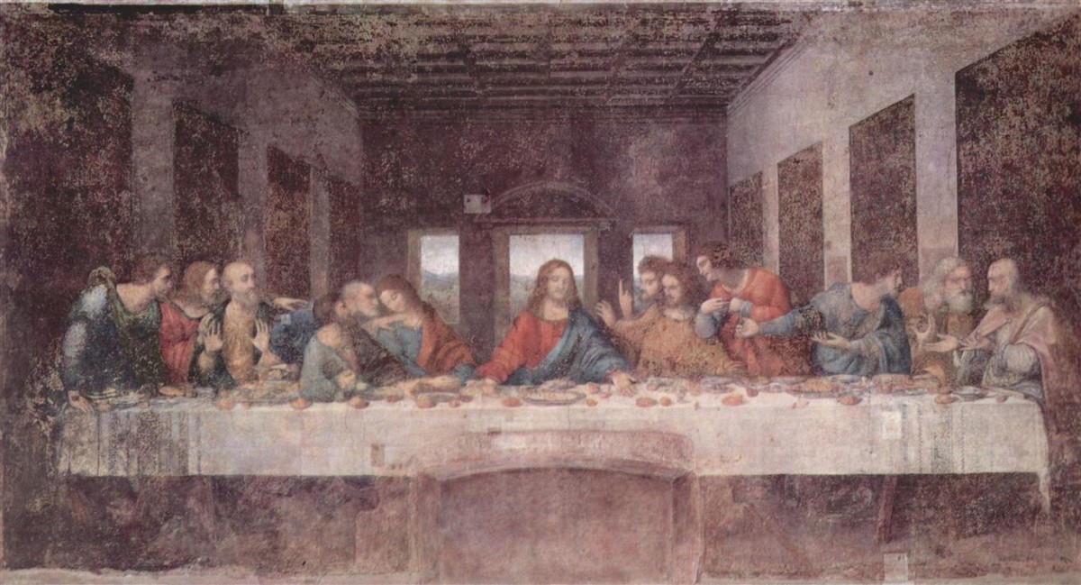
Aerial perspective was first used in the High Renaissance
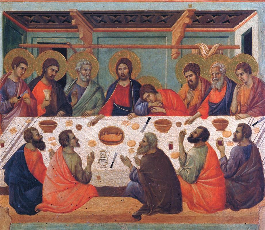
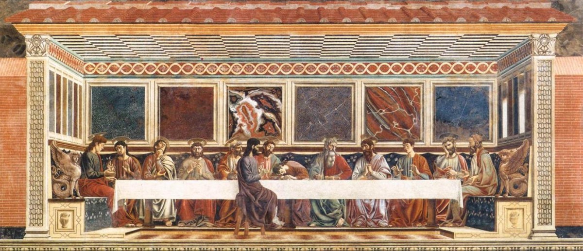
Creating a convincing representation of shapes at various distances depends on accurate perspective. Size, overlap, and position on the page are how we recognize distance and depth in linear perspective. Combine them with consistent atmospheric perspective cues to convey distance convincingly. The paintings below show how perspective in artwork has evolved from the Middle Ages to the High Renaissance.
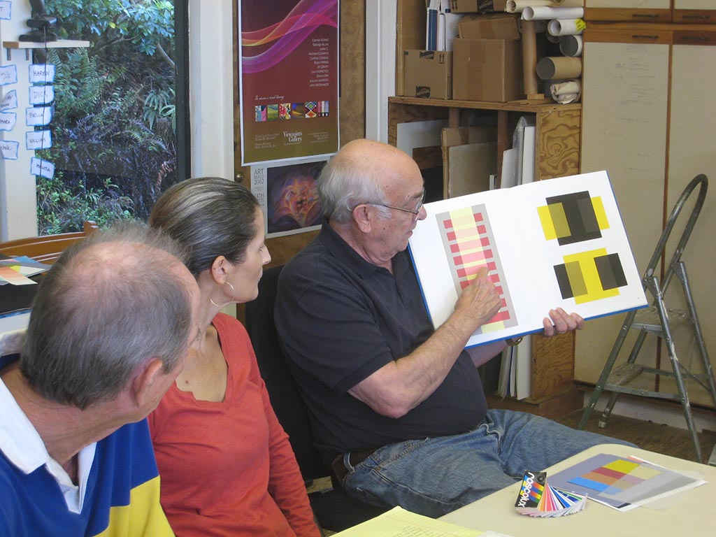
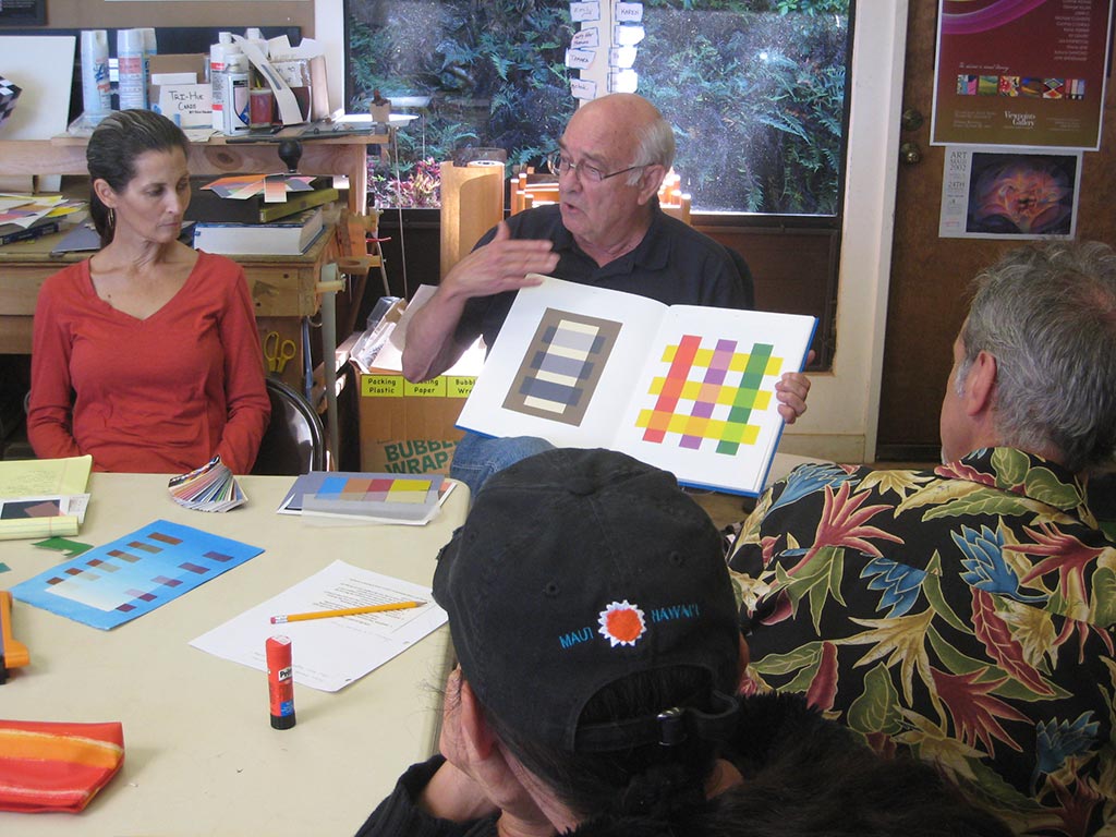
Robert Pollock visited and shared musical analogies to some of the color class concepts. He had been interested in Albers’ teachings 40 years ago, and sought Dick out when he learned of their connection. He took Dick’s color course a number of years ago, and for each color study, also created an equivalent musical study. Dick and Robert have collaborated on several projects and performances.
Robert played short excerpts from a number of musical pieces to illustrate possible musical analogies to color concepts. Vanishing boundaries is one he is particularly interested in, and gave several examples for. In our visual deception exercises, a small patch of color is influenced by a larger, more dominant surrounding color to appear as something else. In the musical analogies, a note means something different when surrounded by a different harmony. Robert had an analogy for this, too: we have words that sound the same, but mean something different (homonyms), like “steak” and “stake”. Their meaning depends on their context, the rest of the sentence around it.
Listed below are the excerpts Robert Pollock played for us, and some notes about the related color concepts. Most were only 10-15 seconds long and he played them a couple of times so we could listen carefully for what he was trying to show us.
Arnold Schoenberg, String Quartet #2, beginning
“4 from 3” B#=C
Witold Lutoslawski, Concerto for Orchestra, beginning
Transposition (Albers uses “transformation” – chapter XIV). “This is to this, as this is to this…”
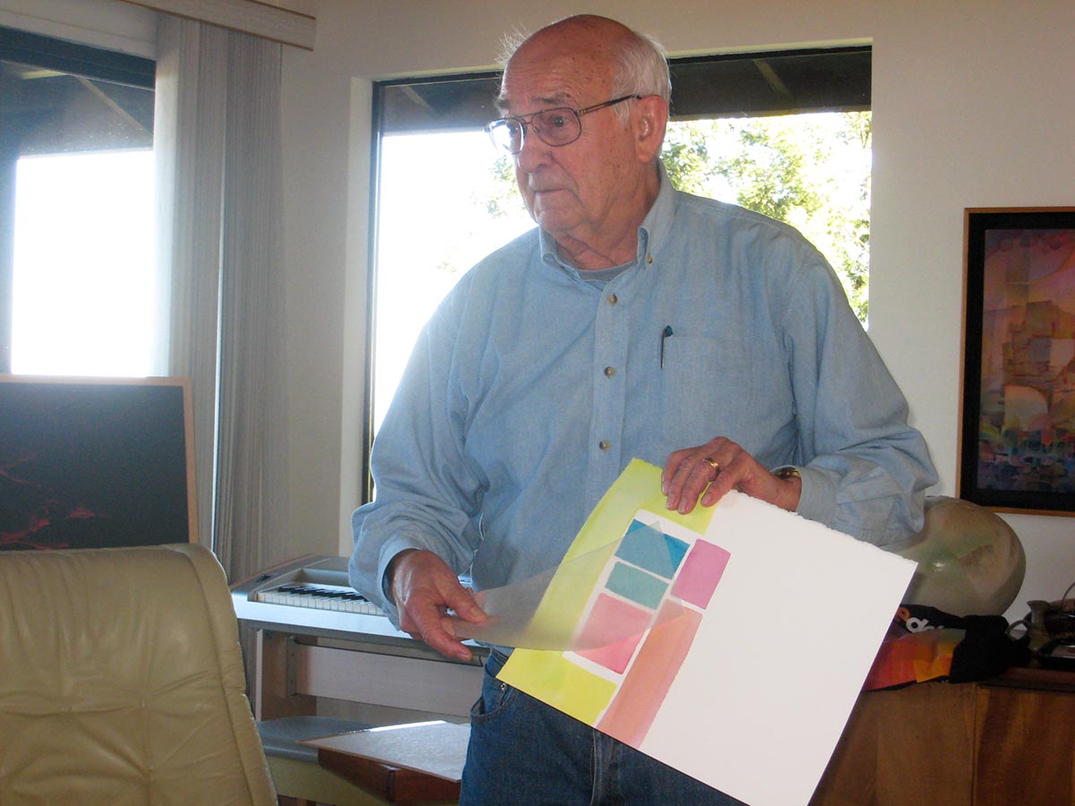
Inspired by Dick’s “Trihue Cuisine” experiments in Illustrator with different transparency overlays of cyan, magenta, and yellow shapes, Jeff Bennett wrote a program in ProcessingJS that draws a set of shapes, with some random variation, in a set of colors with randomly varying transparency. He demonstrated it in class. A few samples below show the different results created by different settings. (Click to view larger)
The image below was generated when you came to this page and will be different every time it is loaded.
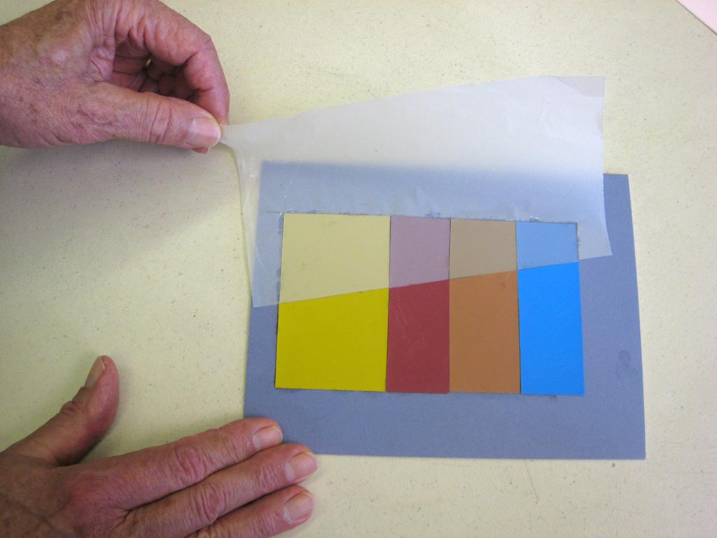
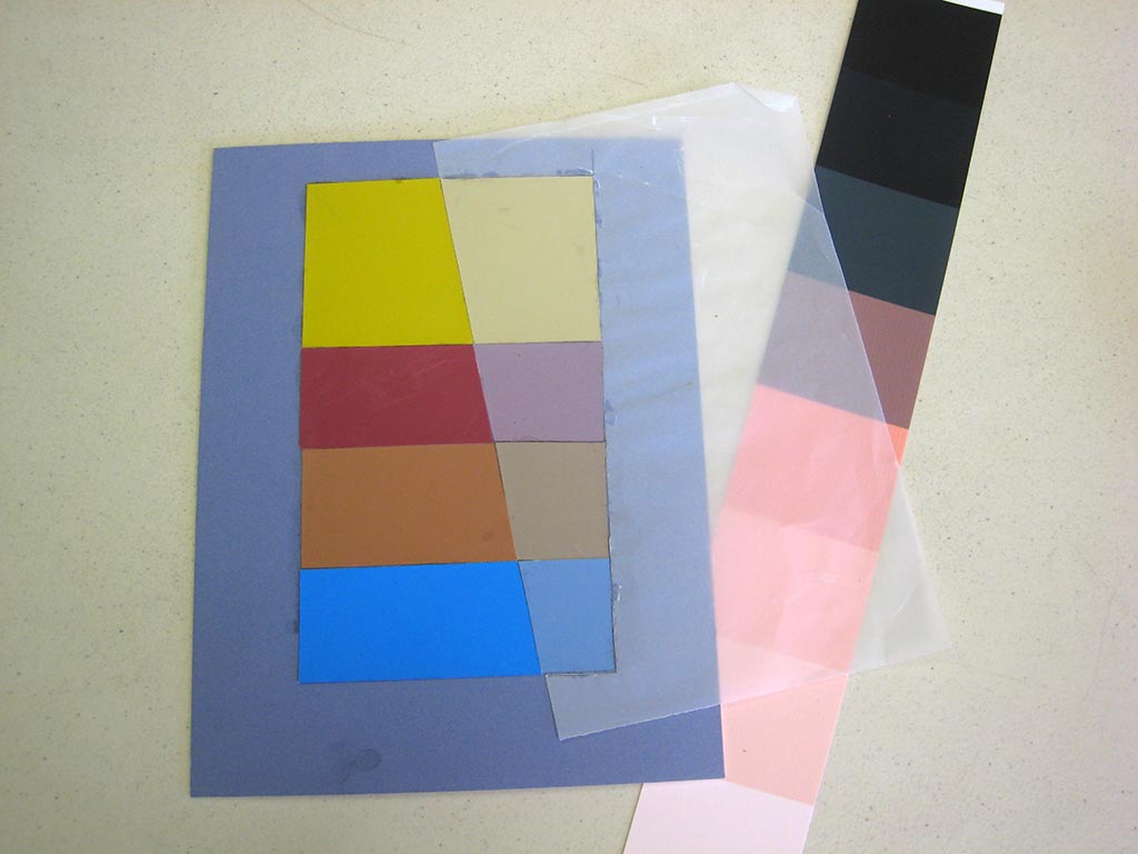
The second session of the Color Relationships class for Winter 2015 was held on Friday, January 16. We critiqued the solutions to the film illusion assignment (Create the illusion of a colored film over two or more colors), and had an introduction to veils. The new homework assignment is to create the illusion of one or more veils over a set of two or more colors, incorporating an actual veil (a piece of tracing paper or the like) into the study. Films and veils are two visual phenomena that help to unify and create emotion in a piece, intriguing the viewer and inviting their participation.
The second session of the Color Relationships class for Winter 2015 was held on Friday, January 16. We critiqued the solutions to the film illusion assignment (Create the illusion of a colored film over two or more colors), and had an introduction to veils. The new homework assignment is to create the illusion of one or more veils over a set of two or more colors, incorporating an actual veil (a piece of tracing paper or the like) into the study. Films and veils are two visual phenomena that help to unify and create emotion in a piece, intriguing the viewer and inviting their participation.
Homework assignment
The new homework assignment is to create an illusion of a veil, as detailed below. In addition, be on the lookout for examples of veils in daily life, in artwork or photos, in magazines or on the web, to share next week. WikiArt.org is a convenient place to look for images of paintings. Check stock photo sites, Flickr, Facebook, etc. for examples from life, or better yet, take your own photos!
Here’s an example of a past student’s solution to this exercise:
Class recap – some key ideas
Critique – illusion of a film
Homework solutions: Illusion of a film
Checking the illusion with a real film
The assignment was to create the illusion of a colored film over two or more colors. The students found doing it, both in Illustrator and in opaque paper, challenged them to observe very carefully and critically, and to think about what colors were needed to make it look right. During critique, Dick helped the class recognize for themselves where the illusions were consistent and where they were ambiguous, and how the contrast of a film over a light color is greater than when it is placed over a darker color.
Regarding the composition of the studies, Dick commented, “I wonder whether you’re putting too many girders on the bridge. Can you say more with less? I think back to Albers – ‘Simplify, simplify.’ The most eloquent way to say it is the simplest.” He asked the students whether a more opaque or a more transparent film was more aesthetically pleasing to them, and suggested the notion of “whisper”. You’ll need to experiment with variations to incorporate films into your visual vocabulary.
Why study films? While creating these film illusions is almost magical, and Dick has always loved magic, the importance of knowing how to recreate the visual phenomenon of films goes beyond artistic sleight of hand. Shadows behave exactly like films, so an artist who recognizes that can create realistic shadows and convey time of day. It’s especially easy for a watercolorist, who can glaze with a single shadow color throughout a work. This contributes to unity and realism in a work. Beyond that, though, films can be used to set a mood. During the Baroque period, artists were interested in conveying emotion and life the way we perceive it. They discovered that glazing over a whole painting with an amber glaze would unify it, and create a warm ambiance, like at sunset. A film can unite colors that otherwise have no relationship and make them relate. In Dick’s opinion, only a fraction of the current artist population has any visual literacy in films. “Nature is relationship” and visually illiterate artists don’t see or convey natural relationships.
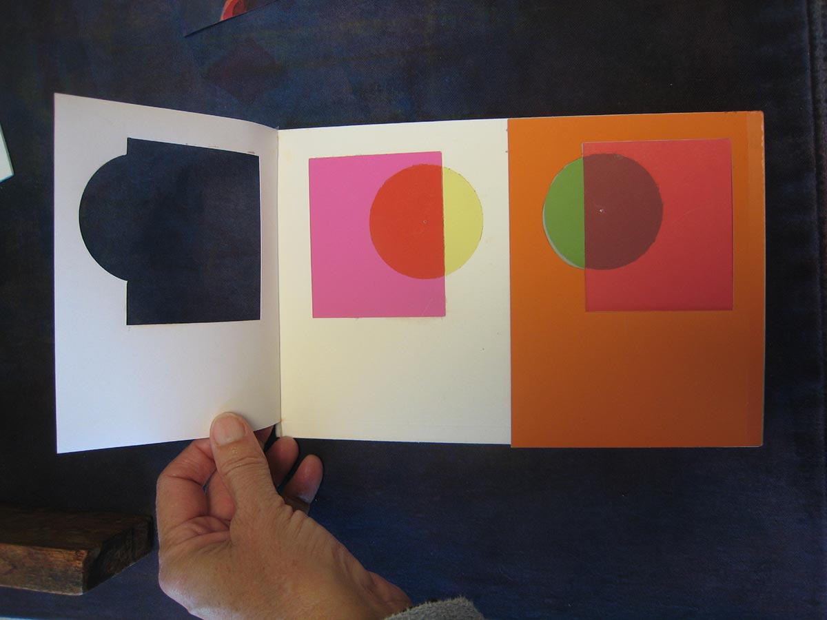
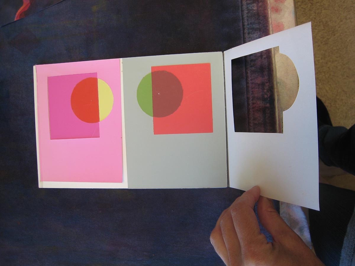
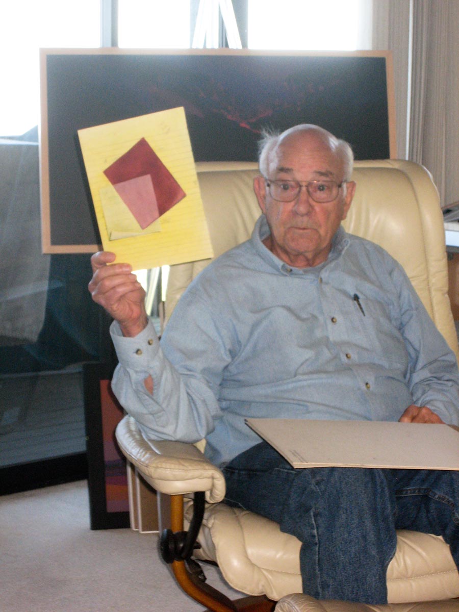
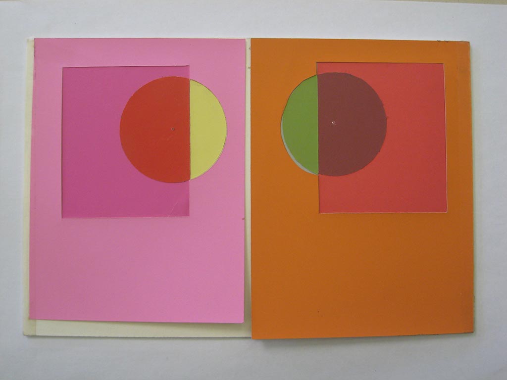
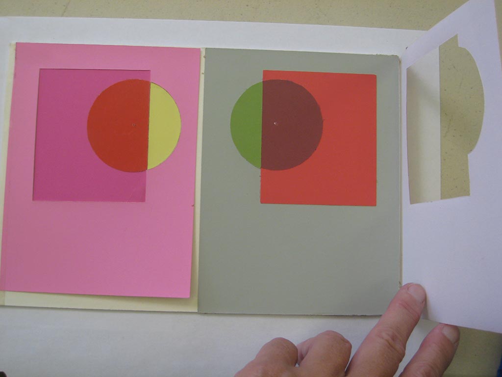
Multiple film illusions created by a past student, demonstrating the impact of context – surrounding colors.
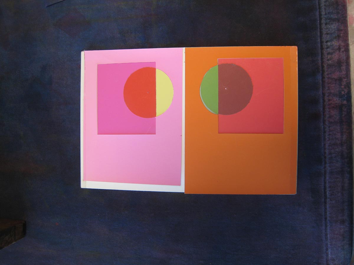
All of the colors in this piece are solid, opaque colors. On the left, it looks like we’re seeing a squarish magenta film over a pink background and a yellow circle, because we don’t see any pink coming through the yellow, the pink is darker and more saturated under the square shape, and the circle looks red. On the right, it looks like we’re seeing a similar squarish magenta film over an orange background and a green circle, because there is no hint of orange coming through the green, and the orange is redder in the square shape and the green is toned to almost gray.
When the left-hand pink flap is lifted, we see a white background with a magenta rectangle, a red semi-circle, and a yellow semi-circle. There is still a film illusion, but it is ambiguous whether the magenta or yellow is the film, or both are, because we can sense white showing through both, but the magenta seems more solid and the yellow more transparent. When the right-hand orange flap is lifted, we see a pale green-gray background with a red square on it, and what appears to be a round green film over both. Here, the rectangle reads unambiguously as opaque because we do not sense any pale green showing through it, and the round shape reads as a green film because the portion over the pale green background is darker and more saturated, and the portion over the red is darker and more neutral.
Because the top background flaps have holes cut in them the shape of the overlapping square and circle, we are actually looking at the exact same colors with the flap closed and with it open, very effectively demonstrating how relative our perception of color is.
Introducing veils
Dick said that if you understood the film assignment, the next, veils, will be a snap. He asked for observations of veils “here, now”. Some answers included clouds, atmosphere, sheer curtains, vog.
Observing a veil over a set of colors
A past student’s veil illusion
A wedding veil is a familiar example of a veil. Why do brides wear them? They partially obscure, creating mystery. It captures our imagination. We can’t help but wonder what’s behind the veil. As an artist, you don’t have to spell everything out for the viewer. If you leave something to their imagination, it involves them more; they participate in the experience of the painting.
Reverse print aloha shirts
Dick talked about “reverse print” aloha shirts as an example of how veils can unify. They are purposely constructed with the bright print on the inside and the more muted “back” side of the fabric on the outside. The tinting effect harmonizes all of the colors, unifying the design. Notice the muted appearance of the shirts in the screen shot to the right.
There’s more emotion in a work when everything is unified. Films and veils are two visual phenomena that help to unify and create emotion in a piece, intriguing the viewer and inviting their participation.
Class materials
Here is the presentation on veils. Notice the parallels to, and differences from, films.
The new homework assignment is to create two illusions of volume color, as detailed below. Arrays are the key! Ongoing assignments are to identify examples of color deceptions and halation (exercises 1-3) and visual phenomena (films and veils) in nature, or in your own or others’ work. Create improved versions of any past assignments. And be on the lookout for freaks, and evidence of your own increasing visual sophistication or color snobbery!
Class recap
There was some discussion of “freaks” versus personal style. It all depends on your intention – what is the artist trying to do? If you’re trying to convey a scene realistically, it’s important to pay attention to how nature really works, and make sure your work is consistent with that. If you’re Vincent van Gogh, that’s not your intent. If you’re an expressionist, make sure every aspect of the work communicates that. The phenomena we’ve been studying give you tools you may choose to use, or not, just as a knowledge of all the styles and traditions in the history of art gives you all those choices, while a child has only their own knowledge and instincts to act on. If you want to try something new, you have to give up the old, at least temporarily. Two metaphors for this were “If you want to try the black horse, you have to get off the white horse” and “You can’t steal second if your foot’s still on first.”
Real learning isn’t memorization, it’s behavioral change. If you see the world, or works in a gallery, differently now than before this class, it’s because you’ve changed. You’re seeing with a different set of eyes.
All of these tools are very rational and analytical. Learning them may not seem very exciting. What IS exciting is what they allow you to do. They let you become a magician, to make people see something that isn’t there. While Dick doesn’t paint realistically anymore, he uses these principles to fool the eye, to involve the viewer in the painting, to make them see the beauty in colors and shapes and values. Dick said, “If I sound a little overbearing, it’s because damn it, I love the truth!” He encouraged everyone to observe and question and develop their own checklists, to become independent of him and me. Rather than limiting your creativity, these principles give you even more options to choose from as you create. As in writing, music, and dance, learning the fundamentals of your art allows you to express yourself more fluently. You are gaining more elements with which you can orchestrate and compose. The more you practice, the more your mastery will grow.
Critique – reworked assignments 1-4
Here’s a study (from past years) which challenges your perception of which color is the film, recognizing that it all has to do with context, or RELATIONSHIP!
Review
It’s absolutely critical to OBSERVE and QUESTION. We’re training our brains and eyes into new habits, and it takes effort at first. Create your own critique checklists and USE THEM.
There are some fascinating transparency illusions in the Albers book, but if you look at them critically, you find they behave inconsistently with nature. Dick created a similar illusion in watercolor that has consistent behavior.
Critique – Assignment 5, Illusion of a veil
Tuesday homework: Illusion of a veilSaturday homework: Illusion of a veil
Refer to the checklist above. Is the illusion believable? Does the veil lighten everything under it consistently? Does the composition have good gestalt?
Dick asked whether class members have incorporated veils into their work, and why. Answers included:
I do it all the time. It adds subtlety. I didn’t have a name for it, though!
It unites and adds mystery.
In a landscape, it helps with perspective.
It helps to give the illusion of depth.
I’d like to use it to fool the viewer into thinking that something 2D is 3D.
The unifying effect is most important to Dick. A veil treats everything in a predictable way. There is a consistency in nature. Like transposing music from one key into another, the intervals are consistent. If there’s consistency in your painting, it works; if there isn’t, you’re creating a freak.
Mastering this allows the artist to be a magician, an illusionist. A veil entices and implies, and allows the mind an opportunity to engage. There’s nothing worse than listening to someone who’s totally literal. Know what the options are, and pick the ones that help your cause. It’s like having a good vocabulary. You don’t have to always use the big words, but you can pick the right one when you need it.
A trihue watercolor landscape incorporating veils
This week’s new concept: Volume color
Several factors work together to create illusions of distance or depth in a painting. Two that we paid particular attention to are linear perspective – how objects further away look smaller – and aerial perspective or volume color – how objects further away take on the color of the medium in which they are immersed (atmosphere or liquid). The relative change, in size and in color, provides a visual cue for how close or distant the objects are.
Using the principle of volume color helps elements of a scene become part OF the scene, not look pasted ON. Using colors from an array in which the object color and volume color are used as the anchor (parent) colors are can help create a consistent, unified, harmonious effect, as in these two arrays from today’s presentation.
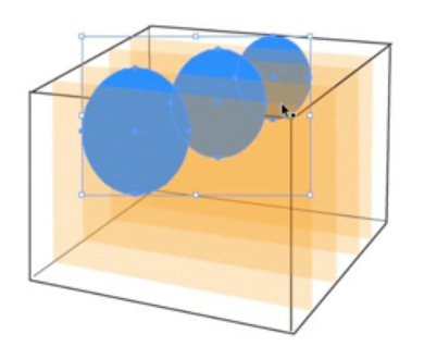
[one-half] Learning never ends! For years, Dick has been teaching that a volume of liquid behaves like infinite layers of films. But this week, he created a video tutorial demonstrating how a blue object’s color is changed under several layers of orange representing a volume of orange liquid, and noticed the object was getting lighter – more orange – not darker, as it would under films. He realized he hadn’t changed the transparency blending mode in Illustrator from “Normal” to “Multiply”. But when he did change it, the effect wasn’t what we observe in nature – the original version was closer.
Use the concepts of films, veils, and volume color to help recognize and create consistency in your work, but don’t follow them slavishly. Understand that they are models – idealized simplifications – and there is no substitute for careful and critical observation.
[/one-half][one-half last=”y”]
Multiple semi-transparent layersMultiple film layers
[/one-half]
[one-half]
Some of the physics behind the phenomenon of volume color is explained in a poster linked to at right. There are a lot of other resource materials available at that website, designed for teaching science in California.
[/one-half][one-half last=”y”]
Light Matters poster
[/one-half]
Class materials
This tutorial demonstrates how volume color modifies a color immersed in it. The demonstration explains how aerial perspective also influences color. An important tool in creating a composition in which all colors are OF and not merely ON the picture plane.