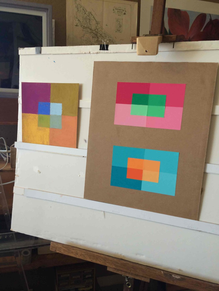
The eighth sessions of the Trihue Watercolor class for Winter 2018 were held on Wednesday, March 7 and Sunday, March 25. The surface and volume color homework was critiqued, and a review covered the whole course. All of the visual phenomena and principles covered in the course are tools you, as an artist, can choose to use, or not, depending on your goals. All have the potential to integrate and contribute to visual harmony, because they behave as nature does. Understanding them will allow you to create visual magic, whether working from nature or your own imagination.
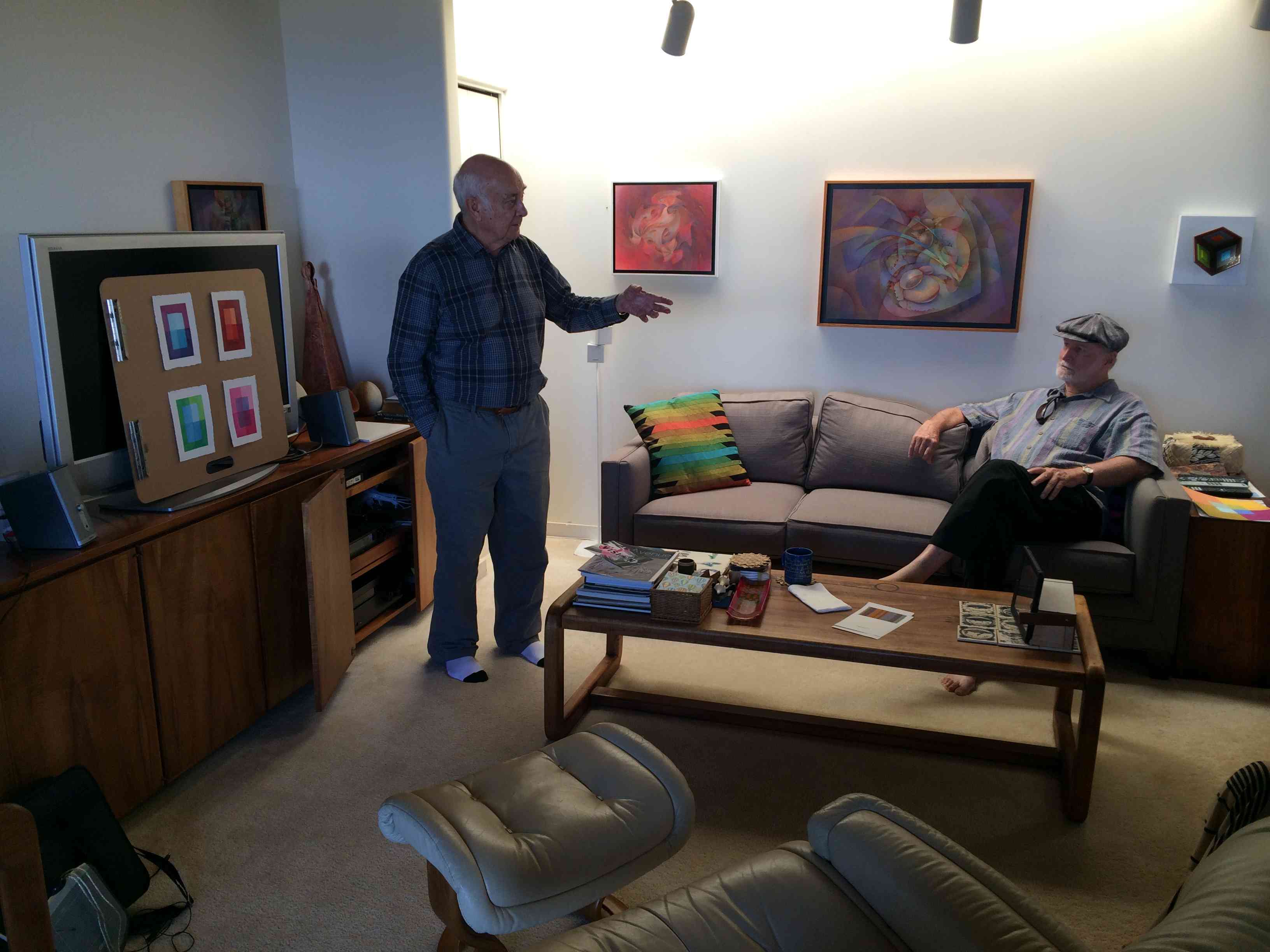
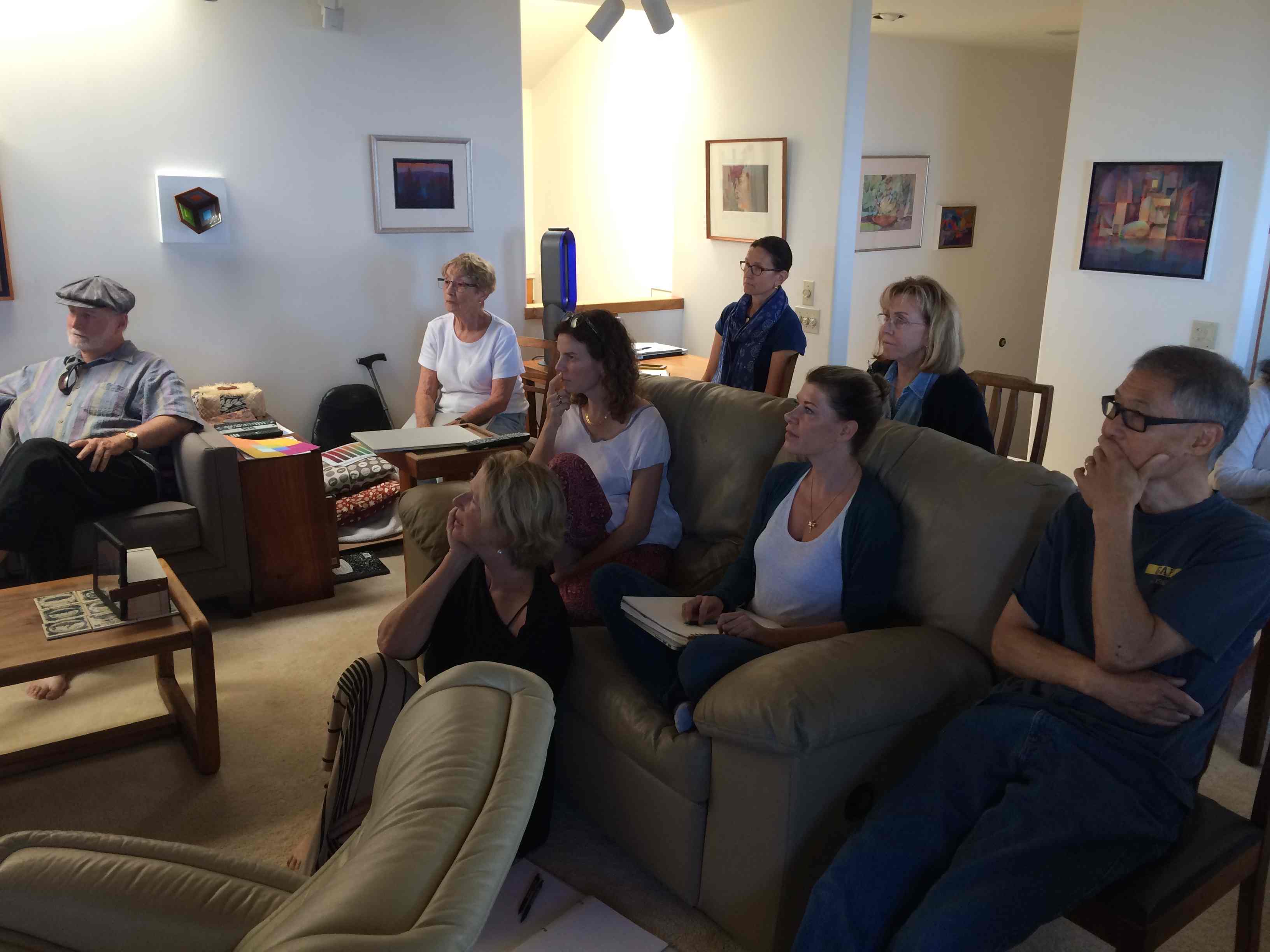
Artist Kit Gentry joined the group by Skype for a question-and-answer session and discussion of artistic concerns.
A ninth, “Do-over” session was held on Wednesday, March 28, for people from both groups to bring reworked studies for critique. Much of the time was spent on the surface reflection exercise, and we have video of Dick illustrating and explaining how to plot reflections and shadows.
Videos – Q&A with Kit Gentry

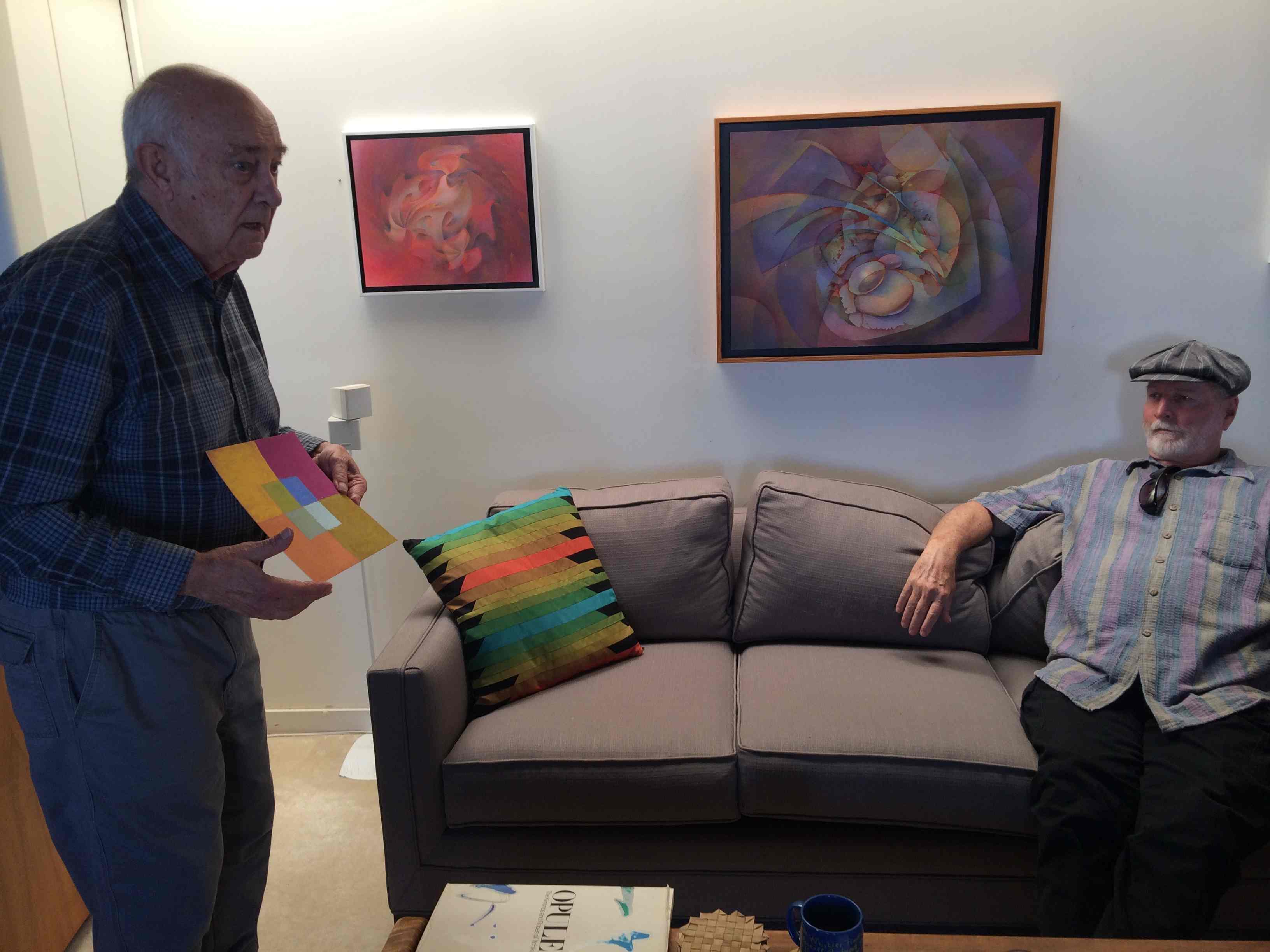
Kit Gentry is an artist who took Dick’s Color Relationships course several years ago. In almost every class since, Dick has raved about how Kit has applied those lessons to his painting. Kit no longer lives on Maui, but they stay in touch, and Dick asked him to join this class via Skype for some discussion.
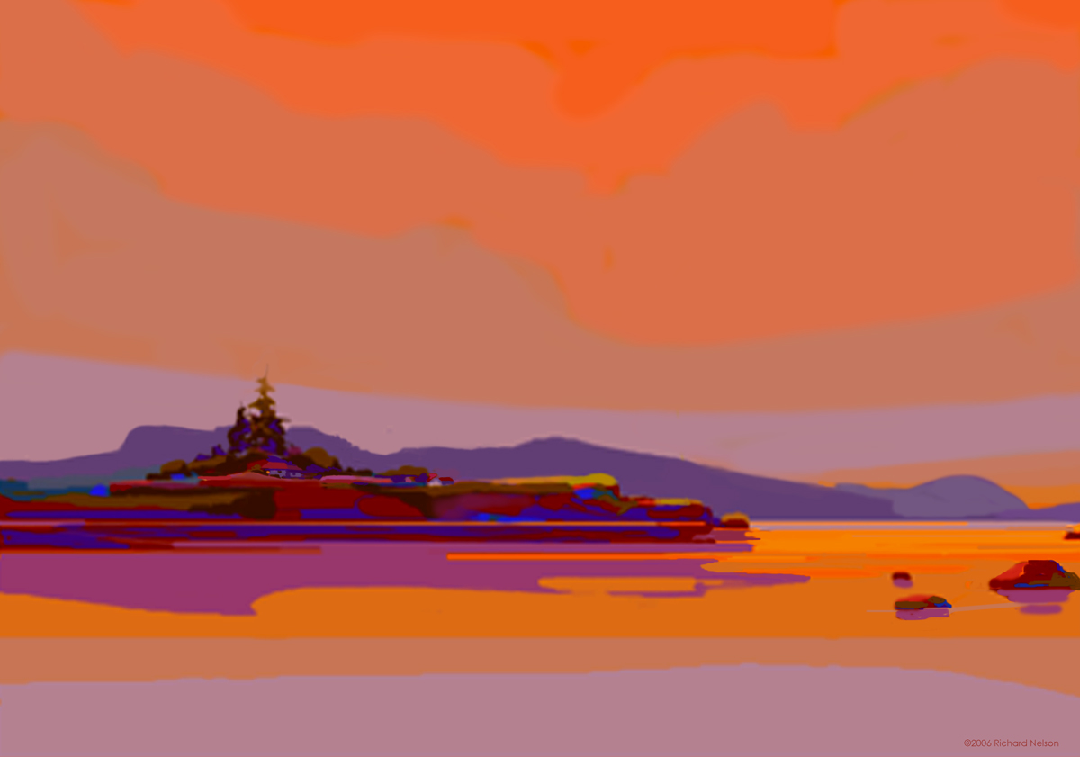
They started by talking about Netherworld, the pastel pictured above.
In the video below, Kit Gentry describes how he prepares his paper for a pastel painting. (2:42) For more detail, see this page on his website. He has separate discussions on his website for each medium he uses.
In the second video, Kit Gentry describes some influences, talks about viewing distance, and chasing fog. (8:21)
In the third video, Kit provides some words of wisdom regarding color. (5:18)
Kit aims for the ring of truth in color relationships, to approach the luminosity of nature. (3:32)
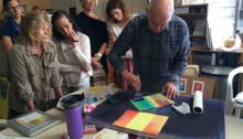
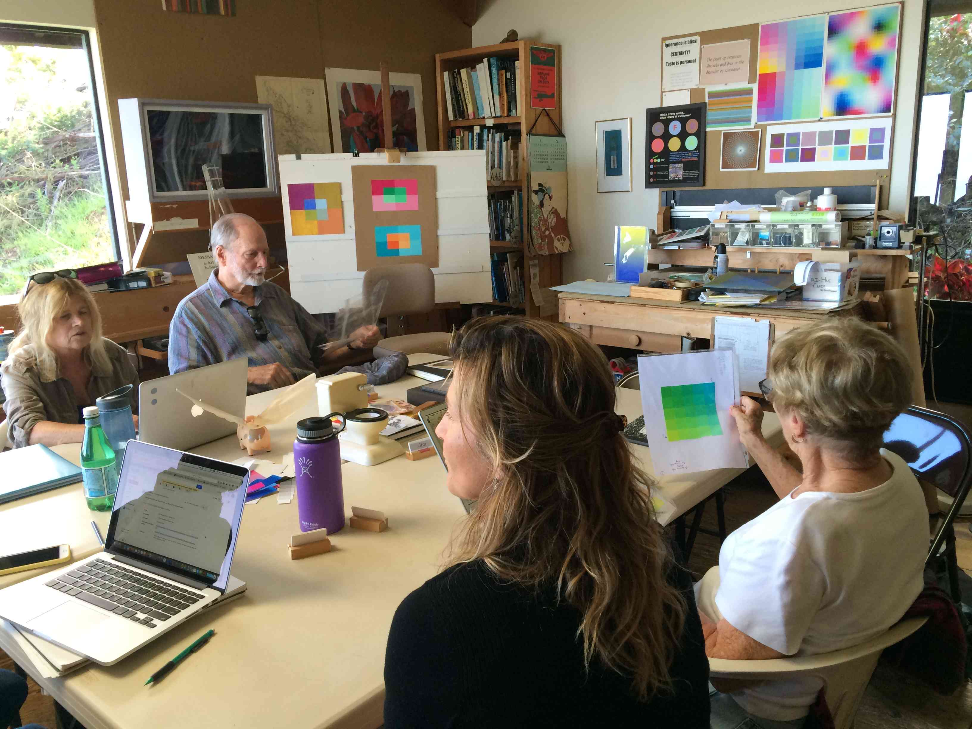
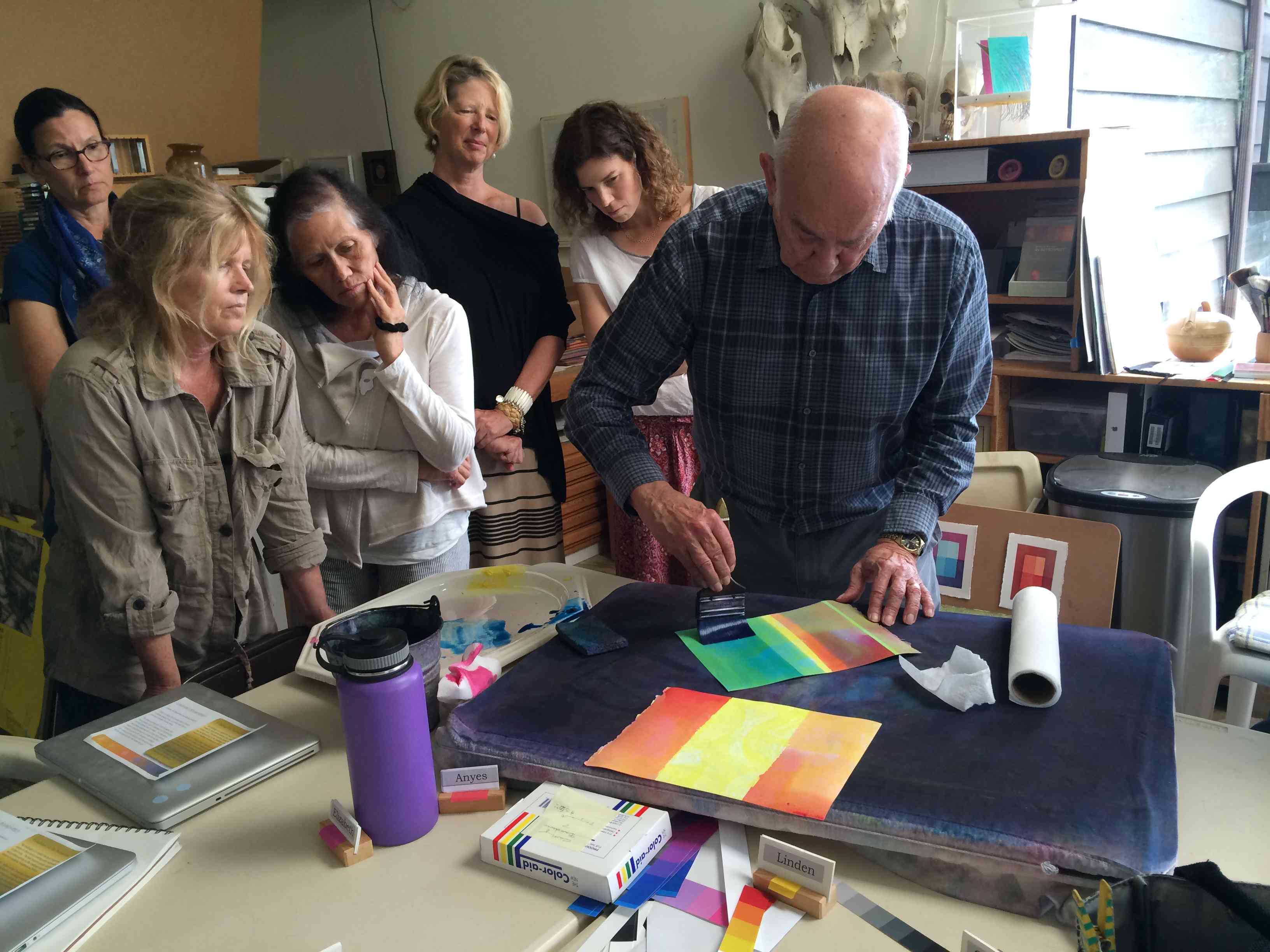
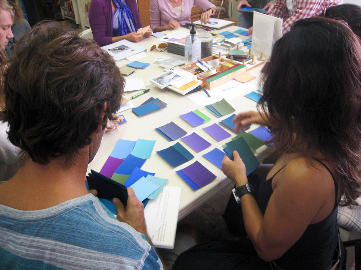
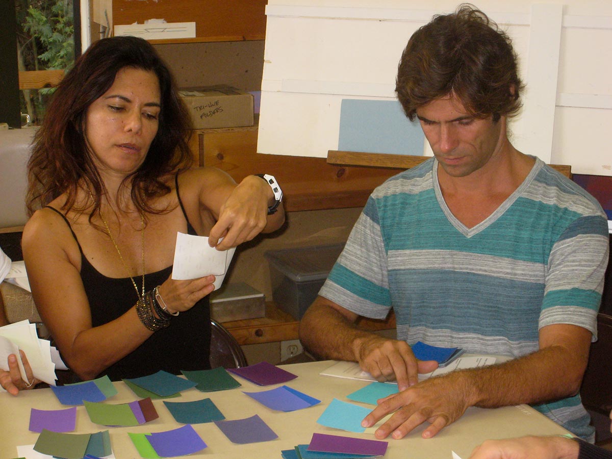
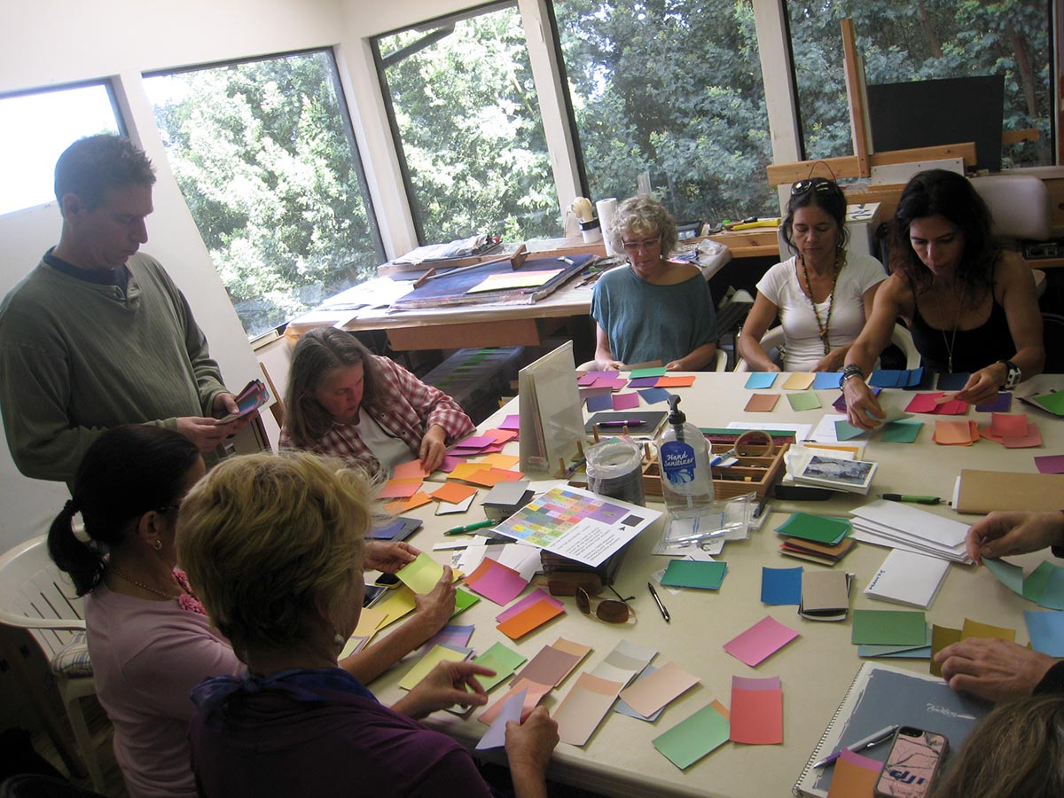
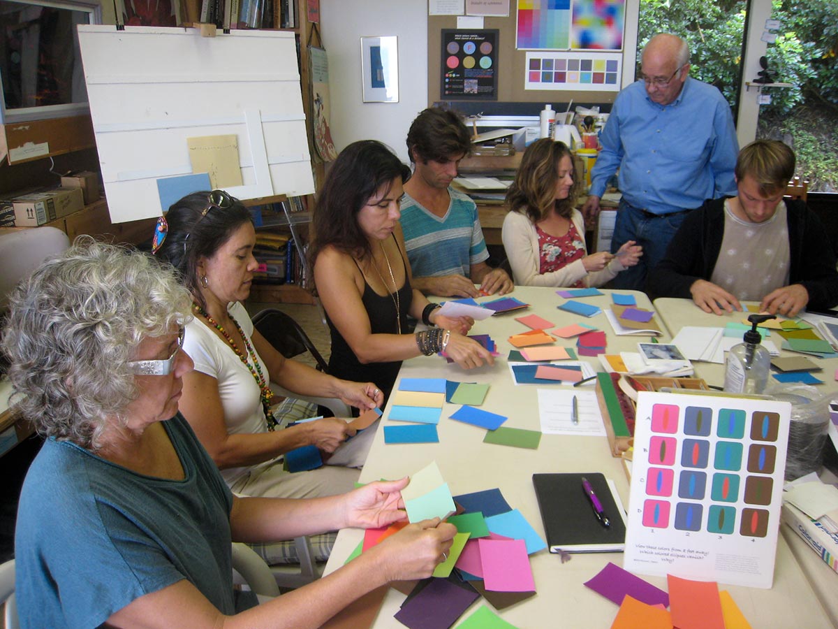
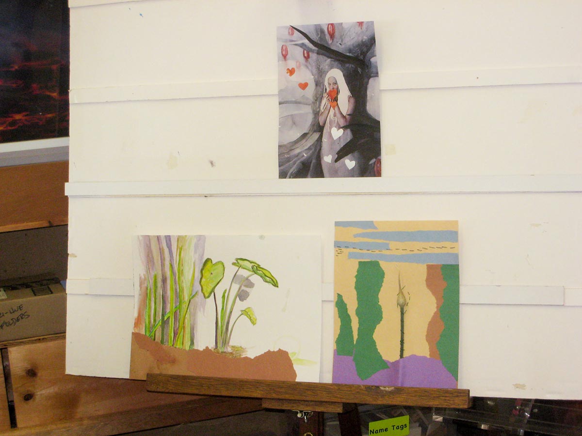
Wednesday class photos
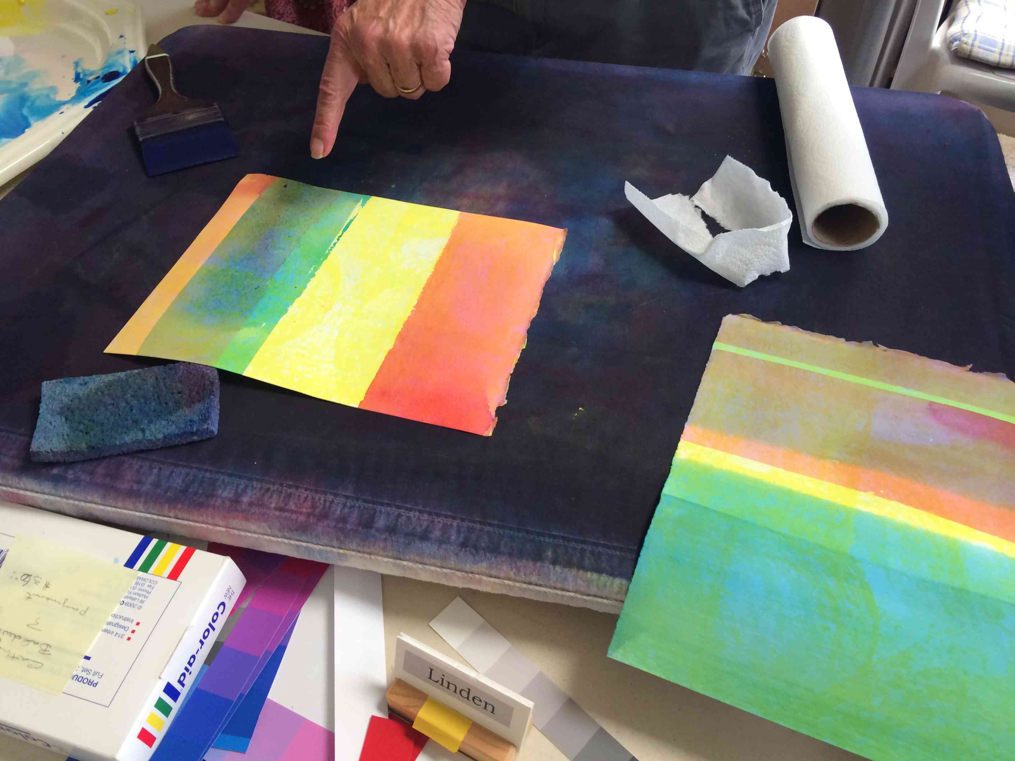
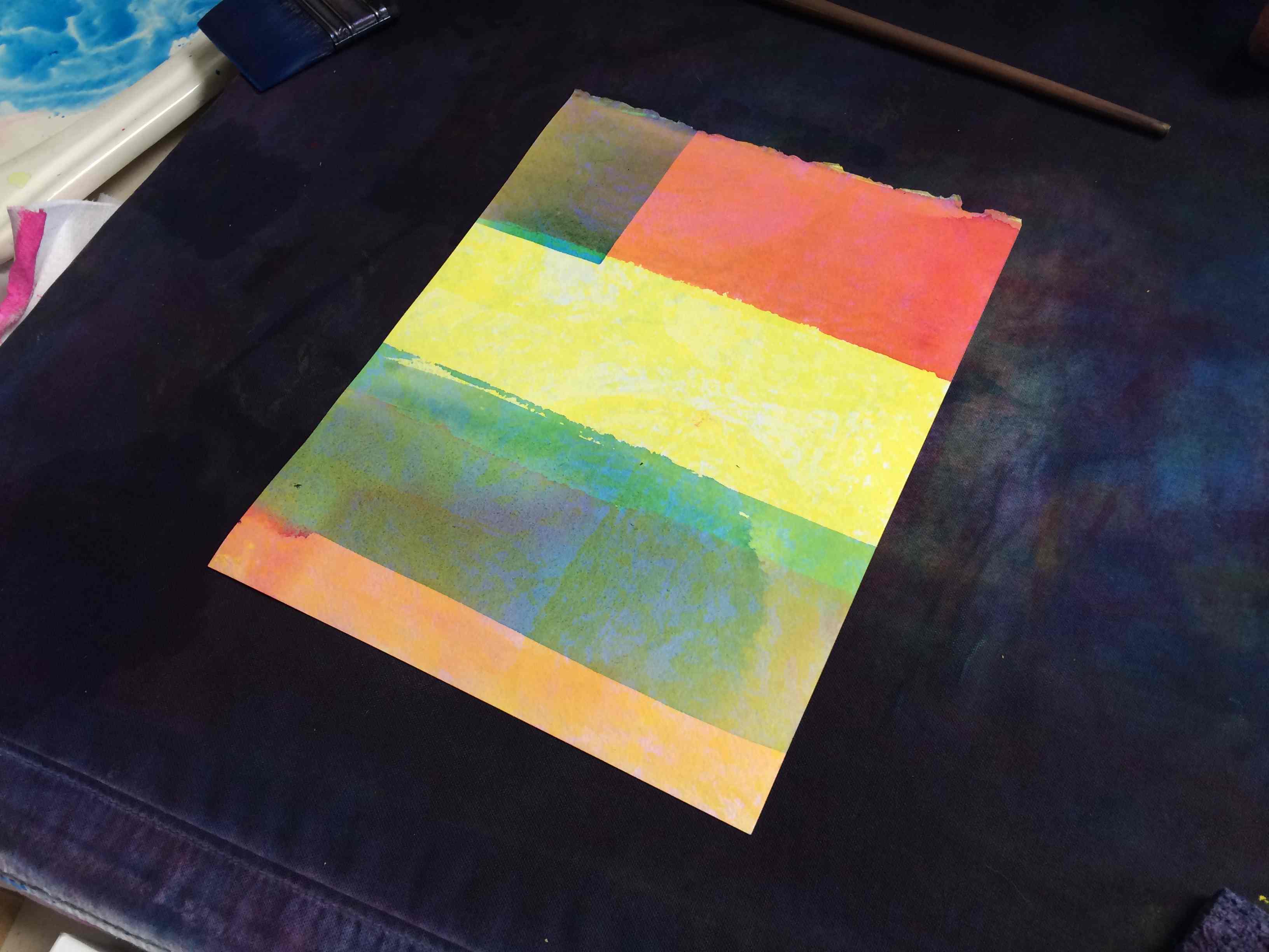
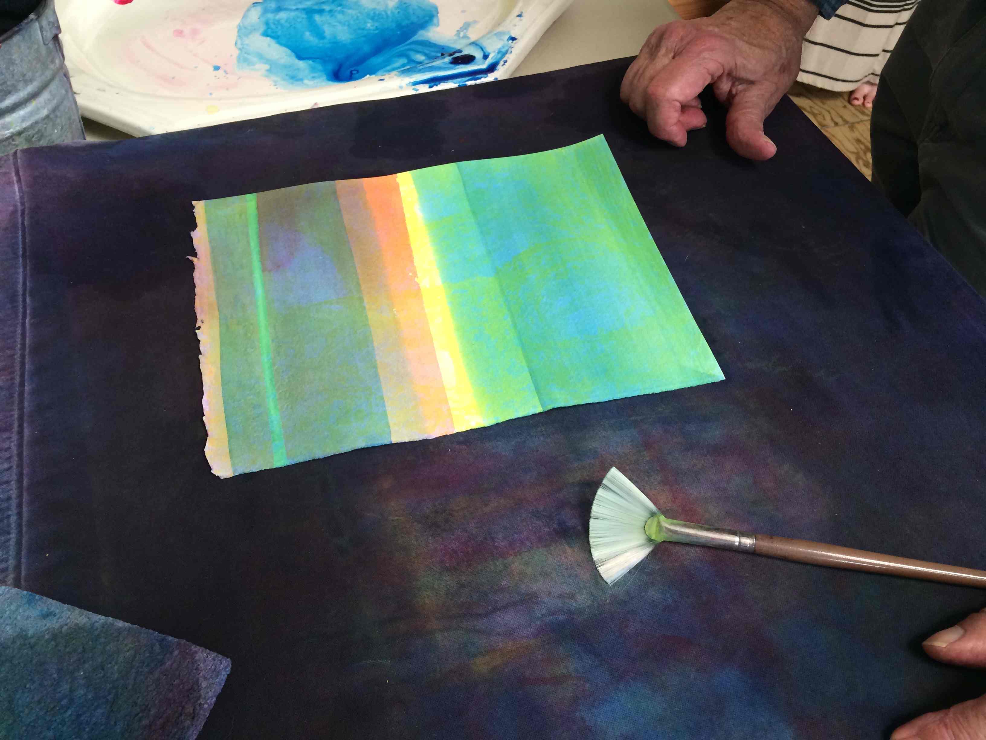
Homework critique


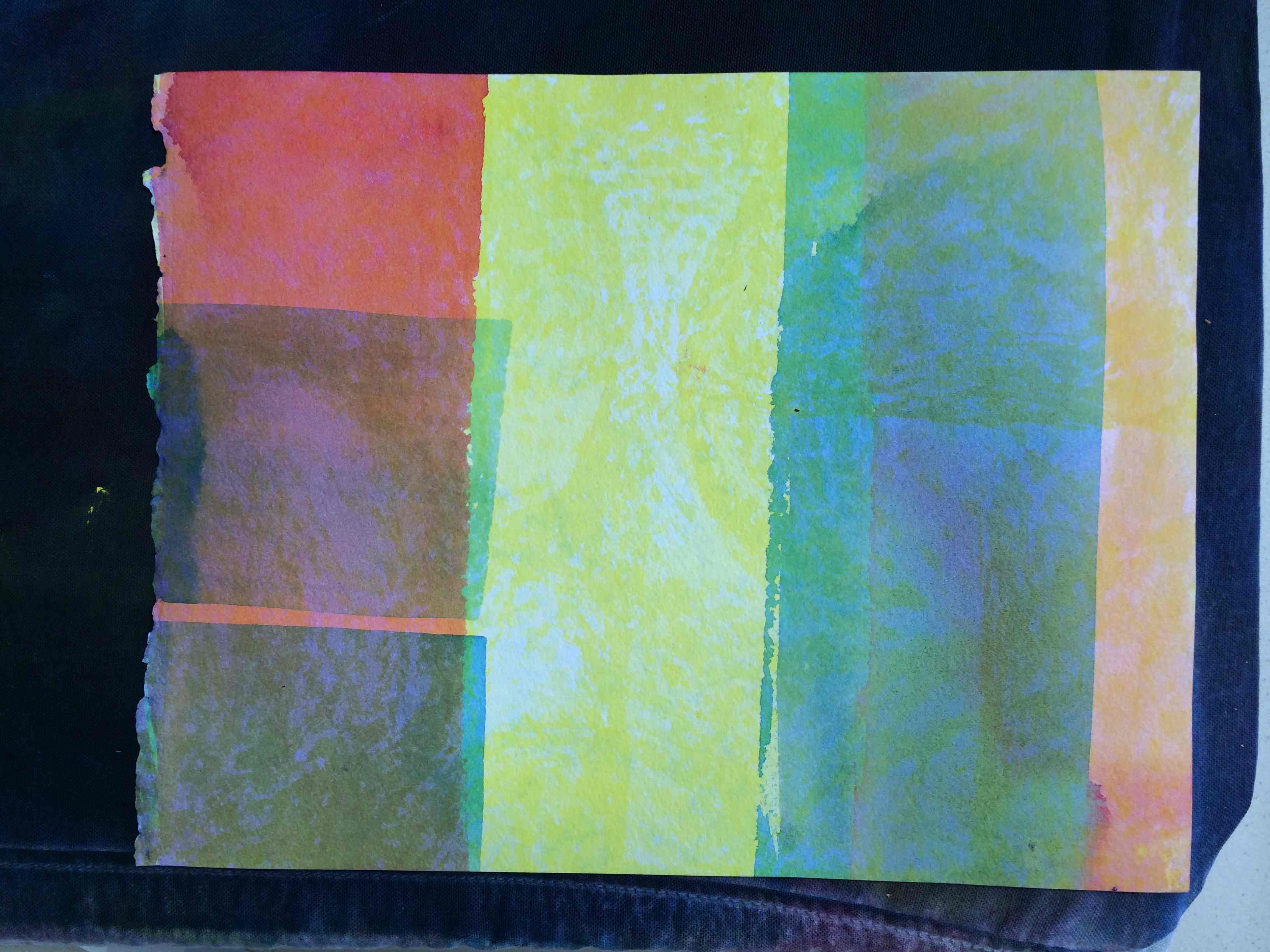
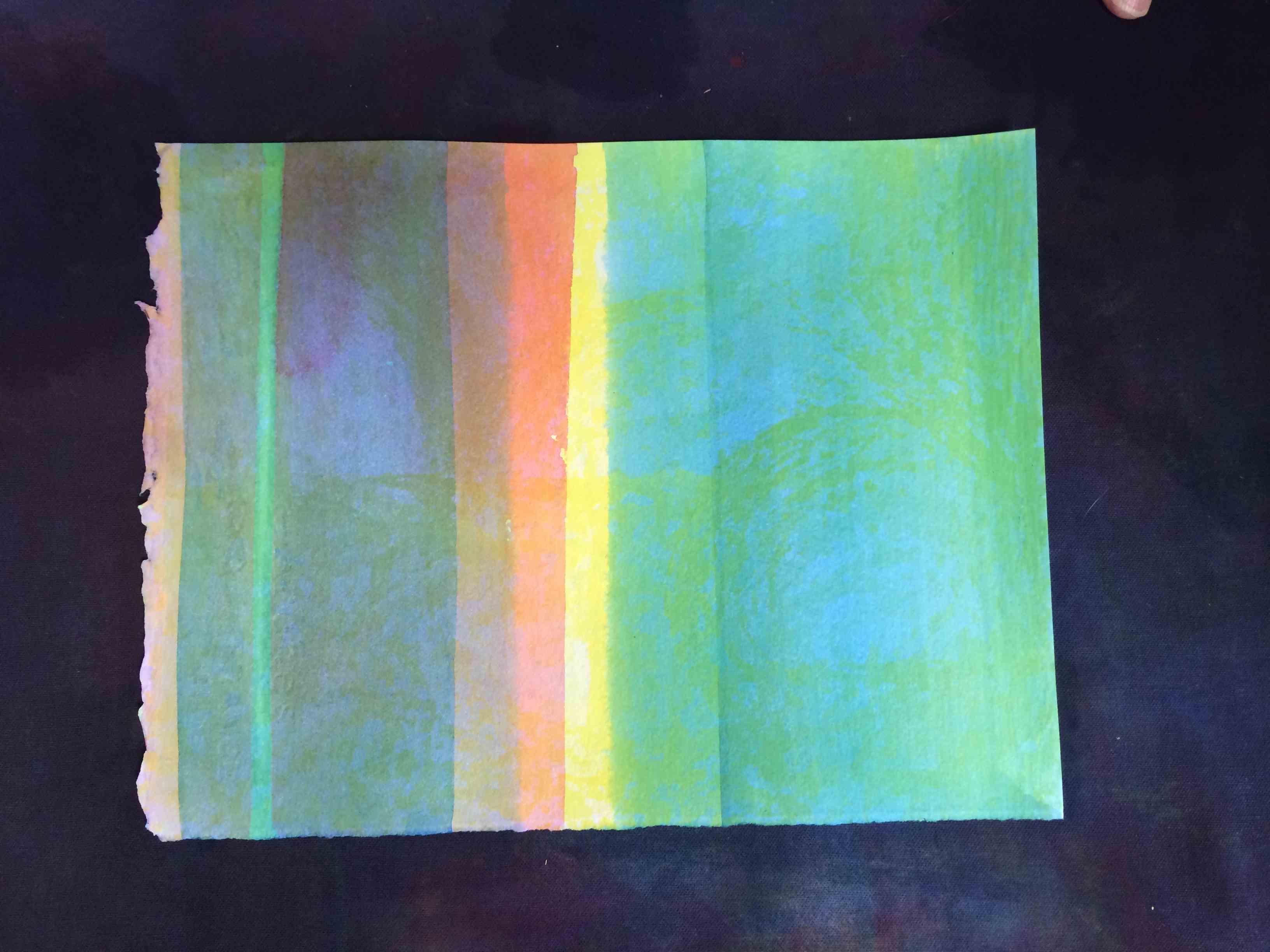
Homework – Gradated veil, surface & volume color


Sunday class photos
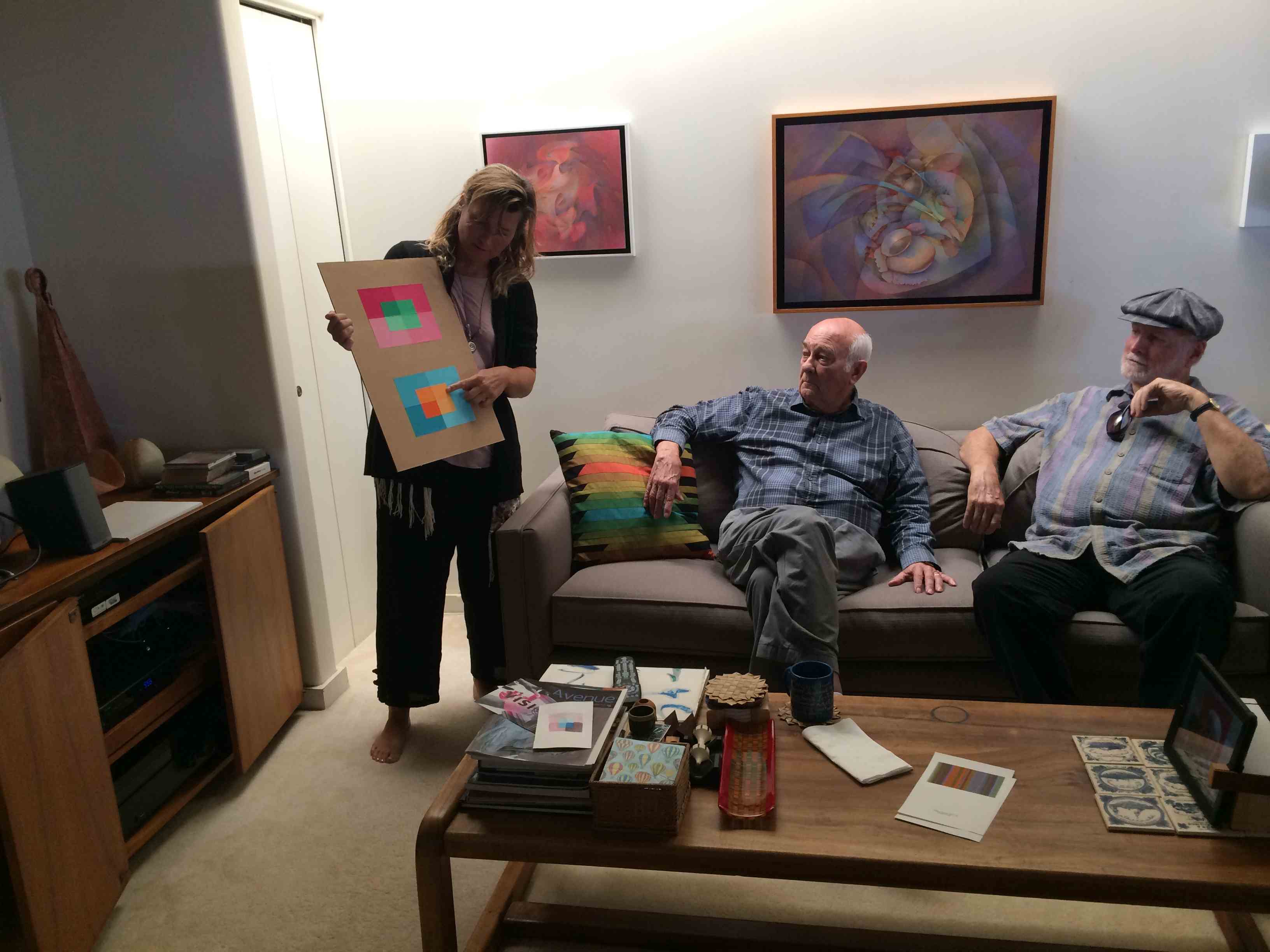
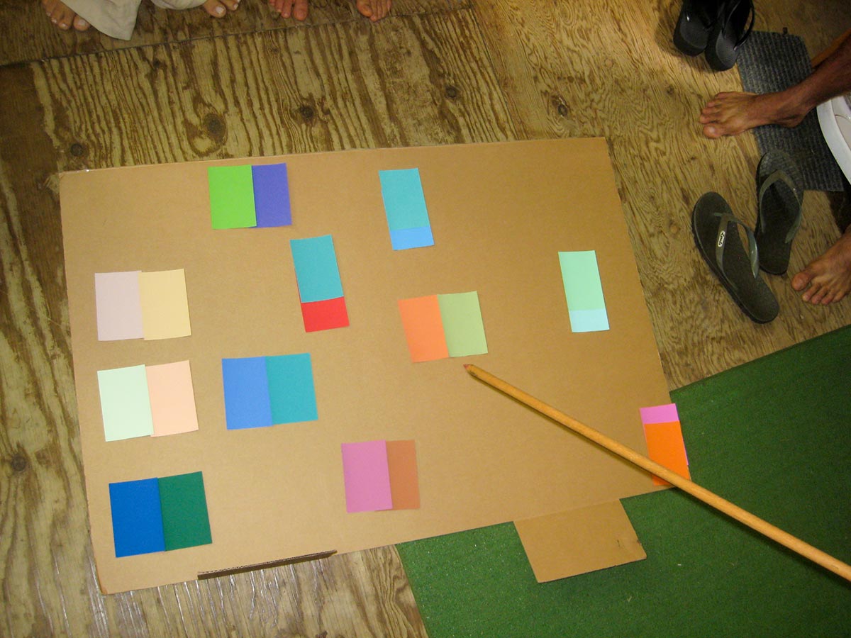
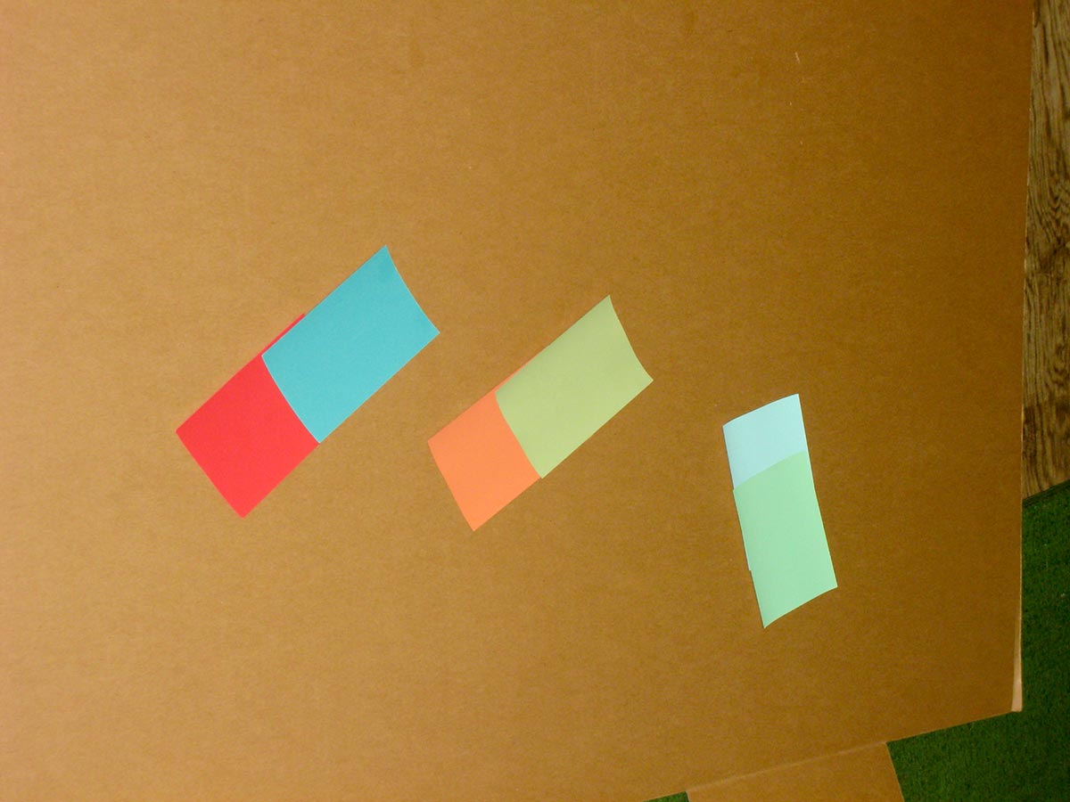
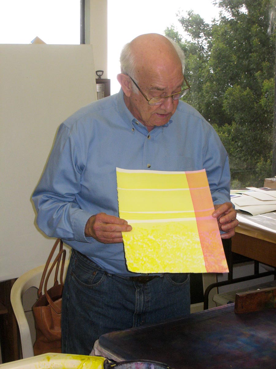
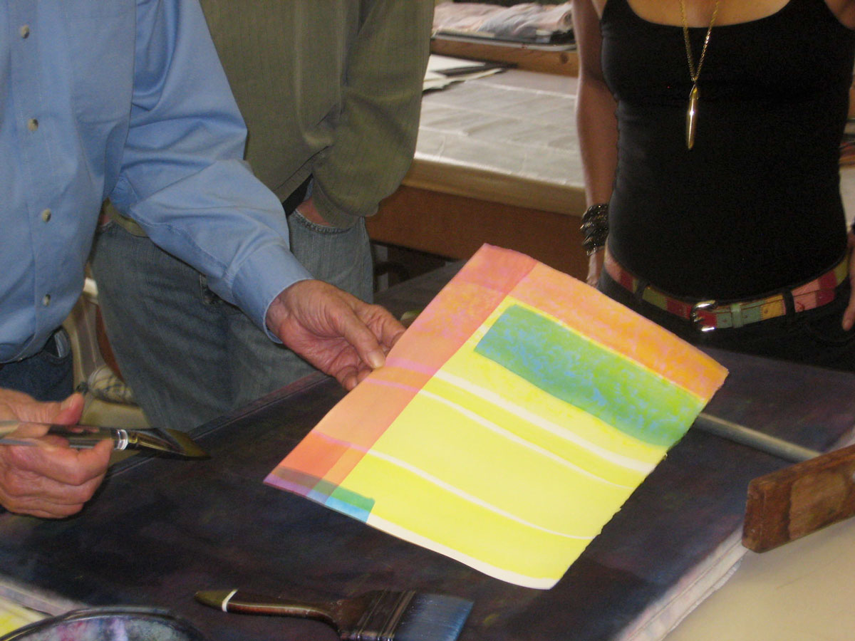
To review and solidify some fundamental concepts, the group answered the Color Pretest from the first week. During the review, Dick asked Carleton to mix some colors to match those on the sheet, which helped clarify understanding of tones and shades.


Week 9: “Do-over” session
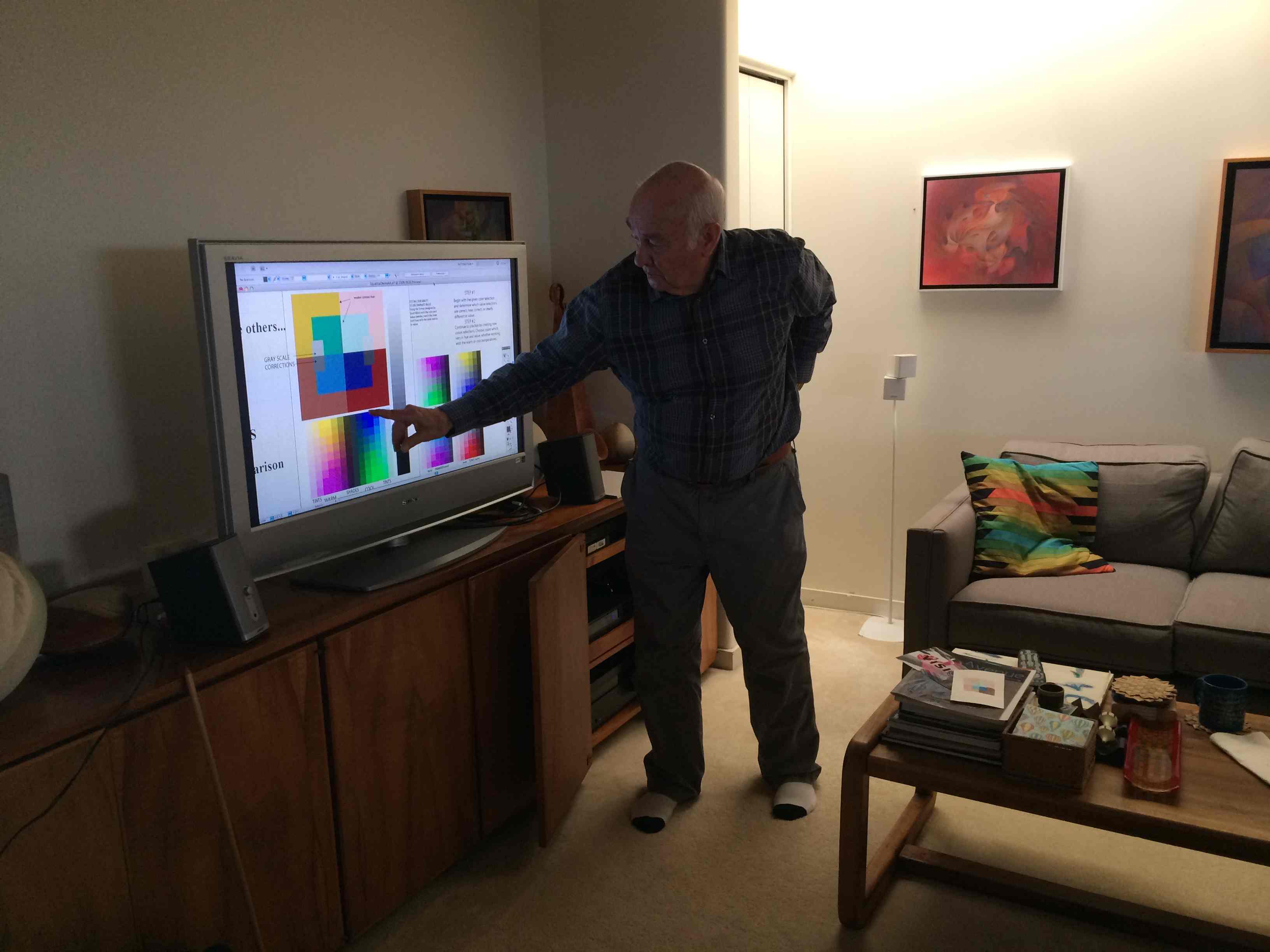
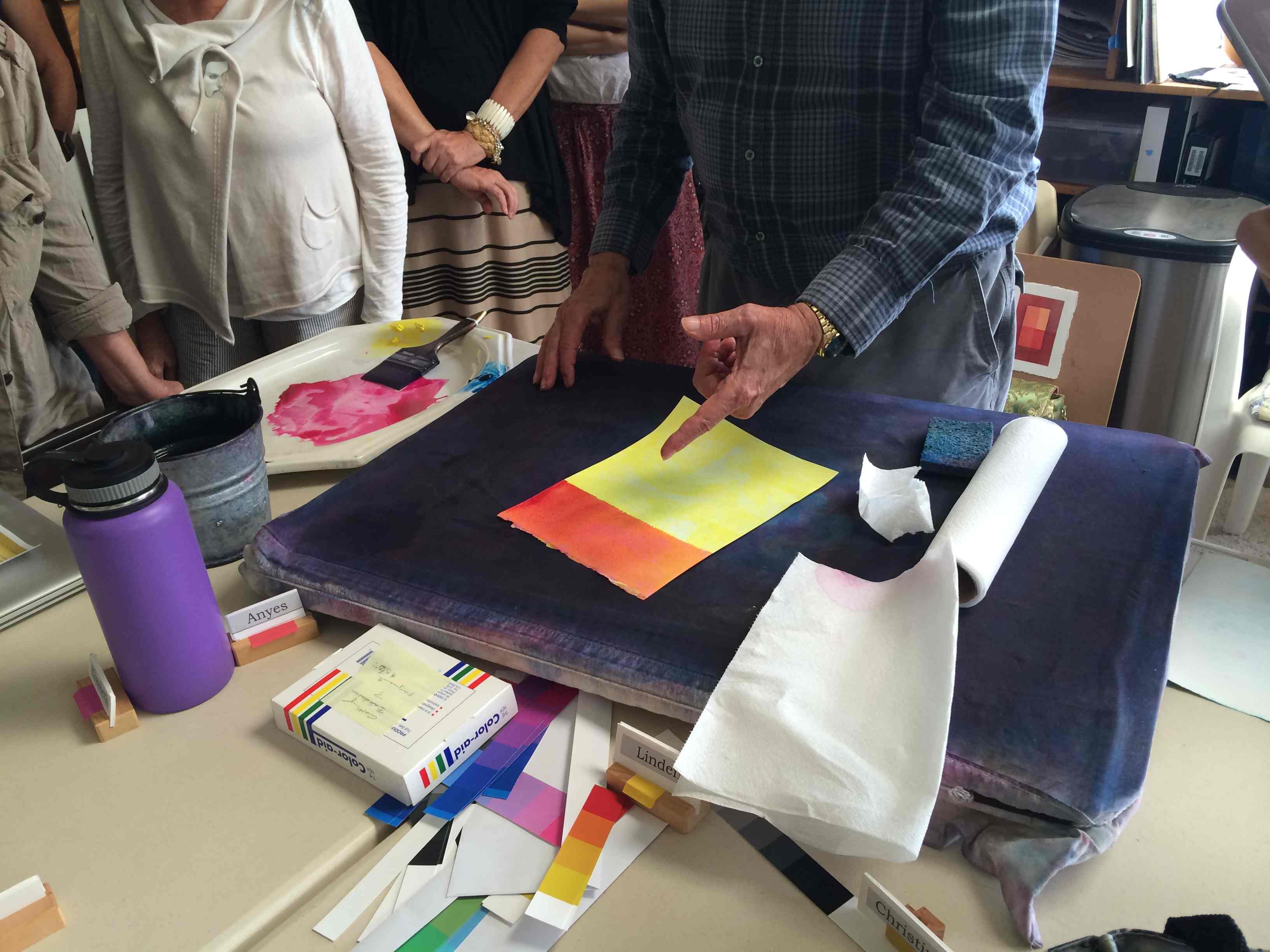
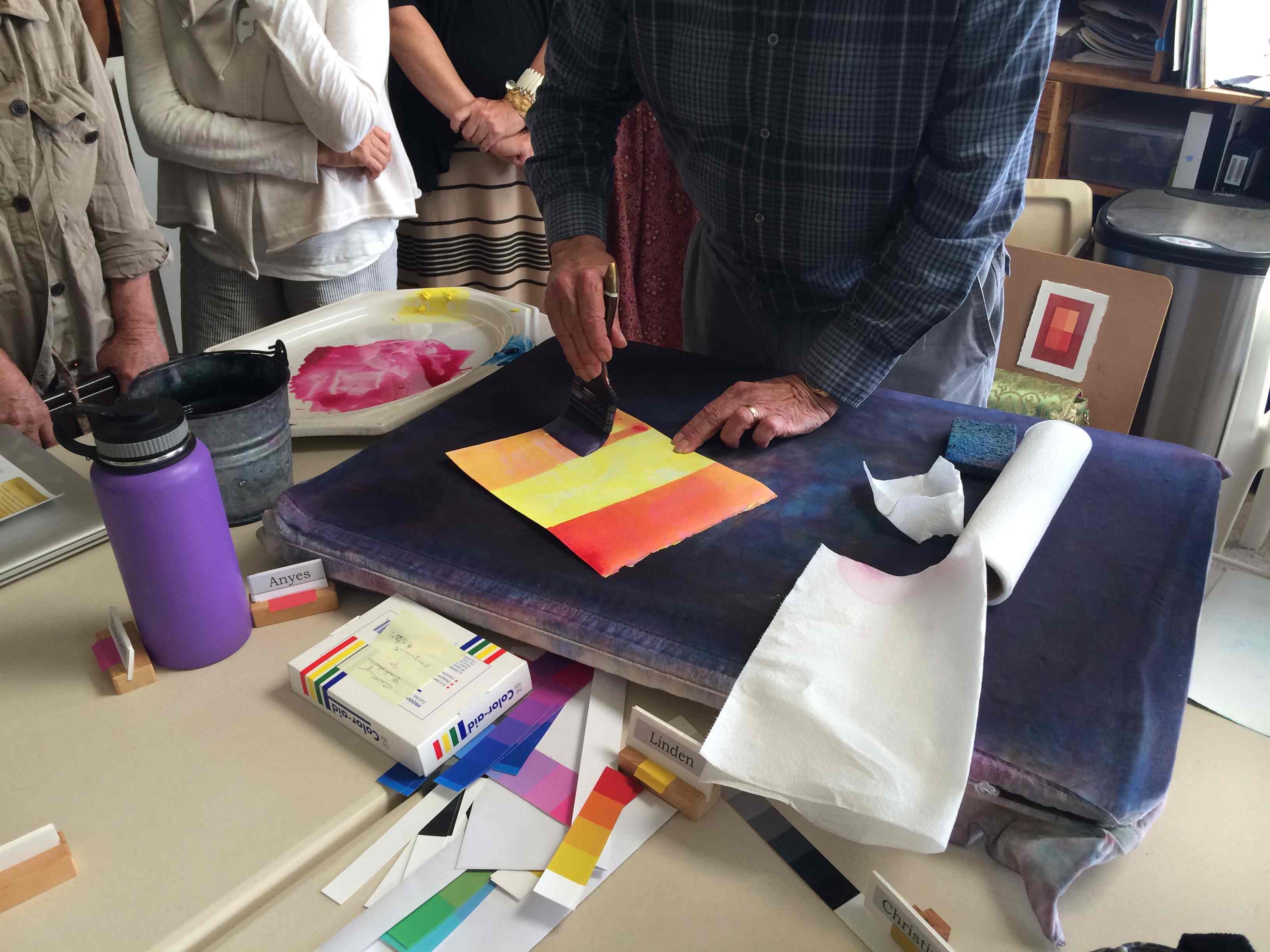
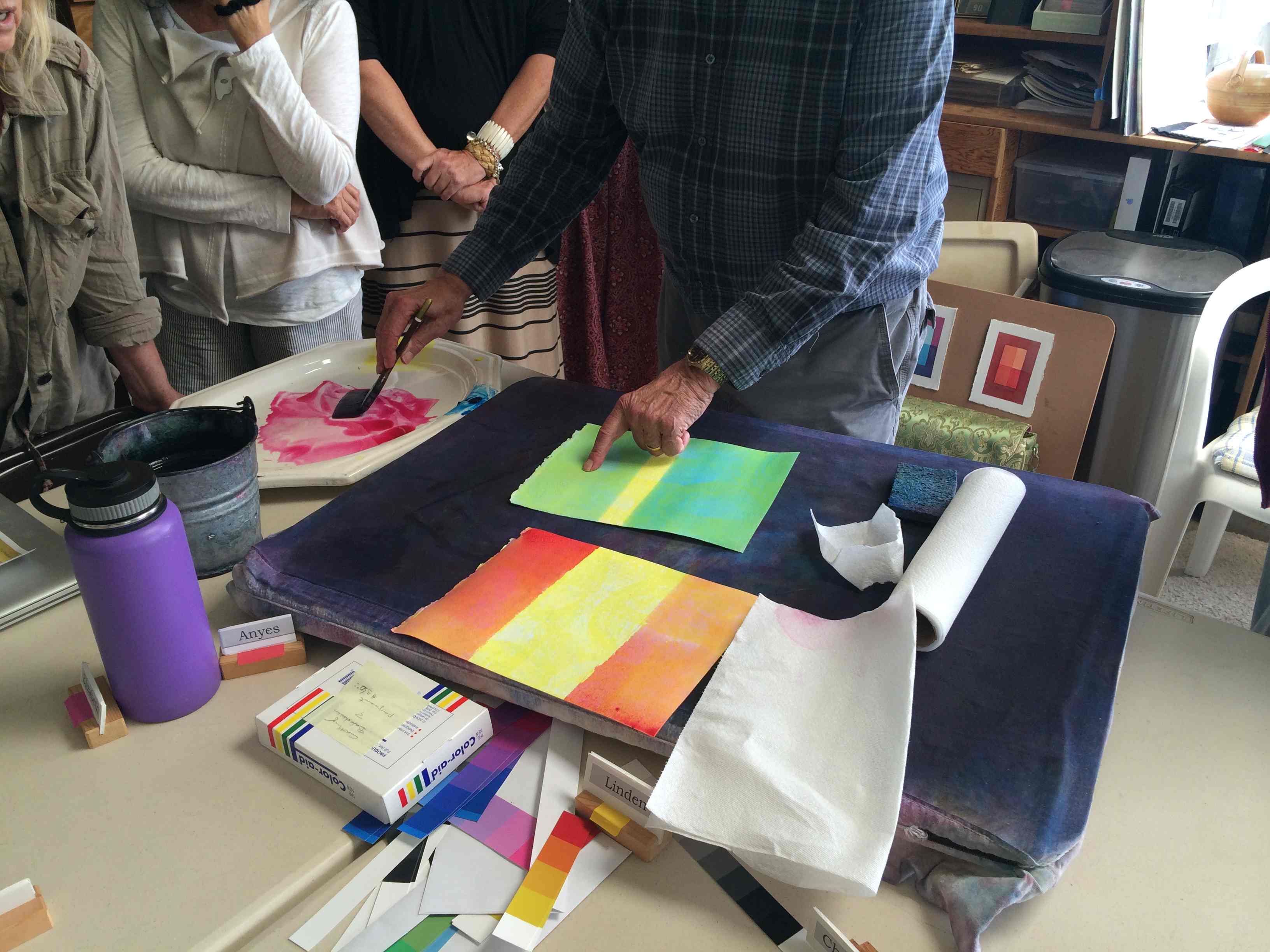
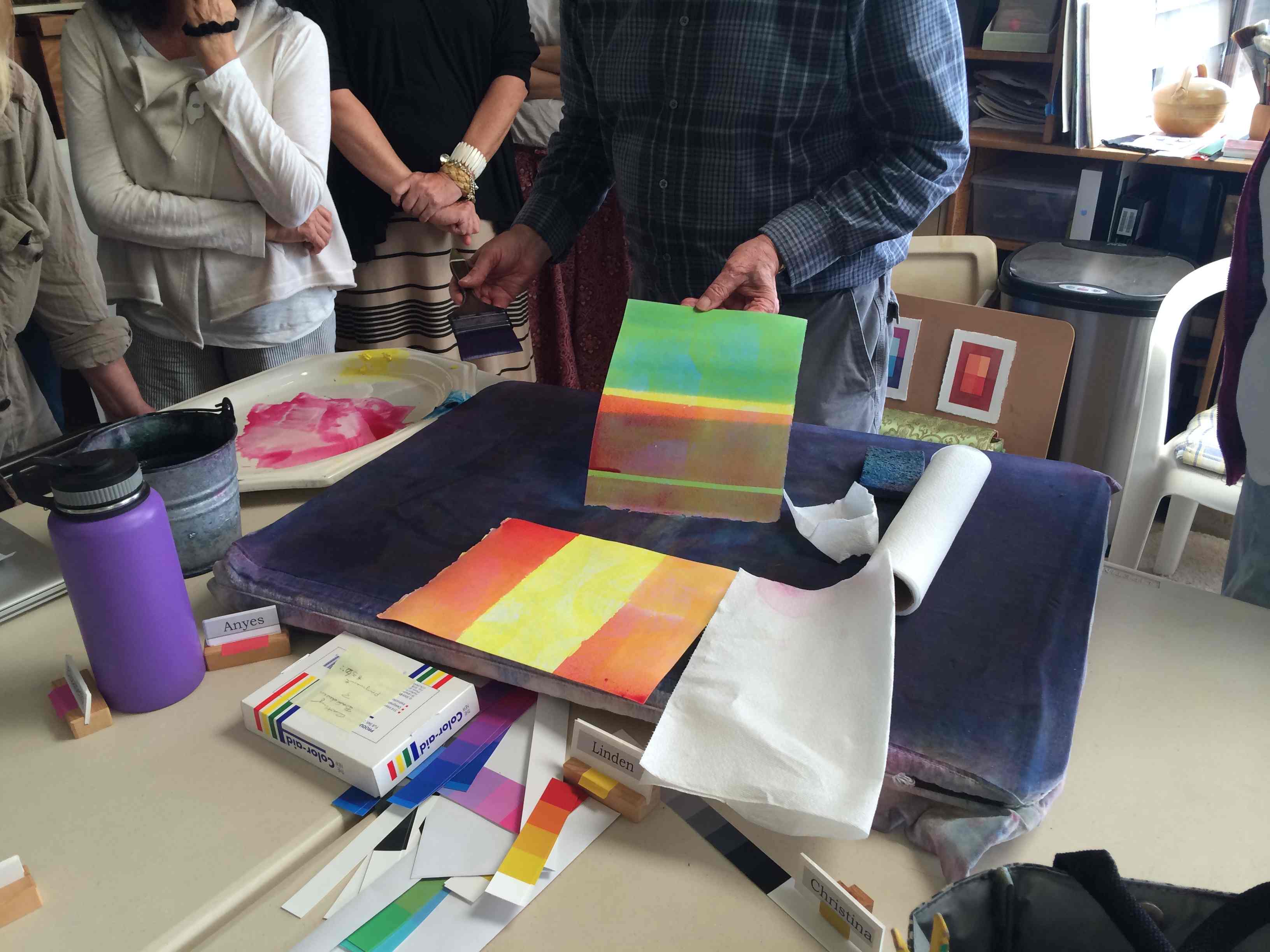
Dick held an extra session, for people to bring reworked studies for critique. Much of the time was spent on the surface exercise, which was a very challenging illusion of how water can be both transparent and reflective.
During the critique, Dick drew attention to the value of the water’s reflective surface. In the distance, it is reflecting the sky, which is generally the lightest area in the painting, so it should also be light. The surface in the foreground is generally darker. He also explained how to plot the height of reflected objects. Reflections depend on the position of the viewer. Dawn Jernaill sent the three photos below, which she took with a drone at three different altitudes, which illustrate both points.


Plotting reflections & shadows, then observing them
Dick Nelson illustrates how to plot reflections and shadows, describes how they behave differently, and provides an opportunity to observe them. (5:10)
Why bother learning to paint reflections?
Being able to pull off an illusion as challenging as reflection and transparency allows you to create visual magic. Careful observation is essential, combined with understanding. (3:15)
You will see when you understand
More on plotting reflections. Understanding the phenomenon intellectually will help you copy or create more accurately and convincingly. (6:13)
Never leave well enough alone
Cropping and playing. Painting demo, experimenting on “playgrounds”. (15:26)
Photos


Mahalo to Valérie Richter for Wednesday photos and videos, and to Holly Duane for Sunday photos.