Critique of last week’s exercises
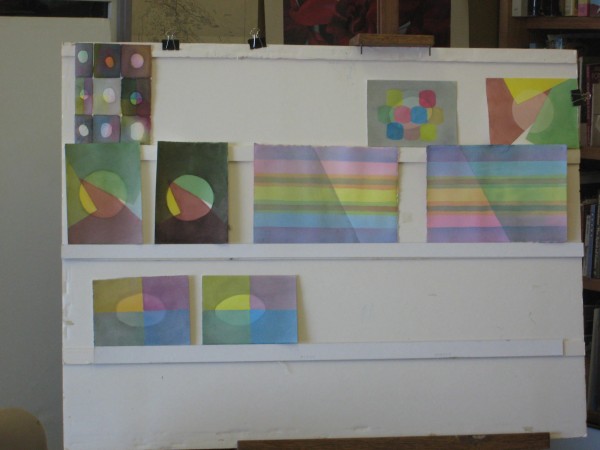
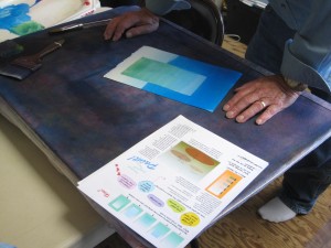
Illusions of white and colored spotlights
Watercolorists have an advantage over artists in other media when it comes to shadows. Since light affects all objects in a scene equally, you can mix a single batch of color for your shadows and apply wherever needed. Dick loves using light and shadow in paintings because, “instantly, it unifies.”
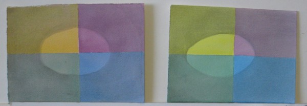
Here’s the basic principle of creating the illusion of a spotlight on a surface: the shaded area contains some degree of black (that’s what defines a shade, remember?) plus the complement of the light color. So for white light, the shadow appears as a black film. For a bright light, the shadow is dark; a dimmer light would have a lighter shadow. For amber light (such as at sunset), the shadow contains blue. (In years past, artists were taught a falsehood: that the shadow of an object contains the complement of the object’s color.) Some hints came out as we reviewed which illusions were most successful:
- You can’t just put a colored circle inside a shaded background; you need to have at least 2 reference shapes and colors in the scene so you can see how they are affected by the light and shadow. This helps its “gestalt” (see below).
- Use a saturated color for at least one shape, because if all are left as tints, the lighted area might be read as a veil instead.
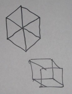 Gestalt has to do with composing your shapes so they will be perceived as you intend. For example, in the picture at left, if you want to illustrate a wire-frame cube, the lower drawing is more convincing that the top one. Symmetrical shapes will tend to be perceived more as a design than as a representation of reality. For this reason, in the picture below, the arrangement on the left is less successful, due to its near symmetry, than the one on the right, which is clearly asymmetrical.
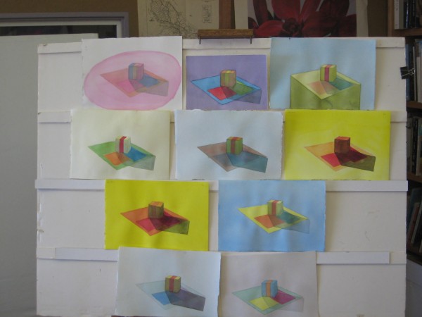
3D still-life/landscape illuminated by ambient light and a point source
There are three sources of light on objects (and their representation in images):
- Ambient, which affects all objects in the scene
- Direct, falling from one or more light sources on some portion of the scene, and
- Reflected, bouncing off one or more surfaces in the scene onto other surfaces
Here again, variation in the hue and saturation of the shapes helps convey the illusion more effectively than where the shapes had similar colors or saturation.
Gradation demos
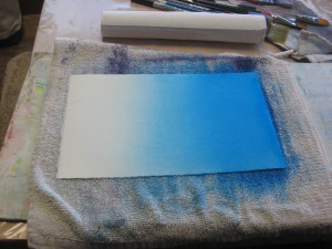
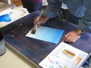
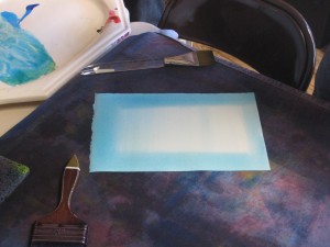
Connie and Dick demonstrated their methods (which were slightly different) for achieving a smooth color gradation. Jill captured a video of Dick’s demo:
Here are Connie’s helpful hints for a gradient wash in watercolor:
- Start wet – both sides
- Use the softest, biggest flat brush you have – or a huge round sable, if you have one
- Start with dark side and lay down several strokes of deep, saturated color
- Brush QUICKLY down from there with back and forth strokes down to 2/3 of your sheet – not recharging your brush with pigment
- Rinse out all color from brush and work from light up to maybe one half of sheet. Tip sheet so that gravity helps move pigment back and forth, being careful not to let pigment run all the way to the bottom or the lightest part of the wash.
- You may add pigment to top and work down again – as long as sheet is evenly wet.
- Dry on towel
Remember to work fast
Remember to have sheet evenly wet to begin with and pay attention to even wetness throughout.
And now for this week’s homework!
[gview file=”https://dicknelsoncolor.com/wp-content/uploads/2012/11/GradationStrategies.pdf”]
The homework assignment for this week is to reproduce all of the exercises on the page above, in your own choice of colors. Use 1/16 or 1/8 of a sheet for each.
