 The fourth color residual session was held on Saturday, April 26.
Dick has been “obsessed” with his Illustrator experiments of overlapping cyan, magenta, and yellow swatches of varying opacity, and displayed prints of two recent creations for us to see. He is fascinated with the colors that result, and how they all relate.
Dick asked that today’s and future critiques center on color, in order to deepen the learning from the color relationships course.
Sharing and critique
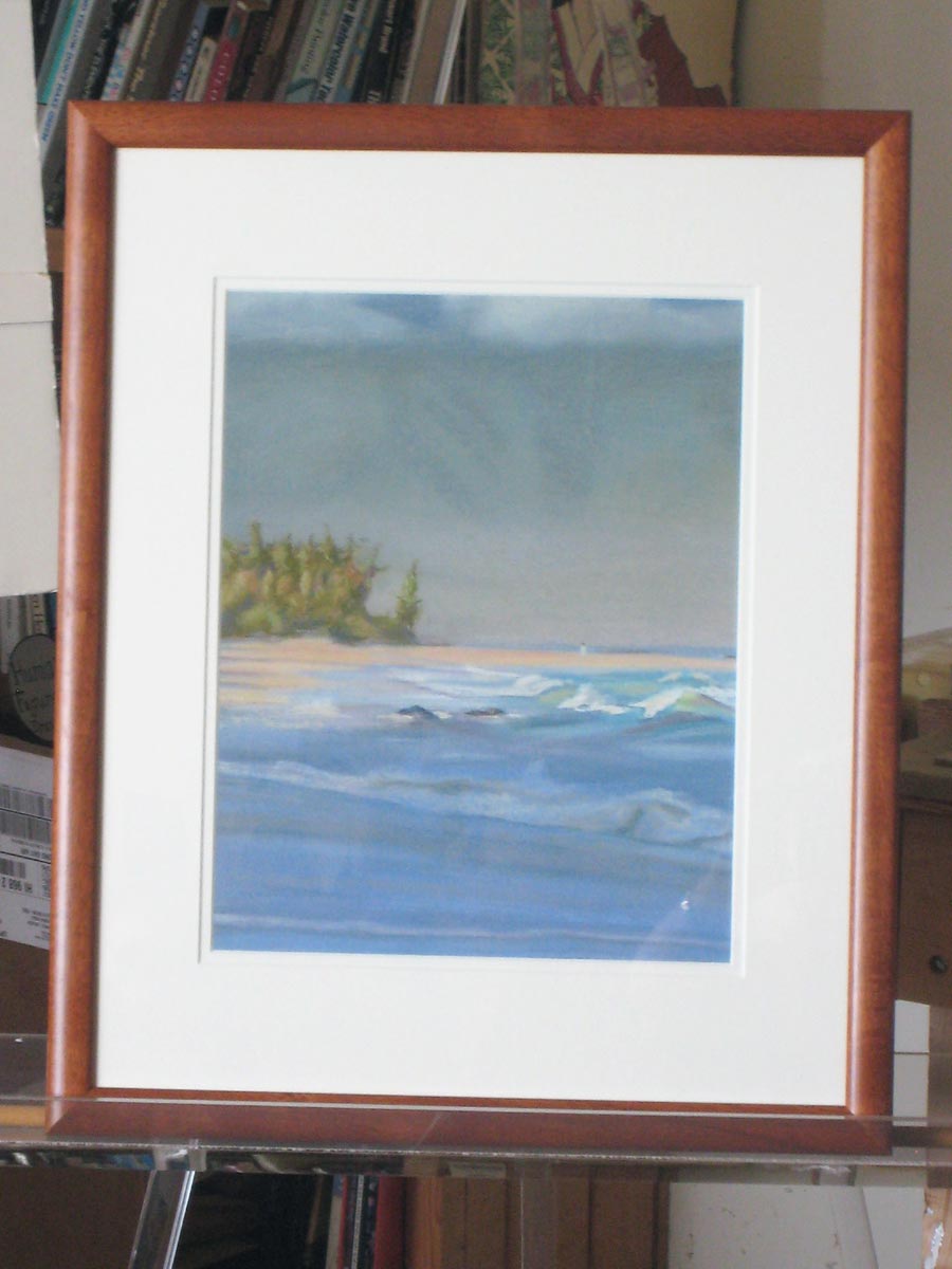
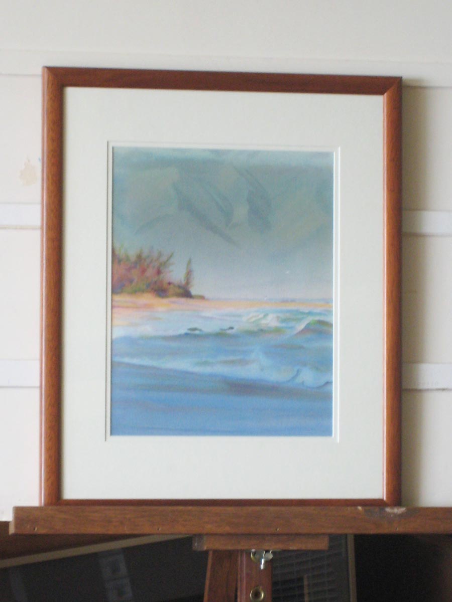
Valerie brought in her watercolor interpretation of a scene she had previously done in pastel, and we compared the two. Warmer hues in sunlit areas of conveyed a sense of a different time of day, so shadow colors should also shift (see other posts on colored light), and highlights, like wave crests, wouldn’t be white.
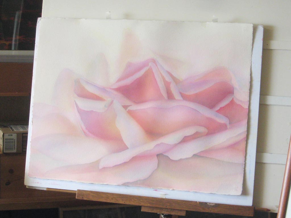
Critiquing a large watercolor (in work) of a rose, Dick warned us to watch out for areas that look like a “foreign land” relative to the rest of the painting, and find ways to use color to unify and integrate the whole painting.
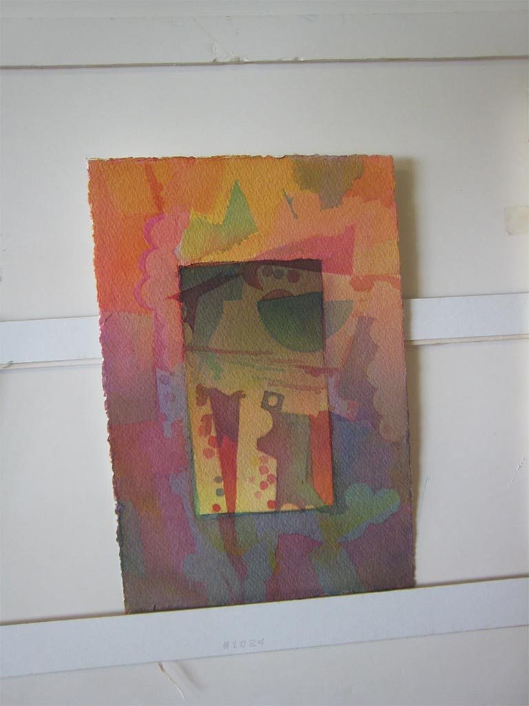
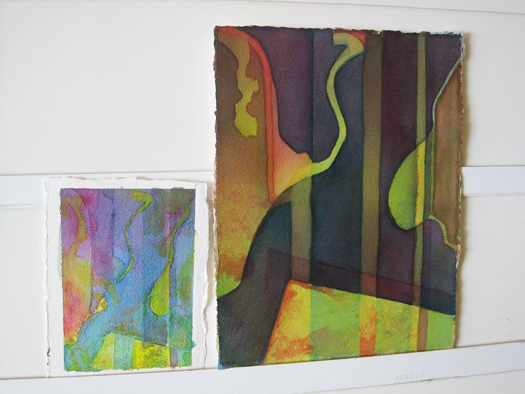
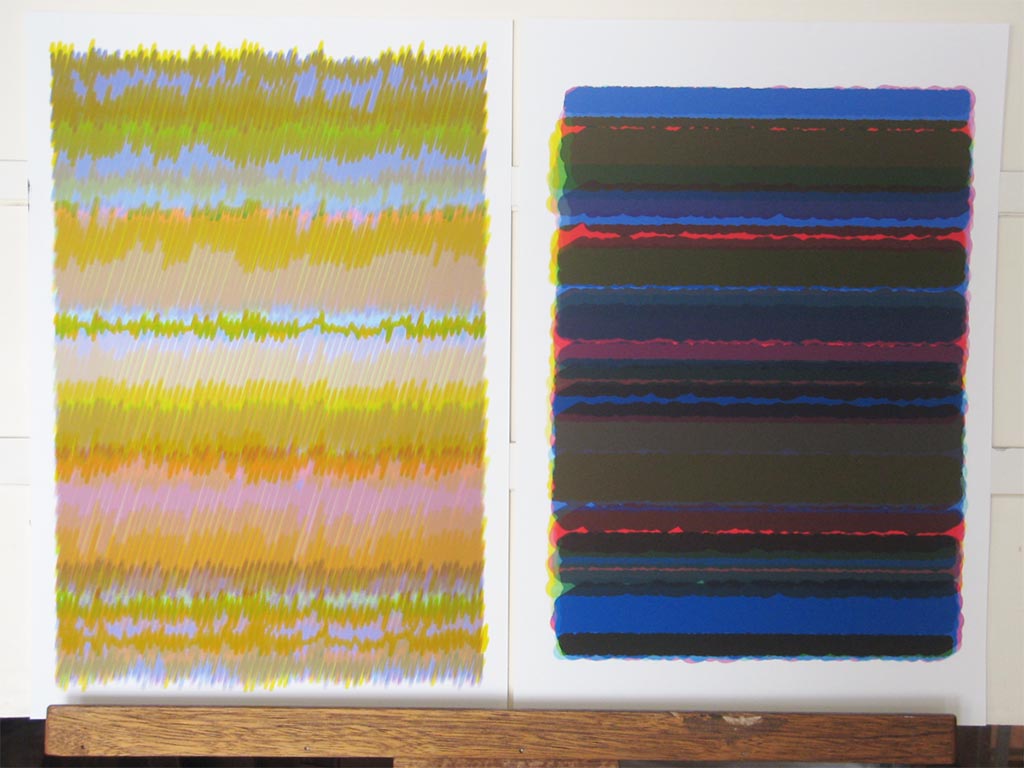
Patt’s objective for her work for this session was to “have it DO something,” and discovered some strategies by experimenting and trying to recreate satisfying results. Dick commented that when he was doing commissions, he’d often paint 4 or 5 versions of a painting, working out strategies to get the results he envisioned. When viewing Patt’s abstract designs, he suggested rotating them to see how a different orientation changes the visual effect.
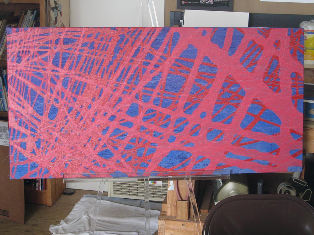
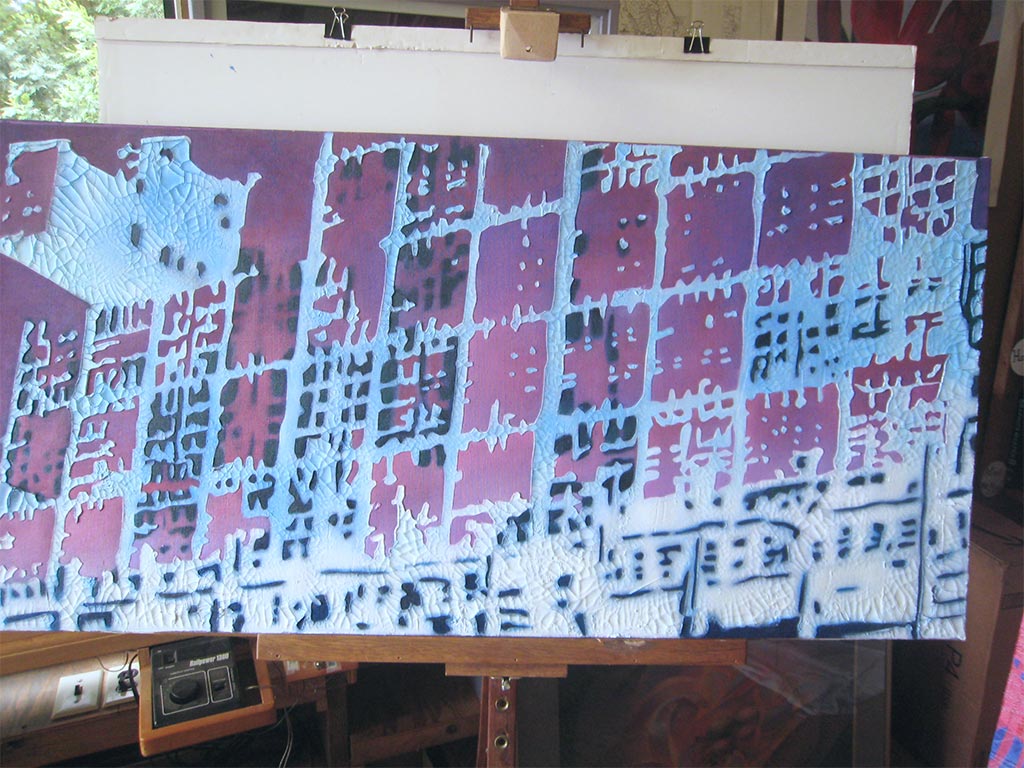
Melissa brought in two more works in her “Agents of Change” series. We discussed formal qualities – line, form, pattern, space, texture, color – and she described some of the processes, thinking, and influences that went into them.
Dick “applauded” the artists for the work they brought to this session.


