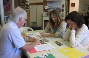
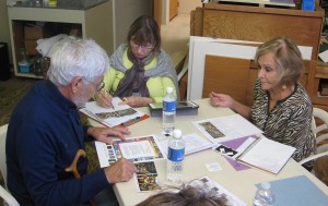
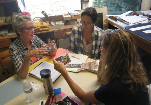
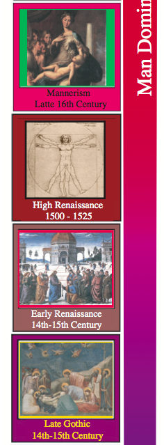
 The fourth session of the “Art is Us” art history class for Spring 2015 was held on Thursday, April 9. We saw examples of art and architecture from the late Gothic, early Renaissance, High Renaissance, and Mannerism periods. Several principles articulated by German art historian Heinrich Wölfflin were introduced.
Homework assignment
Homework for this week is another comparison assignment, and another “Tribes” game.
[gview file=”https://dicknelsoncolor.com/wp-content/uploads/2015/04/AIU-HomewrkLec5.pdf” height=”400px”]
[gview file=”https://dicknelsoncolor.com/wp-content/uploads/2015/04/CompTribes2.pdf”]
Class recap – some key ideas
Homework discussion
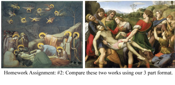
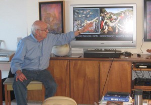
L: The Lamentation of Christ by Giotto, Late Gothic. R: The Deposition of Christ by Raphael, High Renaissance.
Dick asked for reports from each of the five small groups on their identification, general statement, and supporting evidence. He clarified the difference between theme and subject with an example: “For 10 years I painted waterfalls” is a theme. “A waterfall in Hana” is a subject. The general statement for this comparison is: Both of these works have a religious theme, seen from a different perspective and interpretation: the Late Gothic, anchored in the past, but in transition to humanism; and the Renaissance, interested in the here and now. The supporting evidence should provide clear support for the general statement.
Giotto, the artist of the piece on the left, is important as an artist as a bridge between the Gothic and Renaissance periods. The painting shows the beginnings of concerns with perspective and anatomy: Rather than being flat, as they were in the middle ages, the angels are foreshortened (a very difficult problem for artists), and there is a sense of depth (though shallow). Figures have some sense of bulk. The perspective is elementary and awkward, like a beginning art student. The Raphael, on the right, demonstrates the culmination of Renaissance (rebirth of Greek Classic) technique. Idealized figures are represented with good proportions and carefully observed anatomy, in a realistic landscape.
Lecture & slideshow: Late Gothic, Early Renaissance, High Renaissance, Mannerism
- Comparison homework assignment, see above.
- Da Vinci’s Vitruvian Man is synonymous with humanism – man at the center, and man as the measure of all things, drawn with great accuracy. The artists of this time had a fascination with this world, and flesh and blood, but idealized. The Renaissance is a rebirth of Greek Classic thinking and man as he would like to be.
- The “balanced grandeur” of the contrapposto pose is typical of the Renaissance. The figure is deliberately posed in a graceful and balanced way, and the moment depicted is the decision point, the climax
- The stiff, constrained, symbolic figures on the left are reminiscent of the Archaic Greek, while the Donatello statue on the right is free standing. Both have a religious theme, but on the right, man is asserting himself and taking pride (as God’s creation).
- The Gothic painting on the left is flat and symbolic. Giotto’s painting on the right demonstrates the beginning of interest in perspective and anatomy. We can see the transition from God-dominated to Man-dominated thinking beginning. There isn’t time in class to go into a lot of detail. Dick’s specific mission is to help you see the relationships between one period and another, and the link between what you believe and what you create.
- Evidence of the age of reason can be seen in the architecture of the Renaissance. Brunelleschi’s dome is geometric, dramatically different from the lacy spiritual quality of the Gothic cathedrals built in the age of faith. “What has geometry to do with reason?” It is a man-made concept.
- Brunelleschi revolutionized our understanding of space and perspective. He recognized the mathematics governing perspective, that all parallel lines converge in a vanishing point. He and Ghiberti competed for the commission for the bronze doors of the Baptistry.
- Ghiberti won the competition. He even put his portrait on the doors, telling evidence of a man-dominated society. Artisans were anonymous in the middle ages.
- Ghiberti’s scenes in bronze were a wonder throughout Tuscany for their realistic portrayal of depth on the shallow surface of the doors. They are Christian scenes, but with a humanistic interpretation. There’s a preoccupation with this world, with representing it accurately. Sizes of objects vary in relation to the laws of linear perspective. Techniques like deep engraving and undercutting help establish which objects are in the foreground, and details become fainter in distant objects in accordance with how aerial perspective works.
- This painting by Uccello shows the preoccupation with perspective that artists had in the early Renaissance, like a kid with a new toy. A foreshortened body lies on the ground, and distant figures are smaller than close ones. However, foreground, middle ground, and background are all equally sharp – aerial perspective was not yet recognized in the early Renaissance. The enlightenment has started, but is not yet mature.
- This artist was trying out foreshortening, a very difficult artistic problem. Renaissance artists were pioneers of perspective. Architectural settings provided opportunities to practice and demonstrate it.
- This painting demonstrates application of Brunelleschi’s laws of perspective, and illustrates one of Heinrich Wölfflin’s 5 principles of art, plane composition. The foreground figures are all the same distance from the audience, and so are the middle ground figures.
- A Gothic depiction on the left is contrasted with one from the Renaissance on the right. Space is flat and stylized on the left, while the architectural setting is used to literally make a point on the right.
- In the High Renaissance, perspective is integrated into the scene rather than blatantly calling attention to itself.
- Leonardo da Vinci uses perspective, line, color, shapes, and volume to direct the eye of the audience. The parallel lines converge on a vanishing point focusing the viewer on Christ, the central figure of the painting. Leonardo at this point had an incredible understanding of the grammar of vision – this is visual literacy at its finest. Symbolism in this painting is subtle. Groupings of figures within the composition create “closed forms”, another Wölfflin principle typical of the Renaissance.
- Dick compared the early Renaissance to a teenager, struggling with new techniques, and the High Renaissance to a mature adult, very literate. Da Vinci’s Mona LIsa is famous for its sfumato, lost edges, visible in the right side of the painting where there is no clear demarcation between the hair and the shaded left side of the face. The viewer gets involved in interpreting and completing the scene.
- Three of Wölfflin’s principles are demonstrated in this painting by Raphael: closed form, plane composition, and linear (sovereignty of outline). The figures are idealized, portrayed clearly, and the closed form unifies them.
- We’ve seen this painting before (Raphael’s Deposition of Christ) but now have some new things to look for. The plane composition puts us in the audience, as if looking at a play on a stage. The bodies, while anatomically accurate, have more of a sense of stone than flesh.
- This analysis shows how carefully this painting was composed. The groupings and poses were not by chance or intuition. This is controlled, thought-out, arranged, to unify the painting and hold the viewer’s attention.
- Moving from Florence to Venice, we see the work of Titian, anticipating the Baroque. No longer set in the light of day, a more emotional and less rational mood is set. We can’t see Christ’s face, and his stomach looks paunchy – no longer idealized. Another of Wölfflin’s principles can be seen here – painterly – the viewer is asked more to finish the painting. Sunset lighting unifies the painting and creates an intimate mood.
- Giorgione was another Venetian painter. The Venetian paintings were more sensuous and secular, less Christian than the Florentine. We will see these compositions again in the 19th century, when Manet uses them.
- Titian and Raphael were contemporaries, working in different cities.
- Going back to Michelangelo in Florence, in the High Renaissance, we see his David sculpture, and the ceiling of the Sistine Chapel. The David was carved from a block of marble which had been rejected, as being too awkward to use. He is depicted at the moment of decision – “This I will do” – the climax. What follows is the anti-climax.
- There are 343 figures in the Sistine Chapel, and it took four and a half years to paint.
- The twisted torso gives a rhythm. The figure S is everywhere in the human body. Dick loves this drawing, because you can see the artist working through visual problems. Michelangelo knows and incorporates anatomy without showing off.
- In his stone sculptures, Michelangelo believed he was subtracting away stone to release the figure from the stone.
- This has an understanding of gravity and weight.
- Mannerism – what’s happening here? Michelangelo, the master, now makes these distorted figures, sliding off the tomb. Why? Political and economic concerns, perhaps, and where do you go when you’ve reached the pinnacle? The High Renaissance has ended in the same hands as those who created it. He moves into distortion for its own sake.
- Pontormo’s painting is full of distortion and symbolism, and raises lots of questions.
- Part of their mission was to create distortion, uneasiness, tension. This was as carefully planned as anything else. What’s happening in art schools today is 180 degrees from what artists of Dick’s generation were taught.
- “What is real? Significance is real, what I feel and think is more important than what is here.”
- Mannerism is on its way out…This is hinting at next week’s lecture. Notice the change, from the Renaissance climax, to the action of the Baroque.
This is why this program is so important for an artist. You can start to recognize fads and patterns. You can start to understand why you are attracted to some works and time periods. The title of this course, “Art is Us,” recognizes that its purpose is to help you realize where you are in all of this.
Yes, I applaud Michelangelo’s move to Mannerism. Something has changed, and he’s related to that change. Why perspective? More like this world. Why? Not to the glory of God, but man has something to say…humanism, not God domination. Nature, if you really understand it, follows rules, perspective follows rules. Things get smaller in a mathematical way. Nature follows rules. We see our world through very clear rules, and Brunelleschi realized this. What does perspective do? It unifies pictorial space and brings harmony. They really understood our relationship to the world out there. Earlier artists didn’t see it because they weren’t interested in it.
The 2009 version:
Summary
The Renaissance was a rebirth of Greek Classicism, idealism, and humanism. This age of reason was evident in rational, geometric architecture, and carefully planned artworks that demonstrated a detailed understanding of the laws of nature (including linear and aerial perspective) and a sophisticated command of visual communication techniques. Renaissance painting is characterized by several principles articulated by Heinrich Wölfflin – plane composition, closed form, and linear. The High Renaissance lasted only 25 years, and was followed by a short period of Mannerism, characterized by purposeful distortion and tension.
Additional materials
Audio files
Part 1, discussion of homework assignment & slides 1-4 (0:42:43):
Part 2, lecture & slideshow, slides 5-32 (1:33:35):
