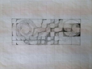
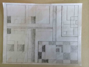
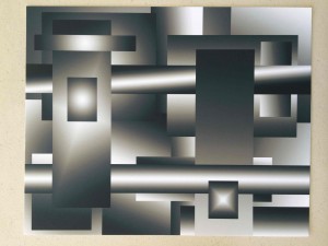
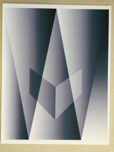
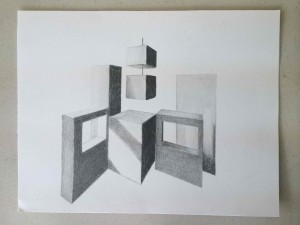
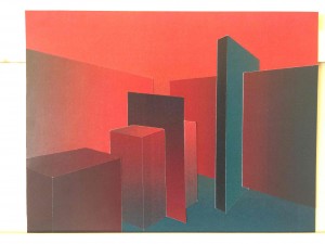
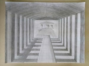
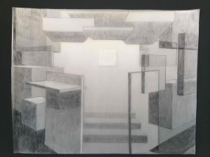
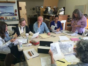
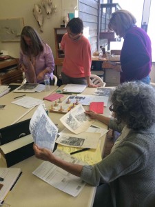
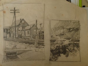
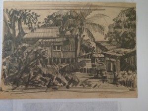
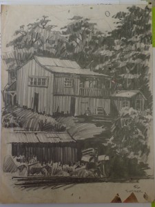
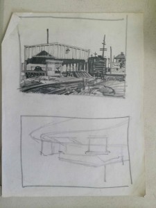
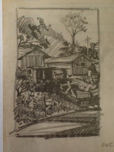
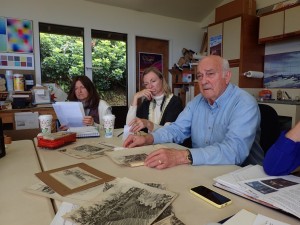
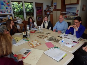
The seventh session of the Advanced Drawing and Composition class for Winter 2016 was held on Wednesday, February 24. We critiqued the previous homework, shared the merits and challenges of keeping to a predetermined structure, and how different the results are when choosing between a plane or recessional composition. We discussed the famous painting, The Fighting Temeraire, by J.M.W. Turner, and went through a ‘checklist’ for what choices Turner had to make to create this masterpiece. We finished the class with a conversation on the differences between sketching and drawing, while Dick shared some of his beautiful sketches set in Hawaii and California from the late 1950s.
Homework assignment
The assignment below refers to class handouts, which are attached on subsequent pages (4 pages total).
[gview file=”https://dicknelsoncolor.com/wp-content/uploads/2016/02/CompositionAssignment4-Handout.pdf”]
Class recap – some key ideas
Homework critique
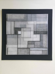
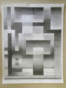
We began our critique with the first part of the homework, which was to create a composition using a 2-dimensional grid. Using this restrictive structure led to a few breakthroughs on topics such as: the use of space; how to create depth, mystery, and emotional response through formal qualities; and the challenges in both creating and viewing non-objective art.
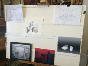
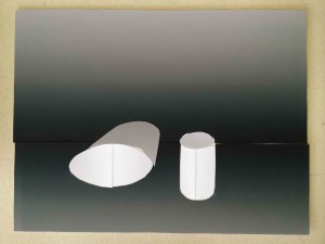
We followed this with a critique of the second part of the homework, creating a composition using a 3-dimensional grid. This assignment had provoked an array of interpretations, and gave more options from which to pursue formal qualities such as light and shadow, perspective and depth, and forms with volume.
One of Dick’s repeated questions for both assignments was, “What was the artist trying to do?” Or, said another way, “What did the artist put down as their guide or criteria?” Being able to correctly answer this question is key in comprehending artwork, because if we are unaware of what the artist’s goal was, we will more than likely be judging it using the wrong standards.
Here are a few highlights from the conversation:
- One of the most essential things is to recognize how you are dividing space (example: Piet Mondrian)
“[Usually] in a design or composition class in art school, they almost always start with Mondrian, because … one of the most critical things is to recognize how you are dividing space. And you can divide it very geometrically, [which is] what Mondrian is about: [being] very exacting, very rational. … The grid [is important, because] it’s confining in certain ways, but from the standpoint of composing, it’s a very rational way to begin.”
- Why would we use ‘lost edges’?
- Create mystery
- Engage the viewer
- Create connections
“[Lost edges] also integrate, in that you don’t get trapped in one shape … In other words, it’s not all separated. It unites, in that I can flow from one shape into another if I’ve got a bit of a break there. See [in this area it] separates because it’s darker than, but then it comes up here, and it’s the same as so I can get out of that shape, and I don’t get trapped.”
- Non-objective vs. recognizable forms
“You see, when we were [critiquing] the other two [images], there was no concern that I can see, either in the work or from what the artist said, that has to do with the subject other than what’s there. In other words, it’s not an interpretation of another reality; this is it. And how incorrect it would be if you walked into a gallery and saw those other two and said, ‘Well, what is it?’ It’s not representing anything other than [what it is]. [However, this artist] is trying to have them re-present something other than just rectangles. In other words, the subject matter adds to it ten-fold. … Now we’re critiquing on two different levels.”
- Choices in composition: plane or recessional?
“In terms of two basic ways of composing, you have the Renaissance and the Baroque. And what it means simply is that the Renaissance always placed you in an audience, and you went back into space, with all of the lines parallel to the picture plane [plane composition]. The Baroque artist took you back in [space with] diagonals, it’s called ‘recessional’, and you move diagonally toward the background, and it usually includes you more ‘in’ the composition as opposed to being in the audience.”
For the full conversation, please listen to Valérie’s recording in the Audio section of the post.
We finished our critique by watching a short animation by Dick, which illustrated in color the 3D composition assignment we had just done (see the animation below in the Video section). In his animation, the panels were designed as transparent planes, and one could see the color interaction that shifted and changed as more panels were added. This also served to illustrate how the composition changed significantly with each added component, which is always a balancing act between the parts and the greater whole.
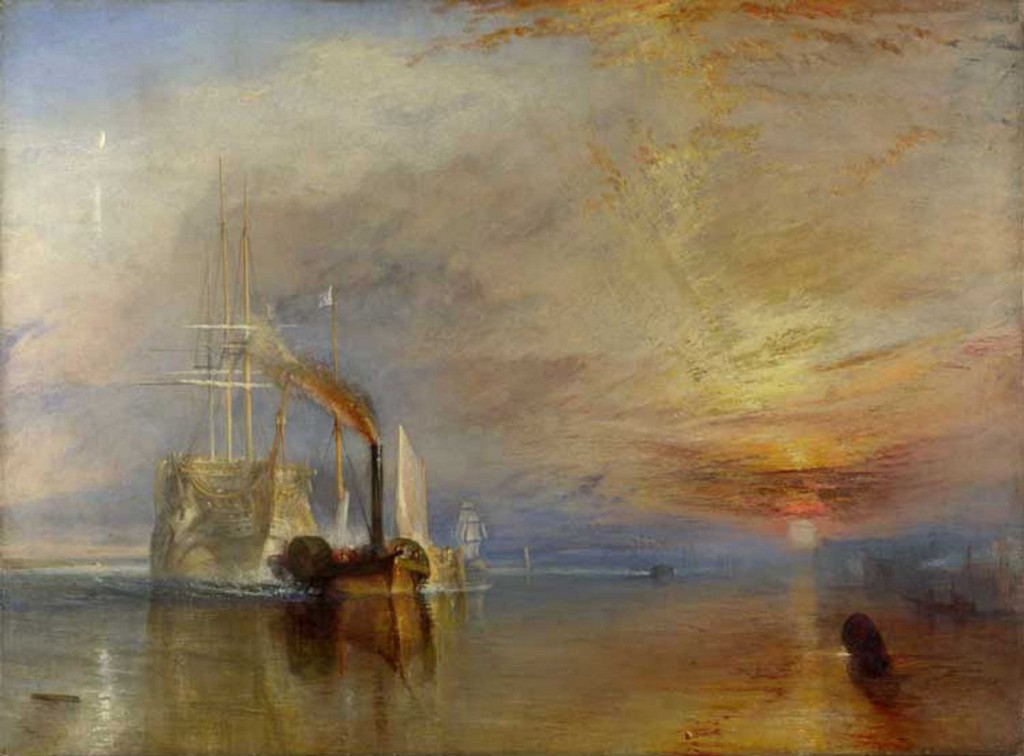
The Fighting Temeraire, by J.M.W. Turner
We moved on to discuss one of J.M.W. Turner’s most well known paintings, The Fighting Temeraire, painted in 1838, and exhibited in 1839. Dick led us through a series of questions on all aspects of the painting, from its theme to its forming process, in order to help hone and focus our critical abilities. These are the questions we have to learn to ask ourselves, as both artist and audience.
In lieu of quotes, I will just list some of the questions Dick asked during our dialogue:
CONTENT:
- What is the artist trying to do?
- What criteria is the artist using?
- What do you think his theme was?
- What’s the subject matter?
- What is the interpretation? … Is he Classic? Is he Baroque? Is he a Realist? A Romantic? An Expressionist? If he were, for example, a Realist, would he have shown the scene this way?
FORMAL QUALITIES:
- As we look at this composition, what elements do we have in it?
- Do you think it was that color in real life?
- What kind of light; what time of day?
- Is it linear or painterly?
- Plane or recessional [composition]?
- By subject, can you see that there is more than one ship? How would you differentiate the two?
- What artistic license has he introduced here?
- Is he playing any editorial here, or is this front page reporting?
Dick reminded us at the end: “You have all these different options, and that’s why your checklist is [so important].”
Please listen to Valérie’s recording in the Audio section to hear the full dialogue, and you can view the entire slideshow (which includes this image) from last year’s art history course, at the end of this post.
Sketching vs. drawing
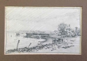
For the last portion of the class, Dick engaged us in a discussion about sketching as it differs from drawing, while also sharing his own sketches as a young artist from the late 1950’s. Some of the qualities that distinguish a sketch from a drawing are speed, brevity, and correctness (in terms of getting down the right information so as to use it later as a reference). Here it is in Dick’s own words:
“When you’re doing a [quick drawing], on location, it’s a sketch. So I think tempo and speed, and getting it down is rather important.”
Student: “What is the advantage of speed?”
“Well, for one thing, [the lighting] changes rather rapidly, and what you’re doing is gathering information … you put down the essentials.”
“[A sketch] is like a photo: you go out and take a photo, and there are the facts. Then you go back to the studio and you render this according to a theme.”
“It’s like taking notes. And a drawing would probably require a lot more thoughtfulness and construction, and all the elements of aesthetics.”
Homework
Along with this discussion, Dick introduced the last and final homework assignment, which is to ‘Compose a sketch’. This assignment asks us to not only create a sketch but also to share our internal deliberations as we confront our artistic decisions. The same kind of questioning we applied to the Turner painting, we will also apply to this assignment, and Dick wants us to bring in our lists along with the visual work to share with the class.
“Do you see how you can pick a theme, and then go out and look at a landscape, and it will be a way of organizing your thinking? … If you go out armed with [a] theme: ‘I’m going to do a series of 12 paintings, the subjects will all be different, but the theme will be transition,’ do you see how that guides the way you will then look at your world?”
“I want to see [the lists for] these. I want you to be able to say, what was your theme, what was your subject, what was your interpretation, what was your forming process. And with each, I want to see a list. What options do you have?”
“And I want you to be as honest as you possibly can with your own [work]: are you a Romantic, or a Realist, or whatever? And if you haven’t identified this [yet], this is a good time in our lives, as creative people, to know where you’re coming from. … [Because] I walk into [almost] any gallery, and I see people who are just totally lost as artists, because they haven’t addressed the issue of what do I want to say? And they’re simply creating things that have no roots.”
Again, this is Dick’s ultimate goal in these classes, to help us go from dependent students who rely on their teacher, to independent artists who make their own creative decisions. And the key to making good decisions is to be informed on why you choose what you did, and to know your full range of options before you commit to a decision. Although these lessons apply to our visual work, they are often good lessons on how to live life, as well. See you next week!
Audio & video recordings
2D Susan (1:28)
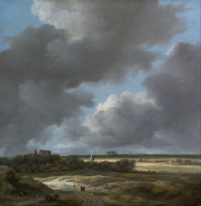
Clouds in composition (0:23)
Clouds can add to a sense of depth in composition.
Dick mentioned Bruegel, but was probably thinking of Jacob van Ruisdael or another Dutch artist.
- View of Alkmaar, Jacob van Ruisdael, 1670
Dick on art school and bad teaching (1:48)
Teachers who teach their students only to copy their own technique do their students a disservice.
3D Grid Designing (1:25)
A screen capture showing transparent planar surfaces placed and sized according to a 3D perspective grid.
Cézanne’s perspective (2:53)
Dick offers an explanation, based on principles from art history, for the curious perspective in a painting by Cézanne.
Class materials
Class handouts are contained in the assignment PDF at the top.
To compare Renaissance and Baroque compositions, Dick wanted to show excerpts from this slideshow from his recent art history course, Art is Us. See the original post for much more detail.
Sketches are useful as references for finished work. Typically, they capture essential details of a scene as it is. In the finished work, the artist may choose to emphasize details in ways that are not strictly objective, as in Ingres’ painting of financier Louis Bertin, shown below. From Art is Us week 6.
The JMW Turner painting that was discussed in some detail during class, The Fighting Temeraire, is slide 19 in this presentation.
