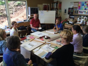
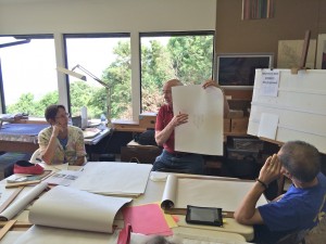
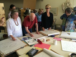
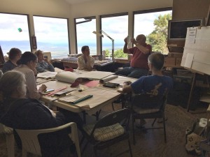
The third session of the Drawing Foundation class for Fall 2015 was held on Thursday, October 1. The class critiqued their results from the previous assignment; shared this week’s index card solutions; and were introduced to drawing cylinders and arches in perspective.
Homework assignment
Class recap – some key ideas
Index card assignment
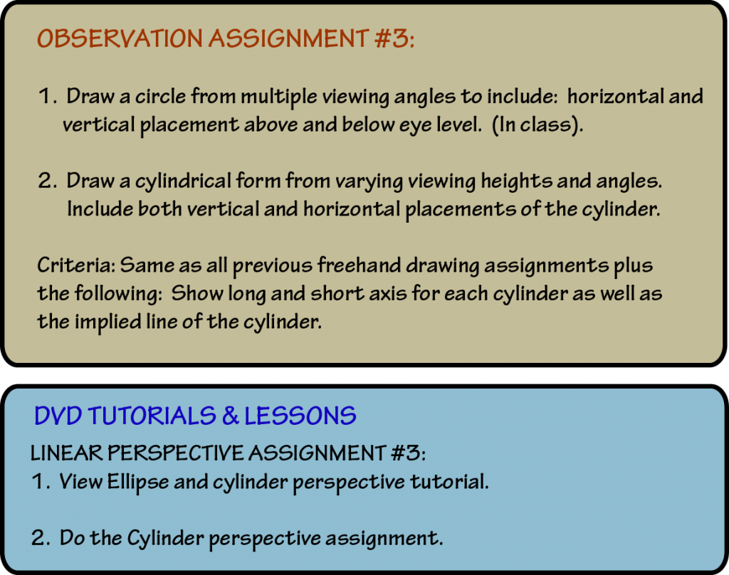
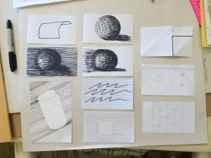
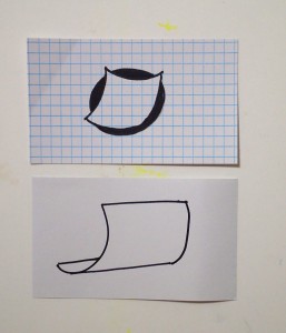
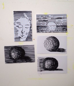
Class began with sharing the latest examples of the index card challenge. The ingenuity of designs is what makes this assignment so fun, proving that “Restrictions breed creativity”! Even when given the same simple instructions, the class produces a variety of final results that are unique.
- More examples of student’s index cards
The variety of interpretations demonstrates that the potential for optical tricks is endless, even when working with restricted criteria. Dick used his garden screen as an example of an illusion he created by deliberately placing the lines in certain patterns. Learning how to properly use and take advantage of optical effects is essential to the success of your visual message.
- Two of Valerie’s drawings of squares on index cards
- Valerie’s drawings on index cards using only parallel lines
Design considerations
Dick then touched briefly on the concept of Gestalt, reminding us that it is as important to recognize a ‘bad Gestalt’ as it is a ‘good Gestalt’. It is critical that you are aware of your design decisions, and how each line and mark contributes to the overall success of your image. If you have a poor Gestalt, the image becomes harder to read, which confuses the viewer and obscures your message.
Dick mentioned that another goal in this class is to teach us to recognize the ‘shape of space’; in other words, the figure-ground reversal. Not only will we be learning to draw shapes, but also how to draw the shape of the space around the forms.
Drawing cylinders in perspective
An essential skill in learning how to draw comprehensive images is recognizing distortion. Most objects will have some kind of distortion depending on our vantage point, but the key is to make all the distortion analogous. When all shapes demonstrate the same distortion, it creates a convincing illusion of space and perspective.
With cylinders, the key is in the shape and alignment of an ellipse. There is a slight difference between ovals and ellipses, but a true circle seen in perspective will be an ellipse. Dick had us practice drawing freehand ellipses multiple times, to teach us to ‘get used to the motion’. He used the analogy of a tennis swing: “like a tennis swing, you have to build it into muscle memory”.
He pointed out that the most common error is to have the bottom of the ellipse flatten out, instead of showing the same degree of curve as the opposite line. The second most common error is to make a ‘football’ shape with your ellipse, by pinching the corners where the ellipse meets with the edge of the cylinder. To avoid these mistakes, Dick demonstrated how an ellipse is actually created from four circles intersecting, which keeps all parts of the line curved, to greater or lesser degrees.
- Demonstrating proper ellipses
- Showing how the long axis “swings” when a circle is “standing up”
Another tip for drawing proper ellipses is to look for the long and short axis. When a circle simply ‘lies down’, the long axis will always be parallel to the horizon line. However, if the circle is ‘standing up’, then the rules change, and you’ll find that the long axis ‘swings’ as you change your perspective.
Dick demonstrated this phenomenon by placing a large cardboard disc on the wall, and had students find the angle of the long axis from a various points in the room. Sure enough, students could see their pencils rotating as they changed position.
These are all tips to keep in mind while doing the homework for this week!
Videos and recordings
Richard Nelson points out subtle aspects of drawing an ellipse in perspective. Due to foreshortening, a constant radial distance is not constant in the drawing.
Richard Nelson demonstrates drawing a vertical cylinder in perspective. Be aware of the long and short axis of the ellipses that form the top and bottom. The bottom ellipse is different from the top one. There should be no sharp points where the ellipse and vertical edge intersect. Use line weight to indicate which edges are closer to and further from the viewer.
Richard Nelson shows how to draw a tuna can – a short vertical cylinder – in perspective. There’s more to it than you’d think!
Richard Nelson shows how to draw a horizontal cylinder in perspective and get the orientation of the ellipses right.
Listen to the class
There are long quiet sections in these files where people are drawing. Feel free to skip ahead!
