The seventh session of the Drawing Foundation class for Fall 2015 was held on Thursday, October 29. We discussed the importance of visual clues and how that contributes to visual literacy; what does it mean when we say art is ‘stylized’; the variation of personality found in line quality; and the new challenges in drawing a complex subject (in this case, a plant).
Homework assignment
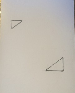
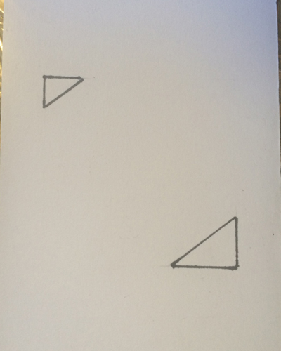
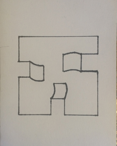
The new homework assignment is shown below. Continue with index card assignments, and the line character assignment from last week.
Week 7 homework assignment
Class recap – some key ideas
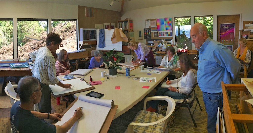
Index cards & worksheet answers
Groups of two answering the worksheet
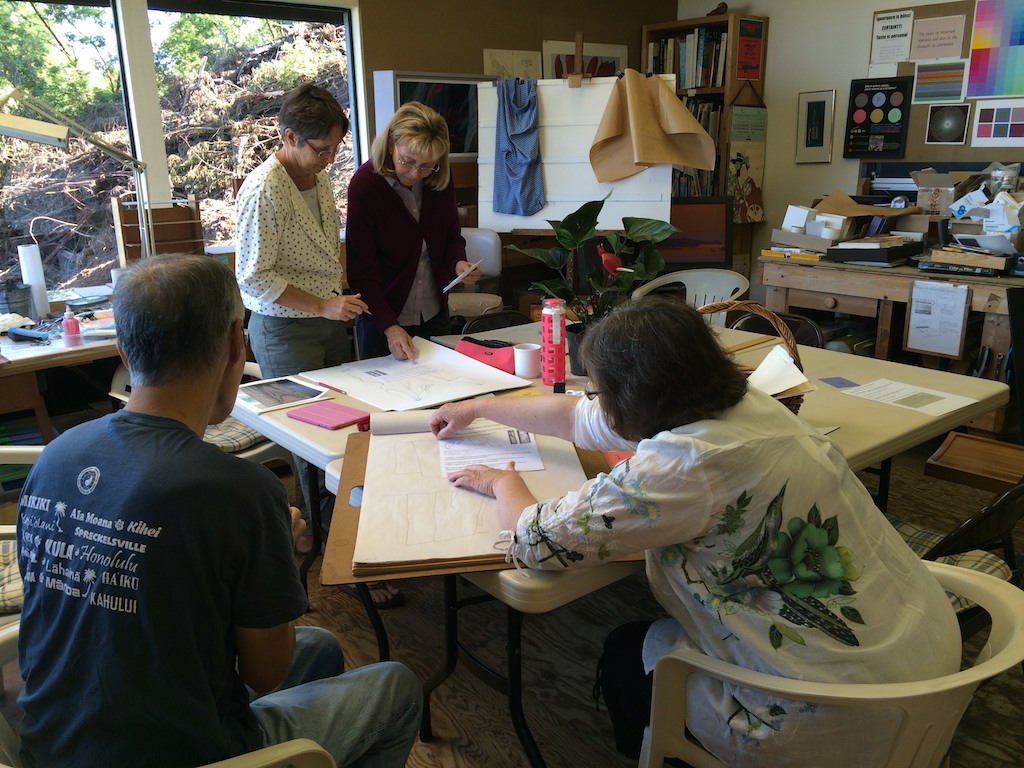
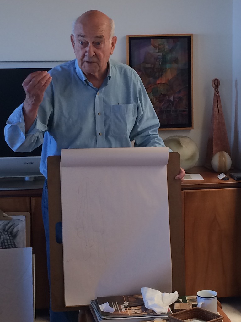
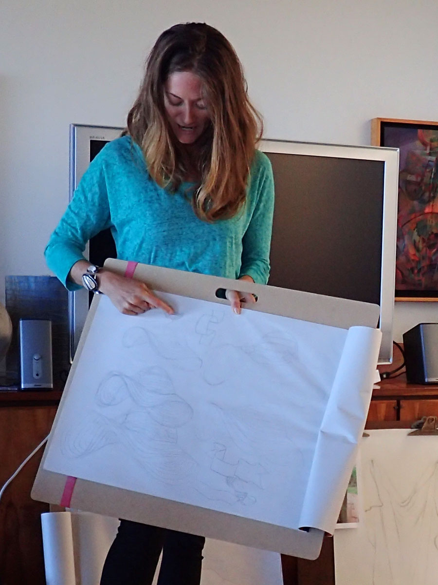
We began class by breaking up into small groups again, to share homework and answer a new round of visual questions. After 15 minutes or so, it was time to share answers and have our critique.
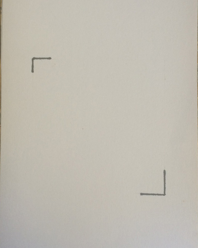
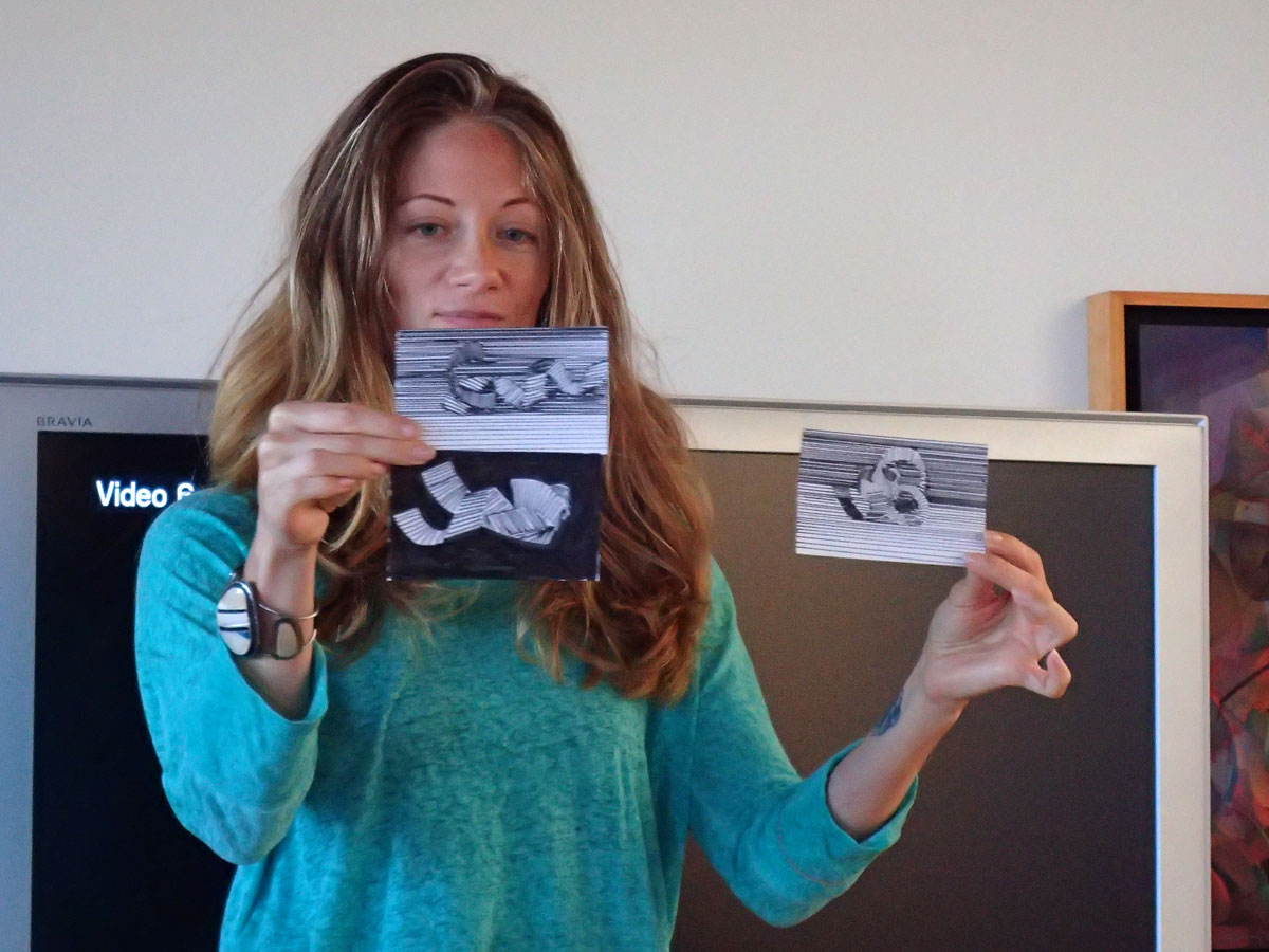
First off we shared this week’s index cards, with students still managing to find new solutions to what seems to be a most basic assignment. One powerful example was Kathy’s minimal square, which was a study of the minimum amount of information needed to show an object. Her index card had only four lines, drawn to imply two corners. She had set out to find the least information you would need to infer a square, and it worked brilliantly. She also showed us an earlier version with triangles in the corners, and the difference between the two was immediate: one read as containing a square, whereas the other simply looked like two small triangles. This was a great example of how the smallest details can have a big impact on the final result (and sometimes, less is more!).
-
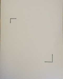
- Kathy’s minimal square
-
- The difference a couple of lines can make
Dick marveled that we are still seeing new answers to this unassuming project, and he laughed about this being one of the most successful assignments he’s ever done, despite the amount of time and ingenuity he’s poured into other lessons. Never underestimate your possibilities when faced with limiting restrictions!
We moved on to discussing the worksheet, and how minute details will convey vital information. When drawing accurate representations the lines we use to suggest form are paramount, and if they are the slightest bit off, the whole image is read differently from what we intended.
Dick asked several pertinent questions: “Pay attention to visual clues and information. What are you trying to show and does the drawing convey that? In other words, what is the difference between materials? What are the visual clues between paper and cloth? Does it have bulk, or is it bulging? What degree of thickness does it have, etcetera … what does the drawing suggest to the viewer?” Learn to convey what the materials are through line work, and make sure that your drawing contains enough information to be consistent in its representation.
-

- Discussing the answers
-
- Worksheet answers

Comments about ‘stylization’ and different genres in art
The next comparison was a bit more difficult, with the images in question being sculptures, not drawings on paper. But there was still a clear difference in style and approach, and it raised an interesting discussion about genres in art. Looking at two church sculptures from different times in the Gothic period, most people’s comments were that one was more “natural-looking”, and the other was “stylized”. But what does that mean?
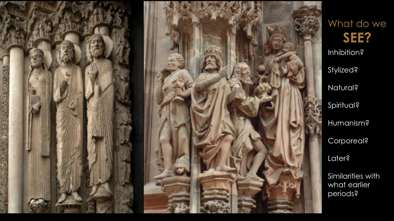
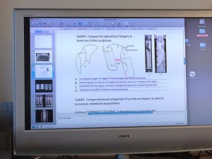
A slide from Dick’s Art History class, held in Spring 2015, showing the differences between early and late Gothic sculptures
“Okay, the word ‘stylized’, what does that mean? Because that’s an important term, and one we use all the time: ‘It’s a stylized drawing’ or ‘It’s a stylized sculpture’. But what exactly are we saying?”
Dick asked one student, Rita, who is a professional writer and editor, how she would define ‘stylized writing’. She described it as being “not natural, or not an actual or factual representation of a subject, but instead being more ceremonial or attempting to establish a tone or mood”. Another way she put it was that it would be more concerned with “making an impression rather than communication”, all definitions that Dick agreed with.
Dick spoke about the periods of art history in which these sculptures were done, and the reason they looked so different is that they represented the prevailing thoughts and beliefs of their time, which had changed as society had changed. “Why was the early Gothic stylized? Because they were not concerned with the mundane or the corporeal world, they were concerned with the spiritual and things not of this world, but that one. When you get to the late Gothic, the focus was man as the center of all things: not God, but man. So you have more attention paid to the figure, more individuality, and a desire to show things of this world.”
Dick moved on to talk about how important this is to our understanding of ourselves as artists, and that by sharing the concepts and techniques that have come before us, he hopes to help us on the path to discovering our own message. As an artist, what is it you are trying to say, and how are you saying it? He mentioned again that education is all about showing you your options, and from there, it is up to the individual to choose the direction they go. “To me, education has got to release you from your prison of misconceptions and ignorance, and if you don’t know what is available to you, I think you’re very limited.”
(If you’d like to know more, check out the post of the corresponding Art History class here: https://dicknelsoncolor.com/2015/art-is-us-2015-week-3/)
Critique of last week’s homework
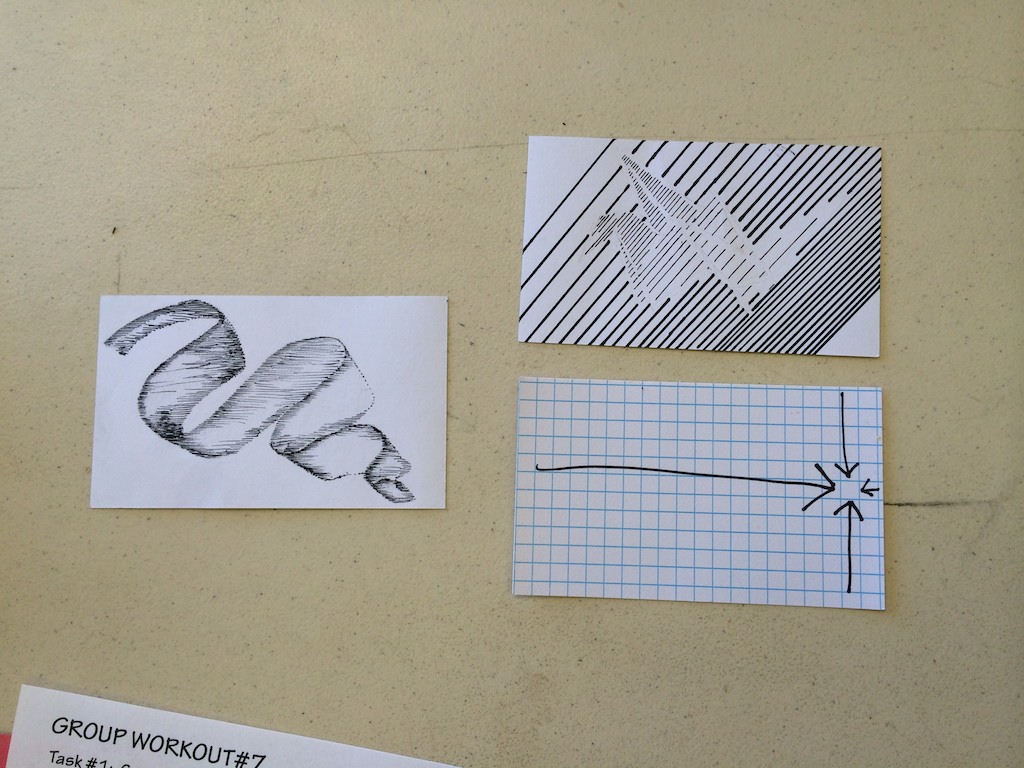
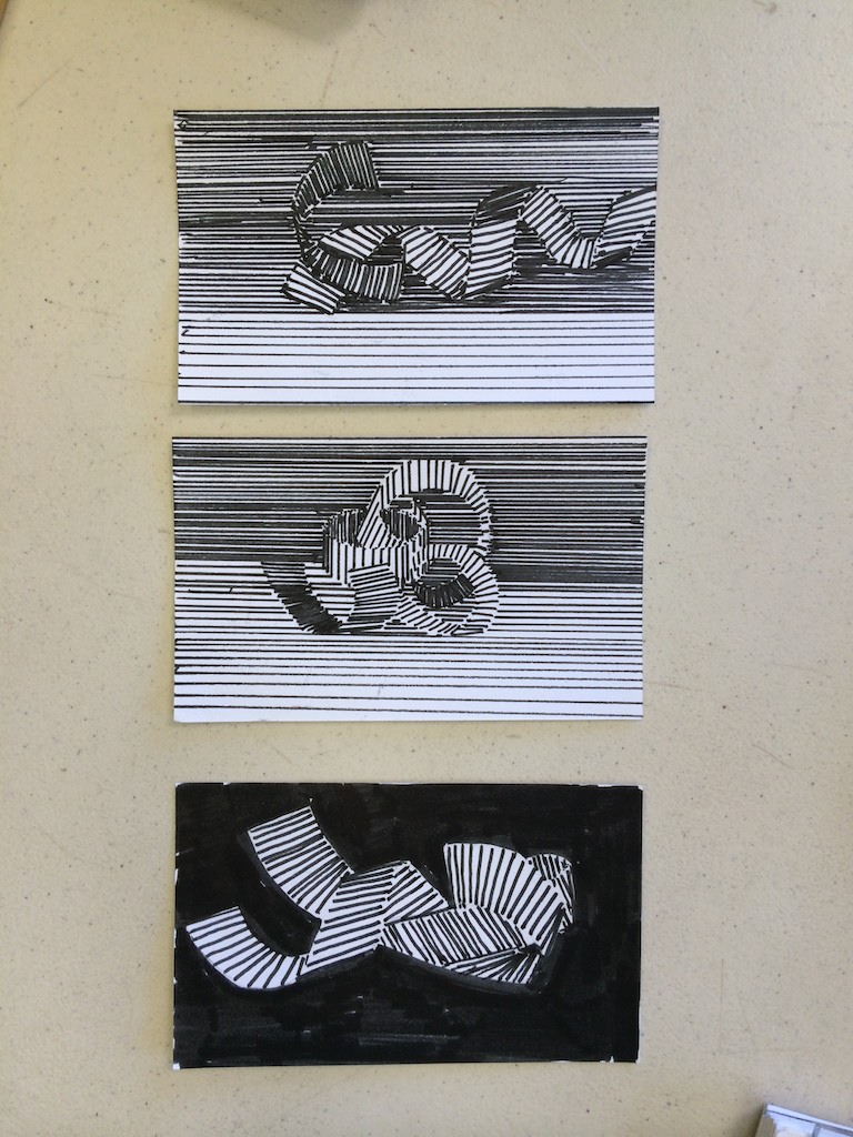
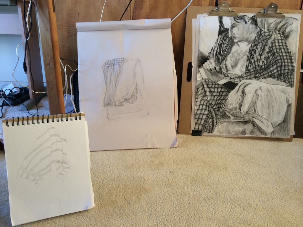
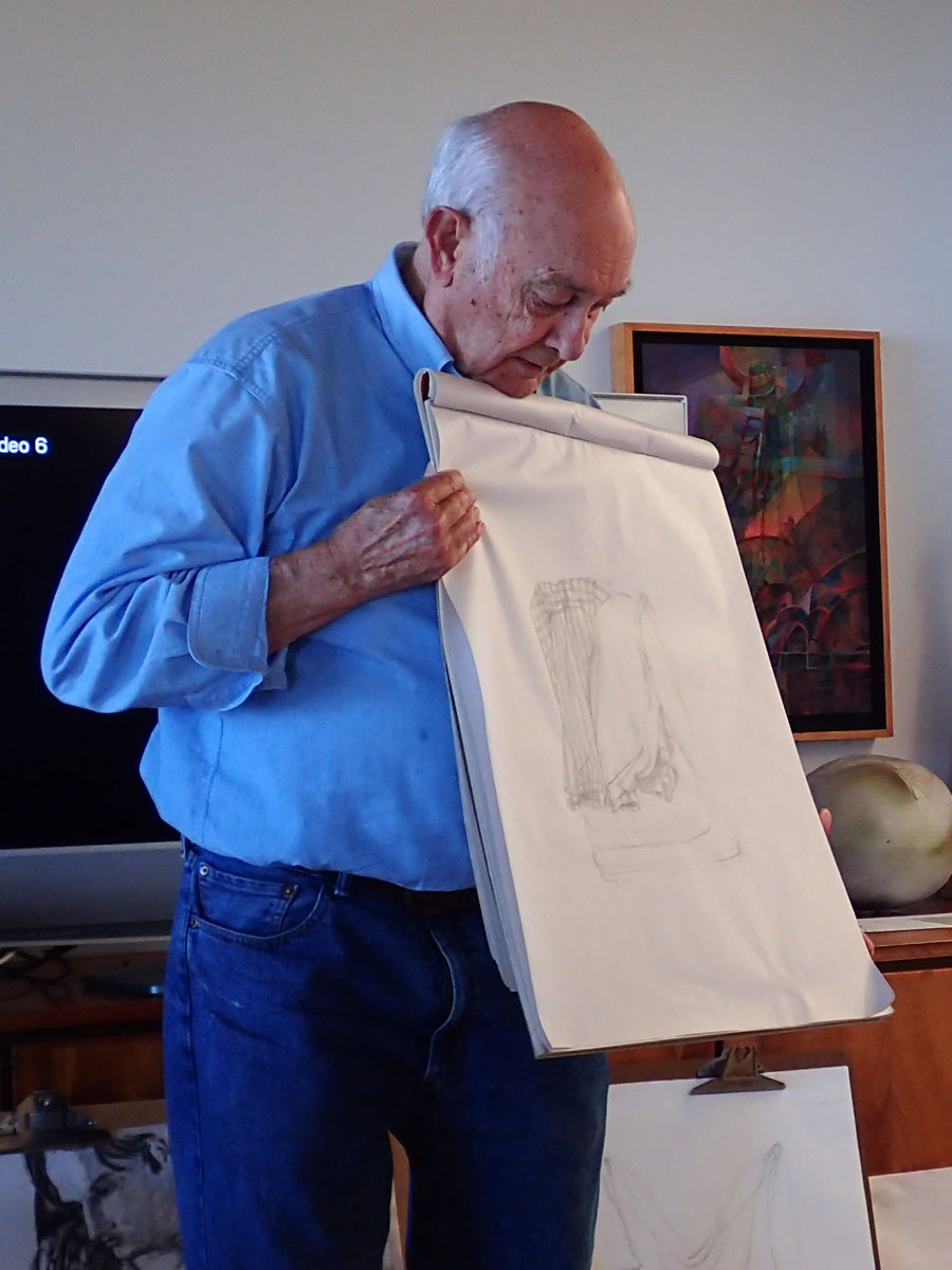
After the worksheet, the class set up their results from last week’s homework, which was to draw drapery or paper scrolls. Dick had asked for us to pick something with stripes on it, and also to take a photo for reference for the class to see how the drawing matched the object. It was quite a display of curtains, t-shirts, and pajama tops that people choose! Dick was able to guide the class through a careful critique of each other’s work, showing where the lines had depicted the form correctly, and where they mistakenly created optical irregularities.
-

- One student used the homework assignment to draw ribbons on her index cards
-
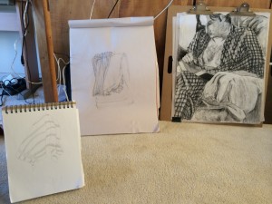
- Drapery homework
-
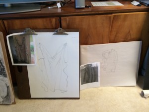
- Some students included photos to show what they were drawing

One of the most common errors was keeping the weight and the shade of the line too uniform throughout the piece, or using it to outline an object in stark relief. Dick mentioned that this was an error he had done for years without realizing how misleading it was when conveying a sense of depth and structure. The darkest lines are going to be what capture your eye, and tell it that ‘this area is closer to you’. Conversely, lighter and more delicate lines read as being far away or ‘behind’ something, or falling off into the shadows. Learning how to properly use this attribute of line is important for visual clarity, and will subtly convince your audience of the full dimensionality of an object.
Line quality and character
After our coffee break, we moved on to our line character studies, with a few students showing the ‘personalities’ they had created. Some of the descriptions of what the class saw: quiet; someone who wouldn’t speak up; relaxed; casual; friendly; dependable; playful; ambitious; someone in motion; conformity; strength; and rigid. Instead of assuming all lines are equal, when you choose to examine a line’s quality and what tone or mood it is conveying, it can turn into a remarkably vibrant subject.
We didn’t have time to go through everyone’s examples, so we will pick this up next week and continue to see how many characteristics we can derive from just a simple line. As we have seen with the index cards, there is no limit to what we can do with minimal criteria!
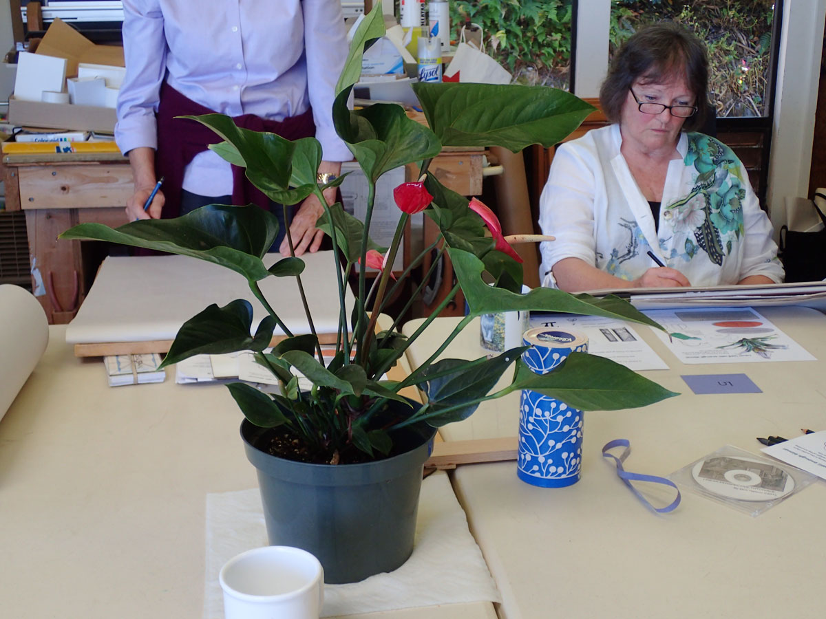
Drawing a complex object
-
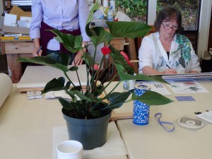
- This week‘s subject, an anthurium plant
-

- Demonstration of how to simplify the subject
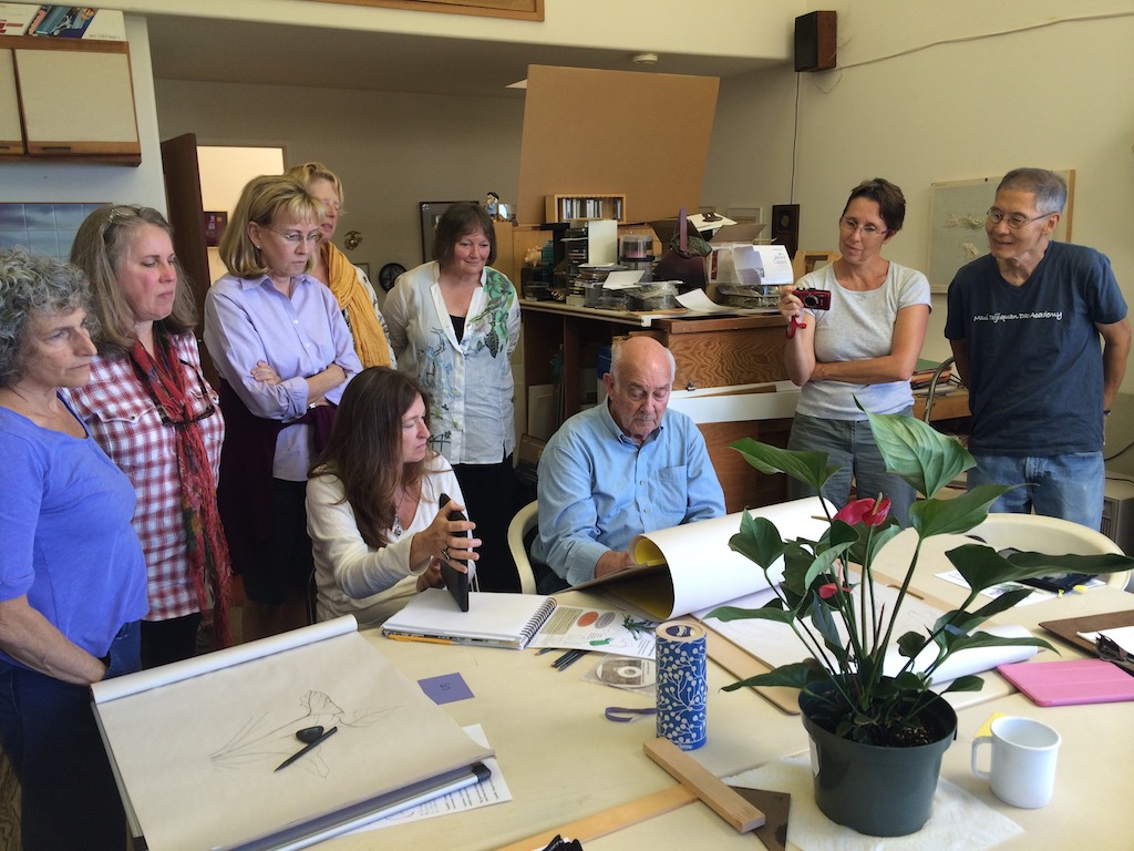
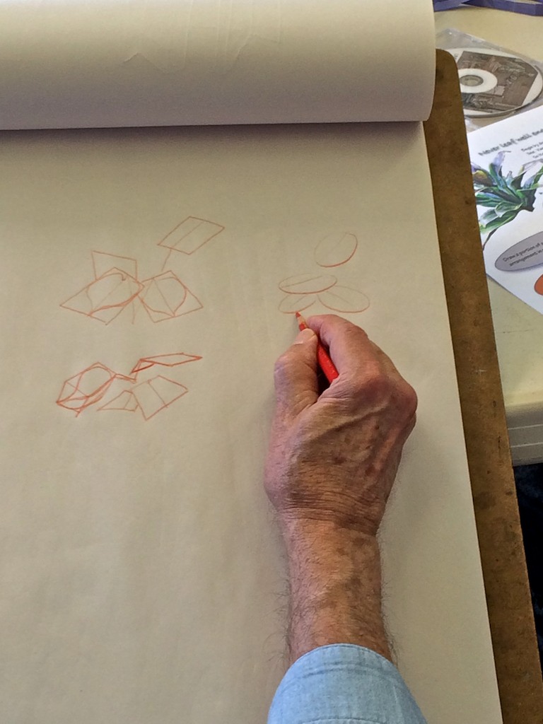
We moved on to our observation assignment for the day, which was to draw a plant, a much more complex figure than what we have dealt with before. Even though the plant is beautifully organic, with no straight lines or rigid rules of perspective, it can be more difficult to visually reduce it to simple forms and not be overwhelmed by the multiple angles and perspectives. Dick encouraged us to once again to look for the most basic forms that surround the object, the ‘invisible’ structure which governs its shape. Similar to how the human head fits in a cube, the various parts of a plant will also have overriding geometrical forms which we can learn to identify. The trick is to start simple, and work your way up to more complexity after you have ‘roughed’ in the basics.
-
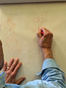
- Simplifying the forms

-

- Find the most basic shape to start with
Dick touched on a few topics that will go a long way in helping create more captivating and intriguing compositions, along with advice on how to become a better artist. One of those is making sure you are aware of your Gestalt, and how you position yourself to view the plant is just as important as the skill with which you draw it, maybe even more so. Another was line quality, and learning how to use the characteristics of line to convey the message of depth, texture, and form accurately. The last was a reminder that nothing comes easily, and if we want to be good at something, we have to practice it every day and give it our attention; otherwise, the skill is lost, and we don’t progress.
Gestalt and composition:
“Make some relationship to what you’re drawing, and look at it. Don’t just draw a leaf, but get yourself located, so you get a good Gestalt or a good angle on it, and from this particular view, this leaf right here is almost like a hula dancer, the rhythms that are coming through on that … but move just a couple of inches to one side and this is just ‘blaaahh.’ So it’s like sitting someone for a portrait: what qualities do you want in this drawing? And some of these [leaves] have just great rhythms.
“Don’t make the mistake also, if you get into a still life and you think, ‘Okay, I’ve got this [the pot]’, and then you put in all of the stems – it’s the damnedest composition in the world, everything is pointing down to the most uninteresting part of the entire composition – no one wants to see this [the pot]. How you crop this is a compositional idea, but even your drawings can begin to recognize that and take into account your position: if I move half an inch, that whole leaf changes.
“So where do you want to be? Considering issues like that [what your composition/subject needs from you] shows a maturity of the artist. So watch your position: what’s the best way to hit that leaf.”
Line quality:
“How do I get this leaf to be ahead of that leaf? When you’re hitting that point, that’s got to be the darkest point you could possibly make to get that leaf to come out towards you. If I make this line darker, because it’s back in the shadows, no – you see how that reads wrong, because that [leaf] becomes far more dominant and it wants to come forward. I’d want this leaf in front of this leaf, so it’d be a mistake to come in and do this [make the line darker]. That pulls that one in front of this.
“And as it drops away, have it drop away, but not disappear – do you know what I’m saying? Let it drop away so your viewer is not even aware of the effect, it should be imperceptible, how that works.”
The importance of practice and endurance:
“Anything that comes naturally – like in tennis or golf or anything else – that ‘natural’ comes in quite late for most people. I can’t teach you that: that is something that is just endurance, and doing it over and over. But I find that after all my years in drawing, if I don’t sit down and draw every single day … there’s a quote, I think it’s by a famous singer who has a tremendous voice, and he says, ‘You know, if I don’t practice every day, I know it. If I miss a day, I know it. If I miss two days, my wife knows it. If I miss three days, everyone knows it’, or something to that effect.* What amazes me is if I do this [draws an ellipse], I still have to marvel at that, because if I lay off it for a few days, I can’t do that. And it’s the same thing if you’re playing a musical instrument or a sport, or anything else: you’re just not going to be as sharp. So most people who take a course like this, they’re never going to go back to it, because they’ve got too many other things on their plate, and you don’t think that you’re going to lose it, but you will. All I can give you are the basics. The rest is practice.”
Continue to work diligently, and the results will show themselves. See you next week!
*note: According to the internet, the original quote is attributed to Ignacy Jan Paderewski, a famous pianist and composer from the early 1900’s. His quote is: “If I miss one day of practice, I notice it. If I miss two days, the critics notice it. If I miss three days, the audience notices it.” – Holly
Video and audio files
Dick Nelson shows ways to approach drawing natural forms like leaves. He builds on concepts from previous lessons, and emphasizes being aware of Gestalt and line quality (23 minutes).
Listen to the class
Lectures from week 7 include commentary on this week’s index card homework, the scroll and drapery studies, and the line character assignment.
Class materials
[gview file=”https://dicknelsoncolor.com/wp-content/uploads/2015/10/Leaf.pdf”]
[gview file=”https://dicknelsoncolor.com/wp-content/uploads/2015/10/Drawing-Group7Ans.pdf”]


