The second session of the Color Relationships class for Fall 2014 was held on Friday, October 17. We critiqued the homework studies for making one color appear as two. We experimented with matching an arbitrary color by combining transparent primaries in the Tri-hue demo on this site. The new color deception assignment for this week is to make three colors appear as two, or reversed grounds, and a free color study was also assigned. Links to Illustrator tutorials and references are provided.
Homework assignment
This week, there are four homework assignments:
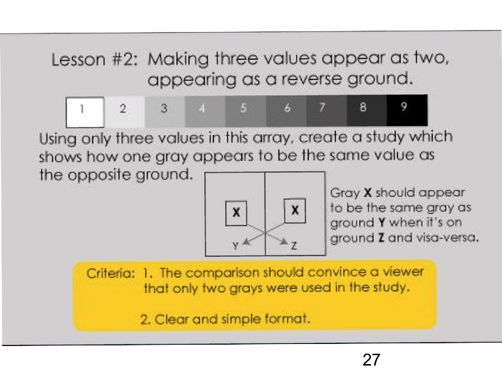
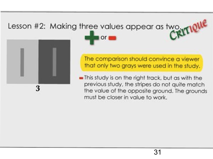
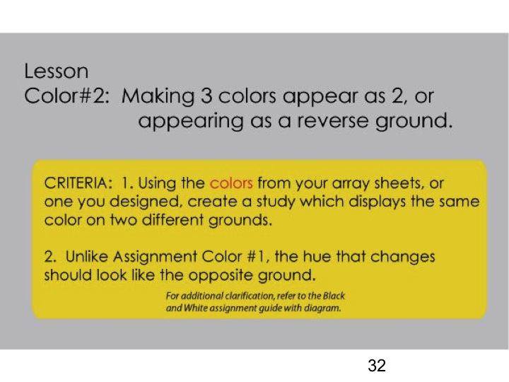
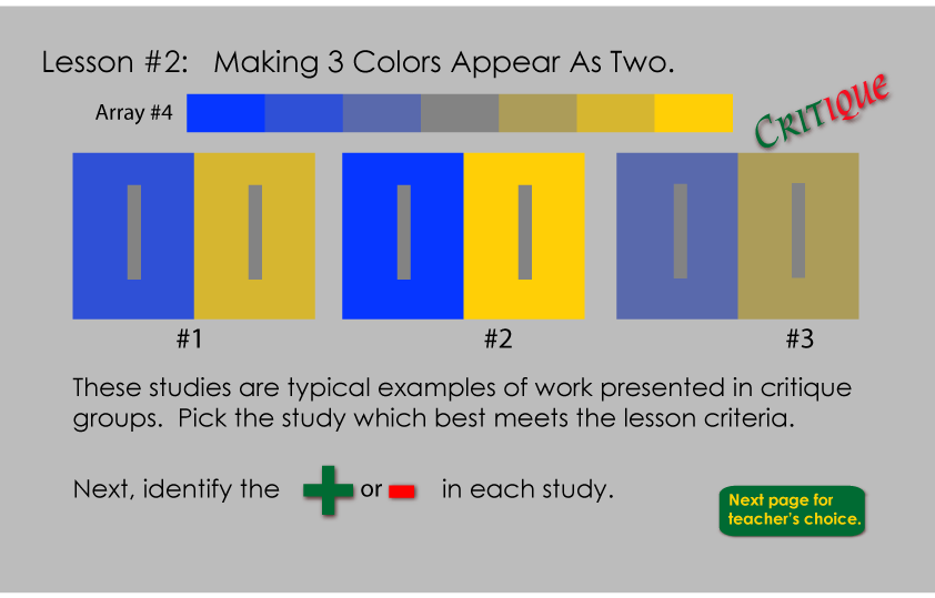
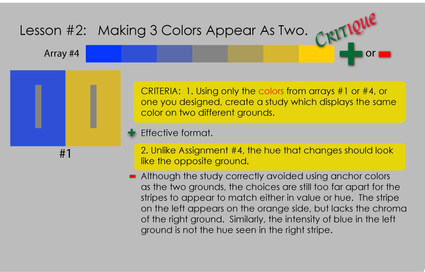
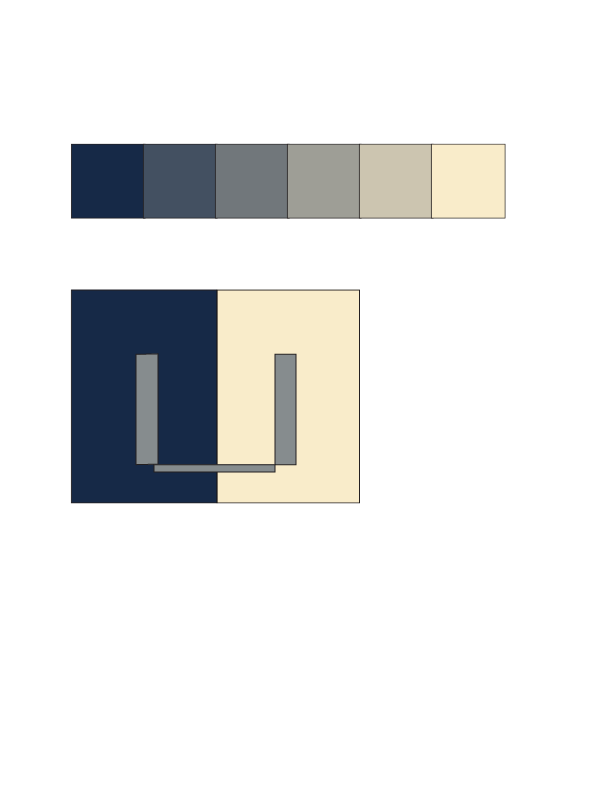
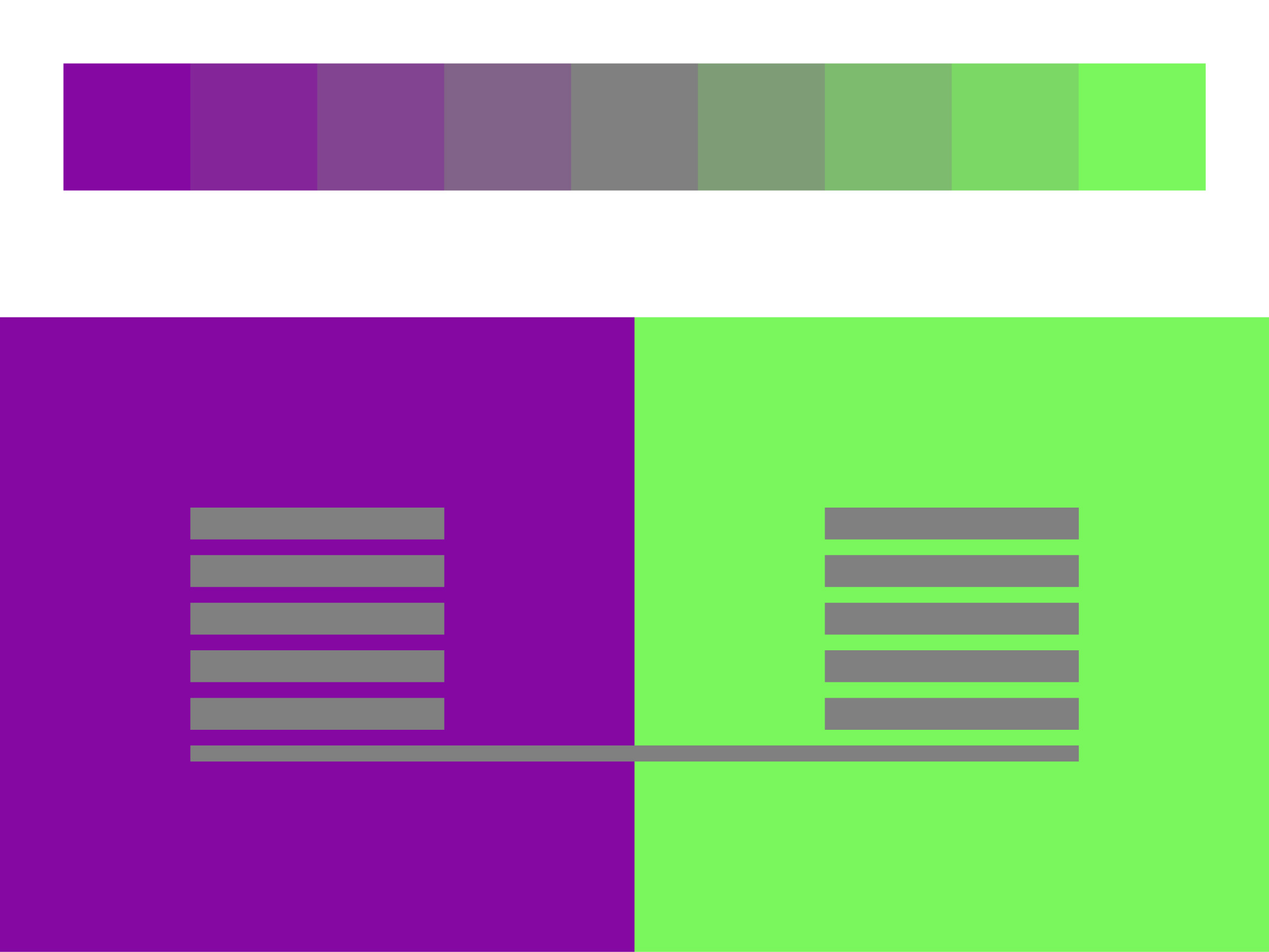
- Making 3 colors appear as 2, or appearing as a reverse ground (see PDF below). Create several solutions to this assignment. If you have access to the Interaction of Color book or app, this exercise comes from chapter VI, “1 color appears as 2 – looking like the reversed grounds”.
- Create a more effective version of the first assignment, making 1 color appear as 2, if you learned something today that you can use to improve it
- Keep a visual and/or written journal of color observations or revelations in daily life, to share in the next class – things in nature or in the man-made world that you notice, or see differently now than before the class
- Free color studies (optional, see second PDF below). If you have access to the Interaction of Color book or app, this exercise comes from chapter XVIII, “Free studies – a challenge to imagination”.
As before, please email your studies in PNG or JPG format to Karen by 2 pm Thursday.
[gview file=”https://dicknelsoncolor.com/wp-content/uploads/2013/09/Lesson2Combined.pdf”]
[gview file=”https://dicknelsoncolor.com/wp-content/uploads/2014/10/Free-Color-Study-Assignment.pdf”]
Some Illustrator resources
TastyTuts 19-part Illustrator video series – Intro
This series includes sample files you can work along with. You can download a PDF overview of the whole course, and all of the sample files at once, from the description to the intro video. Or you can download individual worksheets for each video from its description section. The descriptions also have a guide to where each topic is covered in each video, if you want to review a particular topic without watching the whole video.
Adobe TV – Illustrator tutorials
These are specific to the “CC” – Creative Cloud – version of Illustrator, which is the latest, but most capabilities will also apply to older versions. You can also search for videos specific to your version of Illustrator, such as Illustrator CS5 or CS6.
Adobe help & support
General
Getting started with Illustrator
Illustrator reference topics
Class recap – some key ideas
Review & discussion
Several students reported noticing color in specific ways since last week’s session. For example, Kathy noticed a couple at Costco wearing purple and green shirts that recalled the parent colors of one of her arrays. Others mentioned thinking of couples of different ethnicities, and how their children’s traits favored one side or the other. Keeping track of these kinds of observations is one of the homework assignments for this week.
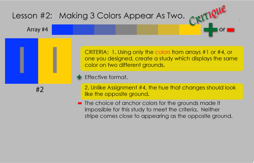
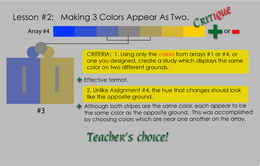
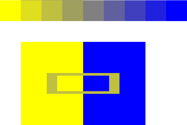
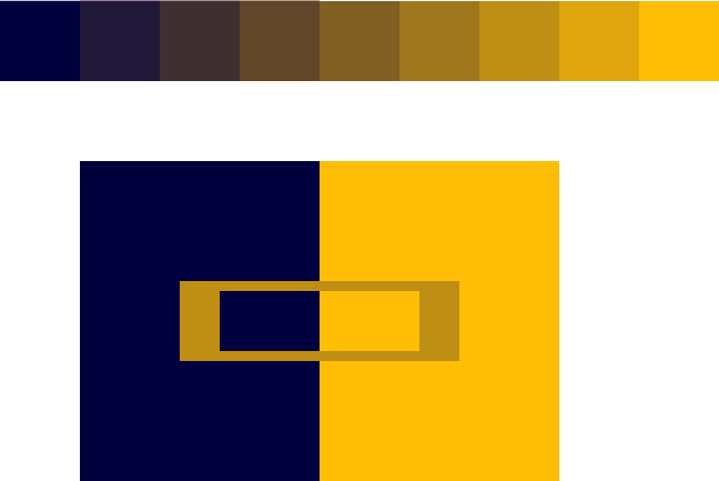
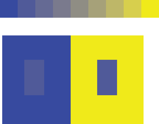
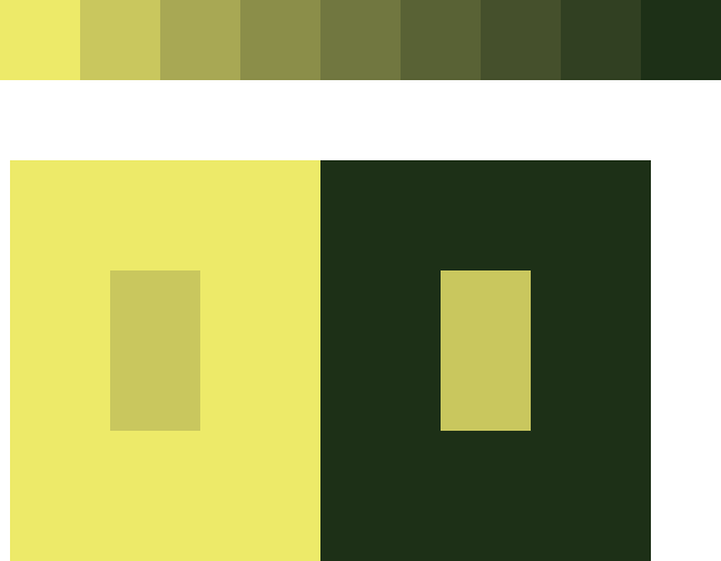
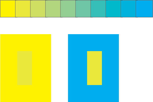
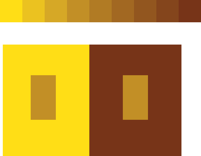
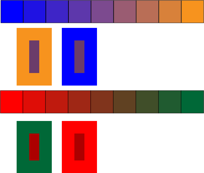
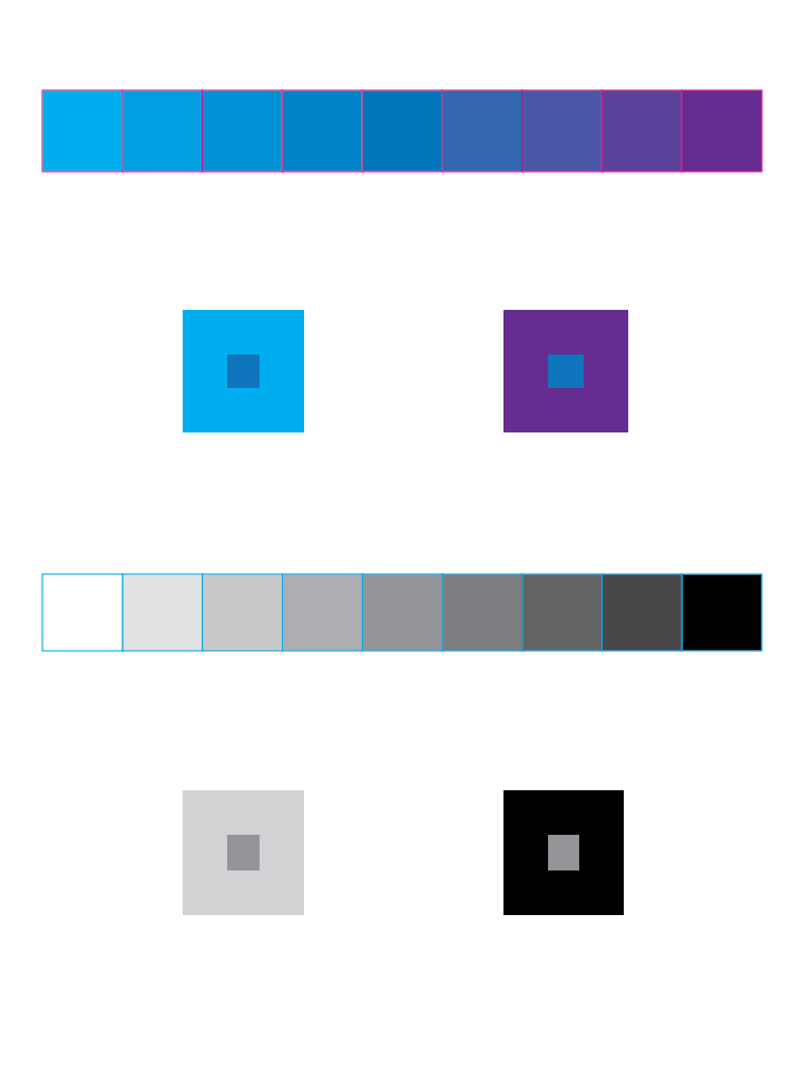
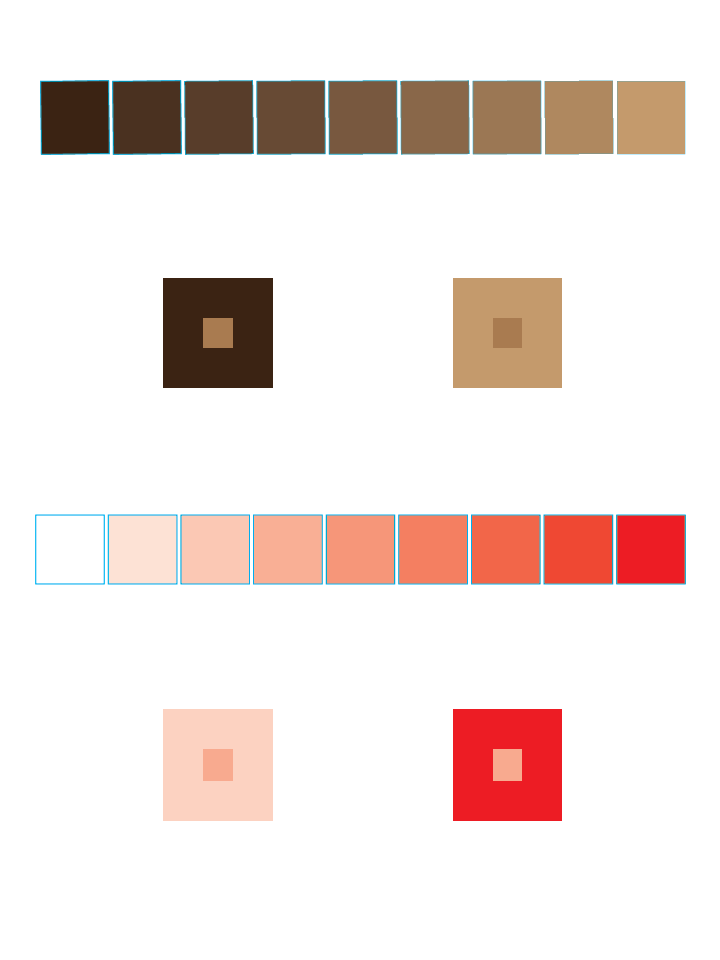
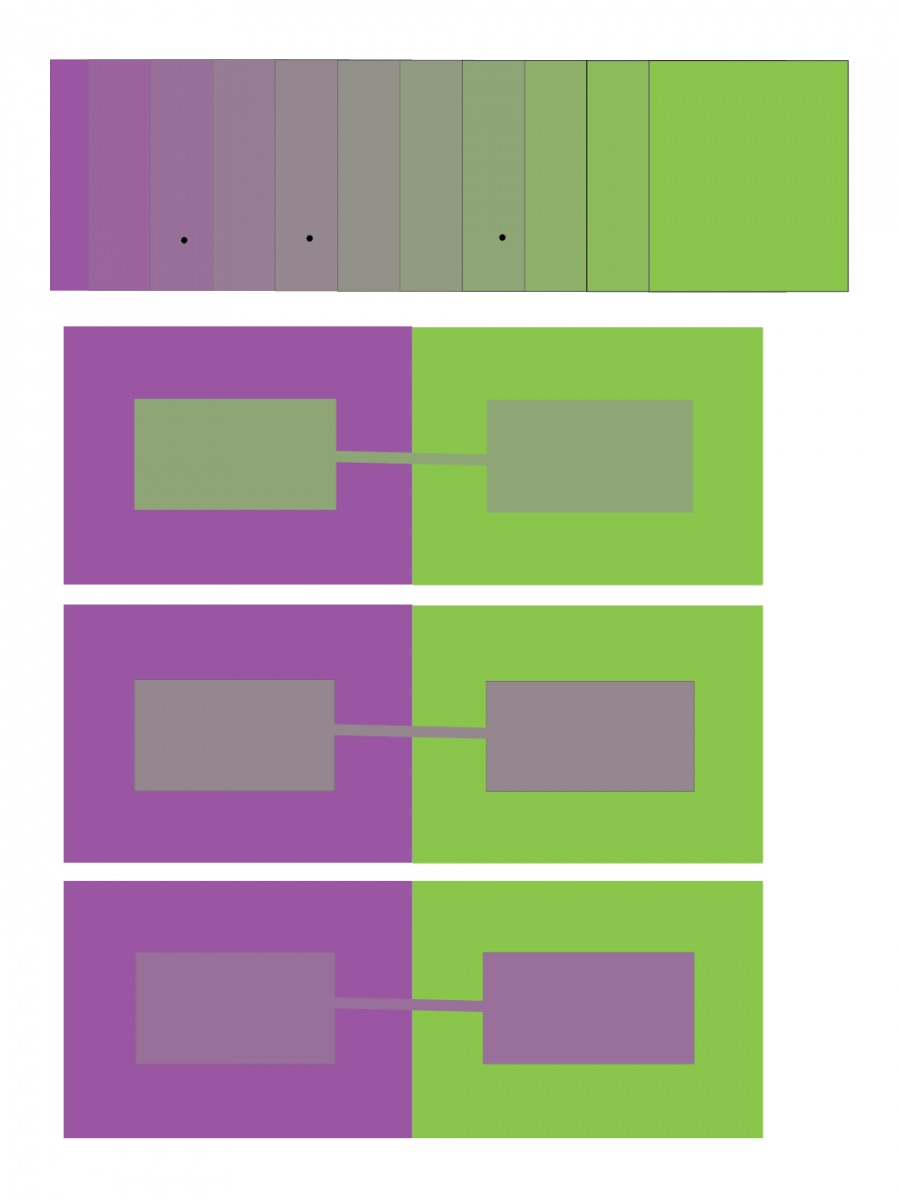
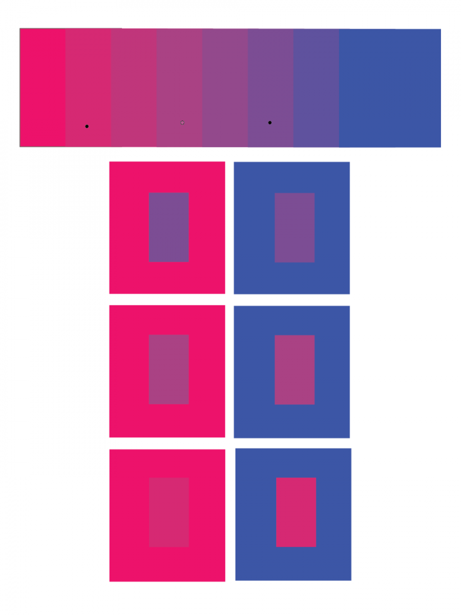
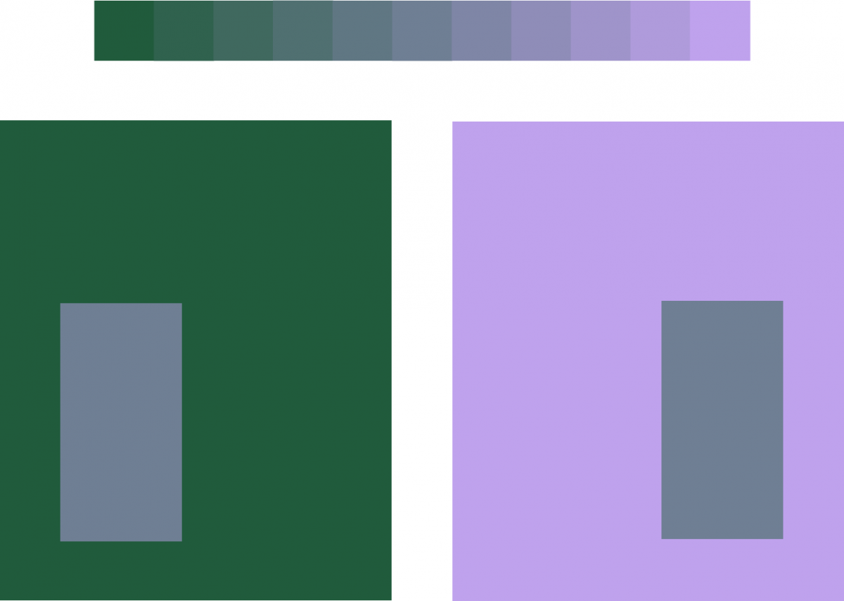
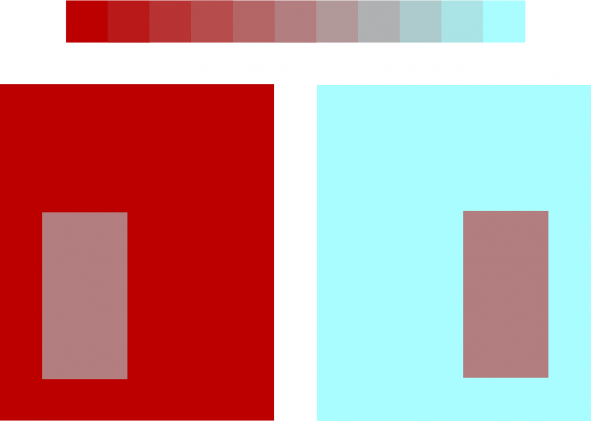
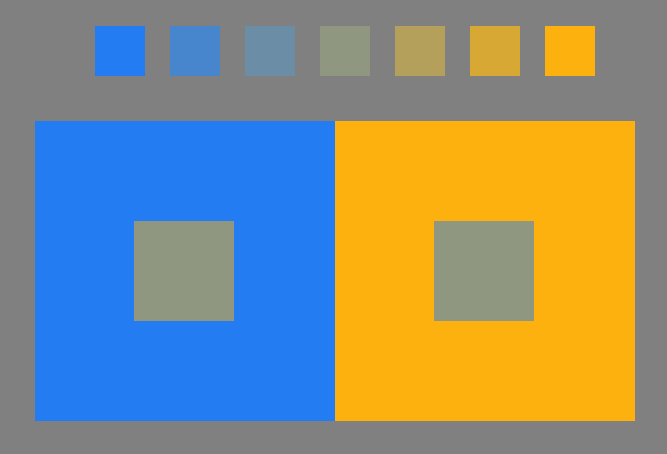
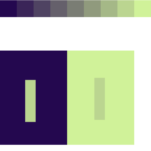
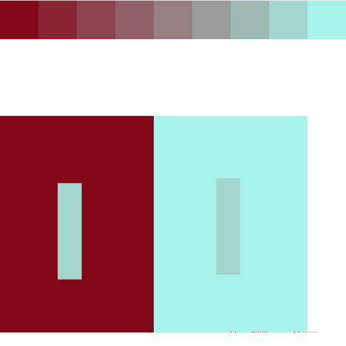
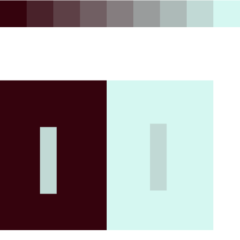
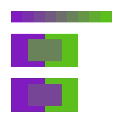
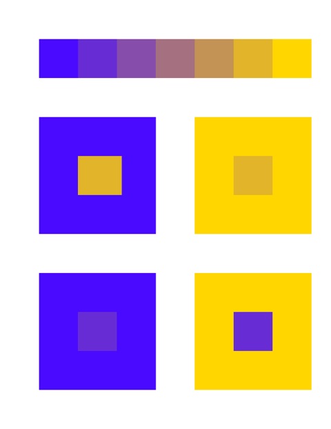
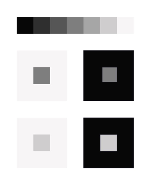
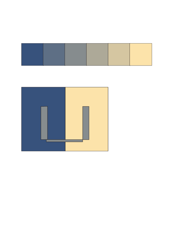
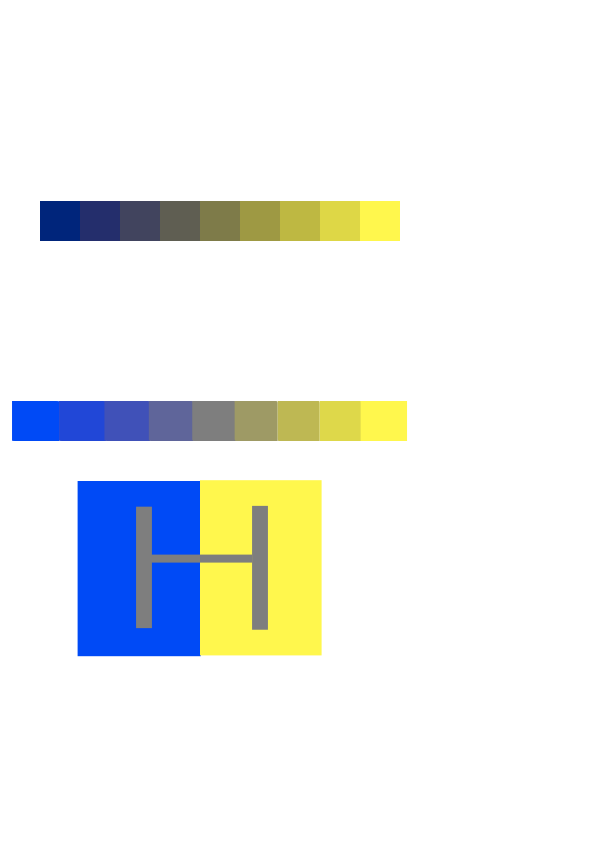
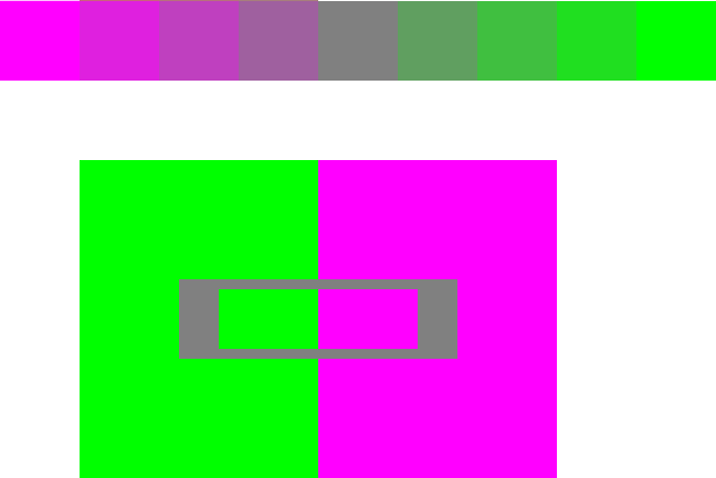
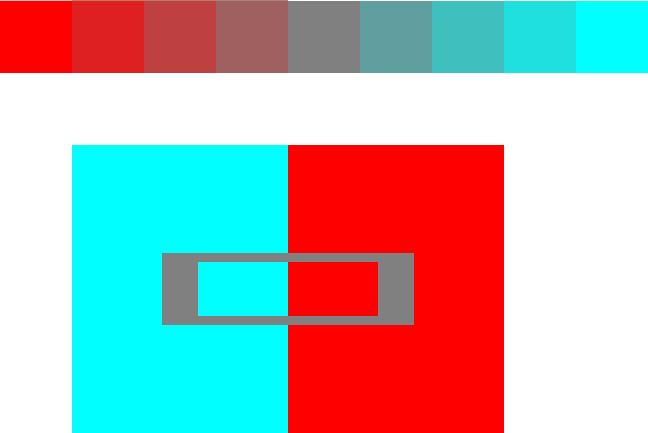
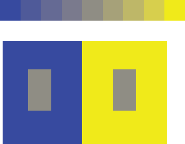
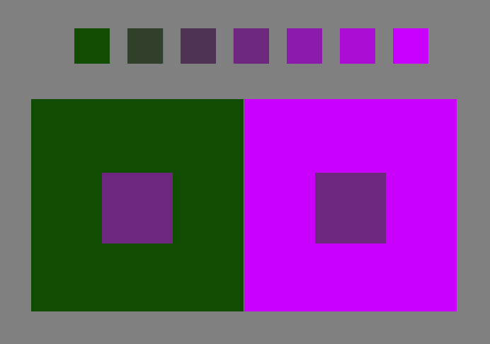
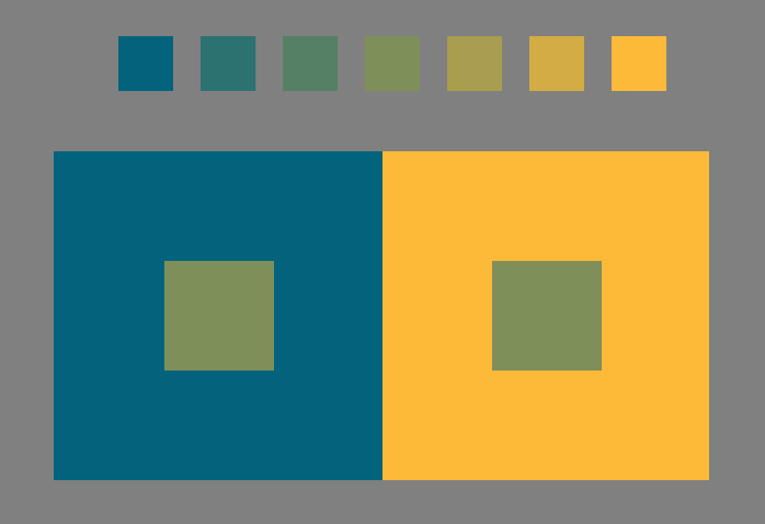
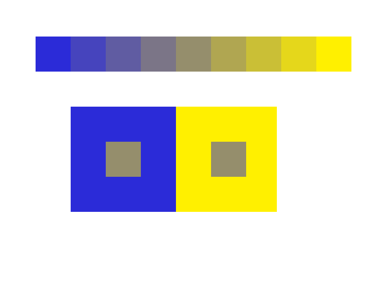
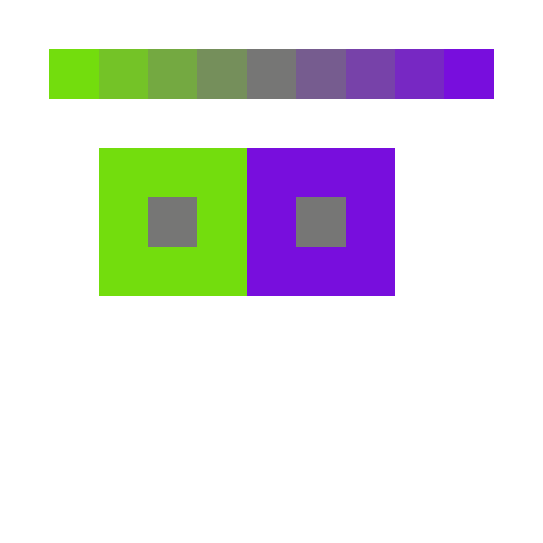
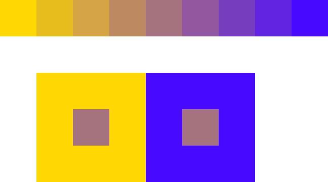
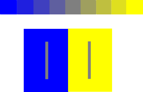
Critique: Make one color appear as two, or three colors look like four
Most students turned in several solutions to the first assignment, and reported having played with more. Exploring multiple solutions is easy with Illustrator, and will develop your sensitivity to, and discrimination of, color. It’s also fun, and you can discover some surprising combinations.
Criteria
- Dramatic hue change: show how different one color appears on two different grounds
- Simple format allows easy comparison
- The greater the change, the better
Constraints
- All colors should be from a single array
Hints for success
- Grounds – influencing colors – should be extremely different – strong in chroma
- Figure – influenced color – should be weaker in chroma
Common problems
- More of a value change than hue change (one or both of the grounds is weak in chroma – a tint or shade)
- Less dramatic than it could be (ground colors have a lot in common)
- Figure favors one ground
- Format hinders or distracts from comparison
(Reference Albers chapter IV, A color has many faces – the relativity of color)


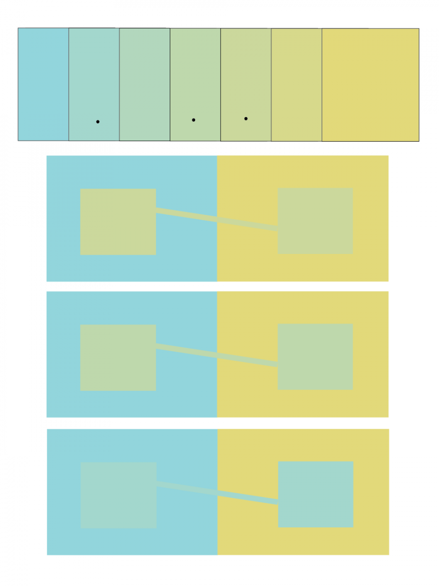


Revised studies
These studies were reworked and submitted the following week.


New content

Trihue demo
The Trihue demo on this site allows one to practice recreating any color by mixing different transparencies of cyan, magenta, yellow, and black. This can help you develop a feel for the primary components of any color.
In parallel with the very structured color deception assignments, Josef Albers assigned his students “free color studies” which allowed more freedom of execution. Dick assigned a free color study for next week. The idea is to create a color collage around a leaf or other object such that you don’t see shape, but color. Combine matte (not glossy) colored paper such that the subject is not shape or composition but color. The leaf or object should be “of”, not “on”, its surroundings – they should all relate.
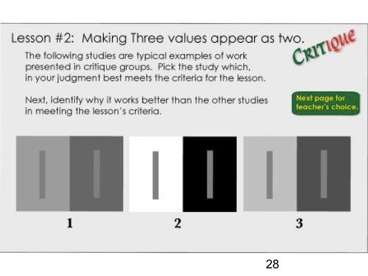
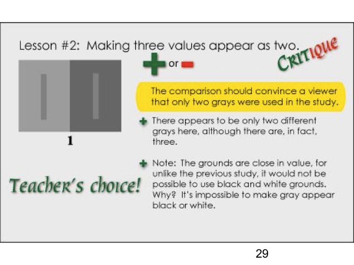
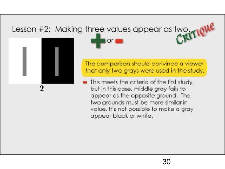
We discussed the new color deception assignment for next week, making 3 colors look like 2, or reversed grounds, via working through the reasoning of the critique for the same assignment in value. The slides for the sample assignment and critique, in both value and hue, are provided below.