The first session of the Color Relationships class for Fall 2014 was held on Friday, October 10. Through hands-on exercises, discussion, video, presentation, and worksheets, eleven students experienced the relativity of color and received their first assignment: make one color appear as two. Read the full post for details and class materials.
Homework assignment
[gview file=”https://dicknelsoncolor.com/wp-content/uploads/2013/09/Lesson1Combined.pdf” height=”590″]
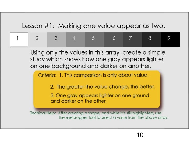
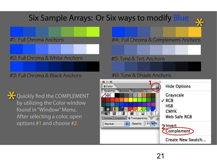
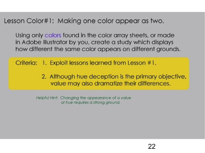
The assignment for next week, making one color appear as two, is on the bottom half of the sheet above. (The top half is the value deception assignment we covered in class, provided for reference.) Using Adobe Illustrator or the application of your choice, create several solutions to this assignment. (You might want to explore primaries, secondaries, tints, shades, complements…) Export them in PNG format (at least 900x1200px; at most 1200x1600px, 72 ppi resolution) and email them to Karen by 2 pm Thursday. Review the tutorial on creating arrays if needed. If you have access to the Interaction of Color book or app, this exercise comes from chapter IV, “A color has many faces – the relativity of color”.
Midweek update #1
Dick has some hints for you as you tackle the homework assignment for Friday.
He says, “After viewing a few color assignments submitted, it appears that I was not successful in making the following point: Change value by strong VALUE influences. Change HUE with strong color influences. In other words, if the background has little or no strength of VALUE OR HUE, your color change will be limited.”
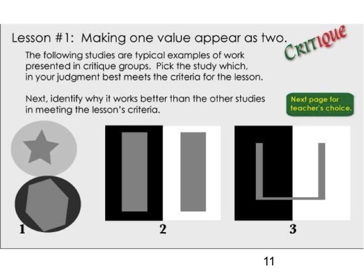
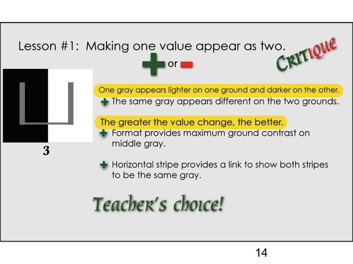
This web page contains sample solutions to the assignment, and their critique. Would your solutions be the teacher’s choice, or lose points on some criteria?
Midweek update #2
An urgent message from Dick about homework assignments:
To those who may have missed some critical points about this first assignment and the course, I submit, in the wake of some completed works submitted by some members of the class, the following: PLEASE READ WITH CARE!!!
- POINT 1: ALL COLORS USED IN CREATING THESE COLOR DECEPTIONS MUST BE CHOSEN FROM A SELF-MADE ARRAY. Review the sample array and subsequent deceptions provided earlier.
- POINT 2: ALL INFLUENCING COLORS OR BACKGROUNDS SHOULD BE DOMINANT IN BOTH VALUE AND HUE, WITH AN EMPHASIS ON THE LATTER.
- POINT 3: THIS COURSE IS ALL ABOUT RELATIONSHIPS. THIS IS WHY THE RELATED COLORS IN YOUR ARRAY PROVIDE THE ONLY COLORS TO BE USED.
- POINT 4: CREATE AS MANY SOLUTIONS YOU WISH, BUT SHOW THE ARRAYS FROM WHICH YOUR COLORS WERE CHOSEN.
Class recap – some key ideas
The purpose of this course is to train you to recognize and create works with colors in relationship. Nature follows rules of relationship. If your work does also, you won’t be creating “freaks”. In the late 19th and early 20th centuries, people with deformities or unusual conditions – “freaks of nature” – were exhibited in freak shows. Dick sees color freaks in artwork everywhere, especially in landscapes, where elements are included that do not follow nature’s laws of relationship. Dick’s classes with Josef Albers at Yale opened his eyes to relationship and forever changed his art and his teaching. Elements in relationship to each other are functional, as a hand functions only because of the relationship of the fingers, thumb, and palm. In art, 1 + 1 equals 3, not 2, because the elements are in relationship to each other.
Learning objective critique in Albers’ classes at Yale was also a revelation for Dick. “I like it” or “it works” or “it’s interesting” are opinions, not critique, and do not help the artist evaluate whether they’ve met the assignment criteria. The assignments in this course have objective criteria that will allow each student to self-critique – to evaluate for themselves how well they’ve completed the assignment.
Dick recreated an experience from his color class at Yale, giving the group (working individually or in pairs) 15 minutes to select three colors from a pack of Color-Aid paper which could be arranged so that one color is made to appear, by contrast with the other colors, as two different colors. Discussing approaches and strategies led to discovering some principles by which colors influence or are influenced.
Strong colors are more influential. The primary colors (cyan, magenta, and yellow) and black and white are the strongest, and thus the most influential. Identify the hue and value components of a color to determine if it is strong or weak, dominant or wimpy – if it will influence, or be influenced. Colors on the outer rim of the color wheel are “full chroma” – the strongest and most saturated – and are made from only one or two primary colors. Colors in the interior of the color wheel are weaker – more easily influenced – because they’re made from all three primaries. The dominance of each primary is diminished by the presence of the others. Grays and tones can be easily influenced – they give up their identity in the context of their backgrounds.
To create an effective color deception, make sure there’s a relationship among all the colors in both hue and value. Colors from an array will always be in relationship.
Hue = color, such as redness or greenness
Value = lightness or darkness
Dick showed two videos he made, “Mix any color” and “3D color wheel” (see Class Materials section below), to introduce fundamental concepts of colors in pigment and light, and terminology used to describe color. He also showed two video commentaries from the Albers Interaction of Color iPad app. One spoke credibly about color interaction; the second, well, brought to mind some of Dick’s favorite sayings. A video about Albers’ Homage to the Square: Aurora was narrated by an art museum curator. Though painted by Albers, the painting lacks luminosity, and the explanation about colors “migrating across boundaries” has nothing to do with creating luminosity.
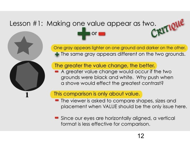
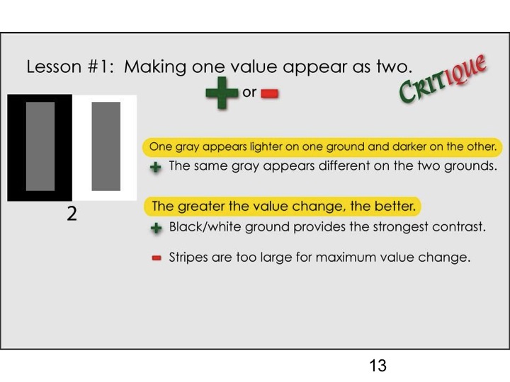
We worked through a value change deception assignment and critique of sample solutions (see slides below). Discussing questions posed in two worksheets solidified concepts of relatedness in arrays, and recognizing factors in color dominance.
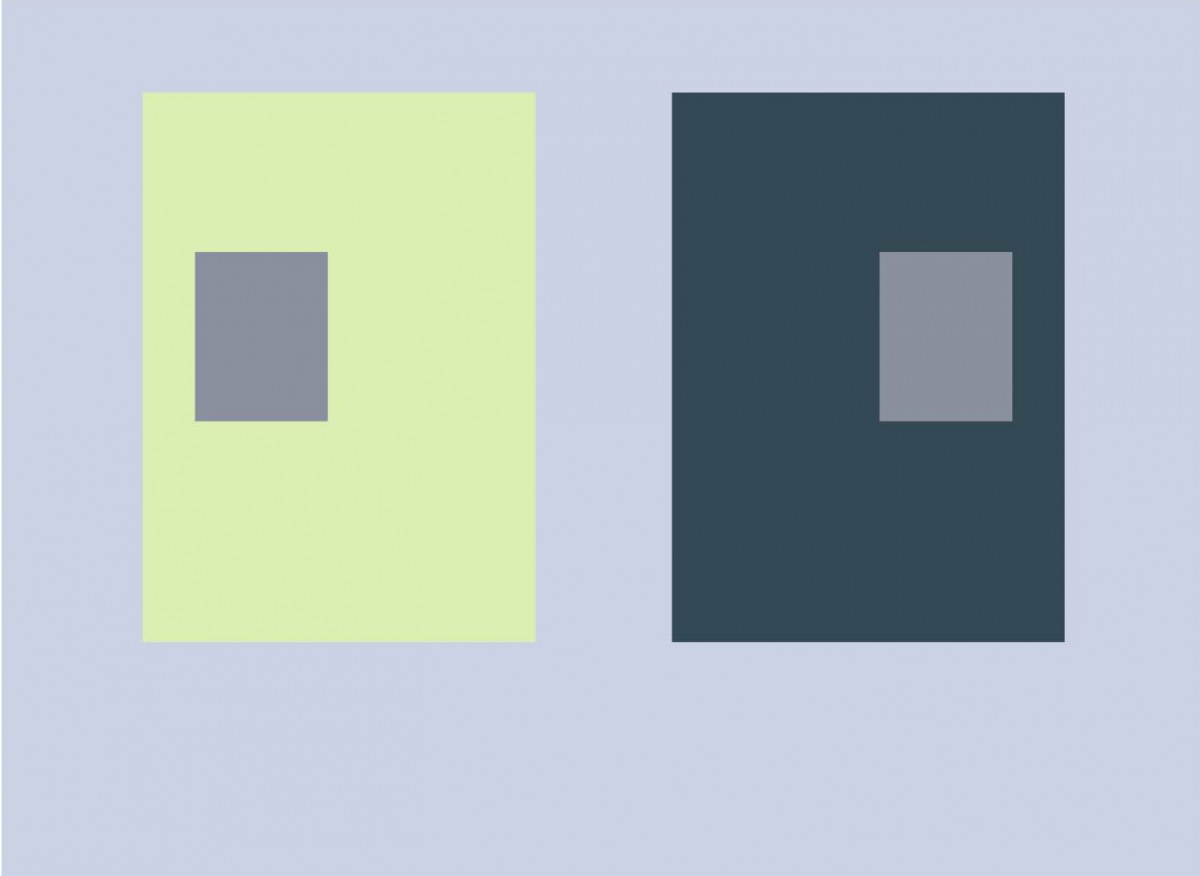 Dick showed Josef Albers’ own solution, from Interaction of Color, to the problem assigned as homework this week: make one color appear as two. Albers’ solution, using small gray rectangles on large grounds of dark blue and light yellow-green, demonstrates more of a value change than a hue change. Understanding what makes one color more dominant than another, combined with the use of an array, provides a reliable method for choosing colors for this assignment.
References
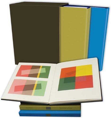 The book Interaction of Color by Josef Albers was originally published in 1963 in a small print run with silk-screened plates of student and faculty solutions to each exercise. Original editions are in the holdings of libraries and collectors. In 2009, it was reprinted in a large 2-volume boxed set, which is available on Amazon for $157. Dick frequently brings his copy out to show and critique solutions to the Albers exercises.
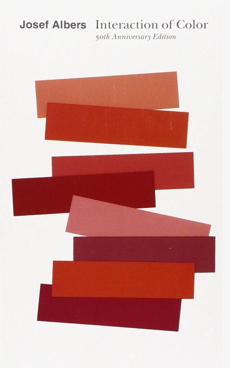 Several paperback editions have been published with the full text, each with more color plates than the previous. The most recent was published in 2013 for the 50th anniversary of the original publication and is available on Amazon for $12.
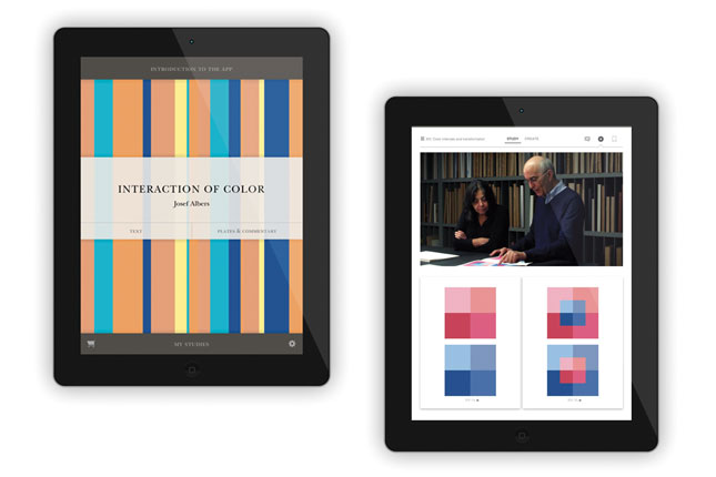 The Interaction of Color iPad app ($14) contains all the text, reproductions of all the color plates, the ability to create one’s own versions of each exercise, and brief video clip commentaries.
Class materials
Videos
The two videos below, “Mix any color” and “3D color wheel”, introduce fundamental concepts of colors in pigment and light, and terminology to describe color – primary, secondary, complement, hue, saturation, value, tint, shade, and tone. Repeated viewing can strengthen and reinforce your understanding of the concepts and terminology.
It’s possible to mix any color in pigment or light by first recognizing that all colors originate from three primaries plus black or white. The pigment primaries, Cyan, Magenta, and Yellow, understood and used in the printing industry for decades, were unknown to most artists and art schools, but are now found in every color printer. Light primaries, Red, Green and Blue-Violet, are the secondary colors of pigments. Every TV or computer monitor depends on RGB color to generate an entire spectrum.
An animated 3D color wheel, with text identifying key color terms.
Slides – Value deception assignment and sample critique

-
- Color deception exercise 1
Worksheets
[gview file=”https://dicknelsoncolor.com/wp-content/uploads/2014/10/Is-That-My-KId.pdf”]
[gview file=”https://dicknelsoncolor.com/wp-content/uploads/2014/10/ColorDominance.pdf”]


