The third session of the Color Relationships 1 class for Summer 2015 was held on Tuesday, August 11th. We heard from participants about their latest experiences with color, critiqued the last two assignments, and moved on to explore a new facet of color interaction: equal value. This was a favored trick of the Impressionist painters, and when properly utilized can manifest the most beautiful and luminous fields of color. But matching value is much more challenging than it seems! It is truly the mark of a skilled colorist, one who can control their value selection as much as their choice of hues.
Class overview
Sharing enthusiasm for color theory
The class began with a call for reflection, as Dick and Holly asked for class feedback and wanted to know how students were feeling about the course. Dick wanted to know how this information was affecting people, and if they were as enthused about it as much as he is. He reflected on his time as a graduate student, and the excitement he felt when he studied with Albers. He hopes he is still expressing his excitement about this subject in a tangible way that students can share with him.
Everyone commented on how amazing this new way of thinking about color has been for them. Individuals talked about seeing color differently in their everyday lives, and how vivid things seem to be now. One student spoke of playing with arrays based on what she sees outside her window, as the weather and time of day changes. Another student described her experience as: “I mean, it’s mind-blowing. It’s just totally mind-blowing to think about color in such a different way.”
A couple participants mentioned still being a bit shocked by learning about this new color wheel, and thinking about the way these colors interact is so new to them that it can sometimes be a bit overwhelming (not to mention staring at a computer screen of color swatches for hours on end!). One student commented that it is still hard for her to see where this is going, and wanted to know how she will apply this information to her work. Dick said, “Oh, you want to know where this is going? Well, I can’t give you that, I can’t give you the answer! It’s called ‘delayed closure’.” Ah, yes, his preferred method of teaching!
Creating color matrices in Illustrator
We then switched to an Illustrator demo, with Dick teaching the class how to create full, four-sided color matrices. He relayed the story of how he came up with this idea, while traveling back to Maui after teaching a workshop: “And on that flight home, I thought, ‘Well, what would happen if yellow married cyan, and then married blue, or any other color? What would happen if cyan then married another color?’ What would happen if …? So I went home and created a matrix.”
Following the ARRAY concept of color relationships, I have
expanded Josef Albers’ two-parent relationship to a broader
spectrum of color possibilities. The results are startling and
a new tool for those who seek color harmony.
The Color Matrix from Richard (Dick) Nelson on Vimeo.
He mentioned the benefit of coming up with color matrixes for fun: “And for me, this is where this course can do wonders for people who tend to get stuck with the same palette. I would never think to use some of these colors, but the array can show me some of those magical things, not to mention the luminosity … and again: they’re all related.“ It all comes back to relationship!
Homework critiques
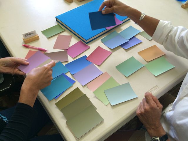
We moved on to the homework critiques, and Dick made special mention of Chelsea’s work, since she is still using ColorAid paper, and the skill she is utilizing to pick her arrays is quite admirable. Unlike playing around on Illustrator, Chelsea has to work at a slower pace, shifting through colors one at a time, and she can’t switch parents or change a family nearly as fast as you can with an ‘eyedropper tool’ on the computer. But she is developing an eye for reading the subtle notes in a color, by taking random color chips and learning to see their ‘ancestry’ (i.e., knowing who the ‘parents colors’ are).
Of course, Illustrator isn’t completely perfect either, and has its own drawbacks to consider, such as the algorithm that calculates the array doesn’t always mimic what would happen in real life. When using the program, you still have to be diligent and check your arrays for consistency. If the array is off, it will be much harder to create the illusion of color change.
We went through some examples of the two previous assignments: ‘Make 3 colors look like 2’, and ‘Make 4 colors look like 3”. Here are some quotes from the critique:
On the selection of backgrounds:
“Why can’t I use two very dominant parents [as my ground] color in this assignment (‘Make 3 colors look like 2’)? Because you can’t have that great of a difference in the backgrounds.”
The importance of checking your arrays for consistent steps, no matter if you are using Illustrator or the medium of your choice:
“The first thing I want you to do is look at one of the parents. The second thing is look at the first child in; I should begin to see a clue that it is moving toward the other parent. And if it gets darker, or lighter, I should see that reflected in the other parent … I want you to train your own vision enough to recognize the process I’m going through right now: in a child color, I should see some glow of the opposite parent, and if I don’t, this should tell us that something is wrong here. And at that stage, what should we do? Try a different parent.”
Looking for those color interactions that offer up delightful surprises:
“When you take colors which are more opposite on the color wheel, then things will happen that are not as easily predictable … In other words, the two parents will provide for a surprise kind of interaction, things that are not kind of basic; or kindergarten, so to speak. It’s like French cuisine, there are flavors which I would generally not normally suggest; and now in a color scheme.”
And he congratulated the class on how far the group’s color perception has come in only two weeks:
“Go back a week ago, when the assignment was to make one color two different colors … and now, look at that. That’s sensational. How far we’ve come in one week, to pull off that deception. I don’t think a couple weeks ago, you would have believed possible that you could get a colored strip to look that different … but you really pulled it off.”
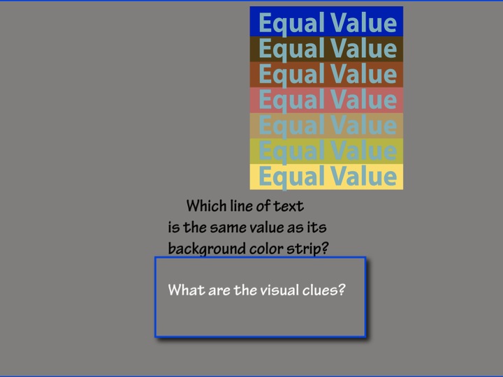
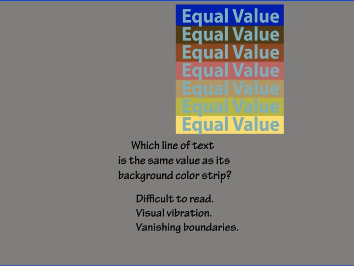
Equal value and transposing colors
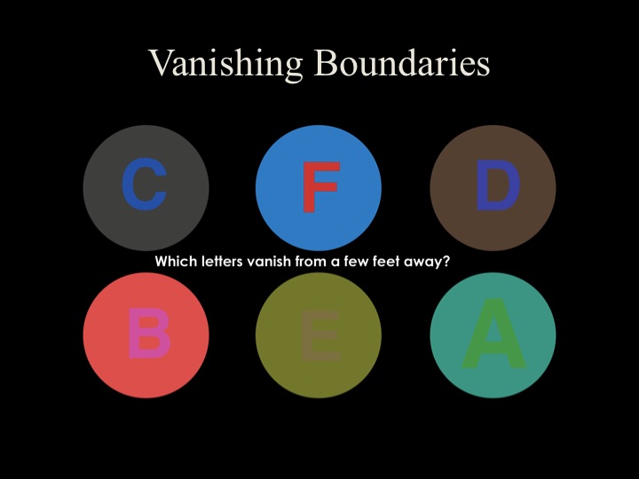
Interestingly enough, many of the homework samples were done with parents of very similar values, which turned out to be the new lesson for this week: equal value. In a few of the homework examples, the class had noticed it was hard to see the inner shapes in crisp detail, and the edges of the shape seemed “fuzzy”, or out of focus.
It turns out this fuzziness is the product of two colors that are matching in value, the aptly named “vanishing boundary” effect. If two colors have matching values, the edge of their shape visually blends with the other one, “as though you’re having eye trouble”, as one student put it.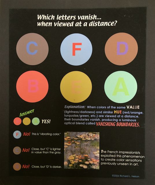
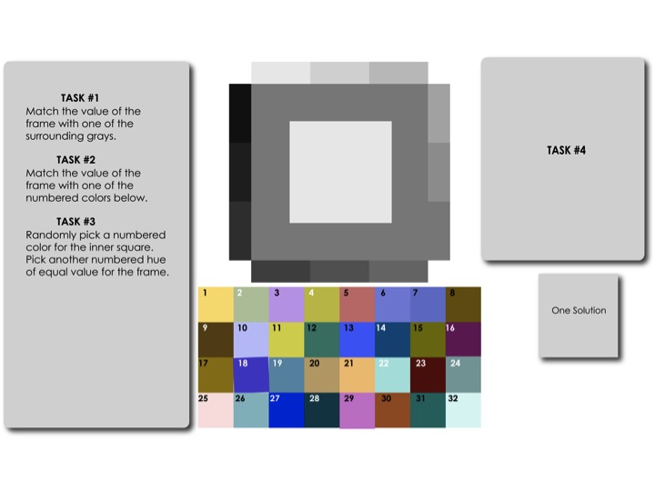
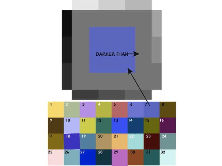
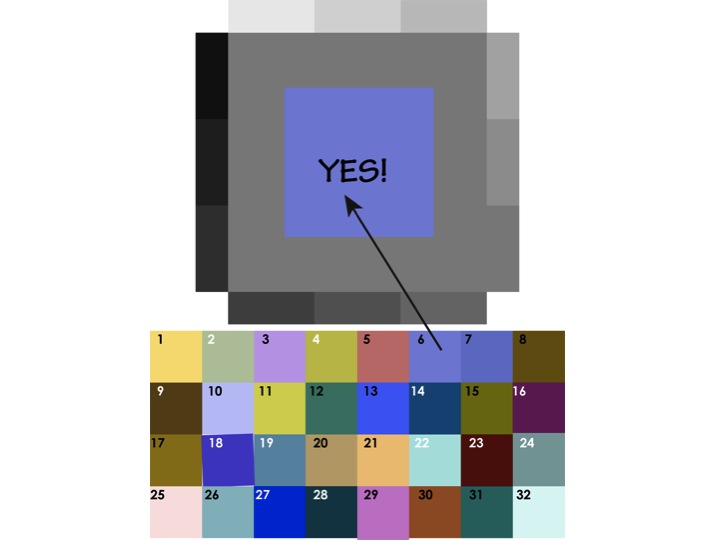
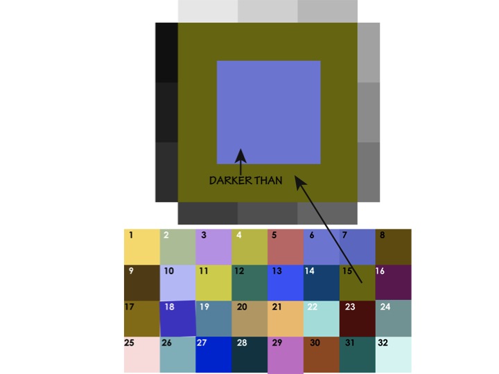
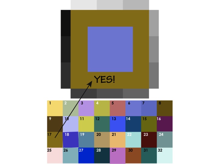
Dick took the class through another Illustrator demo, this one a game to teach how to identify matching values. There was a large square, surrounded by a thin gray scale; a smaller square inside the larger one; and a different assortment of color chips below. The instructions asked for the students to match the value of the large square to the small square, and offered a series of steps to learn how to gauge the value. The game proved challenging, especially with the size of the small color chips! But it did go to show how difficult it is for our eyes to go past hue and truly discern proper values.
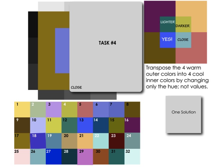
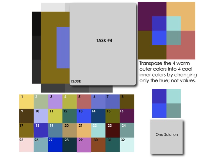
Transposing colors
After playing the game for a bit, we went over this week’s homework assignment of transposing colors. Dick praised Albers for the ingenuity of this exercise and the cleverness of the format, by which you can gauge many different color values in one piece. “You have four colors on the outside, and four colors on the inside. And Albers uses the term ‘transformation’: that you transform one set of colors for another set of colors, but the transformation is that they are only changed in hue, not in value.”
Dick has also adopted his own term. “Instead of using Albers’ term ‘transforming’ color, I prefer something that happens in music, to ‘transpose’. What you’re doing with color is like changing the key, but the intervals between the notes stay the same. It’s the same melody on the inside as on the outside; the only thing that’s changed is that it’s gone from warm to cool colors in the center.”
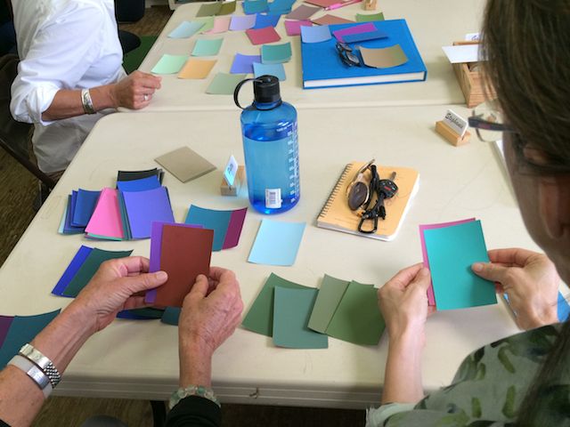
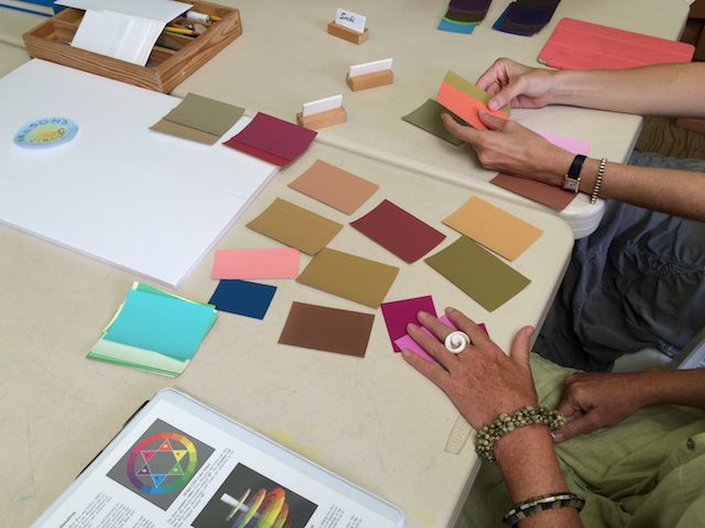
Matching values with ColorAid chips
We ended the class with one more exercise, matching up paper color chips by value. Dick placed a stack of random ColorAid chips on the table, and had teams of two students compare colors. When a team felt they had a good match, Dick would hold up the two colors and ask for the class opinion.
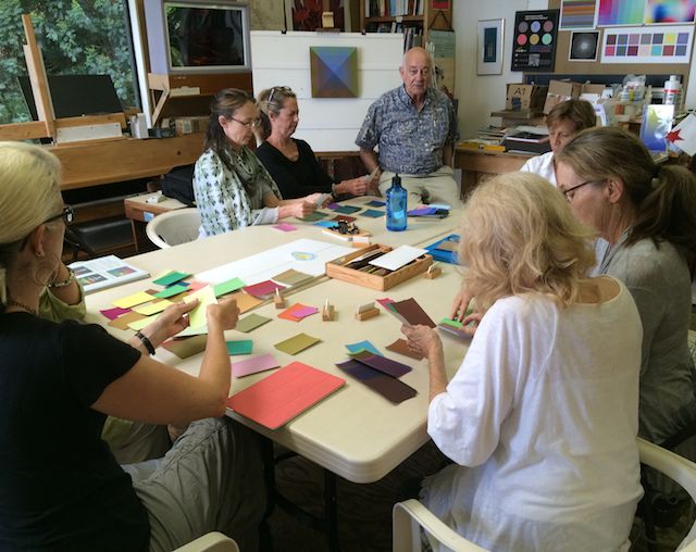
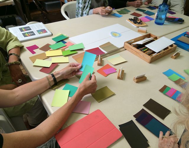
Once again, harder than it seems! Matching up values is a learned trait, and often our prejudices about color confuse our estimation of value. The same as being able to name a color’s ‘ingredients’, Dick says that instant value recognition is a quality you can teach yourself to be good at, but only by spending hours looking at colors! And he promised the students would have plenty of experience with that this week, in their attempts to complete this unique assignment.
Homework assignment
Transposing colors of equal value
[gview file=”https://dicknelsoncolor.com/wp-content/uploads/2015/08/TransposeColorREV2.pdf”]
Dick warns that this is a very difficult assignment: “Give this exercise a try, but recognize that we do not expect any attempts to be right on target until value discrimination develops by hours of trial and correction. At this time, experience with expected failures should be the mindset, so don’t be discouraged with your early results and their direct flight to the trash bucket. This week is truly trial with high percentage of failure.”
Videos
MatrixTutorial from Richard (Dick) Nelson on Vimeo.
A step-by-step tutorial on building a color matrix in Adobe Illustrator.
Class materials
Slide presentation: Equal value and vanishing boundaries
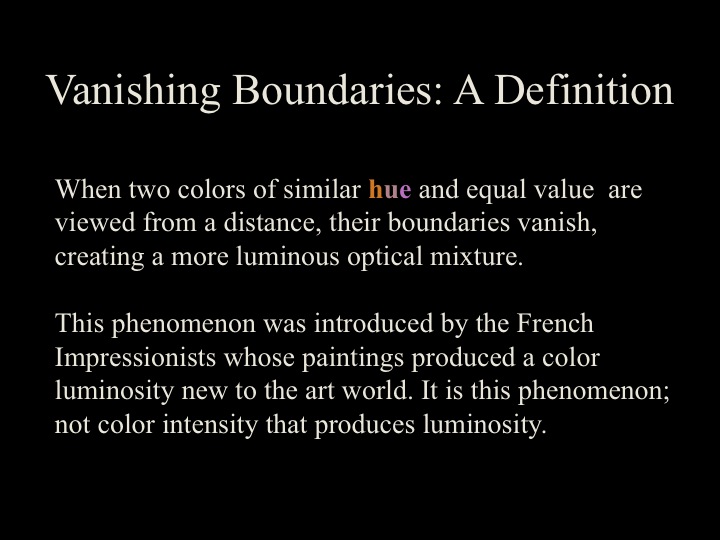
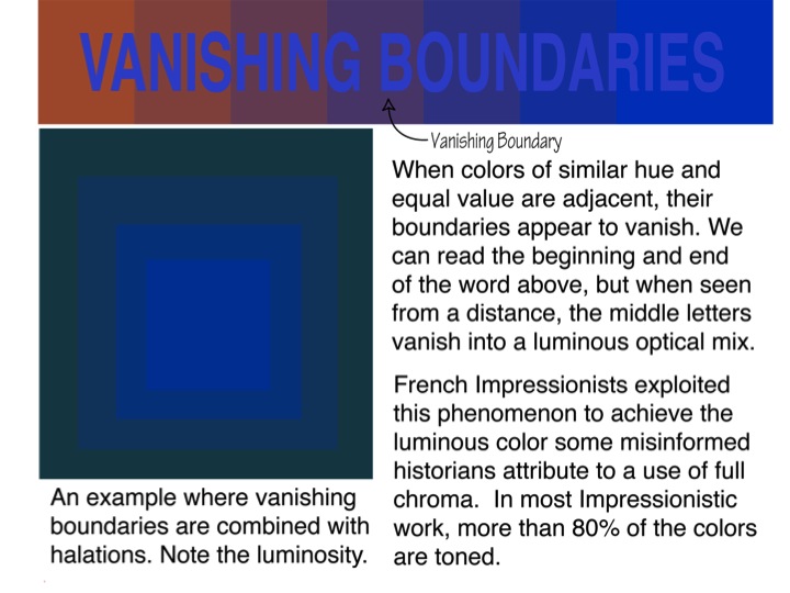
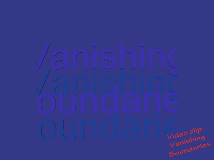
Vanishing boundaries and luminosity
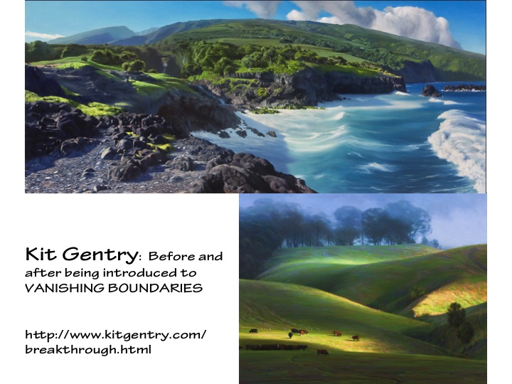
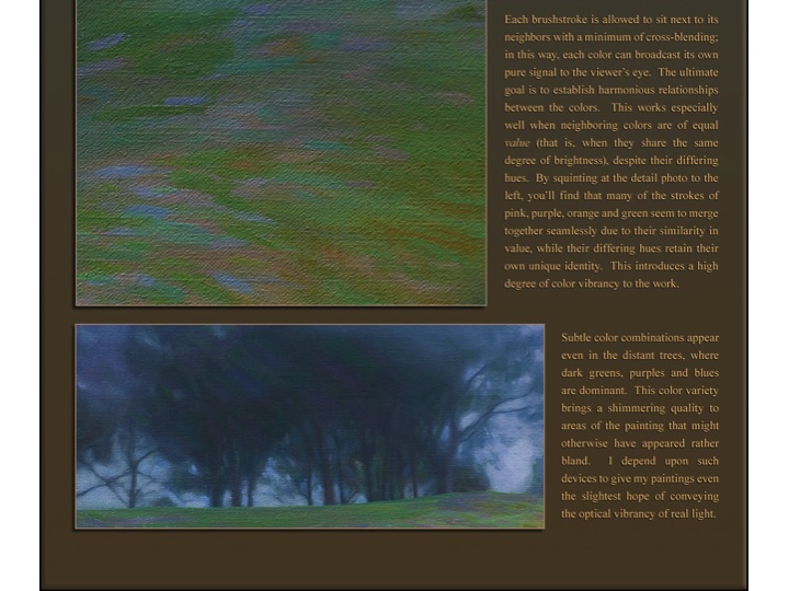
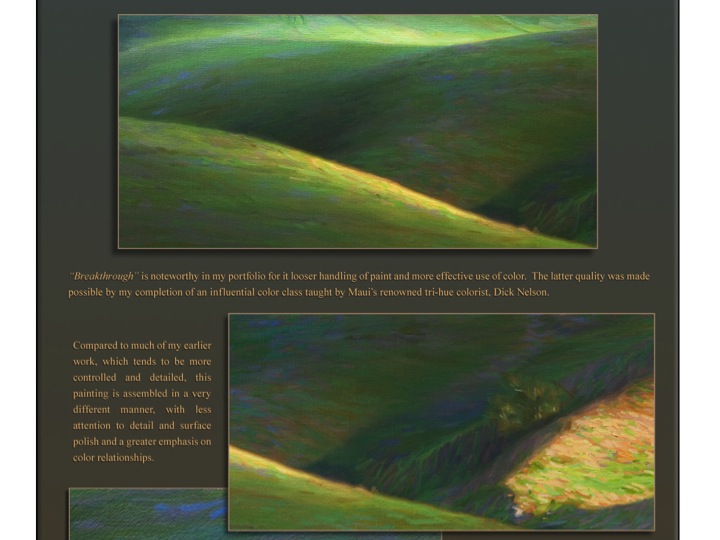
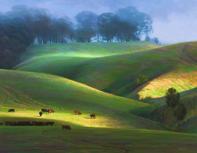
Vanishing boundaries are a special case of equal value. Vanishing boundaries occur between two colors having similar hue and equal value. The optical mixing perceived by the eye results in a more luminous effect than if the colors had been mixed on the palette, and this is the secret of Impressionist painting. Kit Gentry is an artist who, after taking Dick’s class, masterfully applies this approach in his work.