The fourth session of the Color Relationships 1 class for Summer 2015 was held on Tuesday, August 18th. We critiqued the transposition examples seen in Albers’ book, reviewed the homework submissions, enjoyed a poetry reading, and heard from Kit Gentry about the incredible use of value as it is employed in his paintings. We moved on to our last assignment (an exercise in freedom!), and Dick talked about considering how we might put these color concepts to use in the future.
Class overview
Color examples from The Interaction of Color
We began class by looking over the transposing/transformation samples in Josef Albers’ book, The Interaction of Color. Dick asked the students to view the images objectively, going over them square by square.
Dick: “Of all of the reds which is the darkest?”
Class: “The dark red.”
Dick: “And which is the lightest?”
Class: “The pink.”
Dick: “So of all the contrasts between the squares, which would be the greatest? The one between the dark red and the pink. Now take those colors, and transpose them into blue: shouldn’t that border be the same then? So the strongest [most contrasting] border should be at the same place.”
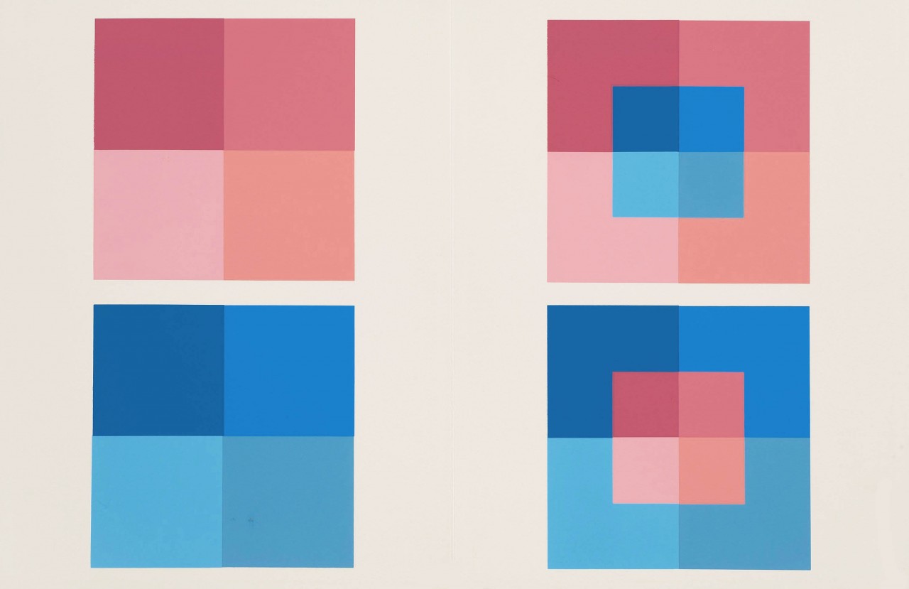
But Dick also used this example to show that the color transposition was wrong. As Dick realized many years ago, the examples Albers included in his book (which were pulled from his own students’ work) are not accurate, and therefore much of Dick’s teaching is designed to get his students to learn how to discern between true color relationships, and those that are false.
Dick: “Now look at the blue and look at the red, of the ones we’re talking about, the place of greatest contrast. Is the blue lighter or darker?”
Class: “The blue is darker.”
Dick: “And let’s move to the left: is the blue lighter or darker?”
Class: “Its still darker.”
Dick: “Now go across the border between the two top reds; look at the strength of that contrast. Is that maintained between the blue?
Class: “No.”
Dick: “Do you see how that’s softer? It’s not as strong a contrast.”
This discussion is similar to one we had a couple weeks ago, after viewing the video about Albers’ ‘Homage to the Square’, narrated by the curator of a Midwest museum. We are learning that we cannot trust every “expert” that comes along. Dick’s message is that he’s teaching us how to make our own judgments, backed by knowledge and understanding of the rules of color interaction.
But even though the book’s example is incorrect, Dick again praised Albers’ genius in exploring this tricky subject, and inventing such original assignments to teach others about the many facets of color interaction. Dick marveled at Albers’ ingenuity in designing the format for this assignment, so that it both shows multiple value contrasts and gives the viewer the ability to properly gauge them. “That’s what makes this such a damn good format, because it gives you the opportunity to make these comparisons. And so we can check another color in the same way, against its neighbor above or below, and to one side. And ask, does that contrast match?”
He advised the class to continue this exercise after the session ends: “And the fine-tuning of value perception is like a conductor knowing if an instrument is off-key: they can recognize the difference between a note that’s correct, and a note that’s flat. And after awhile, you start to hear it, and then you get finer and finer in your discrimination.”
Poetry and color games
After closing the book, we had a few administrative announcements, and then a special treat: one of our classmates had composed a poem about color! Suchi had been so impressed with the new color revelations she encountered in the first class, she had gone home and later found herself writing a poem about our newly discovered color terms. Dick asked her to read it aloud to the class, which she graciously obliged, and we were all the lucky recipients of a spontaneous poetry reading:
[gview file=”https://dicknelsoncolor.com/wp-content/uploads/2015/08/The-Color-Wheel-of-Life.pdf”]
Following that was more fun: another color chip game! This one had the goal of finding two or more matching values from the pile of chips. Dick’s only word of caution was that he had designed this game the night before, and then printed a sheet out on his home printer, only to find that the colors seemed very off from what he was viewing on his screen. He tried it again, and again, and finally gave up trying to perfectly match the screen image. So his instructions made the game even more challenging: “What I’m going to do is put out some color chips, and out of four in a family there will only be two of them which are of equal value. But since the color was off, we really have no idea if we have any of equal value.” Have fun!
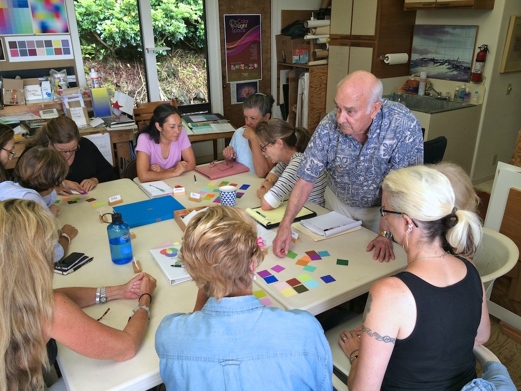
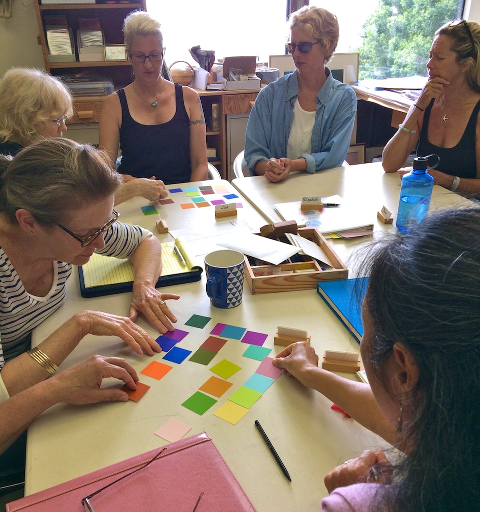
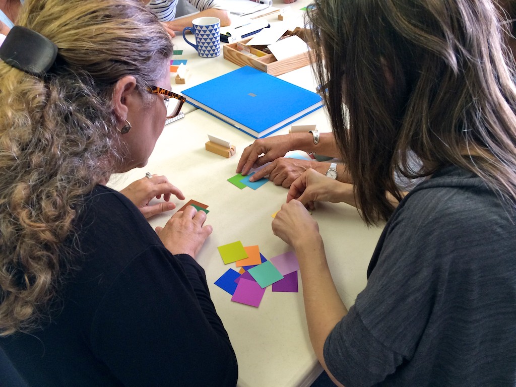
But the class was up to the challenge, and found many examples of value matches, which Dick was pleased to see. “Really, I’m very impressed, you have all improved substantially over this past week … your eye for value, as compared to last week, has improved tenfold.”
Color composition with triangles
We then took a moment to look at a composition Dick had placed on the easel in front of the class. “Now, this has been up on the board for weeks, and I’ve been waiting for someone to mention or say anything about this piece, and no one has said a word. What do you see? Everybody stand up and come to [the opposite] side of the room, and tell me: what do you see?”
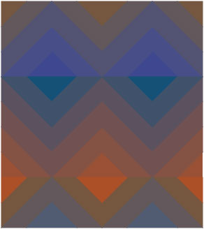
This is not the same pyramid piece we viewed in class, but has the same elements contained in the other piece: vanishing boundaries; halation; and a design that only uses one shape – a triangle.
The class took some time gazing at the piece, and when asked again what they saw, most people commented that they saw a pyramid, or more specifically, what looked to be an optical illusion of a four-sided pyramid. “But now, do you see any halations? Any vanishing boundaries?”
A few people said they did, and Dick asked them to go up and point out the halations. As each person got closer to the piece, they remarked in surprise at some of the triangles they had missed. In fact, the whole composition was constructed from triangles, but most were matching so closely in hue and value that they could hardly be seen from a distance, and are only noticed when up close. This “disappearance” of the triangles from a distance made the colors blend into each other, giving depth and a richness to the piece. There even appeared to be slight movement, as if we were seeing tricks of light and shadow. One student commented: “The longer I look at it, the more comes out to me. It’s really quite something.”
Critique
After our coffee break, we held the critique of last week’s assignment, ‘Transposing colors’. Many students lamented that the images on the screen did not match what they had seen on their monitors, which Dick agreed with. “I was thinking about it last night, all the different translations this image goes through, from your computer, you upload it to the website, to my computer, and now to my t.v. … So just realize that the final result, to hit it right on the button, via the internet and all the translations this color is going through, is near impossible. So I’m not that concerned [with the homework samples], I’m more concerned with whether or not you can see what the values are now, as they appear on the screen.”
So instead of critiquing the homework as it appeared, Dick would instead ask the author to discern which colors appeared lighter or darker on his screen, and which ones they would change to match in border contrast. Once again, Dick was happy to hear the class’ take on what we were seeing, and that even if the homework itself was not an accurate representation, the student’s value perception was right on target.
We followed that with a few short segments from Dick’s DVD, Dimensions of Color: ‘3D Colorwheel’, ‘Color is Relative’, and ‘Color Deception Fun’. [*note: Dick requested that another video be added to this post even though we did not watch in it class, ‘Color Luminosity’. You will find a link to it in the ‘Videos’ section below].
‘3D Color wheel’ we previously viewed on our first day of class, where we were introduced to an animated rendering of a color globe. Seeing the globe again weeks later is a fun way to see how far we’ve come, as students have put to use the terms “tints, tones, and shades”, and also now understand the incredible tools that arrays and matrices are for being able to link colors and get unexpected results.
At the end of the videos, it was time for Dick to dial in our guest for the day, someone whom Dick holds in high regard for his use of color relationships in his work.
Conversation with Kit Gentry
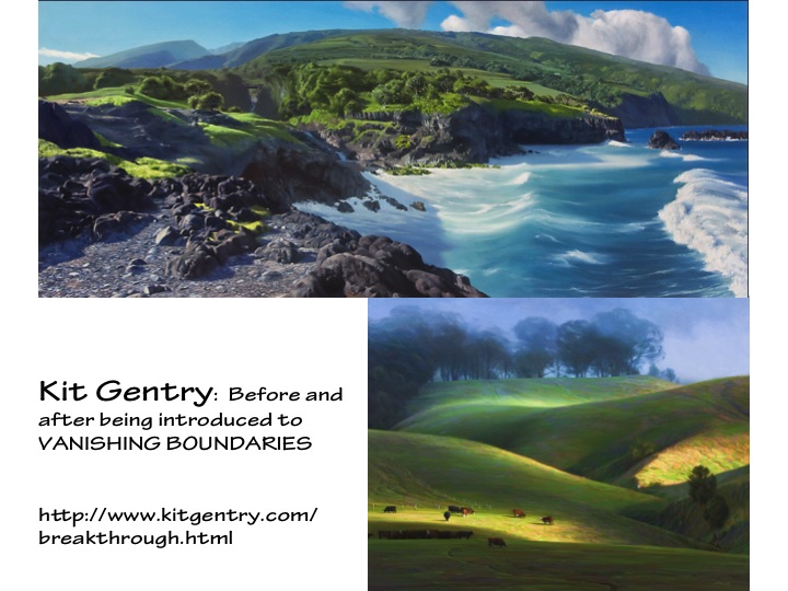
Dick introduced our special guest speaker, Kit Gentry, joining us via Skype from Michigan. Kit is former student of Dick’s, who took the Color Relationships series several years ago, which he credits with revolutionizing his artwork almost immediately. As a professional artist with a strong background in drawing and painting, Kit was able to take the lessons learned in class and incorporate them straight into his work. Dick had asked him to speak with us regarding the use of value in his paintings, which Kit uses masterfully to achieve stunning effects.
”I was drawing and painting for many years, and … [Dick] always marveled that I was able to assimilate the information as quickly as I did into what I was doing. My work changed pretty dramatically pretty quickly, even during the class. I attribute that to the fact that I had been drawing for so long that I had the concepts of value relationships worked out pretty well before I even came to take the class for the first time. So plugging in the color element became relatively simple because I understood value relationships, which I think made a big difference … because this is so much about value relationships and specifically about what you’re talking about today, equal values.”
He spoke about techniques he was incorporating into his recent work:
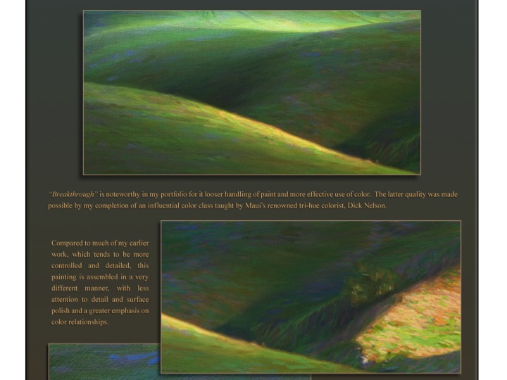
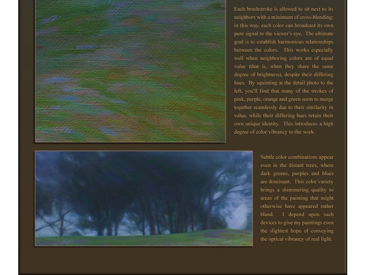
“In my own work right now, I’ve been focused largely on this idea of ‘the conservation of values’, which is something that you can see on display in many of the painters that we’re all familiar with: John Sargent is an example. These guys were trying to limit the value range of their paintings to only about 5 to 9 steps, which seems really, really limited. And it is, but what it recognizes is that paintings cannot have the full range of value that we would see in nature: say, the brightness of the sun to the darkest shadow, where there is absolutely no light at all. We can’t really get that in our paintings, so you have to figure out a way to make it work with fewer value steps available.
“For our purposes, its necessary to simplify and say “Ok, all the little things that are happening in that value area – say a shadow, or maybe a light area – you’re compressing the value range in there. And to show the subtle distinctions in there, you’re using changes in hue, instead of changes in value. So you can have an almost unlimited amount of stuff happening in a shadow as long as all the things you add into that shadow are of the same value. And that’s the sort of thing that you would see happening in my more recent work.”
Dick also asked Kit to talk about his discovery of “viewing distance”, and what he was working on in relation to that:
“What I really want my paintings to be able to do is be continually interesting to view from different distances. So when you come into a gallery and you see that thing across the room, you want that thing to reach out and grab you, and to be interesting to compel you to come up close. And what I want is that you can go up close to the work, and find it just as fascinating there, at that range, but for different reasons. At that point you’re viewing all of these, really millions, of these little color interactions, and those interactions need to be so beautiful that you find reason to stand there at close range as much as you need to view it from across the room. But it is a very different experience; the painting comes across very differently at close range than across the room.”
Free color studies
We thanked Kit for his time spent with us sharing his work and his insight, and Dick invited him to sit in for the rest of the class, as we went over our last assignment for the series.
This assignment turned out to be completely different from any of the other ones we have had thus far. It is a slight variation on something that Albers used to assign his students, which he referred to as “free studies”. For Albers, it was a way for students to take a break from the rigorous structure of his traditional color exercises, and explore the interaction of color in a looser and more personal way. In Albers’ own words: “… after such systematic exercises, a need for independent work arises, and free studies are encouraged. With them one may play with colors as one pleases…”
For our studies, the “free” part of the work is in content and design, and also materials, so students are encouraged to use whichever materials appeal to them. The only constraints are to create a composition that incorporates vanishing boundaries and halations. “If you like to do digital work on the computer, you can use that; you can do paper inlay; you can paint or use pastels: whatever is your ‘cup of tea’. The only criteria being that you inject vanishing boundaries, and halation, hopefully.”
Dick showed a couple of examples of sketches he has done on his iPad, utilizing arrays and matrices. Again he went over the requirements needed to have successful vanishing boundaries: “And if you look at this, I think you can clearly see, that the colors are different but equal in value: those are vanishing boundaries. They will be most successful when you put colors that are very similar together, rather than different. I would prefer that you choose colors that are very close in hue, a composition in which vanishing boundaries will occur.”
And Dick stressed that he didn’t want to see anything fancy or “cute”, as he is not interested in seeing shapes. Instead, he wants the shapes to disappear through color interaction, to let the play happen between ground and figure, object and viewer. “I think that one of the things that was so profound in working with Albers, is that he didn’t try to tell you ‘Look how clever I am with shapes’. He wanted you to experience color. So if the first thing I see is shape, then I know we are on the wrong track. Don’t be cute with it, you can have all the fancy shapes you want, but it will be a lot of time spent in vain, because I’m not going to be looking for it. I’m going to be looking for vanishing boundaries and halation. So consequently, shapes shouldn’t even really be seen, although they’re there.”
The reason for a free study as the last assignment has implications that go beyond our classroom: “I want you to make a transition from being in class and having student assignments, to making this knowledge your own. I want to see that you can take these principles and apply them in your own way.”
It is something that Dick admits he has struggled with throughout his teaching career, and he wonders what is missing that would allow students to take these lessons and incorporate them into their artwork. “I’ve been wrestling with this for years, is why can people understand vanishing boundaries in class, and then they leave class and it never again surfaces in their work? How do I prepare you to use this as your own – whether you’re an interior designer, or a painter, or a ceramicist, or whatever – so that you can take this knowledge and find a way to plug it in? How long does it take before it becomes a part of what you’re doing? How many of you will learn to use it as Kit did, and plug it into your own work?“
He cautioned that not stretching yourself as an artist, and not finding a way to play with these concepts, will keep you stuck at the same level as when you came in. “We all slide back to our comfort zone, and that’s your death knell … ‘One of these days I’ll do it, one of these days …’ So ask yourself: how might I address this issue? And if you can begin to bridge that gap … then maybe we can make a breakthrough there.”
One last tip for this week’s homework, something Dick repeats often: “Stepping stones; if you fill your pockets with precious stones, you’ll never cross the river. Stepping stones …”
Homework assignment
ASSIGNMENT: Vanishing Boundaries
1. Begin with an observation of nature to find evidence of vanishing boundaries. Record these findings with digital photographs, or a sketch, or however you can.
2. Look at artwork of your own and others for similar identification of vanishing boundaries (bring examples to class if possible).
3. Create a color study (or studies) that demonstrates use of EQUAL VALUE, primarily in the form of creating VANISHING BOUNDARIES. You get to choose the format and the materials, as long as you stay focused on color.
- The criteria: to incorporate VANISHING BOUNDARIES first, and hopefully HALATION as well.
- The subject matter can range from a simple shape of one color on a ground of equal value and closeness in hue, to many colors in a variety of shapes. The important thing to remember is that COLOR is the primary focus of the assignment, and shape is secondary. Shape should not be the first thing the viewer notices; in fact, the boundaries around shapes should “disappear” due to color interaction (think of Dick’s triangles that we viewed in class, and the way many of the triangles were hardly seen until pointed out).
- These studies can take be done in a variety of materials, ranging from inlaid paper or magazine collage, to digital work, to painting or pastels – this gets to be your “cup of tea”! The main concern is to find a personal format that incorporates arrays and/or matrix format as a source for your colors.
Videos
3D Colorwheel from Richard (Dick) Nelson on Vimeo.
An animated building of a 3D color wheel with identifying text. The full dimension of color relationships can be viewed in this animated movie. This is part of Dick Nelson’s DVD “Dimensions of Color”, used as his teaching device for the serious student of color. Having studied with the 20th Century master of color Josef Albers at Yale, Dick has incorporated many lessons from his mentor and added some of his own color revelations.
Color is Relative from Richard (Dick) Nelson on Vimeo.
We perceive the hue and value of colors according to their surroundings. This video demonstrates just how relative color is and provides an explanation.
Color Deception Fun from Richard (Dick) Nelson on Vimeo.
Watch a color change right before your eyes by simply viewing it against different backgrounds.
Color Luminosity from Richard (Dick) Nelson on Vimeo.
Here are two ways color luminosity can be achieved. This should dispel the notion that the French Impressionists achieved color luminosity by way of full chroma color application. See with the truth with your own eyes.


