Welcome Summer 2015 color explorers, to our very first session and the start of a new understanding of color interaction! The following post provides a summary of what took place in the classroom (it all seems to go by so fast!), and reinforces the key ideas we discussed in class, along with images of the presentations, videos, and links to reference material. Enjoy!
Class overview
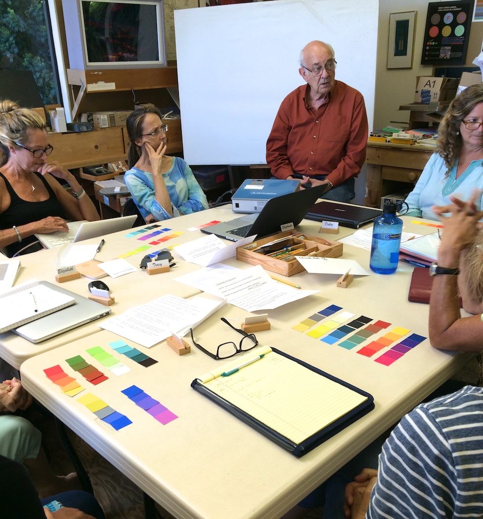
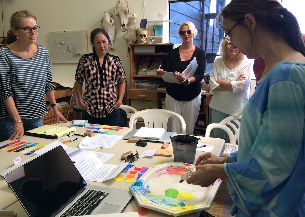
The first class of Color Relationships Summer 2015 met on a Tuesday morning at Dick’s house in Kula. After introductions and a quick overview of class protocol, Dick started off by discussing his background in color theory and his time spent as a student of Josef Albers. Dick has tremendous respect for his teacher and the incredible knowledge about color interaction that Albers discovered on his own, but Dick also knows how far we’ve come since that time. We are now able to go past what Albers discovered, and yet many teachers, institutions, universities, and even artists, don’t want to change their color logic.
Why not? The main reason is that it is hard for anyone to change a belief, since it both challenges what we know to be true, and can also be a profoundly uncomfortable experience. Dick refers to this as a behavioral change, which can often incur a strong sense of resistance, with feelings of frustration and confusion. If this happens to you, don’t be alarmed: it means you are on the right track, and on the cusp of a breakthrough. Sitting through a lecture or memorizing notes is not true learning, though we often mistake it as such. For something to truly affect the way you see the world, it must become a part of your being, and not just a set of facts that you can repeat back.
 Dick is also interested in the heuristics of problem solving, which means he is interested in how true learning takes place. He wants his students to struggle a bit to find solutions to the questions he poses, since it often means more to them in the end, whereas things that come easily tend to be forgotten just as easily. Dick uses the term “delayed closure” to describe this process, and rather than giving away an immediate answer, he wants his students to find it for themselves through trial and error. That being said, this particular course will be challenging, and even counterintuitive; yet it will open doors to color understanding like you’ve never experienced before. Take the challenge, and you stand to be rewarded!
Color game
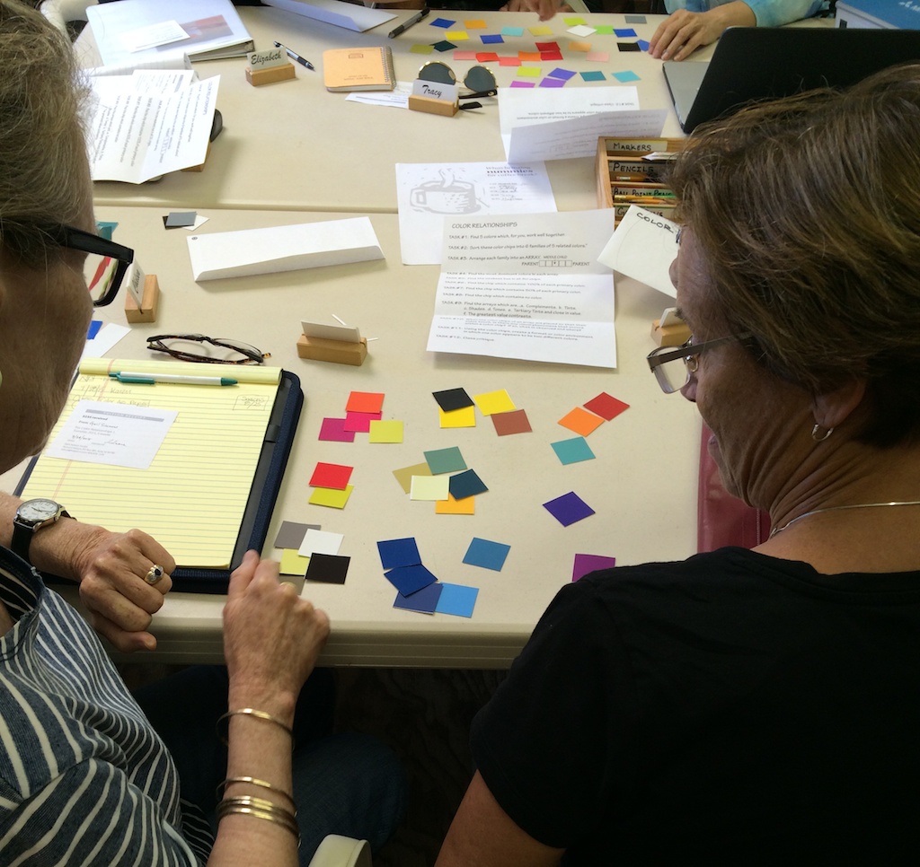
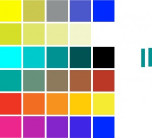
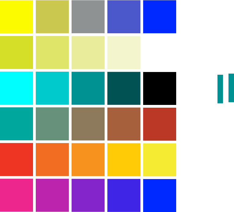
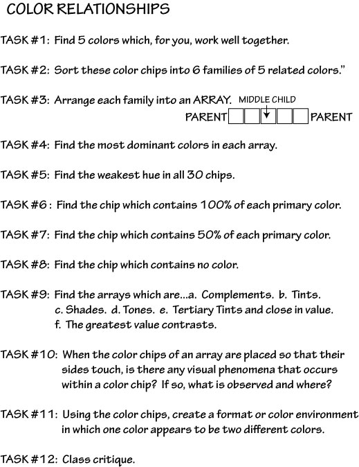
He then presented the first task: color game! Students formed into small groups and were given envelopes containing color chips and instructions. One student commented right away that she was struck by her color arrangement, and how she could see her preferences for color bias through the way she organized her chips. For the next 20 minutes, there was much discussion and lots of color arranging and re-arranging, until Dick announced, “Alright, turn the chips over and you can see the answers. Now organize the colors by their families.” It was fun for people to see which groups they had arranged correctly, and which groups gave them trouble.
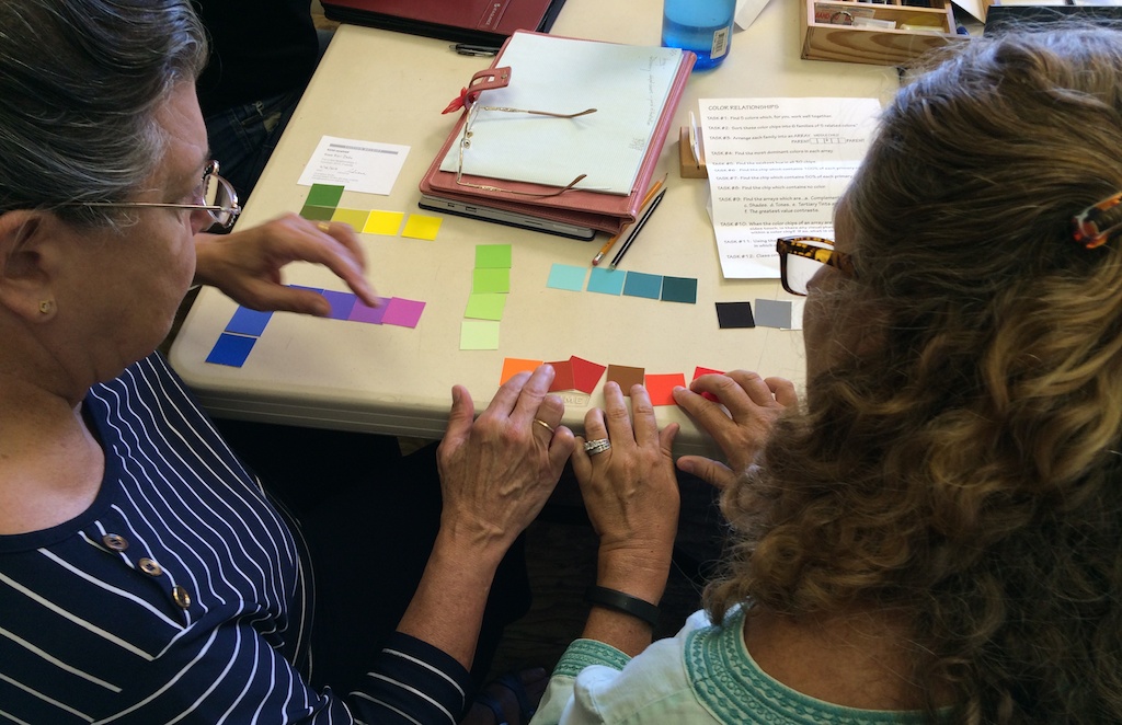 Dick had a few comments about the game, the first being the observation that it is difficult to sort random colors en masse into proper groups. Why? Since color is so easily influenced by what surrounds it, it is tremendously difficult to be objective about what you are seeing and how it fits together. Dick brought up the brilliant game app Huedoku, developed by a former student of his (Gabe Mott), which illustrates this principle perfectly.
Trying to organize scrambled colors into harmonious arrays is difficult even when you are given the correct chips, and it becomes next to impossible when you have an endless variety of colors to choose from. Dick strongly recommends this game as a way to quickly learn how to recognize color harmony when it happens, and how to recognize when it’s missing: it’s either there or it’s not.
Arrays
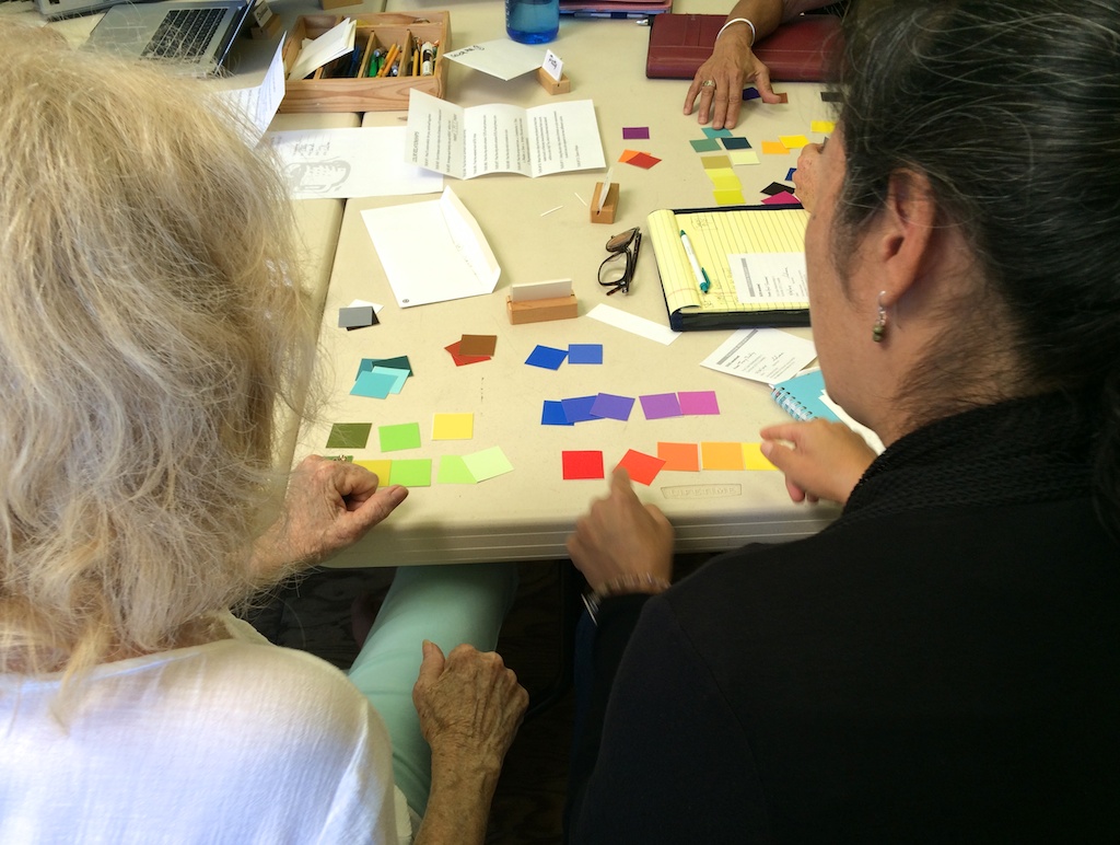
Dick also used the color groups to talk about the use of the array format. By picking two “parent colors”, or anchors, you can create “children” that are the offspring of these two colors, and thus, will be related. When all colors in a group are related, a harmonious color combination is created which is pleasing to the eye. And Dick stressed this point: “This course is all about relationships. In life you don’t have anything that is not in relation to something else, and especially when it comes to color, it’s all about relationship.” We will be working with arrays and color families for the duration of the course, and learning about the characteristics and qualities that contribute to proper relationships.
He asked, “Which array was the most difficult to sort?” Most people picked one particular group: yellow and blue as the parent anchors, with neutral gray as the middle child. Even after they saw it as a family, the class unanimously agreed that they never would have put those colors together. Dick chose this particular group to draw attention to the unexpected mixtures that come from two parents who are complementary colors, and thus are harder for us to connect as being related. He again recommends Huedoku for being the perfect method for increasing recognition of these “improbable” mixtures.
“Are white & black considered colors?” Technically no. When talking about the primaries of pigment, white is the absence of all colors, and black is the sum of all colors. It is the opposite for the primaries of light, which we discussed a little later in class.
-
- Color game chips
-

- Color game instructions
Color terminology and color primaries
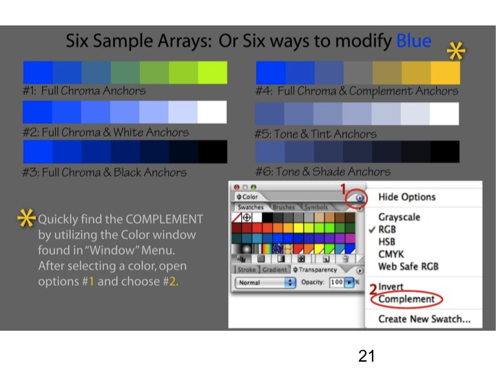
Using the examples of the colors as they were now grouped, 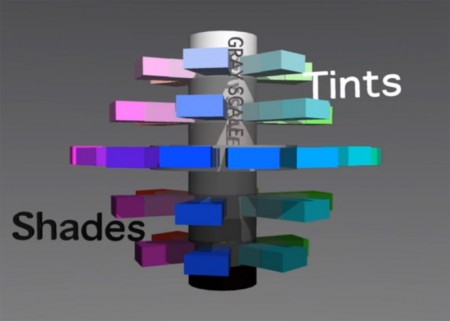 Dick went over some terms that we will be using for the rest of the course: full chroma, tones, tints, and shades (see definitions at the bottom of this post). To illustrate these terms, Dick had the class watch a DVD presentation about color relationships, and how they can be shown to relate to each other through a 3D color wheel, which looks like a ball, or globe, of color.
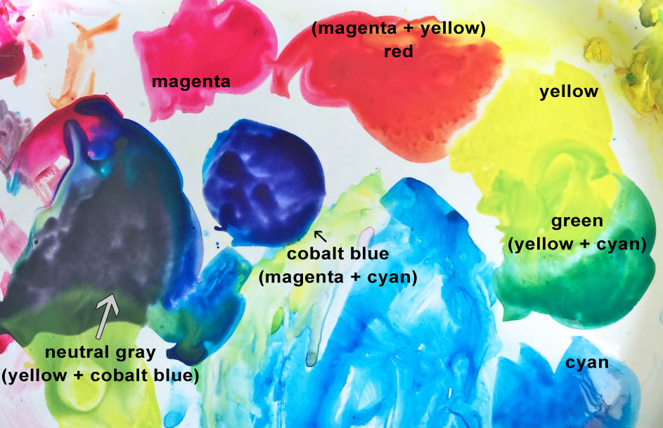
After the presentation, Dick discussed the differences between the primaries of light (Red, Green, Blue), which is called an additive process, and the primaries of pigment (Cyan, Magenta, Yellow), which is called a subtractive process. Dick also mentioned that we will be working with CMY (because those are the pigments we use to paint and print with), and yet to complete the computer assignments we have to work in RGB mode to get a correct match on our computer screens and the projected images we will view in class.
Another interesting aspect we discussed was that the primaries of light and pigment are each other’s secondary colors. In other words, the primary colors of pigment (CMY) have as their secondary colors RGB, which are the primaries of light. When you combine 100% Magenta with 100% Yellow, you will get Red. Combine 100% Cyan with 100% Yellow, you will get Green, and so on.
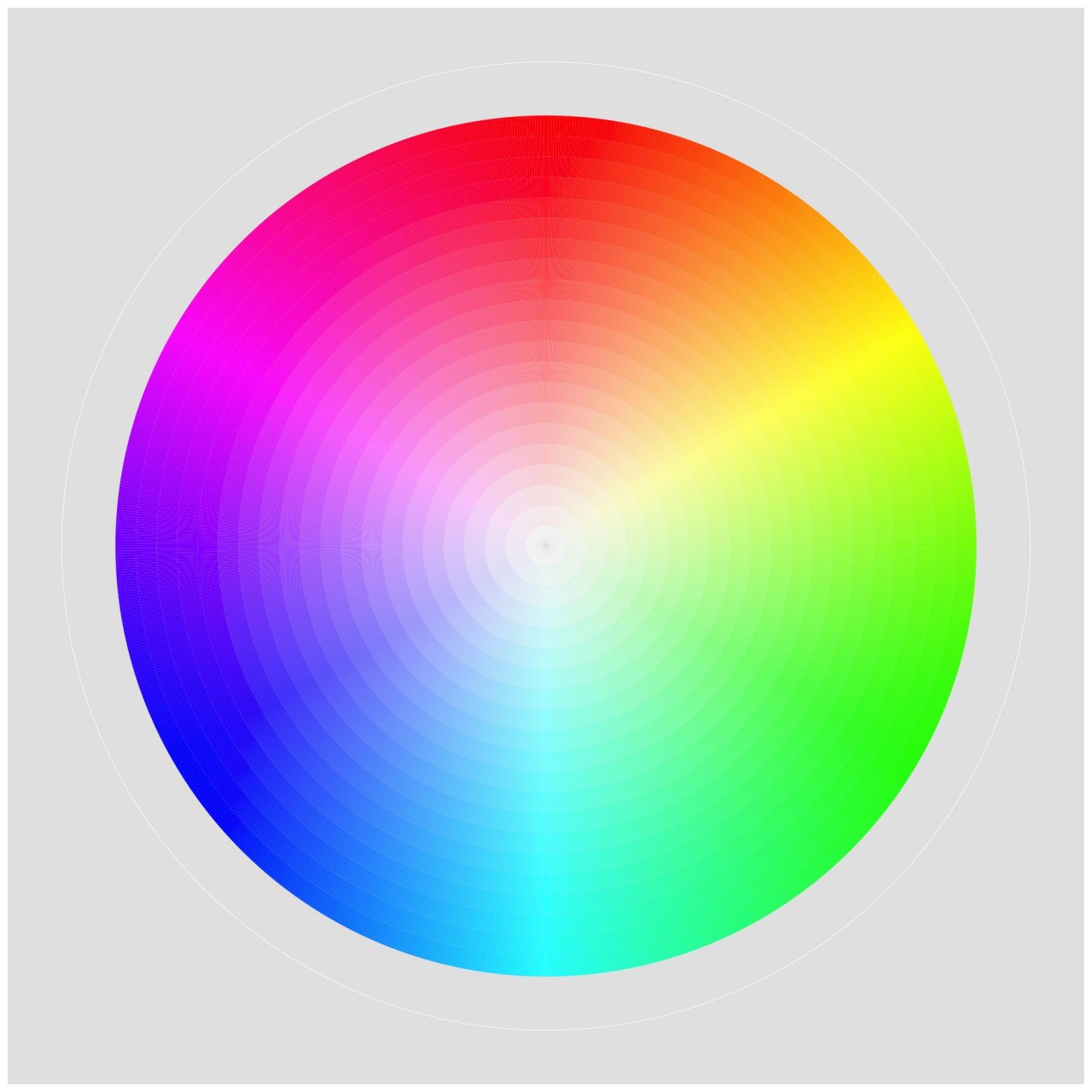
Which means that the primaries of light and pigment are opposite each other on the color wheel: cyan is opposite red, magenta is opposite green, and yellow is opposite blue. Dick then pointed out that mixing complementary colors together results in middle gray, where they each cancel each other out and arrive at the middle of the color wheel. He asked, “What’s in blue: 100% cyan and 100% magenta. And if I mix blue with yellow, what do I get? I have a primary color [yellow] and a secondary color [blue] – what is their offspring? Gray.”
When one participant questioned how this would work with her pigments, Dick answered, “Let’s find out.” He brought out his watercolor tray that held magenta, cyan and yellow pigments, and had her mix up “fire-engine red”, then “green”, and lastly “blue”, which most people want to believe should be purple, since it combines both magenta and cyan. Instead, we saw a deep, cobalt blue appear. The ultimate test was to mix blue (cyan+magenta) with yellow to try and get the hue of middle gray, which is, in fact, what happened!
Working in Illustrator
After our coffee break, Dick displayed a few Illustrator examples, showing how this program is invaluable for exploring color combinations and learning about how the eye perceives mixtures of hues. He cautioned that the program is not perfect, and there are anomalies that will allow color results that are not true to life. Don’t always rely on the computer to be “right”: if the colors look wrong to you, or the values don’t proceed in a logical fashion, make corrections to match what you know to be true.
We talked briefly about eye fatigue, and what happens to your perception of color as you stare at it for too long. Your eyes can only look at colors for so long before they become fatigued, which causes the effect of an after image, and this shows up as the opposing color to one you have been looking at. “If you get too tired, or you look at a color for very long, you will find this is going to happen to you, and distort the color reading.”
Introduction to homework and sample critiques
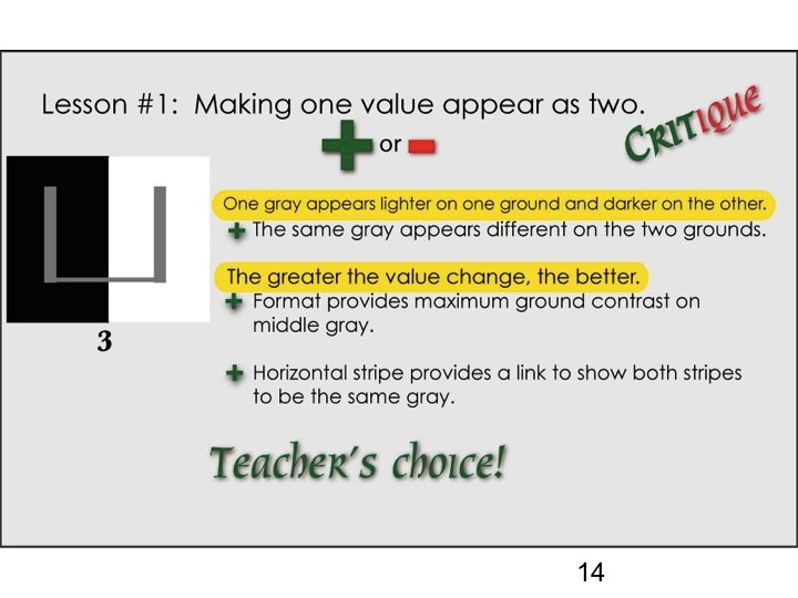
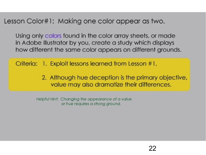
We finished up by talking about the homework, and showing examples of previous students’ work and how they were critiqued. He said that there are only two characteristics we are going to address in this course: value and hue. He offered up a few hints:
- Remember, contrast is key.
- Notice how you use strong, dominant colors versus weak, wimpy colors.
- Pay attention to composition, as you will be critiqued on how well your design illustrates the assignment.
Terms to know
Full Chroma = the most intense hues found on the outer rim of the color wheel. Ask yourself: Does it have white in it? Does it have black in it? Is it toned? If the answer is no to all of these, then the color is at full chroma.
Chroma = the degree of color intensity. Another term for this is saturation.
Tint = a hue that has white added.
Shade = a hue that has black added.
Tone = any hue that has been grayed, by adding the complementary color, or gray itself.
Value = the lightness or darkness of a color.
Hue = a synonym for color. We speak of a color’s yellowness, its orangeness, its blueness, etc.
What is a “weak” color? A color that has been modified becomes easily influenced by its surroundings. It does not take a stand, it does not dominate, and therefore it is weak.
What is a “strong” color? A color that is less diluted and closer to being a true primary. It dominates the colors near it, is less likely to be influenced by its surroundings, and therefore it is strong.
Here’s a reference sheet of color terms, definitions, and examples:
[gview file=”https://dicknelsoncolor.com/wp-content/uploads/2015/07/ColorTerms.pdf”]
Homework
[gview file=”https://dicknelsoncolor.com/wp-content/uploads/2013/09/Lesson1Combined.pdf”]
Things to keep in mind:
- Watch for eye fatigue, and take breaks while doing your homework to reduce the chance of color distortion.
- Know that your computer is not perfect: there are anomalies in the program that do not match real life results. Remember that there are limitations in the Illustrator program, so use your judgment to decide if the colors look correct to you. If not, try to fix them.
- Remember to refer back to the homework criteria, and to objectively assess the assignment. You should pick only one example per color array to submit as your homework; you may have multiple arrays, but only one final image per array. You will be critiqued not only on how well you fulfilled the assignment, but also on design, layout, and color choices. This is a chance to see if you are really finding the limits of what color can do. As Dick likes to say, “Why push when you can shove? Why whisper when you can shout?” Use the homework as a chance to explore and discover how color behaves under various circumstances.
- It’s all about RELATIONSHIPS!!
Color mode for homework
Even though we will be exploring Cyan-Magenta-Yellow, we will be working on the computer, which uses the primaries of light to illuminate our screens. So when we look at our computers, television monitors, etc., we are seeing colors in RGB. To maintain proper color integrity, please set the mode of your assignments to RGB mode, which you can choose when you open a new document in Illustrator. Your palette for working on the assignments themselves should be set to CMYK, so that you are still learning the principles of color mixing in pigments.
File size for homework
The homework will be best viewed if you set the document to between 1000-1200 pixels per side. Anything less than 800px doesn’t show well, and anything larger than 1400px becomes larger than the screen. Also check resolution: 72ppi (pixels/inch) is standard for website viewing, and anything larger than 150 can make the file larger in data than is necessary. You can choose what looks best to you.
Class materials
Huedoku
Huedoku Website
Learn about Huedoku and why it is such a great way to practice color recognition and increase your understanding.
Huedoku App
Download Huedoku for playing on your iPad or iPhone. The game itself is free and you can purchase individual color packs to add to your collection of puzzles. Dick strongly recommends Huedoku as an aid to developing an eye for color, its interaction and RELATIONSHIP! RELATIONSHIP! RELATIONSHIP!
Videos
The three videos below, “Mix any color”, “3D color wheel”, and “Color arrays” introduce fundamental concepts of colors in pigment and light, and terminology to describe color – primary, secondary, complement, hue, saturation, value, tint, shade, and tone. Repeated viewing can strengthen and reinforce your understanding of the concepts and terminology.
Mix Any Color from Richard (Dick) Nelson on Vimeo.
Mix any color in pigment or light by first recognizing that all colors originate from three primaries plus black or white. The true primaries, understood and used in the printing industry for decades, were unknown to most artists and art schools. This brief video hopes to dispel the misconceptions of mixing color in both pigments and light. Additional proof can be found by examining the Cyan, Magenta, Yellow and Black inks of every computer printer. These are pigment primaries. Light primaries, Red, Green and Blue-Violet are the secondary colors of pigments. Every TV or computer monitor depends on RGB color to generate an entire spectrum.
3D Colorwheel from Richard (Dick) Nelson on Vimeo.
An animated building of a 3D color wheel with identifying text. The full dimension of color relationships can be viewed in this animated movie. This is part of Dick Nelson’s DVD “Dimensions of Color”. used as his teaching device for the serious student of color. Having studied with the 20th Century master of color Josef Albers at Yale, Dick has incorporated many lessons from his mentor and added some of his own color revelations.
Color Arrays from Richard (Dick) Nelson on Vimeo.
Color relationships are seen here as ARRAYS of related hues and values. The visual phenomenon of HALATION is ever present in each and every array. This illusion of color and value gradation, explained in my earlier videos, served as a basis for much of Josef Albers work with the INTERACTION OF COLOR.
Tutorial
Create An Array Tutorial from Richard (Dick) Nelson on Vimeo.
A step-by-step tutorial on how to create a VALUE array in Adobe Illustrator.
Slides – Value deception assignment and sample critique
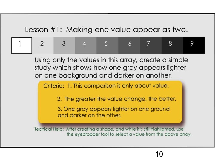
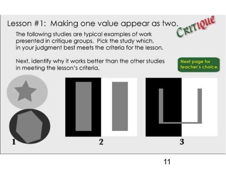
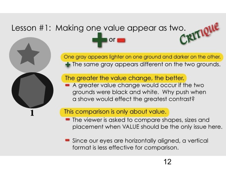
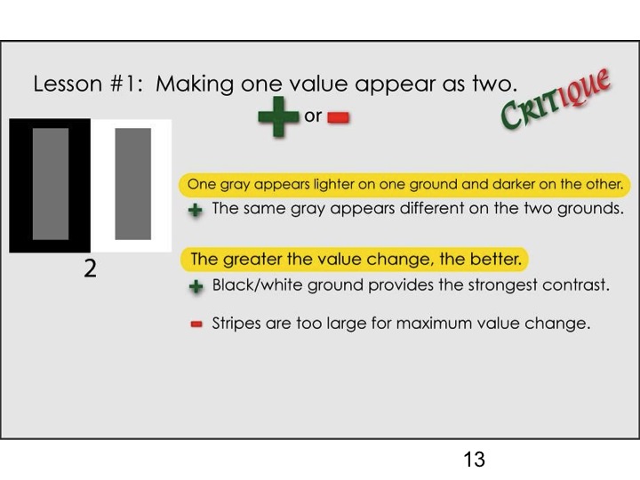
-
- Color deception exercise 1
References
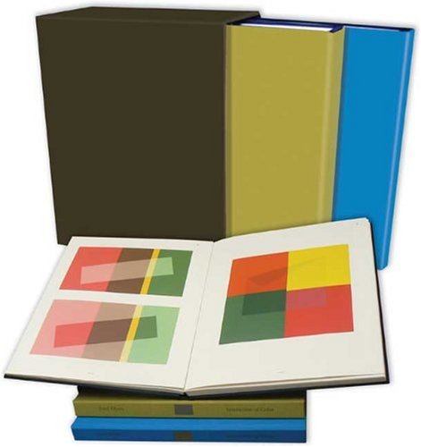 The book Interaction of Color by Josef Albers was originally published in 1963 in a small print run with silk-screened plates of student and faculty solutions to each exercise. Original editions are in the holdings of libraries and collectors. In 2009, it was reprinted in a large 2-volume boxed set, which is available on Amazon for $157. Dick frequently brings his copy out to show and critique solutions to the Albers exercises.
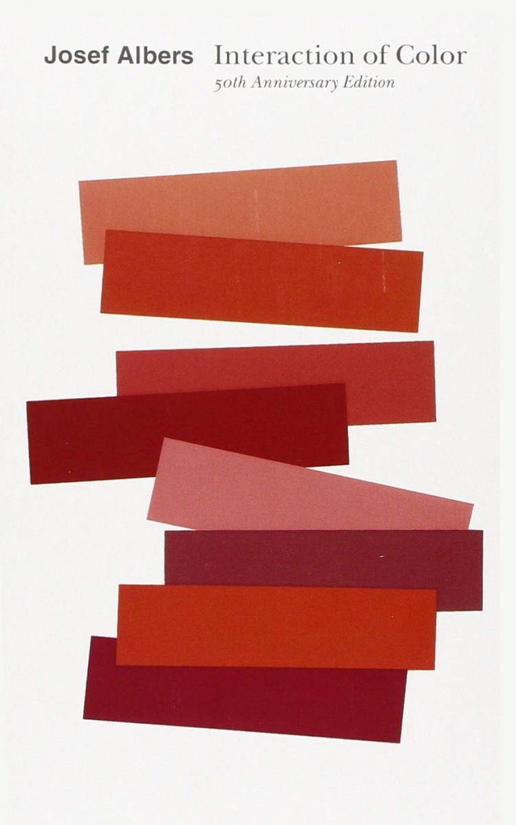 Several paperback editions have been published with the full text, each with more color plates than the previous. The most recent was published in 2013 for the 50th anniversary of the original publication and is available on Amazon for $12.
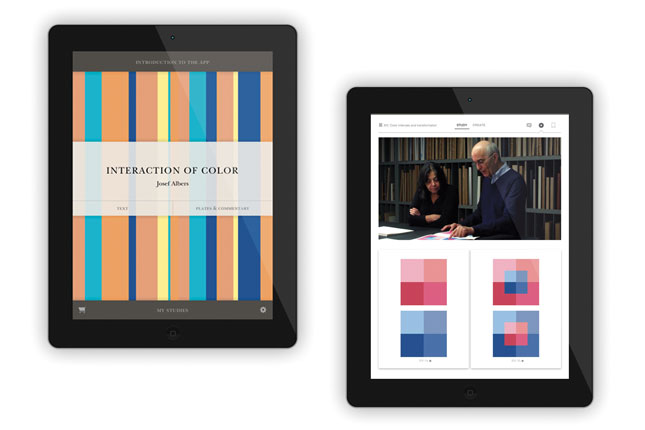 The Interaction of Color iPad app ($14) contains all the text, reproductions of all the color plates, the ability to create one’s own versions of each exercise, and brief video clip commentaries.


