Color Relationships 1, Summer 2015 week 2

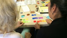
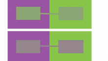
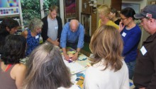
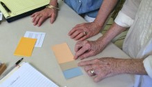
Wow, only our second session and we are fast covering ground! In this class, we moved right ahead, learning more about arrays; the importance of recognizing the difference between hue and value; how to look at your work objectively; and most importantly: HALATIONS! The following post summarizes our exciting class activities, the importance of critique, the new homework, and the fun videos we watched (no shortage of laughter!). Read on for more …

Color Relationships 1, Summer 2015 week 1

Welcome Summer 2015 color explorers, to our very first session and the start of a new understanding of color interaction! The following post provides a summary of what took place in the classroom (it all seems to go by so fast!), and reinforces the key ideas we discussed in class, along with images of the presentations, videos, and links to reference material. Enjoy!

Color Relationships 1, 2014 week 2

The second session of the Color Relationships class for Fall 2014 was held on Friday, October 17. We critiqued the homework studies for making one color appear as two. We experimented with matching an arbitrary color by combining transparent primaries in the Trihue demo on this site. The new color deception assignment for this week is to make three colors appear as two, or reversed grounds, and a free color study was also assigned. Links to Illustrator tutorials and references are provided.

Color Relationships 1, 2014 week 1

The first session of the Color Relationships class for Fall 2014 was held on Friday, October 10. Through hands-on exercises, discussion, video, presentation, and worksheets, eleven students experienced the relativity of color and received their first assignment: make one color appear as two. Read the full post for details and class materials.