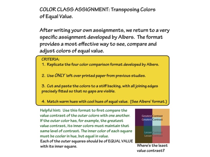
Homework
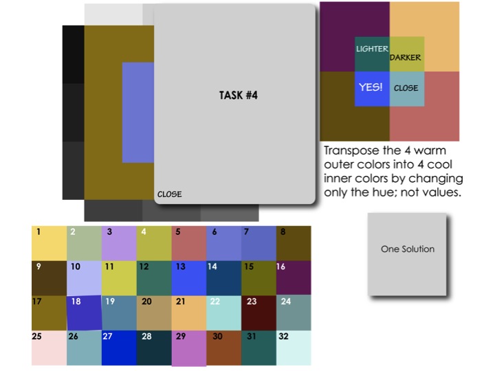
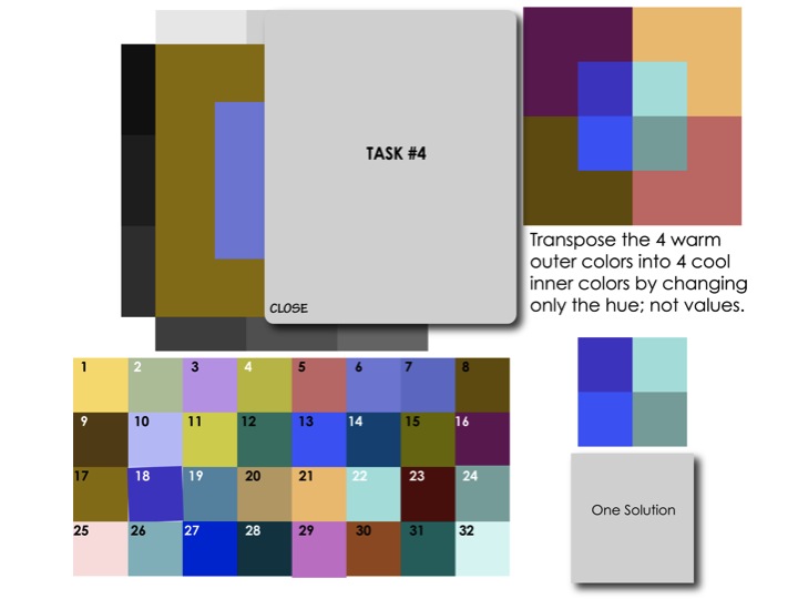
- Transposing colors of equal value
- Think of 1-3 ideas for a final project
- Optional: vanishing boundaries
- Rework or refine any previous assignments.
- Look for positive and negative examples to share.
[gview file=”https://dicknelsoncolor.com/wp-content/uploads/2013/11/TransposeColor.pdf”]
[gview file=”https://dicknelsoncolor.com/wp-content/uploads/2013/11/Synthesis-project.pdf”]
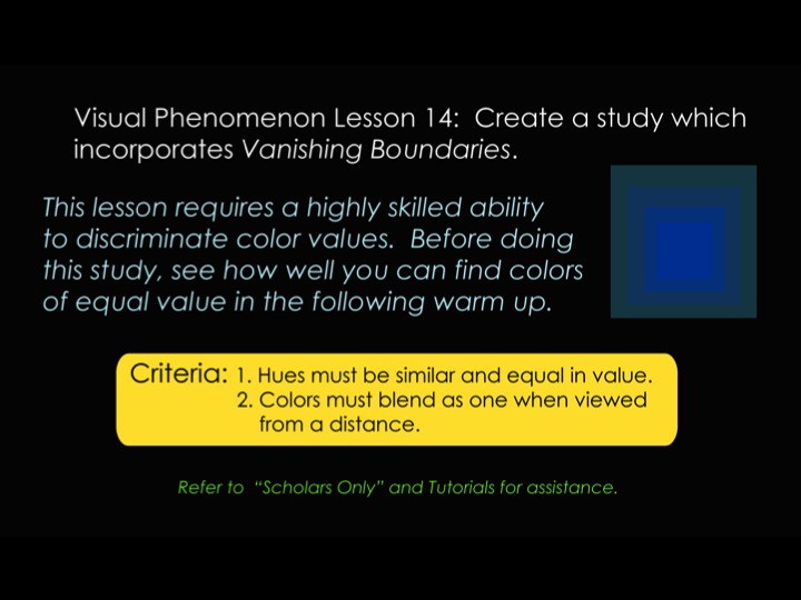
Vanishing boundaries assignment
Class recap
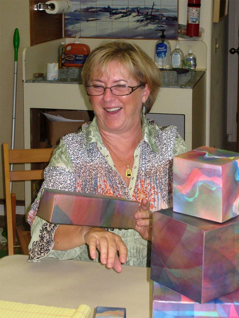
Chris Scharein has taken many of Dick’s classes, beginning in 1999. She brought in some examples of her current projects, boxes made from tri-hue watercolors.
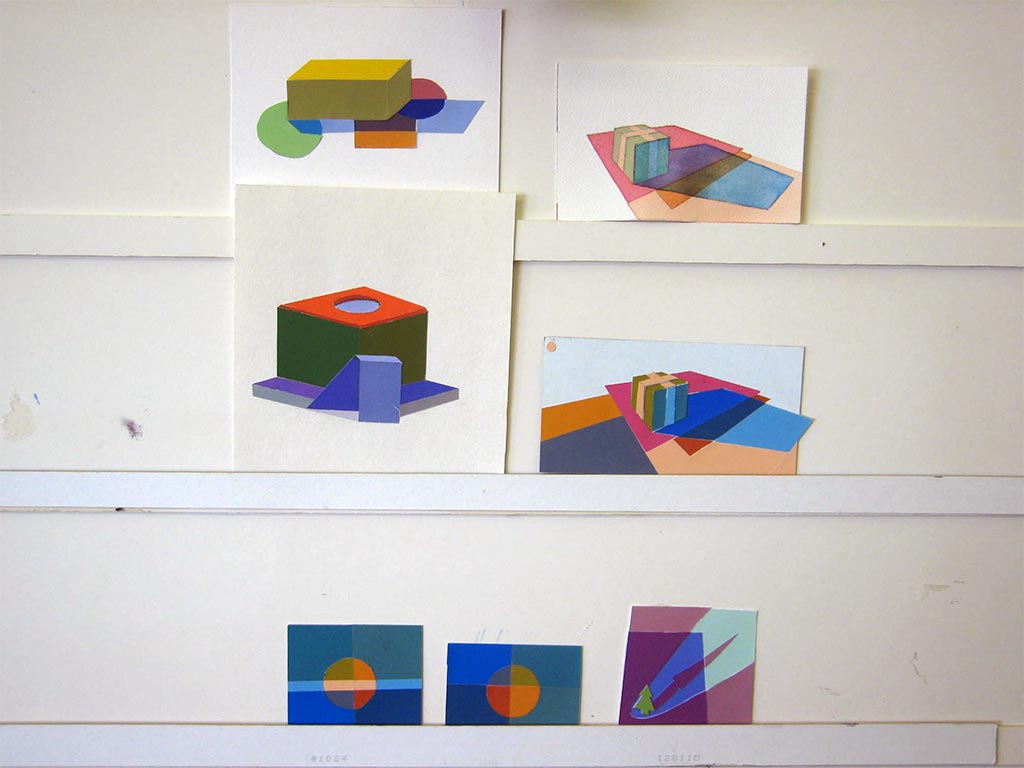
Critique – reworked assignments 1-7
-

- Original: wimpy and inconsistent shading
-
- Redo: dramatic and consistent shading

Reworking an assignment strengthens your understanding of the concepts and provides a lasting reminder for future reference.
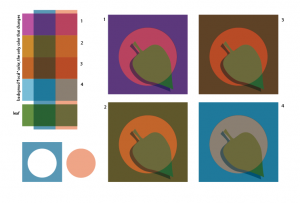
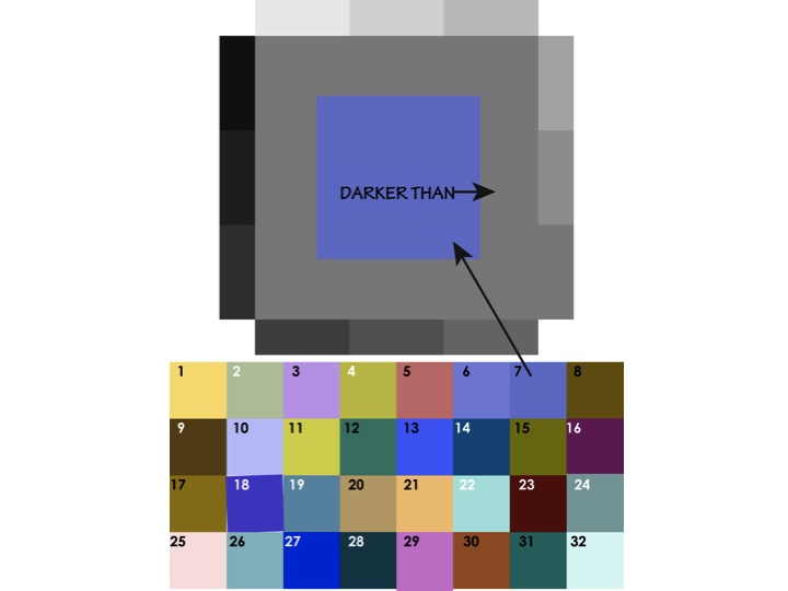
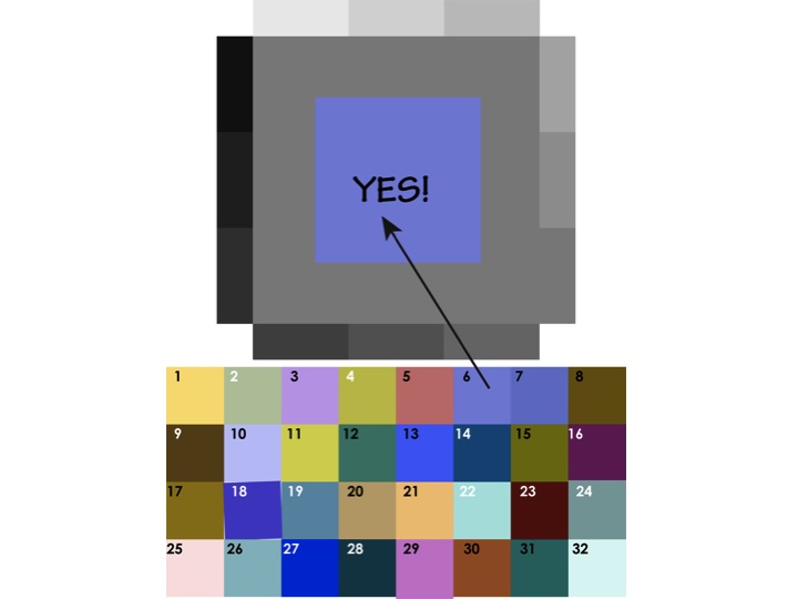
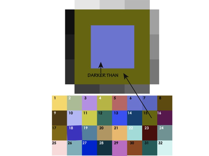
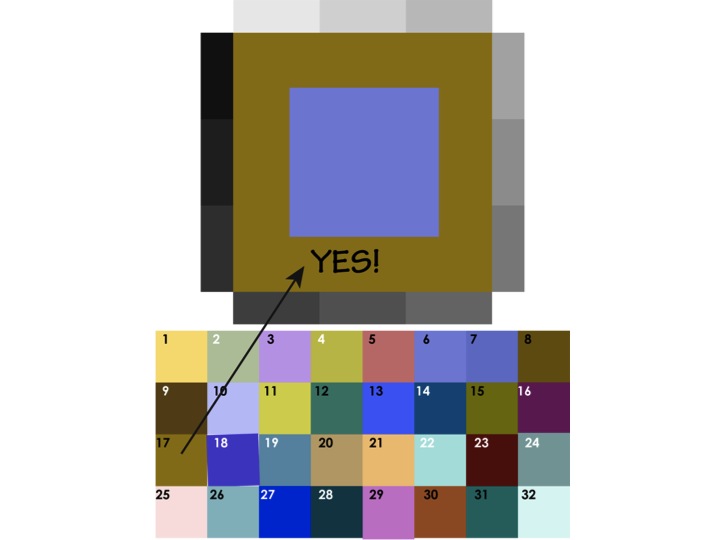
Consistency is key to believability for illusions of light and shadow. Cheryl suggested a simple method for self-checking. Assign number values between 1 and 10 to the different areas of the study. You want the difference between one color’s light and dark value to be the same as a second color’s.
Review
Each person gave some feedback on the course so far. Many are finding they see the world, and artwork (including their own) much differently. They notice things they didn’t before. Some would like to see a follow-on class focused on application, or stay together to critique each other’s work. Chris recalled an advanced group that she was in, where a different person would set the assignment each week for everyone to bring in the next week.
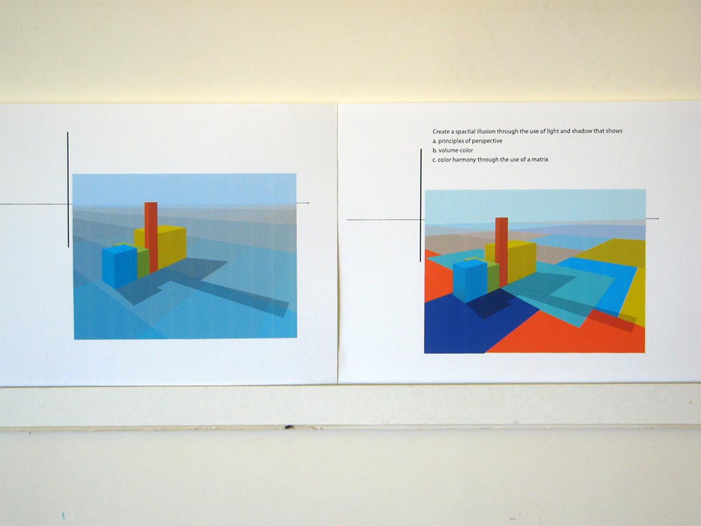
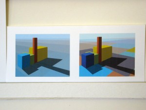
Critique – Assignment 8, Colored light
Tuesday homework: Colored light
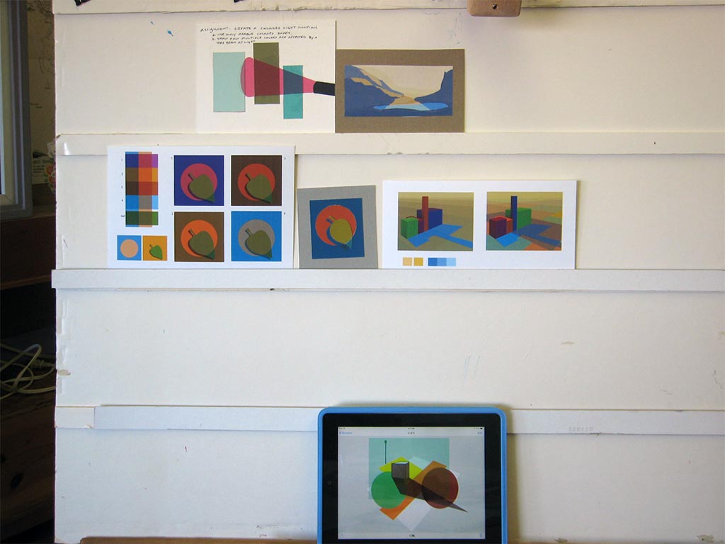
Saturday homework: Colored light
-
- Same subject and lighting conditions, different background color

-

- Colored light study: planning sketch, swatches, and finished study
A common problem with the homework studies was not recognizing that light affects everything in the scene. That’s what makes it so powerful as a unifying factor. Everything in the study needs to be under the influence of either the light or its shadow. There can be no white or other foreign background color. There were also some problems with perspective and gestalt. A casual arrangement of shapes is more believable – has better gestalt – than one in which edges are parallel with or coincide with other shapes. Noticing and correcting those issues can make a more convincing illusion.
Here’s a short video on drawing a cube in two-point perspective. (Thanks, Valerie!)
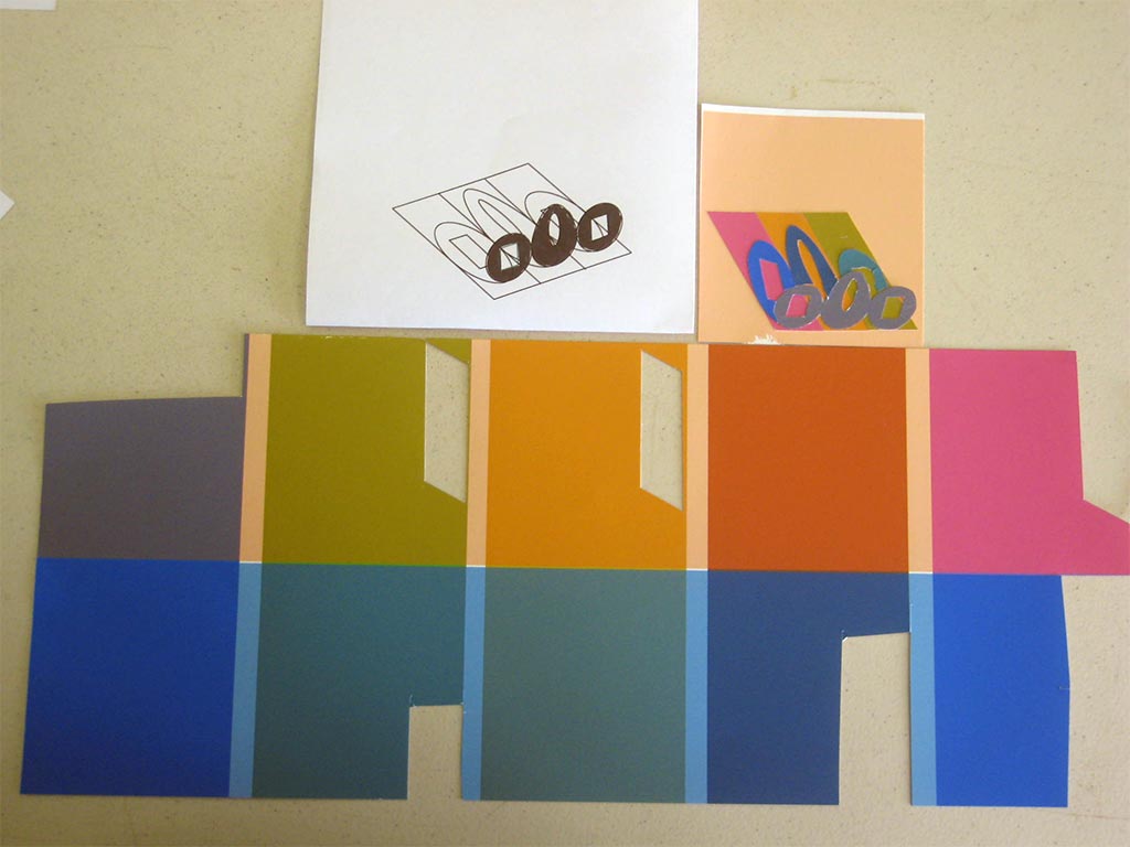
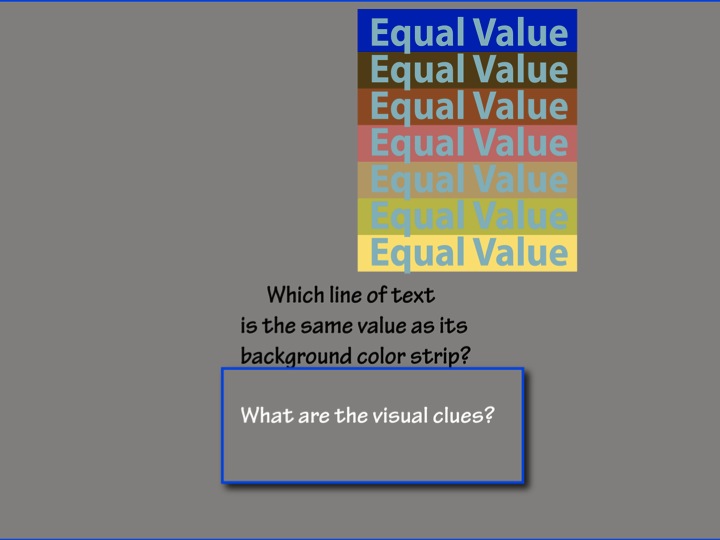
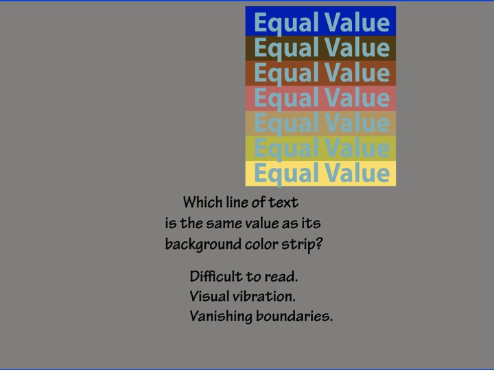
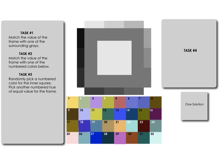
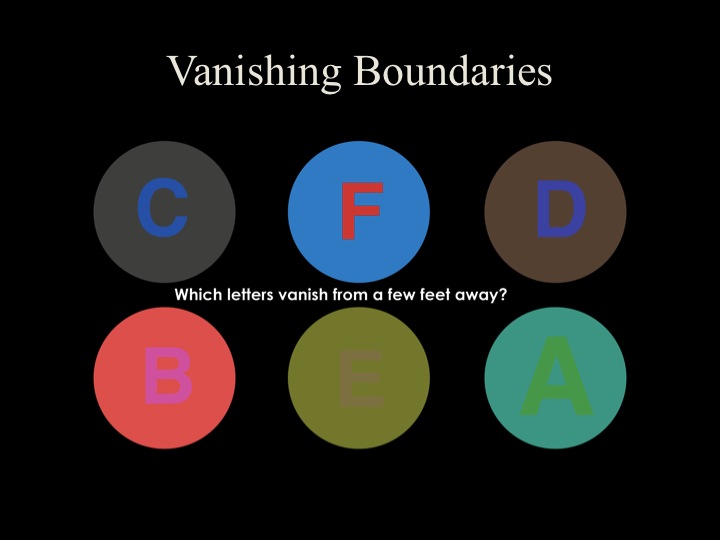
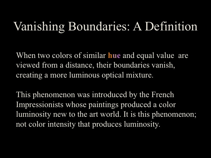
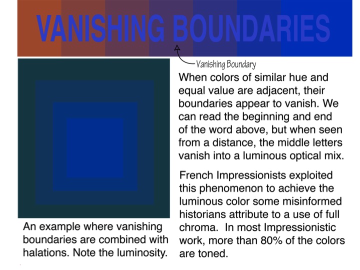
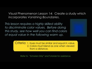
This week’s new concepts: Equal value and vanishing boundaries
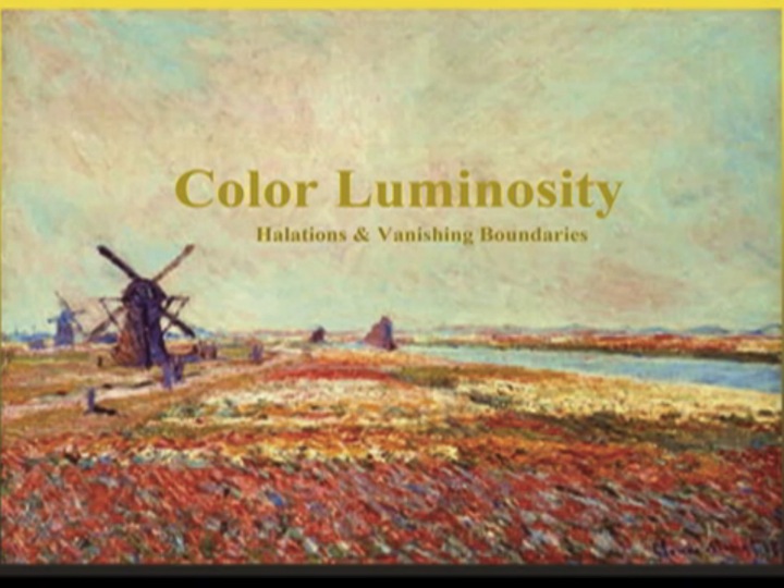
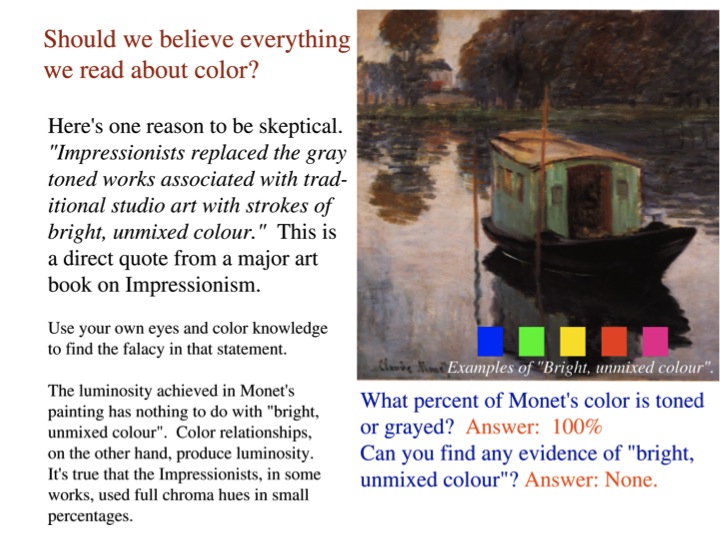
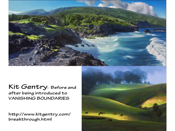
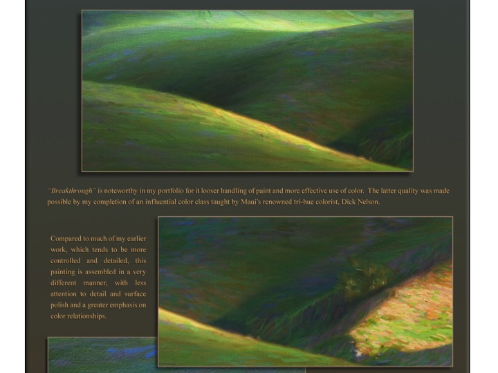
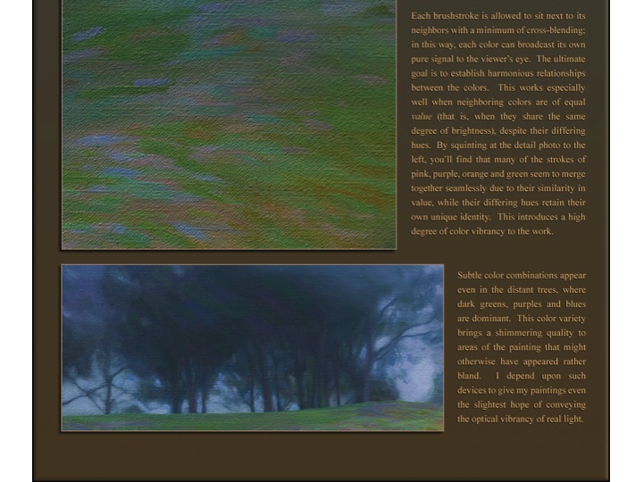
The luminosity achieved in many Impressionist paintings, notably those of Claude Monet, comes from the optical mixing that we perceive of individual brush strokes of colors which are very close in hue and value. Applying this principle, anyone should be able to create luminosity in their work, if they want to. In his “Breakthrough” web page, Kit Gentry shows close-ups of sections of his painting and explains what he was trying to do and how he did it. He writes, “Each brushstroke is allowed to sit next to its neighbors with a minimum of cross-blending … You’ll find that many of the strokes of pink, purple, orange and green seem to merge together seamlessly due to their similarity in value, while their differing hues retain their own unique identity. This introduces a high degree of color vibrancy to the work.” (Excerpts from Kit Gentry’s website used with permission.)
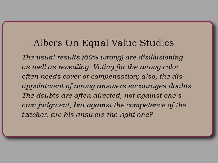
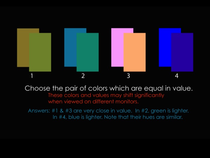
To achieve luminosity from vanishing boundaries, you have to develop your capacity to accurately perceive value, something that is difficult for us to do. We can easily distinguish different hues, but comparing the values of different hues is hard. Albers estimated that students’ initial judgments were wrong over half the time! Repeated attempts and careful comparisons will help develop your eye. This week’s color transposition assignment is designed to provide that practice and improve value discrimination.
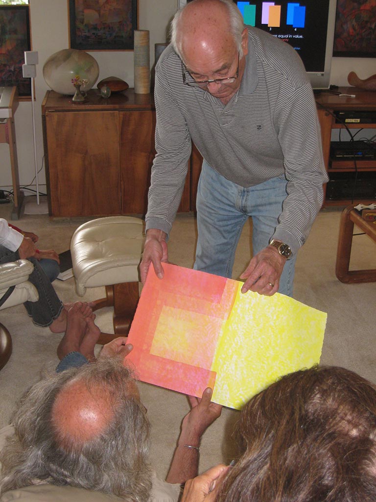
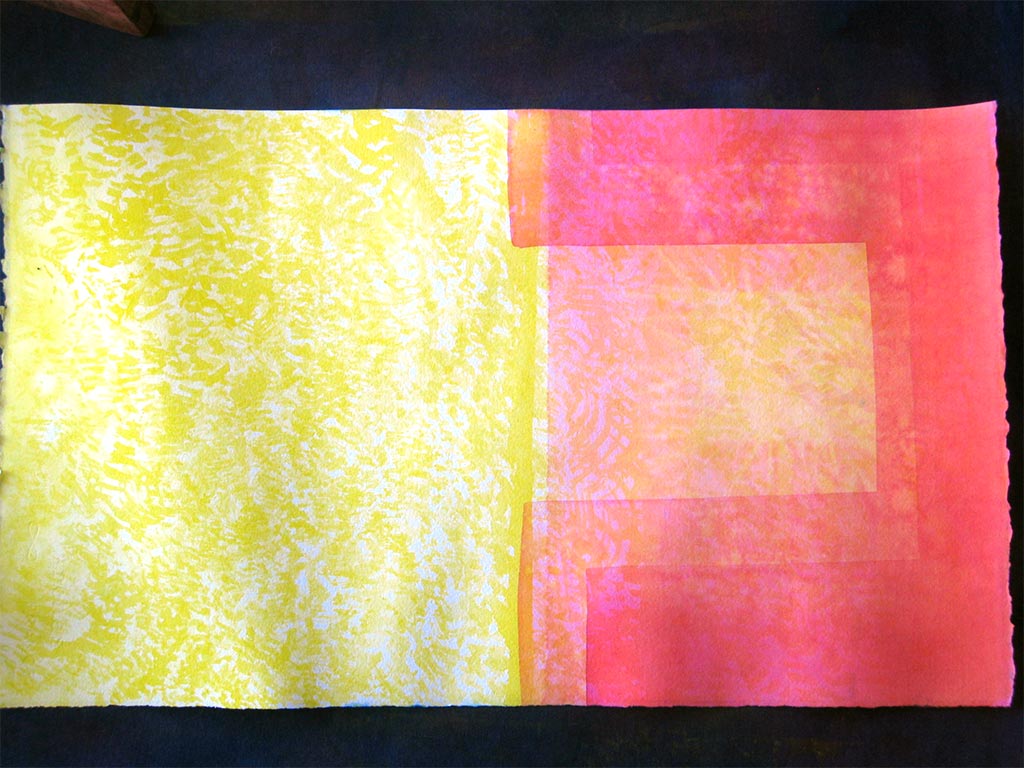
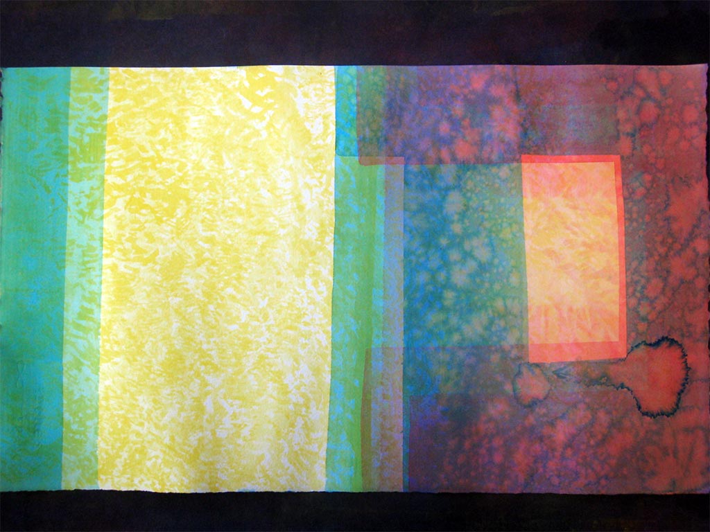
Dick showed how he is able to create luminosity in his watercolors. He starts by applying yellow in small, irregular shapes. Its value is very close to the white of the paper, so when magenta and cyan are glazed over, the resulting colors maintain the relationship of equal value and similar hues.
Class materials
-
- Vanishing boundaries assignment
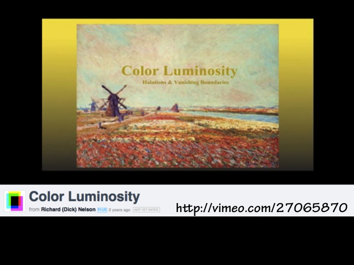
Here are two ways color luminosity can be achieved. This should dispel the notion that the French Impressionists achieved color luminosity by way of full chroma color application. See the truth with your own eyes.
[gview file=”https://dicknelsoncolor.com/wp-content/uploads/2013/11/Equal-ValuePDF.pdf”]
[gview file=”https://dicknelsoncolor.com/wp-content/uploads/2013/11/VanishBound.pdf”]


