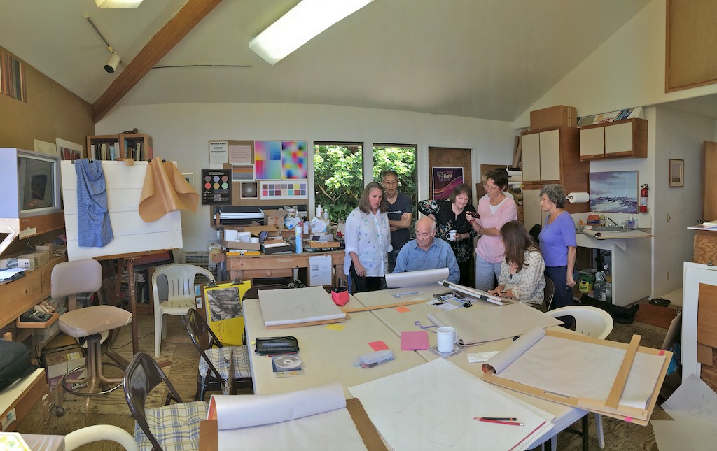
The sixth session of the Drawing Foundation class for Fall 2015 was held on Thursday, October 22. We discussed the six steps in creative problem solving; the importance of line and how an artist can use it to varied effect; and began studies of volume and depth through drawing drapery and folds in paper and cloth.
Homework assignment
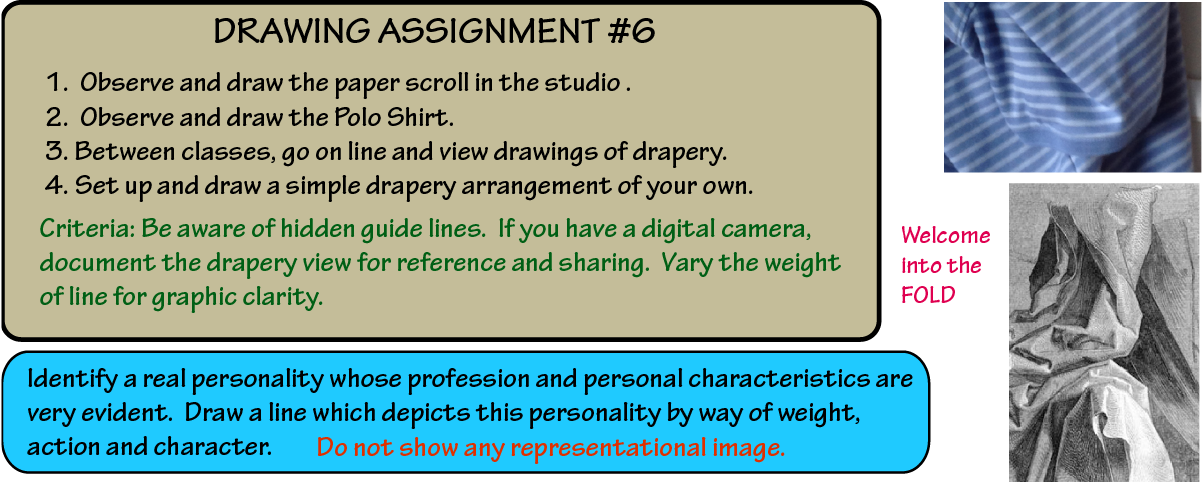
Here is this week’s new homework assignment. Continue with the index card assignments as well.
Class recap – some key ideas
Index card drawings and creative problem solving

Leonard’s box
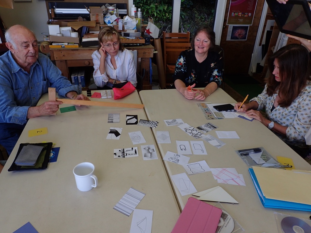
We started the class off by sharing index cards, and since one student had missed a few classes, Dick asked the class to share some of the recent revelations that had occurred through this exercise. Leonard surprised us all with a cardboard model he had built to show how duplicitous our perceptions can be, and how much we depend on a multitude of visual cues to give us information on perspective, size, and depth. The model he built was very similar to a perceptual experiment created by Adelbert Ames, Jr., also known as an ‘Ames room’.
This prompted Dick to muse again on how successful the index card assignment has been for promoting creativity, and he said, “Again, why did I assign the index cards? They push our creative problem solving, they force us to use our imagination.”
He then spoke for a bit about his graduate thesis, which was on the five steps of creative problem solving. He said it wasn’t until he was testing his theory at Ohio State University that he realized there was a sixth step involved as well:
- Point of entry (recognizing our preconceptions)
- Expansion
- Conversion
- Development
- Evaluation
- Exploitation
It was a few years later that he discovered a book on the same subject, Conceptual Blockbusting, by James Adams, which had the same steps outlined. Dick explained how one step leads to another, and by the end, the most important point is to exploit what you’ve learned. “You either go back and make changes and do it correctly, or you incorporate this new knowledge into the next design. Otherwise, it just goes in the trash or whatever, and it goes away, it’s forgotten.”
The point is to learn and understand what tools and knowledge are out there, and then you can pick and choose what to use and what to discard. “An educated person at least knows their options. If you don’t know your options then you’re a prisoner of your own ignorance.”
Worksheets and team critiques
-
- Sharing homework
-

- Going over the worksheet in teams of two
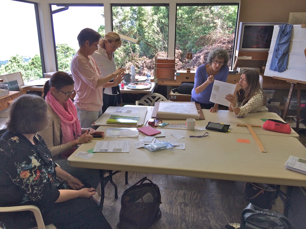
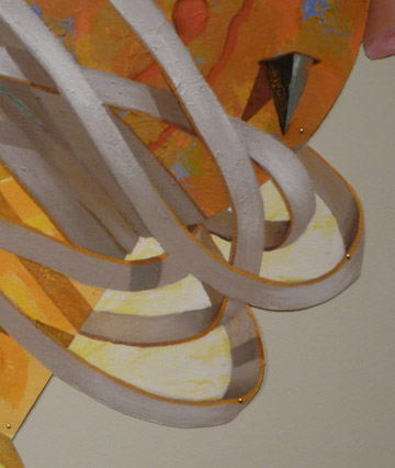
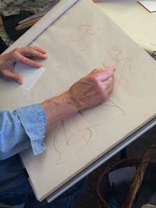
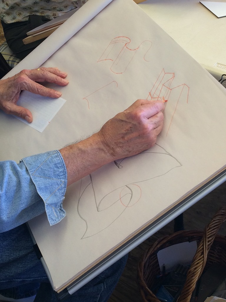
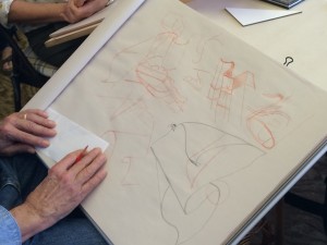
The class then broke into small groups to share their homework designs, and decipher a few visual problems with the question: what’s wrong with these drawings? One of the trickiest ones was a detail of ribbons in a painting Dick had seen some time ago. The rendering of the ribbons was close, but not true to life, and he demonstrated how to draw a ribbon realistically (see the corrections below and in Class Materials, at the bottom of this page).
-

- Detail of a painting attempting to depict silvery ribbons
-

- Corrections marking some of the errors in ribbon depiction. Can you find more errors now?
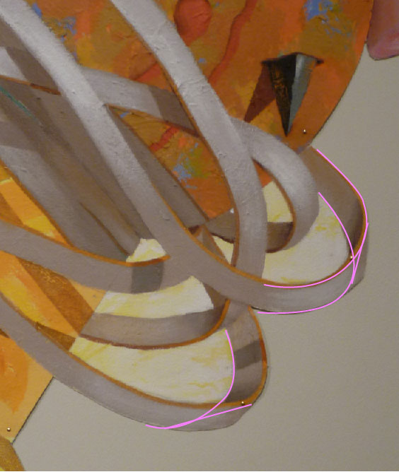
The key lies in ellipses, and making sure you carry the ellipses all the way through to match the edges of the ribbon. Essentially, a curve in a ribbon is very similar to a cylinder, and therefore the two ellipses should be parallel and consistent. If one ellipse is larger than the other, the ribbon will appear to ‘bulge’ unexpectedly. The best way to understand this is to observe a curved ribbon and draw it yourself, both from observation and with drawn ellipses to guide you. The width of the ribbon should never change, and you may find your ‘observed ribbon’ widening where it shouldn’t, which is a common mistake. This is another example of where ellipses and the rules of perspective can come in handy.
Quality of line
We moved on to another topic, discussing the importance of another drawing tool: line. Line quality is very diverse and can range from being subtle and understated, to overpowering and obvious. Line is so integral to visual art that it can often be overlooked, and yet its effect is paramount, so learning how to use it deliberately can go a long way in the final interpretation of a piece.
There are three variables to think about when it comes to line:
- Weight
- Action
- Character
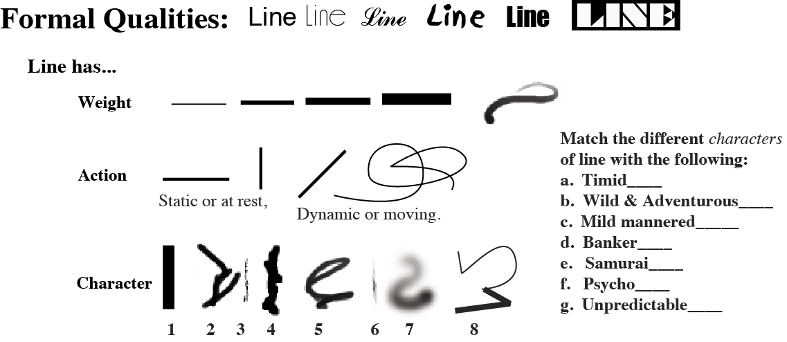 One way to approach these qualities is to ask what kind of personality does the line have? Analyze what you see in the line: is it delicate, strong, rational, wimpy, sporadic, or vague? Ask what kind of person would the line be, or what kind of profession would it have. Thinking of the line as a human being, with all the quirks and contradictions of human behavior, will give you a framework for seeing how diverse and expressive lines can be.
Another consideration is what kind of tool created the line: was it a pencil, a brush, a computer printer? Was a straightedge used, or was it freehand? The tools used will often have as much influence on the end result as the person using them, so picking the right tool will reinforce the quality of the line.
We discussed the differences in making a line appear to be active vs. static, and one of the main clues is the line’s orientation. Lines that are horizontal or vertical tend to read as being stable, predictable, and orderly. Lines that are on the diagonal, or that twist and curve, are read as being active, unstable, and engaged in movement. Be aware how you orient a line on a surface, and how that relates to the story you are trying to tell.
Dick also asked that we list the characteristics of our lines, and to think of the person they are representing; not just a quick sketch, but a fully formed personality at many different levels. “I want to look at that line and really feel who that person is.” And remember, just a line! There should be no recognizable forms or suggestions of an image.
This is an updated version of a page from the 29-page Drawing handout on this page.
[gview file=”https://dicknelsoncolor.com/wp-content/uploads/2015/10/Line-Updated.pdf”]
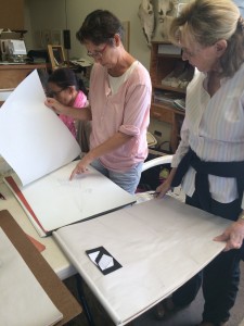
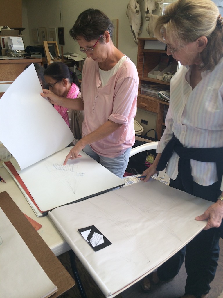
Drawing scrolls and folds
Dick demonstrating how to draw drapery correctly, with an accurate portrayal of volume
We moved on to our observation assignment of drawing drapery and scrolls. We did about five minutes of observation drawing, and then Dick demonstrated some tips to keep in mind.
-
- Demonstrating how to draw scrolls and folds
-
- Examples of the different applications for this technique

Just like the ribbon painting we had discussed earlier, one important consideration is to keep the width of the garment the same throughout. It’s easiest to find the top edge first, and draw a contour line that captures its peaks and valleys. The more difficult part is to correctly portray the volume of the garment, and since some areas may be hidden from view, you have to keep imagining the shape going all the way through even though part of it will be invisible. Remember to maintain the same width throughout the shape, as that will complete the illusion of an object that is curved and draped in space.
-
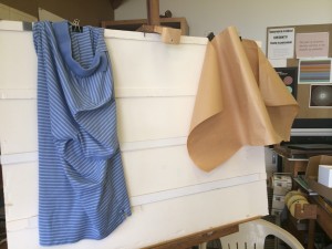
- Draped polo shirt and paper scroll
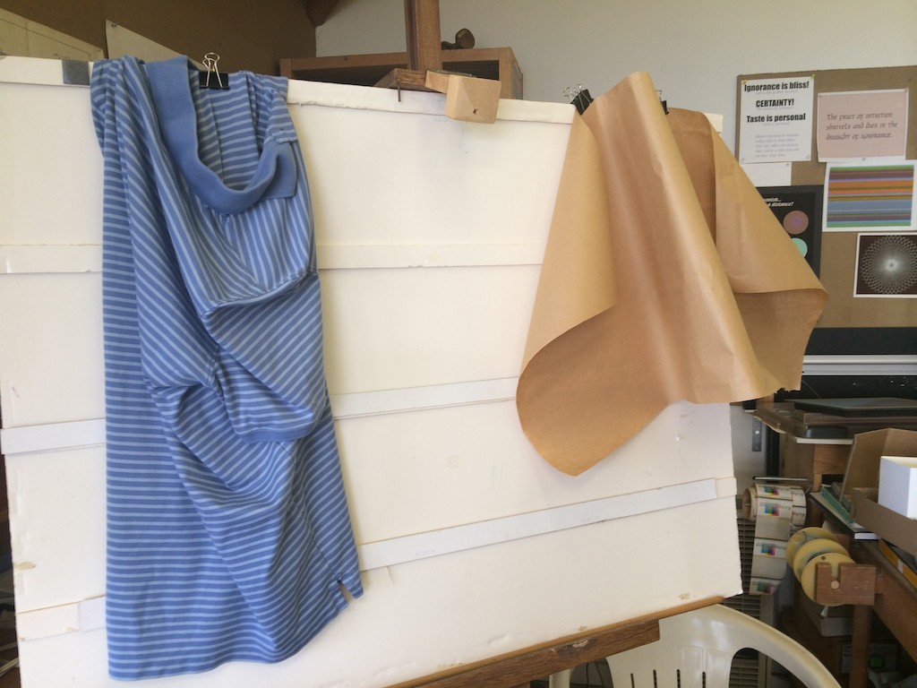
-

- Close-up of the polo shirt

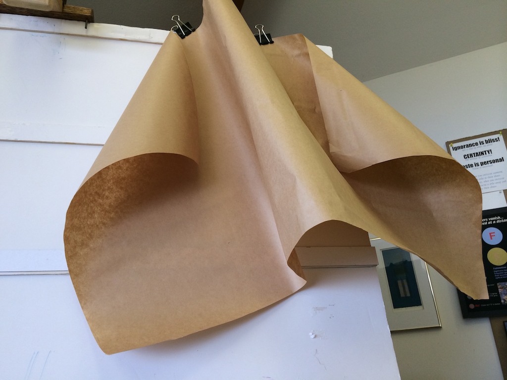
-

- The volume of the folds is visible in this alternate angle of the paper scroll
Dick also asked that we search for images by master painters and study the drapery effects they achieved (such as Albrecht Dürer, see below). Closely studying the details of how they accomplished such convincing renderings will help us understand the visual clues needed to accurately portray three-dimensional volume on a two-dimensional surface.

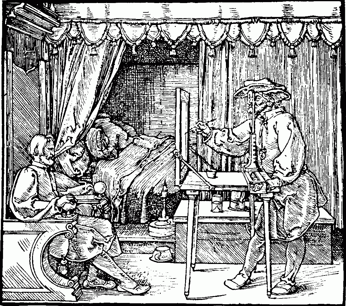
Albrecht Dürer was a northern Renaissance artist, who made these woodcut prints portraying devices for studying perspective.
Video demo and recording
Drawing Scrolls and More (14 minutes): Dick Nelson shows tips for drawing paper scrolls and how that applies to mountain ridges and more.
Listen to the class (20 minutes)
Class materials
Here’s the answer sheet for today’s group workout.
[gview file=”https://dicknelsoncolor.com/wp-content/uploads/2015/10/DrawGrp6Ans.pdf”]


