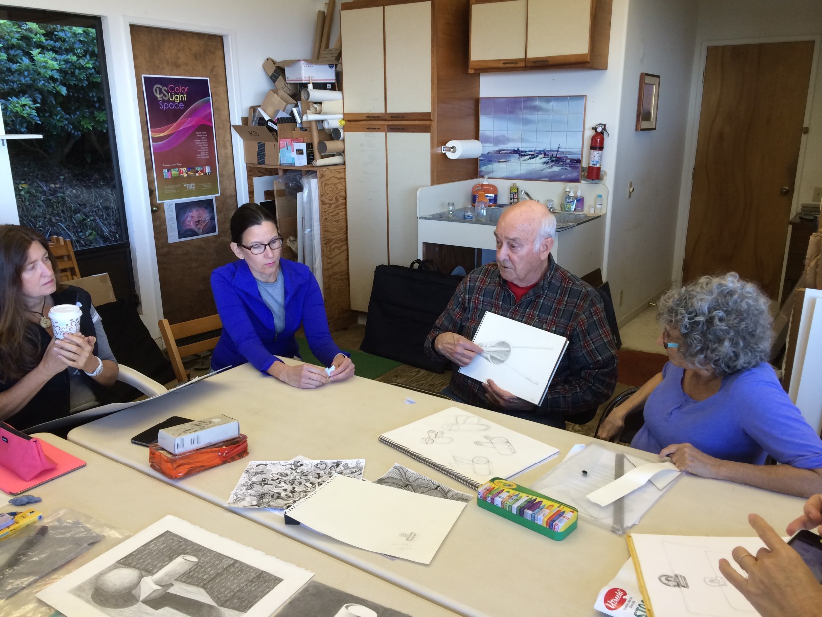
The second session of the Advanced Drawing and Composition class for Winter 2016 was held on Wednesday, January 20. We studied shadows in more detail, critiqued the homework, and watched another demonstration on plotting spherical shadows. We discussed the challenges of the paper clip drawings, the idea of a ‘surface scale’ to show the qualities of reflectiveness in an object, and had a brief introduction to a new medium, charcoal.
Homework assignment
The homework assignments for this week are
- Correct, refine, or redo the rendering assignment from week 1 (be sure to review the criteria)
- Ongoing assignments (clip, square, parallel lines)
Class recap – some key ideas
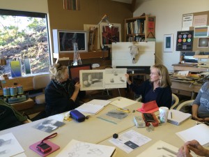
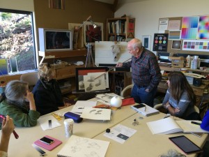
Sharing pre-class work
We began class by sharing a few pieces students had done in the break between Drawing Foundation and Advanced Drawing, a few quick sketches and doodles. Dick was pleased with our efforts, but made mention of how different our discernment will be by the end of the Advanced Drawing series, and that it would be fun to show these pieces again in seven weeks after our perceptions have changed.

He also made note of how important it is to move on to the ‘exploitation phase’ of an idea: once you fully understand a concept, it’s important to play with it and see how it can be used in ways you had not previously thought of. This is the step that leads to true creativity, where you open the door for surprise revelations to occur while you experiment.
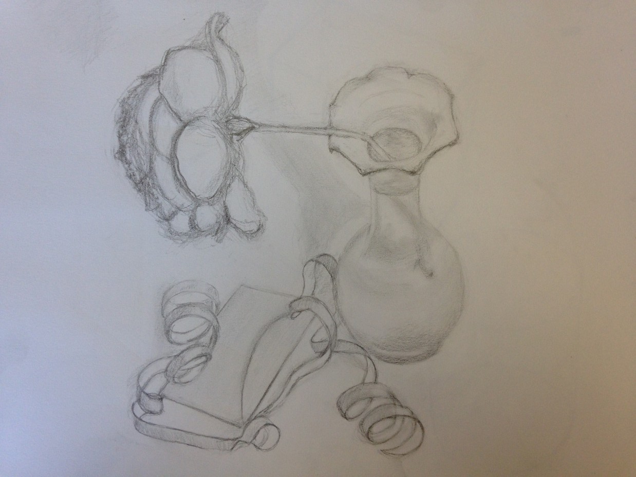
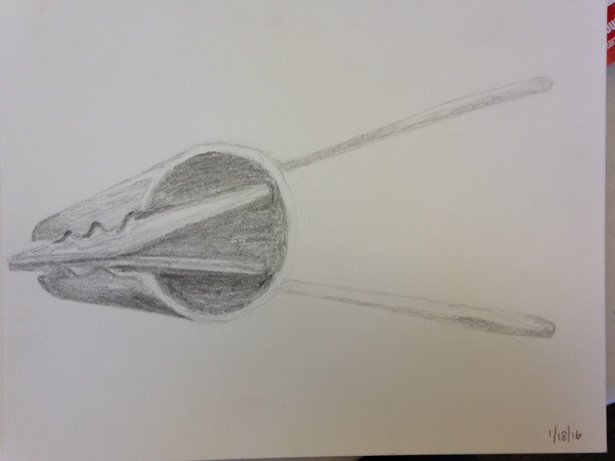
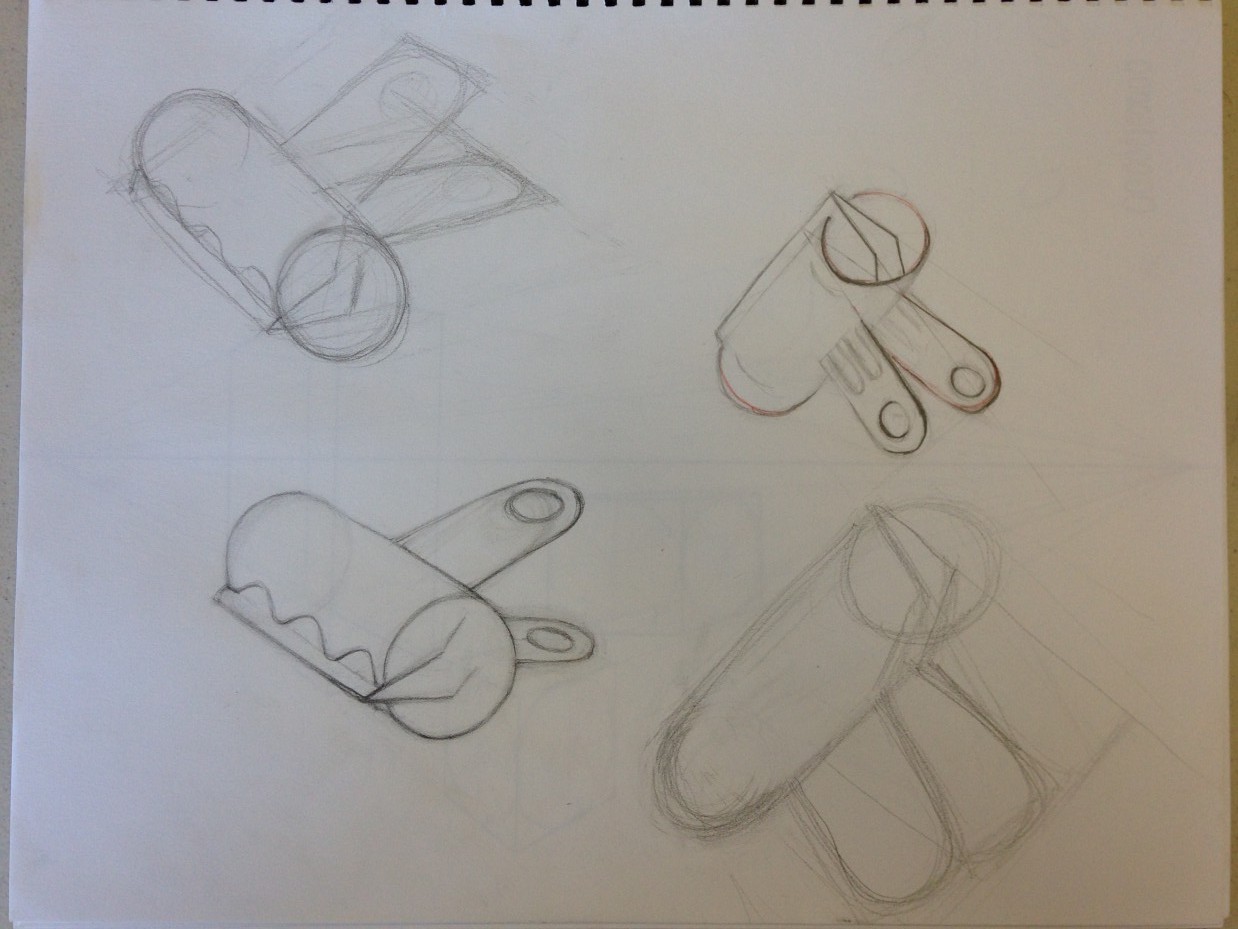
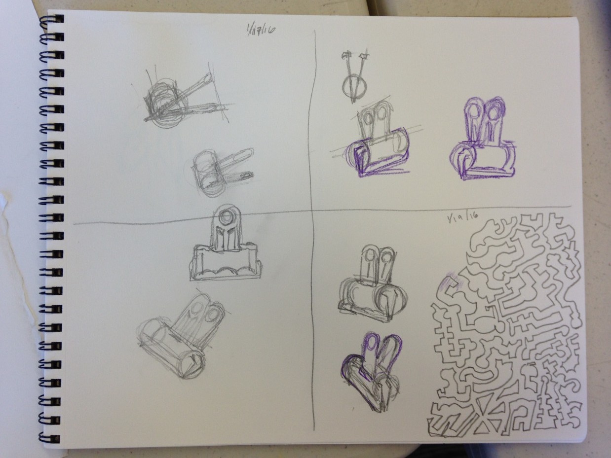
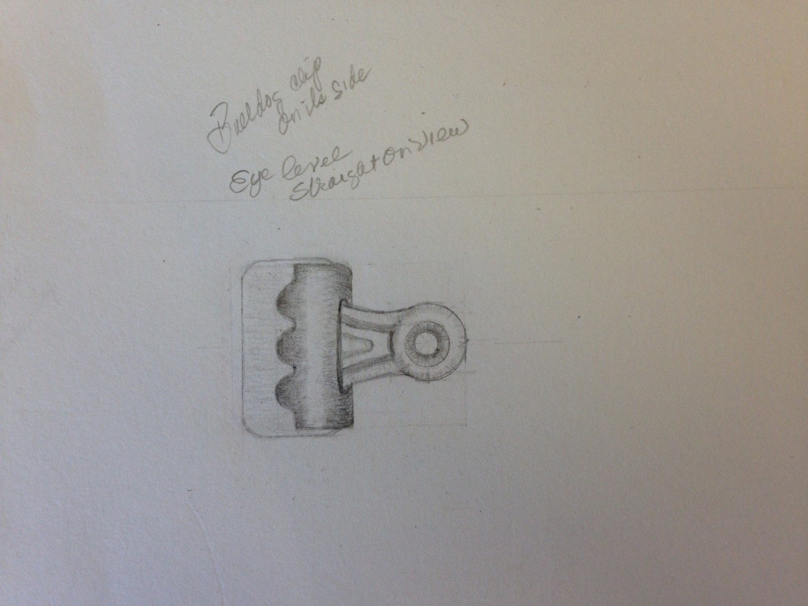
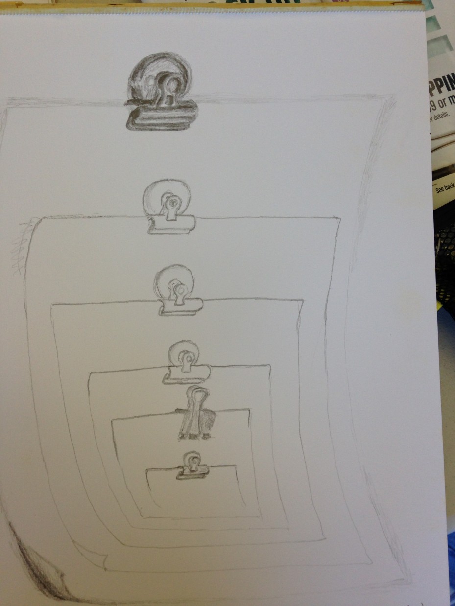
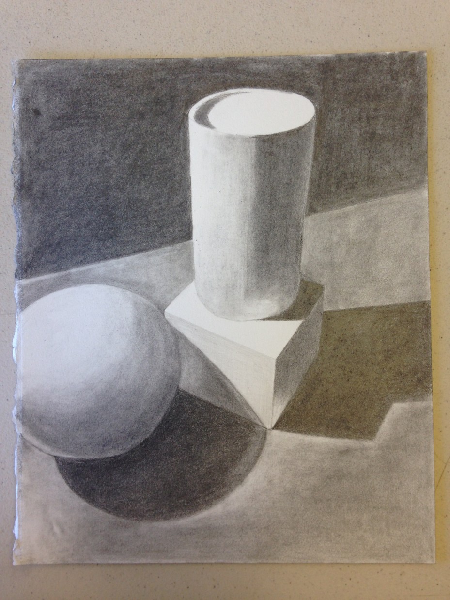
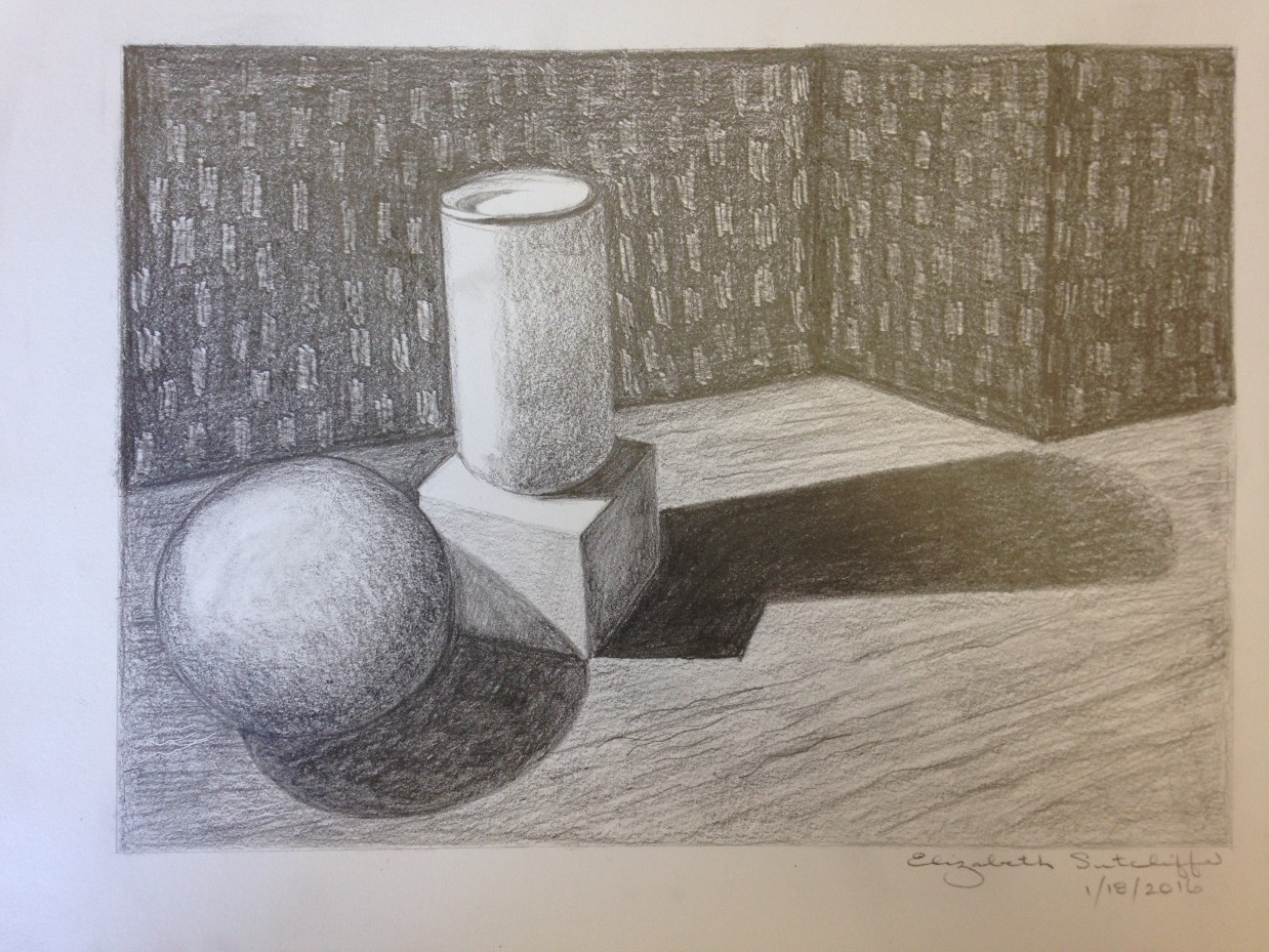
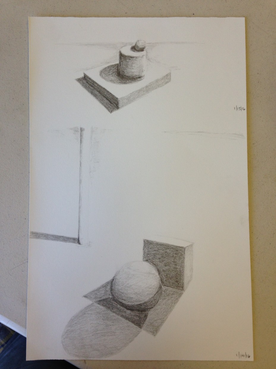
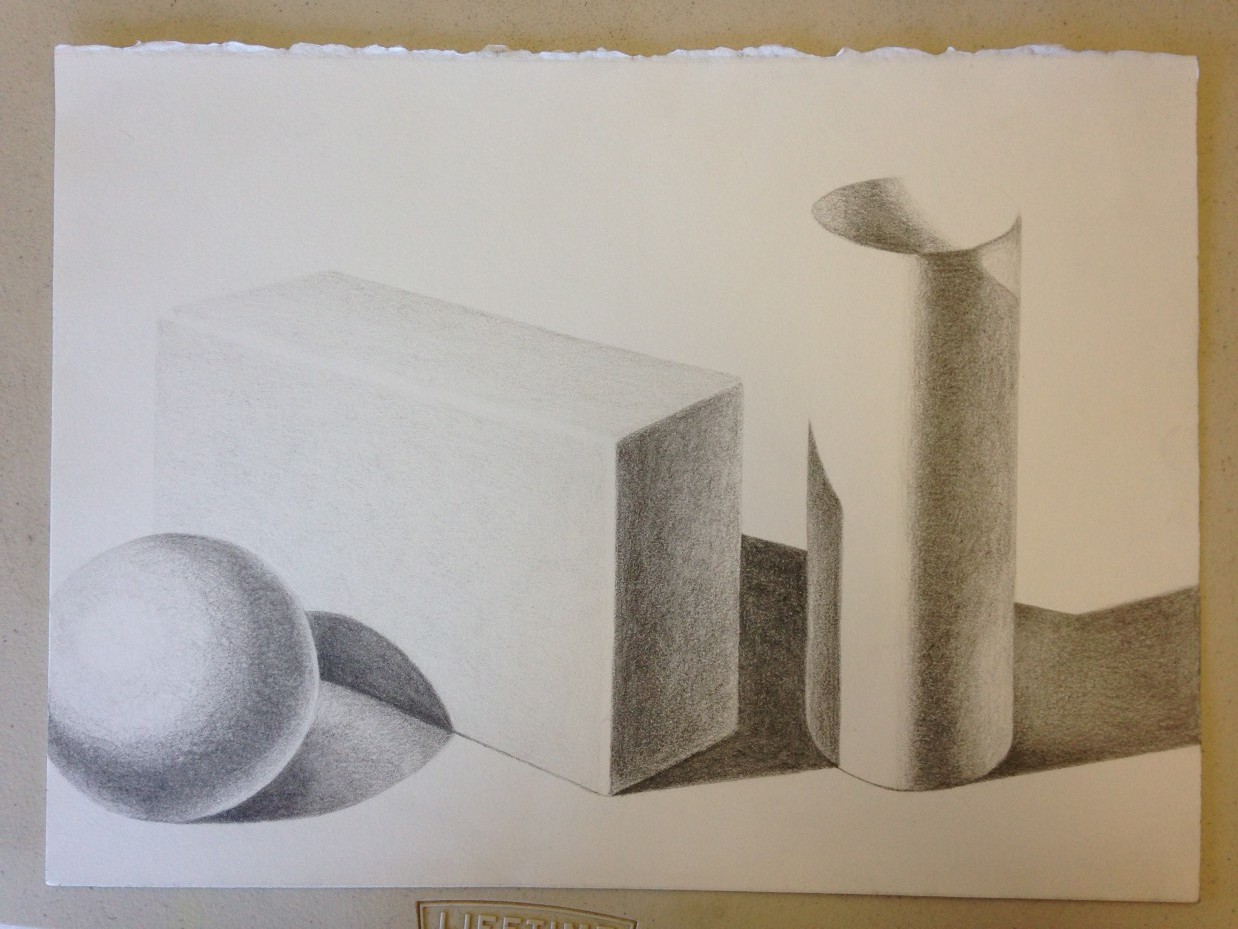
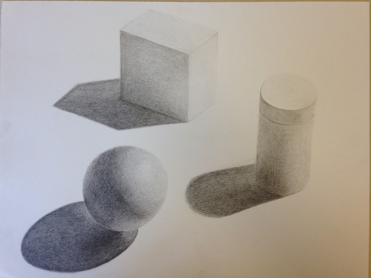
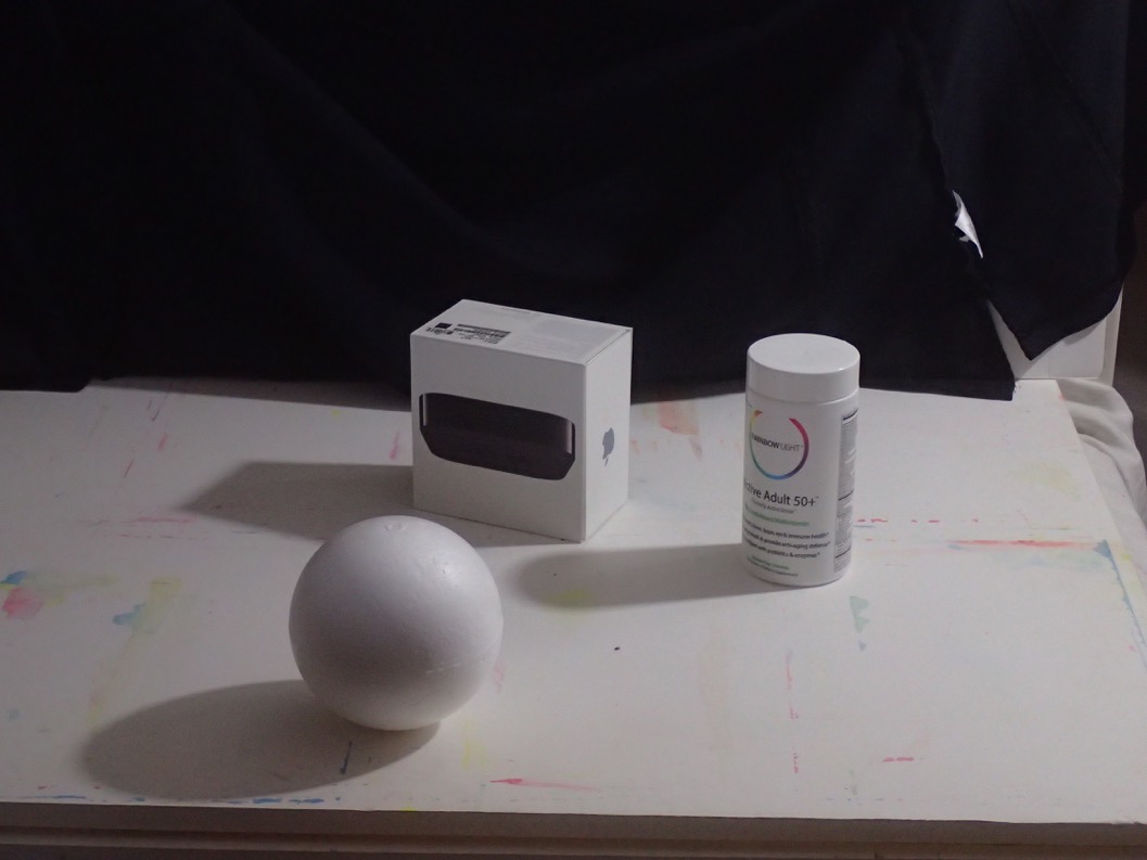
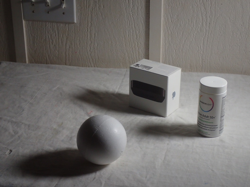
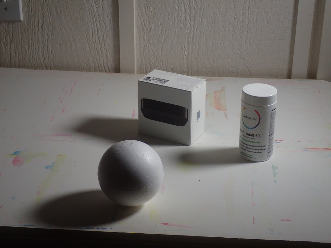
Paper clip studies: recognizing basic forms, and noticing surface qualities
Discussing the challenges of the paper clip assignment
-

- Several variations of the type of clip that is the subject of this challenging assignment

Learn to break down complex forms to their basics (cube, sphere, cylinder, cone), and you will have an easier time drawing them. Understanding how basic forms relate to space will allow you to draw scenes from imagination or inspiration, instead of limiting yourself to only being able to ‘copy’ what you see. “You have two ways of drawing: you can draw by just observing and not understanding, and that way you’re copying, and certainly you can do contour drawings that look fairly accurate. The other way to draw is by understanding what these forms are doing in space.”
This assignment also brought up the consideration of surface, and the ability to identify and render it correctly. There are value scales that go from light and dark, and color wheels which show the progression of color: so why not a surface scale, to show the qualities of most reflective to least reflective? Dick also mentioned that surface is different from texture (texture has its own scale, with various grades from rough to smooth, or hard to soft).
These are qualities to consider in any object; yet, for the paper clip drawings, Dick wants us to focus solely on line work for now: “Your eye can pick up all these things [surface qualities] so this is just as critical to the whole visual message, that we as artists can show the difference between something that is metal, versus something that is not. So the surface of a given object, you see how different this is to this … but I don’t want you to tackle that yet, and in this drawing of the paper clip, I don’t want to see anything other than an understanding of what the lines are doing.”
Dick noted we were off to a good start, and told us to continue studying the basic forms and how they interact.
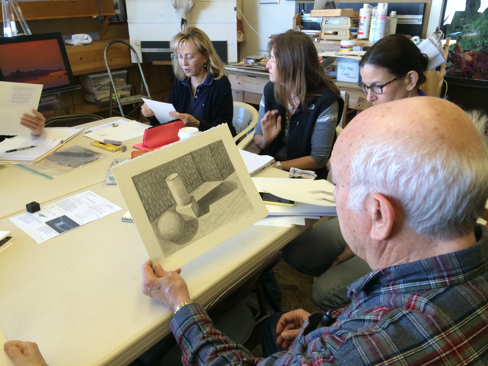
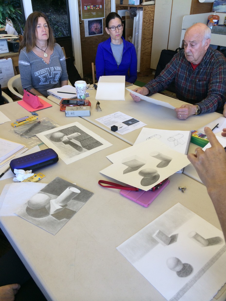
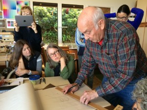
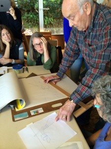
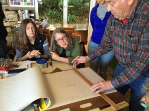
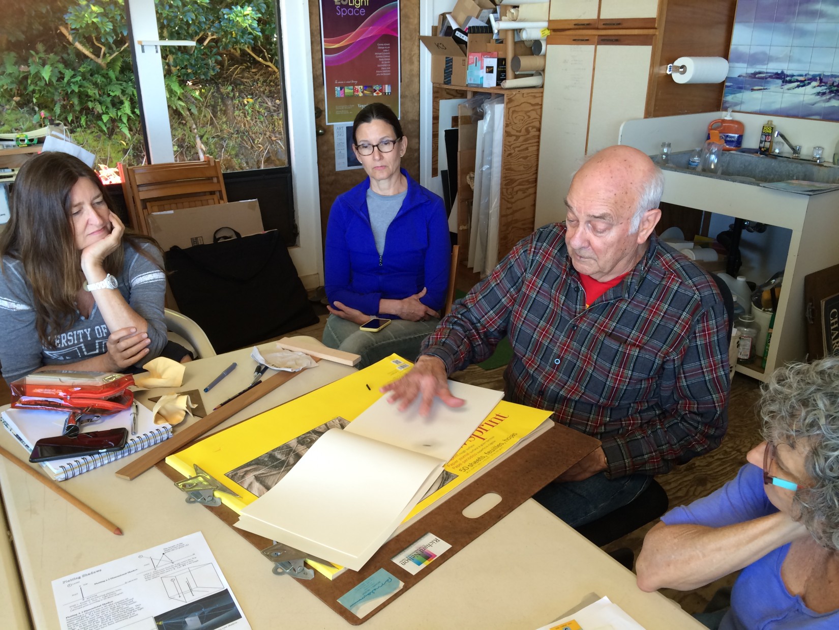
Critique of homework
We passed around the homework studies, so that students could see others’ work in more detail before critique. Dick was pleased with our efforts, but also cautioned that he was not going to “go easy” on us, and he was going to be very honest in his criticism. “I would rather go in depth, and have one drawing that is truly understood and drawn well, because that would serve you far more than a lot of drawings that were very mediocre. If mediocrity is an important part of your character building, than that’s your deal, but that won’t be something that I will promote … I don’t think it promotes pride.”
-
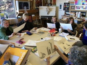
- Passing around the homework before critique

-

- Looking at each work in detail before the group critique
-
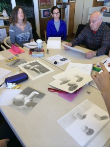
- A variety of cast shadow drawings
-
- Discussing some of the difficulties in rendering the cast shadows correctly

-

- Dick explaining the subtleties of what makes shadows ‘believable’ in a piece
-
- Pointing out the gradations of value which give form and volume to objects

Video: Pencil Drawings (12:30)
Dick Nelson analyzes pencil drawings and gives pointers.
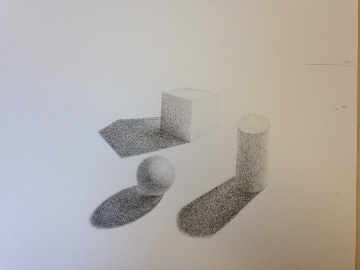
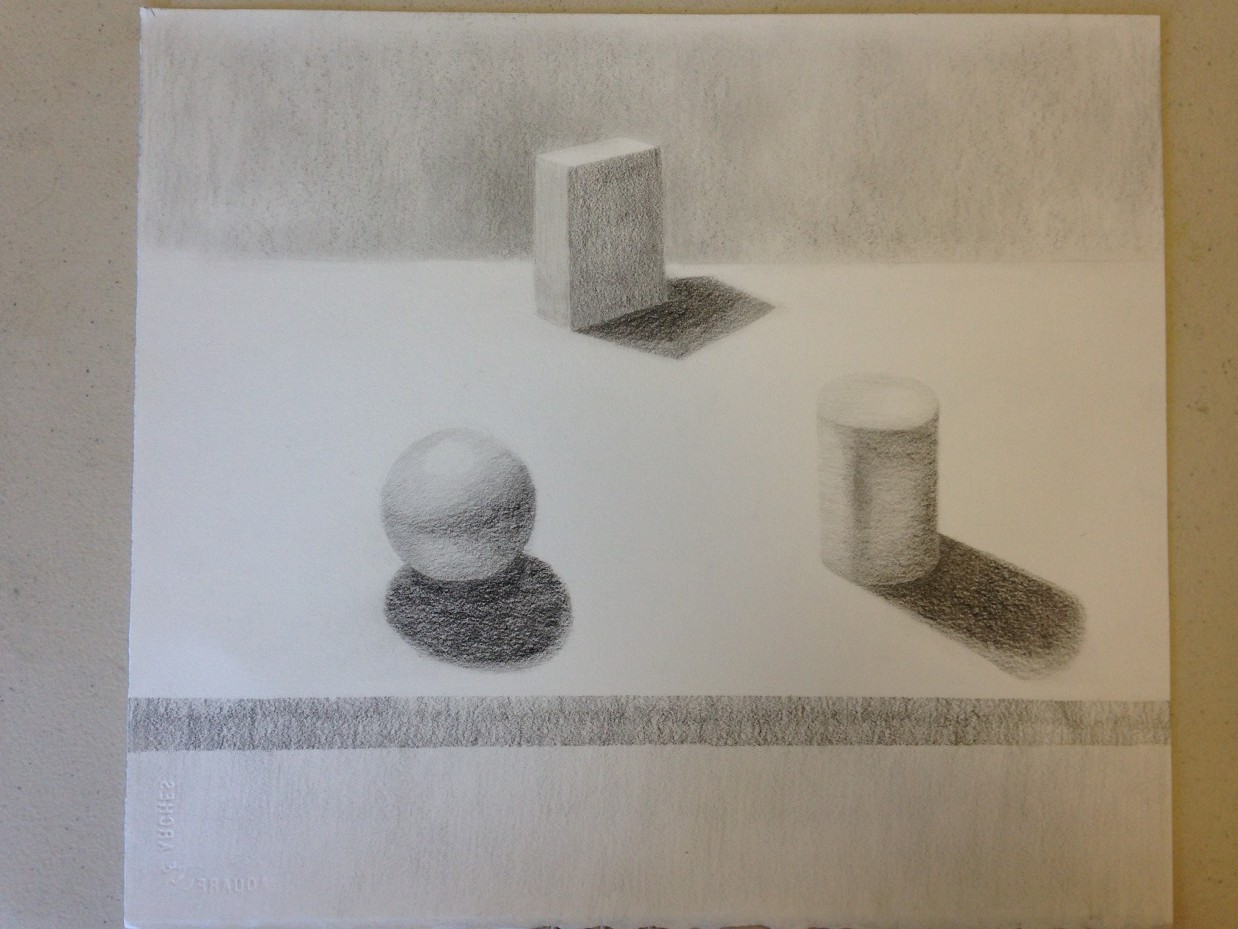
Most of the work had discrepancies in the shadows: different directions, different value, and sudden jumps in the subtle gradations that give form and volume to the shapes. There were also a few problems with perspective in some of the drawings, with edges that were parallel rather than angled. These are subtle and sometimes minute details, but the overall effect can give the viewer the sensation that something is ‘off’. Dick pointed out that light and shadows are very consistent under natural sunlight, and to prove this point we were going to pause our critique and view some lighting examples.
Inconsistencies in artificial lighting & shadows, versus the behavior of sunlight
After our coffee break, we studied photos that Valérie had sent to Dick over the weekend, which illustrated her difficulties in getting proper lighting for this assignment. The photos showed how drastically the shadows changed depending on: the type of light bulb and whether or not a lampshade was used; the distance of the light source from the objects; and the effects of the surrounding environment (reflective qualities of the table, wall, windows, etc.).
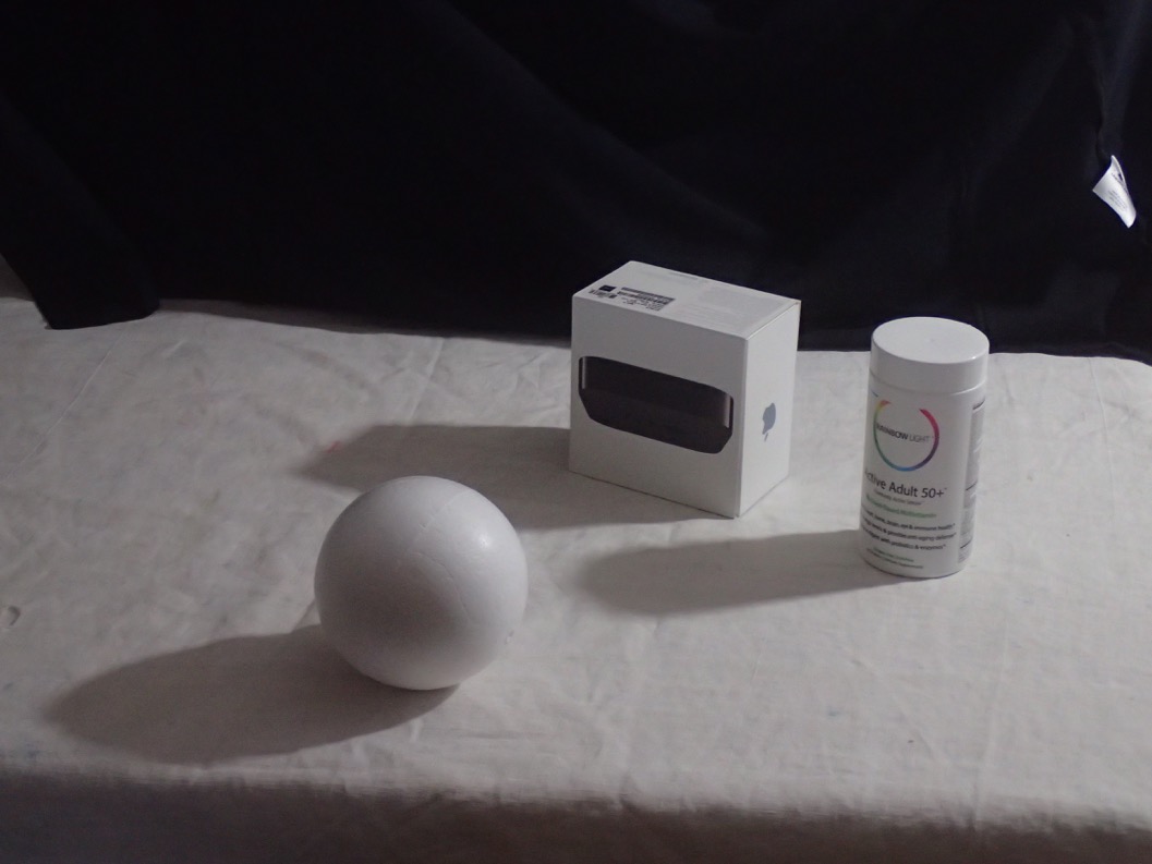
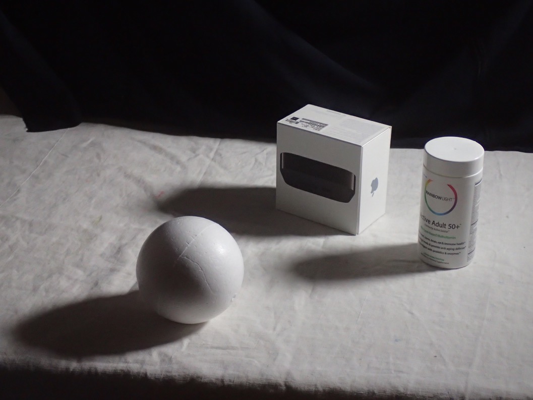
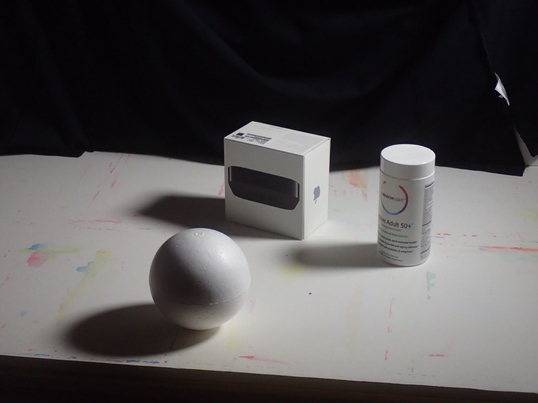
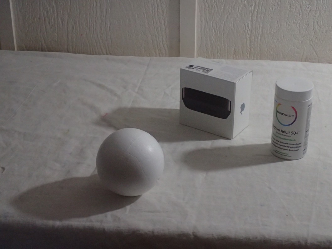
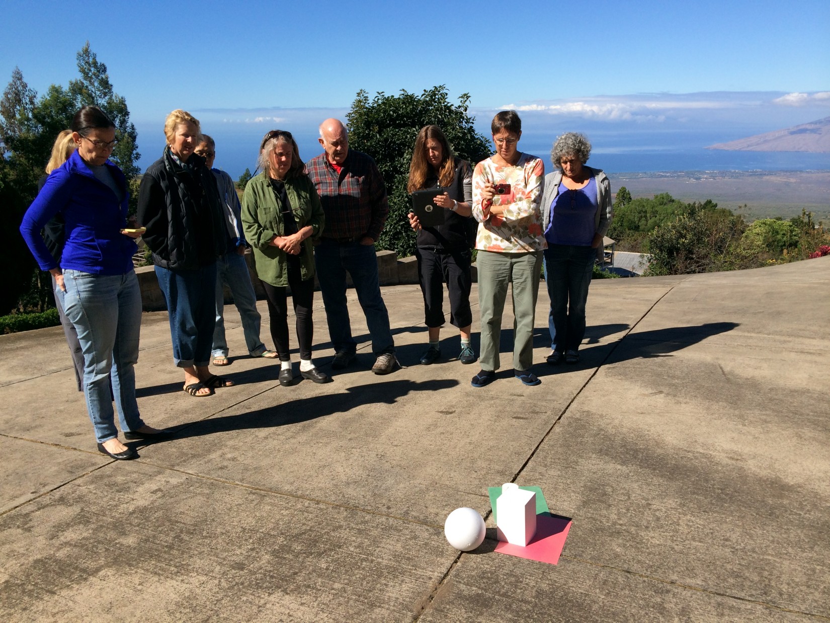
After discussing the various challenges of indoor lighting, we moved outside to see what would happen in strong sunlight. The effect was striking: gone were the value inconsistencies and confusing directions, and instead the shadows were uniformly dark and directionally even. As Dick said, “Nature has rules, and sunlight doesn’t play favorites: it treats everything equally”. When we as artists are trying to create harmonious images, we should strive to understand these natural rules or we will create works that are not ‘of this world’ (or ‘freaks of nature’, as Dick calls them).
-
- Observing cast shadows in sunlight

-
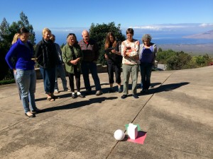
- Dick asking students to observe the uniformity of shadows under natural daylight
-
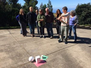
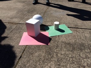
- Discussing the reflected light, which Dick highlighted by adding colored paper underneath the forms

Video: Sun and Shadows (3:21)
Observing light and shadows on geometrical forms.
We came back inside to finish our critique of the homework, and Dick pointed out a few common issues to correct for next class:
- Perspective should be accurate on all the forms; check to make sure your forms will meet at a common vanishing point.
- All shadows should be the same (as we saw in sunlight): same values, same direction, and same intensity.
- Find the brightest part of your composition and compare that to pure white, and then find the darkest part and compare that to pure black. How much do the values change throughout the composition? (“Learn to use the element of contrast to pick your values”).
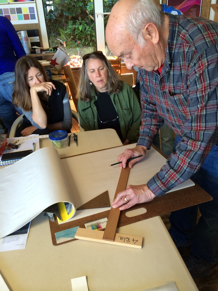
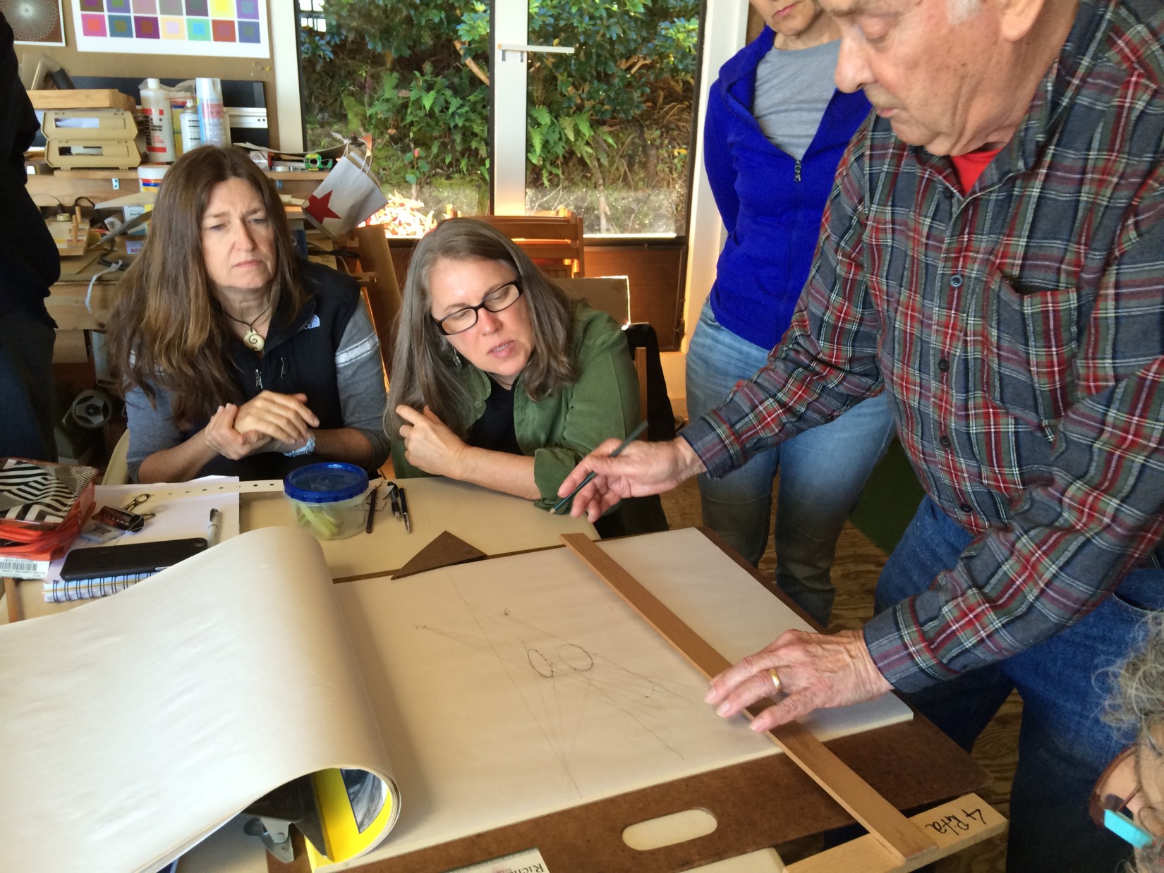
Demonstration of how to plot the shadows of the cylinder and sphere
We then spent some time going over how to plot curved and spherical shadows, which many students said they had a difficult time with. The key is to have a shadow vanishing point (or the ‘ground point’), which becomes another perspective point. This point tells us the plane of the ground surface (or the surface the objects are resting on), and thus dictates the angle and length of the shadows. It also describes what our vantage point is as the viewer (are the objects nearing eye level, or are we looking down at them?). One tip in getting the correct curve of the shadow is to plot as many points as you like so that you can ‘connect-the-dots’ easily.
-
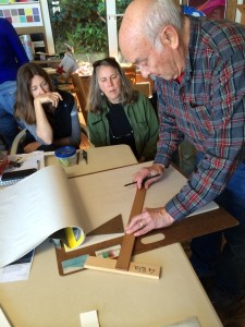
- Demonstrating how to plot the cast shadow of a cylinder
-
- The key to plotting correct shadows is to have a ‘ground point’ which acts as another perspective point

-
- Shadows should widen as they move away from an object

-
- Demonstrating how to plot a cast shadow for a sphere
Video: Cylinder shadow (10:22)
Dick Nelson shows how to plot the cast shadow for a cylinder.
Video: Sphere Shadow (9:30)
Dick Nelson shows how to plot the cast shadow for a sphere.
Video: Pencil Drawings 2 (9:16)
Dick Nelson gives tips on rendering form with pencil.
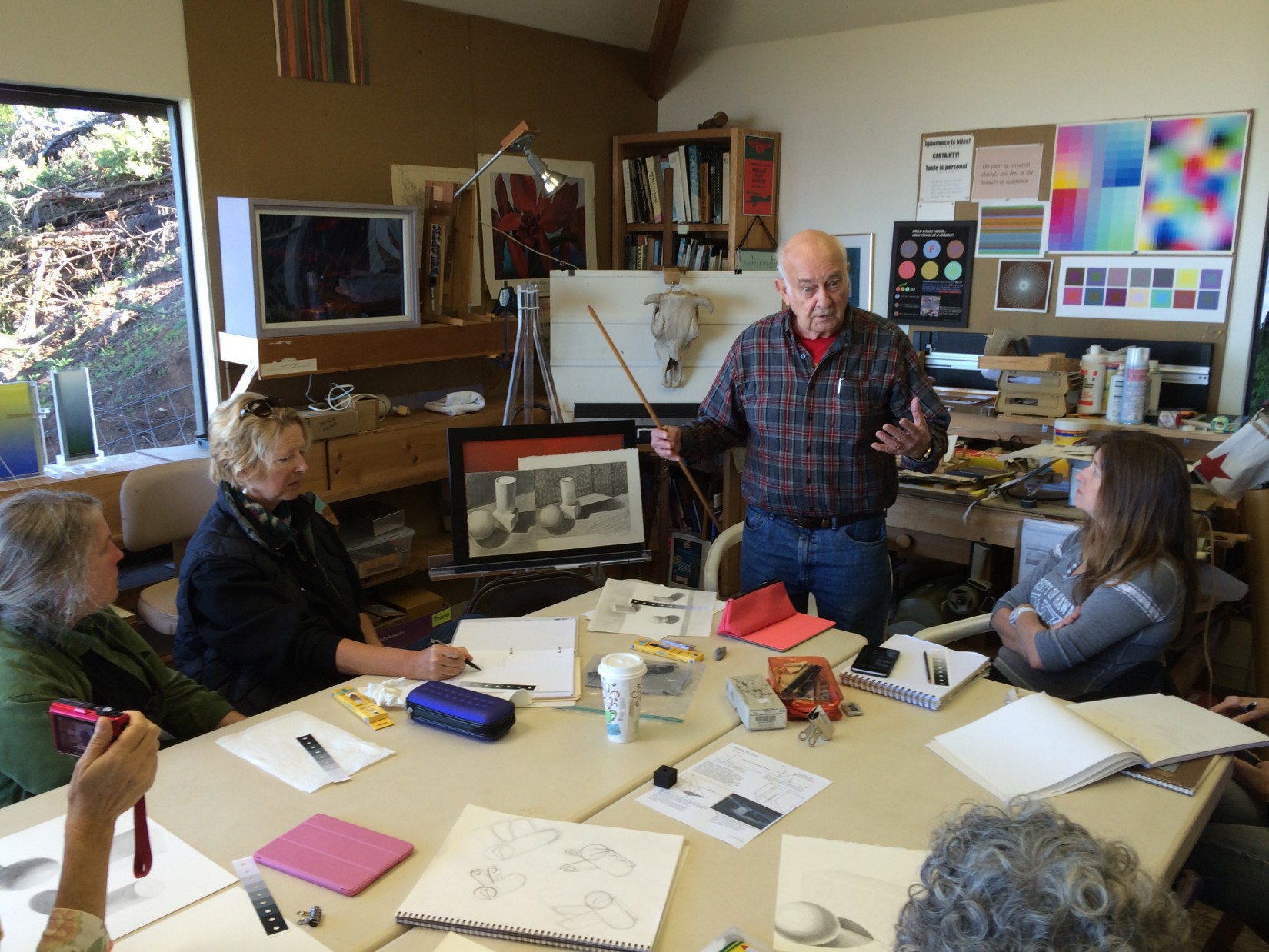
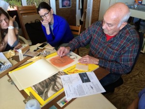
Introduction to charcoal
To end the class, Dick gave us a preview of what’s next by introducing a new medium, charcoal. We discussed some of its qualities:
- Dark black color (“it will give you a real black to extend your value range”)
- Easily blended / very soft medium (which also means it will smudge easily)
- Like pencils, it has different hardness grades (H, B, 1, 2, and so on)
- It comes in different colors (sepia, sienna, etc.) and shapes (vine sticks, compressed into chalk, or pencils)
- Not easily erased from the paper (Dick shared the proper steps to effectively erase vine charcoal: use something like a paper towel first to wipe as much of it off the page as possible, then use the chamois, then the kneaded eraser).
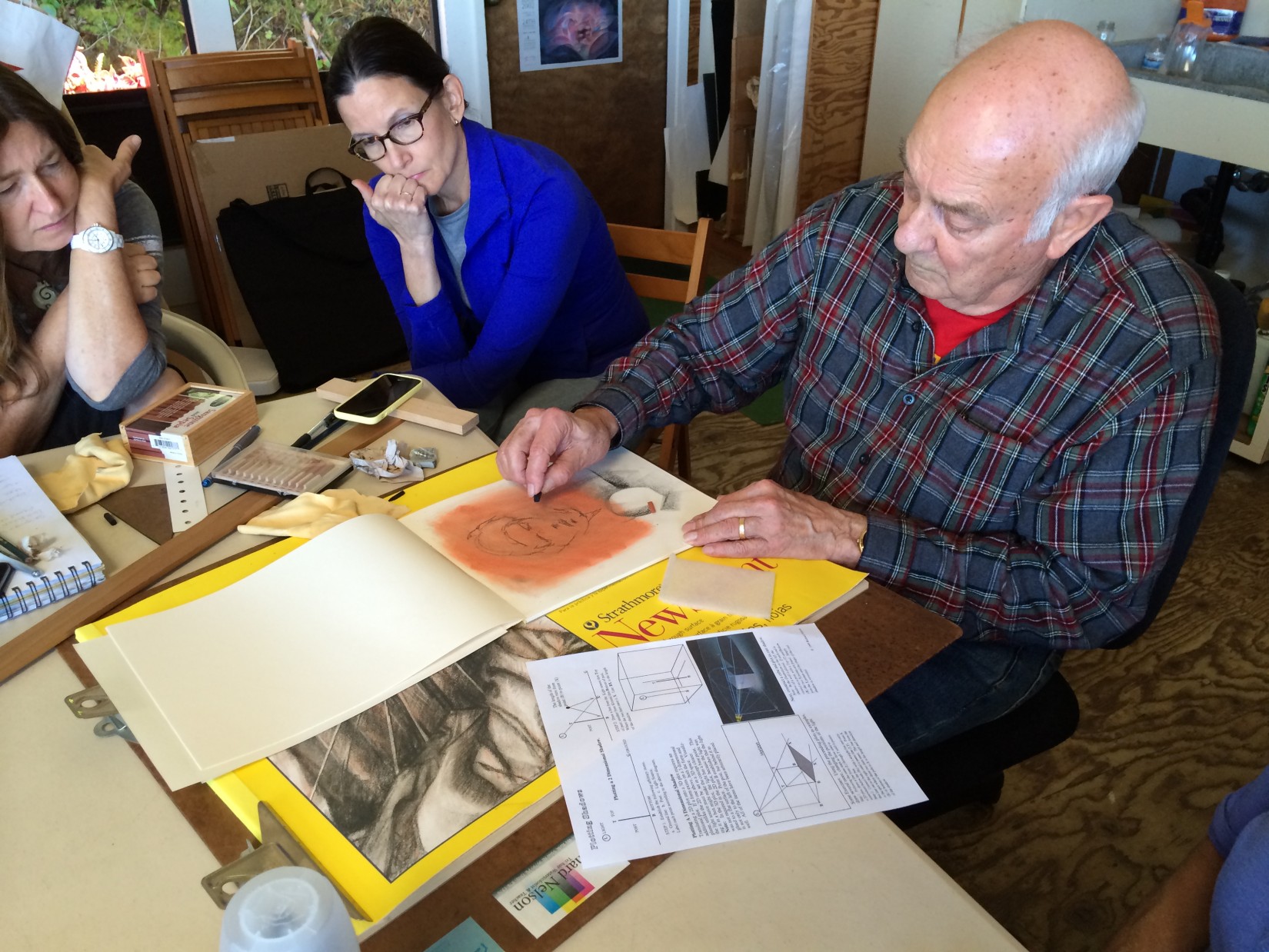
Dick demonstrated a few techniques that we will explore later, such as creating a background wash of charcoal to reduce the bright white surface of the paper, and give the image a range of middle tones. There is also the ability to ‘start over’ if you don’t like your composition by brushing away your latest marks and drawing right on top of it. Charcoal also gives us the chance to use the kneaded eraser as a drawing tool (“using the kneaded eraser, we can ‘pull out’ areas, and subtract to get highlights, and it’s more like painting in this way“).
-

- Introduction to charcoal, and how easily it can be smudged to create a light wash
-

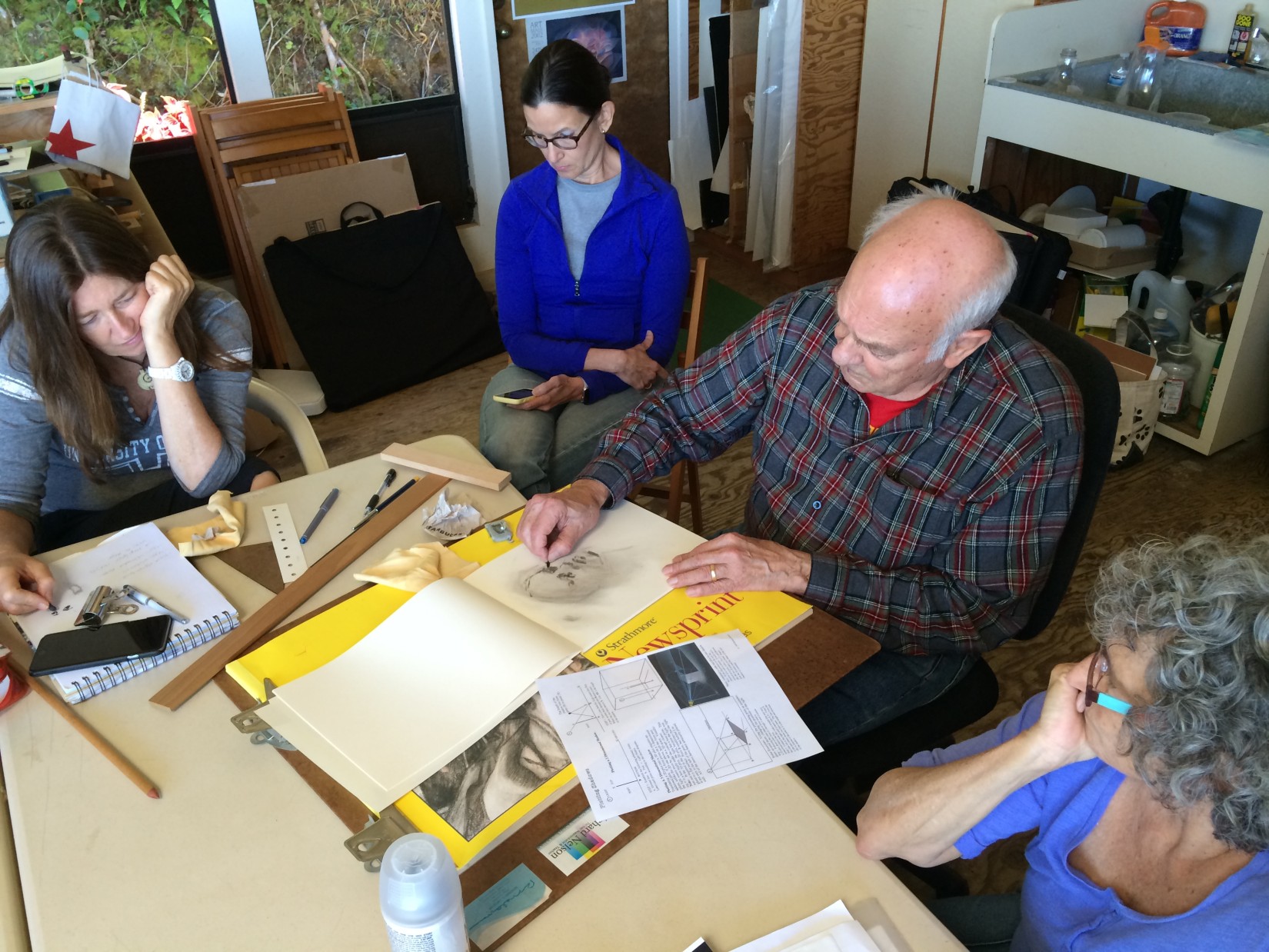
- Drawing a quick portrait in charcoal
-
- Using sepia as a background wash before adding dark shadow areas with charcoal
Video: Charcoal technique (14:17)
Dick Nelson gives some essential information and tips on drawing with charcoal.
Charcoal will be used for our next class, so don’t forget to wear or bring something you don’t mind getting dirty (as charcoal dust tends to get on everything).


