The first session of the Advanced Drawing and Composition class for Winter 2016 was held on Wednesday, January 13. We discussed the relationships between light and shadow, and how to use these relationships to create convincing images. Dick showed us how to plot a cast shadow using perspective, how to gauge the values of light vs. shadow, and talked about the different qualities of H and B pencils. Thanks to Valerie, this week’s summary includes almost 45 minutes of video from the class, and an additional 15 minutes of audio, providing an opportunity to (re-)experience a significant portion of the class.
Homework assignment
[gview file=”https://dicknelsoncolor.com/wp-content/uploads/2016/01/DrawCompAssign1.pdf”]
Class recap – some key ideas
Light and shadow
The first class of Advanced Drawing and Composition was chock-full of new information, building off of what we previously covered in Drawing I. Before class, Dick sent out a pre-course quiz to see how much we had retained from our lessons on linear perspective, weight of line, creative problem solving, etc. The results were wonderful, with many careful and detailed drawings which proved to Dick that we are ready to move forward!
This class focused on the importance of SHADOWS, which can be one of the most useful visual clues for creating a realistic impression of the world. The characteristics of light and shadow allow our eyes to perceive form, volume, and depth or distance. To unify the objects depicted in an image, one would have to maintain the same quality of light and shadow for each object in order to convince the viewer they belong to the same scene.
-
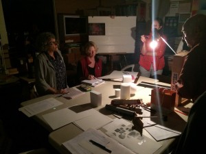
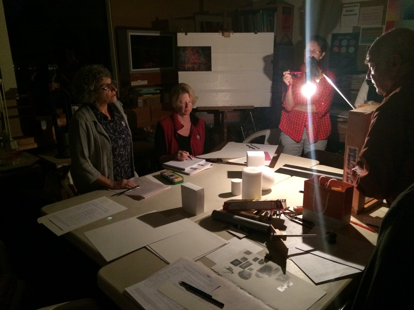
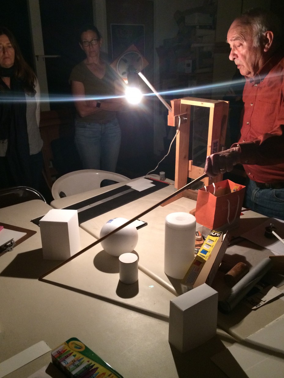
- Dick used a single, clear bulb directed at basic shapes to cast very clear and simple shadows
-

- Pointing out the critical corners of the cast shadow
To mimic realistic lighting effectively, there are two aspects to keep in mind: perspective and value. Dick demonstrated both of these features by using his NelOptic device, to which he had added a bare light bulb attachment. Shining the light on simple geometric forms on the table, he demonstrated how the angles of the shadows are always related to the light source, with the light acting as 3rd point-perspective. These two aspects should be used in tandem if you want to create convincing images of what our eyes perceive in real life. The first 2-1/2 minutes of the video below, and handout below that, give technical guidance for plotting shadows.
Plotting shadows
[gview file=”https://dicknelsoncolor.com/wp-content/uploads/2013/10/Plot-Shadows.pdf”]
Correct values
We also talked about how the intensity of the light would naturally create different values in the shadows, and this range of values is an important clue to our viewers about what kind of light is illuminating a scene. Part of the challenge of our homework is to recognize the minute differences in the shadows and render the correct values. To do this, we have to take into account less obvious sources of illumination, such as ambient and reflected light, which create subtle, but perceptible, changes in both shadow and highlight areas.
Values in the shadows are dependent on the lighting conditions
“The forms are white, the table is white; but when we go down there and observe this: what, in the final drawing, will actually be white? As artists, we are constantly trying to ‘fool’ the viewer, or create an illusion, so that a person says ‘Oh, those are white geometric forms’, when there is no actual white. It’s all relative.”
Dick reminded us that, as artists, we are trying to replicate what our eyes see with our limited palette of materials. Although we can never truly duplicate the brilliance of sunlight (as he said,”Nature can produce, in sunlight, a light that is so bright that I can’t look at it without going blind. I can look at a white piece of paper, or a drawing, and I’ll never go blind”), we can still achieve some masterful optical illusions as long as we understand the laws and ‘rules’ of the natural world.
Discussion prompt: Rules of nature
[gview file=”https://dicknelsoncolor.com/wp-content/uploads/2016/01/Natural-Which.pdf” height=”425″]
Rendering
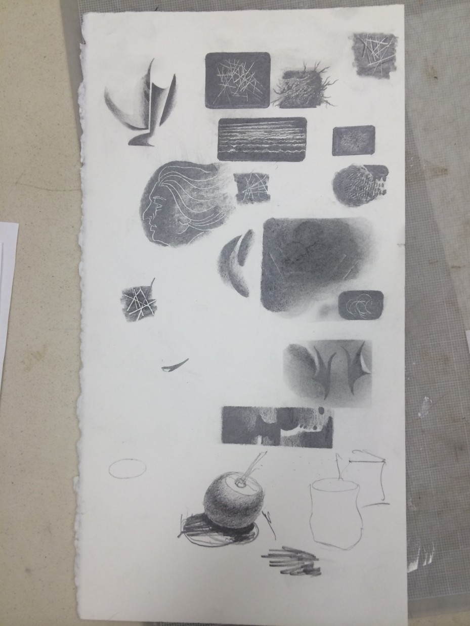
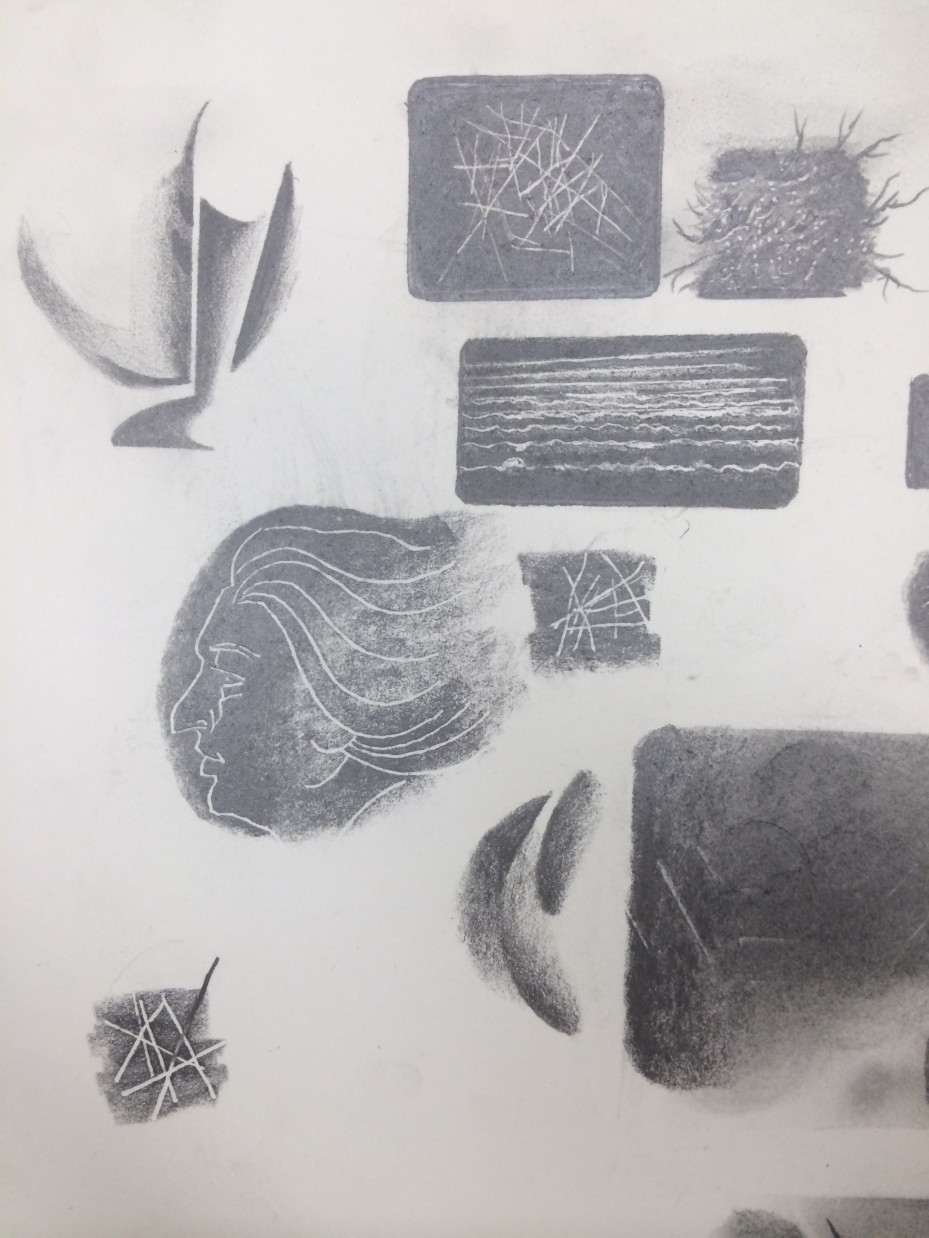
Dick also discussed the various grades of pencils (the qualities of the hard ‘H’ versus the soft ‘B’) and asked us to choose our tools quite deliberately for this assignment. He demonstrated some wonderful techniques to use for our rendering of shadows, and stated that he wants this assignment to look “as though it were airbrushed – no outlines.” He showed a few examples of the different effects you can achieve with a very soft graphite pencil (‘B’ series), and wants us to practice a new type of stroke: instead of clear and obvious lines, these are to be blended and imperceptible. Our homework will be considered a finished piece of work, not a sketch, and will be critiqued as such.
-
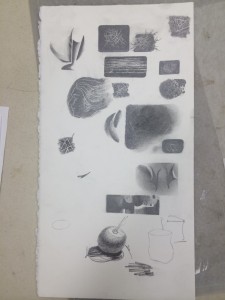
- DIck’s examples of small sketches done with soft graphite pencils on hot-press watercolor paper
-
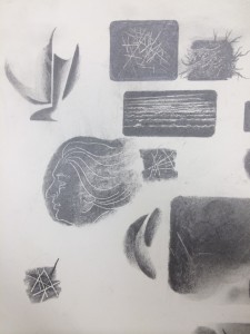
- B pencils can be used very softly to create an ‘airbrushed’ effect
Dick was thrilled with the work he saw in class, and he’s excited to see what revelations unfold in the next few weeks. He summarized the course as such: “If you really want to understand what this whole program is about, it’s not copying, because that’s not what drawing is. It’s UNDERSTANDING, and then you can draw anything, because you see how these relationships work.”
Video and audio recordings
Be sure to watch and listen to the recordings below! If you were in the class, you’ll be able to review and reinforce your learning. If you weren’t in the class, they provide a valuable opportunity to observe, experience, and learn.
Light and Shadows 1 (3:08)
Light and Shadows 2 (24:04)
Pencil Rendering (14:08)
Audio recording: Course context (15:10)
Class materials
Pre-course prep: Drawing Foundation review
[gview file=”https://dicknelsoncolor.com/wp-content/uploads/2016/01/DrawPreClassPrep.pdf”]
Discussion prompt: Light source
[gview file=”https://dicknelsoncolor.com/wp-content/uploads/2016/01/FootInSand.pdf” height=”425″]
Observation & discussion prompt: Light, shade, shadow & geometric forms
[gview file=”https://dicknelsoncolor.com/wp-content/uploads/2016/01/CompAssign1.pdf”]


