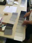
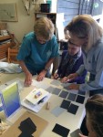
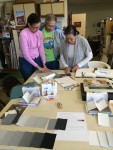
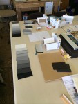
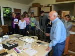
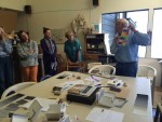
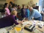
The first session of the Color Relationships class for Spring 2016 was held on Wednesday, April 6. A group of eleven students was introduced to new ways of thinking about color, including arrays, halation, and the primary colors of pigment (hint: it’s not the traditional red, yellow, blue!). See the full post for handouts, videos, and class materials.
Homework assignment
[gview file=”https://dicknelsoncolor.com/wp-content/uploads/2013/09/Lesson1Combined.pdf”]
Homework hints – array exploration and self-critique
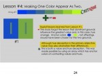
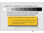
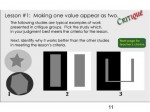
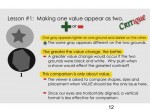
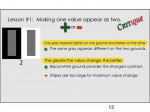
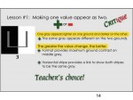
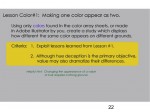
Dick suggests viewing these excerpts from his Color DVD in order to see your own work in relationship to the simulated critique. This is the color equivalent to the “Value” critique shown in class. (click to view larger)
Class recap – some key ideas
- This class is first and foremost about RELATIONSHIPS. Everything in life is in relationship to everything else, and color is no different.
- Color comes down to two fundamental aspects, HUE and VALUE. Always come back to these two characteristics when faced with a color problem.
- Dick’s teaching methods are about creating a behavioral change in his students – don’t be surprised to find yourself frustrated, challenged, or even a bit distraught: these feelings can signify that true learning is taking place. Dick’s stated goal is to take his students from dependence to independence, and the only way to do that is to let you find your own solutions, not to give you the answers.
- Remember, we are not creating “precious stones” in this class. “If you fill your pockets with precious stones, how can you cross the river?” Focus on creating stepping stones, and the precious ones will come later.
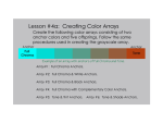
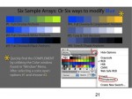
- An array consists of a “family” of related colors in a sequence which changes predictably in both hue and value from one end to the other. Arrays are easy to create in Illustrator using the Object > Blend function, and difficult to set up using Color-Aid paper.
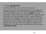
- Halation is the apparent gradation seen in an area of color when it is between two related colors, as in an array. If you see halation, you know you have an array. It is a visual phenomenon created by our perception.
Class photos
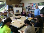
- Class introductions
- First group challenge
- One of the criteria was to only use 9 cards
- Another criterion was to have equal steps between the different values
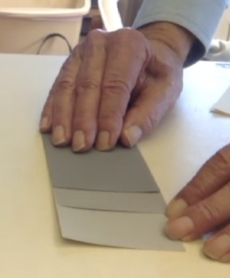
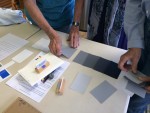
- Working on value arrays
- Groups of three worked together
- Finished arrays
- Group critique
- Noticing the subtle differences in value changes
- Different array possibilities from different ‘parents’
- Halation demonstration
Class materials
Worksheets
In order to ensure a smooth and productive class experience, it is very important that we all understand and are familiar with the terms of color. The misuse of color terms is partly responsible for why there is so much color confusion in the world, so take the time to learn these terms if you have not already!
[gview file=”https://dicknelsoncolor.com/wp-content/uploads/2015/07/ColorTerms.pdf”]
While we did not go over this sheet specifically in class, it is a great way to test your color acuity and train your eyes to recognize when colors are, or are not, in relation to each other.
[gview file=”https://dicknelsoncolor.com/wp-content/uploads/2014/10/Is-That-My-KId.pdf”]
Tri-hue Demo
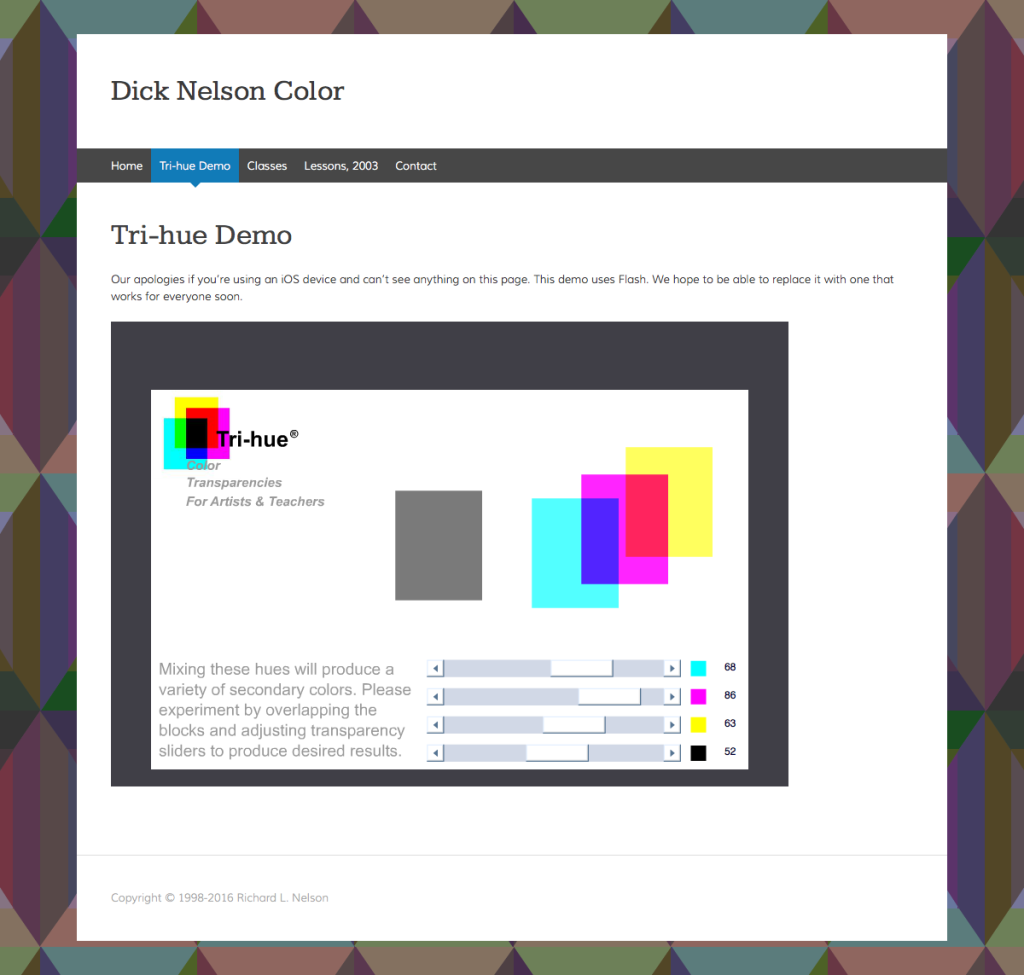
Dick mentioned, but didn’t show, the Tri-Hue demo page. It allows you to experiment with the three primary colors cyan, magenta, and yellow (plus black) to mix any color you can imagine. Notice in the screenshot below that red is a combination of yellow and magenta – therefore, a secondary color, not a primary. Likewise, blue is a mix of cyan and magenta – again, a secondary, not a primary!
You can access the demo easily from almost any page on the website, from the top menu bar, or the “Mix any color” area in the right sidebar.
- Access the tri-hue demo from the main menu
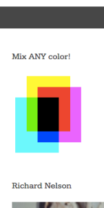
- Access the tri-hue demo from the sidebar
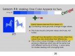
Slides – Value deception assignment and sample critique
- Color deception exercise 1
Videos
3D Color Wheel
An animated building of a 3D color wheel with identifying text. The full dimension of color relationships can be viewed in this animated movie. This is part of Dick Nelson’s DVD “Dimensions of Color”, used as his teaching device for the serious student of color. Having studied with the 20th Century master of color Josef Albers at Yale, Dick has incorporated many lessons from his mentor and added some of his own color revelations.
Color is Relative
We perceive the hue and value of colors according to their surroundings. This video demonstrates just how relative color is and provides an explanation.
Color Arrays
Color relationships are seen here as ARRAYS of related hues and values. The visual phenomenon of HALATION is ever present in each and every array. This illusion of color and value gradation, explained in my earlier videos, served as a basis for much of Josef Albers work with the INTERACTION OF COLOR.
Tutorials
Create an Array – Illustrator tutorial
Cutting a hole – Illustrator tutorial
Same session, different year
View the class posts from previous years, which are filled with various handouts, games, videos and commentary to further enrich the lessons. View the post from 2014 or 2015.
References
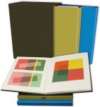 The book Interaction of Color by Josef Albers was originally published in 1963 in a small print run with silk-screened plates of student and faculty solutions to each exercise. Original editions are in the holdings of libraries and collectors. In 2009, it was reprinted in a large 2-volume boxed set, which is available on Amazon for $157. Dick frequently brings his copy out to show and critique solutions to the Albers exercises.
 Several paperback editions have been published with the full text, each with more color plates than the previous. The most recent was published in 2013 for the 50th anniversary of the original publication and is available on Amazon for $12.
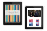 The Interaction of Color iPad app ($14) contains all the text, reproductions of all the color plates, the ability to create one’s own versions of each exercise, and brief video clip commentaries.
