The second session of the Color Relationships class for Spring 2016 was held on Wednesday, April 13. We shared the insights and challenges produced by the homework, discussed important questions to ask when determining the ‘ingredients’ of a color, and had a thorough critique of the first assignment. See the full post for additional handouts and videos, and the two new homework assignments for this week.
Homework assignment
[gview file=”https://dicknelsoncolor.com/wp-content/uploads/2013/09/Lesson2Combined.pdf”]
[gview file=”https://dicknelsoncolor.com/wp-content/uploads/2013/09/Lesson3Combined.pdf”]
Class recap – some key ideas
Questions to ask while assessing color
- How many primaries does the color contain? Practice identifying color in terms of how much cyan, magenta, and yellow it contains. The Tri-hue Demo is a great method for practicing this skill.
- Is the color tinted, shaded, or toned? Does the color contain any white, black, or complementary hues (leading it towards neutral gray)? These are the 3 ways to weaken, or desaturate, a color. Full saturation or full chroma colors are more dominant than colors that have been altered in any of these ways.
- Is it a dominant (strong) color, or a passive (weak) color? In other words, how easily can it be influenced? Karen had this to say from the Color Relationships post from 2014:
-
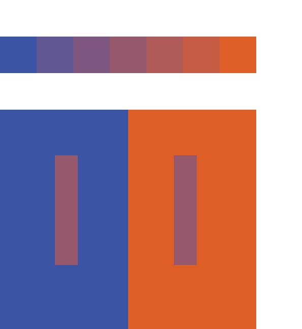
Strong colors are more influential. The primary colors (cyan, magenta, and yellow) and black and white are the strongest, and thus the most influential. Identify the hue and value components of a color to determine if it is strong or weak, dominant or wimpy – if it will influence, or be influenced. Colors on the outer rim of the color wheel are “full chroma” – the strongest and most saturated – and are made from only one or two primary colors. Colors in the interior of the color wheel are weaker – more easily influenced – because they’re made from all three primaries. The dominance of each primary is diminished by the presence of the others. Grays and tones can be easily influenced – they give up their identity in the context of their backgrounds.
The importance of arrays
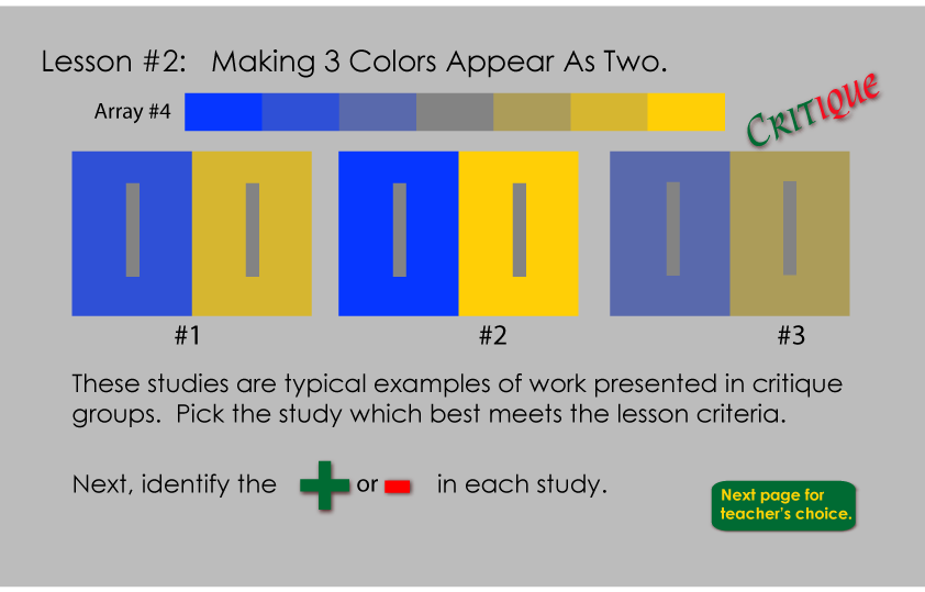
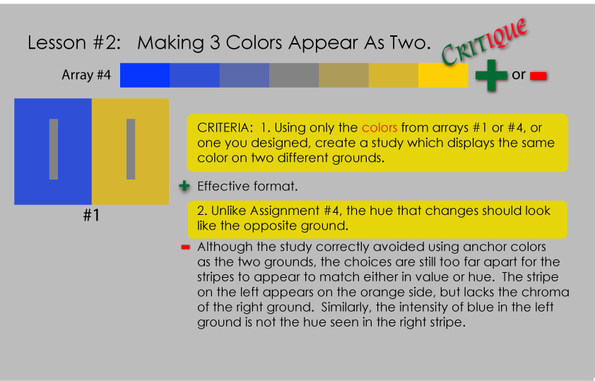
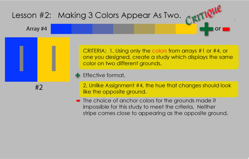
The importance of the array format became apparent during the critique, as we saw a few examples where students had used colors that were not related by ‘family ties’. One student asked if if you could still have color deception take place even if the colors were not part of an array. The answer is yes, you can still make colors look different even if they don’t stem from the same parents, but this is at the root of why certain color combinations are harmonious and others are not. This was a clear illustration of Dick’s constant reminder that, “This course is all about relationships. In life you don’t have anything that is not in relation to something else, and especially when it comes to color, it’s all about relationship.” When all colors in a group are related, a harmonious color combination is created which is pleasing to the eye.
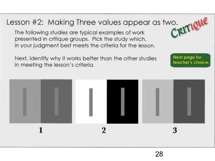
Homework solutions
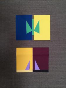
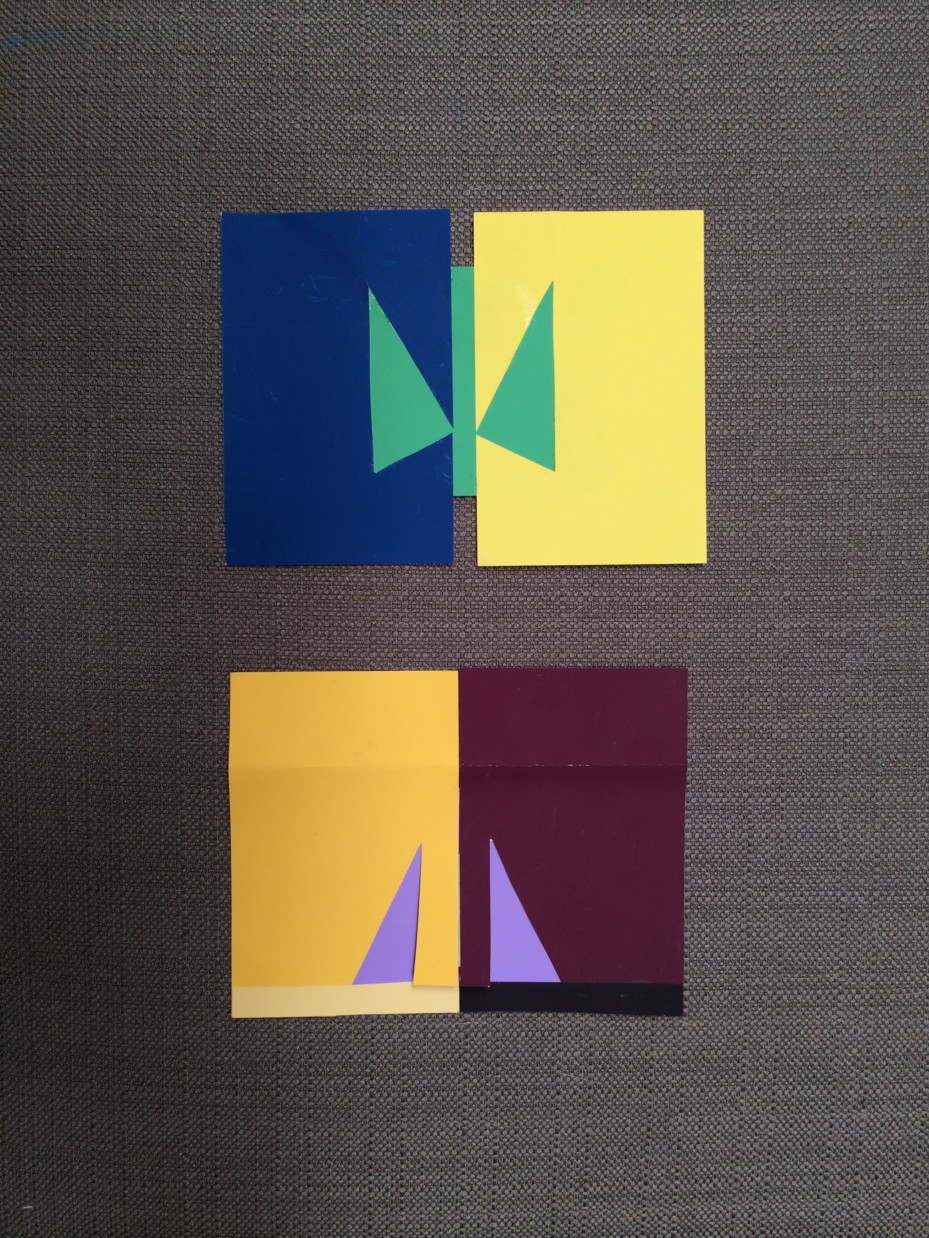
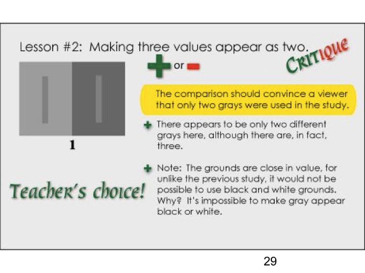
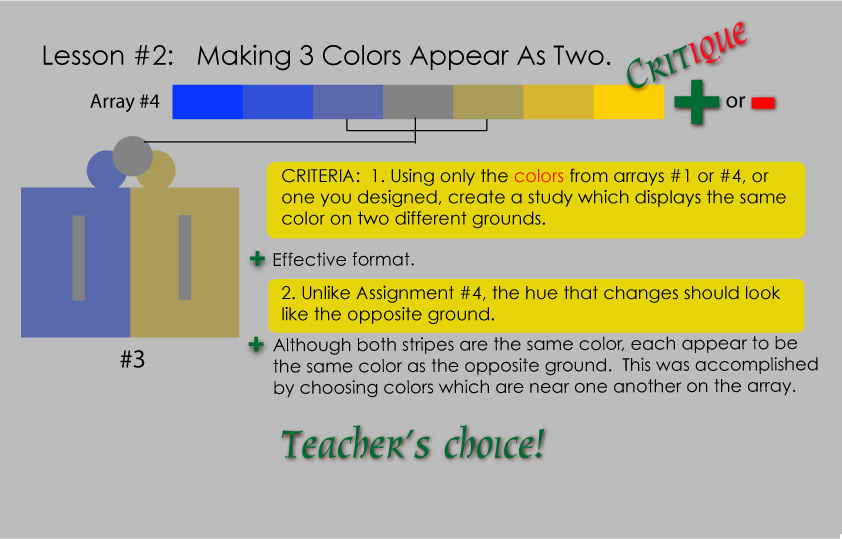
This study is a very effective solution, with the central figures appearing to be very different from each other in the context of the strong background colors. It addition, notice the luminosity of the array, coming from halation within the swatches.
View all homework submitted digitally.
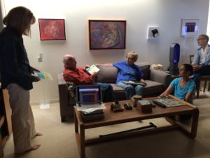
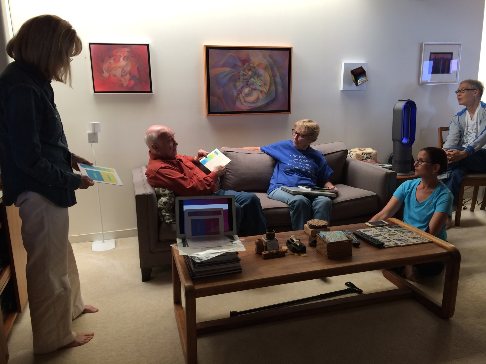
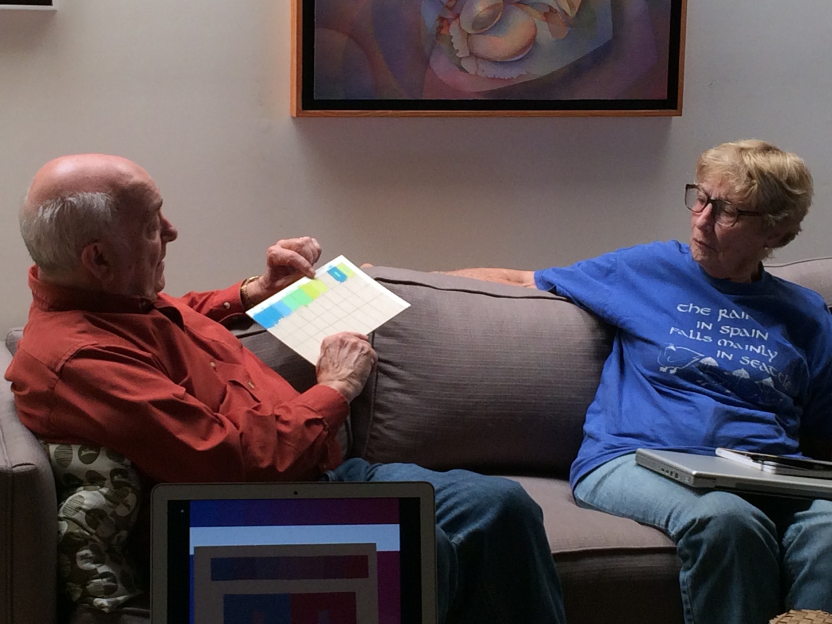
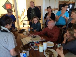
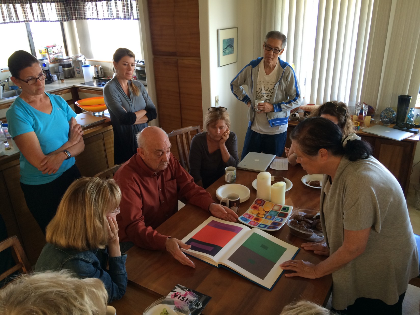
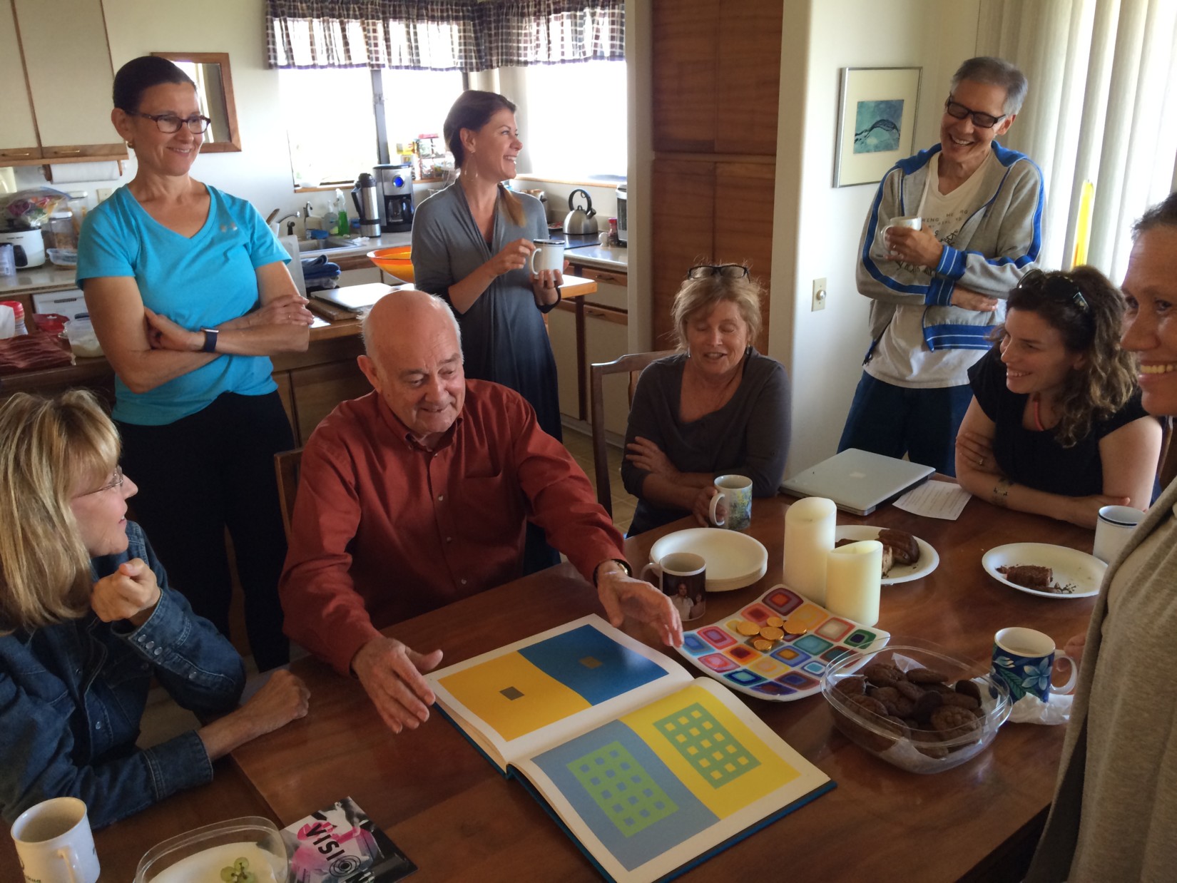
Class photos
-
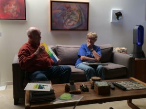
- Critiquing students’ homework

-
- Discussing arrays
-

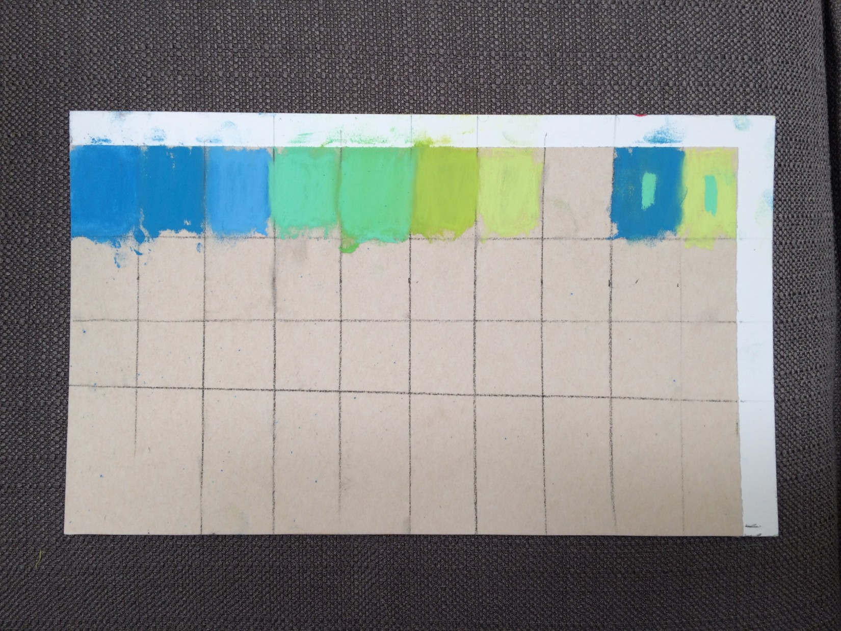
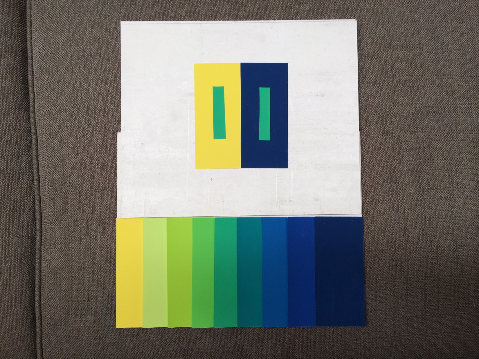
- Looking for equal steps in both value and hue as one color changes into another
-
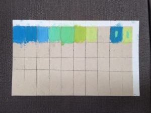
- The assignment done in pastels
-

- The assignment done with Color-Aid papers
-
- Another example done with Color-Aid papers
-
- Dick showed some examples from the Albers book, Interaction of Color

-

- The examples in the Albers book don’t always make sense, nor do they always accurately demonstrate effective color interaction
-

- The book contains both examples of Albers work and studies done by his students
Class materials
Worksheets
[gview file=”https://dicknelsoncolor.com/wp-content/uploads/2016/04/Critique-Guide.pdf”]
[gview file=”https://dicknelsoncolor.com/wp-content/uploads/2014/10/ColorDominance.pdf”]
Huedoku
Huedoku Website
Learn about Huedoku and why it is such a great way to practice color recognition and increase your understanding.
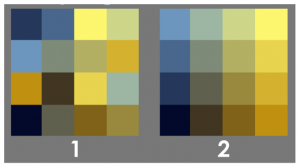
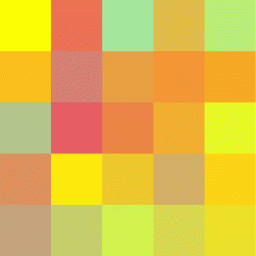
Huedoku: Rearrange the scrambled squares to form a matrix
Huedoku App
Download Huedoku for playing on your iPad or iPhone. The game itself is free, and you can purchase individual color packs to add to your collection of puzzles. Dick strongly recommends Huedoku as an aid to developing an eye for color, its interaction, and RELATIONSHIP! RELATIONSHIP! RELATIONSHIP!
Also check out this link to one of the meetings of the Color 1 group in 2014, when Gabe Mott presented his Huedoku app to the class.
Huedoku simulation
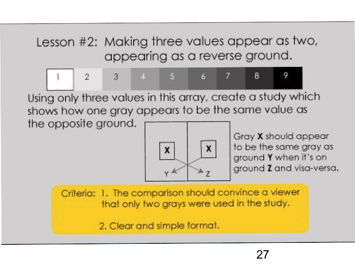
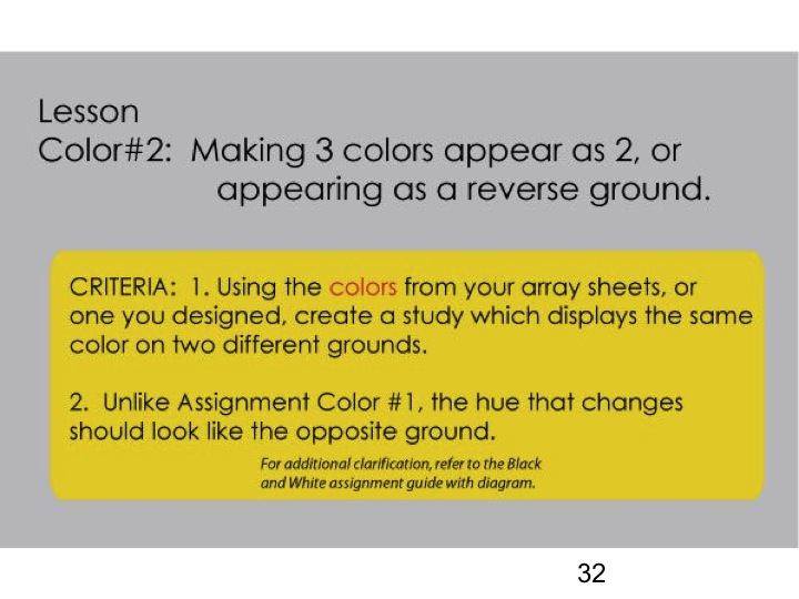
Slide presentation: Making 3 colors appear as 2, or appearing as a reverse ground
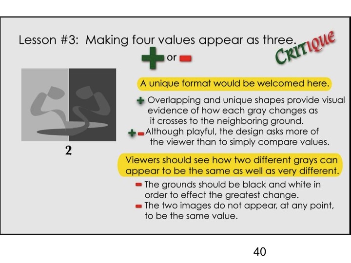
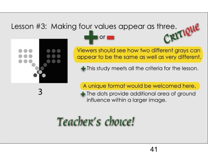
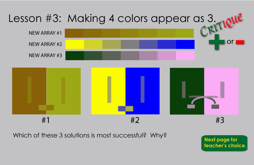
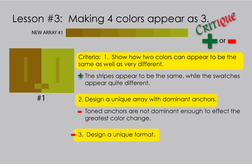
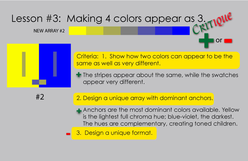
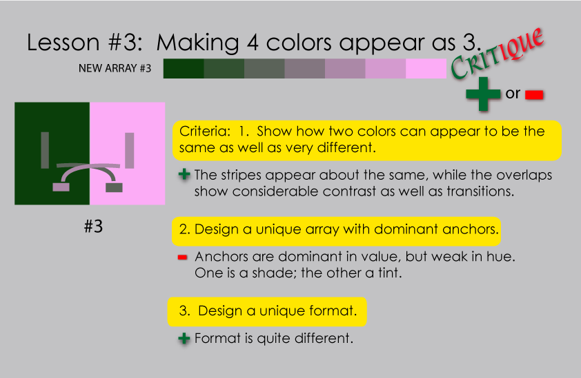
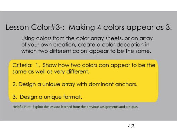
Slide presentation: Making 4 colors appear as 3
Videos
Mix Any Color
Mix any color in pigment or light by first recognizing that all colors originate from three primaries plus black or white. The true primaries, understood and used in the printing industry for decades, were unknown to most artists and art schools. This brief video hopes to dispel the misconceptions of mixing color in both pigments and light. Additional proof can be found by examining the Cyan, Magenta, Yellow and Black inks of every computer printer. These are pigment primaries. Light primaries, Red, Green and Blue-Violet are the secondary colors of pigments. Every TV or computer monitor depends on RGB color to generate an entire spectrum.
The Color Matrix
Following the ARRAY concept of color relationships, I have expanded Josef Albers’ two parent relationship to a broader
spectrum of color possibilities. The results are startling and a new tool for those who seek color harmony.
Albers Homage To The Square: An Explanation
A descriptive analysis of the work of Josef Albers by a former student Dick Nelson. This is followed with Dick’s animated collection of his own color studies which incorporate Albers format and his principles of color interaction.
Same session, different year
View the posts from previous years: 2014 (one post for Make 3 colors look like 2, a separate post for Make 4 colors look like 3), and 2015.


