Color Relationships 1, Summer 2015 week 3

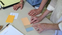
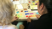
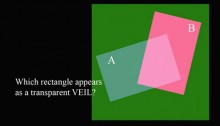
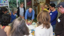
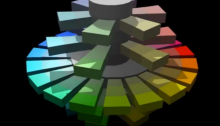
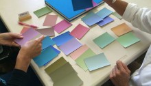
The third session of the Color Relationships 1 class for Summer 2015 was held on Tuesday, August 11th. We heard from participants about their latest experiences with color, critiqued the last two assignments, and moved on to explore a new facet of color interaction: equal value. This was a favored trick of the Impressionist painters, and when properly utilized can manifest the most beautiful and luminous fields of color. But matching value is much more challenging than it seems! It is truly the mark of a skilled colorist, one who can control their value selection as much as their choice of hues.

Color Relationships 1, Summer 2015 week 2

Wow, only our second session and we are fast covering ground! In this class, we moved right ahead, learning more about arrays; the importance of recognizing the difference between hue and value; how to look at your work objectively; and most importantly: HALATIONS! The following post summarizes our exciting class activities, the importance of critique, the new homework, and the fun videos we watched (no shortage of laughter!). Read on for more …

Color Relationships 1, Summer 2015 week 1

Welcome Summer 2015 color explorers, to our very first session and the start of a new understanding of color interaction! The following post provides a summary of what took place in the classroom (it all seems to go by so fast!), and reinforces the key ideas we discussed in class, along with images of the presentations, videos, and links to reference material. Enjoy!

Color Relationships 2, 2015 week 2

The second session of the Color Relationships class for Winter 2015 was held on Friday, January 16. We critiqued the solutions to the film illusion assignment (Create the illusion of a colored film over two or more colors), and had an introduction to veils. The new homework assignment is to create the illusion of one or more veils over a set of two or more colors, incorporating an actual veil (a piece of tracing paper or the like) into the study. Films and veils are two visual phenomena that help to unify and create emotion in a piece, intriguing the viewer and inviting their participation.

Color Relationships 1, 2014 week 3

The third session of the Color Relationships class for Fall 2014 was held on Friday, October 24. We critiqued the second color deception assignment, “make three colors appear as two, or reversed grounds” and free color studies, as well as revisions of the first color deception exercise, “make one color appear as two”. The third color deception exercise was assigned: make four colors appear as three, showing how two colors can appear to be the same, yet are very different, in a unique format. An exercise with Color-Aid paper gave practice in recognizing arrays and the phenomenon of halation.

Color Relationships 1, 2014 week 2

The second session of the Color Relationships class for Fall 2014 was held on Friday, October 17. We critiqued the homework studies for making one color appear as two. We experimented with matching an arbitrary color by combining transparent primaries in the Trihue demo on this site. The new color deception assignment for this week is to make three colors appear as two, or reversed grounds, and a free color study was also assigned. Links to Illustrator tutorials and references are provided.

Color Relationships 1, 2014 week 1

The first session of the Color Relationships class for Fall 2014 was held on Friday, October 10. Through hands-on exercises, discussion, video, presentation, and worksheets, eleven students experienced the relativity of color and received their first assignment: make one color appear as two. Read the full post for details and class materials.

Pre-class prep

Dick has assigned homework to prepare for the upcoming color relationships classes, 2 videos and a quiz. Everyone should familiarize themselves with the concepts and terminology in these videos.