Homework
You have four homework assignments this week.
1. Revisit the first assignment and create a stronger study
If the critique made you see that your study was flawed, or that you could have pushed the deception even further, create a new one. Critique it yourself, based on the assignment criteria, and the questions in the box below. Remember that choosing your colors from a single array is a simple, systematic way to succeed!
[box color="yellow"]Some questions to ask in a personal critique
These will be useful for the first three assignments.
- Is this deception one of value, hue, or both?
- What is the relationship of the stripe to the two grounds?
What colors are present in each of the two parents?
Does the child possess all of these colors?
Does the child have any colors, tints, or shades not found in either parent? - How dominant are the parents?
More chroma than the child? - Does the child favor one parent over the other in value? Hue?[/box]
For easy reference, here is the assignment for both value and color on one page.
[gview file=”https://dicknelsoncolor.com/wp-content/uploads/2013/09/Lesson1Combined.pdf” height=”600″]
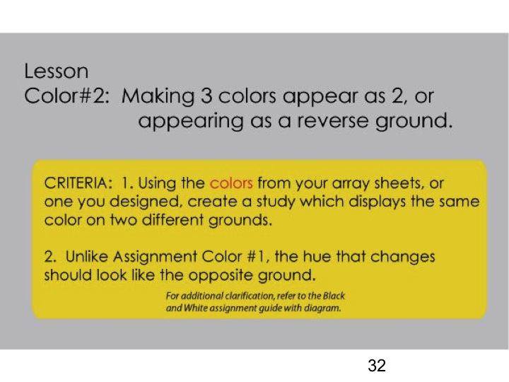
2. Color deception two. Bring in your study for critique next week.
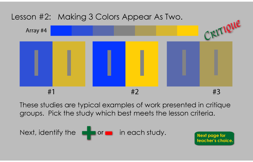
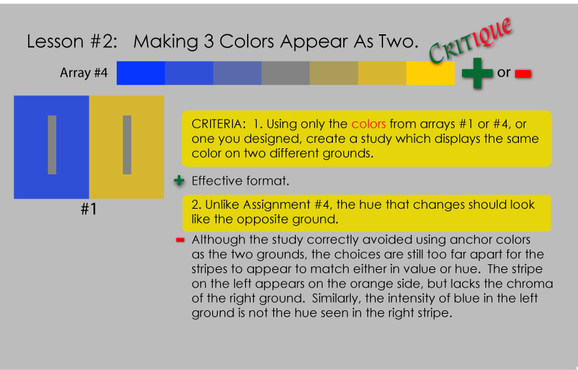
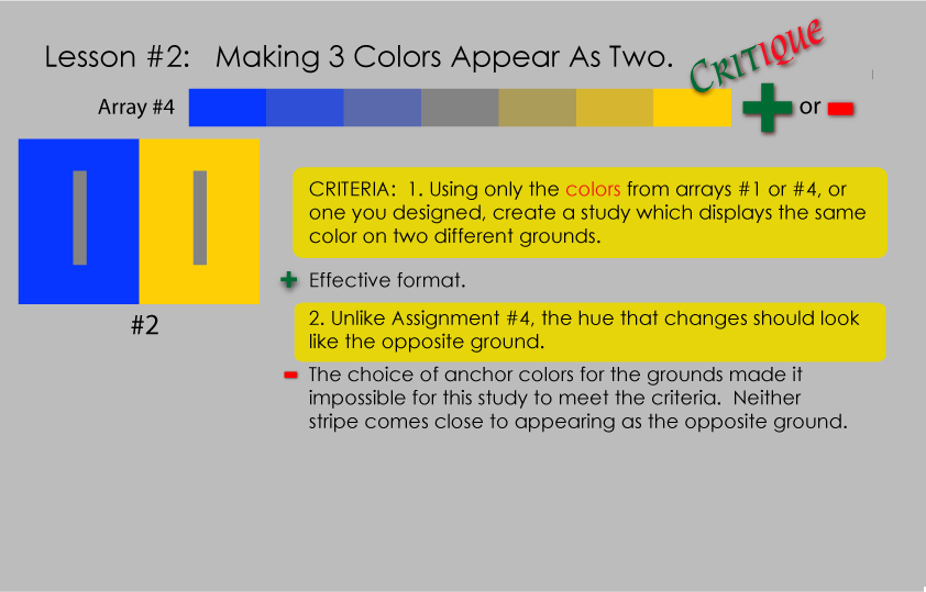
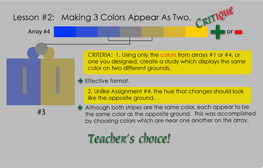
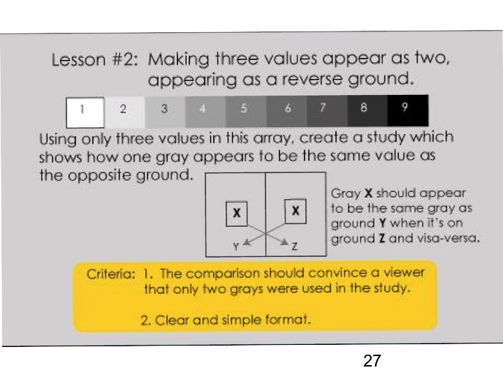
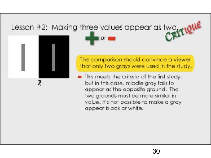
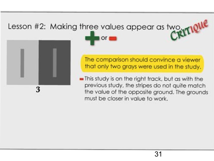
The second homework assignment is to create in color the same deception that we discussed in value in class: Make three colors appear as two. Notice the criteria highlighted in yellow; these are the criteria that will be used to critique each piece at the beginning of class next week.
Here is assignment two for both value and color on one page.
[gview file=”https://dicknelsoncolor.com/wp-content/uploads/2013/09/Lesson2Combined.pdf”]
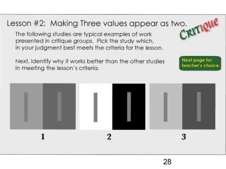
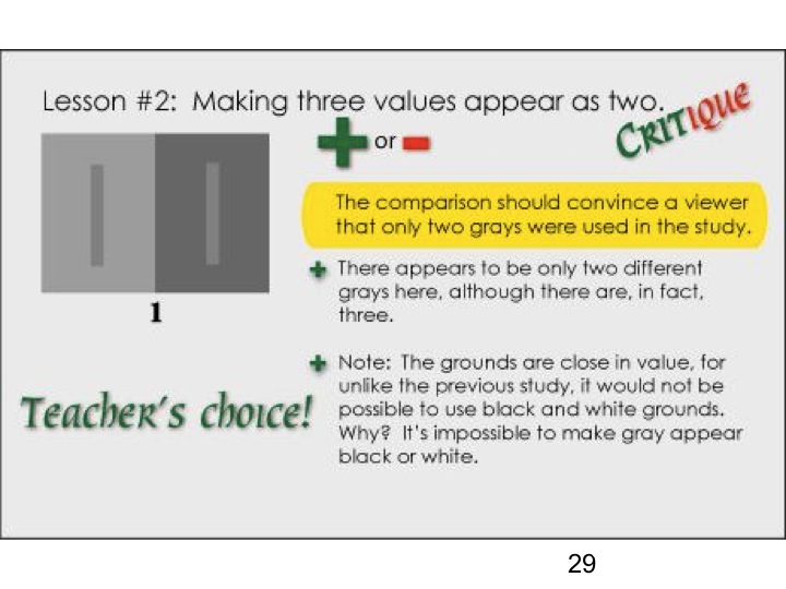
The hypothetical student solutions and their critiques below may give you some clues, help you understand how the criteria will be used, and help you evaluate your own work, prior to bringing it in for class critique next week. (Click to view larger.)
Reviewing the value deception exercise criteria, solutions, and critique (slides 27-31 in the Class Materials section) may also be helpful.
3. Observe and critique
Develop your critical eye. Share some examples in class next week.
[gview file=”https://dicknelsoncolor.com/wp-content/uploads/2013/09/ColorRelationshipIDWeek2.pdf” height=”360″]
For example, here’s a little gallery. Which pieces are freaks? How can you tell?
-

- A
-

- B

-

- C

-
- D
-

- E

-

- F
-

- G

-

- H

4. Exploitation
Look even more closely. Identify the phenomena we’ve been studying. Share examples.
[gview file=”https://dicknelsoncolor.com/wp-content/uploads/2013/09/ColDeceptExploitWeek2.pdf” height=”400″]
Class recap – some key ideas
Opening with a review of concepts from last week, we found some areas that needed reinforcement, explanation, or clarification:
- There are only two qualities of color that we need to worry about: hue (color) and value (light and dark)
- Halation is an optical phenomenon that occurs only when three or more colors in a family or array are adjacent. A single flat color displays an apparent gradation, due to an effect called “simultaneous contrast.”
- No single color will display halation on its own.
- Halation will not occur in the parent (end, or anchor) colors.
- Halation only occurs when the colors are arranged in a particular sequence.
- Watch Dick’s Homage video for more detailed explanations and examples
A descriptive analysis of the work of Josef Albers by former student Dick Nelson. This is followed with Dick’s animated collection of his own color studies which incorporate Albers format and his principles of color interaction. - There are three ways to reduce a color’s chroma (saturation):
1. Tinting (adding white)
2. Shading (adding black)
3. Toning (adding the complement)
This led right into our critique session of the first homework assignment: Make one color appear as two.
-
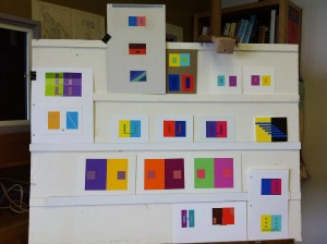
- Tuesday Homework, week 2
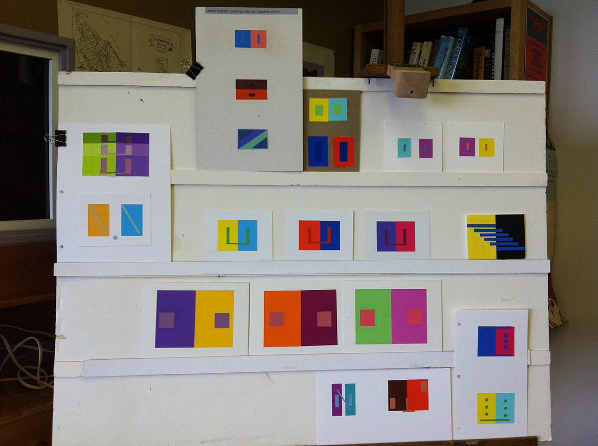
-
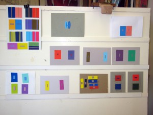
- Saturday Homework, week 2
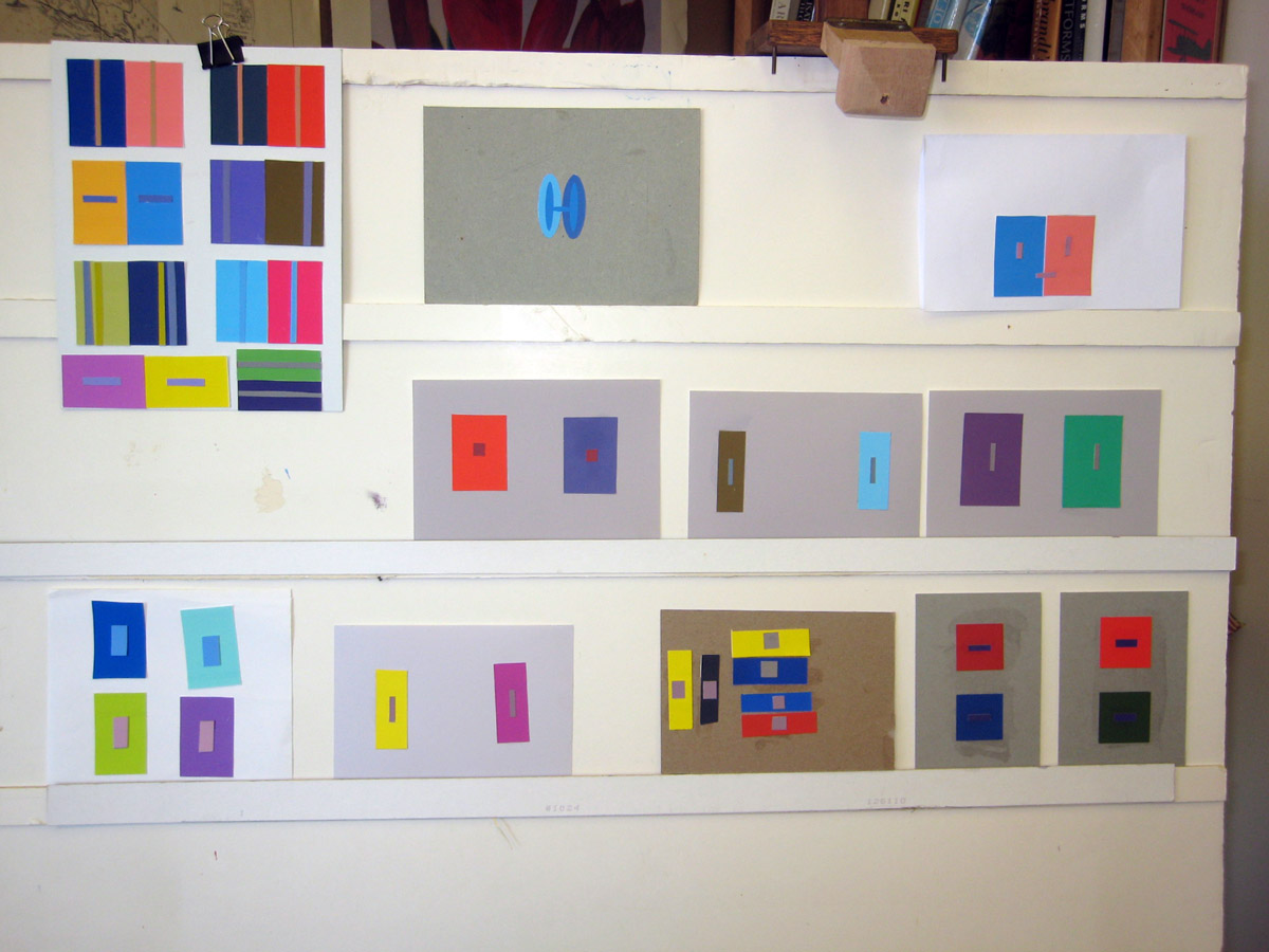
Critique session discussion, with the assignment criteria in mind, brought a deeper understanding of the problem and the solution.
- We analyzed the hue and value components of each element of the studies (figures and grounds) separately, and compared them: How do the two grounds relate? Which is darker? Which is lighter? Is the figure lighter or darker than the ground? What about the other pair? And so on.
- Identifying the primary components (yellow • , magenta • , and cyan • ) of a color made it easier to analyze how related or distant two colors were
Experiment with the Tri-hue demo to create and analyze colors! - Arrays with parents lacking a common primary caused more dramatic hue shifts in this exercise
- Using a tint or shade for the figure, with full-chroma grounds, introduced a foreign element (white or black, respectively) that made the solution look “off”
- The printed sheets are not necessarily accurate arrays. There was at least one “middle child” that clearly favored one parent more than the other. Rely on your eyes, not just a formula: Is your study convincing to you?
Dick showed selected video clips from the Albers Interaction of Color iPad app. A textile designer spoke with great confidence, but did not demonstrate any awareness of the kind of color interaction that can occur when working with arrays or families of color.
We watched a video about Albers’ Homage to the Square: Aurora narrated by an art museum curator. The colors in the painting do not have the kind of family relationship we’ve been studying, and it shows no halation.
These examples led Dick to exhort us to learn these principles ourselves so we can trust our own judgment, and not be misled by the pronouncements of self-proclaimed experts.
Dick showed the solutions, from Interactions of Color, to the same problem the class had addressed in today’s homework: make one color appear as two. With an understanding of arrays, and emphasizing the assignment’s criteria, to effect a convincing hue change, we critiqued the published solutions and identified ways they could have been made stronger.
Even Josef Albers’ published solution can be improved!
Class materials
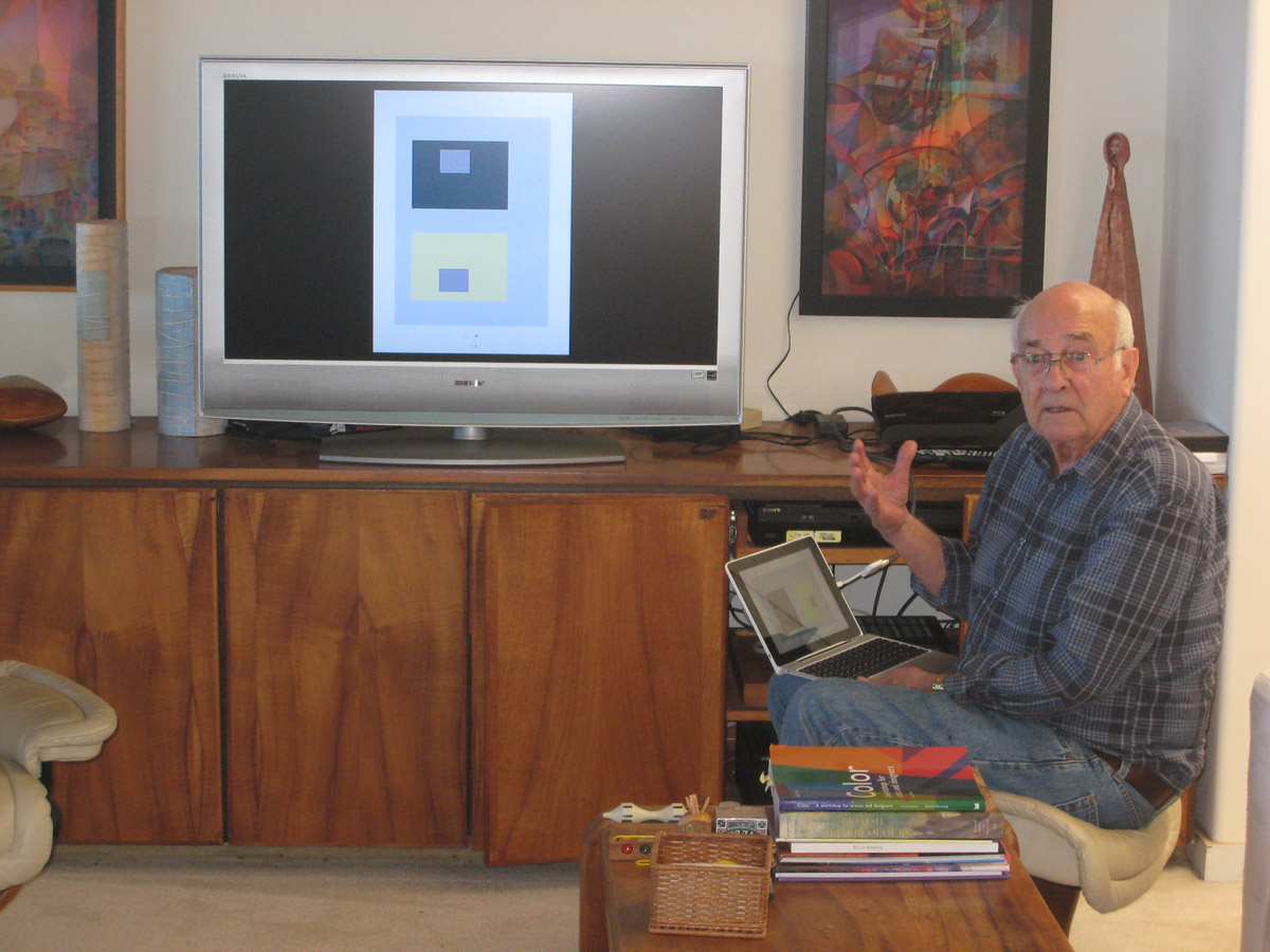
We talked through the new value deception exercise, shown below.
We watched a 30-second video with an animation dramatizing the color deceptions we are learning.
Watch a color change right before your eyes by simply viewing it against different backgrounds.


