Homework
The new homework assignment for this week is to create an illusion of a colored film, detailed below. Ongoing homework assignments, as in past weeks, are to 1) Create more convincing studies of previous assignments; 2) Identify “freaks” in artworks or publications; and 3) Exploitation: Identify halation or uses of color deception in your own or others’ works, or examples of films in nature or images.
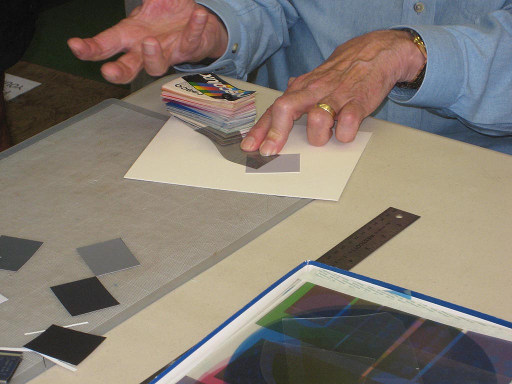
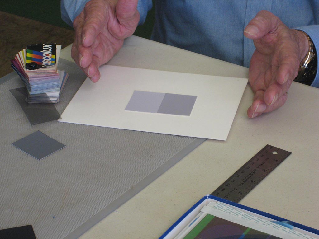
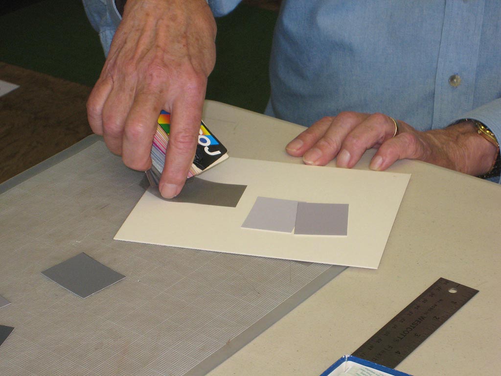
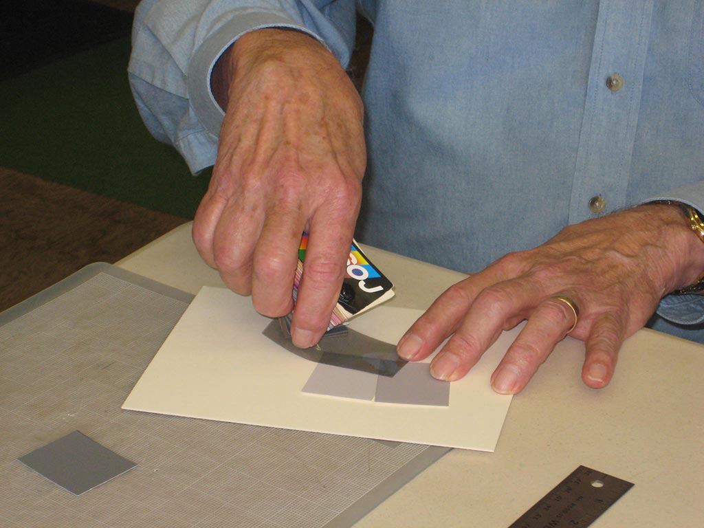
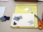
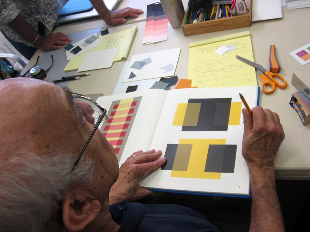
Here’s a sample solution and example of the collage inlay technique to use for this assignment.
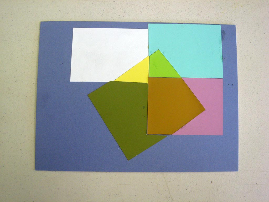
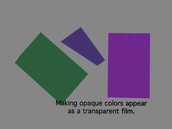
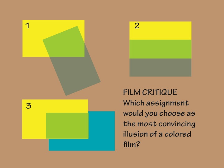
Illusion of a film: a collage inlay made only of opaque colors
Class recap – some key ideas
Critique – reworked assignments 1 and 2
Dick stressed the importance of getting into the habit of identifying the primary components of every color, until it becomes second nature. The goal of these assignments is to effect a COLOR change. If one parent is a shade or tint, its chroma is reduced, relative to one with full saturation, so it will be less influential – less dominant. Placing a tinted or shaded figure on higher chroma grounds introduces a foreign element, creating a “freak” and weakening the illusion.
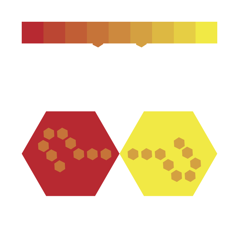
An array with its tints and shades. You’ll create the strongest color deception effects if you stay within the array with the most chroma: the base array, not tinted or shaded.
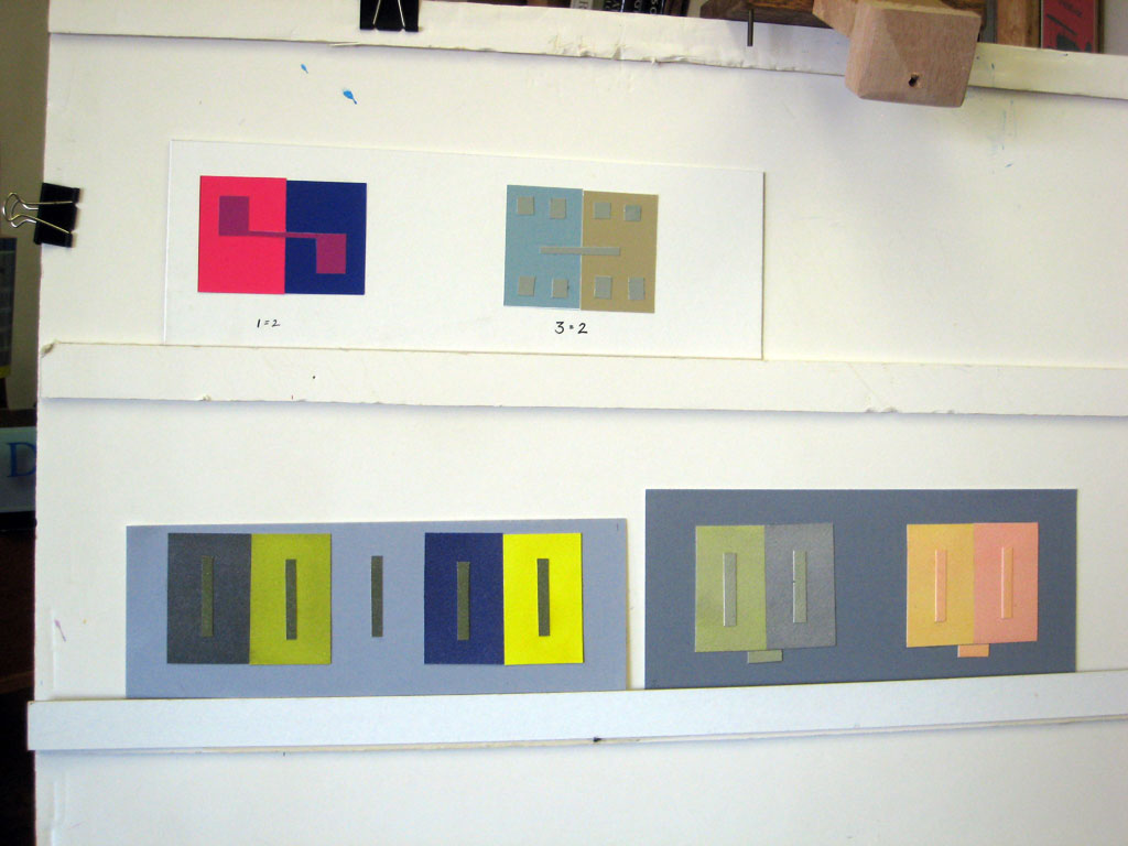
For assignment 1 (make 1 color appear to be 2, or 3 appear to be 4), choosing colors with very strong chroma (full saturation array parents) as the grounds, and a middle child as the figure, creates the most convincing illusion. The strong chroma of the parent essentially removes or subtracts its color from the child, making the child look more like the other parent in comparison.
For assignment 2 (make 3 colors appear as 2, or reversed grounds), the grounds cannot be as strong in chroma as for assignment 1. Just as it is impossible to make a gray look like white or black, it is impossible to make a mixed color look like a primary.
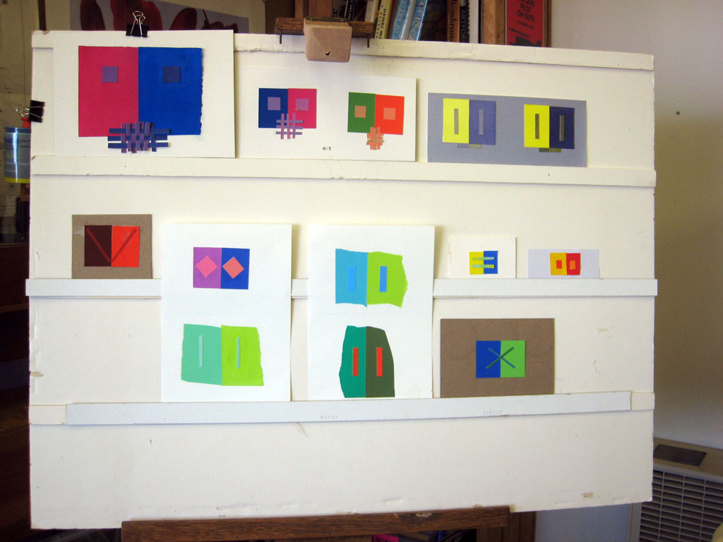
Critique – assignment 3
This was the third of the three color deception assignments. Refer to the detailed critique questions in last week’s summary.
1. What was I trying to do?
Make four colors appear as three. Show how two colors can appear to be the same, as well as very different. Design a unique array with dominant anchors. Design a unique format.
2. Did I do it?
Did I create a convincing illusion? Did I show how two colors looked the same, but were actually very different? Is my format unique and effective? Is the illusion as dramatic as possible?
For assignment 3, the grounds (parents) should be very different from each other, and the figures (children) have to look alike. A common mistake was having the figures reversed, creating an effect more like assignment 1. Putting the figure (child) on the ground (parent) that it most favors was the key to making this illusion convincing. The strong chroma of the parent “sucks out” that color from the child.
3. Was it worthwhile?
Where can I use this in my own work? Does this help me see why a particular piece didn’t work as well as it could have, or why something appears magical and I didn’t realize how it was done?
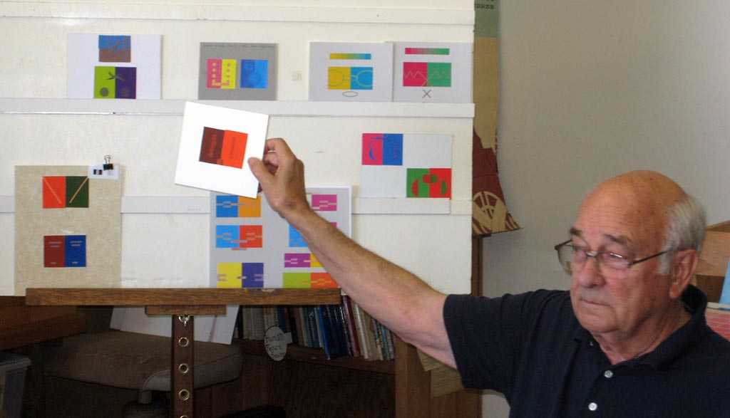


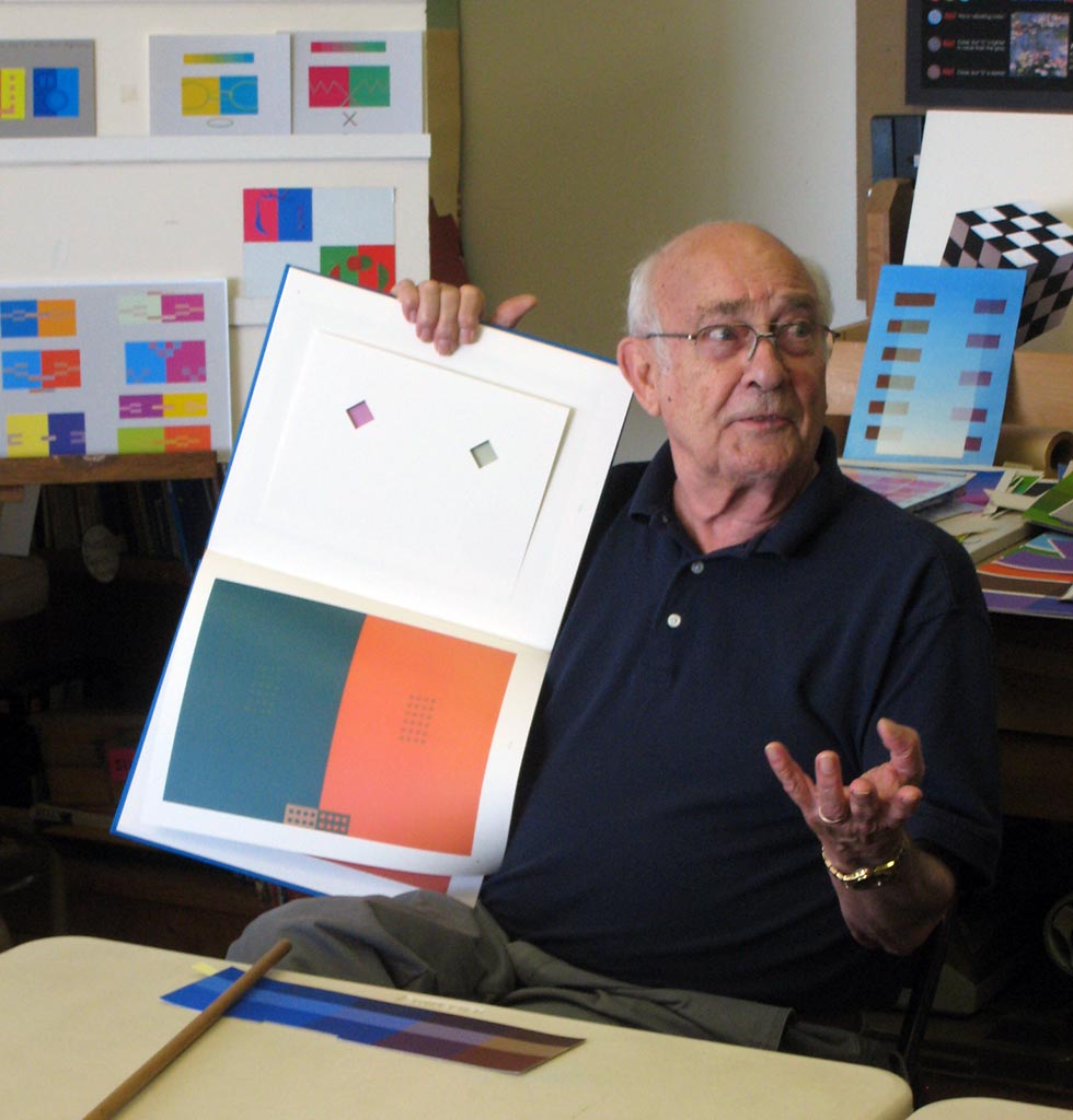
Dick described how his own piece in the Albers book could have been improved
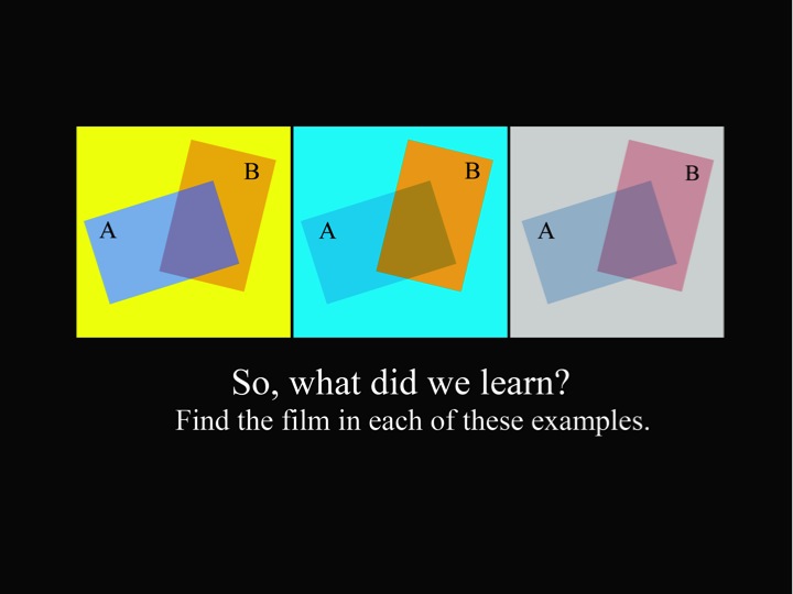
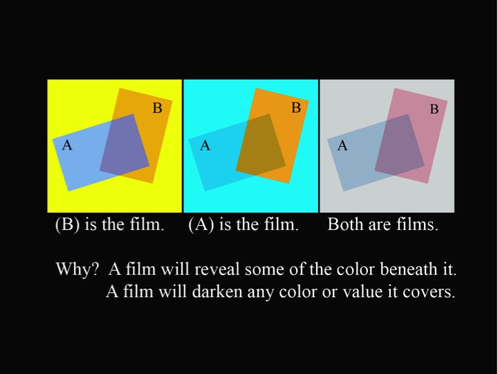
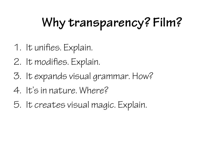
This week’s new concepts: Films and Gestalt
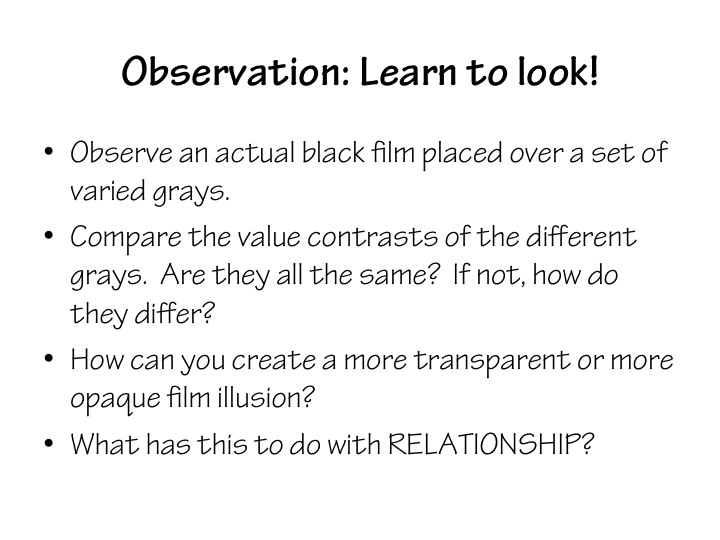
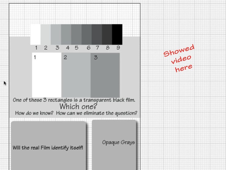
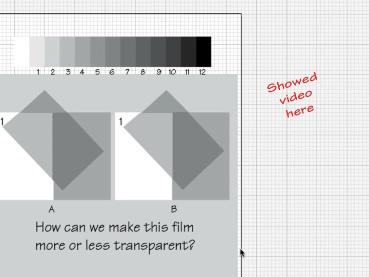
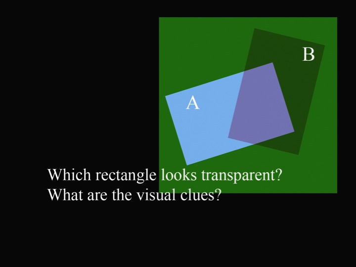
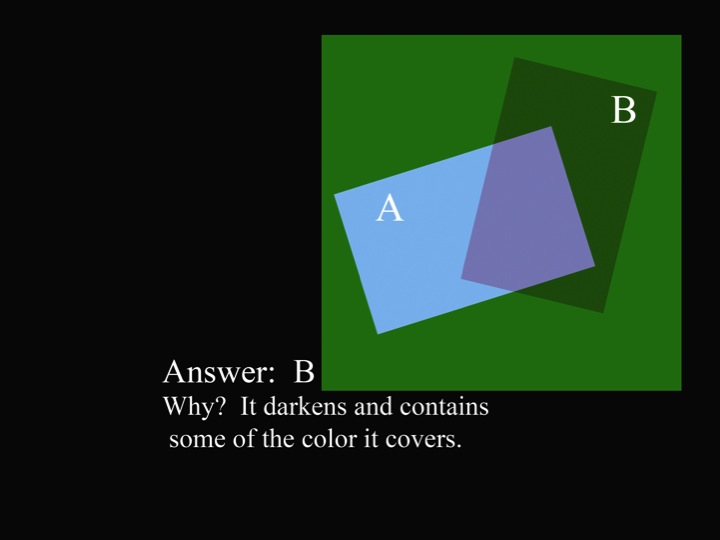
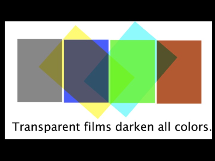
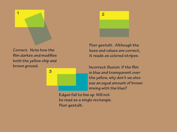
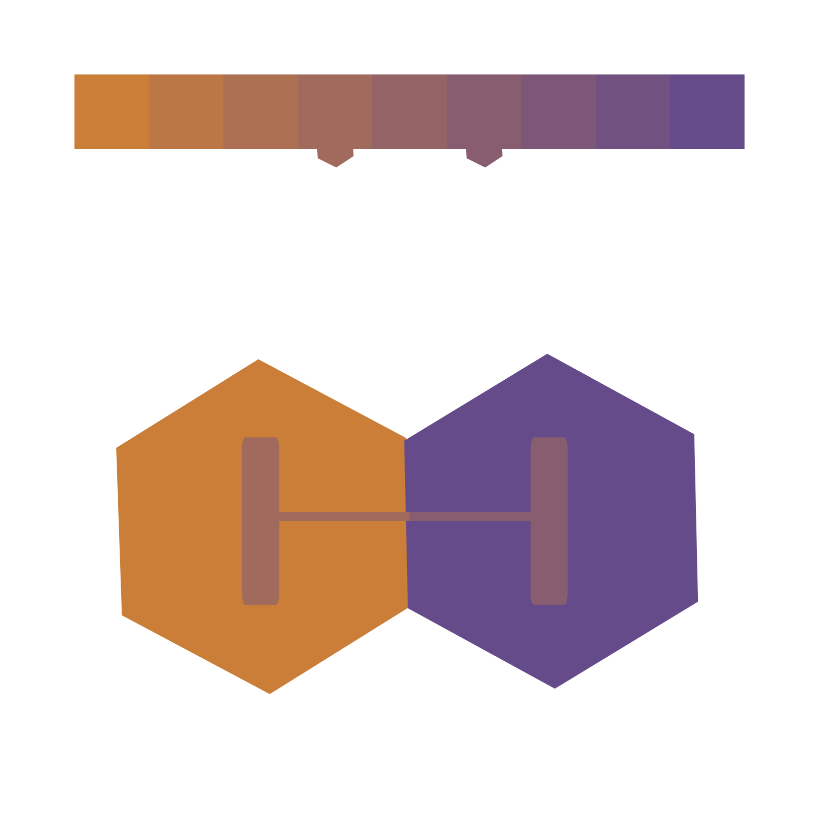
The new material this week concerned films. What are they, where are they found, why should we care, and how can we use them? The key fact to remember about films: they will always darken any color they cover.
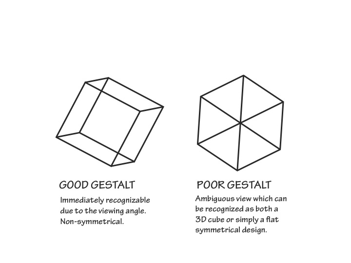
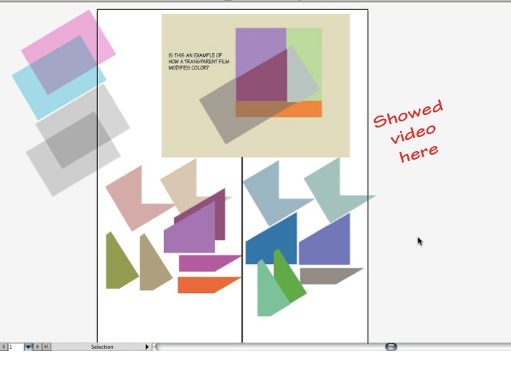
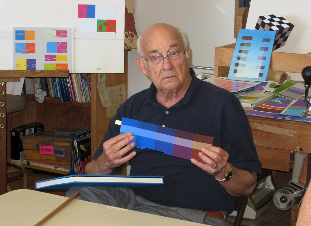
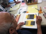
Placing a transparent black film over gray chips, Dick demonstrated how a film behaves. He also showed how to create, in a collage of opaque gray pieces, the illusion of a black film. Video tutorials of film illusions, in gray scale and in color, supplemented the materials below. The pieces must be cut and placed very precisely in order to create a convincing illusion – one with good Gestalt.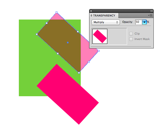
If you’re working in Illustrator, you can make an object behave like a film by using the Transparency panel to reduce its opacity and set its blending mode to “Multiply”. This can be handy to check your homework, but please use opaque colors to create your illusion, just as if you were working in paper!
-
- The illusion of a film. Example collage created with opaque pieces of gray paper

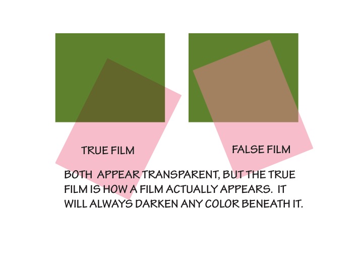
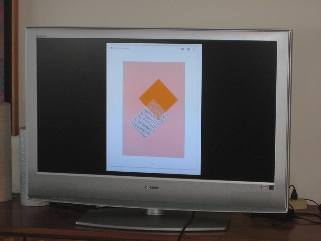
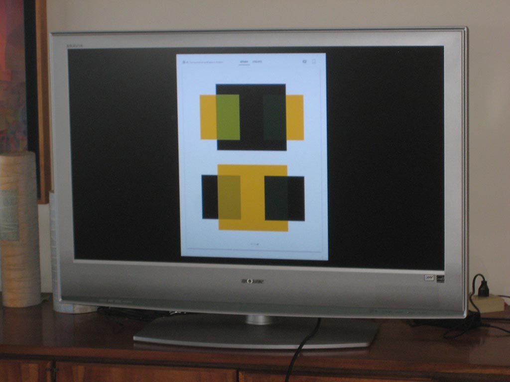
In Dick’s studies with Albers at Yale, they created illusions of transparency, but he recognizes now that they were creating false films – the studies do not demonstrate how real films behave. We critiqued the two transparency illusions below from the Albers app and book.
-
- Critiquing an example from the Albers book. True films behave consistently, darkening all colors beneath them. These do not!
Class materials