Homework
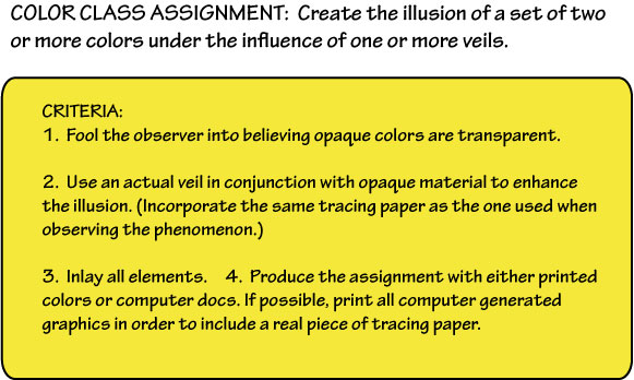
The new homework assignment is to create an illusion of a veil, as detailed below. Ongoing assignments are to identify examples of color deceptions and halation (exercises 1-3) and visual phenomena (films and veils) in nature, or in your own or others’ work. Create improved versions of any past assignments. And be on the lookout for freaks, and evidence of your own increasing visual sophistication or color snobbery!
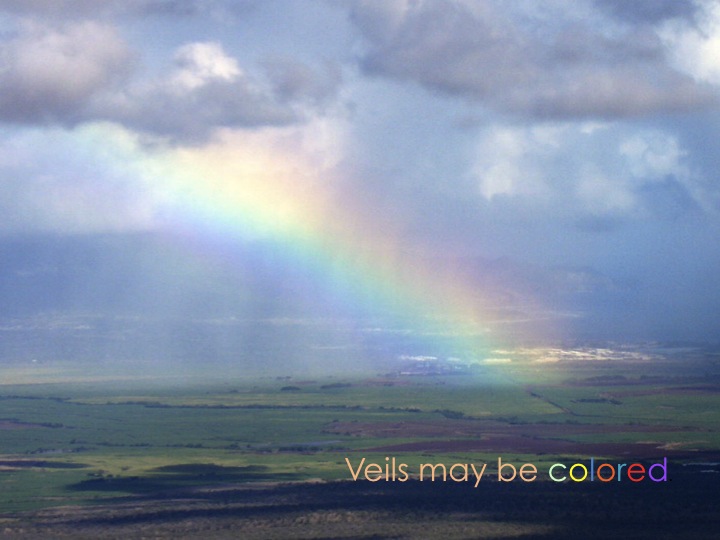
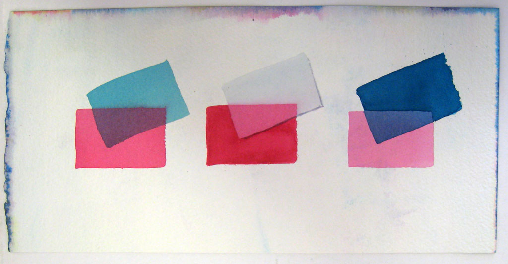
Here’s an example:
Class recap
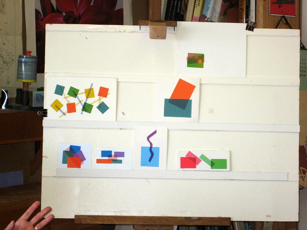
Critique – reworked assignments 1, 2, and 3
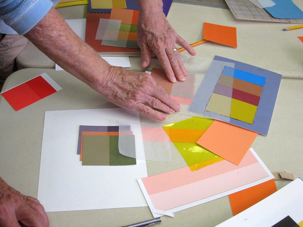
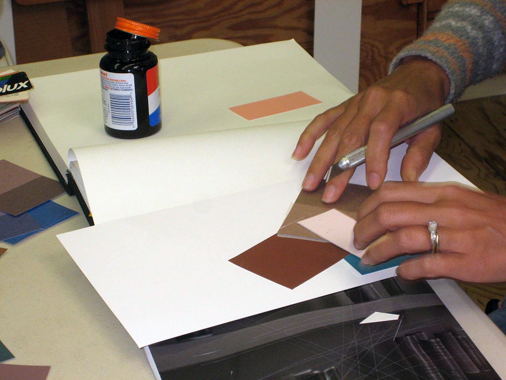
Assignments 1-3 were about color deception – fooling the viewer’s eye with our choice of color. To have a strong influence, a color must have a lot of chroma, not be wimpy. Primary colors, and other full-saturation colors (those on the outer rim of the color wheel) have the most chroma. Any color that is tinted, shaded, or toned has less chroma. You can pull off these deceptions with non-saturated colors, but the most dramatic and surprising results will come from using saturated colors, particularly complements. These are the colors to choose as the array parents, and grounds, for assignments 1 and 3. For assignment 2, the colors must be less saturated, and closer in hue, but can still have quite a lot of value contrast.
Quiz and review
The latest exercise (illusion of a film) added to the first three the element of consistency in order to pull off a very specific illusion.
While films darken all colors in a consistent manner, their relative contrast over light colors is greater than over dark colors, due to a mathematical relationship called the “Weber-Fechner Law,” something we won’t study in class but which is described in Interaction of Color.
Several people shared experiences of their growing “color snobbery.”
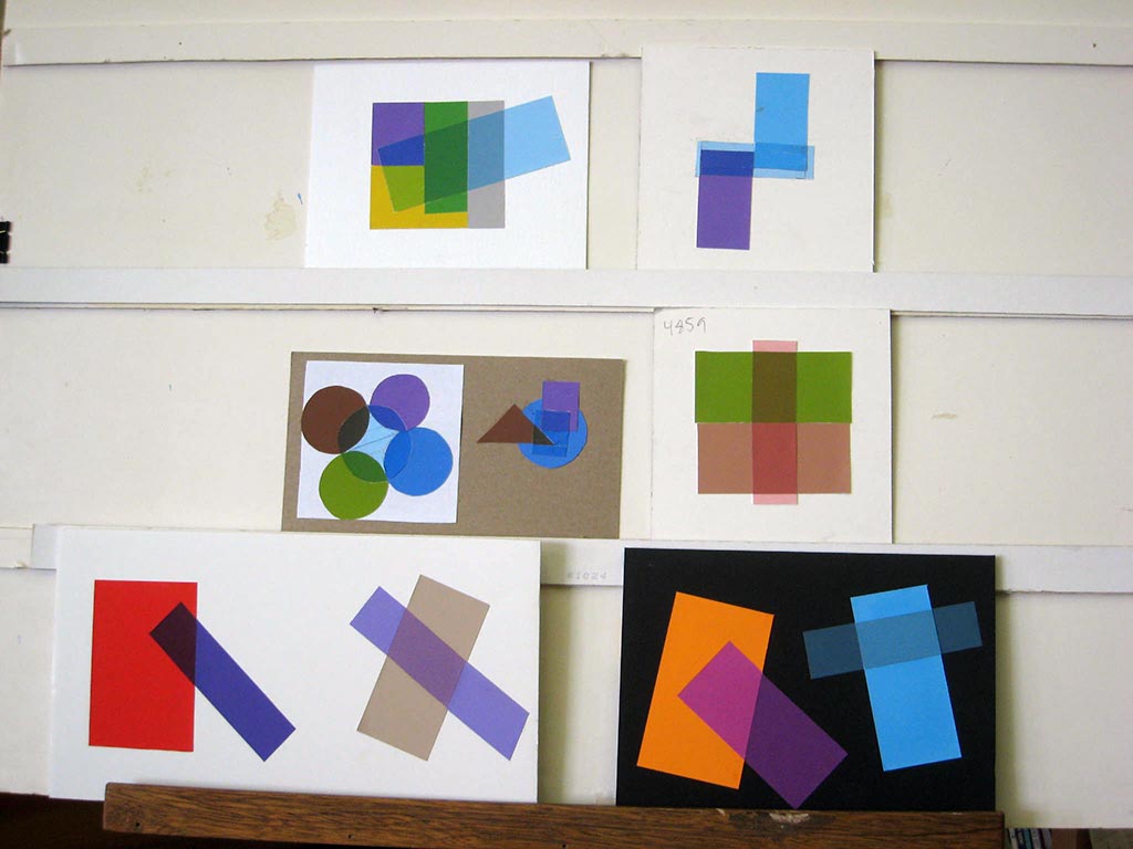
Critique – illusion of a film
Tuesday homework: Illusion of a film


Saturday homework: Illusion of a film
Remember the key fact of films: they darken any color they cover. They CAN be made from an array, but not all arrays will create the illusion of a film. Instead, they often create a “false film” – an illusion of transparency, that doesn’t behave as a film does in nature. This was never recognized in Dick’s time in the Albers course, or in the examples published in the book or app. They also failed to recognize that the film had to affect the support (background) in the same way it affected the figures in the study. The most familiar example of a film in nature is a shadow. Shadows darken all objects under them in a consistent manner.
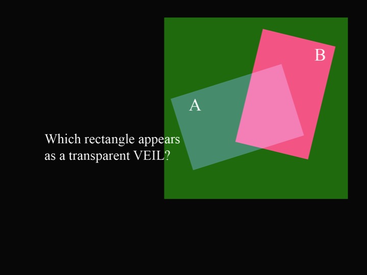
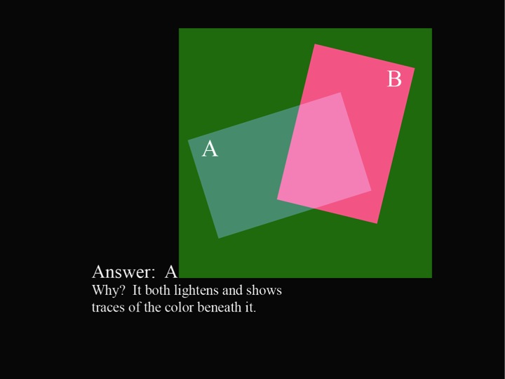
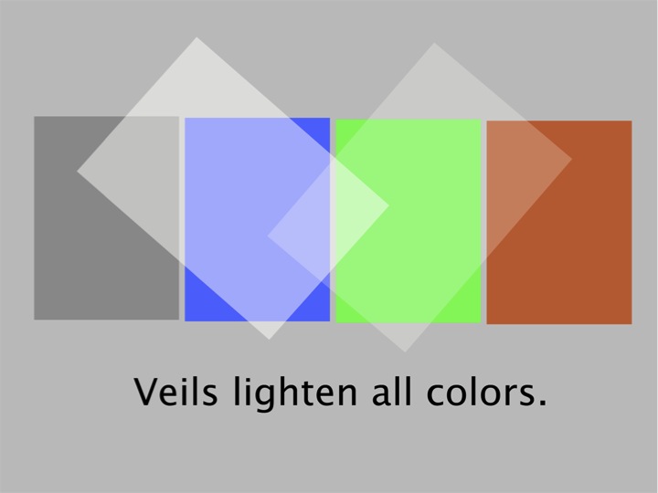
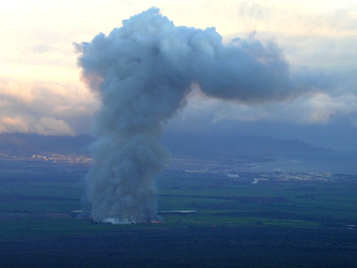
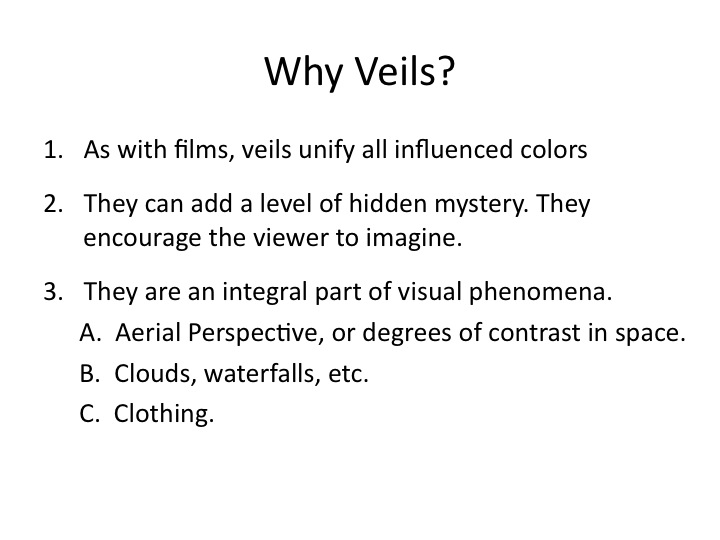
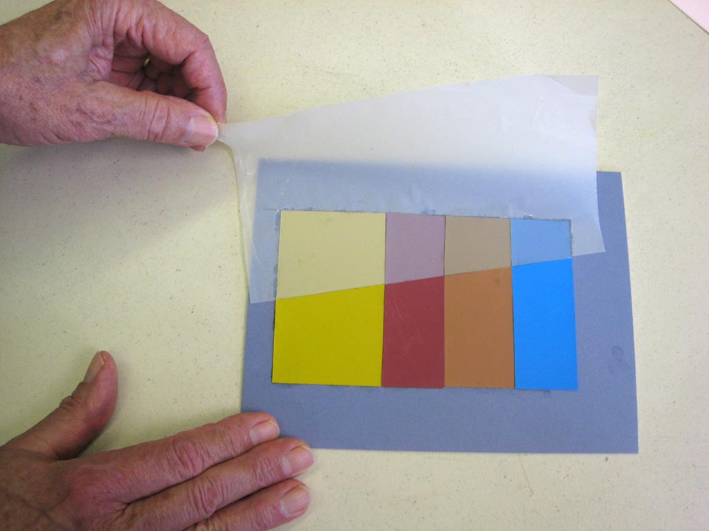
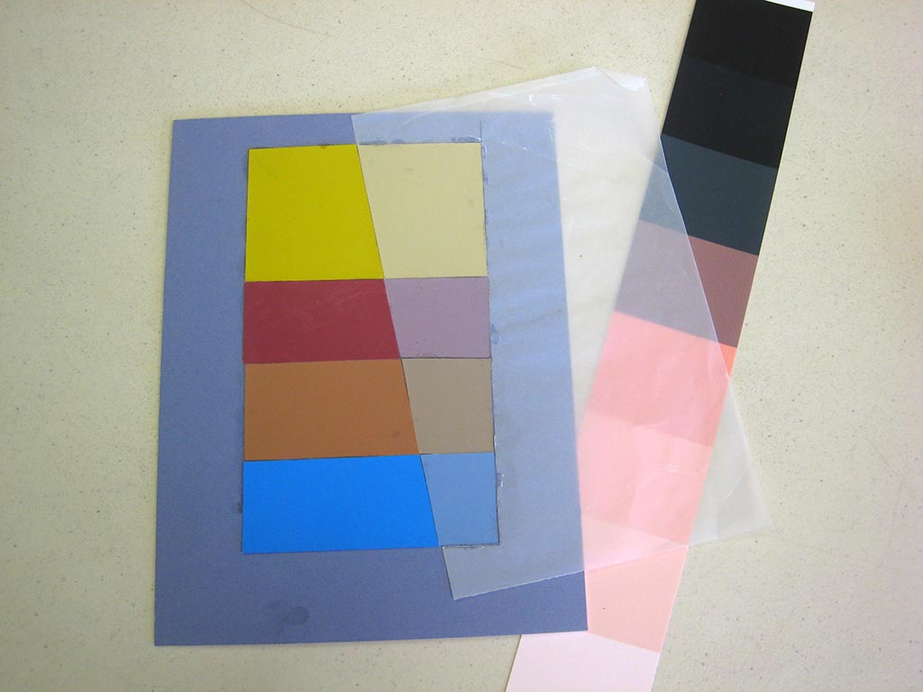
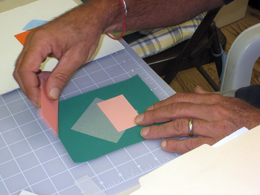
This week’s new concept: Veils
The key fact to remember about veils: They will lighten every color they cover.
These visual phenomena – films and veils – enrich our vocabulary for visual communication. You may choose to use them, or not, but at least be aware of the choice. You may want to make a conscious effort to include films or veils, or create halations. Create a checklist for yourself of elements of visual grammar from which to choose. You automatically create harmony in your work when all parts behave as they do in nature. Mastering visual grammar will let your art speak more eloquently and effectively.
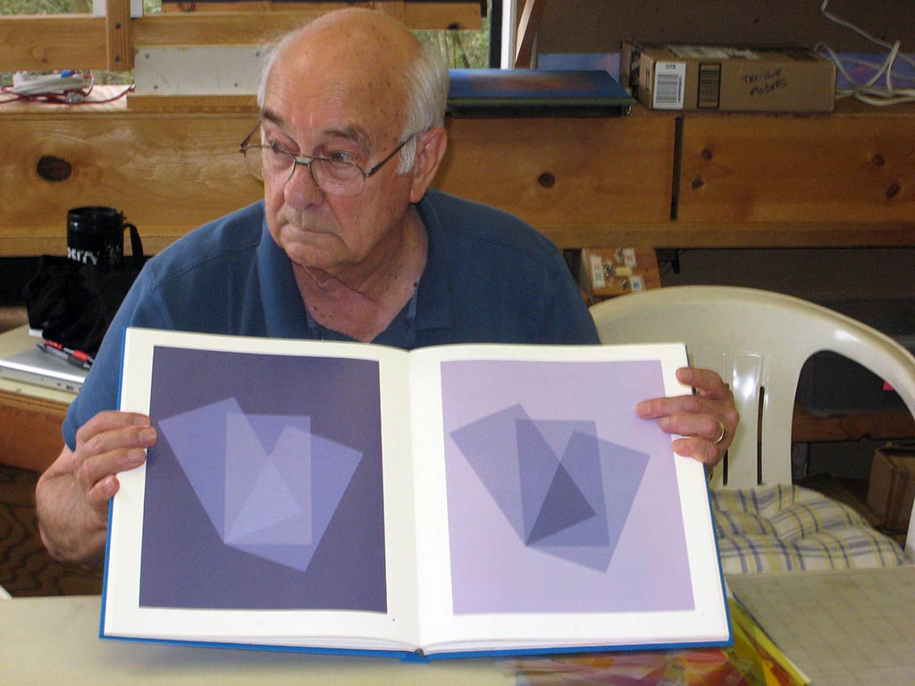
Successful veil and film transparency illusions from the Albers book
What do you see? How were these created?
Class materials
Here is the presentation on veils. Notice the parallels to films!