Homework
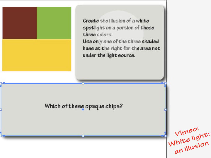
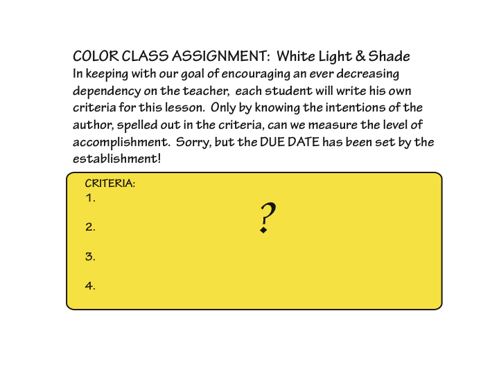
Create your own assignment and criteria for a light illusion, as described below. Rework or refine any previous assignments. Look for positive and negative examples.
[gview file=”https://dicknelsoncolor.com/wp-content/uploads/2013/10/WhiteLiteAssign.pdf”]
Class recap
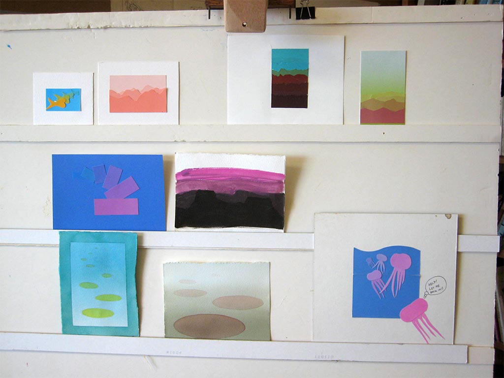
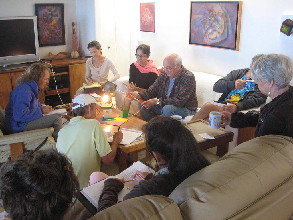
Critique – reworked assignments 1-5
New or improved versions of previous assignments were reviewed and critiqued. Class members helped each other see where the illusions succeeded, and where they were incorrect or could be made more convincing. The authors accepted the criticism openly and plan to rework them.
Critique – Assignment 6, Volume color
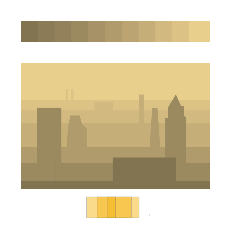
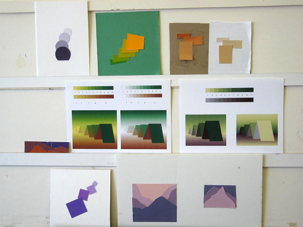
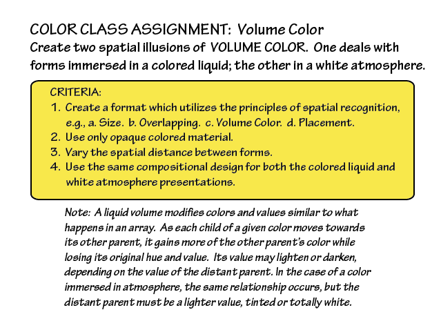
The assignment was to create spatial illusions of volume color utilizing principles of spatial recognition. Two renaissance discoveries, linear and aerial perspective, are key (see PDF at the bottom of the Week 6 page). A lovely benefit from using arrays was the sense of “mist” in the valleys between ridge lines, thanks to halation.
Dick is getting “picky, picky” in the critique, with the intent of making each person the best artist they can possibly be: “You owe it to yourself.” You’re producing studies in these exercises, not works of art, but they should still be executed with professionalism and craftsmanship. No real artist wants to be just “good enough.”
In volume color, whether it’s liquid or air, the “background” is key, because its color influences all objects in it. If that context is missing, the illusion falls apart. Use an array with the volume color and object color as the parents.
Tuesday homework: Volume color


Saturday homework: Volume color
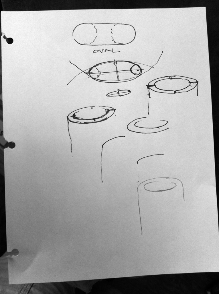
In perspective, the major cues to depth and distance are size, overlap, vertical position on the page, and color. Fine corrections included maintaining the same proportions for repeating elements, consistency between size changes and color changes, and reducing the vertical dimension of ellipses more than the horizontal as they recede. Dick sketched differences between “ovals” and “ellipses”, and demonstrated how simply varying line weight could differentiate closer from further, and communicate qualitative differences between sharp and rounded edges.
-
- The vertical dimension of ellipses decreases more than the horizontal as they recede

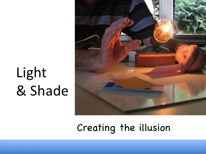
This week’s new concept: White light
An artist starts first with observing very carefully. Using a bright light, Dick set up a scene enabling the class to pay attention to how we perceive light. Our main cue is shadow. The brighter the light, the more contrast between it and its shadow – the shadow appears darker. Questions aided careful observation and appreciation of the phenomenon:
- What tells us that we are looking at a white light on color?
- What determines the dimensions and placement of the cast shadow?
- What determines the hue and value of the shades?
- Why light? What does light do for the composition?
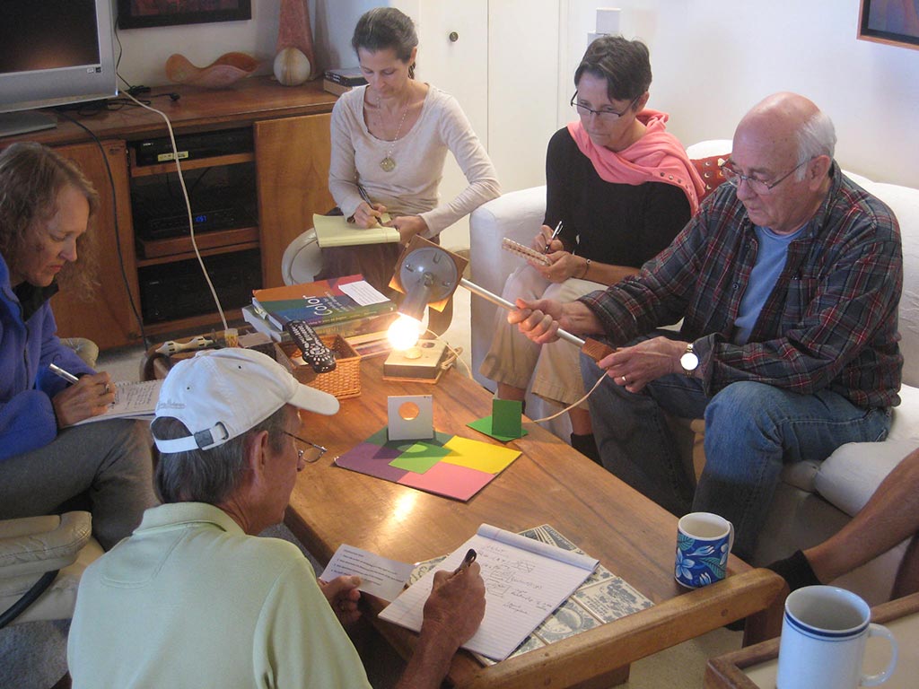
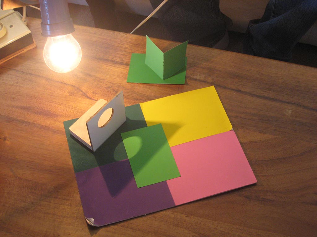
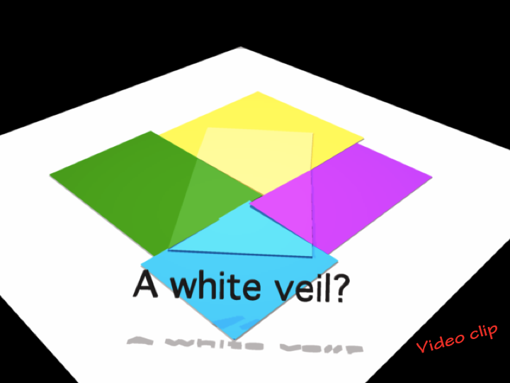
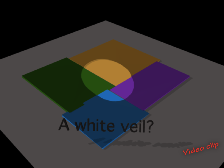
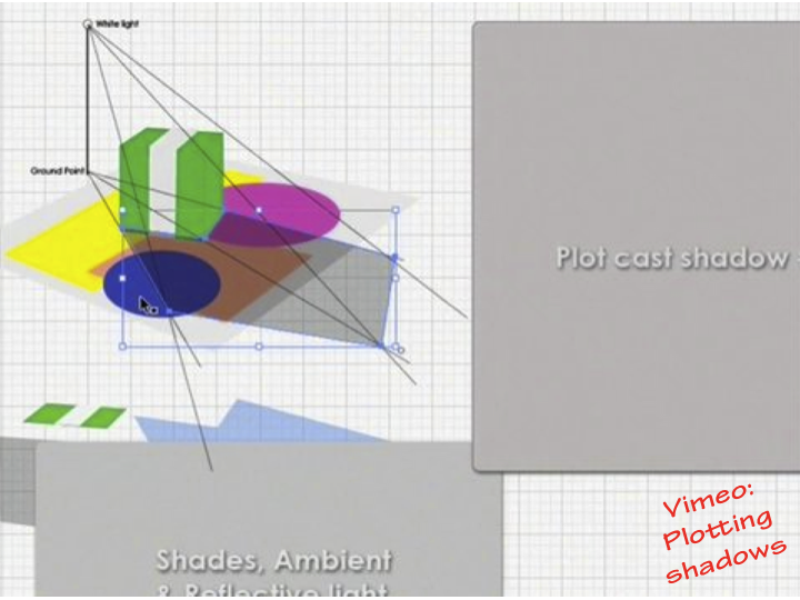
Videos demonstrated how to create an illusion of light and shadow using opaque colors in a collage, and how to plot cast shadows for an imagined scene (see Class Materials section below). The color of a shadow is the complement of the light color, so a white light casts a black shadow. The brighter the light, the darker the shadow. For an outdoor scene, the shadow color is slightly blued by the ambient light of the sky. Strategies for creating illusions of light and shadow in watercolor and oils were discussed. For watercolor, mix up one gray and use it for any shaded or shadowed area. In oil, a thin black glaze can be used in the same way, or the artist must precisely mix shaded versions of the local colors.
[one-half]
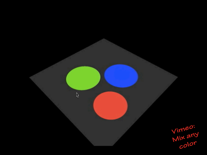
The relationship between colors of light and colors of pigment is explained in the “Mix any color” video below, and in the poster linked to at right. There are a lot of other resource materials available at that website, designed for teaching science in California.
[/one-half][one-half last=”y”]

Color concepts: light and pigment
[/one-half]
Class materials
A tutorial for artists who wish to incorporate the illusion of a light on a variety of hues and values.
Without light, there can be no color. This animation demonstrates mixing the primary colors of light and of pigment, and the relationship of light primaries and pigment primaries. In either medium, the primaries can be combined to create any color imaginable.
A tutorial on plotting white light and its cast shadow.
[gview file=”https://dicknelsoncolor.com/wp-content/uploads/2013/10/WhiteLightShade.pdf”]
[gview file=”https://dicknelsoncolor.com/wp-content/uploads/2013/10/Light-ExerciseC-Converted-copy.pdf”]
[gview file=”https://dicknelsoncolor.com/wp-content/uploads/2013/10/Plot-Shadows.pdf”]


