The fifth session of the Color Relationships class for Fall 2014 was held on Friday, November 7. We tried to find Color-Aid swatches of equal value; discussed real-world observations of luminosity through equal value in an autumn forest scene with Kit Gentry; critiqued the warm-cool color transposition exercises and free color studies; and had a demonstration of creating luminosity in watercolors. This was the final session of the course so there was no new homework assignment. A six-week follow-on class will be offered beginning in January, covering the visual phenomena of films, veils, volume color, white light, and colored light.
Class recap – some key ideas
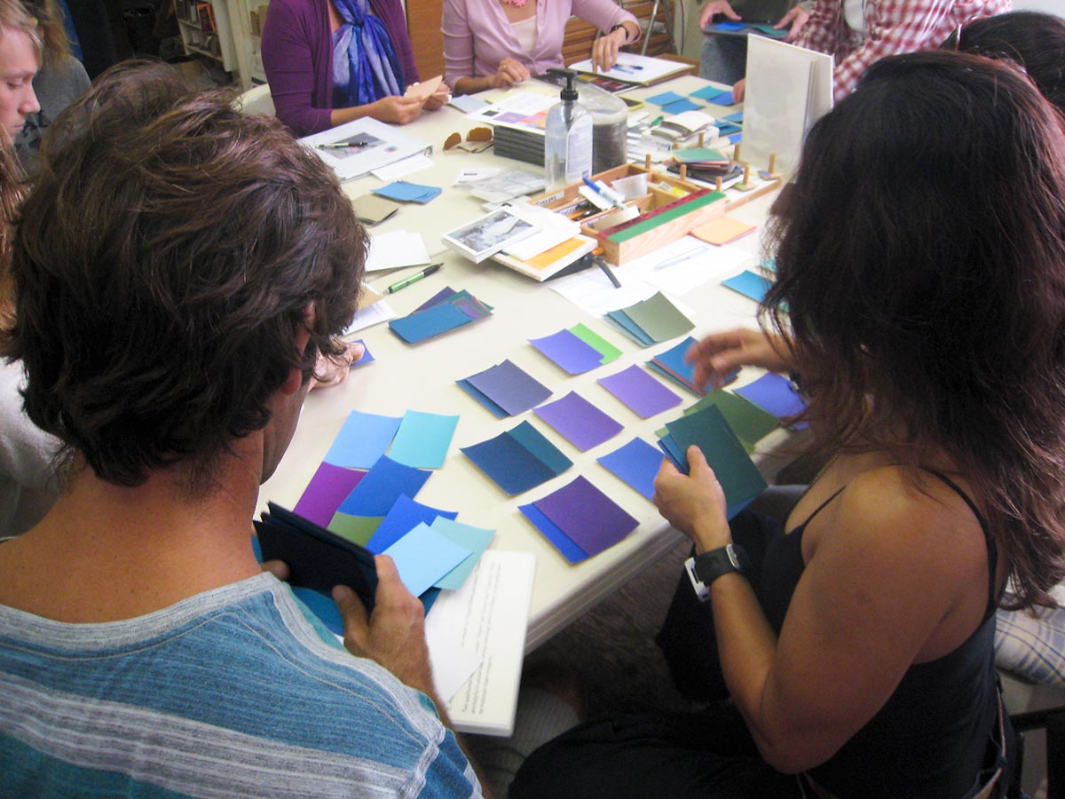
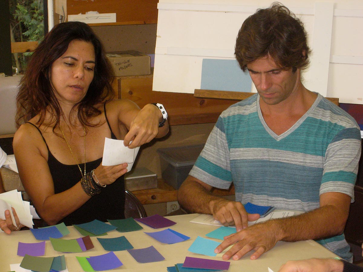
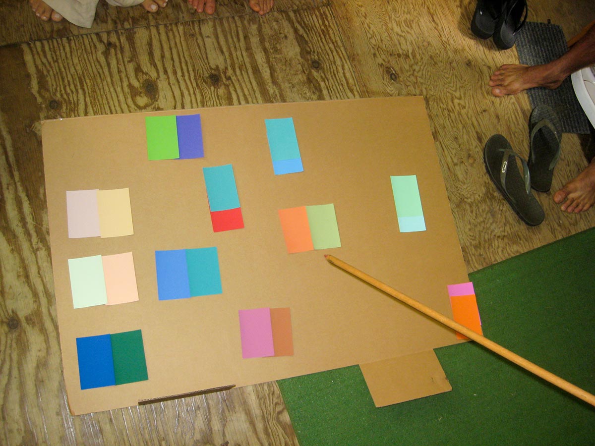
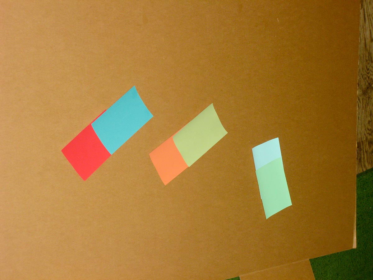
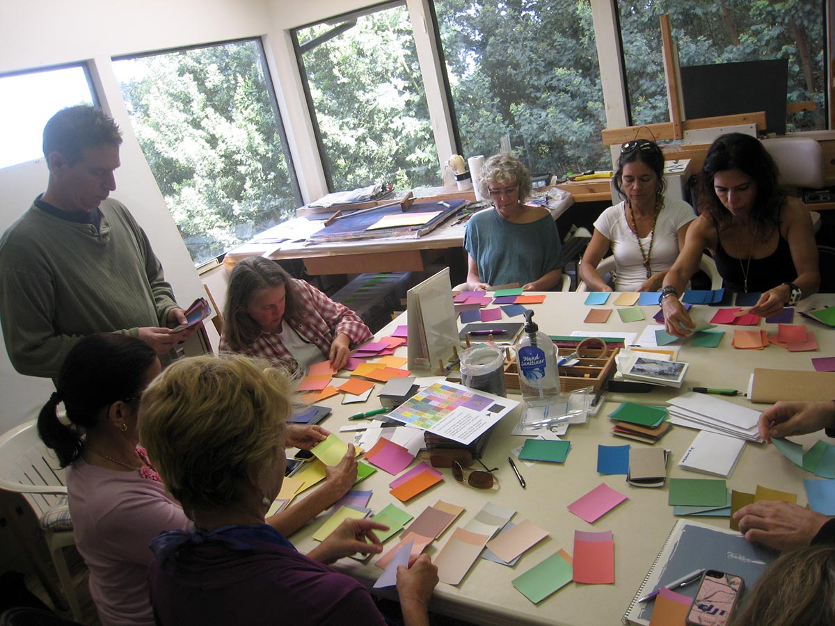
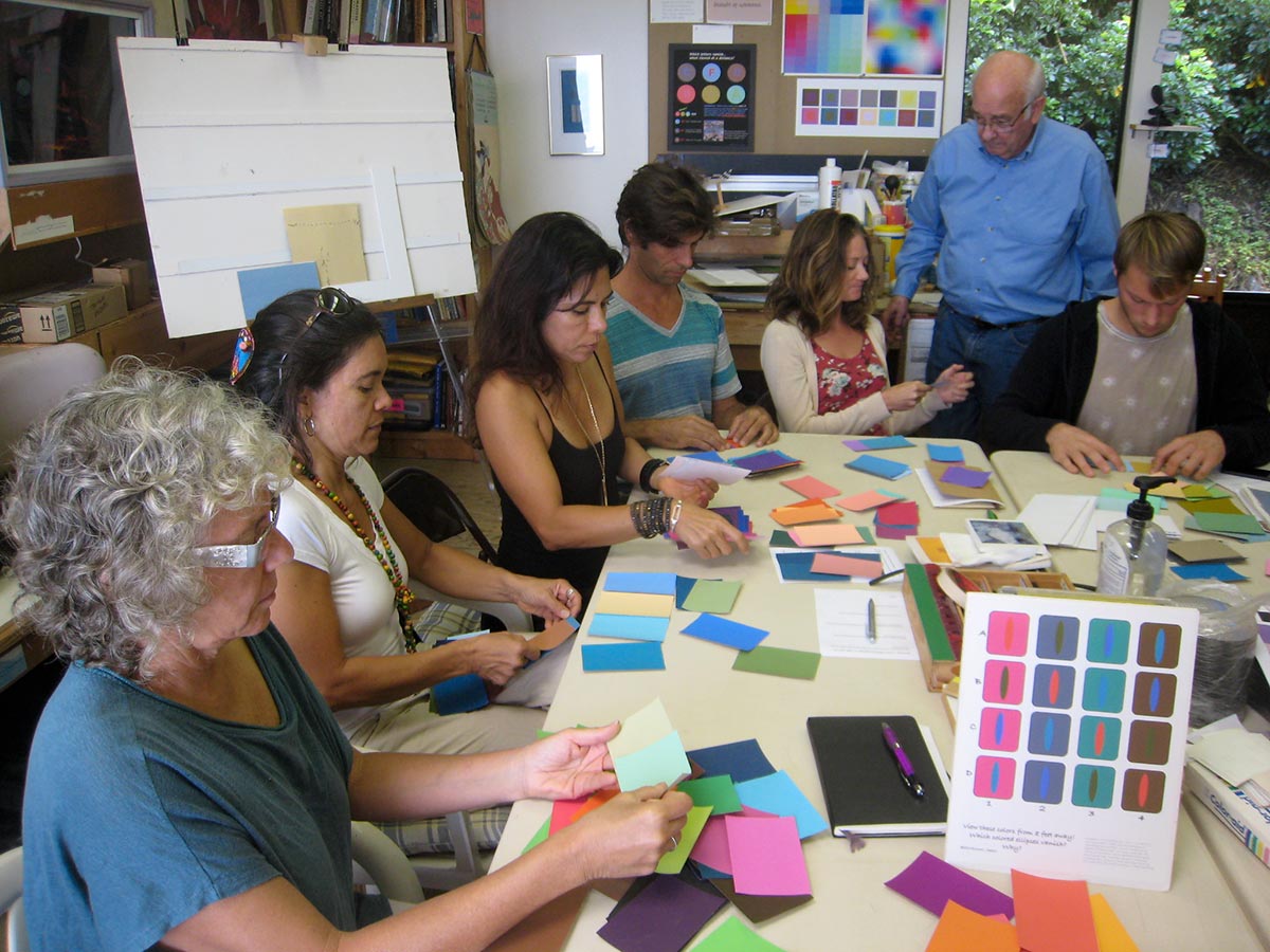
In-class exercise: Find two color chips of equal value
Judging the value of different colors is very difficult. When the hues are different, we have trouble telling which is lighter or darker. Working with swatches of Color-Aid paper, Dick gave the class a couple tries, to start to build skill at value discrimination. After each person had selected a pair of swatches that they thought were equal value, the whole class compared them all, weeding out those that obviously weren’t equal value and discussing close calls, until finally three sets were left that were close.
Kit Gentry: Equal value and vanishing boundaries
Kit Gentry joined us by Skype. He is an artist who used to live on Maui, and now lives near Smoky Mountain National Park in Tennessee, where he finds dramatic and inspiring scenery. He took Dick’s color class a few years ago, and recognized that incorporating vanishing boundaries into his oils and pastels would enhance their luminosity. Discussing the photo below, of Kit photographing trees in an autumn forest, he talked about how the brightly colored leaves were all close in value, and nearly the same value as the gray tree trunks. He described working on a painting of such a scene and feeling that the colors were overplayed. In Photoshop, he sampled colors from his reference photo and put them on a white background, where every one seemed almost gray, but when interacting with each other, they seemed vibrant and much more saturated. “Nature is essentially gray,” he said.

Kit Gentry in an autumn forest in Tennessee. More photos from this location are available on his website.
Kit’s website has detailed descriptions and close-up photos of many of his paintings, and some are for sale through Village Gallery in Lahaina and Viewpoints Gallery in Makawao. Kit frequently adds new photos to his Facebook page.
Critique
Transposing warm and cool colors of equal value
Everyone reported that this was a hard exercise. On most of the homework samples, the cool inside squares were too dark. Dick advised not to choose a pale yellow for an outer warm color; it’s too hard to find a cool color to match it, because they tend to be darker. One person noticed that sticking with one hue each for outer and inner (as in 11, 13, and 14 below) made matching easier than having four different hues for each (as in 12).
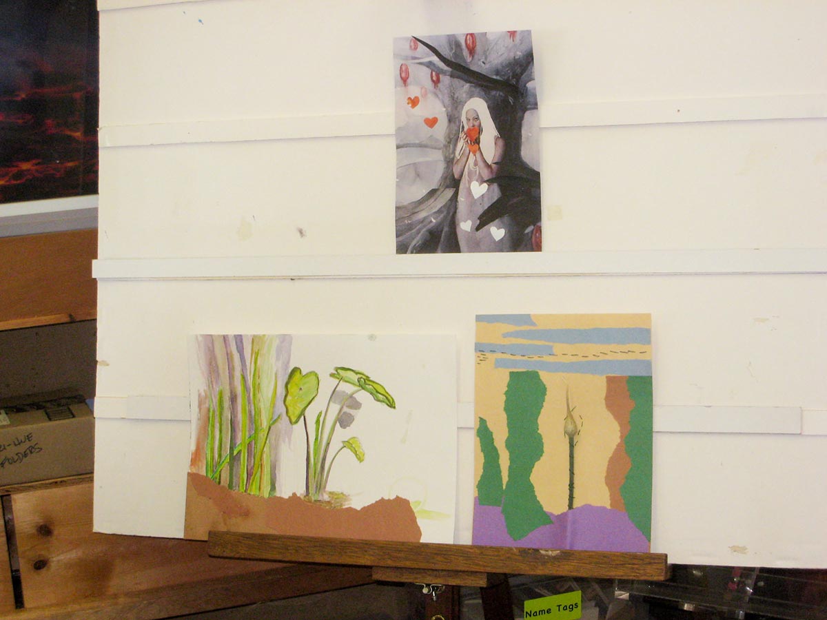
Free color studies
The main critique of the free color studies was that they were more about subject matter than color. Free color studies should be about color, and only incidentally about shape. Dick advised staying away from recognizable subject matter, so the critique could focus on color and not be distracted with meaning and interpretation.
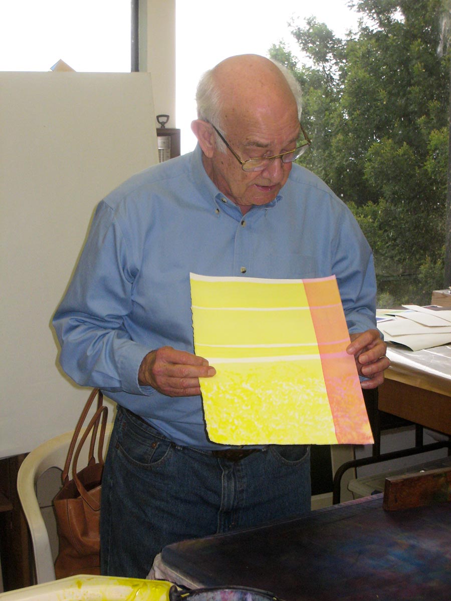
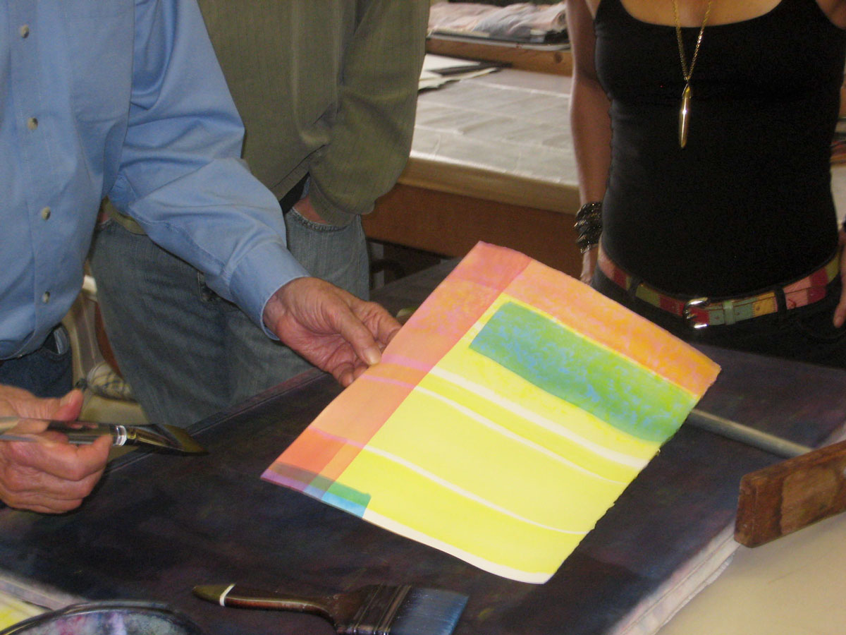
Watercolor demonstration: Equal value, vanishing boundaries, and halation
Dick demonstrated how to achieve equal value, vanishing boundaries, and halation in watercolor. He started with strips of solid and mottled yellow, then laid in stripes of magenta and cyan over it. Because the yellow is so light – so close in value to the white of the paper – neighboring values of cyan and green, and magenta and red, are also nearly identical, creating a luminous, sparkling effect, much more engaging because of the optical mixing than areas of solid color would be. No matter how many further layers are added, this relationship remains.
A six-week follow-on class will be offered beginning in January, covering the visual phenomena of films, veils, volume color, white light, and colored light.

Collage by Elen of images from Dick’s video of the equal-value exercise, “To win just once”


