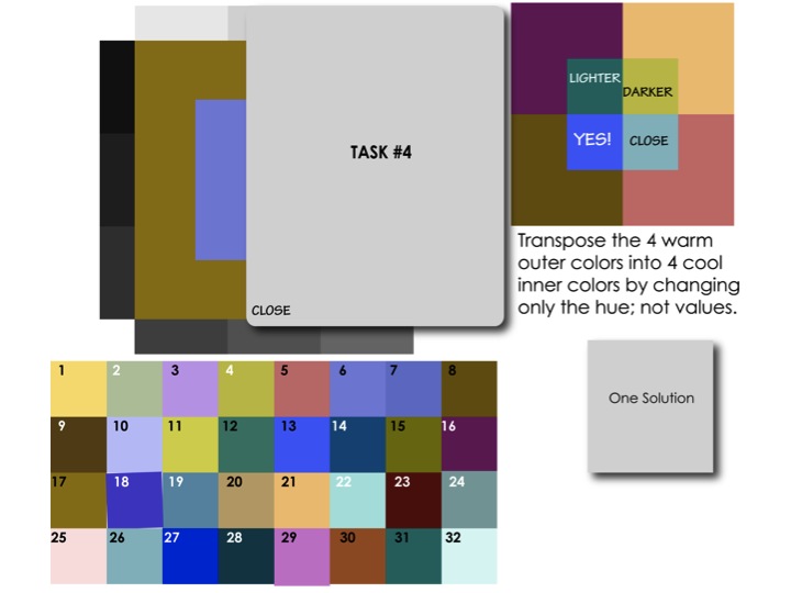
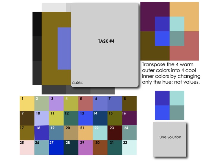
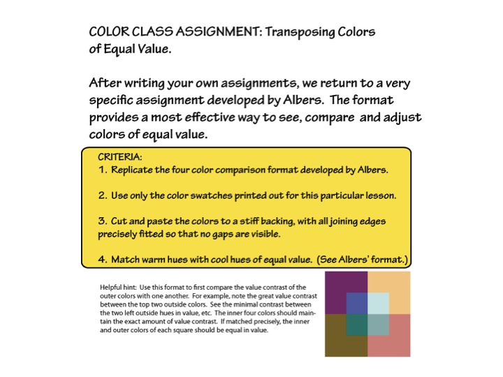
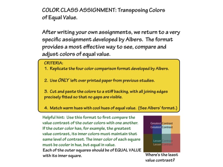
The fourth session of the Color Relationships class for Fall 2014 was held on Friday, October 31. We critiqued the third color deception assignment, making four colors appear as three. Gabe Mott visited and gave a preview of his Huedoku app, a game based on color matrices as developed by Dick. We practiced recognizing when two hues are of equal value, and saw examples of a special case, vanishing boundaries, which the Impressionists exploited to give their paintings striking luminosity. The new assignment is to transpose a set of four warm colors to a set of cool colors of equal value, in a specific format developed by Josef Albers.
Homework assignment
Here are this week’s homework assignments:
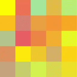
- The new assignment, transposing warm and cool colors of equal value, is shown below. Create several solutions to this assignment. If you have access to the Interaction of Color book or app, this exercise comes from chapter XIV, “Color intervals and transformation”, and chapter XXIII, “Equal light intensity – vanishing boundaries”. See additional notes below.
- Create a more effective version of the first, second, or third assignment. Send them to me and I’ll post them for peer comment. This is in place of critiquing previous assignments in next week’s class.
- A free color study
- Add to your journal of color observations or revelations in daily life, to share in the next class – things in nature or in the man-made world that you notice, or see differently now than before the class
Please send in your homework by Thursday afternoon.
[gview file=”https://dicknelsoncolor.com/wp-content/uploads/2014/11/ColorTranspositionAssignment.pdf”]
See also.
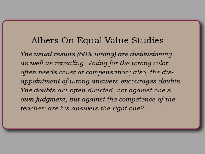
Dick warns that this is a very difficult assignment: “Give this exercise a try, but recognize that we do not expect any attempts to be right on target until value discrimination develops by hours of trial and correction. At this time, experience with expected failures should be the mindset, so don’t be discouraged with your early results and their direct flight to the trash bucket. This week is truly trial with high percentage of failure.”
In other words, be patient with yourself and the process. It will take (a lot of) time to develop value discrimination. We’ll plan time in class next week for extensive hands-on experience.
Class recap – some key ideas
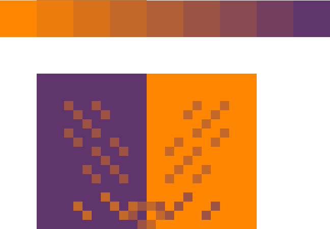
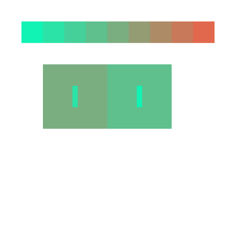
Critique – exercise 3, making 4 colors look like 3
Criteria
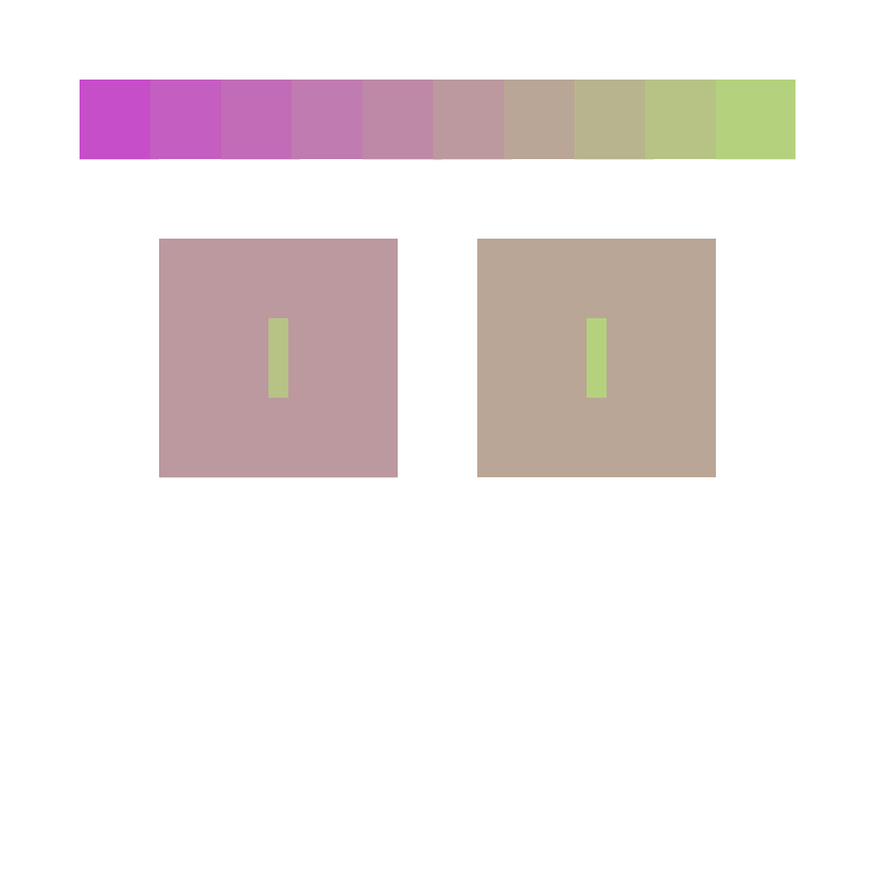
- Two colors look like they are the same by placing them on different grounds
- Show how two colors can appear to be the same, as well as very different
- Show that they are actually different
- Simple format allows easy comparison
Constraints
- All colors should be from a single array
Hints for success
- Grounds – influencing colors – should be extremely different – strong in chroma
- Figures – influenced colors – should be weaker in chroma, somewhat similar to each other already
- Figure should be placed on the parent ground it favors. The parent’s strong chroma will make the child look more like the other parent
Common problems
- Illusion fails to convince: looks like 4 colors, not 3
- More of a value change than hue change (one or both of the grounds is weak in chroma – a tint or shade)
- Less dramatic than it could be (ground colors have a lot in common)
- Format hinders or distracts from comparison
- Backwards – makes 2 colors look more different rather than alike
(Reference Albers chapter VII, 2 different colors look alike – subtraction of color)
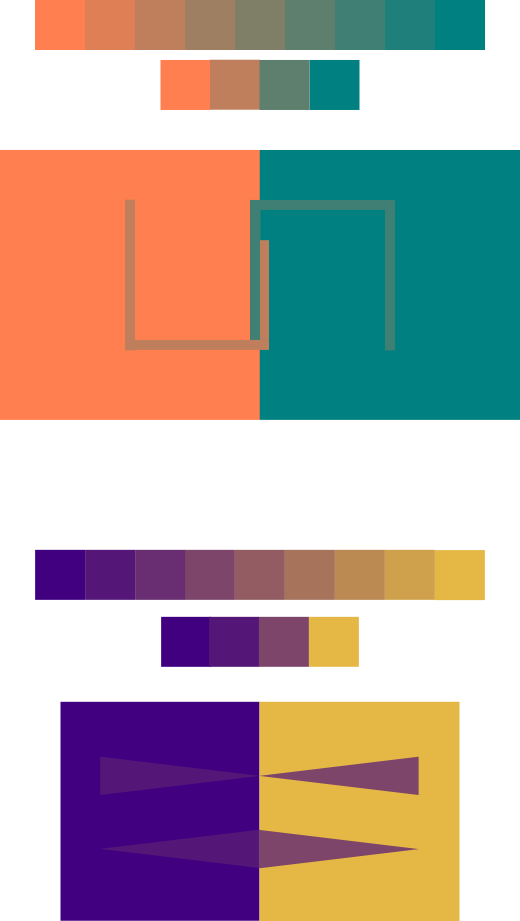
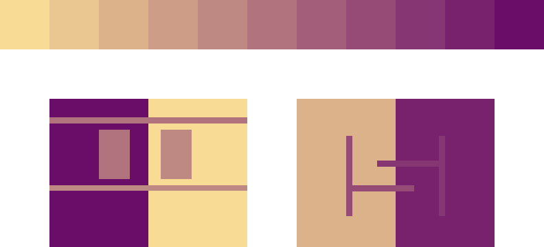


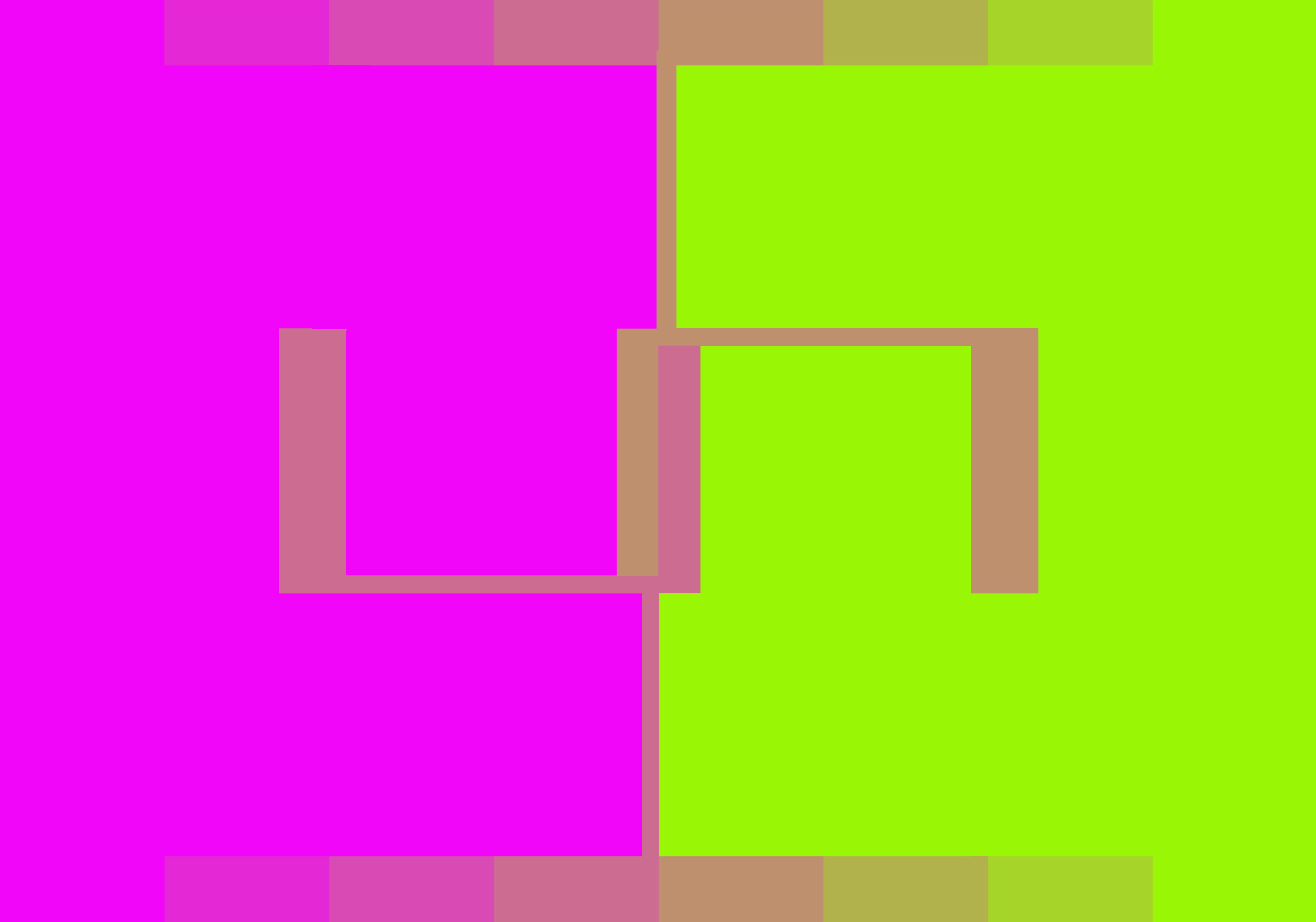
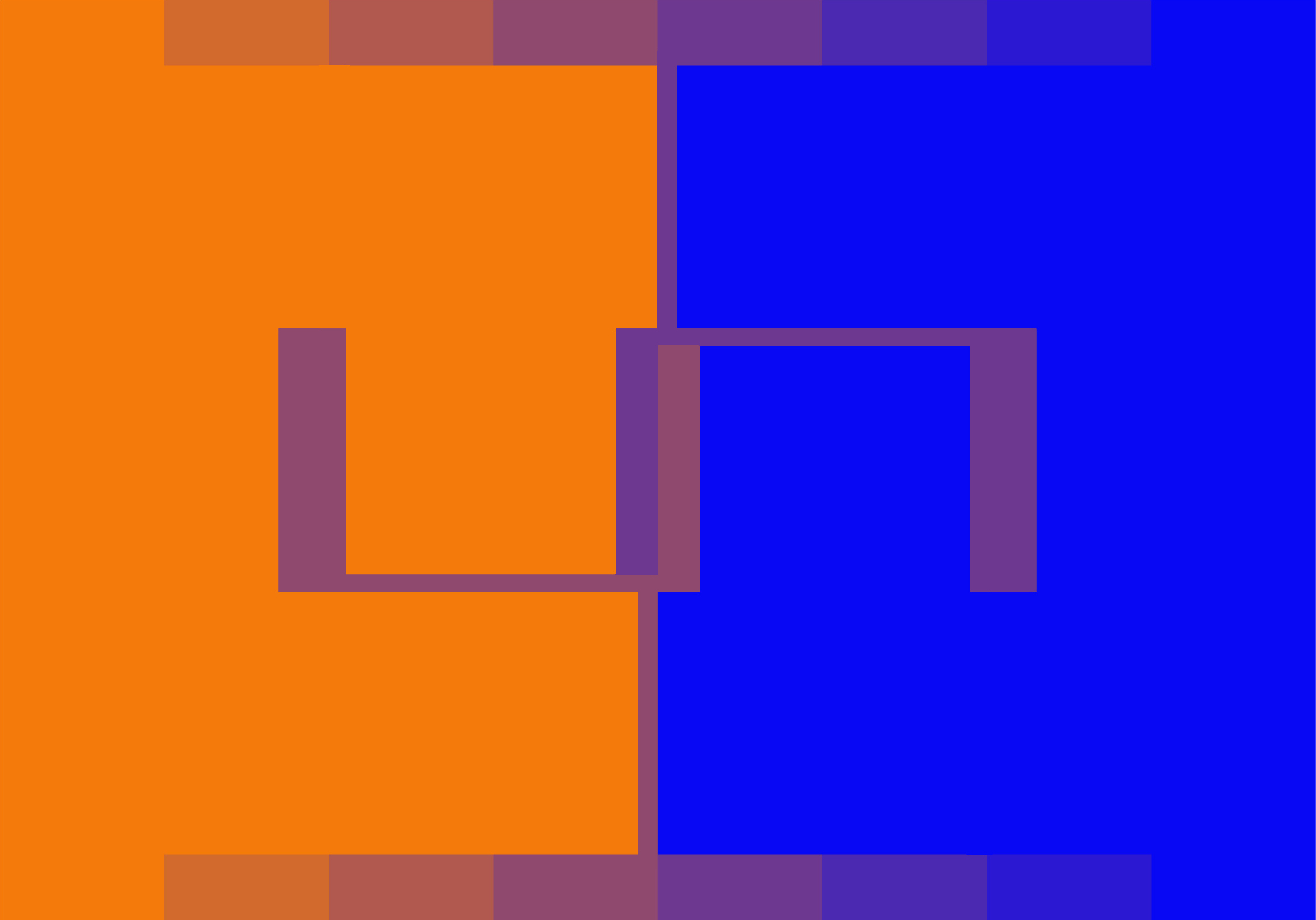
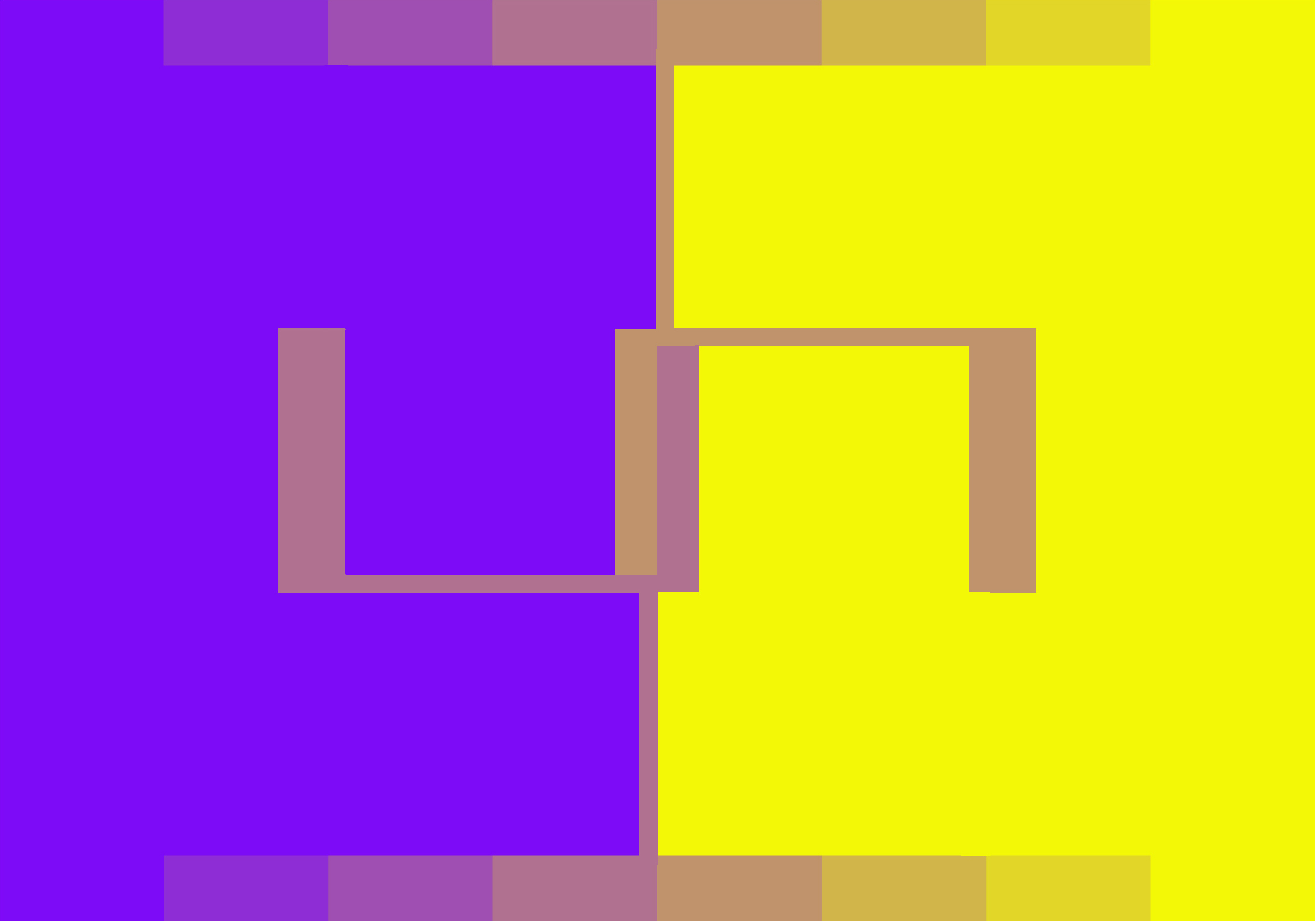

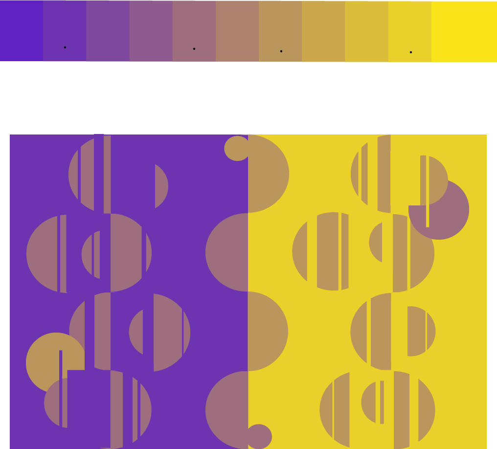
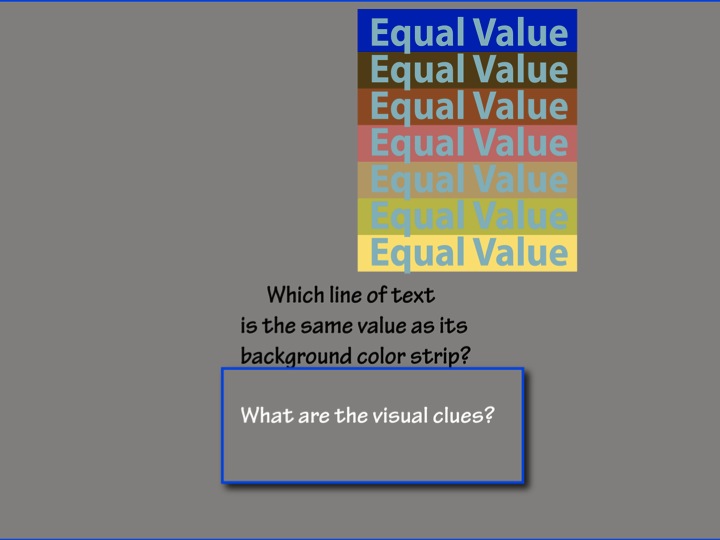
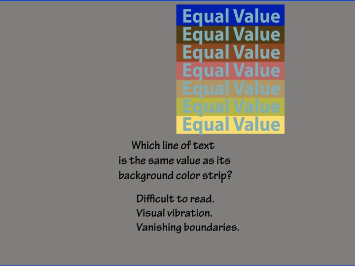
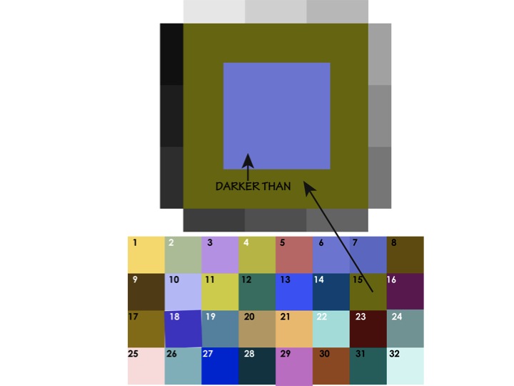
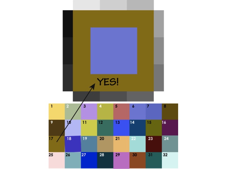
Color transposition: Equal value
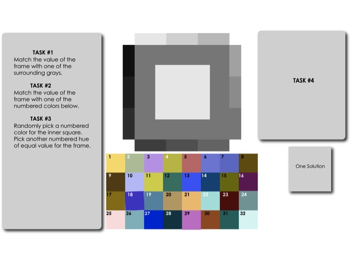
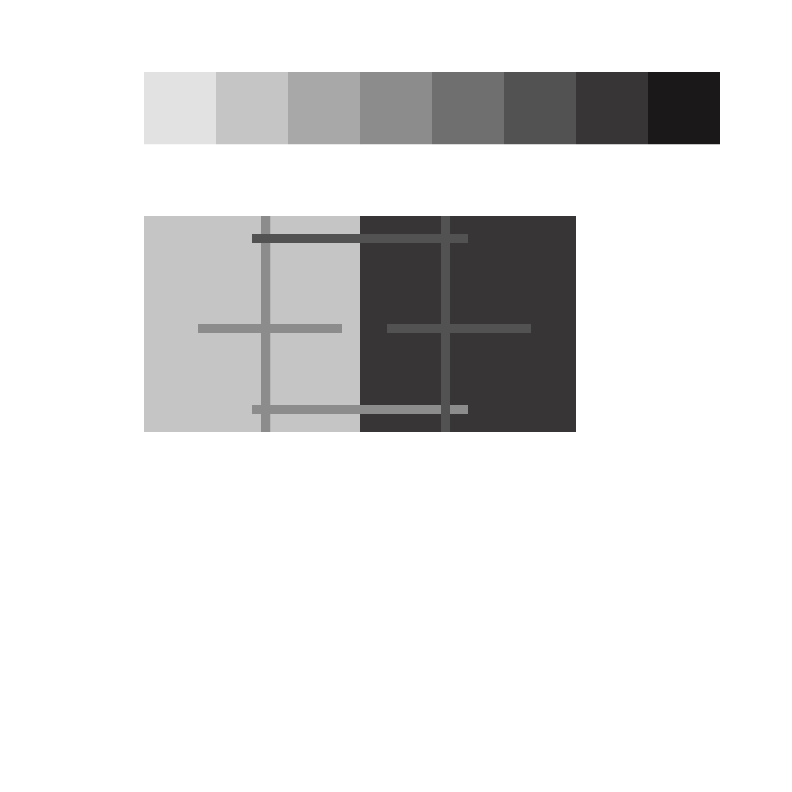
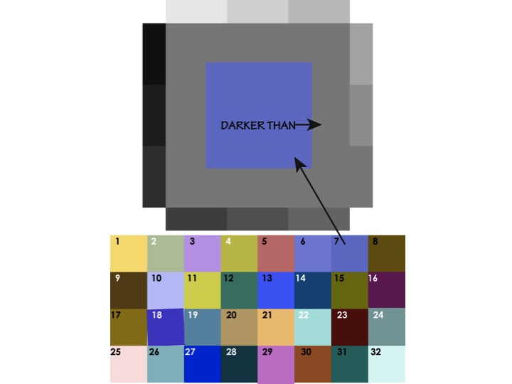
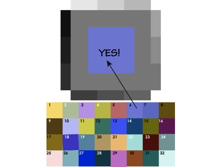
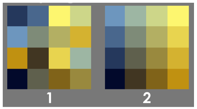
To introduce the new assignment, we played a game of matching a color swatch to a shade of gray. Determining which color is lighter or darker is difficult when their hues are different. A useful clue is noticing when the border between between them looks blurry, fuzzy, or indistinct. The new assignment is to create a composition following Josef Albers’ format of 8 squares (shown below), in which warm colors of different values and hues in the outer squares are “transposed” into cool hues in the inner squares, but with value equal to the corresponding outer square.

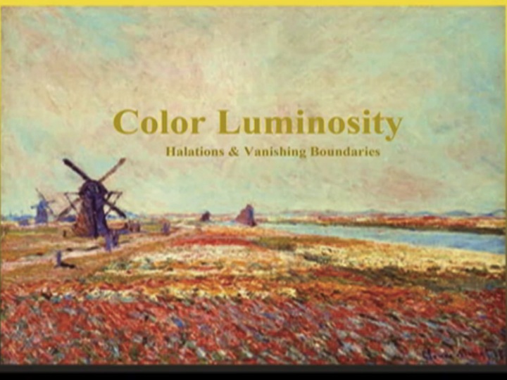
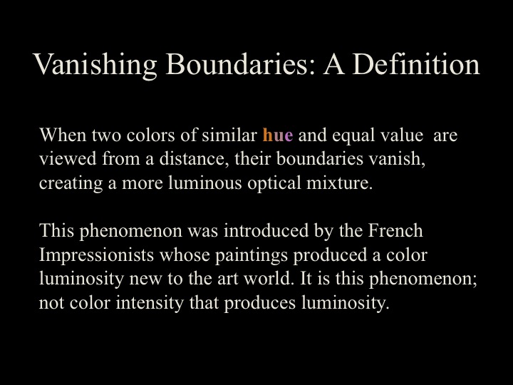
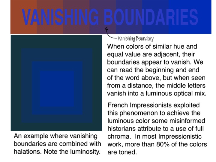
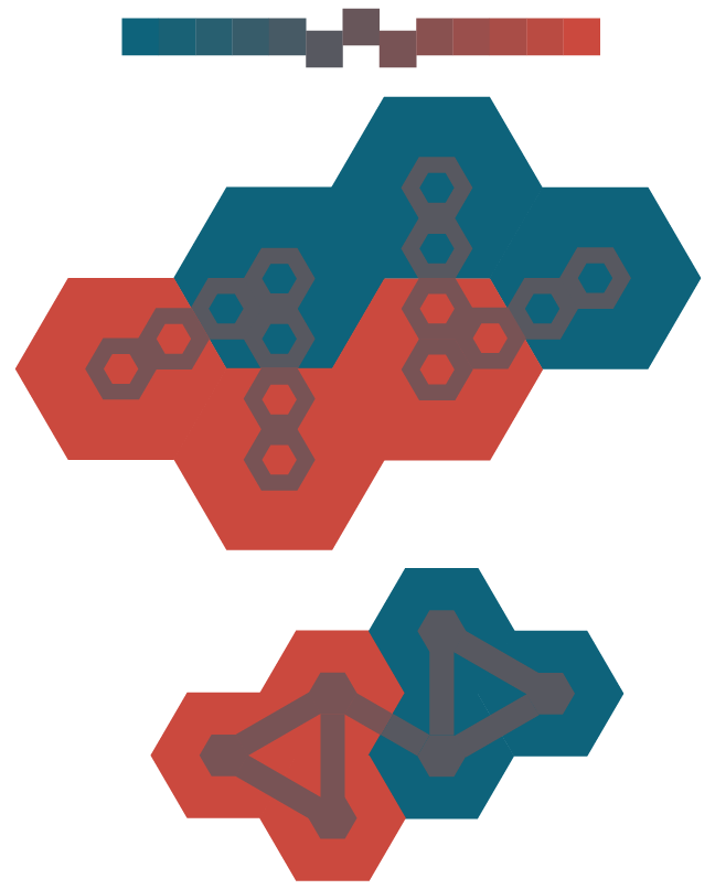
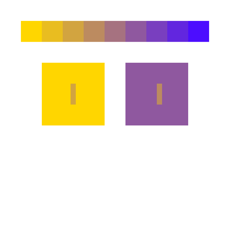
Vanishing boundaries
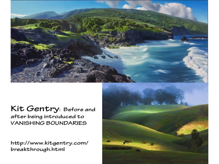
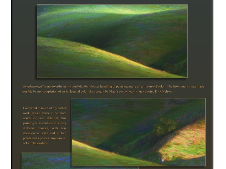
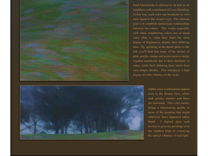
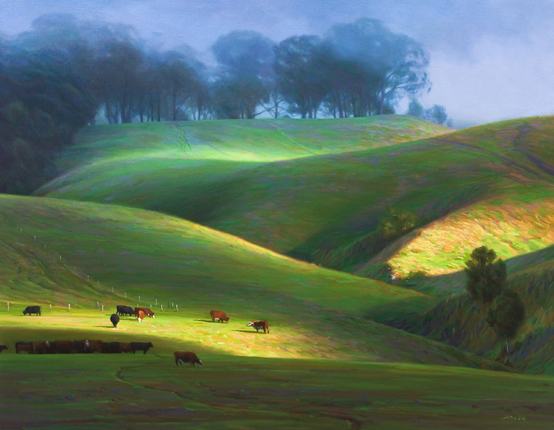
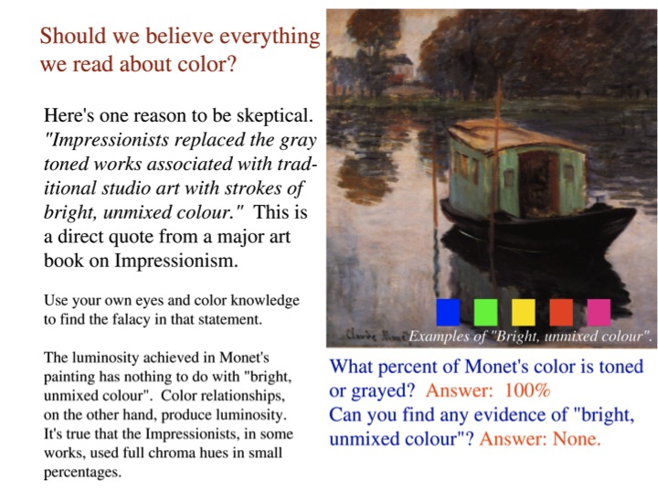
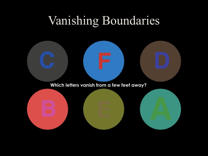 Vanishing boundaries are a special case of equal value. Vanishing boundaries occur between two colors having similar hue and equal value. The optical mixing perceived by the eye results in a more luminous effect than if the colors had been mixed on the palette, and this is the secret of Impressionist painting. Kit Gentry is an artist who, after taking Dick’s class, masterfully applies this approach in his work.
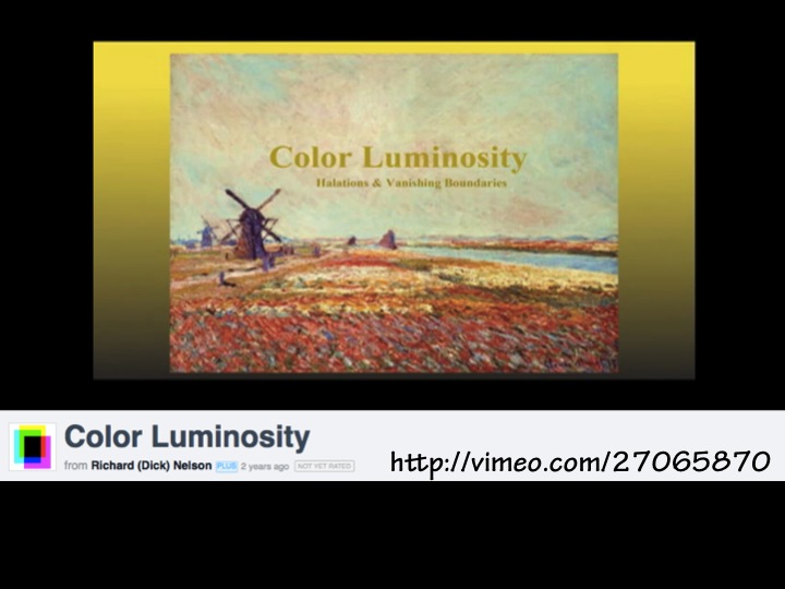
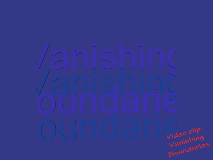
This video highlights luminosity and dispels some myths about Impressionist technique.
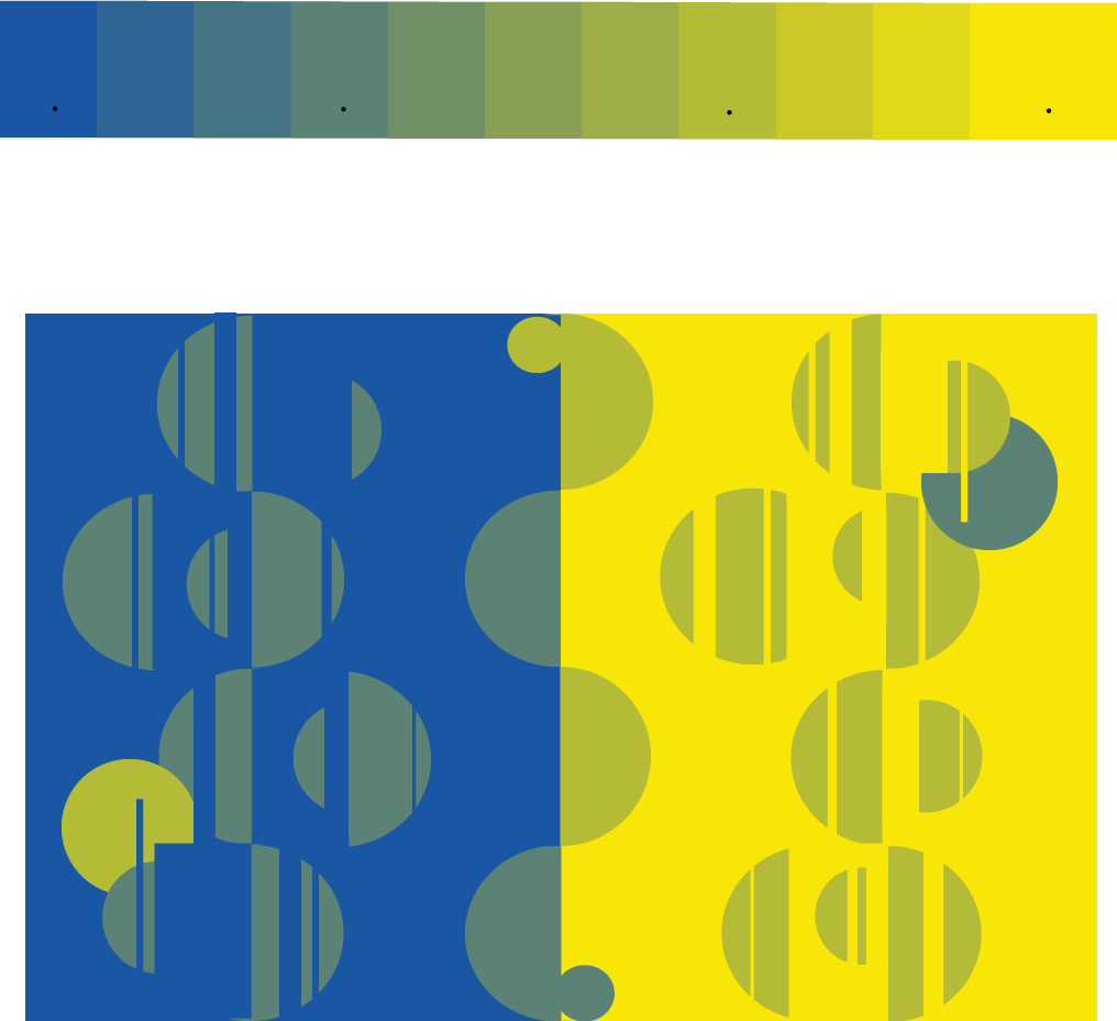
Guest presentation – Gabe Mott and Huedoku
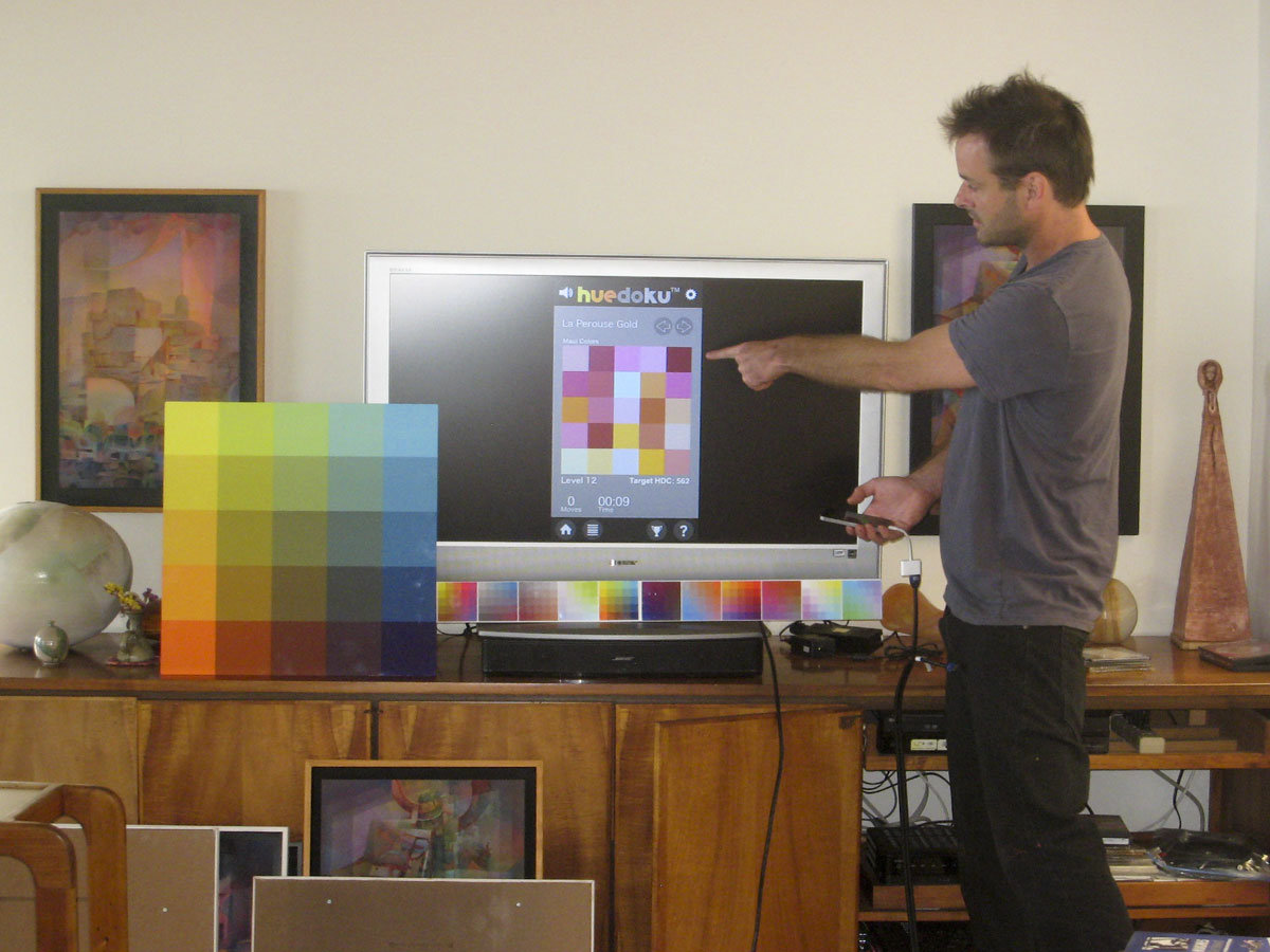
Gabe Mott demonstrating Huedoku
Huedoku: Rearrange the scrambled squares to form a matrix
Since taking Dick’s color class in 2008, Gabe Mott has been obsessed with the matrix and halation. He got the idea to make a game of unscrambling colors from a matrix, teamed up with a programmer friend, and the Huedoku app was born. It’s currently in beta testing and is planned for release November 22. See the Huedoku website for more examples and information, and ColorIsRelative.com for more interactive demonstrations of color relativity.
Huedoku simulation
A matrix is a logical extension of the array concept. See it animated here:
If you’d like to try creating a matrix in Illustrator, this video tutorial shows the process.
Class materials