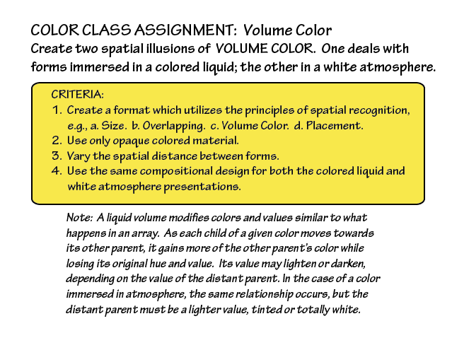
The third session of the Color Relationships class for Winter 2015 was held on Friday, January 23. We critiqued the veil illusion homework studies. Volume color and aerial, or atmospheric, perspective were introduced. Class members shared some observations and experiments with color. Composer Robert Pollock visited and gave a presentation on musical analogies to color concepts. The new homework assignment is to create two spatial illusions of volume color, one of forms immersed in a colored liquid, the other in a white atmosphere.
Homework assignment
The new homework assignment is to create two illusions of volume color, as detailed below (except the compositions need not be identical). You can turn in your assignment in digital form (by Thursday!) or paper. Arrays are the key!
Class recap – some key ideas
Critique – illusion of a veil
Veil studies
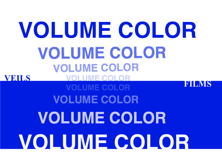
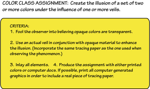
The assignment was to create the illusion of one or more veils over a set of two or more colors, incorporating an actual veil. The studies demonstrated a good grasp of the concept of how a light veil lightens or tints the colors underneath it. Dick got “picky, picky” pointing out instances where the perceived transparency wasn’t quite consistent, weakening the illusion. This shows the importance of developing a very precise sense of value, and careful observation of the phenomena you’re trying to recreate. We go through 12 years of language study in school, but our visual literacy is under-developed. Dick used the critique to lead into a review of films, reinforcing those concepts, and to set the stage for today’s new concepts, volume color and perspective.
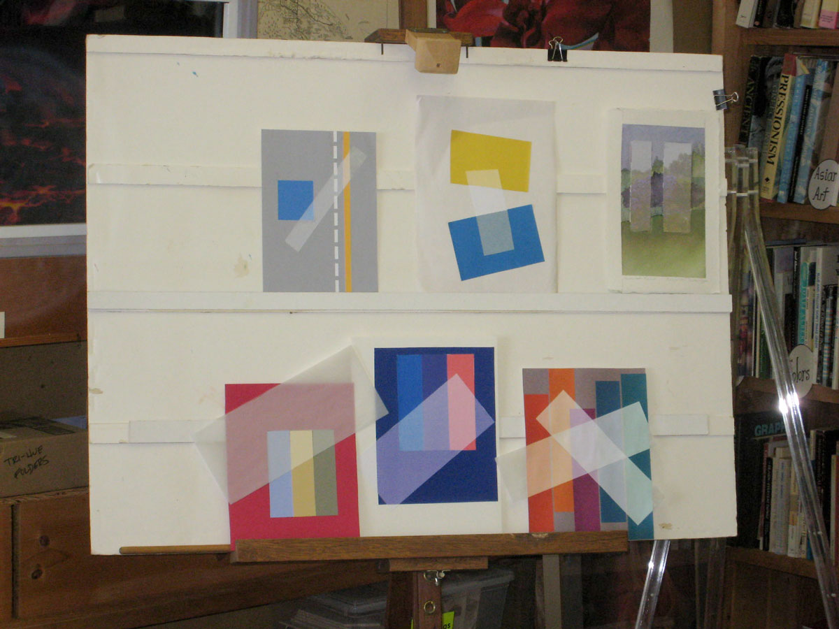
What functions do the puffs of steam and smoke serve?
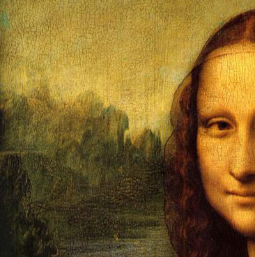
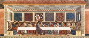
See other versions of this painting on WikiArt and Wikimedia.
Learning is behavioral change
Holly experimented with veil and film transparency
Dick commented that he was “particularly pleased” to see what the students were doing outside of class to explore and deepen their understanding of color, like Kathy and her photographs, Holly and her methodical investigation of transparency gradations, and Jeff with his color programming (see below). Real learning is evidenced by behavioral change. These behaviors are evidence of learning.
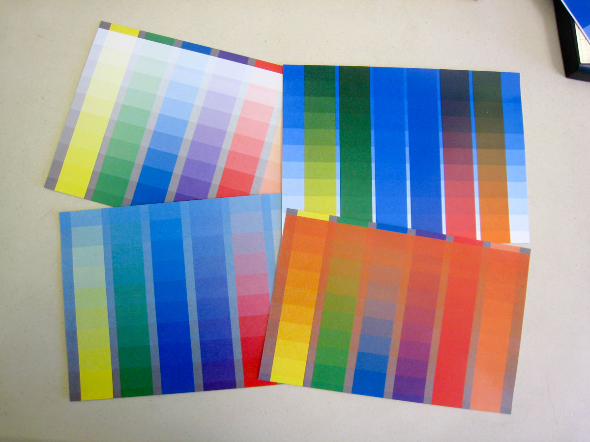
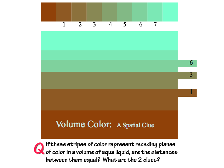
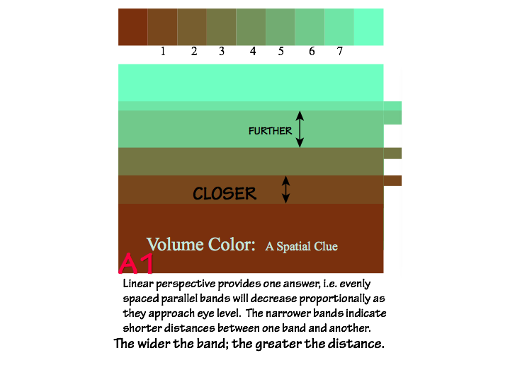
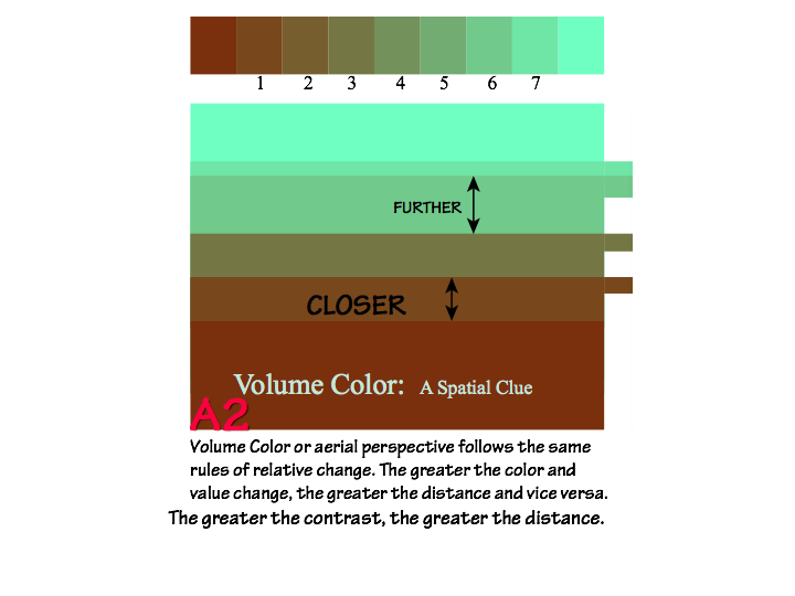
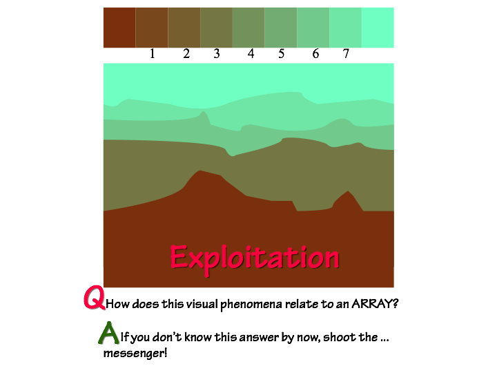
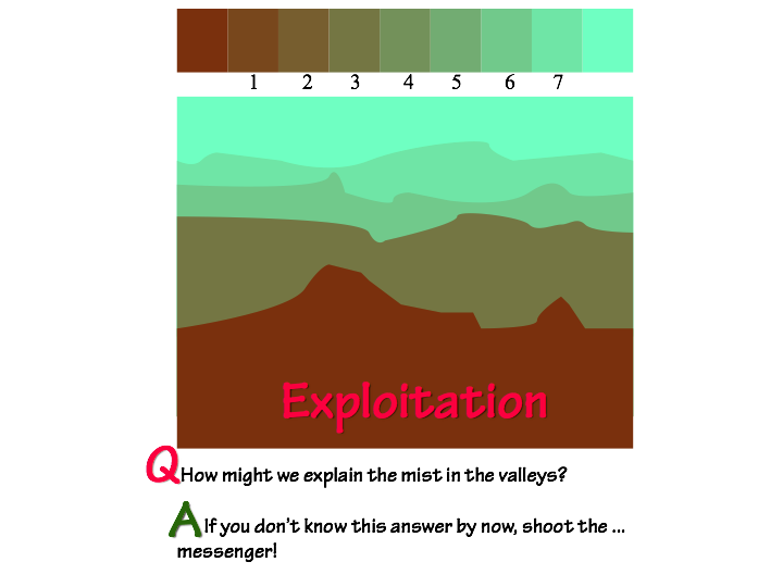
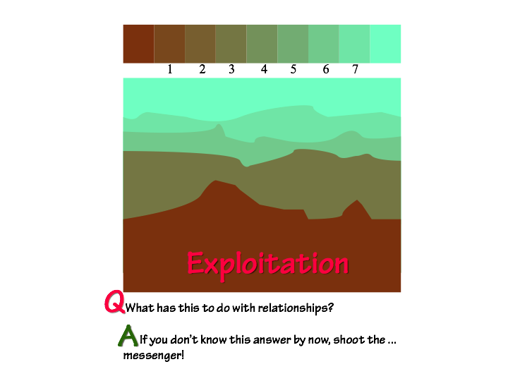
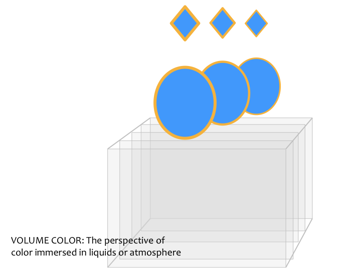
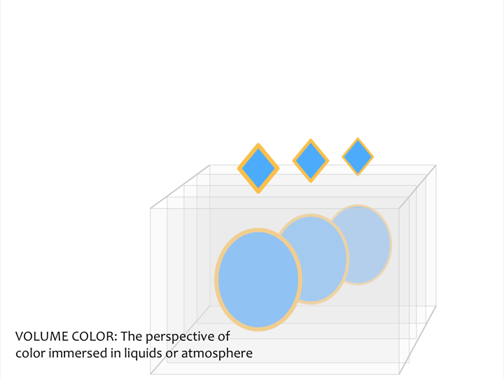
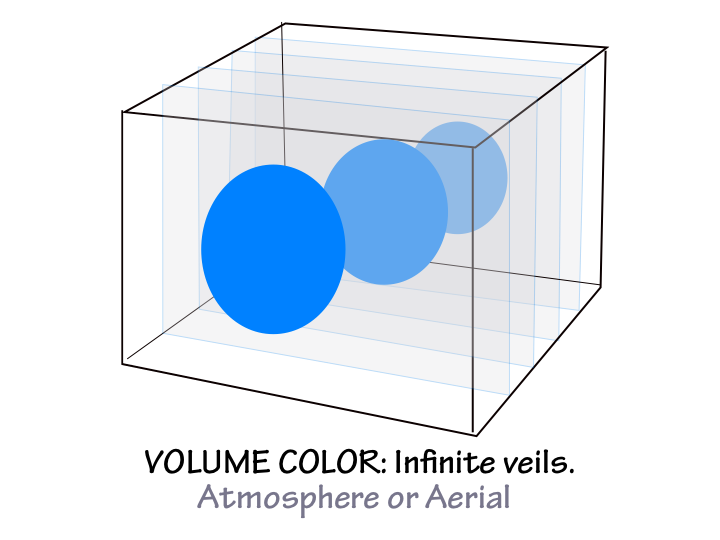
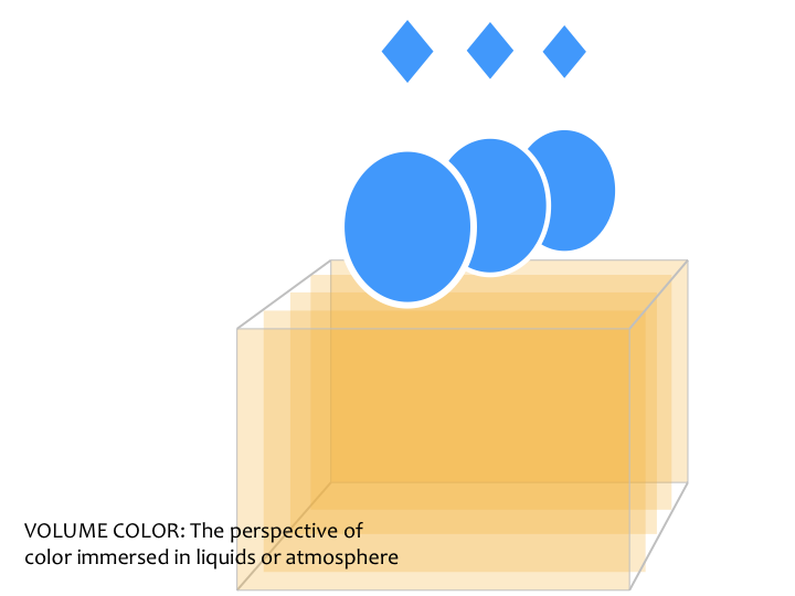
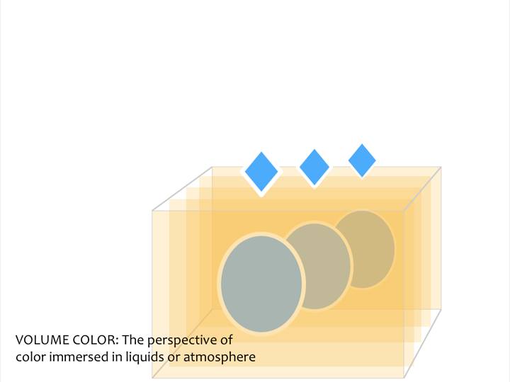
Introducing volume color
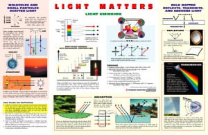
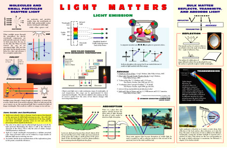
The most familiar example of volume color is atmospheric veiling – the way distant shapes are fainter and less detailed in the distance. It can also be observed under water, where distant objects become indistinguishable from the water color. The physics behind these phenomena are explained visually in the “Light Matters” poster available from the General Atomics Sciences Education Foundation (light is transmitted, scattered, refracted, reflected, and absorbed). Atmospheric or aerial perspective wasn’t introduced in painting until the High Renaissance. See the 2013 volume color notes for more detail on using aerial and linear perspective together to represent distance and depth.
-

- Volume color: aerial or atmospheric perspective

-

- Volume color: liquid

-

- Aerial perspective was first used in the High Renaissance
-
- Light Matters poster
-

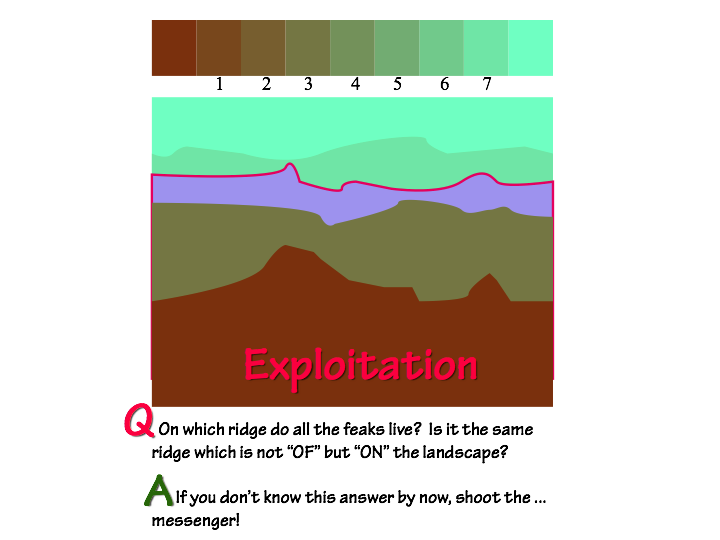
- Volume color: atmospheric perspective (ridges)

-

- Volume color: atmospheric perspective (dusk)

-

- Volume color: atmospheric perspective (ridges & clouds)

-

- Volume color: atmospheric perspective (with moon)

-
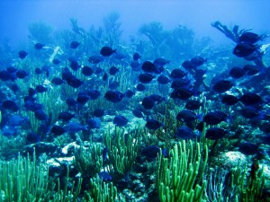
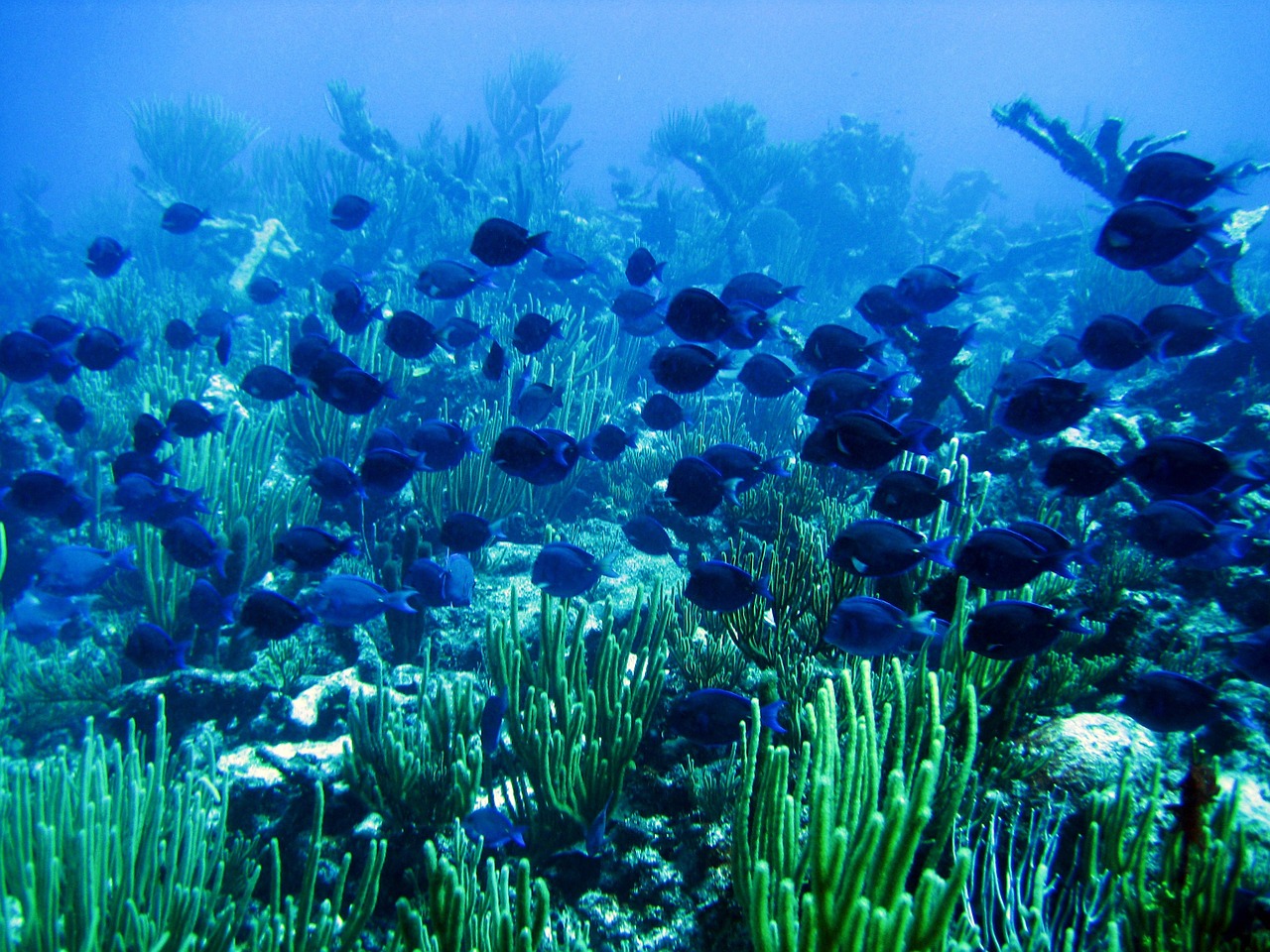
- Volume color: liquid (reef)
-
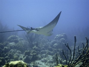
- Volume color: liquid (manta)

-

- Volume color: liquid (snorkelers)

Perspective
Creating a convincing representation of shapes at various distances depends on accurate perspective. Size, overlap, and position on the page are how we recognize distance and depth in linear perspective. Combine them with consistent atmospheric perspective cues to convey distance convincingly. The paintings below show how perspective in artwork has evolved from the Middle Ages to the High Renaissance.
-

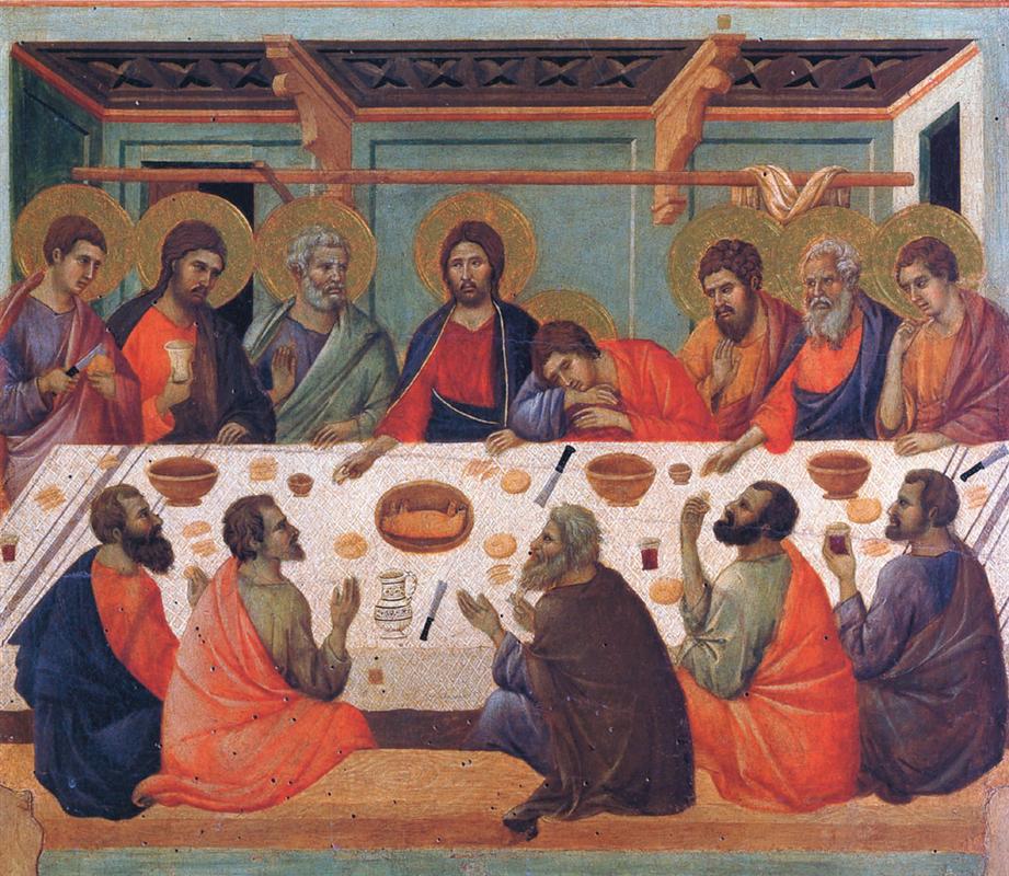
- Late Gothic: Duccio – The Last Supper (1311)
-
- Early Renaissance: Andrea del Castagno – The Last Supper (1447)

-
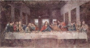
- High Renaissance: Leonardo da Vinci – The Last Supper (1495)

-
- 1 point perspective
-
- 2 point perspective

[gview file=”https://dicknelsoncolor.com/wp-content/uploads/2013/10/VolumeColor2PDF-optimized2.pdf”]
Musical analogies
Robert Pollock
Robert Pollock visited and shared musical analogies to some of the color class concepts. He had been interested in Albers’ teachings 40 years ago, and sought Dick out when he learned of their connection. He took Dick’s color course a number of years ago, and for each color study, also created an equivalent musical study. Dick and Robert have collaborated on several projects and performances.
Robert played short excerpts from a number of musical pieces to illustrate possible musical analogies to color concepts. Vanishing boundaries is one he is particularly interested in, and gave several examples for. In our visual deception exercises, a small patch of color is influenced by a larger, more dominant surrounding color to appear as something else. In the musical analogies, a note means something different when surrounded by a different harmony. Robert had an analogy for this, too: we have words that sound the same, but mean something different (homonyms), like “steak” and “stake”. Their meaning depends on their context, the rest of the sentence around it.
Listed below are the excerpts Robert Pollock played for us, and some notes about the related color concepts. Most were only 10-15 seconds long and he played them a couple of times so we could listen carefully for what he was trying to show us.
- Arnold Schoenberg, String Quartet #2, beginning
“4 from 3” B#=C - Witold Lutoslawski, Concerto for Orchestra, beginning
Transposition (Albers uses “transformation” – chapter XIV). “This is to this, as this is to this…” - Beethoven, Symphony #7, beginning
Vanishing boundaries – oboe > clarinet > horn - Mario Davidovsky, Synchronism #6, beginning
Vanishing boundary = timbral substitution. Timbre is instrumental color. Pitch ≈ hue. - Claude Debussy, from Prelude to the Afternoon of a Faun
- J. S. Bach, Prelude in C Major, beginning
- Robert Pollock, Woodwind Quintet, ending
- Tristan Keuris, from To Brooklyn Bridge
- Per Norgard, from Third Symphony, mvt 1
- Gustav Mahler, from Symphony #6, mvt 1
- Roger Sessions, Piano Concerto, transition between mvt 1 and mvt 2
Robert Pollock is a musician and composer, and the founder of Ebb & Flow Arts.
Color Potluck
Inspired by Dick’s “Trihue Cuisine” experiments in Illustrator with different transparency overlays of cyan, magenta, and yellow shapes, Jeff Bennett wrote a program in ProcessingJS that draws a set of shapes, with some random variation, in a set of colors with randomly varying transparency. He demonstrated it in class. A few samples below show the different results created by different settings. (Click to view larger)
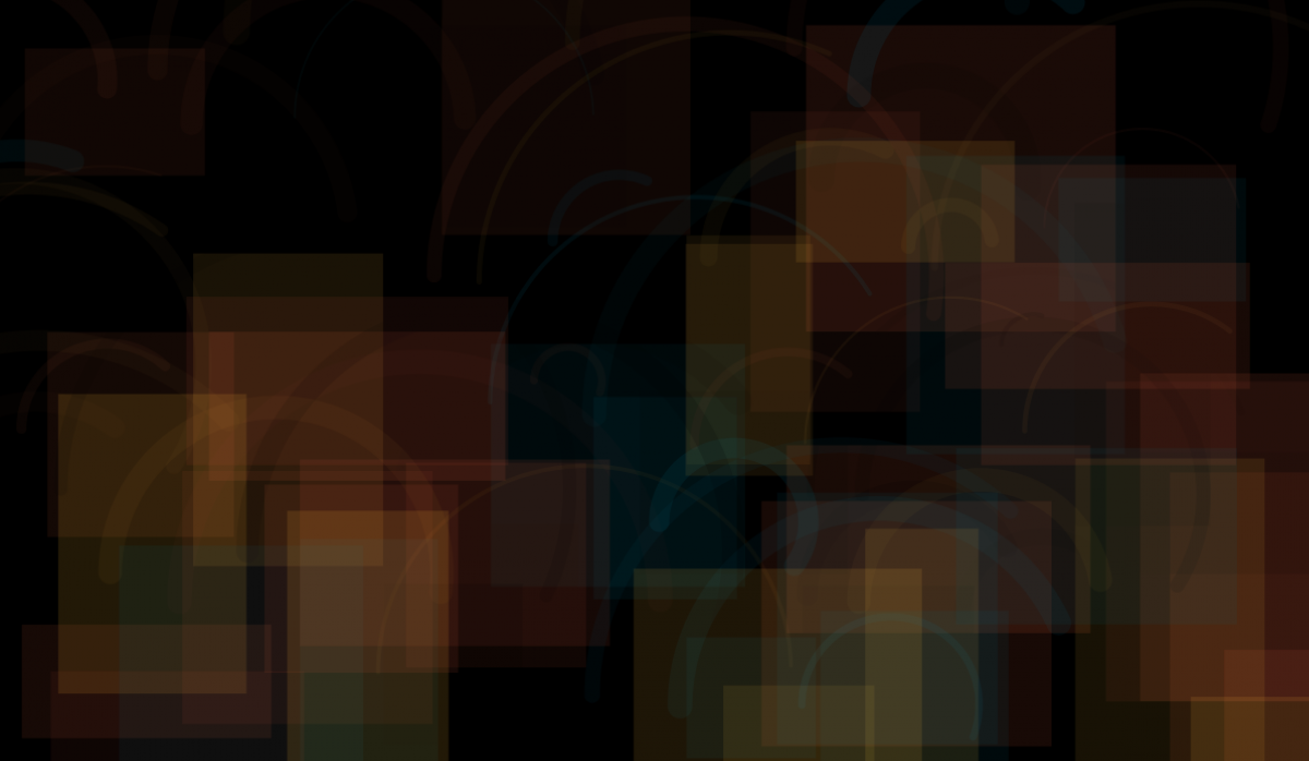
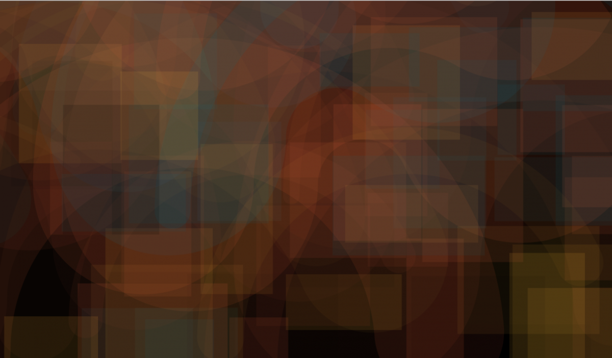
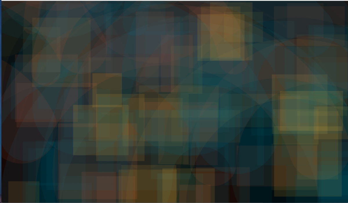
The image below was generated when you came to this page and will be different every time it is loaded.
To see the program behind this, go to Jeff Bennett’s Color Potluck program on OpenProcessing.org


