The fourth session of the Color Relationships class for Winter 2015 was held on Friday, January 30. We critiqued the volume color assignment. The phenomenon of white light was introduced through a demonstration, discussion, and video presentations. Students will define their OWN assignment and criteria for a white light illusion.
Homework assignment
Create your own assignment and criteria for a light illusion, as described below. Refer to the videos and PDFs in the “Class Materials” section for helpful supplemental information.
[gview file=”https://dicknelsoncolor.com/wp-content/uploads/2013/10/WhiteLiteAssign.pdf”]
Class recap – some key ideas
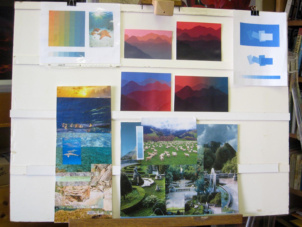
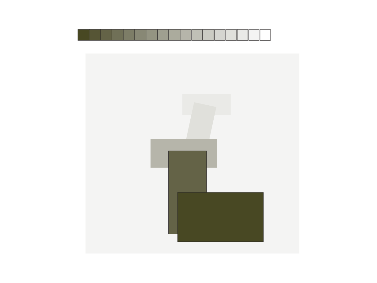
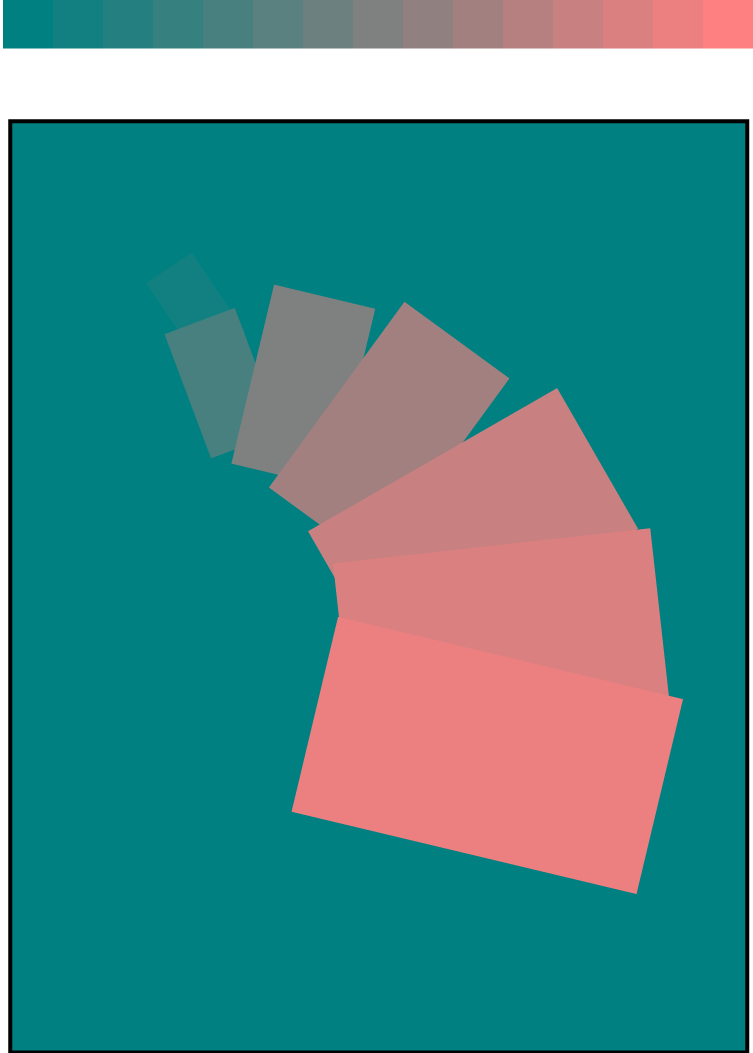
Critique – volume color
Volume color is an important tool for an artist. Used correctly, it can create unity and harmony in an image. Being aware of, and understanding, what happens in nature helps you avoid problems evident in the work of many “intuitive” artists.
One student commented that what she is learning in this class is seeping into every part of her life – viewing work in galleries, choosing clothes to wear, even earrings! This awareness is more behavioral evidence that learning is taking place.
Volume color homework


Dick went into depth on some details during critique. Keep proportions consistent between similar objects. Use contrasts of scale to strengthen illusions of depth, such as adding a large foreground tree to the cityscape above. Be aware of (and eliminate) coincident (overlapping or aligned) edges that undermine or weaken an illusion. He pointed out how one piece didn’t hang together as a single image; how hard edges separated it into three. He softened this by saying, “The process of going through this is not an easy one. I applaud you for taking it on. But I won’t sugar coat, and slap you on the back just for trying. I will give you an objective critique so you can learn. I won’t say ‘it works’ or ‘it doesn’t work’ without providing objective reasons.” He also pointed out areas that allow the eye to move around within the image, to help clarify his point.
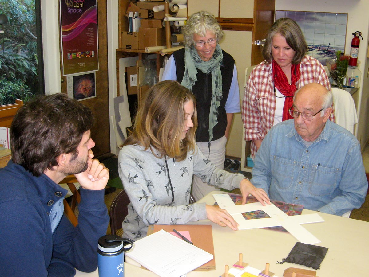
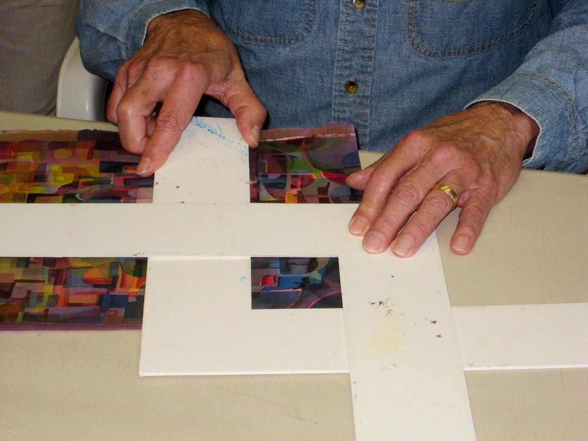
Cropping can help your images communicate. Edit out distractions, in order to best tell your story. Using cropping Ls can help you focus on essential elements, and discover hidden pictures within pictures.
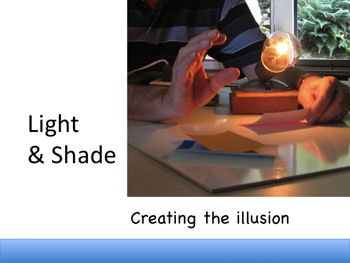
Introducing white light
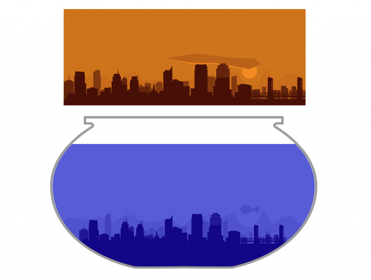
Dick gave a demo of white light shining on a white cube and an arrangement of colors. Shining the light from different directions allowed analysis of how we perceive the strength and direction of light – from the shadows it casts. The contrast between shaded and illuminated areas of a light color (like white or yellow in the photos) is greater than the contrast on a darker color like green, because light colors reflect more light, and dark colors absorb more light. Carefully observing this kind of phenomenon will help you identify and solve problems in your own or others’ work.
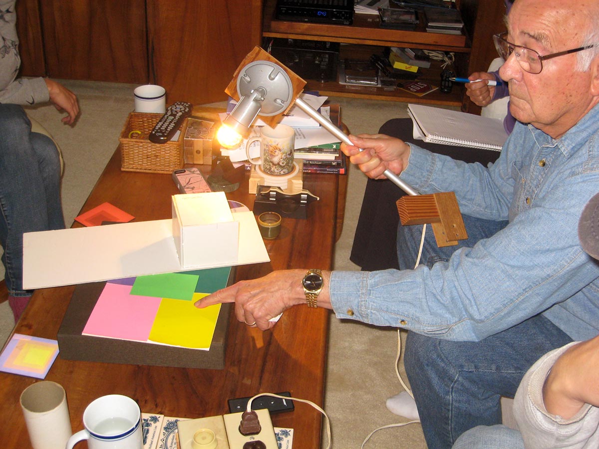
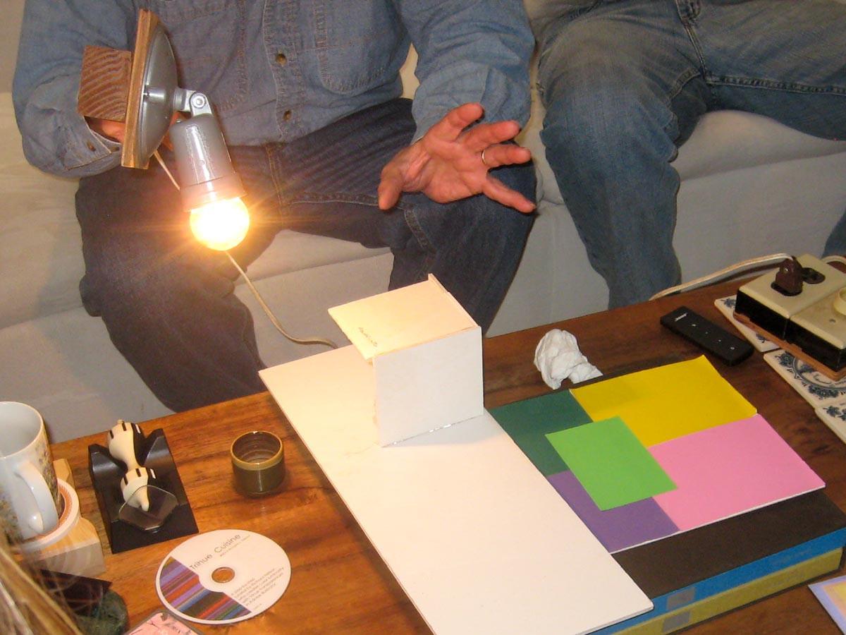
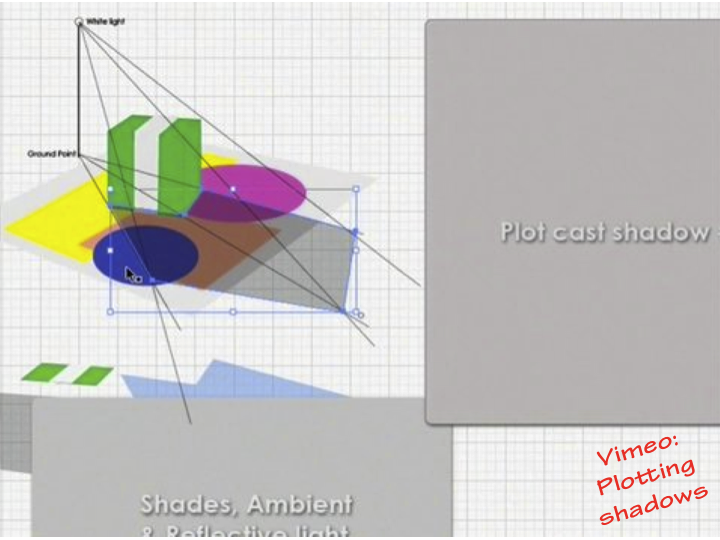
Shadow colors are the complement of the light source, so for white light, the shadow is black. Outdoors, most areas are exposed to some ambient light, which tends to be blue because “we live in a blue dome,” as Monet observed. Thus, because of this ambient blue light, most outdoor shadows will be cool. Light reflected from neighboring surfaces also influences the local color of an object. The third video below, on plotting white light, illustrates these effects.
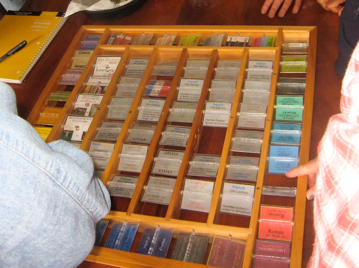
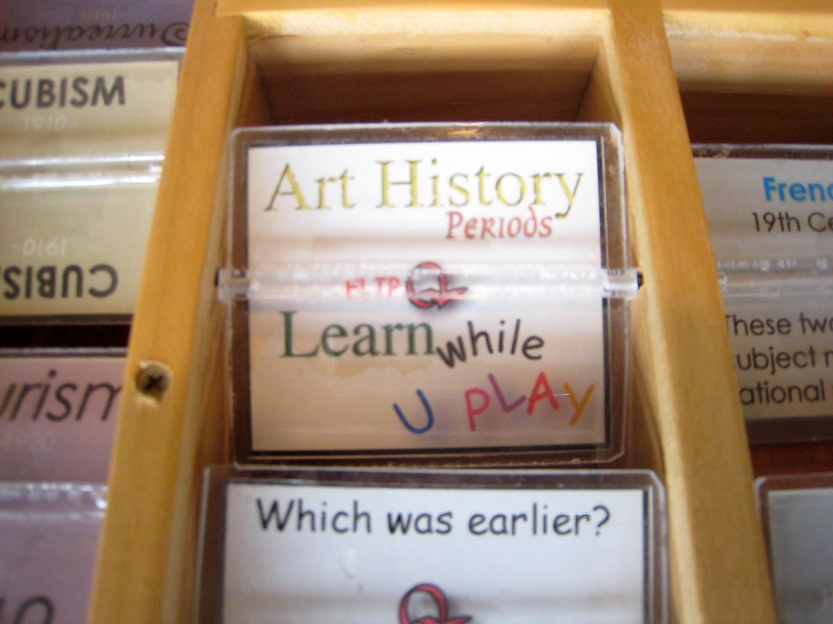
Sneak peek at the art history game
Dick may offer a 9-week art history class soon. It starts with a game, providing students with a cognitive framework of important periods in the history of western art, and some of their main characteristics. This allows Dick to focus on common themes across different periods, rather than following a strict chronological path. Art expresses the values of the culture and the artist. Learning about the past allows an artist to identify their own place in history, their own values and philosophy, and to choose them consciously. “There’s room for you in art whether you’re a romantic, a realist, a classicist…” Dick said.
Class materials
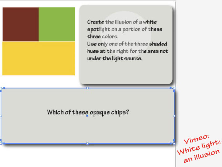
A tutorial for artists who wish to incorporate the illusion of a light on a variety of hues and values.
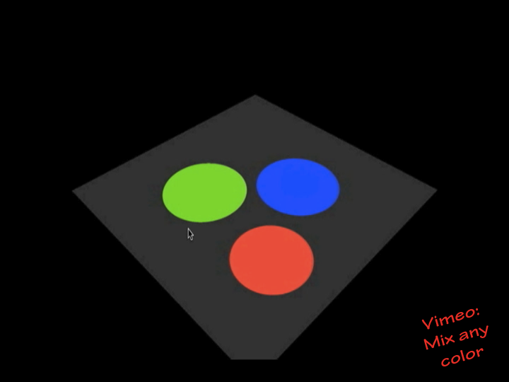
Without light, there can be no color. This animation demonstrates mixing the primary colors of light and of pigment, and the relationship of light primaries and pigment primaries. In either medium, the primaries can be combined to create any color imaginable.
The video above is slightly different from the one shown in class.
A tutorial on plotting white light, its cast shadow, and reflected light.
[gview file=”https://dicknelsoncolor.com/wp-content/uploads/2013/10/WhiteLightShade.pdf”]
[gview file=”https://dicknelsoncolor.com/wp-content/uploads/2013/10/Light-ExerciseC-Converted-copy.pdf”]
[gview file=”https://dicknelsoncolor.com/wp-content/uploads/2013/10/Plot-Shadows.pdf”]


