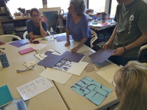
The ninth session of the Drawing Foundation class for Fall 2015 was held on Thursday, November 12. We critiqued the negative space collages, discussed the figure-ground ‘doodles’, and the importance of considering both aspects in your composition. We shared some laughs and debate over a final drawing test, and watched a video that answered the question, “Why bother with art?”
Class recap – some key ideas
Negative space collage
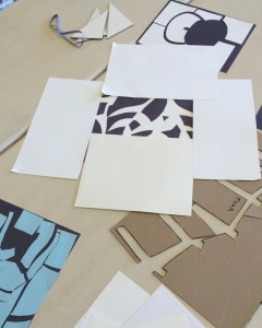
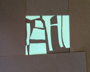
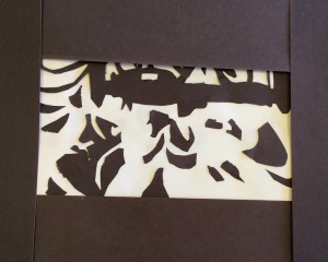
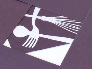
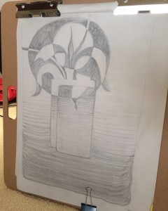
Class began with a critique of the negative space collages, some of which featured a variety of recognizable forms: a teakettle, a chair, houseplants, and kitchen utensils. However, simply identifying the negative space turned out not to be the objective of the assignment; Dick was more interested in getting us to see how the interaction of figure and ground could be enhanced through design decisions or cropping.
- Using cropping as a tool to create a stronger composition
- Playing with reversing the figure-ground identification on negative space collages
“Which is the figure, and which is the ground … and I’m asking you to read this without necessarily thinking – if you walked into an art gallery, would you see the white as the background or as the figure? What do you realize as the background? Black or white?”
Dick stressed that it was fine to see a recognizable object and be able to identify what was in the image, but the goal of this assignment is to pay attention to how the various shapes interact with each other, regardless of which is figure and which is ground. It’s too easy for us to get distracted by the object or form in our work, and we concentrate on that at the expense of other elements.
“As you’re looking at this, you’re forcing the viewer to see both shapes as legitimate and important to the whole idea … and I hope you see how important the negative space can be, in terms of visual excitement. And why have anything, in any good design, that is just ‘fill in’?”
As creators, we have to give full consideration to everything that enters our artwork and acknowledge that we are responsible for the whole image, which includes both the positive and negative spaces. On the page or canvas, nothing is incidental, and our image will lose its integrity if we do not take all parts into equal consideration.
Figure-ground drawings
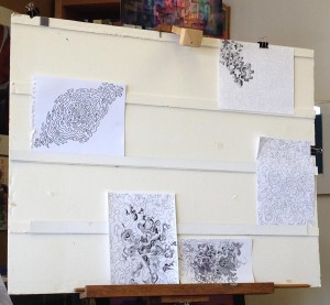
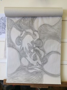
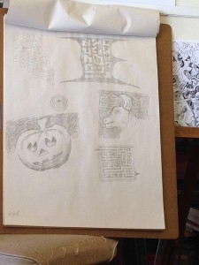
We moved on to share our figure-ground ‘doodles’, which showcased some exciting results. One noticeable characteristic was the different ways students expressed motion or movement in their pieces. Generally, there were two polarities expressed: some drawings used curvilinear lines, and were more ‘organic’ in form; others had drawn with straight lines, suggesting mechanical or ‘man-made’ shapes.
Dick immediately picked up on whether or not there was an engaging play between the figure-ground relationship, mentioning a few pieces where the effect was successful: “Again, look how effective this is, in that no part of it is becoming ‘this is figure, and this is the background’, they’re playing equal roles … Here, in this one, you can see how every shape is given attention … And in this one: the way it’s cropped, because both the black goes off the page and the white goes off the page. In other words, you don’t have the boundary of black or white.”
The class discussed the various attributes of the different works, and how the design, along with the perception of movement and space, affected the final result. Dick asked individuals how the assignment might have challenged them, or if there were any revelations encountered while doing this. Students mainly agreed that it was tricky – and stimulating – to observe both shape and ground simultaneously, which also introduced a whole new way of approaching the page.
- Figure-ground drawing
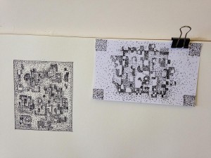
- A combination of the figure-ground drawing, negative space, and reverse gradation
- Figure-ground drawings with reverse gradation
Dick mused: “Well, the process, think of the process … You really have to think creatively for this assignment, and it forms like a conversation would: this shape suggests that shape, and then that shape – and it just evolves. So that as you are developing this from a piece of white paper: my god, every moment, a new revelation. Because you can’t imagine what the final piece will look like, any more than I could imagine what our conversation was going to be here. I know we’re going to be talking about figure-ground relationship, but someone says something, or you put something up there, and it suggests a particular response.”
He applauded the students’ efforts in trying something new: “What an incredibly different travel program you have, when you yourself are surprised: ‘I couldn’t have imagined any of this until it happened!’ And the creativeness and the process is what I’m talking about, not necessarily just the final image, because like any conversation, you get to the end, and it’s ‘how did we get on this subject?’ And these [drawings] are real conversations.”
He encouraged us to continue experimenting with this type of exercise. Practicing an awareness of both ‘object’ and ‘not-object’ will help us engage with our work more thoroughly, and potentially even help us see the world in a different way.
Drawing comprehension test
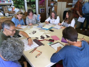
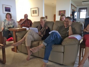
Dick’s final task for the class was a drawing test, comprising various questions and images to test the student’s comprehension of all that we have covered. We joined together in his living room to go over the answers.
[gview file=”https://dicknelsoncolor.com/wp-content/uploads/2015/11/DrawVisualization.pdf”]
The very first question tripped up a lot of students, and addressed again how easy it is to assume that the viewer will understand the artist’s intended message. If an artist does not make sure to identify their own assumptions, they will create unintentional errors.
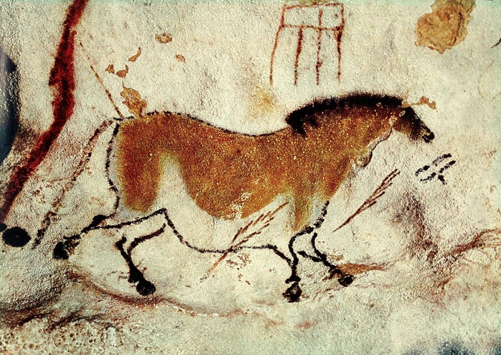
As students shared their answers, Dick shook his head, proclaiming: “All of these [answers] are ambiguous”, because they did not take into account how many different ways the viewer could interpret the scene. We went over the four ways to show depth and space (size, overlapping, placement, and atmosphere/aerial perspective) and how three of those principles could still lead to unclear impressions. There is only one principle which unequivocally demonstrates depth (or that something is behind another object), and that is overlapping.
Paleolithic artists understood this principle thousands of years ago. Notice how the overlapping legs convey clearly that the horse’s right side is closest to us. (For more detail, see these art history notes.)
“And I’ve heard this from young art students all the time, ‘Can’t you see it?’ – well no, if you’d drawn it correctly then I would have seen it. And don’t give me the intentional fallacy answer: ‘Well, I intended it to be that way’. No, it’s ambiguous. We are trying to get to the point where you don’t have to explain it and people immediately recognize what is happening.” Pay attention to what your message is, and make sure you are conveying that information accurately: there are many ways to show information, but not all of them will be clear and direct.
- Discussing the answers to the drawing test
- Going over the correct answers as a group
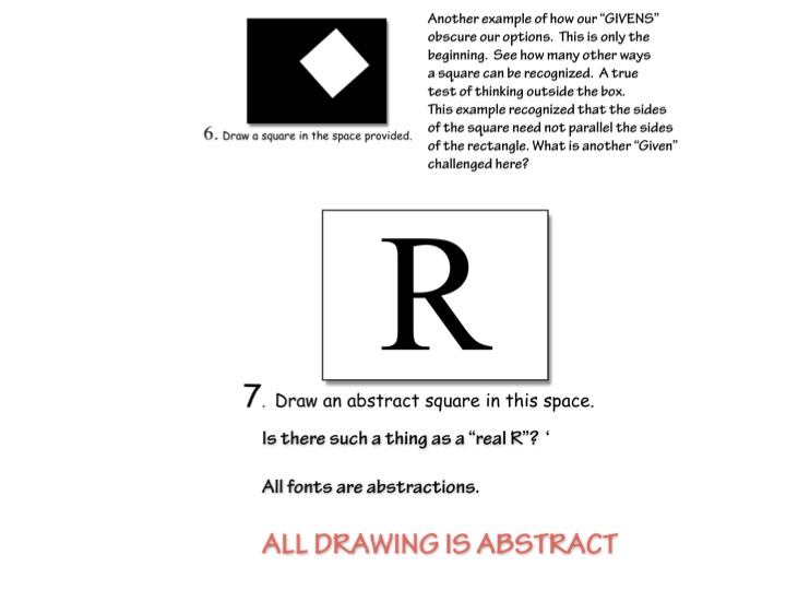
Another set of questions turned into a debate on semantics, with the class disagreeing on the definitions of ‘real’ and ‘abstract’. One question called for the class to draw a ‘real square’ and then an ‘abstract square’, and the answers were varied. Dick told us again: “The definition of abstract is what? Abstract: ‘to take from’, or ‘abbreviation’. All drawing is abstract.”
He pointed out that when it comes to art, people most often confuse the term ‘abstract’ with ‘distort’. “I’ve seen so many people who do this: distorted the square. Did any of you distort it? Because people confuse ‘abstraction’ with ‘distortion’, so if they distort it, it’s abstracted. No, the point is that all drawing is abstract. All drawing is abstract; it’s taken from; it’s created within the mind of man. If you draw a square, it’s going to be abstract.”
Dick introduced this concept in the very first week.
Watch out for what you consider to be ‘real’, and how you might take that for granted in your visual work. When creating a two-dimensional piece, everything becomes an abstraction: a shadow is not a ‘real’ shadow, simply a certain type of shape with a degree of darkness compared to other shapes. Question your own assumptions!
Six phases of problem solving
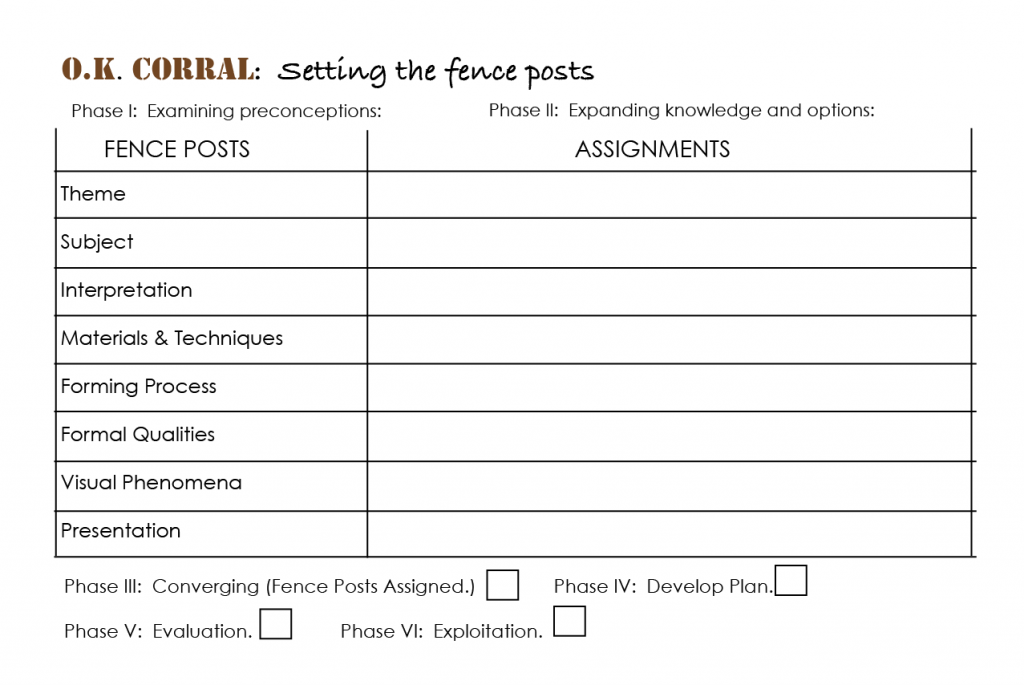
Dick finished up the test with a short talk on the six phases of problem solving, which we had touched on in a previous class. Dick’s repeated goal is to free his students from a reliance on the teacher and provide the tools that create artistic self-determination. “As a teacher, I want to take you from total dependence to total independence through understanding what decisions you have to make. For example, the first one is point of entry, where you address all your preconceptions. The most dangerous thing in any creative endeavor is yourself: you get in the way with your preconceptions.
“Then this goes onto the second phase, third, fourth, etc. When I was teaching this at Ohio State, I only had five stages, and after a critique I finally hit on the sixth one: exploit it. Because you’ve learned from your mistakes, so don’t stop there, go back and exploit it. But you need the critique, and the critique makes no sense unless you know what the criteria are.”
And that goes back to the work itself:
“Everyone, whether you’re conscious of it or not, when they start to create a work of art, is going to address all of these issues, and I like to think of them as fence posts. These are all the areas we want to cover: what materials are you going to work with? What’s your theme, subject matter, interpretation, et cetera. All of these choices come down to your ability to assign your own objectives.”
For a thorough inventory of artistic options from which one might choose, see the pages below (excerpted from Dick’s “Critical Evaluation” handout), and the listing of formal qualities on this website.
[gview file=”https://dicknelsoncolor.com/wp-content/uploads/2015/11/ArtisticOptions.pdf”]
Queensland Symphony Orchestra video
We finished the class with a short video, introduced by Dick with a thought-provoking question: “So people like to ask, ‘Why the arts? Why culture, why anything?’ To me this video says more than anything I can possibly say.“
After the video, he summed up his own question with a touchingly concise statement: “This is ART folks, in the finest sense of the word … this is what happens when you have learned to survive, and then gone beyond survival: you create ART … the gift of the human soul.”
Class materials
Dick handed out these two pages outlining six phases of creative problem solving. For more on this topic, see the write-up for Color Relationships 2013 week 10.
[gview file=”https://dicknelsoncolor.com/wp-content/uploads/2013/11/6PhaseProbSolv1.pdf”]
[gview file=”https://dicknelsoncolor.com/wp-content/uploads/2013/11/6PhaseProbSolv2-2.pdf”]
