The third session of the Color Relationships class for Spring 2016 was held on Wednesday, April 20. We shared the results from the previous two homework assignments, discussed and critiqued the many examples in Josef Albers’ book Interaction of Color, and introduced the new assignment: Transposing Colors of Equal Value. This is by far the most difficult exercise in the course, and usually involves many hours of trial and error. See the full post for class materials, photos, and videos to supplement our class time.
Homework assignment
[gview file=”https://dicknelsoncolor.com/wp-content/uploads/2015/08/TransposeColorREV2.pdf”]
The basic format for the homework is as follows:
Class recap – some key ideas
Transposing color
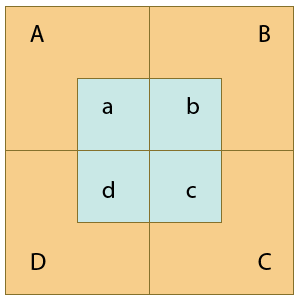
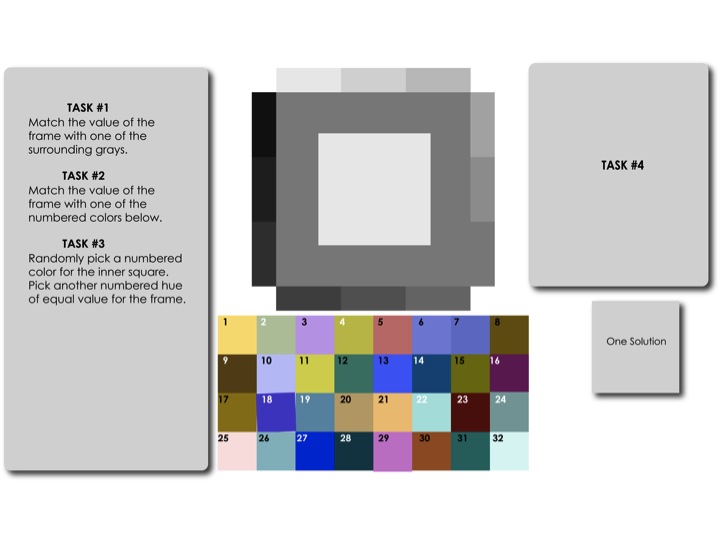
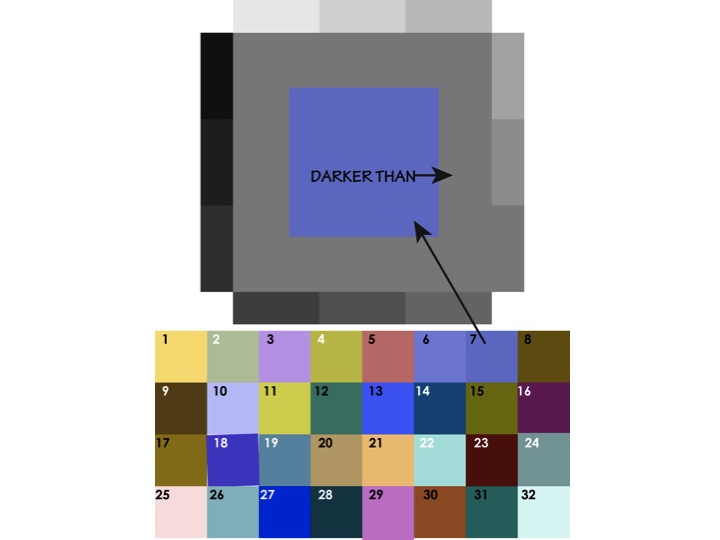
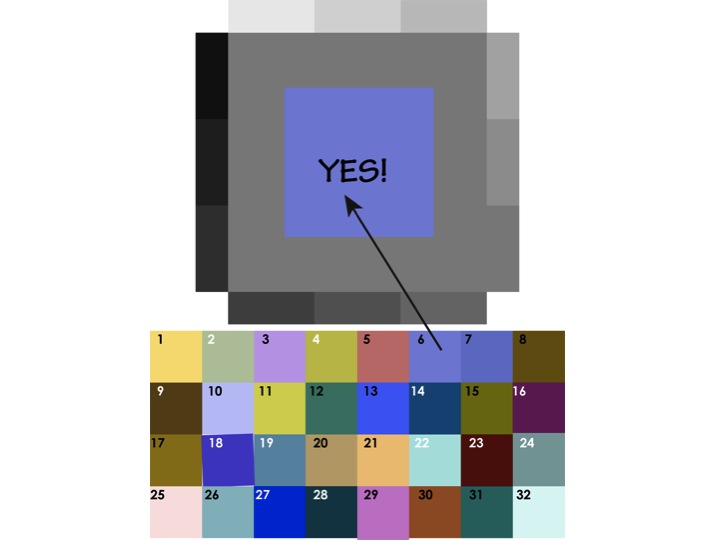
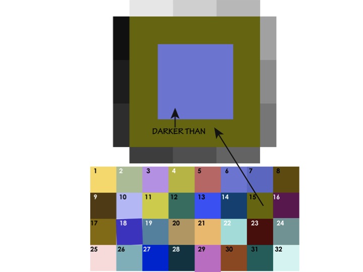
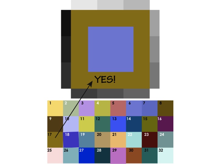
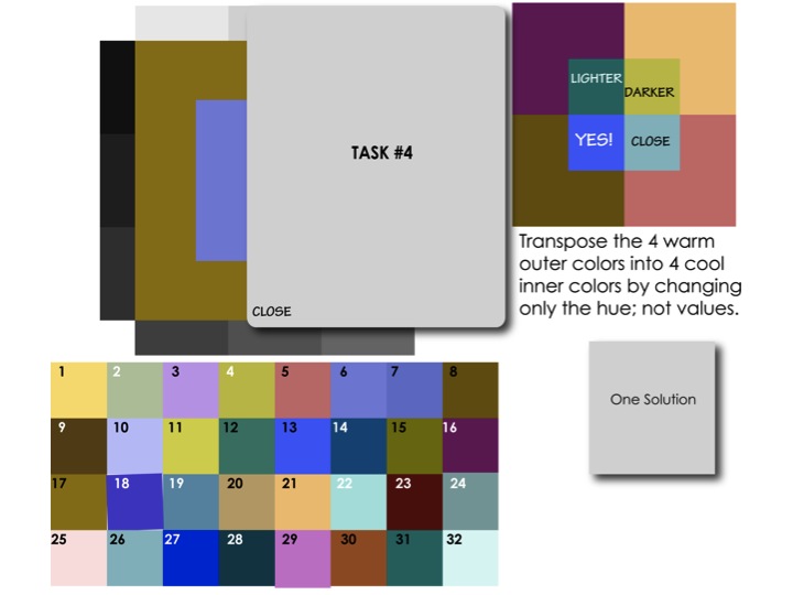
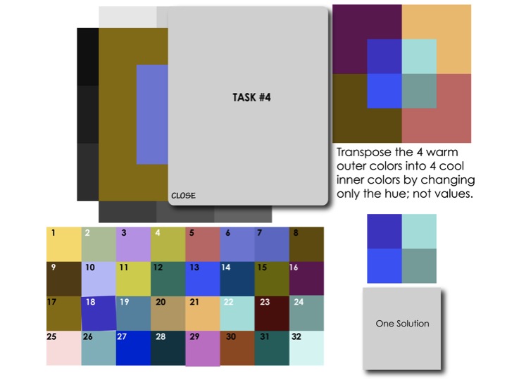
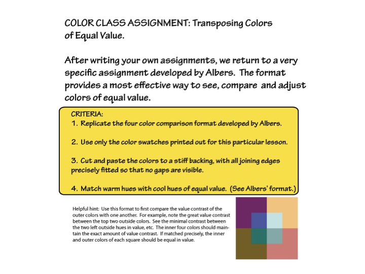
The new assignment is the most difficult one in this course. It is an exercise designed to develop the students’ value discrimination, which is a tricky skill to learn, by matching values between a range of warm and cool hues. Dick praised Albers for the ingenuity of this exercise and the cleverness of the format, by which you can gauge different color values in one piece. “You have four colors on the outside, and four colors on the inside. And Albers uses the term ‘transformation’: that you transform one set of colors into another set of colors, but the transformation is that they are only changed in hue, not in value.”
Dick has adopted his own term for the assignment: “Does anyone know what the term ‘to transpose’ means? If I have three notes and I transpose them, it means the melody is still recognizable, but the key has changed. What you’re doing with color is like changing the key, but the melody has stayed the same. The only thing that’s changed is going from warm to cool colors.”
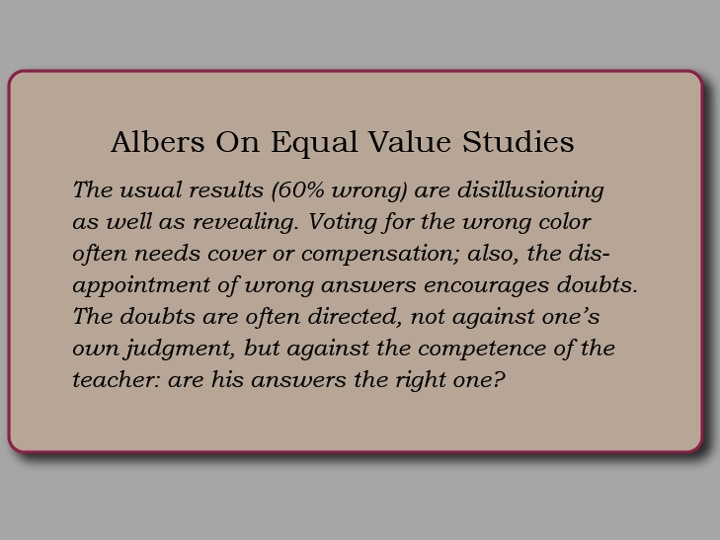
The assignment is to find equal values between the outer and inner squares, and make sure that the shift from one quadrant to the next is matched in both the warm and cool colors. As this is a very difficult assignment, Dick advises students to expect failure: “Give this exercise a try, but recognize that we do not expect any attempts to be right on target until value discrimination develops by hours of trial and correction. At this time, experience with expected failures should be the mindset, so don’t be discouraged with your early results and their direct flight to the trash bucket. This week is truly trial with a high percentage of failure.”
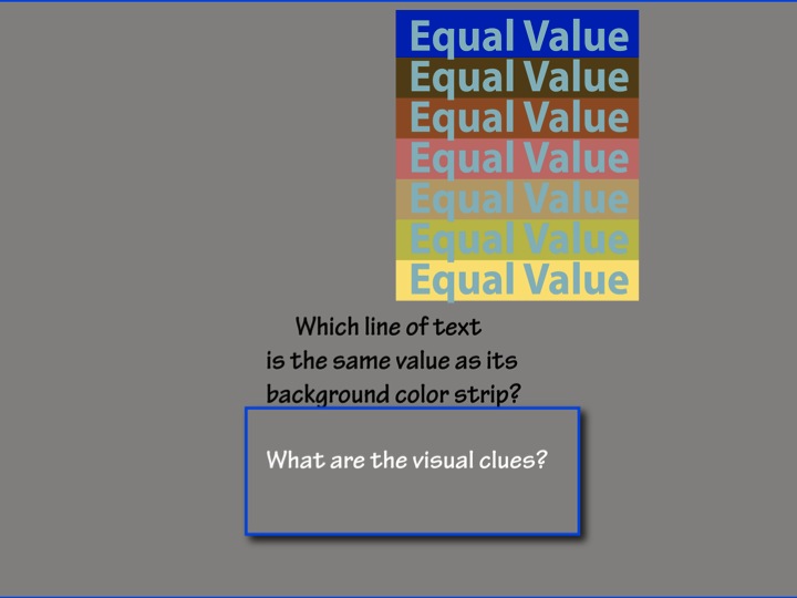
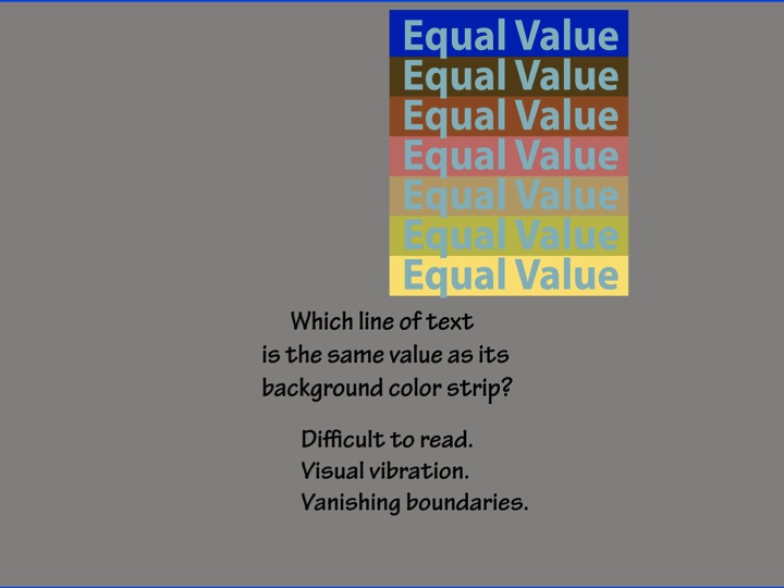
Vanishing and vibrating boundaries
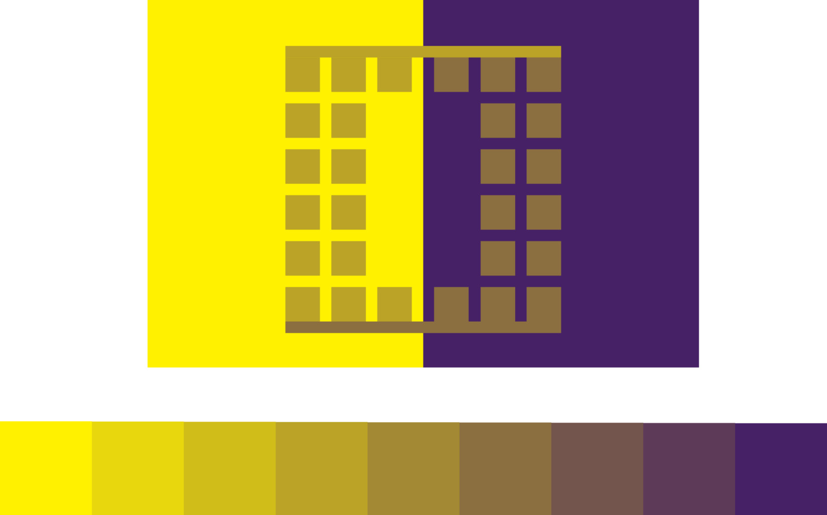
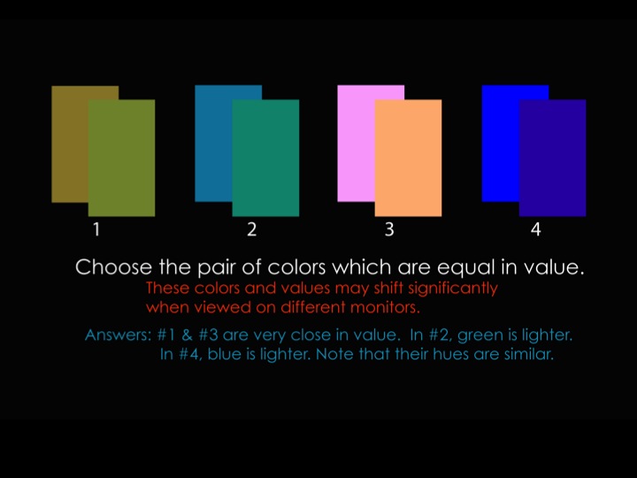
The results of equal value can be seen in two opposing optical illusions: one is vanishing boundaries, and the other is vibrating boundaries. Vanishing boundaries occur between two very similar hues that have matching values (such as light blue and lavender); and vibrating boundaries occur between two very opposed hues with matching values (such as full chroma red and green).
With either illusion, the border between the colors becomes hard to discern, since the eye has trouble separating the hues from their respective values. With colors of similar hues, the boundary appears fuzzy, diffuse, or seems ‘out of focus’; thus, the term vanishing boundaries. With colors in opposing hues, the boundary is hard to pin down because the eye has difficulty in seeing the opposing hues simultaneously, and they might even be irritating to look at. Dick used the example of Christmas posters made by high school students, where the red and green are competing so much that the viewer can’t look at it without feeling that something is wrong with their vision; thus, vibrating boundaries.
Hints for the color transposition / equal value assignment
Here are some additional suggestions for working with this assignment.
- Make sure the screen brightness is all the way up (as Gabe recommends for Huedoku)
- Try using a gray or black background instead of white, to reduce the competing light level and make it easier to focus on the study
- Work for limited periods of time (5, 10, 15; 30 minutes max). When you think you have it, take a break and do something else away from the computer for at least 15 minutes, then take a fresh look.
- Use the Albers afterimage trick with a movable swatch.
- Squint, or zoom out, or stand some distance from your screen to view the overall effect.
- When you think you have it, duplicate the swatch twice and make one a little lighter, one a little darker, and see if either of those is a better value match.
Some of these tips apply only if working in Illustrator, but some should help those working in physical media as well.
Student solutions to last week’s assignments
A single solution for each assignment is shown below, along with the assignment. Follow the links to see all digitally-submitted student solutions.

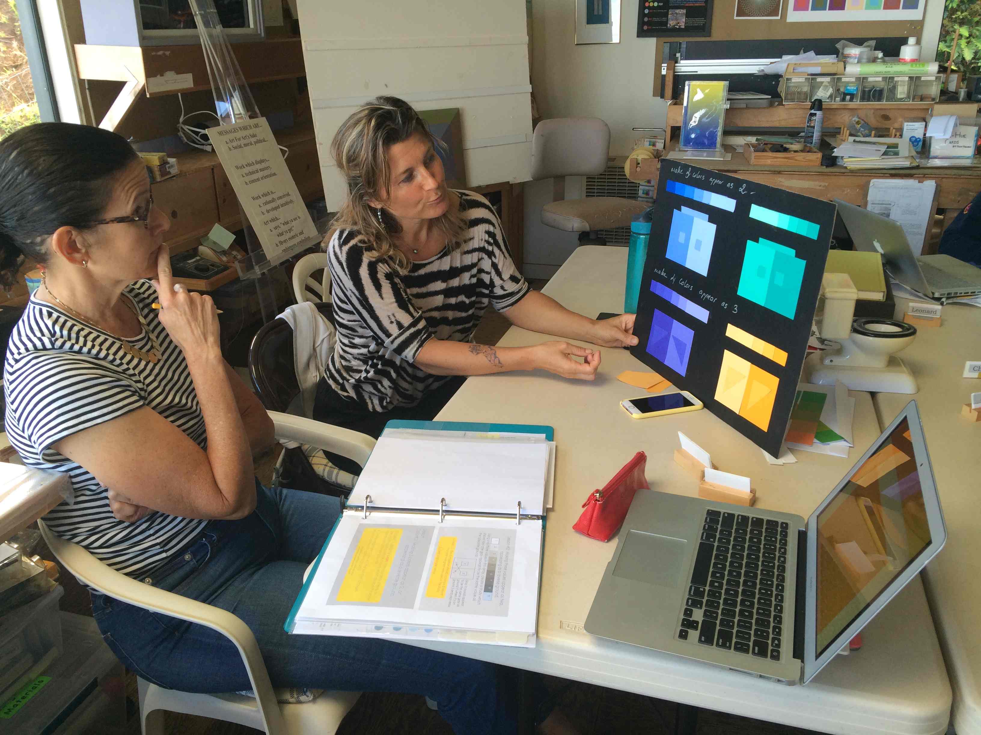
All solutions to Assignment 2: Make three colors appear as two, or reversed grounds.
All solutions to Assignment 3: Make four colors appear as three.
Class photos
-

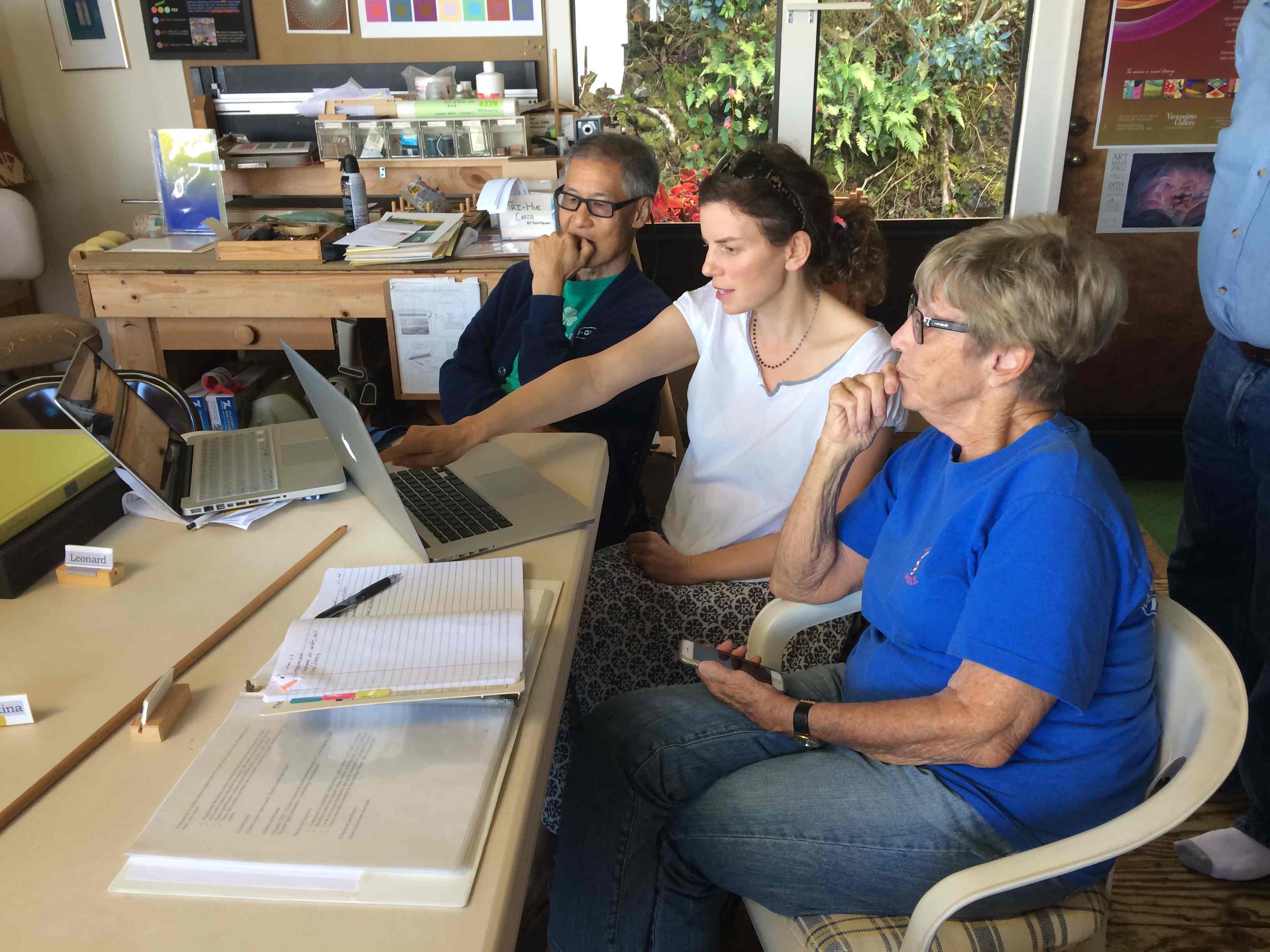
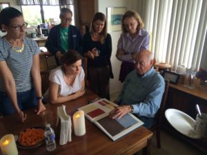
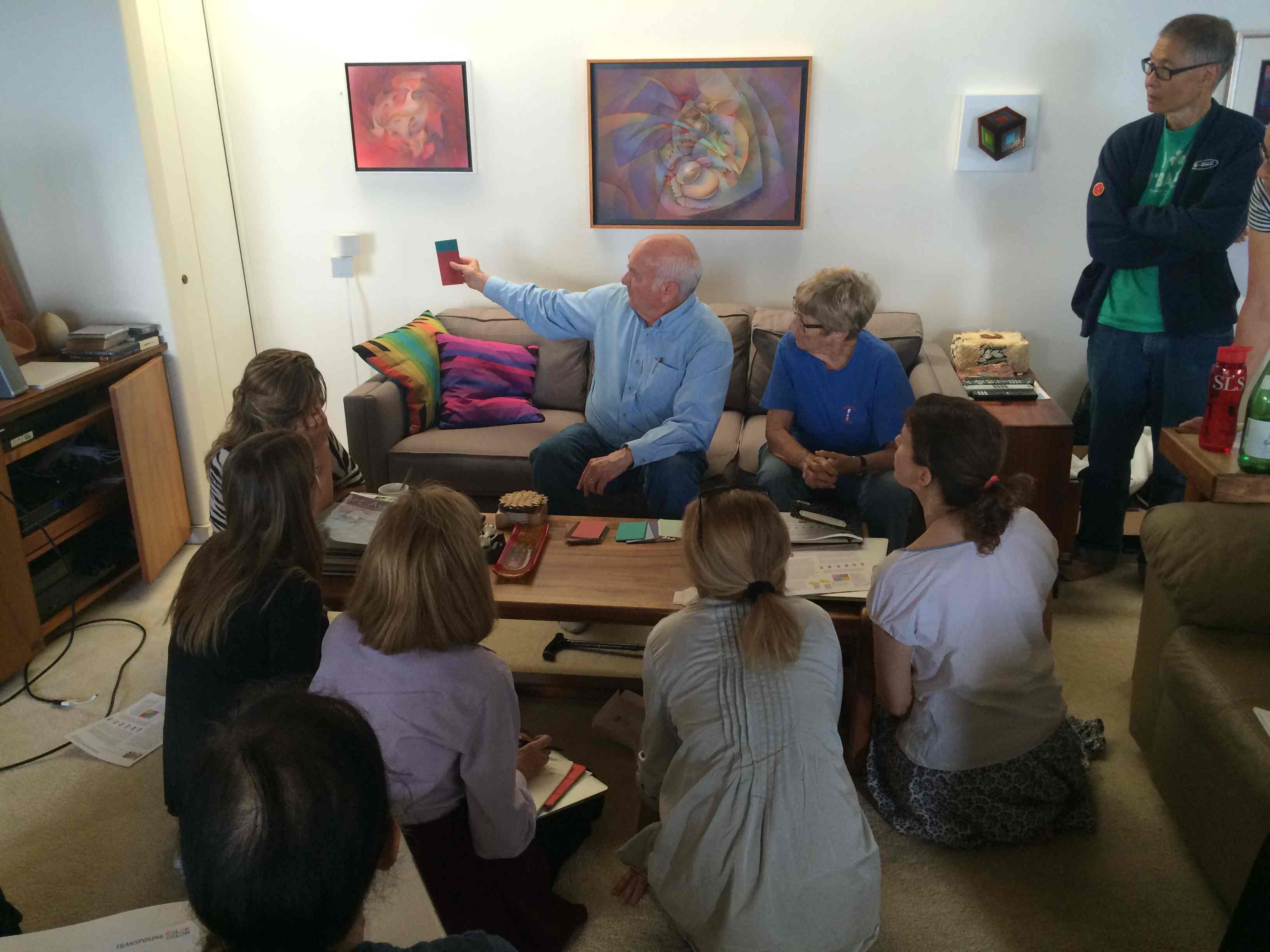
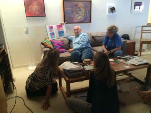
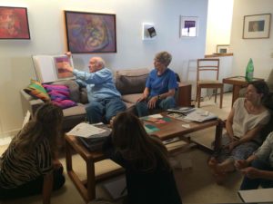
- Students shared their homework in small groups
-

- Discussing the results of the two homework assignments
-

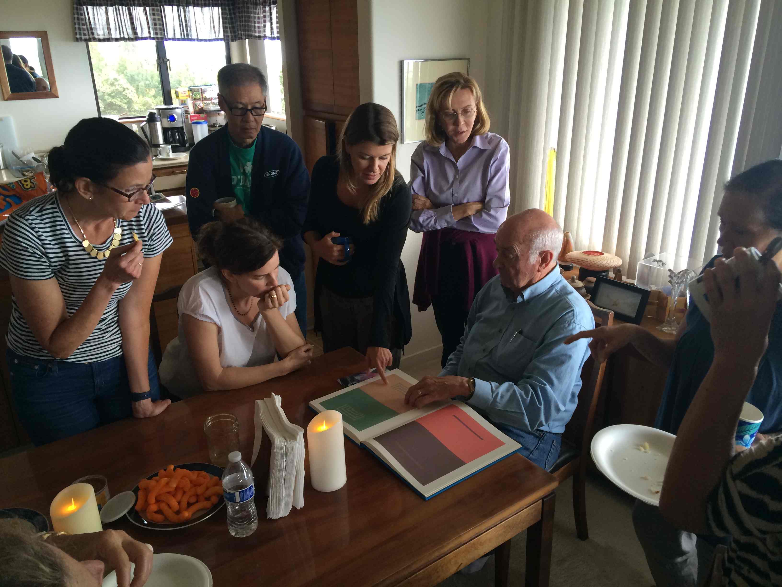
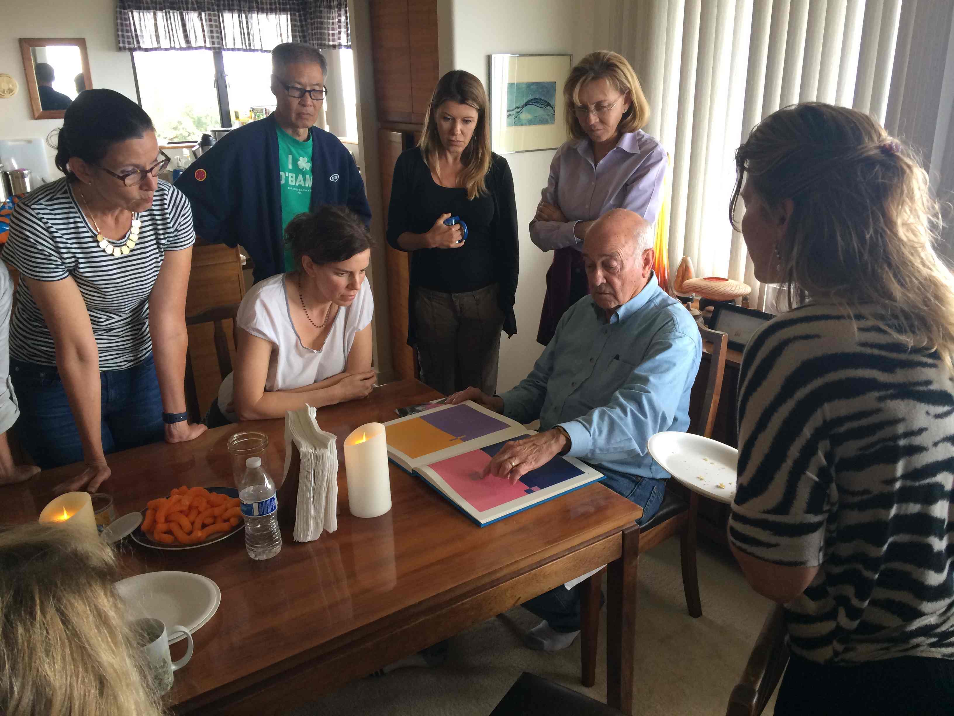
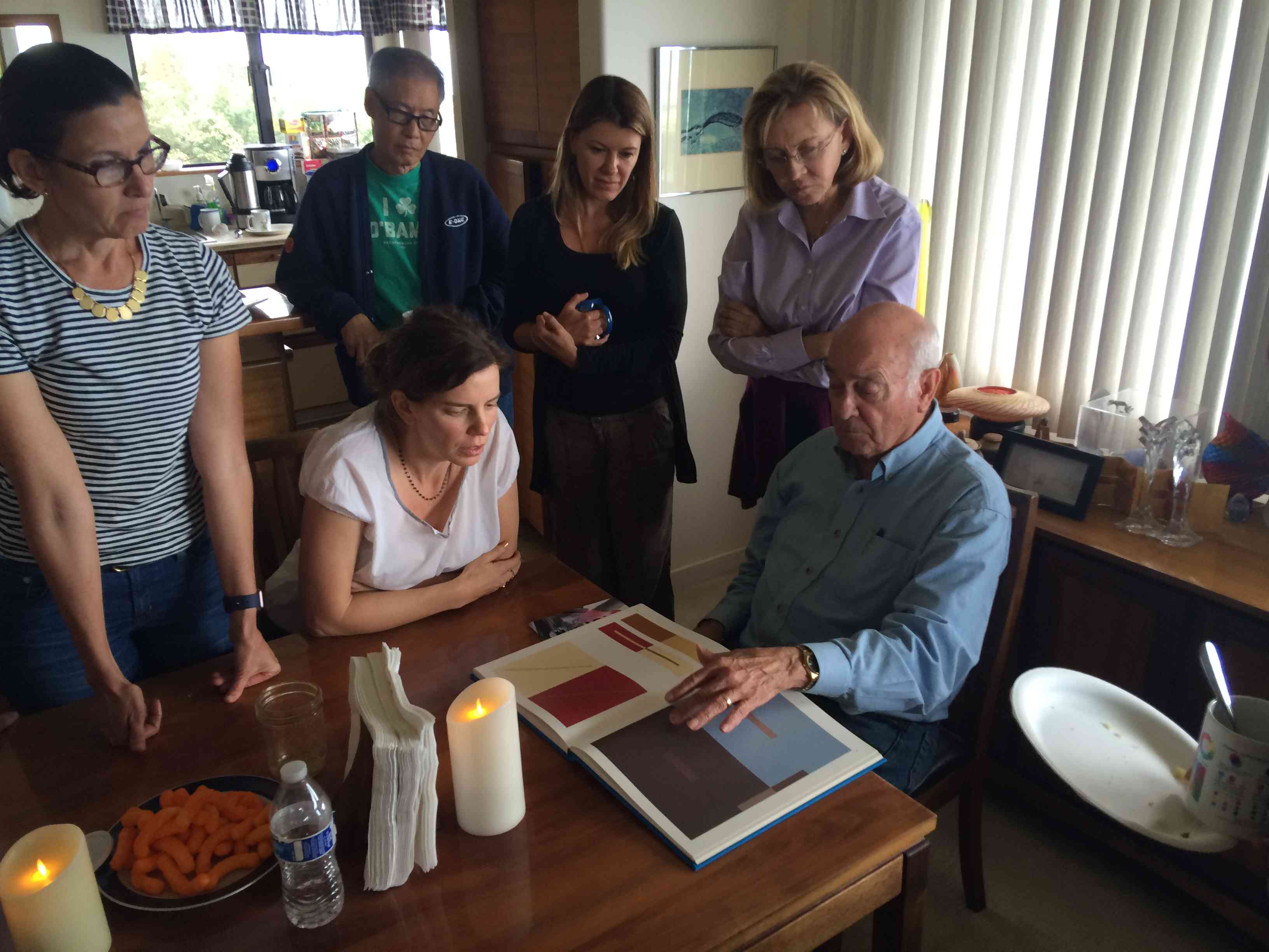
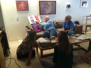
- Dick showed examples from the Albers book at the end of the coffee break
-

- This format for showing color interaction in this example is very effective
-

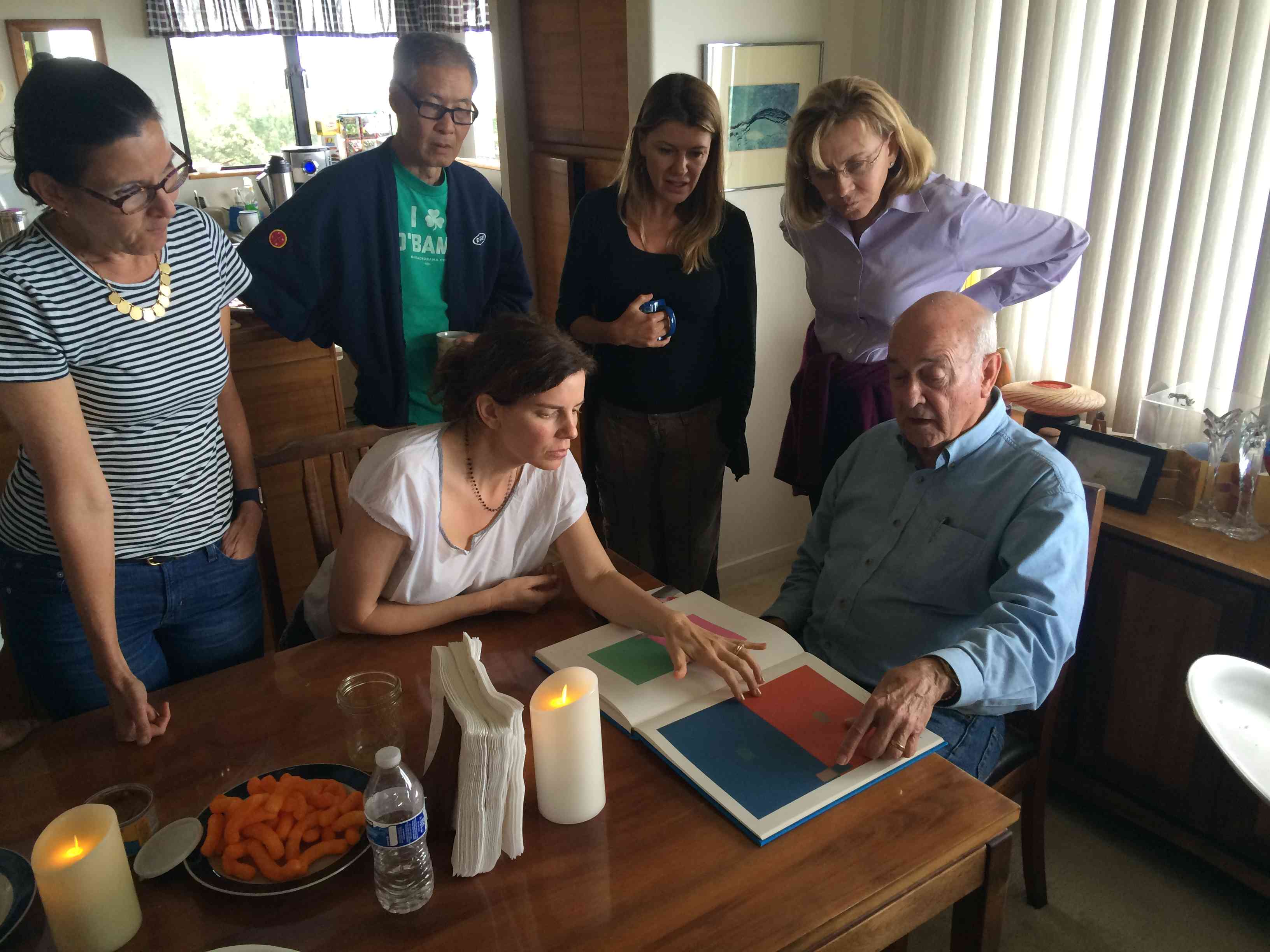
- Placing the cut-outs over the page allows us to see how different the two colors are
-
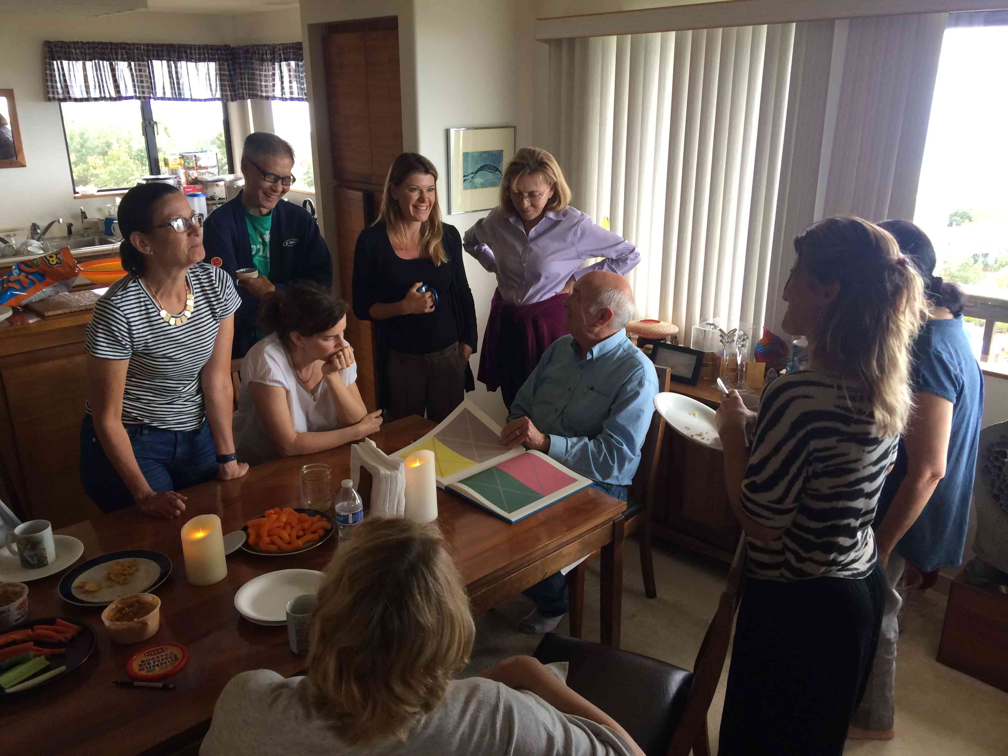
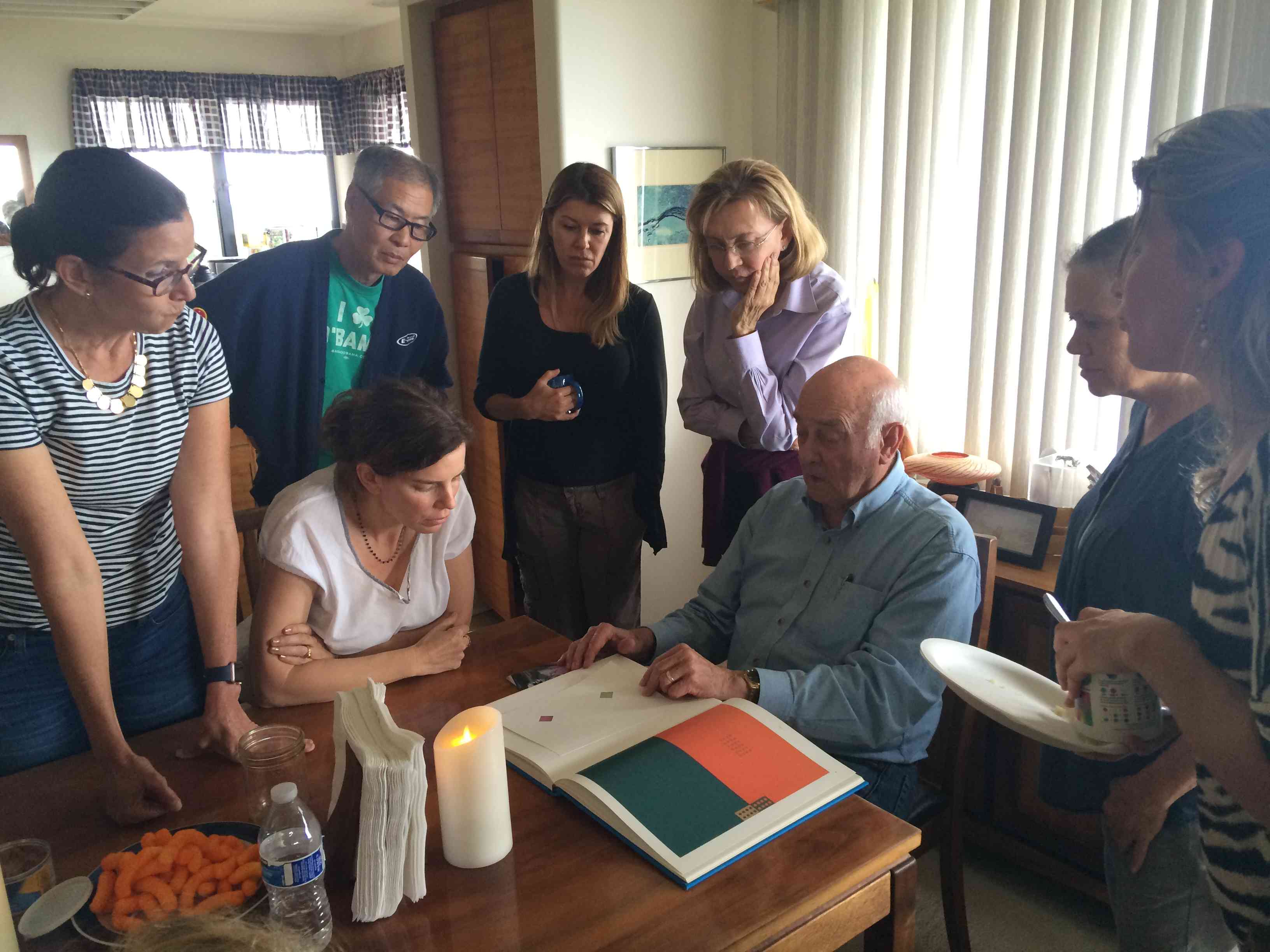
- Dick discussed how different these assignments turn out when done with an understanding of color interaction (i.e., using arrays for color selection)
-

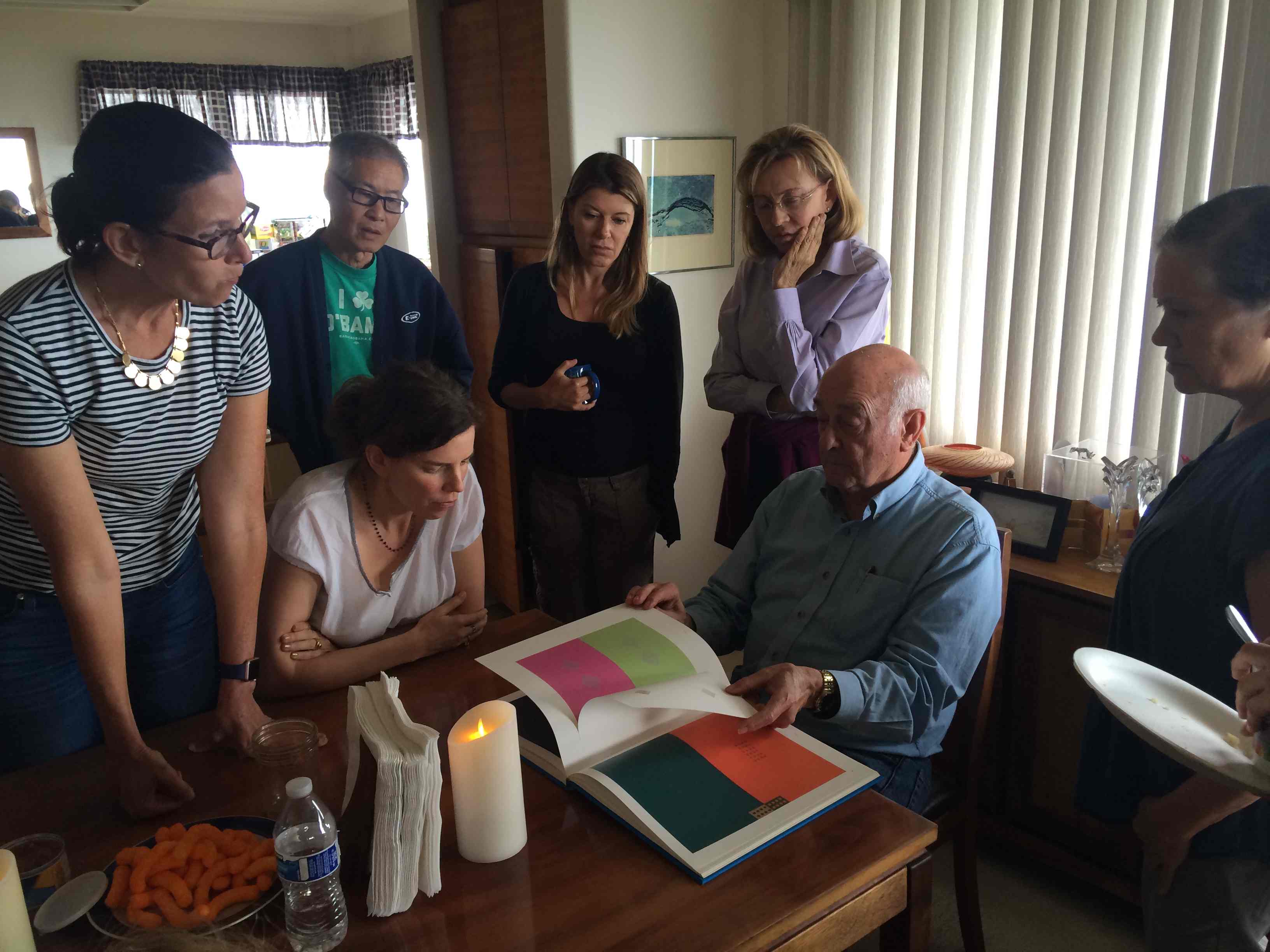
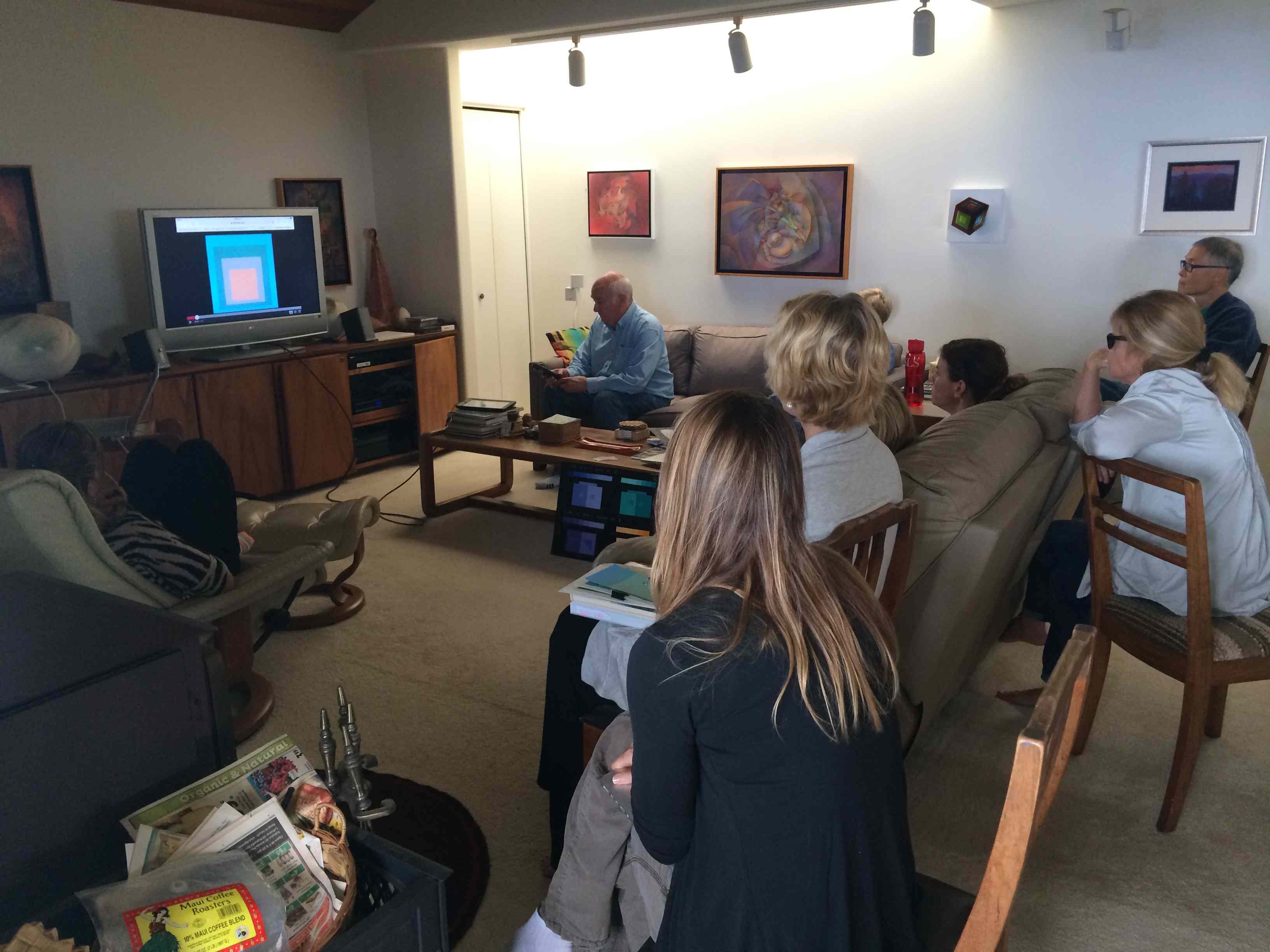
- Watching a video with faulty “expert” information
-
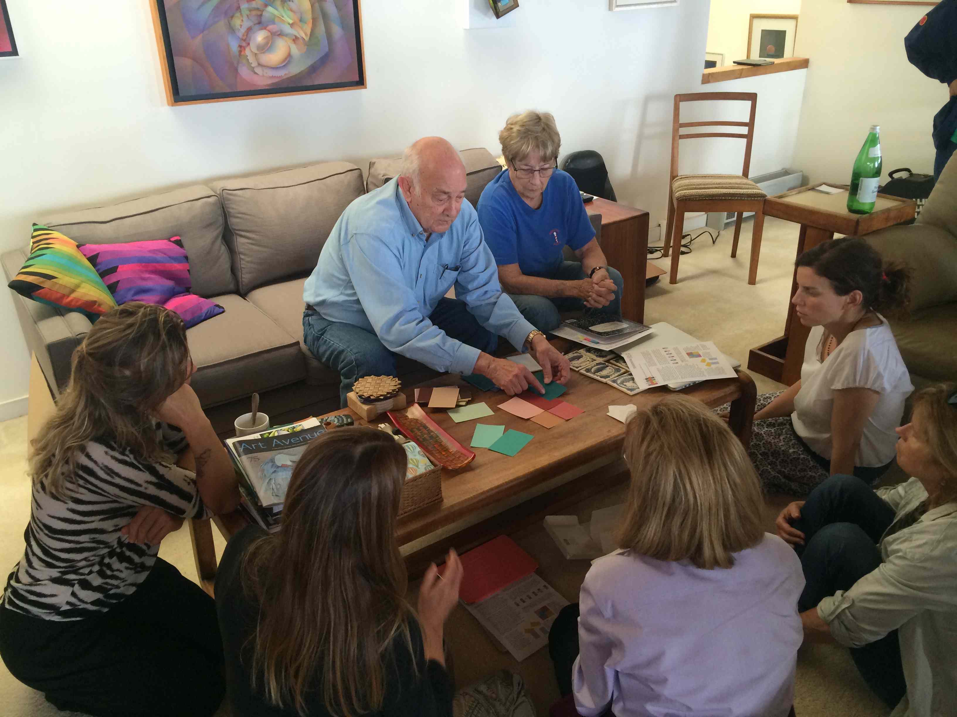
- Using Color-Aid paper to measure the values in these two different hues
-

- Matching value can be very challenging
-
- The format in Albers’ book allows one to compare the values of eight different hues

-
- Is the value shown in these examples correct? Not always.

-
- Value discrimination will come naturally after many hours of looking at colors, so don’t be discouraged by early failures!

Class materials
[gview file=”https://dicknelsoncolor.com/wp-content/uploads/2016/04/EqualValue2.pdf”]
[gview file=”https://dicknelsoncolor.com/wp-content/uploads/2016/04/Equal-Value-hints.pdf” height=”400″]
Even though we did not go over these particular images in class, this slide show demonstrates a very helpful way to practice equal value studies.
Dick briefly showed two paintings by Kit Gentry, a former student of his. Kit was already an accomplished artist before he took Dick’s class, but was amazed by the color theory that Dick taught. On his website, Kit shows a painting done after learning about equal value and vanishing boundaries, which he titled “Breakthrough” in reference to the revelation he had in understanding how to apply these theories to his work.


Videos
Color Luminosity
Here are two ways color luminosity can be achieved. This should dispel the notion that the French Impressionists achieved color luminosity by way of full chroma color application. See the truth with your own eyes.
Equal Value
The video tutorial below attempts to show and tell how to use the color transformation homework format to compare values. It seems that some colors and values have changed somewhat between what he was working with onscreen and the final result, but if you can overlook that you should still find value (ha-ha, get it?) in watching and listening to it.


