The second session of the Color Relationships 2 class for Fall 2016 was held on Wednesday, September 7. We critiqued the homework (Create the illusion of a colored film over two or more colors), and discussed the next visual phenomenon: veils. What are their characteristics, where do you see them in nature, and why would an artist choose to use them in their work? See the full post for class photos, videos, and more.
Homework assignment
Create the illusion of a set of two or more colors under the influence of one or more veils.

Class recap – some key ideas
Critique – Illusion of a colored film
We began our second class with a critique of the homework, Create the illusion of a colored film over two or more colors. Many of the students had experimented with several studies, becoming aware of the challenges in both choosing the correct colors to create their illusion, and the importance of the Gestalt, which provides the visual clues to the viewer as to what they are seeing.
Here are some of the Illustrator film studies. View all studies submitted online. Studies executed in physical media – watercolor, Color-Aid paper, and fabric – are shown in the Class Photos section later in this post.


One student, Susan, decided to do a bit more research on the concept of Gestalt in order to understand it better. ‘Gestalt’ is a German word, loosely translated as meaning ‘shape, form, or figure’, while a Google search gives the definition as ‘an organized whole that is perceived as more than the sum of its parts’ (sound familiar?). Susan shared some of her discoveries, noting “the importance of simplified composition and clarity of design” as being key to creating work which viewers could respond and relate to. Another student commented on the qualities of a piece being “casual versus composed”, which can make all the difference for this particular assignment. (To see more information on the theory of Gestalt as it pertains to visual design, visit these web pages: Gestalt Theory of Visual Perception, The Gestalt Principles, and Gestalt Principles).
Many of the homework examples proved that students understood the characteristics of films, noting right away when a homework submission showed a correct film versus a false film. One way to tell when you are viewing a false film is that it lightens the colors underneath it, instead of darkening them. Another way is to see if the film is modifying colors equally, in both hue and value. The value part can be tricky, since a film will create more contrast when placed over a lighter color than when placed over a darker color. As for hue, Dick asked the class, “How essential is the white underneath the film [leaving a few white spaces between color shapes]? Could you tell the hue [of the film] without it?” Without a point of reference, it is more difficult to recognize the color and degree of opacity of the film.
Dick again brought up RELATIONSHIPS, asking, “Are you introducing things that don’t make sense? Copying is not understanding.” He stressed the importance of understanding the principles and making use of films and veils as a part of your visual vocabulary: “[The educated person] can pick those things which they want to talk about”. Karen had this to say in her post from the Color 2 class of 2015:
Why study films? While creating these film illusions is almost magical, and Dick has always loved magic, the importance of knowing how to recreate the visual phenomenon of films goes beyond artistic sleight of hand. Shadows behave exactly like films, so an artist who recognizes that can create realistic shadows and convey time of day. It’s especially easy for a watercolorist, who can glaze with a single shadow color throughout a work. This contributes to unity and realism in a work. Beyond that, though, films can be used to set a mood. During the Baroque period, artists were interested in conveying emotion and life the way we perceive it. They discovered that glazing over a whole painting with an amber glaze would unify it, and create a warm ambiance, like at sunset. A film can unite colors that otherwise have no relationship and make them relate. In Dick’s opinion, only a fraction of the current artist population has any visual literacy in films. “Nature is relationship” and visually illiterate artists don’t see or convey natural relationships.
Teamwork – Creating the Illusion of a Veil
After the critique, Dick presented a new team challenge, to create the illusion of a veil over three different colors, and once that was achieved, to show another veil of differing opacity. Teams were provided swatches of colors, and it was left up to them to determine how they would group the swatches together, along with what shapes they chose to cut the swatches into. Once again, creating a convincing illusion depends not only on correct color relationships, but also on good design and visual coherence.
-

- Instructions for the in-class challenge.

-

- Working in teams of two to create the illusion of a veil.


-

- One part of the challenge is deciding how to cut the paper so as to create a design that accurately conveys an image of a veil over other colors.


-

- The other part of the challenge is to properly match the correct hues to simulate a realistic veiling effect.


One solution to the in-class veil assignment:
[gview file=”https://dicknelsoncolor.com/wp-content/uploads/2016/09/Create-Veil.pdf”]
Discussion and slide show about veils
Dick began his lecture with the question, “Where do you see veils in nature?” Responses included clouds, fog, bridal veils, and mosquito netting, to name a few. Dick mentioned that the most common use of veils in artwork is seen in landscapes, where veiling is used to create the illusion of depth. Aerial perspective (also known as atmospheric perspective) was used in Renaissance artwork to much acclaim; one famous example would be the Mona Lisa painting by Leonardo da Vinci (who is credited as the fist person to use the term in his Treatise on Painting).
Dick then asked, “What is a veil, and what purpose does it serve?” ‘Veil’ can be used as both a noun and a verb, and one definition of the word is to ‘partially conceal, disguise, or obscure’. Synonyms include words such as cover, screen, cloak, mask, conceal, hide, covert, indirect, and implied, among others. Bridal veils were mentioned as an example, where the veil was traditionally used to create a sense of mystery and anticipation, along with an aura of sacredness and purity.
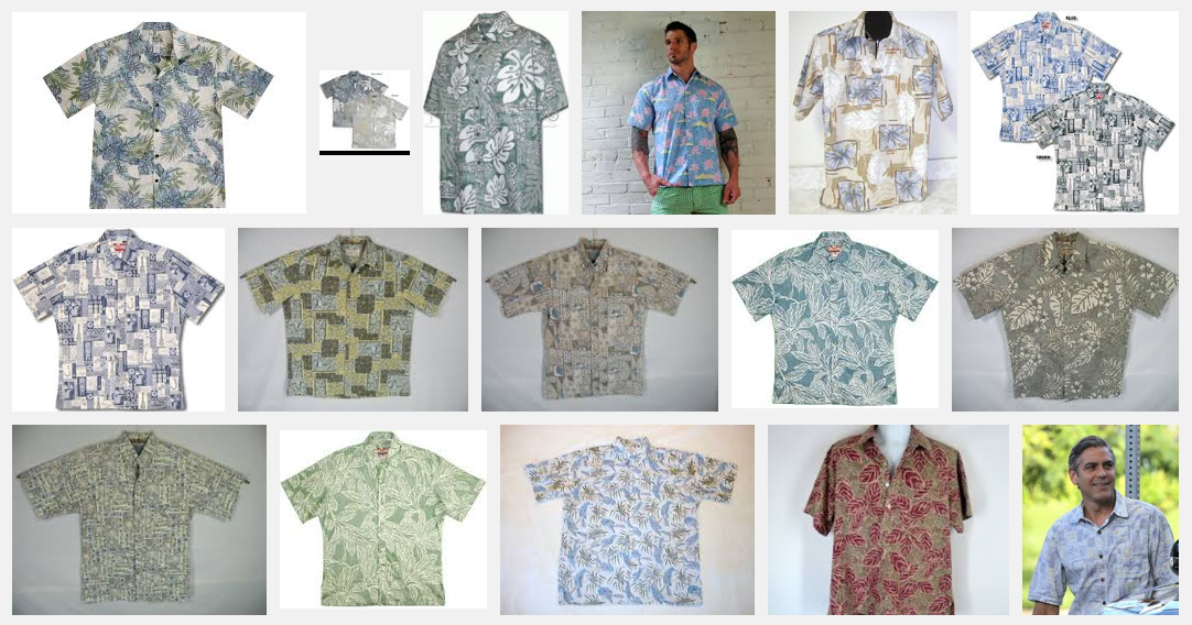
The class discussed some of the characteristics of veils, the most obvious being that they will lighten the colors underneath them. One student asked if that meant that veils always had to be white, which is not the case – just like films, there can be colored veils. Adding a veil can also harmonize and unify differing colors, and one of Dick’s favorite examples is the reverse print aloha shirt. As Karen wrote in the Color 2 Winter 2015 post:
Dick talked about “reverse print” aloha shirts as an example of how veils can unify. They are purposely constructed with the bright print on the inside and the more muted “back” side of the fabric on the outside. The tinting effect harmonizes all of the colors, unifying the design. Notice the muted appearance of the shirts in the screen shot below.
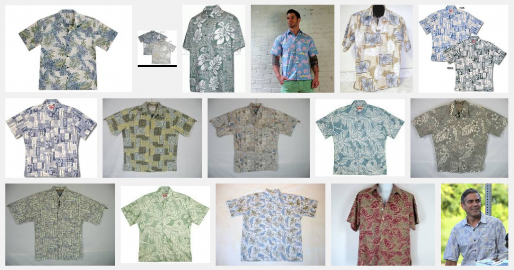
- Reverse print aloha shirts
Just as with the films, the critical question is, “Why would an artist use veils in their work?” As mentioned with the bridal veils, it can create a sense of mystery; it implies the ‘suggestion of’; and most significantly, it engages the viewer. If you don’t show everything, the viewer is allowed to “fill in the blanks” using their own imagination, and in the process becomes a participant in the artwork, rather than just an audience. Dick stressed again the importance of being an educated artist: “Know why you want to veil something, and by how much. Visual artists have to know the magic tricks [of creating optical illusions], they have to know the visual grammar.”
Class photos
-

- Gathering in the living room to start the critique.

-

- We began by critiquing the digital submissions. Adobe Illustrator can be a very useful tool for experimenting with films and their modifying effects.

-

- Leonard submitted homework in both the digital format and this study done in watercolor. The left side is done by layering the watercolor and letting the film effect happen naturally. The right side was done by mixing the colors before putting them down, trying to match the hue and opacity of the left side.

-

- Elizabeth choose to do her homework in a variety of mixed media: in this case, crayon and watercolor, along with an image she found in a magazine.

-

- Another one of Elizabeth’s submissions, using watercolor and Color-Aid paper.

-

- Elizabeth’s optical illusion, using watercolor to create an image of a transparent box. See if you can shift your perception of the box: the box can either appear to be above eye level or below it.

-

- Keri choose to use fabric to create a very convincing illusion of a transparent film over multiple colors.

-

- Stephanie also submitted her answer to the Recreate a Masterpiece assignment, creating this collage that replicates a Pierre Bonnard painting.

-

- The original Bonnard painting which Stephanie used for reference (she pointed out that the printing of this image is not true to the actual colors of the original).

Class materials
Dick showed the presentation and videos below.


Videos
Fog – a very short simulation
Free color study – trihue stripes in Illustrator
A free color study process Dick enjoys, using Adobe Illustrator to come up with unique color combinations by overlapping varying transparencies of the three primaries, cyan, magenta, and yellow.
Optional assignments
Free color studies were an important part of Dick’s color classes at Yale. Here are some options for exploring color, without the strict constraints of the weekly studies. You may work on these at any time throughout the course.
[gview file=”https://dicknelsoncolor.com/wp-content/uploads/2016/09/OldMastersAssign.pdf”]
(need to add assignment here: Lose a Leaf…)
Some examples of Lose a Leaf studies:
[gview file=”https://dicknelsoncolor.com/wp-content/uploads/2016/09/Leaf-2s.pdf”]


