The third session of the Color Relationships 2 class for Fall 2016 was held on Wednesday, September 14. We critiqued the last assignment, (Create the illusion of a veil), and Dick discussed some recent revelations he has had concerning the tricky nature of a veil (sometimes it acts like a false film). The class tackled a new team challenge, discussed the features of atmospheric and volume color, and also heard from Dick on the four ways to show depth through visual clues.
Homework assignment – Volume color

Class recap – some key ideas
Critique – Illusion of a veil
Class began with a critique of the homework, Create the illusion of a set of two or more colors under the influence of one or more veils. Students commented on some of the difficulties they had with the homework, especially when it came to colored veils. Using a white veil was fairly easy, since it would simply tint the colors underneath it. But adding color to a veil made anomalies appear, where sometimes the veil acted in ways that didn’t match our definition (that a veil should always lighten the colors underneath it).
Dick revealed that he had had some revelations about veils over the last week that changed his mind on their characteristics. It occurred to him that there are black veils, such as those you would see at a funeral, and there is no way a black veil would lighten the colors behind it. And what would happen if you made the black mesh tighter or looser, or as Dick said, “What happens if I make that mesh more opaque?”. To further explore these ideas, Dick created an Illustrator test to see what would happen (see A closer look at veils, below).
What he found is that veils are tricky: sometimes they will lighten colors, and other times they will darken them. Using the black veil as an example, when you place a black mesh over other colors, it will act as both a film and a veil. It is darkening the colors behind it, and also obscuring them at the same time. Through various trials, Dick found that if the veil is darker than the color it is placed over, it will turn into a false film (see last week’s post for more information on false films).
This changes his previous rule that veils will always lighten colors underneath them. Veils, in certain cases, will behave like films and end up darkening a color. Dick summed it up with a new clarification of the difference between veils and films: the primary difference is that veils are made up of opaque particles (such as atmosphere) or material (such as mesh veils) that are actually obscuring your view, while films are entirely transparent (such as shadows). Observe veils in the real world to gain more understanding of how they modify color.
See all Illusion of a veil homework submitted online. Some students also submitted work done in physical media, fabric and watercolor.
-

- Beginning the critique


-

- Keri’s veil homework done with fabric

-

- A second submission from Keri

-

- Elizabeth Ann did several color studies in watercolor and crayon

-

- Elizabeth Ann also continued working on film studies, in this case using both CMY and RGB as color themes for a cube illusion

-

- In this study, Elizabeth Ann combined both her explorations of color harmony (seen in the stripes), and the use of films to create another cube illusion

A closer look at veils
 To clarify his understanding of how veils behave, Dick simulated real-world veils in Illustrator, by creating grids or meshes of various colors and densities. Dick demonstrated it for the class, overlaying them on a variety of colors. Download the PDF below and open it in Illustrator to try for yourself.
[gview file=”https://dicknelsoncolor.com/wp-content/uploads/2016/09/VeilMeshTest.pdf”]
Another look at films
At the beginning of the slide show, Dick briefly touched on a recap of films and how to demonstrate them correctly. As he often repeats, it all comes back to RELATIONSHIPS. Films should modify all colors equally, and they should also show what colors are underneath them; they should be transparent. By changing the background colors, one can change the perception of which shape is the film versus which shapes are opaque.
Volume color
The slide show continued on to the topic of volume color. Dick uses this term to describe the effects of both objects seen at a distance (other terms include atmospheric perspective or aerial perspective), and under water. In both cases, objects become less detailed and fainter as they recede into space, with objects in water taking on the color of the water, and objects on land taking on the color of the atmosphere. Both atmosphere and liquid behave as infinite veils, imparting their color to objects behind them, in proportion to their density or thickness. The effect can vary from delicate modification to almost complete obscuration.
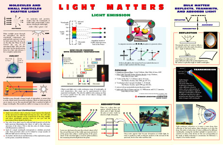
Light Matters poster
Dick pointed out that the reason objects at a distance are difficult to discern (such as a view of a mountain range) is due to little particles floating around in the atmosphere which are reflecting light. These particles can reflect different wavelengths of light, leading most often to a slight bluish tint as objects get further away. Karen has also found a great poster which illustrates the science behind this, writing in 2015, “The physics behind these phenomena are explained visually in the “Light Matters” poster available from the General Atomics Sciences Education Foundation (light is transmitted, scattered, refracted, reflected, and absorbed).”
Along with color modification, what other visual clues do we need to show space and depth? Dick spelled out the four main ways to convey depth in visual art work: overlapping, orientation on the picture plane, size/scale, and atmospheric perspective (for more information on this topic, please see these notes from the 2015 Drawing Foundation class). These are visual clues which help the viewer understand what they are looking at, and it is important to figure out which ones are necessary for the particular message the artist is trying to send. By using two or more of these principles simultaneously, the viewer will get an accurate sense of depth and space.
Watercolor demo
At the end of class, Dick had another watercolor demo for the class, to show how a watercolorist has to plan for veiling effects. Since watercolors are a transparent medium, any time one color is layered on top of other colors, it will act as a film and darken all the layers. To achieve a veiling effect, the artist has to choose where the veil will be, and then progressively darken around that area so that a veil naturally emerges from the untouched colors. Dick asked several students to take turns adding select layers, which also involved choosing the right color mixture and value change, so that all the colors would be affected equally, thus making the illusion complete.
-

- Setting up for the watercolor demonstration


-

- Creating a veil in watercolor means the artist has to plan in advance where the veils will be, and then darken around them to create the effect.

-

- In the upper right quadrant, dark blue was added to enhance the veiling effect, along with a dark turquoise on the left side, and a touch of darker orange in the middle stripe.

-

- Before creating the veil, Dick had drawn a rectangle, and asked students to apply darker colors around it.

-

- After adding darker colors, the veil begins to emerge.

Free color studies
Dick also showed some slides on free color studies, discussing how Albers wanted his students to work with color and color alone. Albers’ assignment was to use autumn leaves and create collages which had color as the focal point, not shape. He asked his students to “lose the shape” by using the interaction of color. Dick encourages this class to try their hand at both free color studies, and also the ‘Recreate a Masterpiece’ assignment, as they are both challenging exercises which will enhance students’ color acuity and understanding (see handouts below, under ‘Class materials’).

Class photos
-

- The team challenge this week was to create the illusion of objects in space, one composition as seen through atmosphere and one through liquid.


-

- Dick asked the class to think about all the ways to show depth: overlapping, size/scale, placement, and atmosphericcolor.


-

- Some of the final results

-

- Both overlapping and changing size can be very effective at conveying depth


-

- Dick also encouraged sutdents to think about ‘casual’ compositions

Class materials
Another take on films


Volume color


Free color studies
[gview file=”https://dicknelsoncolor.com/wp-content/uploads/2016/09/OldMastersAssign.pdf”]
[gview file=”https://dicknelsoncolor.com/wp-content/uploads/2016/09/Lose-a-shape.pdf”]
[gview file=”https://dicknelsoncolor.com/wp-content/uploads/2014/10/Free-Color-Study-Assignment.pdf”]
Videos
Opaque or transparent?
Changing background colors change your perception of which shape is opaque and which is transparent. Baffling, even when you understand the principles involved!
Volume color
This tutorial demonstrates how volume color modifies a color immersed in it. The demonstration explains how aerial perspective also influences color. An important tool in creating a composition in which all colors are “OF” and not merely “ON” the picture plane.
Same class, different year
View the corresponding class post from 2015 or 2013.
Additional / supplementary materials
Here is another website which provides an explanation of atmospheric color and how to use it successfully in artwork.


