Homework
The new homework assignment is to create two illusions of volume color, as detailed below. Arrays are the key! Ongoing assignments are to identify examples of color deceptions and halation (exercises 1-3) and visual phenomena (films and veils) in nature, or in your own or others’ work. Create improved versions of any past assignments. And be on the lookout for freaks, and evidence of your own increasing visual sophistication or color snobbery!
Class recap
There was some discussion of “freaks” versus personal style. It all depends on your intention – what is the artist trying to do? If you’re trying to convey a scene realistically, it’s important to pay attention to how nature really works, and make sure your work is consistent with that. If you’re Vincent van Gogh, that’s not your intent. If you’re an expressionist, make sure every aspect of the work communicates that. The phenomena we’ve been studying give you tools you may choose to use, or not, just as a knowledge of all the styles and traditions in the history of art gives you all those choices, while a child has only their own knowledge and instincts to act on. If you want to try something new, you have to give up the old, at least temporarily. Two metaphors for this were “If you want to try the black horse, you have to get off the white horse” and “You can’t steal second if your foot’s still on first.”
Real learning isn’t memorization, it’s behavioral change. If you see the world, or works in a gallery, differently now than before this class, it’s because you’ve changed. You’re seeing with a different set of eyes.
All of these tools are very rational and analytical. Learning them may not seem very exciting. What IS exciting is what they allow you to do. They let you become a magician, to make people see something that isn’t there. While Dick doesn’t paint realistically anymore, he uses these principles to fool the eye, to involve the viewer in the painting, to make them see the beauty in colors and shapes and values. Dick said, “If I sound a little overbearing, it’s because damn it, I love the truth!” He encouraged everyone to observe and question and develop their own checklists, to become independent of him and me. Rather than limiting your creativity, these principles give you even more options to choose from as you create. As in writing, music, and dance, learning the fundamentals of your art allows you to express yourself more fluently. You are gaining more elements with which you can orchestrate and compose. The more you practice, the more your mastery will grow.
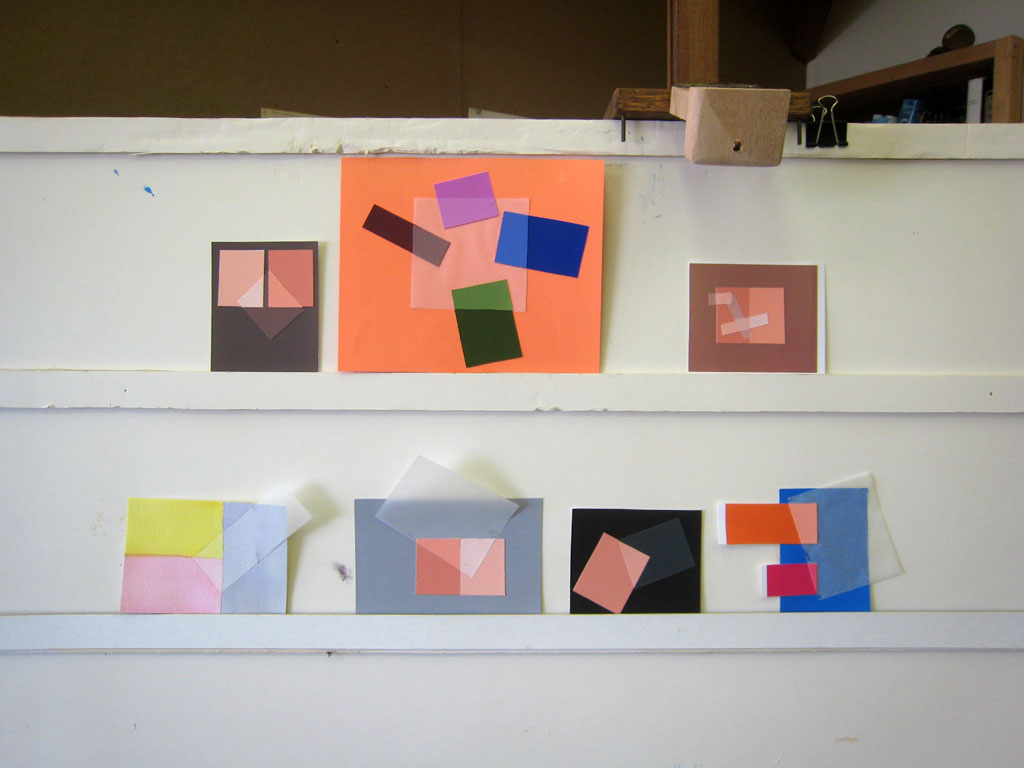
Critique – reworked assignments 1-4
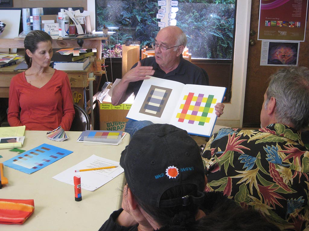
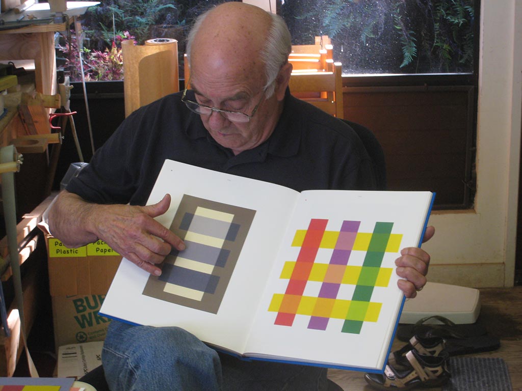
Here’s a study (from past years) which challenges your perception of which color is the film, recognizing that it all has to do with context, or RELATIONSHIP!
Review
It’s absolutely critical to OBSERVE and QUESTION. We’re training our brains and eyes into new habits, and it takes effort at first. Create your own critique checklists and USE THEM.
[gview file=”https://dicknelsoncolor.com/wp-content/uploads/2013/10/CheklistUpload.pdf”]
There are some fascinating transparency illusions in the Albers book, but if you look at them critically, you find they behave inconsistently with nature. Dick created a similar illusion in watercolor that has consistent behavior.
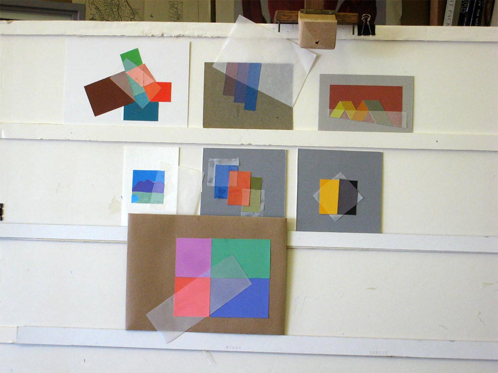
Critique – Assignment 5, Illusion of a veil
Tuesday homework: Illusion of a veil
Saturday homework: Illusion of a veil
Refer to the checklist above. Is the illusion believable? Does the veil lighten everything under it consistently? Does the composition have good gestalt?
Dick asked whether class members have incorporated veils into their work, and why. Answers included:
- I do it all the time. It adds subtlety. I didn’t have a name for it, though!
- It unites and adds mystery.
- In a landscape, it helps with perspective.
- It helps to give the illusion of depth.
- I’d like to use it to fool the viewer into thinking that something 2D is 3D.
The unifying effect is most important to Dick. A veil treats everything in a predictable way. There is a consistency in nature. Like transposing music from one key into another, the intervals are consistent. If there’s consistency in your painting, it works; if there isn’t, you’re creating a freak.
Mastering this allows the artist to be a magician, an illusionist. A veil entices and implies, and allows the mind an opportunity to engage. There’s nothing worse than listening to someone who’s totally literal. Know what the options are, and pick the ones that help your cause. It’s like having a good vocabulary. You don’t have to always use the big words, but you can pick the right one when you need it.
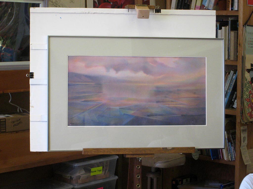
A trihue watercolor landscape incorporating veils
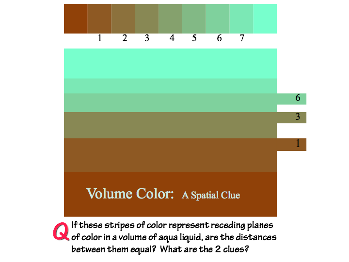
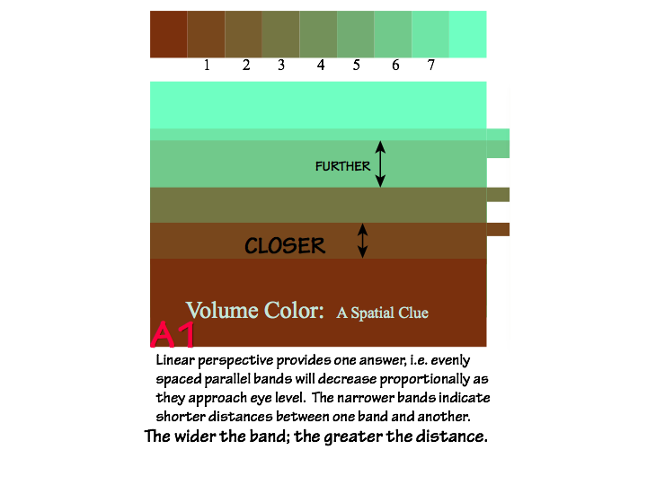
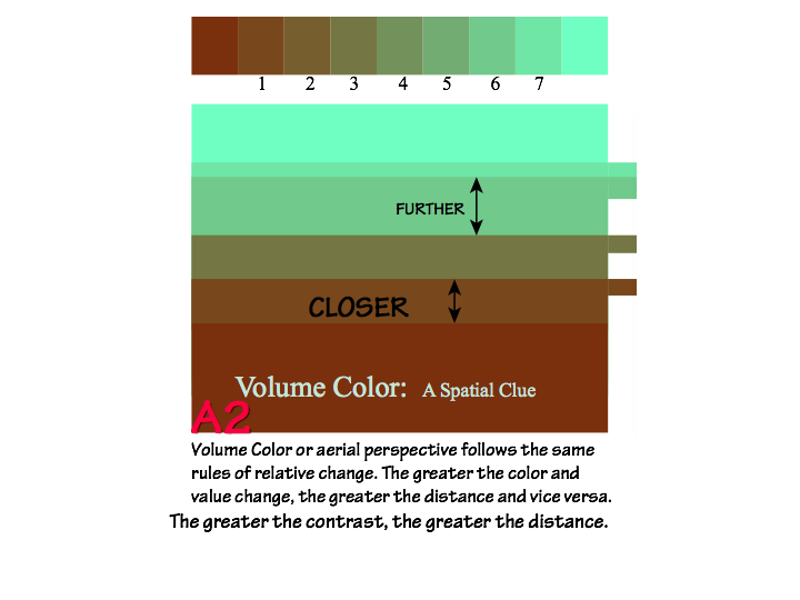
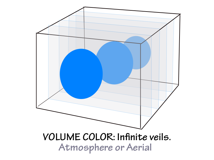
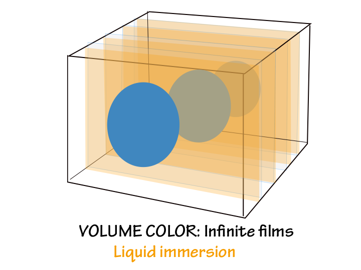
This week’s new concept: Volume color
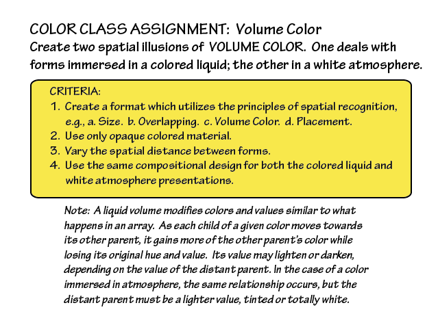
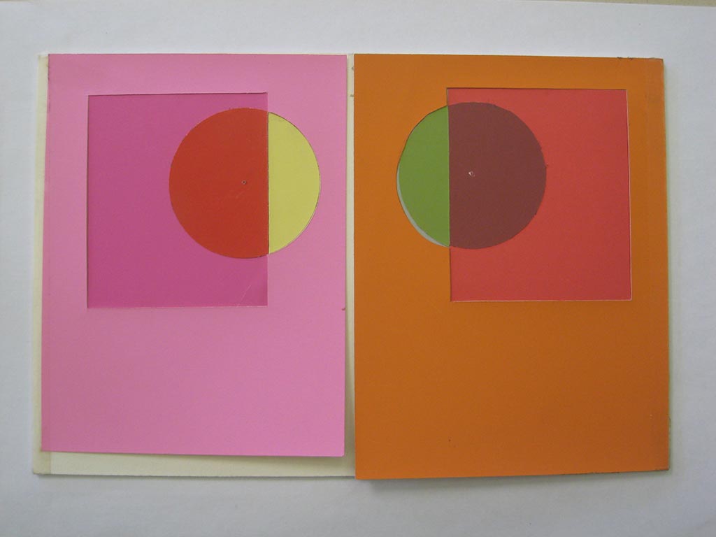
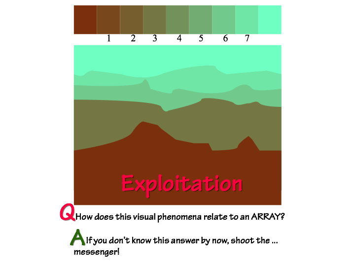
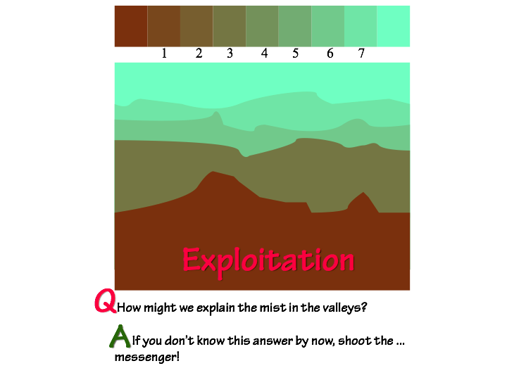
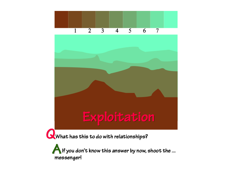
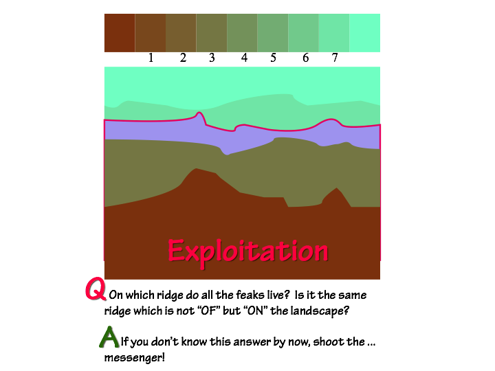
Several factors work together to create illusions of distance or depth in a painting. Two that we paid particular attention to are linear perspective – how objects further away look smaller – and aerial perspective or volume color – how objects further away take on the color of the medium in which they are immersed (atmosphere or liquid). The relative change, in size and in color, provides a visual cue for how close or distant the objects are.
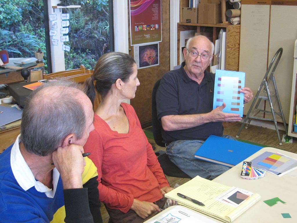
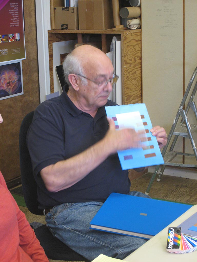
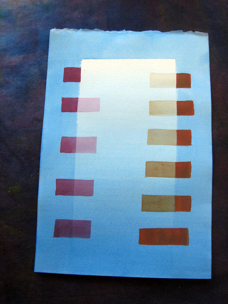
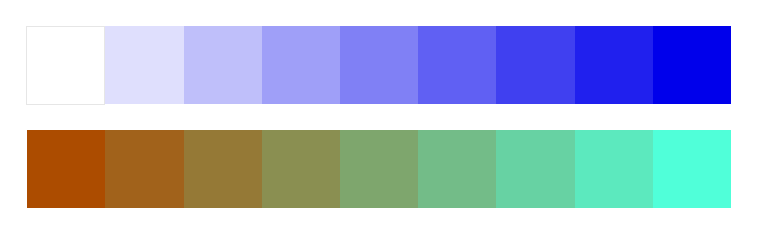
Using the principle of volume color helps elements of a scene become part OF the scene, not look pasted ON. Using colors from an array in which the object color and volume color are used as the anchor (parent) colors are can help create a consistent, unified, harmonious effect, as in these two arrays from today’s presentation.
[one-half]
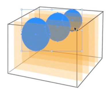
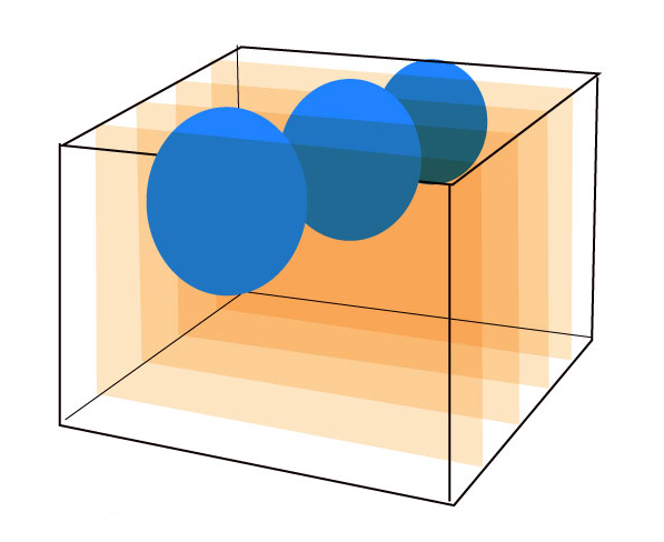
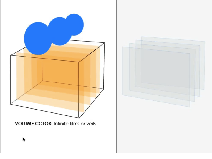
Learning never ends! For years, Dick has been teaching that a volume of liquid behaves like infinite layers of films. But this week, he created a video tutorial demonstrating how a blue object’s color is changed under several layers of orange representing a volume of orange liquid, and noticed the object was getting lighter – more orange – not darker, as it would under films. He realized he hadn’t changed the transparency blending mode in Illustrator from “Normal” to “Multiply”. But when he did change it, the effect wasn’t what we observe in nature – the original version was closer.
Use the concepts of films, veils, and volume color to help recognize and create consistency in your work, but don’t follow them slavishly. Understand that they are models – idealized simplifications – and there is no substitute for careful and critical observation.
[/one-half][one-half last=”y”]
Multiple semi-transparent layers
Multiple film layers
[/one-half]
[one-half]
Some of the physics behind the phenomenon of volume color is explained in a poster linked to at right. There are a lot of other resource materials available at that website, designed for teaching science in California.
[/one-half][one-half last=”y”]

Light Matters poster
[/one-half]
Class materials
This tutorial demonstrates how volume color modifies a color immersed in it. The demonstration explains how aerial perspective also influences color. An important tool in creating a composition in which all colors are OF and not merely ON the picture plane.
[gview file=”https://dicknelsoncolor.com/wp-content/uploads/2013/10/VolumeColor2PDF-optimized2.pdf”]


