The fifth session of the Color Relationships class for Winter 2015 was held on Friday, February 6. We critiqued the white light and shade assignment. The phenomenon of colored light was introduced through a demonstration, discussion, and video presentations. Students will define their own assignment and criteria for a colored light illusion.
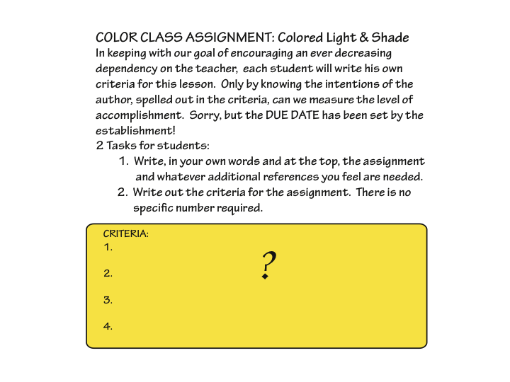
Homework assignment
Create your own assignment and criteria for a colored light illusion, as described below.
Class recap – some key ideas
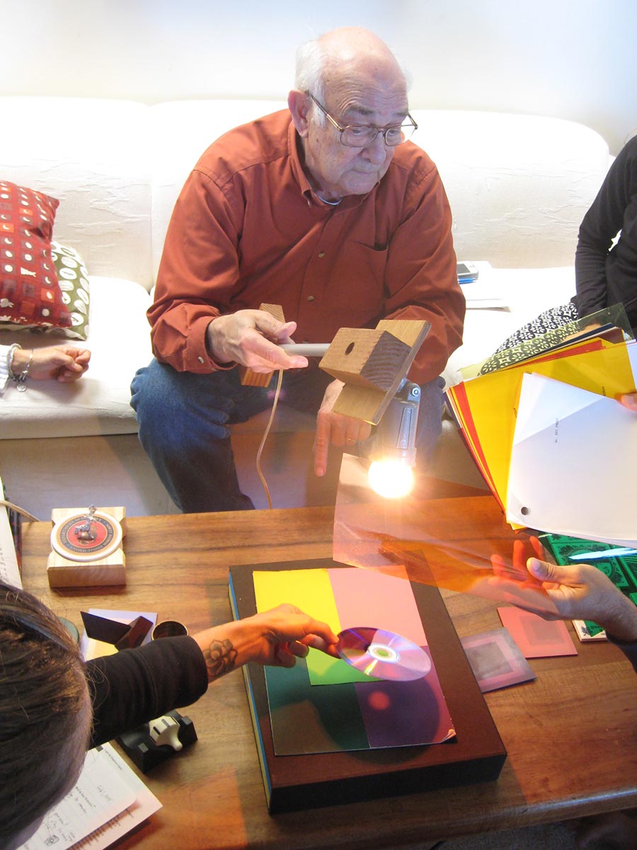
Critique – white light
Homework & studies
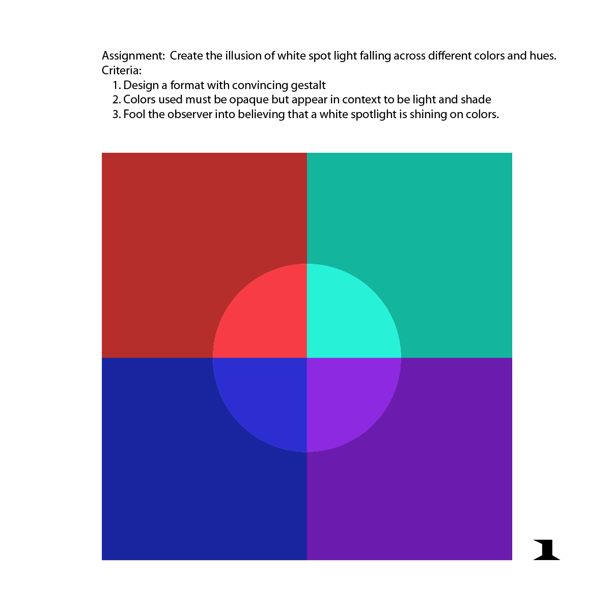
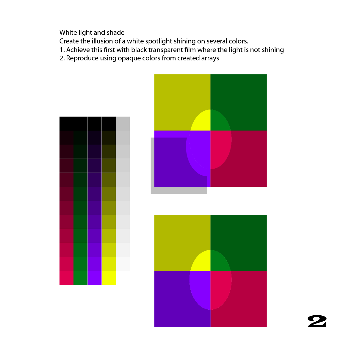
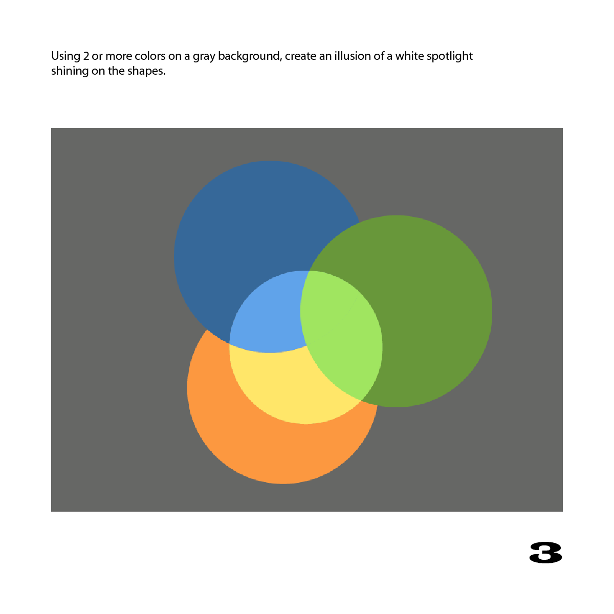
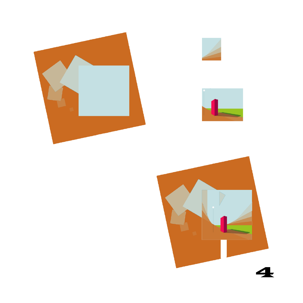
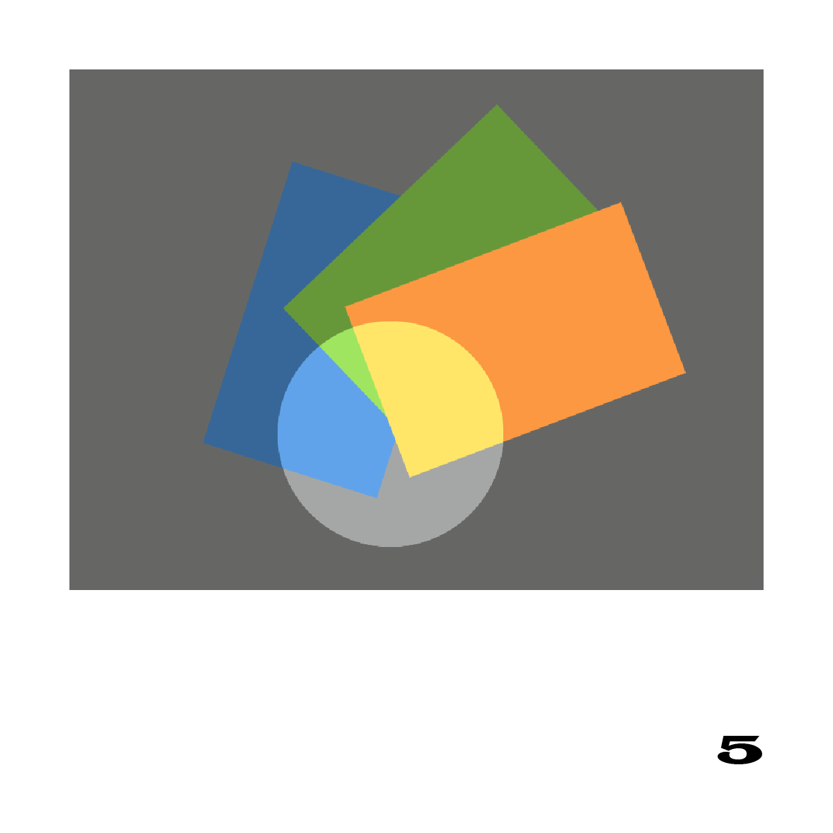
Homework studies submitted demonstrated an understanding that we need to see multiple colors under both light and shade to correctly read an illusion of white light. The gestalt in some of the studies could have been improved by using a more casual arrangement of shapes. Unevenly placed shapes, and an off-center light, would more closely resemble real life. There’s a lot to pay attention to, to be an effective visual magician!
Observations
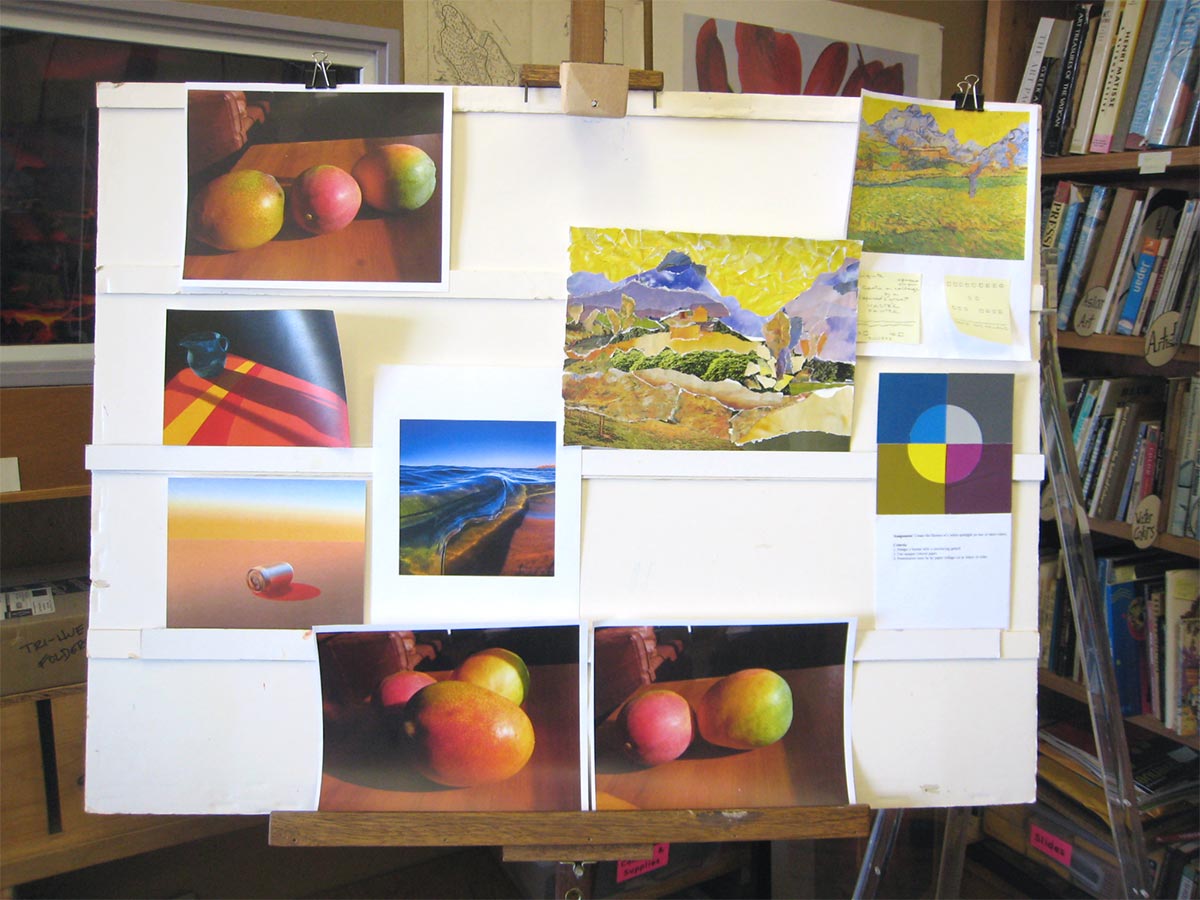
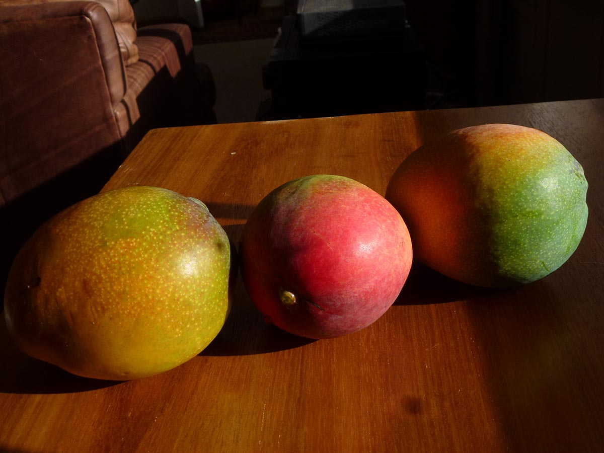
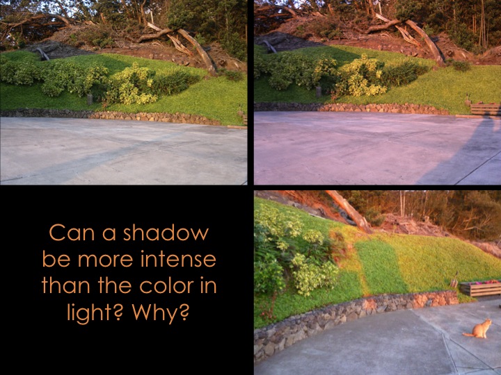
Kathy shared some photos of mangoes, where colored reflected light from neighboring fruit and the table can be clearly seen (below, and above in the critique board photo). Holly shared photos she’d taken which illustrate light and shadow phenomena, below.
-

- Colored reflected light from neighboring fruit and the table can be seen clearly.
-
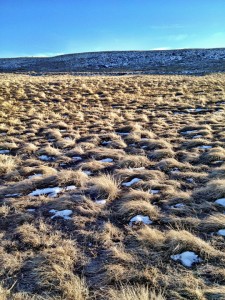
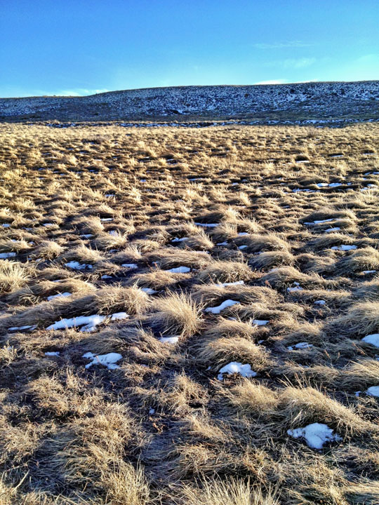
- With the sun from the right at a low angle, pockets of snow in the shade of the grasses are not white. Instead, they reflect the blue color of the ambient light, from the blue dome of the sky. It’s also noticeable on the distant hillside.
-
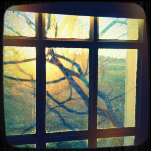
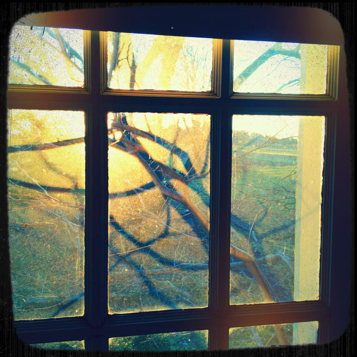
- Intensely blue shadows cast by a golden light
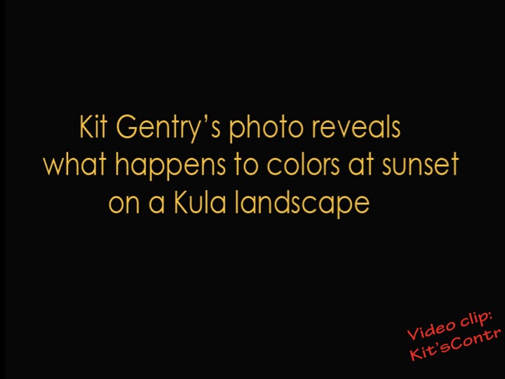
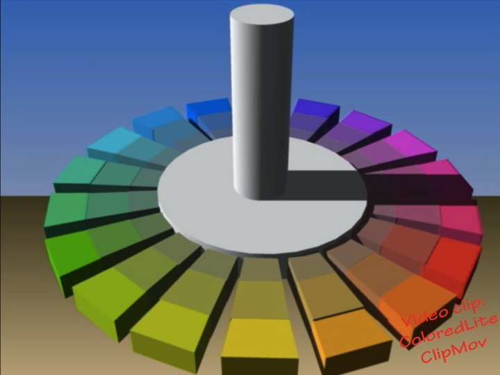
New this week: Colored light
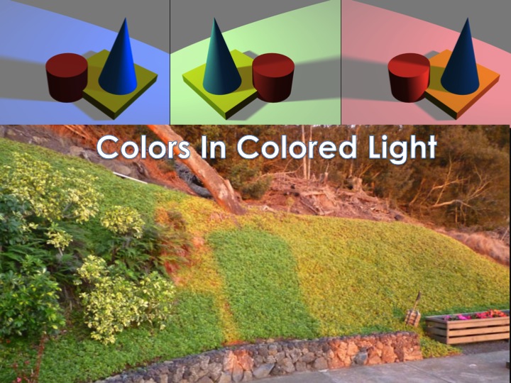
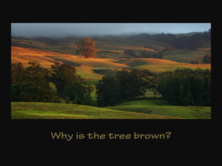
Even more than white light, colored light has the power to both unify a scene and set a mood. Because the shadow color is the complement of the light color, all colors in the scene are modified. Under a warm light like amber, warm colors are intensified and cool colors are dulled (toned, made more neutral), while in the blue-green shadow of an amber light, warm colors are dulled and cool colors intensified. We frequently observe this phenomenon at sunset, “the magic hour,” the time Leonardo da Vinci was referring to when he said, “Paint at no other time than this!”
-
- Slightly yellow white light

-

- Amber light, blue-green shadow
-

- Green light, reddish shadow
-
- Amber light, blue-green shadow

-

- Amber light, blue-green shadow
-

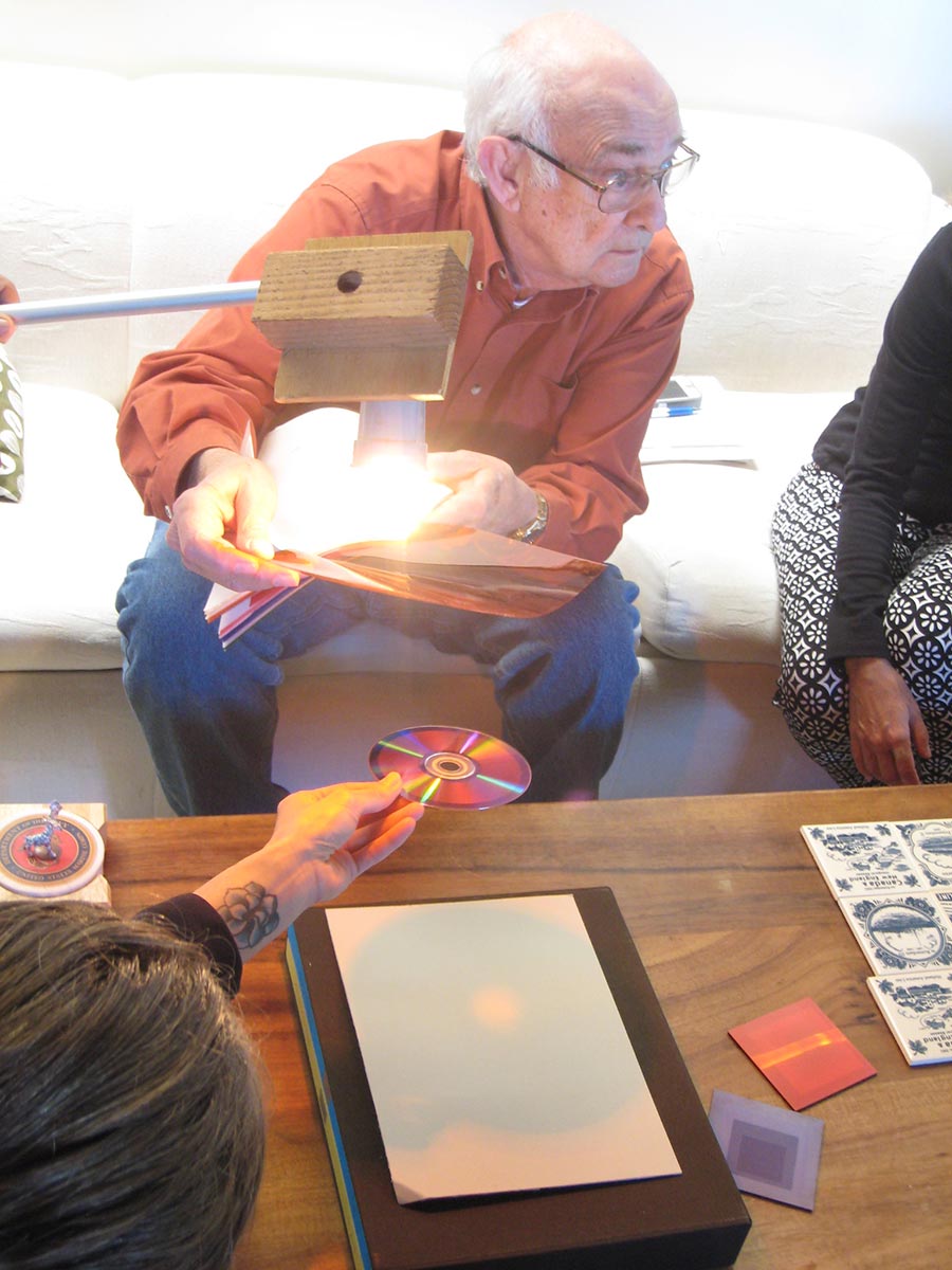
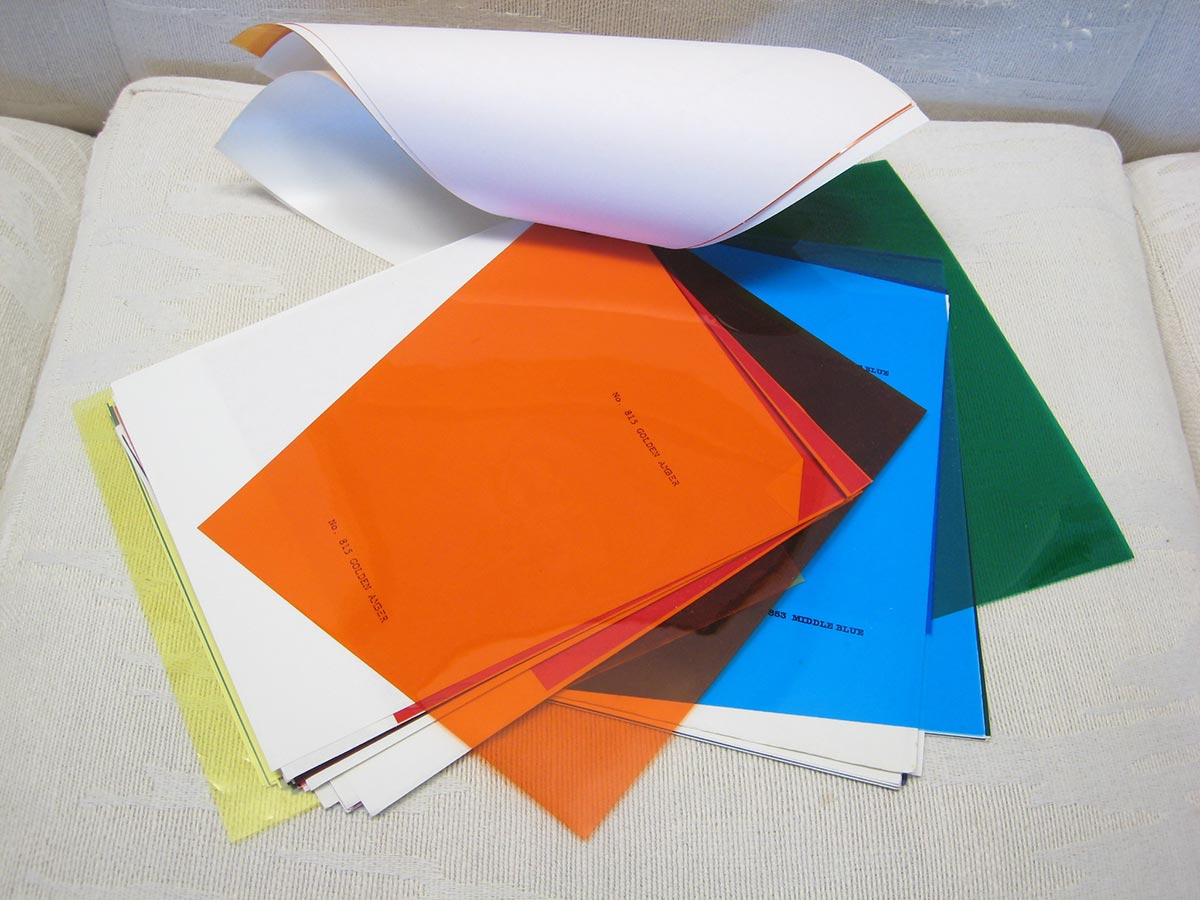
- Where the orange and blue films overlap, the result is almost black, because almost all light is absorbed by the two nearly complementary colors.
Colored light has a lot of white in it, so its shadows also have a lot of black. Shaded areas will also show evidence of the ambient light color, but in illuminated areas, the ambient light color is insignificant, because it is overwhelmed by the colored light source.
We don’t always perceive these colors accurately, however, due to an effect called “color constancy.” If we “know” from past experience that objects have a certain color – a red apple, a white house – we will tend to interpret them as that color, even when the color is strongly modified by colored light or shade. But if we paint them as the color we “know” they will look wrong, as seen in some local paintings depicting white surf at sunset. This is the idea of “local color.” Local color exists only in our minds. Color is never absolute; it is always relative to the lighting conditions and surrounding colors. Colors at sunset are different than “in the light of day,” which is why it evokes such a different mood. If you understand these concepts, you are more likely to notice these phenomena, and perceive them more accurately. Renaissance paintings show objects with distinct colors, in the light of day, while Baroque paintings tend to have colors unified under a common light, setting a very different mood.
Class materials
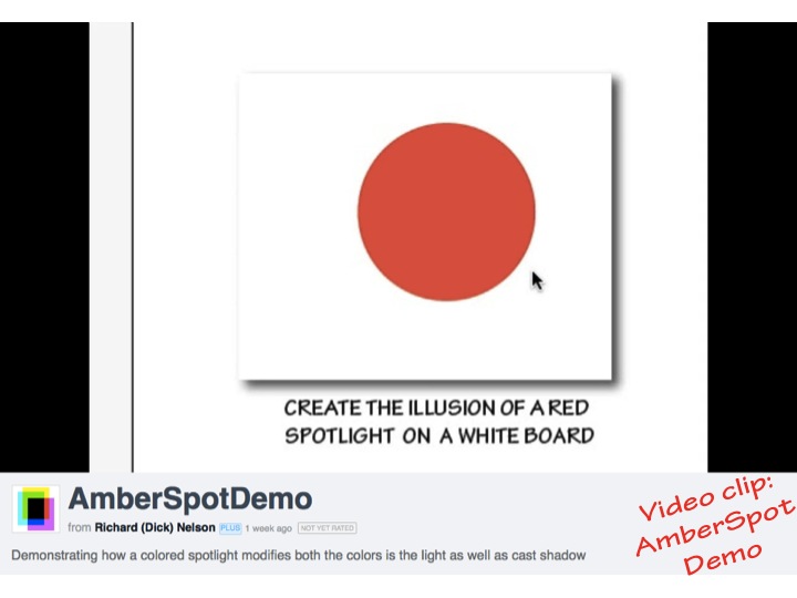
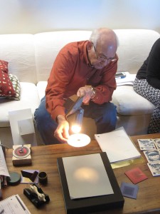
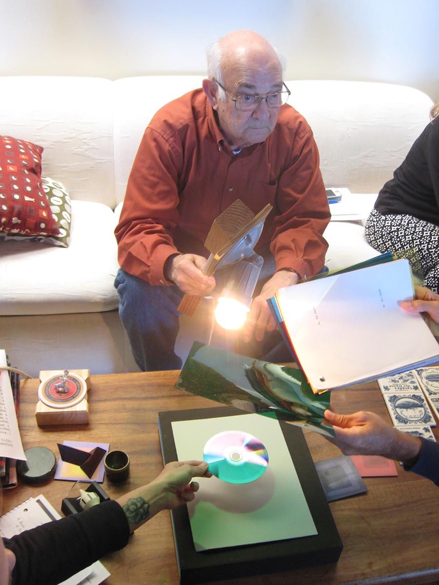
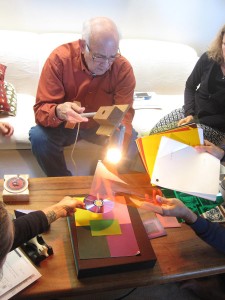
Demonstrating how a colored spotlight modifies both the colors in the light as well as cast shadow
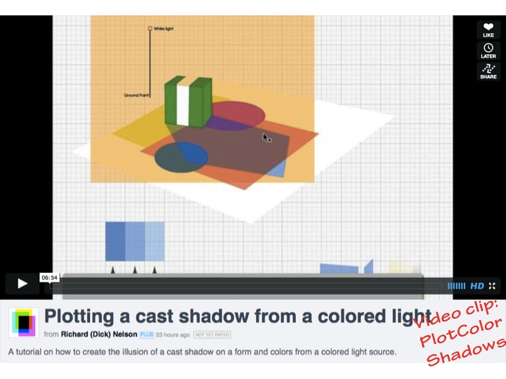
A tutorial on how to create the illusion of a cast shadow on a form and colors from a colored light source.
[gview file=”https://dicknelsoncolor.com/wp-content/uploads/2013/10/Forms-in-lights-updated.pdf”]
[gview file=”https://dicknelsoncolor.com/wp-content/uploads/2013/10/ColoredLightShade.pdf”]
[gview file=”https://dicknelsoncolor.com/wp-content/uploads/2013/10/ProducingColoredLite.pdf”]
[gview file=”https://dicknelsoncolor.com/wp-content/uploads/2013/10/CreatingColorLite.pdf”]
The PDF below has 29 pages of drawing instruction and exercises, including helpful information on perspective and light.
[gview file=”https://dicknelsoncolor.com/wp-content/uploads/2012/05/Drawing.pdf”]
See also the 2013 post on colored light, and the following week.


